Honeycomb SW 6375 by Sherwin Williams
Warmth and Cheer Brightening Spaces with Vibrant Amber Tones
Are you considering giving your space a fresh, warm update? Let me introduce you to Sherwin Williams SW 6375 Honeycomb. This paint color is like a cozy, sunny morning all year round. The golden tone of Honeycomb has a welcoming vibe that can instantly make a room feel more inviting.
This shade fits beautifully in spaces where you want to add a touch of warmth without overwhelming the room with too bright a color. It’s perfect for creating a cheerful kitchen, a cozy reading nook, or adding a burst of sunshine to a bathroom.
Honeycomb pairs well with a wide range of decor styles, from rustic to modern, making it a great choice for your next painting project.
Why choose Honeycomb? It’s not just its warm hues that you’ll love, but also how it brings a natural, soothing feeling into your home.
Whether you want to paint an accent wall or renew the look of your entire living room, Honeycomb can help you achieve the atmosphere you’re aiming for.
Give your home a touch of warmth with Sherwin Williams SW 6375 Honeycomb. It could be just what you need to make your space feel just right.
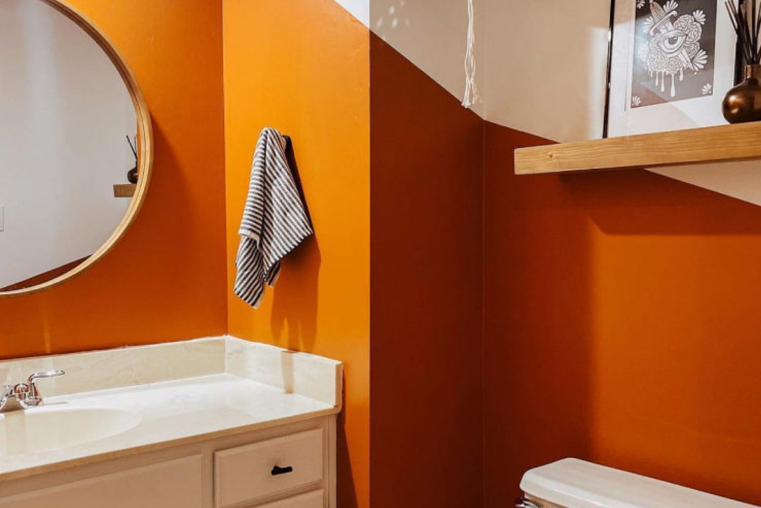
via sherwin-williams.com
What Color Is Honeycomb SW 6375 by Sherwin Williams?
Honeycomb SW 6375 by Sherwin Williams is a warm, inviting color that resembles the natural tones found in beehives. This rich amber hue exudes coziness and can add a sunny vibrancy to any space. Its golden undertones make it versatile in coordinating with a variety of decor styles and materials.
This color works exceptionally well in rustic and farmhouse interiors, where its earthy essence aligns perfectly with natural wood textures, from reclaimed pine to weathered oak.
Honeycomb SW 6375 also complements traditional settings, offering a splash of warmth that pairs seamlessly with classic furnishings and rich textiles like velvet or silk.
In modern homes, this shade can provide a welcoming contrast to clean, minimalistic designs, softening stark whites and balancing cooler grays and blues. Incorporating Honeycomb in accessories like cushions, throws, or a feature wall can bring a cozy feel to contemporary decor.
For materials, Honeycomb matches beautifully with leather and suede, enhancing their luxurious feel. It also works well with linen, adding a casual, airy vibe to the amiability of the space. In terms of metallic finishes, brass and copper accents amplify the warmth of Honeycomb, creating a harmonious and appealing aesthetic.
housekeepingbay.com
Is Honeycomb SW 6375 by Sherwin Williams Warm or Cool color?
HoneycombSW 6375 by Sherwin Williams is a warm, vibrant shade of yellow. This cheerful color adds a sunny vibe to any room, making spaces feel more welcoming and lively. It’s perfect for areas like kitchens or dining rooms, where a bright, inviting atmosphere can enhance gatherings and meals. Honeycomb can also make small spaces seem larger and brighter when used on walls or accents.
Pairing this shade with neutral tones such as whites, grays, or earthy browns balances its brightness and creates a cozy, harmonious look. In bedrooms, combining Honeycomb with soft fabrics and subtle decor can soften its energy, yielding a relaxed yet cheerful sleeping environment.
Overall, HoneycombSW 6375 is versatile in its application, adapting well to various decorative styles, from modern to rustic. It infuses rooms with warmth and positivity, making it a popular choice for those looking to refresh their home with a lively splash of color.
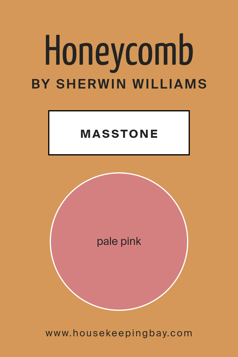
What is the Masstone of the Honeycomb SW 6375 by Sherwin Williams?
HoneycombSW 6375 by Sherwin Williams is a color with a masstone of Pale Pink (#D58080), giving it a soft and gentle appearance. This color can bring a touch of warmth and coziness into any space in your home. Its subtle pink hue is perfect for creating a soothing atmosphere, making it ideal for rooms where you want a calming environment, like bedrooms or bathrooms.
Since the color is not overly bold, it works well with a range of decorating styles, from modern to traditional. It can be paired with neutral shades like whites and greys to maintain a soft, muted palette, or combined with darker colors like deep blues or greens to create a more dynamic look.
The flexibility of HoneycombSW 6375 makes it an excellent choice for those looking to add a sense of warmth without overwhelming the space with strong colors. This makes your room feel welcoming and comfortable.
housekeepingbay.com
Undertones of Honeycomb SW 6375 by Sherwin Williams
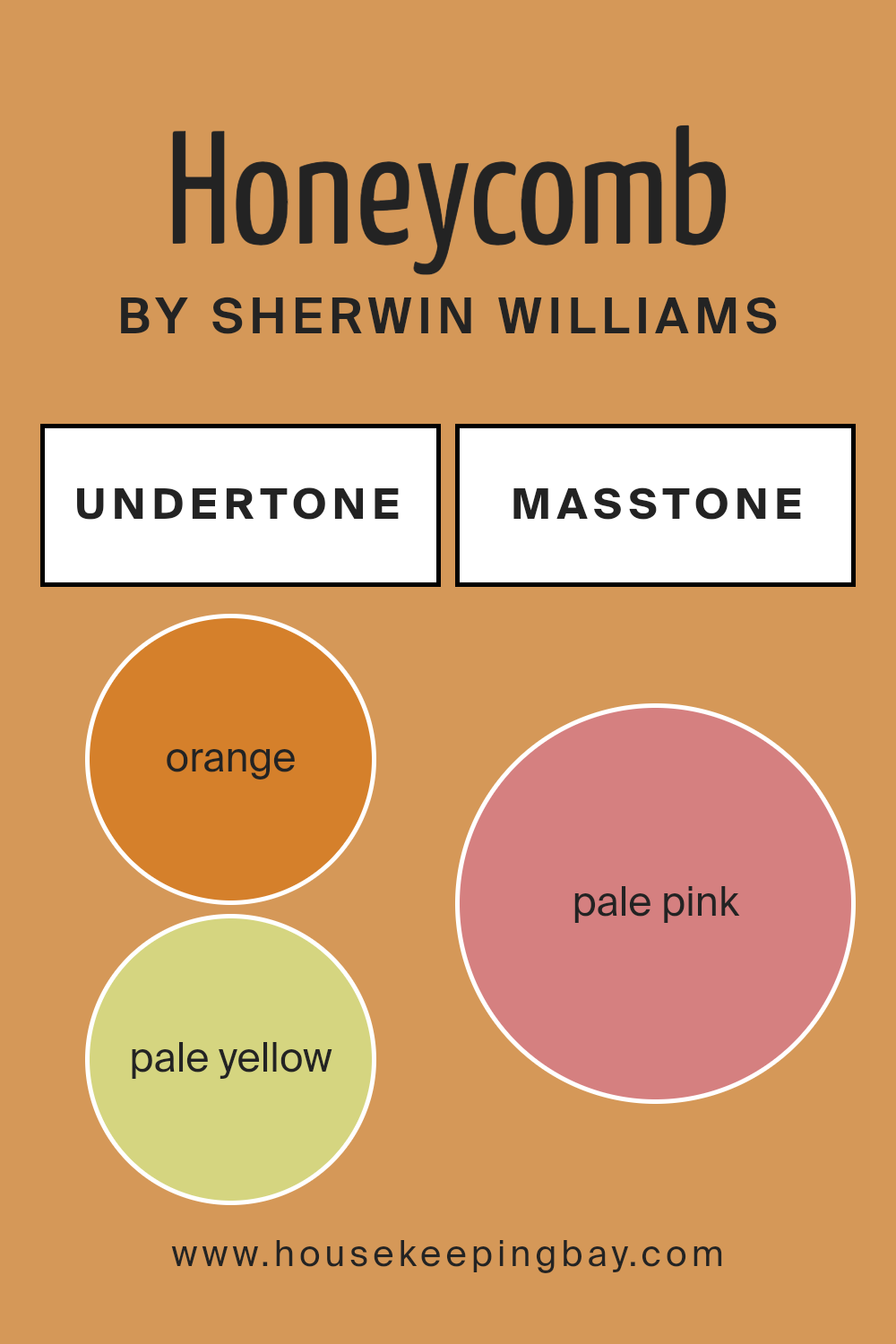
Honeycomb SW 6375, by Sherwin Williams, is a rich, warm color that can significantly influence the atmosphere of any room. The undertones of a paint color are the subtle colors that lie beneath the surface of the primary color. These undertones affect how we perceive the main color, especially under different lighting conditions.
Honeycomb SW 6375 is primarily seen as a vibrant color, but it has a complex range of undertones including orange, pale yellow, yellow, grey, olive, and more. These undertones make the color versatile and dynamic. For example, the orange and yellow undertones add warmth and coziness, making it a great choice for living rooms or study areas.
Meanwhile, undertones like grey and olive provide a grounding effect, which can help balance brighter furnishings.
When applied to interior walls, Honeycomb SW 6375 offers a warm embrace due to its orange and yellow undertones, creating a welcoming environment. The presence of grey and olive undertones can subtly tone down the intensity, making it comfortable for the eyes. This complexity allows Honeycomb to adapt to various styles and pair well with many other colors, from soft neutrals to bold shades.
In summary, the undertones of Honeycomb SW 6375 affect its overall appearance on walls, influencing both the mood and style of the space. This makes it an adaptable and appealing choice for interior design.
housekeepingbay.com
Coordinating Colors of Honeycomb SW 6375 by Sherwin Williams
Coordinating colors are selected to create a harmonious color scheme that complements a main color, enhancing the overall aesthetic of a space.
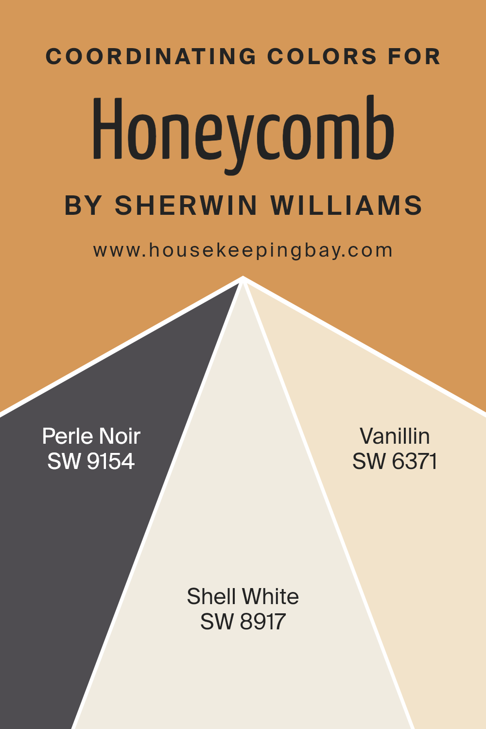
For example, when working with a base color like Honeycomb SW 6375 by Sherwin Williams, which is a warm, inviting golden hue, selecting the right coordinating colors can enrich this primary shade and tie a room’s decor together beautifully. Pair it with colors such as SW 9154 – Perle Noir, SW 8917 – Shell White, and SW 6371 – Vanillin to achieve a balanced and inviting look.
SW 9154 – Perle Noir is a deep, intense black that provides a strong contrast to Honeycomb, offering a sophisticated edge to the color palette. Using this color in accents can ground the space and draw attention to focal points. SW 8917 – Shell White is a soft, clean white that offers a fresh, crisp backdrop that allows Honeycomb to truly shine.
It works well for trim or as an expansive wall color that doesn’t compete for attention. Lastly, SW 6371 – Vanillin is a creamy, off-white tone with just a hint of yellow, echoing the warmth of Honeycomb without overpowering it, perfect for creating a seamless flow between rooms.
You can see recommended paint colors below:
- SW 9154 Perle Noir
- SW 8917 Shell White
- SW 6371 Vanillin
housekeepingbay.com
How Does Lighting Affect Honeycomb SW 6375 by Sherwin Williams?
Lighting plays a crucial role in how we perceive colors, influencing the mood and atmosphere of a space. The color Honeycomb SW 6375 by Sherwin Williams is no exception and its appearance can change significantly under different lighting conditions.
Honeycomb is a warm, deep yellow with a hint of mustard, perfect for creating a cozy and inviting environment. Under artificial light, such as LED or incandescent bulbs, this color tends to appear richer and more intense. Artificial lighting, especially warmer tones, can enhance the yellow hues, making the walls seem more vibrant and lively.
In natural light, the appearance of Honeycomb can vary throughout the day. The quality and direction of natural light can dramatically affect how this color is perceived. In north-facing rooms, natural light is cooler and may cause Honeycomb to look slightly muted, bringing out more of its subtle earthy tones. These rooms will not get much direct sunlight, which can make the color appear more consistent throughout the day.
South-faced rooms receive a significant amount of light throughout the day, which can make Honeycomb look brighter and more vivid. The warm southern sunlight enhances the warm tones of the paint, making the room feel sunny and cheerful even on dull days.
East-faced rooms see most of their light in the morning when the light is golden and soft. In these rooms, Honeycomb will appear bright and fresh in the morning, transitioning into a softer, deeper shade as the day progresses and the natural light diminishes.
West-facing rooms get a lot of sunlight in the late afternoon, which can make Honeycomb appear very warm and dynamic during this time. The late-day sunlight can really make this color glow, adding warmth to the space as the sun sets.
Overall, the color Honeycomb SW 6375 is quite versatile, adapting to various lighting conditions which shift its mood and character. It’s beneficial to consider these aspects when choosing paint colors, especially for spaces used throughout different times of the day.
housekeepingbay.com
What is the LRV of Honeycomb SW 6375 by Sherwin Williams?
Light Reflectance Value (LRV) measures the percentage of light a paint color reflects from or absorbs into a painted surface. LRV ranges from 0 to 100, with 0 being perfectly black, absorbing all light, and 100 being pure white, reflecting all light back.
This value is crucial when choosing paint colors because it affects how light or dark a color will look on the walls and how it influences the overall mood and brightness of a room. The higher the LRV, the lighter the color appears, making spaces feel more open and airy, while lower LRV values create a cozier and more intimate atmosphere.
Honeycomb SW 6375 by Sherwin Williams has an LRV of 37.443, placing it in the medium range on the scale. This means it neither reflects nor absorbs light excessively, making it a versatile choice that provides a balanced look in most spaces.
In a well-lit room, Honeycomb will appear slightly lighter and can help enhance the room’s natural brightness without being overpowering. In a darker room, it will pull in the limited light, offering a warm and more enclosed feel, which can appeal to those wanting a cozier setting.
This particular shade can effectively moderate the brightness of a space while adding a warm hue to the walls.

housekeepingbay.com
What are the Trim colors of Honeycomb SW 6375 by Sherwin Williams?
Trim colors play a vital role in defining the architectural details and enhancing the overall appeal of a space. Specifically for Honeycomb SW 6375 by Sherwin Williams, choosing the right trim color can significantly impact the ambiance and visual balance in a room.
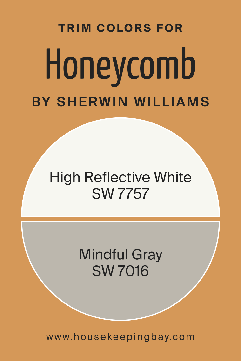
SW 7757 High Reflective White and SW 7016 Mindful Gray are excellent trim choices for this vibrant yellow shade. Using High Reflective White as a trim provides a crisp, clean border that highlights Honeycomb’s lively nature, making the wall color pop and giving the space a fresh, airy feel.
On the other hand, Mindful Gray offers a softer contrast, adding a touch of sophistication and subtlety that harmonizes beautifully with Honeycomb, creating a more grounded and cohesive look.
High Reflective White is a brilliant white that acts as a versatile backdrop, making it ideal for creating a distinct, bold delineation between walls and trim. This shade ensures that any accompanying colors appear more vibrant and dynamic, making it a popular choice for those looking to invigorate their space.
Mindful Gray, a gentle gray with warm undertones, provides a soothing contrast that complements a variety of color palettes. Its ability to blend seamlessly with both vibrant and muted tones makes it a practical and appealing option for trim, enhancing the overall aesthetic without overpowering the primary color.
You can see recommended paint colors below:
housekeepingbay.com
Colors Similar to Honeycomb SW 6375 by Sherwin Williams
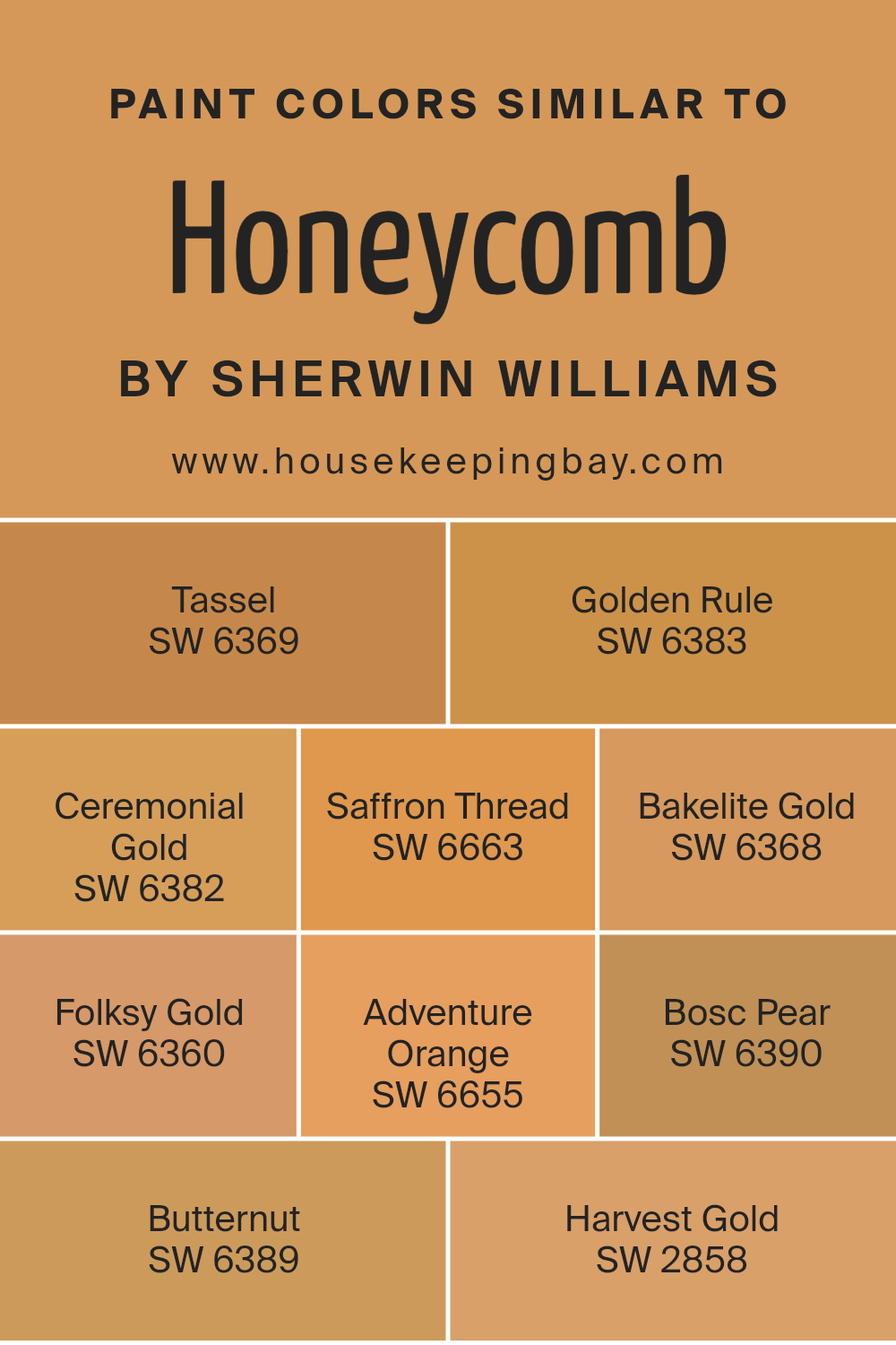
Similar colors are crucial in design because they create a sense of harmony and balance. Colors that share the same hue but have different tones or saturations can tie a space or design together seamlessly. For instance, when dealing with a base color like Honeycomb SW 6375 by Sherwin Williams, incorporating shades like Tassel SW 6369 and Ceremonial Gold SW 6382 can enrich the visual experience.
These colors hold the warmth of Honeycomb but introduce subtle variations that can highlight different aspects of a room or artwork. Similarly, colors like Saffron Thread SW 6663 and Bakelite Gold SW 6368 maintain the warm ambiance but shift slightly in brightness or depth, providing a layered and cohesive look.
For fostering a sunny and bright setting, shades like Golden Rule SW 6383 and Folksy Gold SW 6360 offer lighter or darker nuances, which can accentuate or soften the overall impact of the color scheme.
More adventurous choices such as Adventure Orange SW 6655 bring in a zesty pop that’s closely aligned with the golden family.
On the other hand, more muted yet warm tones like Bosc Pear SW 6390 and Butternut SW 6389 add a subtler, earthy feel that complements places needing a touch of softness.
Harvest Gold SW 2858 rounds out options by leaning into more traditional golden hues that are perfect for entries that aim for a classic yet cozy warmth. Using similar colors like these ensures a cohesive and inviting space that feels thoughtfully put together.
You can see recommended paint colors below:
- SW 6369 Tassel
- SW 6383 Golden Rule
- SW 6382 Ceremonial Gold
- SW 6663 Saffron Thread
- SW 6368 Bakelite Gold
- SW 6360 Folksy Gold
- SW 6655 Adventure Orange
- SW 6390 Bosc Pear
- SW 6389 Butternut
- SW 2858 Harvest Gold
housekeepingbay.com
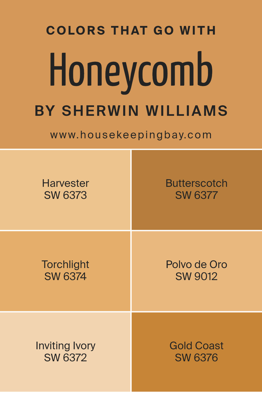
Colors that Go With Honeycomb SW 6375 by Sherwin Williams
When choosing the right colors to complement Honeycomb SW 6375 by Sherwin Williams, it’s important to consider what other hues will highlight its warm, inviting nature. Such compatibility ensures a cohesive and visually appealing space.
Colors like Harvester SW 6373 and Butterscotch SW 6377, with their rich, golden tones, naturally enhance the depth of Honeycomb, creating a cozy, sunlit atmosphere. Torchlight SW 6374 adds a slightly reddish tint, offering a vibrant contrast that makes the room feel more dynamic. These combinations are perfect for areas where a sense of warmth and energy is desired.
On the other hand, colors like Polvo de Oro SW 9012 introduce a nuanced, earthy beige that softens the intensity of Honeycomb, making it suitable for spaces where a more subtle and relaxing vibe is needed.
Inviting Ivory SW 6372 and Gold Coast SW 6376 provide a lighter backdrop, which can help in opening up the space and making it feel more airy and light-filled.
These paler hues work well in balancing the bolder character of Honeycomb, ensuring that the space remains bright and welcoming without overwhelming the senses. Selecting the right colors to pair with Honeycomb can truly enhance the overall aesthetic and mood of any room.
You can see recommended paint colors below:
- SW 6373 Harvester
- SW 6377 Butterscotch
- SW 6374 Torchlight
- SW 9012 Polvo de Oro
- SW 6372 Inviting Ivory
- SW 6376 Gold Coast
housekeepingbay.com
How to Use Honeycomb SW 6375 by Sherwin Williams In Your Home?
Honeycomb SW 6375 by Sherwin Williams is a warm, inviting yellow hue that brings a sunny and cheerful atmosphere to any room. Ideal for spaces where you want to add brightness and warmth, this color works well in kitchens, living rooms, and dining areas. Honeycomb can help make small spaces feel larger and more open due to its light-reflective properties.
When used in a kitchen, it can be painted on walls or used on cabinets for a refreshing look. In living rooms, pairing it with neutral furniture can create a balanced aesthetic. For those looking to add a cozy yet lively vibe to their home office or study area, Honeycomb offers a burst of energy that stimulates focus and creativity.
Furthermore, combining Honeycomb with deeper shades such as navy or dark gray can offer a beautiful contrast, making it a versatile choice for many home decorating schemes. It’s also an excellent choice for accents like doors and trim to add a playful splash of color without overwhelming the space.
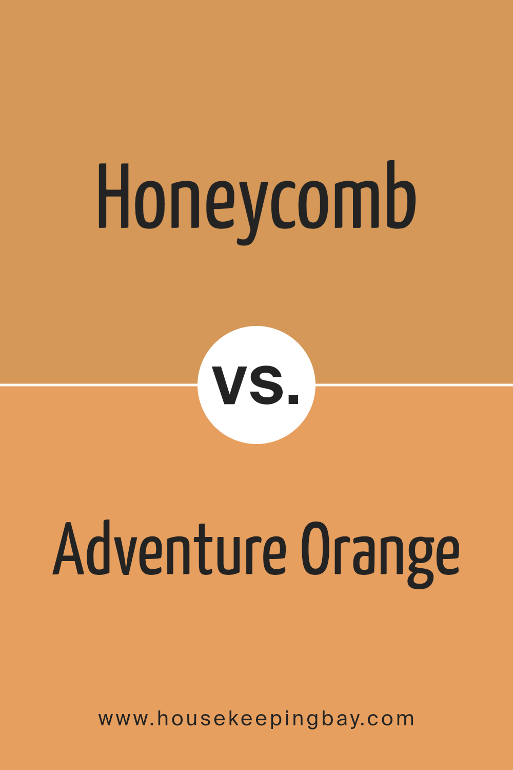
Honeycomb SW 6375 by Sherwin Williams vs Adventure Orange SW 6655 by Sherwin Williams
Honeycomb SW 6375 by Sherwin Williams is a warm, inviting yellow with golden tones that give off a cozy and welcoming vibe. It’s perfect for spaces where you want to create a bright and lively atmosphere. This color works well in kitchens and living rooms, adding a cheerful energy.
In contrast, Adventure Orange SW 6655 is a bold, vibrant orange that infuses any room with excitement and personality. It’s ideal for areas where you aim to stimulate activity and enthusiasm, like exercise rooms or creative spaces. This shade has a dynamic quality that can invigorate any décor.
Both colors are strong yet distinct choices for interior design, with Honeycomb bringing a sunny brightness and Adventure Orange offering a fiery zest. They offer unique visual impacts, making them suitable for different preferences and room functions.
You can see recommended paint color below:
- SW 6655 Adventure Orange
housekeepingbay.com
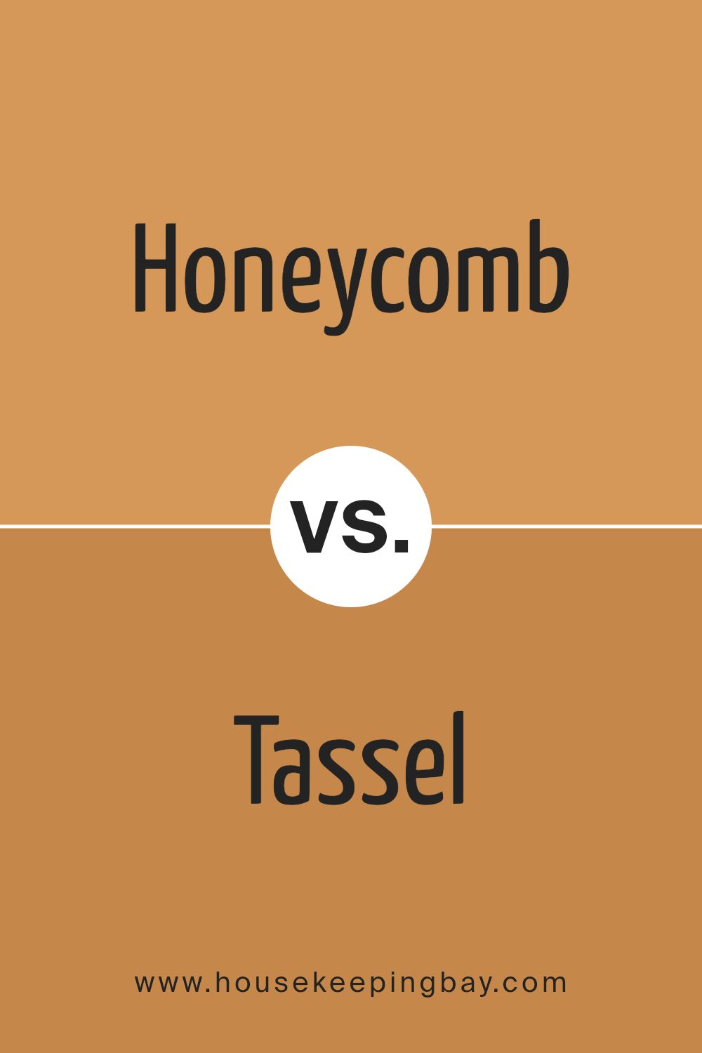
Honeycomb SW 6375 by Sherwin Williams vs Tassel SW 6369 by Sherwin Williams
Honeycomb SW 6375 by Sherwin Williams is a warm, rich yellow color with an inviting depth that suggests coziness and comfort. It has a golden tone that can bring a sunny and cheerful ambiance to any space, making it ideal for living rooms or kitchens where a welcoming feel is desired.
Tassel SW 6369 by Sherwin Williams is a slightly deeper color compared to Honeycomb. Though also yellow, Tassel leans towards a mustard shade, offering a more subdued yet sophisticated vibe. This color suits spaces that aim for a more grounded, mature appearance while still maintaining brightness.
Both Honeycomb and Tassel work beautifully to inject warmth into a room. However, Honeycomb’s brighter, more vibrant yellow is better suited for spaces that aim for an energetic and lively feel, whereas Tassel’s mustard hues are perfect for creating a more refined and soothing atmosphere.
You can see recommended paint color below:
- SW 6369 Tassel
housekeepingbay.com
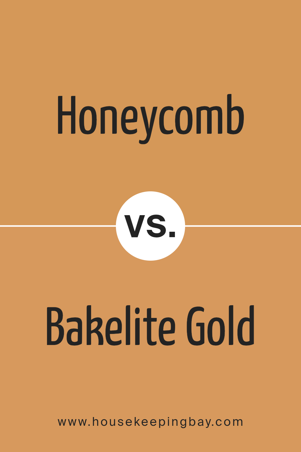
Honeycomb SW 6375 by Sherwin Williams vs Bakelite Gold SW 6368 by Sherwin Williams
Honeycomb SW 6375 by Sherwin Williams is a warm, mid-tone yellow with a golden hue, giving a cozy and inviting feel to spaces. It’s an excellent choice for areas like kitchens and living rooms, where you want a welcoming atmosphere.
In contrast, Bakelite Gold SW 6368 is also from Sherwin Williams but has a deeper, more saturated appearance. It veers more towards an orange-yellow, offering a bolder and richer look. This color works well in spaces that aim to make a strong visual impact or where you want to add a sense of warmth and vibrancy.
Both colors are great for adding warmth, but the choice between them depends on your preference for brightness and the mood you aim to create in your space. Honeycomb is lighter and softer, making it versatile, while Bakelite Gold is richer and ideal for making a statement.
You can see recommended paint color below:
- SW 6368 Bakelite Gold
housekeepingbay.com
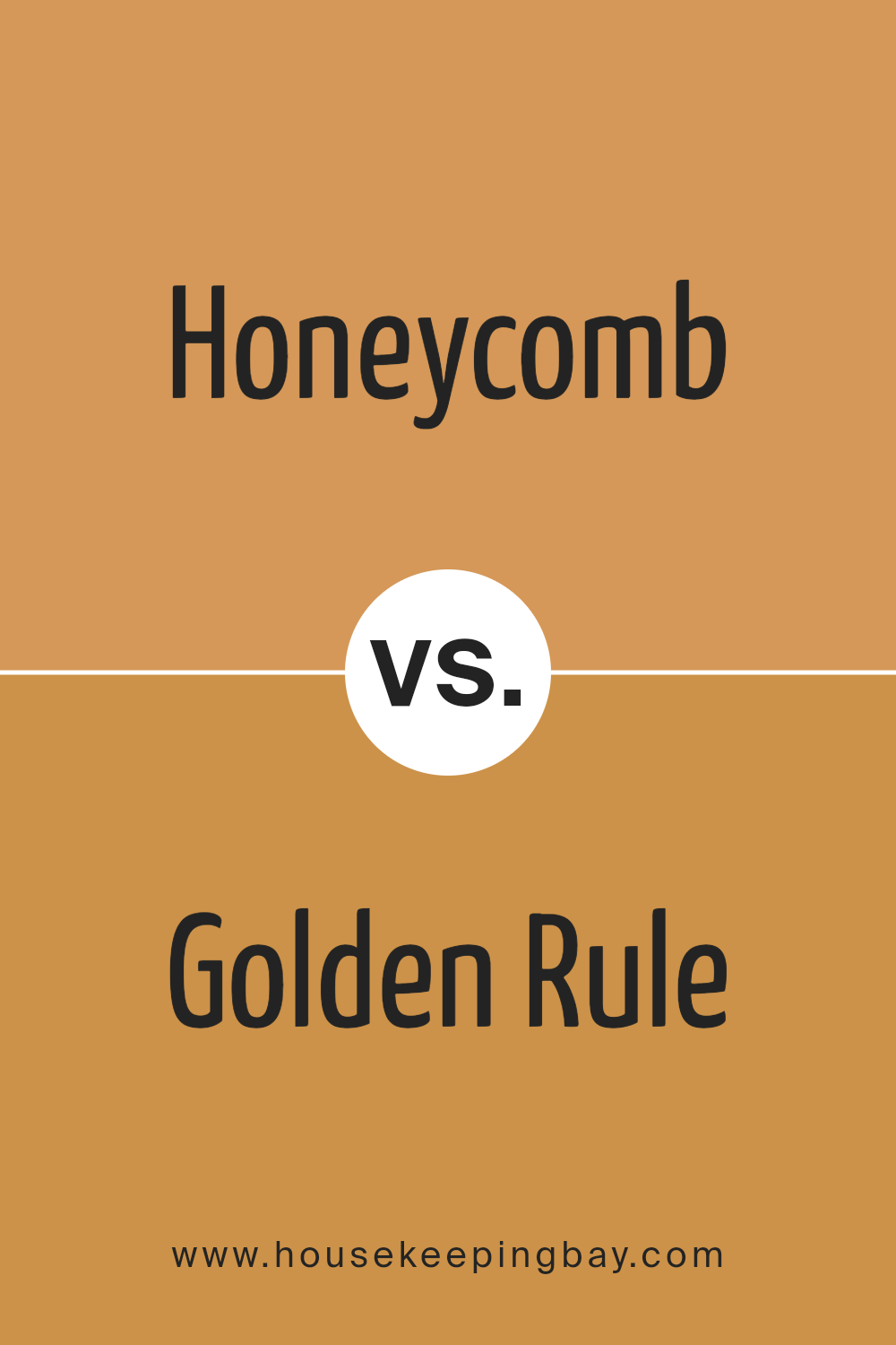
Honeycomb SW 6375 by Sherwin Williams vs Golden Rule SW 6383 by Sherwin Williams
Honeycomb SW 6375 by Sherwin Williams is a warm, inviting shade similar to the natural color of honey. This hue has a comforting appeal and works well in spaces designed for relaxation or gatherings, creating a cozy atmosphere. It pairs beautifully with darker woods or earthy accents, enhancing a rustic or traditional decor style.
Golden Rule SW 6383, also by Sherwin Williams, is a bolder, more vibrant yellow. This color exudes positivity and energy, making it perfect for areas where you want to stimulate activity and enthusiasm, such as kitchens or playrooms. It also complements modern and contemporary styles, especially when contrasted with neutral or cool tones.
Both colors add warmth to interiors, but Honeycomb is subtler and more muted, whereas Golden Rule offers a stronger visual impact with its brighter and richer intensity.
You can see recommended paint color below:
- SW 6383 Golden Rule
housekeepingbay.com
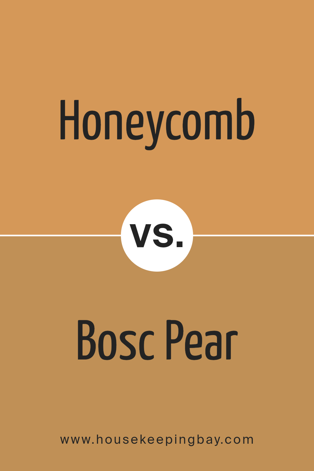
Honeycomb SW 6375 by Sherwin Williams vs Bosc Pear SW 6390 by Sherwin Williams
Honeycomb SW 6375 by Sherwin Williams is a warm, inviting yellow. It is reminiscent of the golden tones found in a natural honeycomb, providing a cozy and cheerful ambiance in any room. This color is versatile and pairs well with both dark and light furnishings, bringing a sunny brightness to living spaces, kitchens, or bedrooms.
Bosc Pear SW 6390, by contrast, leans towards a richer, deeper yellow with slight green undertones. It offers a bold yet earthy feel, suitable for spaces that feature natural elements like wood or stone. This color tends to make a room feel more grounded and can be complemented with neutral accents to balance its intensity.
Both Honeycomb and Bosc Pear illuminate a space but in distinctly different ways. Honeycomb is lighter and brighter, perfect for a lively, energetic vibe. Bosc Pear, with its muted green hints, provides a more subdued yet impactful aesthetic that can make a room feel more intimate and warm.
You can see recommended paint color below:
housekeepingbay.com
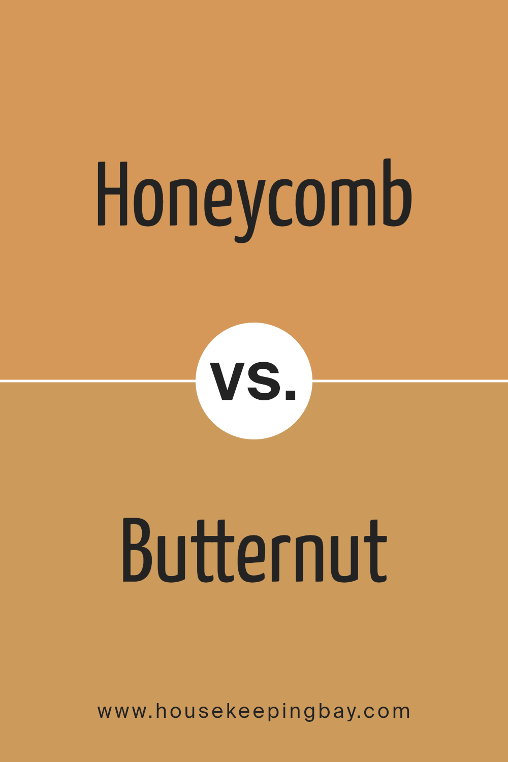
Honeycomb SW 6375 by Sherwin Williams vs Butternut SW 6389 by Sherwin Williams
Honeycomb SW 6375 and Butternut SW 6389, both by Sherwin Williams, offer warm, welcoming tones but with distinct differences. Honeycomb is a rich, golden yellow that simulates the natural color of a beehive’s honeycomb. This shade is vibrant and can add a cheerful, sunny ambiance to any space. It works well in kitchens and living areas where you want to inject energy and brightness.
On the contrary, Butternut SW 6389 is a deeper, more muted yellow with a touch of brown. It presents a more subdued feel, reminiscent of autumn and the soft warmth of roasted nuts. This color is ideal for creating a cozy and comforting atmosphere, suitable for bedrooms or spaces where a more relaxed vibe is desired.
Both colors can warm up a room but serve different moods and preferences depending on the effect you wish to achieve. Honeycomb is more stimulating, while Butternut offers a gentler warmth.
You can see recommended paint color below:
- SW 6389 Butternut
housekeepingbay.com
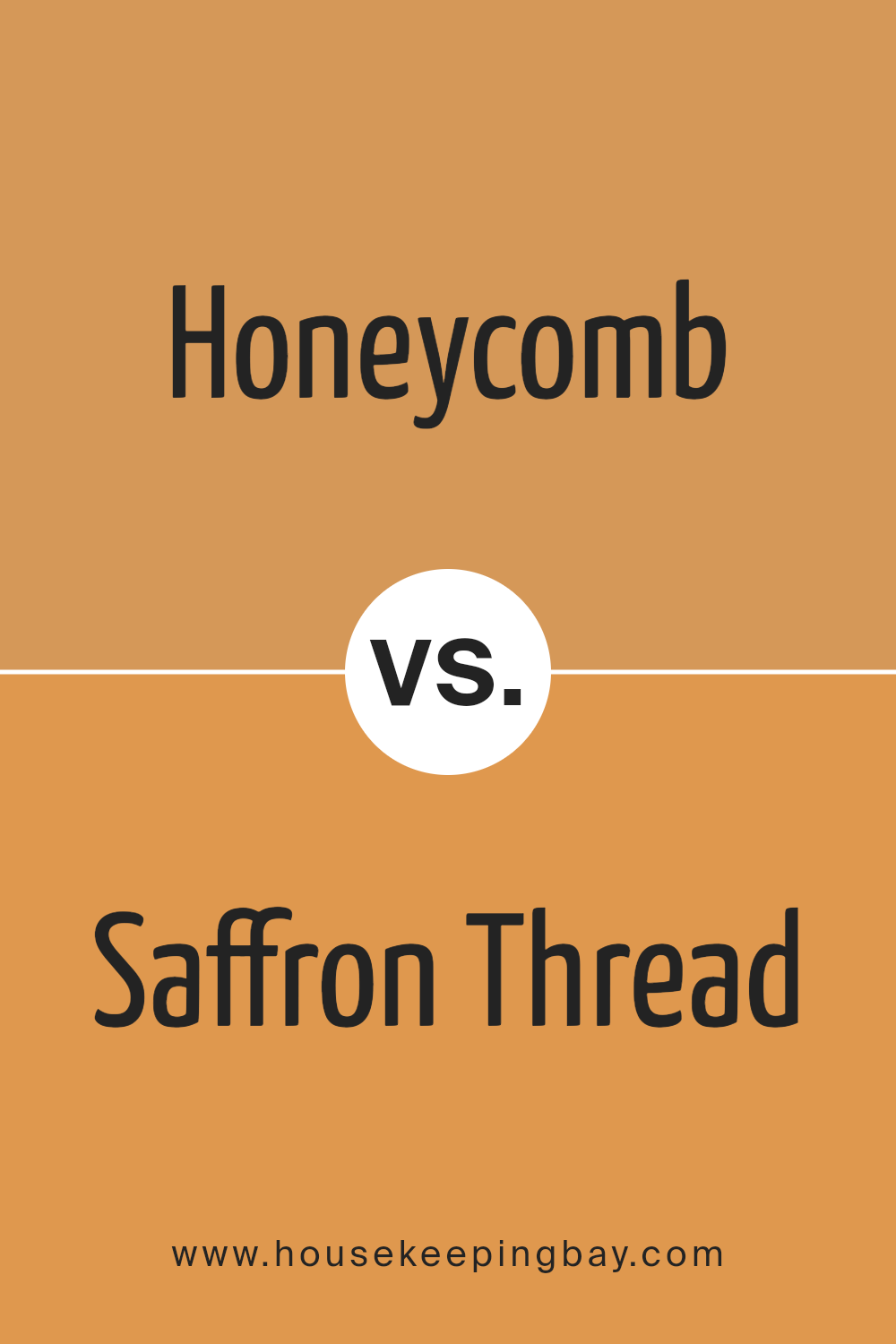
Honeycomb SW 6375 by Sherwin Williams vs Saffron Thread SW 6663 by Sherwin Williams
Honeycomb SW 6375 by Sherwin Williams is a warm, golden yellow with a subdued quality, reminiscent of the natural tones found in a beehive. It brings a cozy and inviting feel to any space, making it ideal for living rooms or entryways where a welcoming atmosphere is appreciated.
In contrast, Saffron Thread SW 6663 is a vibrant, bold yellow that’s brighter and more intense. This color is more energizing and is great for areas where you want to inject vitality and cheerfulness, like kitchens or playrooms.
Both colors share a base in yellow, but their intensity and mood are quite different. Honeycomb, with its muted tones, offers a soothing backdrop, suitable for spaces that call for a soft ambiance. Saffron Thread, with its vivid hue, works well where a dynamic and lively environment is desired.
Each color serves a unique purpose and can markedly influence the atmosphere of a room.
You can see recommended paint color below:
- SW 6663 Saffron Thread
housekeepingbay.com
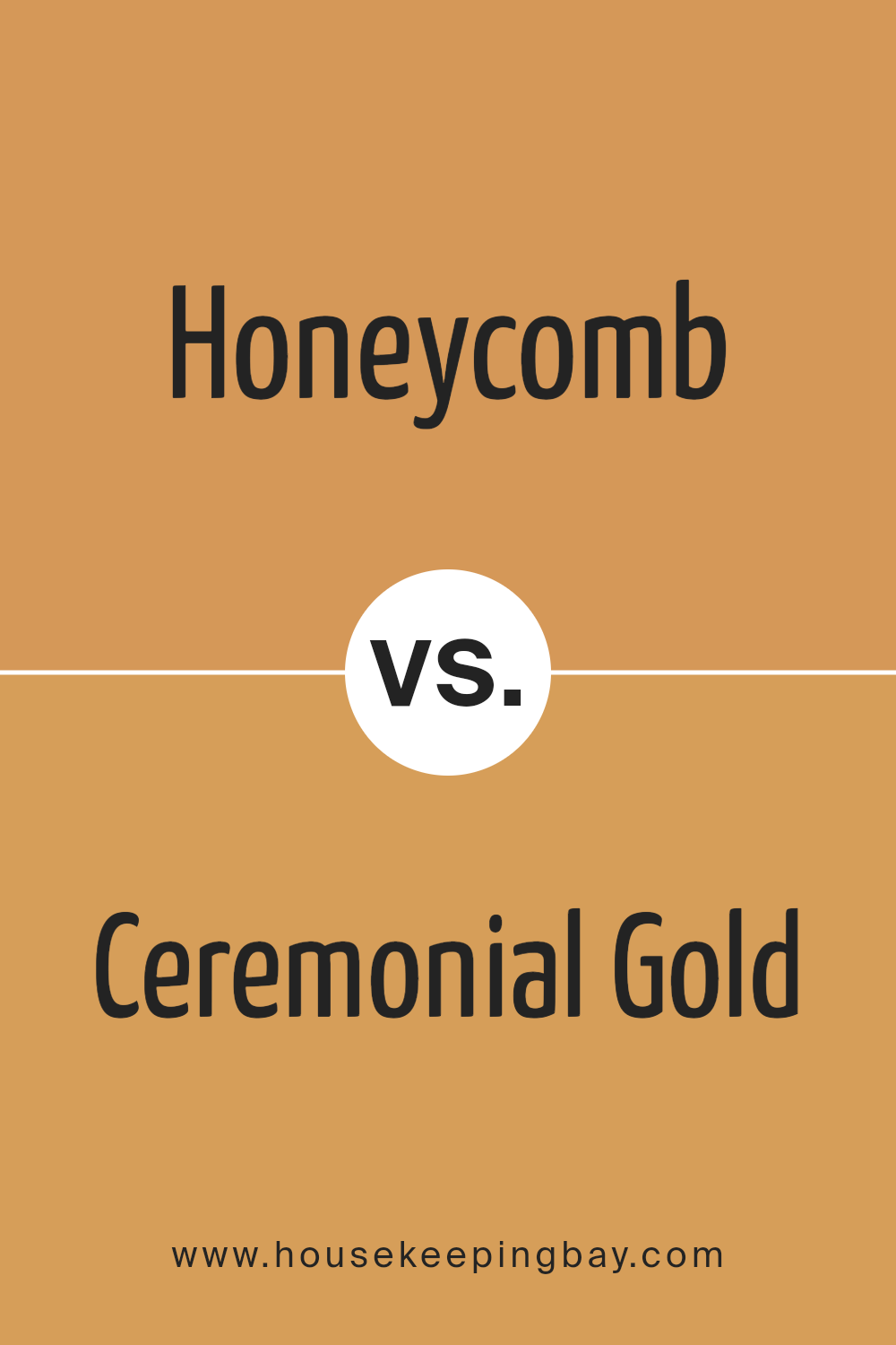
Honeycomb SW 6375 by Sherwin Williams vs Ceremonial Gold SW 6382 by Sherwin Williams
Honeycomb SW 6375 by Sherwin Williams is a warm, golden yellow that brings a sense of coziness and cheer to any space. It has a soft, inviting vibe that works well in living rooms or dining areas where you want to create a welcoming atmosphere. This color pairs nicely with natural wood tones and other earthy hues.
Ceremonial Gold SW 6382 by Sherwin Williams, in contrast, is a bolder, deeper shade of yellow with a slight orange undertone. It makes a strong statement and is ideal for accent walls or areas where you want to add a splash of energy and vibrancy. This shade complements dark greens, blues, and rich browns, adding a touch of sophistication to any room.
Both colors reflect light beautifully, but Honeycomb tends to maintain a softer glow, while Ceremonial Gold offers a richer luminosity. Depending on the mood you want to set and the existing decor, each color has its unique appeal and can significantly influence the room’s ambiance.
You can see recommended paint color below:
- SW 6382 Ceremonial Gold
housekeepingbay.com
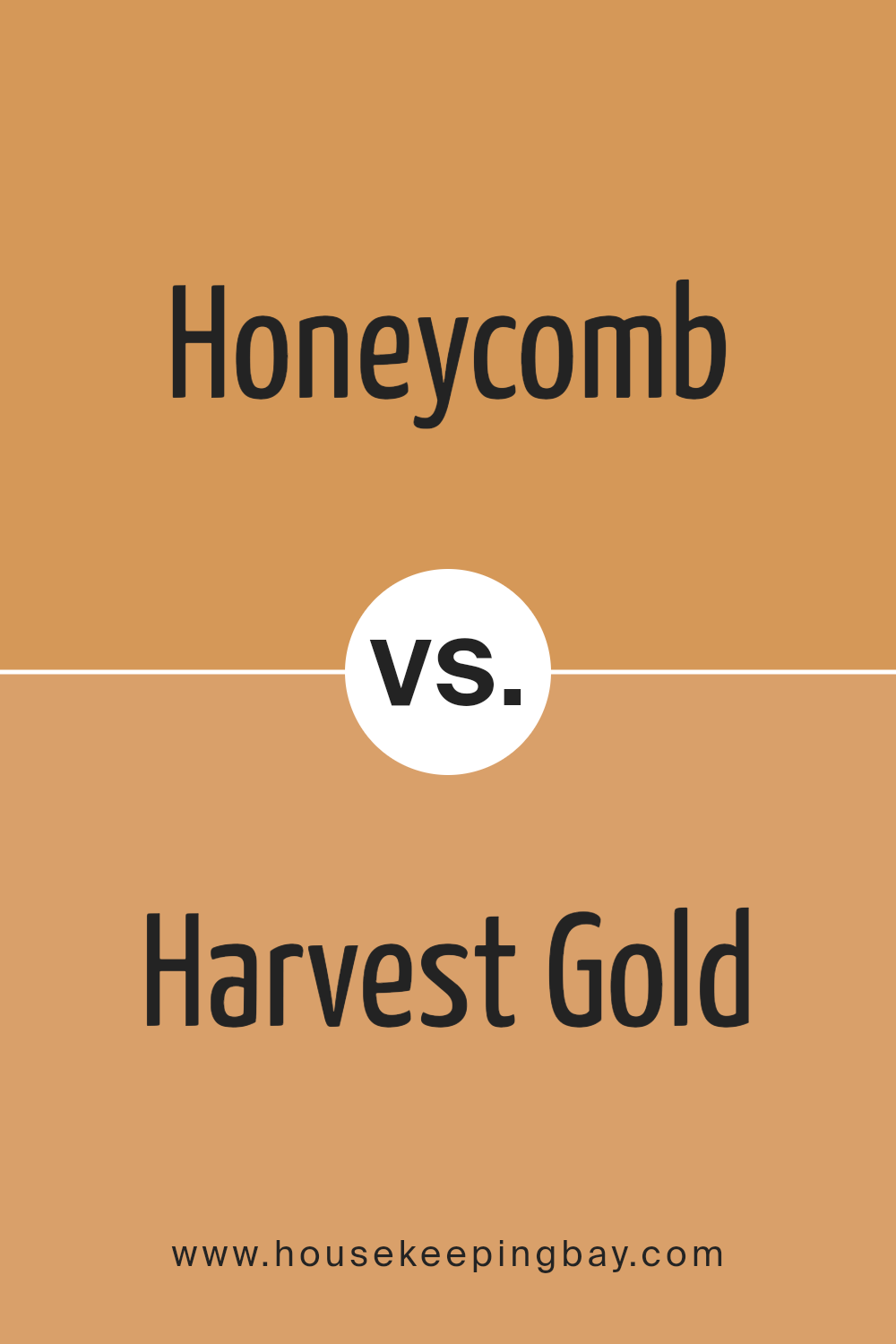
Honeycomb SW 6375 by Sherwin Williams vs Harvest Gold SW 2858 by Sherwin Williams
Honeycomb SW 6375 by Sherwin Williams is a warm, inviting shade that closely resembles the natural color of honey. This medium-toned hue offers a cozy, comforting feel, making it ideal for living spaces where relaxation is key. Its golden undertones can create a sunny ambiance, potentially brightening up a room.
Harvest Gold SW 2858, also by Sherwin Williams, is another warm color but with a deeper, richer golden yellow tone. It is reminiscent of autumn and evokes a sense of nostalgia and warmth. This color works well in spaces that aim to generate a welcoming, homey atmosphere.
Both colors add warmth to interiors, but Honeycomb has a lighter, breezier feel compared to the more saturated, intense character of Harvest Gold. While Honeycomb might be preferred for smaller, darker spaces to create an illusion of light, Harvest Gold suits large areas that can handle a bolder color without feeling constricted.
You can see recommended paint color below:
- SW 2858 Harvest Gold
housekeepingbay.com
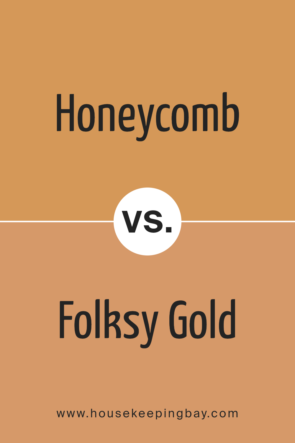
Honeycomb SW 6375 by Sherwin Williams vs Folksy Gold SW 6360 by Sherwin Williams
Honeycomb SW 6375 and Folksy Gold SW 6360, both by Sherwin Williams, are warm, inviting colors, but they have distinct tones and vibes. Honeycomb is a bright, cheerful yellow with a clear, vibrant feel. It resembles the color of the honey produced by bees, suggesting a lively and energetic atmosphere when used in a space. This color works perfectly in kitchens or dining areas where a sunny, pleasant ambiance is desired.
In contrast, Folksy Gold has a deeper, mustard-like yellow shade. It tends to give off a more subdued, cozy feeling, making it ideal for living rooms or bedrooms where a relaxed, comforting environment is beneficial.
Despite being similarly yellow, Folksy Gold leans towards a rustic aesthetic due to its earthier undertones.
Both colors can warm up a room but in different ways: Honeycomb injects brightness and vitality, while Folksy Gold offers a sense of groundedness and warmth.
The choice between them depends on the mood and style you want to achieve in your space.
You can see recommended paint color below:
- SW 6360 Folksy Gold
housekeepingbay.com
Conclusion
With its golden tones, Honeycomb brings a cozy, sunlit feel to rooms, making them feel inviting and cheerful.
This shade is versatile enough to serve as an accent wall or envelope a whole room, depending on the desired impact.
Honeycomb pairs beautifully with a wide range of colors, from deep blues to earthy greens, which showcases its adaptability in various design styles, from rustic to modern. Its use in a space not only brightens the area but also adds a sense of warmth that can make large spaces feel more intimate or give a snug room a burst of energy.
For anyone considering a new look for their home or a particular room, SW 6375 Honeycomb offers a delightful balance of warmth and cheerfulness.
It’s a color that keeps a room feeling lively year-round, from the bright bloom of spring and summer to the cozy, golden glow of fall and winter. It stands as a testament to the transformative power of color.

housekeepingbay.com
Ever wished paint sampling was as easy as sticking a sticker? Guess what? Now it is! Discover Samplize's unique Peel & Stick samples. Get started now and say goodbye to the old messy way!
Get paint samples
