Quicksilver SW 6245 by Sherwin Williams
Embracing the Elegance of Subtle Silver Elegance
Welcome to our article on SW 6245 Quicksilver, a unique color from Sherwin Williams. In this piece, we’re going to explore the many characteristics of Quicksilver, breaking down its components, its mood, and where it fits best in your home or project.
Quicksilver is more than just a shade of gray; it’s a nuanced color that can add sophistication and depth to any space. Whether you’re thinking about painting a whole room or just adding an accent wall, Quicksilver offers a versatile palette that works well in various settings.
From its inspirations to practical tips on application, we’ll cover everything you need to know about this stylish shade. If you’re interested in updating your space with a fresh look or searching for the perfect gray, Quicksilver by Sherwin Williams could be the answer you’re looking for.
So, let’s get started and explore all that this color has to offer, from its airy vibe to its ability to pair with other hues and materials.
via sherwin-williams.com
What Color Is Quicksilver SW 6245 by Sherwin Williams?
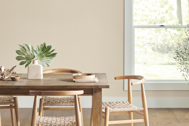
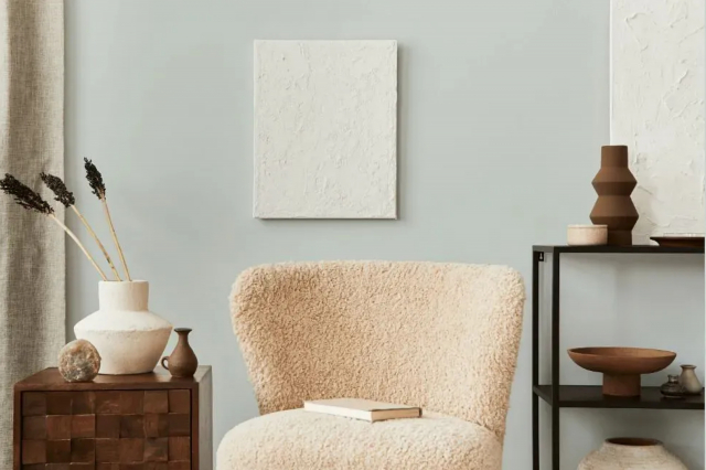
Quicksilver SW 6245 by Sherwin Williams is a charming shade that leans towards the cooler end of the color spectrum. It’s a gentle gray with a subtle hint of blue, giving off a serene and refreshing vibe that can effortlessly lighten up any space.
This color’s softness makes it incredibly versatile, allowing it to blend seamlessly into a variety of interior styles.
Quicksilver is particularly well-suited for modern and Scandinavian decor, owing to its clean and understated nature. It works harmoniously with minimalistic designs, where the focus is on simplicity and functionality.
However, its adaptability doesn’t end there; it can also beautifully complement coastal themes, where its soft blue undertones evoke feelings of calmness reminiscent of the sea.
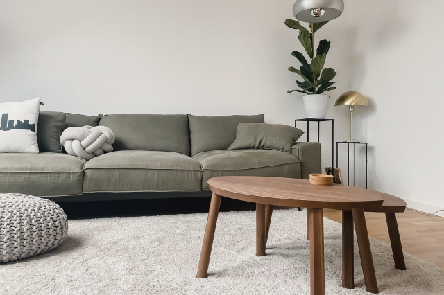
When it comes to materials and textures, Quicksilver forms stunning pairings with natural wood, bringing warmth to rooms and creating a balanced, inviting atmosphere. It also pairs wonderfully with metals like silver and chrome, enhancing its modern vibe and adding a touch of sophistication.
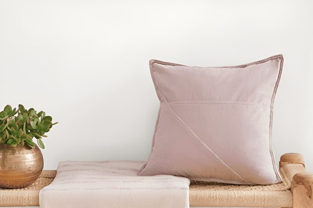
Textural contrasts like soft wool blankets or plush velvet cushions against the subtly cool backdrop of Quicksilver can add depth and interest to your space, making it feel cozy and well-rounded.
In summary, Quicksilver SW 6245 is a flexible, refreshing color that can elevate any interior design, pairing well with a wide range of styles, materials, and textures to create beautiful, harmonious spaces.
housekeepingbay.com
Table of Contents
Is Quicksilver SW 6245 by Sherwin Williams Warm or Cool color?
QuicksilverSW 6245 by Sherwin Williams is a unique and versatile paint color that has a lot to offer to any home. At first glance, it might seem like a simple light gray. However, what makes Quicksilver special is the subtle blue undertones that give it a fresh and modern feel.
This cool nuance means it pairs beautifully with a wide range of decor styles, from sleek and contemporary to cozy and traditional.
In well-lit rooms, Quicksilver comes alive, reflecting the natural light in a way that can make the space feel bigger and more open. It’s an excellent choice for small rooms or spaces with limited natural light, as it can help brighten them up.
In contrast, in areas with less light, the color can appear more subdued, providing a calming and serene feel that’s perfect for bedrooms or quiet sitting areas.
Because of its versatility, Quicksilver works well in almost any room in the house. Whether you’re painting your living room, kitchen, or even the exterior, it can complement other colors and materials beautifully.
Plus, its modern yet timeless appeal means you won’t have to worry about your walls feeling outdated anytime soon. QuicksilverSW 6245 is a wonderful choice for anyone looking to rejuvenate their home with a fresh, modern look.
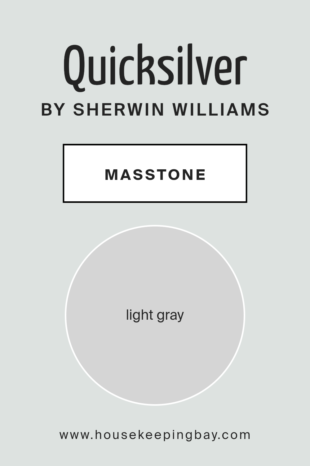
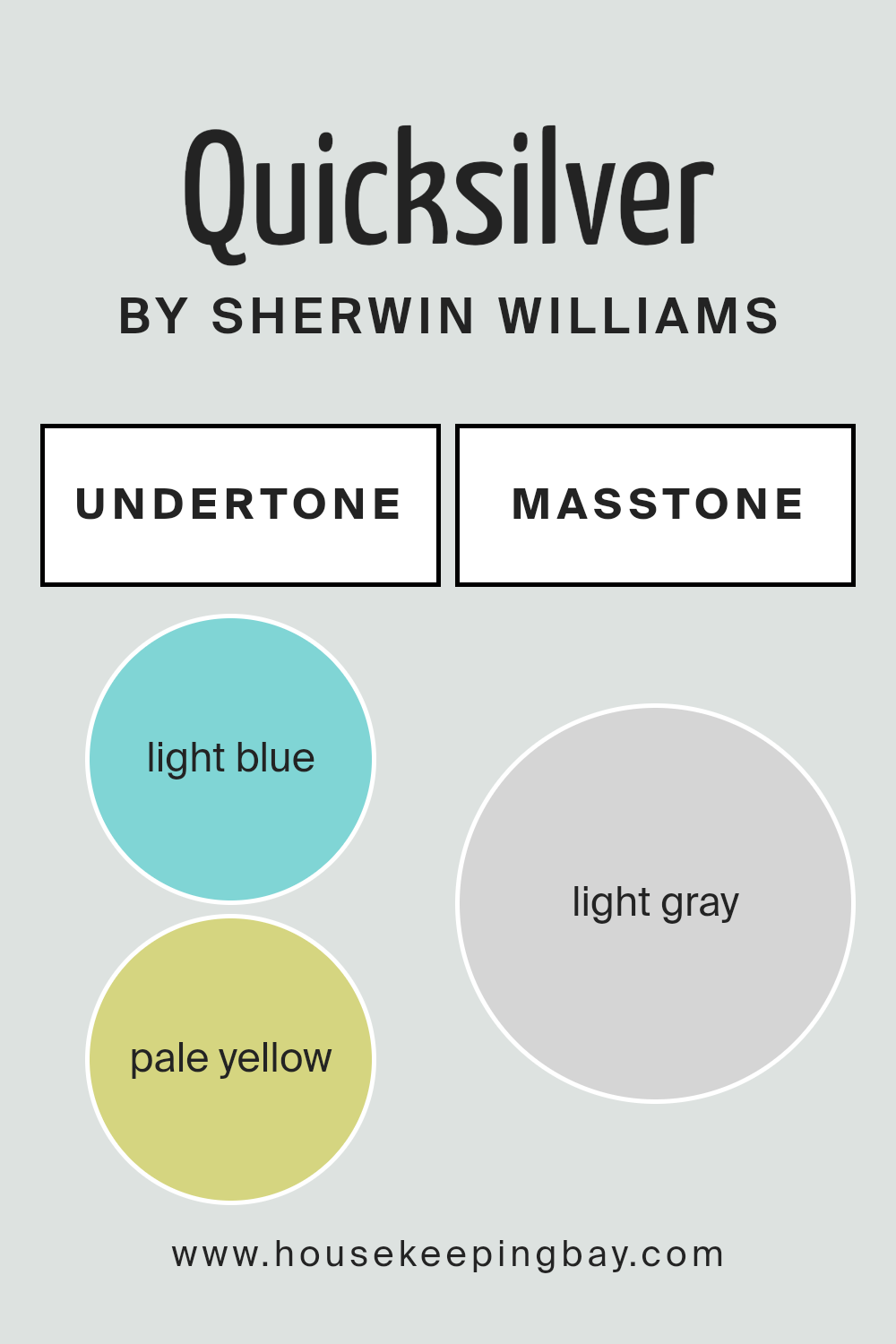
What is the Masstone of the Quicksilver SW 6245 by Sherwin Williams?
QuicksilverSW 6245 by Sherwin Williams has a masstone, or main color, of light gray, with a specific shade close to #D5D5D5. This light gray shade is very versatile and works well in many parts of a home. Because it is light, it helps make small rooms look bigger and brighter.
This is great for spaces that don’t get a lot of sunlight. The neutral tone of QuicksilverSW 6245 means it can match with almost any color scheme, making it easy for homeowners to use in their decorating.
You can pair it with bright colors for a lively feel or with other neutrals for a calming effect. It’s especially good for modern looks, but can also fit in with traditional decor because of its timeless quality. Overall, this light gray adds a fresh and clean feel to any room, making it a popular choice for those updating their homes.
housekeepingbay.com
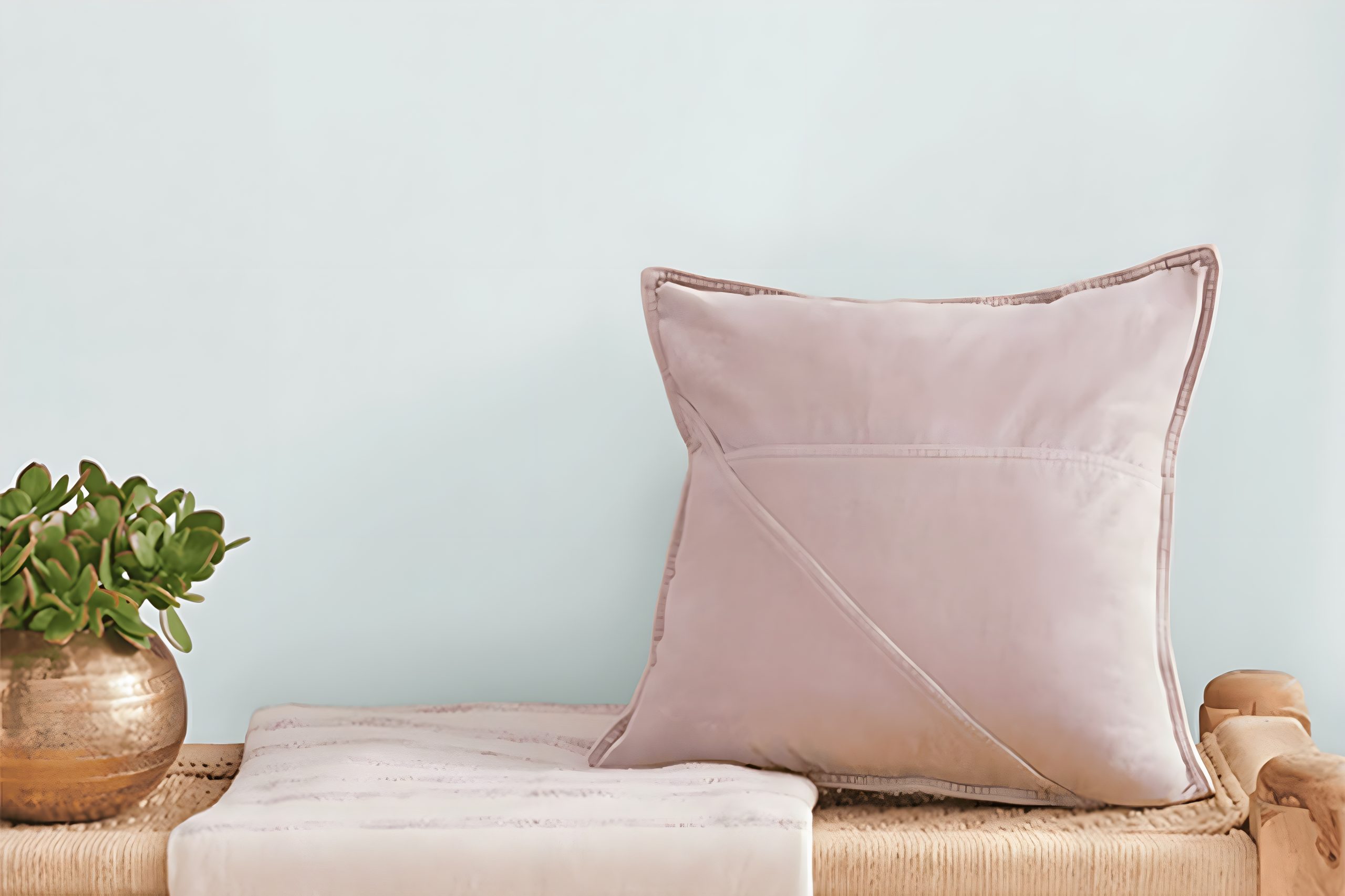
Undertones of Quicksilver SW 6245 by Sherwin Williams
Quicksilver SW 6245 by Sherwin Williams is a unique color that carries subtle undercurrents of light blue (#80D5D5) and pale yellow (#D5D580). These undertones play a significant role in how the color appears to us and can truly shape the atmosphere of any room.
When we talk about undertones, we’re referring to the hints of other colors that are present within the main color. These subtle hints can affect whether a color feels warm or cool and can significantly influence how it interacts with both natural and artificial light.
The light blue undertone in Quicksilver adds a touch of calmness and serenity, giving spaces a more open and airy feel. This is especially useful in creating a relaxing environment, making it an excellent choice for bedrooms or bathrooms where you want to foster a sense of tranquility.
On the other hand, the pale yellow undertone injects a subtle warmth into the color, preventing it from feeling too cold or sterile. This makes Quicksilver a versatile color that can create a cozy yet light atmosphere, ideal for living rooms or kitchens.
When applied to interior walls, the combined effect of these undertones in Quicksilver SW 6245 can make spaces feel more inviting and spacious.
Depending on the lighting, the color can shift throughout the day, from a gentle, cool morning light, accentuating the blue undertones, to a warmer, softer glow in the evening, highlighting the yellow undertones. These dynamic shifts help ensure that spaces retain visual interest and comfort at all times.
housekeepingbay.com
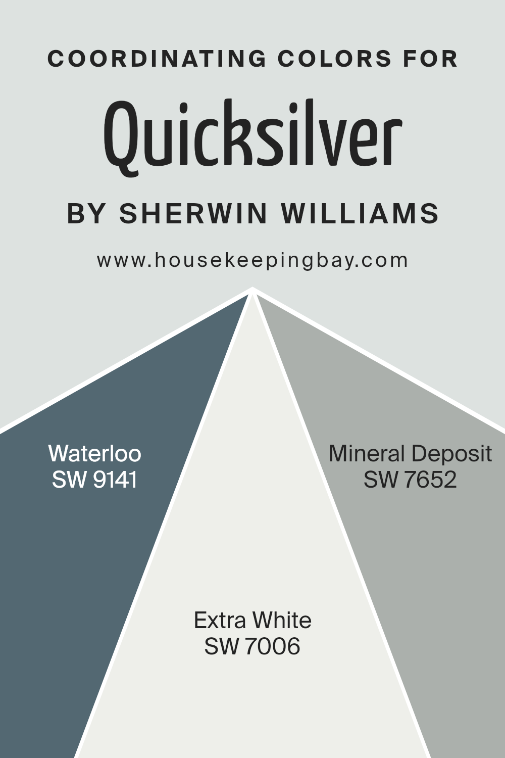
Coordinating Colors of Quicksilver SW 6245 by Sherwin Williams
Coordinating colors are hues that effectively complement each other to create a visually appealing and harmonious look in any space. When a primary color is chosen, like Quicksilver SW 6245 by Sherwin Williams, coordinating colors are selected based on their ability to enhance or balance the primary color’s impact.
These coordinating colors can be used for walls, trim, accents, and even furniture to tie a room’s decor together seamlessly. The idea is to pick colors that either contrast or complement the main shade in a way that fosters a sense of aesthetic unity throughout the space.
One of the coordinating colors for Quicksilver SW 6245 is Waterloo SW 9141, a deep, moody blue that offers a stunning contrast to Quicksilver’s light and airy feel, providing depth and sophistication to any room.
Another coordinating color, Extra White SW 7006, works as a perfect counterbalance. Its clean and crisp nature brings out the silvery notes of Quicksilver, making spaces feel more open and bright.
Then there’s Mineral Deposit SW 7652, a subtle gray that bridges the gap between Quicksilver and its more pronounced coordinating colors. It offers a soft, serene backdrop that complements without overpowering, enhancing the overall palette with its understated elegance. Together, these colors provide a range of options to create a cohesive and inviting space.
You can see recommended paint colors below:
- SW 9141 Waterloo
- SW 7006 Extra White
- SW 7652 Mineral Deposit
housekeepingbay.com
How Does Lighting Affect Quicksilver SW 6245 by Sherwin Williams?
Lighting plays a huge role in how we perceive colors. The way a color looks can change dramatically under different lighting conditions. This happens because light sources vary in their intensity and the color spectrum they emit. Understanding this can help you make smart choices when picking out paint colors for your home.
Let’s talk about Quicksilver SW 6245 by Sherwin-Williams. It’s a unique color that can look different depending on the lighting. In artificial light, such as LED or fluorescent bulbs, Quicksilver might seem cooler or slightly bluer. This is because many artificial lights have a blueish tint, which can influence how we see colors.
Under natural light, Quicksilver can show its true charm. Natural light, particularly sunlight, is broader in the spectrum and can reveal the true depth and subtlety of this color. On a sunny day, Quicksilver will likely appear as a vibrant, bright gray with subtle blue undertones that become more pronounced.
In rooms facing north, which receive less direct sunlight and tend to have cooler, softer light, Quicksilver will lean more towards its cooler, more muted side, emphasizing its gray qualities. This can give a serene and calming feel to the room.
South-facing rooms get a lot of direct sunlight, making colors appear brighter and more intense. Here, Quicksilver can truly shine, revealing its dynamic range from a light reflective gray in the morning to a more pronounced cool hue as the light changes.
East-facing rooms enjoy bright light in the morning, which then tapers off. Quicksilver will look more lively and vibrant in the morning light, and then more subdued as the day goes on.
West-facing rooms have the opposite effect. They get softer light in the morning, making Quicksilver appear as a gentle, muted gray, but as the sun sets, the color can look warmer and more welcoming.
Knowing these effects can help you decide where to use Quicksilver to its best advantage. It’s fascinating how the same paint color can offer a range of appearances, all influenced by the lighting it’s under.
housekeepingbay.com
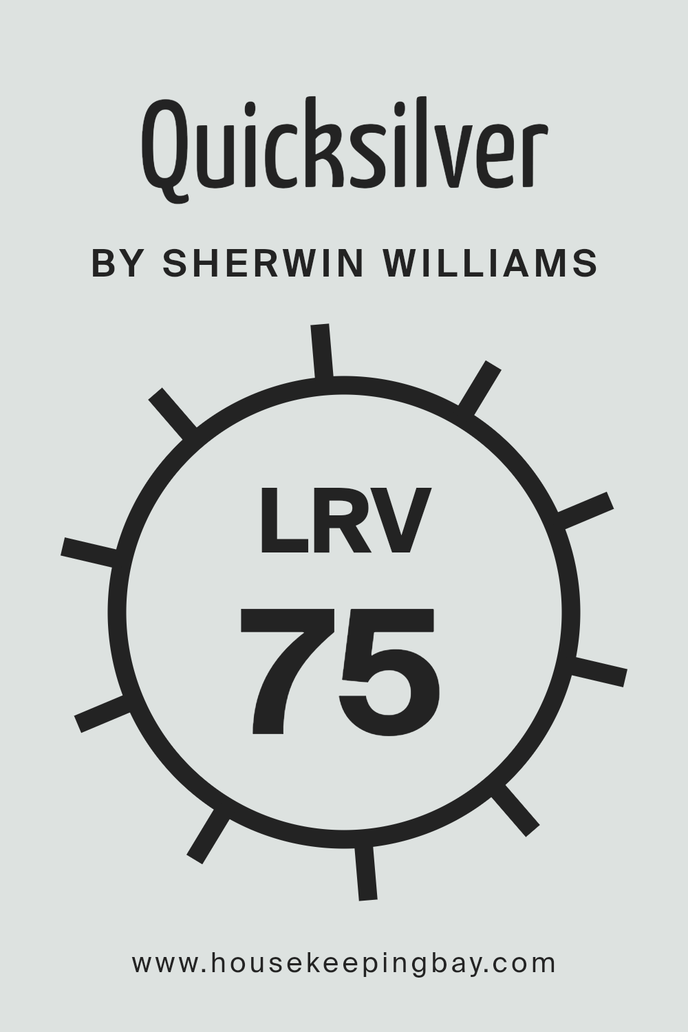
What is the LRV of Quicksilver SW 6245 by Sherwin Williams?
LRV stands for Light Reflectance Value. It’s a fancy term that basically tells you how much light a color reflects or absorbs when it’s painted on a wall. Think of LRV on a scale from 0 to 100, where 0 is super dark (it absorbs a lot of light) and 100 is very light (it reflects a lot of light).
This number helps you understand how light or dark a color will look in a room. So, when you’re picking out paint, looking at the LRV can give you a clue about how the color will change the feel of your space.
Lighter colors make rooms feel more open and airy because they reflect more light, while darker colors can make a space feel cozier or smaller because they absorb more light.
Speaking of QuicksilverSW 6245 from Sherwin Williams, with an LRV of 75.405, this color is on the lighter side of the scale. This means it’s going to reflect a good amount of light, making your room feel bright and lively.
In spaces with lots of natural light, QuicksilverSW 6245 will look especially vibrant, bouncing light around and potentially making the room look larger. Even in rooms with less natural light, this high LRV color can help brighten the space up, as it will make the most of whatever light is available.
So, QuicksilverSW 6245 is a great choice if you’re aiming for a light and airy feel in your room, without the starkness that can come from using a pure white.
housekeepingbay.com
What is LRV? Read It Before You Choose Your Ideal Paint Color
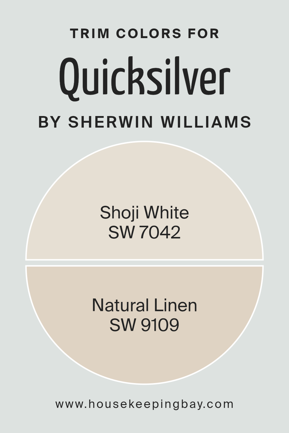
What are the Trim colors of Quicksilver SW 6245 by Sherwin Williams?
Trim colors are those specific shades selected to paint the architectural elements of a house or room, such as door frames, baseboards, moldings, and window trims, distinct from the wall color.
They play a crucial role in interior and exterior design by highlighting the architectural features, creating visual contrasts, and enhancing the overall aesthetic appeal of the space.
For a wall color like Quicksilver SW 6254 by Sherwin Williams, which is a cool, light gray shade, choosing the right trim color can significantly influence the ambiance of a room, guiding the visual flow and adding depth and character to the space.
When considering Quicksilver SW 6254, Shoji White SW 7042 is an excellent trim color option. This color is a soft, warm off-white with a subtle touch of gray.
It beautifully complements Quicksilver by softening the coolness of the gray, thus adding a welcoming warmth to the room without overpowering the main color.
Another great choice for trim is Natural Linen SW 9109, a neutral, soft beige that brings a hint of earthiness and natural comfort to the setting. It contrasts just enough with Quicksilver to define the space while still maintaining an understated elegance.
Both Shoji White and Natural Linen work harmoniously with Quicksilver, ensuring the room feels cohesive, balanced, and inviting.
You can see recommended paint colors below:
- SW 7042 Shoji White
- SW 9109 Natural Linen
housekeepingbay.com
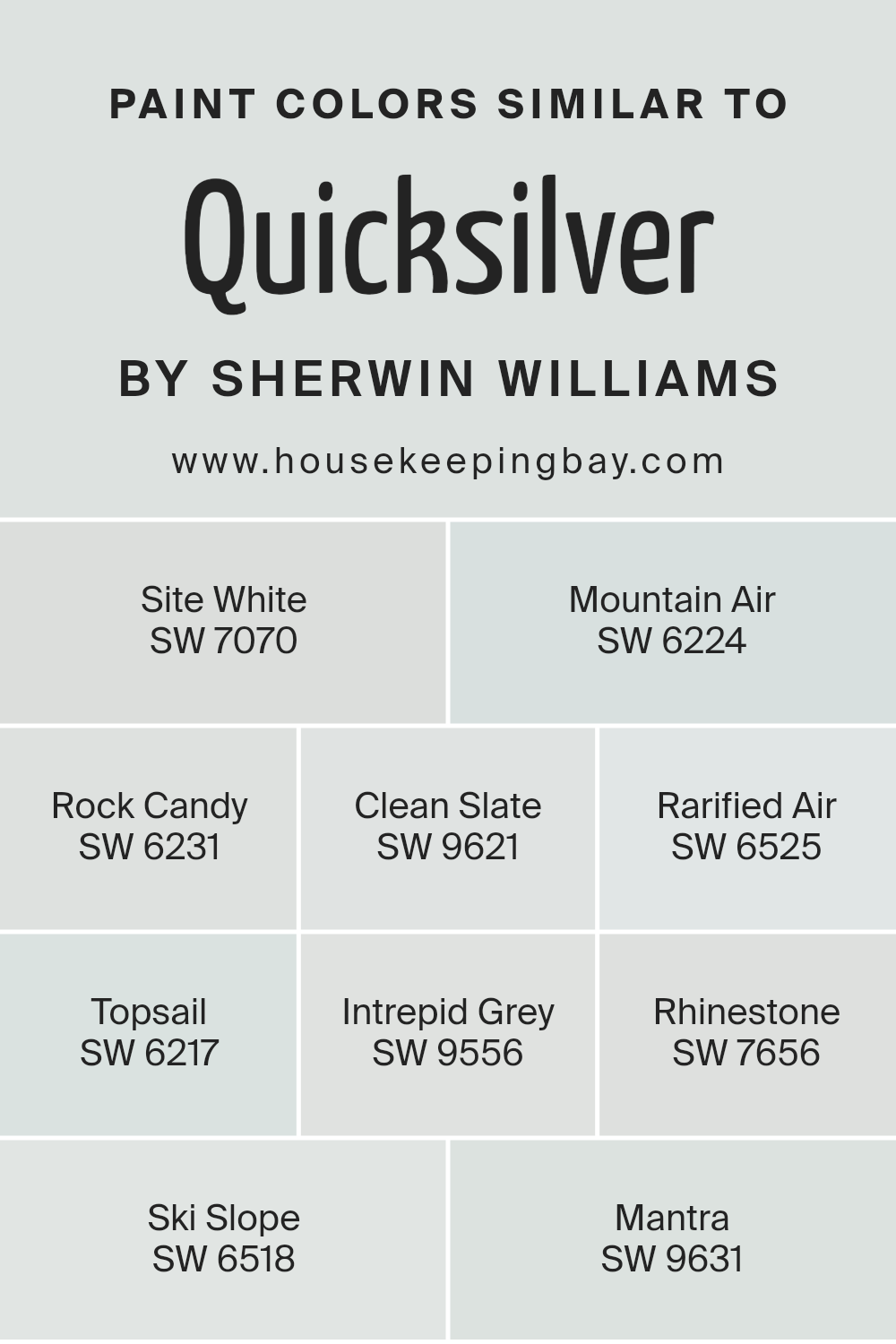
Colors Similar to Quicksilver SW 6245 by Sherwin Williams
Similar colors play a crucial role in design and decoration, primarily because they create a sense of harmony and balance within a space. When colors share a similar hue or tone, they naturally complement each other, producing a pleasing aesthetic that’s easy on the eyes.
This principle is perfectly illustrated by the color QuicksilverSW 6245 by Sherwin Williams and its similar shades. These colors, despite their unique individual characteristics, share a common foundation that ties them together, allowing for seamless integration within a design scheme.
Utilizing similar colors can also simplify the decision-making process when decorating, as they ensure a cohesive look without the need for exact matches.
Among the colors akin to QuicksilverSW 6245, we find hues like Site White SW 7070, a clean and inviting off-white, and Mountain Air SW 6224, offering a breath of fresh, airy lightness to any space.
Rock Candy SW 6231 whispers soft neutrality, making it an effortless background hue, while Clean Slate SW 9621 introduces a subtle depth that’s versatile and understated. Rarified Air SW 6525 elevates with its ethereal lightness, and Topsail SW 6217 ushers in a serene, maritime calmness.
Intrepid Grey SW 9556 is boldly neutral, providing a sophisticated grounding effect. Rhinestone SW 7656 sparkles with its light, almost ethereal touch, and Ski Slope SW 6518 brings the cool, crisp freshness of winter indoors.
Lastly, Mantra SW 9631 marries the essence of tranquility with a hint of mystique, making it a compelling choice for spaces intended for reflection or calm. Together, these similar colors enhance the beauty and cohesiveness of environments, illustrating the power of color harmony in design.
You can see recommended paint colors below:
- SW 7070 Site White
- SW 6224 Mountain Air
- SW 6231 Rock Candy
- SW 9621 Clean Slate
- SW 6525 Rarified Air
- SW 6217 Topsail
- SW 9556 Intrepid Grey
- SW 7656 Rhinestone
- SW 6518 Ski Slope
- SW 9631 Mantra
housekeepingbay.com
How to Use Quicksilver SW 6245 by Sherwin Williams In Your Home?
Quicksilver SW 6245 by Sherwin Williams is a unique and lovely paint color that can really lighten up your home. This color is like a soft, light gray that has a hint of blue in it. It’s perfect for giving any room a fresh, modern look while still feeling warm and welcoming.
Imagine using Quicksilver in your living room or bedroom; it can make the space feel more open and airy, creating a peaceful environment where you can relax.
It’s also a great choice for a kitchen or bathroom because it pairs beautifully with white cabinets or fixtures, adding a sleek, clean look to the space. If you have a smaller room that doesn’t get a lot of natural light, painting it Quicksilver can help brighten it up.
What’s nice about this color is its versatility. It works with many different styles and decorations. Whether you have a house full of modern pieces or more traditional furnishings, Quicksilver can fit right in, making it a smart choice for anyone looking to refresh their home.
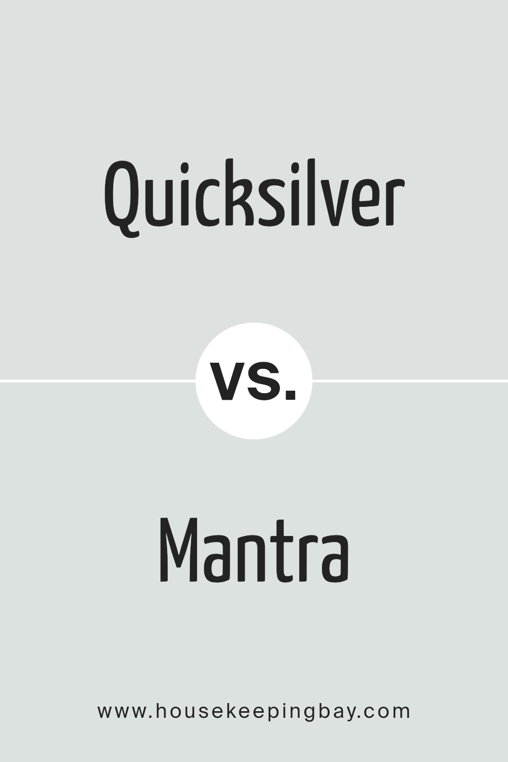
Quicksilver SW 6245 by Sherwin Williams vs Mantra SW 9631 by Sherwin Williams
Quicksilver SW 6245 by Sherwin Williams is a cool, light gray color with a hint of blue undertones. It can give a room a fresh, airy look, making it feel open and bright. On the other hand, Mantra SW 9631, also by Sherwin Williams, is a more muted shade.
It leans towards a soft, sophisticated blend of gray and beige, often referred to as “greige.” This color brings warmth to a space, providing a cozy and inviting atmosphere.
While Quicksilver’s cool tones might be perfect for a modern, minimalistic design, giving a sleek and clean look, Mantra offers a warmer, more comforting appeal that works well in many settings such as living rooms or bedrooms where a calm, serene environment is desired.
Depending on the lighting and surrounding colors, Quicksilver might appear more gray or slightly blue, adding a dynamic quality. Mantra remains consistent, offering a stable, grounded feeling due to its balanced blend.
In summary, Quicksilver is your go-to for a crisp, refreshing vibe, whereas Mantra offers warmth and comfort, making spaces feel more like home.
You can see recommended paint color below:
housekeepingbay.com
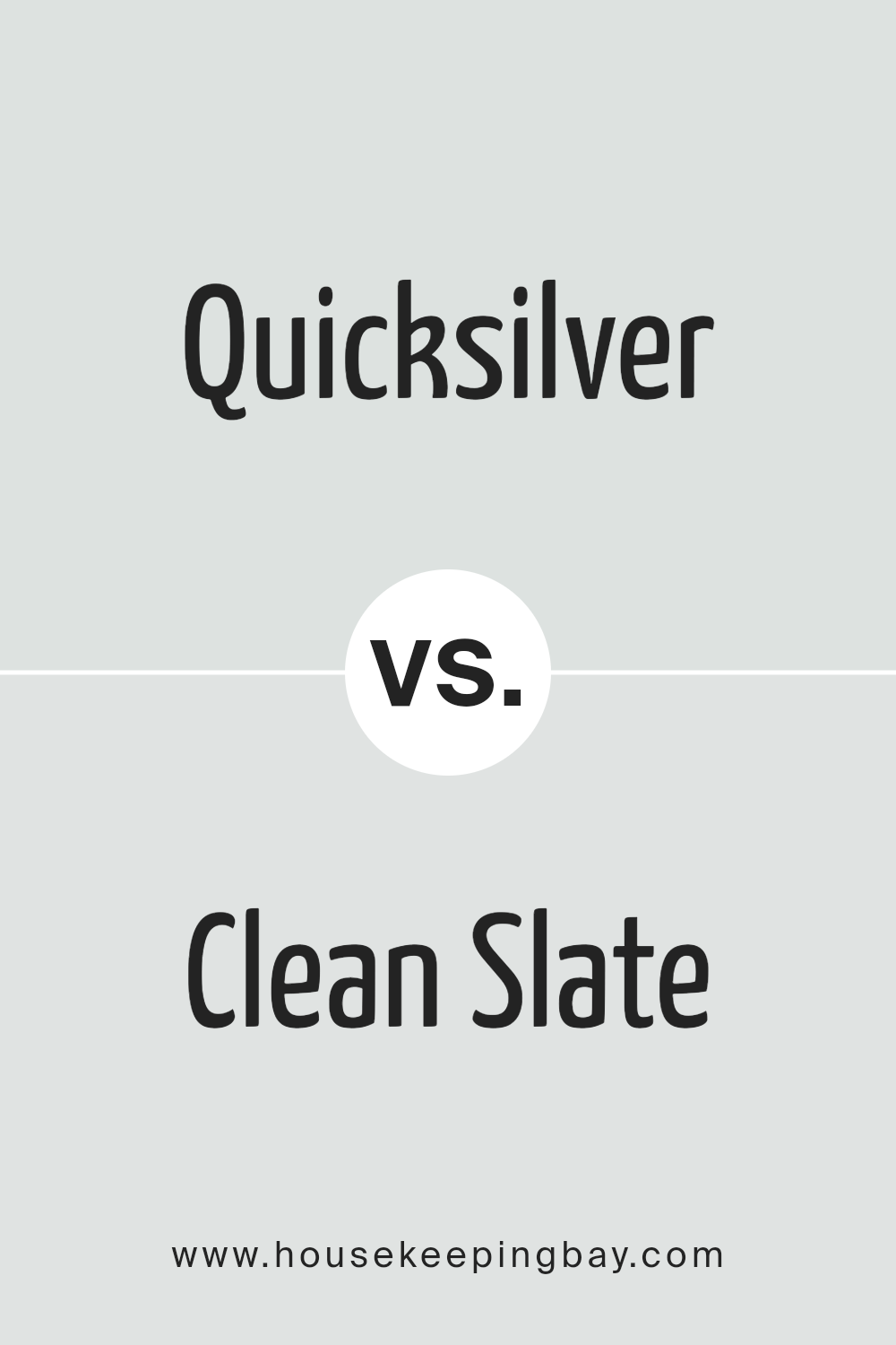
Quicksilver SW 6245 by Sherwin Williams vs Clean Slate SW 9621 by Sherwin Williams
Quicksilver SW 6245 by Sherwin Williams and Clean Slate SW 9621 by Sherwin Williams are two distinctive colors, each with its own unique vibe. Quicksilver is a light, airy gray that has a subtle coolness to it, making it perfect for creating a serene and calm environment.
Think of it as a gentle morning mist, soft and soothing, ideal for bedrooms or living rooms where you want to relax.
On the other hand, Clean Slate offers a more pronounced, deeper gray tone that leans towards the elegance and sophistication of charcoal shades. It’s like the color of storm clouds before a rain, bold and dramatic, but still with a certain warmth.
This color works great in spaces where you want to make a statement, like an accent wall in a dining room or a home office.
Both Quicksilver and Clean Slate bring their own flavor to the table – one being a tender whisper of gray and the other a confident, deeper hue. Depending on the mood you’re aiming for in your space, either color could be the perfect choice.
Quicksilver is for those who prefer a lighter touch of gray, while Clean Slate fits the bill for a more striking, robust presence.
You can see recommended paint color below:
housekeepingbay.com
Quicksilver SW 6245 by Sherwin Williams vs Rarified Air SW 6525 by Sherwin Williams
Quicksilver SW 6245 and Rarified Air SW 6525, both from Sherwin Williams, might seem similar at first glance, but they have noticeable differences. Quicksilver is a unique shade that strikes a balance between a soft gray and a gentle blue.
It’s like looking at the sky just before dusk falls, offering a serene and somewhat cool feeling to any room. It’s perfect for creating a peaceful and slightly sophisticated space.
On the other hand, Rarified Air SW 6525 is lighter and leans more towards a pure, fresh sky blue. It brings a breath of fresh air to spaces, making them feel open and airy.
While Quicksilver adds a touch of depth and mystery, Rarified Air is all about clarity and openness, almost like standing on a hilltop breathing in the fresh, crisp air.
Both colors serve different moods and vibes. Quicksilver suits those looking for a calm, thoughtful ambiance, while Rarified Air is ideal for creating a bright, refreshing space.
Whether one chooses the reflective tranquility of Quicksilver or the clear, uplifting feel of Rarified Air depends on the atmosphere they’re hoping to achieve.
You can see recommended paint color below:
housekeepingbay.com
Quicksilver SW 6245 by Sherwin Williams vs Rock Candy SW 6231 by Sherwin Williams
Quicksilver SW 6245 by Sherwin Williams is a unique color that gives off a cool, almost metallic feel, similar to the element it’s named after. It has a sleek, modern vibe, making it perfect for creating a fresh and contemporary space.
This color rides the line between gray and blue, adding depth and sophistication to any room without feeling too heavy or dark.
On the other hand, Rock Candy SW 6231 is a much lighter shade, leaning towards a soft, pale gray. It’s almost like looking at a gentle mist or a whisper of smoke, bringing a sense of calm and serenity to your space.
This color is incredibly versatile, working well in small, cozy spaces or larger, airy rooms to create a feeling of openness and light.
When you compare Quicksilver and Rock Candy, you see that Quicksilver brings more of a statement with its deeper, moodier tones, whereas Rock Candy offers a subtle backdrop, promoting a peaceful and tranquil environment.
Both colors work beautifully in modern homes, depending on whether you want that hint of dramatic flair or a clean, minimalist look.
You can see recommended paint color below:
housekeepingbay.com
Quicksilver SW 6245 by Sherwin Williams vs Topsail SW 6217 by Sherwin Williams
Quicksilver SW 6245 by Sherwin Williams is a light gray with a cool, almost silver touch that gives it a very modern and sleek feel. It’s perfect for spaces where you want a clean and airy vibe.
Think of it as a gentle gray that doesn’t overwhelm but instead offers a soft backdrop for any room.
On the other hand, Topsail SW 6217 also by Sherwin Williams is a light, airy blue with a hint of gray. This color brings a calm and relaxing feel to any space, making it ideal for bedrooms or bathrooms. It’s like a breath of fresh air, reminding you of a gentle sea breeze.
While both colors are on the lighter side, Quicksilver leans more towards a neutral, cool gray, making it super versatile for combining with other colors. Topsail, with its whisper of blue, brings a serene and tranquil quality, perfect for creating a peaceful retreat.
Both are great choices for creating a modern and uplifting space, but your preference for a cooler gray or a soft blue will guide the best choice for your project.
You can see recommended paint color below:
- SW 6217 Topsail
housekeepingbay.com
Quicksilver SW 6245 by Sherwin Williams vs Mountain Air SW 6224 by Sherwin Williams
Quicksilver SW 6245 by Sherwin Williams is a unique color that lives somewhere between gray and blue, offering a cool and serene vibe.
It’s a bit like a cloudy sky on a calm day, making it a great choice for spaces where you want to relax and unwind. It has a modern and sleek feel, perfect for those who appreciate a touch of sophistication in their décor.
On the other hand, Mountain Air SW 6224 is a much lighter and softer color. It leans more towards a crisp, fresh green with a hint of blue, reminding you of a gentle breeze in the mountains or the airy feel of being outdoors in spring.
This color brings a breath of fresh air into any room, creating a light and uplifting environment.
Both colors have their charm and use. Quicksilver, with its deeper, cooler tones, is ideal for creating a more grounded, chic atmosphere.
Mountain Air, being lighter and fresher, works well to brighten up spaces and introduce a feeling of openness. Depending on the mood you want to set in your room, either color can transform your space beautifully.
You can see recommended paint color below:
- SW 6224 Mountain Air
housekeepingbay.com
Quicksilver SW 6245 by Sherwin Williams vs Rhinestone SW 7656 by Sherwin Williams
Quicksilver SW 6245 and Rhinestone SW 7656, both by Sherwin Williams, have their own unique vibes. Quicksilver has a cooler tone, a bit like a cloudy sky before a storm. It’s not super dark, but it has that hint of mystery to it, making it a go-to for a modern look that doesn’t scream for attention.
On the other hand, Rhinestone is much lighter. It’s like the first light of dawn, very soft and subtle. It brings a breezy and airy feeling to a room, making spaces feel more open and peaceful.
When you put them side by side, Quicksilver brings the drama, while Rhinestone keeps things calm. They could work well together if you’re going for a contrast, like having a bold, cozy corner in a room that’s mostly light and inviting.
Each has its charm, with Quicksilver leaning towards a sleek, contemporary feel, and Rhinestone offering a gentle backdrop that could suit just about anywhere you want a touch of freshness.
You can see recommended paint color below:
housekeepingbay.com
Quicksilver SW 6245 by Sherwin Williams vs Ski Slope SW 6518 by Sherwin Williams
Quicksilver SW 6245 and Ski Slope SW 6518 by Sherwin Williams are two distinct colors with unique vibes. Quicksilver is a cool, muted gray that’s very versatile.
It’s like a light shadow that can match with a lot of other colors easily, perfect for making a room look modern and sleek without trying too hard. It’s kind of like a quiet background color that lets other things stand out.
On the other hand, Ski Slope is a soft, pale green with a fresh and airy feel. It’s light and brings a touch of nature inside.
This color can make a space feel more open and relaxed, as if you’re taking a deep breath of fresh, cool air. It’s great for creating a calm and soothing environment, maybe in a bathroom or a cozy corner.
When you compare them, Quicksilver is more about adding a cool, neutral base, while Ski Slope offers a hint of color to liven up a space. Both can make a room look great, but they serve different moods – one is more about urban simplicity and the other is about bringing a gentle touch of the outdoors inside.
You can see recommended paint color below:
- SW 6518 Ski Slope
housekeepingbay.com
Quicksilver SW 6245 by Sherwin Williams vs Site White SW 7070 by Sherwin Williams
Quicksilver SW 6245 by Sherwin Williams is a cool, soft gray that brings a calm and gentle vibe to any space. This color is versatile, easily fitting into modern or traditional decor. It works great as a soothing background, making it perfect for bedrooms or living areas where a peaceful atmosphere is desired.
Quicksilver has a light touch, providing a fresh and airy feel without being overly stark or cold.
On the other hand, Site White SW 7070 by Sherwin Williams has a warmer tone to it, closer to an off-white with a subtle, earthy base. This color is excellent for creating a cozy and welcoming space.
It is particularly effective in areas that get a lot of natural light, where its warmth is enhanced, making rooms feel more inviting. Site White’s versatility allows it to pair well with a wide range of colors, making it a solid choice for walls, trim, or cabinets.
While both colors offer a neutral palette, Quicksilver leans toward a cooler, more serene gray, and Site White towards a warmer, comforting off-white. Each brings its unique mood to the environment, with Quicksilver offering a more modern, crisp look, and Site White a soft, inviting feeling.
You can see recommended paint color below:
housekeepingbay.com
Quicksilver SW 6245 by Sherwin Williams vs Intrepid Grey SW 9556 by Sherwin Williams
Quicksilver SW 6245 by Sherwin Williams is a unique and light shade of gray that carries a subtle, airy vibe with it. It’s the kind of color that makes a room look bright and spacious, helping small spaces feel larger.
This color is perfect for anyone wanting to add a soft, serene atmosphere to their home without making it feel cold or stark.
On the other hand, Intrepid Grey SW 9556 by Sherwin Williams is a deeper, bolder shade of gray. This color has a stronger presence, making it great for adding character to a space.
It’s ideal for creating a cozy and inviting atmosphere, especially in areas where you want more of a statement. Intrepid Grey can give a room a more grounded, sophisticated look compared to the lighter, breezier feel of Quicksilver.
In comparison, Quicksilver is lighter and contributes to a more open, refreshing look, while Intrepid Grey offers depth and warmth, making spaces feel more enclosed and snug. Both colors offer unique ways to beautify a room, depending on the mood you’re aiming to create.
You can see recommended paint color below:
housekeepingbay.com
Conclusion
Quicksilver SW 6245 by Sherwin Williams is an appealing paint color that has gained popularity for its unique ability to bring a fresh and contemporary vibe to spaces. It’s a versatile shade that works wonderfully in various settings, providing a calming and sophisticated backdrop.
The color is known for its soothing qualities, making it an excellent choice for bedrooms, living rooms, and even offices. Its light and airy feel can make small spaces appear larger, while adding a sense of elegance and tranquility to any room.
Choosing Quicksilver SW 6245 is a smart option for those looking to update their space with a modern and stylish touch. Its adaptability allows it to compliment different decor styles, from minimalist to more eclectic designs.
Whether you’re redoing a single room or considering it for an entire home, this color can effortlessly elevate the overall aesthetic. The color can also pair well with a variety of furnishings and accent colors, allowing for creative freedom in designing a cohesive and inviting space.
housekeepingbay.com
Ever wished paint sampling was as easy as sticking a sticker? Guess what? Now it is! Discover Samplize's unique Peel & Stick samples. Get started now and say goodbye to the old messy way!
Get paint samples