Opalescent SW 9686 by Sherwin Williams
A Gem of Tranquility: Unveiling a Pearly Hue
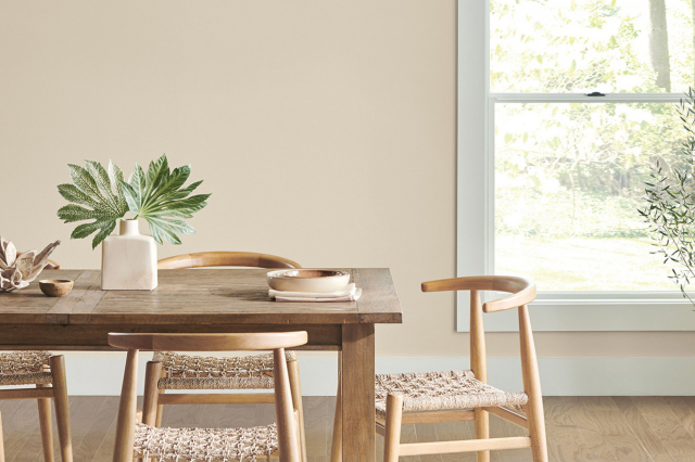
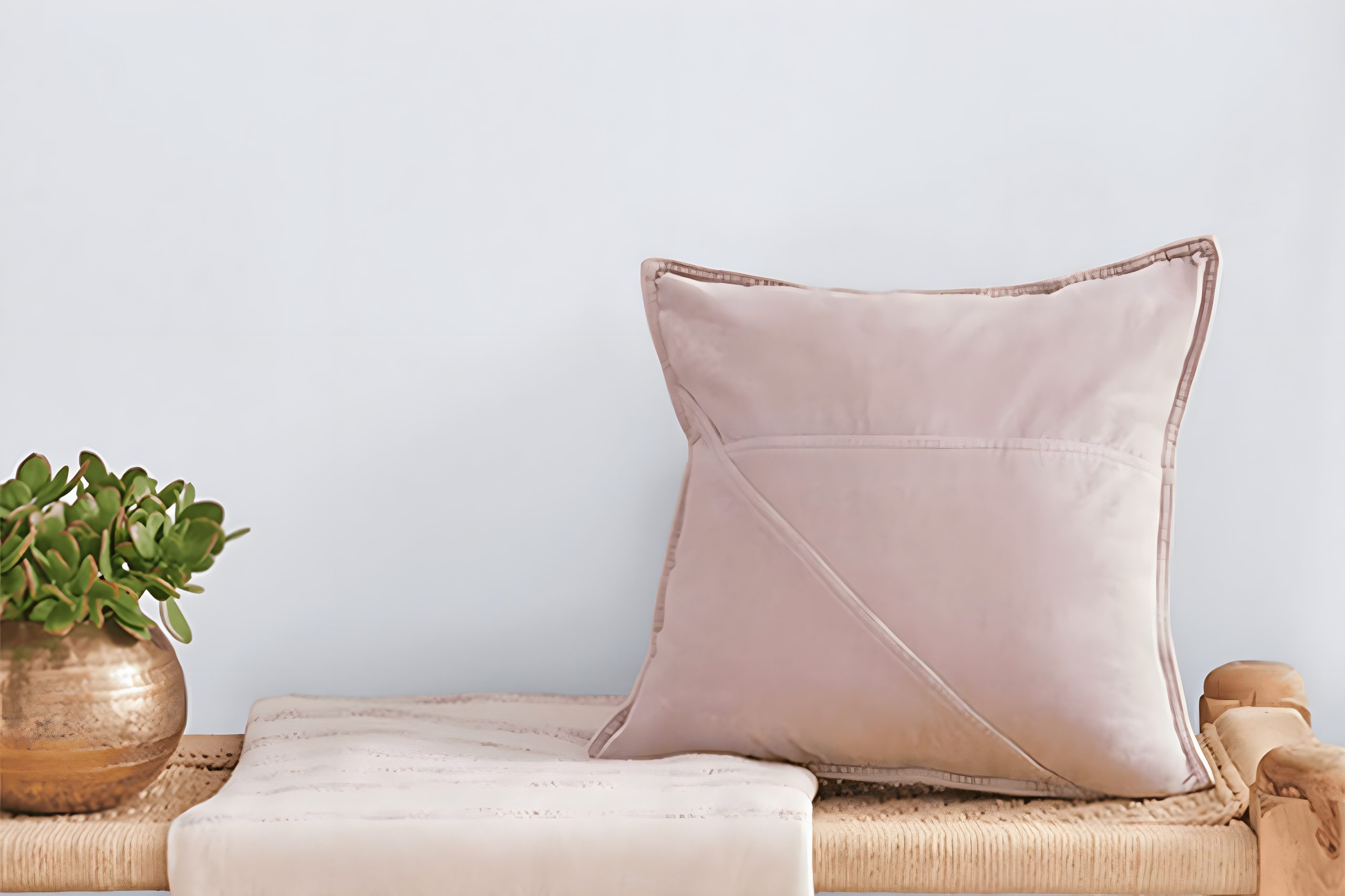
Welcome to our exploration of the serene and beautiful color, SW 9686 Opalescent, by Sherwin Williams. This pleasant shade of paint isn’t just any ordinary color. It has a unique charm that can transform any space into a peaceful sanctuary.
With its subtle elegance, Opalescent finds a lovely balance between being striking yet soothing, making it a perfect choice for those wanting to add a touch of calmness to their environment.
Opalescent is all about bringing in a sense of tranquility and lightness. Whether you’re looking to refresh your living room, bedroom, or even a bathroom, this color provides a versatile backdrop that pairs well with a wide array of decor styles and other colors.
Its gentle hue works magic by making spaces appear larger and more open, imparting an airy feel that is both inviting and refreshing.
Homeowners and interior designers adore Opalescent for its ability to inspire a peaceful vibe, making it an ideal choice for creating a relaxed atmosphere.
Its understated elegance ensures that it complements, rather than competes with, your existing decor, enhancing the overall aesthetics of your home.
Join us as we explore how SW 9686 Opalescent by Sherwin Williams can transform your space into a haven of peace and elegance, reflecting your taste and style.
via sherwin-williams.com
What Color Is Opalescent SW 9686 by Sherwin Williams?
Opalescent SW 9686 by Sherwin Williams is a subtle and versatile color that brings a gentle touch of elegance to any space. It’s a soft, muted hue with a hint of warmth, making it perfect for creating a cozy and inviting atmosphere.
This color has an understated charm that seamlessly blends with various interior styles, from classic and traditional to more modern and minimalist designs.
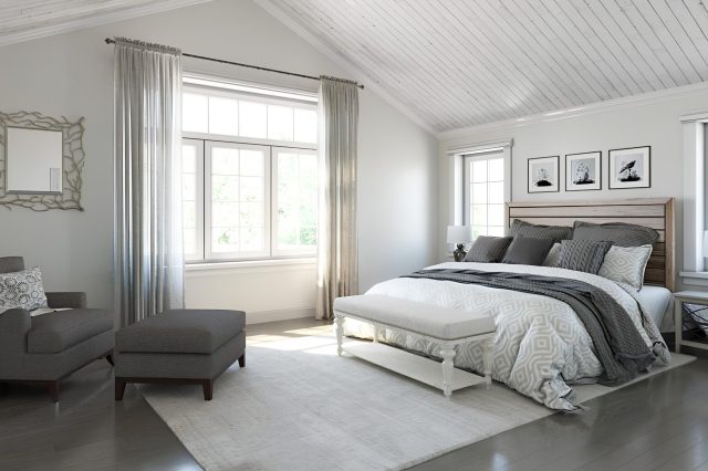
In terms of interior styles, Opalescent SW 9686 shines in settings that aim for a calm and serene vibe. It’s particularly well-suited for bedrooms, living rooms, and bathrooms where its soothing presence helps create a peaceful retreat.
Moreover, it pairs beautifully with Scandinavian and coastal-inspired themes, thanks to its light and airy feel. Its versatility also allows it to complement shabby chic and contemporary spaces, offering a neutral backdrop that supports a wide range of decor elements.
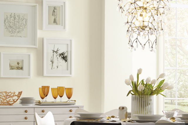
Opalescent SW 9686 works wonders with materials and textures that enhance its soft sophistication. Natural wood, with its warm tones, complements the color’s inherent warmth, creating a harmonious look.
Soft textiles like linen or cotton in white, cream, or light pastel shades add layers of texture without overpowering the color. For a bit of contrast, matte black or deep navy accents can offer a striking visual without disturbing the tranquil atmosphere this color promotes. In summary, Opalescent SW 9686 is a flexible and soothing choice, ideal for creating a light, airy, and welcoming space.
housekeepingbay.com
Table of Contents
Is Opalescent SW 9686 by Sherwin Williams Warm or Cool color?
Opalescent SW 9686 by Sherwin Williams is a beautiful light color that carries hints of soft pastels, blending subtle purples and grays. This unique mix makes it a versatile color for homes, capable of adding a gentle, soothing vibe to any room.
When you use Opalescent in your home, it acts like a chameleon, changing tones slightly depending on the lighting. During the day, natural light brings out its soft, peaceful qualities, making spaces feel open and airy.
At night, under artificial lighting, it can appear more grounded, providing a cozy, comfortable feeling to the environment.
This color works wonders in bedrooms and living areas, where you want a calming atmosphere that helps you relax. It’s also a great choice for bathrooms, where its light, almost spa-like quality can make the space feel clean and refreshing.
Unlike stronger, more saturated colors, Opalescent doesn’t overwhelm the senses, making it an excellent backdrop for various decor styles and color schemes. By choosing Opalescent SW 9686, you can easily add a touch of elegance and tranquility to your home without making drastic changes.
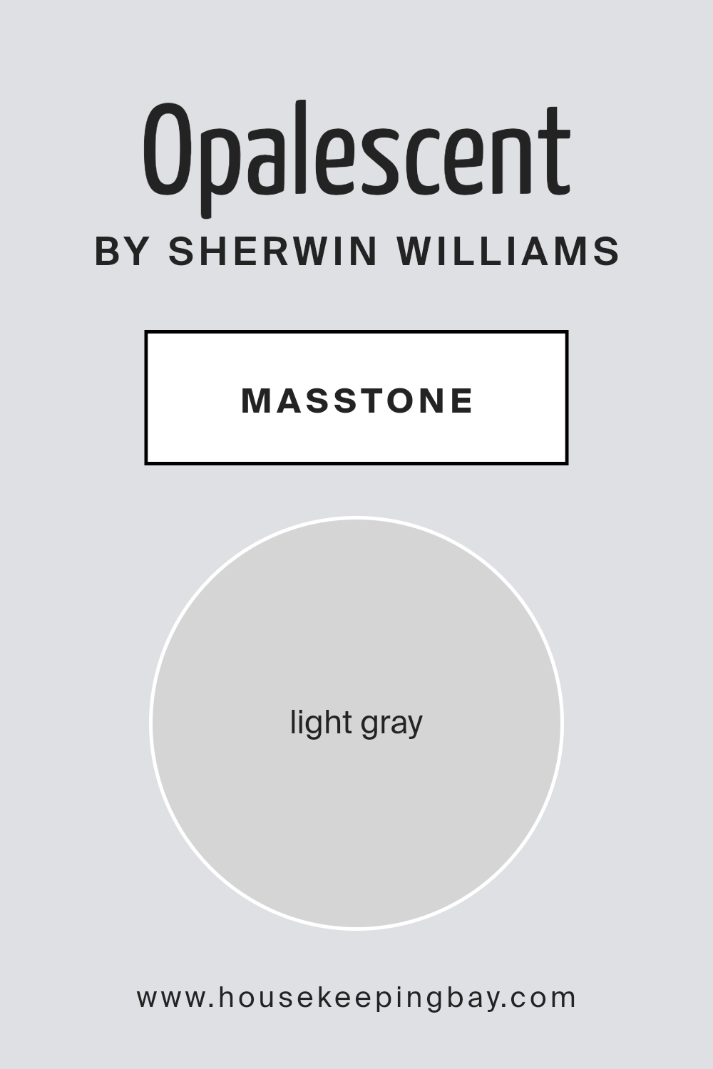
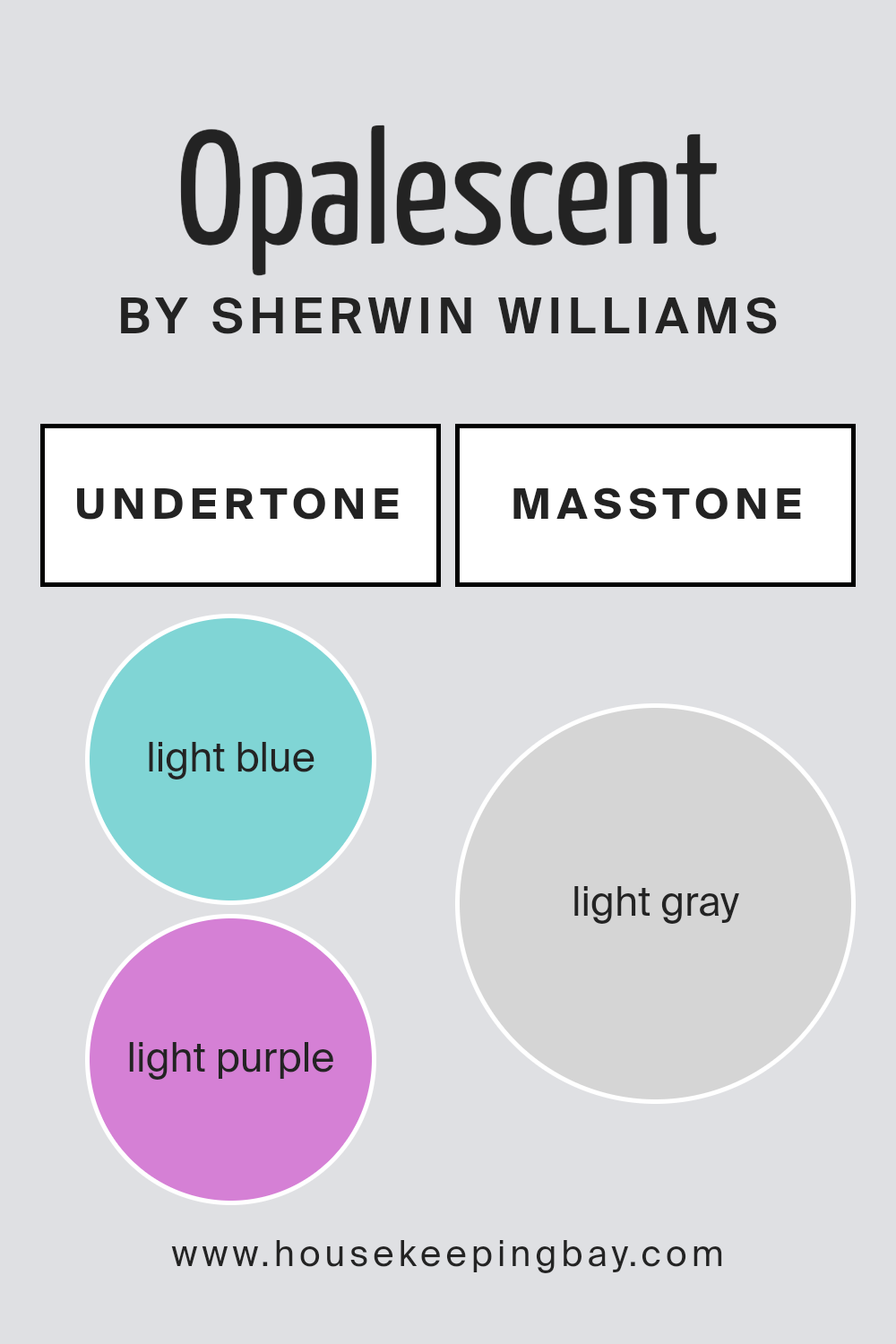
What is the Masstone of the Opalescent SW 9686 by Sherwin Williams?
OpalescentSW 9686 by Sherwin Williams has a masstone that is a light gray, similar to the shade #D5D5D5. This specific light gray shade brings a soft and serene vibe to any room in a house.
It’s a versatile color that works well in many spaces, from living rooms to bedrooms, because it doesn’t overpower the room’s atmosphere. Instead, it adds a gentle, calming touch.
The beauty of this light gray is in how it pairs with both bright and dark colors, making it easy for homeowners to decorate. For those who love colorful furniture or art, this light gray acts as a perfect backdrop, allowing those vibrant pieces to stand out.
On the other hand, if you prefer a minimalist look, this color harmoniously blends with whites, beiges, and other neutral tones, creating a clean and cohesive space.
Furthermore, because it is a light shade, it can help smaller rooms feel more spacious and open by reflecting light instead of absorbing it.
This can make your home feel more inviting and comfortable. Overall, OpalescentSW 9686’s light gray masstone is a fantastic choice for creating a peaceful and elegant home environment.
housekeepingbay.com
Undertones of Opalescent SW 9686 by Sherwin Williams
Opalescent SW 9686 by Sherwin Williams is a unique color that carries subtle hints of light blue and light purple. These undertones play a big role in how we perceive the color overall.
Imagine looking at a seemingly straightforward color, only to notice it changing mood under different lighting conditions or when paired with various decor elements. That’s the magic of undertones; they add depth and complexity, making the color more versatile.
The light blue undertone in Opalescent adds a fresh, calming vibe. It reminds us of a clear, sunny sky or tranquil waters. This makes the paint ideal for creating a serene and inviting space.
On the other hand, the light purple undertone introduces a gentle hint of playfulness and creativity. It whispers of soft lavender fields and brings a subtle warmth to the mix.
When applied to interior walls, Opalescent SW 9686 transforms the space depending on its environment. In rooms with plenty of natural light, the walls might lean towards the cooler, airy light blue.
Meanwhile, in spaces with warmer, artificial lighting or during the sunset, the light purple tones might become more pronounced, adding coziness and charm.
This interplay between the undertones ensures the walls are never just a static background but a dynamic element that interacts with the light and objects around them, making the room feel alive and continuously interesting.
housekeepingbay.com
How Does Lighting Affect Opalescent SW 9686 by Sherwin Williams?
Lighting has a big effect on how we see colors. The same color can look different under artificial light than it does in natural sunlight. This is because different light sources have their own color temperatures, which can make colors appear warmer or cooler.
Let’s take the color Opalescent SW 9686 by Sherwin Williams as an example. This color has a unique ability to change its appearance under different lighting conditions, making it a fascinating choice for any space.
In artificial light, such as LED or fluorescent lighting, Opalescent SW 9686 can appear slightly different depending on the type of bulb used. LED lights that mimic daylight can make it look more vibrant, highlighting its subtle undertones.
On the other hand, warmer bulbs can soften the color, giving it a cozier feel. This makes the color versatile for spaces that are used both day and night.
Natural light brings out the true charm of Opalescent SW 9686. As the quality of natural light changes from dawn to dusk, so does the perception of this color. It can glow softly in the morning light, appear bright and lively around noon, and turn into a more subdued, gentle hue by the evening.
The direction of the room also matters. In north-faced rooms, which often get cooler, softer light, OpalescentSW 9686 might appear more muted and serene, making the space feel calm.
In south-faced rooms, where light is warmer and more abundant, the color can look more lively and radiant, enhancing the room’s brightness.
East-faced rooms see the morning sun, so Opalescent SW 9686 can look especially fresh and cheerful in the morning, gradually becoming softer as the day progresses.
West-faced rooms, on the other hand, may not benefit much from this color in the morning but will see it come to life in the warm, golden light of the afternoon and evening.
In summary, lighting significantly influences how we perceive the color OpalescentSW 9686. Whether it’s under artificial light or natural sunlight, and regardless of the room’s direction, this color shows a wide range of tones, from vibrant and striking to soft and serene, making it a versatile option for any space.
housekeepingbay.com
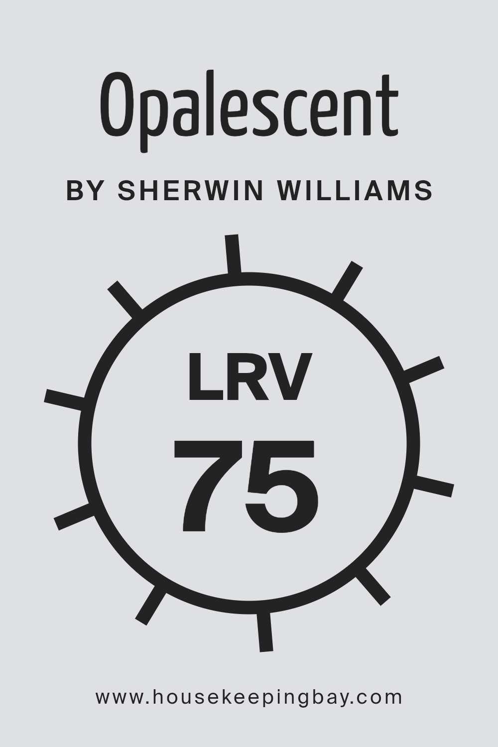
What is the LRV of Opalescent SW 9686 by Sherwin Williams?
LRV stands for Light Reflectance Value, which is a measure of how much light a color reflects or absorbs. Imagine LRV on a scale from 0 to 100, where 0 means it doesn’t reflect any light (totally black), and 100 means it reflects all the light (totally white).
This value helps you figure out how bright or dark a color will look on your walls. If a color has a high LRV, it will reflect more light, making the space feel brighter and more open.
On the other hand, colors with low LRV values will absorb more light, making a room feel cozier but potentially darker.
Now, considering the LRV of Opalescent SW 9686 by Sherwin Williams is 74.644, this tells us it’s on the lighter side of the scale. This means it’s going to reflect a good amount of light, making your room feel brighter and more spacious.
Because it reflects a lot of light, the color can also appear more vibrant and true to its hue, rather than getting lost or dulled down in a dimly lit room.
For this particular color, having a high LRV makes it a great choice for spaces where you want to maximize natural light or make the area feel airier and more open.
housekeepingbay.com
What is LRV? Read It Before You Choose Your Ideal Paint Color
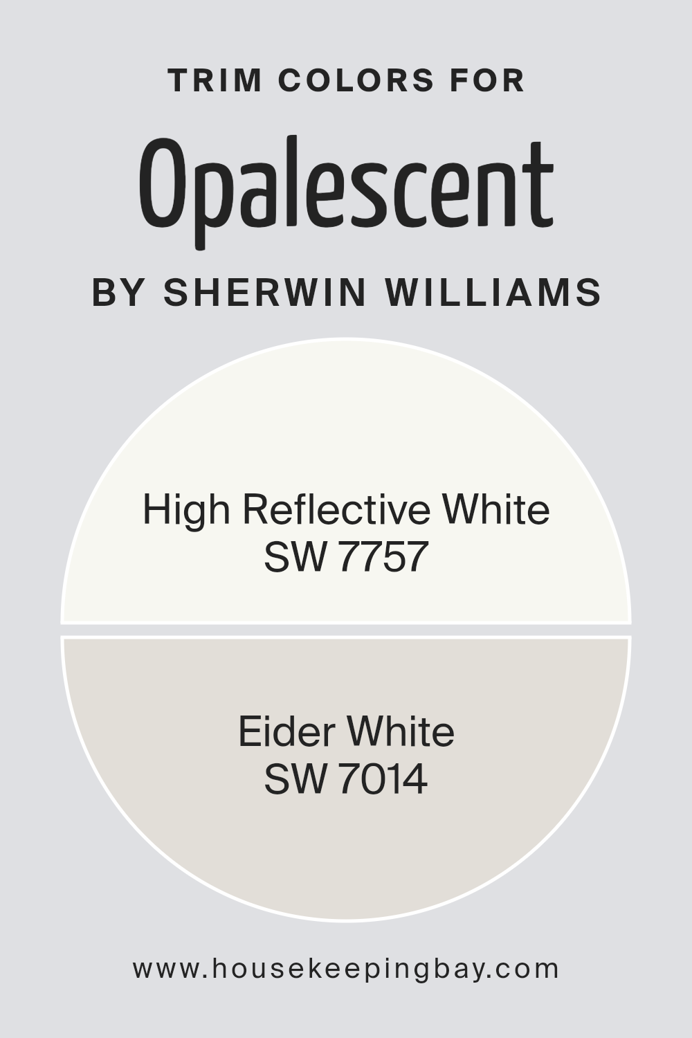
What are the Trim colors of Opalescent SW 9686 by Sherwin Williams?
Trim colors are the shades used on the architectural elements and edges of a room or a house, such as door frames, window frames, skirtings, and moldings. These colors significantly impact the overall aesthetic and feel of a space by either subtly blending with the primary wall color or providing a striking contrast that adds dimension and character.
For OpalescentSW 9686 by Sherwin Williams, a gentle and soft hue that carries the essence of tranquility with a hint of warmth, selecting the right trim colors is crucial to enhance its beauty without overpowering it.
High Reflective White SW 7757 is an excellent choice for trim, offering a bright and clean appearance that can make the subtle tones of OpalescentSW 9686 pop, giving a crisp and tailored finish to any room.
It’s like adding a frame to a piece of art—it makes the colors stand out more vividly. On the other hand, Eider White SW 7014 serves a softer approach, with its grayish-white tone that blends seamlessly with OpalescentSW 9686, promoting a harmonious and cohesive look.
This color softly ties the room’s elements together, providing a gentle transition from the walls to the trim, perfect for creating a soothing and inclusive environment.
Both choices depend on the desired effect, either to define spaces with a stark contrast or to unify them with gentle traces.
You can see recommended paint colors below:
housekeepingbay.com
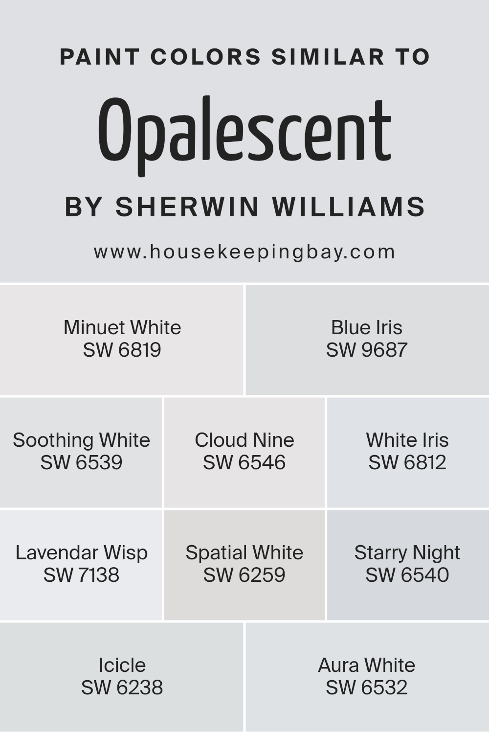
Colors Similar to Opalescent SW 9686 by Sherwin Williams
Choosing similar colors, like those related to Opalescent SW 9686 by Sherwin Williams, is essential because they harmonize in space, creating a serene and unified look. These colors share a connection through their tones, offering subtle variations that can enrich a room without overwhelming it.
Colors like Minuet White and Soothing White lean towards a soft, comforting ambiance, gently filling a room with warmth. On the other hand, shades such as Blue Iris and Starry Night introduce a hint of color, adding depth and interest in a subtle, understated manner.
This balance between calm neutrals and soft hues allows for a versatile palette that can adapt to various styles and preferences.
Each color, despite its individuality, works together to craft a cohesive and inviting space. White Iris and Icicle, with their crisp and clean essence, reflect light beautifully, making spaces appear larger and more open.
In contrast, Lavender Wisp and Cloud Nine offer a touch of softness and dreaminess, perfect for creating a tranquil retreat. Spatial White and Aura White serve as sophisticated neutrals, laying a foundation that allows for personalization with decor and art.
Together, these colors create an inviting palette that enhances the aesthetic and mood of a room, demonstrating the power of using similar hues to achieve a harmonious and visually appealing space.
You can see recommended paint colors below:
- SW 6819 Minuet White
- SW 9687 Blue Iris
- SW 6539 Soothing White
- SW 6546 Cloud Nine
- SW 6812 White Iris
- SW 7138 Lavendar Wisp
- SW 6259 Spatial White
- SW 6540 Starry Night
- SW 6238 Icicle
- SW 6532 Aura White
housekeepingbay.com
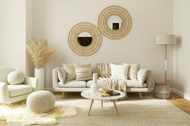
How to Use Opalescent SW 9686 by Sherwin Williams In Your Home?
Opalescent SW 9686 by Sherwin Williams is a special kind of paint color that brings a unique touch to any home. It’s like a soft hug for your walls, giving a peaceful and calm atmosphere to any room.
This color has a gentle blend of warm and cool tones, making it super versatile for different spaces in your home. Whether you’re giving your living room a fresh look, making your bedroom a cozy retreat, or adding some calm to your bathroom, Opalescent can do the trick.
Using this color, you can create a soothing backdrop that makes your furniture and decor pop. It’s great for people who love a modern, clean style but still want a bit of warmth. You can pair it with whites for a bright, airy feel, or with darker colors for a striking contrast.
It’s not just about looks; choosing a color like Opalescent can make your home feel more welcoming and comfortable. So, if you’re thinking about refreshing your space, Opalescent SW 9686 is definitely worth considering.
Opalescent SW 9686 by Sherwin Williams vs White Iris SW 6812 by Sherwin Williams
Opalescent SW 9686 by Sherwin Williams is a unique color that mixes hints of white and very soft, subtle undertones of pale blue and pink, giving it a gentle, almost glowing feel. It’s like looking at a delicate sunrise where the colors softly blend together.
On the other hand, White Iris SW 6812 is more straightforward. It’s a light, airy shade of purple that brings a sense of calm and simplicity to a space.
While Opalescent has a magical, shimmering quality that can change under different lighting, White Iris provides a steady, serene backdrop.
Both colors are great for creating a peaceful and inviting environment, but Opalescent offers a touch of mystery due to its ever-changing hues, whereas White Iris is more consistent, offering a tranquil vibe with its understated elegance.
You can see recommended paint color below:
- SW 6812 White Iris
housekeepingbay.com
Opalescent SW 9686 by Sherwin Williams vs Icicle SW 6238 by Sherwin Williams
Opalescent SW 9686 by Sherwin Williams is a unique color that carries hints of soft, pale purple with a touch of gray. It offers a gentle and calming vibe, making spaces feel light and airy.
This color suits well in rooms that aim for a soothing and serene atmosphere, like bedrooms or quiet reading corners.
On the other hand, Icicle SW 6238 leans more towards a cool, crisp blue with gray undertones. It’s a fresh color that reminds you of a clear, icy day.
Icicle can make spaces feel more spacious and open, giving off a clean and refreshing look. It’s perfect for bathrooms or kitchens where you want to create a feeling of cleanliness and tranquility.
While both colors are on the cooler side of the spectrum, Opalescent offers a hint of warmth due to its purple-gray shade, making it feel a bit cozier.
Icicle, with its clearer and crisper blue tones, provides a sharper, more invigorating feel. Choosing between the two would depend on whether you’re aiming for a soft, subtle ambiance or a bright, airy environment.
You can see recommended paint color below:
- SW 6238 Icicle
housekeepingbay.com
Opalescent SW 9686 by Sherwin Williams vs Aura White SW 6532 by Sherwin Williams
Opalescent SW 9686 by Sherwin Williams is a unique color that offers a subtle, soft glow reminiscent of the inside of a seashell. This color has a hint of shimmer, giving walls a soft, radiant feel without being overly shiny. It’s gentle, almost like a whisper of color, and works well in spaces that aim for a serene, calming vibe.
Aura White SW 6532 by Sherwin Williams, on the other hand, is a clear, crisp white. It’s a solid choice for someone looking for a clean, straightforward white that brings brightness to a room.
Aura White doesn’t have the same shimmer as Opalescent and is more about creating a fresh, open feel. This color is perfect if you want to make a small room appear larger or bring a sense of daylight into a space.
While both colors are light and can enhance the feeling of space, Opalescent offers a touch of warmth and depth with its subtle glimmer, whereas Aura White delivers a classic, pure white ambiance.
You can see recommended paint color below:
- SW 6532 Aura White
housekeepingbay.com
Opalescent SW 9686 by Sherwin Williams vs Soothing White SW 6539 by Sherwin Williams
Opalescent SW 9686 by Sherwin Williams and Soothing White SW 6539 by Sherwin Williams are both beautiful, yet distinct colors. Opalescent is a unique shade that has a subtle, magical quality to it, almost like it’s gently glowing.
This color has a slight iridescence, which means it might look slightly different depending on the light, adding a special touch to any room. On the other hand, Soothing White is exactly what its name suggests – a calming, clean white that brings a sense of peace and simplicity to spaces.
It’s a more straightforward color compared to Opalescent, offering a clean slate that can make other colors pop or stand beautifully on its own for a minimalist look. While Opalescent brings a hint of mystery and depth to spaces with its shifting tones, Soothing White provides a clear and tranquil backdrop.
Both colors offer something special, but the choice between them depends on whether you’re looking for a magical hint of color or a serene and straightforward white.
You can see recommended paint color below:
- SW 6539 Soothing White
housekeepingbay.com
Opalescent SW 9686 by Sherwin Williams vs Lavendar Wisp SW 7138 by Sherwin Williams
Opalescent SW 9686 from Sherwin Williams is a subtle, soft hue that adds a hint of coziness and warmth to any space. It has a gentle touch of color that can brighten a room without overwhelming it.
This makes it a great choice for creating a calm and inviting atmosphere. It’s like a whisper of color, offering a delicate backdrop that can effortlessly blend with various decor styles.
On the other hand, Lavender Wisp SW 7138, also by Sherwin Williams, brings a different vibe. This color is a bit more defined, leaning towards a soft, muted version of lavender. It introduces a soothing, gentle feel to a room but with a slightly more noticeable presence compared to Opalescent.
Lavender Wisp is perfect for someone looking to add a touch of serenity with a more discernible color. It still maintains a light and airy feel but with a bit more personality.
Both colors are beautifully understated, but where Opalescent leans towards neutrality, Lavender Wisp dips slightly into the realm of pastel colors, providing a peaceful yet slightly more colorful ambiance.
You can see recommended paint color below:
- SW 7138 Lavendar Wisp
housekeepingbay.com
Opalescent SW 9686 by Sherwin Williams vs Cloud Nine SW 6546 by Sherwin Williams
Opalescent SW 9686 and Cloud Nine SW 6546 are both colors by Sherwin Williams, but they have distinct vibes. Opalescent is a unique color, standing out because it has a soft, pearl-like quality.
It kind of shimmers lightly, offering a subtle hint of elegance and serenity. It’s the sort of color that can make a space feel more open and airy, adding a soft touch to any room without overwhelming it.
On the other hand, Cloud Nine is a solid, clean color that leans towards a pure, bright vibe. It’s like looking at a clear sky on a sunny day. This color brings a fresh and crisp feel to a room, making it feel more alive and vibrant. It has a straightforward charm that can make spaces feel more inviting and cheerful.
While Opalescent adds a hint of sophistication with its delicate shimmer, Cloud Nine stands out for its bright and crisp energy. Both colors can brighten up a room, but they do so in their unique ways – Opalescent with a soft glow and Cloud Nine with a lively brightness.
You can see recommended paint color below:
- SW 6546 Cloud Nine
housekeepingbay.com
Opalescent SW 9686 by Sherwin Williams vs Starry Night SW 6540 by Sherwin Williams
The main color, Opalescent SW 9686 by Sherwin Williams, presents a soft, light feel with its gentle mix of pale hues, resembling a barely-there blend of pastel colors under a soft, bright light.
It brings a calm and serene vibe to a space, making it feel open and airy. This color is perfect for creating a subtle backdrop that doesn’t overpower but rather enhances the tranquility of a room.
On the other hand, Starry Night SW 6540 by Sherwin Williams is a bold, striking color. It’s a deep, rich blue that reminds you of the night sky just as the last light fades away.
This color adds drama and depth to spaces, creating a strong statement. It’s ideal for accent walls or rooms where you want to inject a sense of energy and dynamism.
Comparing the two, Opalescent offers a quiet whisper of color, soft and light, perfect for a peaceful setting. Starry Night, conversely, is all about making an impact with its deep, vibrant tone, suitable for more dynamic or focused spaces.
You can see recommended paint color below:
- SW 6540 Starry Night
housekeepingbay.com
Opalescent SW 9686 by Sherwin Williams vs Minuet White SW 6819 by Sherwin Williams
Opalescent SW 9686 and Minuet White SW 6819 by Sherwin Williams are two subtly different shades that have their unique qualities. Opalescent is a soft, airy shade that has a hint of pink, giving it a warm and welcoming feel.
It’s light enough to brighten up a space while adding a touch of coziness with its gentle pink undertones. This color works well in rooms that aim for a soft, serene, or romantic vibe.
Minuet White SW 6819, on the other hand, is a cooler shade compared to Opalescent. It leans more towards a neutral white with slight gray undertones. This gives it a clean, crisp look, making it an excellent choice for spaces that you want to feel fresh and modern.
It doesn’t carry the warmth of Opalescent, but its simplicity makes it versatile for various decorating styles, from minimalist to contemporary.
Both colors offer a different approach to decorating. Opalescent brings warmth and a hint of color, perfect for creating inviting spaces. Minuet White offers a clean backdrop, ideal for a modern, sleek look or as a base for adding pops of color through furniture and decor. Depending on the mood and style you’re aiming for, each color has its strengths.
You can see recommended paint color below:
- SW 6819 Minuet White
housekeepingbay.com
Opalescent SW 9686 by Sherwin Williams vs Blue Iris SW 9687 by Sherwin Williams
Looking at Opalescent SW 9686 and Blue Iris SW 9687, both by Sherwin Williams, we see two distinct colors. Opalescent is light and airy, offering a soft vibe to any space.
It’s almost like looking at a gentle sky at dawn, where the light begins to touch everything with a sort of peaceful glow. This color can make a room feel bigger and more open because it has a way of bouncing light around.
On the other side, Blue Iris is a richer, deeper color. It has more of a bold presence, bringing in a sense of depth and sophistication to a space.
If Opalescent is the quiet morning sky, then Blue Iris is the evening sky, with a bit more mystery and a deeper tone. It’s great for adding a splash of character, especially if you’re going for a vibe that’s both elegant and striking.
Together, these colors could complement each other nicely, with Opalescent brightening up a space and Blue Iris adding a dash of drama and depth.
You can see recommended paint color below:
housekeepingbay.com
Opalescent SW 9686 by Sherwin Williams vs Spatial White SW 6259 by Sherwin Williams
Opalescent SW 9686 by Sherwin Williams is a unique color. It has a soft, light-hearted feel and often looks like it has little hints of rainbow-like sparkles in it, almost like the inside of a seashell. It’s very gentle and can make a room feel calm and a bit magical.
Spatial White SW 6259 by Sherwin Williams, on the other hand, is a straightforward white color. It’s clean and clear, creating a sense of openness and space wherever it’s used. This color is great for making small rooms look bigger and brighter, offering a fresh and airy vibe.
When comparing the two, Opalescent is more playful and has a subtle personality with its hints of various colors, giving spaces a touch of whimsy.
Spatial White is more about simplicity and clarity, perfect for someone looking to create a crisp, open feel in their space. Both colors offer different vibes: one is enchanting and delicate, and the other is crisp and expansive.
You can see recommended paint color below:
- SW 6259 Spatial White
housekeepingbay.com
Conclusion
In summary, the article discusses the unique qualities of Opalescent SW 9686 by Sherwin Williams, highlighting its versatility and soft appeal. This color is praised for its ability to bring a subtle but distinct charm to any space, making it a go-to option for those looking to add a touch of elegance without overwhelming a room.
The blend of hues in Opalescent SW 9686 offers a balance that works well in various settings, from contemporary to traditional, showing its adaptability and broad appeal.
Moreover, the article touches on the practical benefits of choosing Opalescent SW 9686, such as its compatibility with a wide range of decor styles and color palettes. It suggests that this color can act as a tranquil background for vibrant accessories or as a standalone statement, depending on the desired effect.
The versatility of Opalescent SW 9686, coupled with its serene and inviting quality, makes it a compelling choice for decorators and homeowners alike, seeking to create spaces that are both stylish and comfortable.
housekeepingbay.com
Ever wished paint sampling was as easy as sticking a sticker? Guess what? Now it is! Discover Samplize's unique Peel & Stick samples. Get started now and say goodbye to the old messy way!
Get paint samples