Midnight SW 6264 by Sherwin Williams
Embrace the Elegance of Nightfall
When it comes to transforming a space, the power of paint should never be underestimated. Among the vast array of colors, SW 6264 Midnight by Sherwin Williams stands out as a truly special hue.
This color is a deep, rich blue that has the unique ability to add both elegance and drama to any room. It’s perfect for those looking to make a bold statement, yet it retains a classic feel that ensures lasting appeal.
SW 6264 Midnight isn’t just another shade of blue. It’s a color that pulls you in, offering depth and sophistication to your walls.
Whether you’re updating your living room, bedroom, or even adding an accent wall, this color brings a sense of serenity and style that’s hard to find elsewhere.
Plus, it pairs beautifully with a wide range of decor, from modern minimalist to cozy and traditional.
Choosing the right color for your space can be a big decision, but with SW 6264 Midnight, you’re selecting a shade that offers both versatility and vibrancy.
It’s a way to transform your environment without overwhelming it, allowing you to create a space that feels both refreshing and refined. Stay with us as we explore how this stunning shade can elevate your home’s interior and inspire your next decorating project.
via sherwin-williams.com
What Color Is Midnight SW 6264 by Sherwin Williams?
MidnightSW 6264 by Sherwin Williams is a rich, deep blue color, reminiscent of the sky at the very heart of the night. It’s a bold hue with a sophisticated aura, making any space feel immediately more elegant and mysterious.
This color, in its essence, carries the tranquility and depth of the ocean’s depths, offering a serene backdrop to any room it adorns.
When it comes to interior styles, MidnightSW 6264 shines in modern and contemporary settings, where its boldness can be balanced with clean lines and simple forms.
It also makes a stunning statement in industrial designs when combined with raw, textured materials like exposed brick, metal, and reclaimed wood.
For a classic or traditional look, it brings a deep, regal accent, especially when paired with luxurious textures like velvet or silk and accented with gold or brass finishes.
Materials and textures that go well with MidnightSW 6264 include natural wood, which adds warmth against its cool tones; smooth leather, which brings sophistication; and light, airy fabrics like linen, to create a soft contrast.
Glossy finishes, whether in furniture or decorative elements, can add a spark of energy to spaces dominated by this deep blue, offering a lively interplay of light and color.
housekeepingbay.com
Table of Contents
Is Midnight SW 6264 by Sherwin Williams Warm or Cool color?
MidnightSW 6264 by Sherwin Williams is a unique and rich paint color that can transform any room in a home. This dark, deep shade of blue has a hint of mystery and elegance, making it perfect for creating a statement wall or adding depth to a space.
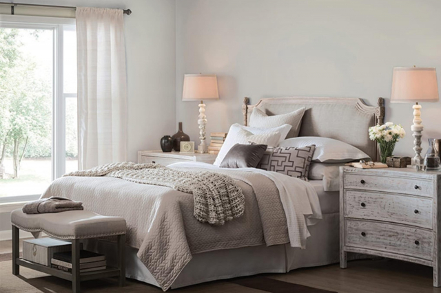
When used in homes, MidnightSW 6264 can bring a sense of calm and sophistication. It works well in bedrooms, offering a cozy, enveloping feeling that can help with relaxation and sleep.
In living rooms or dining areas, this color adds a luxurious touch, especially when paired with the right lighting and decor.
Because of its dark tone, MidnightSW 6264 can make small rooms look smaller, so it’s best used in larger spaces or rooms with plenty of natural light.
When matched with light-colored furniture and accents, it creates a beautiful contrast that makes the room stand out. Additionally, this color can set a moody, stylish backdrop for artwork, making colors pop and giving the room an artistic feel.
Overall, MidnightSW 6264 by Sherwin Williams offers a way to bring a sense of depth and style into homes.
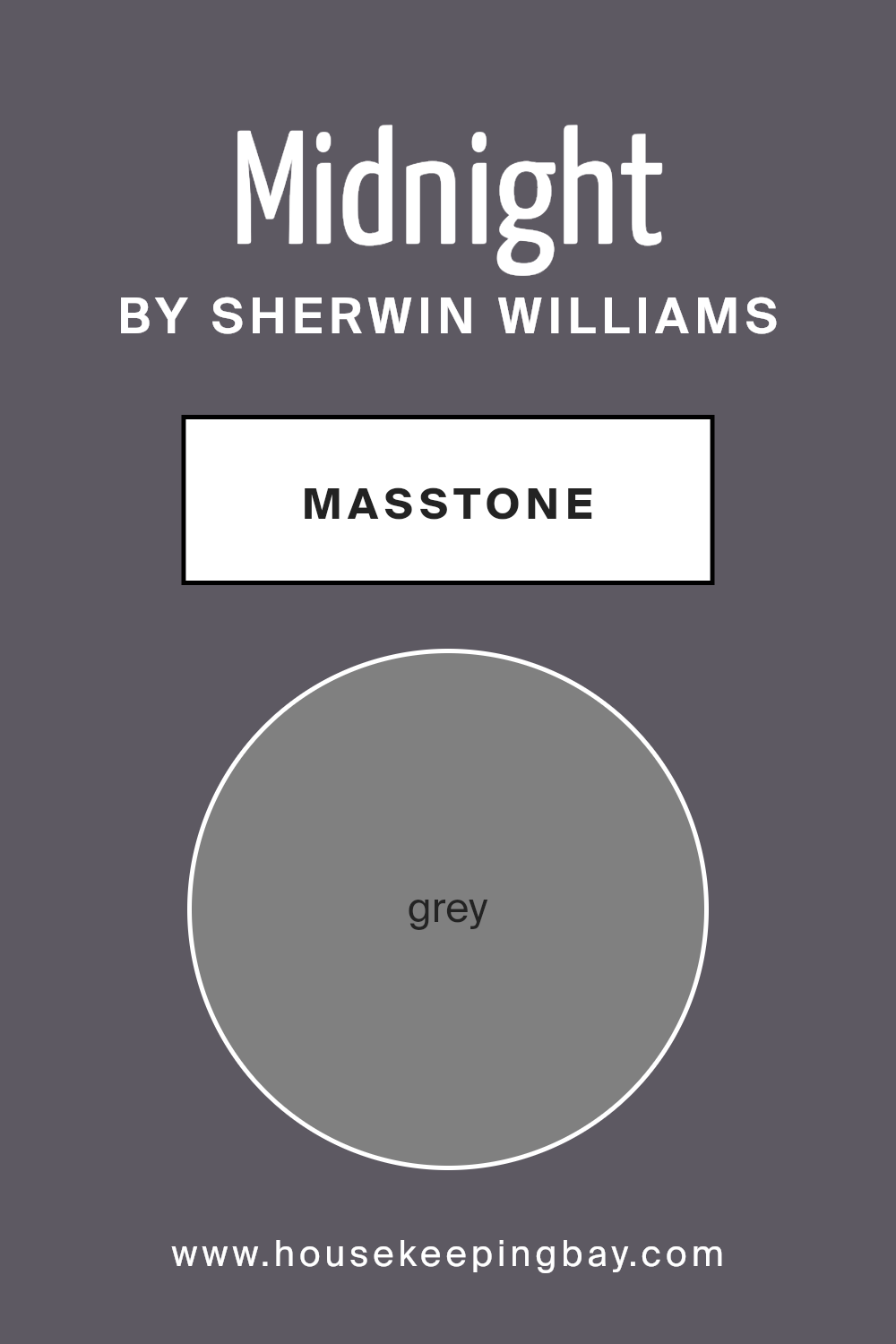
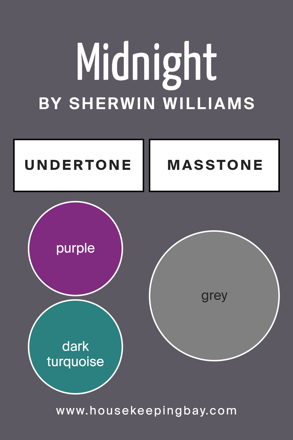
What is the Masstone of the Midnight SW 6264 by Sherwin Williams?
MidnightSW 6264 by Sherwin Williams is a unique color that might surprise you. At its core, the masstone, or the main color you see when you look at it, is a type of Grey (#808080). This isn’t just any grey.
It’s the sort of shade that can change how a room feels, making it super versatile. When you use MidnightSW 6264 in your home, it has a special way of fitting in with a lot of different styles and decorations.
Because the masstone is grey, it acts like a chameleon. In rooms with a lot of light, this color can feel softer and more inviting. But in spaces with less light, it might seem a bit stronger and more dramatic.
This makes it a great choice for all kinds of spots in your home, from your cozy living room to a peaceful bedroom.
What’s really neat is how it can make other colors pop. Whether you’ve got bright pillows or a colorful rug, MidnightSW 6264 helps them shine.
It’s like the perfect background that lets other colors be the stars. So, using this color can freshen up your home in a subtle yet powerful way.
housekeepingbay.com
Undertones of Midnight SW 6264 by Sherwin Williams
MidnightSW 6264 by Sherwin Williams is a unique color that at first glance might look simply dark or deep. However, a closer look reveals it has subtle undertones of purple and dark turquoise.
These undertones play a huge role in how we perceive the color. Imagine undertones as the hidden flavors in a dish; they can completely change how it tastes without you even realizing it.
Similarly, undertones in paint colors add depth and complexity, affecting the overall vibe of the color on your walls.
So, what does this mean for MidnightSW 6264 in your home? The purple undertone gives a touch of warmth and richness, making spaces feel cozy and inviting.
It’s like having a quiet hint of warmth in the midst of darkness. On the other hand, the dark turquoise undertone introduces a sense of calm and rejuvenation, much like the serene effect you feel when looking at deep waters.
When MidnightSW 6264 is used on interior walls, these undertones can influence the room’s ambiance significantly. Depending on the lighting, the color can shift from appearing almost mysterious and profound to becoming lively and dynamic.
The interplay between the coolness of the dark turquoise and the warmth of the purple creates a dynamic and versatile backdrop for various decor styles and color palettes.
This makes MidnightSW 6264 an excellent choice for those looking to add depth and intrigue to their space without overwhelming it with color.
housekeepingbay.com
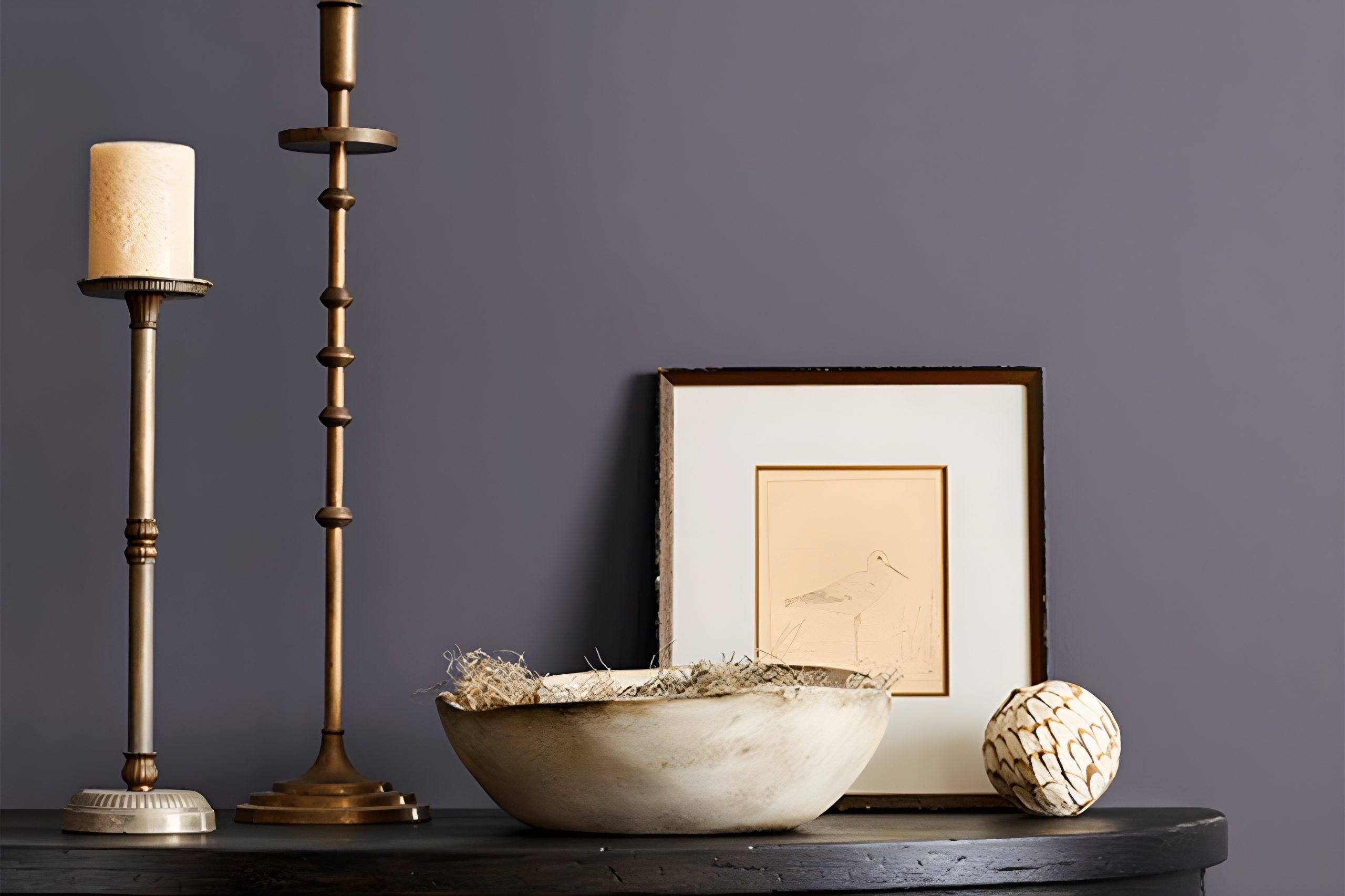
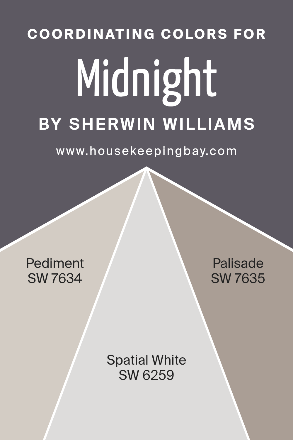
Coordinating Colors of Midnight SW 6264 by Sherwin Williams
Coordinating colors are hues that complement each other and work well together to create a cohesive look in a space. They can enhance the overall aesthetic by adding depth, contrast, or harmony to a color scheme.
When it comes to painting or decorating a room, choosing coordinating colors can help you achieve a balanced and visually pleasing environment.
For instance, when paired with Midnight SW 6264 by Sherwin Williams, a deep and serene navy blue, certain colors can bring out its richness without overwhelming the senses.
SW 7634 – Pediment is a soft, subtle gray that offers a calm and soothing backdrop, making it an excellent companion for the deeper tones of Midnight.
Its lightness provides a gentle contrast, allowing the navy to stand out while maintaining a serene atmosphere. SW 6259 – Spatial White, on the other hand, is a crisp and clean white that creates a striking balance with darker hues.
It reflects light beautifully, making any room feel more spacious and airy, and it highlights the depth of Midnight without competing for attention.
Lastly, SW 7635 – Palisade is a unique color, resembling the natural tones of clay; it adds a warm and inviting touch to the coolness of Midnight.
This combination is perfect for adding a hint of earthiness and warmth to a space, ensuring the environment feels welcoming and harmoniously balanced.
You can see recommended paint colors below:
- SW 7634 Pediment
- SW 6259 Spatial White
- SW 7635 Palisade
housekeepingbay.com
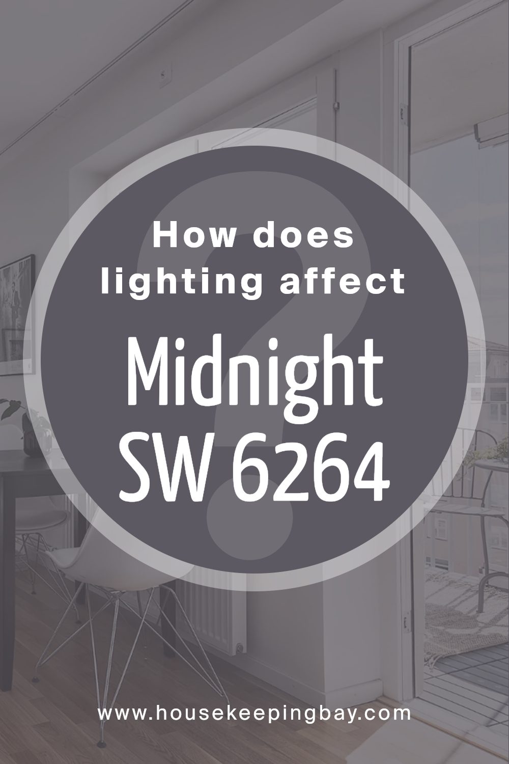
How Does Lighting Affect Midnight SW 6264 by Sherwin Williams?
Lighting has a huge role in how we see colors. It can change the look of a paint color drastically, making it appear different under various light settings. Let’s take the color MidnightSW 6264 by Sherwin Williams as an example.
This color is a deep, dark hue that can add a rich layer to any space. However, its appearance can change based on the light it’s exposed to, be it artificial or natural.
In artificial light, especially warm, yellow-toned lights, MidnightSW 6264 will appear warmer and more inviting. It might even pick up some hidden undertones that you wouldn’t notice in natural light.
Under cooler, LED lights, this color may seem harsher and more solid, with its blue and black tones becoming more pronounced.
In natural light, the true beauty of MidnightSW 6264 shines differently during various times of the day and orientations of the rooms.
In north-faced rooms, which get cooler, less direct sunlight, this color can appear somewhat muted and more shadowy, giving a sophisticated but somewhat subdued look.
Without the strong sunlight, its deeper qualities are highlighted, showing off its complexity in a subtle way.
South-faced rooms bask in warm, direct sunlight for most of the day, which can lighten the appearance of MidnightSW 6264, making it seem less intense than it would in a north-facing room.
The warmth of the sun can bring out hidden dimensions in the color, adding a lively and dynamic feeling to the space.
East-faced rooms enjoy bright morning light, which can make MidnightSW 6264 look vibrant and rich; its deep undertones are beautifully highlighted in the morning glow.
As the day progresses and the light changes, the color can transition beautifully, showing depth and versatility.
West-faced rooms receive intense evening light, which can make MidnightSW 6264 glow if the room catches the sunset.
During the day, however, the color might appear cooler and more shadowy, only to warm up and become more inviting as the day ends.
Overall, lighting plays a crucial part in how we perceive colors, and MidnightSW 6264 by Sherwin Williams is no exception. Knowing how light affects this particular shade can help in deciding where and how to use it effectively in home décor.
housekeepingbay.com
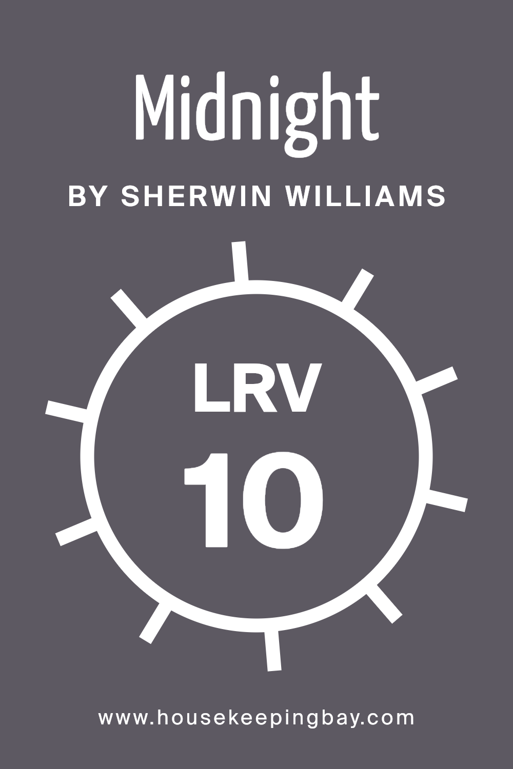
What is the LRV of Midnight SW 6264 by Sherwin Williams?
LRV stands for Light Reflectance Value, and it’s a measurement that shows how much light a paint color reflects back into a room.
Think of it this way: on a scale from 0 to 100, 0 means it’s super dark and doesn’t reflect light at all (like a black hole), and 100 means it’s super bright and reflects all the light, just like a mirror or white snow.
This number is super handy because it helps you understand how bright or dark a color will look on your walls. If you pick a paint with a high LRV, your room will feel brighter and more open because it reflects more light around.
If you choose a paint with a low LRV, it will absorb more light, making the space feel cozier or smaller.
The color MidnightSW 6264 by Sherwin Williams has an LRV of 10.317, which means it’s pretty dark. This low LRV tells you that it won’t reflect much light, absorbing most of it instead.
So, if you use this color on your walls, it’s going to create a bold statement, making the room feel more intimate and dramatic.
Since it reflects such a small amount of light, it’s perfect for a space where you want to bring in depth and character, but it’s also important to consider how this might make the room feel smaller or darker.
To balance things out, you might want to add more light sources or pair it with lighter colors in decor and furniture.
housekeepingbay.com
What is LRV? Read It Before You Choose Your Ideal Paint Color
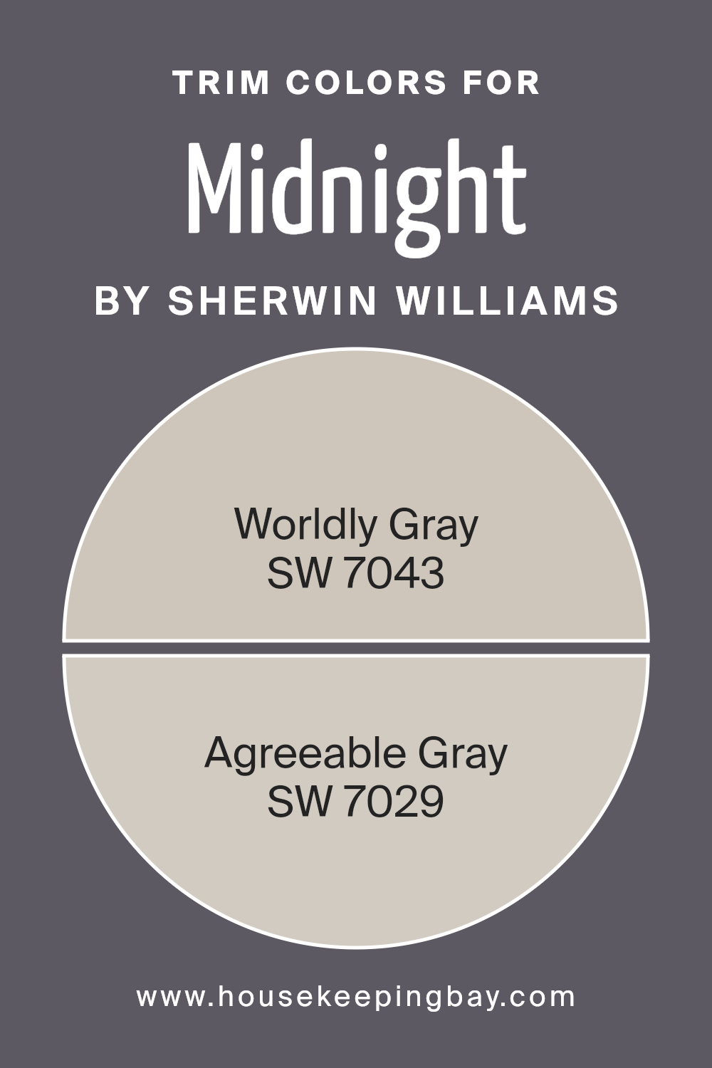
What are the Trim colors of Midnight SW 6264 by Sherwin Williams?
Trim colors are the hues selected for the architectural elements of a room or exterior, such as door frames, baseboards, molding, and window sills.
These colors play a significant role in defining the space, enhancing the overall aesthetic, and complementing the primary wall colors.
When paired with a deep, sophisticated shade like Midnight SW 6264 by Sherwin Williams, choosing the right trim colors becomes crucial. They can either highlight the boldness of Midnight or soften its impact, bringing balance and cohesion to the design.
Trim colors can also affect how we perceive the size and brightness of a room, making them an important aspect of interior decorating.
For a color like Midnight SW 6264, a deep and mysterious hue, selecting a trim color such as SW 7043 – Worldly Gray or SW 7029 – Agreeable Gray can have a profound effect.
Worldly Gray is a warm, neutral shade that provides a gentle contrast, softening the intensity of Midnight without diminishing its richness. It carries an earthy undertone, which brings a sense of comfort and serenity to the space, making it feel grounded.
Agreeable Gray, on the other hand, is a lighter, more subdued gray that bridges traditional and modern styles. Its versatility can lighten the mood of Midnight, adding a fresh and airy feel to the room.
Both choices offer a way to beautifully frame and complement MidnightSW 6264, enhancing the room’s visual appeal and creating a harmonious color scheme.
You can see recommended paint colors below:
housekeepingbay.com
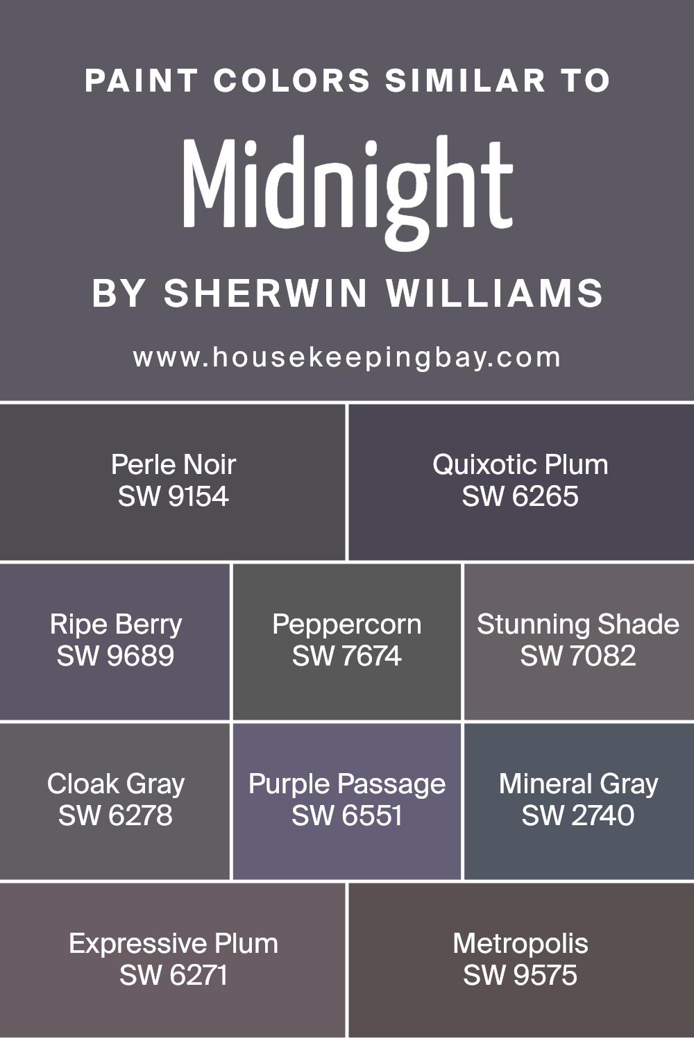
Colors Similar to Midnight SW 6264 by Sherwin Williams
Choosing colors that are similar can create a sense of harmony and balance in a space, making it feel unified and thoughtfully designed.
When colors like Midnight SW 6264 by Sherwin Williams and its companion hues are used together, they create a sophisticated palette that can enhance the ambiance of any room.
These similar shades, ranging from the deep tones of Perle Noir to the rich hue of Ripe Berry, work together because they share a common intensity and depth which allows for a seamless visual experience.
For instance, Perle Noir is a deep, dark tone that echoes the mystery of the night, offering a solid anchor in a color scheme, while Quixotic Plum brings a touch of deep, romantic purple, setting a moody atmosphere.
Ripe Berry adds a juicy, vibrant touch, giving life to the palette with its dynamic presence. Peppercorn serves as a versatile gray with a hint of warmth, perfect for grounding spaces.
Stunning Shade offers a contemporary, bold gray that makes a statement, whereas Cloak Gray introduces a softer, nuanced approach to dark colors.
Purple Passage whispers elegance with a subtle plum undertone, and Mineral Gray provides a balanced, natural feel.
Expressive Plum deepens the connection to sophisticated, vibrant interior narratives, whereas Metropolis rounds off the selection with a rich, inviting charcoal that complements the depth and sophistication of its peers.
Together, these colors offer a harmonious blend, enabling designers and homeowners to craft spaces that feel cohesive, stylish, and warmly inviting.
You can see recommended paint colors below:
- SW 9154 Perle Noir
- SW 6265 Quixotic Plum
- SW 9689 Ripe Berry
- SW 7674 Peppercorn
- SW 7082 Stunning Shade
- SW 6278 Cloak Gray
- SW 6551 Purple Passage
- SW 2740 Mineral Gray
- SW 6271 Expressive Plum
- SW 9575 Metropolis
housekeepingbay.com
How to Use Midnight SW 6264 by Sherwin Williams In Your Home?
Midnight SW 6264 by Sherwin Williams is a gorgeous, deep shade of navy that can add a touch of sophistication and drama to any space in your home. If you want to make a strong statement, consider using it in your living room or bedroom.
This color works great on a feature wall, adding depth and focus to the room. It pairs beautifully with neutral tones like whites or light grays, which help balance its intensity and keep the space feeling open and airy.
For those who enjoy a bit of creativity, Midnight SW 6264 can also be used on cabinets or furniture, giving them a modern and chic look.
It’s an excellent choice for a home office, where its serene and calming qualities can help in focusing and calming the mind. In the bathroom, pairing it with bright white fixtures and soft lighting can create a spa-like atmosphere.
Overall, Midnight SW 6264 by Sherwin Williams is a versatile color that can bring elegance and character to various rooms in your home, whether used on walls or as an accent color.
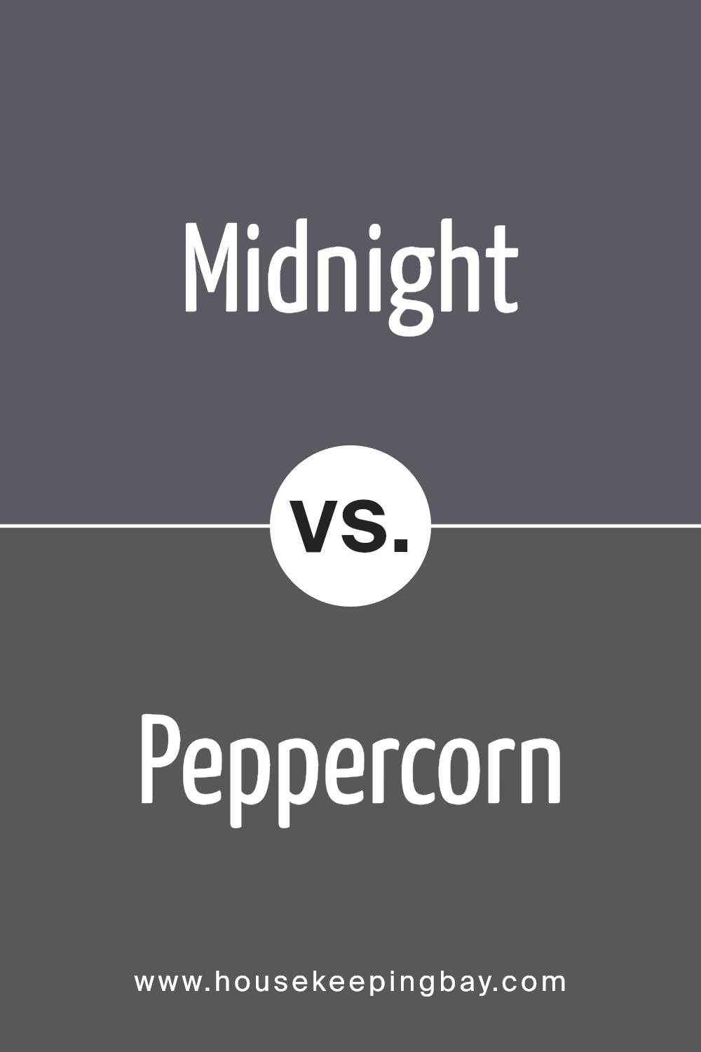
Midnight SW 6264 by Sherwin Williams vs Peppercorn SW 7674 by Sherwin Williams
Midnight SW 6264 and Peppercorn SW 7674, both from Sherwin Williams, offer unique shades for your space. Midnight SW 6264 is a deep, rich blue, almost touching the edges of black, reminiscent of the sky at midnight.
It’s perfect for creating a bold, cozy, or sophisticated look in any room. On the other hand, Peppercorn SW 7674 is a warm gray with slight brown undertones.
It’s not as dark as Midnight but offers a strong presence that can make spaces feel grounded and elegant.
While Midnight leans towards a cooler spectrum, invoking a serene, night-time feel, Peppercorn offers a softer, more neutral backdrop that easily pairs with various decor styles.
Both colors can dramatically transform a space, but your choice depends on the ambiance you want to achieve; cooler and deeper with Midnight or warm and versatile with Peppercorn.
You can see recommended paint color below:
housekeepingbay.com
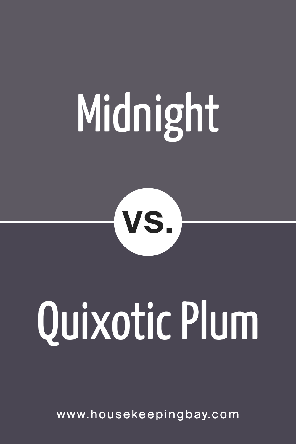
Midnight SW 6264 by Sherwin Williams vs Quixotic Plum SW 6265 by Sherwin Williams
Midnight SW 6264 and Quixotic Plum SW 6265, both from Sherwin Williams, offer unique vibes to any space. Midnight SW 6264 is a deep, almost mystical blue that has the power to make a room feel cozy and serene, like a clear night sky.
It’s perfect for creating a tranquil and peaceful atmosphere. On the other hand, Quixotic Plum SW 6265 brings a warmer, more vibrant feel, with its rich plum hue.
This color adds a touch of elegance and sophistication, making it great for spaces where you want to add a bit of drama and luxury.
While Midnight leans towards a calm, deep blue ocean feeling, Quixotic Plum is like the last rays of a sunset, warm and inviting. Both colors are bold and can make a statement, but the choice between a cooler or warmer ambiance is the main difference.
Whether you’re going for a calm retreat or a luxurious escape, these colors offer distinctive moods.
You can see recommended paint color below:
- SW 6265 Quixotic Plum
housekeepingbay.com
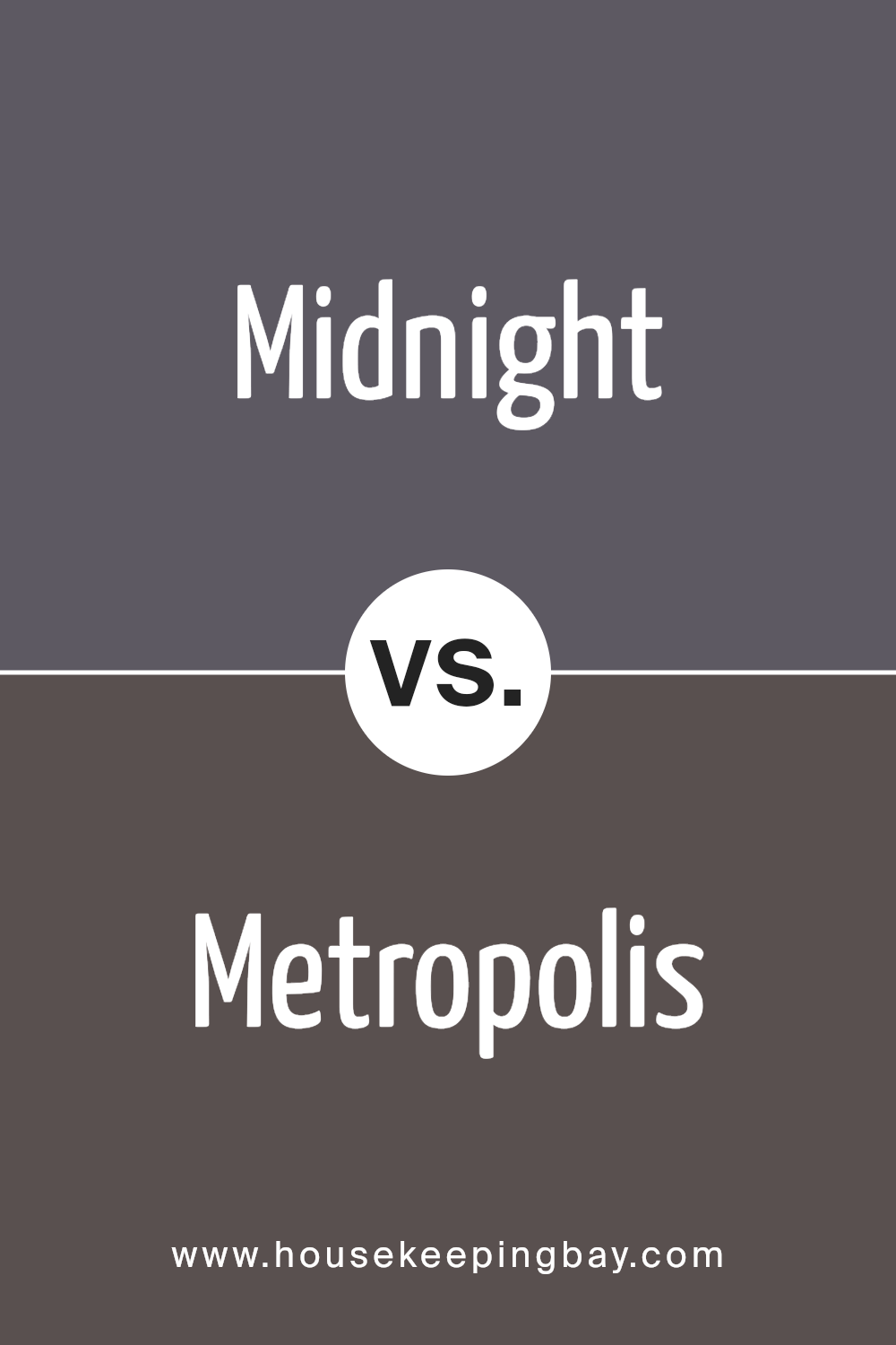
Midnight SW 6264 by Sherwin Williams vs Metropolis SW 9575 by Sherwin Williams
Midnight SW 6264 by Sherwin Williams is a deep, dark blue color that might remind you of the sky on a clear night, just around midnight. It’s a strong and bold color that can make a big statement in a space, giving off a cozy yet sophisticated vibe.
On the other side, Metropolis SW 9575, also from Sherwin Williams, is quite different. Though it’s also on the darker side, Metropolis leans towards a gray tone, offering a more neutral and versatile option.
It’s the kind of color that can easily fit into many designs, adding depth and a modern touch without overwhelming the space with too much color.
While both colors are dark and can create elegant, stylish environments, Midnight is all about that deep blue charm, great for creating a focal point.
Metropolis, however, is your go-to if you want something subtler, grounded in gray shades, perfect for a contemporary look that’s easy to match with various decor elements.
You can see recommended paint color below:
- SW 9575 Metropolis
housekeepingbay.com
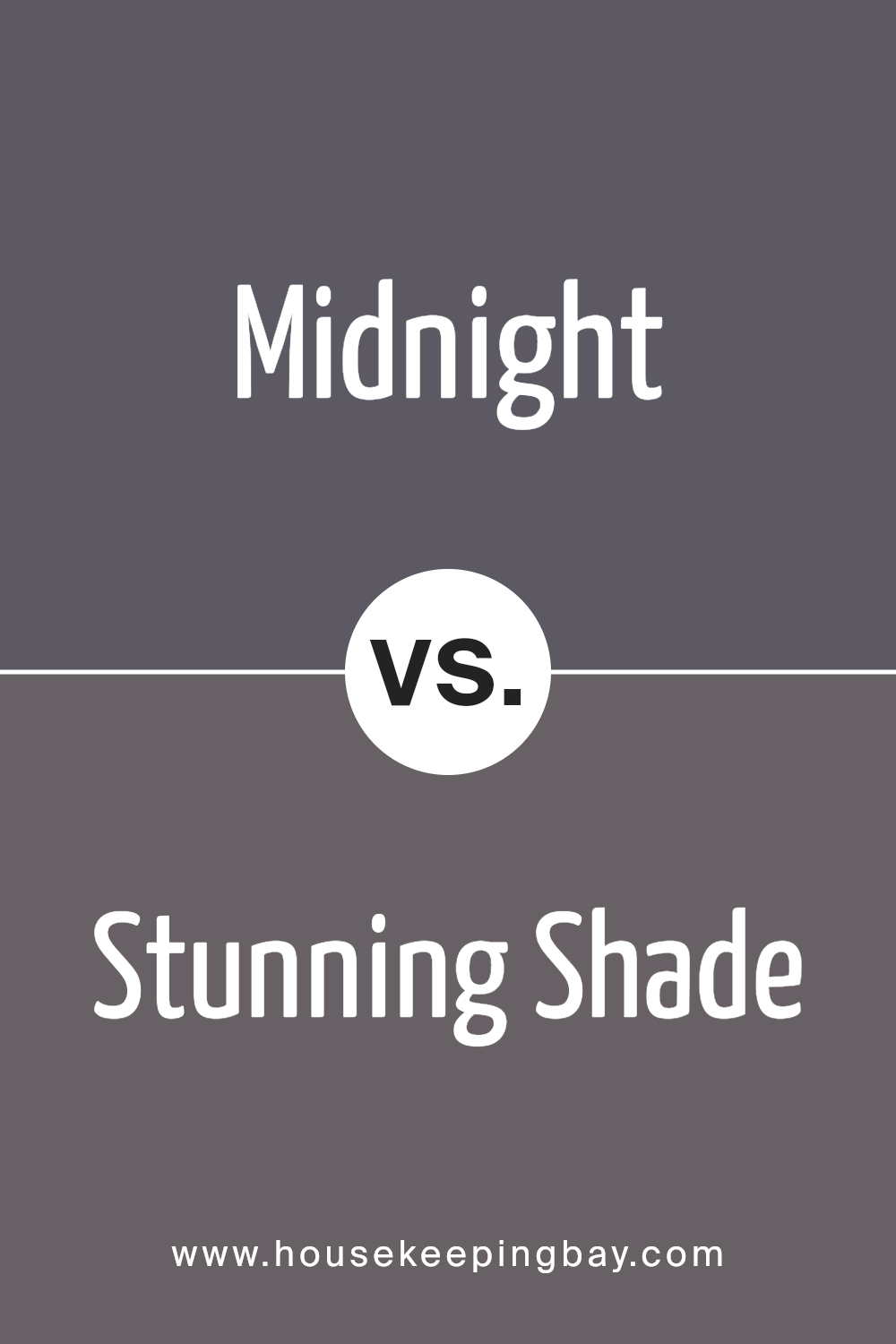
Midnight SW 6264 by Sherwin Williams vs Stunning Shade SW 7082 by Sherwin Williams
Midnight SW 6264 by Sherwin Williams is a deep and rich blue color. It has a very striking appearance that makes it stand out. This color is close to the shade you’d see in the sky on a clear night, far from city lights.
It brings a sense of calm and depth to spaces and is quite bold.
On the other hand, Stunning Shade SW 7082 by Sherwin Williams is more subtle than Midnight. It’s a unique blend of gray with hints of blue. This color is lighter and provides a tranquil, soothing atmosphere.
It’s versatile, working well in many different areas of a home, adding a modern and elegant touch.
Both colors are beautiful, but they have different vibes. Midnight creates a statement with its deep, dark tone, perfect for a cozy, dramatic look.
Stunning Shade offers a softer, more understated elegance, ideal for creating a peaceful and chic space. Each color has its charm, making them suitable for different preferences and room moods.
You can see recommended paint color below:
- SW 7082 Stunning Shade
housekeepingbay.com
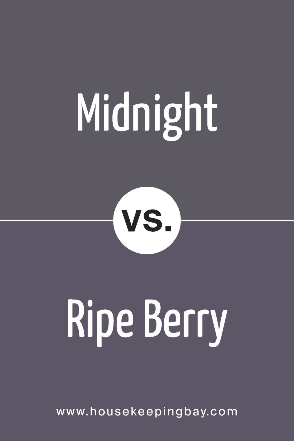
Midnight SW 6264 by Sherwin Williams vs Ripe Berry SW 9689 by Sherwin Williams
Midnight SW 6264 and Ripe Berry SW 9689 by Sherwin Williams are two striking colors with their own unique charm. Midnight SW 6264 is a deep, dark blue shade that resembles the sky at midnight.
It’s a bold color, perfect for creating a cozy, sophisticated atmosphere in a room. It can make spaces feel more secure and tucked away, ideal for bedrooms or areas where a calming effect is desired.
On the other hand, Ripe Berry SW 9689 is a vibrant, rich red hue that stands out for its warmth and energy. This color is lively and can add a pop of excitement to any space.
It works well in areas where you want to stimulate conversation and activity, like dining rooms or kitchens.
While Midnight SW 6264 offers a tranquil and serene vibe, Ripe Berry SW 9689 brings a sense of passion and dynamism.
Both colors have their own way of making a statement, whether you’re looking to create a peaceful retreat or an energetic gathering spot.
You can see recommended paint color below:
- SW 9689 Ripe Berry
housekeepingbay.com
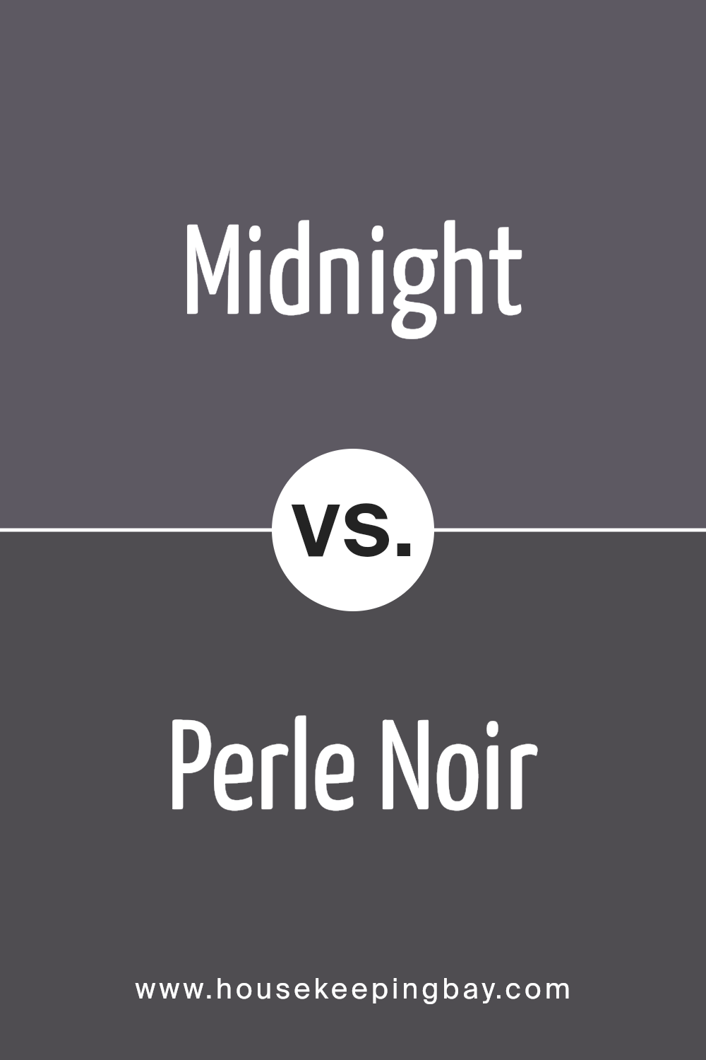
Midnight SW 6264 by Sherwin Williams vs Perle Noir SW 9154 by Sherwin Williams
Midnight SW 6264 and Perle Noir SW 9154, both from Sherwin Williams, offer distinct vibes for any space. Midnight is a deep, dark blue that almost looks like the night sky just before it turns completely black.
It’s perfect for creating a cozy, serene atmosphere in a room. Think of it as the kind of color that wraps around you like a warm blanket on a cold night.
Perle Noir, on the other hand, leans more towards a true, soft black with subtle hints of gray. It’s not as harsh as a pure black, making it a great choice if you want to add depth and elegance without overwhelming a space.
It’s like the soft shadows in a room when the light is just right – there, but not taking over.
Both colors are beautiful in their own right. Midnight brings a touch of calm and quiet mystery, perfect for a bedroom or reading nook.
Perle Noir offers sophistication and warmth, ideal for a living room or an accent wall that needs a bit of drama.
Choosing between them depends on the mood you want to set and the space you’re working with.
You can see recommended paint color below:
- SW 9154 Perle Noir
housekeepingbay.com
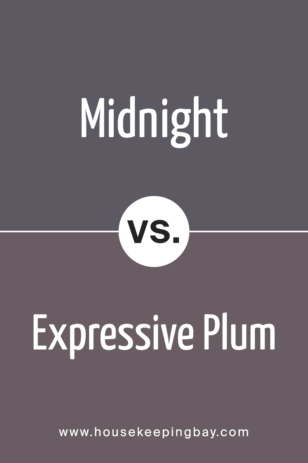
Midnight SW 6264 by Sherwin Williams vs Expressive Plum SW 6271 by Sherwin Williams
Midnight SW 6264 by Sherwin Williams is a deep, dark blue color that gives off a strong and calm vibe. It’s like looking into a clear night sky, peaceful and vast.
This color can make a space feel more secure and cozy, especially in a well-lit room where it doesn’t turn too dark.
Expressive Plum SW 6271, on the other hand, is a rich, vibrant purple. This color has a warm and inviting quality to it, bringing a sense of creativity and comfort to any space.
It shines best in areas that get a lot of natural light, highlighting its depth and beauty without overwhelming the room.
While both colors are dark and can add a dramatic flair to any space, Midnight leans cooler with its deep blue tones, and Expressive Plum warms things up with its purple hue.
They could complement each other well in a space that aims to be both cozy and full of character.
You can see recommended paint color below:
- SW 6271 Expressive Plum
housekeepingbay.com
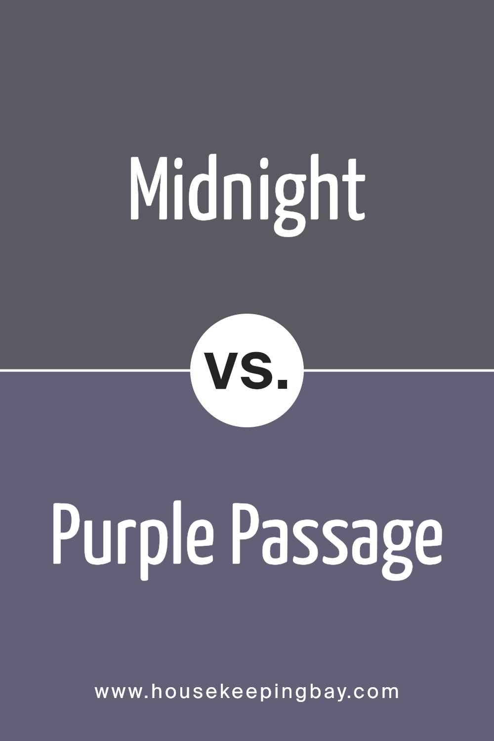
Midnight SW 6264 by Sherwin Williams vs Purple Passage SW 6551 by Sherwin Williams
Midnight SW 6264 by Sherwin Williams is a deep, rich color that reminds one of the sky on a clear, starry night. It’s a dark shade, almost bordering on black, but with subtle hints of navy blue that give it a sophisticated and serene appearance.
This color is great for creating a cozy and elegant atmosphere in spaces, making them feel more intimate and secure.
On the other hand, Purple Passage SW 6551 by Sherwin Williams is a vibrant purple hue. It’s not too loud but has enough brightness to add a playful and cheerful vibe to any room.
This shade combines the calmness of blue with the energy of red, resulting in a color that’s both soothing and stimulating at the same time.
In essence, Midnight is the go-to for a tranquil and refined space, embodying a sense of calm and depth.
Purple Passage, however, offers a lighter, more energetic feel, making it perfect for injecting some fun and personality into a space.
Both colors bring their unique characteristics to the table, catering to different tastes and design needs.
You can see recommended paint color below:
- SW 6551 Purple Passage
housekeepingbay.com
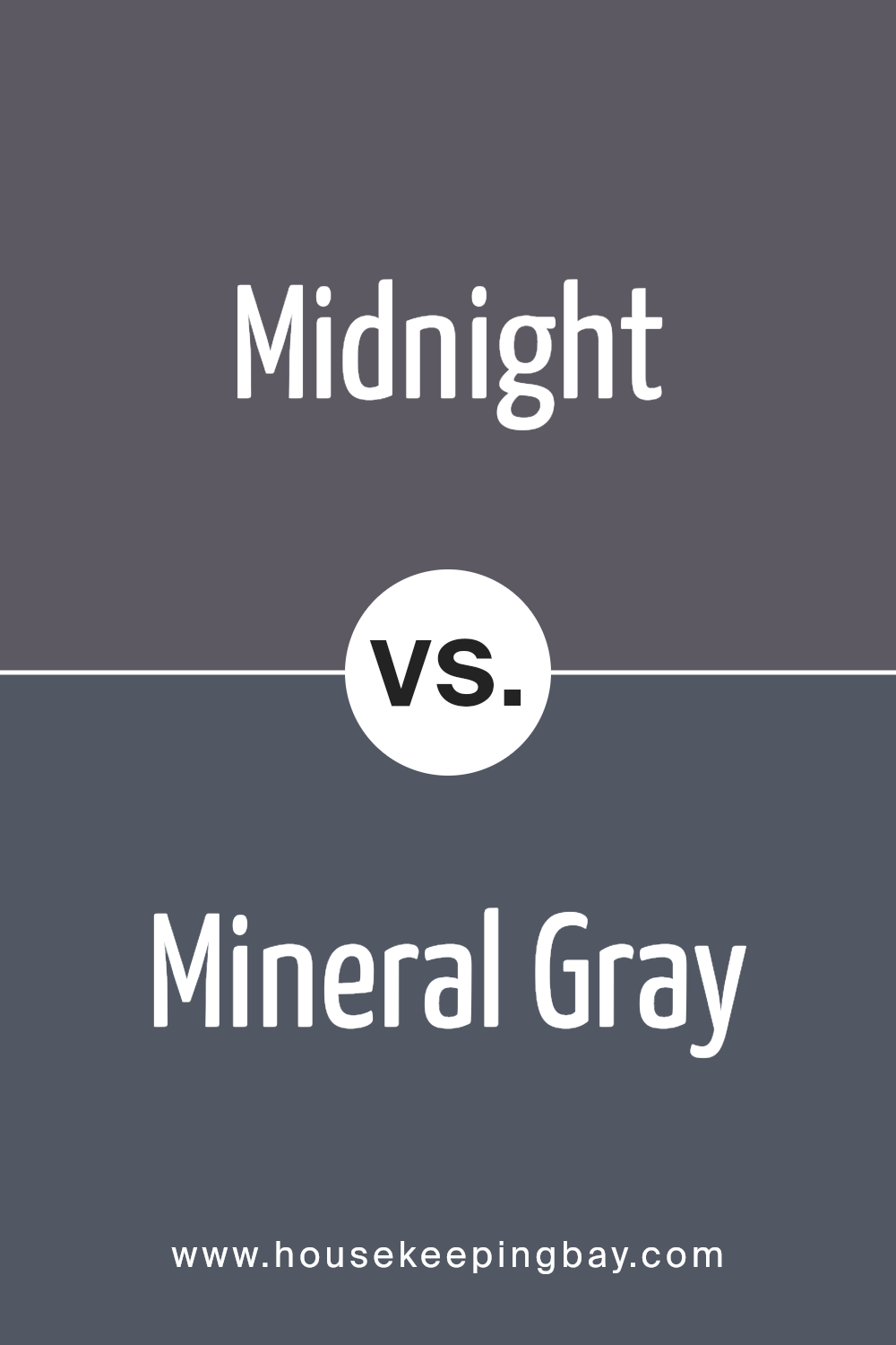
Midnight SW 6264 by Sherwin Williams vs Mineral Gray SW 2740 by Sherwin Williams
The main color, Midnight SW 6264 by Sherwin Williams, is a deep, rich blue that looks almost like the night sky just after dusk. It’s a bold color that can make a statement in any room, bringing with it a sense of tranquility and sophistication.
On the other hand, Mineral Gray SW 2740 is a soft, warm gray with earthy undertones. It’s a versatile color that can fit into many styles, creating a cozy and inviting atmosphere.
While Midnight carries a certain dramatic flair and depth, Mineral Gray offers a grounded, calming effect. Both colors can work beautifully in a home, but they serve different purposes.
While Midnight might be perfect for creating a focal point or an accent wall, Mineral Gray could be ideal for covering larger areas, providing a subtle backdrop for other colors and decorations.
Choosing between them really depends on the mood and function you want for your space.
You can see recommended paint color below:
- SW 2740 Mineral Gray
housekeepingbay.com
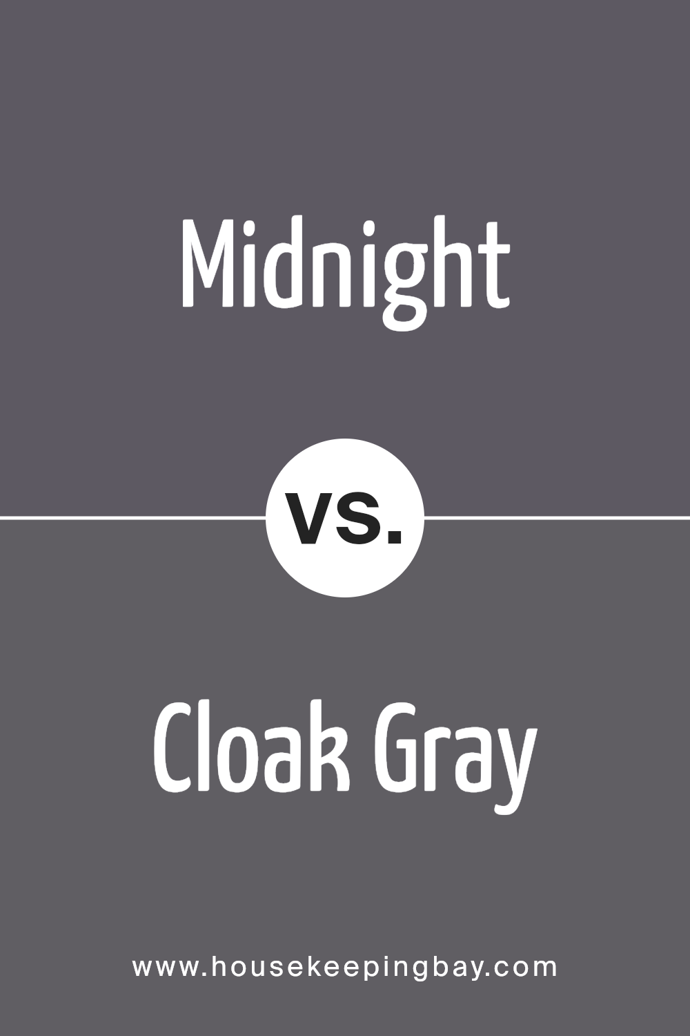
Midnight SW 6264 by Sherwin Williams vs Cloak Gray SW 6278 by Sherwin Williams
Midnight SW 6264 and Cloak Gray SW 6278, both by Sherwin Williams, are two distinct shades that can enhance any space in different ways. Midnight is a deep, dark blue that resembles the night sky just before it turns completely black.
It’s a strong color that adds a lot of character and depth to walls, making spaces feel more cozy and intimate. On the other hand, Cloak Gray is a softer, lighter gray with a subtle hint of warmth.
This color is versatile and calming, making it perfect for creating a peaceful and inviting atmosphere in any room.
While Midnight adds drama and intensity, Cloak Gray offers a more laid-back and relaxing vibe.
Choosing between them depends on the mood you want to set in your space. Midnight works well for a bold, sophisticated look, while Cloak Gray is ideal for a serene and welcoming feel.
You can see recommended paint color below:
- SW 6278 Cloak Gray
housekeepingbay.com
Conclusion
Midnight SW 6264 by Sherwin Williams is an intriguing paint color that takes a bold stand in any space. This deep shade is reminiscent of the night sky, offering a profound and serene atmosphere wherever it is applied.
Ideal for those wanting to make a statement in their home, Midnight SW 6264 effortlessly balances between sophistication and a touch of drama.
Its versatility allows it to blend well with various decor styles, making it a go-to choice for accent walls, cabinets, or even exterior applications.
The appeal of Midnight SW 6264 lies in its ability to create a cozy and enveloping feel in rooms, encouraging a sense of calm and focus.
Whether aiming for a moody vibe in a bedroom or looking to add depth to a living space, this color does not disappoint.
It serves as a stunning backdrop to metallic accents, natural wood tones, or vibrant hues, proving its strength in both bold and subdued design schemes.
Overall, Sherwin Williams’ Midnight SW 6264 is a true gem for those looking to infuse their spaces with a sophisticated and timeless elegance.
housekeepingbay.com
Ever wished paint sampling was as easy as sticking a sticker? Guess what? Now it is! Discover Samplize's unique Peel & Stick samples. Get started now and say goodbye to the old messy way!
Get paint samples