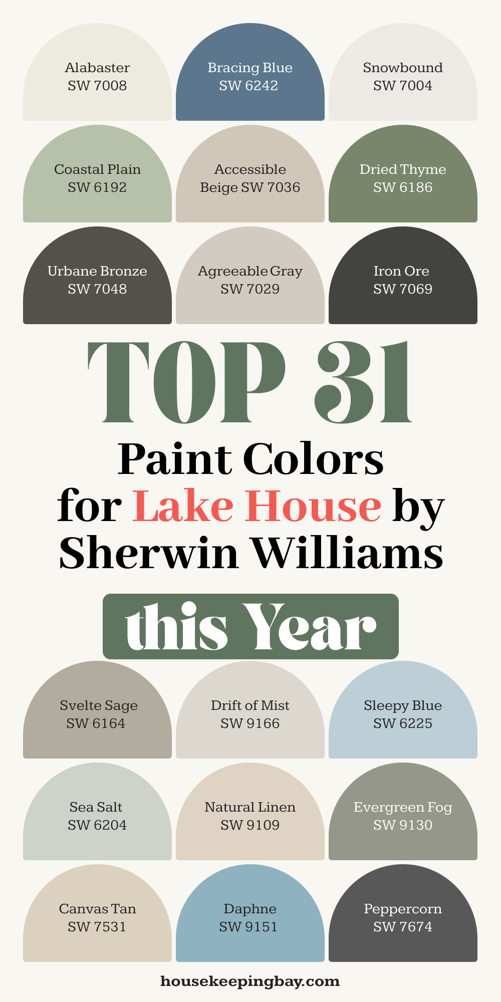
31 Lake House Exterior Paint Colors by Sherwin Williams
Why Your Lake House Color Matters
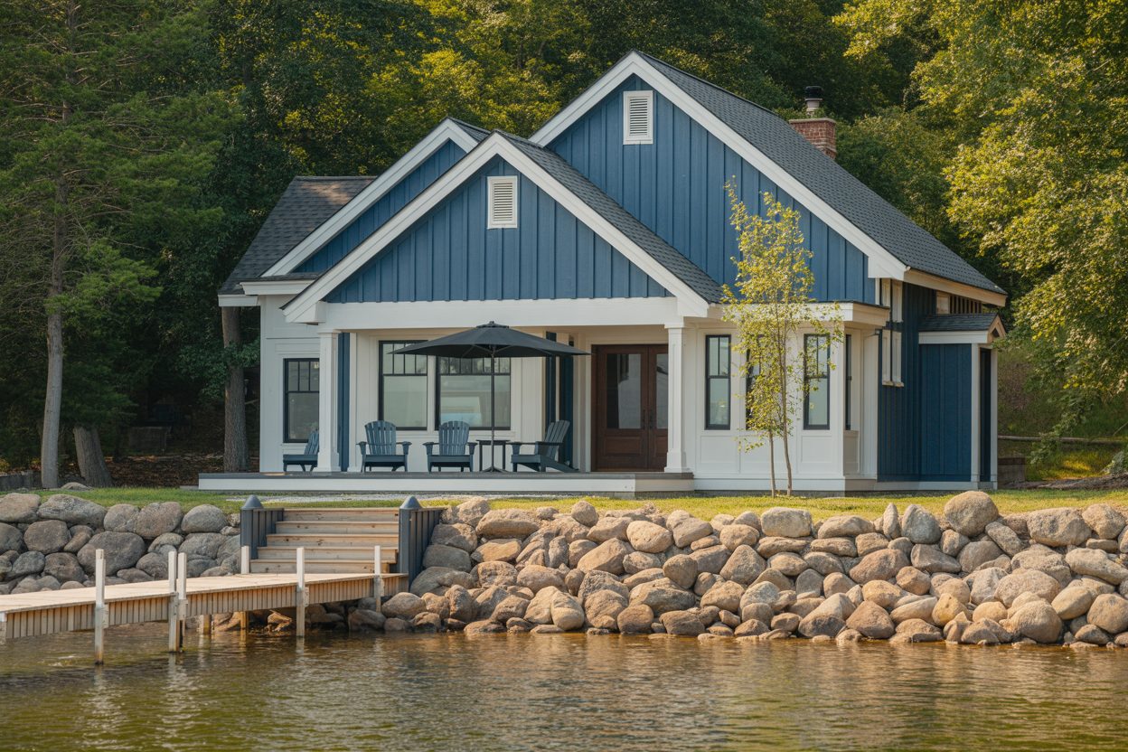
I’ve walked up to hundreds of lake houses—some made me stop in my tracks, and others just… blended in. And not in a good way. The color you choose for your lake house isn’t just about what looks pretty. It’s how the place feels when you come down that gravel road after a long week.
It’s the backdrop to your summer photos, the tone of your family weekends, and honestly, it’s the first thing anyone notices—even before they step onto the porch.
Nature sets the tone—and you don’t want to fight it
A lake house lives in nature. There’s sky, water, trees, rock, dirt. If your exterior color doesn’t play nicely with those elements, it can feel jarring. But if you get it right? That house suddenly feels like it belongs. I’ve seen even small cottages look like million-dollar retreats just because the color hit that balance.
housekeepingbay.com
First impressions stick
Sherwin-Williams did a study that showed 62% of people say the exterior color of a home influences their opinion of its value
So yes, that dusty beige from 2002 might still technically match the trim… but it could also be dragging down the whole look.
Every home has its own “yes” color
I remember working on a cedar-sided lake house a few years back. The owners wanted navy blue. Beautiful in theory, but once we tried a few samples, the dark blue clashed with the green water reflection and just looked cold. We switched to a gray-green tone—Sherwin-Williams Escape Gray—and instantly the whole place felt calm and tucked into its setting. Like it had always been there.
That’s what we’re aiming for.
My Go-To Tips Before Choosing a Paint Color
Before anyone picks up a brush—or even samples a swatch—there are a few key things I always think about. Choosing the right color for a lake house is different from picking one for a city home or a suburban ranch. You’re working with trees, water reflections, morning fog, sunsets, and sometimes, old materials like stone or wood siding. All of that matters.
Here’s how I approach it every time:
1. Start With the Landscape
Look around. Is your house near evergreens? Tall grass? Is the lake bright and open, or dark and still? These things change how colors look. A sandy shoreline feels different than rocky terrain.
👉 If there’s a lot of green outside, stay away from strong greens—they can blend too much.
👉 If your lake reflects a lot of blue, warm neutrals will create a softer balance.
2. Know Your Light
Lake houses often sit under lots of sky and trees. That mix of shade and direct sun can completely change a paint color. A beige might look soft in shade and straight-up yellow in sun. Always test outside!
“Lighting, more than anything, alters how we perceive color. That’s why we recommend exterior testing before making a final decision.”— Sue Wadden, Director of Color Marketing at Sherwin-Williams
3. Honor the Architecture
Some lake homes have a cozy cabin vibe. Others are clean-lined and modern. The shape of your house helps guide what feels “right.” For example:
- A-frames or rustic cabins usually look great in earthy, weathered colors.
- Modern lake homes lean toward crisp whites, sharp blacks, or muted grays.
I had a client with a sharp-edged home who wanted a barn red. It clashed hard. We switched to Sherwin-Williams Iron Ore and suddenly the whole place felt intentional and sharp, not awkward.
4. Think Trim and Roof Together
Don’t just choose the main color. Think about the trim, porch railings, shutters, and the roof too. A charcoal roof needs different companions than a faded green one. It’s like putting together an outfit—you don’t wear five bold pieces all at once.
Quick Checklist Before You Pick
✔️ Is your home mostly shaded or in direct sun?
✔️ What’s the roof color? Will it stay the same?
✔️ Are you keeping or changing your trim color?
✔️ What colors show up naturally in your view (trees, water, rocks)?
✔️ What emotion do you want: cozy, bright, peaceful, modern?
Earthy and Natural Tones
These colors are perfect when your home sits among trees, rocks, and natural shoreline. They work beautifully on cabins, cedar-sided homes, and houses with a rustic or traditional shape.
- Svelte Sage (SW 6164)
A soft, warm green with gray undertones. It’s calm, not flashy. Feels like moss on stone. - Dried Thyme (SW 6186)
A deeper olive green. I’ve used this on a home with lots of pine trees—it melted into the background in the best way. - Coastal Plain (SW 6192)
A lighter green-gray. Great when you want something airy but not plain. - Retreat (SW 6207)
Mid-tone with a quiet vibe. Not quite green, not quite gray. Perfect for cedar trim. - Urbane Bronze (SW 7048)
2021 Color of the Year for a reason. It’s moody, dark, earthy. Looks stunning with stone foundations. - Hardware (SW 6172)
A muted brown-gray. Classic and rugged, especially for board-and-batten exteriors. - Rookwood Dark Green (SW 2816)
Feels like a deep forest. Best for bold homeowners with lots of natural shade.

housekeepingbay.com
Cool and Coastal Blues
These shades work if your lake house has big sky views or modern lines. They play off the water and make the house feel crisp and fresh.
- Naval (SW 6244)
A classic navy. Bold, but not harsh. I like it with bright white trim or light stonework. - Smoky Azurite (SW 9148)
Kind of a stormy lake color. Deeper and more complex than it looks on the chip. - Jubilee (SW 6248)
Blue with a hint of silver. Works great with metal roofs or black windows. - Sleepy Blue (SW 6225)
Peaceful and pale. If your lake view is always misty, this feels just right. - Daphne (SW 9151)
Not too bright, not too dull. Just enough color to give life without taking over. - Distance (SW 6243)
Cool blue-gray. I’ve used this when clients want a modern feel but still some softness.14. Bracing Blue (SW 6242)
Rich and strong. I like it on shingle-style homes with white framing.

Warm Neutrals and Greige
These shades bring in warmth without being boring. Ideal for homes that face west (get that strong sunset light) or sit close to the ground.
- Accessible Beige (SW 7036)
This color is famous for a reason. It’s never too yellow or too gray. Plays well with everything. - Kilim Beige (SW 6106)
A little more warmth than Accessible Beige. I’ve used it with red brick accents and it works well. - Shiitake (SW 9173)
Earthy and grounded. Works better than stark gray in most outdoor light. - Nomadic Desert (SW 6107)
Soft tan that looks clean without being bright. Really nice with dark trim. - Canvas Tan (SW 7531)
Barely there but still reads as “color.” Easy and safe, but never dull. - Perfect Greige (SW 6073)
Exactly what it sounds like—when you can’t decide between beige and gray. - Loggia (SW 7506)
More taupe, less yellow. I used this on a lakeside duplex with black shutters and it looked great.
Classic Whites and Soft Grays
Timeless and clean. If you like a Cape Cod or farmhouse feel, or want something that will never feel outdated, start here.
- Alabaster (SW 7008)
Soft, creamy white. Sherwin-Williams Color of the Year in 2016. Still one of my go-tos. - Greek Villa (SW 7551)
A tiny bit warmer than Alabaster. Looks amazing in full sun. - 24. Snowbound (SW 7004)
Bright, crisp white with a modern edge. Works on minimalist-style homes. - Repose Gray (SW 7015)
A perfect soft gray. Not cold, not green, just a good balance. - Agreeable Gray (SW 7029)
The most popular Sherwin-Williams color for a reason. It’s safe, flexible, and great on large exteriors. - Mindful Gray (SW 7016)
A little deeper than Agreeable Gray. Looks good against wood and stone accents. - Eider White (SW 7014)
Looks white inside, but outside reads as soft gray. I like it for trim too.
Housekeepingbay.com
Bold and Unexpected Choices
Sometimes, you want something a little different. These colors are for the brave—or for homes that need to stand out just a bit.
- Iron Ore (SW 7069)
Charcoal with depth. So bold on the right house—especially with natural wood doors.30. Redend Point (SW 9081)
2023 Color of the Year. A soft clay blush that feels cozy and artistic. Better on cottages than big homes.31. Tricorn Black (SW 6258)
Yes, black. On a lake house, with white trim or raw wood? Absolutely stunning.
What Works Best Where
Choosing a color is only half the story. The materials on your home—your siding, roof, stonework, and trim—change how those colors look and feel. I’ve seen great colors fall flat because they clashed with the roof or didn’t pop off the siding. Here’s how I think about pairing colors with what’s already on your house.
Wood Siding (Cedar, Pine, or Stained Planks)
Wood has warmth. Whether it’s aged gray or golden-toned, it gives a natural richness. You want your paint color to balance that without fighting it.
Good pairs:
- Svelte Sage
- Retreat
- Iron Ore (as trim)
- Greek Villa (for a fresh contrast)
Tip: If your wood is weathered, avoid cool grays—they can make the house feel washed out.
Stone or Brick Accents
Stone can be gray, tan, or even pinkish—check the undertones first. You want a paint color that ties into the natural shades in the stone.
Good pairs:
- Urbane Bronze (with brown or dark stone)
- Mindful Gray (with mixed stone)
- Kilim Beige (with red-toned brick)
- Alabaster (to lighten things up)
Tip: Don’t try to “match” stone exactly. Find a tone that supports it instead.
Board and Batten or Lap Siding (Fiber Cement, Composite, or Painted Wood)
These clean siding styles offer flexibility. You can go bold or keep it simple.
Good pairs:
- Naval
- Accessible Beige
- Snowbound
- Tricorn Black (for a modern farmhouse)
Tip: If your house has strong lines or tall gables, bold colors work better than you’d expect.
Roof Color Matters More Than You Think
The roof is hard to change—and it covers a huge area. Here’s a quick guide:
- Charcoal or black roofs: Work with almost anything. Great with grays, whites, navy, or beige.
- Brown or warm red roofs: Better with warmer neutrals or earthy greens.
- Greenish or faded composite shingles: Go with muted colors like Retreat, Coastal Plain, or Nomadic Desert.
Tip: Always sample your color under the eaves and next to the roofline. That’s where they meet, and it changes how your eyes read the color.
Trim, Shutters & Details
When I help clients choose a house color, we always decide trim together. Here are a few combos I love:
- Alabaster with Iron Ore trim – Soft white with bold contrast
- Retreat with Greek Villa trim – Earthy and welcoming
- Jubilee with Snowbound trim – Cool and clean
- Dried Thyme with Accessible Beige trim – Natural and balanced
- Tricorn Black with natural wood doors – Modern and dramatic
What Makes a Lake House Feel Just Right
I’ve worked with families, retirees, weekenders, and even first-time homeowners on lake houses—and I can tell you, it’s never just about the color. It’s about how you want to feel when you pull into the driveway. It’s about looking at your house from the dock and feeling proud. It’s about knowing you chose something that fits the land, the light, and the life you live there.
Your lake house doesn’t need to shout. It just needs to feel like it belongs. When the color works with the surroundings—when it brings out the beauty in your siding, roof, trees, and water—that’s when it feels right.
Here’s My Final Advice:
- Don’t rush it. Take your time to sample and stand back.
- Let nature help you decide—look at what’s already around you.
- Think about how you want the home to feel, not just how it looks.
- And trust your gut. If you smile every time you see the sample, that’s your answer.
I’ve seen Accessible Beige feel like a hug, and Iron Ore give a house the boldness it needed. I’ve seen Greek Villa reflect the morning sun like cream, and Retreat melt into a wooded backdrop like it was grown there.
Paint is powerful. It’s simple, but it changes everything. If you’re standing in front of a wall of swatches and feeling overwhelmed—just know, you’re not alone. But you can get it right. And when you do? Your lake house will feel like home—before you even open the door.
housekeepingbay.com
