In the Navy SW 9178 by Sherwin Williams
Embrace the Depths of Sophistication
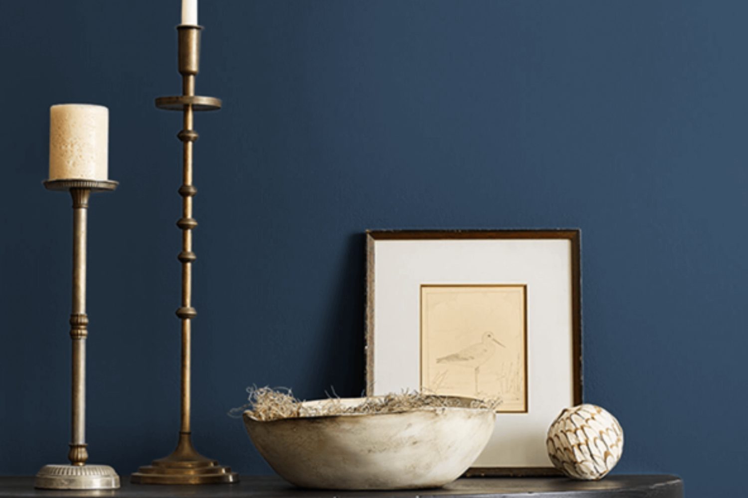
When you’re looking to transform your space with a touch of sophistication, SW 9178 In the Navy by Sherwin Williams is an excellent choice. This color isn’t just any ordinary shade of blue. It’s a rich, deep navy that carries with it an air of elegance and refinement. Imagine the serene depth of the ocean or the vastness of a starlit night sky – that’s the essence of In the Navy. It’s a color that can easily become the focal point of any room, adding both drama and a sense of calm.
Whether you want to create a striking feature wall in your living room, add depth to your bedroom, or even give your kitchen cabinets a luxurious makeover, In the Navy is versatile enough to fit a variety of spaces and styles. Its deep hue pairs beautifully with neutral tones for a classic look, or can be mixed with bright colors for a more dynamic and contemporary vibe. Plus, since it’s a darker shade, it does wonders in hiding imperfections on your walls, making it not just a stylish, but also a practical choice for your next home decorating project.
So, if you’re thinking of giving your space a refresh and want to make a bold statement, SW 9178 In the Navy by Sherwin Williams might just be the perfect color to start with. Its timeless elegance will surely transform and elevate your home.
by sherwin williams
What Color Is In the Navy SW 9178 by Sherwin Williams?
In the Navy SW 9178 by Sherwin Williams is a rich, deep blue hue that adds a sophisticated and bold touch to any space. This dark navy color has a timeless quality, making it perfect for a variety of interior styles, from classic to modern, nautical themes to minimalist designs. It’s a versatile color that can create a striking contrast when paired with light colors like whites or creams, giving a space a fresh and dynamic look.
When it comes to integrating In the Navy into interior designs, it works particularly well in living rooms, bedrooms, and even bathrooms, offering a cozy, secure feeling. This color shines when combined with a range of materials and textures. For a luxurious feel, pairing it with metallic accents like gold or brass can add warmth and elegance. With natural wood, In the Navy brings out the earthy tones of the wood, creating a grounded and comforting atmosphere.
Textures also play a big role in complementing this deep navy. Soft, plush fabrics in lighter colors can create a cozy and inviting look, while sleek and smooth surfaces, such as glass or polished metal, can enhance a modern aesthetic. Incorporating this color into an interior style adds depth and interest, making the space more inviting and visually appealing.
housekeepingbay.com
Is In the Navy SW 9178 by Sherwin Williams Warm or Cool color?
In the Navy SW 9178 by Sherwin Williams is a rich, dark blue paint color that brings a sense of sophistication and depth to any room it’s used in. It has a nautical vibe that’s both modern and timeless, making it incredibly versatile for home decoration. This color works well in a variety of settings, from creating a cozy, serene bedroom to adding a bold statement in a dining area or living room. It pairs beautifully with a wide range of colors, from bright whites and soft grays to warm woods and metallic accents, offering endless possibilities for designing your space.
Using In the Navy in your home can dramatically change the atmosphere of a room. It has the power to make large, open spaces feel more intimate and cozy, while also giving smaller rooms a touch of elegance and depth.
Because of its dark hue, it’s important to balance it with lighter colors or natural light to ensure the space doesn’t feel too closed in. Whether you’re aiming for a calm retreat or a dynamic focal point, In the Navy SW 9178 can be the perfect choice to enhance your home’s aesthetics.
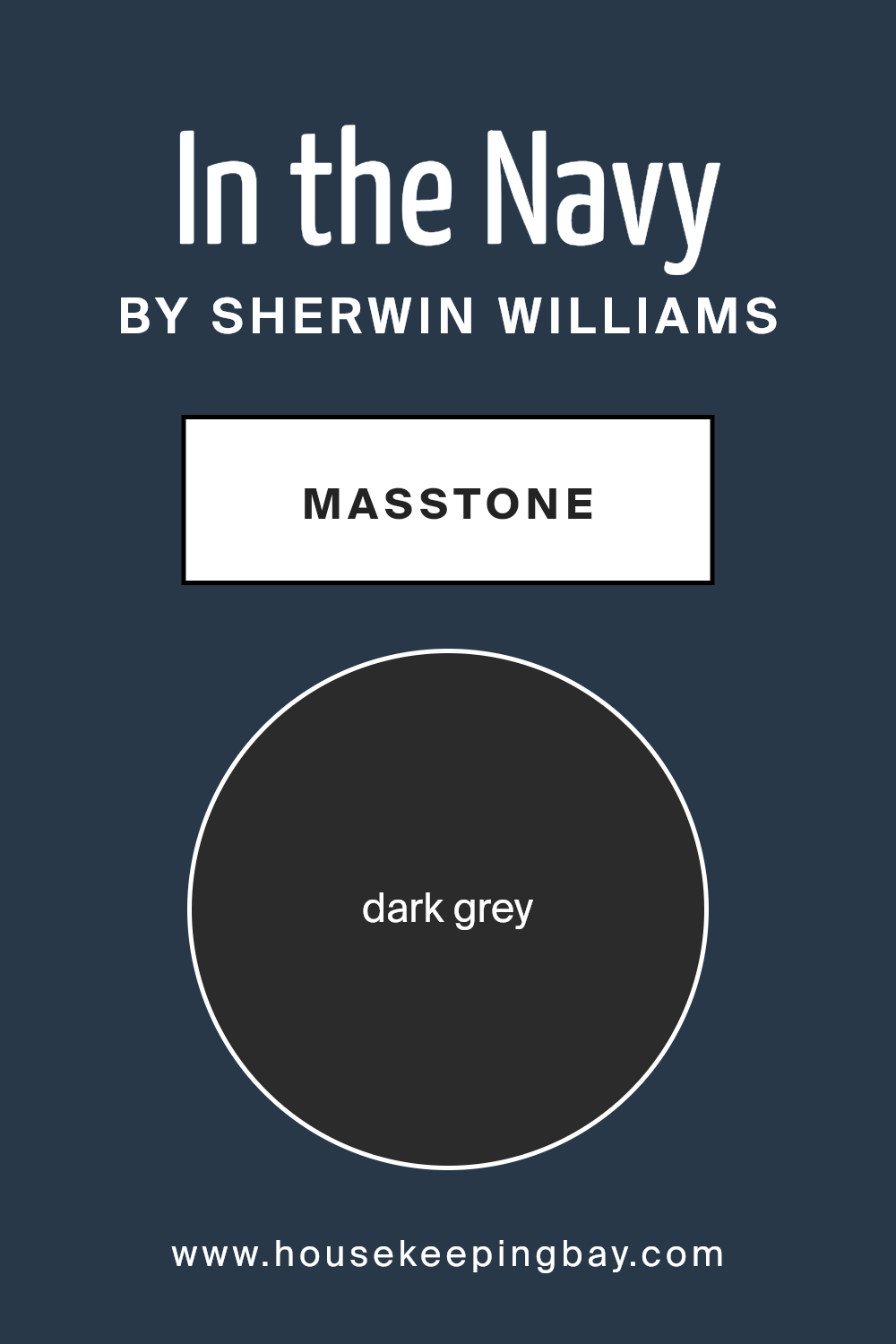
What is the Masstone of the In the Navy SW 9178 by Sherwin Williams?
In the Navy by Sherwin Williams (SW 9178) has a masstone of dark grey, with the specific shade being very close to a color you could call almost black (#2B2B2B). This unique color quality influences how it’s used in homes to create a striking impact. Since it’s not your typical navy blue at first glance, it brings a deeper, more grounding effect to spaces. It’s the kind of color that can make rooms feel cozy and well-defined without making them seem smaller or too dark.
When used in homes, In the Navy can work wonderfully as an accent wall or on cabinetry, providing a sophisticated backdrop that pairs nicely with brighter colors or different shades of wood, making the space feel more inviting and rich. Because it’s a dark grey masstone, it’s really flexible and can be matched easily with many different decor styles and colors, from modern to traditional.
This quality makes it an excellent choice for those looking to add a bit of drama and elegance to their home without overwhelming it with too bold a color.
housekeepingbay.com
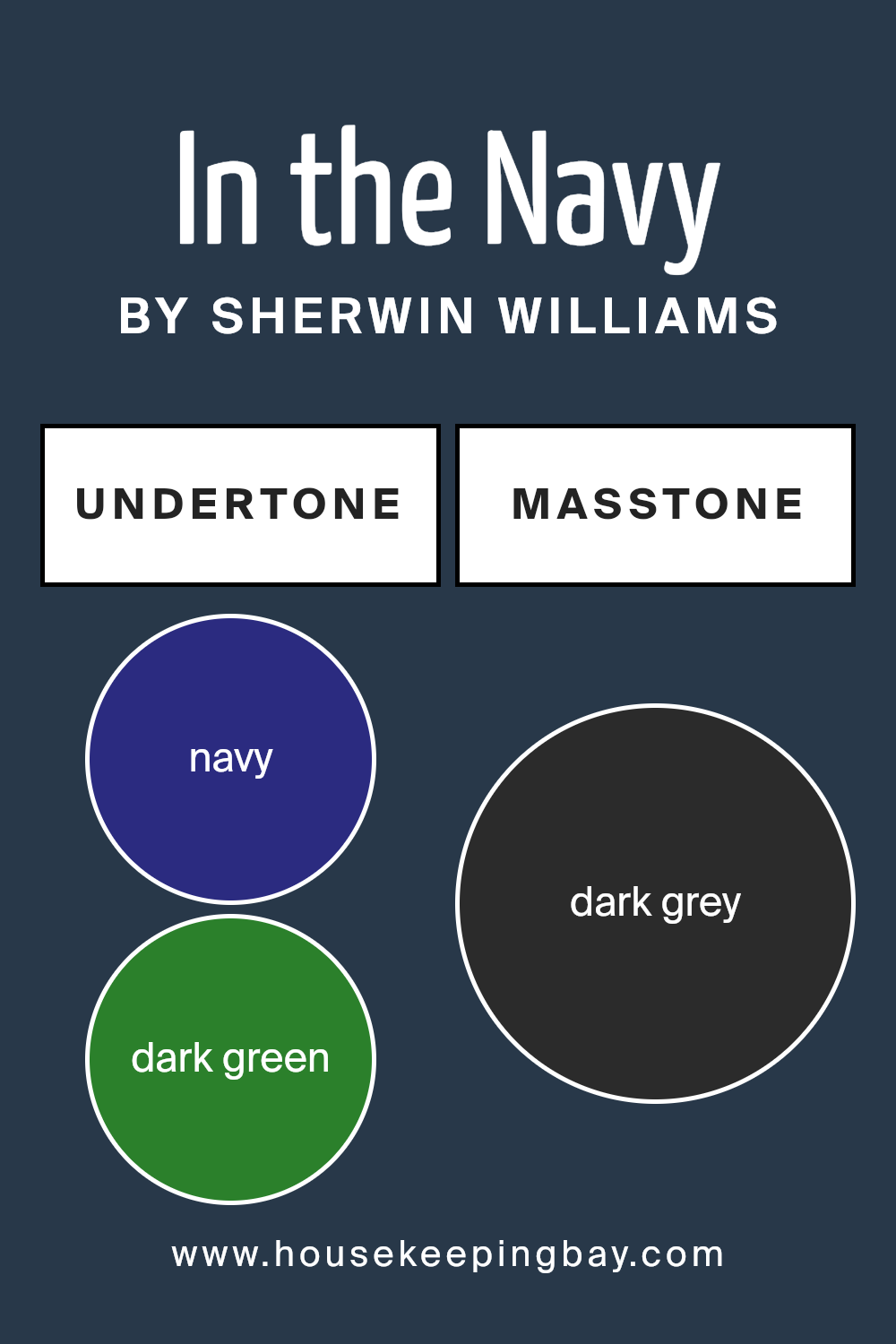
Undertones of In the Navy SW 9178 by Sherwin Williams
In the Navy SW 9178 by Sherwin Williams is not just a simple navy color. It has a mix of undertones, making it unique and versatile. The undertones in this color include navy, dark green, dark turquoise, brown, purple, olive, and grey. These undertones are like hidden colors that can pop up under different lighting situations, affecting how we perceive the main color.
When we look at colors, the undertones play a big role. They can make a color feel warmer or cooler, and even change how it looks next to other colors. So, even though In the Navy looks like a deep blue, the undertones can make it shift. For example, in bright sunlight, the dark turquoise might stand out, giving the paint a cooler vibe. In a room with less light, the brown or olive might come through, making the color feel warmer.
On interior walls, these undertones of In the Navy can really affect the mood of a room. The dark green and dark turquoise can give a calming, ocean-like feel, while the brown and olive can make a space feel cozy and grounded. The purple undertone can add a touch of mystery and luxury. This makes In the Navy a versatile choice for walls, as it can blend well with many different decor styles and preferences.
Remember, the actual lighting in your room will greatly influence which undertones stand out, making the color look slightly different in every space. This is why it’s always a good idea to test the color in your own space before painting your whole room.
housekeepingbay.com
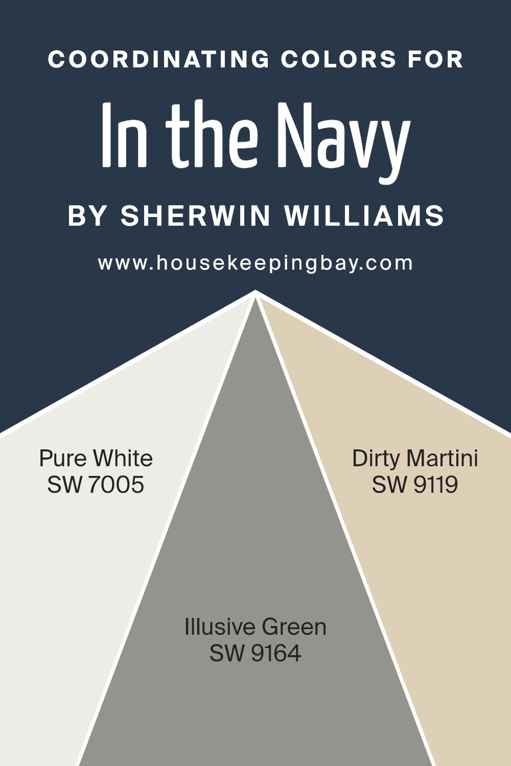
Coordinating Colors of In the Navy SW 9178 by Sherwin Williams
Coordinating colors are those that complement each other well and create a harmonious and balanced look when used together in a space. These colors are carefully selected to enhance the primary color, which in this case is the deep, rich hue of In the Navy SW 9178 by Sherwin Williams. This selection process ensures that each shade supports and accentuates the main color, adding depth and character to the overall design.
The idea is to choose colors that either contrast or complement the main hue in such a way that they bring out its best features without overshadowing it.
- For In the Navy SW 9178, a strikingly deep blue, there are three coordinating colors that work beautifully with it.
- Pure White SW 7005 offers a clean and crisp contrast that can make the navy pop, providing a refreshing clarity that balances the depth of the navy.
- Illusive Green SW 9164, with its subtle and soothing tones, adds a natural and serene feel when paired with the navy, promoting a sense of calm and relaxation.
- Dirty Martini SW 9119, a unique and earthy green, lends an organic and grounded element to the palette, creating a sophisticated look when combined with the navy.
These coordinating colors, when used together, offer a layered and cohesive look that enhances the overall aesthetic of the space.
You can see recommended paint colors below:
- SW 7005 Pure White
- SW 9164 Illusive Green
- SW 9119 Dirty Martini
housekeepingbay.com
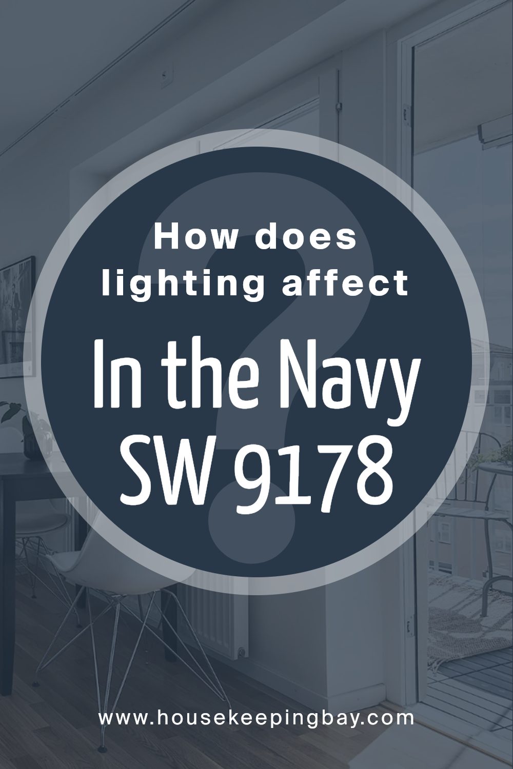
How Does Lighting Affect In the Navy SW 9178 by Sherwin Williams?
Lighting plays a huge part in how we see colors. It can make colors look brighter, darker, or even change their hue slightly. Sherwin Williams’ In the Navy SW 9178 is a beautiful, deep blue color that can look different depending on the light it’s under.
In artificial light, such as from bulbs inside your home, In the Navy might appear richer and more profound. This is because most indoor lighting has a warm tone, making the blue feel cozier and more intense. It’s a great choice for spaces where you want depth and sophistication.
In natural light, however, the color can look a bit brighter and more vibrant. Natural light, especially direct sunlight, reveals the true color. So, in a room with lots of windows and sunlight, In the Navy will have a lively, dynamic quality.
Now, the direction your room faces affects the natural light it gets and how this color will look:
- North-faced rooms don’t get a lot of direct sunlight, making In the Navy appear more muted and subtle. It gives off a calm and serene vibe, perfect for creating a peaceful space.
- South-faced rooms get a lot of sun, making In the Navy appear brighter and more vibrant. It can add a lively, energetic feel to the room, especially during the day when the light is strongest.
- East-faced rooms have the most sunlight in the morning. Here, In the Navy will start the day looking bright and fresh, then gradually become more subdued as the day goes on. It’s nice for spaces used mostly in the morning.
- West-faced rooms get afternoon and evening light. In the Navy will look softer in the morning and then gain intensity as the day progresses. This is great for rooms used more in the afternoon or evening.
Overall, lighting can significantly affect how In the Navy and any color looks in a space, changing its mood and energy throughout the day.
housekeepingbay.com
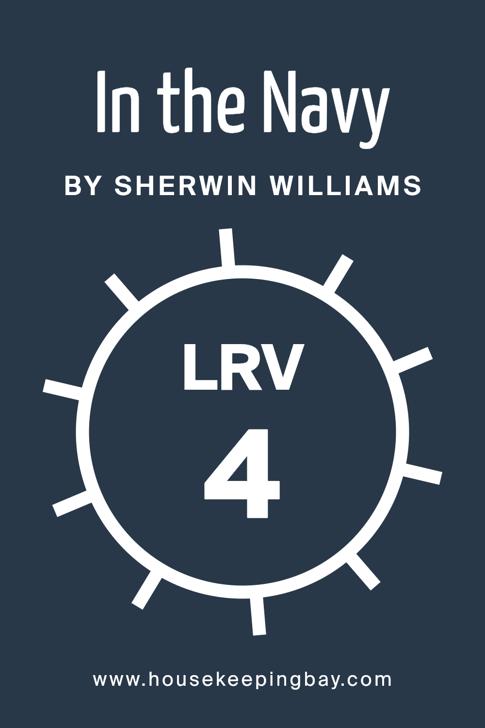
What is the LRV of In the Navy SW 9178 by Sherwin Williams?
LRV stands for Light Reflectance Value, and it’s a number that tells you how much light a color reflects or absorbs. This number ranges from 0 to 100, with 0 being pure black (which absorbs all light) and 100 being pure white (reflecting all light). The higher the LRV number, the more light a color will reflect and the brighter and more open a space will feel. Conversely, colors with lower LRVs absorb more light, making spaces feel cozier but potentially darker and smaller.
With an LRV of 3.712, In the Navy SW 9178 by Sherwin Williams is on the very low end of the scale, meaning it’s a very dark color that doesn’t reflect much light. In a room, this means it will absorb most of the light rather than reflecting it, contributing to a much moodier, more intimate atmosphere.
Due to its low LRV, using this color on the walls can dramatically transform a space, making it feel closer and more enclosed. It’s important to consider the amount of natural and artificial light in your room when using a color with such a low LRV, as it can significantly affect the overall ambiance and feel of your space.
housekeepingbay.com
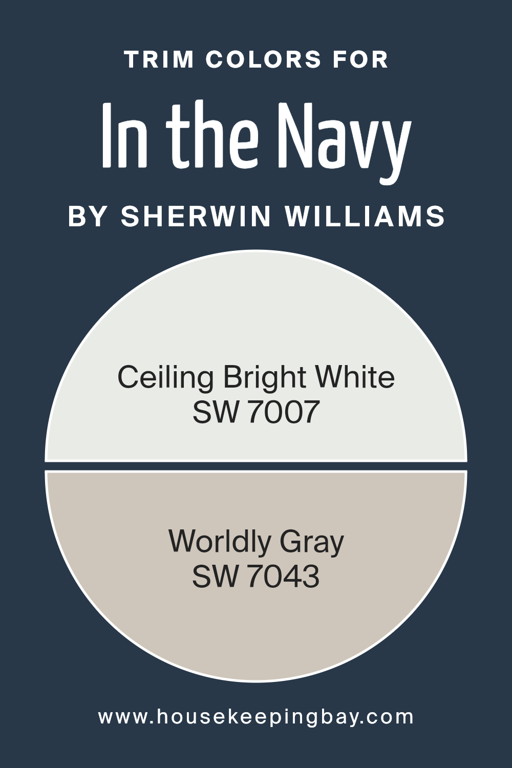
What are the Trim colors of In the Navy SW 9178 by Sherwin Williams?
Trim colors are those hues selected to accent or highlight architectural features, such as door frames, window sills, skirting boards, and crown moldings, contrasting with or complementing the primary wall color. They play a crucial role in enhancing the visual appeal and overall ambiance of a space. Specifically, for a rich, deep shade like In the Navy SW 9178 by Sherwin-Williams, choosing the right trim colors is essential to create a balanced, polished look. Trim colors can either subtly frame the navy walls to amplify their elegance or gently offset the strong character of such a dark shade, ensuring the room feels inviting rather than overwhelming.
Using SW 7007 – Ceiling Bright White as a trim color provides a crisp, clean edge that can make the navy walls stand out strikingly, giving the room a fresh and airy feel. Ceiling Bright White is a pure, luminous shade that brings a sense of spaciousness and light to any area, making it particularly suitable for rooms aiming for a sharp, sophisticated contrast.
On the other hand, SW 7043 – Worldly Gray offers a softer, more subtle option for trim, complementing In the Navy with its warm, adaptable grey tone. Worldly Gray softly frames the navy, adding depth and warmth to the space without stealing the spotlight, fostering a cozy yet refined atmosphere. Together, these trim color choices provide versatile options to either brighten or subtly complement a space dominated by In the NavySW 9178, catering to different styles and preferences.
You can see recommended paint colors below:
housekeepingbay.com
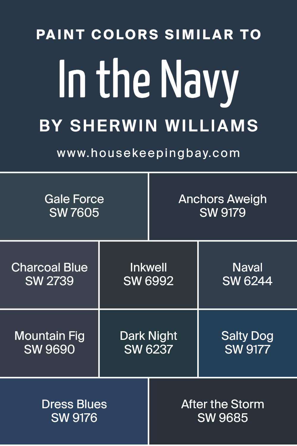
Colors Similar to In the Navy SW 9178 by Sherwin Williams
Similar colors play a crucial role in design and aesthetics by creating harmony and coherence in spaces. When colors closely resemble each other, as seen with variations of deep blues and striking charcoals, they allow for a seamless blend within a palette, fostering a sense of continuity and elegance. For instance, colors like In the Navy by Sherwin Williams and its counterparts, such as Gale Force and Anchors Aweigh, work beautifully together due to their shared undertones and intensity. Gale Force brings a stormy depth, adding drama without overwhelming, while Anchors Aweigh offers a solid, classic navy tone that grounds spaces with its robust character.
Further down the spectrum, Charcoal Blue and Inkwell introduce a cooler, softer edge, perfect for adding a sophisticated layer to interiors without sacrificing warmth. Naval stands out as a slightly brighter hue, offering a refreshing breath of air among deeper tones, infusing spaces with a sense of openness.
Similarly, Mountain Fig, Dark Night, Salty Dog, Dress Blues, and After the Storm extend this palette’s versatility, ranging from the moody allure of a twilight sky to the peaceful calm of a dusky evening. Each color, with its unique blend, contributes to a dynamic yet cohesive collection that allows for creative expression and tailored aesthetics within any home or project. This harmonious dance between shades establishes a visually appealing environment, making similar colors an essential tool in the world of design.
You can see recommended paint colors below:
- SW 7605 Gale Force
- SW 9179 Anchors Aweigh
- SW 2739 Charcoal Blue
- SW 6992 Inkwell
- SW 6244 Naval
- SW 9690 Mountain Fig
- SW 6237 Dark Night
- SW 9177 Salty Dog
- SW 9176 Dress Blues
- SW 9685 After the Storm
housekeepingbay.com
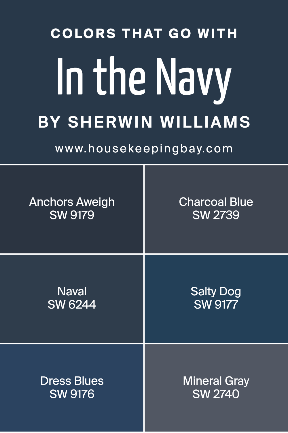
Colors that Go With In the Navy SW 9178 by Sherwin Williams
Colors that harmonize with In the Navy SW 9178 by Sherwin Williams are crucial because they help create a cohesive and aesthetically pleasing palette in any space. These coordinating colors, including Anchors Aweigh, Charcoal Blue, Naval, Salty Dog, Dress Blues, and Mineral Gray, all have unique qualities that contribute to a balanced and harmonious look when paired with the deep, rich blue of In the Navy. This coordination ensures that the deep blue does not overpower a room but instead, is complemented and enriched by these additional shades.
Anchors Aweigh is a slightly lighter navy that provides a subtle contrast, perfect for creating a serene and calming environment. Charcoal Blue has a touch of gray, offering a softer option for those looking to add a bit of lightness to their space. Naval is another strong blue that shares a similar depth with In the Navy, allowing for a monochromatic scheme that’s both sophisticated and inviting.
Salty Dog brings in a hint of vibrancy, leaning towards a more pronounced blue, which can add a dynamic edge to your palette. Dress Blues is close to the foundational hue of In the Navy, working well for a seamless look, ideal for creating depth and interest. Lastly, Mineral Gray acts as a neutral balance, grounding the blues and ensuring the space feels not only coordinated but also welcoming and warm. Together, these colors work in harmony to enhance the beauty and depth of In the Navy, making any design project look professional and well-thought-out.
You can see recommended paint colors below:
- SW 9179 Anchors Aweigh
- SW 2739 Charcoal Blue
- SW 6244 Naval
- SW 9177 Salty Dog
- SW 9176 Dress Blues
- SW 2740 Mineral Gray
housekeepingbay.com
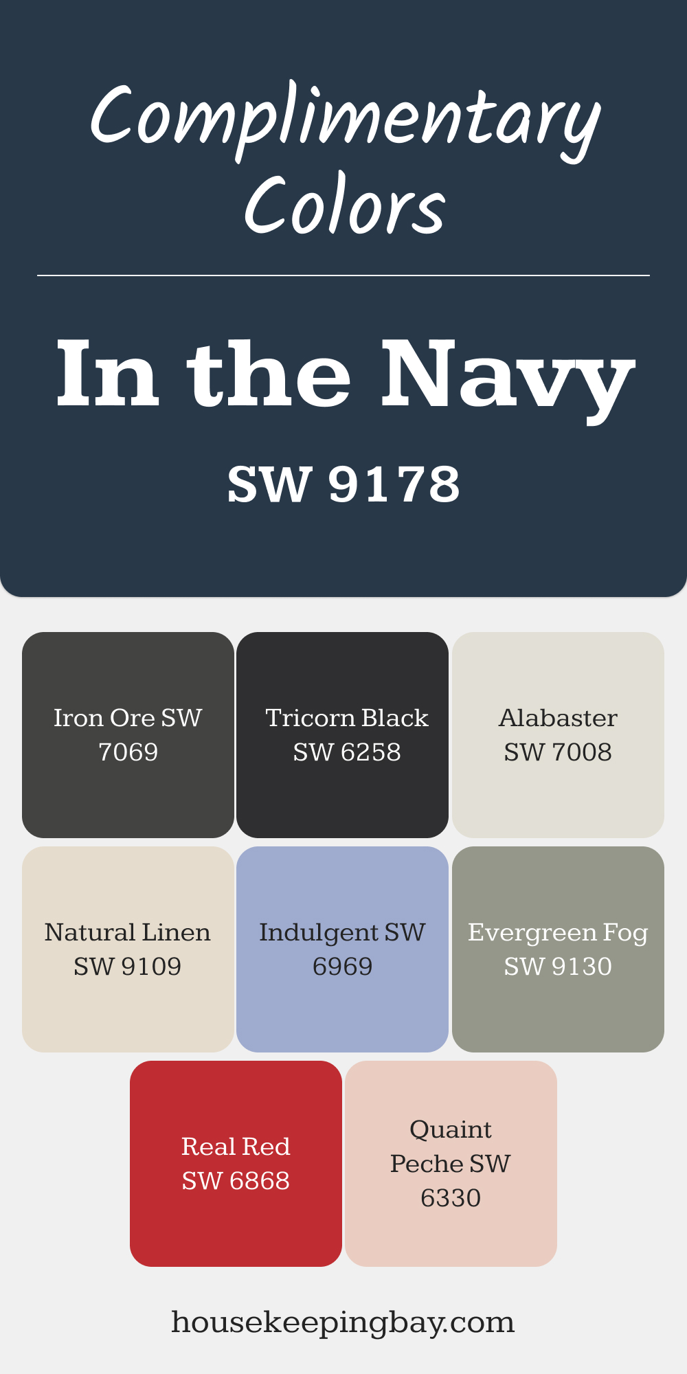
Complimentary Colors for In the Navy SW 9178 Paint Color by Sherwin Williams
In the Navy SW 9178 pairs perfectly with soft neutrals like Alabaster and Natural Linen, creating a peaceful balance. Iron Ore adds depth, making a bold statement alongside this rich navy. For a bit of vibrancy, Real Red and Quaint Peche bring energetic pops of color that contrast beautifully with the deep blue.
Evergreen Fog and Tricorn Black provide sophisticated contrasts to In the Navy, offering a stylish balance between light and dark. Meanwhile, Indulgent brings warmth, blending seamlessly into the overall palette.
These complementary colors work together to enhance the beauty of In the Navy, perfect for any space looking for a layered, inviting look.
via housekeepingbay.com
How to Use In the Navy SW 9178 by Sherwin Williams In Your Home?
In the Navy SW 9178 by Sherwin Williams is a rich and bold paint color. It’s a shade of blue that’s deep and strong, a bit like the sea at night. It’s the kind of color that can make a statement in your home. You can use it in many ways. One idea is to paint one wall with it in a room, creating what’s called an accent wall. This can make the room look more interesting without overwhelming it. It works really well in living rooms or bedrooms, adding a cozy and stylish touch.
If you’re feeling a bit more adventurous, you could paint your kitchen cabinets with In the Navy. It’s a unique choice that can make your kitchen stand out. Just be sure to balance it with lighter colors in other parts of the room, like the walls or backsplash, to keep things bright.
In the Navy is also great for furniture. You could paint a bookshelf or a side table with it. This adds a pop of color and personal touch to your space.
In general, this color brings a sense of calmness and strength to a home. It works well with many styles, from modern to rustic. Plus, it’s easy to find accents and decorations to match.
In the Navy SW 9178 by Sherwin Williams vs Anchors Aweigh SW 9179 by Sherwin Williams
In the Navy SW 9178 and Anchors Aweigh SW 9179, both by Sherwin Williams, are quite similar at first glance, but they have subtle differences that set them apart. In the Navy is a rich, deep blue that feels strong and stable. It’s a color that would beautifully coat a room, bringing a sense of calmness and steadiness. It’s like gazing at the deep ocean – vast and serene.
On the other hand, Anchors Aweigh is a shade darker. This color leans more towards the charcoal side, giving it a more intense and slightly mysterious vibe. It’s a color that commands attention, making it perfect for accent walls or furniture, adding depth and drama to any space.
Both colors are beautiful and carry the essence of the sea and the night sky, but while In the Navy brings a peaceful serenity, Anchors Aweigh adds a bold, mysterious touch. Choosing between them depends on the atmosphere you’re aiming to create – a tranquil retreat or a statement space.
You can see recommended paint color below:
- SW 9179 Anchors Aweigh
housekeepingbay.com
In the Navy SW 9178 by Sherwin Williams vs Mountain Fig SW 9690 by Sherwin Williams
In the Navy SW 9178 and Mountain Fig SW 9690 are both colors by Sherwin Williams, offering unique vibes. In the Navy is a strong, deep blue color that brings to mind the vastness of the ocean at night. It’s a rich shade that can make any space feel more sophisticated and anchored. On the other hand, Mountain Fig is a warm, cozy purple with a touch of earthiness, reminiscent of natural landscapes and tranquil sunsets.
While In the Navy leans towards a classic, timeless elegance, Mountain Fig offers a softer, welcoming atmosphere that’s perfect for creating a relaxing retreat. Both colors are beautiful in their own right, but they cater to different moods and settings. “In the Navy” is great for a bold, statement look, whereas Mountain Fig is ideal for a gentler, more soothing ambiance.
You can see recommended paint color below:
- SW 9690 Mountain Fig
housekeepingbay.com
In the Navy SW 9178 by Sherwin Williams vs Dress Blues SW 9176 by Sherwin Williams
In the Navy SW 9178 and Dress Blues SW 9176 by Sherwin Williams are both dark shades, but they have their unique vibes. In the Navy is the darker one of the two, giving off a strong and solid feel. It’s perfect for someone looking to add a bold statement to their space. It has a deep blue hue that makes you think of the night sky just before it turns completely dark.
Dress Blues, on the other hand, is slightly lighter. It carries a more traditional blue color, reminding you of classic navy uniforms. It’s still bold but has a fresher feel compared to In the Navy. This color can brighten up a room while keeping that feel of seriousness and tradition.
Both colors are great for creating a feeling of stability and depth in a space. Whether you choose In the Navy or Dress Blues depends on how dark you want to go and what kind of atmosphere you’re looking to create.
You can see recommended paint color below:
- SW 9176 Dress Blues
housekeepingbay.com
In the Navy SW 9178 by Sherwin Williams vs Salty Dog SW 9177 by Sherwin Williams
In the Navy SW 9178 and Salty Dog SW 9177 by Sherwin Williams are both strong, striking colors, but they have distinct tones that set them apart. “In the Navy” is a deep, classic navy blue. It’s very close to what you’d picture as the true essence of navy: dark, rich, and perfect for creating a cozy, profound space or an elegant, sophisticated vibe. On the other hand, Salty Dog leans a bit more adventurous. It’s also a navy, but with a noticeable brightness that gives it a slightly more energetic personality.
This vibrant twist makes Salty Dog ideal for spaces where you want a bold color but with a hint of cheerfulness. Although both shades are rooted in navy blue, In the Navy offers a more traditional, serene backdrop, whereas Salty Dog brings a peppy, spirited character into the room. Choosing between them depends on whether you’re aiming for a more classic elegance or a lively, dynamic atmosphere.
You can see recommended paint color below:
- SW 9177 Salty Dog
housekeepingbay.com
In the Navy SW 9178 by Sherwin Williams vs Charcoal Blue SW 2739 by Sherwin Williams
The main color, In the Navy SW 9178 by Sherwin Williams, is a rich, dark navy blue that carries a sense of sophistication and strength. It’s a color that can easily anchor a room, providing a deep, solid background that makes lighter colors pop. On the other hand, Charcoal Blue SW 2739, also by Sherwin Williams, blends the coolness of blue with the muted tones of gray, resulting in a versatile shade that feels slightly lighter and softer than In the Navy.
While both colors share a blue base, making them somewhat similar, Charcoal Blue has a grayish tint that gives it a more subdued appearance compared to the deeper, more traditional blue hue of In the Navy. Each color offers unique possibilities for interior design: In the Navy is perfect for creating a bold, dramatic look, while Charcoal Blue is ideal for achieving a more relaxed, tranquil atmosphere.
You can see recommended paint color below:
- SW 2739 Charcoal Blue
housekeepingbay.com
In the Navy SW 9178 by Sherwin Williams vs After the Storm SW 9685 by Sherwin Williams
In the Navy SW 9178 and After the Storm SW 9685 by Sherwin Williams are two beautiful colors, each with its own unique vibe. In the Navy is a deep, rich blue. It’s like looking at the ocean at night – dark and mysterious, yet comforting. This color is perfect if you want to add a touch of sophistication and drama to your space.
After the Storm, on the other hand, is a softer, more muted blue. It carries the calmness of a sky clearing up after a rainstorm. This color has a peaceful, soothing quality to it, making it great for creating a relaxed and serene environment.
When comparing these two, In the Navy stands out as the bolder choice, likely to make a strong statement in a room. After the Storm is more subtle and understated, ideal for a background color that’s easy on the eyes. Both are beautiful in their own right, but your choice would depend on the mood you want to set in your space.
You can see recommended paint color below:
- SW 9685 After the Storm
housekeepingbay.com
In the Navy SW 9178 by Sherwin Williams vs Naval SW 6244 by Sherwin Williams
In the Navy SW 9178 and Naval SW 6244 by Sherwin Williams are both dark shades, but they offer unique vibes because of their subtle differences. Think about “In the Navy” as a really dark shade, almost leaning towards a very dark charcoal but with a hint of blue. It’s perfect for creating a cozy, sophisticated space without feeling too heavy.
On the other hand, Naval is also a dark blue, but it’s a bit brighter than In the Navy. It can give a rich, elegant feel to any room, making it stand out without being too overpowering. If you’re looking to bring a dark blue into your space but want it to have a bit more brightness, Naval is the way to go. However, if your aim is to go for that almost-black elegance, In the Navy is your color. Both are beautiful and would make a statement, it just depends on the mood you’re going for!
You can see recommended paint color below:
housekeepingbay.com
In the Navy SW 9178 by Sherwin Williams vs Gale Force SW 7605 by Sherwin Williams
Main color, In the Navy SW 9178, by Sherwin-Williams, is a dark, rich blue that looks like a clear night sky or the deep sea, making spaces feel cozy and sophisticated. It’s a color that can make big rooms feel more inviting or add a touch of drama to a small space without making it feel cramped.
On the other hand, Gale Force SW 7605, also by Sherwin-Williams, is a slightly lighter shade of blue with a touch of gray. Think of a stormy sea or a cloudy day – it’s moody and intense but has a softness to it due to the gray undertone. This color can bring a cool, serene vibe to a room, perfect for creating a retreat-like atmosphere.
Both colors are beautiful and bold, with In the Navy being a tad darker and more traditional blue, while Gale Force offers a hint of mystery and moodiness with its gray undertones. They can be used in different parts of the house depending on the feeling you want to bring into the space.
You can see recommended paint color below:
housekeepingbay.com
In the Navy SW 9178 by Sherwin Williams vs Inkwell SW 6992 by Sherwin Williams
In the Navy SW 9178 and Inkwell SW 6992 by Sherwin Williams are both dark hues, but they bring different feelings and looks to a space. In the Navy, as the name suggests, is a dark blue color. It’s like looking at the ocean at night, where the water meets the sky in the deep. This color has a sense of calmness and is perfect for creating a serene and sophisticated space.
Inkwell SW 6992, on the other hand, is a very dark, almost black color with a hint of blue. It’s like the color of the night sky in the countryside, where it’s so dark you can barely see the stars. Inkwell is bolder and makes a strong statement. It can make any room feel more grounded and profound.
Although both colors are dark and can be used to create a strong impact, In the Navy adds a touch of color and depth, making spaces feel cozy yet spacious. Inkwell, being closer to black, offers a dramatic and intense feeling, perfect for accent walls or furniture to add depth and intrigue to a room. Depending on the mood you want to set, each color has its unique charm and uses.
You can see recommended paint color below:
- SW 6992 Inkwell
housekeepingbay.com
In the Navy SW 9178 by Sherwin Williams vs Dark Night SW 6237 by Sherwin Williams
In the Navy SW 9178 by Sherwin-Williams is a classic, deep blue hue that brings a strong and stable feel to any space. It’s like looking into the deep ocean, calm and mysterious. This color adds a touch of sophistication and is perfect for creating a serene and focused atmosphere, whether in a cozy bedroom or a chic office.
On the other hand, Dark Night SW 6237 strikes a different chord. While it’s also a dark color, it blends deep blue with hints of green, resulting in a unique shade that reminds you of a dark, lush forest at night. This color is more about adding depth and intrigue, making it a great choice for adding character to outdoor spaces or accent walls.
Both colors are dark and mood-setting but in different ways. In the Navy offers a straightforward, pure blue, while Dark Night brings in an extra layer of complexity with its green undertones. Whether you’re going for a classic navy feel or something a bit more mysterious, both colors provide a strong foundation for design.
You can see recommended paint color below:
- SW 6237 Dark Night
housekeepingbay.com
Conclusion
In summing up our journey through the bold and beautiful world of SW 9178 In the Navy by Sherwin Williams, you’ve discovered a shade that’s not just any blue. This color is a statement, yet it manages to keep a sense of sophistication and class. It’s the kind of blue that brings depth and drama to any space without being overpowering.
You now know that whether you’re aiming to add a touch of elegance to your living room or bring some serious style to your bedroom, In the Navy has got you covered. It works wonders in various settings, be it a modern minimalist home or a cozy, traditional space. And let’s not forget, this shade pairs beautifully with a wide range of colors, from neutrals to more vibrant hues, giving you the flexibility to create a space that truly reflects your unique style.
Choosing In the Navy is a smart move if you’re aiming to transform your space with a color that’s both trendy and timeless. So, if you’re ready to give your home a makeover that speaks volumes of style, SW 9178 In the Navy by Sherwin Williams is a choice you won’t regret. It’s more than just a color; it’s an experience that changes the way you see and feel about your space.
housekeepingbay.com
Ever wished paint sampling was as easy as sticking a sticker? Guess what? Now it is! Discover Samplize's unique Peel & Stick samples. Get started now and say goodbye to the old messy way!
Get paint samples


