Gale Force SW 7605 by Sherwin Williams
Embracing the Power of Deep Sea Blues
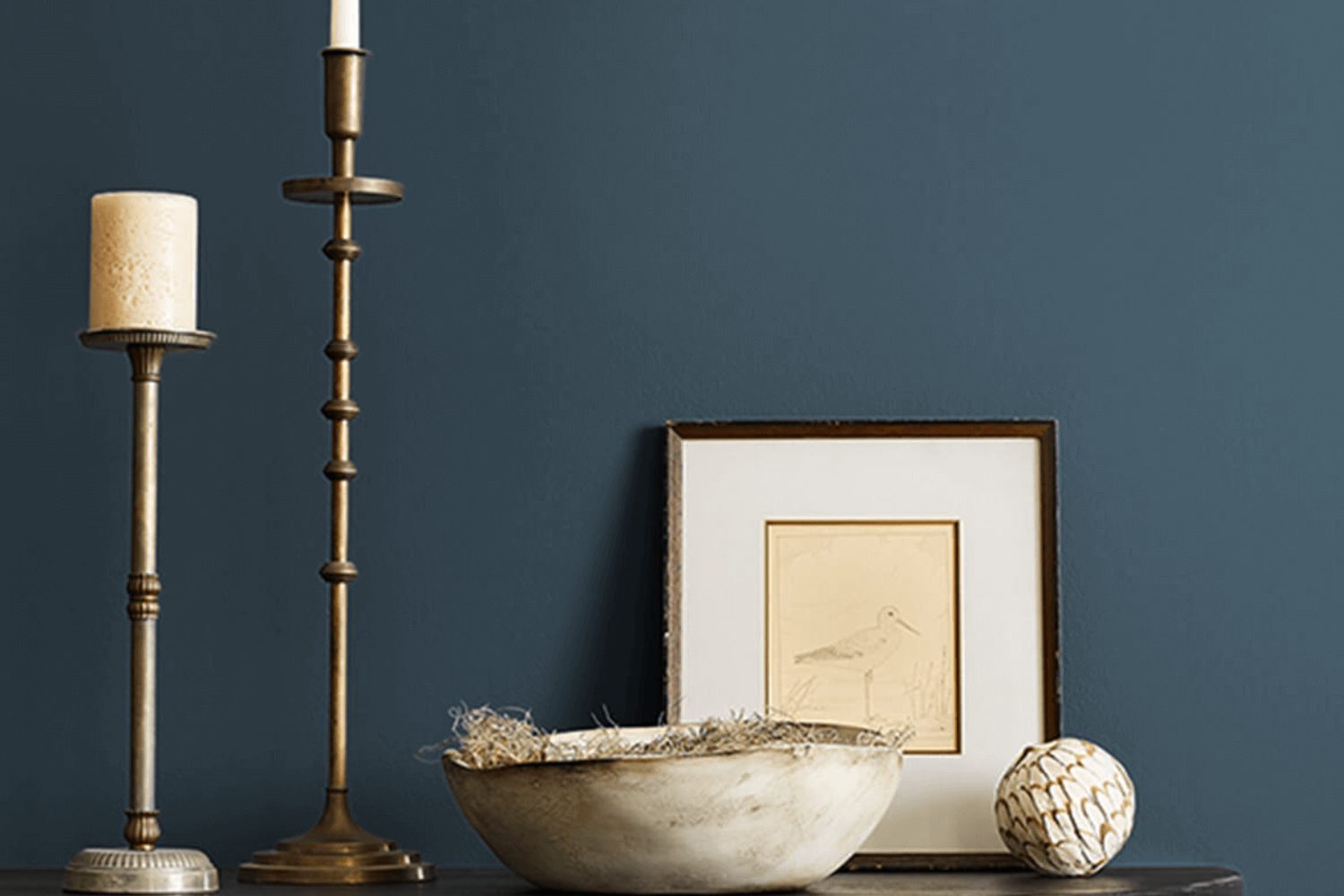
If you’re on the lookout for a paint color that can transform your space with elegance and depth, Sherwin Williams SW 7605 Gale Force might just be the perfect pick for you. This unique shade is a deep, moody blue that somehow manages to feel both warm and cool at the same time, making it incredibly versatile and suitable for various rooms and settings.
Gale Force offers a richness that can add character and sophistication to your space. Whether you’re aiming to create a cozy, inviting living room or a serene, tranquil bedroom, this color brings a sense of calmness and chic style. It’s excellent for feature walls, cabinets, or even external facades, providing a stunning backdrop that complements a wide range of decor styles and color schemes.
You’ll find that Gale Force pairs beautifully with natural materials like wood and stone, enhancing the overall warmth and texture of your space. Additionally, it serves as a dramatic contrast to lighter shades, making it ideal for creating a striking visual impact. Its unique balance makes it a fantastic choice for anyone looking to add a touch of sophistication without overwhelming a room with darkness.
So, if you’re considering a paint makeover, Gale Force by Sherwin Williams could offer the perfect blend of style and versatility, making it a standout choice for your next project.
by Sherwin Williams
What Color Is Gale Force SW 7605 by Sherwin Williams?
Gale Force SW 7605 by Sherwin Williams is a rich, deep blue that evokes the strength and mystery of the sea during a storm. This color is bold and powerful, yet has an underlying sophistication, making it an excellent choice for those looking to add a dynamic and dramatic touch to their spaces. Gale Force stands out for its ability to add depth and interest to rooms, transforming them into stylish and refined settings.
This deep blue shade works wonderfully in a variety of interior styles, especially in modern, coastal, and industrial designs. Its intensity brings a modern edge to spaces, while the maritime vibes fit perfectly with coastal themes. Industrial spaces benefit from Gale Force’s boldness, as it contrasts nicely with raw, textured materials.
Speaking of textures and materials, Gale Force pairs beautifully with natural wood, which can help to warm up spaces and add a touch of rustic charm. Metals, like brushed nickel or copper, can also complement this color, adding a sleek and contemporary feel. For a softer touch, incorporating fabrics like linen or cotton in lighter shades will create a welcoming contrast, making the room feel more balanced and inviting.
In summary, Gale ForceSW 7605 is a versatile and stunning blue shade that enhances various decor styles and pairs commendably with a wide range of materials and textures, making it a top choice for those wishing to infuse their space with depth and character.
housekeepingbay.com
Table of Contents
Is Gale Force SW 7605 by Sherwin Williams Warm or Cool color?
Gale Force SW 7605 by Sherwin Williams is a strong, appealing color that makes a statement in any home. This deep, rich shade of blue has a touch of gray, giving it a sophisticated and modern feel. When used in homes, Gale Force can create a cozy and inviting atmosphere, making rooms feel more intimate and comfortable. Its versatility allows it to work well in different spaces, whether it’s as a striking accent wall in a living room or a calming backdrop in a bedroom.
The dark, moody vibe of Gale Force can also help to highlight decor and furniture, making them stand out. For instance, pairing it with lighter colors like whites or creams can create a beautiful contrast, drawing attention to architectural features or artwork. However, because it’s a bold color, it’s important to consider the size and lighting of a room. In smaller, less lit spaces, using Gale Force in smaller doses or on one wall can prevent the room from feeling too closed in. Overall, Gale Force SW 7605 offers a unique blend of elegance and warmth, making it a great choice for homeowners looking to add a touch of personality to their spaces.
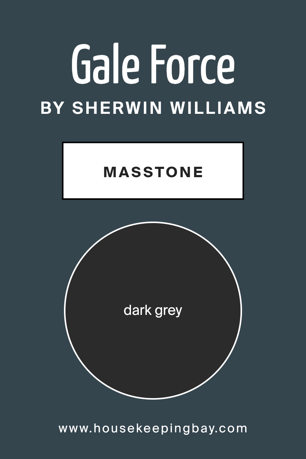
What is the Masstone of the Gale Force SW 7605 by Sherwin Williams?
Gale ForceSW 7605 by Sherwin Williams is a paint color that has a masstone of Dark Grey, which can be represented by the code #2B2B2B. This dark grey color has a strong, deep tone that brings a sense of sophistication and elegance to any room. When used in homes, this color can make spaces look more modern and stylish. It’s perfect for creating a statement wall or for adding depth to a room’s decor.
The beauty of Gale ForceSW 7605 lies in its versatility. Despite being a darker shade, it can beautifully complement various decor styles, from contemporary to rustic. This color works well in large spaces like living rooms or bedrooms because it can make them feel more cozy and inviting. In smaller rooms, using it on an accent wall can add interest without overwhelming the space. Plus, this dark grey pairs nicely with a wide range of other colors, including bright hues, which can pop against its deep backdrop, or lighter shades, creating a balanced and harmonious look.
housekeepingbay.com
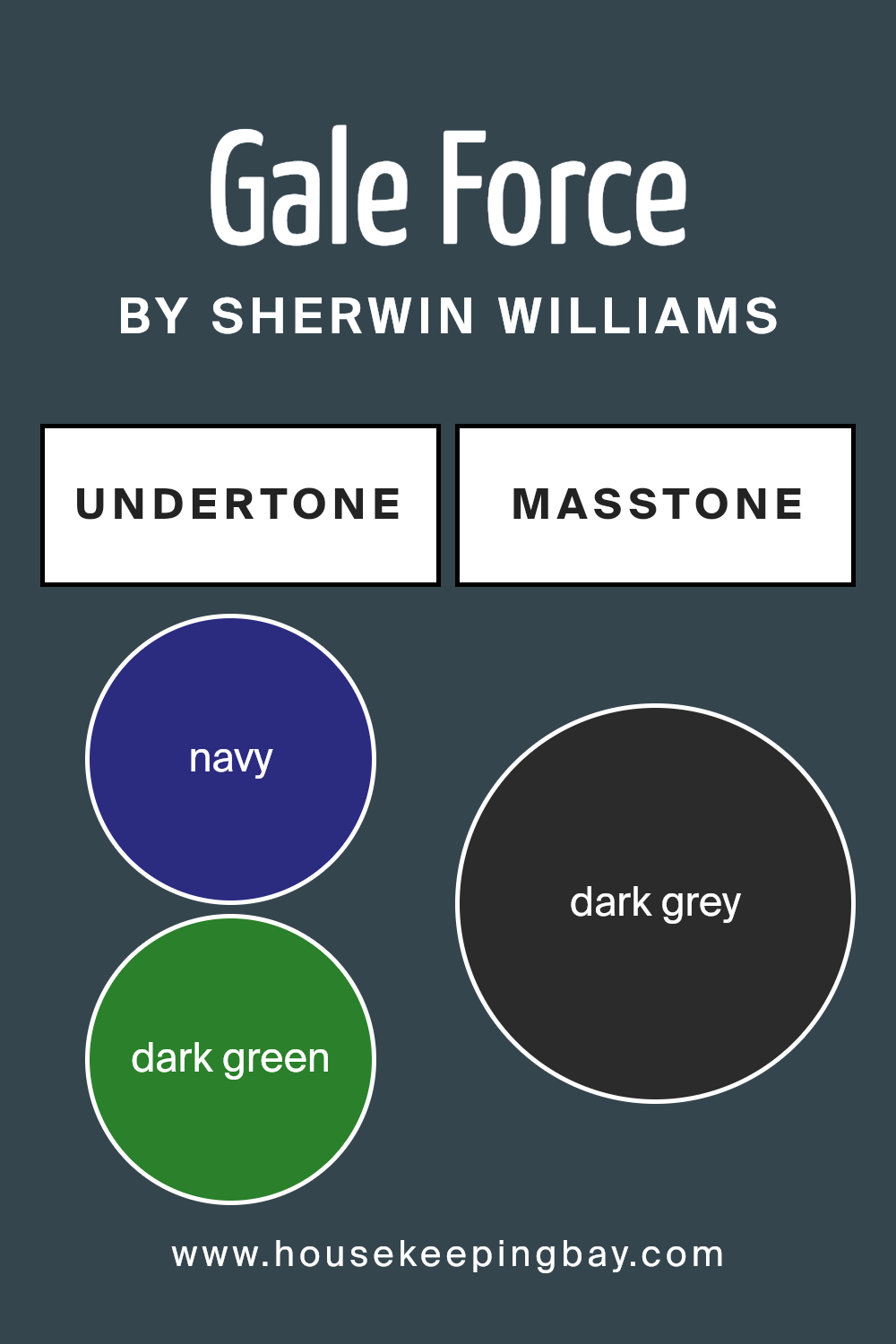
Undertones of Gale Force SW 7605 by Sherwin Williams
Gale Force SW 7605 by Sherwin Williams is a unique color that carries a variety of hues hidden beneath its surface. These hues include navy, dark green, dark turquoise, brown, purple, olive, and grey. These accents are called undertones. Undertones are subtle colors that, although not immediately noticeable, greatly influence how we perceive the main color.
Understanding undertones helps us see why the same paint can look different in various environments or under different lighting conditions. For example, in bright sunlight, Gale Force might lean towards its navy undertone, giving a cool and calming vibe. In artificial or dimmer light, the brown or olive undertones could become more prominent, making the space feel warmer and cozier.
When applied to interior walls, the undertones of Gale Force SW 7605 can significantly impact the room’s atmosphere and mood. The navy and dark green undertones can bring a sense of depth and sophistication, while the dark turquoise can add a touch of lively energy. The brown and olive undertones can make a room feel more grounded and inviting, whereas the purple undertone adds a hint of luxury and creativity. Lastly, the grey undertone helps in balancing the color, ensuring it meshes well with various decor styles and color schemes.
In essence, the complex mix of undertones in Gale Force SW 7605 makes it a versatile choice for interior walls, capable of creating a range of atmospheres based on its surrounding elements and lighting conditions.
housekeepingbay.com
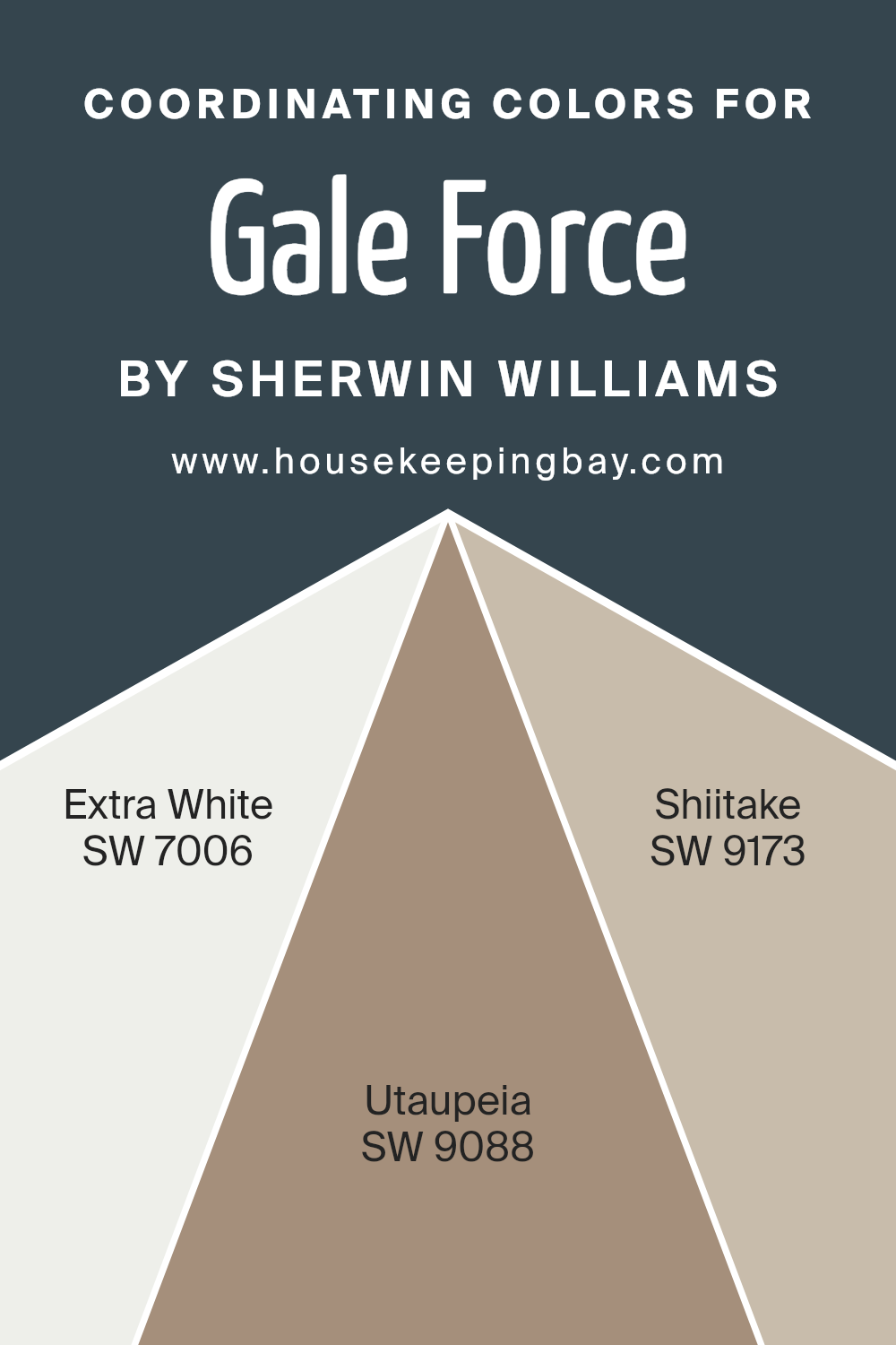
Coordinating Colors of Gale Force SW 7605 by Sherwin Williams
Coordinating colors are hues that complement each other and work together to create a harmonious and visually appealing palette in a space. When you choose coordinating colors for a base color like Gale Force SW 7605 by Sherwin Williams, a rich, moody blue with undertones that can shift with the light, you focus on finding colors that not only stand out on their own but also enhance the beauty and depth of the primary shade. In this context, colors like SW 7006 – Extra White, SW 9088 – Utaupeia, and SW 9173 – Shiitake are excellent choices. They have been carefully selected to coordinate with Gale Force, ensuring that whether you’re decorating a room or working on a design project, the overall aesthetic is balanced and pleasing to the eye.
SW 7006 – Extra White serves as a fresh, clean slate that can brighten any space, providing a crisp contrast to Gale Force’s deeper tones, ideal for trim or ceilings to add a sense of airiness. SW 9088 – Utaupeia is a subtle, warm taupe offering a neutral backdrop that complements the cool depth of Gale Force, allowing for a grounded, yet sophisticated palette.
Lastly, SW 9173 – Shiitake brings in a natural, earthy element with its muted, mushroom hue, creating a soft, inviting environment that highlights the richness of the base color without overwhelming the senses. Together, these coordinating colors work seamlessly with Gale Force, offering a variety of decorating possibilities that appeal to many different tastes and styles.
You can see recommended paint colors below:
housekeepingbay.com
How Does Lighting Affect Gale Force SW 7605 by Sherwin Williams?
Lighting plays a crucial role in how we perceive colors. The color of a room can look different throughout the day and under various lighting conditions. Let’s explore how this works with the color Gale Force SW 7605 by Sherwin Williams, a rich and deep shade that can add character to any space.
- In artificial light, such as LED or incandescent lighting, Gale Force SW 7605 can show its depth and richness. Under warm, yellow-toned light, this color might appear cozier and slightly darker, making it ideal for creating a snug and inviting atmosphere. On the other hand, in cooler, white light, the same color can seem more vibrant and more precise, giving the room a fresher look.
- Natural light affects colors differently throughout the day and depending on the room’s orientation. For north-faced rooms, which receive less direct sunlight, Gale Force SW 7605 might look cooler and more subdued. The natural light from the north can enhance the color’s depth without overwhelming the space, making it perfect for a calming and concentrated ambiance.
- South-faced rooms, bathed in warm sunlight for most of the day, can make Gale Force SW 7605 come alive with warmth and richness. The abundant light can highlight the color’s complexity and provide a lively and inviting environment.
- In east-faced rooms, the morning light can illuminate Gale Force SW 7605 with a soft glow, making the color appear bright and cheerful in the morning and then more profound and serene as the day progresses. This changing intensity can add an interesting dynamic to the space.
West-faced rooms experience the opposite effect, with the afternoon and evening light casting a golden hue on the walls. Gale Force SW 7605 can look exceptionally dramatic and vibrant in these rooms, perfect for spaces used mainly in the afternoon or evening.
In summary, lighting can significantly enhance or change the appearance of Gale Force SW 7605, from creating a cozy retreat with artificial light or embracing the full spectrum of its depth and warmth in natural sunlight. The direction of the room also influences the color’s appearance, making it more adaptable and exciting.
housekeepingbay.com
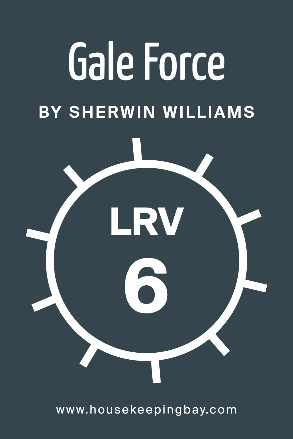
What is the LRV of Gale Force SW 7605 by Sherwin Williams?
Light Reflectance Value, or LRV, is a measure that tells us how much light a color reflects or absorbs. Think of it like this: on a scale from 0 to 100, 0 means the color can absorb all light, making it extremely dark, while 100 means it reflects all light, making it very bright. So, when you’re choosing paint for your walls, the LRV helps you understand how light or dark a color will look in a room. Colors with high LRV make spaces feel brighter and more open because they reflect more light, and those with low LRV can make a room feel cozier or smaller because they absorb more light.
Gale Force SW 7605 by Sherwin Williams, with an LRV of 5.584, falls on the darker end of the scale. This means it’s a deep and rich color that doesn’t reflect much light. In your home, this can affect how your space feels. Rooms with lots of natural light can handle darker colors like Gale Force, though it will look significantly darker at night or in spaces without a lot of light.
It’s an excellent choice if you’re going for an intimate, serene, or dramatic look. Just remember, because of its low LRV, this color will absorb more light than it reflects, so it’s important to consider your room’s lighting to ensure the color works the way you want it to.
housekeepingbay.com
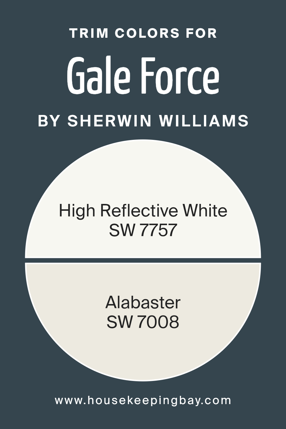
What are the Trim colors of Gale Force SW 7605 by Sherwin Williams?
Trim colors are chosen to complement or highlight the main color used on walls or exterior surfaces, providing an accent that defines and finishes the look of a space. For Gale Force SW 7605 by Sherwin Williams, selecting the right trim color is crucial because it frames the area, enhances architectural details, and can even affect the perceived size and brightness of the space.
High Reflective White SW 7757 and Alabaster SW 7008 are popular choices that work beautifully as trim colors with Gale Force, as they bring contrast while either sharpening the boldness of the primary color or softening the overall aesthetic for a more subtle transition.
High Reflective White SW 7757 is a brilliant, pure white that offers a crisp contrast to the deep, maritime blues of Gale Force, making architectural elements pop and giving spaces a more expansive feel.
On the other hand, Alabaster SW 7008 has a warmer tone, providing a gentler transition from the walls to the trim, which can create a cozy and inviting atmosphere.
This choice between a stark and a soft complement to Gale Force SW 7605 allows for versatility in design, enabling the creation of spaces that can either feel bold and dramatic or subdued and welcoming, depending on the ambiance one wishes to achieve.
You can see recommended paint colors below:
housekeepingbay.com
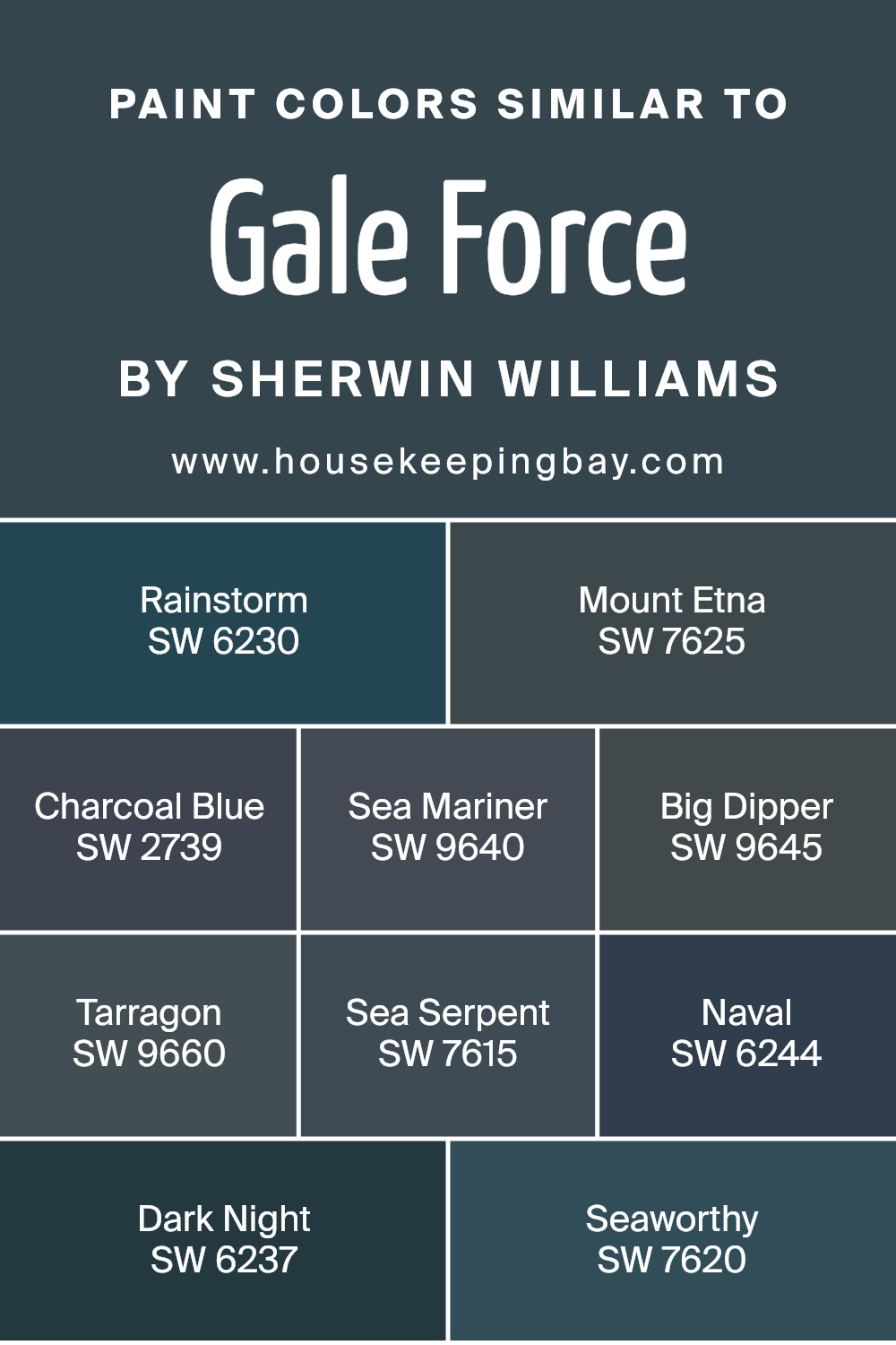
Colors Similar to Gale Force SW 7605 by Sherwin Williams
Similar colors play a vital role in design and aesthetics, providing a harmonious and refined look. They work well together because they share a common hue basis, making it easy to create a cohesive and appealing palette. Colors like Gale Force SW 7605 and its similarities, which include a range of deep blues and greens, offer a serene and sophisticated feel to any space. These similar colors, with their subtle differences, allow for depth and complexity in design without overwhelming the senses.
They can beautifully transition from one to another, creating a dynamic yet unified look.
- Starting with Rainstorm SW 6230, it’s a strong, stormy blue with a touch of green, reminiscent of a tumultuous sea sky. On a similar note, Mount Etna SW 7625 is a deep, mysterious shade of blue-green that evokes the mystique of its namesake volcano.
- Charcoal Blue SW 2739 has a solid, dark blue tone that brings to mind the night sky just before it turns black. S
- ea Mariner SW 9640 and Big Dipper SW 9645 serve up a vivid, oceanic blue and a slightly lighter, playful blue, respectively, both encapsulating the expansive beauty of the sea.
- Tarragon SW 9660 adds a unique twist with its dark, subdued green, providing an earthy counterbalance to the cooler blues. Sea Serpent SW 7615 introduces a deep, enigmatic teal, blending the line between blue and green waters.
- Naval SW 6244 speaks to a more traditional navy, offering a classic and calming deep blue. Dark Night SW 6237 is a rich, intense blue with a hint of green, mirroring the mysterious hue of a nocturnal sky.
- Lastly, Seaworthy SW 7620 finishes the spectrum with a robust, maritime blue, perfect for creating a striking, yet inviting space.
Together, these colors create a spectrum that is both versatile and visually harmonious, suitable for various design preferences.
You can see recommended paint colors below:
- SW 6230 Rainstorm
- SW 7625 Mount Etna
- SW 2739 Charcoal Blue
- SW 9640 Sea Mariner
- SW 9645 Big Dipper
- SW 9660 Tarragon
- SW 7615 Sea Serpent
- SW 6244 Naval
- SW 6237 Dark Night
- SW 7620 Seaworthy
housekeepingbay.com
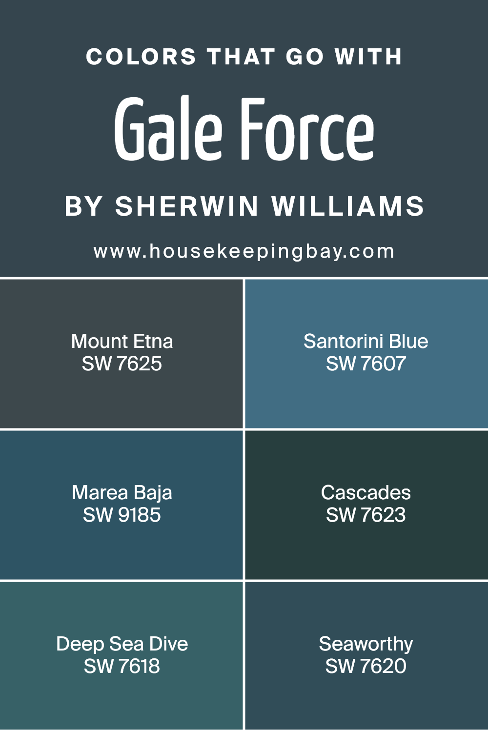
Colors that Go With Gale Force SW 7605 by Sherwin Williams
Choosing the right colors to pair with Gale Force SW 7605 by Sherwin Williams can make a big difference in any interior design project. The beauty of Gale Force lies in its deep, brooding character, which can serve as a striking backdrop or a bold statement piece. When combined with colors like Mount Etna SW 7625 or Santorini Blue SW 7607, the design takes on a harmonious balance. Mount Etna adds a touch of gravitas with its rich, volcanic gray, making it a perfect complement to the cooler undertones of Gale Force, while Santorini Blue offers a refreshing breath of airy lightness, giving rooms a more expansive feel.
For those looking to introduce a dynamic contrast or a natural flow throughout their spaces, Marea Baja SW 9185, Cascades SW 7623, Deep Sea Dive SW 7618, and Seaworthy SW 7620 are fantastic options. Marea Baja brings a serene vibe with its deep, oceanic blue, creating a smooth transition when paired with Gale Force.
Cascades, with its lush, enchanted green, adds an intricate layer of depth and sophistication. Whereas Deep Sea Dive offers a mysterious aura with its dark aquatic tone, inviting a sense of exploration and reflection. Seaworthy, on the other hand, leans a bit lighter, offering a nautical charm that can lighten the mood without losing the profound ambiance set by Gale Force. Together, these colors work to enhance the distinctive allure of Gale Force SW 7605, making it a versatile choice for those looking to create a space that’s both inviting and stylistically coherent.
You can see recommended paint colors below:
- SW 7625 Mount Etna
- SW 7607 Santorini Blue
- SW 9185 Marea Baja
- SW 7623 Cascades
- SW 7618 Deep Sea Dive
- SW 7620 Seaworthy
housekeepingbay.com
How to Use Gale Force SW 7605 by Sherwin Williams In Your Home?
Gale Force SW 7605 by Sherwin Williams is a deep, soothing blue shade, perfect for adding a touch of elegance and calm to any room in your home. This color is great if you’re looking to create a peaceful retreat or add a bit of drama to your space without overwhelming it. You can use Gale Force in your bedroom to help promote relaxation and a good night’s sleep. It’s also a fantastic choice for bathrooms, where it can create a spa-like environment.
In living areas, this deep blue can be used on a feature wall to draw attention and add depth to the room. Pairing it with light furniture and decor can make the space feel more open and inviting. If you’re feeling adventurous, painting your kitchen cabinets in Gale Robust can offer a unique and modern look that stands out.
No matter where you decide to use Gale Force, it can definitely help make your home feel more cozy, stylish, and welcoming.
Gale Force SW 7605 by Sherwin Williams vs Tarragon SW 9660 by Sherwin Williams
Gale Force SW 7605 and Tarragon SW 9660 by Sherwin Williams are two unique colors. Gale Force is a deep, moody blue with a hint of gray. It feels like a stormy sea or a dark, cloudy sky, giving a room a sophisticated and calming vibe. On the other hand, Tarragon SW 9660 is a vibrant, earthy green. It’s lighter and carries the freshness of spring or the lushness of a well-kept garden. While Gale Force adds drama and depth, making it perfect for creating a cozy, intimate atmosphere, Tarragon brings in a lively, refreshing feel, ideal for energizing a space or introducing a touch of nature indoors. Both colors have their charm and can significantly influence the mood and style of a room, but they offer very different experiences: Gale Force is about depth and mystery, while Tarragon suggests growth and vitality.
You can see recommended paint color below:
- SW 9660 Tarragon
housekeepingbay.com
Gale Force SW 7605 by Sherwin Williams vs Sea Serpent SW 7615 by Sherwin Williams
Gale Force SW 7605 and Sea Serpent SW 7615 by Sherwin Williams are both deep, rich colors but they bring their unique vibes to a space. Gale Force is like a stormy sky with its dark blue-gray shade, giving a calm yet strong feel. It’s perfect for creating a cozy, serene atmosphere in a room. On the other hand, Sea Serpent is darker and leans towards a greenish-blue tone. It reminds you of the deep parts of the ocean. This color is great for adding a bold and mysterious touch to a space.
While Gale Force has a bit more gray in it, making it softer and more versatile, Sea Serpent stands out with its depth and slightly greener hue, offering a statement look. Both colors work beautifully in modern spaces, but Gale Force could be easier to blend with a variety of décor due to its less intense tone. Sea Serpent, however, would be a stunning choice for creating dramatic accents. Though different, both colors can add sophistication and depth to any room they are used in.
You can see recommended paint color below:
housekeepingbay.com
Gale Force SW 7605 by Sherwin Williams vs Sea Mariner SW 9640 by Sherwin Williams
Gale Force SW 7605 by Sherwin Williams and Sea Mariner SW 9640 by Sherwin Williams are both unique colors, but they offer different vibes. Gale Force is a deep, rich blue with a grayish tint, making it great for a space where you want a touch of sophistication and calmness. It’s like looking at the ocean during a stormy day, deep and mysterious. On the other hand, Sea Mariner is a brighter blue, fresher, and more vibrant. It brings to mind clear skies and calm seas, perfect for adding a cheerful and lively splash to any room.
While Gale KForce presents a more reserved and mature look, Sea Mariner offers an energetic and inviting atmosphere. If you’re aiming for a cozy, serene spot, Gale Force would be the go-to. For a room that feels open, sunny, and joyful, Sea Mariner would be the better choice. They both have their unique charm, depending on the mood you’re looking to create in your space.
You can see recommended paint color below:
- SW 9640 Sea Mariner
housekeepingbay.com
Gale Force SW 7605 by Sherwin Williams vs Mount Etna SW 7625 by Sherwin Williams
Gale Force SW 7605 and Mount Etna SW 7625, both by Sherwin-Williams, are unique colors with their own special qualities. Gale Force is a deep, soothing blue with a hint of gray. It gives a calm and relaxing vibe, perfect for creating a peaceful space in your home. It’s like looking at the ocean on a stormy day – dark but incredibly serene.
On theother hand, Mount Etna SW 7625 is a darker shade, leaning more towards a charcoal with a subtle hint of green. It’s a much bolder color, resembling the deep, dark green of pine trees in a dense forest. This color is great for making a statement in a room, providing a rich and luxurious feel. While Gale Force has a tranquil, soft presence, Mount Etna brings a powerful and dynamic energy. Depending on what atmosphere you want to create, either of these colors could be the perfect choice.
You can see recommended paint color below:
- SW 7625 Mount Etna
housekeepingbay.com
Gale Force SW 7605 by Sherwin Williams vs Dark Night SW 6237 by Sherwin Williams
Gale Force SW 7605 and Dark Night SW 6237 by Sherwin Williams are two colors that really stand out, but in different ways. Gale Force is a deep, smoky blue that can give a room a calm, peaceful feeling. It’s like looking at the ocean at dusk, deep and mysterious yet comforting. On the other hand, Dark Night SW 6237 is a rich, dark blue, almost leaning towards a navy or black under certain lights. This color is perfect for making a bold statement in a space, offering a sense of sophistication and depth.
When comparing them, Gale Force feels a bit lighter and airier, making it a good choice for a soothing bedroom or a relaxing living space. Dark Night, because of its darker tone, is great for creating a dramatic backdrop, ideal for an accent wall or a cozy den. Both colors can make a room look beautiful and stylish in their own unique ways. They work well with bright whites for contrast or soft, warm tones for a more blended look.
You can see recommended paint color below:
- SW 6237 Dark Night
housekeepingbay.com
Gale Force SW 7605 by Sherwin Williams vs Rainstorm SW 6230 by Sherwin Williams
Gale Force SW 7605 and Rainstorm SW 6230 are both beautiful colors by Sherwin Williams, but they bring different vibes to a space. Gale Force is a deep, striking blue with a hint of gray in it. Imagine looking at the ocean on a cloudy day. It’s strong and moody, perfect for creating a bold statement in a room.
On the other hand, Rainstorm SW 6230 leans more towards a rich, navy blue. It’s like looking at a dark, stormy sky. Rainstorm is deeper and can make a room feel cozy and enveloping. It’s great for a space where you want a touch of drama without going too dark.
Both colors are excellent choices for accent walls, cabinets, or even exterior use. Gale Force is ideal if you want a color that’s deep but with a slightly softer edge, thanks to its gray undertones. Rainstorm is your go-to if you prefer a pure, deep blue that draws attention. Depending on the mood you’re trying to create, either color can add a lot of personality to your space.
You can see recommended paint color below:
housekeepingbay.com
Gale Force SW 7605 by Sherwin Williams vs Big Dipper SW 9645 by Sherwin Williams
Gale Force SW 7605 and Big Dipper SW 9645 by Sherwin Williams are two interesting colors to compare. Gale Force is a deep, rich navy blue that has a strong presence. It’s the kind of color that makes a statement, perfect for creating a bold look or adding depth to a space. On the other hand, Big Dipper is lighter and leans more towards a mid-tone blue. It’s a bit more relaxed and versatile, easy to use in various settings without overwhelming the space.
While Gale Force brings an air of sophistication and drama, Big Dipper offers a softer approach, more inviting and easygoing. Gale Force is ideal for those looking to make a strong visual impact, whereas Big Dipper suits spaces that aim for a balanced, cheerful atmosphere. Whether used separately or together, each color has its unique charm, with Gale Force providing depth and intensity, and Big Dipper bringing lightness and versatility. Both colors offer distinct opportunities to enhance the character and mood of a room.
You can see recommended paint color below:
- SW 9645 Big Dipper
housekeepingbay.com
Gale Force SW 7605 by Sherwin Williams vs Naval SW 6244 by Sherwin Williams
Gale Force SW 7605 and Naval SW 6244 by Sherwin Williams are two beautiful colors with distinct tones. Gale Force has a deep, rich grayish-blue tint, bringing a sense of calm and sophistication to any space. It’s like the color of the sea during a storm, strong and full of mystery.
On the other hand, Naval SW 6244 leans more towards a pure, classic navy blue. It’s reminiscent of the deep ocean at night or the sky just after the sun sets, offering a feeling of serenity and stability. While both colors share a similar blue base, Gale Force has a murkier, more complex undertone, making it unique and versatile for creative spaces.
Naval, however, is straightforward and timeless, perfect for creating elegant and peaceful environments. Whether you’re looking to make a bold statement with Gale Force or achieve a classic look with Naval, both colors offer distinct vibes that can beautifully transform any room.
You can see recommended paint color below:
housekeepingbay.com
Gale Force SW 7605 by Sherwin Williams vs Seaworthy SW 7620 by Sherwin Williams
Gale Force SW 7605 and Seaworthy SW 7620, both by Sherwin Williams, are unique colors. Gale Force is a rich, deep blue with a hint of gray. It feels like the deep ocean at twilight, mysterious yet soothing. It’s perfect for creating a calm and reflective space, maybe in a bedroom or a reading nook.
Seaworthy SW 7620 is also in the blue family but with a slightly different vibe. It’s a bit brighter and has more intensity, like the color of the ocean on a clear day. Seaworthy brings a fresh and lively feel to a room, making it ideal for spaces like bathrooms or kitchens, where you want a splash of color to energize the room.
Both colors are beautiful and have their own special qualities. Gale Force offers a darker, more subdued look, while Seaworthy is lighter and more vibrant. Depending on the atmosphere you want to create, each color has its perfect spot in a home.
You can see recommended paint color below:
- SW 7620 Seaworthy
housekeepingbay.com
Gale Force SW 7605 by Sherwin Williams vs Charcoal Blue SW 2739 by Sherwin Williams
Gale Force SW 7605 and Charcoal Blue SW 2739, both by Sherwin Williams, offer unique shades for adding character to any space. Gale Force is a deep, rich blue with a hint of green, making it versatile for various design needs. It brings a tranquil and sophisticated vibe, perfect for creating a serene atmosphere in bedrooms or living areas.
On the other hand, Charcoal Blue SW 2739 leans towards a darker, more profound blue with a slight gray undertone. This color is excellent for those wanting to add a bit of drama and elegance to their space. It works well in areas where you want to make a bold statement, such as accent walls or cabinets.
While both colors share a base in the blue family, Gale Force leans towards a slightly lighter and greener tint, offering a refreshing feel. Charcoal Blue is the darker and more intense of the two, providing a more grounded and bold look. Depending on the mood you want to set, both are excellent choices, but they cater to different tastes and design goals.
You can see recommended paint color below:
- SW 2739 Charcoal Blue
housekeepingbay.com
Conclusion
In conclusion, SW 7605 Gale Force by Sherwin Williams is a unique and powerful color choice for anyone looking to transform their space. This deep shade of blue has the ability to make a strong statement in any room it’s used in. Whether you’re looking to create a bold accent wall or give your whole room a dramatic makeover, Gale Force offers a sense of depth that can elevate the aesthetics of your home.
This color works wonders by adding an air of sophistication and elegance. It pairs beautifully with a wide array of colors, from soft neutrals to vibrant hues, allowing for flexibility in your decor choices. If you’re worried about the space feeling too dark, incorporating elements like metallic accents, light wood tones, or even vibrant artworks can balance out the intensity of Gale Force, ensuring your room feels cozy and inviting.
Choosing Gale Force by Sherwin Williams means making a statement that is both bold and beautiful. It’s perfect for you if you want to add a touch of drama and style to your living environment without overwhelming it. Give your home a makeover with Gale Force and see how this beautiful shade can transform your space into something truly special.
housekeepingbay.com
Ever wished paint sampling was as easy as sticking a sticker? Guess what? Now it is! Discover Samplize's unique Peel & Stick samples. Get started now and say goodbye to the old messy way!
Get paint samples


