Real Red SW 6868 by Sherwin Williams
Igniting Passion with Every Brushstroke
Are you looking for a bold and vibrant color to add energy and excitement to your space? Look no further than SW 6868 Real Red by Sherwin Williams. This brilliant hue is the perfect choice for anyone aiming to make a strong statement in their home or office.
The power of Real Red lies in its ability to bring life and vitality to any room, transforming dull spaces into areas full of passion and dynamism.Real Red isn’t just any red; its unique shade has been carefully crafted to ensure it stands out in the vast spectrum of reds.
Whether you’re thinking of refreshing your living room, kitchen, or even the exterior of your home, Real Red offers endless possibilities. Its striking presence can be utilized in various ways – from creating a stunning accent wall to adding pops of color through decor items.
This article will explore the various aspects of SW 6868 Real Red, including complementary colors, design ideas, and practical tips on how to incorporate this fiery hue into your home effectively.
Whether you’re a seasoned interior designer or someone looking to update their space with a fresh coat of paint, Real Red by Sherwin Williams promises a transformation that’s both stunning and spirited.
via Sherwin Williams
What Color Is Real Red SW 6868 by Sherwin Williams?
Table of Contents
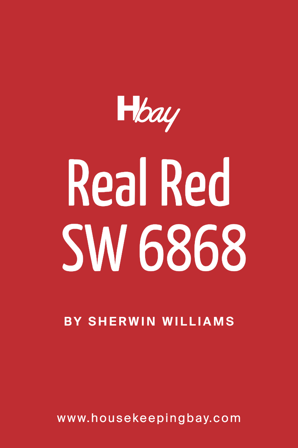
Real Red SW 6868 by Sherwin Williams is a bold and vibrant color, full of energy and life. It’s a true red, meaning it doesn’t lean too much towards orange or purple, making it a pure statement color. This vivid shade can instantly brighten up a space and add a pop of personality.
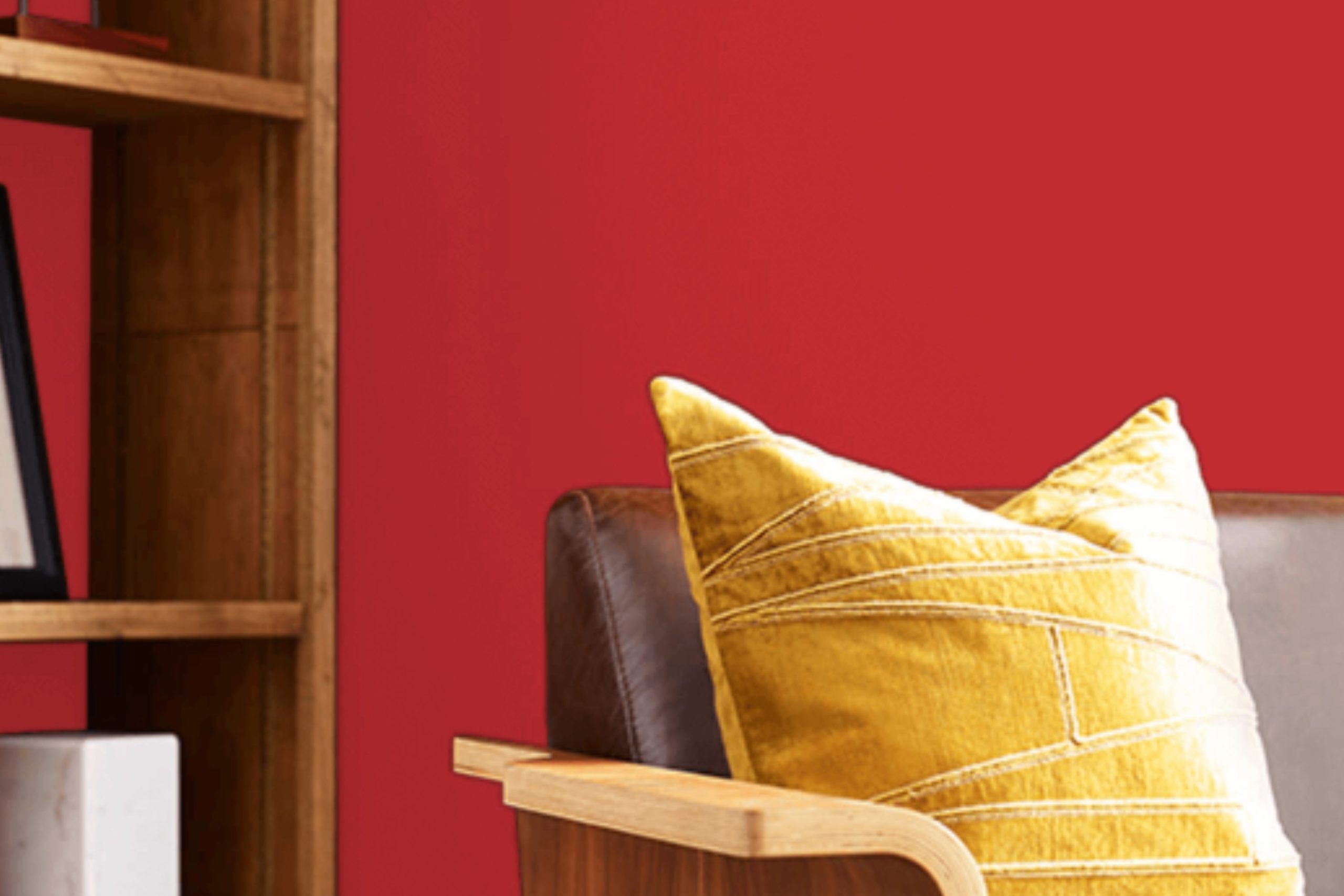
In terms of interior styles, Real Red works exceptionally well in modern and contemporary designs due to its bold and straightforward appeal. However, it can also bring warmth and character to industrial and even some rustic settings when used thoughtfully. It’s perfect for creating a focal point in a room, whether as a feature wall, on a piece of statement furniture, or through decorative accents.
Real Red pairs beautifully with a range of materials and textures. With natural wood, it highlights the warmth of the wood grains, creating a cozy yet striking look. In spaces with metal accents or fixtures, especially in black or brushed nickel, it adds a sophisticated contrast.
Textures like soft velvet or smooth leather in neutral colors like white, black, or gray can balance its intensity, ensuring the red stands out without overwhelming the space.
This color encourages creativity in design, allowing for a dynamic and inviting interior atmosphere.
housekeepingbay.com
Is Real Red SW 6868 by Sherwin Williams Warm or Cool color?
Real Red SW 6868 by Sherwin Williams is a bold and vibrant paint color. It’s a true red that stands out in any space, making it a popular choice for those who want to add a lively and energetic feel to their homes. When used in interior design, Real Red can create a strong focal point, drawing attention and bringing warmth to a room.
This color works great in living rooms, kitchens, or dining areas where you want to encourage conversation and socializing.
However, because it’s so powerful, it’s important to balance Real Red with more neutral colors like white, grey, or beige. These combinations can prevent the color from overwhelming the space.
Additionally, using Real Red in smaller doses, such as on an accent wall or through decorative accessories, can introduce a pop of color without dominating the room. The key to incorporating Real Red in your home is to use it thoughtfully, ensuring that it enhances the space rather than overpowering it.
What is the Masstone of the Real Red SW 6868 by Sherwin Williams?
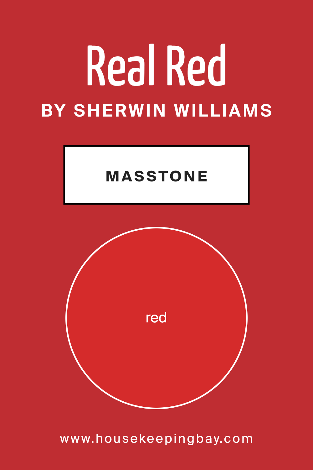
Real Red SW 6868 by Sherwin Williams, marked by its masstone Red (#D52B2B), is a vibrant and bold color that stands out in any space. This shade of red is warm and inviting, making it perfect for creating a focal point in a room.
Whether you’re painting an accent wall, a door, or some furniture, Real Red adds energy and passion to the space. In homes, this color works well in places where you want to spark conversation or add a touch of drama, like dining rooms or living areas.
However, because it’s so bright, it’s important to balance it with neutral tones or softer colors to avoid overwhelming the space.
Using Real Red in well-lit areas can also enhance its beauty, making the space feel more dynamic and lively. Overall, Real Red SW 6868 brings a confident and warm ambiance to any home, making it a great choice for those looking to add a burst of color.
housekeepingbay.com
Undertones of Real Red SW 6868 by Sherwin Williams
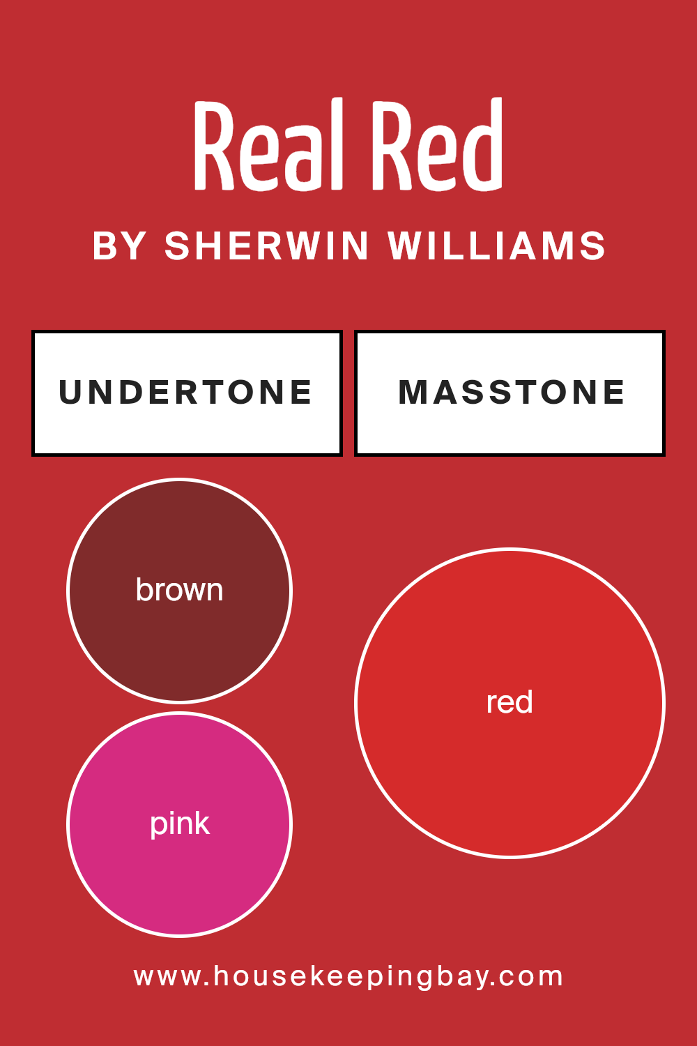
Real Red SW 6868 by Sherwin Williams is a vivid, energetic color that’s more than just a simple red. When you look closely, you’ll notice it has subtle hints of brown and pink. These undertones add layers to the paint, making it rich and complex.
Brown tones bring a sense of warmth and earthiness to the mix, grounding the bold red in a way that feels cozy and inviting. On the other hand, pink undertones add a touch of softness and playfulness, giving the color a slightly cheerful vibe.
In general, undertones play a big role in how we perceive color. They can influence the mood of a room, how we feel in it, and even how we decorate it. With its specific undertones, Real Red can create a dynamic backdrop in interior spaces. On interior walls, this paint does more than just cover a surface; it adds depth and character.
The brown undertones help in making spaces feel warm and snug, great for living rooms or dining areas. Meanwhile, the pink undertones keep the red from feeling too overwhelming, making it easier to pair with a wide range of decor.
Choosing Real Red SW 6868 for interior walls means engaging with a color that carries depth and complexity through its undertones. It’s a choice that adds vibrancy while maintaining a balanced and welcoming atmosphere in any room.
housekeepingbay.com
Coordinating Colors of Real Red SW 6868 by Sherwin Williams
Coordinating colors play a pivotal role in creating a harmonious and visually appealing space, acting as complementary shades that enhance the main color.
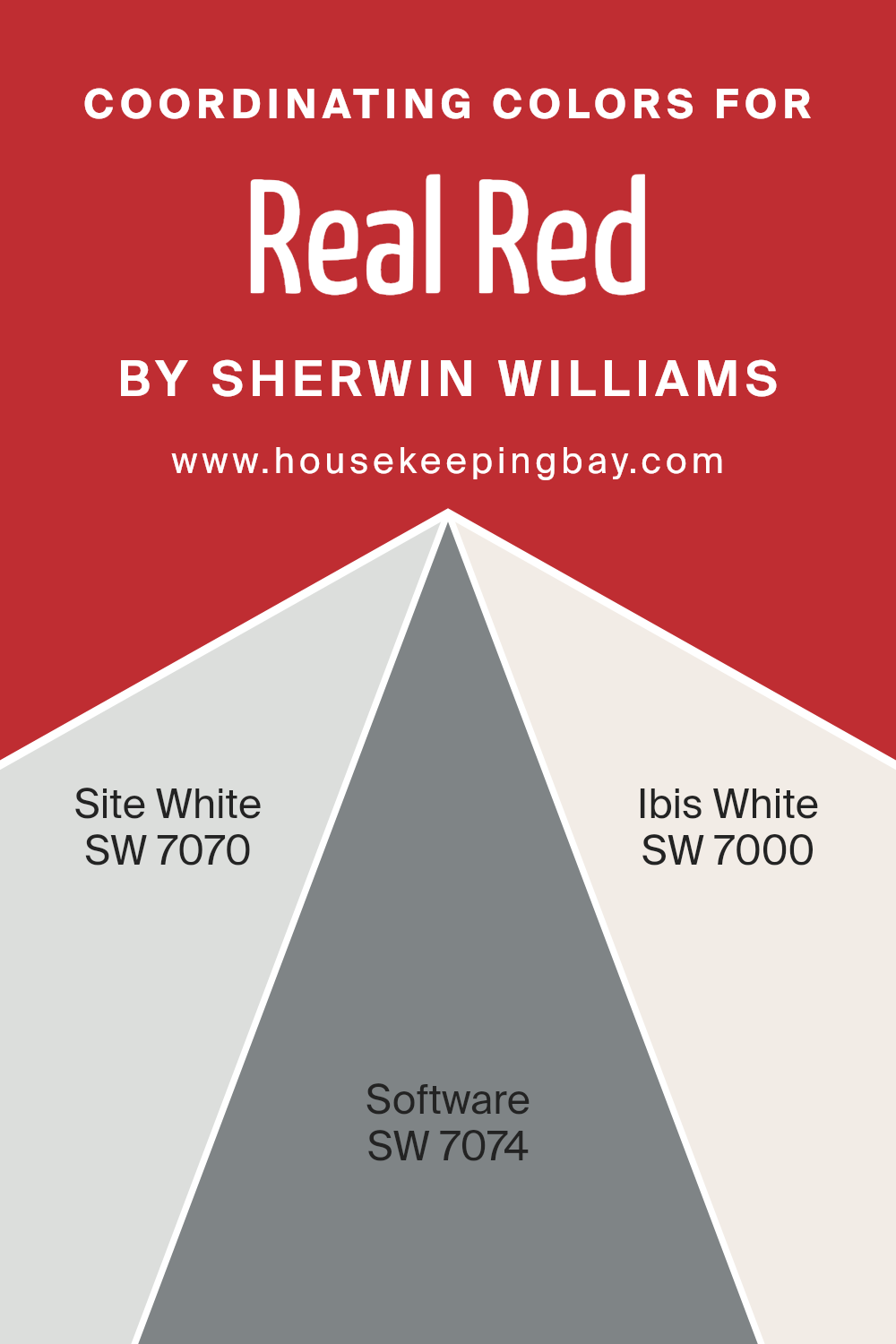
In the context of Real Red SW 6868 by Sherwin Williams, a vivid and dynamic hue, selecting coordinating colors wisely is key to balancing its intensity and bringing a cohesive look to your decor. SW 7070 – Site White, SW 7074 – Software, and SW 7000 – Ibis White have been chosen as coordinating colors for Real Red, offering a spectrum of whites with unique undertones to soften and complement the starkness of the red.
SW 7070 – Site White is a clean and subtle shade, providing a fresh backdrop that allows Real Red to stand out without overwhelming the space. It’s like a breath of fresh air, injecting lightness and a sense of spaciousness into the room. Next, SW 7074 – Software presents itself as a cooler, more muted white with a hint of gray.
This sophisticated color adds depth and dimension when paired with Real Red, creating a contemporary vibe that’s both chic and inviting. Lastly, SW 7000 – Ibis White is a warm and creamy hue, offering a softer alternative to bright whites.
It brings a cozy and comforting element to the palette, ensuring that Real Red remains the focal point while the surroundings glow with a welcoming warmth.
Together, these coordinating colors work seamlessly to create a balanced and harmonious environment that enhances the vibrancy and energy of Real Red.
You can see recommended paint colors below:
- SW 7070 Site White
- SW 7074 Software
- SW 7000 Ibis White
housekeepingbay.com
How Does Lighting Affect Real Red SW 6868 by Sherwin Williams?
Lighting plays a significant role in how we perceive colors. The same color can look quite different under various types of light. For instance, Real RedSW 6868 by Sherwin Williams can appear vibrant and lively or subdued and warm, depending on the lighting conditions.
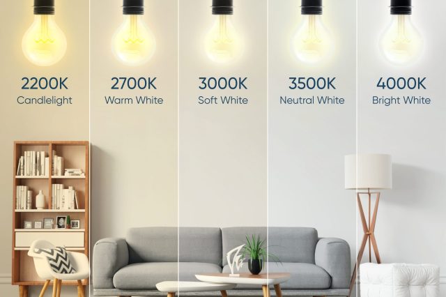
In artificial light, the appearance of Real RedSW 6868 can change based on the type of bulb used. Warm light bulbs tend to enhance the richness and depth of the red, making it appear cozier and more inviting. In contrast, cool light bulbs might make the red seem more intense and brighter, giving it a sharper look. This variability shows why it’s important to consider your light source when choosing paint colors for a room.
Under natural light, Real RedSW 6868 can look drastically different throughout the day and based on the room’s orientation. North-faced rooms receive less direct sunlight, which can make this red appear deeper and more muted.
It might not have the same vibrancy as it would in a well-lit area but can still offer a sophisticated touch to the space.
- South-faced rooms are bathed in abundant light for most of the day, which can make Real RedSW 6868 appear very bright and vivid. The color can seem almost glowing, adding a lively and energetic feel to the room. It’s perfect for spaces where you want a strong, dynamic atmosphere.
- East-faced rooms get plenty of morning light, making Real RedSW 6868 look bright and fresh in the morning then softer as the day progresses. This can add a dynamic quality to the space, as the color transitions throughout the day.
- West-faced rooms capture the evening light, which could make this shade of red look incredibly warm and welcoming in the afternoon and evening. It might take on a softer appearance as the sun sets, creating a cozy and relaxing environment.
Understanding how lighting affects colors, especially vibrant ones like Real RedSW 6868, can help you choose the right room and conditions to use it in, ensuring you achieve the desired effect in your space.
housekeepingbay.com
What is the LRV of Real Red SW 6868 by Sherwin Williams?
LRV stands for Light Reflectance Value. It measures the percentage of light a paint color reflects from or absorbs into a wall. The scale goes from 0 to 100, where 0 is pure black that absorbs all light and 100 is pure white that reflects all lightReal Red SW 6868 by Sherwin Williams, with an LRV of 13.205, falls on the lower end of the scale. This means it absorbs much more light than it reflects, making it a deep, rich color.
On walls, this low LRV suggests that Real Red will create a bold statement and bring a strong character to the room. It’s likely to make spaces feel more intimate and can visually shrink the size of a room because it doesn’t bounce much light around. In rooms with plenty of natural or artificial light, Real Red can appear beautifully vibrant, but in poorly lit spaces, it may seem darker and more intense.

housekeepingbay.com
What are the Trim colors of Real Red SW 6868 by Sherwin Williams?
Trim colors are those selected to enhance and define the edges or outline of a room—like door frames, window sills, and baseboards—or exterior features like eaves, fascias, and doors. When paired with a vibrant main color, such as Real Red SW 6868 by Sherwin Williams, trim colors can either subtly complement or starkly contrast to create a visually appealing and well-defined space.
Choosing the right trim color is crucial because it can influence the overall ambiance of a room, highlighting architectural details and ensuring that the main color truly pops. For Real Red SW 6868, a bold and energetic hue, the selection of trim colors is especially important to balance its intensity and bring harmony to the space.
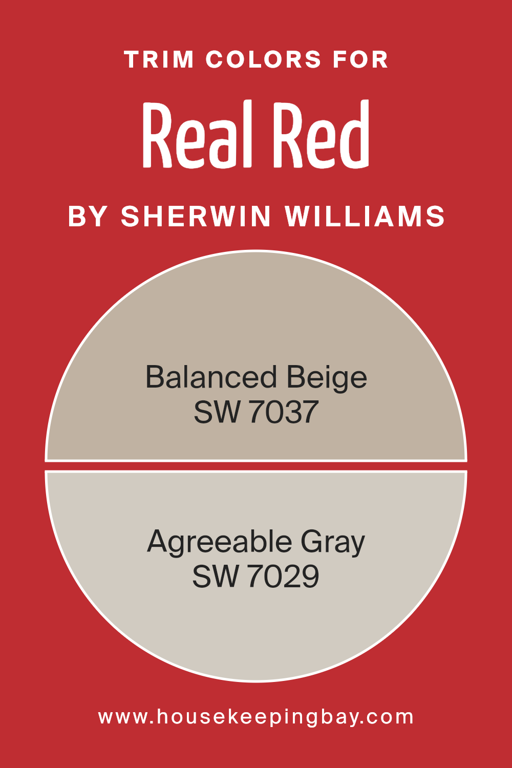
SW 7037 Balanced Beige and SW 7029 Agreeable Gray are excellent choices for trim colors with Real Red SW 6868. Balanced Beige is a warm and inviting neutral that offers a soft, earthy contrast to the boldness of Real Red, providing a calming effect that can help in creating a more grounded and cohesive look.
On the other hand, Agreeable Gray carries a lighter and more subdued tone, offering a gentle and seamless transition from the strong personality of Real Red. This subtle gray acts as a bridge between the vivid red and the rest of the space, ensuring the color scheme flows smoothly without overwhelming the senses. Together, these trim colors work to enhance the room’s character and aesthetic appeal by framing and defining the space with sophistication.
You can see recommended paint colors below:
- SW 7037 Balanced Beige
- SW 7029 Agreeable Gray
housekeepingbay.com
Colors Similar to Real Red SW 6868 by Sherwin Williams
Similar colors play a pivotal role in design and aesthetics, particularly when it comes to creating a harmonious and visually appealing space. Colors that share a close relationship on the color wheel, such as those similar to Sherwin Williams’ Real Red SW 6868, provide a cohesive look while still allowing for variety and interest. U
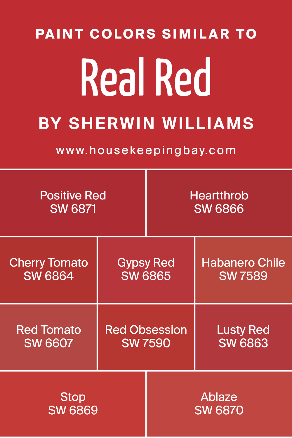
sing shades like Positive Red SW 6871 or Heartthrob SW 6866 brings in slight variations that can add depth and warmth without clashing. Colors like Cherry Tomato SW 6864 and Gypsy Red SW 6865 offer a vibrant yet balanced energy, ensuring spaces feel lively but not overwhelming. Similarly, Habanero Chile SW 7589 and Red Tomato SW 6607 can inject a spicy or fresh undertone, respectively, tailoring the ambiance to fit specific moods or themes.
Red Obsession SW 7590 and Lusty Red SW 6863 veer towards more dramatic and intense expressions of red, perfect for making bold statements or accenting focal points.
On the other hand, Stop SW 6869 and Ablaze SW 6870 can act as signal colors, drawing attention and guiding the viewer’s eye within a design.
Together, these shades work cohesively, offering a spectrum from warm and inviting to bold and passionate. Their similar base allows for a unified theme, yet each possesses unique undertones and intensities that can either subtly enhance or strikingly define a space.
By carefully selecting among these hues, one can achieve a refined palette that resonates with the desired mood and style, whether aiming for a gentle wash of warmth or a dynamic burst of energy.
You can see recommended paint colors below:
- SW 6871 Positive Red
- SW 6866 Heartthrob
- SW 6864 Cherry Tomato
- SW 6865 Gypsy Red
- SW 7589 Habanero Chile
- SW 6607 Red Tomato
- SW 7590 Red Obsession
- SW 6863 Lusty Red
- SW 6869 Stop
- SW 6870 Ablaze
housekeepingbay.com
How to Use Real Red SW 6868 by Sherwin Williams In Your Home?
Real Red SW 6868 by Sherwin Williams is a bright and bold paint color that can add a lively splash of energy to any home. This vibrant shade of red can make a strong statement and bring a sense of excitement into a room.
If you’re thinking about using Real Red in your home, consider applying it on an accent wall to create a focal point in a living room, dining area, or bedroom without overwhelming the space. It’s also perfect for adding a pop of color to smaller elements like a front door, a piece of furniture, or even kitchen cabinets for those who prefer a daring touch.
Since Real Red is very bold, pairing it with neutral colors such as white, gray, or black can help balance its intensity, ensuring your space feels inviting and not too busy. It’s ideal for anyone looking to add a dynamic and cheerful vibe to their home with a modern twist.
Real Red SW 6868 by Sherwin Williams vs Gypsy Red SW 6865 by Sherwin Williams
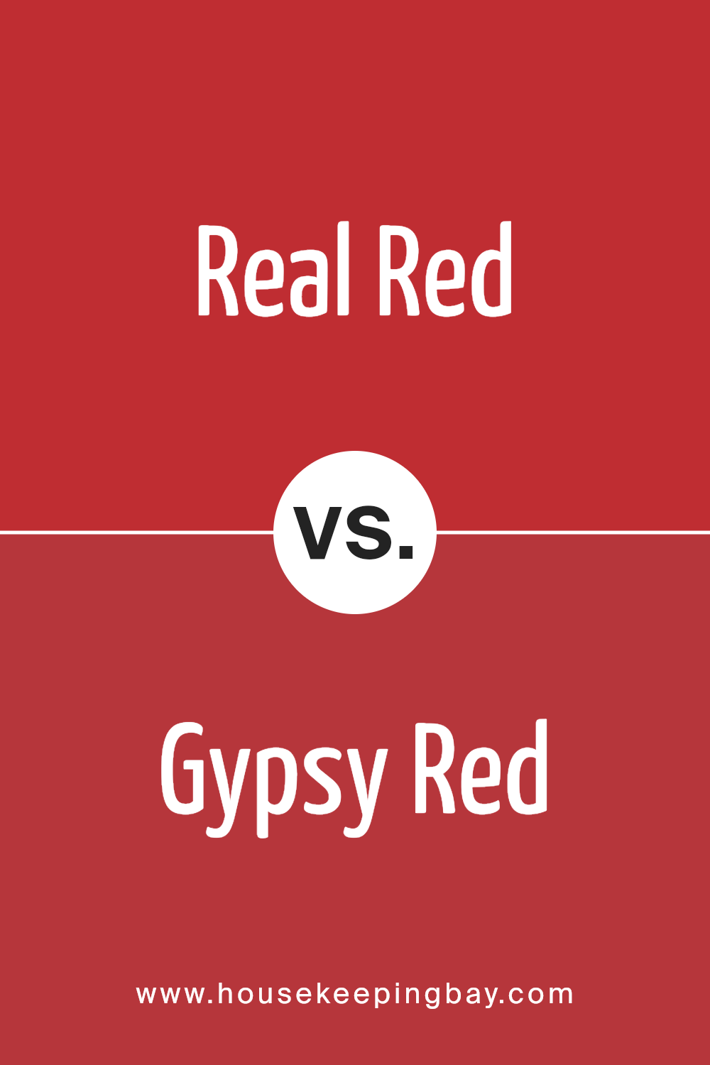
Real Red SW 6868 and Gypsy Red SW 6865 by Sherwin Williams are two vibrant colors with unique characteristics. Real Red is a bold, pure red that draws attention. It’s the kind of red that makes a statement, perfect for someone looking to add a splash of energy to a space. It’s bright and lively, often associated with love, passion, and excitement.
On the other hand, Gypsy Red is a bit softer and has a more earthy tone. It’s not as intense as Real Red but still holds a lot of warmth and depth. Gypsy Red could be seen as more versatile, fitting easily into various decor styles without overwhelming the space. It brings a cozy, inviting vibe, making it ideal for creating a comfortable, welcoming area.
Both colors are beautiful, but your choice depends on what mood or atmosphere you’re aiming to achieve. Real Red is your go-to for boldness and vibrancy, while Gypsy Red is perfect for a softer, more grounded appeal.
You can see recommended paint color below:
- SW 6865 Gypsy Red
housekeepingbay.com
Real Red SW 6868 by Sherwin Williams vs Habanero Chile SW 7589 by Sherwin Williams
Real Red SW 6868 by Sherwin Williams is a vibrant, pure red color. It’s bold and stands out, making a strong statement wherever it’s used. This color is perfect if you want something that grabs attention, like on an accent wall or for a piece of furniture that you want to be the room’s focal point.
On the other hand, Habanero Chile SW 7589 is also a red, but with a twist. It has a slightly orange undertone, making it warmer and a bit more earthy compared to Real Red.
Habanero Chile feels like a mix of red’s energy and orange’s warmth, giving it a unique appeal. It’s great for spaces where you want warmth and vibrancy without the intensity of a pure red.
Both colors are bold and lively, but Real Red leans towards a classic red look, while Habanero Chile offers a slightly softer, warmer option. Choosing between them depends on the mood and atmosphere you’re aiming for in your space.
You can see recommended paint color below:
- SW 7589 Habanero Chile

housekeepingbay.com
Real Red SW 6868 by Sherwin Williams vs Red Tomato SW 6607 by Sherwin Williams
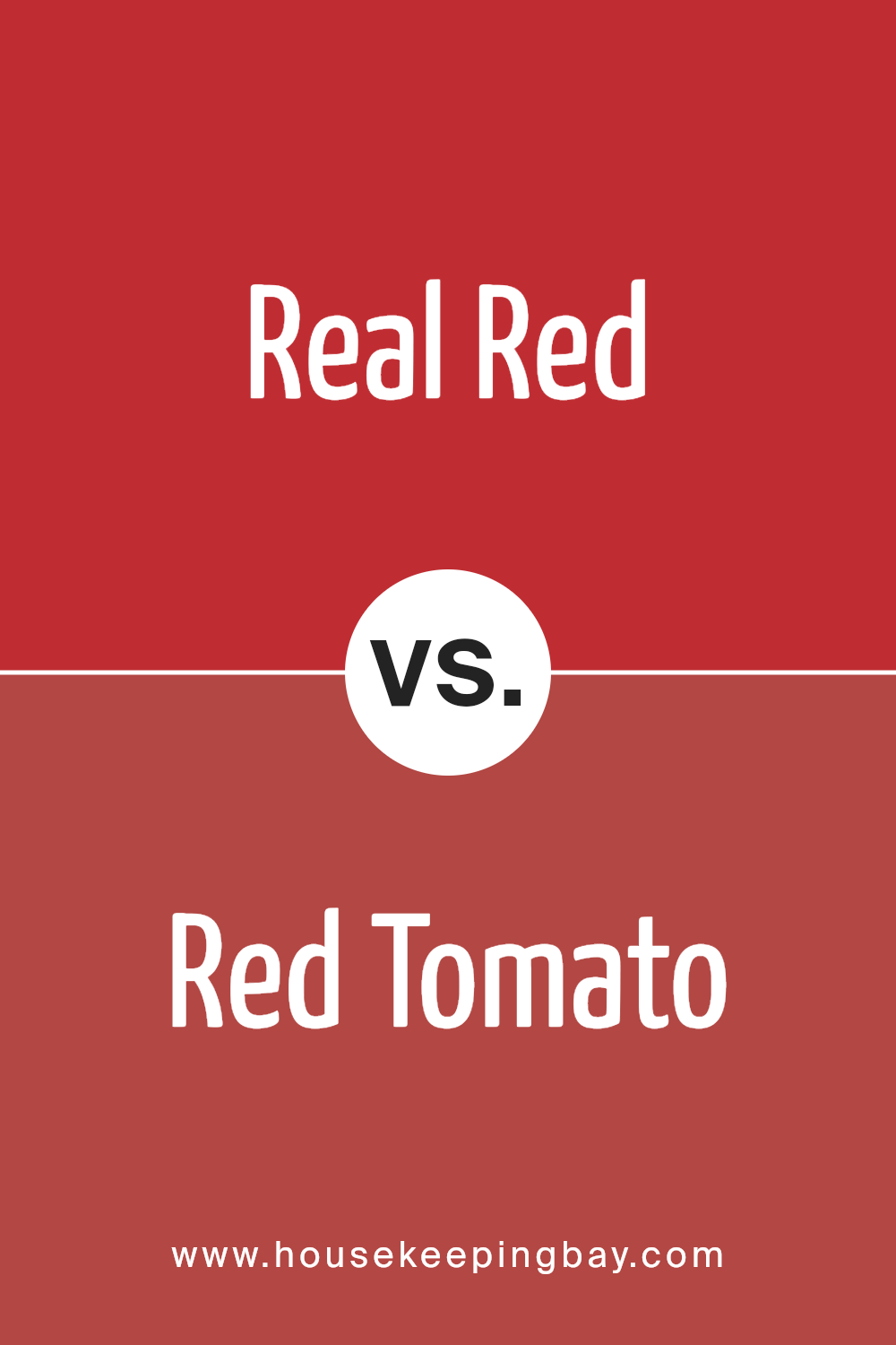
Real Red SW 6868 by Sherwin Williams is a vibrant and bold color. It’s the kind of red that really stands out because of its deep and intense hue. This makes it a perfect choice if you want a color that draws attention and makes a strong statement. It’s the kind of red you might use on a feature wall or to add a pop of color to a space that needs a bit of energy.
On the other hand, Red Tomato SW 6607 by Sherwin Williams is a slightly different type of red. While it’s also vibrant, it leans a bit more towards a warm, inviting shade with a hint of orange undertone.
This gives it a more welcoming feel compared to the pure intensity of Real Red. Red Tomato is great for creating a cozy atmosphere, making it ideal for living rooms, kitchens, or anywhere you want a more comfortable and homey vibe.
So, while both colors are red, Real Red is more about boldness and intensity, and Red Tomato offers warmth and comfort.
You can see recommended paint color below:
- SW 6607 Red Tomato
housekeepingbay.com
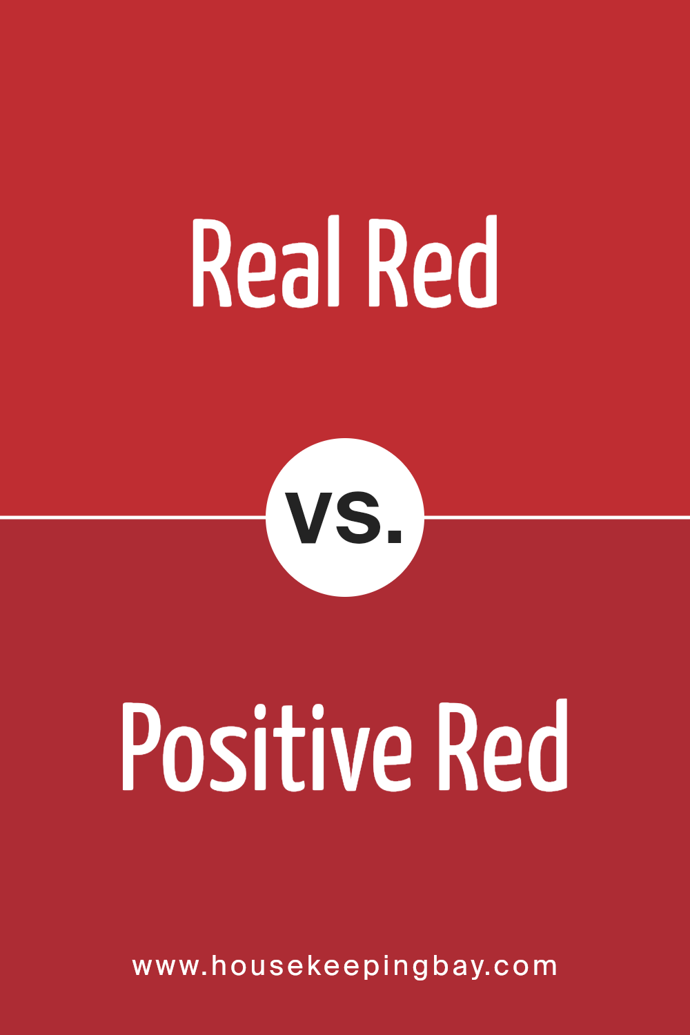
Real Red SW 6868 by Sherwin Williams vs Positive Red SW 6871 by Sherwin Williams
Real Red SW 6868 by Sherwin Williams is a bold, vibrant color. It’s very much like the classic red you’d think of—strong and full of energy. It grabs your attention right away and is a powerful choice if you want to make a statement in a room or on a piece of furniture.
On the other hand, Positive Red SW 6871 by Sherwin Williams is also a red tone but with a slightly different vibe. It’s a bit lighter and has a more cheerful feel to it. While still energetic, Positive Red might feel more inviting and less intense than Real Red.
If you’re choosing between the two, consider what mood you want to set. Real Red is more about boldness and drama, while Positive Red offers a slightly softer, yet still lively, atmosphere. Both are great choices if you love red, but your preference might depend on the specific feeling you’re aiming for.
You can see recommended paint color below:
- SW 6871 Positive Red
housekeepingbay.com
Real Red SW 6868 by Sherwin Williams vs Red Obsession SW 7590 by Sherwin Williams
Real Red SW 6868 by Sherwin Williams and Red Obsession SW 7590 are both beautiful shades of red but they bring different vibes to a space. Real Red is a bold and pure red. It’s the kind of color that grabs your attention as soon as you walk into a room, making everything look lively and energetic. It’s perfect if you want a place that feels dynamic and full of life.
On the other hand, Red Obsession is a deeper, more subdued shade of red. It has hints of maroon, giving it a more sophisticated and somewhat cozy feel.
This color can make a room feel more elegant and warm, creating a welcoming atmosphere. It’s great for spaces where you want a touch of drama without overwhelming the senses.
In short, if you’re looking for a vibrant, stand-out red, Real Red is your go-to. But if you prefer a richer, more refined red, Red Obsession will not disappoint.
You can see recommended paint color below:
- SW 7590 Red Obsession

housekeepingbay.com
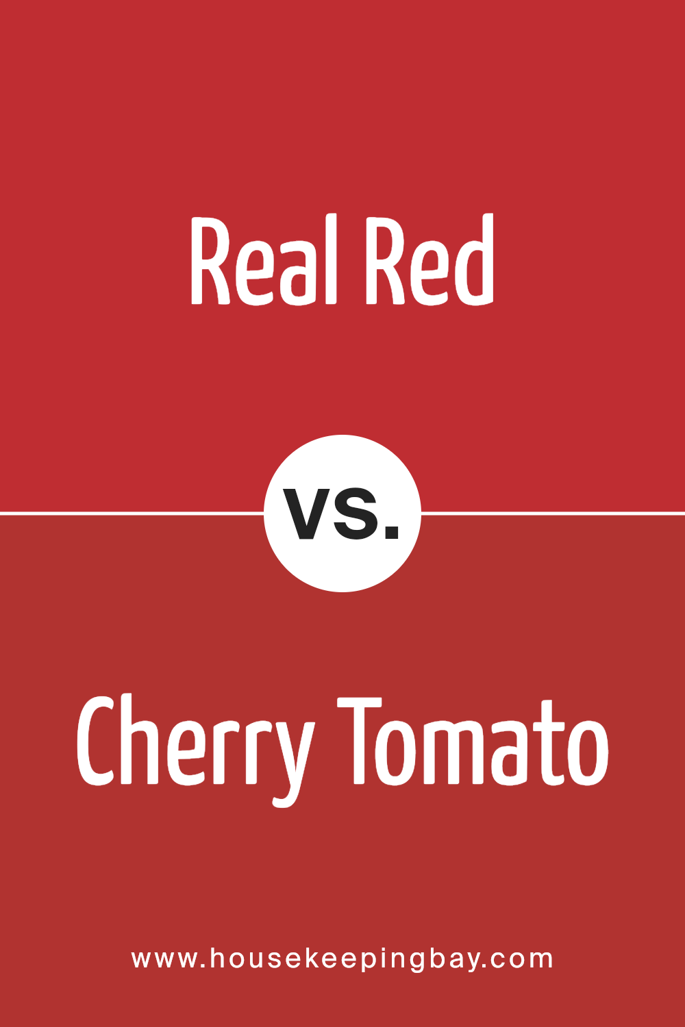
Real Red SW 6868 by Sherwin Williams vs Cherry Tomato SW 6864 by Sherwin Williams
Real Red SW 6868 by Sherwin Williams is a strong and vibrant color, full of life and energy. It’s the kind of red that grabs your attention, making a bold statement wherever it’s used.
This color is great for bringing a sense of dynamism and passion into a space. On the other hand, Cherry Tomato SW 6864 is also a lively color, but it leans a bit more towards the orange side of red. It’s a cheerful and inviting shade that can warm up any room. This color is excellent for creating a cozy yet vibrant atmosphere.
When comparing the two, Real Red is more of a classic, pure red, while Cherry Tomato introduces a hint of orange, making it appear slightly softer and less intense. Depending on the mood you want to create, Real Red is perfect for adding drama and intensity, whereas Cherry Tomato can brighten a space with a more playful and welcoming vibe. Both colors are stunning, but their different undertones can significantly affect the ambiance of a room.
You can see recommended paint color below:
- SW 6864 Cherry Tomato
housekeepingbay.com
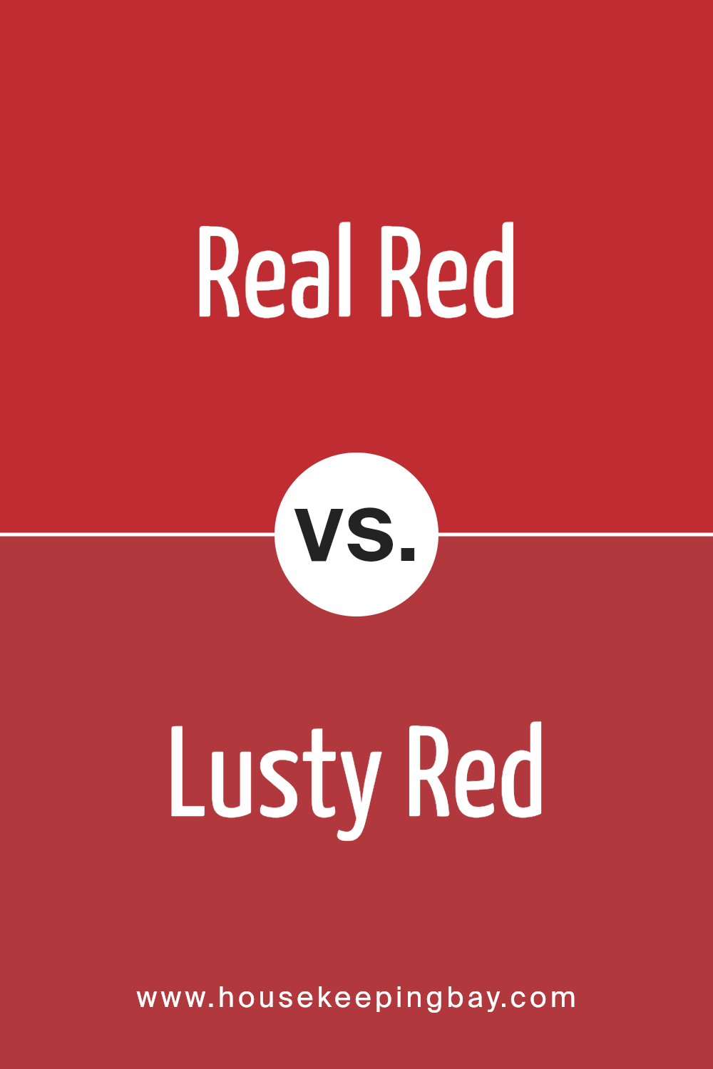
Real Red SW 6868 by Sherwin Williams vs Lusty Red SW 6863 by Sherwin Williams
Real Red SW 6868 and Lusty Red SW 6863 by Sherwin Williams are two striking colors that share the warmth and vibrancy of red. Real Red is a bold, vibrant hue that stands out with its pure, classic red shade.
It’s a color that grabs attention, making it a great choice for areas where you want to make a statement or add excitement. On the other hand, Lusty Red is a bit deeper and richer, with a touch of warmth that makes it feel more intimate and cozy.
While still lively, it has a slightly muted tone compared to Real Red, making it more versatile for spaces where you want a hint of passion without overwhelming the senses.
Both colors are beautiful and can create different moods in a space, with Real Red being more about pure, energetic vibes, and Lusty Red offering a more sophisticated, indulgent atmosphere.
You can see recommended paint color below:
- SW 6863 Lusty Red
housekeepingbay.com
Real Red SW 6868 by Sherwin Williams vs Heartthrob SW 6866 by Sherwin Williams
Real Red SW 6868 and Heartthrob SW 6866 by Sherwin Williams are two vibrant colors that stand out for their boldness. Real Red is a bright, true red that pops with energy. It’s the kind of red you’d imagine on a sports car or a lipstick that aims to grab attention. It’s pure and has a lively vibe, perfect for spaces or items wanting to make a strong statement.
On the other hand, Heartthrob is slightly deeper and leans a bit towards a warm, romantic red. It carries a hint of coziness and warmth, making it ideal for creating a welcoming and somewhat intimate atmosphere. This color has the power to add depth to a space or design, offering a rich backdrop that suggests passion and comfort.
Both colors are stunning and can set a solid foundational mood for any decor or project. While Real Red goes all out with its brightness and energy, Heartthrob tones it down a notch, inviting a softer, warmer feel. Depending on what vibe one is aiming for—whether it’s striking energy or cozy warmth—either color can be a fantastic choice.
You can see recommended paint color below:
- SW 6866 Heartthrob

housekeepingbay.com
Real Red SW 6868 by Sherwin Williams vs Ablaze SW 6870 by Sherwin Williams
Real Red SW 6868 by Sherwin Williams is a loud and bold color. It screams attention and has a classic vibe, making it a popular choice for adding drama to any space. Think of the red on a stop sign; that’s how upfront and striking Real Red is. It’s perfect for creating a focal point in a room or adding a splash of vibrant energy.
On the other hand, Ablaze SW 6870 takes the energy of red to a warmer, more inviting level. This color has an orange undertone that makes it appear a bit softer and more welcoming than Real Red. It’s like the color of autumn leaves or a cozy, crackling fire. Ablaze is great for spaces where you want warmth and comfort, offering a snug, inviting atmosphere.
While both colors pack a punch, Real Red leans more toward a pure, classic red, whereas Ablaze offers a warmer, cozier vibe. Depending on the feeling you want to bring into a room, you might choose the boldness of Real Red or the warmth of Ablaze.
You can see recommended paint color below:
- SW 6870 Ablaze

housekeepingbay.com
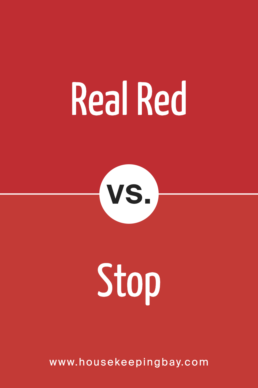
Real Red SW 6868 by Sherwin Williams vs Stop SW 6869 by Sherwin Williams
Alright, let’s compare these two colors, Real Red SW 6868 and Stop SW 6869, both from Sherwin Williams. These colors are pretty close cousins in the world of red paint, but they have their own unique vibes.
Real Red is a true, bright red. It’s the kind of red that stands out, bold and lively. If you’re painting a space where you want a pop of color that’s both cheerful and attention-grabbing, Real Red is your go-to. It’s the type of red that brings energy into a room without overwhelming it.
On the other hand, Stop is a tad darker than Real Red. While still in the red family, Stop leans a bit towards a deeper tone, offering a slightly more sophisticated and mature feel. This color might be the choice if you’re going for bold but with a touch of seriousness. It’s great for spaces that aim to make a statement but in a somewhat more subdued or elegant way.
Both colors are vibrant and can bring a lot of personality to a space, but your choice between them might come down to the mood you’re aiming to create.
You can see recommended paint color below:
- SW 6869 Stop
housekeepingbay.com
Conclusion
Real Red SW 6868 by Sherwin Williams stands out as a vibrant and bold paint color, ideal for adding a pop of energy to any space. The hue has the power to transform areas, bringing life and vibrancy wherever applied.
Its dynamic nature makes it perfect for accent walls, decor pieces, or even entire rooms where a strong and lively atmosphere is desired.
The shade is versatile enough to be integrated into various design styles, from contemporary to traditional, proving its adaptability and appeal in different settings.
Furthermore, selecting Real Red SW 6868 indicates a confident approach to interior design, showcasing a willingness to make bold choices. The color exudes a sense of warmth and excitement, making spaces more inviting and stimulating.
Whether used in a residential or commercial environment, it captures attention and creates focal points with ease. For anyone looking to infuse their surroundings with a spirited and robust color, Real Red SW 6868 by Sherwin Williams offers a promising option, ensuring spaces are anything but dull.
housekeepingbay.com
Ever wished paint sampling was as easy as sticking a sticker? Guess what? Now it is! Discover Samplize's unique Peel & Stick samples. Get started now and say goodbye to the old messy way!
Get paint samples
