Garden View 616 Paint Color by Benjamin Moore
In the realm of interior design, colors play a pivotal role in shaping the atmosphere and mood of a space.
In the realm of interior design, colors play a pivotal role in shaping the atmosphere and mood of a space. One such color that has gained popularity for its unique charm is Garden View 616. This color, with its distinctive hue, can transform a room, making it essential to understand its characteristics, undertones, coordinating colors, and how it interacts with lighting.
This comprehensive exploration will delve into the nuances of Garden View 616, guiding homeowners and designers in making informed choices for their spaces.
via plan home
What Color Is Garden View 616?
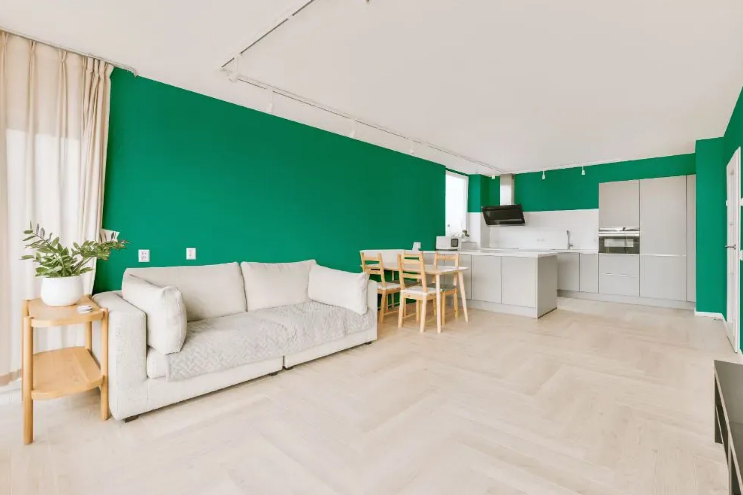
Garden View 616 is a captivating color that exudes tranquility and sophistication. It’s a rich, deep green with a touch of earthiness, reminiscent of a lush, verdant garden after rainfall. This color brings the serenity of nature indoors, making it ideal for creating a calming oasis in any home. It works exceptionally well in interior styles that emphasize natural elements, such as rustic, Scandinavian, and modern minimalistic designs.
In terms of materials and textures, Garden View 616 pairs beautifully with natural wood, stone, and organic fabrics like cotton and linen. Its depth complements metallic accents in bronze or gold, adding a touch of elegance. For a harmonious look, use it with soft, matte finishes rather than glossy surfaces.
housekeepingbay.com
Table of Contents
Is It a Warm Or Cool Color?
Garden View 616 is predominantly a cool color, with its green hue evoking a sense of freshness and tranquility. Cool colors are known for their calming effect, and Garden View 616 is no exception. It brings a soothing ambiance to any room, making it ideal for spaces where relaxation is a priority, such as bedrooms and living areas.
This cool nature affects how the color works in homes. It can make a room feel more spacious and airy, creating a serene backdrop for various design elements. However, in rooms with limited natural light, it might appear somewhat darker, so it’s essential to balance it with warm lighting and accents.
Undertones of Garden View 616
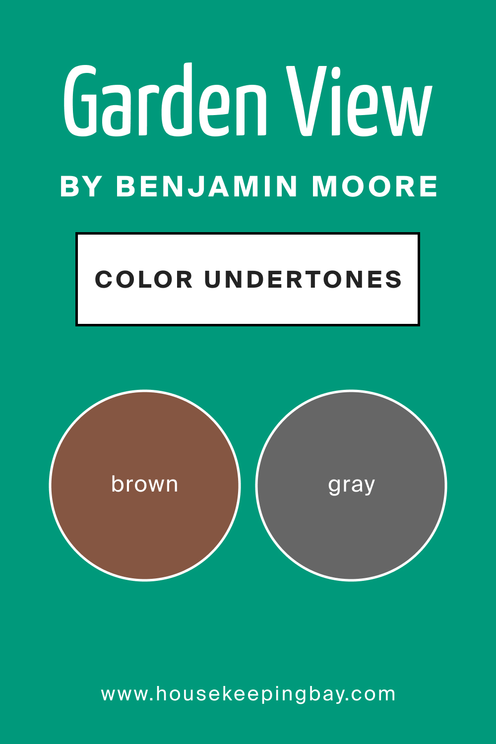
The undertones of a color significantly influence how we perceive it, and Garden View 616 has subtle undertones that add to its complexity. It possesses an underlying earthiness, with hints of gray and brown, which grounds the color and adds a sense of depth.
These undertones affect how the paint appears on interior walls.
In rooms with ample natural light, the green may appear more vibrant, while in dimmer spaces, the earthy undertones become more pronounced, giving the color a richer, more muted look. It’s crucial to consider these undertones when selecting complementary colors and decor.
housekeepingbay.com
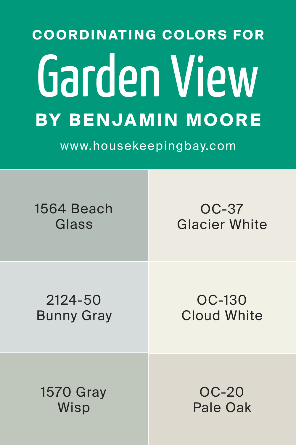
Coordinating Colors of Garden View 616
Coordinating colors are hues that harmonize well with a primary color, enhancing its beauty without overpowering it. For Garden View 616, coordinating colors include OC-37 Glacier White, OC-130 Cloud White, and BM 1570 Gray Wisp.
- OC-37 Glacier White : A crisp, clean white with a slightly cool undertone.
- OC-130 Cloud White : A soft, warm white with a hint of creaminess.
- BM 1570 Gray Wisp : A gentle gray with a subtle blue-green undertone.
Additionally, three other coordinating colors are:
- OC-20 Pale Oak : A warm, neutral beige with a touch of gray.
- BM 2124-50 Bunny Gray : A soft, light gray with a hint of blue.
- BM 1564 Beach Glass : A muted blue-green, reminiscent of sea glass.
These colors complement Garden View 616, creating a balanced and harmonious palette.
housekeepingbay.com
How Does Lighting Affect Garden View 616?
Lighting significantly impacts how colors appear, and Garden View 616 is no exception. Under artificial light, especially warm-toned bulbs, the color may appear slightly more muted and warmer. In contrast, natural daylight tends to bring out its vibrant green qualities.
In north-faced rooms, which receive cooler, indirect light, Garden View 616 may lean more towards its earthy undertones. In south-faced rooms with abundant sunlight, the color can appear brighter and more lively.
East-faced rooms experience warm morning light, which can highlight the green vibrancy, while west-faced rooms, with afternoon and evening light, may bring out the color’s depth and richness.
housekeepingbay.com
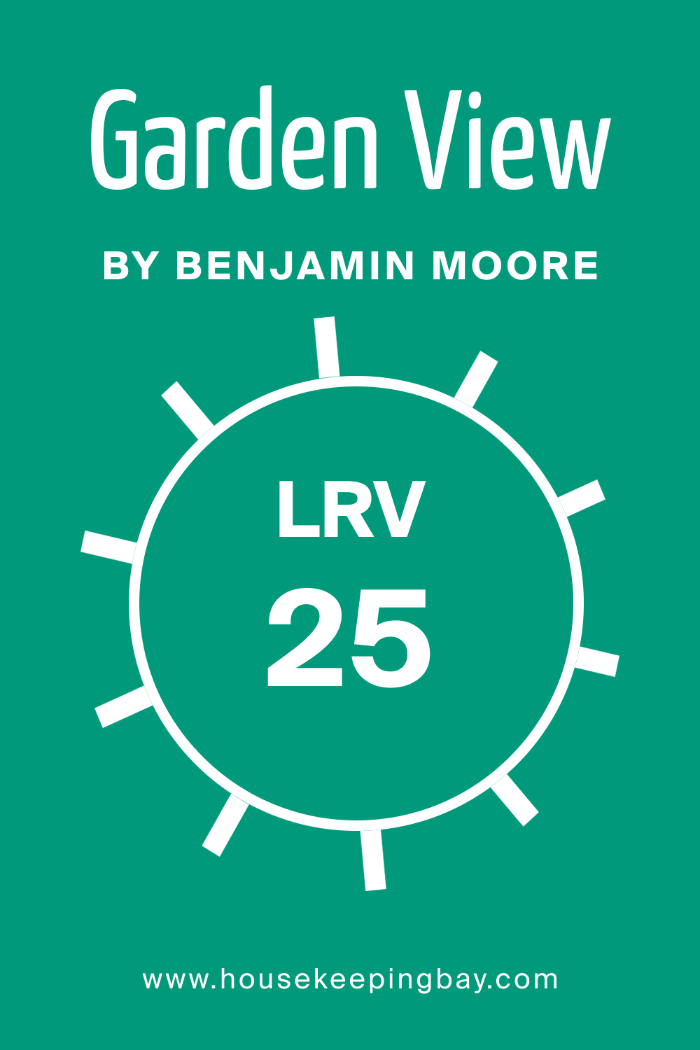
LRV of Garden View 616
Light Reflectance Value (LRV) measures the amount of light a color reflects. Garden View 616 has an LRV of 25, meaning it reflects a moderate amount of light. This LRV indicates that while it’s not overly dark, it’s also not a light color. In well-lit rooms, this LRV allows Garden View 616 to stand out without overpowering the space. In rooms with less natural light, however, it may appear deeper and more saturated.
The LRV of 25 affects how this color is perceived on walls. It’s ideal for creating a focal point or accent wall, providing a balance between boldness and subtlety. It’s also suitable for larger rooms, where it can add depth without making the space feel closed in.
housekeepingbay.com
What is LRV? Read It Before You Choose Your Ideal Paint Color
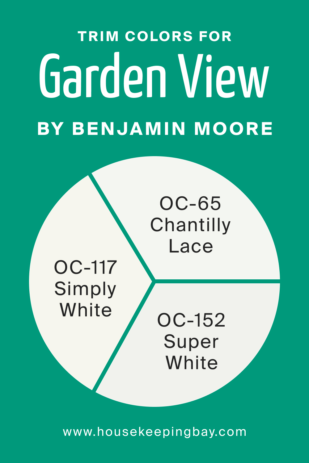
Trim Colors of Garden View 616
Trim colors are used on moldings, door frames, and other architectural details to accentuate and complement the primary wall color. For Garden View 616, shades of white make excellent trim colors, providing a crisp, clean contrast that highlights the richness of the green.
Three suitable trim colors from the same brand are:
- OC-117 Simply White : A versatile, bright white with a slight yellow undertone.
- OC-152 Super White : A pure, stark white, great for a modern, crisp look.
- OC-65 Chantilly Lace : A soft white with a neutral undertone, offering a subtle contrast.
These shades of white enhance the sophistication of Garden View 616, creating an elegant and chesive look.
housekeepingbay.com
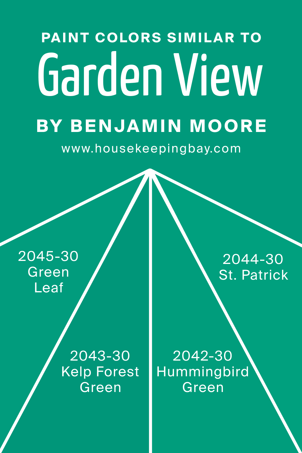
Colors Similar to Garden View 616
Knowing similar colors is crucial for finding alternatives that may fit better with specific design themes or personal preferences. For a color close to Abbey Brown 1225, consider:
- BM 2043-30 Kelp Forest Green : A deep, dark green with a noticeable earthy tone.
- BM 2042-30 Hummingbird Green : A vibrant green with a touch of blue, lively and refreshing.
- BM 2045-30 Green Leaf : A bold, leafy green, full of natural vibrancy.
- BM 2044-30 St. Patrick : A rich, traditional green, reminiscent of lush foliage.
Each of these colors offers a different take on a deep, nature-inspired green, providing options for various design preferences.
housekeepingbay.com
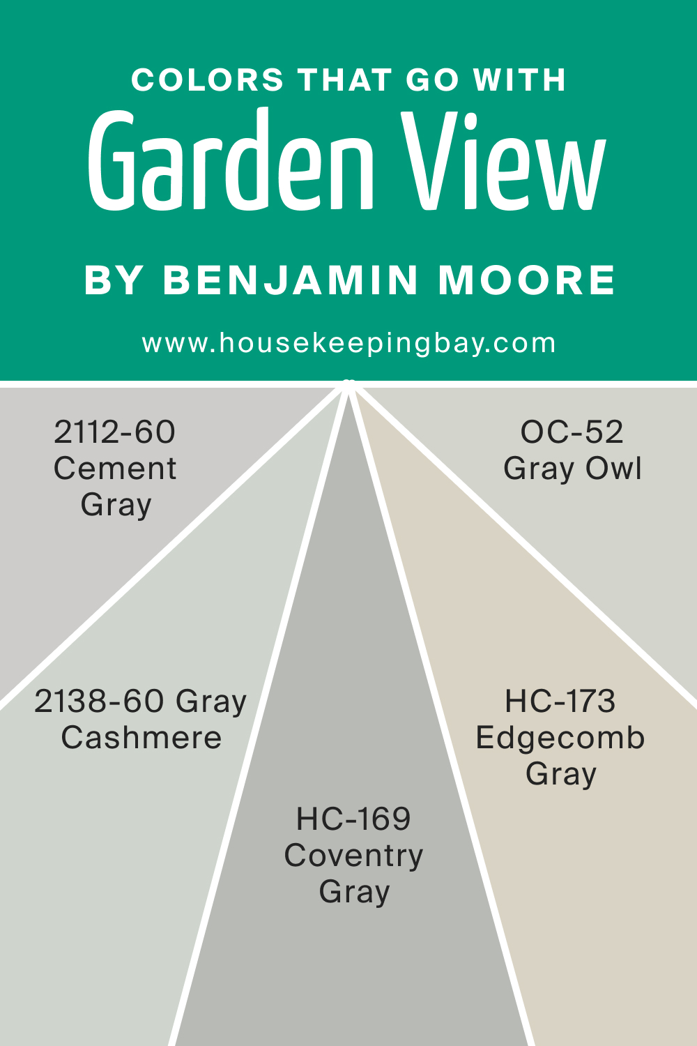
Colors That Go With Garden View 616
Using colors that complement each other in the same room is crucial for creating a harmonious and visually appealing space. For Garden View 616, several Benjamin Moore colors pair well, including:
- HC-173 Edgecomb Gray : A soft, warm gray with a hint of beige.
- OC-52 Gray Owl : A versatile, light gray with a subtle green undertone.
- BM 2112-60 Cement Gray : A mid-tone gray with a balanced, neutral quality.
- BM 2138-60 Gray Cashmere : A gentle, green-gray, soothing and serene.
- HC-169 Coventry Gray : A deeper gray with a slight blue undertone.
These colors complement Garden View 616, offering a range of options from subtle to dramatic, suitable for any home design.
housekeepingbay.com
How to Use Garden View 616 In Your Home?
Garden View 616, with its serene and lush green hue, is versatile enough to be used in various rooms. Its calming nature makes it ideal for bedrooms and living spaces, where relaxation is key. In kitchens and bathrooms, it evokes freshness and cleanliness, while outdoors, it harmonizes with nature. From modern minimalist designs, where it can be a bold focal point, to rustic or Scandinavian styles, where it complements natural materials, Garden View 616 fits seamlessly
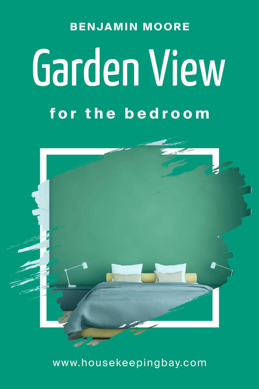
How to Use Garden View 616 in the Bedroom?
In the bedroom, Garden View 616 brings a touch of the outdoors, instilling a sense of calm. Paired with neutral bedding and wooden furniture, it creates a sanctuary for relaxation. Soft, muted lighting enhances its cozy feeling, making it perfect for winding down after a long day.
Whether for an accent wall or throughout the room, it provides a refreshing escape.
housekeepingbay.com
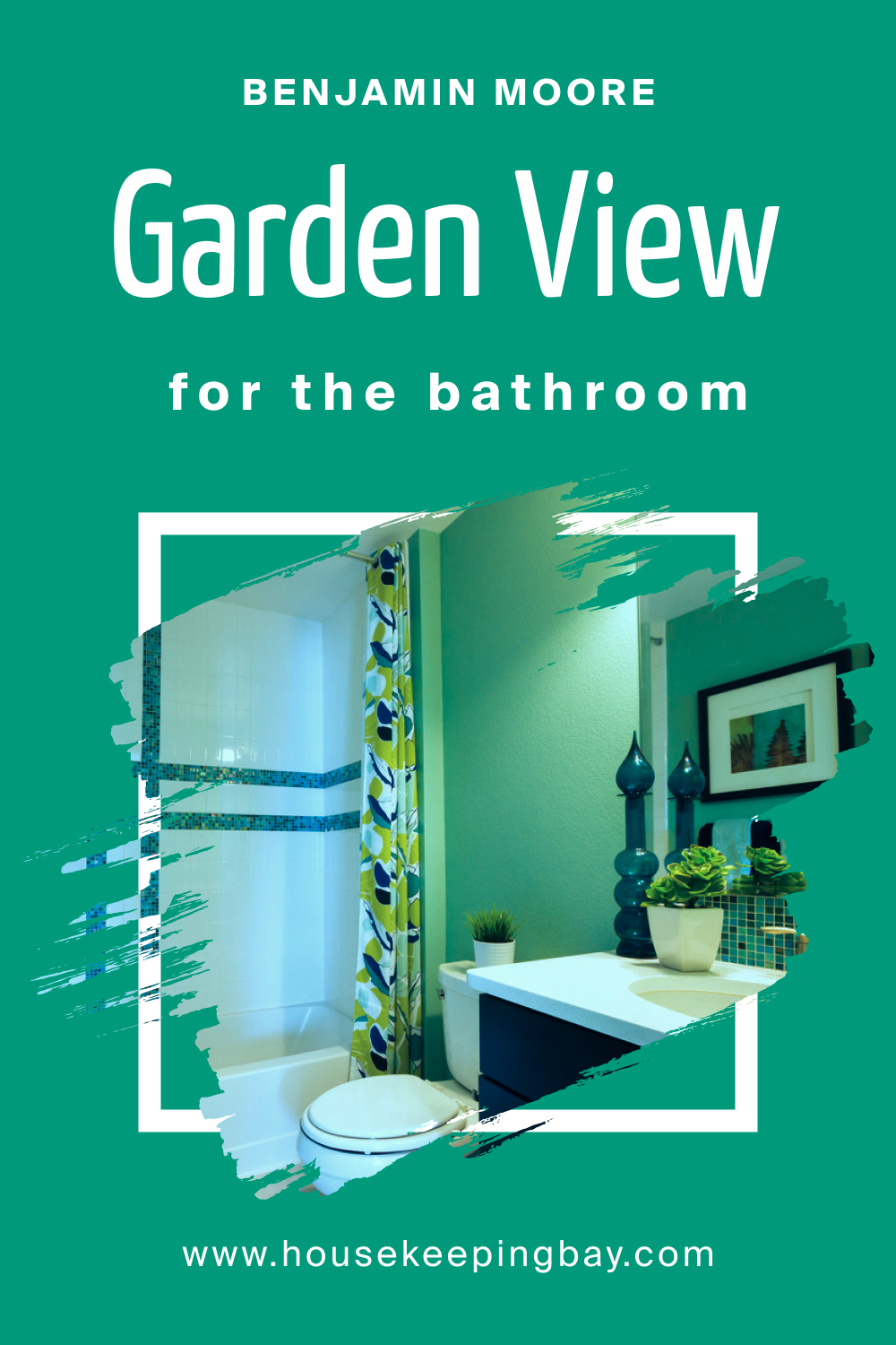
How to Use Garden View 616 in the Bathroom?
Bathrooms benefit from the refreshing and clean vibe of Garden View 616. It evokes feelings of rejuvenation, akin to a spa. Paired with white fixtures and subtle metallic accents, the color adds depth without feeling overpowering. For a tranquil bathing experience, combine it with soft textiles and plants.
housekeepingbay.com
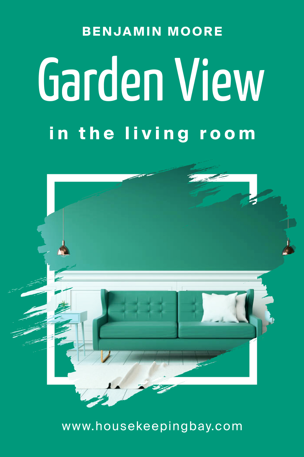
How to Use Garden View 616 in the Living Room?
In the living room, Garden View 616 offers a backdrop for both lively interactions and peaceful moments. It complements natural materials like wood and stone, while its depth contrasts nicely with lighter textiles and furnishings. Incorporate gold or bronze accents for a touch of elegance. It’s a hue that unites different elements, ensuring cohesiveness.
housekeepingbay.com
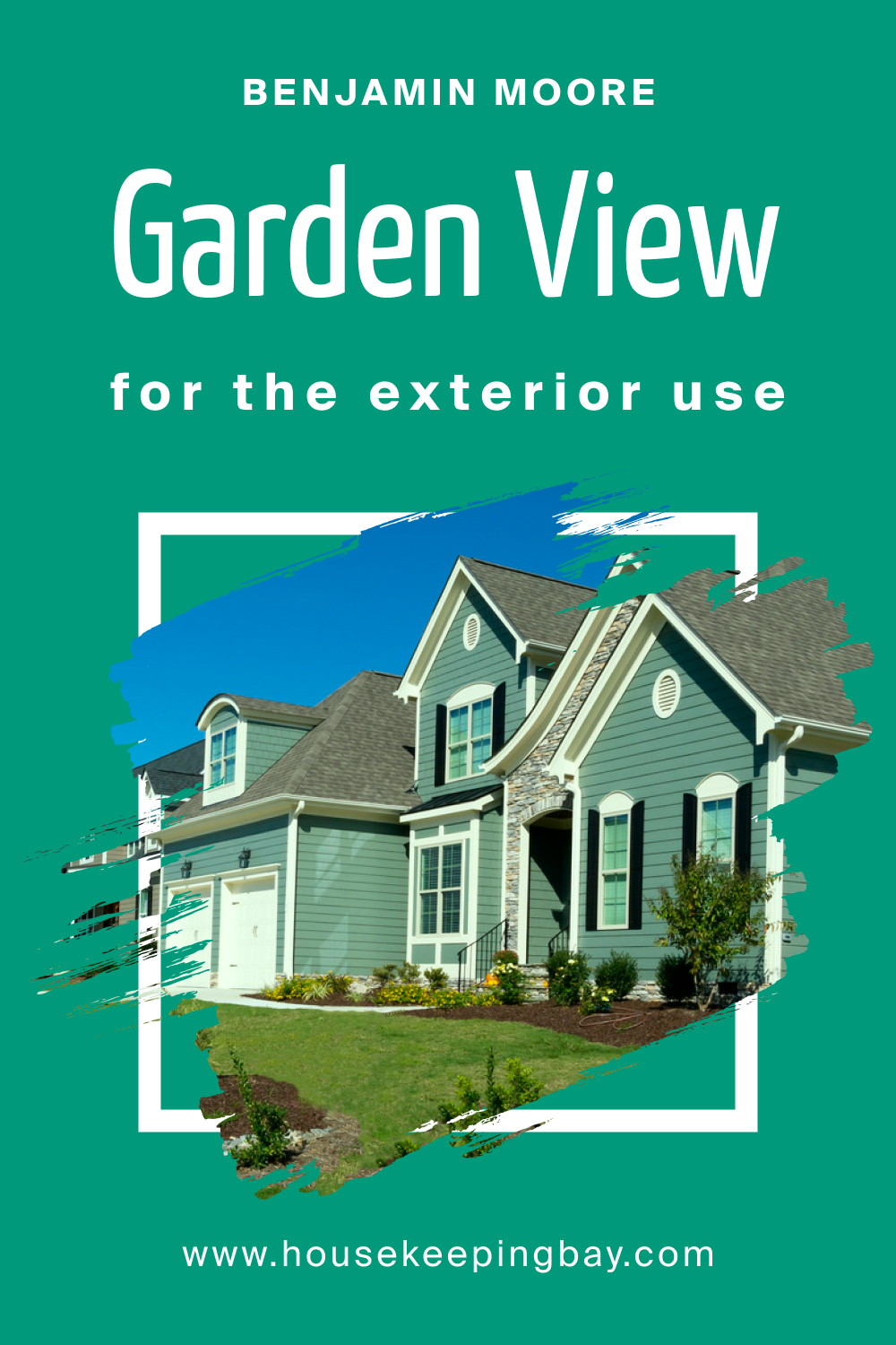
How to Use Garden View 616 for an Exterior?
For exteriors, Garden View 616 is a nod to nature. It’s perfect for homes nestled in green landscapes, as it creates a harmonious transition. Paired with crisp white trims and darker accents, it exudes sophistication. Whether for a modern facade or a quaint cottage, this color elevates the curb appeal.
housekeepingbay.com
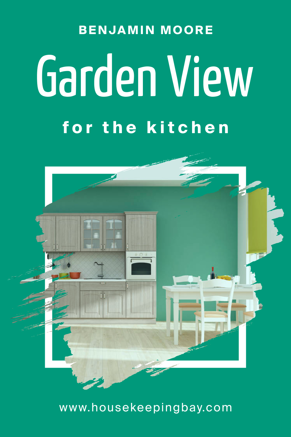
How to Use Garden View 616 in the Kitchen?
Kitchens adorned with Garden View 616 feel fresh and invigorating. As a backdrop, it promotes a sense of well-being, essential for a space where nutrition begins. Combine it with white countertops and stainless-steel appliances for a modern touch, or with wooden elements for a more rustic feel. It’s a hue that energizes and soothes simultaneously.
housekeepingbay.com
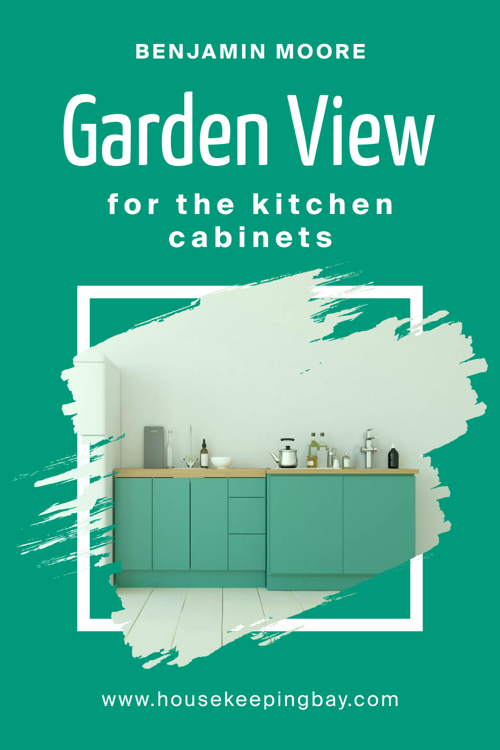
How to Use Garden View 616 on the Kitchen Cabinets?
Choosing Garden View 616 for kitchen cabinets is a bold and rejuvenating choice. The color adds depth and character, turning cabinets into standout features. Paired with light-colored walls, it ensures balance. Incorporate brushed gold or silver hardware for a chic touch. These colored cabinets, combined with open shelving displaying neutral-toned dishes, create a stylish and functional kitchen.
housekeepingbay.com
Comparing Garden View 616 With Other Colors
Comparing colors is crucial in the realm of interior design. The subtleties and nuances between hues can dramatically affect the mood, tone, and visual impact of a space. Understanding the differences and similarities allows homeowners and designers to make informed decisions, ensuring the desired ambiance is achieved. Moreover, by contrasting colors, you can appreciate the distinct qualities each possesses, helping to tailor design choices to specific aesthetics and preferences.
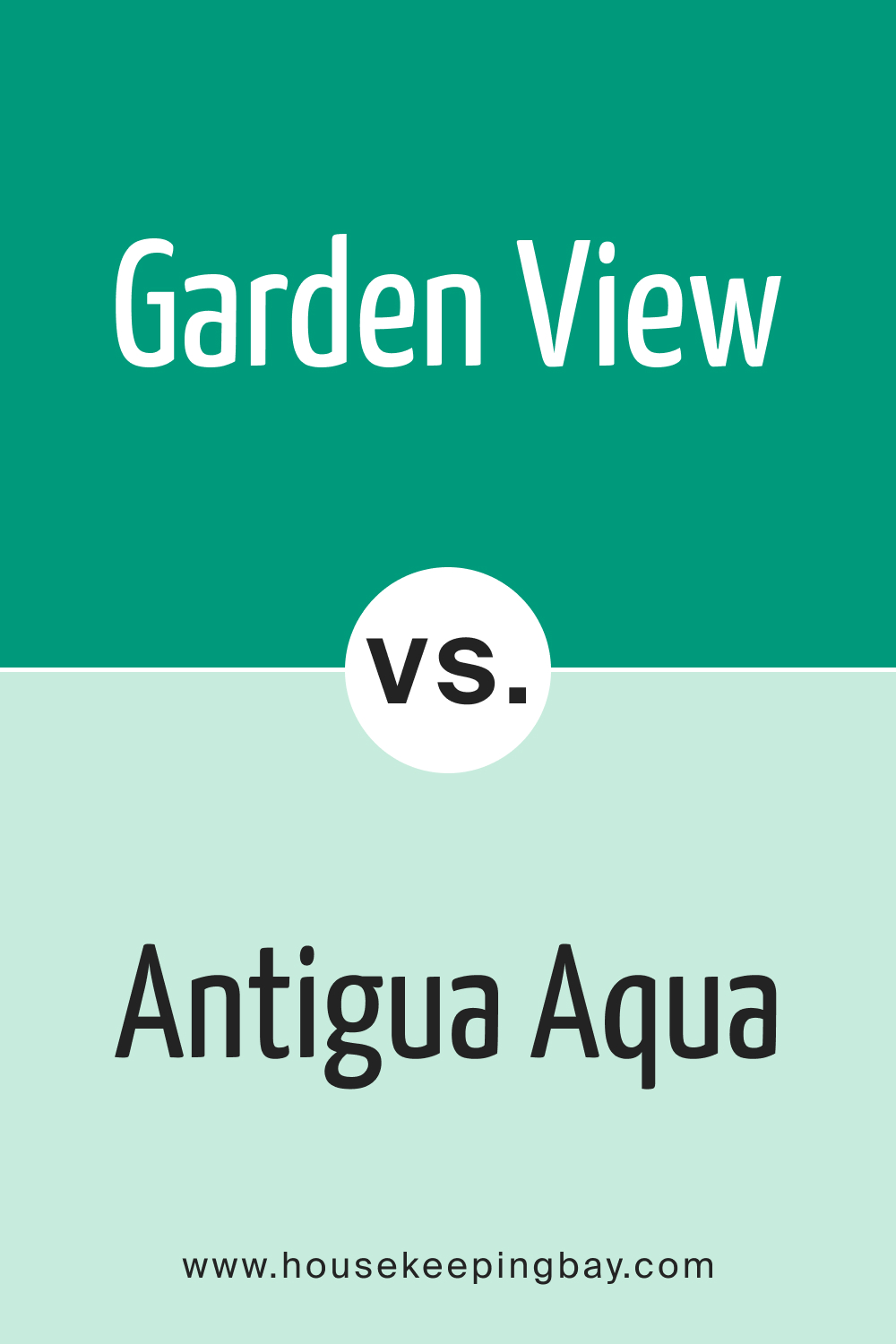
Garden View 616 vs. BM 610 Antigua Aqua
While both are inspired by nature, Garden View 616 has a serene and lush quality, reminiscent of a quiet forest. In contrast, Antigua Aqua offers a coastal, breezy vibe, echoing turquoise waters. Garden View invites calmness, whereas Antigua Aqua evokes vacation-like feelings. In spaces requiring tranquility, Garden View excels, but for a more refreshing, beachy ambiance, Antigua Aqua shines.
housekeepingbay.com
Garden View 616 vs. BM 611 Springtime Green
Springtime Green , as the name suggests, is reminiscent of the fresh burst of green seen in early spring. It’s brighter and has an optimistic tone. Garden View 616, while still refreshing, has a more mature, grounded feel. Springtime Green might be apt for lively spaces or children’s rooms, while Garden View 616 feels more suited for sophisticated living areas.
housekeepingbay.com
Garden View 616 vs. BM 612 Hills of Ireland
Hills of Ireland brings forth the vast landscapes of the Emerald Isle – a bit deeper and more intense. It contrasts with Garden View 616’s softer and subdued tone. While both colors are deeply rooted in nature, Hills of Ireland feels adventurous, whereas Garden View 616 instills calm.
housekeepingbay.com
Garden View 616 vs. BM 613 Fresh Green
Fresh Green is invigorating and full of zest. In juxtaposition, Garden View 616 is mellow. Fresh Green could be the choice for areas needing energy and vigor, like a home gym or study, while Garden View 616 provides solace, making it a top pick for bedrooms or lounges.
housekeepingbay.com
Garden View 616 vs. BM 2040-20 Green Meadows
Green Meadows is robust and vibrant, echoing fields in peak summer. This color is bolder compared to the serene vibe of Garden View 616. In settings where a striking visual is desired, Green Meadows is apt, but for a gentle touch, Garden View 616 prevails.
housekeepingbay.com
Garden View 616 vs. BM 615 Mayan Green
Mayan Green is exotic, with a depth reminiscent of ancient civilizations. Garden View 616 is contemporary and straightforward. For spaces where a touch of history and mystery is desired, Mayan Green stands out. In contrast, Garden View 616 works beautifully in modern, minimalist designs.
housekeepingbay.com
Conclusion
Color comparison isn’t just about finding shades that match or contrast well; it’s a journey into the essence of each hue. Garden View 616, with its tranquil aura, has showcased its adaptability against a spectrum of greens, from the lively Fresh Green to the historical Mayan Green. It’s a testament to the fact that while trends may change, the timeless charm of a well-chosen color remains unbeaten.
When choosing colors, delving deep into their characteristics and understanding their emotional impacts ensures spaces that resonate with the dweller’s soul.

housekeepingbay.com
Ever wished paint sampling was as easy as sticking a sticker? Guess what? Now it is! Discover Samplize's unique Peel & Stick samples. Get started now and say goodbye to the old messy way!
Get paint samples


Frequently Asked Questions
⭐What kind of mood does Garden View 616 evoke in a room?
Garden View 616 infuses a calming and rejuvenating ambiance into any room. Inspired by nature, it has the serene touch of lush green landscapes, making it perfect for creating a relaxing retreat within your home.
⭐Is Garden View 616 suitable for small rooms?
Absolutely! Garden View 616 can be especially beautiful in small rooms. Its tranquil vibe can make a compact space feel like a cozy nook, and when paired with the right decor and lighting, it can even give the illusion of a larger, more open area.
⭐How does Garden View 616 hold up in high traffic areas?
The durability of Garden View 616, like any paint color, largely depends on the quality and finish of the paint chosen. Opt for a higher-quality paint, perhaps in a satin or semi-gloss finish, for high traffic areas to ensure longevity and ease of cleaning.
⭐Can I use Garden View 616 for my home's exterior?
Certainly! Garden View 616 complements natural surroundings beautifully, making it an excellent choice for home exteriors. It pairs especially well with natural materials like stone or wood, offering a harmonious transition between nature and your living space.
⭐Which trim colors pair best with Garden View 616?
Neutral shades, especially whites, are excellent choices for trim colors with Garden View 616. Colors like OC-37 Glacier White or OC-130 Cloud White accentuate Garden View's lushness and offer a clean, crisp finish to the overall look.


