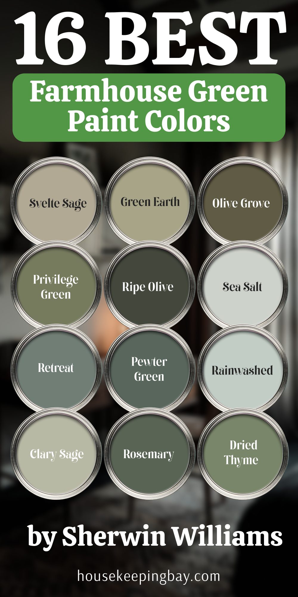
Top 16 Farmhouse Green Paint Colors by Sherwin Williams
My go-to green paint picks for cozy, lived-in farmhouse charm
When I’m working on a farmhouse-style interior, green is one of the first colors I reach for. It’s not loud, but it makes a strong impression. It feels real. To me, green adds heart to a home — it brings in a quiet warmth, like something that’s always been there. Especially in farmhouse design, which is about comfort and lived-in charm, green just fits.
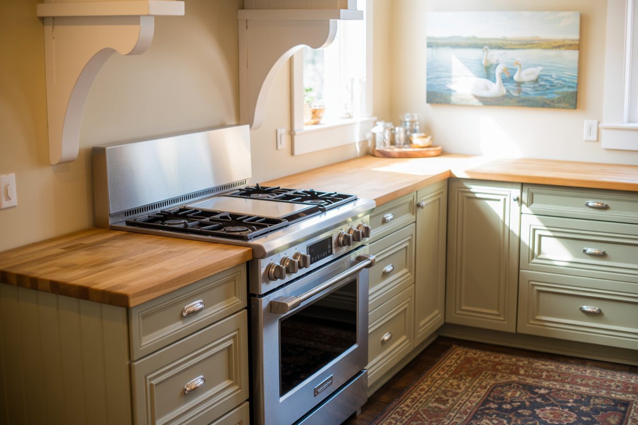
I’ve used green in all kinds of spaces: on kitchen cabinets with butcher block counters, in sunlit living rooms with white shiplap walls, even in powder rooms with brass fixtures. And the paint brand I trust most for these greens is Sherwin-Williams. Their colors have depth, stay consistent, and work beautifully with the textures and materials we usually find in farmhouse settings — things like reclaimed wood, linen, and aged metal.
Green can also be surprisingly personal. Some people are drawn to soft sage tones, others to moodier olive or mossy shades. But no matter the tone, green gives farmhouse interiors something that grays and beiges just can’t — it brings life.
So I’ve put together my favorite 16 green paint colors from Sherwin-Williams that I’ve used again and again in farmhouse homes. These aren’t trendy picks. They’re reliable, beautiful, and they work.
housekeepingbay.com
What Makes a Green Paint Work for Farmhouse Style?
Not every green will feel right in a farmhouse setting. Some are too sharp, some too bright. What works best is a green that feels settled — like it belongs. When I’m choosing greens for a farmhouse look, here are the things I always think about:
1. Tone Matters: Warm vs Cool
Farmhouse design usually leans warm. So greens with warm undertones — think olive, moss, or muted sage — tend to look the most natural. Cool greens, especially with blue or minty undertones, can sometimes feel too fresh or modern.
My tip: If your room has warm wood tones or cream trim, go for a warm green. It blends better and won’t clash.
2. Lighting Changes Everything
A green that looks perfect on the swatch might turn icy under LED lights or too yellow in afternoon sun. That’s why I always test swatches on different walls, and check them at different times of the day.
Pro move: Use real paint samples, not just peel-and-stick. They give you a better sense of how the undertone behaves.
3. Think About the Materials Around It
Green works especially well with these farmhouse staples:
- Natural wood (especially oak, walnut, and pine)
- Antique or matte black hardware
- White or cream shiplap
- Soft linen curtains or upholstery
If you have a lot of these in your room already, the right green will bring them all together.
4. Green Can Act Like a Neutral
This might surprise you, but muted greens often function like a neutral in farmhouse homes. They don’t shout for attention. They sit quietly in the background and make everything else feel cozier.
A client once told me: “I didn’t realize my green kitchen was exactly what the house needed until it was done. Now it feels calm without being boring.”
Top 16 Farmhouse Green Paint Colors by Sherwin-Williams
Soft & Sagey Greens
These are the lightest, most subtle greens — perfect for when you want something gentle that still has character. They work beautifully in rooms with lots of natural light or as a calm backdrop in bedrooms, bathrooms, and even kitchens.
1. Sherwin-Williams Sea Salt (SW 6204)
A mix of soft green and gray with a slight blue undertone.
This one is super popular — and for good reason.
Where I like it: Bathrooms, laundry rooms, bedrooms. It feels clean and airy without being cold.
Designer Note: This color is often called a chameleon. In different light, it shifts from soft green to almost gray-blue.
Fun stat: Sea Salt has been one of Sherwin-Williams’ top-selling colors for over 5 years
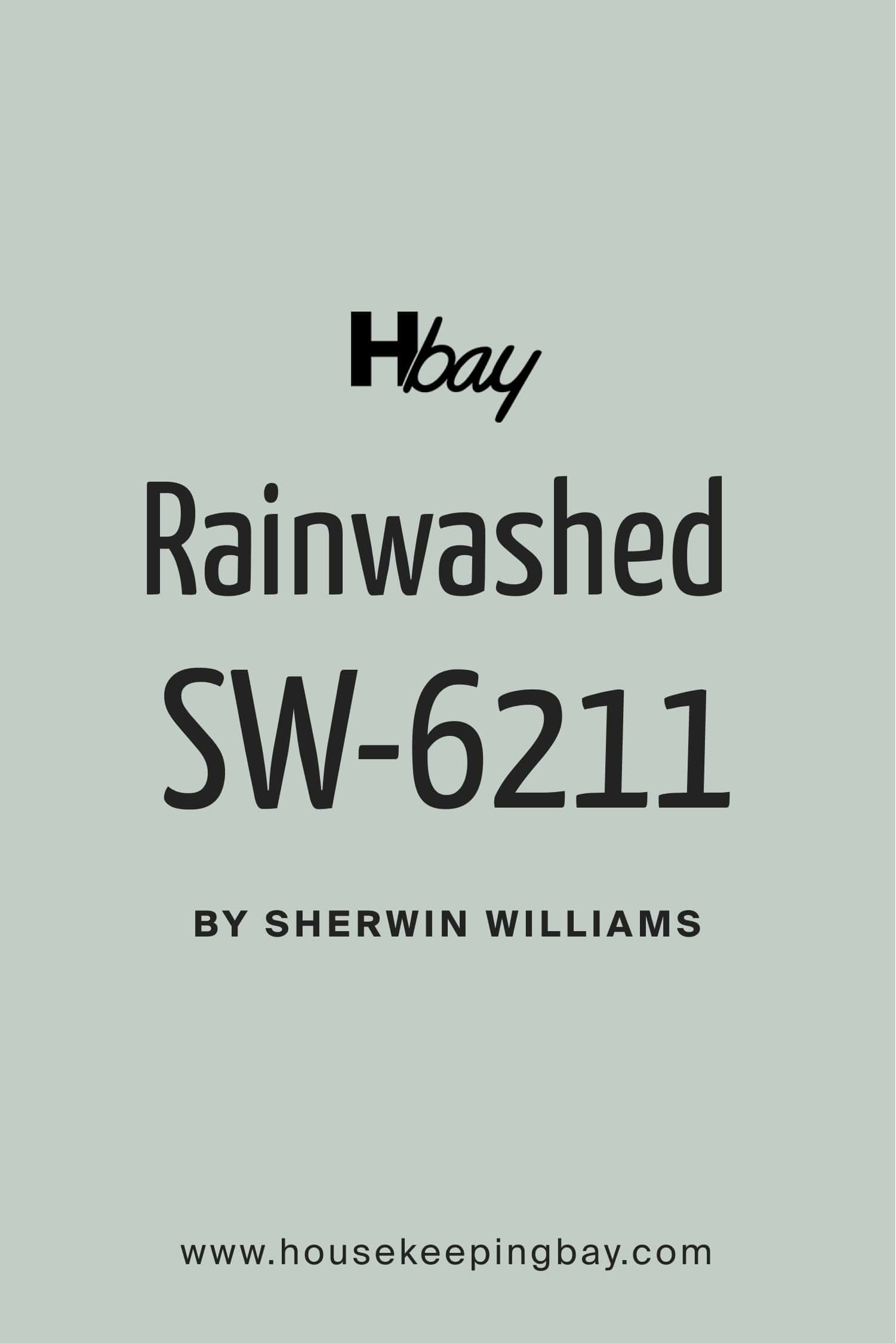
2. Sherwin-Williams Rainwashed (SW 6211)
Softer than mint, with a watery green-blue feel.
Where I like it: Guest rooms and nurseries. It has a peaceful, fresh look that doesn’t feel overdone.
My tip: If your room doesn’t get a lot of light, this one may lean more blue.
housekeepingbay.com
3. Sherwin-Williams Clary Sage (SW 6178)
A true warm sage — earthy, soft, and steady.
Where I like it: Kitchen cabinets, mudrooms, or an accent wall. It pairs so well with black hardware and white oak.
Frank Lloyd Wright once said: “Study nature, love nature, stay close to nature. It will never fail you.”
4. Sherwin-Williams Softened Green (SW 6177)
Less gray than Sea Salt, more muted than Clary Sage. It’s that sweet spot of soft and warm.
Where I like it: Farmhouse living rooms, especially with beige or cream textiles.
Tip: Use with antique brass finishes — it warms up the whole room.
5. Sherwin-Williams Contented (SW 6191)
More depth than Sea Salt, but still a gentle tone. Has a tiny bit of gray to it.
Where I like it: Bedrooms and offices. It gives off that quiet energy that helps people focus or rest.
Important: Try this one in northern light before painting — it may turn cooler.

housekeepingbay.com
Earthy & Olive Greens
These greens feel grounded. They remind me of herbs, tree bark, and vintage farmhouse kitchens. They’re especially nice when you want the green to stand out a bit more — without being loud.
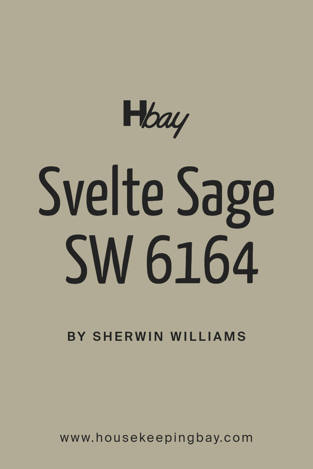
6. Sherwin-Williams Svelte Sage (SW 6164)
A soft olive with beige undertones. It leans neutral but still has that earthy character.
Where I like it: Kitchen walls or even full pantry cabinets. It looks amazing with open wood shelves and aged bronze pulls.
My note: This color works like a bridge between green and taupe — perfect for people who are scared of “too much green.”
7. Sherwin-Williams Green Earth (SW 7748)
Warm, muted green with a rustic feel. This one feels like dried herbs.
Where I like it: Mudroom doors or barn doors. Adds just enough character without going bold.
Tip: Pair with greige trim or whitewashed wood — it’s very farmhouse-friendly.
8. Sherwin-Williams Olive Grove (SW 7734)
Deeper than Green Earth, with a true olive tone. It’s rich but still calming.
Where I like it: Living room accent walls, dining rooms. It has that cozy, “evening light” feeling.
Design fact: Olive green has been used in country homes for over a century — it hides dust well and pairs with both cool and warm decor.
9. Sherwin-Williams Privilege Green (SW 6193)
A richer olive with a subtle gray undertone. Strong, but not overpowering.
Where I like it: Gallery-style hallways, back entryways, and even stair risers.
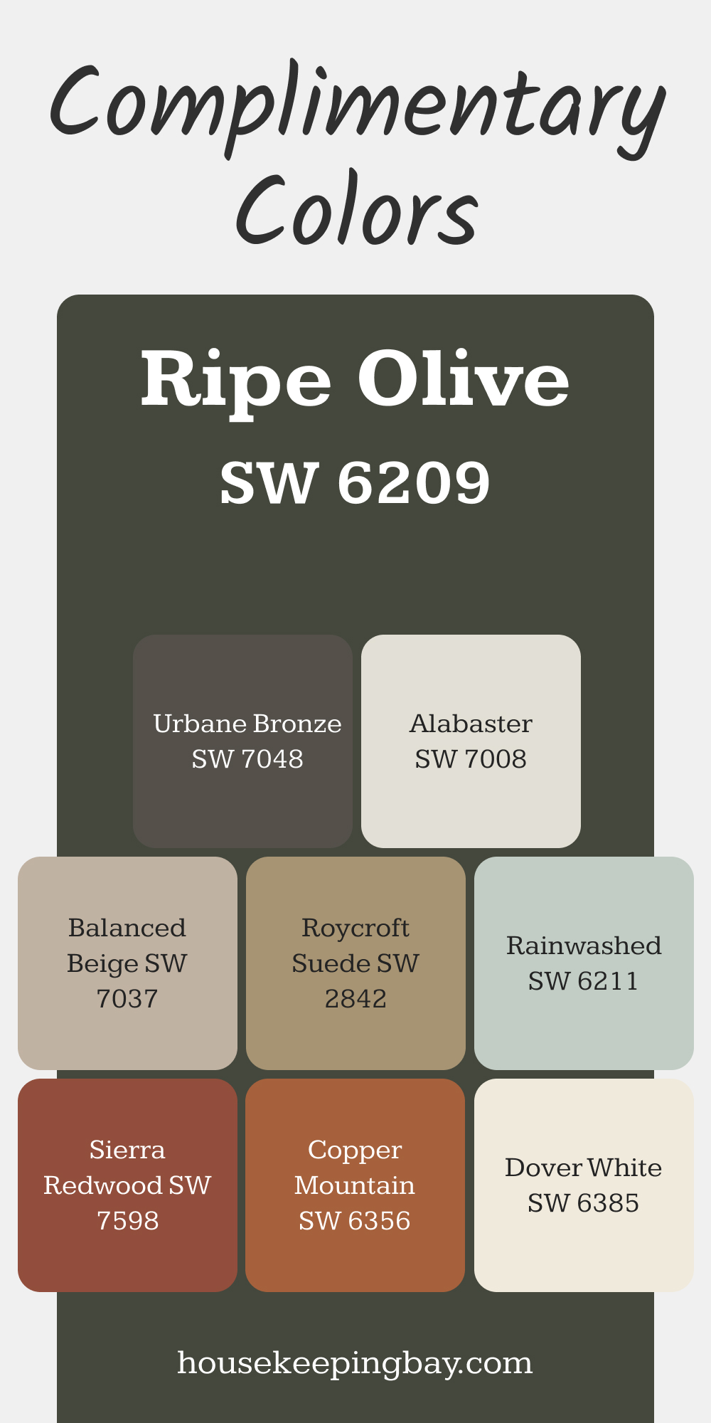
10. Sherwin-Williams Ripe Olive (SW 6209)
This one is bold. Dark olive, almost black in low light. Dramatic, yet still earthy.
Where I like it: Interior doors, lower kitchen cabinets, even built-ins.
Tip: Use it with light walls and natural light. It creates contrast without feeling too heavy.
via housekeepingbay.com
Muted & Dusty Greens
These colors have a quiet charm. They feel aged, almost like they’ve always been part of the house. Perfect for older homes or when you want that soft, worn-in look.
11. Sherwin-Williams Retreat (SW 6207)
A smoky green-gray with a cool edge. A bit moodier than the soft sages, but still subtle.
Where I like it: Living rooms, reading nooks, or as a kitchen island color. It feels calm and grounded.
Tip: If you’re using a lot of raw woods or rattan, Retreat can balance things out with a cooler tone.
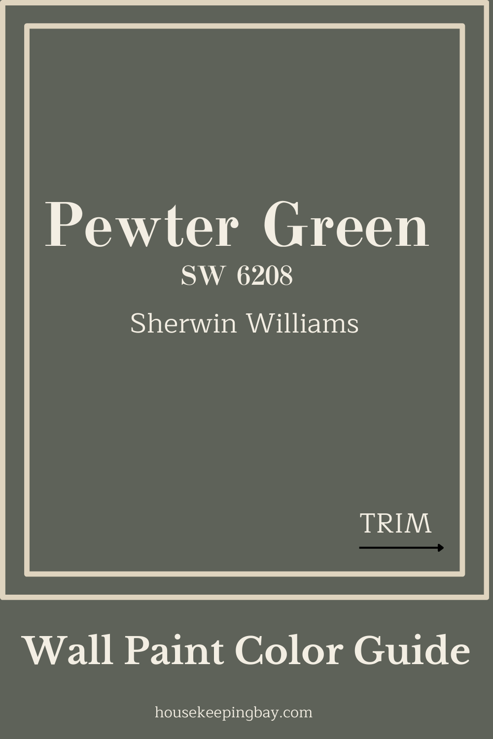
12. Sherwin-Williams Pewter Green (SW 6208)
This one has serious farmhouse character — it’s like an old green milk can or vintage army jacket.
Where I like it: Mudroom lockers, built-in bookshelves, or on cabinetry. Very cozy with butcher block.
housekeepingbay.com
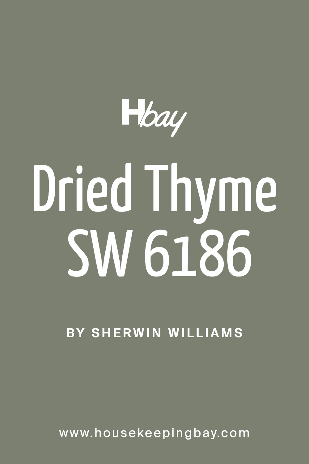
13. Sherwin-Williams Dried Thyme (SW 6186)
Warm, muted green with a little brown in it — like its name, very herbal.
Where I like it: Laundry rooms and kitchens. Works great with black and brass fixtures.
14. Sherwin-Williams Escape Gray (SW 6185)
Despite the name, this one leans green more than gray — just enough dustiness to feel lived-in.
Where I like it: Dining rooms or guest rooms. It looks especially nice with off-white trim and dark floors.
Tip: Works beautifully in rooms with soft morning light.
Deep & Moody Greens
15. Sherwin-Williams Rosemary (SW 6187)
This one’s dark and foresty, with warm undertones. It feels solid — like it belongs in an old countryside kitchen.
Where I like it: Lower cabinets, library walls, or a cozy bedroom. It works well with rustic wood and vintage rugs.
Design tip: Try pairing Rosemary with warm white trim (like SW Alabaster) to keep things from feeling too heavy.

16. Sherwin-Williams Rock Garden (SW 6195)
A bold, deep green with cool undertones. A bit more saturated than Rosemary, and great if you want the green to stand out.
Where I like it: Accent walls, dining rooms, or even painted floors. Yes — painted floors! It’s stunning.
Note: If you’re nervous about dark paint, try this in a small space first. It creates a cozy cocoon effect that works surprisingly well.
How to Choose the Right Green for Your Home
I’ve seen people fall in love with a green swatch… then regret it once it’s on the wall. That doesn’t have to happen to you. Picking the right green for a farmhouse-style space is more about feel than trend. Here’s how I help clients choose the one that works for their home:
1. Look at the Light First
Light can completely change how a green looks.
- In north-facing rooms, greens tend to go cooler and grayer.
- In south-facing rooms, they warm up and show more yellow or brown.
- Artificial lighting (especially LED) can shift soft greens to look almost blue.
My advice: Always paint a large sample (at least 2’ x 2’) on different walls and check it at different times of the day.
2. Think About What’s Already in the Room
Look at your floors, trim color, furniture, and even fabrics. You don’t want your green to clash with the warm oak floors or make your white walls look dingy.
If you have a lot of cool grays or stark whites, go for a cooler green like Retreat or Rock Garden.
If you have warm woods and cream tones, choose a warm green like Clary Sage or Svelte Sage.
3. Avoid Greens That Are Too Bright or Too Clean
In a farmhouse setting, super-saturated greens or minty tones can feel too new. Stick with muted, earthy shades — they age well and look right with raw materials.
Tip from me: If the green reminds you of a tennis ball or neon sign, skip it. Farmhouse greens should feel relaxed.
4. Match the Right Sheen to the Surface
Even the right color can feel wrong in the wrong finish.
Here’s how I usually break it down:
- Walls: Use eggshell or matte. It softens the color and hides wall texture.
- Cabinets or trim: Use satin or semi-gloss — easier to clean and brings out richness.
- Furniture pieces: Satin is usually best. Too much gloss can feel modern and shiny.
5. Trust How It Makes You Feel
This is the biggest one. If you stand in the room and the color makes you feel calm, cozy, and “at home,” that’s your green. Even if it wasn’t on your original list.
One of my clients tested seven greens and chose one that wasn’t trendy, but felt right. She told me later,
“I smile every time I walk into the room. That’s how I knew we picked the right one.”
My Closing Thoughts
When I think about the homes I’ve helped shape, the rooms that really stay with people aren’t always the biggest or the fanciest. They’re the ones that feel warm and settled. And so often, the right green has been a part of that feeling.
Green, especially in a farmhouse setting, brings a quiet strength. It doesn’t show off. It supports everything around it — the wood beams, the slipcovered sofas, the old baskets in the corner. It says, “You’re home.”
Don’t feel pressured to pick the “perfect” green from the start. Let your eye and your instincts guide you. Put up real samples. Sit with them. Walk past them in the morning and again at night. Think about how they make you feel.
And if you’re choosing between a trendy new beige and a soft sage that makes you take a deeper breath… go with the sage.
I’ve used every single one of the colors I shared here in real homes, with real families. Some were bold and moody. Others were barely-there. But all of them helped the house feel more honest, more grounded, and more lived-in.
That’s what good paint should do. It should feel like it’s always been there.
housekeepingbay.com
