Privilege Green SW 6193 by Sherwin Williams
Fresh Harmony for Your Space
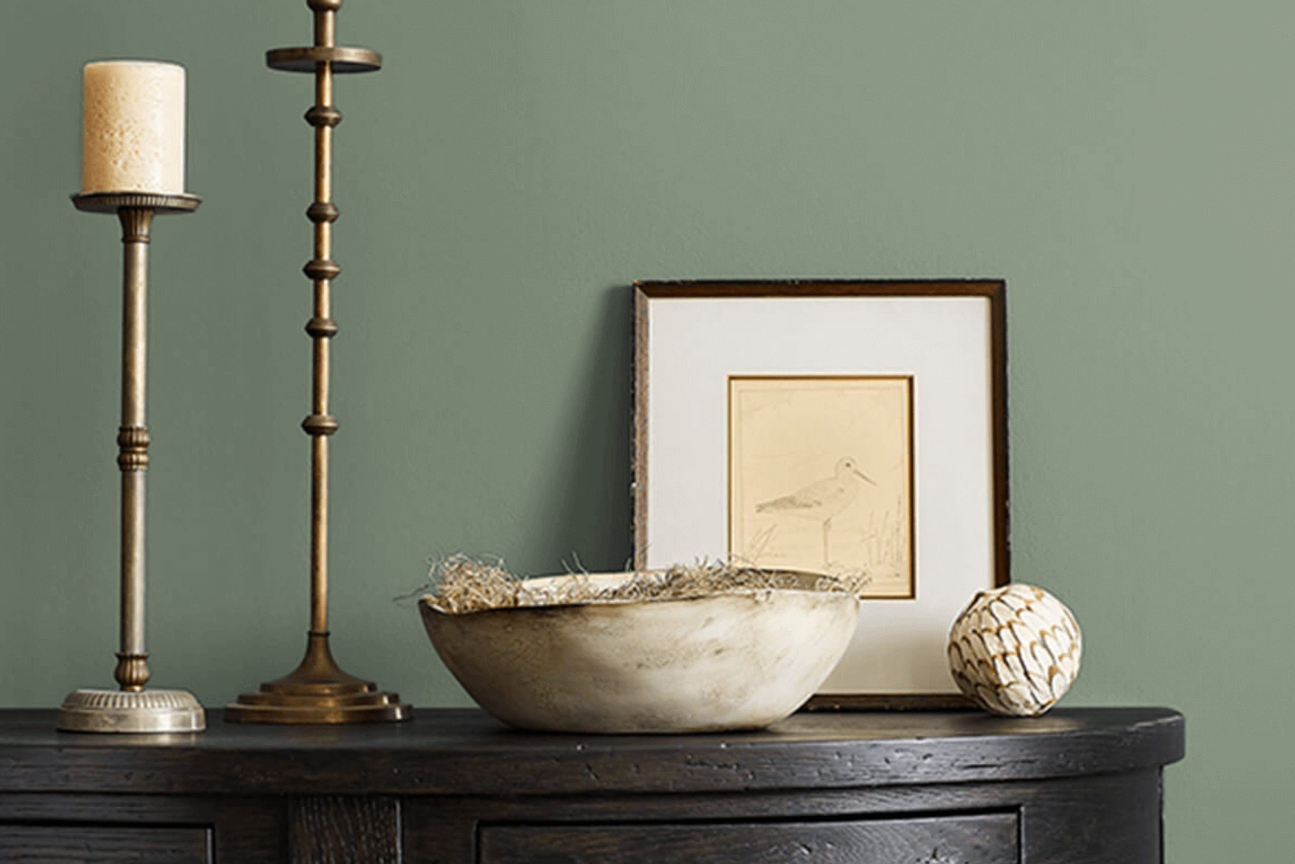
Imagine refreshing your space with a color that brings a touch of the outdoors inside. SW 6193 Privilege Green by Sherwin Williams is a gentle, natural shade that inspires calmness and renewal. This inviting green can effortlessly create a serene setting in any room.
When you want to introduce a bit of nature into your home or workspace, Privilege Green stands out for its subtle charm. It has an organic feel, making it an excellent choice for areas where you relax or gather with family and friends.
Whether it’s in the living room, bedroom, or even your kitchen, this shade provides a peaceful backdrop that complements a wide range of design styles.
You might pair it with neutral tones for a clean, modern look, or combine it with warm wood accents for something more cozy and rustic. If you’re aiming to boost creativity, consider using this green in a workspace or study area.
Its soft yet lively hue encourages focus without overwhelming the senses.
Privilege Green also works beautifully with natural light, enhancing its gentle vibrancy. As you apply this hue to your walls or furniture, you’ll notice how it establishes a nurturing environment. You feel a sense of balance as the freshness and subtlety of the color wrap around you, creating an inviting space where everyone wants to linger.
via sherwin-williams.com
What Color Is Privilege Green SW 6193 by Sherwin Williams?
Privilege Green SW 6193 by Sherwin Williams is a soft, muted green with a touch of warmth, providing a serene and welcoming atmosphere. This gentle color carries subtle earthiness, making it versatile for various interior design styles.
In a modern farmhouse setting, Privilege Green complements natural wood tones, adding a touch of softness without being overwhelming. The color works exceptionally well in rustic interiors, harmonizing with exposed wooden beams, stone elements, and vintage furnishings.
For a coastal or cottage-style home, it captures the essence of nature, blending seamlessly with whitewashed or light-colored furniture and airy fabrics.
Privilege Green can enhance Scandinavian design, where simplicity and functionality prevail. It pairs nicely with light woods like birch or pine, maintaining the clean, minimalist approach while adding warmth and depth.
In traditional interiors, this green shade acts as a refined backdrop for antique pieces and ornate details, highlighting craftsmanship.
Perfect materials to match with Privilege Green include natural linen for curtains or upholstery, rattan and wicker for furniture accents, and jute or wool rugs for texture. Incorporating brass or copper fixtures adds a hint of elegance and warmth.
Overall, Privilege Green offers a flexible palette, suiting a range of styles and materials, fostering a cozy environment.
housekeepingbay.com
Is Privilege Green SW 6193 by Sherwin Williams Warm or Cool color?
Privilege Green SW 6193 by Sherwin Williams is a soft, muted green that can bring a sense of calm to any home interior. This color has an understated elegance that works well in various spaces due to its gentle and soothing appearance. Privilege Green combines hints of gray with its green tones, creating a balanced look that doesn’t overwhelm.
In living rooms, it can create a welcoming and serene atmosphere, making these spaces perfect for relaxation. In kitchens, it can add a fresh, clean feeling, harmonizing beautifully with stainless steel or white appliances.
For bedrooms, using Privilege Green can promote a restful environment conducive to a good night’s sleep.
This versatile shade pairs well with neutrals like beige or cream and can also complement bolder colors like navy or deep earth tones. Overall, Privilege Green’s calming presence can enhance the comfort and harmony of home interiors.
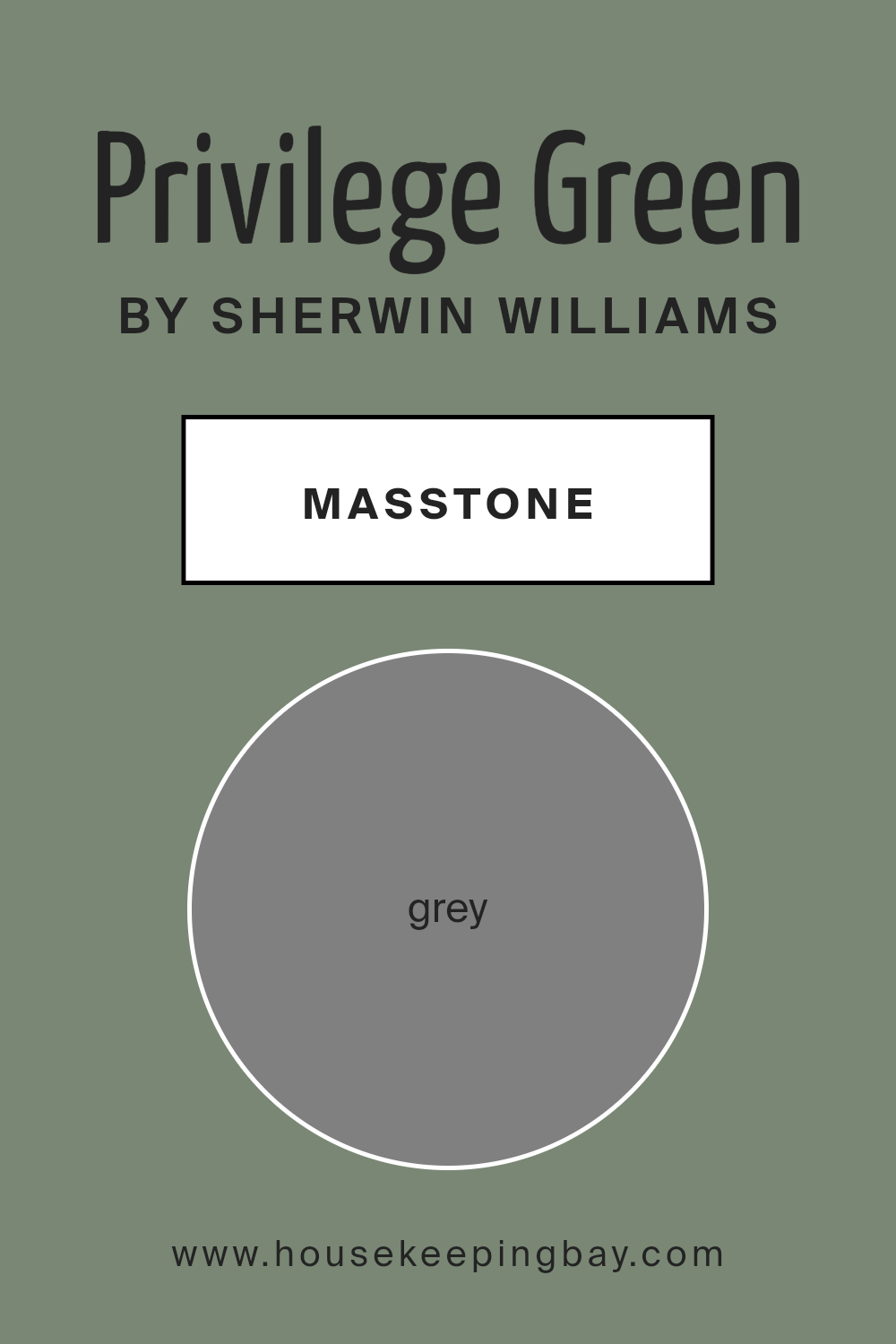
What is the Masstone of the Privilege Green SW 6193 by Sherwin Williams?
Privilege Green (SW 6193) by Sherwin Williams is a calming, muted green shade that brings a sense of balance to interior spaces. Its masstone, which is a neutral gray (#808080), plays a key role in how the color works in homes.
The gray undercurrent provides stability and neutrality, making the green adaptable to different styles and settings. This lets Privilege Green complement various design elements, from wood furniture to metal fixtures.
In living rooms, it cultivates a cozy atmosphere without overpowering other colors. Kitchens painted in Privilege Green feel fresh and inviting, aligning well with natural materials like stone and wood. Bedrooms painted this shade encourage a peaceful environment, promoting relaxation.
The presence of gray in its undertone ensures versatility, allowing it to pair beautifully with a variety of colors such as whites or darker accent tones. Overall, Privilege Green contributes a subtle elegance to any room, underscoring comfort and style.
housekeepingbay.com
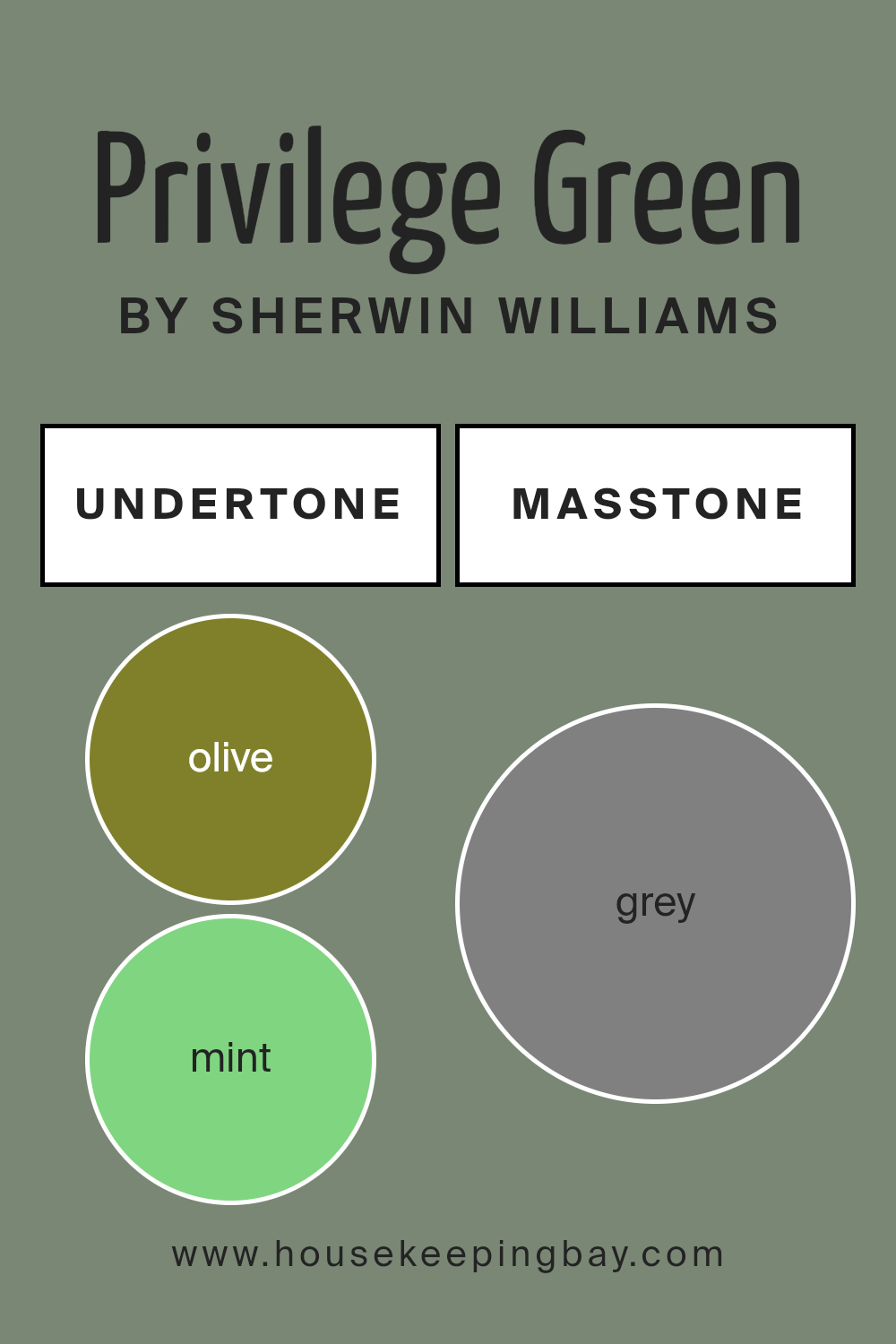
Undertones of Privilege Green SW 6193 by Sherwin Williams
Privilege Green SW 6193 by Sherwin Williams is a color rich in complex undertones. These undertones, like olive, mint, dark turquoise, and others, give the color depth and versatility. When light hits this shade, it can subtly shift and show different hues, making it dynamic.
Olive and dark green undertones add warmth and earthiness to Privilege Green, giving a cozy and grounded feeling to a room. These undertones can make spaces feel connected to nature, bringing an organic touch indoors.
Mint and light turquoise hints introduce a fresh and airy quality. This helps brighten smaller rooms or areas with limited natural light, creating an open and lively atmosphere.
Pale pink and lilac undertones introduce softness and calm. These subtle hints can add a gentle, soothing aspect, perfect for creating relaxing spaces like bedrooms or reading nooks.
The presence of colors like purple, violet, and navy in the undertones adds depth and sophistication. These undertones might create a more formal or elegant ambiance, suitable for dining areas or formal living rooms.
Lastly, touches of yellow and pale yellow infuse energy and optimism, making common areas like kitchens or hallways feel welcoming and cheerful.
Overall, the mixed undertones make Privilege Green adaptable, lending it a versatile charm suitable for various moods and settings in interior design.
housekeepingbay.com
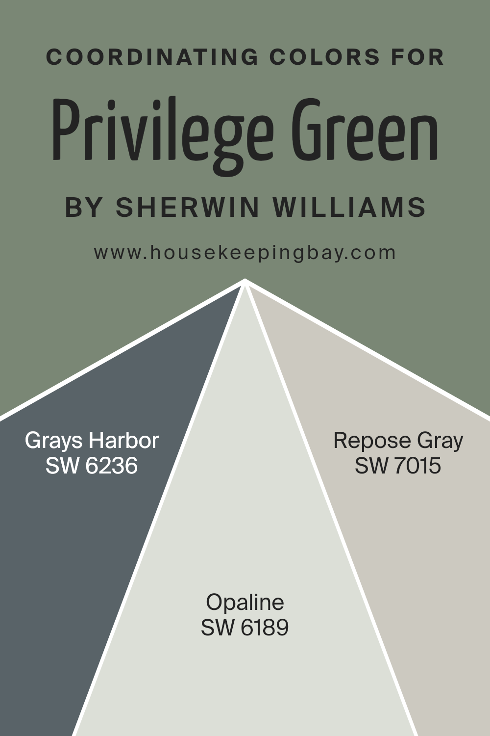
Coordinating Colors of Privilege Green SW 6193 by Sherwin Williams
Coordinating colors are shades that work well together to create a visually pleasing and harmonious look. The idea is to choose colors that complement each other, enhancing the overall effect when they are used in combination.
Privilege Green SW 6193 by Sherwin Williams is a vibrant yet calming green, and it sets the stage for a serene atmosphere. Choosing coordinating colors for Privilege Green involves selecting hues that can either enhance or balance its vivid tones, adding depth and interest to the space.
For instance, SW 6236 Grays Harbor offers a deep, rich gray with blue undertones. This color adds a strong contrast to Privilege Green, providing a sophisticated and grounding element to a room.
SW 6189 Opaline is a subdued, soft green with a hint of gray, capturing the essence of nature’s calmness, and it produces a gentle transition when paired with Privilege Green.
Then there’s SW 7015 Repose Gray, a versatile, light gray with warm undertones. It serves as a neutral backdrop, allowing Privilege Green to shine while adding a touch of warmth to the overall palette.
Together, these coordinating colors offer balance, contrast, and harmony, allowing for diverse styling opportunities in any interior space.
You can see recommended paint colors below:
- SW 6236 Grays Harbor
- SW 6189 Opaline
- SW 7015 Repose Gray
housekeepingbay.com
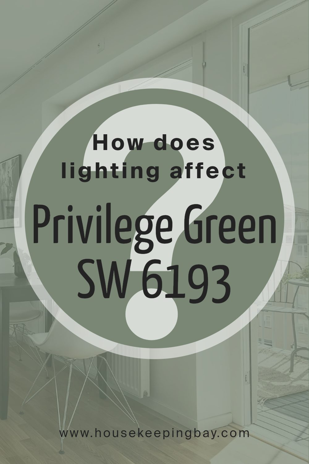
How Does Lighting Affect Privilege Green SW 6193 by Sherwin Williams?
Lighting plays a major role in how colors appear in a room. Privilege Green SW 6193 by Sherwin Williams is a color that can look different based on the light it receives.
In natural light, colors often look brighter and more vivid. This green has a fresh, soft appearance in natural sunlight, making it a vibrant choice for rooms where you want a calm and airy feeling. However, in artificial light, the vibe of Privilege Green might change.
Under warmer lights, this green may take on a slightly more muted or yellowish tint, giving it a more earthy feel. Cool artificial lights might enhance its green tones, making it appear crisper and more modern.
In a north-facing room, which generally receives less direct sunlight, colors can seem cooler and more subdued. Privilege Green in such rooms might feel a bit muted or grayish, giving the space a calm and understated appearance.
It’s important here to use warmer artificial lights if you want to bring out the color’s warmth.
South-facing rooms get the most consistent natural light throughout the day, making colors look bright and vibrant. Privilege Green will appear bright and lively in these rooms, offering a warm and welcoming atmosphere.
The generous natural light enhances its green tones, making it a great choice for a lively space.
East-facing rooms have morning sunlight that is soft and warm, while afternoons can be cooler. In the morning, Privilege Green appears warm and inviting, while later it may seem a bit cooler and more subdued.
West-facing rooms receive warm afternoon and evening light. In these spaces, Privilege Green can look especially cozy and inviting during late afternoon and sunset hours, with its tones enhanced by the warm light for a comforting atmosphere.
housekeepingbay.com
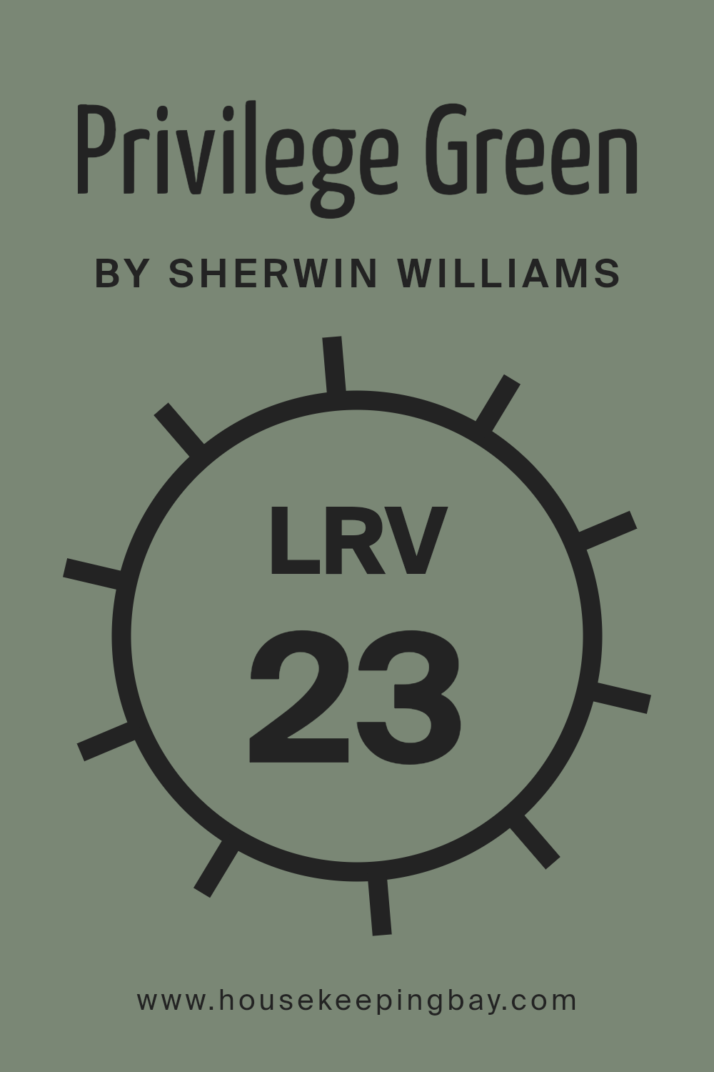
What is the LRV of Privilege Green SW 6193 by Sherwin Williams?
LRV, or Light Reflectance Value, measures the amount of light a color reflects. It ranges from 0 to 100, where 0 is absolute black, reflecting no light, and 100 is pure white, reflecting all light. This value helps understand how light or dark a color will appear when applied to a surface.
Colors with lower LRV values, like Privilege Green SW 6193, absorb more light, making rooms feel cozier and more intimate. In contrast, colors with higher LRVs reflect more light, brightening spaces and making them feel larger.
With an LRV of 22.639, Privilege Green is on the darker side of the spectrum. This means that when used on walls, it will absorb a significant amount of light, giving the room a rich and enveloping feel. It is ideal for spaces where you want a cozy and comfortable atmosphere, such as a den or bedroom.
However, in smaller or poorly lit rooms, it might make the space feel smaller or less open. To balance this, it can be paired with lighter accents or used on a feature wall to prevent the room from feeling too enclosed.
housekeepingbay.com
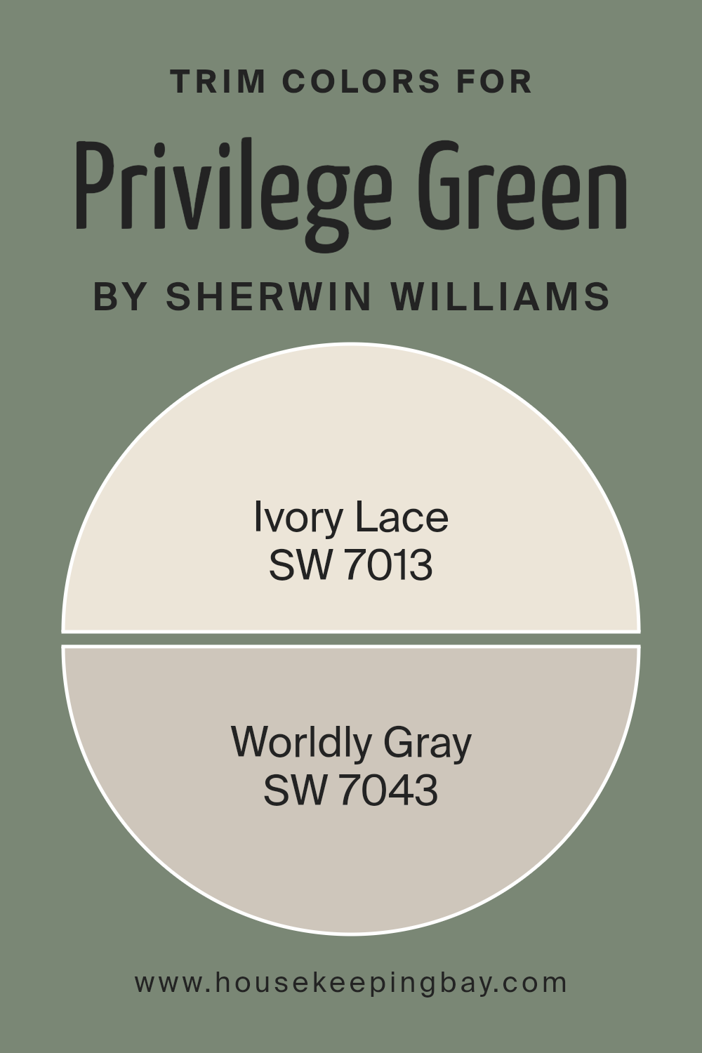
What are the Trim colors of Privilege Green SW 6193 by Sherwin Williams?
Trim colors play a crucial role in enhancing the aesthetic appeal and defining the architectural features of a space. When used with a primary wall color like Privilege Green (SW 6193) by Sherwin Williams, trim colors help frame and highlight important elements such as windows, doors, and baseboards.
Choosing the right trim colors can create a balanced and cohesive look, adding depth and character while maintaining a seamless transition between different areas.
In this case, using Ivory Lace (SW 7013) as a trim color can provide a soft, creamy contrast to the gentle, earthy tone of Privilege Green.
Its understated elegance offers a warm touch that pairs beautifully with the green’s calming influence.
On the other hand, Worldly Gray (SW 7043) serves as a more sophisticated, neutral counterpart. It provides a subtle, warm gray tone, slightly deeper than Ivory Lace, adding another layer of dimension to the overall color scheme.
The soft gray of Worldly Gray complements Privilege Green by providing a grounding effect without overshadowing the primary color’s natural feel. Both trim colors are crucial for enhancing the primary color’s features while offering different stylistic approaches—Ivory Lace for a lighter, airy feel and Worldly Gray for a more grounded, mature ambiance.
The selection of these specific trim colors ensures that spaces remain inviting and harmonious, perfectly suiting both modern and traditional interiors.
You can see recommended paint colors below:
housekeepingbay.com
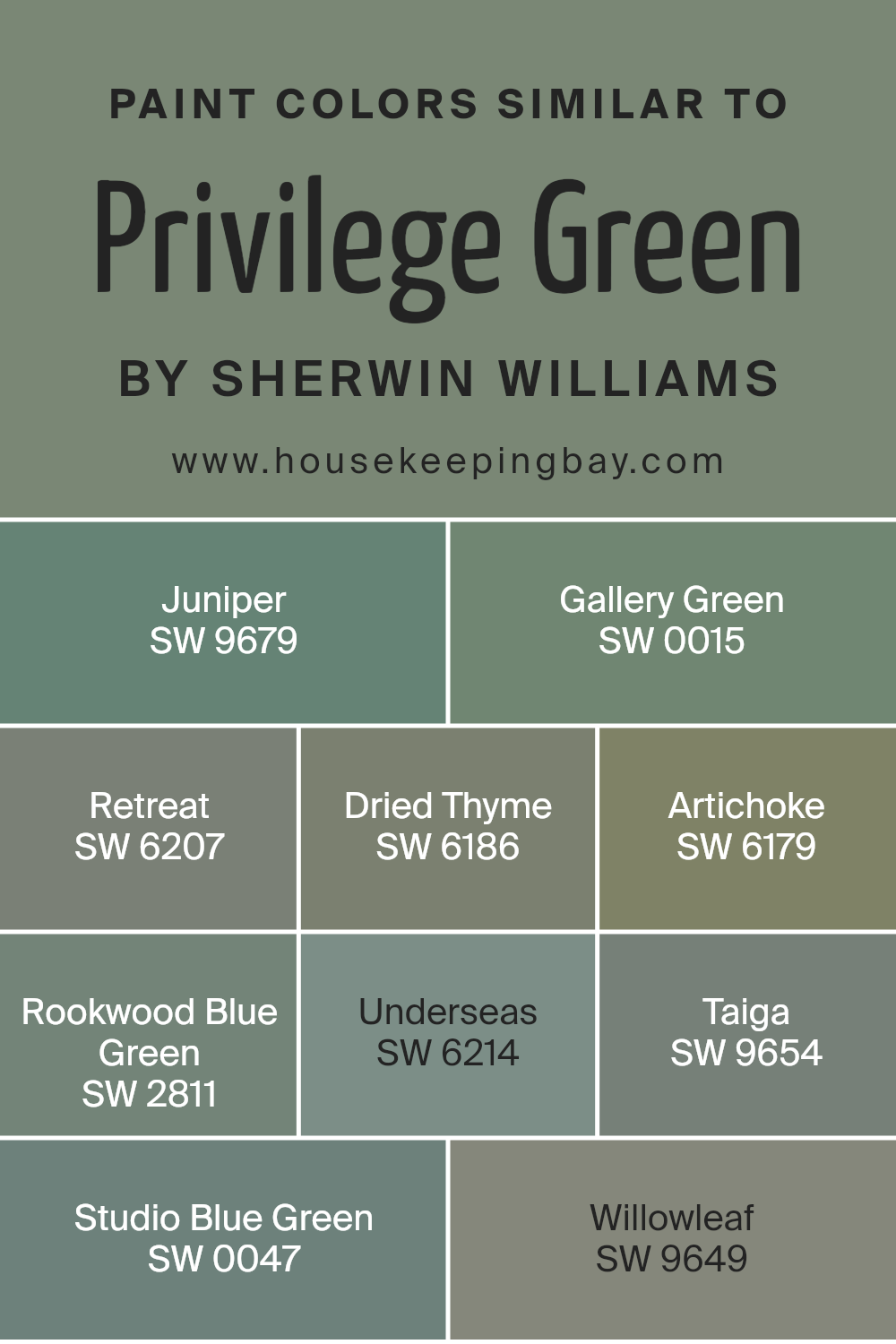
Colors Similar to Privilege Green SW 6193 by Sherwin Williams
When it comes to design, similar colors are crucial in creating a cohesive look. These colors not only harmonize with each other but also help in tying different elements together without clashing. Consider Sherwin Williams’ Privilege Green SW 6193; it’s a soothing and versatile green that finds harmony with several shades, each adding its unique touch.
SW 9679 – Juniper, for example, is a slightly darker shade with a rich depth, giving a space warmth and comfort. SW 0015 – Gallery Green presents a classic and timeless air, offering an elegant backdrop to any setting. Then there’s SW 6207 – Retreat, which is a calm and restful hue perfect for creating serene spaces.
Other similar colors include SW 6186 – Dried Thyme, which introduces a subtle earthy tone, adding a cozy and grounded feeling to any room. SW 6179 – Artichoke is a muted green that feels soft yet sophisticated.
If you want a touch of blue, SW 2811 – Rookwood Blue Green and SW 0047 – Studio Blue Green deliver just that, with the former providing a vintage undertone and the latter offering a playful burst of color. SW 6214 – Underseas carries a deep, moody vibe that feels dramatic yet relaxing.
Lastly, SW 9654 – Taiga and SW 9649 – Willowleaf echo the tranquility of nature with their rich, forest-inspired tones. When used together, these colors can create a harmonious and inviting environment.
You can see recommended paint colors below:
- SW 9679 Juniper
- SW 0015 Gallery Green
- SW 6207 Retreat
- SW 6186 Dried Thyme
- SW 6179 Artichoke
- SW 2811 Rookwood Blue Green
- SW 6214 Underseas
- SW 9654 Taiga
- SW 0047 Studio Blue Green
- SW 9649 Willowleaf
housekeepingbay.com
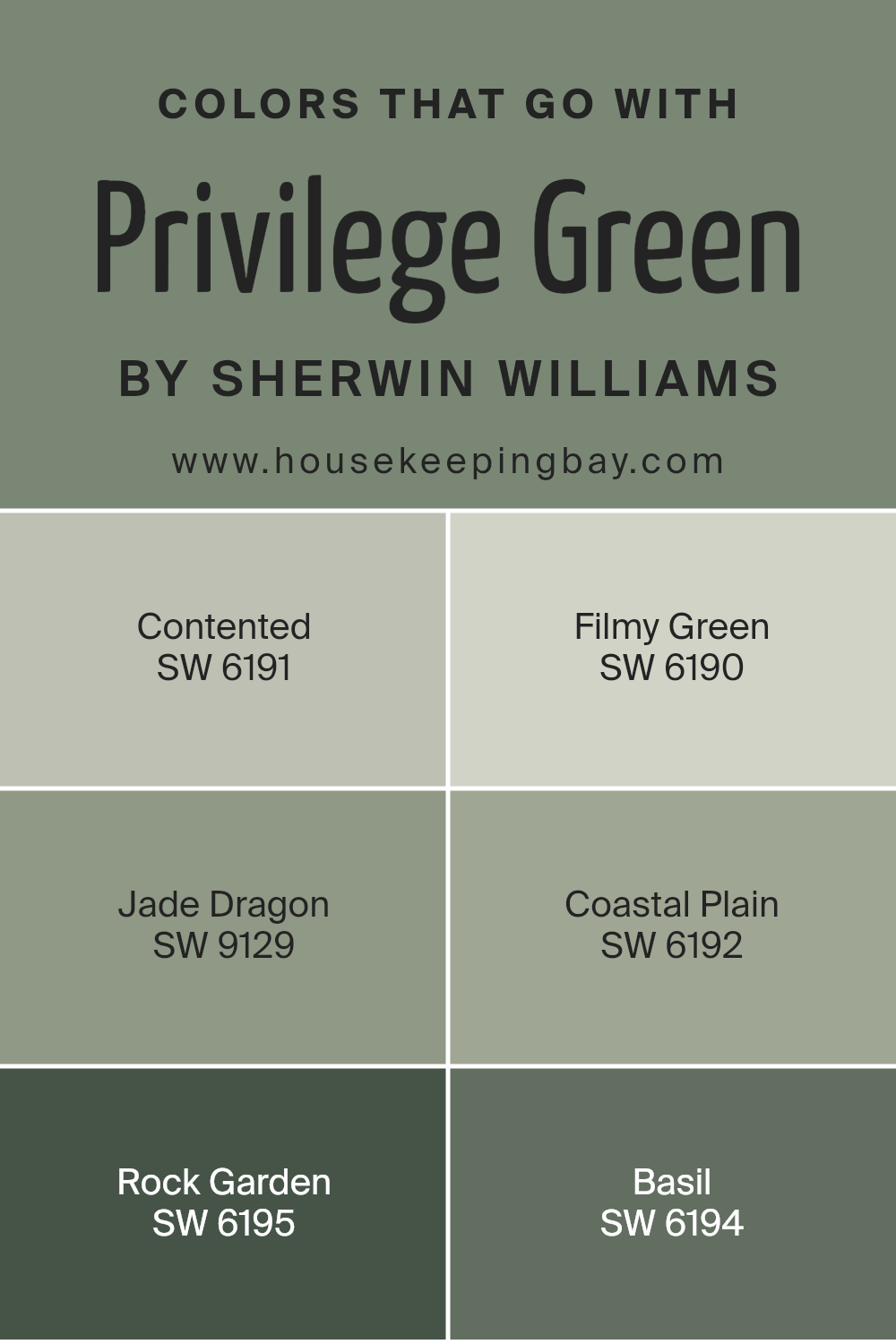
Colors that Go With Privilege Green SW 6193 by Sherwin Williams
Choosing colors that go with Privilege Green SW 6193 from Sherwin Williams is important because they create harmony and balance in a space. These colors can enhance the mood and feeling of a room. For example, SW 6191 – Contented offers a soft, muted green that feels calming and relaxed, making it a great companion for Privilege Green.
Meanwhile, SW 6190 – Filmy Green is a fresh and airy shade, bringing lightness and openness. This particular color can make a room feel more spacious and inviting.
Another color, SW 9129 – Jade Dragon, delivers richness with its deeper green tone, adding depth and sophistication when paired with Privilege Green. SW 6192 – Coastal Plain evokes a sense of the outdoors with a slightly earthy feel, enhancing the natural vibe.
For a touch of boldness, SW 6195 – Rock Garden presents a darker green, which can add a striking contrast and create a focal point. Finally, SW 6194 – Basil is a warm, earthy green that balances well, adding warmth and comfort to a room.
Together, these colors work in concert to create a well-rounded palette that can make any space feel beautifully put together and cohesive.
You can see recommended paint colors below:
- SW 6191 Contented
- SW 6190 Filmy Green
- SW 9129 Jade Dragon
- SW 6192 Coastal Plain
- SW 6195 Rock Garden
- SW 6194 Basil
housekeepingbay.com
How to Use Privilege Green SW 6193 by Sherwin Williams In Your Home?
Privilege Green SW 6193 by Sherwin Williams offers a soft, inviting shade of green that brings a fresh, soothing vibe to any space. Its gentle hue works well in various areas of a home, creating a calm and balanced atmosphere. In living rooms, this color can be a perfect backdrop for neutral furniture, adding a touch of nature and serenity.
For kitchens, it complements wood tones, enhancing warmth and charm. In bedrooms, Privilege Green promotes relaxation and restfulness, making it an ideal wall color for restful nights. Bathrooms benefit from its refreshing feel, evoking a sense of cleanliness when paired with white tiles or fixtures.
This color also fits into home offices, encouraging focus with its subtle, natural energy. Accent it with earth tones or soft pastels for a cohesive look. Privilege Green blends effortlessly into different styles, from modern to traditional, making it versatile for any home setting.
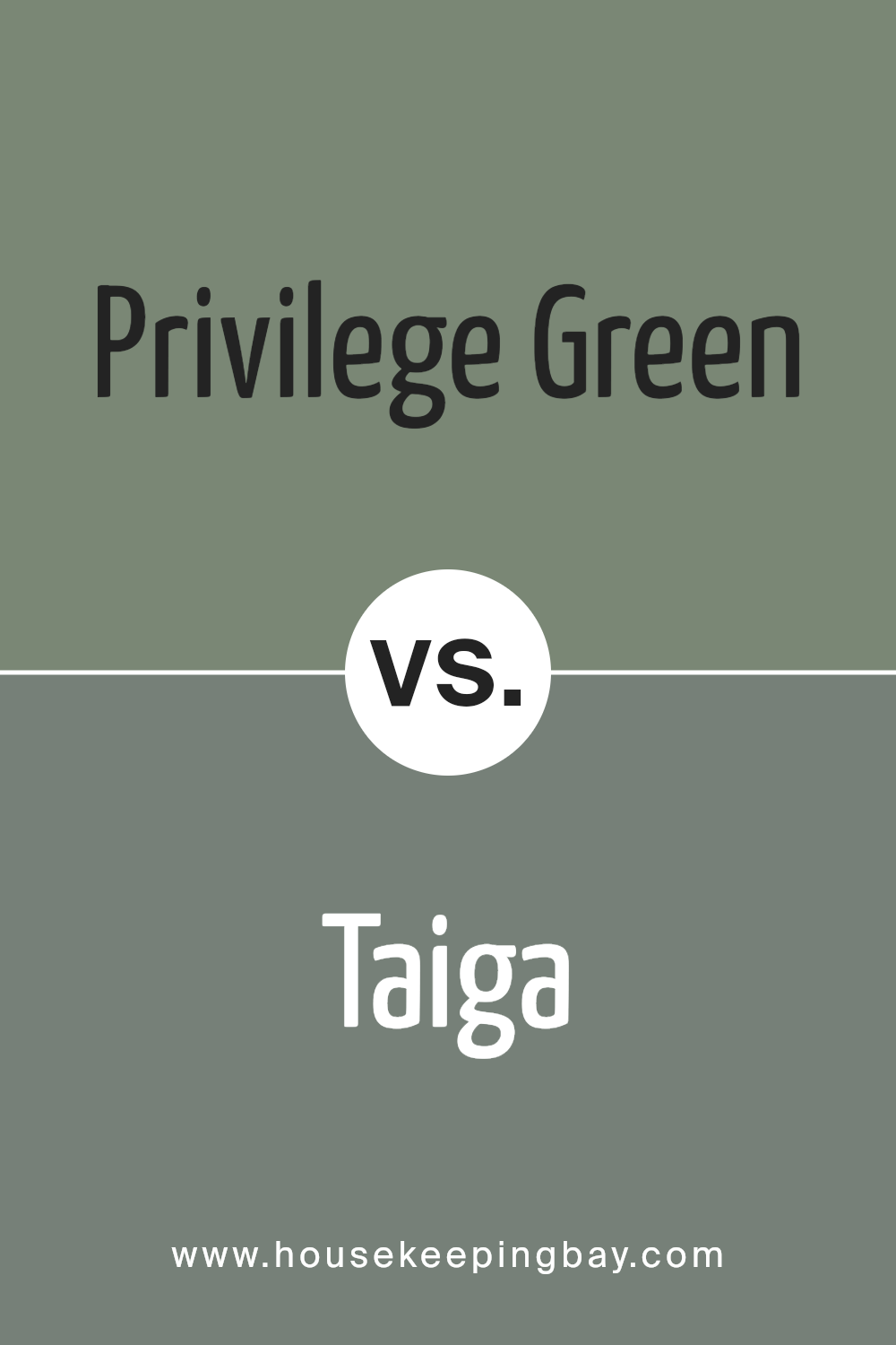
Privilege Green SW 6193 by Sherwin Williams vs Taiga SW 9654 by Sherwin Williams
Privilege Green SW 6193 and Taiga SW 9654, both by Sherwin Williams, offer distinct shades and personalities. Privilege Green is a soft, muted sage that brings a touch of calmness and sophistication. It works well in spaces needing a gentle, serene atmosphere, effectively complementing natural materials like wood and stone.
Taiga, on the other hand, is a richer, darker green infused with blue undertones. This hue creates a more dramatic and moody feel, ideal for making a bold statement or adding depth to a room. It pairs well with crisp whites or deep charcoal tones, creating high contrast.
Both colors suit various styles but convey different moods. Privilege Green shines in spaces aiming for peace and subtle elegance, while Taiga delivers intensity and a modern edge. Choosing between them depends on the desired ambiance and the existing decor elements in your space.
You can see recommended paint color below:
- SW 9654 Taiga
housekeepingbay.com
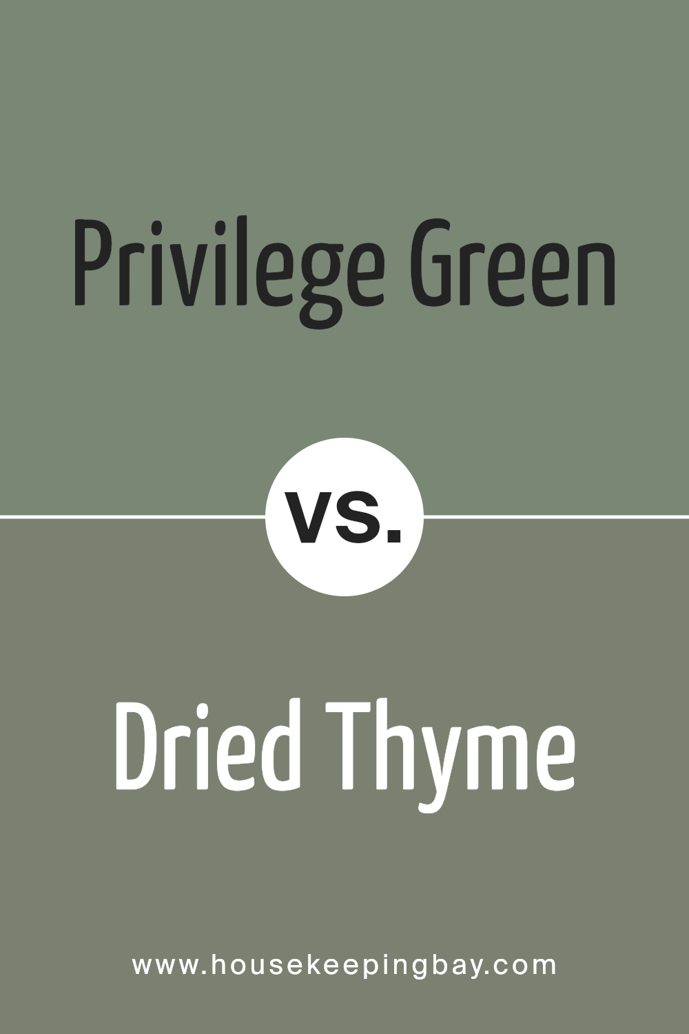
Privilege Green SW 6193 by Sherwin Williams vs Dried Thyme SW 6186 by Sherwin Williams
Privilege Green SW 6193 and Dried Thyme SW 6186 are both beautiful shades by Sherwin Williams, each offering a unique aesthetic. Privilege Green is a light, airy green with a fresh vibe. It’s uplifting, creating a lively environment that feels open and bright. This color works well in spaces where you want a cheerful, welcoming atmosphere.
Dried Thyme, on the other hand, offers a more subdued feel. It is a darker, muted green with a hint of gray. This creates a calm, grounded effect, making it ideal for cozy spaces like a study or bedroom. The earthiness of Dried Thyme gives rooms a sophisticated, serene look.
While Privilege Green refreshes with its lightness, Dried Thyme comforts with its depth and warmth. Both colors complement natural wood and white trims but create distinctly different moods in a space, whether you want it lively or soothing.
You can see recommended paint color below:
housekeepingbay.com
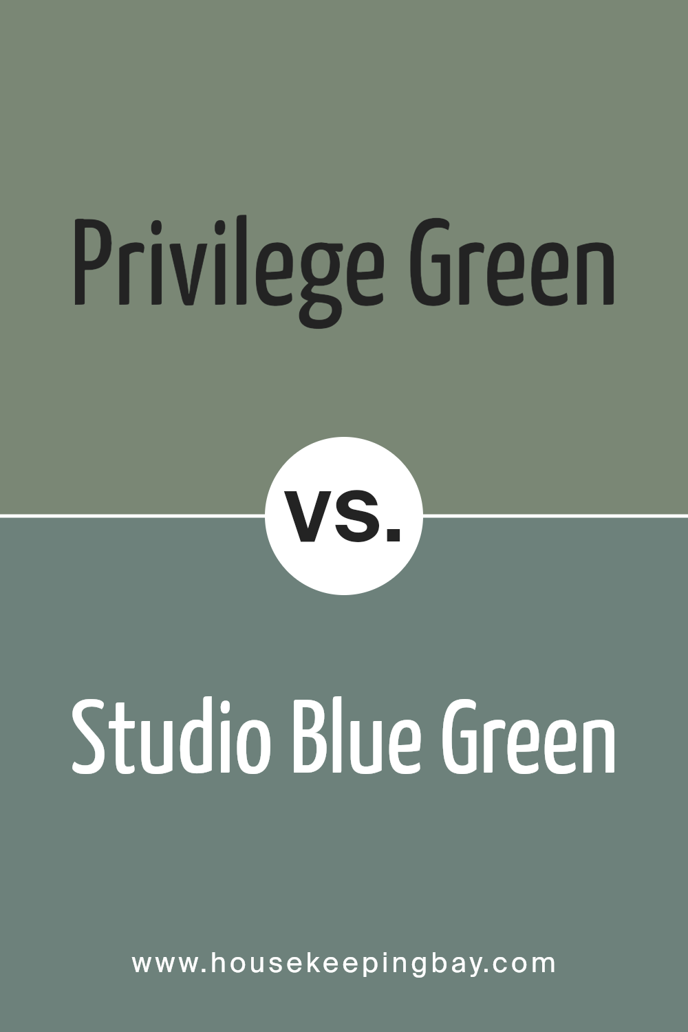
Privilege Green SW 6193 by Sherwin Williams vs Studio Blue Green SW 0047 by Sherwin Williams
Privilege Green SW 6193 and Studio Blue Green SW 0047 are two distinctive colors by Sherwin Williams. Privilege Green is a soft, muted shade with subtle hints that evoke a natural, organic feel, making it perfect for creating a calm, inviting space.
It has an earthy quality, leaning more towards a gentle, nature-inspired green, which can bring a sense of harmony to a room.
Studio Blue Green, however, offers a more vibrant and dynamic blend with its mix of blue and green. It feels lively and can introduce a refreshing energy into a space. The bluish undertones in Studio Blue Green add depth and can make a room feel bright and airy.
While both colors offer their own unique charm, Privilege Green tends to be more subdued and soothing, whereas Studio Blue Green has a brighter, more invigorating presence. Each color can greatly influence the mood of a space, catering to different design preferences.
You can see recommended paint color below:
- SW 0047 Studio Blue Green
housekeepingbay.com
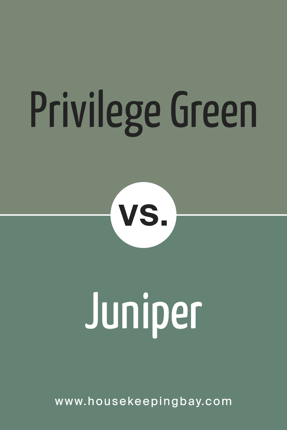
Privilege Green SW 6193 by Sherwin Williams vs Juniper SW 9679 by Sherwin Williams
Privilege Green SW 6193 and Juniper SW 9679 both belong to the green family, yet they offer distinct vibes. Privilege Green SW 6193 has a muted, earthy tone. It brings a natural, calming feel and works well in spaces where a subtle touch is desired. It’s ideal for rooms where relaxation is key.
Juniper SW 9679 presents a deeper, more vibrant shade. It carries bolder energy and stands out more. This color suits areas needing a lively atmosphere or a strong focal point. Its richer hue draws more attention and can invigorate a space.
Both colors share green’s refreshing qualities, enhancing a room’s appeal. Choosing between them depends on the desired effect. Privilege Green suits those seeking a calm space, while Juniper is great for adding bold character. Both can beautifully complement a range of styles and furnishings, allowing for versatile design options.
You can see recommended paint color below:
- SW 9679 Juniper
housekeepingbay.com
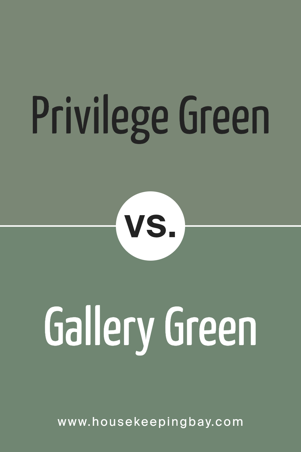
Privilege Green SW 6193 by Sherwin Williams vs Gallery Green SW 0015 by Sherwin Williams
Privilege Green SW 6193 by Sherwin Williams is a soft, muted green with subtle undertones that create a calming and versatile atmosphere. It pairs well with natural materials and is ideal for creating a serene space that feels both contemporary and timeless. This color works particularly well in living rooms or bedrooms, providing a refreshing backdrop without commanding too much attention.
Gallery Green SW 0015, however, is a deeper, more traditional green. It has a rich tone that brings warmth and character to a room, making it a great choice for libraries or dining rooms where a cozy, inviting ambiance is desired.
This color can add depth and drama to a space, contrasting beautifully with lighter accents and furnishings.
While both greens offer unique appeal, Privilege Green offers a more subtle and understated look, whereas Gallery Green provides boldness and rich character. Both can enhance a room’s style, but they cater to different design needs.
You can see recommended paint color below:
housekeepingbay.com
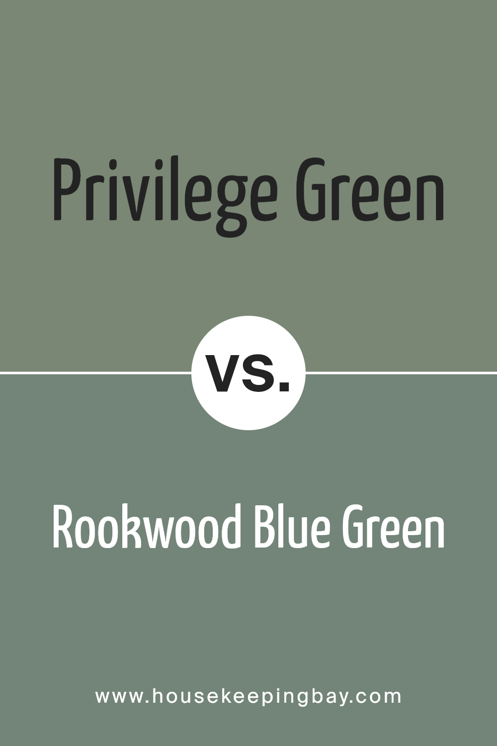
Privilege Green SW 6193 by Sherwin Williams vs Rookwood Blue Green SW 2811 by Sherwin Williams
Privilege Green SW 6193 and Rookwood Blue Green SW 2811 are distinct shades by Sherwin Williams that each bring unique qualities to a space. Privilege Green is a soft, muted green that suggests a sense of calm and relaxation. It works well in areas where you want a peaceful ambiance, like a bedroom or living room. The color isn’t too bold, making it easy to pair with other colors and decor.
Rookwood Blue Green, however, offers a different vibe. This color leans more towards blue, giving it a slightly cooler and more dramatic feel. It has a historical quality, often used in classic or traditional settings. This tone can add depth to a room and works particularly well in spaces that see a lot of natural light, such as sunrooms or dining areas.
Both colors are versatile and can complement a variety of styles, but Privilege Green is more subdued, whereas Rookwood Blue Green stands out with its richer hue.
You can see recommended paint color below:
- SW 2811 Rookwood Blue Green
housekeepingbay.com
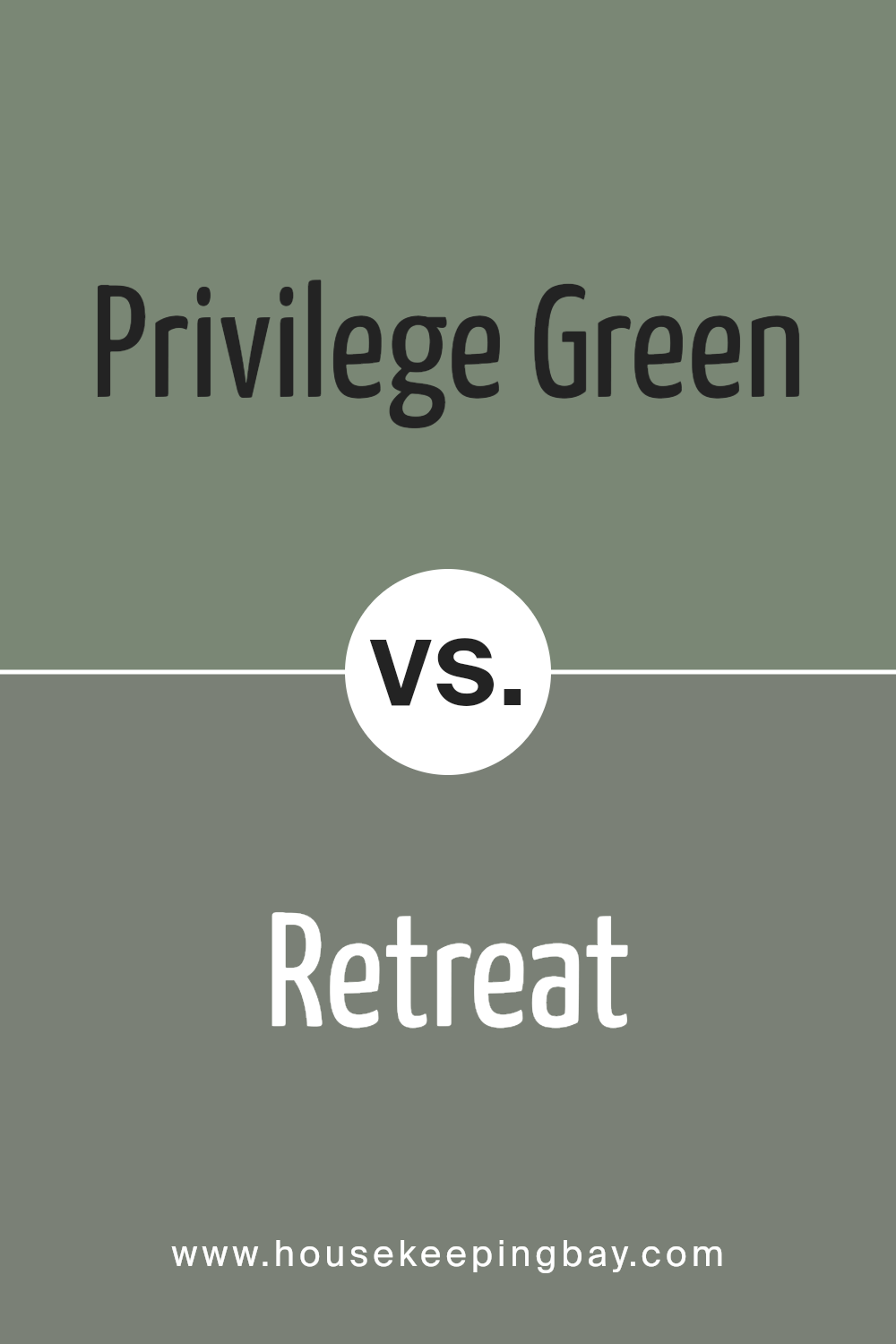
Privilege Green SW 6193 by Sherwin Williams vs Retreat SW 6207 by Sherwin Williams
Privilege Green SW 6193 by Sherwin Williams and Retreat SW 6207 both belong to the family of greens but offer distinct vibes. Privilege Green presents a lighter, fresher shade with subtle hints of yellow, creating a feeling of renewal and energy. Its lightness makes it suitable for bright and airy spaces, adding a soft, cheerful touch to any room.
Retreat SW 6207, however, leans towards a deeper, more muted green with blue undertones, giving it a slightly cool, cozy appearance. This shade tends to feel more calming and grounding, making it ideal for creating a relaxing, comfortable environment.
While Privilege Green works well in spaces that benefit from light and vibrancy, Retreat suits areas where a peaceful, intimate atmosphere is preferred. Choosing between these colors depends on whether you desire a space filled with light, openness, and energy or one that offers warmth and a sense of calm. Both colors bring unique personalities to interior designs.
You can see recommended paint color below:
- SW 6207 Retreat
housekeepingbay.com
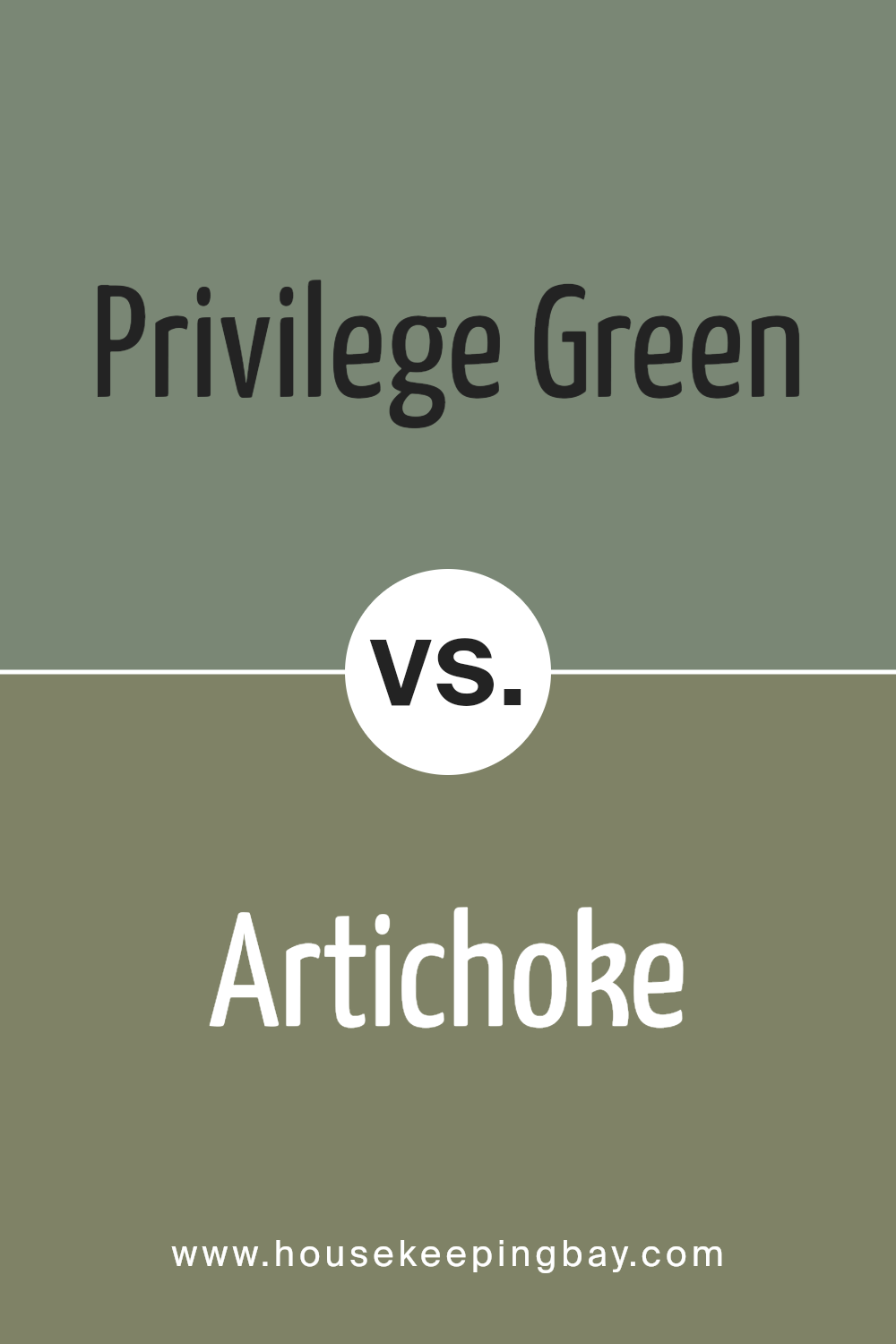
Privilege Green SW 6193 by Sherwin Williams vs Artichoke SW 6179 by Sherwin Williams
Privilege Green SW 6193 and Artichoke SW 6179, both by Sherwin Williams, create distinct atmospheres. Privilege Green, a fresh, muted shade, brings a lively, calming feel, reminiscent of nature’s softer tones. It works well in rooms needing a touch of vibrancy while remaining subtle and sophisticated.
Artichoke SW 6179 offers a deeper, more earthy green, evoking a sense of grounding and stability. This color draws its richness from nature, leaning towards a warm, nurturing environment, ideal for spaces where comfort and coziness are desired.
Though both hues stem from green, Privilege Green stands out with its brightness, suited for modern, airy designs, while Artichoke’s warmth makes it perfect for traditional or rustic settings. When choosing, consider the desired mood: Privilege Green for freshness and energy, or Artichoke for warmth and depth. Both bring a taste of nature, yet distinctly shape the room’s ambiance.
You can see recommended paint color below:
housekeepingbay.com
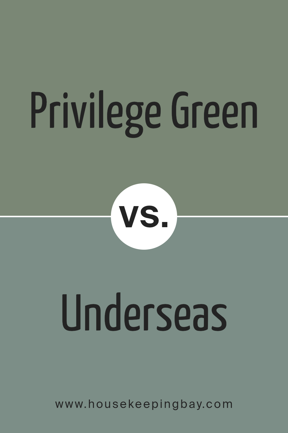
Privilege Green SW 6193 by Sherwin Williams vs Underseas SW 6214 by Sherwin Williams
Privilege Green (SW 6193) by Sherwin Williams and Underseas (SW 6214) offer distinct vibes that suit different spaces. Privilege Green is a gentle, muted green with warm undertones. It brings a sense of calm and comfort, making it ideal for living rooms or bedrooms where a soothing atmosphere is desired.
The subtle warmth in this green can complement neutral palettes, adding a refreshing touch without overwhelming the space.
Underseas, in contrast, leans towards a deeper, blue-green hue reminiscent of ocean depths. It provides a cooler, more tranquil feel, perfect for spaces where you want to evoke relaxation, like bathrooms or study areas.
Its deeper tone adds depth and interest, and it pairs well with whites and darker colors for a more dramatic look. Both colors bring nature indoors, but Privilege Green feels earthy and soft, whereas Underseas offers a cooler, more intense look.
You can see recommended paint color below:
- SW 6214 Underseas
housekeepingbay.com
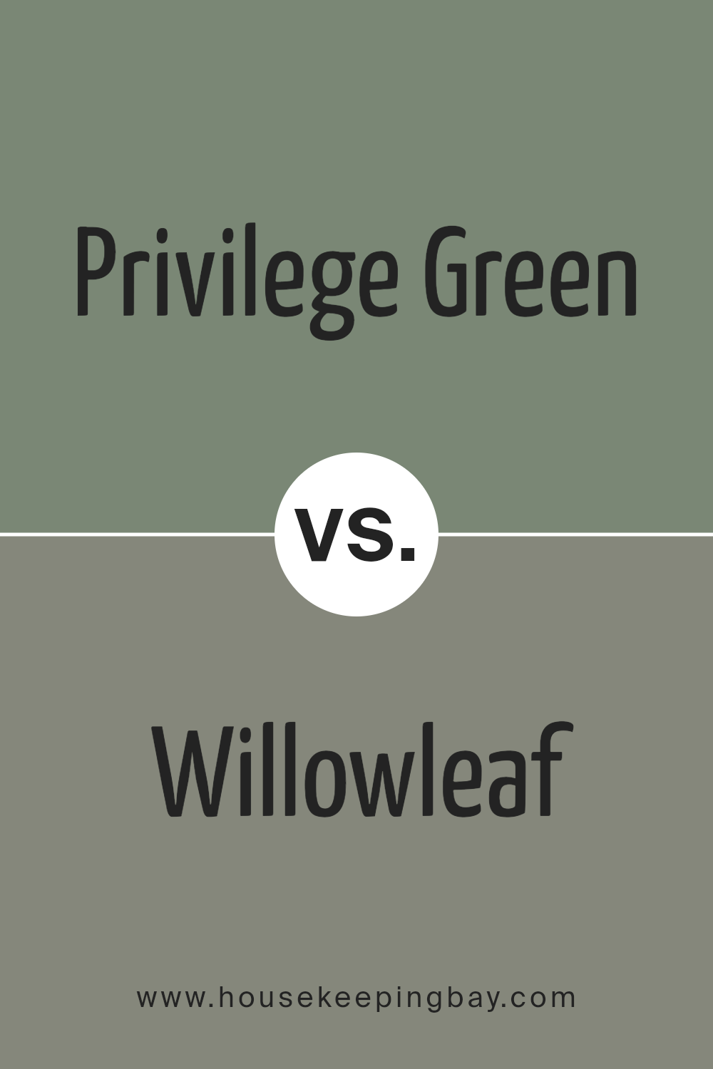
Privilege Green SW 6193 by Sherwin Williams vs Willowleaf SW 9649 by Sherwin Williams
Privilege Green SW 6193 and Willowleaf SW 9649 from Sherwin Williams present two distinct shades of green. Privilege Green offers a soft, muted tone that feels calming and gentle. It leans slightly towards a sage hue, providing a subtle and understated backdrop.
This color works well in spaces aimed at relaxation and balance, blending seamlessly with neutral tones and warm wood accents.
Willowleaf, meanwhile, presents a richer, more vibrant green. It captures the essence of fresh foliage, bringing a lively and energetic feel to a room. This shade can easily become a focal point, adding a refreshing touch to interiors. It pairs beautifully with crisp whites, dark grays, and natural textures like rattan or jute.
Both colors evoke natural elegance, though Privilege Green maintains a more subdued presence, while Willowleaf adds a burst of nature-inspired vibrancy.
Each color uniquely enhances a space in its own way.
You can see recommended paint color below:
- SW 9649 Willowleaf
housekeepingbay.com
Conclusion
SW 6193 Privilege Green by Sherwin Williams offers a beautiful blend of sophistication and calmness. As I reflect on this color, I find it brings a sense of nature into interiors, creating an inviting space that feels both lively and soothing.
This shade of green feels versatile, working well in various settings, from modern to traditional. It can be paired with neutrals for a serene environment or with bolder colors for a vibrant look.
Using Privilege Green in my home, I notice how it alters the mood of a room, adding warmth without overwhelming the space. It connects indoor spaces with nature, making rooms feel more open and grounded. This connection often results in a more relaxed and comfortable atmosphere, which I appreciate.
The color’s adaptability also means it can complement a wide range of furnishings and decor styles, making it a practical choice.
Overall, I see Privilege Green as a confident choice that adds depth and harmony to any room, inviting not just aesthetics but also a sense of balance and relaxation into living spaces.
housekeepingbay.com
Ever wished paint sampling was as easy as sticking a sticker? Guess what? Now it is! Discover Samplize's unique Peel & Stick samples. Get started now and say goodbye to the old messy way!
Get paint samples


