19 Paint Colors that go with Honey Oak
Soft Shades That Calm the Orange and Bring Out the Best in Your Wood Tones
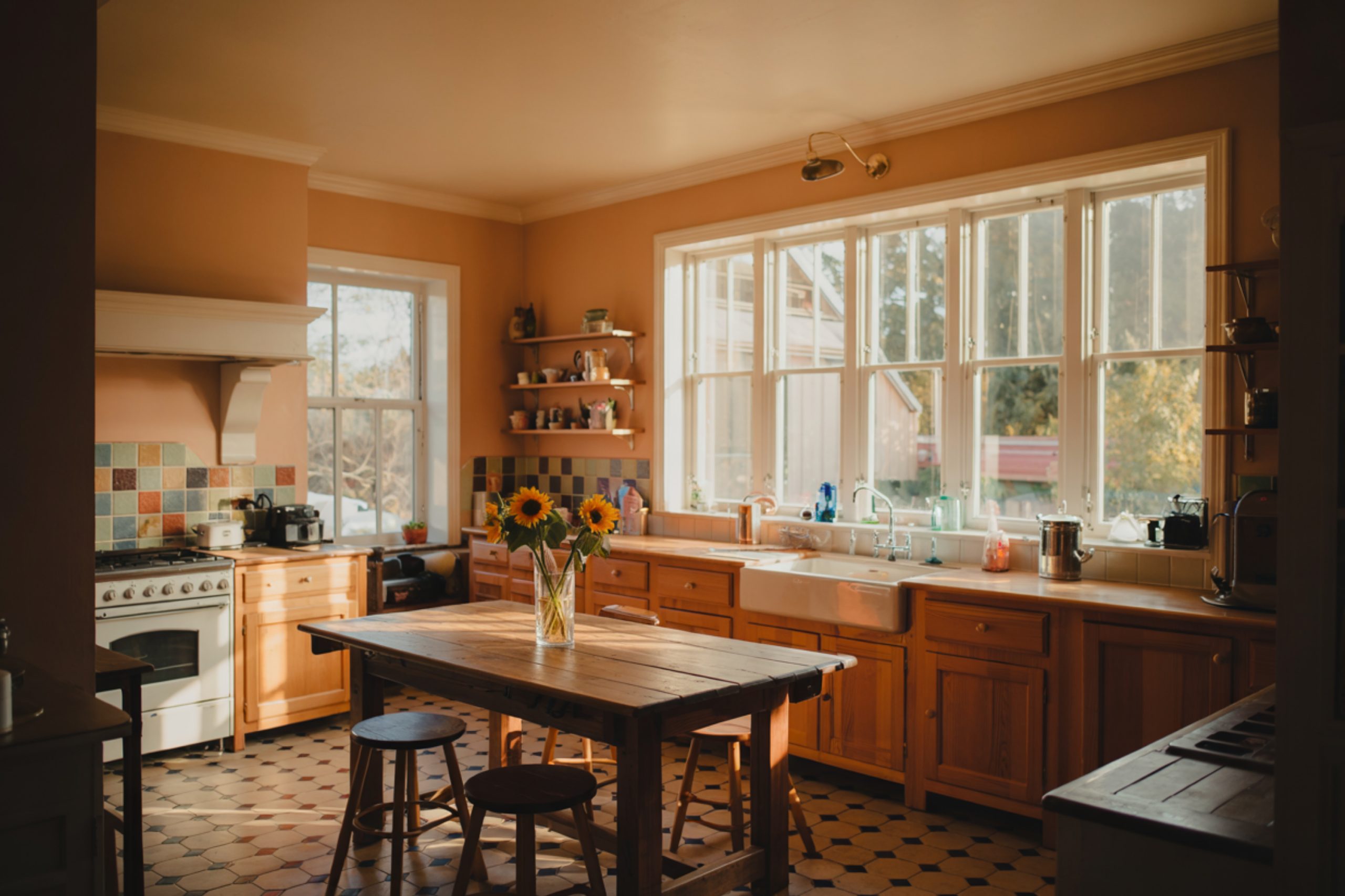
I’ve walked into so many homes where the first thing someone says is, “I just don’t know what to do with all this honey oak.”
It’s everywhere — cabinets, trim, floors. It was huge in the ’80s and ’90s, and honestly? It still has a place today. But only if you know how to work with it, not against it.
One client told me, “I tried gray walls, and it just made everything feel wrong.” And she was right. Cool grays can make honey oak feel even more orange. That clash is hard on the eyes and even harder on the heart when it’s your home.
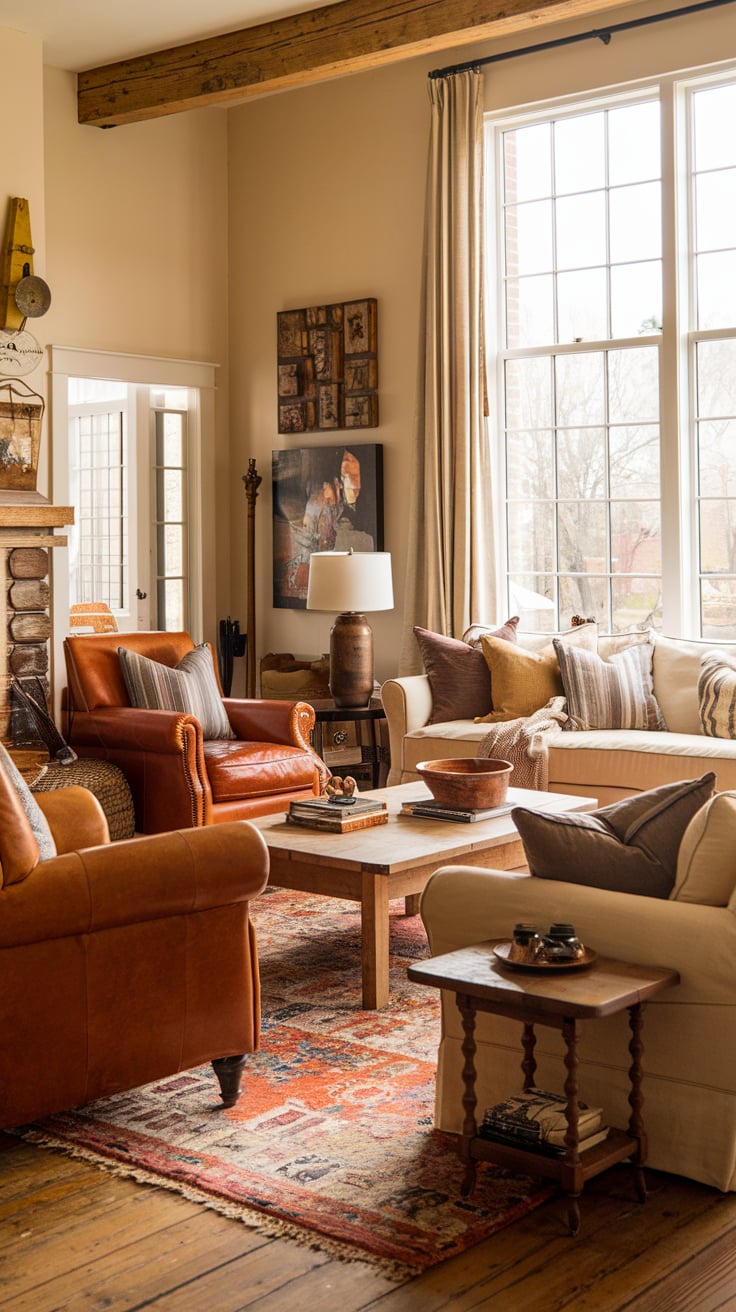
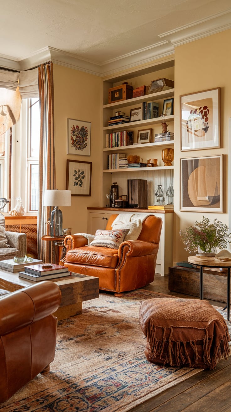
What I’ve learned, both in my own spaces and helping others: the right wall color can completely shift the way honey oak feels. It can take it from “dated” to “intentional” — warm, homey, and charming. It just needs the right paint partner.
And that’s what I’m sharing today. These 19 colors are ones I trust, use often, and have seen work beautifully in real homes.
via housekeepingbay.com
The Color Trick – What Actually Works with Honey Oak?
Table of Contents
When I’m standing in a room full of honey oak, I’m not trying to hide it. I’m trying to balance it.
Here’s the thing — honey oak has strong orange and yellow undertones. So, when you put it next to the wrong color, that orange jumps out even more. I’ve seen it happen with icy grays, harsh whites, and bold cool tones. The wood ends up looking even louder.
But when you bring in colors that are:
- Soft
- Muted
- A little warm or neutral
…something changes. The oak calms down. It starts to feel like part of a cozy whole, not the odd one out.
These are the kinds of colors that work best:
- Warm whites that don’t feel stark
- Tans and beiges that sit right next to the wood, not on top of it
- Muted greens with a tiny hint of gray or beige to ground them
It’s not about being boring — it’s about letting the wood be warm without overpowering the room.
And honestly, most of these colors make the entire home feel softer. I’ve watched living rooms feel less yellow, kitchens feel lighter, and hallways suddenly make sense.
via housekeepingbay.com
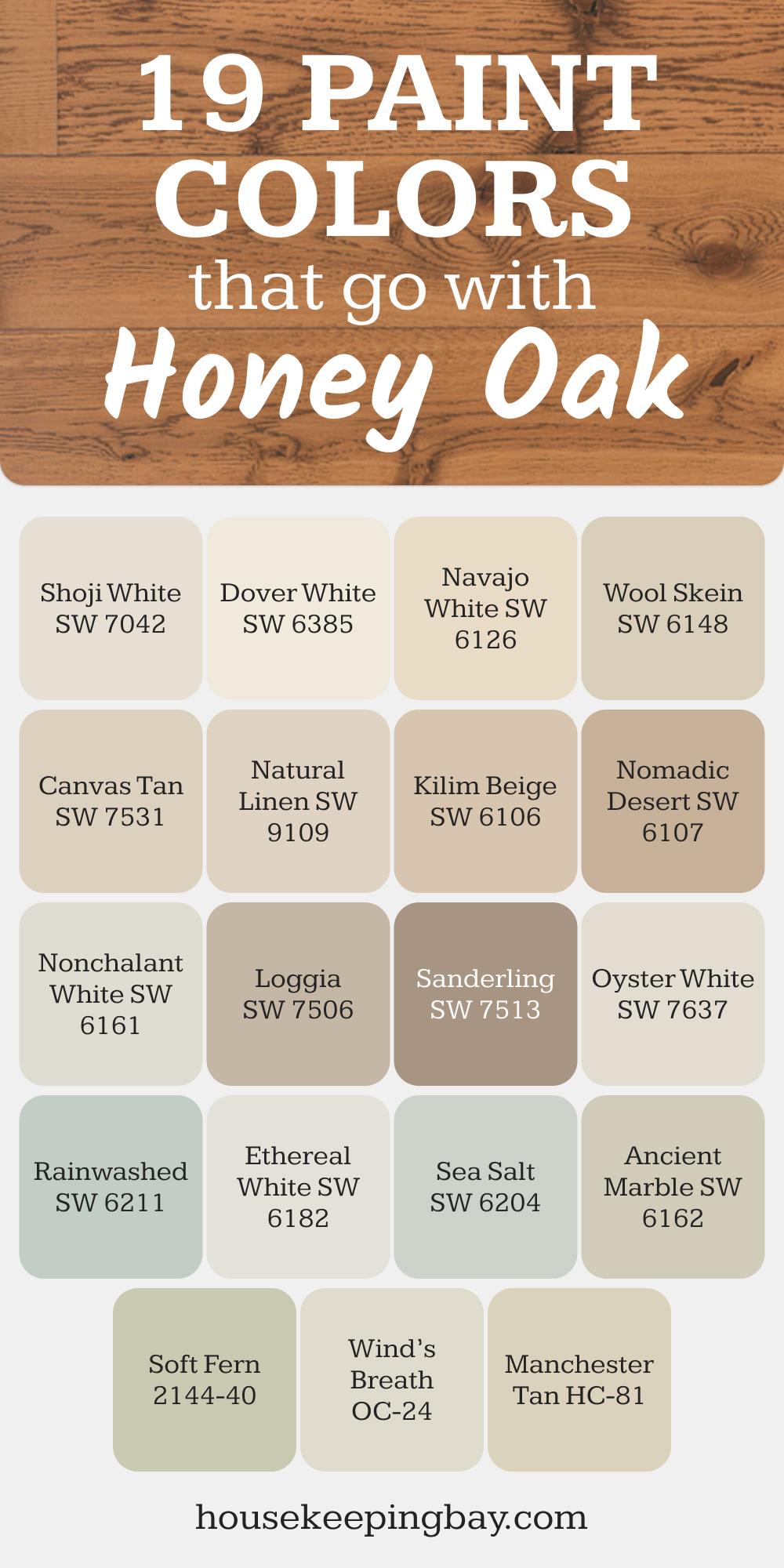
The 19 Best Paint Colors That Pair with Honey Oak
When I’m choosing paint for a home with honey oak, I start by asking, “Do we want this to feel warm and calm, or soft and airy?”
These colors do both, in just the right way.
Soft and Warm Whites
These whites have a creamy, soft base — not bright, not stark. They feel inviting, and they soften the wood without washing it out.
- Shoji White SW 7042 – creamy with a subtle taupe undertone, looks elegant next to golden oak
- Dover White SW 6385 – a cozy white with warmth that keeps things from feeling sterile
- Navajo White SW 6126 – timeless off-white, loved for its classic feel in traditional homes
- Oyster White SW 7637 – a soft gray-beige white, just enough pigment to stay interesting
- Wind’s Breath OC-24 (Benjamin Moore) – a gentle off-white with a drop of gray
- Nonchalant White SW 6161 – light and easygoing with a pale greige tone
- Ethereal White SW 6182 – it leans neutral, but still warm enough to pair beautifully with oak
Beiges and Tans That Calm the Wood
These are the “safe bets” — warm, not orange, and grounded. They match the oak’s depth without fighting it.
- Wool Skein SW 6148 – a whisper of beige, gentle and flexible in light
- Canvas Tan SW 7531 – subtle and soft, never overpowering
- Kilim Beige SW 6106 – one of the most reliable beige tones I use — rich but not muddy
- Loggia SW 7506 – deeper than others, good for contrast if you like stronger walls
- Sanderling SW 7513 – soft and sandy, almost earthy, very pretty in bedrooms
- Nomadic Desert SW 6107 – grounded beige with some weight, works well in larger spaces
- Manchester Tan HC-81 (Benjamin Moore) – the kind of neutral that always behaves
- Natural Linen SW 9109 – barely-there beige with a touch of warmth
via housekeepingbay.com
Greens and Cool Neutrals That Tone it Down
These are the colors that quiet the orange and bring a calm, earthy feeling. If you want something different than beige, this is it.
- Ancient Marble SW 6162 – pale green-gray with a soothing feel
- Rainwashed SW 6211 – soft blue-green with just enough gray — great in kitchens or baths
- Sea Salt SW 6204 – this one is a client favorite, it reads differently in every light but always feels fresh
- Soft Fern 2144-40 (Benjamin Moore) – a gentle green that works like a neutral
My quick tip: If you’re not sure which to choose, start with a few sample pots and paint big squares on the wall — next to your trim or cabinets. You’ll see what works fast.
Tips to Help You Choose the Right One
Over the years, I’ve seen clients fall in love with a paint chip… then hate it on the wall. It’s not their fault. Paint changes — a lot — depending on what’s around it.
Here’s how I guide people through the decision:
1. Don’t Trust the Swatch Alone
Those tiny squares at the store? They lie. What looks warm beige on paper might go peach on your wall. Always test on the wall itself, and right next to your oak.
2. Look at It in Morning and Night
Light shifts everything. One color can feel calm and cozy at noon, but yellow and loud by dinner. Check it at different times, especially near windows or under ceiling lights.
3. Consider What Else Is in the Room
- What color is your floor?
- Are the cabinets oak too?
- Is your trim white or wood?
Paint has to get along with all of it. Sometimes that means going warmer. Sometimes it means keeping it soft and muted so the oak stands out just enough.
4. Sample at Least 2–3 Shades
Even if you think you love one color, always test others. Put them side by side. You’ll start to see how undertones show up differently — and which one feels right in your home.
5. Use Large Sample Swatches
I always tell my clients to paint at least a 2×2 ft. square on the wall — bigger is better. If you don’t want to paint, peel-and-stick samples from Samplize are a great option too.
Expert quote to remember:
“Paint color is the most powerful tool in a room—but also the most misunderstood.” – Maria Killam, Color Expert
via housekeepingbay.com
Real Homes, Real Looks
I’ve walked through so many homes with honey oak that I’ve stopped counting. But a few stories really stick with me — because the right paint completely changed how those homes felt.
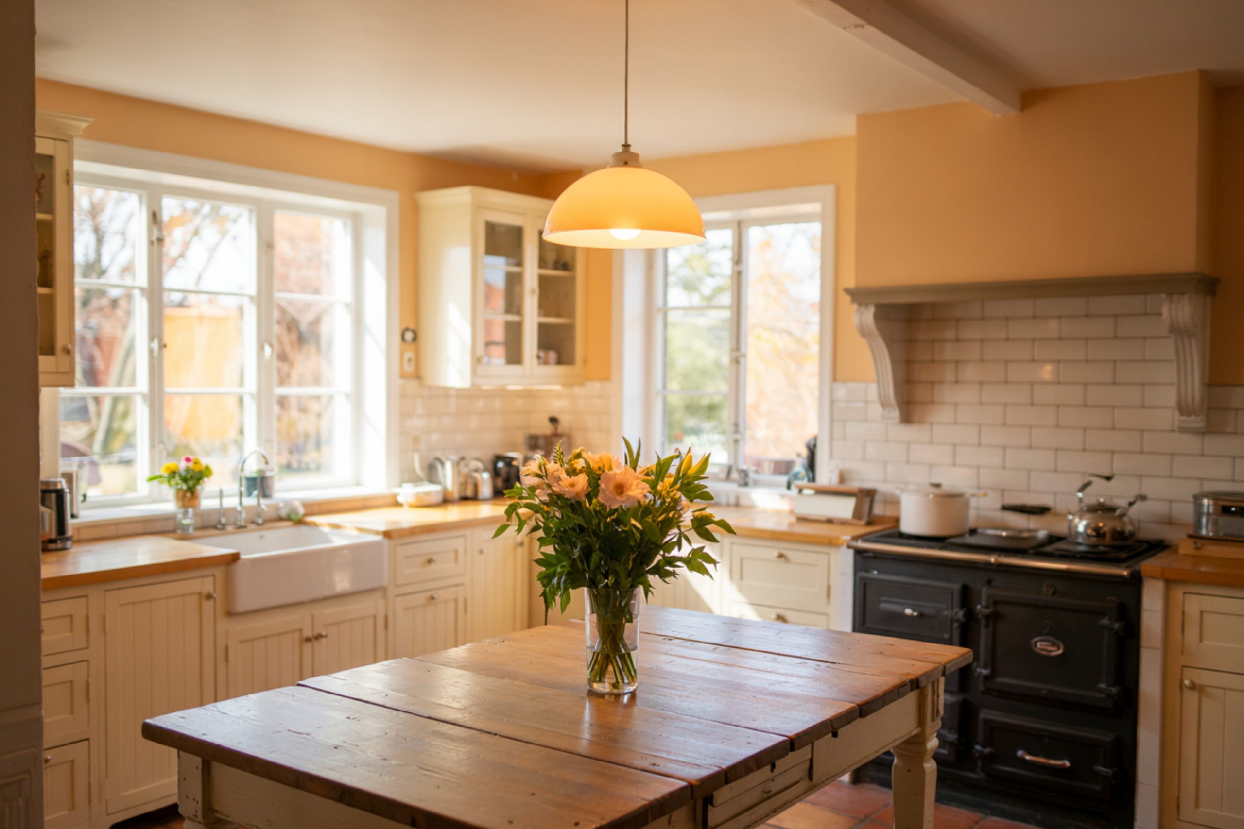
Sea Salt in a Small Kitchen
One of my clients, Janelle, had a small kitchen with honey oak cabinets and floors. She was convinced she needed to rip them all out.
Instead, we painted the walls Sea Salt SW 6204. It’s this quiet blue-green that changes with the light. Suddenly, the oak didn’t scream orange anymore — it felt natural. Peaceful. She even said, “I don’t hate my cabinets anymore.”
Canvas Tan in an Open Living Space
Another home had a huge open floor plan. Oak floors, oak trim, oak staircase — the whole thing was golden and overwhelming.
We went with Canvas Tan SW 7531. It’s not too yellow, not too gray. The walls felt soft, but grounded. The oak still had its place, but the whole room breathed better.
The client texted me a week later and said, “It feels like we finally live here, not just in a house that used to belong to someone else.”
Manchester Tan for a Classic Touch
I used Manchester Tan HC-81 in a home with both honey oak and darker antique furniture. It blended perfectly with both. The oak didn’t feel like a leftover — it felt like part of the design.
It’s stories like these that remind me: you don’t always need to renovate. Sometimes, the right color gives you the feeling you were chasing all along.
Final Thought from My Paintbrush
If I had to pick just one combo that works almost every time? I’d go with Canvas Tan on the walls and Shoji White for trim. It’s soft, warm, and never makes the oak feel out of place. It just feels right.
But here’s the truth: any of these 19 colors can work. You just need to look at your light, your flooring, and how you want to feel in the room.
I’ve seen homes where people wanted to rip out every bit of honey oak… and ended up loving it once the wall color changed. Sometimes all your house needs is a little kindness — and a little paint.
So take your time. Paint some swatches. Stand in the room. Watch the light.
You’re not just picking a color. You’re setting the mood for your home.
And when it all comes together — it won’t just look better.
It’ll feel better too.
via housekeepingbay.com
