Crisp Linen SW 6378 by Sherwin Williams
A Fresh Touch for Any Room
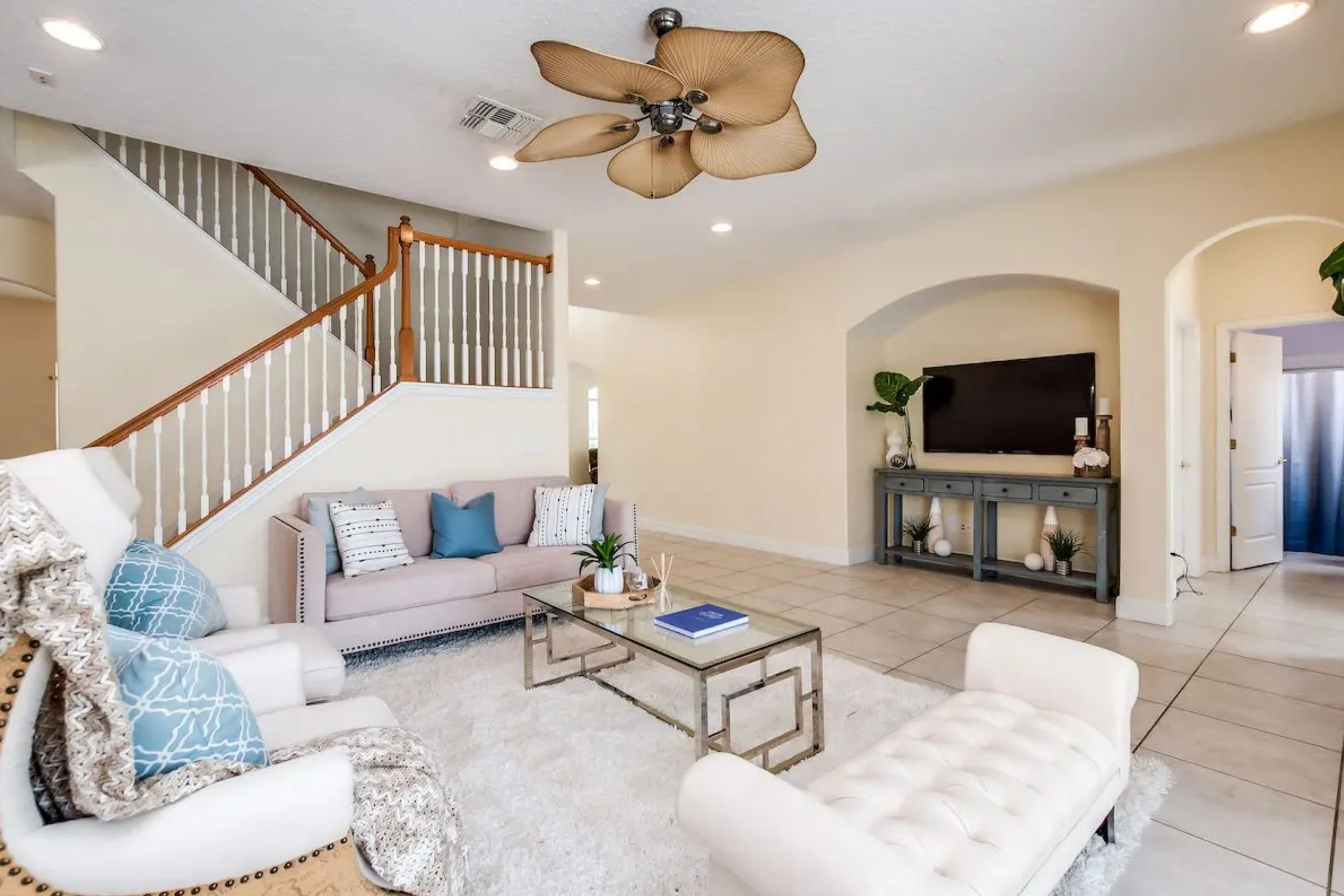
SW 6378 Crisp Linen by Sherwin Williams is a gentle and inviting paint color that can brighten any space in your home. With its soft, neutral tones, it’s remarkably adaptable, fitting seamlessly into a range of styles and decors. Think of it as a blank canvas, ready to enhance the elements you already treasure in your space.
Imagine walking into a room where the walls seem to whisper comfort and calmness. That’s the feeling Crisp Linen evokes. It provides a serene backdrop that suits both contemporary and more traditional settings.
You might find it particularly appealing for creating a cozy living room, a tranquil bedroom, or a welcoming kitchen.
Pairing it with darker shades can create a striking contrast, while combining it with other neutrals can maintain a soothing atmosphere. Its subtleness allows you to play with different textures and materials, letting your home’s unique character shine through.
Whether you prefer modern decor or a more classic look, Crisp Linen makes it all come together effortlessly.
SW 6378 Crisp Linen is not just about color; it’s about creating a space where you feel at peace and at home. It can subtly refresh your surroundings, making rooms feel bigger and more open without overwhelming your senses.
Embrace the warmth and simplicity of Crisp Linen, and enjoy the sense of ease it brings to your living areas.
via professionalstaging.com
What Color Is Crisp Linen SW 6378 by Sherwin Williams?
Table of Contents
Crisp Linen SW 6378 by Sherwin Williams is a warm, inviting shade of off-white with subtle yellow undertones. This color evokes a sense of coziness and comfort, making spaces feel soft and welcoming. Ideal for various interior styles, Crisp Linen shines in traditional settings, farmhouse decor, and classic interiors. Its warmth balances well with wood tones, creating harmony with rustic or vintage furniture.
In modern or minimalist homes, Crisp Linen provides a gentle backdrop, allowing furniture and artwork to stand out. Pair this hue with natural materials like light oak, pine, or walnut to bring out its warmth.
It complements textiles such as cotton, linen, and wool, enhancing the texture and depth of a room. Leather furnishings and metal fixtures in brass or bronze work well, adding a chic touch to the setting.
In coastal or cottage-style interiors, Crisp Linen effortlessly blends with woven baskets, rattan, and sisal rugs, enhancing a beachy vibe without overwhelming the eye.
It acts as an excellent canvas for pops of color from curtains, cushions, or pottery, while keeping the overall look balanced and fresh. Crisp Linen’s versatility allows it to adapt across seasons, always providing a serene, homey atmosphere.
housekeepingbay.com
Is Crisp Linen SW 6378 by Sherwin Williams Warm or Cool color?
Crisp Linen SW 6378 by Sherwin Williams is a soft, creamy off-white color that adds a touch of warmth to any room. Its gentle tones create a cozy and inviting atmosphere, making spaces feel comfortable and welcoming. Unlike stark whites, Crisp Linen offers a balanced warmth that pairs well with various color schemes, allowing it to fit seamlessly into both traditional and modern interiors.
In living rooms, this shade provides a perfect backdrop for colorful furniture and art, enhancing their vividness without overwhelming the space. In bedrooms, Crisp Linen fosters a soothing ambiance, promoting relaxation and ease.
When used in kitchens or bathrooms, it contributes to a clean and fresh look, complementing stainless steel or wooden finishes beautifully.
Overall, Crisp Linen SW 6378 works wonderfully in homes, offering a versatile and timeless option that highlights other design elements while adding its own subtle charm. It’s an excellent choice for those wanting a warm and neutral palette.
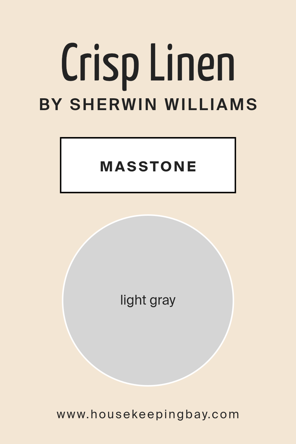
What is the Masstone of the Crisp Linen SW 6378 by Sherwin Williams?
Crisp Linen SW 6378 by Sherwin Williams is a warm, welcoming shade with a soft, inviting feel. Its masstone, light gray (#D5D5D5), gives it a gentle strength, balancing the warmth. This gray undertone helps the color adapt to different lighting conditions in homes, making it versatile.
In bright, sunlit rooms, Crisp Linen’s warm base stands out and feels fresh and airy. The light gray aspect ensures it doesn’t become too stark or overwhelming. In dim or shaded spaces, the gray helps maintain a cozy, calming atmosphere.
This makes it an ideal choice for living rooms, bedrooms, or any space where comfort is key.
Crisp Linen pairs beautifully with both warm and cool tones. It complements natural materials like wood and stone, enhancing their textures.
White trim or accents highlight its warmth, adding depth to the design. Its adaptability makes it a reliable option for any home style.
housekeepingbay.com
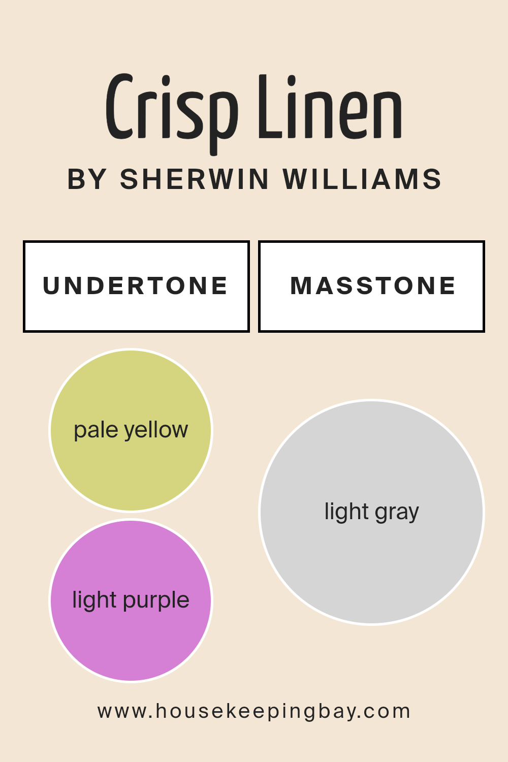
Undertones of Crisp Linen SW 6378 by Sherwin Williams
Crisp Linen SW 6378 by Sherwin Williams is a versatile and soft paint color. It has undertones that influence how it appears in different lighting and surroundings. This light, warm shade carries hints of pale yellow, light purple, and even mint. These undertones form a subtle base that affects perception.
Undertones play a significant role in paint colors. They can change how a color looks depending on light and other colors nearby. For example, a yellow undertone can make a color seem warmer, while a blue undertone can give it a cooler feel.
The presence of these subtle hints can sometimes shift a color visibly under different lighting conditions.
For Crisp Linen, the pale yellow undertone gives it a gentle warmth. This makes rooms feel cozy and inviting. The light purple and pink hints introduce a soft touch that can appear elegant and refined.
Meanwhile, the cool undertones like light blue and lilac balance the warm tones, offering a refreshing, airy feel. These mixed undertones enable Crisp Linen to work well in a variety of spaces, complementing both modern and traditional decor.
Its grey undertones add a neutral base, ensuring it remains calm and adaptable in different light settings.
housekeepingbay.com
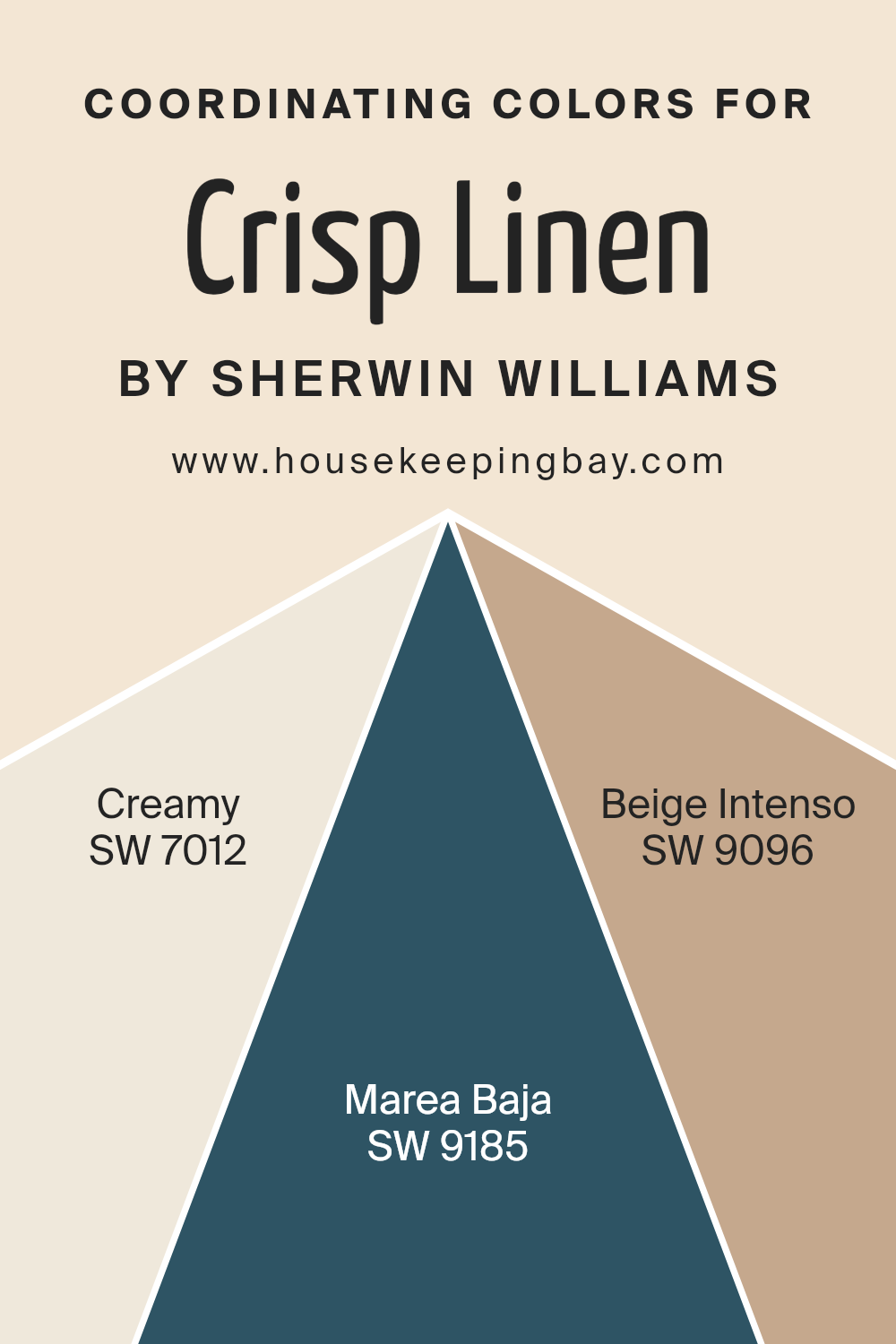
Coordinating Colors of Crisp Linen SW 6378 by Sherwin Williams
Coordinating colors are hues that work well together in a space to create a harmonious and pleasing visual effect. They complement the main color, in this case, Crisp Linen SW 6378 by Sherwin Williams, through a balance of tones and intensities.
When choosing coordinating colors, it’s important to consider both contrast and harmony to ensure that the colors enhance each other without clashing. The key is to select colors that share undertones or that fall within the same color palette, providing a cohesive look.
SW 7012, known as Creamy, offers a warm and inviting off-white shade that pairs beautifully with Crisp Linen. Its subtle warmth makes it a great choice for creating a soft, comforting atmosphere. SW 9185, Marea Baja, is a deep, earthy brown that adds depth and richness to a room.
It brings a grounded, natural feel when paired with lighter tones like Crisp Linen.
SW 9096, Beige Intenso, is a robust beige that acts as a versatile neutral. It helps unify the color scheme with its cozy, welcoming vibe, tying together both lighter and darker elements. Together, these colors create a balanced and aesthetically pleasing environment, providing a sense of unity and style.
You can see recommended paint colors below:
- SW 7012 Creamy
- SW 9185 Marea Baja
- SW 9096 Beige Intenso
housekeepingbay.com
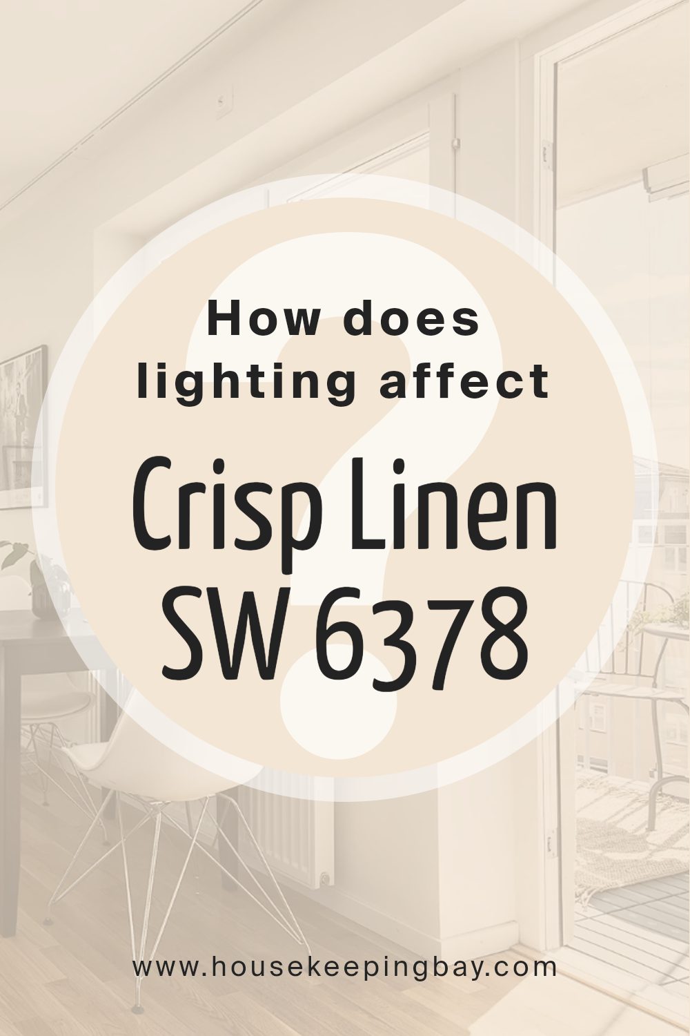
How Does Lighting Affect Crisp Linen SW 6378 by Sherwin Williams?
Lighting plays a crucial role in how we perceive colors. Crisp Linen SW 6378 by Sherwin Williams is a warm off-white shade that can change its appearance based on lighting conditions. Understanding how this color behaves in different types of light can help make informed decisions about where to use it.
In natural light, Crisp Linen tends to show its true color more clearly. In north-facing rooms, which receive cooler, softer light, this color can appear slightly more muted and may even take on a greyish tone. The natural light is less intense, often reducing the warmth in the paint.
It’s important to keep in mind that north-facing rooms might need additional artificial lighting to enhance the warmth of Crisp Linen.
In south-facing rooms, the light is usually warmer and brighter throughout the day. Here, Crisp Linen can reveal its warmth nicely and look creamy and inviting. The strong natural light enhances the color’s soft undertones, making it a great choice if you want a welcoming ambiance.
East-facing rooms receive bright morning light that turns cooler as the day progresses. In morning sunlight, Crisp Linen looks bright and warm, but in the afternoon, the cooler light may bring out more neutral or even shadowy notes in the color.
West-facing rooms get softer morning light and warm, golden tones in the evening. In these rooms, Crisp Linen might appear more neutral in the morning and gain a rich warmth in the afternoon and evening, making the space feel cozy as the sun sets.
Under artificial lighting, Crisp Linen’s appearance will depend largely on the type of bulbs used.
With warm, ambient lighting, the paint will generally maintain its inviting appearance. However, under cool or fluorescent lighting, it may lose some of its warmth, appearing more subdued or neutral. Choosing the right lighting will enhance the desired qualities of Crisp Linen, making it adaptable to various spaces and moods.
housekeepingbay.com
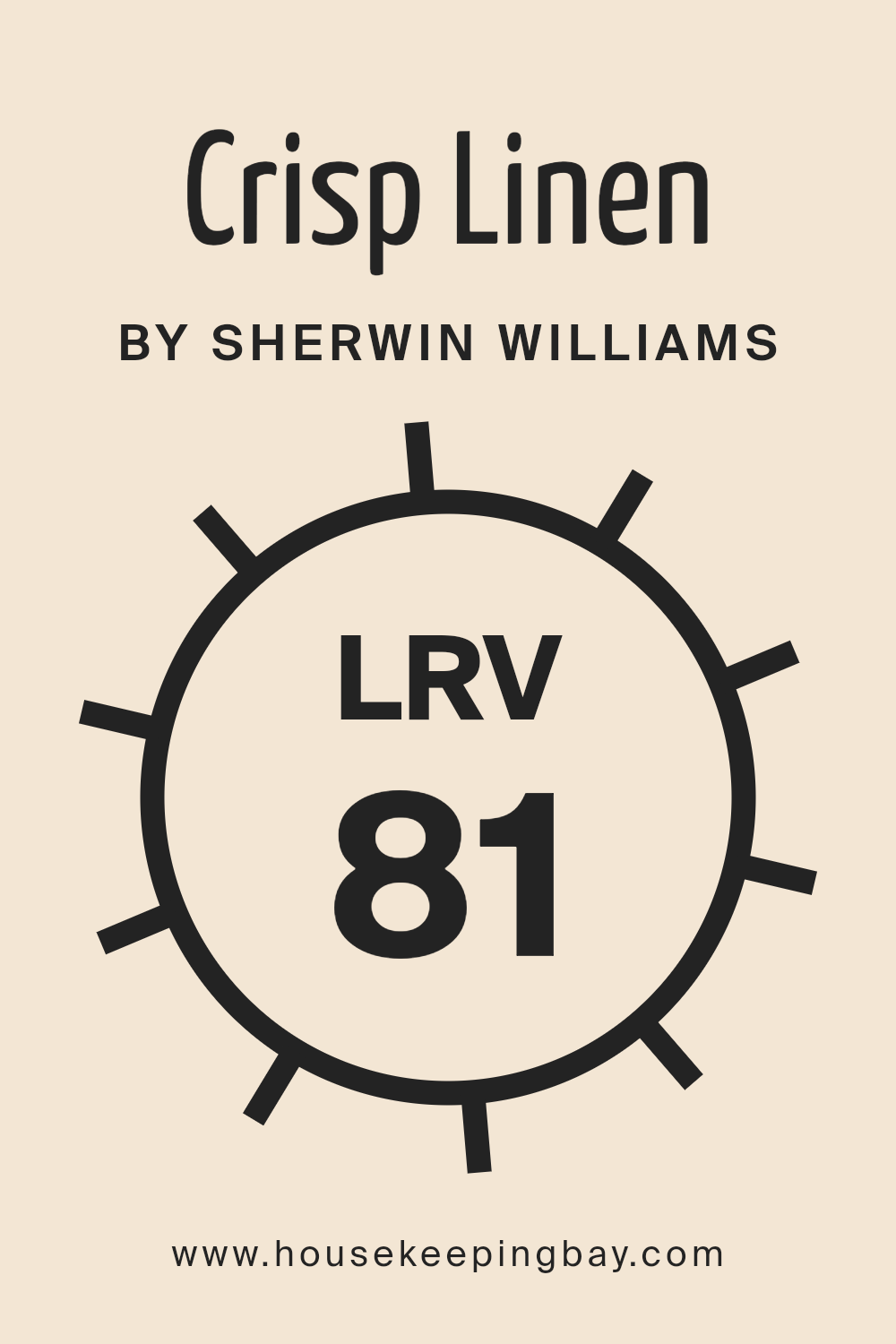
What is the LRV of Crisp Linen SW 6378 by Sherwin Williams?
LRV stands for Light Reflectance Value. It’s a number that helps you understand how much light a color will reflect when it’s on your walls. Imagine standing in a room; the color with an LRV of 0 would be completely dark, and a color with an LRV of 100 would reflect all light, like a bright white.
A higher LRV means the color reflects more light and can make spaces appear bigger and brighter. It’s an important factor to consider when choosing a paint color because it affects how the room feels. If a room doesn’t get much natural light, a color with a high LRV can help make it seem lighter and airier.
For Crisp Linen SW 6378 by Sherwin Williams, the LRV is 80.558. This is quite high, indicating that this color reflects a lot of light. On walls, Crisp Linen would look bright and light, making the space feel open and spacious. It’s a versatile choice for rooms that need a boost in brightness.
Even in darker spaces, this color can prevent the room from feeling closed in or gloomy. Because it reflects so much light, Crisp Linen can also subtly change with different lighting conditions, adding a fresh and clean look to any room.
housekeepingbay.com
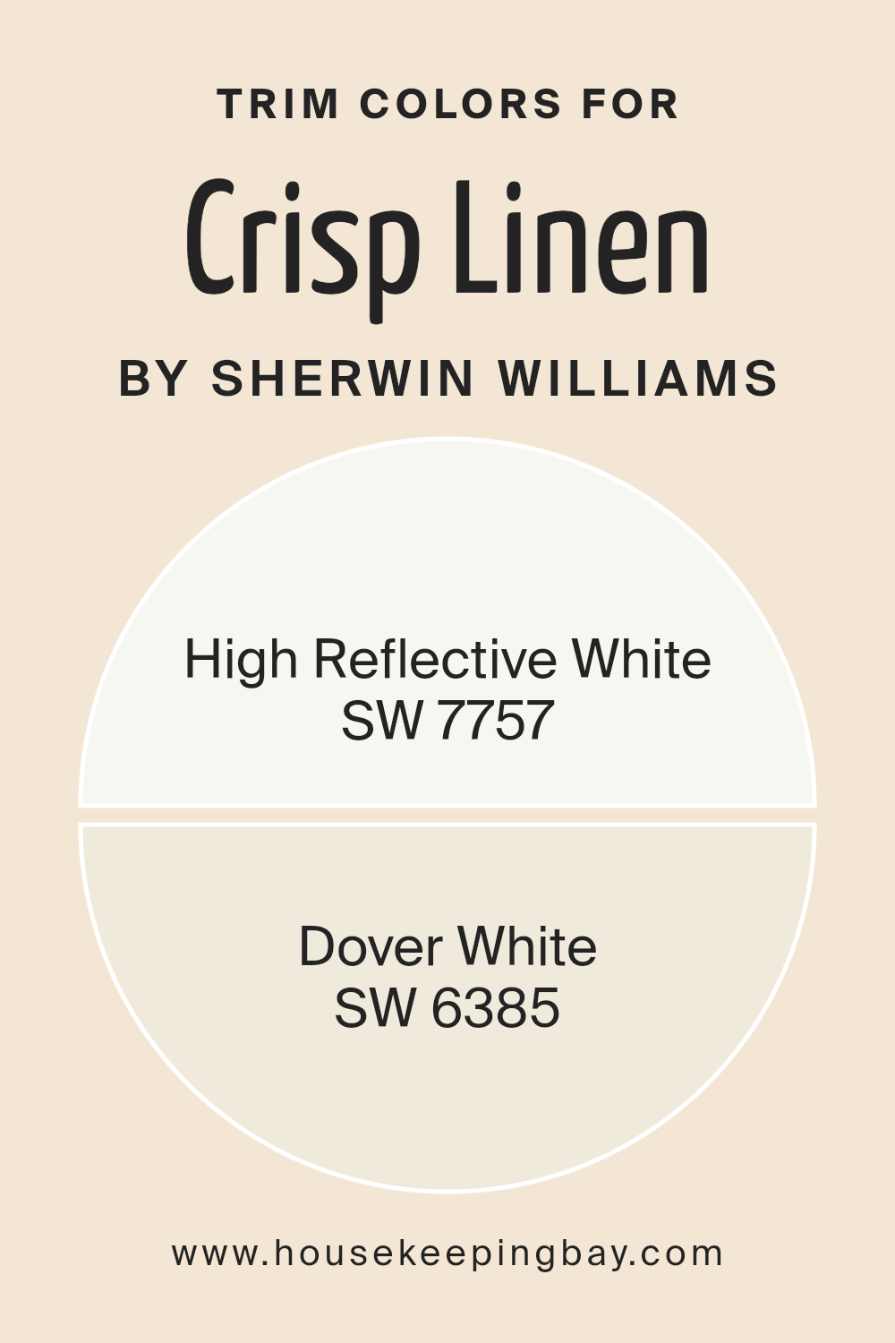
What are the Trim colors of Crisp Linen SW 6378 by Sherwin Williams?
Trim colors are the shades used on the edges or borders of walls, doors, and windows, serving as a contrast to the primary wall color. They help define the structure of a room and add a polished, cohesive look, enhancing the main color choice.
When working with Crisp Linen SW 6378 by Sherwin Williams, the choice of trim color is significant as it determines the overall effect and harmony of the space.
Good trim colors can greatly enhance the elegance and warmth of Crisp Linen, which offers a soft, inviting backdrop that can shine in both modern and classic settings.
High Reflective White SW 7757 provides a sharp, clean contrast when used as a trim color. Its brightness makes it ideal for defining architecture and bringing out the subtle warmth in Crisp Linen. On the other hand, Dover White SW 6385 offers a softer contrast with its creamy undertones.
This color can complement Crisp Linen by adding a gentle, warm transition between walls and trim, creating a cohesive, welcoming environment.
By choosing the right trim color, one enhances the depth and character of Crisp Linen walls, contributing to the overall aesthetic of the space.
You can see recommended paint colors below:
housekeepingbay.com
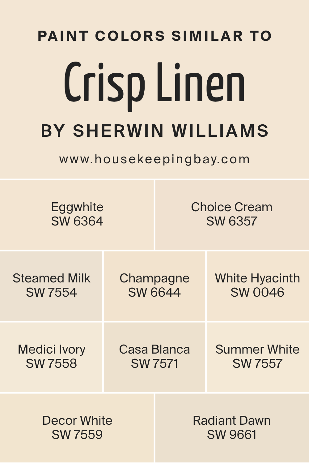
Colors Similar to Crisp Linen SW 6378 by Sherwin Williams
Similar colors play a crucial role in interior design as they create a harmonious and calming environment. When colors are close in tone, like those related to Crisp Linen SW 6378, they provide a smooth flow and subtle elegance to any space.
For example, SW 6364 – Eggwhite offers a soft yellow tint, adding warmth without overpowering the overall atmosphere. SW 6357 – Choice Cream follows with a bit more depth, enhancing coziness while maintaining the gentle aesthetic.
Another color in this palette, SW 7554 – Steamed Milk, brings a creamy texture with a touch of sophistication. SW 6644 – Champagne introduces a hint of pinkish hue, adding a delicate flair. SW 0046 – White Hyacinth stands out with its cool white shade, perfect for balancing warmer tones.
SW 7558 – Medici Ivory has a slightly deeper shade, providing a rich, historical feel. SW 7571 – Casa Blanca presents an inviting creamy note that complements both modern and traditional spaces.
For a lighter touch, SW 7557 – Summer White offers a breezy brightness. SW 7559 – Decor White maintains a pure elegance, while SW 9661 – Radiant Dawn gently adds a sense of morning freshness. Together, these colors create a serene, inviting ambiance.
You can see recommended paint colors below:
- SW 6364 Eggwhite
- SW 6357 Choice Cream
- SW 7554 Steamed Milk
- SW 6644 Champagne
- SW 0046 White Hyacinth
- SW 7558 Medici Ivory
- SW 7571 Casa Blanca
- SW 7557 Summer White
- SW 7559 Decor White
- SW 9661 Radiant Dawn
housekeepingbay.com
Colors that Go With Crisp Linen SW 6378 by Sherwin Williams
Choosing colors that complement Crisp Linen SW 6378 by Sherwin Williams is crucial for creating a harmonious space within a room. Crisp Linen is a gentle, warm neutral that offers a subtle backdrop, allowing other colors to shine.
When paired with SW 6364 – Eggwhite, the result is a soft glow that keeps the room feeling cozy and inviting.
Eggwhite is a warm off-white that blends smoothly with Crisp Linen, enhancing its warmth. SW 8917 – Shell White adds a hint of lightness and airiness, balancing the warmth with a touch of freshness. It’s a soft neutral with a delicate warmth that softly brightens a space.
Pairs like SW 6126 – Navajo White provide a creamier, more traditional feel. Navajo White is a rich, creamy color that deepens the overall warmth of a room. On the other hand, SW 7572 – Lotus Pod brings in a subtle earthiness with its warm, muted tones. It’s a soft brown that grounds the palette.
SW 7571 – Casa Blanca offers a cooler, more refined contrast that still sits comfortably within the warm spectrum. Echelon Ecru SW 7574 works similarly, providing depth with its slightly darker shade, enhancing the richness of the overall palette.
These colors ensure that Crisp Linen stands out while also creating an inviting, cohesive environment.
You can see recommended paint colors below:
- SW 6364 Eggwhite
- SW 8917 Shell White
- SW 6126 Navajo White
- SW 7572 Lotus Pod
- SW 7571 Casa Blanca
- SW 7574 Echelon Ecru

housekeepingbay.com
How to Use Crisp Linen SW 6378 by Sherwin Williams In Your Home?
Crisp Linen SW 6378 by Sherwin Williams offers a welcoming shade that can fit into different interiors. This color is warm and creamy, resembling natural fabrics, which brings a pleasant sense of comfort. It works well in living areas, kitchens, or bedrooms because its subtle tone adds light and space to any room.
In a living room, use Crisp Linen as a backdrop, and it will complement both modern and classic furniture, allowing colorful accessories or artwork to stand out. In a kitchen, paired with natural wood finishes or white cabinets, it creates a fresh and inviting atmosphere.
Bedrooms benefit from this color too, as it promotes relaxation without feeling too stark.
Natural light enhances its warmth during daytime, while soft lighting can make evenings cozy. Overall, Crisp Linen offers versatility and can combine with other shades to add harmony and unity to your home interior.
Crisp Linen SW 6378 by Sherwin Williams vs Choice Cream SW 6357 by Sherwin Williams
Crisp Linen SW 6378 and Choice Cream SW 6357 by Sherwin Williams are warm, inviting colors, each with unique qualities. Crisp Linen is a delicate, soft off-white with a hint of warmth that brings about a cozy, gentle atmosphere. It’s versatile, working well in various spaces, from living rooms to bedrooms, where a light, airy feel is desired.
Choice Cream is a richer, more saturated hue, with a deep, creamy tone that exudes warmth and comfort. It adds a subtle, buttery touch to walls, creating a welcoming environment, perfect for spaces like dining rooms or kitchens, where a warmer ambiance is appreciated.
When comparing, Crisp Linen is lighter and more neutral, lending itself to a minimalistic and clean aesthetic. Conversely, Choice Cream carries more color depth, making spaces feel snug and inviting. Both colors enhance interiors, though they establish different moods based on their intensity and undertones.
You can see recommended paint color below:
housekeepingbay.com
Crisp Linen SW 6378 by Sherwin Williams vs Medici Ivory SW 7558 by Sherwin Williams
Crisp Linen SW 6378 and Medici Ivory SW 7558, both by Sherwin Williams, offer gentle, warm hues ideal for creating inviting spaces. Crisp Linen is a soft, light beige with a hint of warmth. It brings brightness and a sense of cleanliness to a room, making it suitable for spaces like living rooms or bedrooms where a fresh and airy feel is desired.
Medici Ivory, in contrast, is a warm, creamy color with slightly more depth. It has deeper undertones that deliver a cozy, welcoming atmosphere, perfect for dining rooms or kitchens where comfort is key.
While both colors belong to a neutral palette, Crisp Linen leans into lighter tones, reflecting more light, thus enhancing airy vibes. Medici Ivory, richer in feel, adds warmth while embracing subtle sophistication.
These two colors can play well together, with Crisp Linen as a primary wall color and Medici Ivory as an accent, adding depth to a room’s design.
You can see recommended paint color below:
housekeepingbay.com
Crisp Linen SW 6378 by Sherwin Williams vs Summer White SW 7557 by Sherwin Williams
Crisp Linen SW 6378 and Summer White SW 7557, both from Sherwin Williams, are soft, light colors with subtle differences. Crisp Linen SW 6378 has a warm undertone, leaning slightly towards a creamy appearance. It’s perfect for creating a cozy and inviting space, bringing warmth and comfort to any room. It works nicely in areas where you want a gentle, welcoming atmosphere.
Summer White SW 7557, in contrast, is slightly cooler with a more neutral undertone. It provides a clean and fresh look, ideal for spaces where you want a brighter, airy feel. This color fits well in modern settings, highlighting simplicity and elegance without overwhelming a room’s decor.
Both colors add sophistication, making rooms feel open and spacious. Crisp Linen adds a hint of warmth, while Summer White offers a more neutral, fresh vibe. Choosing between them depends on whether you want a warmer or more neutral backdrop.
You can see recommended paint color below:
housekeepingbay.com
Crisp Linen SW 6378 by Sherwin Williams vs Steamed Milk SW 7554 by Sherwin Williams
Crisp Linen SW 6378 and Steamed Milk SW 7554 by Sherwin Williams are two inviting, neutral colors, each offering a unique aesthetic. Crisp Linen, with its soft, warm undertone, evokes the comfort of freshly laundered sheets. It brings brightness, making spaces feel open and airy. It pairs well with bold accents, adding contrast without overwhelming.
Steamed Milk, on the other hand, offers a creamier appearance. It straddles the line between warmth and neutrality. Its subtle beige undertone creates a soothing backdrop that envelopes spaces, promoting a cozy atmosphere.
It beautifully complements natural materials, like wood and stone, emphasizing an earthy palette.
When compared, Crisp Linen leans slightly towards the crisper, cleaner side, adding light, while Steamed Milk offers more depth and warmth, providing a comfortable, enveloping feel.
Both colors are versatile, fitting well in most interiors, yet their differences allow personal expression based on ambiance preference.
You can see recommended paint color below:
housekeepingbay.com
Crisp Linen SW 6378 by Sherwin Williams vs Decor White SW 7559 by Sherwin Williams
Crisp Linen SW 6378 by Sherwin Williams is a warm, creamy off-white with a hint of yellow. It’s a cozy shade that creates a welcoming atmosphere, often used to make a room feel more inviting and comfortable. The yellow undertone gives it a soft glow, making it suitable for spaces where relaxation is key, like living rooms or bedrooms.
Decor White SW 7559, in contrast, is a purer white with a cooler, neutral tone. It has less of the yellow warmth found in Crisp Linen, offering a cleaner, more traditional white look. This makes it an excellent choice for modern or minimalist spaces where clarity and brightness are desired.
It can make rooms appear more spacious and crisp, perfect for kitchens, bathrooms, or spaces aiming for a fresh, clean vibe.
Both colors offer different moods: Crisp Linen provides warmth and coziness, while Decor White delivers brightness and purity.
You can see recommended paint color below:
housekeepingbay.com
Crisp Linen SW 6378 by Sherwin Williams vs Radiant Dawn SW 9661 by Sherwin Williams
Crisp Linen SW 6378 and Radiant Dawn SW 9661, both by Sherwin Williams, bring different vibes to a space. Crisp Linen is a warm, soft off-white with creamy undertones. It feels like a cozy, neutral backdrop that complements various styles. It’s versatile, working well in both traditional and modern settings, and creates a relaxed environment.
Radiant Dawn, however, has a touch more color. This subtle peachy-pink adds warmth and a hint of playfulness to a room. Its gentle tones infuse spaces with a sense of soft positivity.
While Crisp Linen leans more toward a neutral palette, Radiant Dawn introduces a splash of color without overwhelming a room.
Both colors harmonize well with similar shades but serve different purposes. Crisp Linen is versatile and safe, creating a timeless and polished look. Radiant Dawn, with its soft peach, provides warmth and cheerfulness, making spaces feel inviting and fresh. They both enhance interiors but offer unique moods.
You can see recommended paint color below:
- SW 9661 Radiant Dawn
housekeepingbay.com
Crisp Linen SW 6378 by Sherwin Williams vs Champagne SW 6644 by Sherwin Williams
Crisp Linen SW 6378 and Champagne SW 6644 are both warm, inviting colors by Sherwin Williams, but they offer different moods and applications. Crisp Linen SW 6378 is a soft, neutral off-white with subtle yellow undertones. It gives spaces a light, airy feel, perfect for creating a clean and serene atmosphere in any room. This color works well in spaces that need a gentle, understated look without being stark or cold.
Champagne SW 6644, in contrast, leans more towards a warm, peachy tone. It’s vibrant and lively with a touch of elegance.
Champagne can add a sense of cheerfulness and energy to a space, making it ideal for dining rooms, kitchens, or any area where you want to create a cozy, welcoming vibe.
While both colors are warm, Crisp Linen offers subtlety and calmness, while Champagne brings a richer, more engaging feel to a room.
Together, they can complement each other beautifully when used strategically in a home.
You can see recommended paint color below:
- SW 6644 Champagne
housekeepingbay.com
Crisp Linen SW 6378 by Sherwin Williams vs Casa Blanca SW 7571 by Sherwin Williams
Crisp Linen SW 6378 and Casa Blanca SW 7571 by Sherwin Williams are both warm, inviting colors, yet they offer different vibes. Crisp Linen SW 6378 has a creamy, soft appearance that brings a subtle glow to a space. It’s gentle and soothing, creating a comfortable and relaxed environment.
Casa Blanca SW 7571 is similarly warm but slightly deeper and more grounded. While Crisp Linen feels light and airy, Casa Blanca adds more depth and a hint of richness. It’s a versatile color that works well in spaces where a touch more warmth is desired.
When put together, Crisp Linen can be used to lighten a room, while Casa Blanca can add depth. Both pair nicely with natural materials and work perfectly in living areas, bedrooms, or kitchens.
These colors reflect warmth and comfort, making them ideal for creating a cozy home atmosphere.
You can see recommended paint color below:
housekeepingbay.com
Crisp Linen SW 6378 by Sherwin Williams vs Eggwhite SW 6364 by Sherwin Williams
Crisp Linen SW 6378 and Eggwhite SW 6364, both by Sherwin Williams, are soft, warm neutrals. Crisp Linen has a subtle, creamy tone that brings warmth without feeling heavy. It offers a cozy backdrop, perfect for spaces needing a gentle yet inviting atmosphere. The color feels light and airy, making rooms appear more open and comfortable.
Eggwhite SW 6364 is slightly richer, with a hint of golden undertone. This shade adds a touch of elegance and provides a more defined warmth compared to Crisp Linen. It complements earthy tones beautifully.
While both colors bring warmth, Crisp Linen feels a bit lighter, ideal for modern or minimalist decor. Eggwhite, although warm, offers more depth, making it suitable for traditional or classic settings. Both colors provide a welcoming feel, though Crisp Linen leans softer, while Eggwhite brings a bit more character with its golden hues.
You can see recommended paint color below:
housekeepingbay.com
Crisp Linen SW 6378 by Sherwin Williams vs White Hyacinth SW 0046 by Sherwin Williams
Crisp Linen SW 6378 and White Hyacinth SW 0046 are both light, neutral shades, perfect for creating a calm and inviting atmosphere. Crisp Linen is a warm, creamy hue that resembles the color of natural linen fabric, offering a subtle yellow undertone. It provides a cozy and soft appearance, making spaces feel welcoming and comfortable.
White Hyacinth, in contrast, is a cooler white with a slight hint of gray. It is more traditional and classic, offering a fresh, clean look without the yellow warmth found in Crisp Linen. This color works well in spaces requiring a crisp, modern feel.
Crisp Linen adds warmth and coziness, making it ideal for living spaces or bedrooms where relaxation is key. White Hyacinth, with its cooler tones, suits kitchens or bathrooms, providing a polished and bright finish. Both colors can pair well with various accent tones, allowing for versatility in design.
You can see recommended paint color below:
housekeepingbay.com
Conclusion
Its soft, warm undertones create a welcoming atmosphere that works well in a variety of spaces. I find it ideal for living rooms, bedrooms, or any area where a sense of calm and comfort is desired.
This color also pairs nicely with both traditional and modern decor, providing a neutral backdrop that allows furniture and accents to stand out. I appreciate how it incorporates a touch of warmth while remaining light and neutral, making it suitable for small and large spaces alike.
Natural lighting plays a significant role in how this color presents itself, enhancing its subtle charm and adding depth. I like how Crisp Linen complements a range of other colors, such as muted blues or soft grays, offering flexibility in design choices. It balances elegance and simplicity, which can be soothing after a long day.
Overall, I’m drawn to SW 6378 Crisp Linen because it delivers a timeless and fresh appearance that can enhance any room’s aesthetic without overwhelming the senses.
It’s a color that can easily adapt to changing styles and preferences, ensuring it remains a favorite choice for those seeking both beauty and comfort in their home environment.
housekeepingbay.com
Ever wished paint sampling was as easy as sticking a sticker? Guess what? Now it is! Discover Samplize's unique Peel & Stick samples. Get started now and say goodbye to the old messy way!
Get paint samples


