White Hyacinth SW 0046 by Sherwin Williams
Embrace Tranquility & The Allure of SW 0046 White Hyacinth
In the vast and nuanced world of interior paint, “SW 0046 White Hyacinth” by Sherwin Williams emerges as a compelling choice for those seeking to imbue their spaces with a sense of calm, elegance, and timelessness.
This article delves into the unique qualities of White Hyacinth, a paint color that transcends the ordinary by offering a whisper of warmth in its inherently bright white hue, making it a versatile option for a myriad of design aesthetics.
From the crisp, refined edges of minimalist decor to the layered, textured atmospheres of more eclectic homes, White Hyacinth proves its worth as not just a color, but as a foundational element that shapes the mood and character of interiors.
Alongside a detailed exploration of its visual appeal, this article examines the practical virtues of choosing Sherwin Williams paint, focusing on durability, coverage, and the brand’s commitment to eco-friendly formulations.
For homeowners, designers, and architectural professionals alike, “SW 0046 White Hyacinth” offers a unique blend of aesthetic flexibility and timeless style, making it a standout contender in the quest for the perfect paint.
vis sherwin-williams.com
What Color Is White Hyacinth SW 0046 by Sherwin Williams?
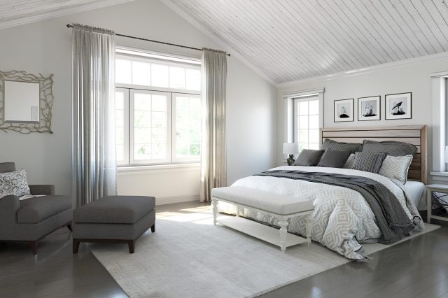
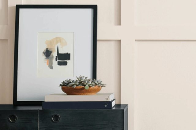
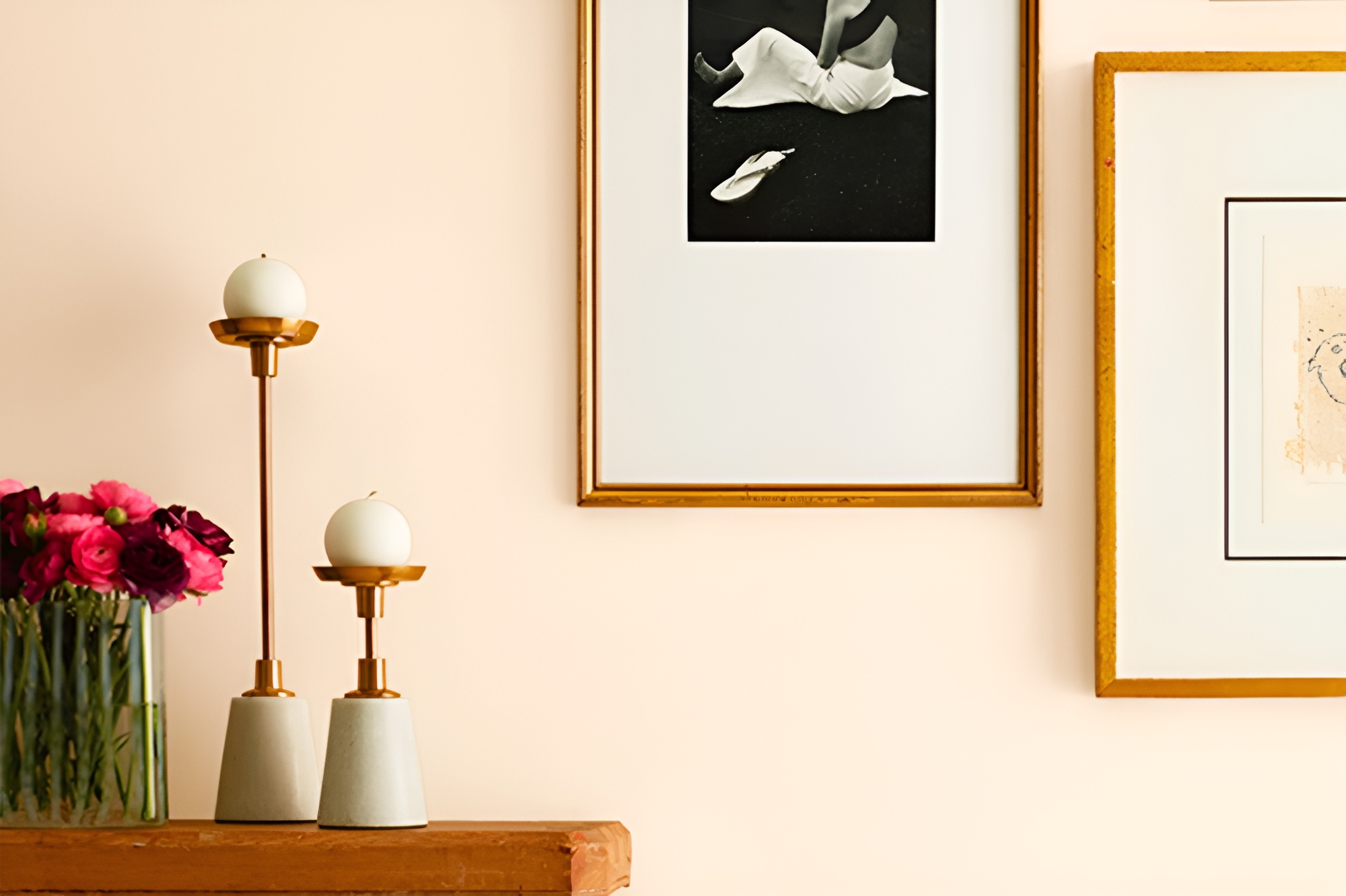
White Hyacinth SW 0046 by Sherwin Williams evokes a pristine and tranquil ambiance that breathes life into any space. This color, subtle and sophisticated, boasts a soft, creamy undertone, making it versatile and welcoming.
Unlike stark whites, White Hyacinth carries a warmth that echoes the gentle hues of early spring blossoms, creating spaces that are soothing and serene.
This exquisite shade pairs exceptionally well with a multitude of interior styles, particularly shining in environments that embrace minimalist, Scandinavian, or coastal aesthetics.
Its understated elegance provides a perfect canvas for these decor themes, enabling textures and materials to stand out. In minimalist settings, White Hyacinth enhances the beauty of clean lines and uncluttered spaces, while in Scandinavian and coastal inspired interiors, it complements natural light and amplifies the sense of airiness and openness.
Materials such as light woods, like ash or birch, create a harmonious match with White Hyacinth, emphasizing the connection to nature and serenity.
Textures in linen, wool, or cotton in soft, neutral tones add depth and warmth to the overall look, creating inviting environments. Paired with materials like marble or metallic finishes, White Hyacinth maintains its delicacy, ensuring spaces remain bright and timeless.
This color is adept at balancing sophistication with comfort, making it a superior choice for those looking to marry classic design with a touch of modernity.
housekeepingbay.com
Table of Contents
Is White Hyacinth SW 0046 by Sherwin Williams Warm or Cool color?
White Hyacinth SW 0046 by Sherwin Williams is a distinctive paint color that exudes serenity and elegance. This subtle hue possesses a gentle warmth, making it a versatile choice for a myriad of home interiors.
The beauty of White Hyacinth lies in its softness, a characteristic that allows it to stand as a serene backdrop or complement bolder accents within a space. When applied to walls, it imbues rooms with a feeling of airy openness, while still offering a touch of coziness.
The color’s effectiveness in home decor stems from its ability to adapt effortlessly to various lighting situations. In natural daylight, White Hyacinth takes on a luminous quality, reflecting light to make spaces appear more spacious.
Under artificial lighting, it maintains its warmth, ensuring the ambiance remains inviting and comforting. This adaptability makes it ideal for living rooms, bedrooms, and even kitchens, where it can create a clean, fresh look without feeling sterile.
White Hyacinth’s understated elegance also allows homeowners to play with textures and patterns, as it acts as a neutral canvas that supports a range of decor styles, from minimalist to eclectic. Its ability to blend seamlessly into any design theme is what makes White Hyacinth a timeless choice for creating tranquil and stylish home environments.
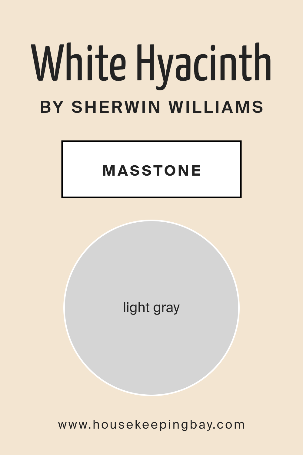
What is the Masstone of the White Hyacinth SW 0046 by Sherwin Williams?
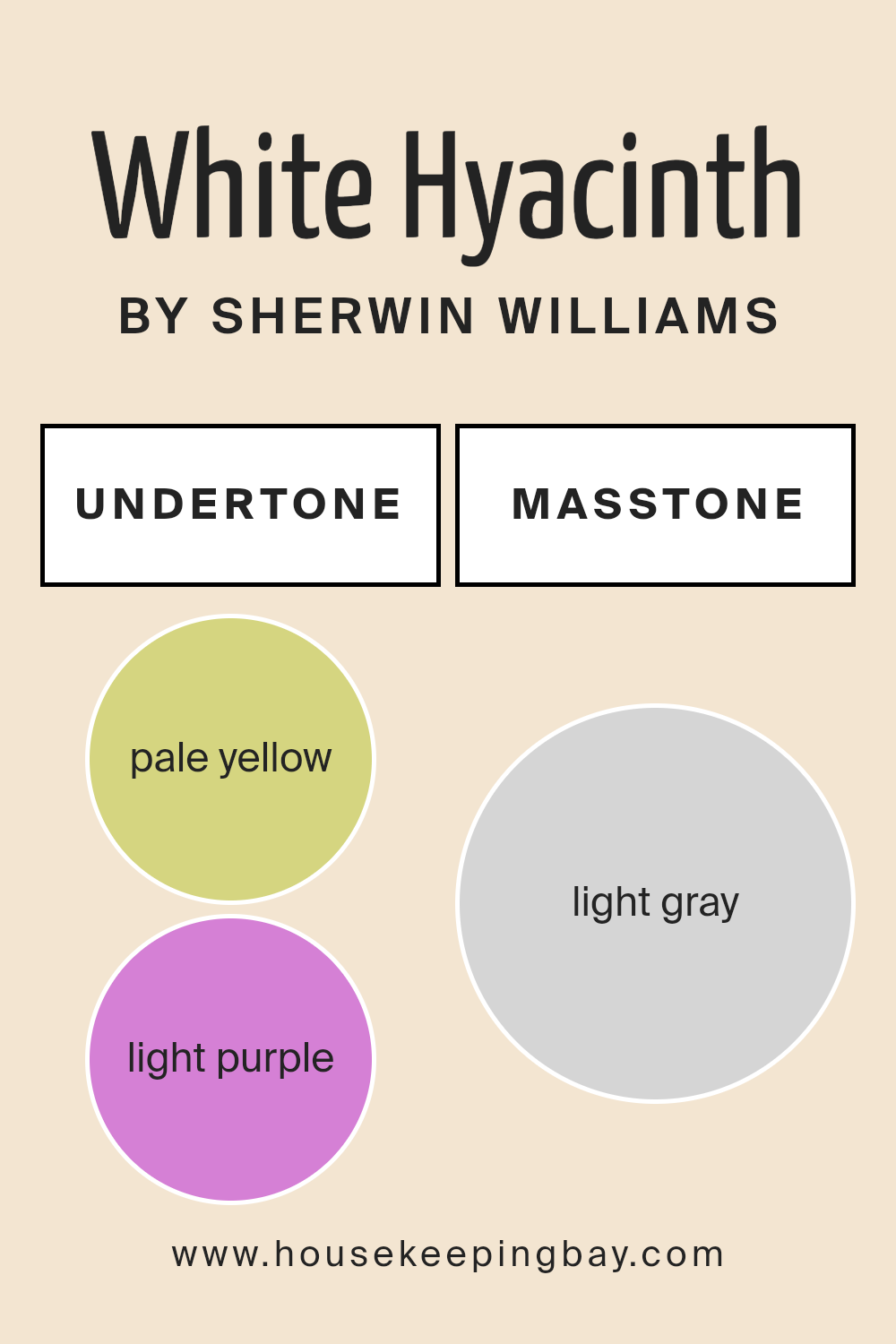
White Hyacinth SW 0046 by Sherwin Williams, with its masstone of Light Gray (#D5D5D5), is a versatile and serene hue that brings a soft, understated elegance to any home space.
Masstone, the color you see when the paint is applied in a thick coat, is crucial in understanding how this particular shade will impact a room’s aesthetic. White Hyacinth’s light gray masstone has a calming and neutral effect, making it an excellent choice for creating a peaceful and welcoming atmosphere.
In homes, this shade acts as a subtle backdrop, perfect for highlighting artwork, furniture, or accent details without overwhelming them. Its light gray color efficiently reflects natural light, thereby brightening rooms and making them appear larger.
This quality is especially beneficial in smaller spaces or areas with limited natural light. Furthermore, its neutral palette supports a wide range of color schemes, from monochromatic minimalism to vibrant, contrasting accents.
This flexibility allows homeowners to easily refresh their décor without needing a complete overhaul, making White Hyacinth an enduring favorite for its adaptability and understated charm.
housekeepingbay.com
Undertones of White Hyacinth SW 0046 by Sherwin Williams
White Hyacinth SW 0046 by Sherwin Williams is a captivating color with a nuanced palette that subtly shapes perceptions and atmospheres in any space it adorns. Its undertones, pale yellow (#D5D580) and light purple (#D580D5), play a crucial role in its overall appearance and the way it interacts with its surroundings.
Undertones are essentially the underlying hues that, while not immediately apparent, significantly influence a color’s character and how it is perceived in various lighting conditions.
They can warm up or cool down a color, affect its brightness, and even influence mood and spatial perception. For instance, a color with a yellow undertone may appear warmer and more inviting, while a purple undertone might lend a cooler and more serene quality.
In the case of White Hyacinth, the pale yellow and light purple undertones contribute to its unique charm. The pale yellow undertone adds a subtle warmth, making spaces feel cozy, welcoming, and full of light, especially in sunshine-filled rooms.
On the other hand, the light purple undertone introduces a hint of cool sophistication that can enhance the feeling of spaciousness and tranquility. This duality means White Hyacinth can adapt beautifully to different lighting conditions, casting a soft, inviting glow in sunlight or a tranquil, airy feel in artificial light.
When applied to interior walls, White Hyacinth bestows a delicate balance of warmth and coolness, depending on the room’s natural and artificial lighting.
Its versatility makes it an excellent choice for creating a serene backdrop that enhances the visual warmth or freshness of a space. The subtle interplay of its undertones with ambient light can also subtly affect mood, evoking feelings of calm and comfort.
Furthermore, it offers a sophisticated canvas that can complement a wide range of decor styles and color palettes, making it a favored choice for designers seeking a paint color that bridges traditional warmth with modern elegance.
housekeepingbay.com
Coordinating Colors of White Hyacinth SW 0046 by Sherwin Williams
Coordinating colors are those that harmoniously align with one another, creating a cohesive and visually appealing palette in any space. This seamless integration is achieved by selecting colors that share underlying hues or offer complementary contrasts, ensuring that no single color overpowers another.
The focus lies in enhancing the aesthetic and emotional impact of the primary color, in this case, White Hyacinth SW 0046 by Sherwin Williams, a subtle and serene shade that evokes the freshness of early spring. By carefully choosing coordinating colors, designers can sculpt depth, warmth, or coolness into a room, affecting its mood and perceived size.
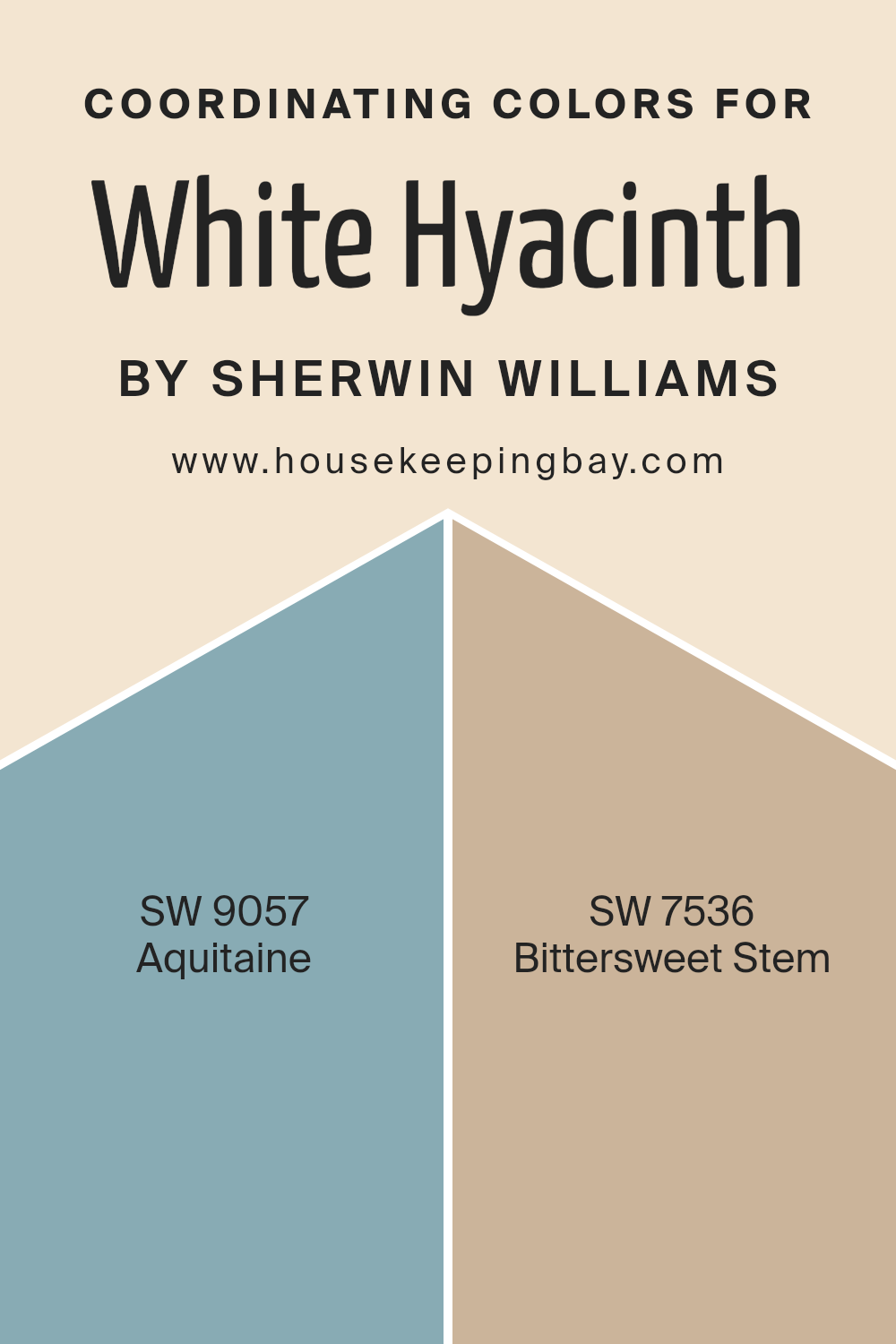
For a harmonious accompaniment to White Hyacinth, Sherwin Williams suggests Aquitaine SW 9057, a shade that whispers of ancient stone ruins beneath a dusky sky, offering a muted elegance that complements the gentle whisper of White Hyacinth without overshadowing its purity.
This color brings a layer of sophistication and depth, inviting contemplation and tranquility. Equally compelling, Bittersweet Stem SW 7536, with its earthy, rooted tones, grounds the airy lightness of White Hyacinth, providing a balanced, natural backdrop that encourages relaxation and a sense of renewal.
Together, these coordinating colors offer a palette that is both versatile and harmonious, creating spaces that are inviting and cohesive.
You can see recommended paint colors below:
- SW 9057 Aquitaine
- SW 7536 Bittersweet Stem
housekeepingbay.com
How Does Lighting Affect White Hyacinth SW 0046 by Sherwin Williams?
Lighting plays a crucial role in how we perceive colors, fundamentally altering their appearance and the ambiance of a space. Each type of light—natural or artificial—interacts distinctively with colors, transforming their vibrancy and shades.
When considering a specific color such as White Hyacinth SW 0046 by Sherwin Williams, understanding these effects is crucial to achieving the desired visual outcome in interior design.
In natural light, White Hyacinth reveals its true color, but the quality and direction of the light can significantly impact its appearance. North-facing rooms receive consistent, cool light throughout the day, causing White Hyacinth to appear more serene and subtly cool-toned, maintaining a crisp and fresh ambiance.
In contrast, south-facing rooms are bathed in warm, abundant sunlight for most of the day, which would warm up the color, making it appear softer and slightly more inviting.
East-facing rooms enjoy bright, warm light in the morning, with the light becoming cooler as the day progresses. In these rooms, White Hyacinth will appear lively and warm in the morning, transitioning to a cooler, more balanced white as the day goes on.
West-facing rooms, on the other hand, receive less intense light in the morning, which shifts to warm, golden tones by the evening. This makes White Hyacinth appear neutral and calm in the morning light, evolving into a cozier, more warmly lit white towards the evening.
Artificial lighting adds another layer of complexity. Incandescent bulbs, which emit warmer light, will accentuate the warm tones in White Hyacinth, making it appear more inviting.
Fluorescent lighting, which is cooler, can enhance its crispness, giving the space a more sterile feel. LED lights, depending on their color temperature, can either warm the color up or keep it neutral and true to its swatch.
Understanding these nuances is pivotal in interior design, ensuring that the chosen colors perform as expected under varying lighting conditions. White Hyacinth SW 0046, with its versatile nature, can adapt across different lighting scenarios, making it an excellent choice for various spaces and orientations.
housekeepingbay.com
What is the LRV of White Hyacinth SW 0046 by Sherwin Williams?
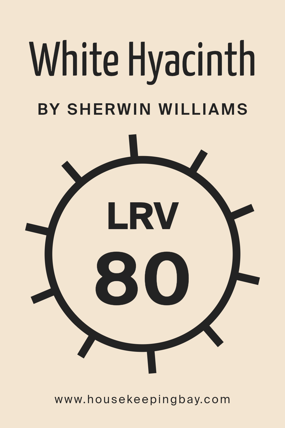
Light Reflectance Value (LRV) is a measure used to express the percentage of light a certain color reflects compared to pure white (100%) or absorbs when compared to black (0%). This value is crucial in design and architectural circles because it helps to understand how light or dark a color will appear under natural or artificial lighting conditions.
A higher LRV means the color reflects more light, making spaces appear brighter and larger, while a lower LRV indicates that a color absorbs more light, thereby creating a cozier or more intimate atmosphere.
This measurement aids in making informed decisions about paint colors not just for aesthetic appeal but also for their impact on lighting requirements and the overall ambiance of a room.
For White Hyacinth SW 0046 by Sherwin Williams, with an LRV of 79.68, this color is on the higher end of the LRV scale, indicating it is a light color that will reflect a significant amount of light.
In practical terms, this means that when applied to walls, White Hyacinth will help to create a space that feels open and airy. The high LRV allows for more flexibility in lighting, often requiring less artificial light to keep the space feeling bright. Additionally, this light hue can make smaller spaces appear larger and more welcoming.
The specific LRV of White Hyacinth suggests it is an excellent choice for creating a neutral, yet bright backdrop, capable of enhancing natural light during the day while remaining distinct and calming under nighttime lighting.
housekeepingbay.com
What is LRV? Read It Before You Choose Your Ideal Paint Color
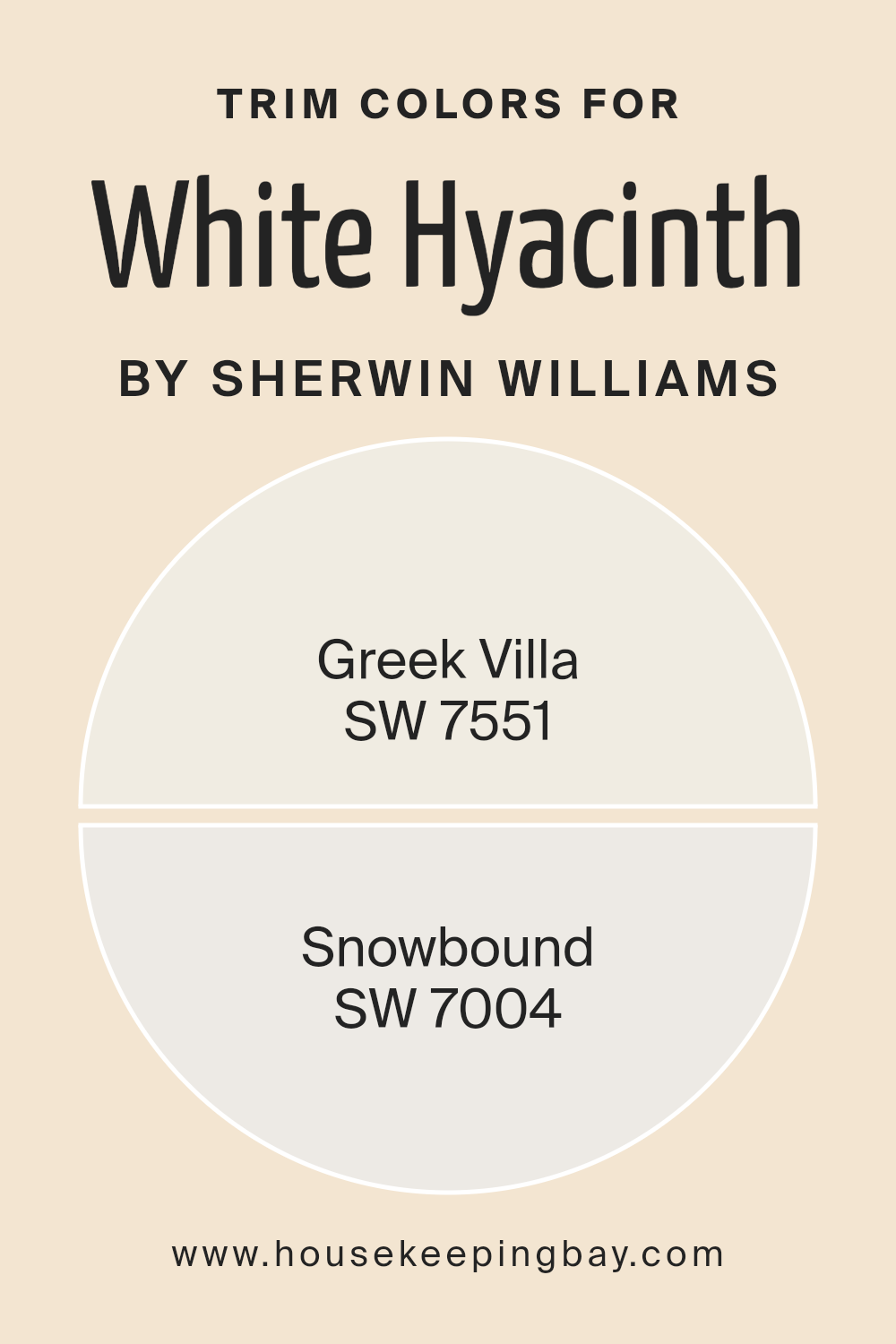
What are the Trim colors of White Hyacinth SW 0046 by Sherwin Williams?
Trim colors serve as an essential aspect of interior design, acting as a decorative accent that frames the architecture of a room, adds depth and character, and creates a cohesive look.
When paired with the main color, like White Hyacinth SW 0046 by Sherwin Williams, trim colors have the power to enhance the overall aesthetic, highlight architectural details, and even impact the perception of the space’s size and shape.
Choosing the right trim color is crucial as it complements the main wall color, providing contrast or continuity to the design scheme. For White Hyacinth, a soft and subtly warm white, selecting the right trim colors can elevate its elegance and warmth.
Greek Villa SW 7551 and Snowbound SW 7004 are two trim colors that harmonize beautifully with White Hyacinth SW 0046. Greek Villa, with its slight warmth and creamy undertone, offers a soft transition from the walls to trim, enriching the space without overwhelming it with stark contrast.
This color is perfect for spaces where a gentle and inviting atmosphere is desired, blending seamlessly with White Hyacinth to create an environment that feels both cohesive and finely detailed. On the other hand, Snowbound SW 7004, with its cooler undertones and a hint of gray, provides a crisp, clean boundary for the walls.
This choice is ideal for modern spaces, offering a subtle yet impactful contrast that enhances the sophistication and purity of White Hyacinth. Together, these trim colors offer versatile options for creating a tailored look that accentuates the beauty of White Hyacinth by Sherwin Williams, making the space feel more intentional and complete.
You can see recommended paint colors below:
housekeepingbay.com
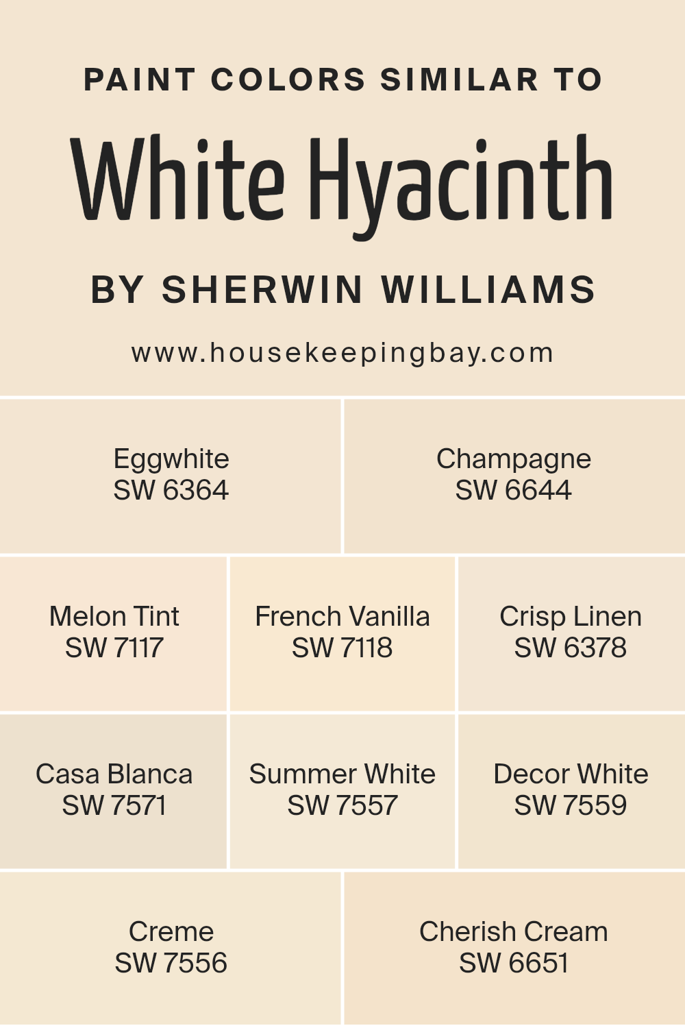
Colors Similar to White Hyacinth SW 0046 by Sherwin Williams
Similar colors play a vital role in creating a visually harmonious and cohesive look in interior design, often used to evoke a specific ambiance or mood in a space. For instance, when designing a room with the aim of achieving a serene, airy, and spacious feel, colors similar to White Hyacinth SW 0046 by Sherwin Williams become essential.
These colors, ranging from subtle off-whites to gentle creams, work together by providing a seamless blend that enhances natural light and adds warmth to interiors without overwhelming the senses.
For example, Eggwhite SW 6364 introduces a soft, almost imperceptible hint of yellow, evoking the warmth of a sunny morning. In contrast, Champagne SW 6644 adds a touch of sophistication with its slightly pink undertone, reminiscent of the finesse and luxury associated with its namesake.
Melon Tint SW 7117 gently nudges towards a peachy warmth, lending a cozy yet fresh vibrancy. French Vanilla SW 7118 offers a deeper tone, suggesting the rich creaminess its name implies. Crisp Linen SW 6378, as fresh as clean laundry, suggests openness and clarity.
Casa Blanca SW 7571 richer in tone, brings an elegant, refined backdrop, perfect for spaces aiming for a classic yet modern feel. Summer White SW 7557, with its sunny disposition, brightens spaces with its uplifting energy. Decor White SW 7559, a decorator’s dream, provides a neutral canvas with just the right touch of warmth.
Crème SW 7556, as indulgent as its name, wraps rooms in a gentle, soft embrace. Lastly, Cherish Cream SW 6651 offers a slightly more pronounced hint of yellow, creating an inviting and comforting atmosphere. Together, these shades exemplify the power of similar colors in achieving a nuanced, layered look that’s both cohesive and rich with character.
You can see recommended paint colors below:
- SW 6364 Eggwhite
- SW 6644 Champagne
- SW 7117 Melon Tint
- SW 7118 French Vanilla
- SW 6378 Crisp Linen
- SW 7571 Casa Blanca
- SW 7557 Summer White
- SW 7559 Decor White
- SW 7556 Creme
- SW 6651 Cherish Cream
housekeepingbay.com
How to Use White Hyacinth SW 0046 by Sherwin Williams In Your Home?
White Hyacinth SW 0046 by Sherwin Williams is a unique and captivating paint color that adds a touch of elegance and warmth to any space. With its understated yet distinct hue, it bridges the gap between a pure white and a soft, welcoming off-white.
This versatility makes it an excellent choice for homeowners seeking to create a serene and inviting atmosphere in their homes. Ideal for spaces that aim to be bright and airy, White Hyacinth can illuminate living rooms, bedrooms, and kitchens, fostering a sense of openness and tranquility.
Applying White Hyacinth on walls can make small rooms appear larger and make spaces with limited natural light feel brighter. Its subtle warmth pairs beautifully with a wide range of colors, from soft pastels to bold and vibrant hues, providing a harmonious backdrop for various design styles. Whether used as a main color scheme or as an accent, White Hyacinth SW 0046 brings a delicate refinement to interiors.
Homeowners can also use White Hyacinth for trim, doors, and ceilings to create a seamless and cohesive look throughout their home. Its versatility extends to being the perfect canvas for showcasing art, fabrics, and furnishings, allowing personal styles to shine. For those aiming for a chic, minimalist look or a cozy, traditional feel, White Hyacinth offers a timeless elegance that enhances the beauty of your home decor.
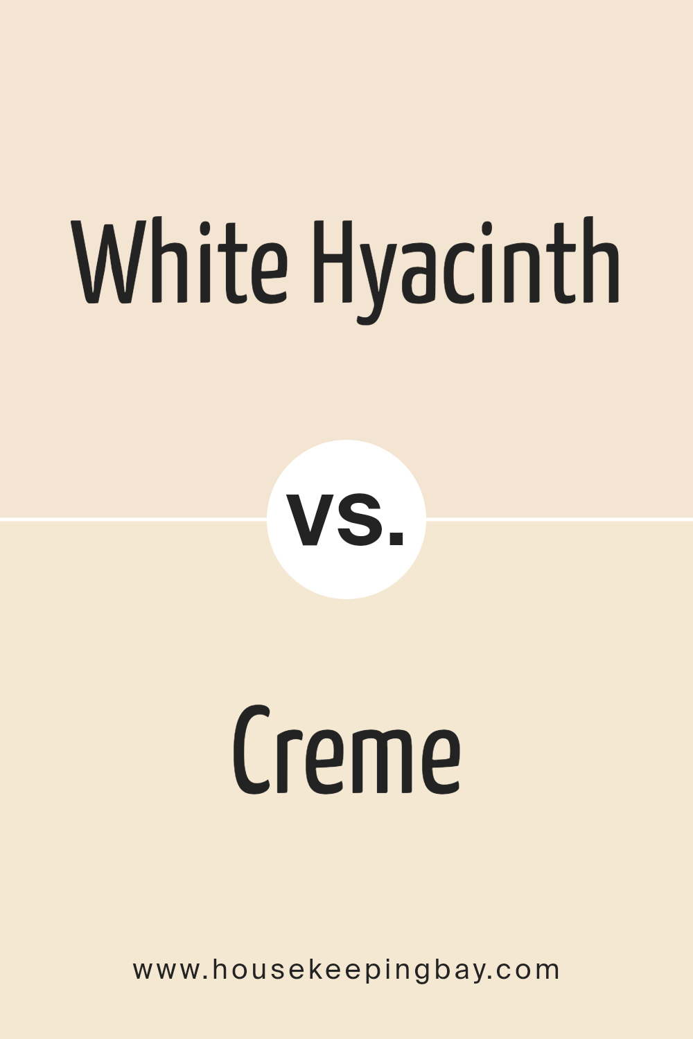
White Hyacinth SW 0046 by Sherwin Williams vs Creme SW 7556 by Sherwin Williams
White Hyacinth SW 0046 by Sherwin Williams is a delicate, airy shade that embodies the purity and subtle sophistication of white flowers. It carries a light, ethereal quality, making spaces feel open, fresh, and inviting. This hue is perfect for creating a bright, serene atmosphere, reflecting natural light beautifully and adding a sense of spaciousness to any room.
In contrast, Creme SW 7556 by Sherwin Williams leans towards warmth, embodying a soft, creamy tone that evokes a sense of comfort and coziness. It’s a versatile color, bridging the gap between pure white and deeper, warm shades.
Creme offers a gentle, soothing presence, lending rooms a plush, welcoming feel. It’s excellent for spaces where warmth and light are desired without the starkness of pure white.
Both colors, White Hyacinth and Creme, offer unique aesthetic appeals—the former providing a crisp, clean backdrop, and the latter, a comforting, warm embrace. Each can dramatically transform a space, depending on the desired atmosphere, from the refreshing simplicity of White Hyacinth to the soft, inviting warmth of Creme.
You can see recommended paint color below:
- SW 7556 Creme
housekeepingbay.com
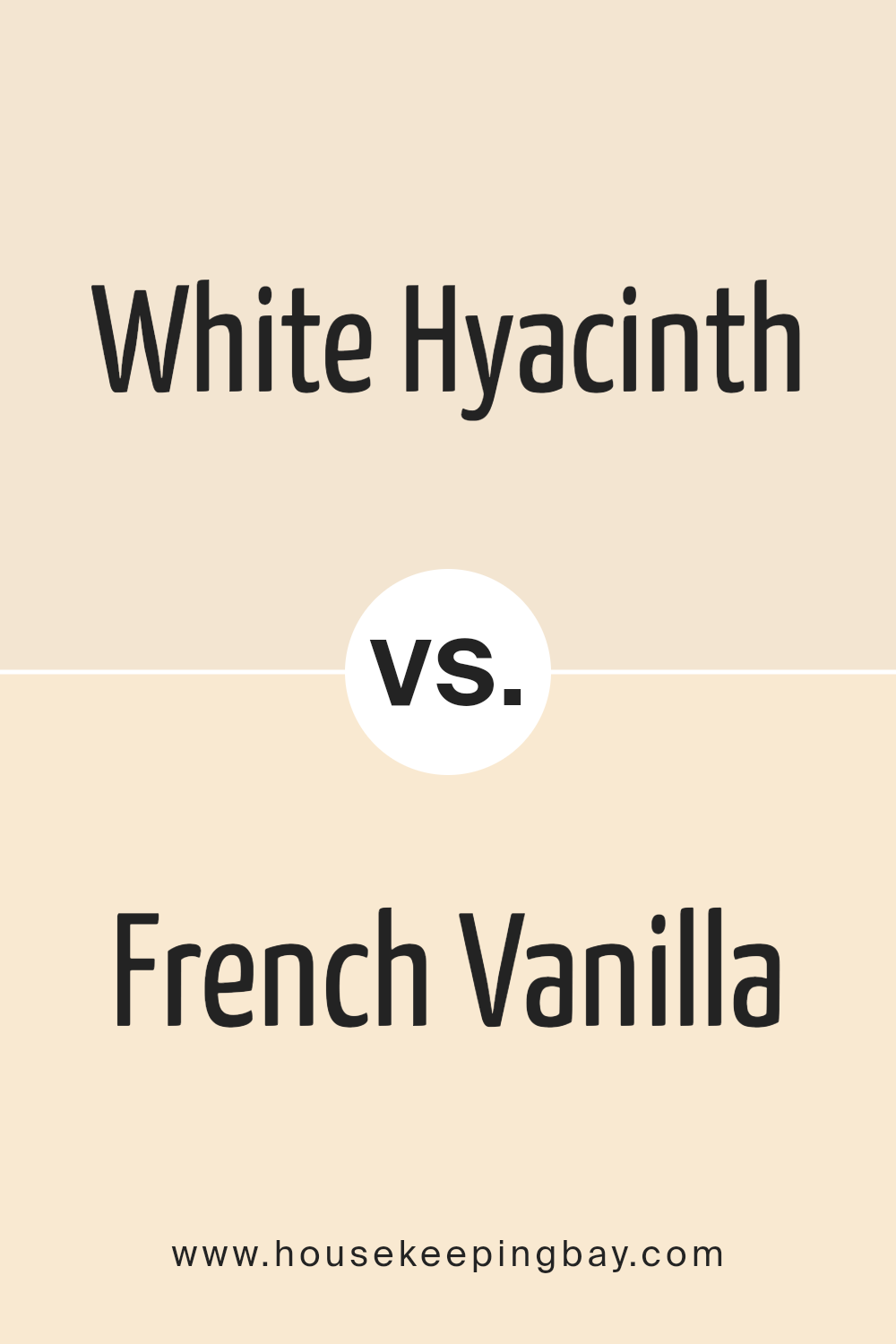
White Hyacinth SW 0046 by Sherwin Williams vs French Vanilla SW 7118 by Sherwin Williams
White Hyacinth SW 0046 and French Vanilla SW 7118, both from Sherwin Williams, embody unique personas within the spectrum of neutral tones, each carrying a distinct essence and warmth.
White Hyacinth steps forward as a crisp and clean hue, reminiscent of the first light of dawn. It carries a subtle freshness, making it an ideal choice for spaces that aim to embody serenity and an airy, open atmosphere. Its purity and simplicity allow for versatility in pairing with both bold and soft palettes, enhancing a sense of space and light.
In contrast, French Vanilla SW 7118 leans into a creamier, more comforting presence. This color wraps a room like the warmth of morning sunlight filtered through sheer curtains.
With its hint of yellow undertone, French Vanilla offers a cozy and welcoming vibe, making spaces feel more intimate and nurtured. It’s perfect for creating a soft, inviting ambiance, suitable for areas where warmth and comfort are desired.
While both colors promote a sense of calm and cleanliness, White Hyacinth stands out for its crisp, invigorating feel, whereas French Vanilla brings an enveloping softness and warmth, making each ideal for different aesthetic goals and atmospheres.
You can see recommended paint color below:
- SW 7118 French Vanilla
housekeepingbay.com
White Hyacinth SW 0046 by Sherwin Williams vs Summer White SW 7557 by Sherwin Williams
White Hyacinth SW 0046 and Summer White SW 7557 by Sherwin Williams present two nuanced takes on white, tailoring to different aesthetic preferences and atmospheres within a space. White Hyacinth leans towards a very soft, almost ethereal white with a subtle coolness, suggesting a hint of blue or lavender under specific lighting conditions.
This quality makes it a perfect choice for spaces seeking a serene, tranquil ambiance with a fresh and airy feel. It reflects light beautifully, enhancing the sense of spaciousness in a room.
On the other hand, Summer White SW 7557 offers a warmer tone, imbued with a faint, creamy quality. Its warmth brings a cozy, inviting atmosphere to spaces, making it ideal for areas where comfort and relaxation are key.
This color tends to soften the environment, creating a gentle backdrop that complements a wide array of decor, from traditional to contemporary.
Choosing between them hinges on the desired mood and the lighting of the room. White Hyacinth is suited for a crisp, clean look with a modern edge, while Summer White is perfect for creating a snug, welcoming environment.
You can see recommended paint color below:
- SW 7557 Summer White
housekeepingbay.com
White Hyacinth SW 0046 by Sherwin Williams vs Eggwhite SW 6364 by Sherwin Williams
White Hyacinth SW 0046 and Eggwhite SW 6364 by Sherwin Williams are two elegantly versatile hues that, on the surface, may appear quite similar but possess unique undertones and qualities upon closer examination.
White Hyacinth SW 0046 is a soft, slightly muted white with a gentle, intrinsic warmth that evokes the delicate bloom of its namesake flower. This color excels in spaces that seek a touch of serenity and openness, offering a backdrop that balances crispness with a welcoming, airy feel, making it ideal for minimalist or Scandinavian-inspired designs.
On the other hand, Eggwhite SW 6364 leans into the warmth of traditional whites with a creamy, almost yellow undertone that imbues spaces with a cozy, inviting atmosphere. This hue is reminiscent of the soft, natural color of eggshells, providing a comforting sense of familiarity and home.
It pairs beautifully in environments where warmth and comfort are prioritized, working well with rustic, farmhouse, or traditional decor styles.
While both colors are versatile and can elevate a room’s aesthetic, White Hyacinth offers a cleaner, more neutral base, whereas Eggwhite adds warmth and coziness, making each suitable for specific design intentions and atmospheres.
You can see recommended paint color below:
housekeepingbay.com
White Hyacinth SW 0046 by Sherwin Williams vs Decor White SW 7559 by Sherwin Williams
White Hyacinth SW 0046 and Decor White SW 7559 by Sherwin-Williams are both nuanced shades within the broad spectrum of white, yet they present distinctive characteristics that cater to different preferences and design needs.
White Hyacinth leans towards a soft, slightly warm tone with an understated creamy quality, making it a versatile choice for creating a cozy and welcoming ambience. This subtlety imbues spaces with a gentle luminosity, enhancing textures and fabrics by providing a soft backdrop that isn’t stark or cold.
On the other hand, Decor White SW 7559 moves in a direction that is crisp and clean, with a brighter base that reflects more light. This makes it particularly suitable for modern, minimalist spaces where the emphasis is on clarity, spaciousness, and a fresh atmosphere.
It pairs beautifully with bold colors, serving as a neutral backdrop that allows other design elements to shine.
Choosing between these two shades depends on the intended aesthetic; White Hyacinth brings a warm, soft elegance, while Decor White offers a clear, bright canvas for diverse interior styles.
You can see recommended paint color below:
- SW 7559 Decor White
housekeepingbay.com
White Hyacinth SW 0046 by Sherwin Williams vs Cherish Cream SW 6651 by Sherwin Williams
“White Hyacinth SW 0046” and “Cherish Cream SW 6651” by Sherwin Williams both offer a soft, serene palette, but they differ subtly in their influence and mood within a space. White Hyacinth leans towards a clean, crisp white with minimal undertones, offering a fresh and airy feel that can help spaces seem larger and more open.
Its purity makes it a versatile choice, acting as a perfect canvas for any design style, from modern minimalist to cozy farmhouse.
On the other hand, Cherish Cream exudes a warmer, cozier vibe, thanks to its creamy, slightly golden undertones. This color brings a comforting, welcoming feel to rooms, making spaces feel intimate and lived-in.
It works wonderfully in spaces that aim for a soft, nurturing atmosphere, such as living rooms and bedrooms.
While White Hyacinth reflects more light, making it a go-to for achieving a bright, open feel, Cherish Cream offers warmth and coziness, perfect for creating a snug, inviting environment. The choice between them depends on the desired emotional and aesthetic impact in the space — pristine and refreshing, or warm and comforting.
You can see recommended paint color below:
- SW 6651 Cherish Cream
housekeepingbay.com
White Hyacinth SW 0046 by Sherwin Williams vs Melon Tint SW 7117 by Sherwin Williams
White Hyacinth SW 0046 by Sherwin Williams and Melon Tint SW 7117 by Sherwin Williams are both part of Sherwin Williams’ vast palette, yet they bring distinctly different moods and atmospheres to spaces.
White Hyacinth is a gentle, soft shade that belongs to the white and off-white family, offering a subtle, airy presence that can make rooms feel more spacious and illuminated. Its inherent brightness lends itself to creating a sense of purity and tranquility, making it ideal for a minimalist aesthetic or for complementing bolder colors without overwhelming them.
In contrast, Melon Tint presents a soft, warm vibe that belongs to the realm of pastel oranges. This color radiates warmth and coziness, infusing spaces with a delicate, inviting glow.
Melon Tint is perfect for adding a hint of cheerfulness and personality to rooms without the intensity of a vibrant orange. It’s especially well-suited for creating cozy, soothing environments where relaxation is a priority.
Together, White Hyacinth and Melon Tint could harmonize beautifully, with the purity and openness of White Hyacinth balancing the warm, welcoming embrace of Melon Tint. This combination can achieve an elegant, understated aesthetic that’s both comforting and refined.
You can see recommended paint color below:
- SW 7117 Melon Tint
housekeepingbay.com
White Hyacinth SW 0046 by Sherwin Williams vs Casa Blanca SW 7571 by Sherwin Williams
“White Hyacinth” SW 0046 and “Casa Blanca” SW 7571, both by Sherwin-Williams, offer unique aesthetics in the realm of whites, each bringing its own subtle character to spaces. White Hyacinth exudes a softly radiant, almost ethereal quality, reminiscent of the gentle hue found in its namesake flower.
It’s a color that captures light, giving off a clean, airy feel that enhances spaces with a touch of serenity. This color is particularly well-suited for creating a tranquil and refreshing ambiance, making it ideal for bedrooms, bathrooms, or any area meant to be a calm sanctuary.
On the other side, Casa Blanca leans towards a warm, inviting tone, with a hint of creaminess that adds depth and coziness to its appearance. This warmth makes Casa Blanca a superb choice for living areas, dining rooms, or any space where a welcoming, comforting atmosphere is desired.
It pairs beautifully with a wide range of decor, from traditional to modern, adding a layer of richness without overwhelming the senses.
In comparison, while both colors are in the white spectrum, White Hyacinth offers a cooler, more pristine backdrop, whereas Casa Blanca brings warmth and a subtle, embracing quality. The choice between them depends on the desired mood and the specific characteristics of the space to be painted.
You can see recommended paint color below:
housekeepingbay.com
White Hyacinth SW 0046 by Sherwin Williams vs Champagne SW 6644 by Sherwin Williams
White Hyacinth SW 0046 and Champagne SW 6644 by Sherwin Williams present a subtle yet distinct contrast in their color profiles, appealing to those seeking a sophisticated and serene ambiance.
White Hyacinth, with its soft and pure essence, captures the delicate balance of a white that is warm without veering into cream or starkness, making it an excellent choice for spaces aiming for a bright, open, and airy feel. It exudes freshness and simplicity, providing a versatile backdrop that enhances natural light and complements various decor styles.
Champagne SW 6644, on the other hand, offers a more nuanced hue, reminiscent of the gentle warmth and effervescence of its namesake beverage. It’s a color that straddles the line between a light, inviting beige and a muted, understated gold.
This color possesses a unique warmth, lending itself to creating cozy, inviting spaces without overwhelming them with color intensity. Champagne introduces an element of sophistication and understated elegance, perfect for achieving a serene and welcoming atmosphere.
Comparatively, while both colors promote a sense of calm and brightness, White Hyacinth leans towards a crisper, cleaner look, whereas Champagne offers a warmth and richness that’s subtle yet impactful.
In application, White Hyacinth is more likely to enhance spaciousness and clarity, making rooms appear larger and more luminous. Champagne, with its warm undertones, is adept at creating a cozy, comforting environment, ideal for rooms meant for relaxation and intimate gatherings.
Together, these colors can harmonize beautifully, with White Hyacinth providing a refreshing counterpoint to the cozy depth of Champagne.
You can see recommended paint color below:
- SW 6644 Champagne
housekeepingbay.com
White Hyacinth SW 0046 by Sherwin Williams vs Crisp Linen SW 6378 by Sherwin Williams
White Hyacinth (SW 0046) by Sherwin Williams and Crisp Linen (SW 6378) are two elegant shades that beautifully encapsulate subtlety and serenity in interior design. White Hyacinth stands out for its pure, bright essence, seemingly capturing the gentle luminosity of a hyacinth flower in full bloom under the soft light of dawn.
It’s a color that resonates with freshness and clarity, offering a canvas that enhances natural light and amplifies spaces with an airy and open ambience.
On the other hand, Crisp Linen embodies the comfort, warmth, and inviting texture suggested by its name. It leans towards a creamy, warmer hue, reminiscent of sunlit linen gently fluttering in a summer breeze.
This color brings a comforting, cozy feel to spaces, promoting a sense of well-being and serenity. It pairs beautifully with a wide range of colors, adding a touch of warmth without overwhelming the senses.
Comparatively, while both shades thrive on their ability to create peaceful and welcoming environments, White Hyacinth offers a sharper, more pristine backdrop, ideal for minimalist or contemporary designs.
Crisp Linen, with its slightly warmer undertones, suggests a more classic, comforting approach, perfect for creating a cozy, nurturing home atmosphere. Together, they can harmonize within a design, allowing for a balance between stark modernity and soft traditionalism.
You can see recommended paint color below:
- SW 6378 Crisp Linen
housekeepingbay.com
Conclusion
Concluding, the article on Sherwin Williams’ White Hyacinth SW 0046 presents this color as a highly versatile and elegant choice for interiors. Emphasizing its ability to bring a sense of calm and spaciousness to any room, White Hyacinth is praised for its soft and airy qualities, making it an ideal backdrop for both modern and traditional decors.
Its adaptability in complementing a wide range of colors and materials highlights its utility in design schemes, proving it to be a timeless choice for homeowners and designers alike.
Furthermore, the article underscores the practical aspects of White Hyacinth SW 0046, noting its excellent coverage and the quality of finish that Sherwin Williams paint is known for.
This color is not just aesthetically pleasing but also practical, offering durability and ease of maintenance. Whether used for creating a serene bedroom space or making small spaces appear larger, White Hyacinth stands out as a sophisticated choice that can transform and elevate the look of any home interior, demonstrating its enduring appeal in the world of interior design.
housekeepingbay.com
Ever wished paint sampling was as easy as sticking a sticker? Guess what? Now it is! Discover Samplize's unique Peel & Stick samples. Get started now and say goodbye to the old messy way!
Get paint samples