Creme SW 7556 by Sherwin Williams
Embracing Warmth and Elegance in Every Space
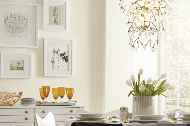
Introducing SW 7556 Crème by Sherwin Williams, a paint color that speaks volumes about elegance and simplicity. This shade is an embodiment of luxury that is subtle yet profoundly impactful. Designed to bring warmth and a cozy ambiance to any room, SW 7556 Crème has become a favorite among homeowners and interior designers alike.
It’s not just any ordinary color; it’s a versatile hue that complements various decor styles, from classic to modern.The magic of SW 7556 Crème lies in its ability to transform spaces with its inviting glow, creating a serene and welcoming environment.
Whether it’s used as a primary color enveloping the entirety of a room or as an accent to highlight specific areas, this color adds depth and character without overwhelming the senses. It pairs beautifully with a wide array of colors, from soft neutrals to bold tones, making it a highly adaptable choice for any design project.
With SW 7556 Crème, Sherwin Williams offers more than just paint; it presents an opportunity to create a home that feels both refined and harmonious. It’s ideal for anyone looking to update their space with a touch of sophistication and warmth. As we explore the unique charm of SW 7556 Crème, let’s discover how it can breathe new life into any space, making it feel fresh and inviting.
via sherwin-williams.com
What Color Is Creme SW 7556 by Sherwin Williams?
The color Crème SW 7556 by Sherwin Williams is a soft, inviting hue that brings a sense of warmth and comfort to any space. It’s a subtle shade that falls somewhere between ivory and light beige, offering a perfect neutral backdrop for a variety of decor styles. This color is understated yet sophisticated, making it an excellent choice for those who prefer a timeless aesthetic.
Crème SW 7556 works exceptionally well in interior styles that prioritize light and airiness, such as Scandinavian, modern farmhouse, and shabby chic. Its neutral tone provides a versatile foundation that can support either a calm, serene atmosphere or a dynamic, contrasting look when paired with bolder colors.
When it comes to materials and textures, Crème SW 7556 pairs beautifully with natural wood, adding warmth and organic texture to the space. It also complements soft, cozy fabrics like cotton and linen, enhancing the overall comforting vibe. For a touch of elegance, pairing it with sleek materials such as marble or metallic finishes like brass and gold can add a subtle shine and sophistication.
Overall, Crème SW 7556 is a highly adaptive color that works well with a wide range of materials and textures, making it suitable for creating a cozy, welcoming space that feels both modern and timeless.
housekeepingbay.com
Table of Contents
Is Creme SW 7556 by Sherwin Williams Warm or Cool color?
CremeSW 7556 by Sherwin Williams is a warm, soothing color that adds a cozy touch to any home. This shade leans on the neutral side, making it incredibly versatile for different spaces and design styles. It’s like a soft hug for your walls, creating a calm and inviting atmosphere that makes rooms feel more welcoming. Because of its gentle nature, it pairs well with a wide range of other colors, from bold and vibrant to soft and subtle, giving homeowners the flexibility to play around with their decor.
Using CremeSW 7556 in a home can also help spaces appear brighter and more open, especially in areas that don’t get a lot of natural light. It reflects light beautifully, adding a subtle glow that can make small rooms seem larger.
This color is particularly effective in bedrooms and living areas, where the main goal is to create a peaceful retreat from the hustle and bustle of everyday life. All in all, CremeSW 7556 brings a warm foundation that allows for creative freedom in decorating and styling any home.
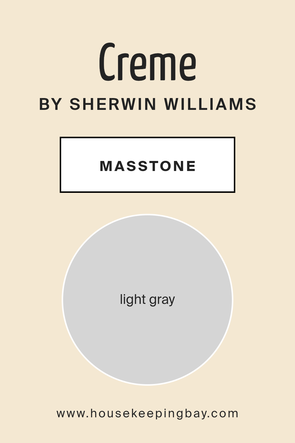
What is the Masstone of the Creme SW 7556 by Sherwin Williams?
CremeSW 7556 by Sherwin Williams has a masstone, or the color’s purest form before it’s mixed or diluted, of light gray, appearing as a lovely shade similar to #D5D5D5. This neutral and gentle gray tone makes it a versatile choice for homes. Since it’s a lighter gray, it has a soft and soothing presence in any room, making spaces feel more open and airy. This color works well in various settings, from living rooms and bedrooms to kitchens and bathrooms.
Its light gray nature means it can blend seamlessly with different decor styles, whether you’re going for a modern, minimalist look or something cozier and traditional. It pairs beautifully with whites and creams for a crisp, clean look or can be matched with bolder colors for a more dynamic contrast.
Because it’s so understated, it won’t overwhelm your space but will instead provide a calm backdrop that enhances everything around it. This makes CremeSW 7556 a fantastic choice for anyone wanting to refresh their home with a color that’s both stylish and easy to live with.
housekeepingbay.com
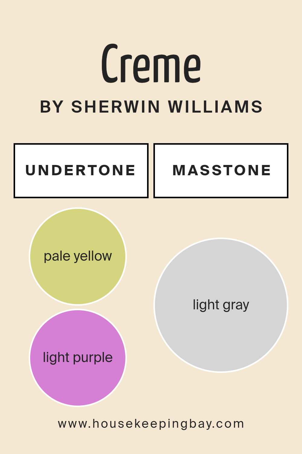
Undertones of Creme SW 7556 by Sherwin Williams
Creme SW 7556 by Sherwin Williams is a unique paint color that looks simple at first glance but has complex undertones that can change its appearance in different settings. The undertones of this color are pale yellow and light purple. Let’s break down what this means.
Undertones are subtle colors that hide beneath the surface of the primary paint color. They can affect how we see the color, making it appear cooler or warmer depending on the lighting and surrounding colors. For Creme SW 7556, the pale yellow undertone adds a soft warmth to the color, making spaces feel cozy and inviting. On the other hand, the light purple undertone brings a hint of coolness, adding a touch of sophistication and depth.
When Creme SW 7556 is used on interior walls, these undertones come into play in unique ways. In rooms with lots of natural light, the pale yellow undertone may be more noticeable, creating a bright and airy feel. In spaces with less light, or during different times of the day, the light purple undertone might stand out more, giving the room a calm and serene vibe.
This means that Creme SW 7556 can look slightly different in every room and at different times, which is part of its beauty. Choosing this color for interior walls can add a layer of complexity and interest to your space, making it feel more dynamic and adaptable to changing light conditions.
housekeepingbay.com
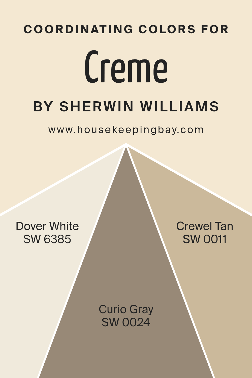
Coordinating Colors of Creme SW 7556 by Sherwin Williams
Coordinating colors are those that complement each other beautifully when used together in any space, creating a harmonious and balanced look. Essentially, these are colors that work well side by side, either by offering a striking contrast or by softly blending with each other, enhancing the overall aesthetic of a room. The concept behind coordinating colors is to pick hues that share a certain level of compatibility, whether through their tones, shades, or intensities, thereby elevating the design of any space.
For example, Creme SW 7556 by Sherwin Williams finds its harmony alongside coordinating colors like Dover White SW 6385, a soft, inviting white with a warm undertone that brings a gentle brightness to any room, making it feel welcoming and spacious.
Curio Gray SW 0024, on the other hand, offers a sophisticated balance with its deeper, nuanced shade that adds depth and character, perfect for creating an elegant contrast without overwhelming the space.
Crewel Tan SW 0011, with its earthy, warm hue, complements Creme SW 7556 by adding a touch of natural simplicity, enabling a space to feel grounded and serene. Together, these coordinating colors offer a palette that can transform any room into a cohesive and inviting space.
You can see recommended paint colors below:
- SW 6385 Dover White
- SW 0024 Curio Gray
- SW 0011 Crewel Tan
housekeepingbay.com
How Does Lighting Affect Creme SW 7556 by Sherwin Williams?
Lighting plays a big role in how we see colors. It can make the same color look different depending on whether it is under artificial light or natural sunlight. Let’s take the color CremeSW 7556 by Sherwin Williams as our example to explore how lighting changes its appearance.
In artificial light, like from light bulbs inside your house, CremeSW 7556 can look warmer and richer. It tends to bring out the yellow undertones, making spaces feel cozy. If the light bulb has a cool tone, the color might appear slightly muted but still retains its creamy warmth.
When it comes to natural light, the time of day and the direction your room faces can make a big difference. Natural light shows the truest color, but not all natural light is the same.
- In north-faced rooms, natural light is cooler and can make colors look a bit more muted. CremeSW 7556 in a north-facing room might look a bit paler and less vibrant, but it still keeps its warm, inviting feel.
- South-faced rooms get plenty of bright sunlight all day, which can make CremeSW 7556 look brighter and more lively. The warmth of the color is enhanced, making the room feel cheerful and sunny, even on gloomy days.
- East-faced rooms get the morning light, which is soft and warm. In these rooms, CremeSW 7556 will look very warm and welcoming in the morning, creating a soft ambiance. As the day goes on, the intensity of the color may decrease but still remains pleasant.
- West-faced rooms experience the opposite. They get the evening light, which is warmer. CremeSW 7556 in these rooms will glow warmly in the afternoons and evenings, making spaces feel cozy and relaxing.
- Overall, lighting can change how CremeSW 7556 looks, but in every situation, it maintains its creamy, inviting essence, just in varying degrees of warmth and brightness.
housekeepingbay.com
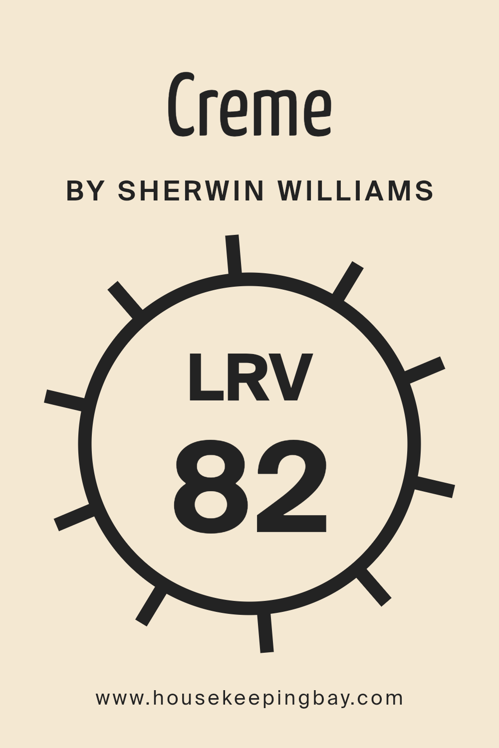
What is the LRV of Creme SW 7556 by Sherwin Williams?
LRV stands for Light Reflectance Value, which measures the percentage of light a paint color reflects from or absorbs into a surface. It’s a scale from 0 to 100, where 0 is completely black, absorbing all light, and 100 is pure white, reflecting all light.
The LRV helps us understand how light or dark a color will look when painted on the walls. It can be especially useful in figuring out how a paint color will make a room feel – lighter colors can make a room feel more spacious and brighter, while darker colors can make a space feel cozier but smaller.
In the case of the color CremeSW 7556 by Sherwin Williams, which has an LRV of 81.597, it is on the lighter end of the scale. This high LRV means that it will reflect a lot of light, making spaces appear brighter and more open. When used on walls, this color can help in amplifying natural light in the room, potentially reducing the need for artificial lighting during the day.
It’s a great choice for smaller rooms or spaces without a lot of natural light, as it can help make them feel more airy and welcoming. Understanding the LRV can help you predict how the color will interact with both natural and artificial light in your space.
housekeepingbay.com
What is LRV? Read It Before You Choose Your Ideal Paint Color
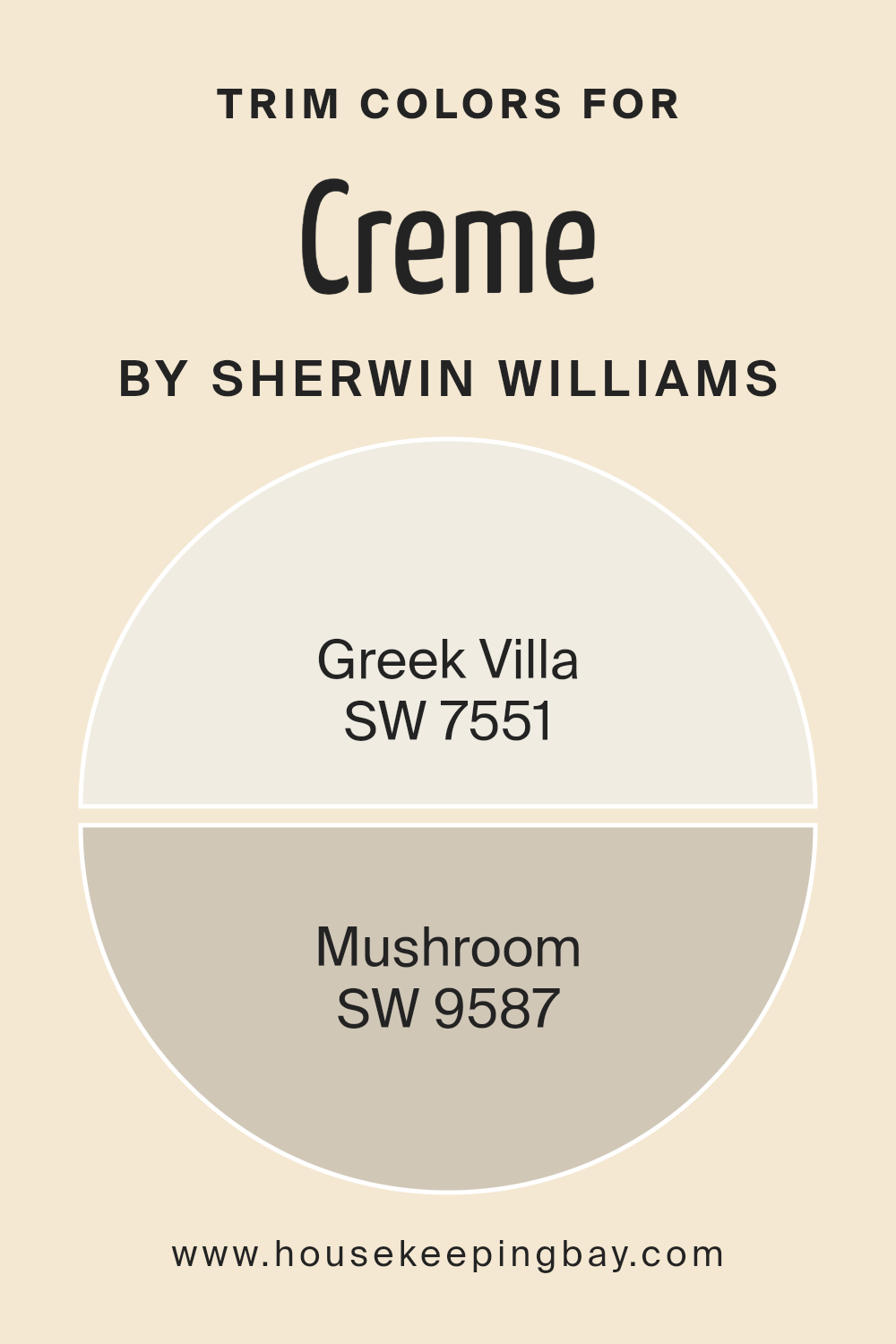
What are the Trim colors of Creme SW 7556 by Sherwin Williams?
Trim colors refer to the shades applied to the edges, frames, and other architectural details of a room or exterior, effectively highlighting or contrasting with the main color palette. For a color like CremeSW 7556 by Sherwin Williams, which has a gentle, warm tone, choosing the right trim colors can significantly enhance the overall aesthetic.
Trim colors help in defining the character of the space, drawing attention to the craftsmanship of the architecture, and creating a cohesive look that ties the entire design together. With a color as versatile as CremeSW 7556, the selection of trim colors becomes crucial in either softening the transition between colors or providing a striking outline that adds depth and interest to the spaces.
SW 7551 – Greek Villa, a soft, off-white with a hint of warmth, works beautifully as a trim color with CremeSW 7556 by creating a subtle, harmonious contrast that brightens and enlarges a space without overwhelming it. The slight warmth in Greek Villa complements the creamy tone of CremeSW 7556, ensuring the space feels welcoming and cohesive. On the other hand, SW 9587 – Mushroom, carries a more grounded and earthy feel, offering a deeper contrast as a trim color that anchors the room and brings a rich, sophisticated dimension.
This color can draw out the warmer undertones of CremeSW 7556, adding visual interest and depth, making it ideal for spaces that aim for a more dramatic and defined appearance. Together, these trim choices offer versatile options for enhancing the beauty of CremeSW 7556, ensuring a stunning result whether the goal is to create a bright and airy feel or to evoke an elegantly grounded atmosphere.
You can see recommended paint colors below:
housekeepingbay.com
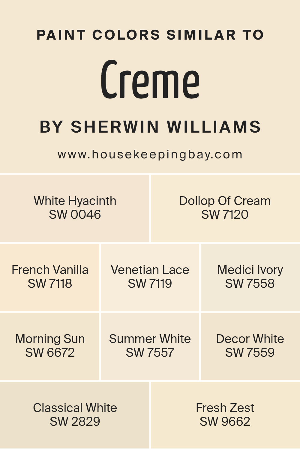
Colors Similar to Creme SW 7556 by Sherwin Williams
Similar colors play a crucial role in design and aesthetics by creating harmony and a sense of balance. Using colors like those similar to Creme SW 7556 by Sherwin Williams helps in achieving a seamless look, making spaces feel more cohesive and thoughtfully put together. The subtle variations among these shades allow designers and homeowners to layer tones for depth without overwhelming with contrast. For example, White Hyacinth and Dollop Of Cream offer gently differing shades that can complement each other beautifully in a space, providing a backdrop that’s both inviting and serene.
French Vanilla and Venetian Lace add a touch of warmth, perfect for creating a cozy and welcoming atmosphere. Whereas, Medici Ivory and Morning Sun introduce a hint of richness and brightness, respectively, making a room feel more spacious and airy.
Summer White and Decor White lean towards a purer, more neutral palette, ideal for those seeking a minimalist or modern look. Classical White and Fresh Zest, though subtly different, contribute to a lively and fresh ambiance, proving that even within a similar color spectrum, there’s plenty of room for personalization and creativity.
These colors together demonstrate how similar tones can enrich a space through understated elegance and versatility.
You can see recommended paint colors below:
- SW 0046 White Hyacinth
- SW 7120 Dollop Of Cream
- SW 7118 French Vanilla
- SW 7119 Venetian Lace
- SW 7558 Medici Ivory
- SW 6672 Morning Sun
- SW 7557 Summer White
- SW 7559 Decor White
- SW 2829 Classical White
- SW 9662 Fresh Zest
housekeepingbay.com
How to Use Creme SW 7556 by Sherwin Williams In Your Home?
Creme SW 7556 by Sherwin Williams is a warm and inviting paint color that brings a sense of comfort and calmness to any room. It’s a soft, creamy hue that pairs well with a variety of decor styles, making it a versatile choice for your home. Whether you’re freshening up your living room, bedroom, or kitchen, this color can add a cozy and welcoming vibe.
Using Creme SW 7556 is an easy way to brighten up your space. In rooms with less natural light, it can make the area feel more open and airy. For larger, well-lit rooms, this color helps to enhance the feeling of warmth and comfort. It’s also a great backdrop for both bold and subtle decor, allowing furniture and artwork to really stand out.
Consider pairing it with rich wood tones, vibrant greens, or soft pastels for a balanced and beautiful look. Whether you’re updating a single room or your entire home, Creme SW 7556 offers a timeless appeal that’s hard to beat.
Creme SW 7556 by Sherwin Williams vs Venetian Lace SW 7119 by Sherwin Williams
Creme SW 7556 by Sherwin Williams is a soothing, light beige color that offers a warm, inviting atmosphere to any space. It’s like the soft, comforting hue of fresh cream, bringing with it a sense of calm and coziness. This color works well in rooms where you want to create a relaxed and welcoming vibe.
On the other hand, Venetian Lace SW 7119 by Sherwin Williams leans more towards a delicate, off-white with a hint of warmth. This color is very light, almost like the soft glow of morning light. It’s perfect for spaces where you want to enhance brightness while maintaining a hint of warmth, making the room feel open and airy yet cozy.
Both colors are great for creating a gentle and tranquil space, but Creme SW 7556 brings more warmth and depth with its beige tones, whereas Venetian Lace SW 7119 offers a cleaner, crisper look due to its lighter, more subtle warmth. Depending on the mood you want to set, either color can make a room feel inviting and comfortable.
You can see recommended paint color below:
- SW 7119 Venetian Lace
housekeepingbay.com
Creme SW 7556 by Sherwin Williams vs Decor White SW 7559 by Sherwin Williams
Creme SW 7556 by Sherwin Williams and Decor White SW 7559 by Sherwin Williams are both inviting colors, but they bring different moods to a space. Creme SW 7556 is a warm, soft beige that adds a cozy and welcoming feel to any room. It’s like the gentle hug of a warm blanket, offering comfort and a sense of home.
On the other hand, Decor White SW 7559 is a crisp and clean white with a hint of warmth. This color brightens up spaces, making them feel open and airy. While Creme leans towards a classic, homey vibe, Decor White strikes a balance between warmth and freshness, making rooms feel spacious and tidy.
Choosing between them depends on the atmosphere you want to create: Creme for a snug, inviting space, and Decor White for a bright, refined look.
You can see recommended paint color below:
housekeepingbay.com
Creme SW 7556 by Sherwin Williams vs Classical White SW 2829 by Sherwin Williams
Creme SW 7556 by Sherwin Williams and Classical White SW 2829 are two colors that at first glance, might seem quite similar but have their unique qualities. Creme, as the name suggests, offers a warm and soft touch, with a hint of yellow, creating a cozy and inviting atmosphere. It’s like the color of a light and fluffy vanilla cake, making any space feel more welcoming and homey.
Classical White, on the other hand, is a purer, brighter shade. It doesn’t lean towards yellow or cream but stays true to a classic white with a slightly warm undertone. This makes it perfect for someone looking for a clean and crisp look but still wants to keep the room from feeling too cold or stark.
When comparing the two, Creme will bring warmth and a hint of color to a room, making it perfect for living spaces or bedrooms where a cozy feel is desired. Classical White is great for areas that you want to feel bright and airy, like bathrooms or kitchens, where a clean and fresh look is often preferred.
You can see recommended paint color below:
- SW 2829 Classical White
housekeepingbay.com
Creme SW 7556 by Sherwin Williams vs Medici Ivory SW 7558 by Sherwin Williams
Creme SW 7556 by Sherwin Williams is a warm, soft shade with beige tones. It gives a cozy and inviting feel, perfect for creating a relaxed atmosphere in any room. This color leans towards a light, creamy look, making it versatile for various decorating styles, from modern to traditional. It’s great for walls, giving spaces a bright, airy feel without being too stark.
On the other hand, Medici Ivory SW 7558 by Sherwin Williams is slightly darker and richer compared to Creme. It carries a bit more depth, adding a touch of elegance and sophistication to spaces. Medici Ivory has a subtle undertone that leans towards a soft, sandy hue, offering warmth and comfort. It’s an excellent choice for those looking to add a bit more character to their rooms without overwhelming them with color.
Both colors are beautiful and work well for creating a peaceful and welcoming environment. The main difference lies in their intensity and depth, with Creme being lighter and airier, and Medici Ivory offering a bit more warmth and sophistication.
You can see recommended paint color below:
housekeepingbay.com
Creme SW 7556 by Sherwin Williams vs Dollop Of Cream SW 7120 by Sherwin Williams
Creme SW 7556 by Sherwin Williams and Dollop Of Cream SW 7120 by Sherwin Williams are two colors that share some similarities but also have their own unique differences. Creme SW 7556 is a warm, inviting color that has a soft, cozy feel to it. It’s a bit like a light beige or a very pale, warm brown. This color is great for creating a calm and soothing atmosphere in a room.
On the other hand, Dollop Of Cream SW 7120 is also a warm color, but it’s lighter and airier than Creme SW 7556. It’s closer to a classic cream shade, offering a very subtle hint of yellow. This makes it excellent for brightening up spaces without overwhelming them with too much color.
While both colors are perfect for creating welcoming environments, Creme SW 7556 adds a bit of depth to a room, making it feel more anchored and cozy. Dollop Of Cream SW 7120, however, is better for spaces that you want to feel more open and light-filled. It depends on the mood you’re trying to achieve in your space.
You can see recommended paint color below:
- SW 7120 Dollop Of Cream
housekeepingbay.com
Creme SW 7556 by Sherwin Williams vs Fresh Zest SW 9662 by Sherwin Williams
Creme SW 7556 by Sherwin Williams is a warm, gentle color that feels like soft sunlight on a cozy morning. It’s not too bright but has a comforting glow, welcoming anyone into a room with its subtle, creamy presence. This color is perfect for making spaces feel inviting and relaxed, like being wrapped in a light blanket.
On the other hand, Fresh Zest SW 9662 is a lively, refreshing color that brings a burst of energy. It’s like the first bite of a green apple, crisp and full of zest. This color is all about bringing vibrancy and a touch of nature’s freshness into a space. It stands out more and is a great choice for adding a fun, playful vibe to a room.
Together, these two colors tell a story of balance—Creme SW 7556 offering a soothing backdrop and Fresh Zest SW 9662 adding pops of brightness and energy. Each has its charm, one being a serene base and the other a spirited accent.
You can see recommended paint color below:
- SW 9662 Fresh Zest
housekeepingbay.com
Creme SW 7556 by Sherwin Williams vs Morning Sun SW 6672 by Sherwin Williams
The main color, Creme SW 7556 by Sherwin-Williams, is a soft, warm neutral that feels cozy and inviting. It’s a versatile shade that works well in a variety of spaces, providing a calm and comforting backdrop. Think of it as a gentle hug for your walls, creating a soothing atmosphere that’s easy to live with. This color pairs beautifully with a wide range of decor styles and adds a subtle touch of warmth to any room.
On the other hand, Morning Sun SW 6672, also by Sherwin-Williams, is a bright, cheerful yellow. It’s a vibrant color that brings a burst of sunshine into any space, making it feel more lively and energetic. Morning Sun is perfect for adding a pop of color and creating a positive, uplifting vibe in a room. While it’s more bold and dynamic than Creme, it still maintains a certain level of softness, ensuring it isn’t overwhelming.
Both colors offer unique qualities that can enhance a room in different ways. Creme is all about creating a cozy, warm feel, while Morning Sun aims to brighten and energize the space.
You can see recommended paint color below:
- SW 6672 Morning Sun
housekeepingbay.com
Creme SW 7556 by Sherwin Williams vs Summer White SW 7557 by Sherwin Williams
The two colors, Creme SW 7556 and Summer White SW 7557 by Sherwin Williams, share some similarities but also have noticeable differences. Starting with Creme SW 7556, it presents as a warm, inviting shade that brings a cozy and comforting vibe to any space. Its richness adds depth, making rooms feel more welcoming and intimate.
On the other hand, Summer White SW 7557 is a lighter shade, offering a fresh and airy feel. This color brightens up a space more effectively, giving off a sense of openness and cleanliness. It’s perfect for those looking to create a serene, peaceful environment in their home.
Comparing the two, Creme has a deeper, warmer undertone, which makes it ideal for spaces where a cozy atmosphere is desired. Summer White, being lighter, is better suited for areas where a sense of space and light is preferred. Both colors are versatile and can complement a wide range of decor styles, but the choice between them depends on the mood and feeling you want to achieve in your space.
You can see recommended paint color below:
housekeepingbay.com
Creme SW 7556 by Sherwin Williams vs French Vanilla SW 7118 by Sherwin Williams
Creme SW 7556 and French Vanilla SW 7118 by Sherwin Williams are both warm, inviting colors, but they offer different vibes for your space. Creme SW 7556 has a subtle, soft presence, giving off a cozy, comfortable feel in a room. It’s a bit like a light beige with a touch of warmth, perfect for creating a soothing background.
On the other hand, French Vanilla SW 7118 is a bit lighter and has a creamy, slightly yellow undertone. This color brightens up a space more than Creme SW 7556, making it a great choice for areas where you want to add a hint of cheerfulness without overwhelming the room. It’s reminiscent of a soft, sunlit morning and works beautifully in spaces that aim for a gentle, uplifting atmosphere.
In summary, while both colors share a warmth that can make a room feel welcoming, Creme is more understated, and French Vanilla adds a touch of brightness. Choosing between them depends on whether you prefer the subtlety of beige or the soft glow of yellow in your decor.
You can see recommended paint color below:
- SW 7118 French Vanilla
housekeepingbay.com
Creme SW 7556 by Sherwin Williams vs White Hyacinth SW 0046 by Sherwin Williams
Creme SW 7556 by Sherwin Williams is a warm, inviting off-white with a soft, creamy tone. It brings a cozy feel to any space, making it perfect for living areas, bedrooms, or any place you want a touch of warmth without overpowering brightness.
On the other hand, White Hyacinth SW 0046 by Sherwin Williams leans towards a pure, clean white with a slight hint of cool undertones. This color is great for spaces you want to feel more open, airy, and bright. It’s fantastic for kitchens, bathrooms, or any area where a crisp, refreshing look is desired. While Creme adds a gentle, soothing warmth, White Hyacinth offers clarity and a brisk, fresh vibe.
Together, these colors could complement each other nicely in a home, with Creme adding depth and warmth to cozy spaces and White Hyacinth providing a bright, clean slate in others.
You can see recommended paint color below:
housekeepingbay.com
Conclusion
The Sherwin-Williams color Creme SW 7556 is a versatile and warm neutral that offers a touch of elegance and simplicity to any space. This unassuming yet sophisticated shade pairs beautifully with a variety of decor styles, from contemporary to traditional.
Its creamy texture brings a cozy and inviting atmosphere to rooms, making it an ideal choice for living areas, bedrooms, and kitchens. Its adaptability in complementing a wide range of color palettes and furnishing designs also makes it a popular pick among those looking to add a subtle yet impactful backdrop to their interiors.
Choosing Creme SW 7556 for your home means opting for a color that blends seamlessly with different materials and textures, enriching the overall aesthetic of your space. Whether you’re aiming for a soft and serene vibe or a bright and airy feel, this color adjusts well to your desired mood, enhancing the room’s ambiance without overwhelming it.
Moreover, its timeless appeal ensures that your space remains stylish and welcoming for years to come, making Creme SW 7556 a smart and appealing choice for anyone looking to refresh their home in a subtle yet significant way.
housekeepingbay.com
Ever wished paint sampling was as easy as sticking a sticker? Guess what? Now it is! Discover Samplize's unique Peel & Stick samples. Get started now and say goodbye to the old messy way!
Get paint samples