Oakmoss SW 6180 by Sherwin Williams
Embracing Nature's Deep Greens
Now this is the color that whispers, “I’ve got taste,” but isn’t shouting it from the rooftops. You know that feeling when you walk into a room and immediately feel like you should be sipping espresso from one of those tiny cups? Yeah, Oakmoss gives me that vibe. It’s that deep, olive-y green that just wraps around a space and makes you want to stay a while—like nature, but if nature also had a thing for designer couches.
I once saw it in a living room paired with these creamy beige sofas, and it was basically a hug. A sophisticated hug. It’s got this grounding effect that says, “Hey, relax, but in a cool, collected way.” You know what I mean?
And if you’re someone who’s into those wood accents—walnut, oak, whatever—the way Oakmoss plays off them? Magic. It’s like they were made for each other. It’s bold but doesn’t demand attention like, “LOOK AT ME!” More like, “Oh, you’ll notice me. Just give it a second.”
Plus, this color is a mood-setter. Want to feel cozy but chic at the same time? Oakmoss has got you. The kind of color that makes you wonder why you ever settled for basic beige in the first place. Trust me, once you go green, there’s no going back!
housekeepingbay.com
Is Sherwin Williams Oakmoss SW 6180 a Warm or Cool Green?
Oakmoss SW 6180? Oh, it’s a warm color through and through! It’s like the color version of that cozy sweater you pull out in fall—deep, earthy, and just a little bit rugged. I love it because it’s one of those shades that instantly makes a room feel grounded, like you’ve just brought in a bit of nature without getting dirt on the floor. You know what I mean?
Picture this: You’ve got Oakmoss on the walls, and suddenly your living room feels like a forest retreat, but the stylish kind where you sip espresso, not the kind where you wrestle with a tent. I’ve seen it paired with creamy whites or warm wood tones, and honestly, it’s like a match made in color heaven. Throw in some leather accents or wicker baskets, and boom—you’ve got the perfect cozy, yet sophisticated vibe.
Now, here’s the thing—Oakmoss sounds like it could be cool because, well, moss, right? But no, it’s warm, baby! It’s all about that olive undertone, giving it a more inviting, snug feel. I’m telling you, it’s the color you want when you’re going for “moody, but make it friendly.”
And if you’re thinking of pairing it with something like white or beige trim, just make sure you pick something that won’t clash. I’d say keep it warm and natural so Oakmoss can really do its thing. Trust me, this is one of those colors that will totally change how you feel in a room—it’s like a color hug!
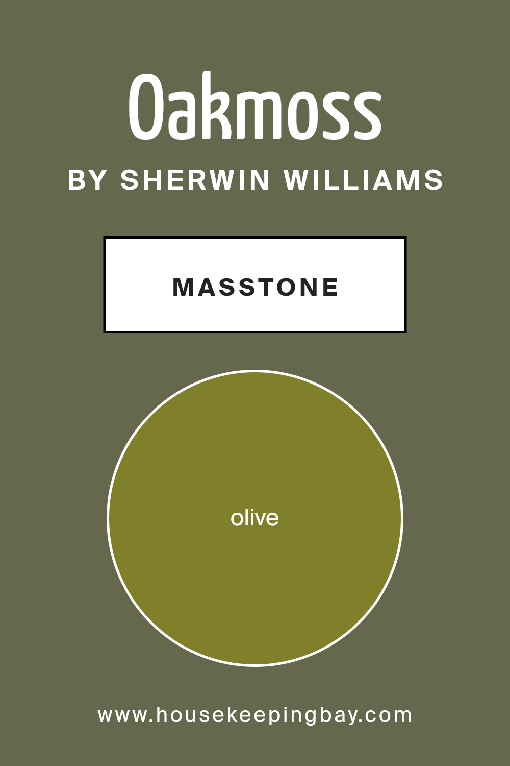
What’s the True Masstone of Sherwin Williams Oakmoss SW 6180?
Let’s talk masstone—because that’s where all the drama is, right? When you first see Oakmoss, its masstone is this deep, earthy green that pulls heavily towards olive. It’s like nature took a big ol’ swatch of forest and handed it to Sherwin Williams. No neon greens here, thank you very much!
In regular lighting, Oakmoss shows off as a solid, grounded green, almost like it’s saying, “I’ve got this!” It’s not one of those colors that wavers in between shades. Think about it—if you were painting a cozy den or a library nook, Oakmoss would just stand there confidently, setting the tone. You want depth? You got it. But it’s not going to hit you over the head with too much darkness either.
I once saw someone use it on kitchen cabinets paired with brass hardware and let me tell you—chef’s kiss! That rich green against the metal was like the ultimate glow-up. You get this earthy, almost moody vibe that feels super stylish but also grounded, like you’re walking through a forest but, you know, with really good Wi-Fi.
Oakmoss is that shade that knows who it is: bold, earthy, but approachable. So yeah, its masstone is like that cool friend who’s all about nature hikes but still loves a good Netflix binge.
housekeepingbay.com
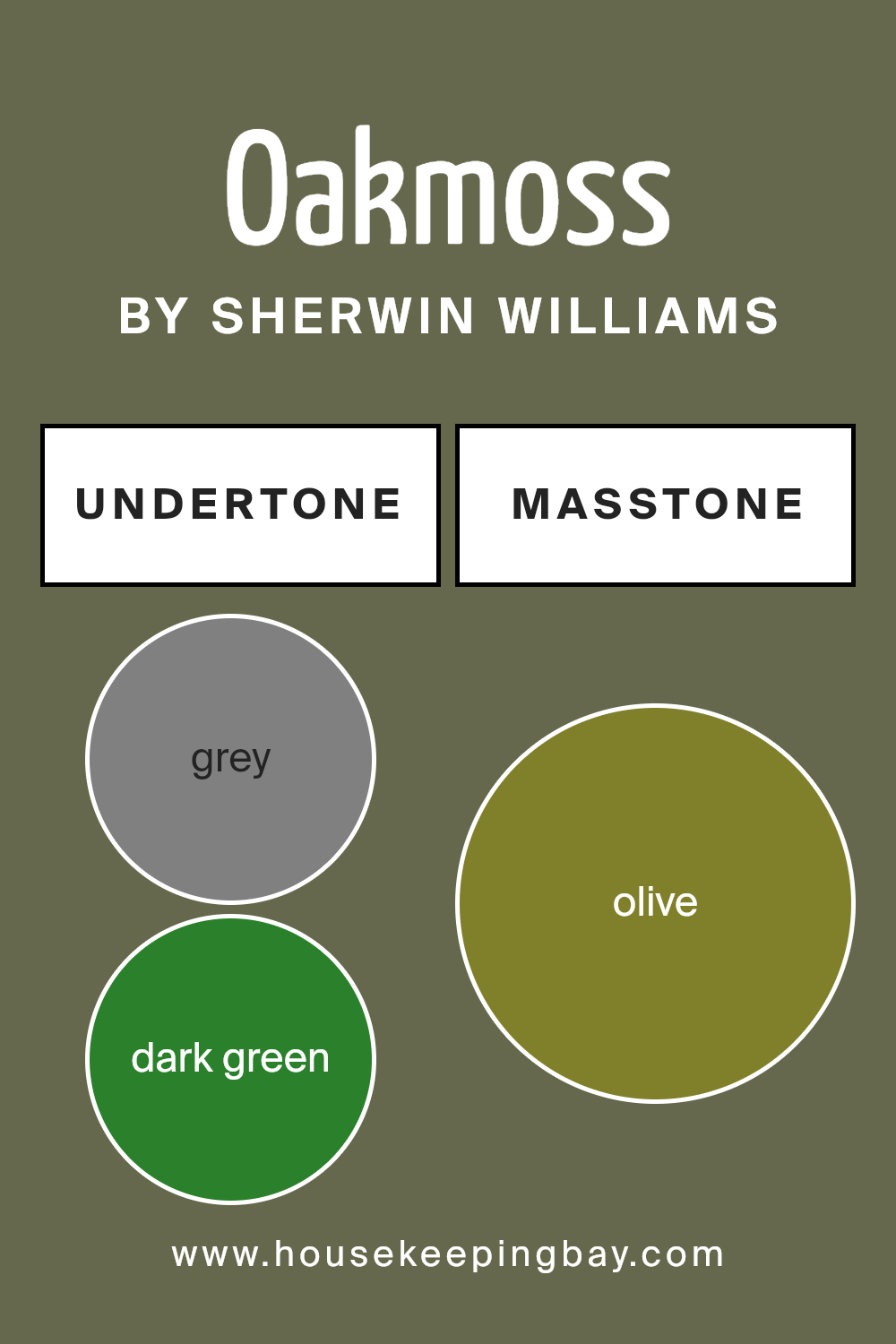
Unpacking the Undertones of Oakmoss SW 6180 by Sherwin Williams
Let me tell you, this color is like that mysterious friend who shows up at the party dressed impeccably, but you can’t quite put your finger on what makes them stand out. Is it the olive? The hint of dark green? Or maybe it’s that sneaky little gray undertone that just keeps you guessing!
Let’s get real for a second. You look at Oakmoss and think, “Okay, it’s green. Cool.” But then BAM—you start noticing that soft, almost moody gray whispering in the background. It’s like a color with secrets! You think it’s all olive and earthy vibes, but no—there’s this shadowy green creeping in, just enough to make the room feel grounded. You know that feeling when you’ve got your favorite cozy sweater on? That’s Oakmoss in a nutshell. You’ll find yourself wanting to stay in that room forever because it just feels right.
I mean, it’s perfect for those spots where you want to feel a little fancy but also keep things real. I’ve seen it work magic in a living room with some dark wood furniture—chef’s kiss—and then turn around and do wonders in a rustic kitchen. Oh, and let’s not forget bathrooms! Picture it with brushed brass fixtures. Yup, you’re welcome.
You might even get that occasional moment where it feels a bit moodier because of that gray undertone, but hey, aren’t we all a bit unpredictable sometimes? That’s what makes it fun.
housekeepingbay.com
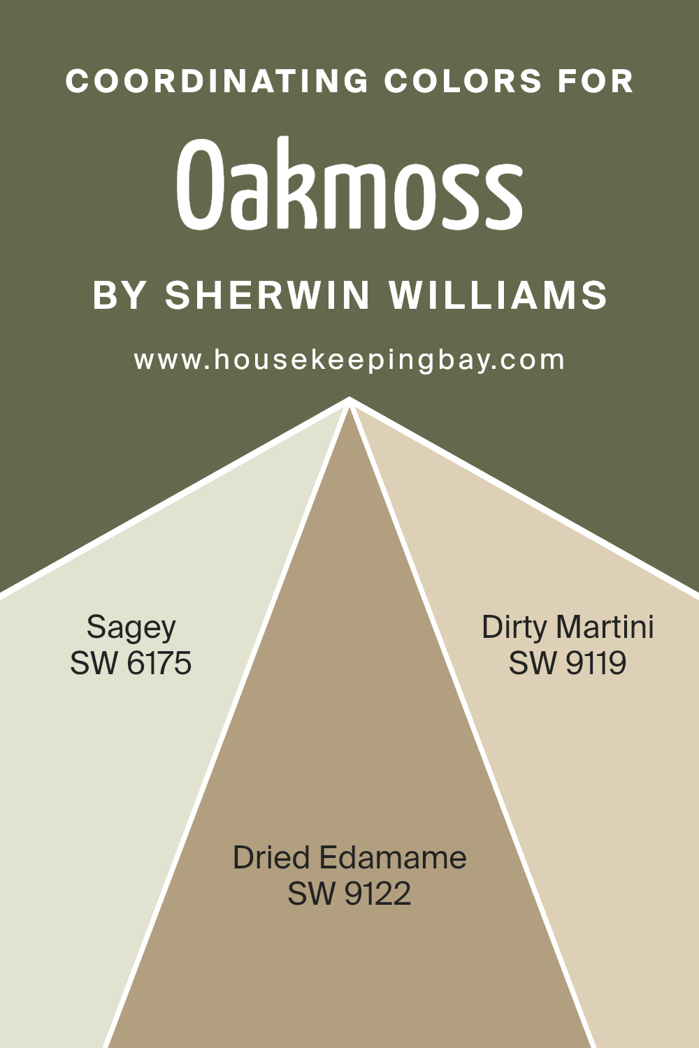
Coordinating Colors of Sherwin Williams Oakmoss SW 6180
Oh, you’ve got the coordinating colors for Oakmoss SW 6180? Alright, picture this: Oakmoss is standing there, all confident and earthy, and then—boom—in walks Sagey SW 6175, like the calm, soft-spoken friend who always manages to balance everything out. It’s the perfect light, muted green that whispers, “Don’t worry, I got this.”
And then, Dirty Martini SW 9119 enters the scene. Just the name alone makes you want to paint your room while holding a cocktail, right? It’s got this warm, beige-y vibe, but with a bit of an edge. Think of it like Oakmoss’ sassy sidekick, adding warmth without being too in-your-face.
Now, Dried Edamame SW 9122—I mean, I don’t even have to sell you on this one. It’s like the grounded, neutral base you never knew you needed. It’s warm, earthy, and just a little bit crunchy (you know, like that friend who’s always going on about their new vegan recipes but in a way that makes you want to try them).
Together? These colors are a dream team. You’ve got balance, warmth, and that sophisticated edge that says, “Yes, I know exactly what I’m doing with my space.”
You can see recommended paint colors below:
- SW 6175 Sagey
- SW 9122 Dried Edamame
- SW 9119 Dirty Martini
housekeepingbay.com
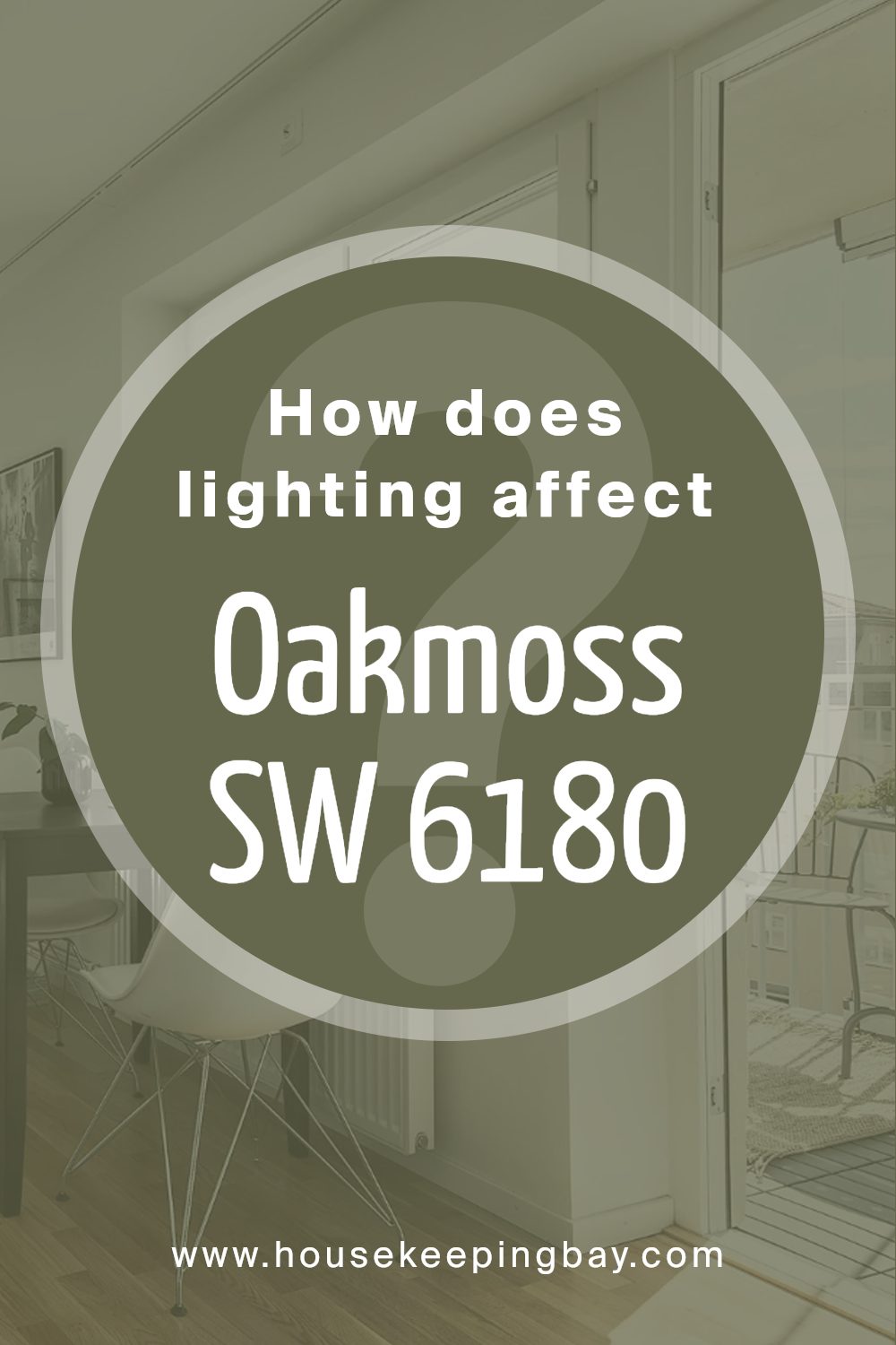
How Lighting Changes the Game for Oakmoss SW 6180 by Sherwin Williams
Lighting and Oakmoss SW 6180? It’s a whole mood situation. Let me tell you, this color changes its entire personality based on the light you throw at it. In bright, natural light, it’ll come off as this lush, olive green—like you’ve got a little slice of forest right in your living room. Seriously, it’s like that green sweater you swear makes you look sophisticated but cozy at the same time. You know the one.
But, take it into a room with low light, and boom—it turns moody. I’m talking deep, mysterious, almost swampy vibes, but in the best way possible.
Like, “I’m here to brood with my book, leave me alone.” Throw in a little warm, artificial lighting, and suddenly Oakmoss softens up again, showing off these warm undertones that make everything feel just a little more grounded and earthy. I wouldn’t say it feels dark, just… inviting. Like a cozy cabin where you curl up with a cup of tea. You get me?
It’s unpredictable, but not in a bad way. One minute it’s all “Hey, I’m here to add a little edge,” and the next it’s like, “I’m sophisticated and deep, but also, I’ll play nice with your beige couch.” Honestly, you gotta test it in different spots to really see which version of Oakmoss you’re going to get.
housekeepingbay.com
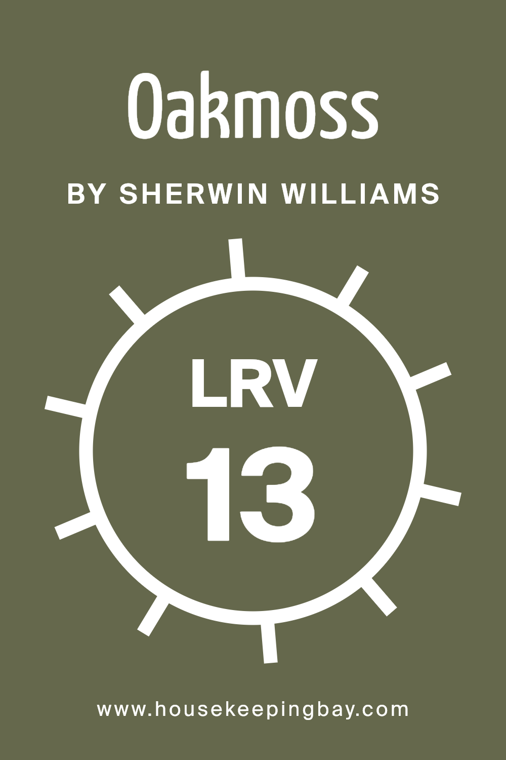
How Much Light Does Sherwin Williams Oakmoss SW 6180 Reflect? Let’s Talk LRV!
So, the LRV (light reflectance value) is 13. Yup, 13. It’s low, so you know what that means—it’s deep, moody, and definitely not here to reflect a lot of light. This color is here to make a statement. You’re not getting bright and airy with this one, no, you’re going for that rich, earthy vibe.
Imagine it in a cozy den, paired with wood tones or even brass accents—boom, instant warmth and sophistication. Or, you could totally use it in a dining room for some drama, like you’re suddenly serving up gourmet meals, even if it’s just pizza night.
And here’s the thing: Oakmoss doesn’t scream for attention, but once it’s in the room, it owns it. You won’t be worrying about how it plays with the other colors in your space because it’s confident. It’s the color equivalent of someone who always knows what to order at a fancy restaurant—cool, collected, and totally at home.
Just be careful with lighting—throw Oakmoss in a dimly lit room, and it could feel darker than you might expect. But pair it with some natural light or a warm lamp, and you’ve got this cozy, sophisticated space where you just want to curl up with a book or sip a glass of wine. You know what I’m talking about!
It’s bold, it’s grounded, and it’s not here to mess around.
housekeepingbay.com
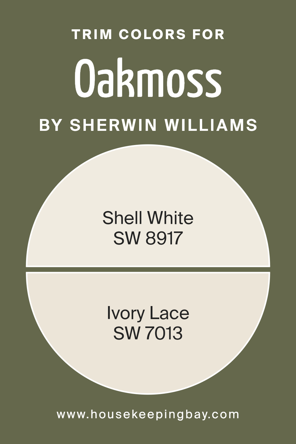
What Trim Colors Pair Best with Sherwin Williams Oakmoss SW 6180?
You know how Oakmoss is all deep and moody, giving you those rich green vibes? Well, the trim has got to be the perfect partner, like the right wine with a steak (not that I know much about wine, but you get the drift).
So, here’s what we’ve got: Shell White SW 8917 and Ivory Lace SW 7013. These two are like the classy sidekicks to Oakmoss’s boldness. They aren’t here to steal the show—they’re here to complement. Shell White? It’s like that reliable friend who’s always down for brunch but doesn’t make a fuss. Clean, simple, and soft enough to not fight with Oakmoss.
And Ivory Lace, oh man, it’s like that vintage lace dress you pull out for special occasions. It’s got just the right amount of warmth to keep things cozy, but not too yellow that it feels like you’re stuck in some grandma’s living room.
Pair either of these with Oakmoss, and trust me, you’re golden. It’s like a team-up where everyone knows their role—no show-stealers, just vibes.
You can see recommended paint colors below:
housekeepingbay.com
Colors Similar to Oakmoss SW 6180 by Sherwin Williams
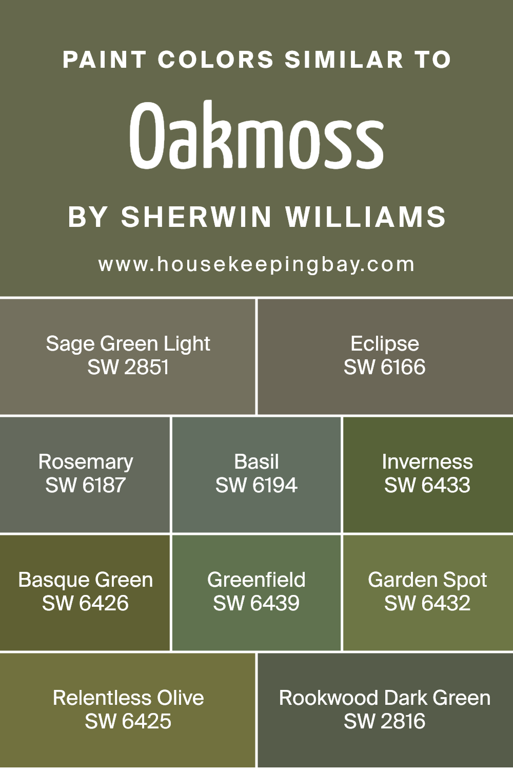
Alright, let’s dive into the world of greens that are similar to Oakmoss SW 6180, and let me tell you, there are some solid contenders in this family. I mean, Oakmoss is a vibe on its own, but maybe you’re feeling like you need a little twist? Well, here are some cousins that could also work their magic.
SW 2851 Sage Green Light – This is like Oakmoss’s chill, laid-back younger sibling. It’s got that soft, earthy green feel, but it’s lighter. If Oakmoss is the bold statement, Sage Green Light is the casual whisper that still gets attention.
SW 6166 Eclipse – Now we’re talking deep and moody, almost like Oakmoss took a little trip to the dark side. Eclipse is a shadowy green that brings depth and mystery. This one’s for when you’re really feeling dramatic. You know, “I’ll paint my room and no one will dare say it’s just green!” kind of vibe.
SW 6187 Rosemary – Ah, Rosemary. It’s a bit softer and a touch more traditional. Think of it as Oakmoss but with a sprinkle of herbal calm. Like, you can almost smell the garden when this color hits the walls. It’s still rich but won’t steal the scene the way Oakmoss can.
SW 6194 Basil – Now, Basil is smooth. It’s got that fresh, kitchen-garden feel but with a solid presence. Kind of like Oakmoss’s more approachable cousin. Still grounded, but it won’t take over the room. Basil knows how to blend in while still keeping things interesting.
SW 6433 Inverness – A little zestier than Oakmoss, Inverness is all about energy. It’s brighter but still grounded. It’s like Oakmoss got a shot of espresso and is ready to take on the day. This one’s for when you want a green that’s bold but not brooding.
SW 6426 Basque Green – Okay, now we’re getting into some rich, luxurious territory. Basque Green is just a smidge more yellow, so it feels warmer. It’s like Oakmoss with a little sun-kissed glow. Fancy, but still earthy.
SW 6439 Greenfield – Greenfield is your friend who’s always down for a hike. Earthy, solid, and a little more muted than Oakmoss, but still very much in the same green zone. It’s got that “just spent the weekend in nature” energy.
SW 6432 Garden Spot – Garden Spot is, like, the optimistic sibling to Oakmoss. It’s brighter and has a bit more punch to it. It’s for when you want that deep green feeling but with a little extra life.
SW 6425 Relentless Olive – Relentless Olive sounds like it means business, right? And it does. It’s got that olive tone, but it’s not here to be soft or subtle. If Oakmoss is earthy, Relentless Olive is, well, relentless. It’s bold, it’s strong, and it’s perfect if you want to make a real statement.
SW 2816 Rookwood Dark Green – Oh, this one’s like stepping back in time, in the best way possible. Rookwood Dark Green feels historic, almost like it’s been sitting in an old, beautiful library for decades. It’s deep, rich, and has that timeless appeal that just oozes class.
So, there you have it. A whole lineup of greens that could work just as well as Oakmoss, depending on the mood you’re going for. Whether you want to tone things down, amp them up, or just get a different kind of green vibe, these colors have got your back.
You can see recommended paint colors below:
- SW 2851 Sage Green Light
- SW 6166 Eclipse
- SW 6187 Rosemary
- SW 6194 Basil
- SW 6433 Inverness
- SW 6426 Basque Green
- SW 6439 Greenfield
- SW 6432 Garden Spot
- SW 6425 Relentless Olive
- SW 2816 Rookwood Dark Green
housekeepingbay.com
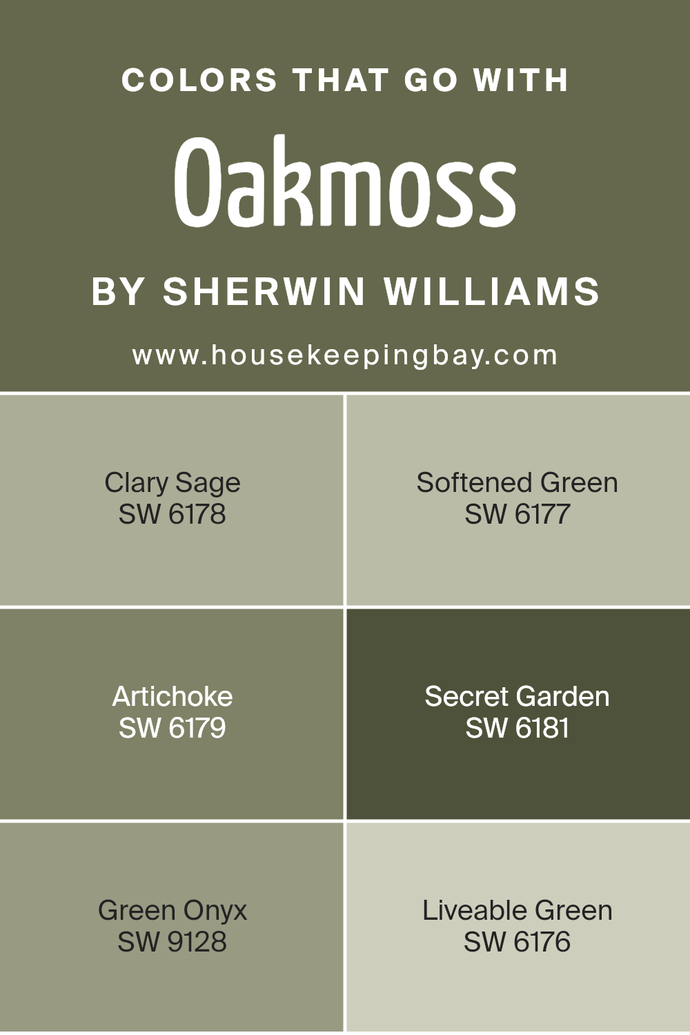
Colors that Go With Sherwin Williams Oakmoss SW 6180
Alright, if you are still with me let’s talk about what colors play well with Oakmoss SW 6180, because trust me, when you’ve got a color that bold, you want the right wingmen. So, who are Oakmoss’s besties? Let’s dive into some serious color coordination.
SW 6178 Clary Sage – Ah, Clary Sage. This is like that soft, gentle hug Oakmoss didn’t know it needed. It’s a lighter, more delicate green with a bit of an herbal undertone. They vibe well together without competing, like that chill friend who’s always there to balance out your drama.
SW 6177 Softened Green – The name says it all, right? It’s soft, it’s subtle, and it knows how to let Oakmoss take the spotlight. But here’s the thing—it’s not going to completely fade into the background. Softened Green adds just enough depth without overwhelming the space.
SW 6179 Artichoke – Ok, Artichoke is like Oakmoss’s slightly funkier cousin. They’re both earthy, grounded, but Artichoke brings a little more attitude. They complement each other beautifully, with Artichoke adding that little extra depth, like, “Hey, let’s keep things interesting.”
SW 6181 Secret Garden – Secret Garden is a darker, moodier green, perfect if you want to keep things rich and dramatic. It’s like Oakmoss decided to go all-in on the forest vibe. This pairing feels luxurious, mysterious, and a little bit romantic, like the perfect backdrop for a cozy reading nook or a moody bedroom.
SW 9128 Green Onyx – This one is fun because it has a hint of blue in it. Green Onyx keeps things fresh while still hanging in the green family. It’s like Oakmoss invited a cooler, breezier friend to the party, and they just work together. I’ve seen these two paired in more modern spaces, and let me tell you, they look fabulous together.
SW 6176 Liveable Green – Liveable Green is exactly what it sounds like. It’s soft, easygoing, and perfect for creating that serene space. It tones down the intensity of Oakmoss and balances it out, making the room feel calm and cohesive. It’s like the color equivalent of slipping into your favorite comfy sweater after a long day.
So, whether you want to keep it moody or lighten things up, Oakmoss has a whole squad of greens that will bring out the best in each other. Pair them up, and you’ve got a space that’s layered, interesting, and totally you.
You can see recommended paint colors below:
- SW 6178 Clary Sage
- SW 6177 Softened Green
- SW 6179 Artichoke
- SW 6181 Secret Garden
- SW 9128 Green Onyx
- SW 6176 Liveable Green
housekeepingbay.com
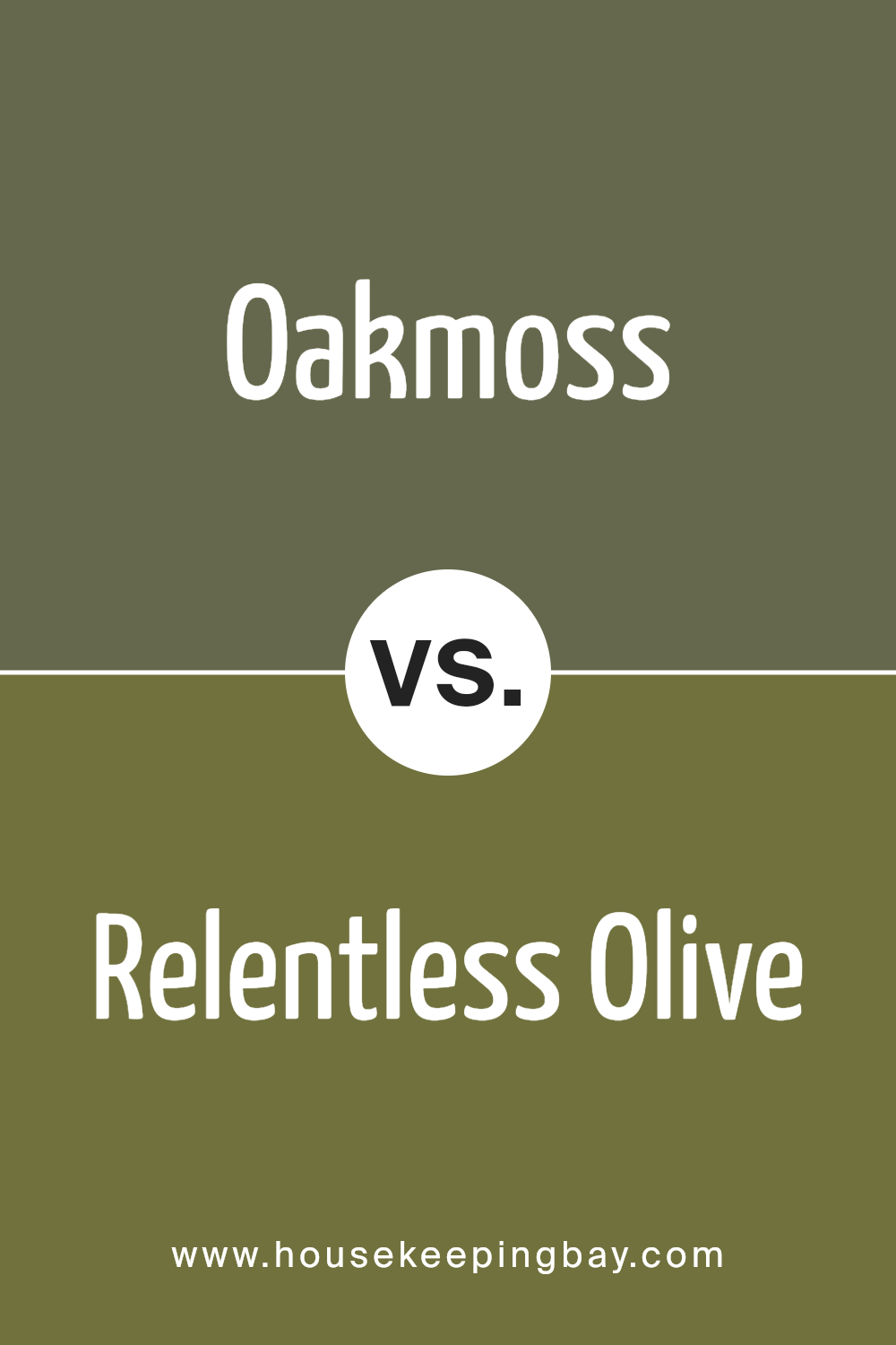
Oakmoss SW 6180 vs. Relentless Olive SW 6425. Battle of the Greens
Two serious contenders in the Sherwin Williams lineup, both bold and earthy, but they bring totally different vibes to the table.
Oakmoss SW 6180 – I’ve said it before, and I’ll say it again, Oakmoss is like that deep, grounded green that just makes a space feel earthy, rich, and sophisticated without being too “in your face.” It’s got this subtle olive tone with a little gray in it, which helps keep it from feeling too intense. Oakmoss is the kind of green that can hold its own but still plays well with others—kind of like the friend who doesn’t have to try too hard but always looks put together.
Relentless Olive SW 6425 – Now, Relentless Olive, this one comes in hot. I mean, it’s called relentless for a reason. It’s that deep, olive tone that’s much bolder, a little bit darker, and it doesn’t shy away from its warmth. Relentless Olive isn’t messing around. It’s got this intensity that Oakmoss doesn’t quite have—it’s like Oakmoss’s edgy cousin who wears all black and always has the best stories.
Here’s how they stack up:
- Depth: Relentless Olive is darker, more saturated, and demands attention. Oakmoss has depth, but it’s more subtle and feels a little softer in comparison. If you want something with a bit more mystery and drama, Relentless Olive is your pick. Oakmoss? It’s a little more chill but still bold.
- Tone: Oakmoss leans slightly more toward an earthy, gray-olive tone, while Relentless Olive has a stronger golden warmth. This means Relentless Olive feels a bit richer, almost like it’s got a touch of bronze hidden in there.
- Mood: Oakmoss feels versatile. You can take it into a modern space, throw it into something more traditional, and it just works. It’s like that green that can be both warm and cool depending on the lighting. Relentless Olive? It’s moodier, bolder, and definitely warmer. It’s got a strong, almost Tuscan vibe, especially in rooms with a lot of natural light. It’s the color that says, “I’m here, and I’m not going anywhere.”
Where they fit:
- Oakmoss would be perfect in a living room where you want a calm, cozy feel without going too dark. It’s a green that plays nice with natural materials like wood and stone, giving you that “nature indoors” vibe.
- Relentless Olive is the kind of color that owns the space. Think accent walls, cozy dens, or even on cabinetry if you’re going for something bold and statement-making. It’s dramatic but still warm, making it a great choice for dining rooms or offices where you want some serious character.
So, if you’re after bold and intense with a punch of warmth, Relentless Olive is your go-to. If you want something a bit more adaptable, grounded, but still bold enough to make an impression, Oakmoss is your best bet. Either way, you can’t lose with these two greens—they just have different personalities, like choosing between rockstar and laid-back cool.
You can see recommended paint color below:
- SW 6425 Relentless Olive
housekeepingbay.com
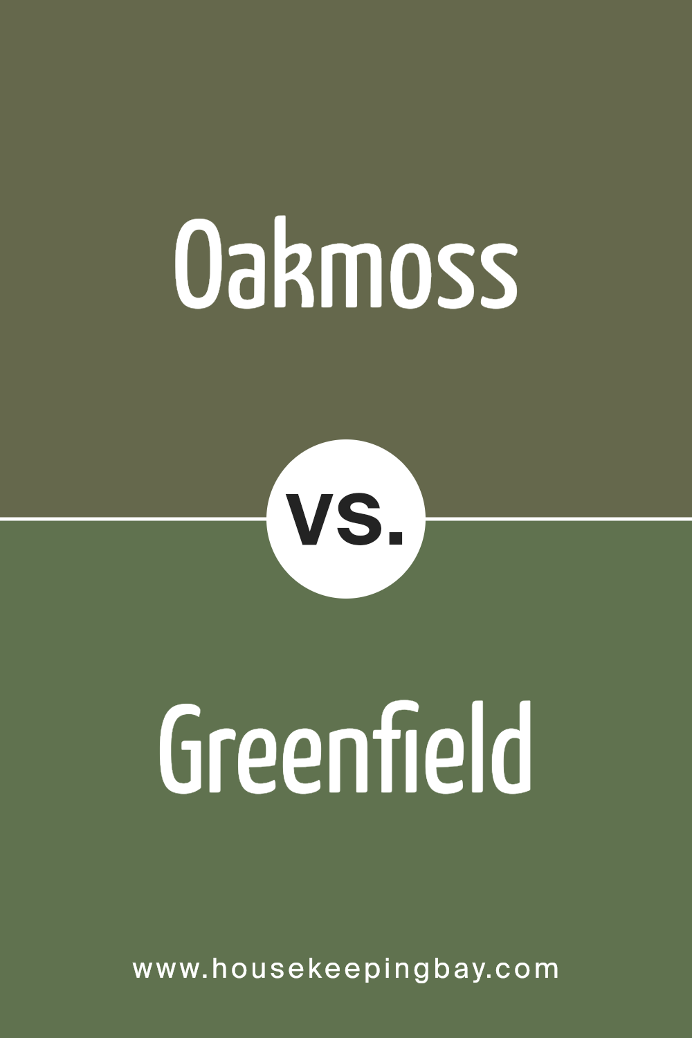
Oakmoss SW 6180 vs Greenfield SW 6439
This green has some energy, like the outdoors on a crisp morning. If we’re comparing, Greenfield is the brighter, more lively cousin—less moody, more “let’s go for a hike.” It’s got this natural, fresh vibe that feels more invigorating than brooding.
Greenfield is a true green, with a bit more punch than its olive-toned counterparts. It’s brighter and lighter, but not in a loud way—more like a “let’s bring some life into the room” kind of way. It works when you want to brighten things up but still keep the connection to nature. Greenfield gives you that perfect middle ground between fresh and grounded, like the moment the sun hits the trees after it rains.
It’s great for spaces where you want a bit of pop—think a kitchen or a family room where you want that energizing feel. I’d also throw it on an accent wall if you’re feeling brave. It’s a green that says, “Hey, I’m here to brighten your day without overwhelming you.”
If you’re thinking natural and lively, Greenfield’s got you. It’s not as deep and mysterious, but it’s got that refreshing, outdoorsy vibe that can bring a whole space to life. You can even pair it with warm neutrals or lighter wood tones for a balanced, airy look. Think of it like that breath of fresh air your room has been waiting for.
You can see recommended paint color below:
- SW 6439 Greenfield
housekeepingbay.com
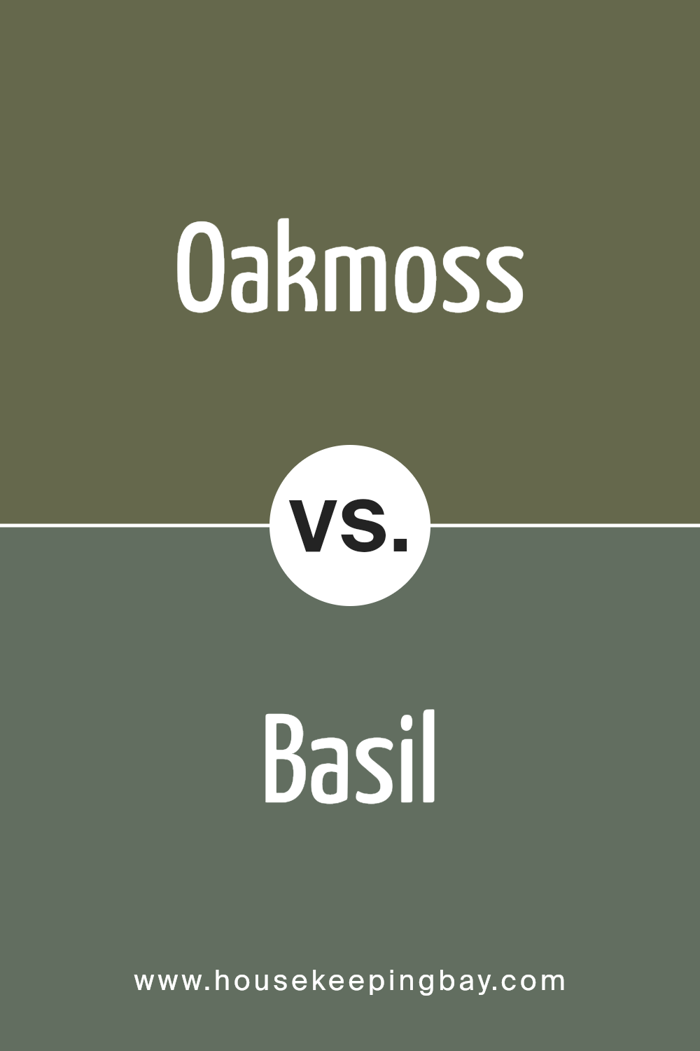
Oakmoss SW 6180 by Sherwin Williams vs Basil SW 6194 by Sherwin Williams
Basil—now this one, it’s like the culinary herb, but way more versatile. It’s softer, calmer, and has this beautiful muted green vibe. If Oakmoss is the bold, mysterious one, Basil is the laid-back, easygoing cousin. Basil feels a little fresher, like a gentle breeze through a garden. It doesn’t push too hard, but it still makes an impression.
While Oakmoss is deep and earthy, Basil leans more into a subtle, sage-y territory, with just enough depth to keep it interesting. It’s green with a hint of warmth, but it’s not trying to steal the show. You can throw Basil in a kitchen, bedroom, or even a home office, and it’s going to give you that fresh, natural vibe without overpowering the space.
Mood-wise, Basil is your go-to when you want something soothing but still full of life. It works great with whites, creams, and soft neutrals, creating a relaxed atmosphere without feeling flat. It’s like the chill friend who always knows how to keep things cool, but can still stand up when paired with rich woods or darker accents.
So, if you’re feeling like Oakmoss is a bit too moody, Basil is the perfect choice for a more subtle, calming, yet still rich green. It’s got that versatility to work in pretty much any room, whether you want a fresh vibe or a little bit of natural warmth. You can’t go wrong—it’s easy on the eyes and perfect for those spaces where you just want to breathe a little easier.
You can see recommended paint color below:
- SW 6194 Basil
housekeepingbay.com
Oakmoss SW 6180 by Sherwin Williams vs Eclipse SW 6166 by Sherwin Williams
Two greens, but let me tell you, they’re not even playing in the same league, okay? Oakmoss is that rich, earthy green you might find in a dreamy woodland cottage. Think deep olive vibes, cozy, and ready to wrap you up in nature’s hug. It’s the kind of color you use when you want your space to feel grounded but also kinda… sophisticated? I’ve seen it look so good paired with creamy whites or those yummy, warm wood tones. Seriously, if Oakmoss were a person, it’d be that effortlessly cool friend who hikes in designer boots.
Now, Eclipse? Hoo boy. Eclipse SW 6166 is like Oakmoss’s moody, rebellious sibling who skipped the nature walks and went straight for the underground jazz club. It’s darker, moodier, with a definite smoky edge. Eclipse is less about cozy and more about drama, right? It’s the kind of green that makes you want to pour a glass of whiskey and read deep, philosophical novels (or, let’s be real, binge true crime podcasts). I’ve seen Eclipse do magical things in a home office or library space—it’s all about that low light, velvety depth, a place to brood and be fabulous. Pair it with brass or deep, warm wood for that old-world, intellectual vibe.
Choosing between them? Do you want to feel like you’re sipping herbal tea in a sunlit forest glade (Oakmoss), or are you vibing with a speakeasy, where you contemplate life while surrounded by books and dark walls (Eclipse)? Both are killer choices, just depends on how mysterious you’re feeling.
You can see recommended paint color below:
- SW 6166 Eclipse
housekeepingbay.com
Oakmoss SW 6180 vs Garden Spot SW 6432
Okay, buckle up.
Oakmoss SW 6180 is like that moody, mysterious friend who shows up in a deep green sweater, sipping herbal tea, and knows how to tell a great story. It’s rich, earthy, and kinda dark but in a cozy way. This is the color that says, “Hey, let’s curl up with a book in this cool cabin.”
Then we’ve got Garden Spot SW 6432, which is like the friend who shows up wearing neon green sneakers. It’s vibrant, lively, and basically shouts, “Let’s go plant something in the garden or maybe start a compost bin!” It’s fresh, it’s brighter, and it’s definitely more playful.
Now, throw them in the same room, and you’ve got a whole vibe clash. Oakmoss is like, “I’m too sophisticated for this.” Garden Spot’s all, “Lighten up!” Oakmoss is better for spaces where you want a grounded, deeper energy—think dining rooms, home offices, places where you want to feel settled. Garden Spot? Perfect for making a sunroom pop or a fun accent wall in a kids’ space where you’re not afraid to get a little wild.
One is the warm, cozy hug; the other’s the pep talk you get before you go run a marathon. Pick your mood!
You can see recommended paint color below:
- SW 6432 Garden Spot
housekeepingbay.com
Oakmoss SW 6180 vs Rosemary SW 6187 by Sherwin Williams
So you’re stuck between Oakmoss SW 6180 and Rosemary SW 6187? Let me tell you, this is like picking between two deliciously earthy greens. But they’re not twins. Think of Oakmoss as that friend who shows up in a leather jacket, confident, a little moody, and not afraid to stand out. It’s got that deeper olive tone—like it’s been hanging out in the forest for a while, soaking in all that natural vibe. This color is perfect when you want a rich, grounding backdrop that doesn’t scream for attention but just is.
Then there’s Rosemary. Oh, she’s fresh, a bit brighter. Still earthy, but she’s the one who brings a homemade salad to the picnic. Less brooding, more lively. Rosemary’s green feels softer, more approachable. You could paint your whole living room in this and not feel like you’re trapped in a moody, dark forest. She plays well with whites, lighter neutrals, and wood tones, and she’s a little more versatile in spaces where you don’t want that heavy hit of green.
Now, which one’s your vibe? Want to feel like you’re wrapped in a cozy green blanket? Oakmoss. Want a fresh, welcoming green that’s less intense? That’s Rosemary all day. Trust me, your walls will thank you either way!
You can see recommended paint color below:
- SW 6187 Rosemary
housekeepingbay.com
Oakmoss SW 6180 by Sherwin Williams vs Rookwood Dark Green SW 2816 by Sherwin Williams
You can see recommended paint color below:
- SW 2816 Rookwood Dark Green
housekeepingbay.com
Oakmoss SW 6180 by Sherwin Williams vs Basque Green SW 6426 by Sherwin Williams
You can see recommended paint color below:
- SW 6426 Basque Green
housekeepingbay.com
Oakmoss SW 6180 by Sherwin Williams vs Sage Green Light SW 2851 by Sherwin Williams
You can see recommended paint color below:
- SW 2851 Sage Green Light
housekeepingbay.com
Oakmoss SW 6180 by Sherwin Williams vs Inverness SW 6433 by Sherwin Williams
You can see recommended paint color below:
- SW 6433 Inverness
housekeepingbay.com
Conclusion
So here’s where we land: Oakmoss SW 6180 by Sherwin Williams is your go-to for a rich, grounded green that brings depth and warmth without overpowering the room. Whether you’re pairing it with softer greens like Basil or bold shades like Relentless Olive, Oakmoss holds its own, adding a sophisticated, earthy vibe to any space. It’s flexible but still a statement, perfect for those who want nature indoors without shouting about it.
When it comes to finding the right trim or coordinating colors, it’s all about balancing that rich green with complementary shades—Clary Sage for softness, Alabaster for a classic trim, or even going bold with Gauntlet Gray. Each choice will shift the room’s mood just enough to keep things interesting without losing that timeless feel Oakmoss brings to the table.
At the end of the day, whether you’re drawn to Oakmoss for its depth, or something like Greenfield for its brighter, livelier take on green, the key is creating a space that feels balanced, bold, and uniquely yours. It’s all about finding that perfect match—whether you want moody and dramatic or soft and calming, Oakmoss has a vibe that can adapt to whatever look you’re dreaming of.
housekeepingbay.com
Ever wished paint sampling was as easy as sticking a sticker? Guess what? Now it is! Discover Samplize's unique Peel & Stick samples. Get started now and say goodbye to the old messy way!
Get paint samples


