Capri Coast OC-87 Paint Color by Benjamin Moore
A Dive into Relaxed Delight of this color
The world of interior design is abundant with a myriad of colors, each carrying its own emotion, vibe, and style. One such color that has piqued interest lately is Capri Coast OC-87. Let’s delve deep into understanding this shade and how it stands out.
via benjamin moore
What Color Is Capri Coast OC-87?
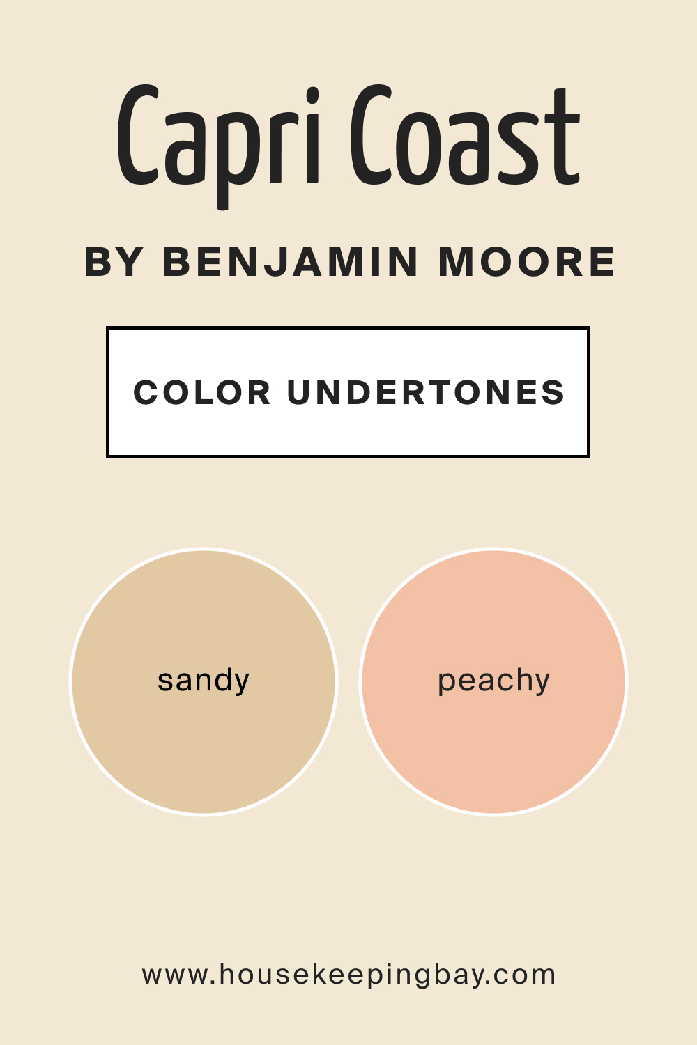
Capri Coast OC-87 is a refined off-white hue drenched in subtle sandy and peachy undertones. It evokes the sensation of a delicate sunrise brushing over serene beaches, where the first light softly paints the sand.
The color possesses an inherent grace that captures the raw beauty of coastal terrains, blending the purity of off-white with the warmth of sun-kissed shores. This versatility makes it suitable for a range of interior styles. Whether aiming for a coastal retreat, a contemporary haven, or a minimalist sanctuary, Capri Coast can anchor the design with its serene elegance.
The hue pairs exceptionally well with natural textures like linen, jute, and raw wood. Additionally, materials such as brushed bronze, matte ceramics, and sea glass accents can enhance its organic touch, echoing a tranquil beachside ambiance.
housekeepingbay.com
Table of Contents
Is It a Warm Or Cool Color?
Capri Coast OC-87 leans towards the warmer spectrum, largely due to its sandy undertones. These warm hints lend a cozy and inviting aura, making spaces feel welcoming and intimate. While many off-white colors can seem stark or clinical, the warmth in Capri Coast breathes life and character into spaces.
In homes, this color plays a pivotal role in softening harsh lines, reflecting light in a gentle manner, and offering a soothing backdrop against which other design elements can come alive.
Undertones of Capri Coast OC-87
The unique charm of Capri Coast OC-87 is greatly attributed to its undertones. Delicate sandy undertones offer an earthy touch, while subtle peachy nuances introduce a gentle warmth. These undertones serve as the underlying essence that gives the paint its character.
Undertones can drastically affect how we perceive color. For instance, two off-whites can look almost identical under certain lighting, but their undertones can make them look distinctly different in diverse settings or when paired with other hues.
In the case of Capri Coast, its undertones ensure that while it remains neutral, it never feels flat or dull. Instead, it resonates with a warm, earthy vibrancy that is both sophisticated and comforting.
housekeepingbay.com
Coordinating Colors of Capri Coast OC-87
Coordinating colors are shades that harmonize and create a cohesive palette with the primary color. For Capri Coast OC-87, use the following colors:
- BM Misty Gray 2124-60 – A soft gray with a touch of blue, perfect for a peaceful backdrop.
- BM Blue Lagoon 2054-40 – A brighter blue, it adds a vibrant pop without overwhelming the serenity of Capri Coast.
- BM 239 Ivory Porcelain – A muted off-white that pairs seamlessly, adding warmth and elegance.
Additional shades include:
- BM 059 Orange Creamsicle – A light coral, it adds a touch of warmth.
- BM 1416 Whispering Wind – Another soothing shade, it plays up the oceanic theme.
How Does Lighting Affect Capri Coast OC-87?
Lighting significantly impacts how we perceive colors, playing a transformative role in revealing the depth, undertone, and mood of a paint shade. With the mutable nature of colors under different lights, understanding this interplay is crucial in interior design.
Capri Coast OC-87, being an off-white enriched with sandy and peachy undertones, is especially susceptible to the nuances of light. In artificial light, especially yellow-toned incandescents, the warm peachy undertones are accentuated, giving rooms a cozy, intimate feel.
This is perfect for evening settings where relaxation is key. Fluorescent lights, cooler in tone, may highlight the sandy undertones, presenting a slightly more neutral appearance.
In natural light, Capri Coast takes on a dynamic character. It interacts harmoniously with the shifting light, constantly evolving throughout the day. The sandy and peachy undertones come alive, reflecting the sun’s radiance in a muted yet vibrant manner.
Considering room orientations:
- North-Faced Rooms: These spaces often receive cooler, indirect light. In such settings, Capri Coast might appear a bit muted, with its sandy undertones becoming more prominent. The peachy warmth might be subdued, giving the room a serene, calm ambiance.
- South-Faced Rooms: Bathed in abundant sunlight for most of the day, south-facing rooms will enhance the warm peachy undertones of Capri Coast, making spaces feel brighter and more inviting. The color will seem livelier, evoking the sensation of a sunny beach day.
- East-Faced Rooms: Morning sunlight is gentle and warm. As the sun rises, Capri Coast in east-facing rooms will exude a soft warmth, highlighting its peachy undertones. As the day progresses and light becomes indirect, the sandy tones might become more noticeable.
- West-Faced Rooms: As the sun sets, it casts a warm, golden hue. West-facing rooms will see Capri Coast reflecting this golden light, intensifying its warm undertones and giving the room a cozy, sunset-like glow.
In conclusion, while Capri Coast OC-87 remains consistent in its elegant off-white nature, its sandy and peachy undertones dance differently with each light source, making it a versatile choice for diverse spaces and lighting conditions.
housekeepingbay.com
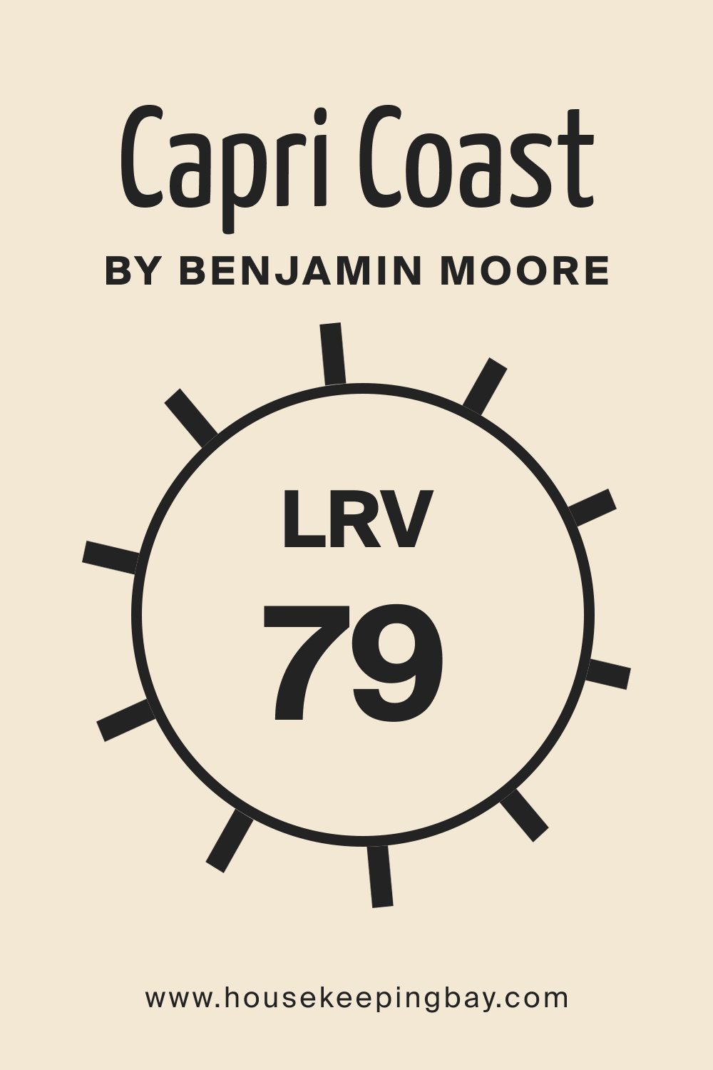
LRV of Capri Coast OC-87
LRV, or Light Reflectance Value, measures how much light a color reflects. With an LRV of 79, Capri Coast OC-87 is quite reflective. High LRV colors can make spaces appear larger and more open. This characteristic, combined with its balanced warmth, makes Capri Coast OC-87 a prime choice for smaller rooms or spaces you wish to feel more expansive.
housekeepingbay.com
What is LRV? Read It Before You Choose Your Ideal Paint Color
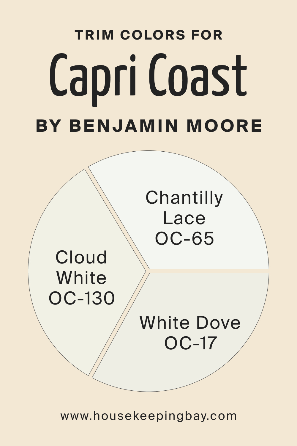
Trim Colors of Capri Coast OC-87
Trims can either contrast or complement a primary color. For Capri Coast OC-87, the following whites make striking trim choices:
- BM White Dove – A soft off-white, it offers a muted contrast.
- BM Chantilly Lace – A pure, bright white, it adds a crisp delineation.
- BM Cloud White – Slightly warm, it can add depth and richness.
housekeepingbay.com
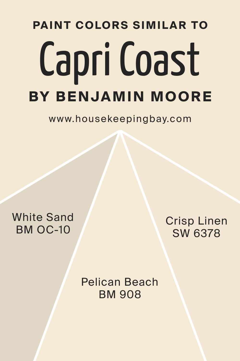
Colors Similar to Capri Coast OC-87
Knowing similar colors helps in making informed design decisions. The following shades can be considered akin to Capri Coast OC-87:
- BM Pelican Beach 908 – A sandy hue, it carries the essence of a peaceful shoreline.
- OC-10 White Sand – A muted, easygoing off-white with a slight hint of beige that looks very appealing.
- SW 6378 Crisp Linen – A bright white with warm peach undertones.
housekeepingbay.com
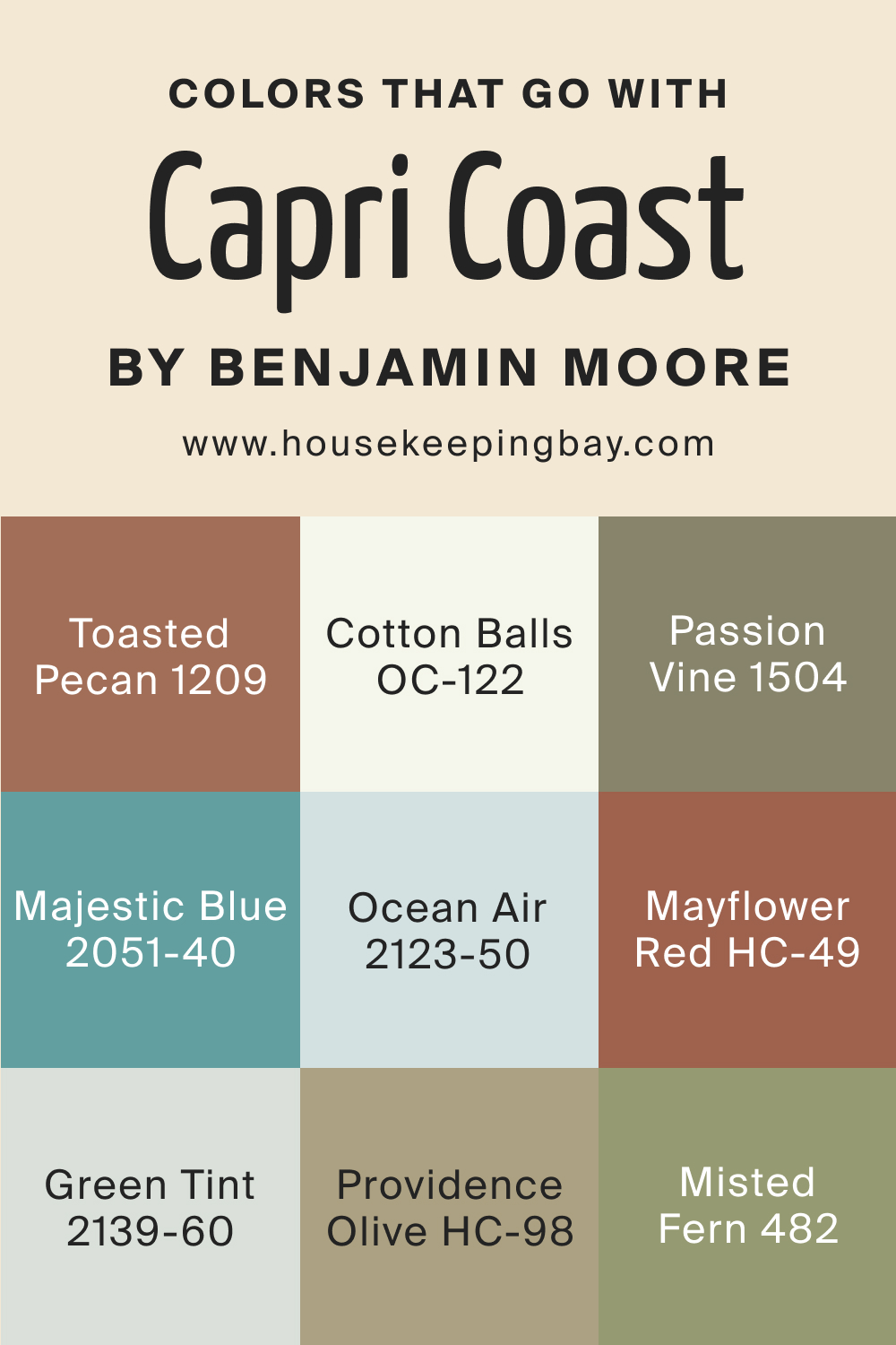
Colors That Go With Capri Coast OC-87
The secret to creating a harmonious room is ensuring that all colors within it complement each other. Using colors that synergize elevates the ambiance, evoking a sense of cohesion and design flair. Alongside Capri Coast OC-87, a range of colors meld seamlessly:
- BM Toasted Pecan 1209 – A rich, woody hue reminiscent of cozy autumn evenings.
- BM Passion Vine 1504 – A muted shade of lavender, lending an air of calm elegance.
- OC-122 Cotton Balls – A pure, airy white; it amplifies Capri Coast’s tranquility.
- BM Ocean Air 2123-50 – This is a breezy pale blue, resonating with the freshness of seaside mornings.
- BM Majestic Blue 2051-40 – A deeper, royal blue adding depth and contrast.
Supplementary colors to consider include:
HC-49 Mayflower Red
Pairing Capri Coast with HC-49 Mayflower Red creates a striking contrast that exudes both tranquility and warmth. Capri Coast’s serene tones balance out the richness and depth of Mayflower Red, making it an ideal combination for those looking to evoke coastal vibes with a touch of traditional elegance.
BM Green Tint 2139-60
When paired with BM Green Tint 2139-60, Capri Coast accentuates the soft and muted quality of the green tint. This combination creates a palette reminiscent of early spring mornings or serene beach landscapes. Ideal for open spaces, bedrooms, or bathrooms, these colors together establish a relaxed and harmonious environment.
HC-98 Providence Olive
HC-98 Providence Olive is a sophisticated, deep olive green with earthy undertones. When juxtaposed with Capri Coast, the resultant effect is grounded yet breezy. Capri Coast lightens the mood, preventing Providence Olive from feeling too heavy, making it a suitable blend for studies, lounges, or even exteriors where one desires a connection with nature.
BM Misted Fern 482
Combining Capri Coast with BM Misted Fern offers a seamless transition between colors. Misted Fern, with its soft, muted green tones, complements the serenity of Capri Coast. It’s an excellent choice for spaces that aim for a natural, calming aesthetic, such as sunrooms, bedrooms, or meditation spaces.
housekeepingbay.com
How to Use Capri Coast OC-87 in Your Home?
Capri Coast OC-87 exudes an air of refreshing serenity. Its muted tones can be embraced in various rooms, such as bedrooms, bathrooms, living areas, and even exteriors. Its versatility complements contemporary, coastal, minimalist, and even farmhouse interior styles. Its light reflection uplifts spaces, making it an excellent choice for rooms that need brightness.
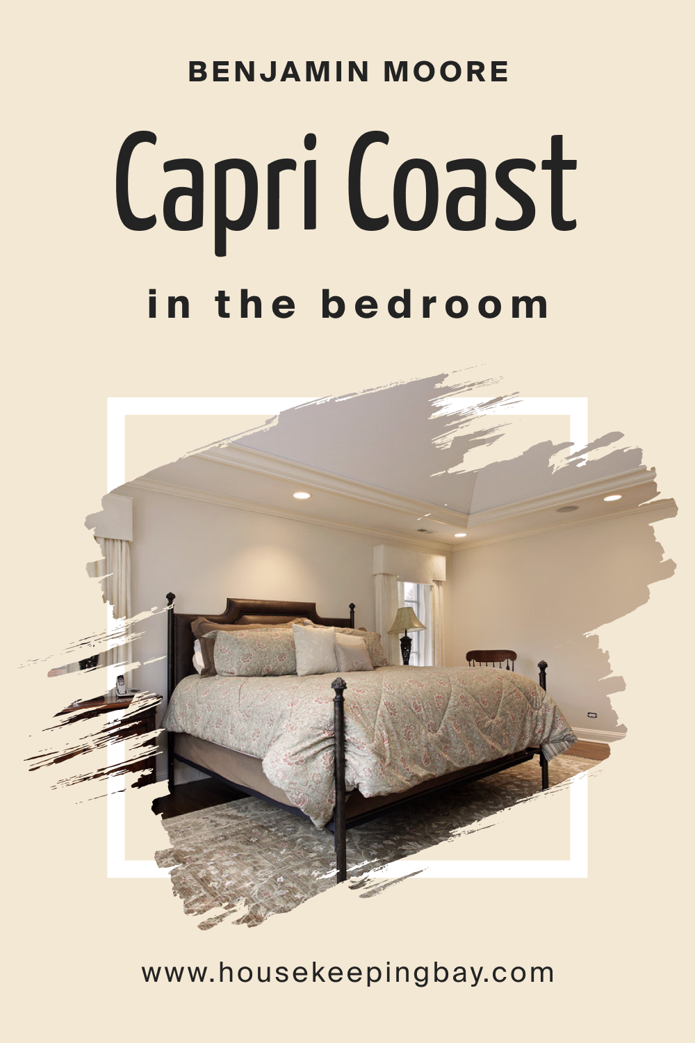
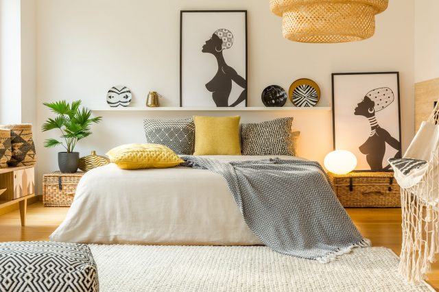
Coast OC-87 Paint Color In the Bedroom
The soft, serene shade of Capri Coast OC-87 can transform a bedroom into a tranquil sanctuary. The color evokes a feeling of restfulness, reminiscent of serene beach mornings. Complement it with soft blues, whites, and driftwood accents for a coastal feel, or blend with neutrals for a modern minimalist appeal.
housekeepingbay.com
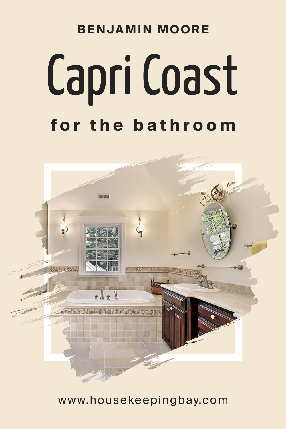
Coast OC-87 Paint Color In the Bathroom
Elevate your bathroom into a spa-like haven using Capri Coast OC-87. Its calming effect, paired with white fixtures and natural wood or stone, can create a refreshing retreat. Accent with marine-inspired accessories for a complete coastal ambiance.
housekeepingbay.com
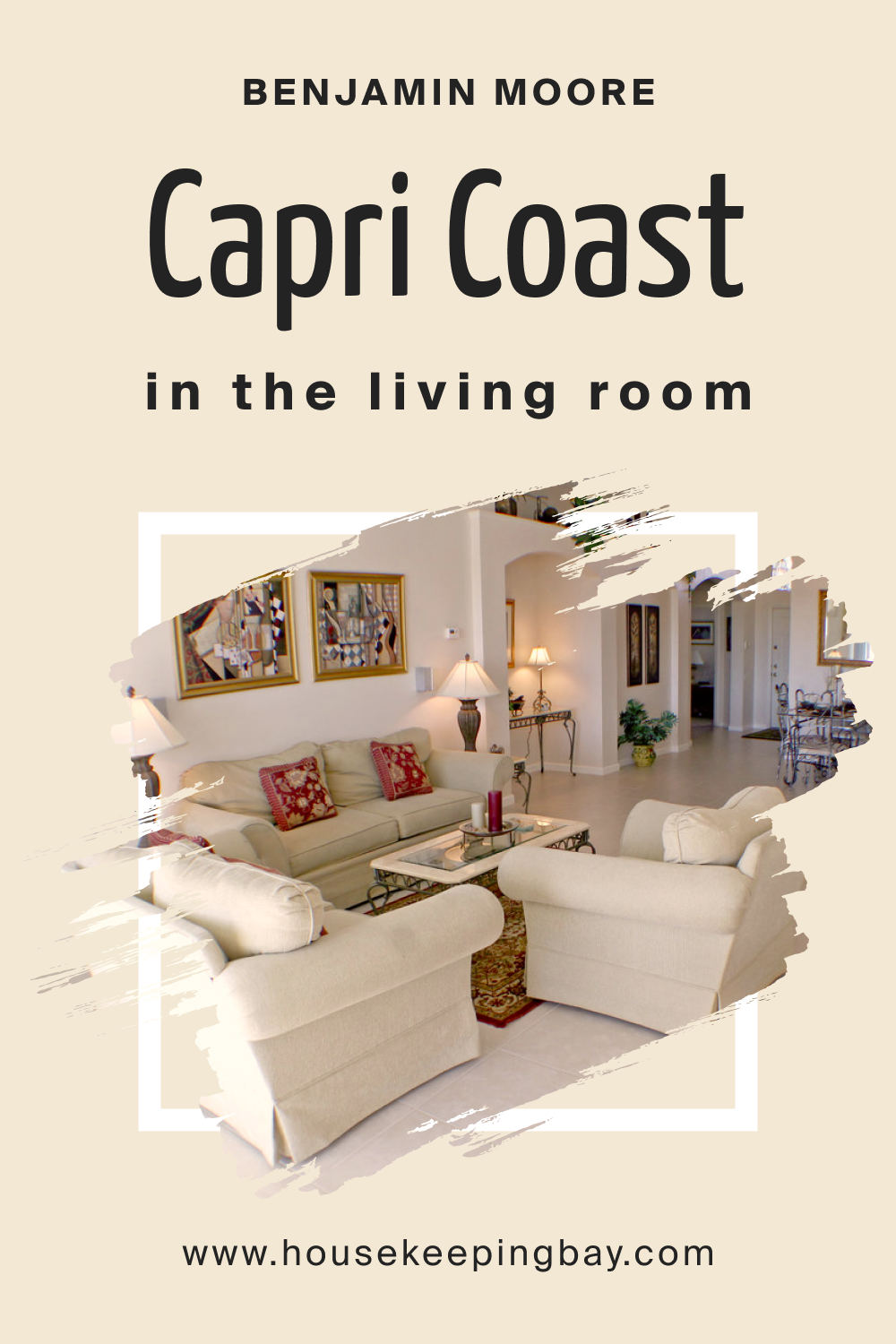
Coast OC-87 Paint Colo In the Living Room
For a light, airy feel in your living room, opt for Capri Coast OC-87. This color brings warmth and elegance when paired with soft furnishings and decor. Complement with creams, tans, and muted blues for a harmonious feel. Incorporate textures like jute or linen to enhance its organic touch.
housekeepingbay.com
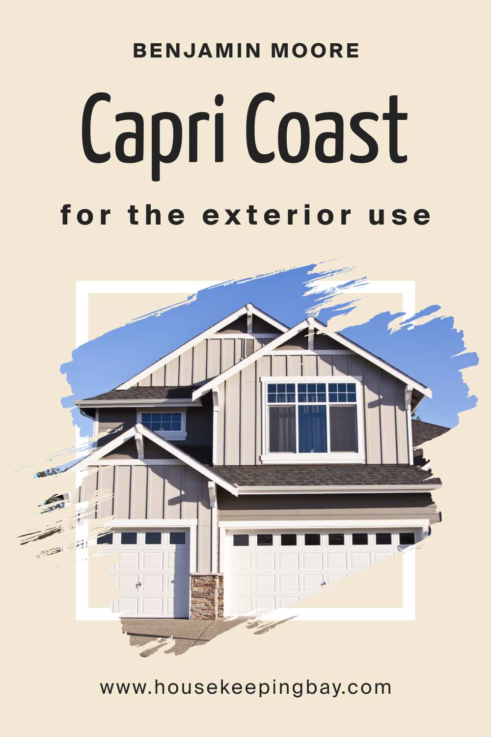
Coast OC-87 Paint Color For an Exterior
Capri Coast OC-87 makes for a sophisticated exterior choice, especially for coastal or cottage-style homes. It stands out beautifully against lush green landscapes, offering a timeless curb appeal. Pair with crisp white trim or soft gray accents to highlight architectural features.
housekeepingbay.com
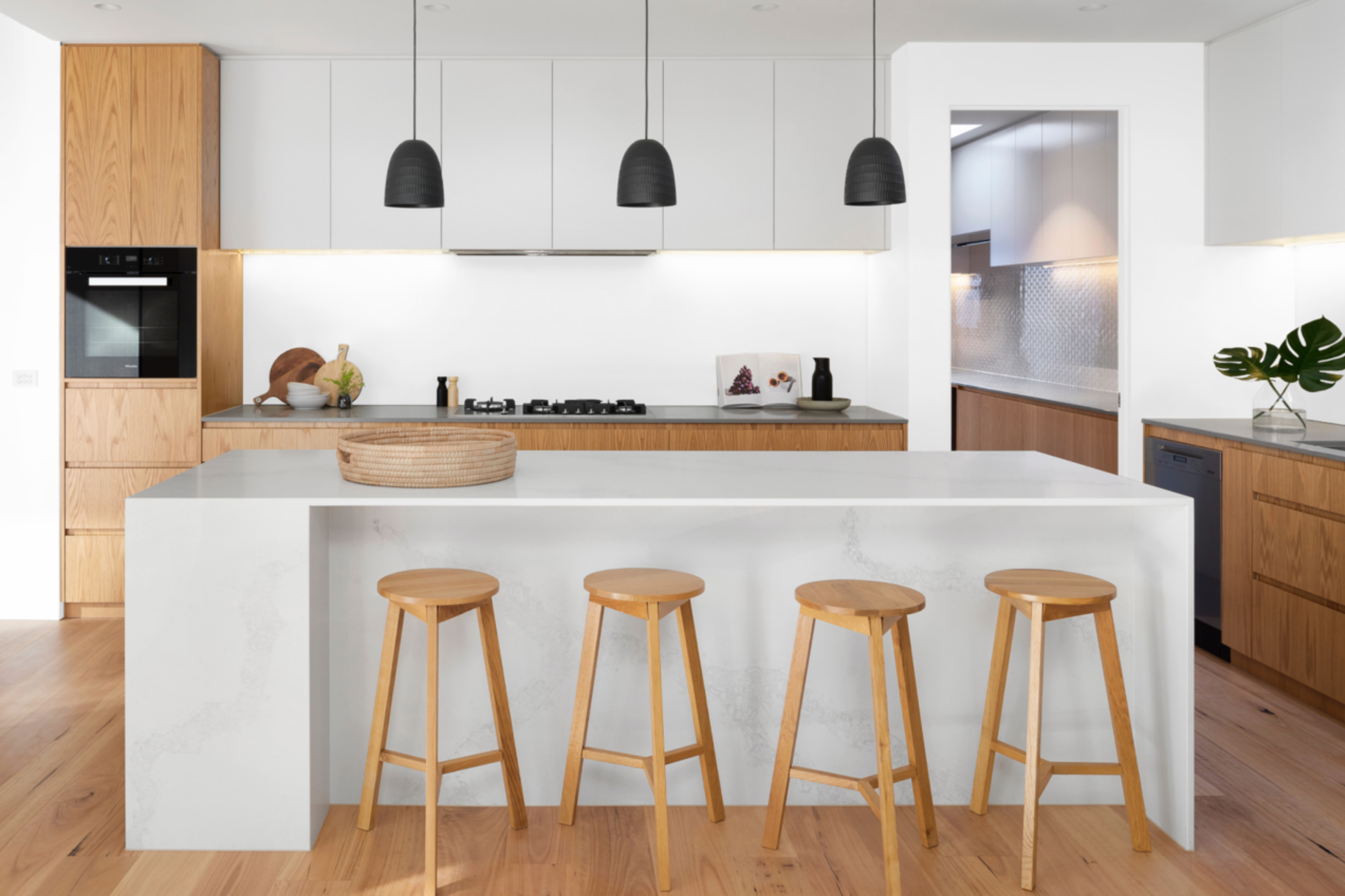
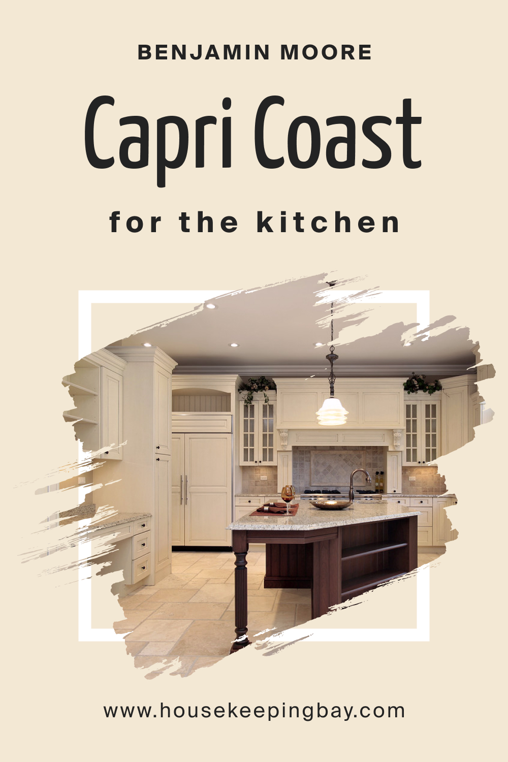
Coast OC-87 Paint Color In the Kitchen
Brighten your kitchen space with Capri Coast OC-87. Its light-reflective properties can make a kitchen feel more expansive and welcoming. To ground the space, pair with darker wooden floors, stainless steel appliances, and neutral countertops. The color sets a pristine backdrop for open shelving and decor.
housekeepingbay.com
Comparing Capri Coast OC-87 With Other Colors
Understanding the nuance in paint colors is vital for achieving the desired atmosphere in any space. By comparing different colors, you can discern the subtle undertones, brightness levels, and emotional resonances each shade brings, ensuring your final choice aligns with your design intent.
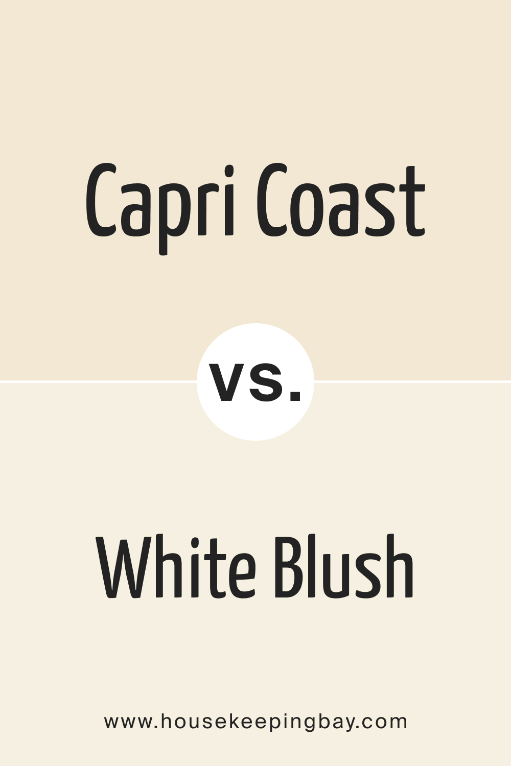
Capri Coast OC-87 vs. OC-86 White Blush
While both paints belong to the lighter spectrum, Capri Coast OC-87 leans more towards coastal tranquility with hints of muted blues. In contrast, OC-86 White Blush offers a hint of a warm pink undertone, making spaces feel soft and romantic.
housekeepingbay.com
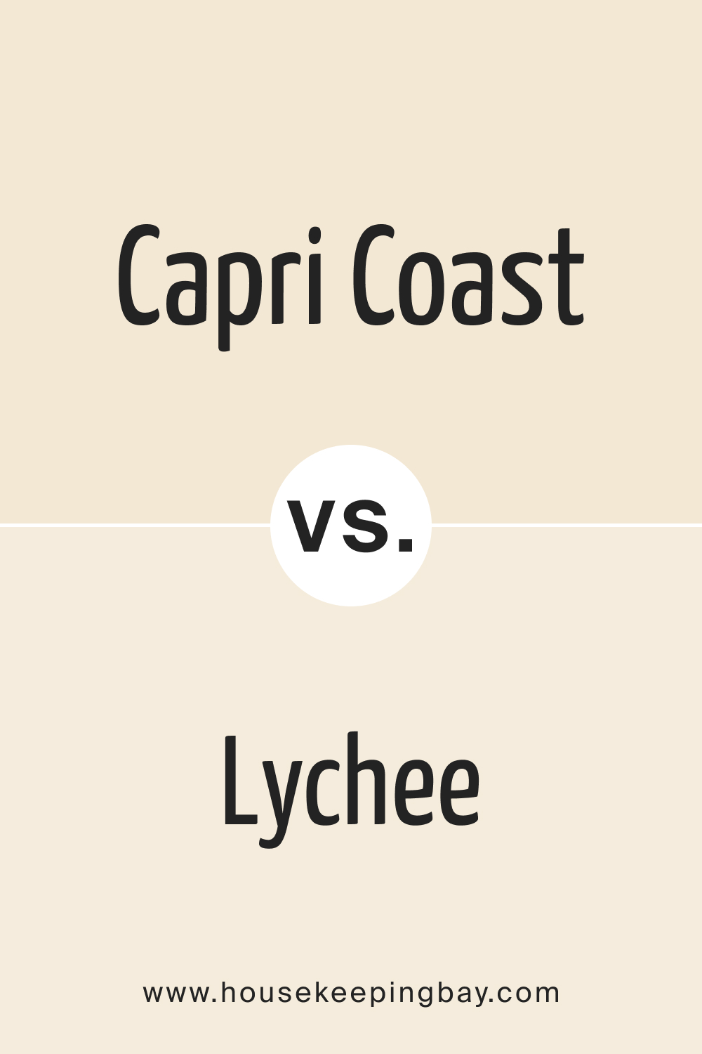
Capri Coast OC-87 vs. AF-40 Lychee
AF-40 Lychee is a warmer, more robust hue with a pinkish undertone. Compared to the calming serenity of Capri Coast, Lychee introduces a touch of energy and warmth, ideal for rooms needing a cozier atmosphere.
housekeepingbay.com
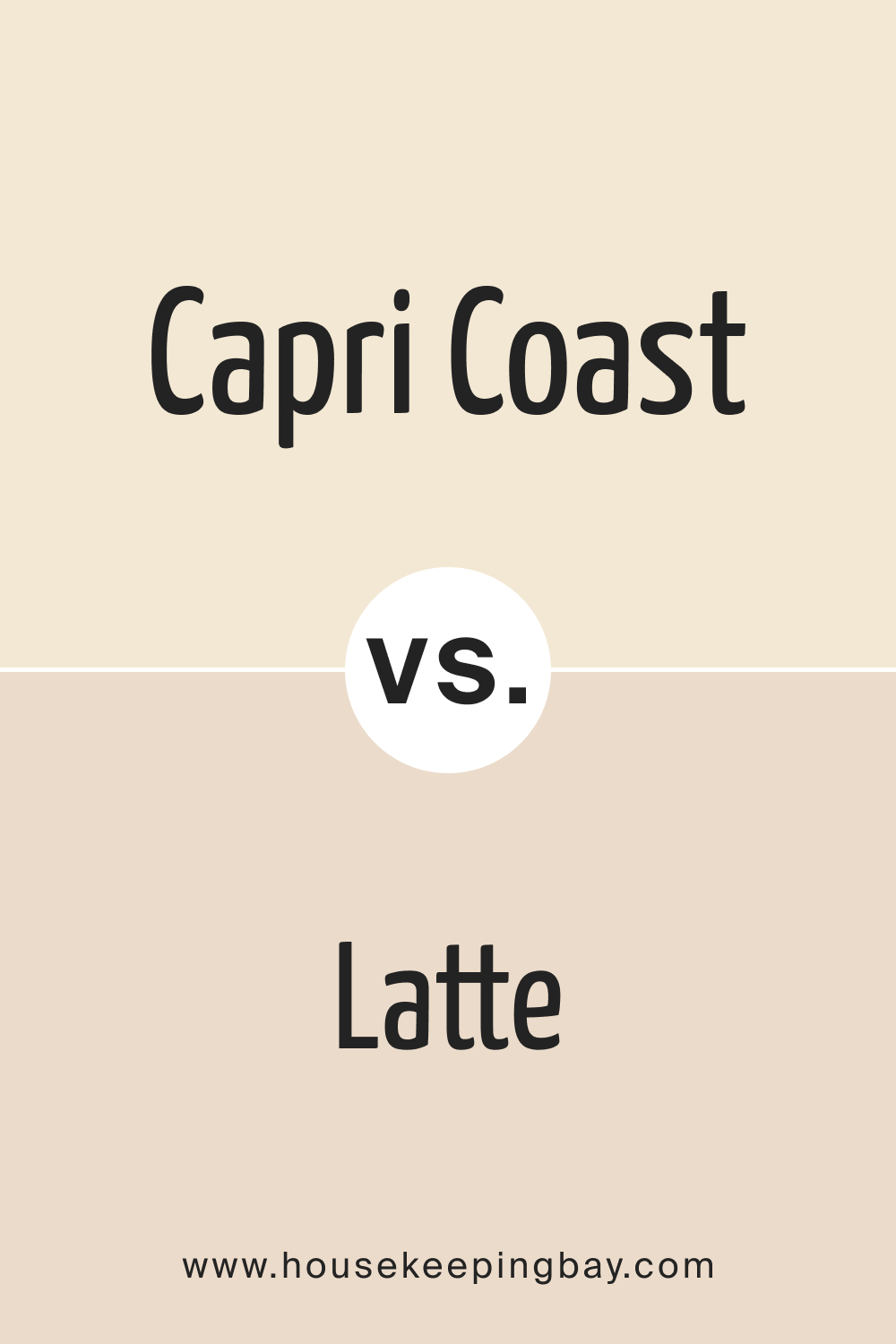
Capri Coast OC-87 vs. BM Latte 2163-60
BM Latte is a warm, creamy color reminiscent of a freshly brewed cup of coffee with milk. Next to Capri Coast, BM Latte feels richer and more enveloping, perfect for creating inviting spaces.
housekeepingbay.com
Capri Coast OC-87 vs. BM Everlasting 1038
BM Everlasting evokes feelings of sunny afternoons with its brighter, cheerful character. When juxtaposed with Capri Coast’s subdued calmness, it brings forward a lively, youthful vibe.
housekeepingbay.com
Capri Coast OC-87 vs. OC-61 White Diamond
OC-61 White Diamond shines with a brighter, crisper white tone. In comparison, Capri Coast’s muted hues create a more relaxed atmosphere, while White Diamond offers a clean, contemporary feel.
housekeepingbay.com
Capri Coast OC-87 vs. BM Crisp Khaki 234
BM Crisp Khaki introduces an earthy, grounded presence. Its neutral undertones starkly contrast Capri Coast’s airy quality, making it more suitable for spaces looking to exude a rustic or organic touch.
housekeepingbay.com
Conclusion
Capri Coast OC-87, with its tranquil and muted tones, encapsulates the serene essence of coastal landscapes. Its versatility enables it to harmonize effortlessly with a myriad of colors, from deep, earthy hues to soft pastels. When used in any space, whether interior or exterior, it brings forth a sense of calm, evoking memories of gentle sea breezes and soft sand underfoot.
In the realm of paints, Capri Coast stands out as a timeless choice for those looking to infuse their environment with a touch of peaceful elegance.
housekeepingbay.com
Ever wished paint sampling was as easy as sticking a sticker? Guess what? Now it is! Discover Samplize's unique Peel & Stick samples. Get started now and say goodbye to the old messy way!
Get paint samples


Frequently Asked Questions
⭐What kind of undertones does Capri Coast OC-87 have?
Capri Coast OC-87 is an off-white shade that boasts subtle sandy and peachy undertones. These undertones lend the color its warmth and depth, making it a serene and inviting hue reminiscent of coastal landscapes.
⭐Is Capri Coast OC-87 more suitable for modern or traditional interiors?
Due to its versatility, Capri Coast OC-87 is ideal for both modern and traditional interiors. Its neutral base allows it to seamlessly blend with contemporary designs, while its warm undertones resonate well with more classic or rustic decors.
⭐How does Capri Coast OC-87 appear under artificial lighting?
Under artificial lighting, especially incandescent lights, the peachy undertones of Capri Coast are accentuated, giving spaces a cozy ambiance. Cooler lights, like fluorescents, might highlight its sandy undertones, presenting a slightly neutral appearance.
⭐Would Capri Coast OC-87 be suitable for an exterior setting?
Absolutely! Capri Coast OC-87, with its neutral yet warm palette, can be an excellent choice for exteriors. It can capture the elegance of coastal homes or be used to give a refined touch to urban exteriors.
⭐Can I pair Capri Coast OC-87 with bold colors, or should I stick to neutrals?
While Capri Coast OC-87 pairs beautifully with neutrals, its subtle undertones also allow it to complement bolder colors. Whether you're aiming for a muted, harmonious palette or seeking a neutral backdrop against which bold colors can pop, Capri Coast offers the flexibility to achieve both.
12 thoughts on “Capri Coast OC-87 Paint Color by Benjamin Moore”
Leave a Reply


How does this color fare in direct sunlight?
Like all colors, direct sunlight can impact its appearance. However, Capri Coast holds well and can exude a warm glow in sunlit spaces.
What’s the best finish for this color in a bathroom?
A semi-gloss or satin finish is recommended for bathrooms due to their moisture-resistant properties.
Does it look good under artificial lighting?
Capri Coast maintains its charm under various lighting conditions, though artificial lights may bring out its undertones differently.
Is it easy to pair with wood furniture?
Yes, Capri Coast complements various wood tones, from light pine to rich mahogany, accentuating their natural beauty.
Can this color work for a nursery?
Absolutely! Its calm and serene nature makes it an excellent choice for a soothing nursery environment.
Is Capri Coast OC-87 more blue or green?
Capri Coast leans more towards a muted blue, giving it a tranquil coastal feel rather than a green undertone.