Beachcomber SW 9617 Paint Color by Sherwin-Williams
A Comprehensive Look
Sherwin-Williams offers a plethora of exquisite shades, one of which is SW 9617 Beachcomber. This shade has garnered much attention due to its versatility and unique appeal. In this article, we will delve deep into its character, explore its undertones, and find out how it harmonizes with other colors and lights.
via sherwin-williams.com
What Color Is SW 9617 Beachcomber?
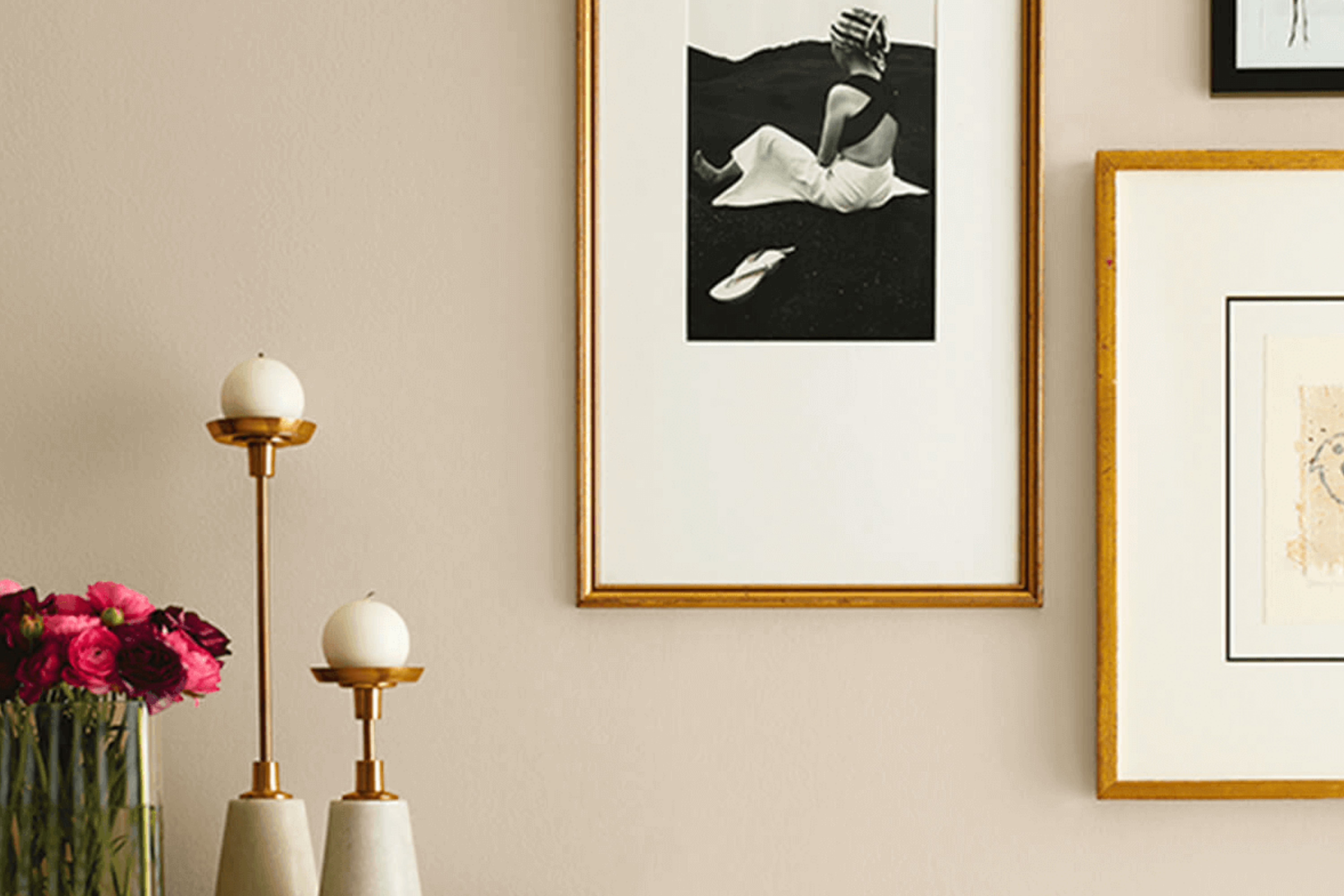
SW 9617 Beachcomber paints a vivid image of a quiet shoreline stroll. With its muted sandy quality, it is reminiscent of the shores where the waves gently caress the beach. It’s a sophisticated neutral, exuding both elegance and warmth.
In terms of interior styles, it seamlessly blends into coastal, contemporary, and even farmhouse decors. Pairing it with raw wooden textures, natural fibers, or even sleek, modern finishes brings out its versatility.
housekeepingbay.com
Table of Contents
Is It a Warm Or Cool Color?
Beachcomber tilts towards the warm spectrum. Its warmth can evoke feelings of coziness and comfort in homes. Warm colors have a way of making spaces feel inviting and intimate, and SW 9617 Beachcomber does precisely that.
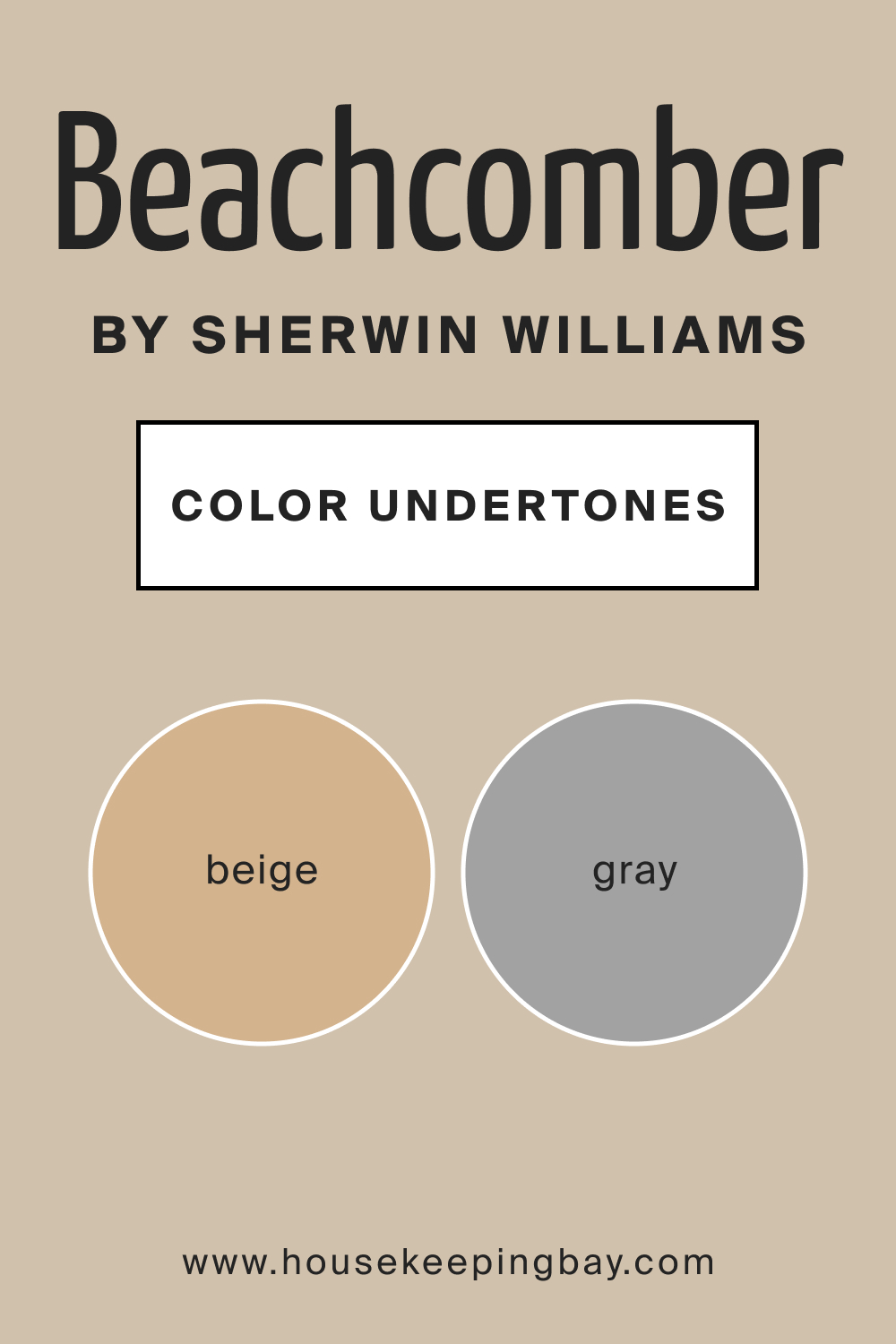
Undertones of SW 9617 Beachcomber
Like most colors, SW 9617 Beachcomber doesn’t stand alone; it has undertones. Its subtle undertones lean towards a soft beige with a hint of gray. Undertones play a crucial role in how a color presents itself, especially under various lighting conditions.
In the case of Beachcomber, its beige undertones allow it to project warmth, while the gray whispers provide balance. On interior walls, these undertones make the paint adaptable, harmonizing with diverse palettes and designs.
housekeepingbay.com
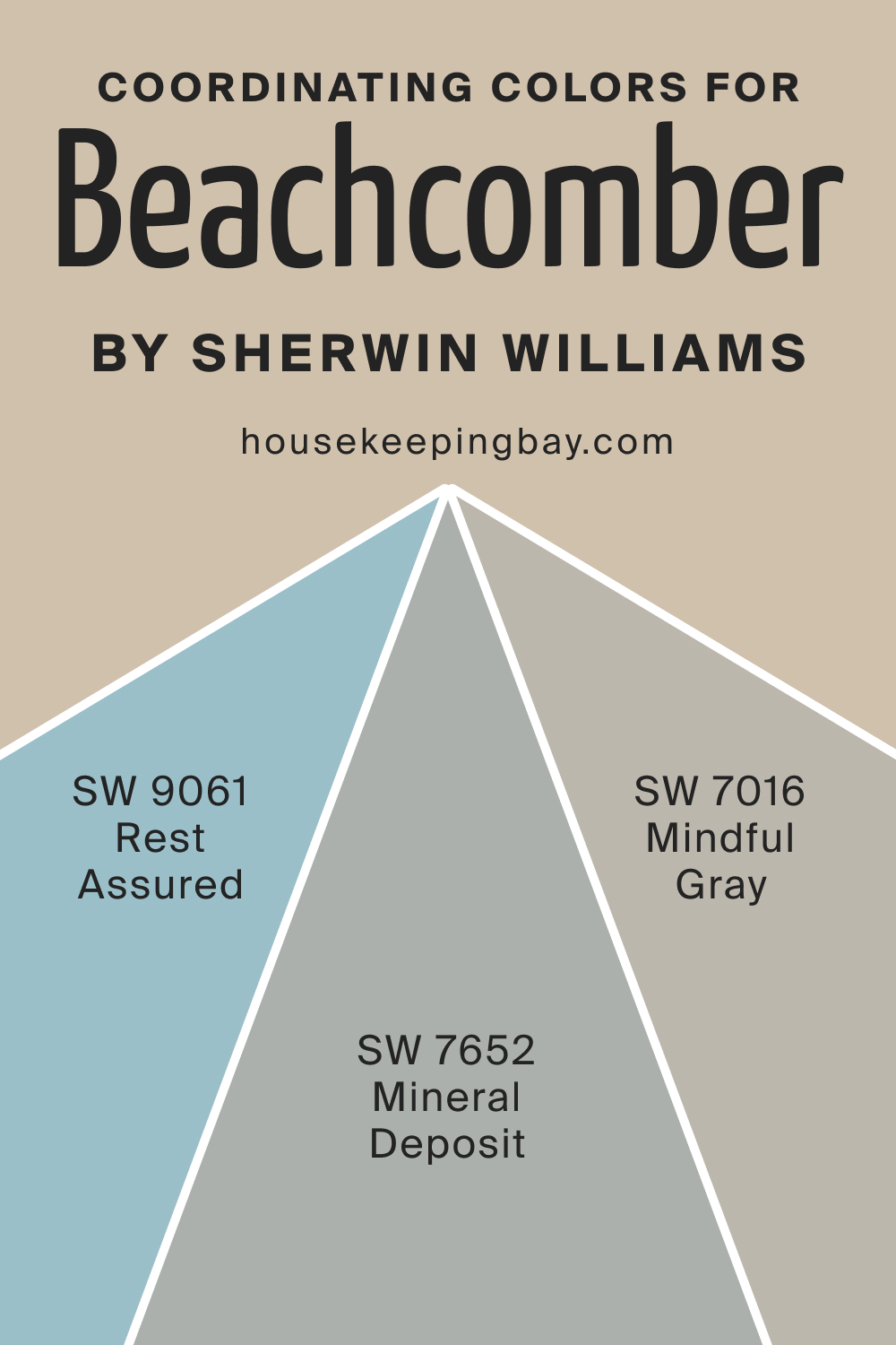
Coordinating Colors of SW 9617 Beachcomber
Coordinating colors are hues that seamlessly blend with the primary shade, amplifying its essence. For SW Beachcomber, think of serene blues, muted greens, and soft grays. These colors, when paired with SW Beachcomber, result in a harmonious palette that is pleasing to the eye.
For example, you might want to consider the following hues:
- SW 9061 Rest Assured
- SW 7652 Mineral Deposit
- SW 7016 Mindful Gray
housekeepingbay.com
How Does Lighting Affect SW 9617 Beachcomber?
Lighting is pivotal when it comes to color perception. In natural light, Beachcomber gleams with a soft glow, exuding its sandy charm. Under artificial light, it takes on a slightly deeper hue, making it perfect for intimate spaces. When it comes to room orientations:
- North-faced rooms, which receive cooler, bluer light, make Beachcomber appear slightly grayer.
- South-faced rooms bathe it in warm light, amplifying its beige tones.
- East-faced rooms with gentle morning light enhance its softness.
- In west-facing rooms, Beachcomber turns richer, especially during sunset.
housekeepingbay.com
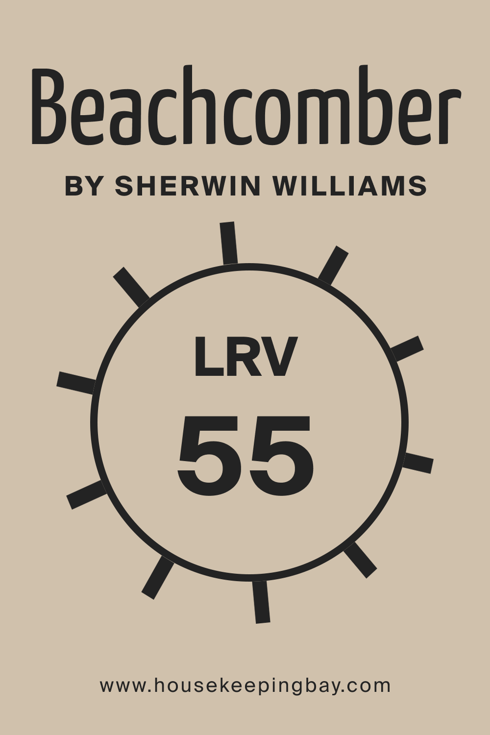
LRV of SW 9617 Beachcomber
Light Reflectance Value (LRV) measures how much light a color reflects. With an LRV of 55, Beachcomber sits in the mid-range. This means it neither absorbs too much light nor reflects excessively, making it perfect for spaces you want to feel balanced. Its LRV value means that while it brightens up a space, it also offers depth, making it a versatile pick for various room sizes.
housekeepingbay.com
What is LRV? Read It Before You Choose Your Ideal Paint Color
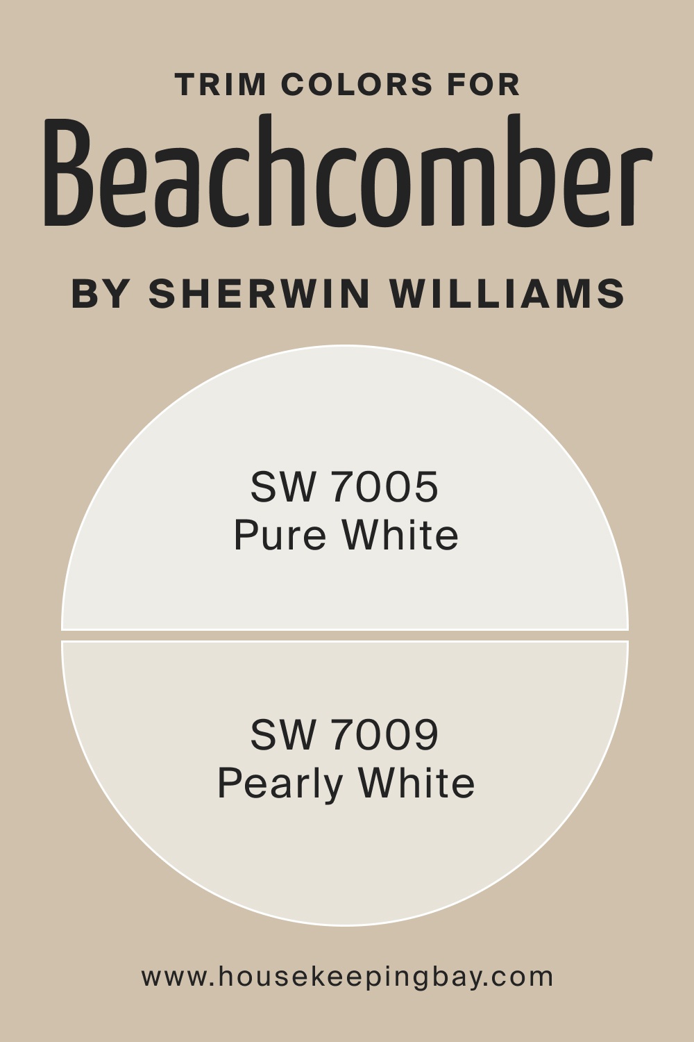
Trim Colors of SW 9617 Beachcomber
Trim colors accentuate and frame wall colors. For Beachcomber, shades of white, such as SW 7005 Pure White and SW 7009 Pearl White, are ideal. These whites contrast yet complement Beachcomber’s sandy warmth.
housekeepingbay.com
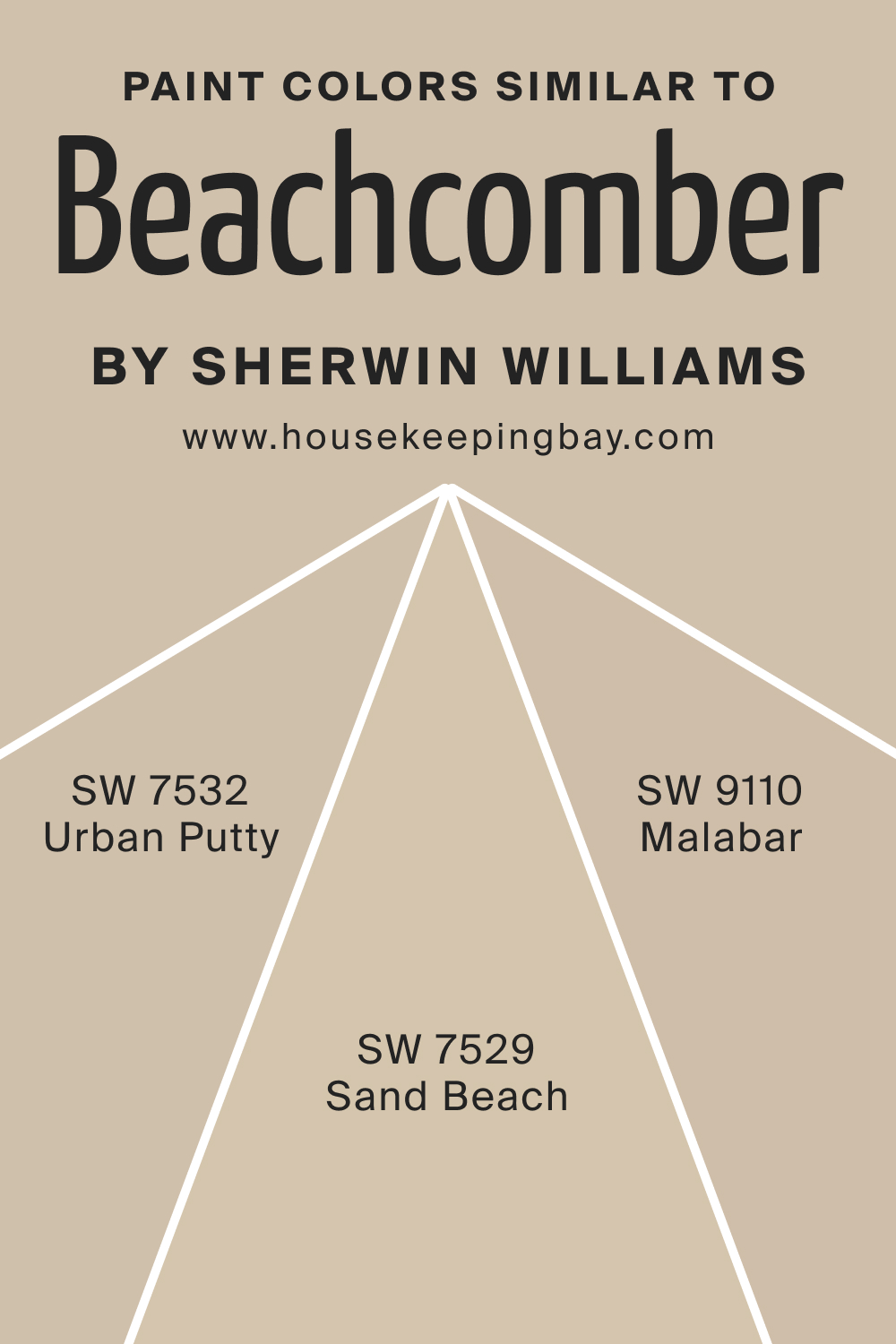
Colors Similar to SW 9617 Beachcomber
Understanding similar shades helps in subtle transitions and achieving design fluidity. Instead of SW 9617 Beachcomber, try out one of these alternative hues:
- SW 7529 Sand Beach : Think of sun-baked shores. It’s slightly sunnier than Beachcomber.
- SW 7532 Urban Putty : This color has a touch more gray, exuding urban sophistication.
- SW 9110 Malabar : A gentle color, Malabar offers a softer, creamier presence.
housekeepingbay.com
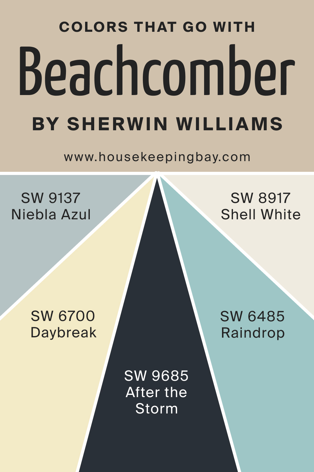
Colors That Go With SW 9617 Beachcomber
Harmonizing colors creates a cohesive aesthetic. Along with SW Beachcomber, consider using the following paint colors to achieve a harmonious palette in your home:
- SW 9685 After the Storm : A muted purple, symbolizing quiet introspection.
- SW 6700 Daybreak : A bright yellow-green echoing the first light of day.
- SW 6485 Raindrop : Soft blue, reminiscent of refreshing rain.
- SW 8917 Shell White : A neutral white with a touch of cream.
- SW 9137 Niebla Azul : A foggy blue, serene and calming.
housekeepingbay.com
How to Use SW 9617 Beachcomber In Your Home?
SW 9617 Beachcomber is a versatile shade that’s apt for numerous rooms in your abode. It fits seamlessly into spaces like bedrooms, living rooms, and bathrooms. Its warm undertones allow it to gel well with coastal, contemporary, and farmhouse interior styles. The color’s neutral essence makes it adaptable to both spacious and compact rooms, serving as a serene backdrop or a defining statement.
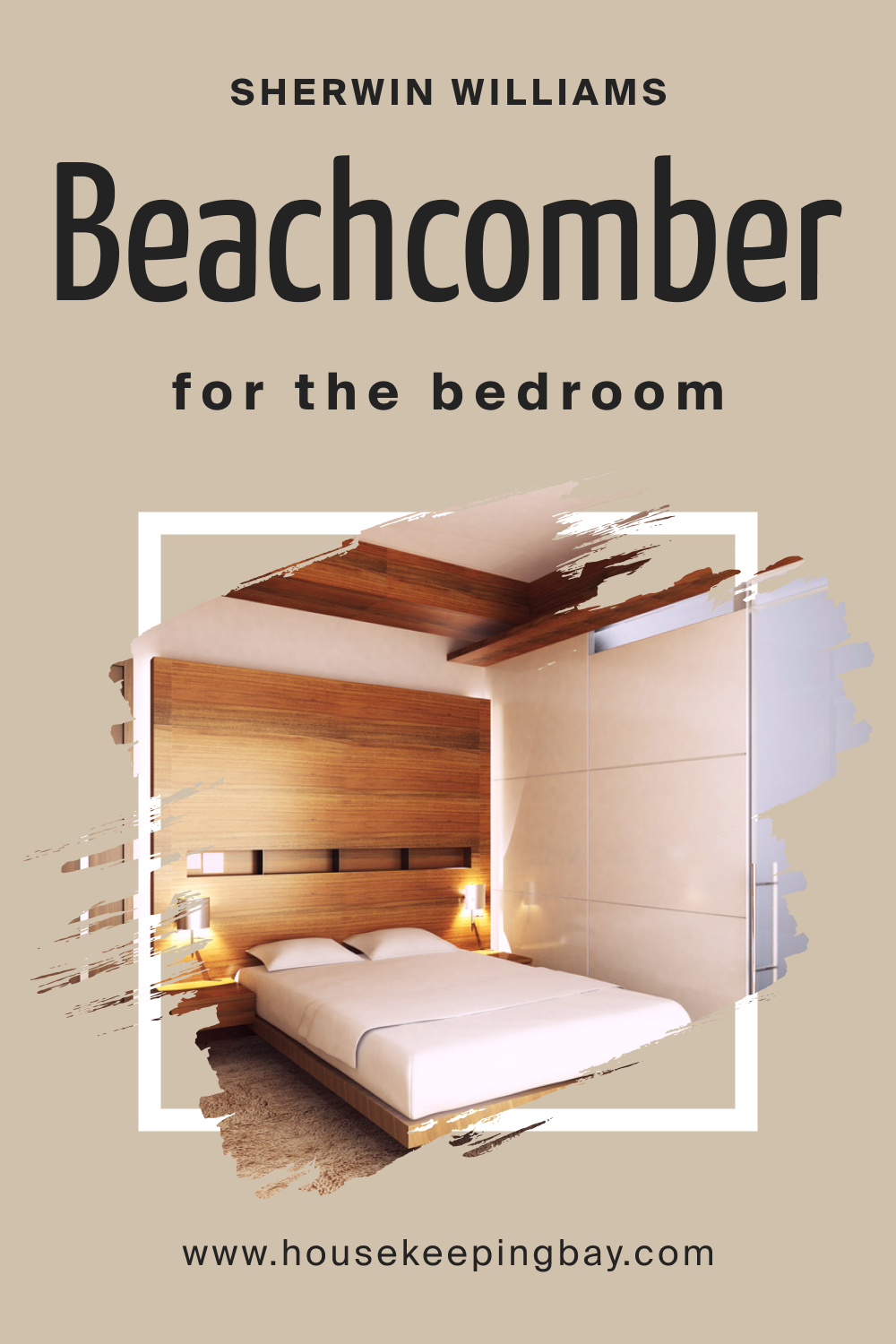
How to Use SW 9617 Beachcomber in the Bedroom?
The calming undertones of Beachcomber make it perfect for bedrooms. It evokes a sense of tranquility and relaxation, conducive for restful slumbers. Pair it with soft linens, natural wood furniture, and gentle lighting. Add touches of blues and greens for a serene coastal ambiance or muted metallics for a modern touch.
housekeepingbay.com
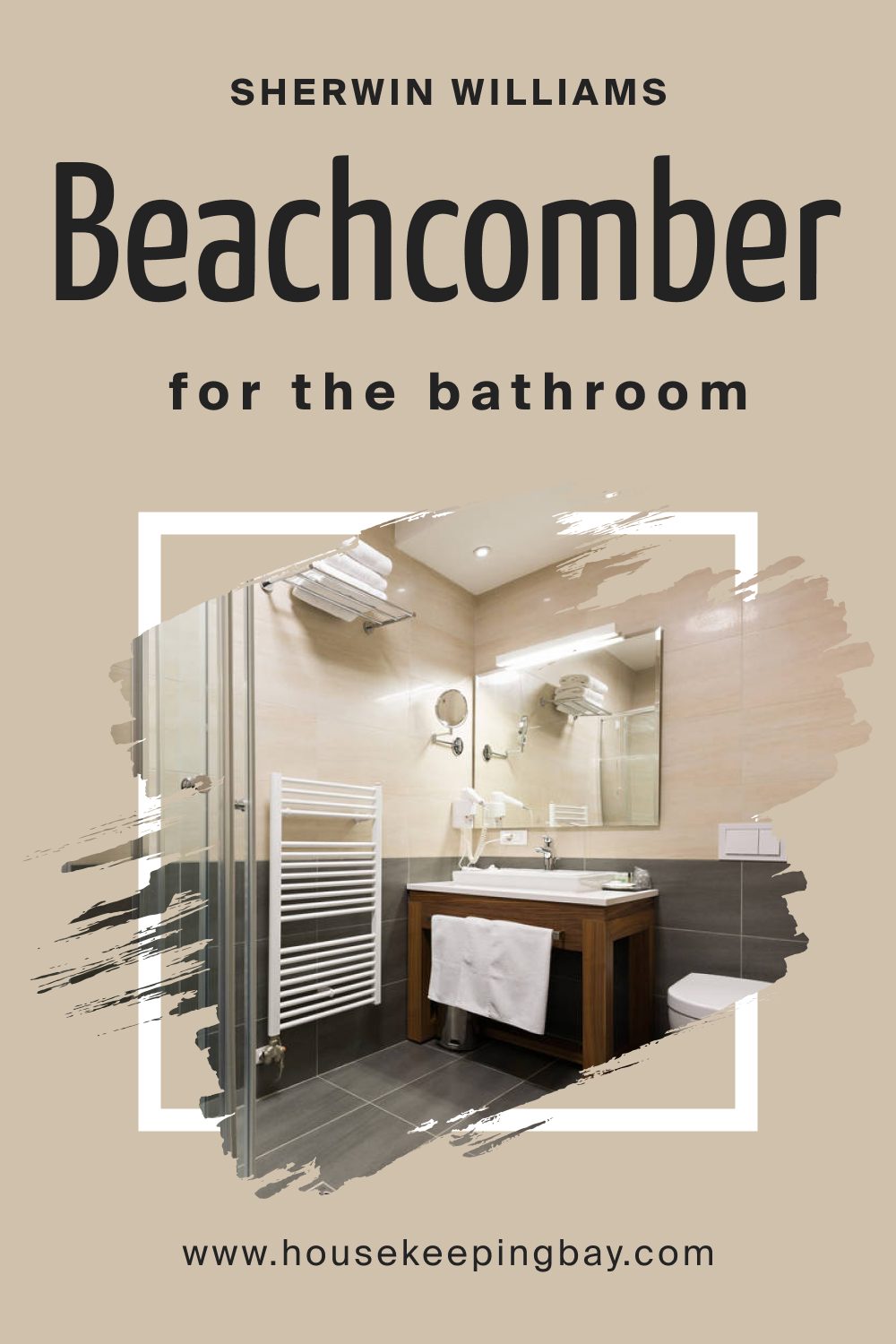
How to Use SW 9617 Beachcomber in the Bathroom?
In the bathroom, Beachcomber shines as a muted oasis. Use it to create a spa-like ambiance. Pair with light tiles, bamboo or wooden accessories, and plants. Its neutrality balances both stark whites of fixtures and the richer textures of natural stone or wood.
housekeepingbay.com
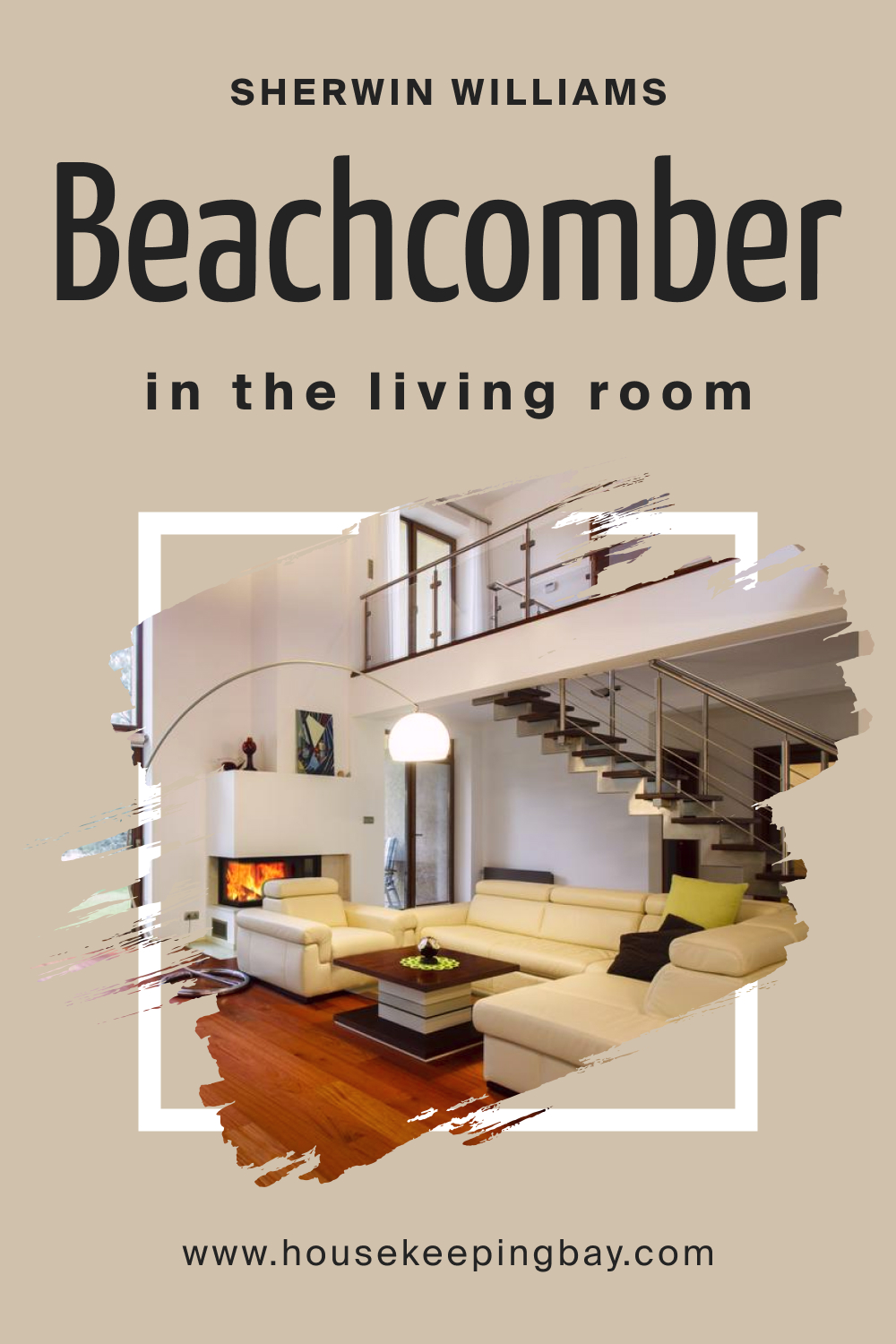
How to Use SW 9617 Beachcomber in the Living Room?
The living room becomes a cozy haven with Beachcomber. Its warmth envelops guests and family alike. Accent with rich earth tones or contrasting cool hues. Plush fabrics, rustic wood elements, or contemporary metal fixtures all harmonize with this shade, creating a cohesive yet dynamic gathering space.
housekeepingbay.com
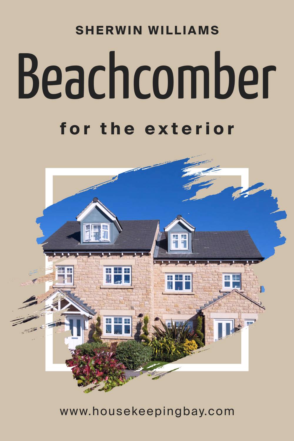
How to Use SW 9617 Beachcomber for an Exterior?
SW Beachcomber serves as a sophisticated choice for exteriors. Its warm neutral shade resonates with natural surroundings, making homes blend seamlessly with landscapes. Whether for coastal, modern, or classic architectural styles, this shade provides a timeless appearance. Pair with white or gray trims for a finished look.
housekeepingbay.com
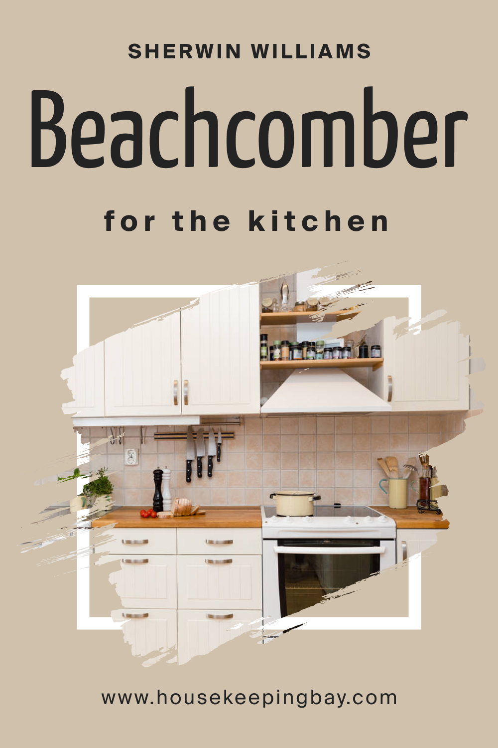
How to Use SW 9617 Beachcomber in the Kitchen?
In kitchens, SW Beachcomber can be the canvas upon which culinary adventures unfold. Its muted sand-like quality pairs well with marble countertops, stainless steel appliances, and wooden details. With open shelving, the color highlights displayed dishes, plants, and kitchen decor, ensuring the space is both functional and stylish.
housekeepingbay.com
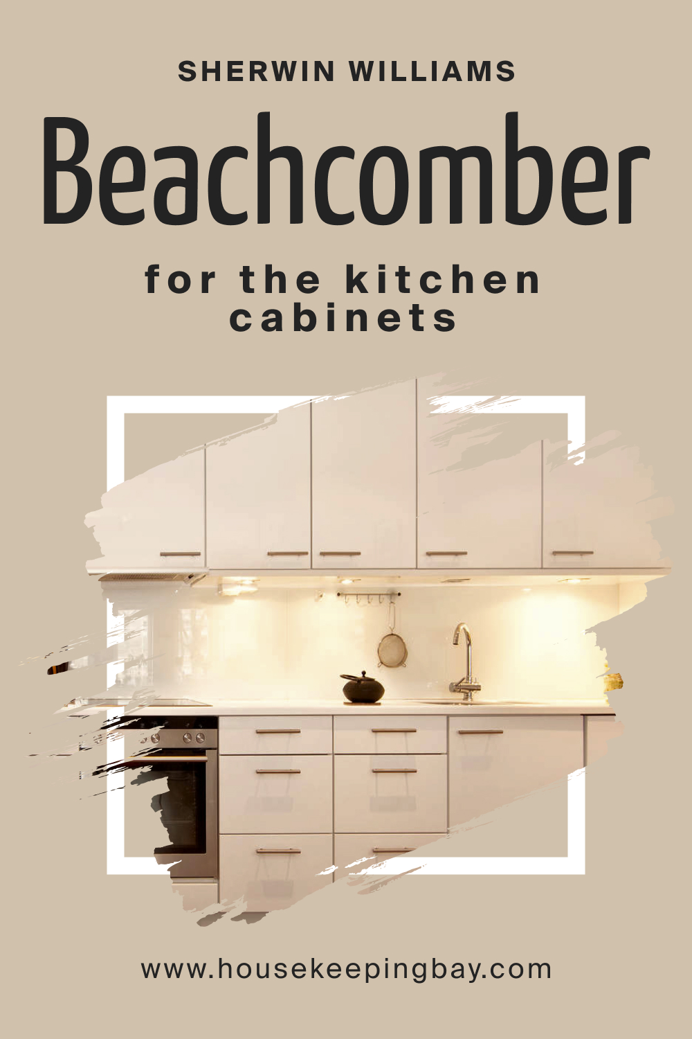
How to Use SW 9617 Beachcomber for the Kitchen Cabinets?
Kitchen cabinets coated in Beachcomber transform into stylish, contemporary storage. The color introduces a sophisticated neutrality, allowing for bold countertops or backsplash choices. Hardware in matte black, brushed nickel, or gold creates varied looks, from modern to classic, amplifying the cabinet’s visual appeal.
housekeepingbay.com
Comparing SW 9617 Beachcomber With Other Colors
Comparing different colors is pivotal in understanding their nuances, undertones, and overall appeal in various contexts. No color exists in isolation; its character often shines through in relation to others. By contrasting hues, one can gauge their versatility, mood-evoking capacity, and compatibility with various design aesthetics. It aids in informed decision-making when curating palettes for interiors or exteriors, ensuring harmonious spaces.
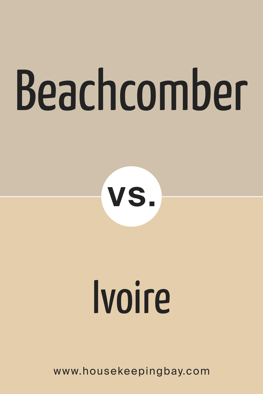
SW 9617 Beachcomber vs. SW 6127 Ivoire
SW Ivoire presents a creamy beige profile , subtly brighter than Beachcomber. While Beachcomber reminds one of muted sandy shores, Ivoire is reminiscent of delicate ivory. Beachcomber offers a slightly muted, serene ambiance, whereas Ivoire leans towards a cheerful, warmer side of neutrals.
housekeepingbay.com
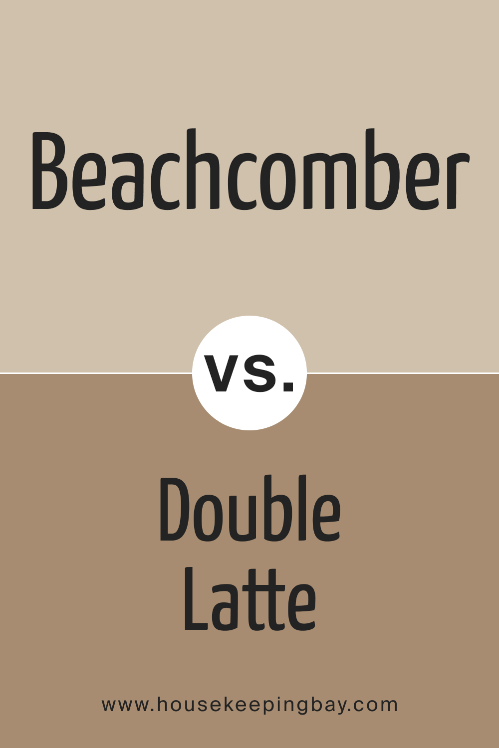
SW 9617 Beachcomber vs. SW 9108 Double Latte
SW Double Latte is a rich, milky brown with cozy warmth. In comparison, Beachcomber’s sandy neutrality contrasts Double Latte’s deeper, coffee-inspired undertones. Where Beachcomber brings in a coastal calm, Double Latte introduces a caffeinated comfort.
housekeepingbay.com
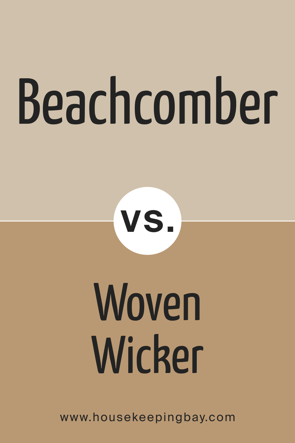
SW 9617 Beachcomber vs. SW 9104 Woven Wicker
SW Woven Wicker , like its name suggests, carries an earthy, woven charm, leaning darker and more rustic than Beachcomber. While both shades hold a warm essence, Woven Wicker’s depth makes it a grounding color, whereas Beachcomber serves as a breezy backdrop.
housekeepingbay.com
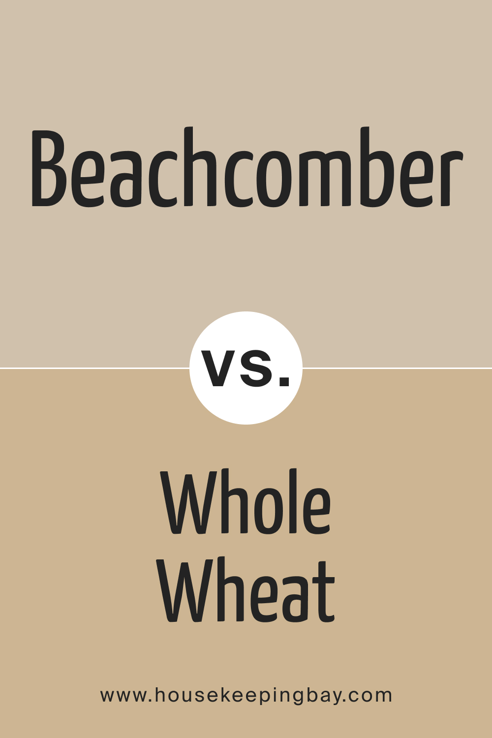
SW 9617 Beachcomber vs. SW 6121 Whole Wheat
SW Whole Wheat is a wholesome beige with a golden undertone. Next to Beachcomber, it gleams with a sunlit glow, presenting a brighter option. While Beachcomber emulates a subdued beach, Whole Wheat conjures images of sunlit fields.
housekeepingbay.com
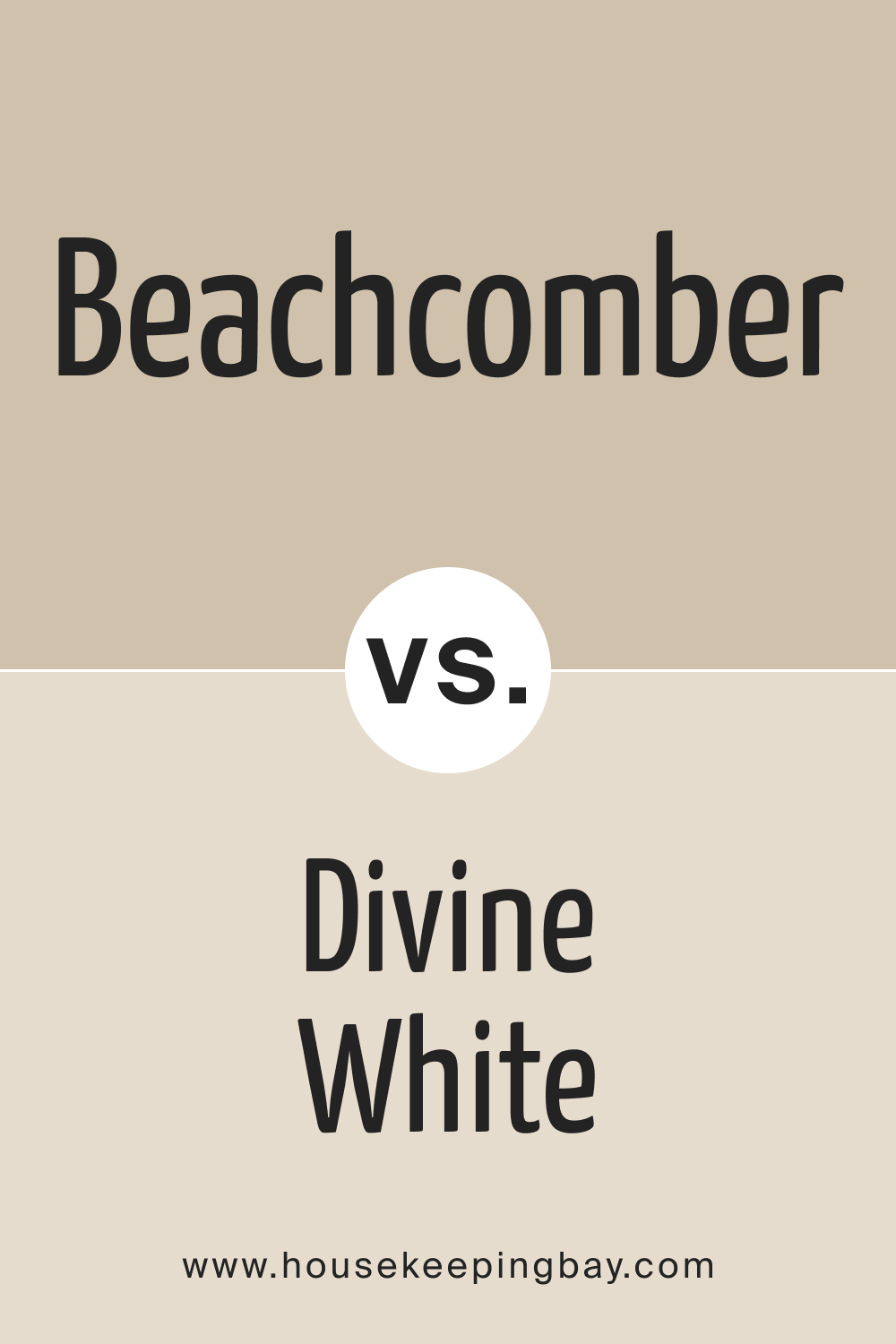
SW 9617 Beachcomber vs. SW 6105 Divine White
SW Divine White is a pristine shade, leaning towards a soft off-white. Its airy lightness starkly contrasts with Beachcomber’s grounded neutrality. Where Beachcomber offers substance and depth, Divine White provides a luminous lift.
housekeepingbay.com
SW 9617 Beachcomber vs. SW 9589 Limewash
SW Limewash is a muted, green-tinted neutral. Placed alongside Beachcomber, it reveals its verdant undertones. While both shades exude calm, Limewash adds a touch of organic freshness, and Beachcomber keeps things warm and beachy.
housekeepingbay.com
Conclusion
Comparing SW 9617 Beachcomber with an array of colors from Sherwin-Williams showcases its versatile nature. Such comparisons not only highlight the distinctiveness of each hue but also enable individuals to visualize and craft spaces that resonate with their aesthetic sensibilities. Beachcomber, with its sandy neutrality, serves as a foundation upon which myriad design stories can be built.
housekeepingbay.com
Ever wished paint sampling was as easy as sticking a sticker? Guess what? Now it is! Discover Samplize's unique Peel & Stick samples. Get started now and say goodbye to the old messy way!
Get paint samples


Frequently Asked Questions
⭐What is the LRV of SW 9617 Beachcomber?
The LRV (Light Reflectance Value) of SW 9617 Beachcomber is 55. This means it's a mid-tone color that can reflect a moderate amount of light.
⭐Is SW 9617 Beachcomber a warm or cool shade?
SW 9617 Beachcomber is primarily a warm shade, making it versatile for various settings and complementary to many decor styles.
⭐What are some coordinating colors for SW 9617 Beachcomber?
Beachcomber pairs well with various hues. Some popular coordinating colors include SW 9685 After the Storm, SW 6700 Daybreak, and SW 6485 Raindrop.
⭐Can I use SW 9617 Beachcomber for exteriors?
Yes, SW 9617 Beachcomber is a versatile shade suitable for both interiors and exteriors. Its neutral undertone makes it a great choice for a variety of architectural styles.
4 thoughts on “Beachcomber SW 9617 Paint Color by Sherwin-Williams”
Leave a Reply


How does this color compare to more grayish neutrals?
While Beachcomber has a neutral essence, its warmth distinguishes it from more grayish neutrals. It offers a cozier feel compared to cooler, stark gray hues.
Does Beachcomber have any noticeable undertones?
Yes, Beachcomber possesses warm undertones that subtly echo sandy beaches. It’s a neutral but leans more towards a comforting, warm ambiance, reminiscent of serene coastal environments.