Warm Stone SW 7032 by Sherwin Williams
Earthy Elegance with Soft Neutrals
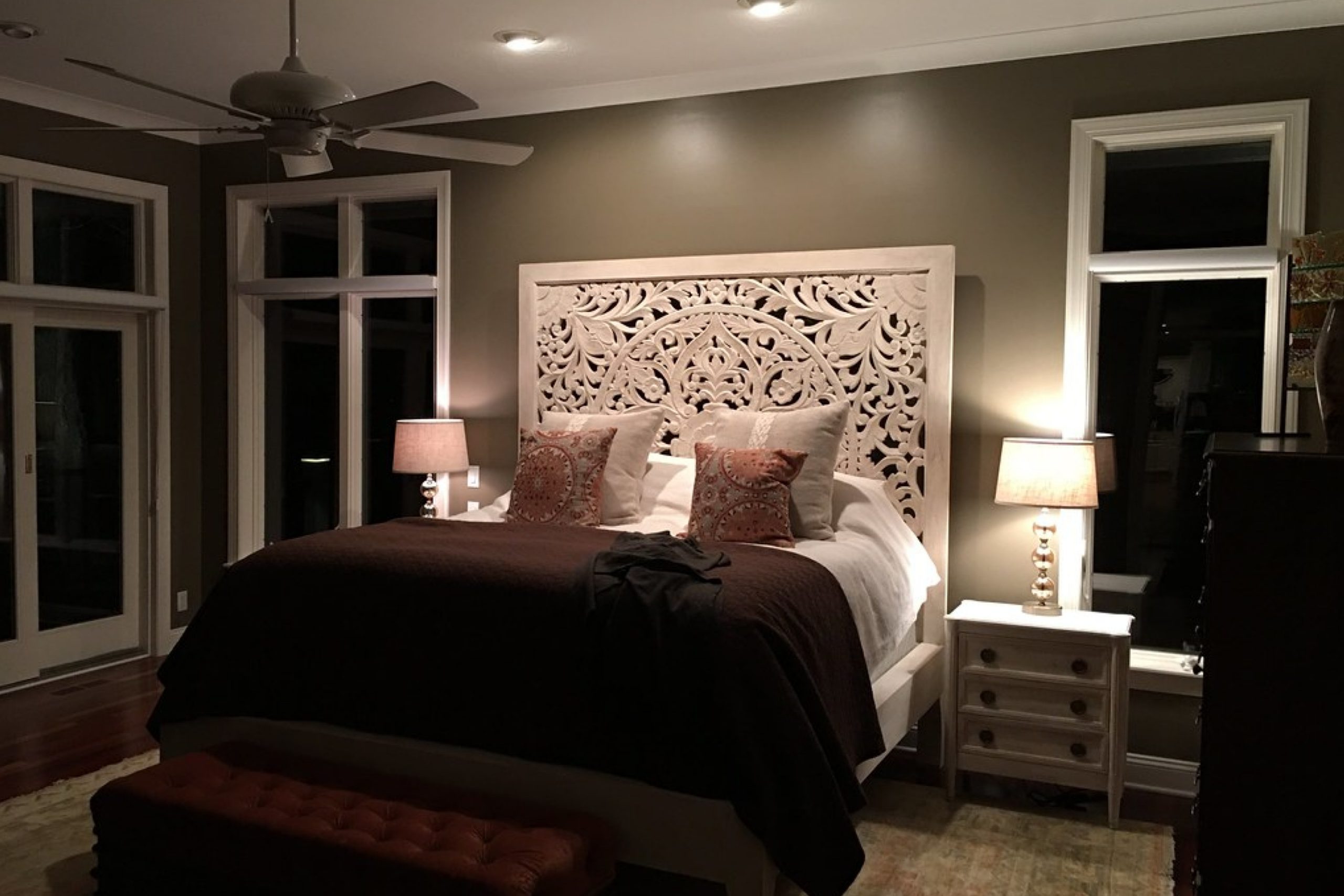
Are you considering a new color for your home or office? SW 7032 Warm Stone by Sherwin Williams might be the perfect shade for you. Warm Stone is a versatile, gentle gray that brings a sophisticated and cozy feel to any space.
Whether you’re updating a living room, bedroom, or even an office, this color provides a subtle warmth that pairs beautifully with a wide range of decor styles.
Since Warm Stone is a neutral color, it serves as an excellent backdrop for both bold and soft color palettes. It works particularly well with natural elements like wood and stone, enhancing the textures without overwhelming them.
For those of you who enjoy a bit of color, it also complements brighter accents like blues, greens, or even yellows, allowing you to personalize your space effortlessly.
One of the best things about Warm Stone is its adaptability. It fits well in many different settings, from modern to rustic, and everything in between. It’s a color that will help you create a welcoming atmosphere where you can relax and feel at home. If you’re thinking about repainting, consider SW 7032 Warm Stone for a look that is both fresh and timeless.
via flickr.com
What Color Is Warm Stone SW 7032 by Sherwin Williams?
Warm Stone SW 7032 by Sherwin Williams is a versatile and rich color that adds depth and warmth to any space. This hue is a blend of gray and beige, making it a perfect neutral that provides a cozy and inviting atmosphere. The muted earthiness of Warm Stone makes it ideal for pairing with a variety of materials and textures.
In terms of interior styles, Warm Stone works exceptionally well in rustic and modern farmhouse settings due to its natural, understated charm. It also complements industrial and contemporary designs, offering a soft contrast to metal finishes and sleek furnishings. This color can anchor a room by providing a solid, neutral background that allows other elements to shine.
Materials that pair well with Warm Stone include natural wood, which enhances the cozy feel of the color. Leather and wool textures also work beautifully with this shade, adding layers of warmth and comfort to the environment. For a more refined look, combine it with polished metals like brass or copper to create a sophisticated palette.
Overall, Warm Stone SW 7032 is a practical and appealing choice for those looking to create a serene yet refined space. Its adaptability with various materials and interior styles makes it a go-to color for designers aiming to create a harmonious and welcoming environment.
housekeepingbay.com
Is Warm Stone SW 7032 by Sherwin Williams Warm or Cool color?
Warm Stone SW 7032 by Sherwin Williams is a rich, neutral color that blends gray and beige tones, commonly known as “greige.” Its versatility makes it an excellent choice for many areas in a home. The balanced nature of Warm Stone means it pairs well with a variety of decor styles and other colors.
This shade can serve as a calming backdrop in bustling kitchen spaces or create a cozy atmosphere in living rooms. Its warm undertones can make large, open spaces feel more inviting and smaller rooms appear spacious yet intimate.
Warm Stone also adapts well to natural light, maintaining a consistent hue throughout the day, which simplifies color matching and decorating. Its neutrality supports a seamless flow between rooms, making it ideal for open floor plans.
Both practical and stylish, Warm Stone SW 7032 enhances the aesthetic of a home while providing the flexibility to accommodate changing decor styles over time.
What is the Masstone of the Warm Stone SW 7032 by Sherwin Williams?
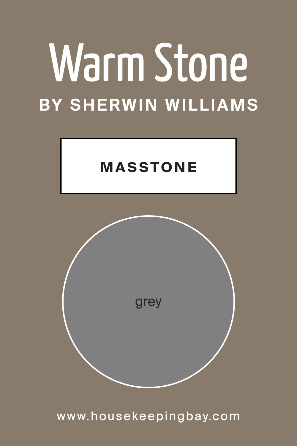
Warm Stone SW 7032 by Sherwin Williams has a masstone of grey, coded as #808080. This neutral grey shade acts as an excellent base in homes, fitting seamlessly into various decorating styles. Whether in a modern setting or a more traditional space, Warm Stone offers a calming presence that doesn’t overpower the senses.
Its flexibility means it pairs well with brighter colors, allowing them to stand out, or with other neutrals for a soft, cohesive look.
Because grey is a balanced color, Warm Stone manages to bring harmony and a sense of steadiness to interiors. It’s particularly useful in rooms that serve multiple purposes, such as living rooms or large kitchens, where different elements need to come together under one unifying shade. Moreover, this color can make small spaces appear larger and brighter as it reflects light well, adding to its functionality within a home.
housekeepingbay.com
Undertones of Warm Stone SW 7032 by Sherwin Williams
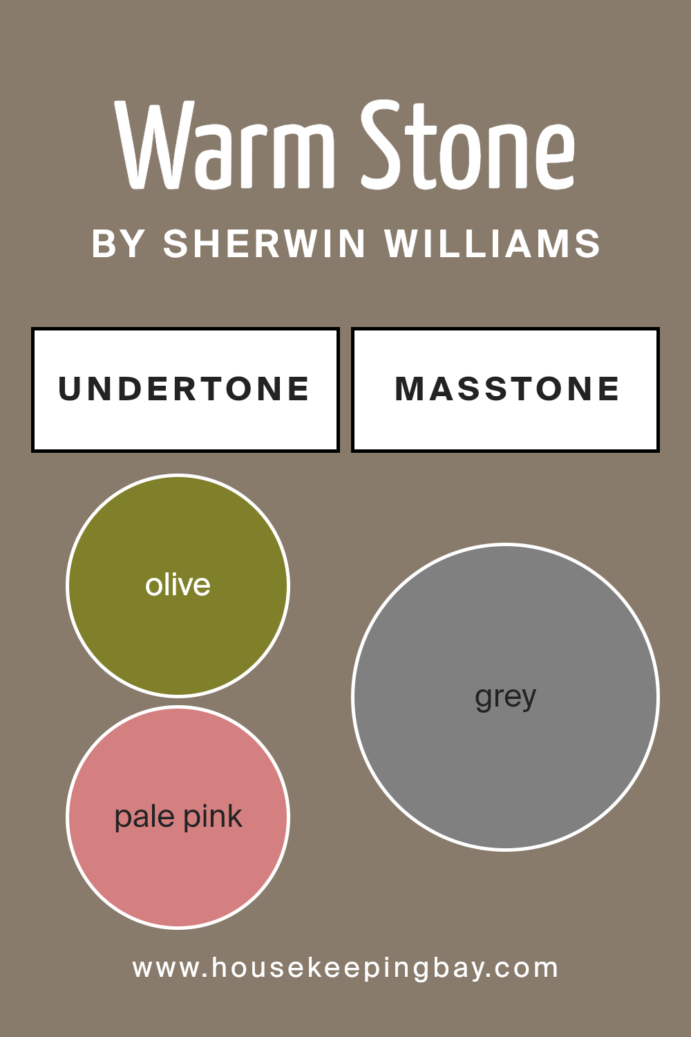
Warm Stone SW 7032 by Sherwin Williams is a versatile paint color with a complex mix of undertones that can subtly influence how the color appears in different settings. Undertones are the underlying hues that can be seen when certain lighting hits the color, or when placed next to other colors. For Warm Stone, these undertones range from olives to browns and from light blues to fuchsias.
In interior spaces, these undertones play a crucial role in how Warm Stone is perceived. For instance, in a room with a lot of natural light, the lighter undertones like pale yellow and light gray might become more prominent, giving the room a softer and warmer feel.
Conversely, in a room with less natural light or with artificial lighting, darker undertones like dark grey and navy may stand out, giving the paint a more grounded and denser look.
When used on walls, Warm Stone can offer a rich backdrop that shifts in mood depending on its surroundings. Furniture and decor in greens or blues can draw out similar undertones in the paint, creating a harmonious feel. Warm-toned woods or fabrics might bring out the olive and brown undertones, enhancing a cozy atmosphere.
As a result, Warm Stone SW 7032 is not just a simple beige or gray; its spectrum of undertones allows it to adapt and shift, providing a dynamic backdrop for an array of interior designs. Its ability to interact with both colors and lighting makes it a smart choice for those looking to add depth and interest to their space without overwhelming it with strong color.
housekeepingbay.com
Coordinating Colors of Warm Stone SW 7032 by Sherwin Williams
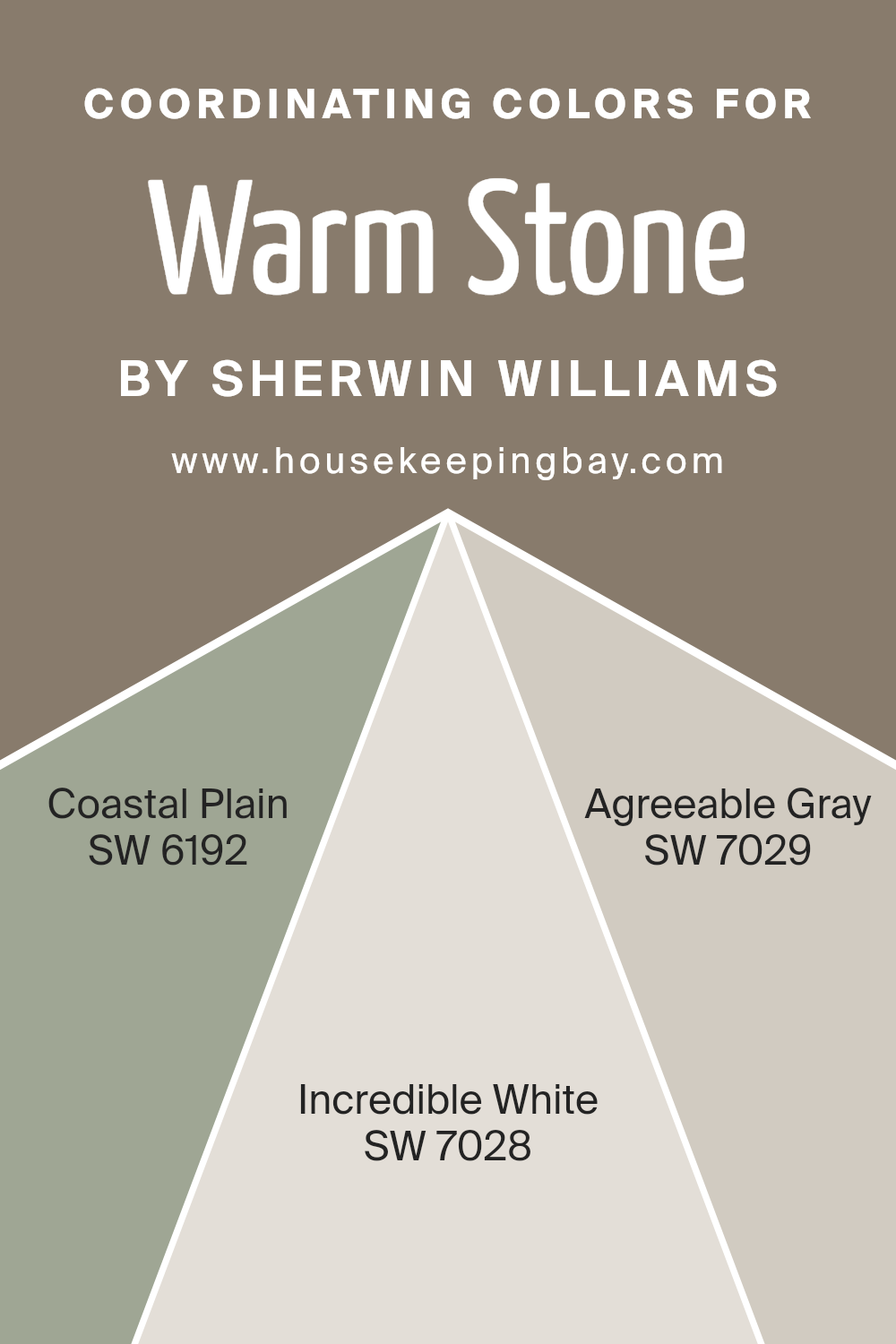
Coordinating colors are shades that complement a primary color, enhancing the overall aesthetic of a space by creating balance and harmony. In the context of Warm Stone SW 7032 by Sherwin Williams, coordinating colors such as SW 6192 – Coastal Plain, SW 7028 – Incredible White, and SW 7029 – Agreeable Gray have been specifically chosen to harmonize with the base hue.
These complementary colors can be used for trim, accents, or adjacent walls, offering a cohesive look that accentuates the primary color’s strengths without overwhelming it.
SW 6192 – Coastal Plain is a soothing green that mirrors the serenity of a lush landscape, making it ideal for creating a calm and restorative space. SW 7028 – Incredible White is a soft and airy white that provides a clean and refreshing backdrop, perfect for enhancing the openness of any room.
Lastly, SW 7029 – Agreeable Gray is a neutral gray that balances warmth and sophistication, versatile enough to adapt to various decor styles and spaces. Together, these colors work seamlessly with Warm Stone SW 7032 to offer a palette that is both inviting and well-coordinated.
You can see recommended paint colors below:
- SW 6192 Coastal Plain
- SW 7028 Incredible White
- SW 7029 Agreeable Gray
housekeepingbay.com
How Does Lighting Affect Warm Stone SW 7032 by Sherwin Williams?
Lighting significantly influences how we perceive colors, a fact crucial when applying paint like Warm Stone SW 7032 by Sherwin Williams. Colors can shift dramatically under different lighting conditions because light sources vary in tones.
In artificial light, the effect on Warm Stone depends on the type of bulb used. Incandescent bulbs, which emit a warmer, yellowish glow, tend to enhance Warm Stone’s warm beige tones, making it appear cozier and richer. On the other hand, fluorescent lighting, which leans towards a cooler, bluish light, might make Warm Stone look slightly more muted and greyish.
Natural light brings out the truest color of the paint, but this too changes with the direction of the room’s windows. In north-facing rooms, which receive less direct sunlight and have a cooler, bluer light, Warm Stone may appear more subdued and cooler, likely emphasizing its grey undertones. This could give the room a crisp, calm atmosphere but might not highlight the warmth you might expect from the color.
South-facing rooms get abundant sunlight, bringing out the warmth and depth of Warm Stone. Here, the paint’s creamy, beige qualities are accentuated, making the space feel warmer and inviting throughout the day.
East-facing rooms enjoy bright morning light, which is typically warm and yellow. Warm Stone will look particularly vibrant and welcoming in the morning but could lose some of this vibrancy in the afternoon or evening as natural light fades.
West-facing rooms get the evening sun, which casts a warm golden glow. Hence, Warm Stone will appear warmer and richer in the afternoon and evening, potentially making the room feel cozy and snug, especially towards sunset.
Knowing how lighting affects Warm Stone SW 7032 helps in planning spaces thoughtfully, understanding that the color’s perception could shift throughout the day and in different lighting setups.
housekeepingbay.com
What is the LRV of Warm Stone SW 7032 by Sherwin Williams?
LRV stands for Light Reflectance Value, a measure indicating how much light a paint color reflects or absorbs when applied to a surface. This value is expressed on a scale from 0 to 100, with 0 being completely black, absorbing all light, and 100 being pure white, reflecting all light.
LRV helps in determining how light or dark a color will appear once it’s on your walls, affecting not only the mood of the room but also its perceived size and warmth. Lighter colors with high LRV make spaces appear larger and brighter, while darker colors with low LRV can make a room feel smaller and cozier.
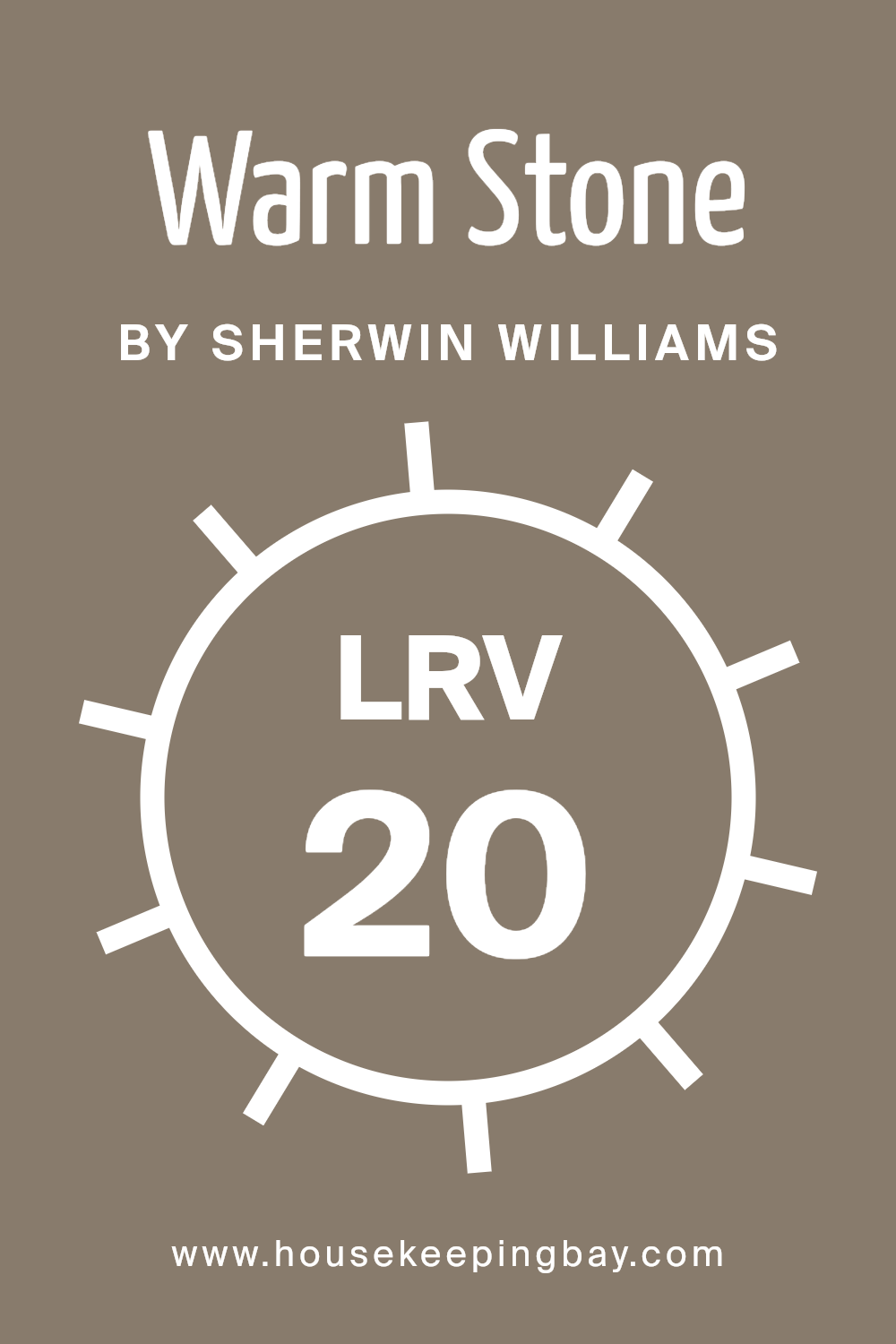
The LRV of Warm Stone SW 7032 by Sherwin Williams is 20.445, placing it on the darker end of the spectrum. This means it absorbs more light than it reflects, which could make a space feel more intimate or enclosed. This characteristic makes Warm Stone an ideal choice for creating a cozy and inviting atmosphere in a room, especially in spaces that receive ample natural light to balance the darkness of the color. When choosing a color with a lower LRV like this, consider the room’s lighting and size to ensure it complements the space without making it feel too cramped.
housekeepingbay.com
What are the Trim colors of Warm Stone SW 7032 by Sherwin Williams?
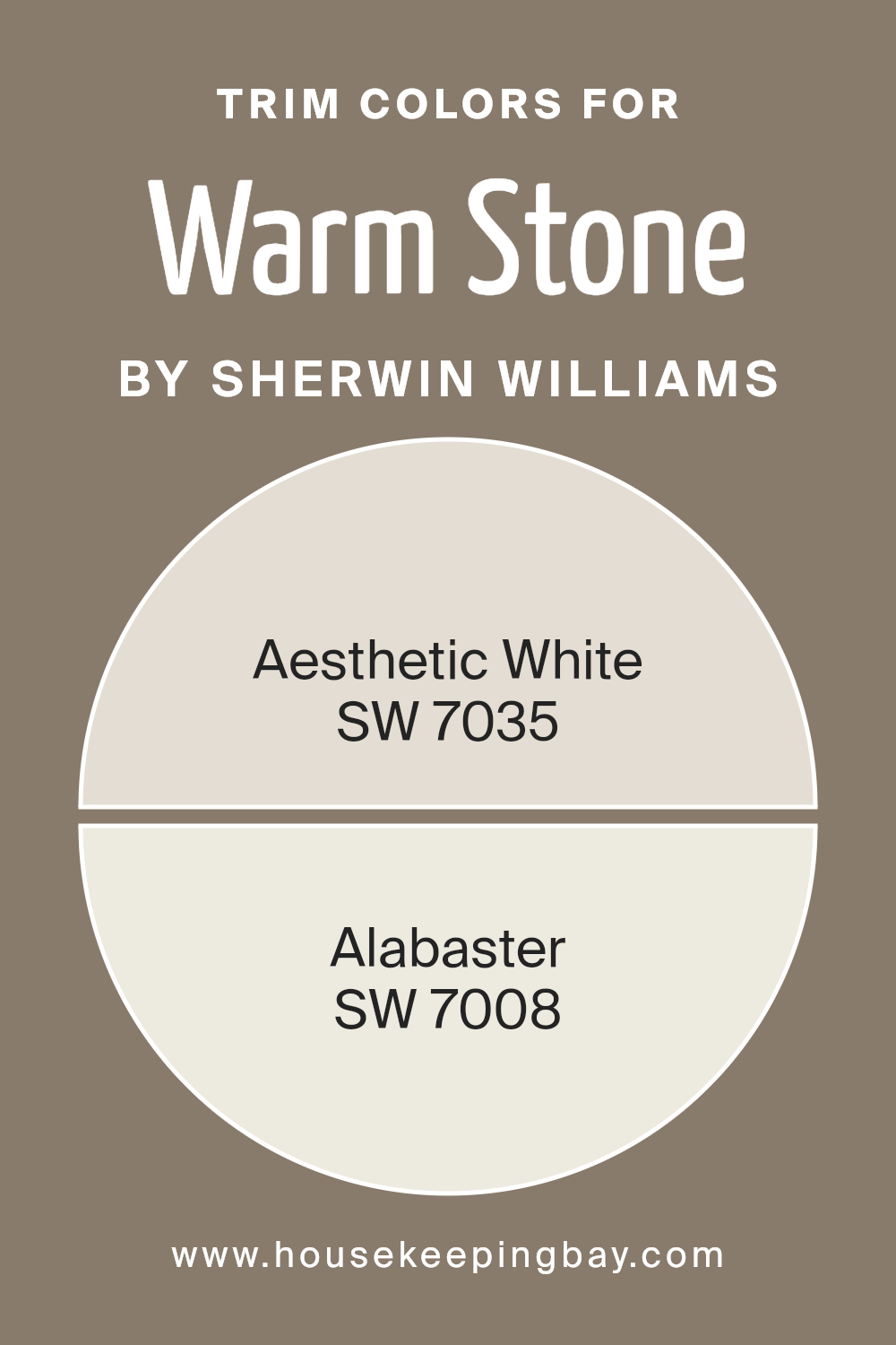
Trim colors, such as SW 7035 Aesthetic White and SW 7008 Alabaster from Sherwin-Williams, play a crucial role in enhancing the appearance of the main wall color, in this case, Warm Stone SW 7032.
These colors are strategically chosen to highlight the architectural features of a room, such as moldings, cornices, windows, and door frames, creating a visually appealing contrast. This contrast not only defines the space more clearly but also complements the primary color, adding depth and refinement to the overall decor.
The right trim color makes the primary wall color appear more cohesive and polished, providing a neat finish to the interiors.
SW 7035 Aesthetic White is a soft, subtle off-white with a hint of beige, making it versatile for pairing with the earthy tones of Warm Stone SW 7032. It offers a gentle contrast, softening the edges where the darker color meets the light, and maintaining a warm, inviting atmosphere.
On the other hand, SW 7008 Alabaster is a pure, bright white with a warm undertone. It offers a sharper contrast against Warm Stone, highlighting the walls dramatically and giving the room a fresh, clean look. Both Aesthetic White and Alabaster serve to enhance the overall aesthetic by providing options that suit different tastes and lighting conditions.
You can see recommended paint colors below:
housekeepingbay.com
Colors Similar to Warm Stone SW 7032 by Sherwin Williams
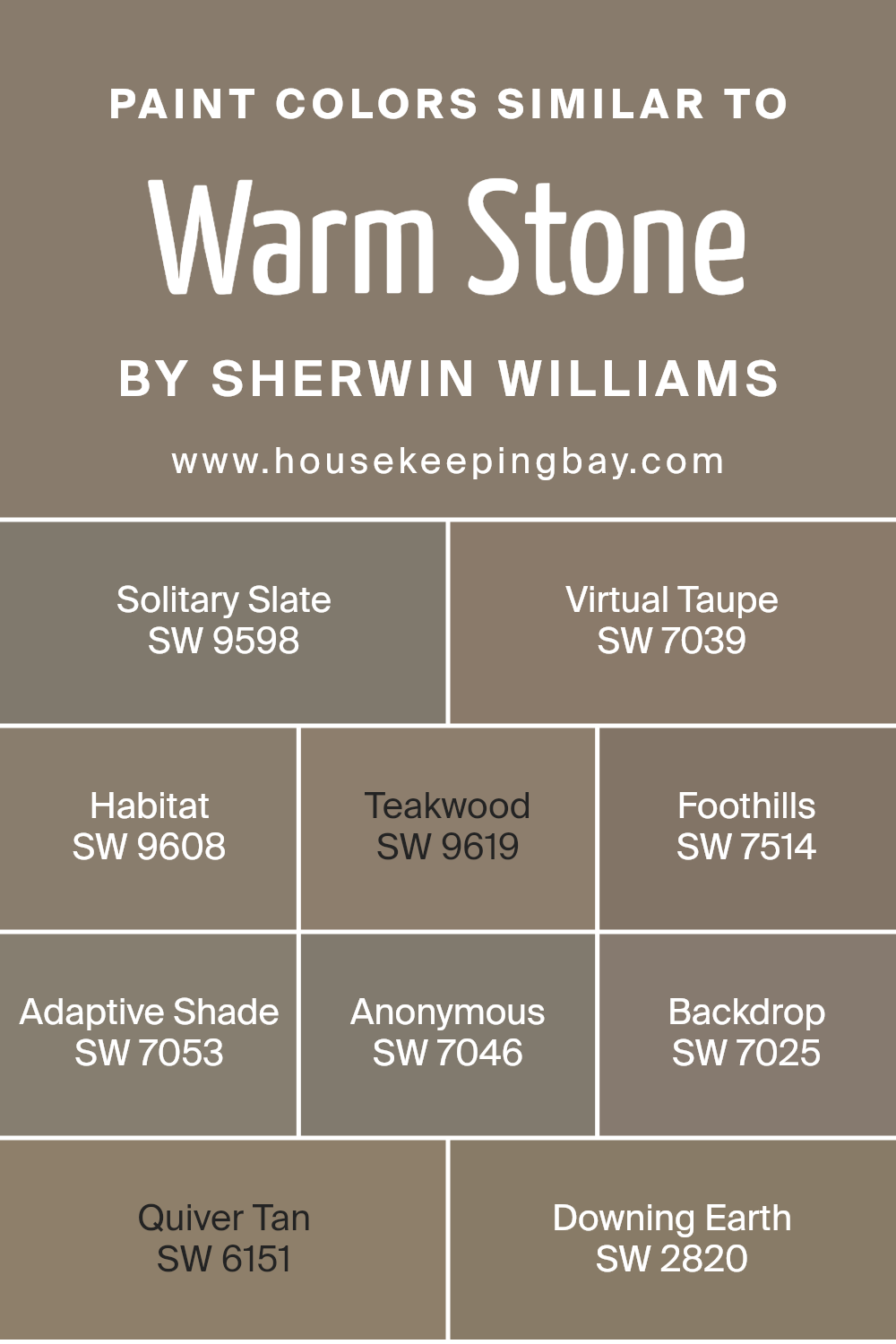
Similar colors are crucial in interior design because they create a seamless flow from room to room, enhancing the overall aesthetic coherence of a space. When colors like those similar to Warm Stone SW 7032 by Sherwin-Williams are used, they help to form a gentle and consistent visual experience, making the environment feel cohesive.
In interiors, repeating similar hues on walls, trim, and even in decorative accents can subtly pull a room together, giving it a polished look without dramatic contrasts.
Solitary Slate SW 9598 offers a cool, gentle gray that works well in spaces that aim for a subdued yet sophisticated atmosphere. Virtual Taupe SW 7039 gives a deeper, beigey-gray tone perfect for adding warmth. Habitat SW 9608 introduces an earthy, greenish touch that can bring a touch of nature indoors.
Teakwood SW 9619 is a rich, deep brown that provides a sense of grounding and strength to any room. Foothills SW 7514, with its toasty brown, enhances a cozy and inviting ambiance. Adaptive Shade SW 7053, a medium gray, offers flexibility in complementing various decor styles.
Anonymous SW 7046 features a gray with subtle green undertones, ideal for those seeking a neutral base with a twist. Backdrop SW 7025 is a dark, warm gray that makes a bold statement yet remains versatile. Quiver Tan SW 6151, a soft tan, brightens spaces with its soothing warmth.
Lastly, Downing Earth SW 2820 serves as a robust earth-toned brown that enriches spaces with its robust depth. These similar colors provide numerous options for achieving a harmonious and refined interior.
You can see recommended paint colors below:
- SW 9598 Solitary Slate
- SW 7039 Virtual Taupe
- SW 9608 Habitat
- SW 9619 Teakwood
- SW 7514 Foothills
- SW 7053 Adaptive Shade
- SW 7046 Anonymous
- SW 7025 Backdrop
- SW 6151 Quiver Tan
- SW 2820 Downing Earth
housekeepingbay.com
Colors that Go With Warm Stone SW 7032 by Sherwin Williams
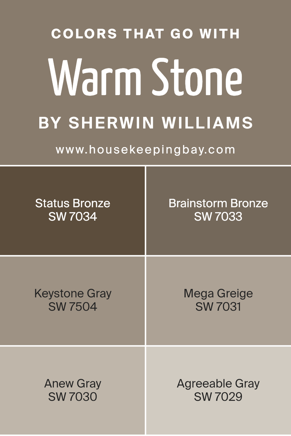
Choosing the right colors to pair with Warm Stone SW 7032 by Sherwin Williams is essential for creating a harmonious and cohesive look in any space. Warm Stone is a versatile greige (a blend of gray and beige) that serves as a strong foundation for various color schemes.
Colors that harmonize with Warm Stone, like Status Bronze, Brainstorm Bronze, Keystone Gray, Mega Greige, Anew Gray, and Agreeable Gray, each bring their unique attributes to the palette, enhancing the overall aesthetic without overpowering.
Status Bronze is a deeper, richer shade that adds a sophisticated touch, perfect for accent walls or furniture, giving a room depth and warmth. Brainstorm Bronze has a slightly lighter tone compared to Status Bronze, which makes it ideal for creating a subtle contrast while maintaining the warmth of the room. Keystone Gray introduces a cooler tone, providing a gentle shift away from the warmer greiges and bronzes for a more balanced look.
Mega Greige, true to its name, amplifies the greige effect by deepening the blend of gray and beige, enhancing the plush feel of a space. Anew Gray scales back on the beige, offering a cleaner, crisper gray that refreshes and modernizes the ambiance.
Lastly, Agreeable Gray stands as the lightest color among these options, excellent for creating a soft, seamless transition between darker and lighter elements in the room. Combined, these colors not only work well with Warm Stone but also help to achieve a layered and inviting environment.
You can see recommended paint colors below:
- SW 7034 Status Bronze
- SW 7033 Brainstorm Bronze
- SW 7504 Keystone Gray
- SW 7031 Mega Greige
- SW 7030 Anew Gray
- SW 7029 Agreeable Gray
housekeepingbay.com
How to Use Warm Stone SW 7032 by Sherwin Williams In Your Home?
Warm Stone SW 7032 by Sherwin Williams is a versatile paint color that brings a cozy and soothing atmosphere to any room. Its rich, earthy tone works well in spaces where you want to create a sense of comfort and relaxation, such as living rooms or bedrooms. You can also use it in a kitchen or dining area to foster a warm, welcoming vibe that’s perfect for family meals and gatherings.
One of the best ways to use Warm Stone is as a base color on walls, which allows you to layer various textures and complementary colors through furniture and decor. This shade pairs beautifully with soft creams, rich browns, and even muted greens, providing a balanced palette.
Additionally, if your home features natural elements like wooden beams or stone accents, Warm Stone will enhance these features without overwhelming them.
For those looking to add a touch of sophistication, pairing Warm Stone with elegant fixtures in bronze or gold can create a chic and cohesive look. Whether your home is modern or traditional, this color offers a timeless appeal that makes it easy to work with while updating the look of your interiors.
Warm Stone SW 7032 by Sherwin Williams vs Virtual Taupe SW 7039 by Sherwin Williams
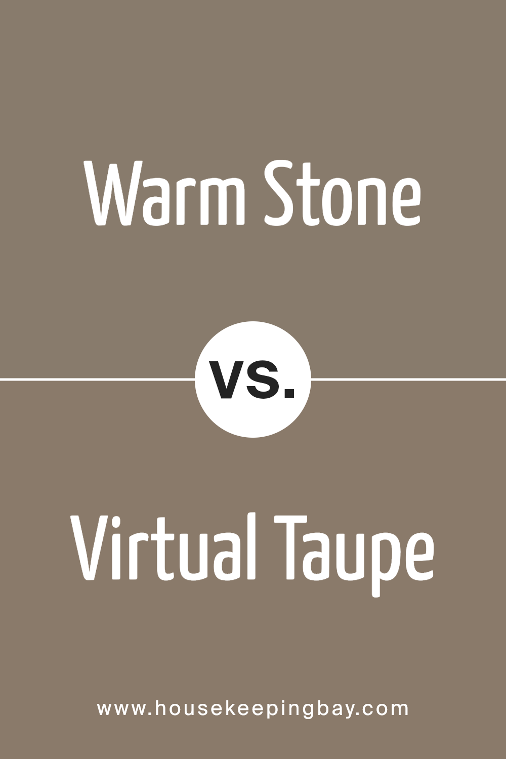
Warm Stone SW 7032 by Sherwin Williams is a gentle, neutral beige with a cozy touch, making it ideal for creating a welcoming atmosphere in any room. It pairs well with different colors, from bold hues to soft pastels, offering flexibility in decor choices.
Meanwhile, Virtual Taupe SW 7039, also by Sherwin Williams, leans more towards a deeper gray-brown. This shade is excellent for those seeking a stronger color presence that still remains within the neutral palette. It offers a sophisticated backdrop that can help highlight artwork or furniture with its richer undertone.
Both colors provide a solid foundation for various interior design styles, from modern to classic. While Warm Stone brings a softer, more light-hearted feel, Virtual Taupe adds a bit more drama and depth to spaces. Consider your room’s natural light and intended use when choosing between these two versatile shades.
You can see recommended paint color below:
- SW 7039 Virtual Taupe
housekeepingbay.com
Warm Stone SW 7032 by Sherwin Williams vs Habitat SW 9608 by Sherwin Williams
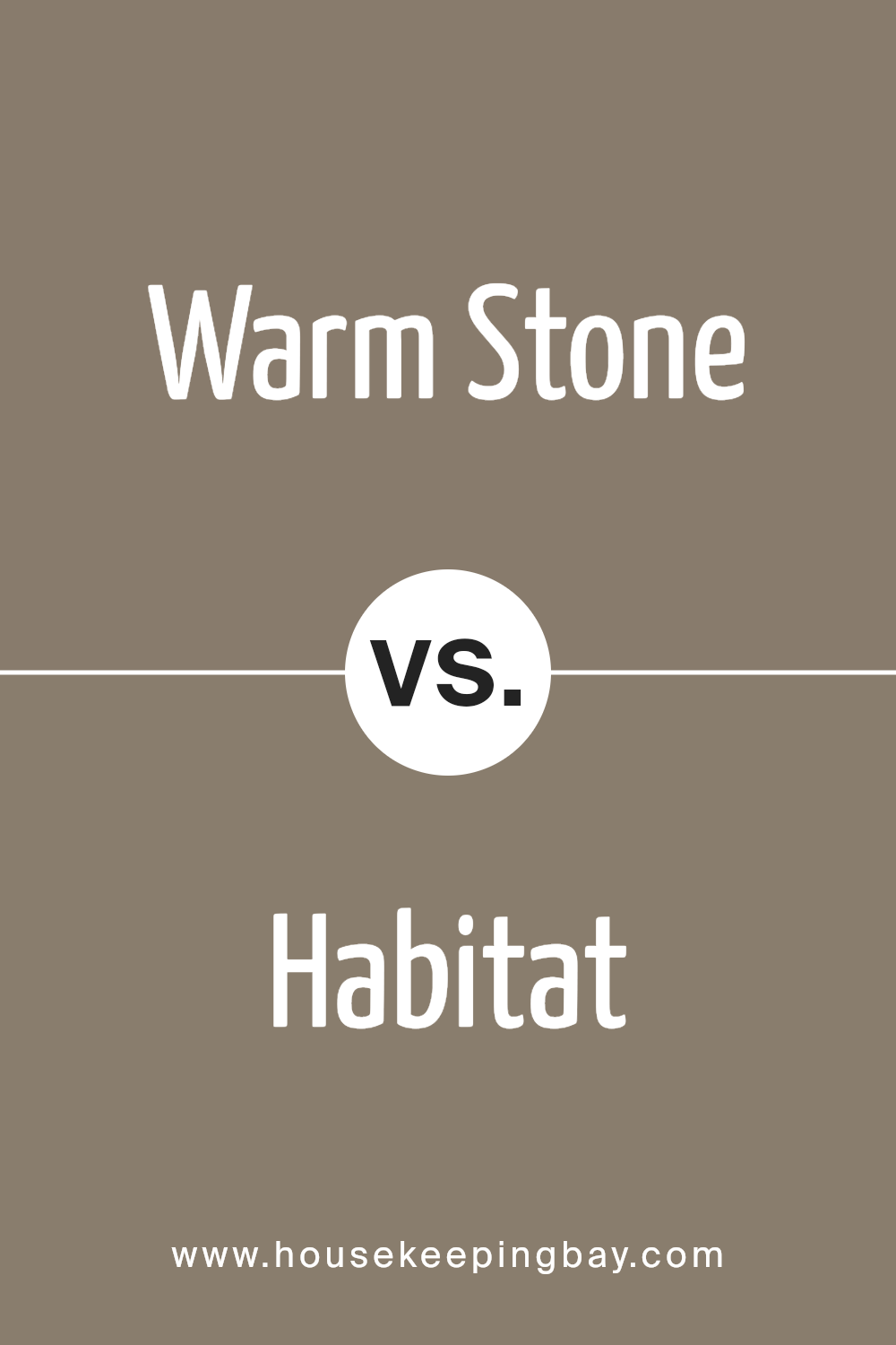
Warm Stone SW 7032 by Sherwin Williams is a gentle, inviting beige with a hint of gray, making it a perfect neutral. It naturally gives a room an open, airy feel and can effortlessly complement various decor styles and colors. Habitat SW 9608, from the same brand, leans towards a darker, rich brown with a rustic edge.
This color adds a cozy, grounded feeling to a space, making it ideal for creating a snug and welcoming atmosphere. While Warm Stone is versatile and can lighten up any room, Habitat provides a strong, earthy base that works well in areas meant for relaxation and warmth.
Both colors offer their unique appeal, with Warm Stone providing flexibility and Habitat giving depth. They can be used in different ways to enhance the ambiance of a home depending on personal taste and the desired mood.
You can see recommended paint color below:
- SW 9608 Habitat
housekeepingbay.com
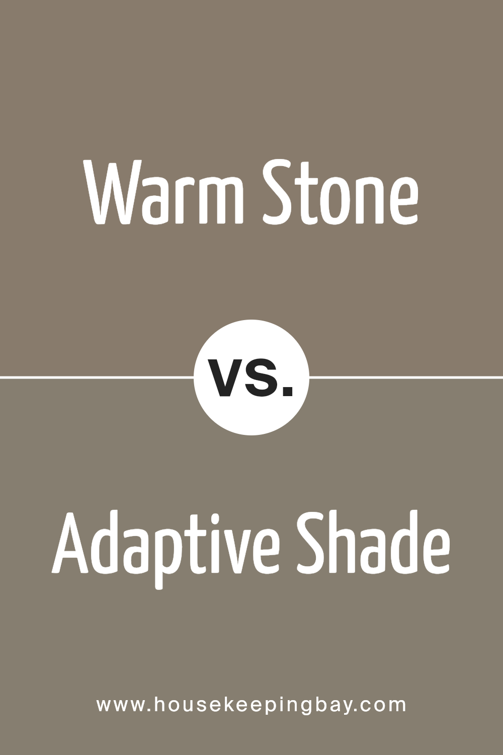
Warm Stone SW 7032 by Sherwin Williams vs Adaptive Shade SW 7053 by Sherwin Williams
Warm Stone SW 7032 by Sherwin Williams is a soft greige that blends the simplicity of gray with the warmth of beige, perfect for creating cozy, inviting spaces. It suits rooms that need both light and warmth, marrying well with natural elements and neutral furnishings.
In contrast, Adaptive Shade SW 7053 is a cooler gray that leans slightly towards blue, offering a serene and sophisticated feel. This color is ideal for spaces that require a sleek, modern look, and pairs effectively with metallic accents and vibrant colors to accentuate a contemporary vibe.
While Warm Stone provides warmth, Adaptive Shade offers a more muted base that can either complement bold designs or maintain an understated elegance. Both colors have their unique appeal, giving decorators versatile options according to their style preferences and room functionalities.
You can see recommended paint color below:
housekeepingbay.com
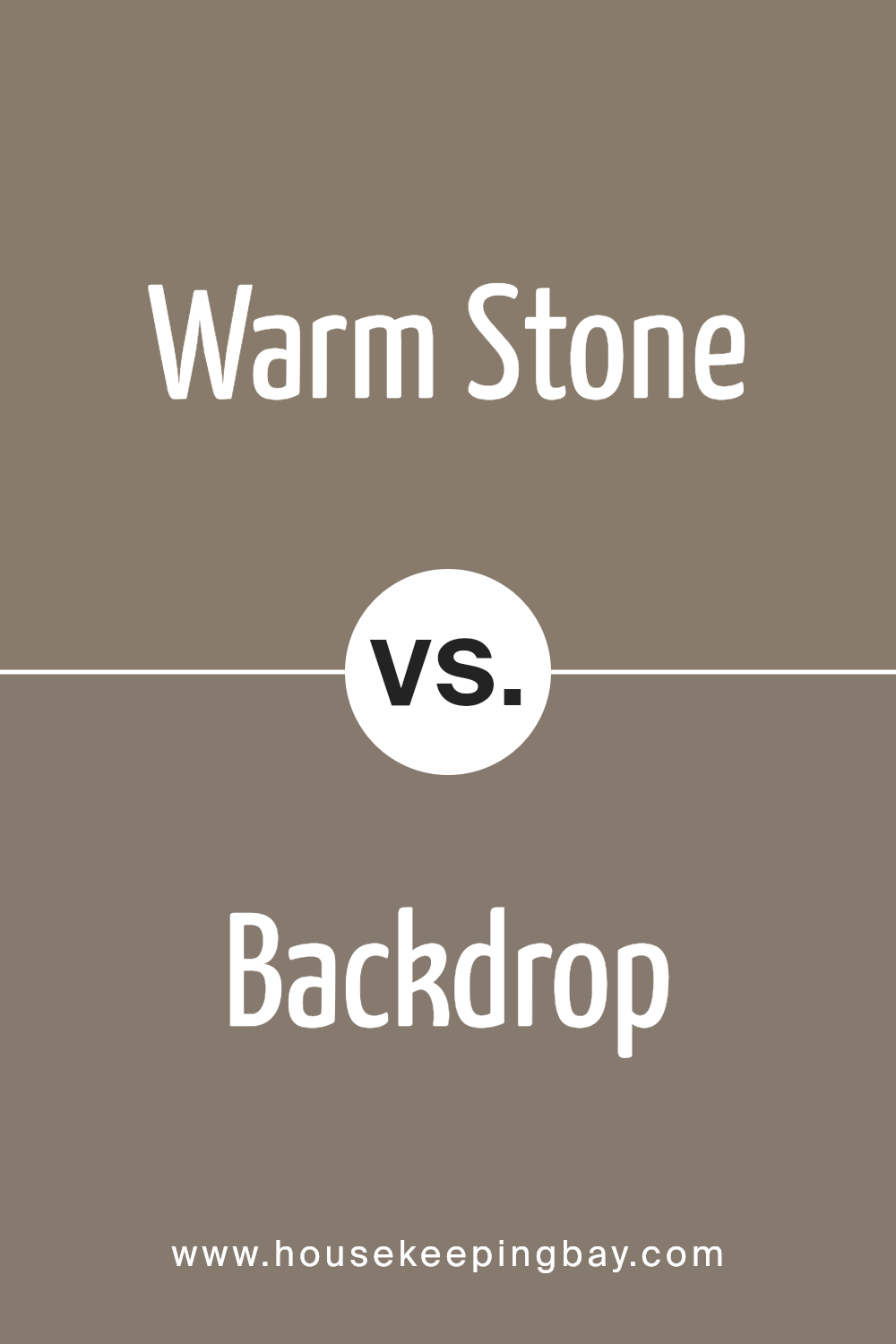
Warm Stone SW 7032 by Sherwin Williams vs Backdrop SW 7025 by Sherwin Williams
Warm Stone SW 7032 and Backdrop SW 7025 by Sherwin Williams are both neutral colors, but they bring different vibes to a space. Warm Stone is a soft, beige color with warm undertones, creating a cozy and inviting atmosphere. It’s great for living rooms and bedrooms where you want a soothing presence.
Backdrop, however, is a darker gray shade with a hint of brown, giving it a slightly more grounded, serious feel. It suits areas that aim for a more sophisticated or formal look, like home offices or dining rooms.
When you compare them, Warm Stone is lighter and conveys warmth, making spaces feel airy and light. Backdrop, being darker, can make large rooms feel more intimate and smaller rooms a bit cozier.
Both colors work well in various design styles and can complement a wide range of furniture and decor, depending on what mood you wish to achieve in your home.
You can see recommended paint color below:
housekeepingbay.com
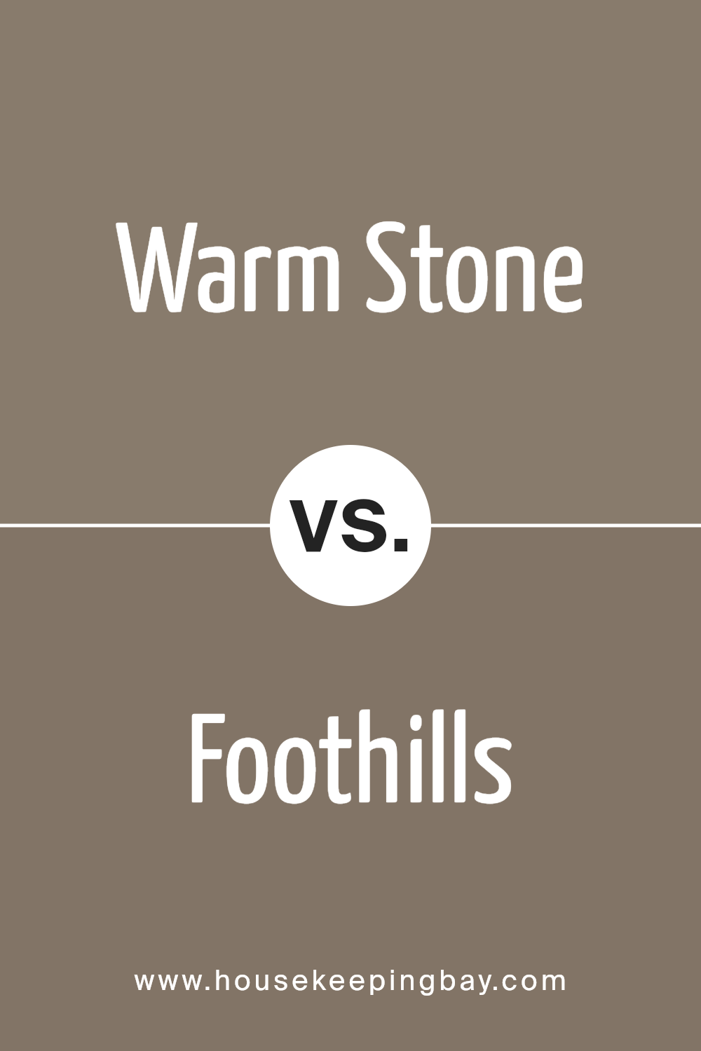
Warm Stone SW 7032 by Sherwin Williams vs Foothills SW 7514 by Sherwin Williams
Warm Stone SW 7032 and Foothills SW 7514 by Sherwin Williams are two nuanced shades that bring their own unique qualities to any space. Warm Stone is a soft, inviting beige with a cozy feel to it. Its lighter tone makes it perfect for smaller rooms or areas where you want to give an impression of more space. This color works well with a variety of decor styles and adds a touch of warmth to a room without being overwhelming.
Foothills SW 7514, on the contrary, is deeper and richer, embodying more of a taupe or grayish-brown hue. It offers a sense of sophistication and depth, making it ideal for larger, airier spaces or as an accent wall to create a focal point. Due to its darker tone, Foothills can also hide marks or smudges better, which might be practical for high-traffic areas.
Both colors pair well with various furnishings and adapt easily to different lighting conditions, reflecting their versatility in home design.
You can see recommended paint color below:
- SW 7514 Foothills
housekeepingbay.com
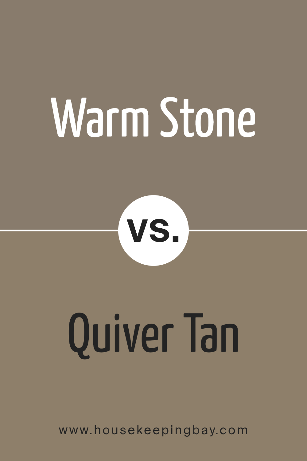
Warm Stone SW 7032 by Sherwin Williams vs Quiver Tan SW 6151 by Sherwin Williams
Warm Stone SW 7032 by Sherwin Williams is a neutral and versatile color with a beige-gray hue, often used to create a cozy and inviting atmosphere in any space. This color pairs well with various decor styles and brings a soothing warmth to interiors. It serves as an excellent base, allowing other colors to stand out more vividly.
Quiver Tan SW 6151, on the contrary, leans more towards a sandy tan shade that subtly enriches the environment, providing a calm and serene feel. It tends to be lighter than Warm Stone, offering a more understated backdrop that works well in spaces that aim for a natural and understated look.
Both Warm Stone and Quiver Tan are great choices for those who prefer neutral palettes, but Warm Stone’s slightly darker and warmer tone might be preferred in spaces needing more warmth, while Quiver Tan is ideal for a lighter, breezier feel.
You can see recommended paint color below:
- SW 6151 Quiver Tan
housekeepingbay.com
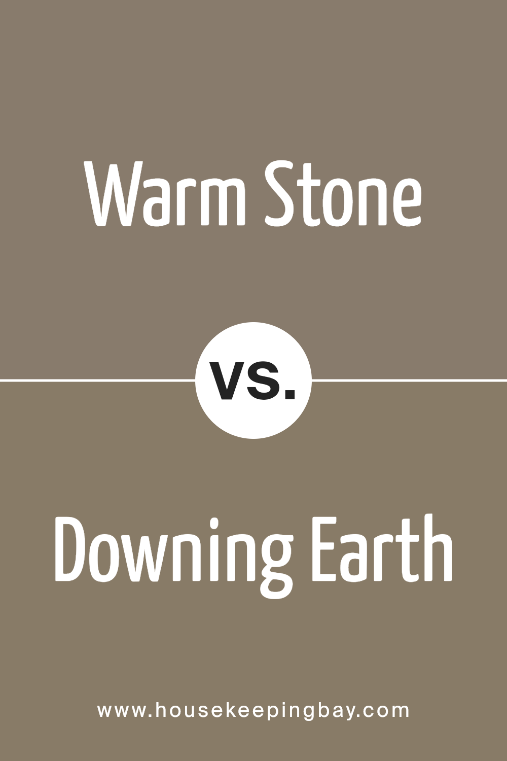
Warm Stone SW 7032 by Sherwin Williams vs Downing Earth SW 2820 by Sherwin Williams
Warm Stone SW 7032 by Sherwin Williams is a soft, neutral beige with a cozy, inviting feel. It works well in spaces where you want a calm, soothing atmosphere, making it a popular choice for living rooms and bedrooms. This color reflects light gently, aiding in making small spaces appear larger and more open.
Downing Earth SW 2820, meanwhile, is a much richer, deeper brown. This color provides a strong sense of groundedness and can anchor a room with its robust earthiness. It’s perfect for areas where you want a bit of drama or a rustic, traditional look. Due to its intensity, it’s best in larger spaces or used sparingly as an accent wall to prevent a room from feeling too dark or closed in.
Comparing these two, Warm Stone offers more versatility and light, useful in various settings, while Downing Earth brings a distinct, powerful character to any space. Both colors evoke warmth, but the depth and impact are noticeably different.
You can see recommended paint color below:
- SW 2820 Downing Earth
housekeepingbay.com
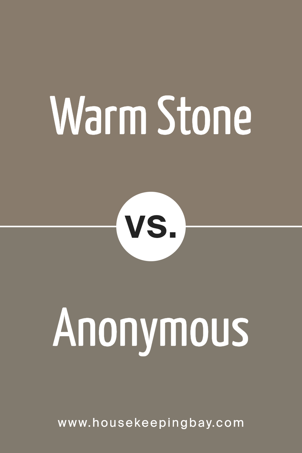
Warm Stone SW 7032 by Sherwin Williams vs Anonymous SW 7046 by Sherwin Williams
Warm Stone SW 7032 by Sherwin Williams is a welcoming, neutral beige color with a rich undertone that gives a cozy feel to any room. It pairs well with a variety of decor styles, making it versatile for use in living spaces, bedrooms, and common areas. The warmth of Warm Stone can make a room feel more inviting and comfortable.
Anonymous SW 7046, meanwhile, is a cool gray with a slight green undertone, presenting a more subdued and modern look. This color suits spaces that aim for a minimalist or contemporary aesthetic, offering a sleek backdrop for bold and bright accents or art. It works particularly well in offices or dens where a calm, focused atmosphere is beneficial.
Both colors present unique atmospheres: Warm Stone promotes warmth and homeliness, while Anonymous cultivates a more detached, stylish vibe. These colors can also complement each other in a color scheme, using Anonymous as a base with Warm Stone accents for a balanced look.
You can see recommended paint color below:
housekeepingbay.com
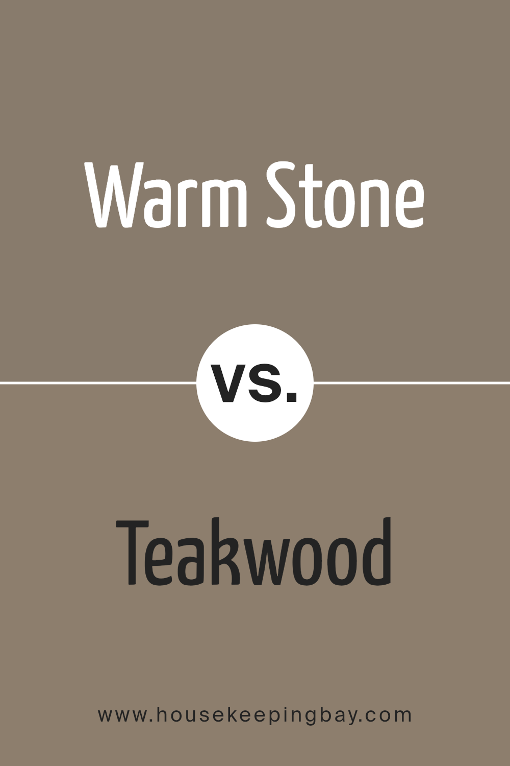
Warm Stone SW 7032 by Sherwin Williams vs Teakwood SW 9619 by Sherwin Williams
Warm Stone SW 7032 and Teakwood SW 9619 by Sherwin Williams are two distinct colors that could bring different vibes to your space. Warm Stone is a soft, neutral beige color with a hint of warmth, making it an excellent choice for creating a cozy and inviting atmosphere in any room. It pairs well with various decor styles and can help to make a space feel more open and relaxed.
Teakwood SW 9619, on the contrary, is a much darker, richer brown with deep reddish undertones. This color provides a strong, earthy base that can add a sense of sophistication and groundedness to your interiors. Teakwood works well in spaces where you want to foster a sense of comfort and establishment, like studies or dens.
Each color serves a different purpose but both are versatile in their own right, suited to various settings and complementing a range of complementary colors and materials.
You can see recommended paint color below:
- SW 9619 Teakwood
housekeepingbay.com
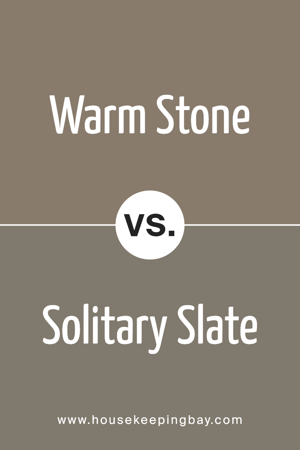
Warm Stone SW 7032 by Sherwin Williams vs Solitary Slate SW 9598 by Sherwin Williams
Warm Stone SW 7032 by Sherwin Williams is a cozy, neutral beige that offers a soothing and inviting vibe, perfect for creating a calm and welcoming space. This soothing hue pairs well with a variety of decor styles and colors, enhancing spaces with its versatile and warm undertones.
Solitary State SW 9598, on the contrary, presents as a deeper, cool gray that gives off a more modern and refined feel. This color works well in spaces meant to have a chic, sophisticated appearance. Its cool tones provide a subtle contrast to warmer colors, making it ideal for contemporary settings.
While both colors are neutral, Warm Stone injects warmth into a room, cozying up spaces that might otherwise feel stark. Solitary Slate offers a sleek, minimalistic look, bringing an air of elegance and modernity. Depending on the mood and style you want to achieve, each color offers unique advantages for interior design.
You can see recommended paint color below:
- SW 9598 Solitary Slate
housekeepingbay.com
Conclusion
In summary, SW 7032 Warm Stone by Sherwin Williams stands out as an excellent choice for anyone looking to update their space with a balanced, neutral color that brings warmth and sophistication. Its versatility makes it ideal for various settings, whether you are refreshing a living room, bedroom, or adding a touch of elegance to your kitchen or bathroom.
The color’s ability to pair well with a wide range of decor styles and colors, from bold and vibrant to soft and subtle, ensures that it can seamlessly integrate into your existing design or serve as a foundation for a new aesthetic.
If you’re planning a makeover or simply want to introduce a fresh vibe into your home, SW 7032 Warm Stone offers a reliable and stylish solution that enhances the overall feel and appearance of any room. Opting for this shade can help create an inviting atmosphere, making your space a more enjoyable and refined place to live.
housekeepingbay.com
