Backdrop SW 7025 by Sherwin Williams
Ultimate Neutral Shade
If you’re thinking about giving your space a fresh coat of paint, consider SW 7025 Backdrop by Sherwin Williams. This is a versatile color that adds a sophisticated touch to any room in your home. The beauty of Backdrop lies in its ability to balance between gray and brown, making it a perfect neutral that works well in a variety of settings and with multiple decorating styles.
Whether you’re updating your living room, bedroom, or kitchen, Backdrop provides a solid foundation that complements both modern and traditional decor. People often find it a reliable choice as it pairs beautifully with bright whites and rich wood tones.
If you want a color that helps create a warm, inviting atmosphere without overpowering your space, SW 7025 Backdrop could be the ideal choice for you.
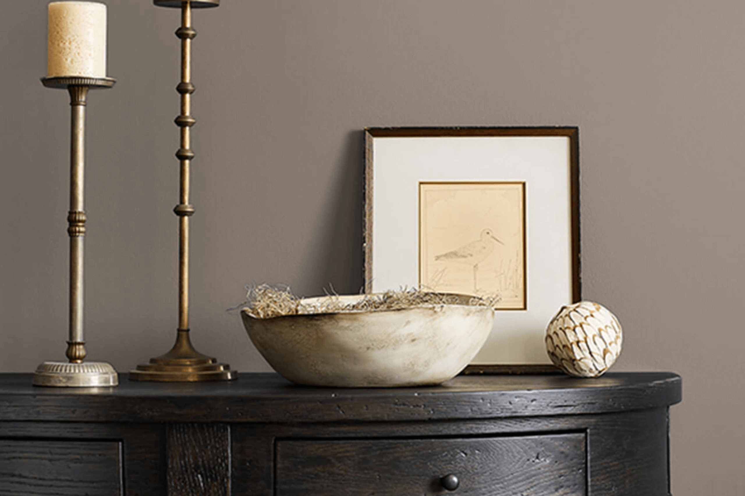
sherwin-williams.com
What Color Is Backdrop SW 7025 by Sherwin Williams?
Table of Contents
The color Backdrop SW 7025 by Sherwin Williams offers a subtle balance between gray and beige, commonly referred to as “greige.” This neutral shade is versatile, making it an excellent choice for various interior design schemes. Its understated elegance provides a soothing backdrop, enabling other decor elements to stand out.
Backdrop SW 7025 works well in minimalist spaces where simplicity is key, as well as in modern and contemporary settings that favor clean lines and neutral palettes. This color also fits beautifully in rustic interiors which incorporate natural materials, adding to the cozy, grounded ambiance of the room.
When it comes to pairing materials, Backdrop SW 7025 complements rich textures like soft velvet, coarse burlap, and sleek leather. The color’s neutral character allows it to blend harmoniously with wooden finishes, from light oak to dark walnut, enhancing the warmth of the wood.
Additionally, metallic accents in silver, gold, or bronze can add a touch of luxury to rooms painted in this color, providing an attractive contrast to its matte surface.
Overall, Backdrop SW 7025 is a practical choice for anyone looking to create a refined yet inviting space. Its ability to coordinate with a wide range of materials and styles makes it a dependable option for any interior design project.
housekeepingbay.com
Is Backdrop SW 7025 by Sherwin Williams Warm or Cool color?
BackdropSW 7025 by Sherwin Williams is a versatile and popular paint color. It is a soothing mid-tone gray that brings a sense of calm and neutrality to rooms. This color fits in well in almost any part of a home, whether it’s a bedroom, living room, or kitchen.
It’s particularly effective in spaces where you want to create a serene and understated ambiance without the starkness that sometimes comes with pure white or darker hues.
The neutral nature of BackdropSW 7025 makes it an excellent base for layering different textures and colors. It doesn’t clash with vibrant colors nor does it overshadow more subtle tones. This makes it an ideal choice for those who like to update their decor often, as it pairs well with a wide range of decorative styles and colors.
Additionally, the color can help amplify natural light in rooms, making spaces appear larger and more open. Overall, BackdropSW 7025 supports a flexible and inviting home environment.
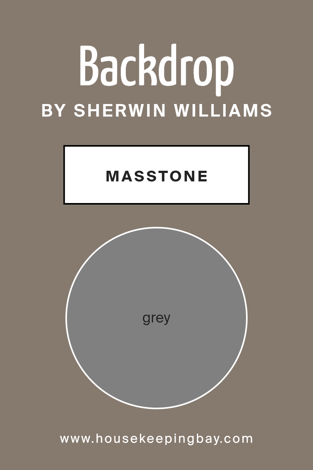
What is the Masstone of the Backdrop SW 7025 by Sherwin Williams?
BackdropSW 7025 by Sherwin Williams, sporting a masstone of grey (#808080), offers homes a versatile and balanced color choice. This particular shade of grey acts as a neutral base, enabling it to work seamlessly with a variety of decor styles and color schemes. Whether you’re aiming for a modern, minimalist look or something more traditional and cozy, this grey can adapt well to your needs.
In homes, BackdropSW 7025’s neutral grey masstone creates a calm, understated atmosphere, making spaces feel more open and airy. It’s excellent for rooms where you want to keep distractions minimal and focus on relaxation or productivity.
From living rooms to bedrooms, and even kitchens, this color provides a solid foundation that can be paired with bold colors for a dynamic effect or matched with other neutrals for a soft, cohesive look. Its adaptability makes it a practical choice for those looking to refresh their interiors without overpowering them with color.
housekeepingbay.com
Undertones of Backdrop SW 7025 by Sherwin Williams
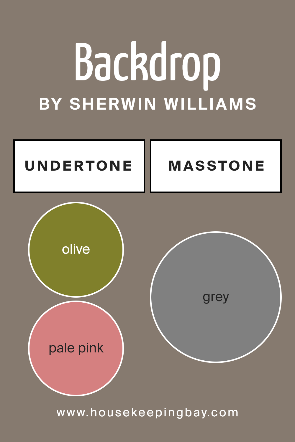
BackdropSW 7025 by Sherwin Williams is a versatile color with rich undertones that can subtly shift its appearance under different lighting conditions and when paired with various decor elements. Undertones like olive, pale pink, purple, and mint add a complex depth to the color, making it not just a simple shade but a backdrop that adapitates to its environment.
For example, olive and dark green undertones can make the paint feel more grounded and natural, which is great for spaces intended to have a soothing and organic feel. On the other hand, undertones of pale pink and lilac bring a soft, gentle vibe to the room, making it perfect for areas like bedrooms where a calm and peaceful atmosphere is desired.
When this color is used on interior walls, its diverse undertones interact with both natural and artificial light, altering its appearance throughout the day. In bright daylight, lighter undertones like mint and pale yellow might become more prominent, giving the room a vibrant and airy feel. In contrast, during the evening under artificial lighting, darker undertones like navy and dark grey could give the space a more intimate and cozy appearance.
Additionally, the undertones of purple and violet might bring a touch of sophistication and luxury, whereas orange and red undertones could add a touch of warmth, making a room feel more welcoming.
In summary, the undertones of BackdropSW 7025 make it a dynamic choice for any room, adjusting subtly to its surroundings and enhancing the overall mood and aesthetic of the space. Whether the room aims for a quiet, elegant, or energetic feel, the undertones provide a nuanced palette that addresses different styles and preferences.
housekeepingbay.com
Coordinating Colors of Backdrop SW 7025 by Sherwin Williams
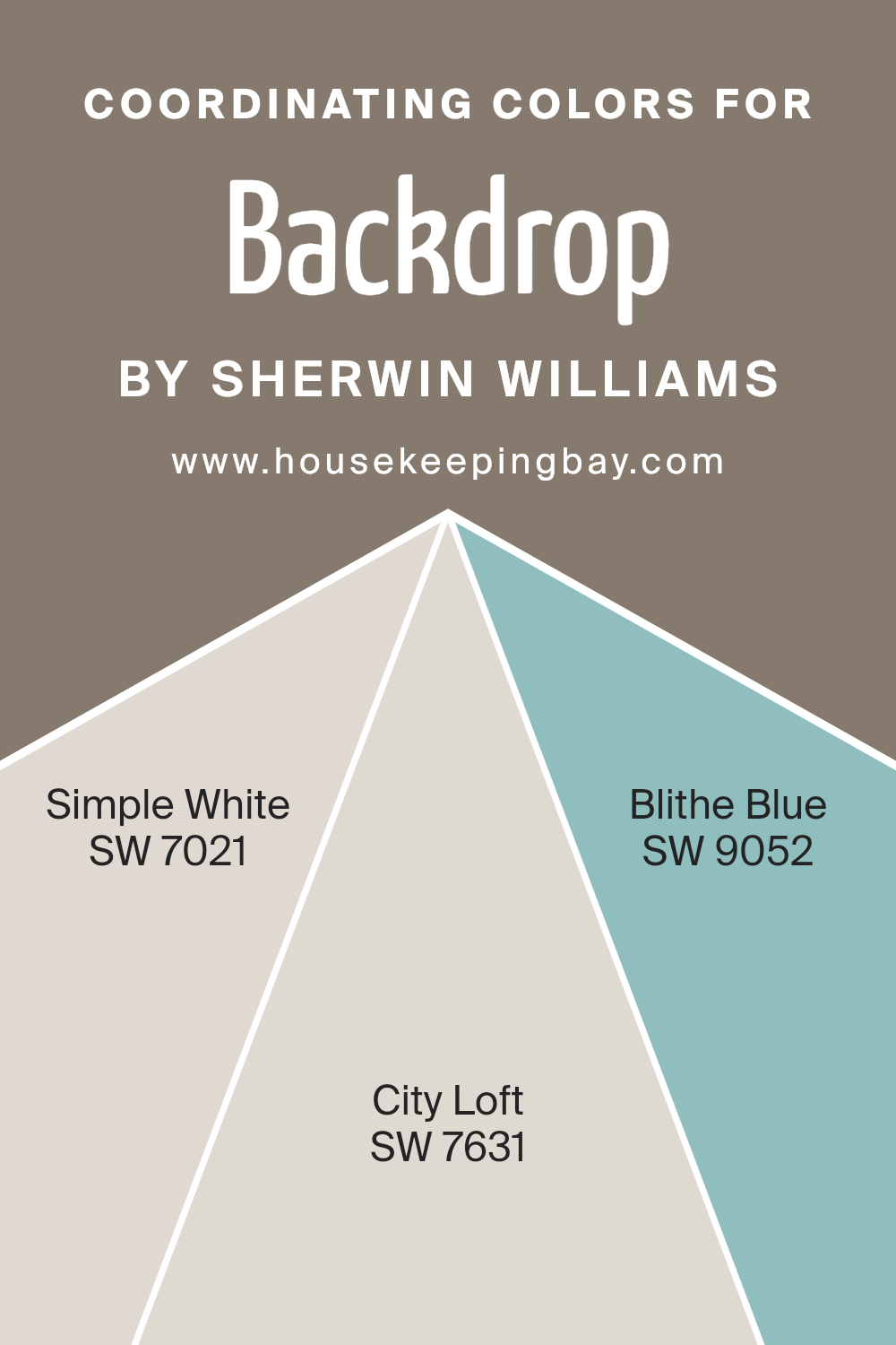
Coordinating colors are selected to complement a base color, enhancing the overall aesthetic of a room. When used effectively, they create a harmonious look that ties different design elements together.
For instance, Backdrop SW 7025 by Sherwin Williams can be beautifully accentuated with well-chosen coordinating colors that ensure a balanced, visually appealing space. By using these coordinating hues, one can achieve a cohesive look that flows seamlessly from one area to another.
Simple White SW 7021 provides a clean and fresh look, acting as a versatile backdrop that allows other colors to pop while maintaining a subtle integrity of its own. Reflecting light, it helps in making smaller spaces appear larger and more open.
City Loft SW 7631 offers a gentle warmth with its light beige tone, complimenting darker shades and adding depth when used in conjunction with neutral or vibrant colors. With its soothing presence, Blithe Blue SW 9052 introduces a soft touch of color, ideal for creating a serene atmosphere.
This pale blue has the ability to soothe and add a gentle splash of color without overwhelming the senses. Together, these colors support the primary paint choice and enhance the space’s aesthetic value.
You can see recommended paint colors below:
- SW 7021 Simple White
- SW 7631 City Loft
- SW 9052 Blithe Blue
housekeepingbay.com
How Does Lighting Affect Backdrop SW 7025 by Sherwin Williams?
Lighting greatly influences how colors appear in different settings, impacting the mood and style of a room. The color BackdropSW 7025 by Sherwin Williams, for example, can look different depending on the light it is exposed to.
In artificial light, depending on the type of bulb (warm or cool), BackdropSW 7025 can either appear slightly lighter or can bring out more gray tones in the paint. This makes it a versatile choice for rooms that are used primarily in the evenings, where it can create a cozy or sleek atmosphere based on the chosen lighting.
Natural light, on the other hand, has a dramatic impact on BackdropSW 7025. Natural lighting conditions change throughout the day and thus affect how this color is perceived. In rooms that face north, which typically receive less direct sunlight, BackdropSW 7025 might look cooler and more muted, making the space seem serene.
Rooms with southern exposure enjoy abundant light most of the day; here, BackdropSW 7025 may appear truer to its color swatch, brighter, and more vibrant.
For east-faced rooms, which get bright morning light, BackdropSW 7025 can look especially lively and warm in the morning but will transition as the day progresses. Conversely, in west-faced rooms, where sunlight is more intense in the later parts of the day, the color may appear duller in the morning but reach its peak warmth in the afternoon to early evening.
All these variations show how BackdropSW 7025 can adapt to different environments, making it a flexible choice that can suit various room orientations and lighting conditions. This adaptability allows for consistent styling despite the dynamic nature of light throughout the day and across different seasons.
housekeepingbay.com
What is the LRV of Backdrop SW 7025 by Sherwin Williams?
LRV stands for Light Reflectance Value, which is a measurement used to determine how much light a paint color reflects. This value is showcased on a scale from 0 to 100, where 0 absorbs all light (pure black) and 100 reflects all light (pure white).
Higher values make rooms feel lighter and bigger because they reflect more light around the space. Conversely, lower values create a cozier and somewhat darker atmosphere as they absorb more light.
For Backdrop SW 7025 by Sherwin Williams, which has an LRV of 20.247, it’s fairly low on the scale, meaning it won’t reflect much light. This quality can make the color ideal for creating a more intimate and enclosed feeling in a space. It might not be the best choice for a small, dark room as it won’t do much to brighten up the space. However, in well-lit or larger areas, this rich color can add depth and sophistication without making the room feel too cramped.

housekeepingbay.com
What are the Trim colors of Backdrop SW 7025 by Sherwin Williams?
Trim colors are essentially the hues selected for the edges, frames, and borders of various architectural elements like doors, window frames, and baseboards. Choosing the right trim colors can significantly impact the overall aesthetic and feel of a space.
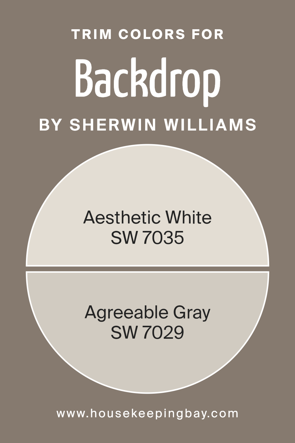
For BackdropSW 7025 by Sherwin Williams, which is a distinctive yet versatile shade, pairing it with the right trim colors can enhance its beauty and ensure it fits perfectly within the room’s design scheme. SW 7035 – Aesthetic White and SW 7029 – Agreeable Gray are excellent choices for trim, complementing the main color without overwhelming it.
Aesthetic White SW 7035 is a soft and muted white with a gentle warmth to it, making it perfect for a trim color that subtly supports the more potent tones of BackdropSW 7025. It brightens spaces gracefully without creating stark contrasts, promoting a light and airy atmosphere.
On the other hand, Agreeable Gray SW 7029 offers a friendly and inviting gray shade that bridges the gap between beige and gray. This color is ideal for creating a seamless look that enhances cohesion in the decor, providing a quiet and sophisticated backdrop to the bolder shades in the vicinity.
Together, these trim colors provide balance and a pleasing palette, supporting the overall visual continuity of your space.
You can see recommended paint colors below:
housekeepingbay.com
Colors Similar to Backdrop SW 7025 by Sherwin Williams
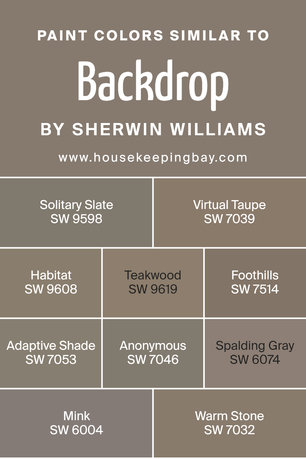
Similar colors play a crucial role in interior design because they provide a sense of harmony and cohesion. By using colors that closely relate to each other, it is possible to create a soothing and seamless aesthetic, ensuring that all elements within a space work together effortlessly.
For instance, multiple hues within the same color family can make a room feel more balanced and unified, which is ideal for creating an environment that feels organized and peaceful.
One good example is Solitary Slate by Sherwin Williams, a subdued blue-gray that offers a sophisticated backdrop to varied design elements, working well with muted tones. Similarly, Virtual Taupe is a warm, earthy gray that grounds furniture and decor, providing a neutral yet inviting canvas.
Habitat, another close color, has a natural, organic feel which makes any space feel grounded and home-like. Teakwood, a bit richer and deeper, adds a touch of elegance to any room, elevating the overall aesthetic without being too overwhelming.
If one wants a darker, more dramatic effect, Foothills—a dusky brown—pairs beautifully with lighter shades, enhancing the depth of the space. Adaptive Shade is versatile, with its chameleon-like ability to adapt, blending seamlessly into both modern and traditional decor.
Anonymous is another flexible option, straddling the line between gray and beige and praised for its understated chic. Spalding Gray brings a gentle warmth, ideal for creating soft, inviting spaces.
Mink offers deeper, chocolate undertones, contributing sophistication and richness. Lastly, Warm Stone provides a calming presence, its earthy palette warming up spaces that require a touch of coziness. Together, these shades form a harmonious palette that can beautifully transform any space with subtlety and quiet elegance.
You can see recommended paint colors below:
- SW 9598 Solitary Slate
- SW 7039 Virtual Taupe
- SW 9608 Habitat
- SW 9619 Teakwood
- SW 7514 Foothills
- SW 7053 Adaptive Shade
- SW 7046 Anonymous
- SW 6074 Spalding Gray
- SW 6004 Mink
- SW 7032 Warm Stone
housekeepingbay.com
Colors that Go With Backdrop SW 7025 by Sherwin Williams
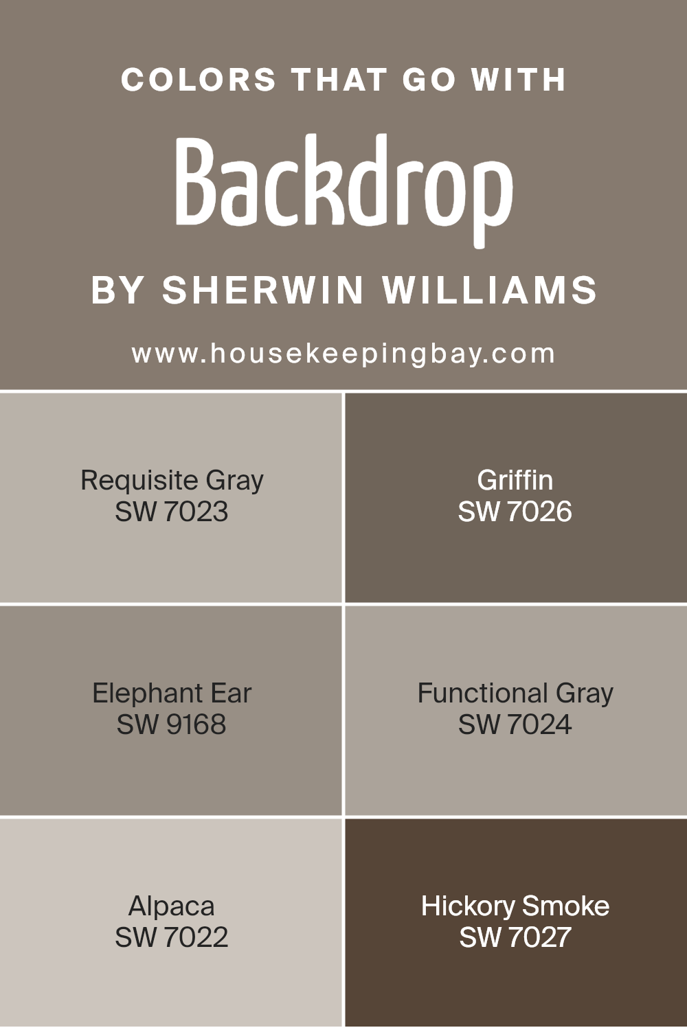
Choosing the right colors to complement Backdrop SW 7025 by Sherwin Williams can greatly enhance the aesthetic appeal of any space. These chosen colors, which harmonize beautifully with Backdrop, create a cohesive and inviting atmosphere.
For example, Requisite Gray SW 7023 is a light grey that offers a subtle contrast, perfect for creating a soft, serene environment. It pairs well with the deeper tone of Backdrop, providing a smooth transition between spaces or on accent features.
On the darker side, Griffin SW 7026 presents itself as a strong, solid gray that gives depth and definition when used alongside Backdrop. This color is ideal for grounding a room or highlighting architectural details.
Elephant Ear SW 9168, another excellent companion, offers a warm, taupe-like shade that adds richness and warmth, ensuring that the space feels cozy and well-coordinated. Functional Gray SW 7024 shifts slightly cooler, bringing a modern edge to the palette with its crisper undertones.
This shade works well in contemporary settings where a balance of warm and cool tones is desired. Alpaca SW 7022 offers a lighter, softer approach with its unique blend of gray and beige, enhancing rooms with natural light and providing a versatile backdrop for decor elements.
Lastly, Hickory Smoke SW 7027 serves as a deep, smoky gray that can create dramatic and sophisticated settings, ideal for accent walls or cabinetry, complementing the lighter tones of Backdrop SW 7025 with elegance. Together, these colors provide options for achieving a balanced and harmonious look that caters to a variety of tastes and styles.
You can see recommended paint colors below:
- SW 7023 Requisite Gray
- SW 7026 Griffin
- SW 9168 Elephant Ear
- SW 7024 Functional Gray
- SW 7022 Alpaca
- SW 7027 Hickory Smoke
housekeepingbay.com
How to Use Backdrop SW 7025 by Sherwin Williams In Your Home?
Backdrop SW 7025 by Sherwin Williams is a versatile shade of gray that blends perfectly with almost any color scheme, making it ideal for various rooms in your home. This soft, neutral color can help create a serene and cozy environment, whether used in the living room, bedroom, or kitchen.
Applying Backdrop SW 7025 on walls can serve as a perfect canvas, allowing your furniture and decor elements to truly shine. It pairs well with brighter colors, bringing a balanced feel, or with other shades of gray for a sophisticated monochrome palette.
For those looking to freshen up their kitchen, this shade works beautifully with white cabinets for a clean and modern look. In a living room, complementing it with textured fabrics and metallic accents can add a touch of elegance. It’s also an excellent choice for bedrooms, where its calming nature can help in relaxing after a long day. This hue is a practical choice for anyone wanting to update their home with a fresh, yet timeless look.
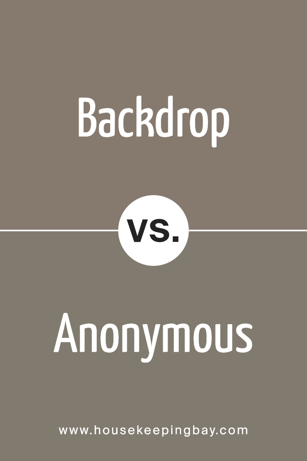
Backdrop SW 7025 by Sherwin Williams vs Anonymous SW 7046 by Sherwin Williams
Backdrop SW 7025 by Sherwin Williams is a gray with a soft warmth to it, making it versatile for various spaces. This color is lighter and provides a subtle, soothing atmosphere, which can make smaller rooms feel larger and more open.
In contrast, Anonymous SW 7046 is a deeper, charcoal gray that can bring a sense of sophistication and strength to a room. It can work well in larger spaces or as an accent wall to create a focal point. When paired together, these colors offer a balanced look.
The lighter Backdrop can soften a room while the darker Anonymous can be used to introduce a more dramatic effect without overwhelming the space. These colors can be used together or separately, depending on the desired outcome for the room’s ambiance.
You can see recommended paint color below:
housekeepingbay.com
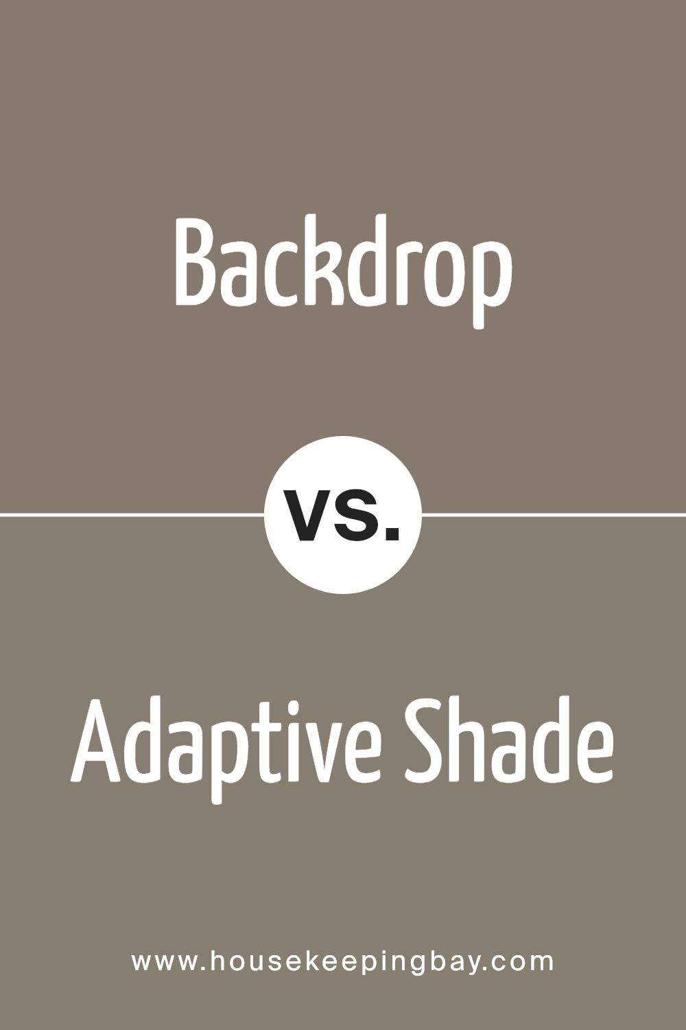
Backdrop SW 7025 by Sherwin Williams vs Adaptive Shade SW 7053 by Sherwin Williams
Backdrop SW 7025 by Sherwin Williams is a rich, dark gray hue with slightly warm undertones, creating a cozy and inviting vibe in any room. It’s perfect for adding depth and highlighting other decor elements due to its boldness.
Meanwhile, Adaptive Shade SW 7053 is a lighter gray that feels more neutral and versatile. This color has a balanced mix of warm and cool undertones, making it incredibly flexible for various lighting conditions and design styles.
While Backdrop offers a strong statement likely to anchor a space, Adaptive Shade provides a subtler approach, enhancing openness and lightness in a room. These two shades of gray work well together, with Backdrop suited for accent walls or furniture, and Adaptive Shade excellent for larger surfaces or adjoining rooms. This combination allows for a harmonious yet distinct visual impact, suitable for modern and traditional designs alike.
You can see recommended paint color below:
housekeepingbay.com
Backdrop SW 7025 by Sherwin Williams vs Habitat SW 9608 by Sherwin Williams
Backdrop SW 7025 by Sherwin Williams is a soft, warm gray with a cozy feel, making it versatile for any space. It reflects light well, giving a room a more spacious appearance. This neutral hue works seamlessly in various settings, from modern to traditional, as it provides a subtle yet sophisticated background for decor and furniture.
Contrasting this, Habitat SW 9608 is a rich, earthy green, inspired by nature. It offers a vivid punch of color, ideal for adding character and vitality to a space. This tone pairs beautifully with natural elements like wood or stone, enhancing the feeling of being connected to the outdoors.
Its deep saturation works well in larger areas or as an accent wall, adding depth and warmth to interiors.
Together, these colors can create a balanced and inviting environment, where the calmness of Backdrop sets a relaxed tone and Habitat adds lively interest.
You can see recommended paint color below:
- SW 9608 Habitat

housekeepingbay.com
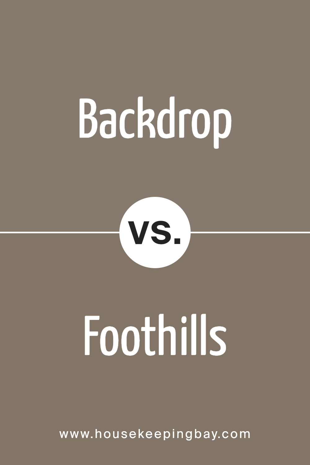
Backdrop SW 7025 by Sherwin Williams vs Foothills SW 7514 by Sherwin Williams
Backdrop SW 7025 by Sherwin Williams is a deep, cool gray that gives a soothing and neutral look. It works well in modern interior designs, providing a clean backdrop for various decor styles. This color is versatile enough to work in spaces like living rooms, bedrooms, and offices, adding depth without overwhelming the space.
Foothills SW 7514 by Sherwin Williams, by contrast, is a warmer, medium shade of brown with a touch of gray. This color makes any room feel cozy and welcoming, especially good in living areas or dining rooms where a homely atmosphere is desired. It pairs nicely with natural elements like wood and stone.
Both colors are great for creating a sophisticated space, with Backdrop leaning towards a more minimalistic, contemporary vibe, while Foothills offers a classic and earthy feel.
You can see recommended paint color below:
- SW 7514 Foothills
housekeepingbay.com
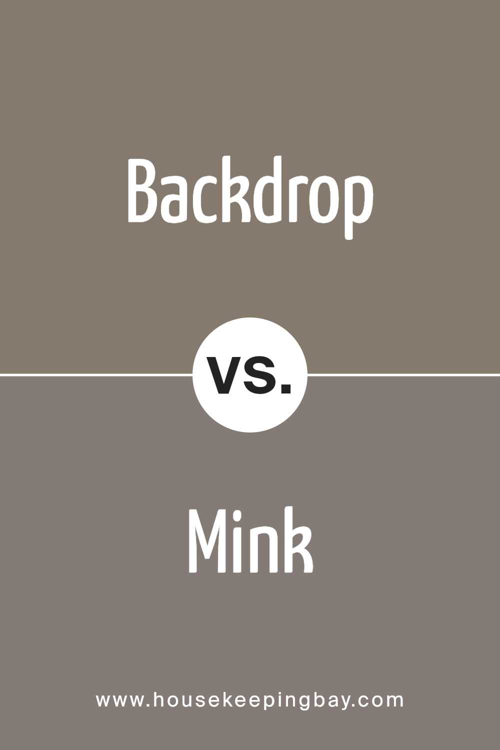
Backdrop SW 7025 by Sherwin Williams vs Mink SW 6004 by Sherwin Williams
Backdrop SW 7025 by Sherwin Williams is a neutral gray that provides a calm and subtle appearance, making it flexible for various spaces whether it be living areas or bedrooms. It acts as an excellent base color, pairing well with brighter or darker shades.
On the contrary, Mink SW 6004 is a richer, deeper color that tends toward a warmer, dark taupe. Its luxurious depth makes it well-suited for creating a cozy and inviting atmosphere, perfect for intimate spaces or accent walls.
While both colors work well in modern interior designs, Backdrop leans towards a more minimalistic and understated look, great for those who prefer a cleaner aesthetic. Mink, with its warmth, adds a touch of sophistication and warmth, ideal for those looking to create a more dramatic or traditional look. Each color therefore has its unique mood and application, depending on the ambiance one wants to achieve in their space.
You can see recommended paint color below:
- SW 6004 Mink
housekeepingbay.com
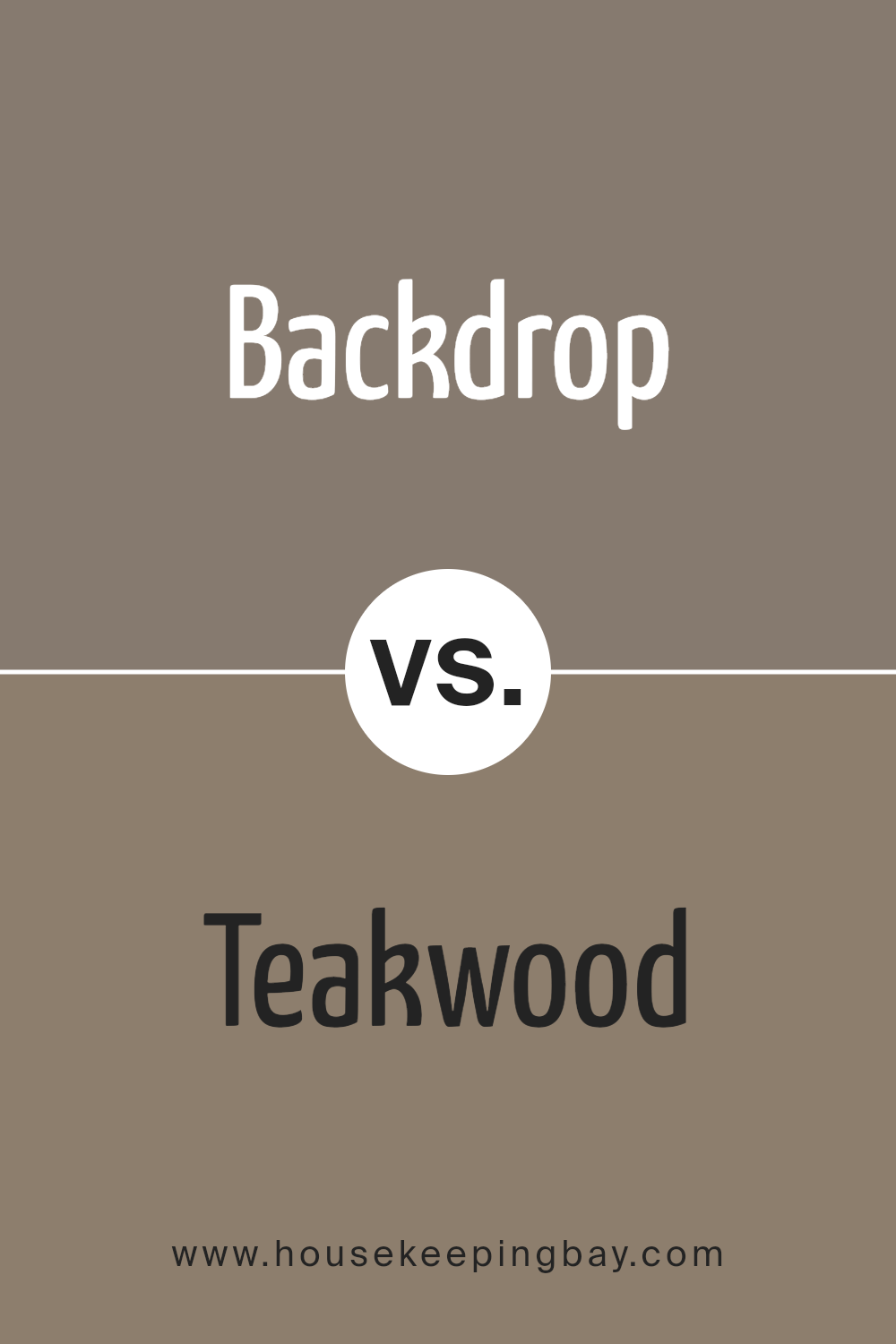
Backdrop SW 7025 by Sherwin Williams vs Teakwood SW 9619 by Sherwin Williams
Backdrop SW 7025 by Sherwin Williams is a neutral gray that offers a soft, warm tone that creates a cozy and inviting atmosphere. This versatile color can easily complement a variety of decor styles and works well in many areas of a home, including living rooms, bedrooms, and kitchens. It pairs nicely with both bright and subdued accents, making it ideal for those who like to keep their space adaptable to changing decor trends.
In contrast, Teakwood SW 9619 is a much darker, richer color that closely resembles the natural brown hues of teak wood. This shade is perfect for adding depth and warmth to a space. It works particularly well in settings that aim for a more traditional or rustic feel.
Teakwood can serve as a striking feature wall color or as an accent to enhance architectural details. Its strong presence can help anchor a room with large, open spaces, giving it a more intimate feel.
Both colors bring distinct vibes to a space: Backdrop being milder and more flexible, and Teakwood adding boldness and warmth.
You can see recommended paint color below:
- SW 9619 Teakwood
housekeepingbay.com
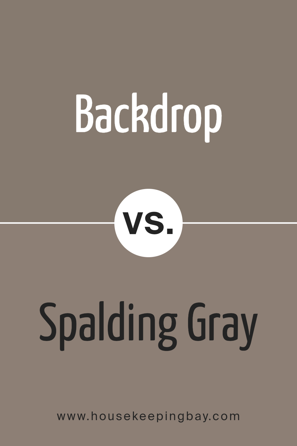
Backdrop SW 7025 by Sherwin Williams vs Spalding Gray SW 6074 by Sherwin Williams
Backdrop SW 7025 by Sherwin Williams is a neutral yet warm gray with versatile appeal. It provides a soft, minimalist look that works well in almost any space, making it an excellent choice for creating a calm and understated background. The color can effectively highlight brighter accents or furniture without clashing.
Spalding Gray SW 6074, in contrast, is a darker, richer gray. This hue offers a more pronounced presence in a room, giving depth and sophistication. Its depth makes it suitable for focal points or accent walls where you want to add some drama.
Both colors share a gray base, but their different shades impact the mood and spatial perception of a room. While Backdrop is lighter and more subtle, Spalding Gray stands out more and can make smaller spaces feel a bit cozier. Depending on the lighting and accompanying decor, both can shift in appearance, offering flexibility in design choices.
You can see recommended paint color below:
- SW 6074 Spalding Gray
housekeepingbay.com
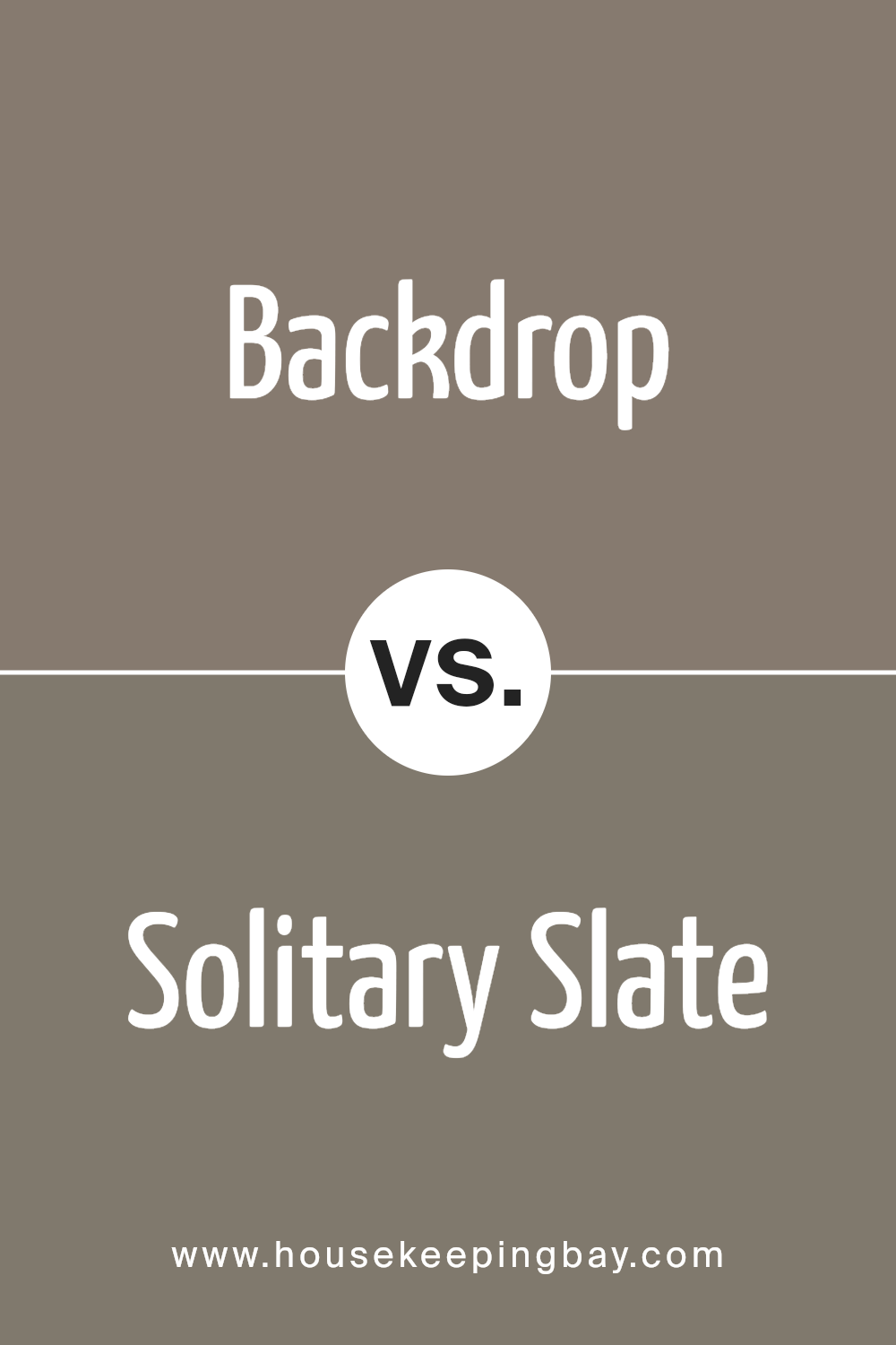
Backdrop SW 7025 by Sherwin Williams vs Solitary Slate SW 9598 by Sherwin Williams
Backdrop SW 7025 by Sherwin Williams is a versatile gray with warm undertones, making it a great neutral choice for any space. It’s light enough to keep rooms feeling airy while providing enough depth to add character and warmth. This color works particularly well in living areas and bedrooms where a cozy, inviting atmosphere is desired.
Solitary State SW 9598, another offering from Sherwin Williams, is a deeper, more pronounced gray. It has cooler undertones, giving it a more modern and somewhat industrial feel. This shade is ideal for those seeking a bold, sophisticated look, and it pairs well with bright whites or vibrant colors for contrast.
Both colors hold their own unique appeal, depending on the vibe and function of the room. Backdrop’s warmth suits communal, relaxed spaces; Solitary Slate’s cool tones fit well in sleek, contemporary settings.
You can see recommended paint color below:
- SW 9598 Solitary Slate
housekeepingbay.com
Backdrop SW 7025 by Sherwin Williams vs Virtual Taupe SW 7039 by Sherwin Williams
Backdrop SW 7025 by Sherwin Williams is a rich, deep gray that offers a strong, classic look. It’s perfect for creating a dramatic mood or grounding a space with its intensity. The color works well in various settings, serving as a versatile backdrop that allows other colors to pop.
Virtual Taupe SW 7039, in contrast, is a softer, brownish-gray that brings a warm, neutral palette to any room. This color is inviting and cozy, ideal for spaces where you want a relaxed feel. It pairs well with a wide range of other hues, adding a touch of warmth without overwhelming the senses.
Both Backdrop and Virtual Taupe have their unique appeal, with Backdrop providing a more pronounced, bold statement and Virtual Taupe offering a soothing, understated elegance. Depending on your room’s function and desired atmosphere, either could be a suitable choice.
You can see recommended paint color below:
- SW 7039 Virtual Taupe

housekeepingbay.com
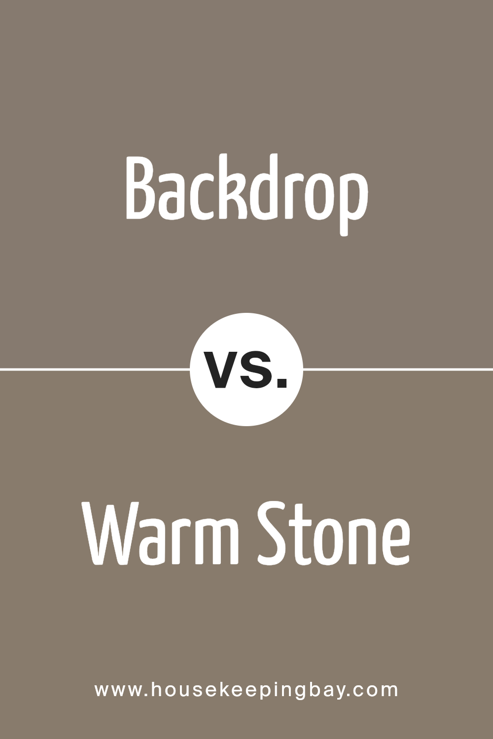
Backdrop SW 7025 by Sherwin Williams vs Warm Stone SW 7032 by Sherwin Williams
Backdrop SW 7025 by Sherwin Williams is a solid, deep gray that offers a strong foundational tone, making it a great choice for those who prefer a neutral yet bold wall color. It can give a room a sense of grounding and sophistication. Its versatility means it pairs well with a variety of decor styles and colors, from bright and vibrant to more subdued and minimalist.
Warm Stone SW 7032, also by Sherwin-Williams, is a slightly lighter shade that leans more towards a warm taupe. This color provides rooms with a cozy and inviting atmosphere, reflecting more natural light and making spaces feel more open and airy. It’s particularly suited for living areas and bedrooms where a softer, more soothing color is desirable.
Both colors are neutral, yet each provides a distinctive vibe – Backdrop being more dramatic and bold, whereas Warm Stone offers a softer, welcoming feel. This makes each suitable for different spaces or preferences depending on the desired ambiance.
You can see recommended paint color below:
- SW 7032 Warm Stone
housekeepingbay.com
Conclusion
Sherwin Williams’ SW 7025 Backdrop is a versatile paint color that suits various spaces in your home or office. Its sophisticated gray shade offers a subtle, yet impactful way to enhance your surroundings.
Using SW 7025 Backdrop can unify a room by providing an elegant background that complements different décor styles and furniture pieces. This color also adapts well to various lighting conditions, gracefully shifting its tone from warm to cool, making it an ideal choice for interior walls.
If you’re considering a fresh paint job, SW 7025 Backdrop should be on your list. It’s perfect for creating a refined atmosphere in places where you spend a lot of time, such as living rooms, bedrooms, or study areas. This color can help make your space look more polished and put together without overwhelming your personal style or existing interior design elements. Give your home or workspace a subtle yet significant lift with SW 7025 Backdrop. It’s not just paint; it’s a backdrop for your life’s everyday moments and special memories.
housekeepingbay.com
