Stone Lion SW 7507 by Sherwin Williams
Unleashing Warmth: How Neutral Tones Redefine Spaces
If you’re leaning towards a neutral shade with a warm, inviting feel, SW 7507 Stone Lion by Sherwin Williams might just be the perfect choice for you.
This color is a subtle, rich beige that works beautifully in a variety of settings, from your living room to your bedroom, adding warmth and a touch of elegance without overwhelming your space.
Stone Lion pairs well with a wide range of decor styles and colors, making it a safe yet stylish choice if you’re looking to update your home. Whether you’re aiming for a classic look or something more modern, this shade creates a lovely backdrop that complements both vibrant and muted furnishing choices.
It’s particularly effective in areas where you want to establish a cozy, welcoming atmosphere.
Choosing the right paint color can really change the feel of a room, and SW 7507 Stone Lion offers a balanced blend of sophistication and comfort. If you’re on the lookout for a color that enhances your space without taking over, this might be the way to go.
Ready to see how it looks in your home? Grab a sample and test it out on your walls.
via sherwin-williams.com
What Color Is Stone Lion SW 7507 by Sherwin Williams?
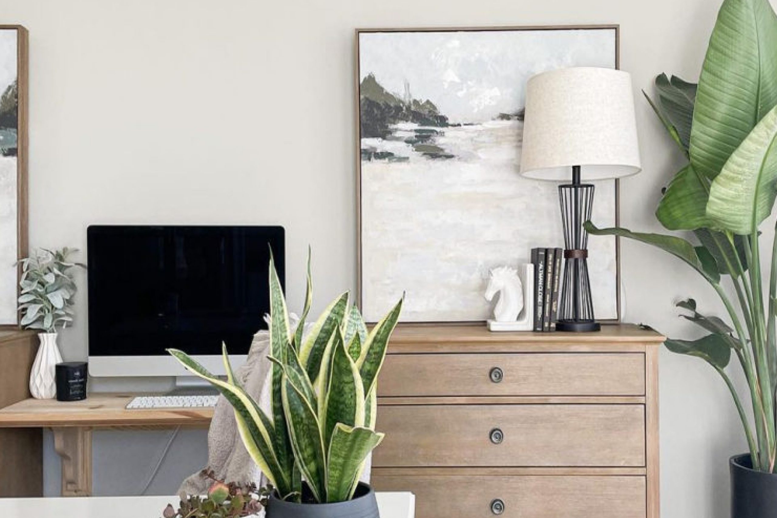
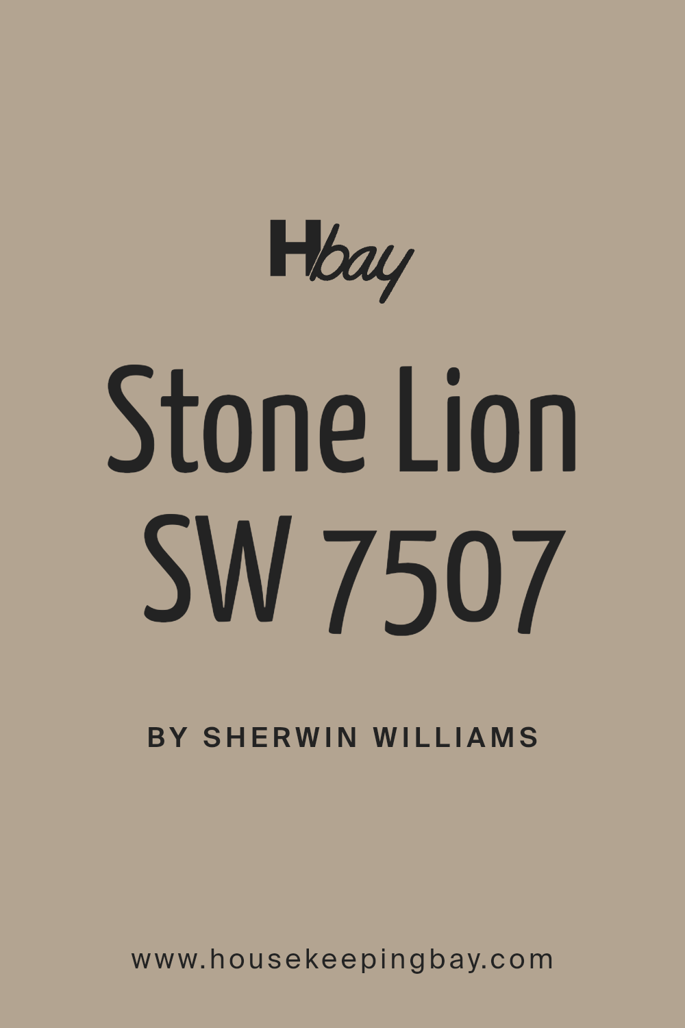
Stone Lion SW 7507 by Sherwin Williams is a warm, neutral hue that resembles the color of natural clay or a soft, sandy beach. This versatile shade belongs to the earth-tone family and provides a soothing background in any room. Its subtlety makes it an excellent choice for creating a cozy and welcoming atmosphere.
Stone Lion works particularly well in interior styles that emphasize comfort and simplicity, such as rustic, country, and traditional designs. It also fits beautifully in modern and contemporary spaces that favor minimalistic yet warm settings.
This color pairs well with natural materials like wood, enhancing the grain and texture of wooden furniture or floors. It complements also well with stone elements, like a stone fireplace or a marble countertop, adding to the organic feel of a space.
For fabrics and textiles, it goes nicely with linens and cotton in both similar and contrasting colors.
Think creams, beiges, and muted blues for a gentle palette or bold colors like navy or emerald green for a daring contrast. The versatility of Stone Lion allows it to harmonize with a wide range of accessories, making it a trustworthy choice for any decorating project.
housekeepingbay.com
Is Stone Lion SW 7507 by Sherwin Williams Warm or Cool color?
Stone Lion SW 7507 by Sherwin Williams is a versatile paint color that can add a cozy and warm feeling to any room in your home. This shade is a soft beige with slight gray undertones, making it a great neutral choice that pairs well with various decor styles and colors. Whether you use it in a living room, bedroom, or kitchen, Stone Lion brings a subtle richness that enhances the space without overwhelming it.
Because of its neutrality, Stone Lion works well in spaces that get a lot of natural light, as well as in rooms that might need a little extra warmth. It can make large rooms feel more inviting and small spaces appear bigger. This color is especially effective in creating a seamless look in homes with open floor plans.
Adding Stone Lion to your home provides a solid foundation for decorating. Whether paired with bright colors for a lively vibe or darker hues for a more grounded feel, this color supports various design choices, making it a practical choice for many homeowners.
What is the Masstone of the Stone Lion SW 7507 by Sherwin Williams?
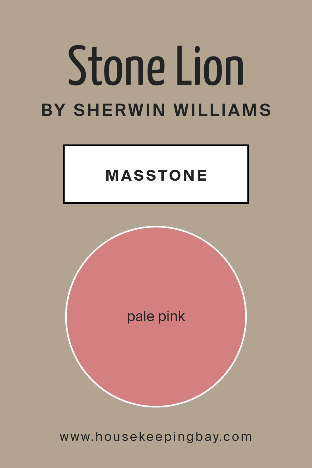
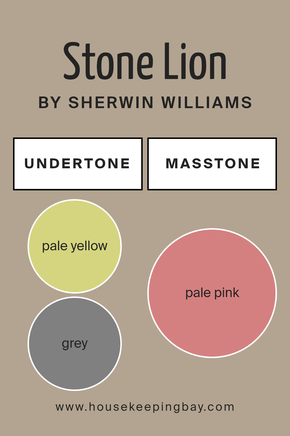
Stone Lion SW 7507 from Sherwin Williams shows off a masstone of pale pink, with the specific shade being #D58080. This gentle, soothing color is perfect for creating a warm and inviting atmosphere in homes. The softness of the pale pink makes rooms feel more open and airy, providing a subtle backdrop that blends well with various decorative styles, from modern to classic.
Since it is not overly bold, Stone Lion offers a delicate touch of color that can enhance spaces without overpowering them. This makes it ideal for use in living rooms, bedrooms, and even bathrooms where a calm and peaceful environment is often desired.
Additionally, the versatility of this shade allows it to pair nicely with darker and lighter tones, providing flexibility in designing and decorating a cohesive home interior. The result is a balanced and harmonious aesthetic that makes your living space both beautiful and comfortable.
housekeepingbay.com
Undertones of Stone Lion SW 7507 by Sherwin Williams
Stone Lion SW 7507 by Sherwin Williams is a versatile paint color that looks different depending on the light and surroundings due to its various undertones. Undertones are subtle colors that lie beneath the surface color of the paint. In the case of Stone Lion, the undertones include shades like pale yellow, grey, mint, and light purple among others.
These undertones impact how we perceive the main color. For example, in bright sunlight, the pale yellow or light blue undertones might make the color appear warmer and brighter.
Meanwhile, in dimmer, artificial light, the grey or light purple undertones could give it a cooler, more muted look. This makes Stone Lion a complex color that can adapt to different settings and moods.
When used on interior walls, the undertones in Stone Lion SW 7507 can significantly affect the room’s atmosphere. If the room has a lot of natural light, the walls might display a warm and inviting look due to the yellow or orange undertones.
In a room with less light, the gray or lilac undertones might make the space feel more enclosed and cozy. Thus, the choice of lighting and decor can help bring out specific undertones in the paint, allowing a room to feel either more spacious and warm or snug and soothing. Choosing decorations and furnishings that complement these undertones can help achieve a consistent and harmonious look.
housekeepingbay.com
Coordinating Colors of Stone Lion SW 7507 by Sherwin Williams
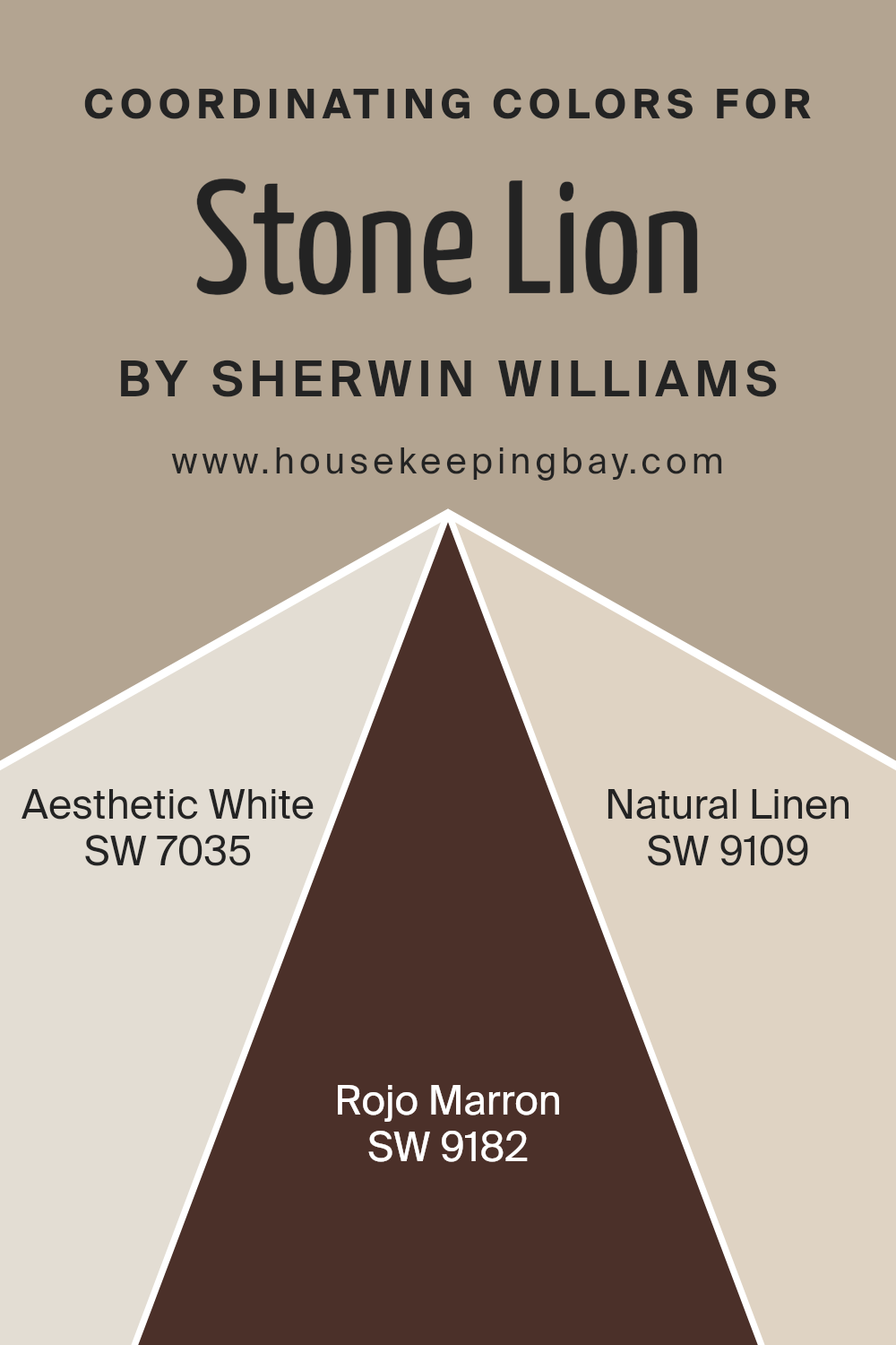
Coordinating colors work harmoniously with a primary color to create a balanced and appealing visual effect. For example, the color Stone Lion SW 7507 by Sherwin Williams pairs well with a selection of coordinating colors in a variety of hues to achieve a cohesive look.
This coordinated approach allows for a more versatile color scheme in decorating, offering options to accent different aspects of a room or to create a specific atmosphere through contrasts and complements.
Aesthetic White SW 7035 is a soft, warm white that provides a subtle backdrop that enhances the richer tones of Stone Lion without overpowering them. It’s ideal for creating a sense of calm and continuity in spaces.
Moving to a more vivid choice, Rojo Marron SW 9182 is a deep, rich brown with a hint of red that offers a striking contrast to Stone Lion, adding depth and warmth to the palette. Lastly, Natural Linen SW 9109 is a gentle beige that echoes the earthy tones of Stone Lion, reinforcing a grounded, serene environment.
This shade is perfect for those looking to maintain a natural, understated elegance in their decor. Together, these coordinating colors can help achieve a harmonious and well-rounded color scheme.
You can see recommended paint colors below:
- SW 7035 Aesthetic White
- SW 9182 Rojo Marron
- SW 9109 Natural Linen
housekeepingbay.com
How Does Lighting Affect Stone Lion SW 7507 by Sherwin Williams?
Lighting significantly impacts the perception of colors. Different light sources can subtly or drastically change the way a color looks. For example, Sherwin Williams’ Stone Lion SW 7507, a warm neutral shade, can appear differently based on the lighting conditions of a room.
In artificial light, such as LED or fluorescent bulbs, Stone Lion SW 7507 tends to look warmer, making the space feel cozy and inviting. Artificial lighting, especially warmer tones, enhances the golden undertones of this color, making it ideal for living spaces where comfort is key.
In natural light, the true color of Stone Lion SW 7507 is more apparent. Natural sunlight can reveal the depth of this hue, showing its complex mixture of beige and gray. The amount and angle of sunlight throughout the day will also affect how this color is perceived. Rooms with ample sunlight will display the color in its truest form, bright and vibrant.
Room orientation affects how Stone Lion SW 7507 is seen. North-facing rooms generally receive less direct sunlight, making this color appear more muted and subdued. The cooler, indirect light can make Stone Lion feel more gray than beige.
South-facing rooms, bathed in abundant sunlight for most of the day, show Stone Lion SW 7507 at its warmest. The ample light highlights the beige, creating a warm and welcoming atmosphere.
East-facing rooms get plenty of morning light, making Stone Lion SW 7507 look bright and lively in the mornings, gradually becoming softer as the day progresses.
West-facing rooms will have a similar effect but in reverse, with the color warming up significantly in the afternoon to evening light as the sunlight becomes more golden.
Understanding how lighting affects colors like Stone Lion SW 7507 helps in making informed choices for painting and decorating spaces to achieve the desired mood and aesthetic.
housekeepingbay.com
What is the LRV of Stone Lion SW 7507 by Sherwin Williams?
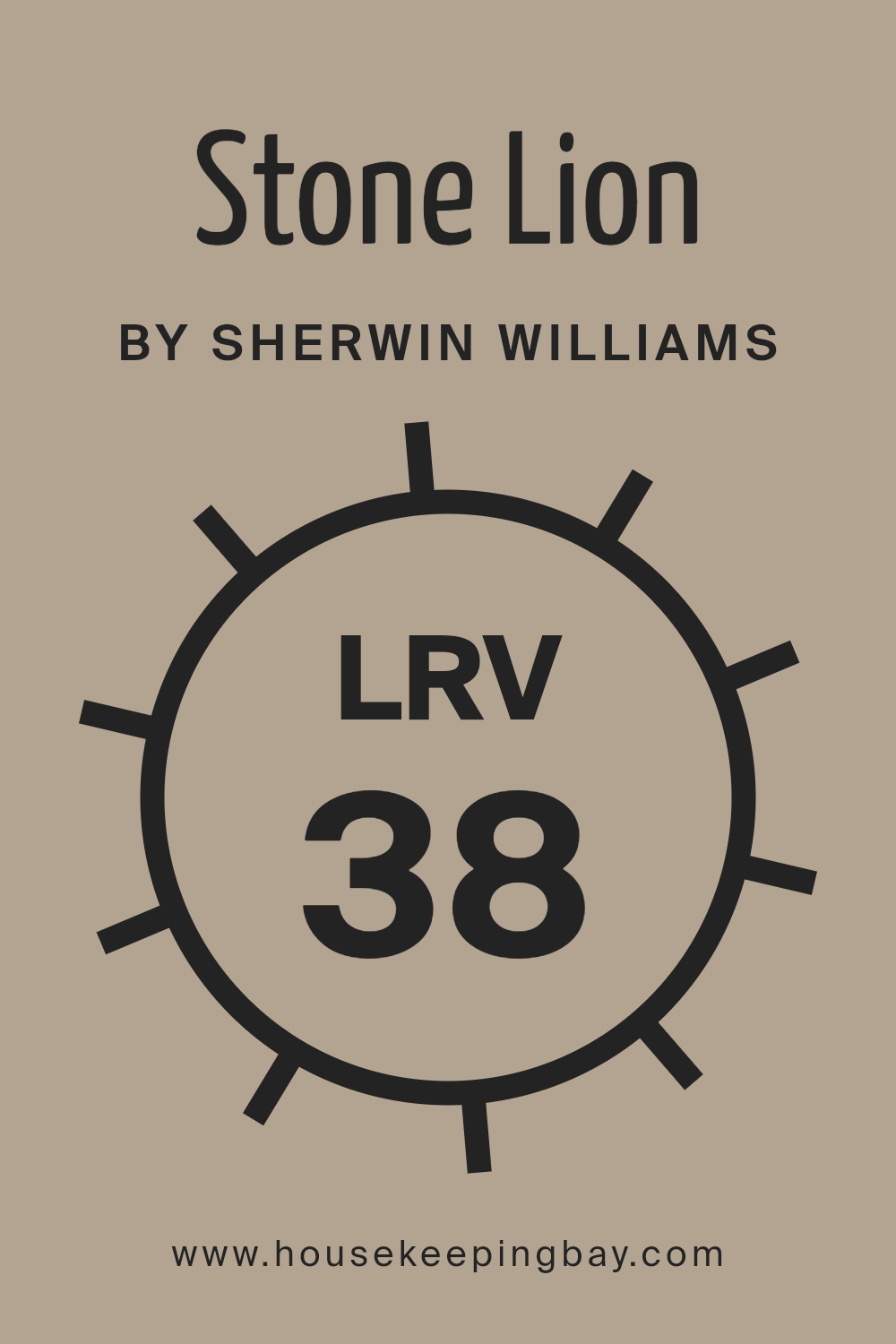
LRV, or Light Reflectance Value, measures the percentage of light a paint color reflects back into a room. It’s a helpful metric when choosing paint colors because it tells you how light or dark a color will look once applied to the walls. Colors with higher LRVs reflect more light, making spaces seem brighter and more open, while colors with lower LRVs absorb more light, giving a cozier, more enclosed feel.
With an LRV of 38.208, Stone Lion SW 7507 by Sherwin Williams is on the darker side of the spectrum. It means that when used on walls, this color will absorb much of the light rather than reflecting it back into the room. This characteristic makes it ideal for creating a more intimate atmosphere in a space.
However, if the room is naturally dark or small, using this color might make it appear even smaller and darker unless combined with good lighting and lighter accents.
housekeepingbay.com
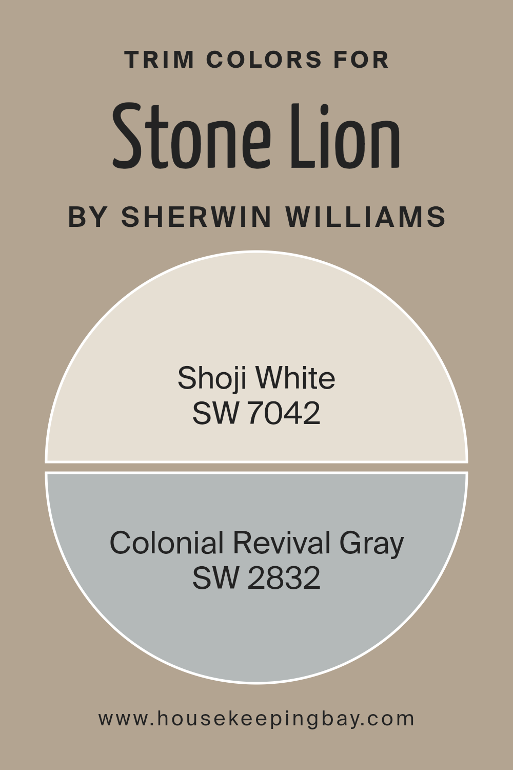
What are the Trim colors of Stone Lion SW 7507 by Sherwin Williams?
Trim colors refer to the shades used for detailing on architectural features such as door frames, window casings, baseboards, and crown moldings, distinguishing these elements from the primary wall colors for added visual appeal and structure.
When paired with a robust and serene hue like Stone Lion SW 7507 by Sherwin Williams, selecting the right trim colors can significantly enhance the overall aesthetic. SW 7042 Shoji White, a soft and warm white, offers a subtle contrast that highlights the rich depth of Stone Lion, making the space feel more defined and cohesive.
On the other hand, SW 2832 Colonial Revival Gray provides a slightly bolder edge, adding a refined and sophisticated touch that complements the muted undertones of Stone Lion, ensuring that the trims create a balanced, yet impactful frame around the room’s features.
SW 7042 Shoji White is a gentle and inviting white that imparts a crisp and airy quality to any space, making it ideal for creating a relaxed and neat border around darker or richer wall colors.
SW 2832 Colonial Revival Gray is a medium-toned gray that carries a classic elegance, perfect for bringing a subtle yet distinct contrast to more neutral or subdued main colors, thus framing the environment with a touch of historical charm.
Each color, when applied as a trim, not only defines the architectural elements of a room but also compleates the overall look, emphasizing calm sophistication and visual interest.
You can see recommended paint colors below:
housekeepingbay.com
Colors Similar to Stone Lion SW 7507 by Sherwin Williams
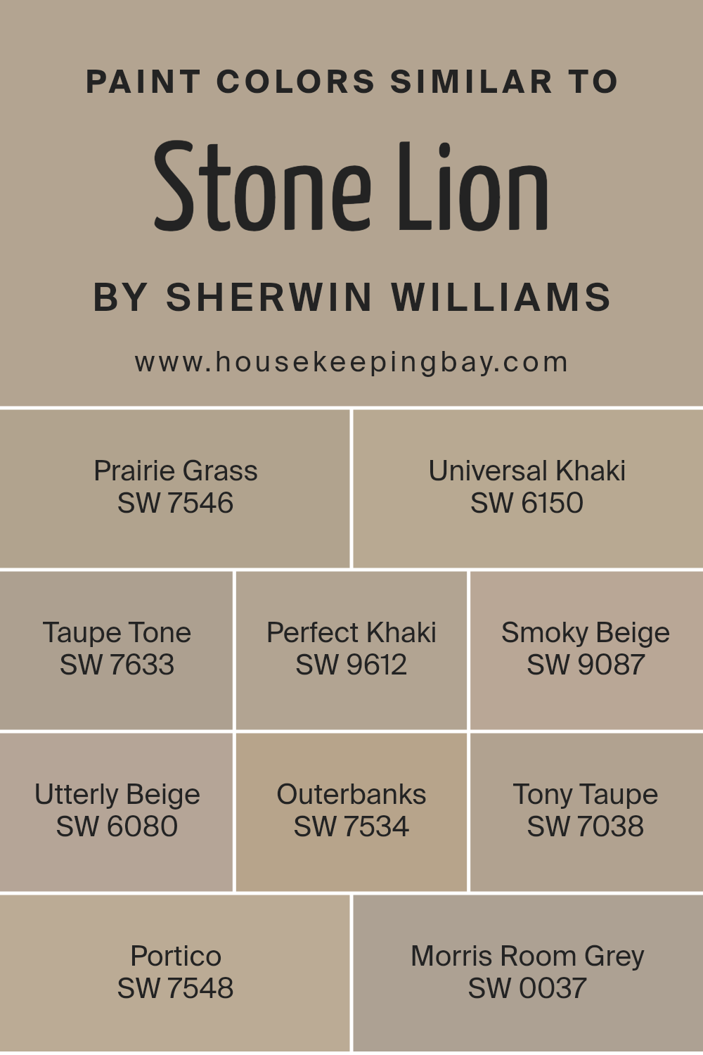
In interior design, using similar colors can create a cohesive and harmonious look, making the space feel more put-together and restful. Colors like Stone Lion SW 7507 by Sherwin Williams and its similar shades, such as Prairie Grass SW 7546 or Universal Khaki SW 6150, blend seamlessly, giving a subtle variation that adds depth and interest to rooms without overwhelming the senses.
These colors work well together because they share similar undertones, making it easy to mix and match them across different elements like walls, furniture, and decor.
For instance, Prairie Grass SW 7546 has an earthy feel that pairs well with the slightly darker Universal Khaki SW 6150, which lends a grounding effect. Taupe Tone SW 7633 has a warm, welcoming vibe, while Perfect Khaki SW 9612 offers a slightly richer hue, adding a hint of sophistication to any space.
Smoky Beige SW 9087 provides a gentle contrast with its softer tone, and Utterly Beige SW 6080 stands out with its creamy warmth. For those looking for a bit darker but still harmonious options, Outerbanks SW 7534 and Tony Taupe SW 7038 add an elegant strength.
Portico SW 7548 bridges the lighter and darker shades with its balanced tone, and Morris Room Grey SW 0037 serves as the companion that offers a more pronounced but still complementary shade, rounding out the collection and giving designers versatile options for creating inviting, polished spaces.
You can see recommended paint colors below:
- SW 7546 Prairie Grass
- SW 6150 Universal Khaki
- SW 7633 Taupe Tone
- SW 9612 Perfect Khaki
- SW 9087 Smoky Beige
- SW 6080 Utterly Beige
- SW 7534 Outerbanks
- SW 7038 Tony Taupe
- SW 7548 Portico
- SW 0037 Morris Room Grey
housekeepingbay.com
Colors that Go With Stone Lion SW 7507 by Sherwin Williams
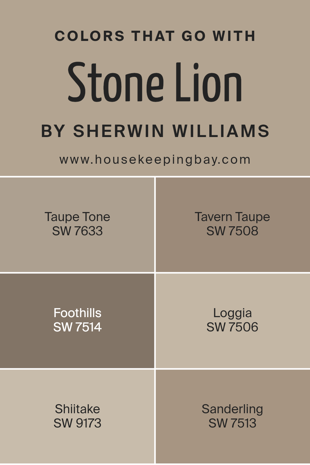
Colors that complement Stone Lion SW 7507 by Sherwin Williams are vital for creating a cohesive and appealing color scheme in interior design. These colors help in achieving a balanced look by either contrasting or enhancing the base color, Stone Lion, which is a warm, mid-tone beige.
For example, pairing it with Taupe Tone SW 7633, which is a slightly darker shade of beige, adds subtle depth to a room without overwhelming the senses. Similarly, Tavern Taupe SW 7508 offers a richer, earthier beige that can give a room a cozy and inviting feel.
Moving to slightly different hues, Foothills SW 7514 is a warmer brown that adds a touch of sophistication and natural elegance, making it perfect for spaces where a more formal ambiance is desired. Loggia SW 7506, a lighter and softer brown, invokes a sense of calm and simplicity, ideal for creating a serene environment.
Shiitake SW 9173 brings in a unique grayish-brown that can act as a neutral backdrop or stand out depending on the surrounding decor. Lastly, Sanderling SW 7513 is a lighter, sandy beige that reflects light beautifully, making it a great choice for smaller or darker rooms needing a touch of brightness.
Using these colors together with Stone Lion allows for a flexible palette that can accommodate a variety of design preferences and room functions.
You can see recommended paint colors below:
- SW 7633 Taupe Tone
- SW 7508 Tavern Taupe
- SW 7514 Foothills
- SW 7506 Loggia
- SW 9173 Shiitake
- SW 7513 Sanderling
housekeepingbay.com
Complimentary Colors for Stone Lion SW 7507 Paint Color by Sherwin Williams
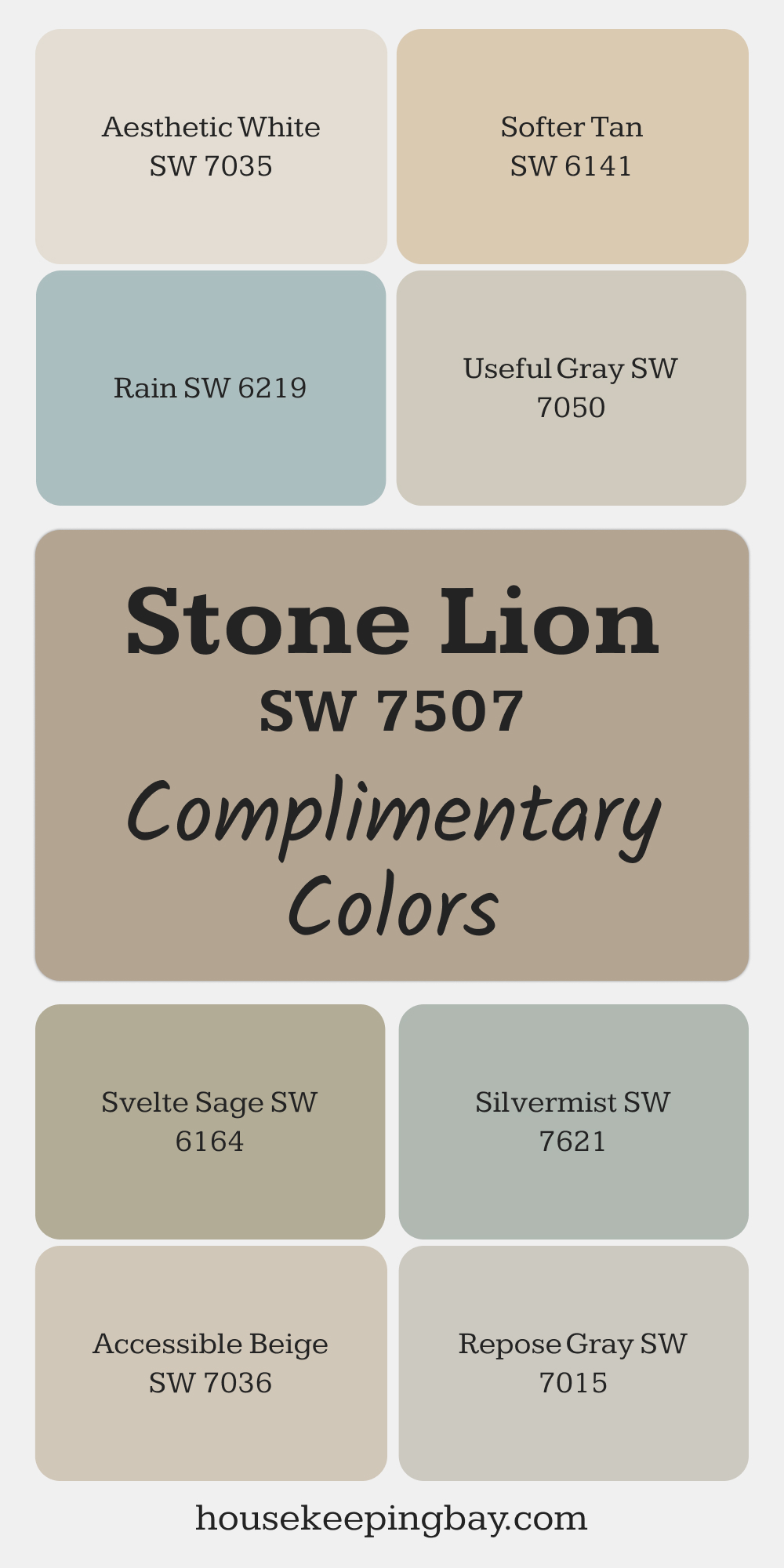
Stone Lion is a versatile color that pairs beautifully with a range of shades. Repose Gray and Aesthetic White provide subtle contrast, creating a clean and polished look. For a softer, more natural feel, Softer Tan and Svelte Sage add warmth and a touch of greenery.
Silvermist and Rain bring a soothing touch of blue, complementing Stone Lion’s neutral base. Useful Gray and Accessible Beige round out the palette, offering balance and effortless cohesion.
via housekeepingbay.com
How to Use Stone Lion SW 7507 by Sherwin Williams In Your Home?
Stone Lion SW 7507 by Sherwin Williams is a versatile neutral paint color that fits seamlessly into any home decor. This warm, taupe-leaning shade imparts a cozy, welcoming feel to spaces, making it ideal for living rooms and bedrooms where comfort is key. Its subtle elegance also suits common areas like hallways and kitchens, harmonizing well with various textures and furnishings.
Because Stone Lion is a neutral tone, it pairs easily with brighter colors or can be used to soften bolder design choices. In a home office, for example, it can create a calm backdrop, helping to maintain focus and reduce visual clutter. For those keen on DIY projects, Stone Lion can rejuvenate old furniture or cabinets, giving them a fresh, modern look without overpowering other elements in the room.
Practical for both large surfaces such as walls and smaller accent areas, Stone Lion SW 7507 provides a neat, polished base that enhances your home’s aesthetics while remaining understated and sophisticated.
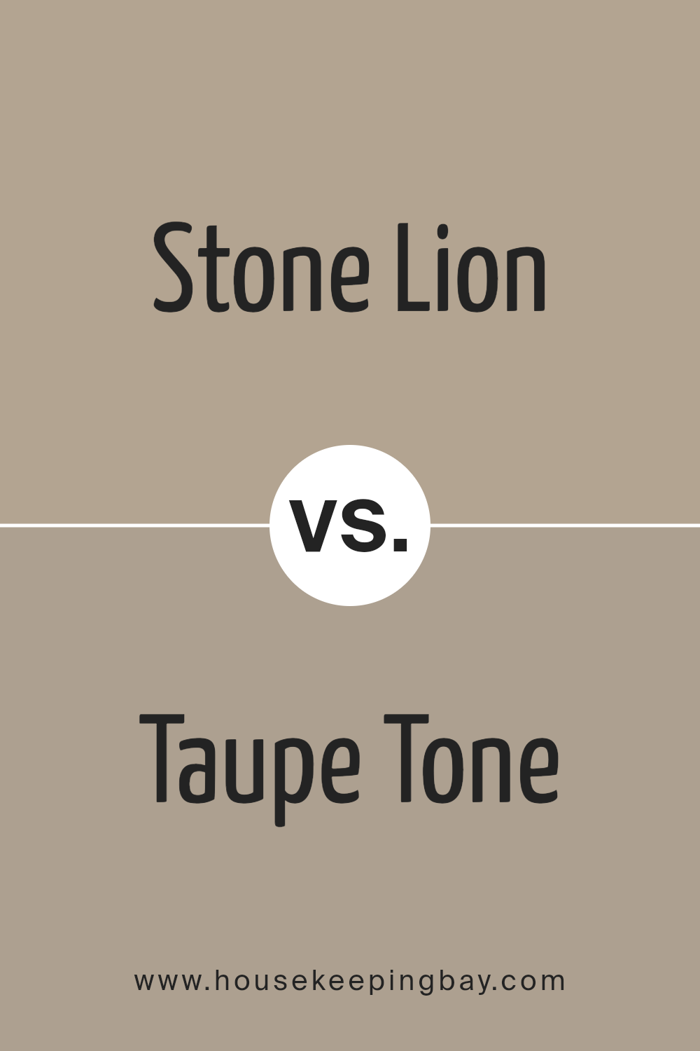
Stone Lion SW 7507 by Sherwin Williams vs Taupe Tone SW 7633 by Sherwin Williams
Stone Lion SW 7507 and Taupe Tone SW 7633, both by Sherwin Williams, offer unique takes on neutral shades. Stone Lion has a warm, sandy quality that feels grounded and cozy, making it ideal for spaces where you want a comforting and inviting atmosphere. It pairs well with rich colors and natural materials like wood and leather.
In contrast, Taupe Tone SW 7633 leans more towards a grayish hue, giving it a slightly more modern and refined look. This color fits well in contemporary settings, providing a soft, neutral backdrop that enhances modern furnishings and metallic finishes.
It also reflects light beautifully, which can make smaller spaces appear larger and more open.
Both colors are versatile and work well in various decorating styles, but the choice between them depends on the mood you aim to set in your room. Stone Lion evokes warmth and familiarity, while Taupe Tone offers a cleaner, crisper feel.
You can see recommended paint color below:
housekeepingbay.com
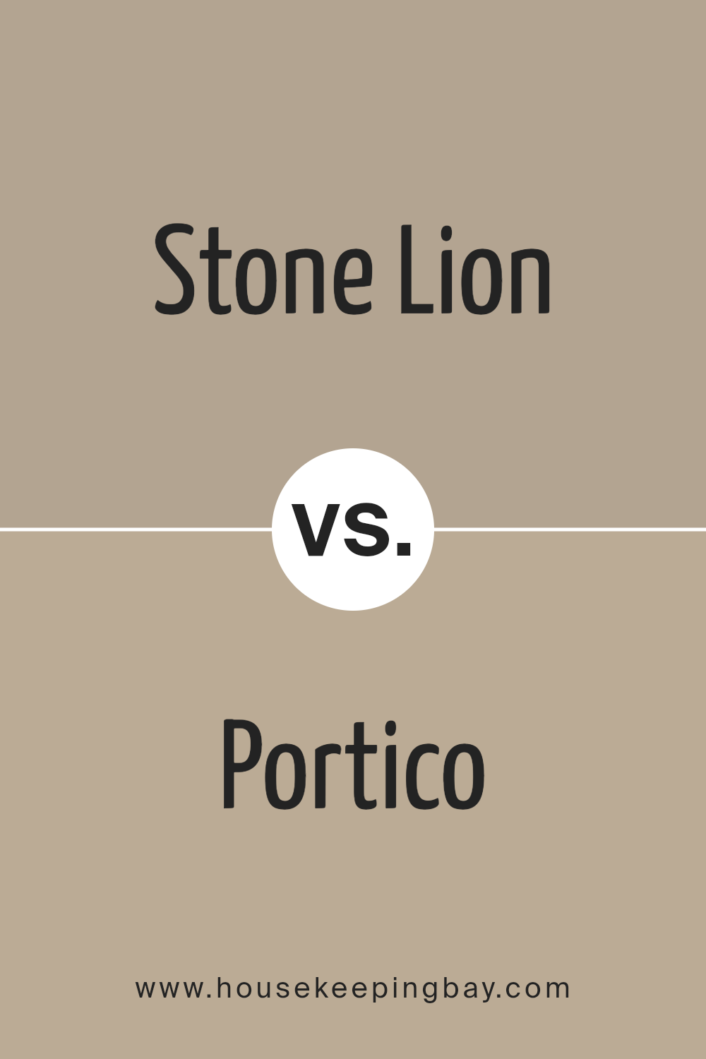
Stone Lion SW 7507 by Sherwin Williams vs Portico SW 7548 by Sherwin Williams
Stone Lion SW 7507 and Portico SW 7548 by Sherwin Williams are both neutral shades, but they carry different tones that set them apart. Stone Lion has a warm, beige hue that offers a cozy and inviting feel, making it perfect for living spaces or bedrooms that aim for a comforting atmosphere. It pairs well with various decor styles, particularly those that incorporate earthy or wooden elements.
Portico SW 7548, in contrast, leans towards a cooler, grayish tone. This color provides a sleek and contemporary look that suits modern interiors or spaces that aim for a minimalist vibe. It works well in areas that get a lot of light, enhancing the space with a crisp, clean appearance.
Both colors are versatile and can be easily integrated into a variety of color schemes, depending on personal preference and the desired ambiance of a room. They are subtle enough to serve as background hues that can highlight bolder accents or furniture pieces.
You can see recommended paint color below:
- SW 7548 Portico
housekeepingbay.com
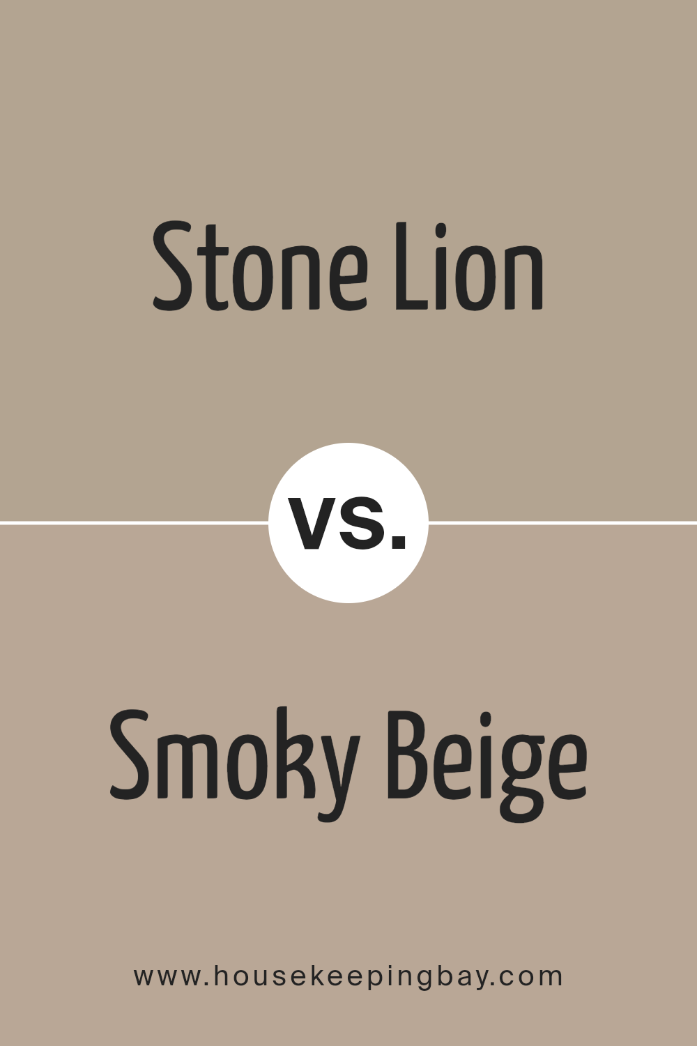
Stone Lion SW 7507 by Sherwin Williams vs Smoky Beige SW 9087 by Sherwin Williams
Stone Lion SW 7507 by Sherwin Williams is a warm, neutral beige that brings a cozy and inviting atmosphere to any space. It is versatile enough to work well in various rooms, including living areas and bedrooms, providing a solid base that complements many decor styles, from modern to traditional.
Smoky Beige SW 9087, another option from Sherwin Williams, leans towards a deeper, richer hue compared to Stone Lion. This color offers a slightly more sophisticated feel, adding depth and warmth to walls with its more pronounced tone.
It’s excellent for creating an accent wall or for spaces that benefit from a bolder neutral palette.
While both colors share a foundation in beige, Stone Lion appears lighter and more neutral, making it easier to pair with a wide range of colors. Smoky Beige, with its deeper tone, is ideal for adding a bit of drama and luxury to a room.
You can see recommended paint color below:
- SW 9087 Smoky Beige
housekeepingbay.com
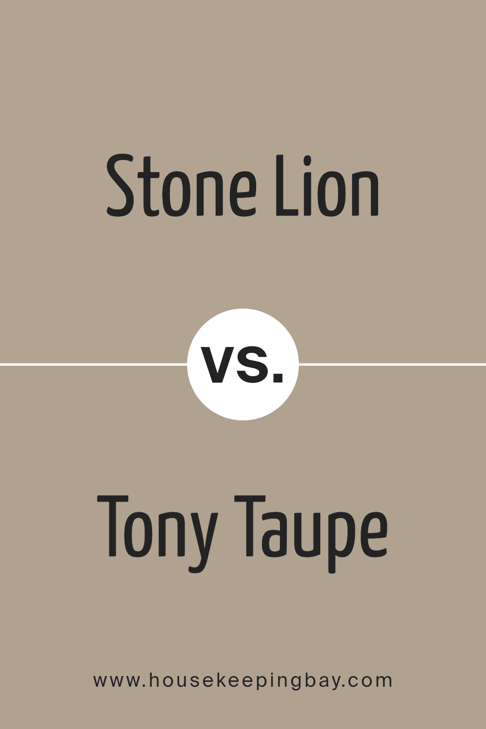
Stone Lion SW 7507 by Sherwin Williams vs Tony Taupe SW 7038 by Sherwin Williams
Stone Lion SW 7507 and Tony Taupe SW 7038 by Sherwin Williams are both neutral colors that possess a warm, welcoming vibe, though they have distinct tones. Stone Lion has a lighter, softer beige shade that brings a gentle warmth to spaces, making rooms feel cozy and inviting.
It works well in areas with natural light, giving a breezy and airy feel. In contrast, Tony Taupe is a deeper taupe that mixes gray with warm brown, resulting in a richer and more pronounced color. This shade is ideal for adding depth and sophistication to a space.
Tony Taupe’s darker tone makes it suitable for larger rooms or as an accent wall to create a focal point. Both colors pair well with a variety of decor styles and are versatile for different settings.
You can see recommended paint color below:
housekeepingbay.com
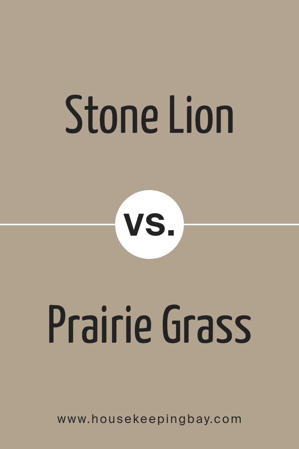
Stone Lion SW 7507 by Sherwin Williams vs Prairie Grass SW 7546 by Sherwin Williams
Stone Lion SW 7507 by Sherwin Williams is a warm, neutral beige color that provides a soft and inviting atmosphere. It’s versatile, easily fitting into many interior styles, from modern to traditional. This color can be used in large spaces, creating a cozy and comfortable environment without overwhelming any design elements.
In contrast, Prairie Grass SW 7546 is a richer, deeper green with subtle brown undertones. It gives a calm, grounded feeling to a space and works well in areas that could benefit from a touch of nature-inspired serenity. This color pairs well with natural materials like wood or stone, enhancing a room’s aesthetic with its earthy vibe.
Both colors offer their unique charm, with Stone Lion SW 7507 leaning more towards a universal backdrop and Prairie Grass SW 7546 anchoring spaces with its robust, earthy quality.
You can see recommended paint color below:
- SW 7546 Prairie Grass
housekeepingbay.com
Stone Lion SW 7507 by Sherwin Williams vs Morris Room Grey SW 0037 by Sherwin Williams
Stone Lion SW 7507 by Sherwin Williams is a warm beige color that gives a cozy and inviting feel to any room. It’s perfect for creating a comfortable, soft backdrop in living areas or bedrooms. Its lightness helps make spaces feel larger and more open.
Morris Room Grey SW 0037, also by Sherwin Williams, is a deeper, mid-tone grey. This color provides a more neutral and versatile background, suitable for various design styles. It can be calming and straightforward, making it great for contemporary or minimalist decor.
Both colors are neutral, but Stone Lion has a warmer undertone, which can add warmth to a space, while Morris Room Grey offers a cooler tone, often making it easier to pair with bold or bright accents. They can work well together in different rooms of a house to maintain a harmonious yet varied color scheme.
You can see recommended paint color below:
- SW 0037 Morris Room Grey

housekeepingbay.com
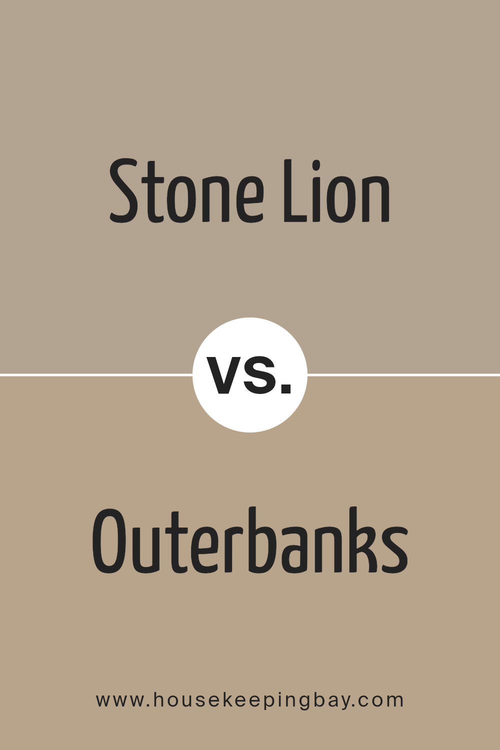
Stone Lion SW 7507 by Sherwin Williams vs Outerbanks SW 7534 by Sherwin Williams
Stone Lion SW 7507 and Outerbanks SW 7534 by Sherwin Williams are both neutral colors that provide a subtle and soothing look. Stone Lion is a light, warm gray with a beige undertone, making it a versatile choice for any space. It’s particularly suitable for creating a cozy and inviting atmosphere, ideal for living rooms and bedrooms.
On the flip side, Outerbanks SW 7534 is a darker shade that leans more towards a rich taupe. This color adds depth and warmth to a room, making it excellent for accent walls or in rooms that need a bit more drama and warmth.
Both colors work well in a variety of lighting conditions and complement a wide range of decor styles. Whether you are aiming for a minimalist look or a more traditional decor, either Stone Lion or Outerbanks could work beautifully. They also pair well with other colors, whether you want to create a monochromatic scheme or introduce vibrant accents.
You can see recommended paint color below:
- SW 7534 Outerbanks
housekeepingbay.com
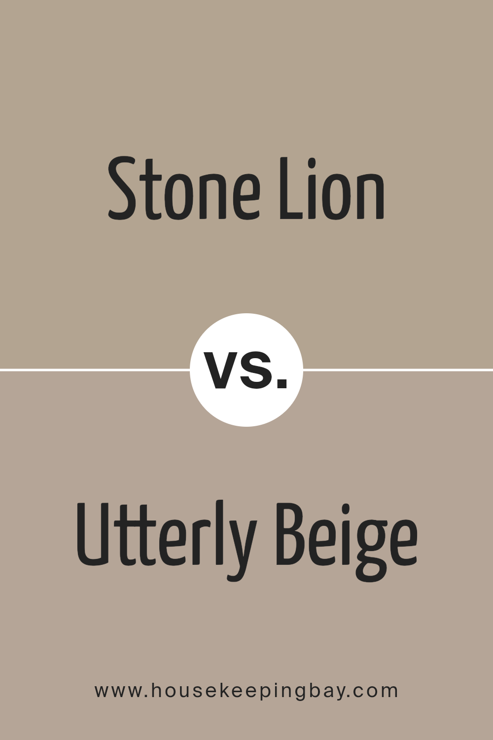
Stone Lion SW 7507 by Sherwin Williams vs Utterly Beige SW 6080 by Sherwin Williams
Stone Lion SW 7507 by Sherwin Williams and Utterly Beige SW 6080 are both warm, neutral beige colors. However, they have subtle differences that can affect the mood and look of a room. Stone Lion has a slightly richer and darker tone, leaning towards a soft brown.
This quality makes it ideal for creating cozy and inviting spaces, as it imparts a comforting earthy hue. It works well in living rooms, bedrooms, or any area where a sense of warmth is desired.
On the contrary, Utterly Beige is lighter, providing a more understated elegance. This color is closer to a classic beige, making it extremely versatile for various decorating styles. It reflects more light, which can help make a small room appear larger and brighter.
Utterly Beige is perfect for spaces where you want a neutral backdrop that still offers some warmth without darkening the space too much.
Both colors offer a soothing background, but Stone Lion provides more depth and warmth, while Utterly Beige offers a lighter, more airy feel.
You can see recommended paint color below:
- SW 6080 Utterly Beige
housekeepingbay.com
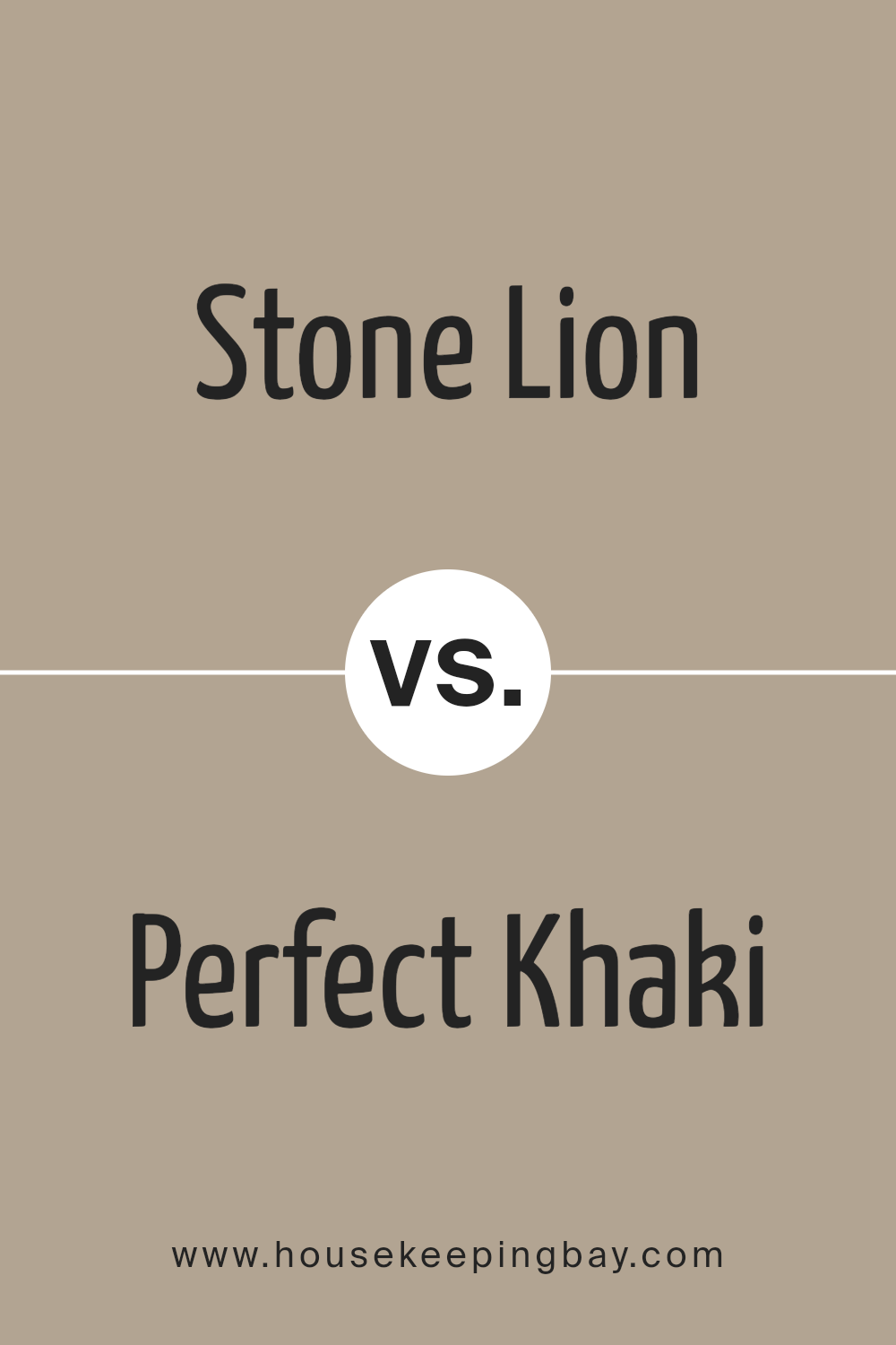
Stone Lion SW 7507 by Sherwin Williams vs Perfect Khaki SW 9612 by Sherwin Williams
Stone Lion SW 7507 by Sherwin Williams is a warm, neutral beige with a subtle yellow undertone. It gives off a cozy, inviting vibe perfect for creating a relaxed atmosphere in any room. This shade pairs well with a variety of colors and materials, making it versatile for both modern and traditional decor.
Perfect Khaki SW 9612, also by Sherwin Williams, is a darker, earthier color compared to Stone Lion. It has a richer, more pronounced khaki tone that can add depth and warmth to spaces. Perfect Khaki offers an aesthetic that can complement darker furniture and accents, giving rooms a more grounded feel.
Both colors are excellent choices for those who prefer neutral tones, but Perfect Khaki provides a deeper, more intense hue while Stone Lion keeps things lighter and softer. These qualities make Stone Lion better suited for smaller or more brightly lit spaces, whereas Perfect Khaki works well in larger areas or rooms with less natural light.
You can see recommended paint color below:
- SW 9612 Perfect Khaki
housekeepingbay.com
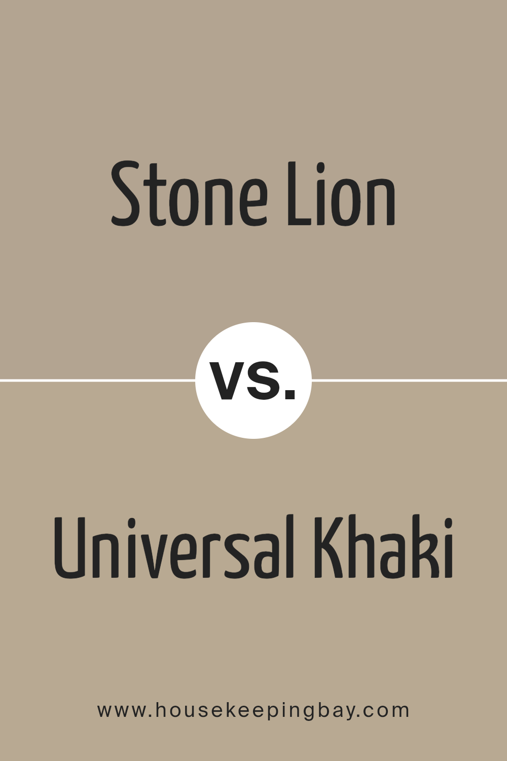
Stone Lion SW 7507 by Sherwin Williams vs Universal Khaki SW 6150 by Sherwin Williams
Stone Lion SW 7507 and Universal Khaki SW 6150, both by Sherwin Williams, are warm and versatile neutral colors. Stone Lion is a gentle beige that offers a soft, understated feel. It’s perfect for creating a cozy atmosphere in any room. This color can effectively make small spaces seem bigger and more inviting.
On the contrary, Universal Khaki has a deeper, earthier tone than Stone Lion. It is a true khaki shade that provides a touch of richness to spaces, making it ideal for areas where a more robust color is needed without overwhelming the senses.
Both colors work well in various settings, from residential to commercial spaces, and can complement a wide range of décor styles and other colors. They each add warmth and a sense of serenity to interiors, making them great choices for those looking to refresh their environment.
You can see recommended paint color below:
- SW 6150 Universal Khaki
housekeepingbay.com
Conclusion
As I wrap up my thoughts on SW 7507 Stone Lion by Sherwin Williams, must say that I am thoroughly impressed by its versatility and subtle charm. The shade, a soft, sandy taupe, offers a sophisticated backdrop suitable for almost any room.
Regardless of the lighting conditions, Stone Lion exhibits a warm and welcoming hue that makes spaces feel cozy yet spacious.
I found that this color pairs beautifully with a wide range of decor styles, from rustic farmhouse to modern minimalist, making it an ideal choice for those wanting a paint that can adapt to various settings and design changes over the years. Additionally, its ability to hide imperfections and maintain a fresh look despite everyday wear and tear is a significant plus.
For those considering a new paint project, SW 7507 Stone Lion is undoubtedly a reliable and stylish choice. It sets a serene mood without being dull and interacts gracefully with other colors and materials. After testing and seeing it in various environments, I recommend it to anyone looking to refresh their home with a neutral yet inviting color.
In conclusion, Sherwin Williams’ Stone Lion is not just a paint color; it’s a smart investment in creating a timeless and adaptive home environment.
Whether you are updating a single room or overhauling your entire house, Stone Lion provides a perfect foundation.
housekeepingbay.com
Ever wished paint sampling was as easy as sticking a sticker? Guess what? Now it is! Discover Samplize's unique Peel & Stick samples. Get started now and say goodbye to the old messy way!
Get paint samples
