Sensitive Tint SW 6267 by Sherwin Williams
Embracing the Subtle Power of Serenity
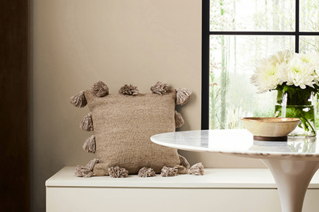
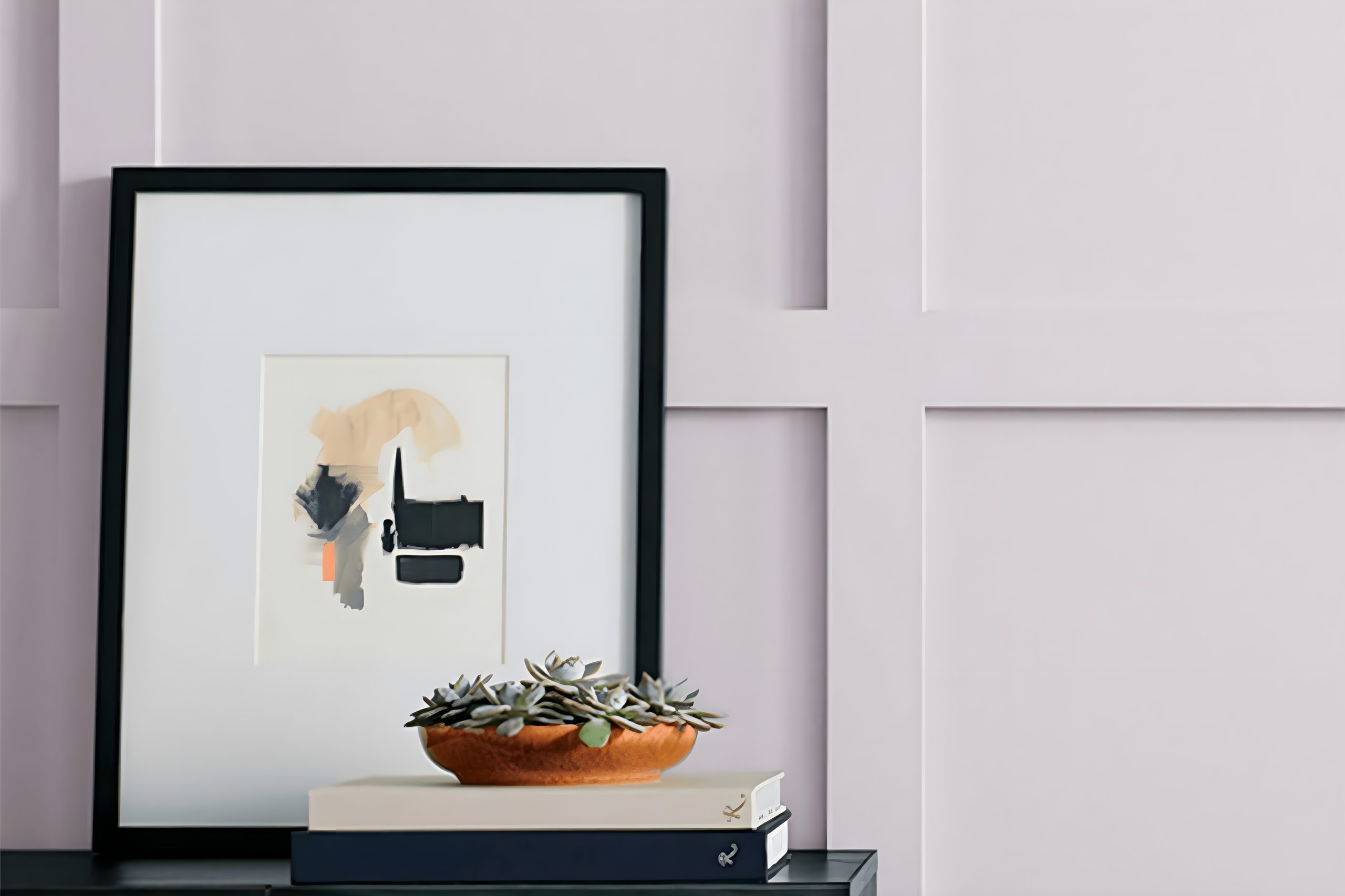
If you’re searching for a paint color that adds a soft and gentle vibe to your rooms, look no further than SW 6267 Sensitive Tint by Sherwin Williams. This shade is a lovely choice for anyone wanting to create a serene and calming environment in their home.
Sensitive Tint is a light and airy color that can make small spaces appear larger and more inviting. Its soothing qualities make it perfect for bedrooms, bathrooms, or any area where relaxation is key.
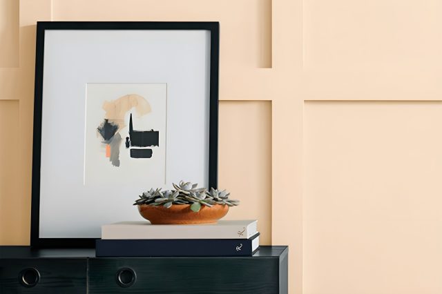
What sets Sensitive Tint apart is its versatility. This color has a unique ability to blend with various decor styles, from modern to traditional, adding a touch of elegance without overwhelming the space.
Whether you’re looking to refresh your walls, furniture, or cabinets, Sensitive Tint provides a subtle backdrop that enhances your home’s overall appeal.
In conclusion, SW 6267 Sensitive Tint by Sherwin Williams is an excellent choice for homeowners aiming to achieve a peaceful and refined atmosphere.
Its welcoming nature can transform your home into a haven of comfort and style. Consider this beautiful hue for your next home makeover project and enjoy the tranquil setting it helps to create.
via sherwin-williams.com
What Color Is Sensitive Tint SW 6267 by Sherwin Williams?
Sensitive Tint SW 6267 by Sherwin Williams is a gentle shade that blends the softness of lavender with a touch of gray. This color has a muted quality, making it versatile and easy to incorporate into various interior designs.
Its subtlety is its strength, allowing it to serve as a calming backdrop in any room. Sensitive Tint is perfect for creating a serene and inviting space, offering a hint of color without overwhelming the senses.
This color works best in interior styles that favor softness and subtlety over bold statements. It’s a perfect match for modern farmhouse, Scandinavian, and contemporary minimalist designs, where its understated elegance can shine.
In a shabby chic setting, Sensitive Tint adds a whisper of color, complementing distressed wood and vintage textures beautifully.
When it comes to materials, Sensitive Tint pairs well with natural wood, bringing out the warm tones of the timber.
It also looks stunning against white trim or when used in conjunction with materials like linen, cotton, and soft wool, adding a layer of texture and depth to the space.
Metals, especially brushed silver or matte gold, can inject a hint of sophistication into a room painted with Sensitive Tint, rounding out a palette that’s both modern and timeless.
housekeepingbay.com
Table of Contents
Is Sensitive Tint SW 6267 by Sherwin Williams Warm or Cool color?
Sensitive Tint SW 6267 by Sherwin Williams is a unique shade that brings a subtle and soft charm to any space. This color, with its gentle touch, fits perfectly in homes aiming for a peaceful and soothing atmosphere.
Its lightness provides a feeling of openness and calm, making it ideal for bedrooms where relaxation is key, or living rooms where you want a welcoming vibe.
Sensitive Tint has a way of blending seamlessly with different decors, whether you’re aiming for a modern minimalist look or something more traditional.
It complements various materials and textures, from the warmth of wooden furnishings to the sleekness of metal accents, enhancing the room without overpowering it.
Moreover, its adaptability in different lighting conditions is noteworthy. During the day, it can reflect natural light to brighten the space, while in the evening, it contributes to a cozy ambiance.
This flexibility makes Sensitive Tint a versatile choice for homeowners looking for a color that balances between adding character and maintaining softness in their living space.
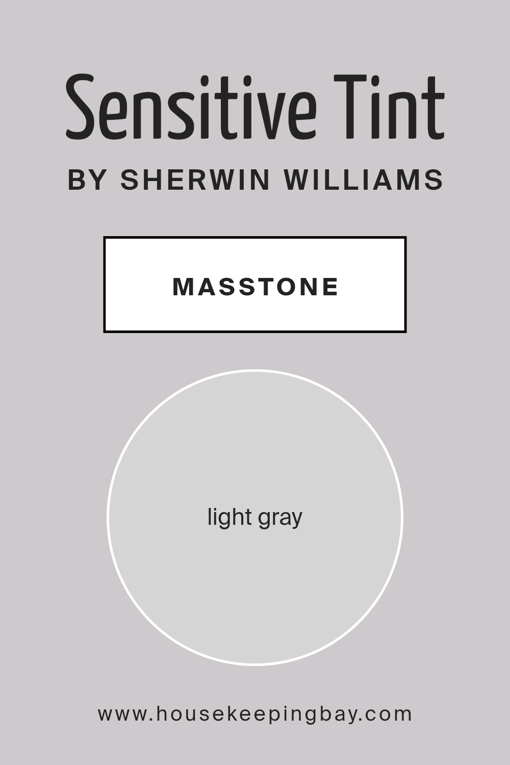
What is the Masstone of the Sensitive Tint SW 6267 by Sherwin Williams?
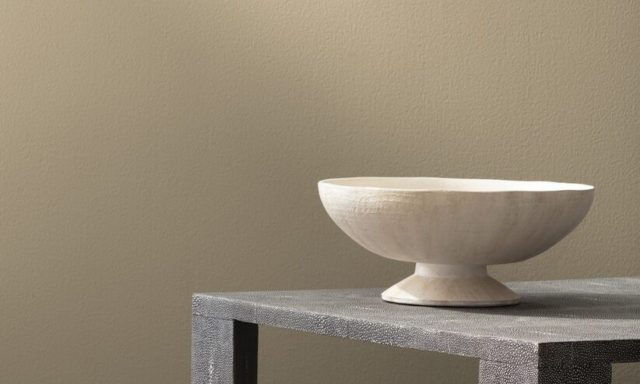
Sensitive Tint SW 6267 by Sherwin Williams is a beautiful light gray color with the masstone corresponding to the hex code #D5D5D5.
This soft and subtle shade is perfect for creating a calm and soothing atmosphere in any home. Its light gray tone offers a fresh and airy feel, making spaces look more open and spacious.
This color works wonderfully in various rooms, from bedrooms to living areas, providing a neutral background that allows for versatile decorating.
Furniture and decor in any color scheme can easily match with Sensitive Tint, making it an excellent choice for those who like to change up their decorations often.
It also reflects natural light beautifully, enhancing the brightness of the room without overwhelming it with color.
This delicate balance of neutrality and light-enhancing qualities makes Sensitive Tint a popular choice for homeowners seeking a modern yet timeless wall color.
housekeepingbay.com
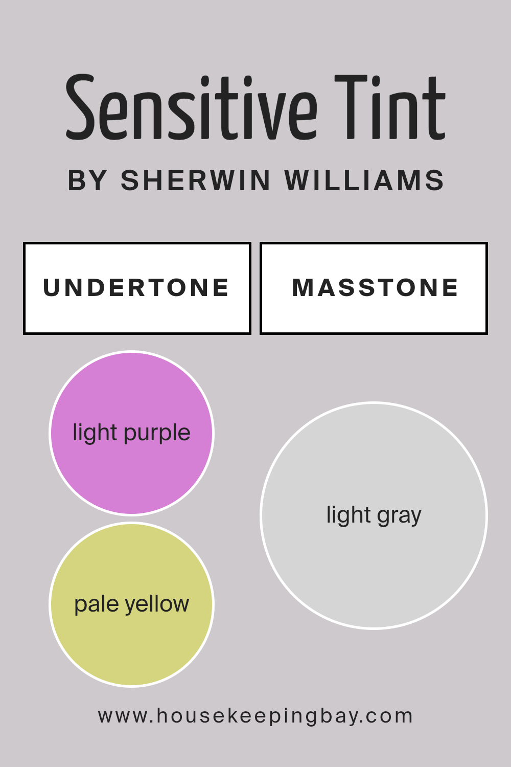
Undertones of Sensitive Tint SW 6267 by Sherwin Williams
Sensitive Tint SW 6267 by Sherwin-Williams is a unique color with nuanced undertones that subtly influence its appearance. Specifically, it has light purple and pale yellow undertones.
Understanding undertones is crucial as they can significantly affect how we perceive the main color, especially under different lighting conditions or when paired with various decor elements.
The light purple undertone in Sensitive Tint adds a soft, gentle vibe to the color, giving it a cooler feel that can make spaces seem calming and serene.
This undertone is particularly noticeable in well-lit areas or rooms with plenty of natural light, where it adds a whisper of richness without overwhelming the space.
On the other hand, the pale yellow undertone introduces a hint of warmth, balancing the coolness of the purple. This subtle warmth ensures the color remains inviting and versatile, capable of complementing a wide range of furnishings and decor styles.
In spaces with less natural light or during the evening, this warmer undertone can help prevent the color from appearing too cold or detached.
When applied to interior walls, the complex interplay of these undertones in Sensitive Tint SW 6267 creates a dynamic and multifaceted backdrop.
It harmonizes well with various textures and finishes, from soft fabrics to sleek metals, adapting its character based on the surrounding elements and lighting conditions.
This adaptability makes it a popular choice for creating a space that feels both personalized and balanced, offering a backdrop that evolves throughout the day.
housekeepingbay.com
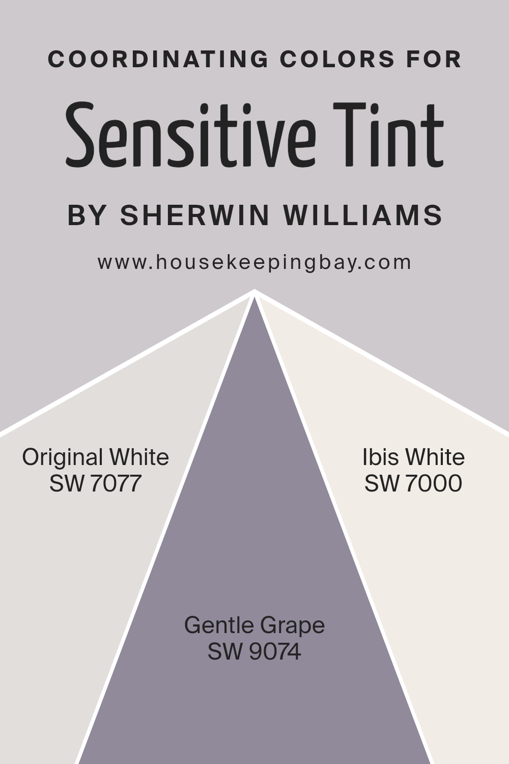
Coordinating Colors of Sensitive Tint SW 6267 by Sherwin Williams
Coordinating colors are hues that harmoniously complement each other, enhancing the overall aesthetic of a space. They work by balancing visual interest and mood, ensuring that no single color overwhelms the others.
The idea is to create a pleasing color scheme that flows seamlessly across a room, connecting different elements and fostering a cohesive look.
When chosen carefully, coordinating colors can accentuate architectural features, influence mood, and express personal style.
For instance, when using Sensitive Tint SW 6267 by Sherwin Williams as a primary color, it’s essential to select coordinating colors that complement its subtle and gentle nature.
SW 7077 – Original White, is a pristine and versatile shade that offers a clean canvas, highlighting the softer tones of Sensitive Tint without competing for attention.
It’s ideal for creating a sense of spaciousness and tranquility in a room. SW 9074 – Gentle Grape, on the other hand, introduces a sophisticated and understated hint of color.
This muted purple can add depth and interest to spaces, serving as a perfect accent color that bridges the gap between neutrality and a touch of whimsy.
Lastly, SW 7000 – Ibis White, presents itself as a warm and inviting off-white. It pairs beautifully with Sensitive Tint, ensuring the space remains light and airy, while also adding a layer of warmth to the ambiance.
Together, these coordinating colors support and enhance the beauty of Sensitive Tint, allowing for a harmonious blend that is both appealing and comforting.
You can see recommended paint colors below:
- SW 7077 Original White
- SW 9074 Gentle Grape
- SW 7000 Ibis White
housekeepingbay.com
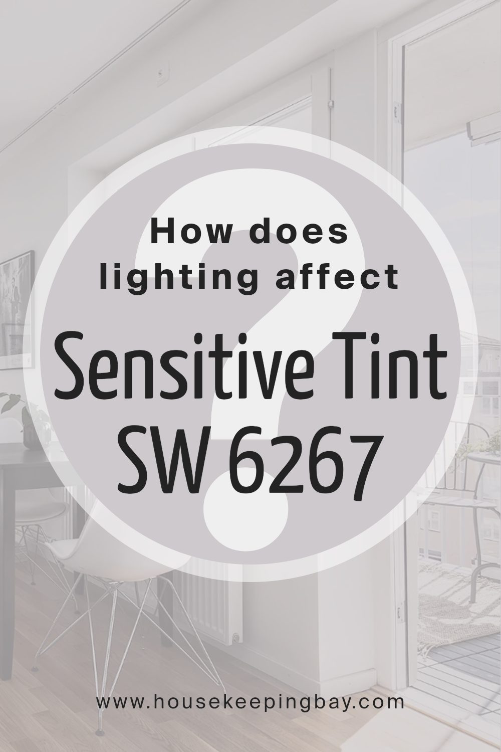
How Does Lighting Affect Sensitive Tint SW 6267 by Sherwin Williams?
Lighting plays a significant role in how we perceive colors. The same color can look different under various types of light. This is because light sources vary in their color temperatures, which can influence the appearance of colors in a space.
Let’s take the shade Sensitive Tint SW 6267 by Sherwin Williams as an example to understand how lighting affects colors.
In artificial light, the appearance of Sensitive Tint SW 6267 can change based on the type of bulbs used. Fluorescent lights, which often have a cooler, bluer tone, may make this color appear more muted, emphasizing its cooler undertones.
Incandescent bulbs, which cast a warmer glow, can bring out the warmer tones in Sensitive Tint, making it feel softer and more inviting.
Under natural light, Sensitive Tint SW 6267 can look quite different throughout the day. Morning light, which is softer and cooler, can make the color appear more subtle and serene.
As the day progresses and the light becomes brighter and warmer, the color may seem more vibrant and lively.
The direction a room faces can also affect how Sensitive Tint looks:
- North-faced rooms receive less direct sunlight, which can make Sensitive Tint SW 6267 appear cooler and more consistent throughout the da
This means the color might maintain a steadier, more reserved appearance without significant changes in its hue.
- South-faced rooms are bathed in warm, direct sunlight for most of the day, making Sensitive Tint feel warmer and brighter. This can enhance the color, giving it a more cheerful and inviting quality.
- East-faced rooms enjoy bright light in the morning, which can make Sensitive Tint look fresh and lively. As the light fades, the color may take on a more subdued, softer character.
- West-faced rooms get the evening light, which is warm and golden. This can make Sensitive Tint SW 6267 glow warmly in the afternoon and evening, showcasing its depth and richness.
In conclusion, the impact of lighting on colors is significant, and Sensitive Tint SW 6267 by Sherwin Williams is no exception.
Whether under artificial light or natural light, and depending on the room’s orientation, this color can show many personalities: from serene and subtle in north light to warm and welcoming in south light, vibrant in the morning East light, and richly warm in the glow of the West evening sun.
housekeepingbay.com
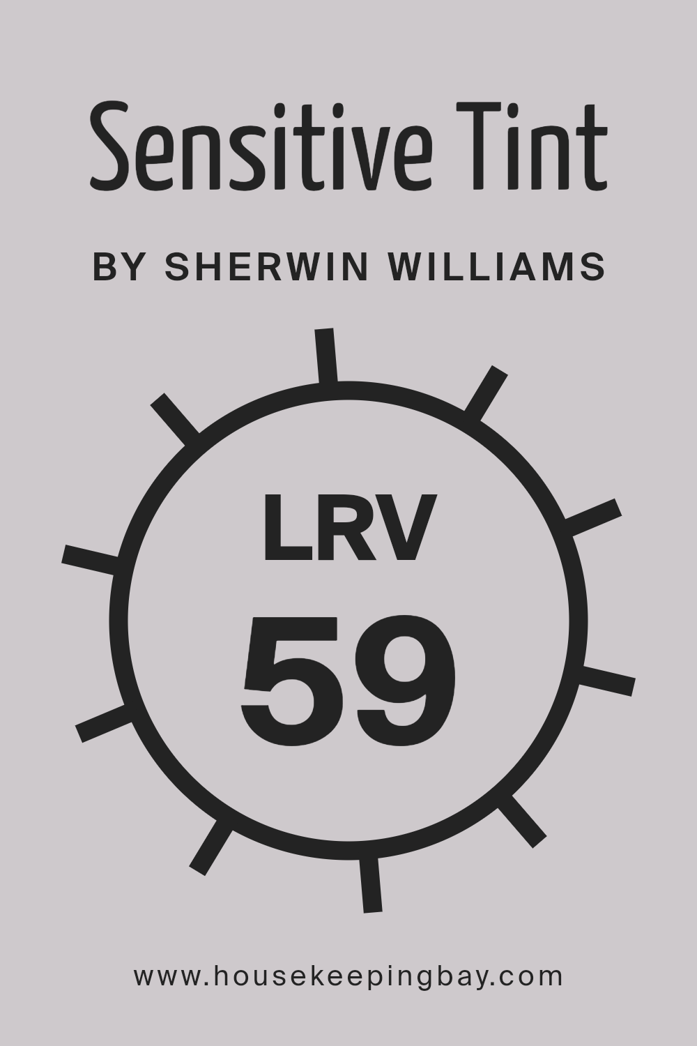
What is the LRV of Sensitive Tint SW 6267 by Sherwin Williams?
LRV stands for Light Reflectance Value, which is a measurement used to understand how light or dark a color will appear once it’s applied to walls or other surfaces.
This scale ranges from 0, which is completely black and absorbs all light, to 100, which is pure white and reflects all light back into the room. LRV is important because it helps you figure out how much light a color will either absorb or reflect in a space.
This means that the LRV of a paint color can significantly influence the appearance and feel of a room, affecting how bright or cozy it feels.
The LRV of Sensitive Tint SW 6267 by Sherwin Williams is 59.16. This indicates that it’s on the lighter side of the scale, capable of reflecting a good amount of light into the room without being overly bright.
For a color with this LRV, it means that when used on walls, Sensitive Tint will help to make the space feel more open and airy.
However, it’s still important to consider the room’s natural lighting before deciding, as this light to mid-range LRV can be influenced by the amount of light entering the space, either making the color feel slightly lighter or darker than you might expect.
housekeepingbay.com
What is LRV? Read It Before You Choose Your Ideal Paint Color
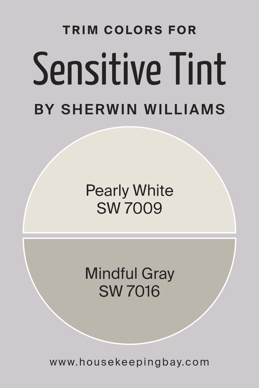
What are the Trim colors of Sensitive Tint SW 6267 by Sherwin Williams?
Trim colors are essentially the hues selected for the architectural elements of a house or room, such as baseboards, moldings, door and window frames, and sometimes ceilings and doors.
They play a crucial role in defining and accentuating the overall aesthetic and architectural features of a space.
Specially, for a color like Sensitive Tint SW 6267 by Sherwin Williams, choosing the right trim colors can enhance its subtle beauty, creating a harmonious and pleasing atmosphere.
The choice of trim color can either make the wall color stand out or subtly blend into the overall design theme, depending on the desired effect.
In this context, SW 7009 – Pearly White and SW 7016 – Mindful Gray serve as excellent trim color options.
Pearly White is a soft, muted white with a warm undertone that provides a gentle contrast, highlighting the light lavender undertones of Sensitive Tint without overpowering it.
This color adds a touch of brightness and freshness, creating an airy feel. On the other hand, Mindful Gray offers a deeper contrast, grounding the space with its earthy tones.
It is a gray with a mix of warm and cool undertones, versatile enough to complement Sensitive Tint by adding depth and sophistication.
Together, these trim colors work to enhance the visual appeal of Sensitive Tint SW 6267, ensuring a balanced and inviting space.
You can see recommended paint colors below:
housekeepingbay.com
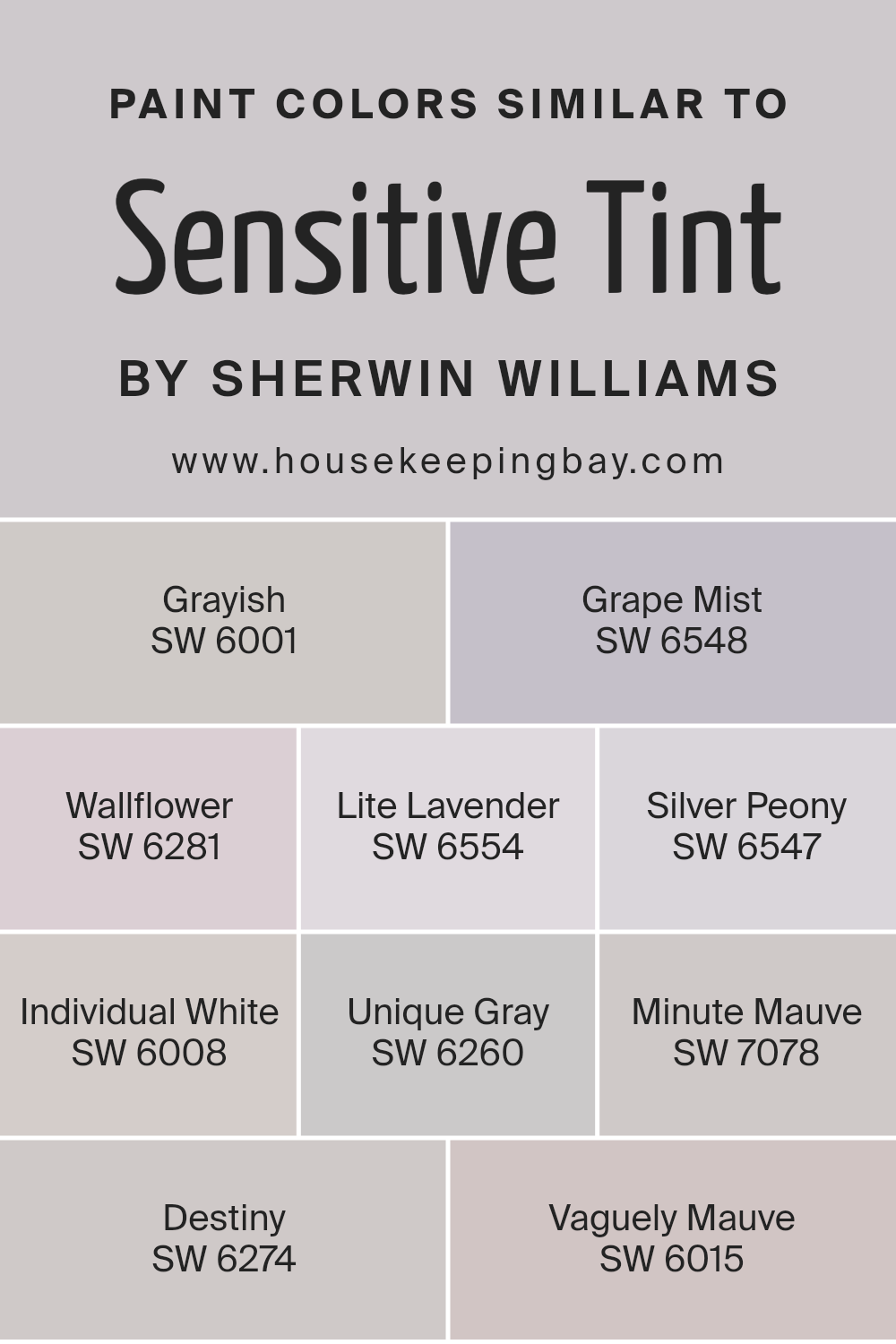
Colors Similar to Sensitive Tint SW 6267 by Sherwin Williams
Selecting similar colors is key for creating a harmonious and balanced look in any space.
Colors that share close ties, like the hues similar to Sensitive Tint SW 6267 by Sherwin Williams, work together seamlessly because they share a common intensity and undertone, presenting a cohesive vibe.
These colors, ranging from soft grays to gentle lavenders, blend effortlessly, providing a soothing palette. They are ideal for crafting spaces that feel cohesive and thoughtfully designed.
Their similarity allows for subtle transitions between areas in an open plan space or can help tie together decor elements across rooms for a sense of continuity.
For instance, Grayish SW 6001 has a muted elegance that works as a neutral base, while Grape Mist SW 6548 introduces a whisper of lilac, adding depth without overwhelming.
Wallflower SW 6281 and Lite Lavender SW 6554 subtly infuse a space with color, offering a hint of serenity and whimsy. Silver Peony SW 6547 and Individual White SW 6008 are softer, almost ethereal, making them perfect for spaces aiming for a light, airy feeling.
Unique Gray SW 6260 and Minute Mauve SW 7078 offer more grounded options, anchoring the ethereal lightness with their earthy tones.
Destiny SW 6274 and Vaguely Mauve SW 6015 merge these concepts, presenting shades that are both uplifting and grounded. Together, these colors craft a palette that is coherent, allowing for a flow of energy and design throughout a space.
You can see recommended paint colors below:
- SW 6001 Grayish
- SW 6548 Grape Mist
- SW 6281 Wallflower
- SW 6554 Lite Lavender
- SW 6547 Silver Peony
- SW 6008 Individual White
- SW 6260 Unique Gray
- SW 7078 Minute Mauve
- SW 6274 Destiny
- SW 6015 Vaguely Mauve
housekeepingbay.com
How to Use Sensitive Tint SW 6267 by Sherwin Williams In Your Home?
Sensitive Tint SW 6267 by Sherwin Williams is a beautiful paint color that can add a tranquil and soothing vibe to any room in your home.
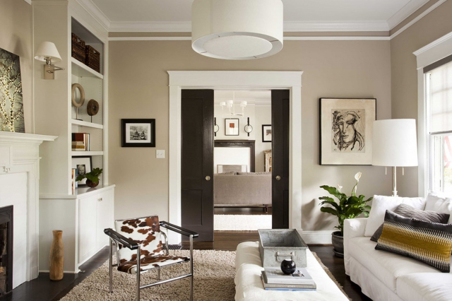
This color is a soft, gentle lavender that brings a touch of calmness and serenity to spaces. It’s a versatile hue that works well in bedrooms, living rooms, or even bathrooms, making them feel more relaxing and peaceful.
If you’re thinking about refreshing the look of your home, Sensitive Tint could be a great choice. For bedrooms, it can help create a cozy and restful atmosphere, perfect for unwinding after a long day.
In living rooms, this color pairs nicely with light woods, whites, and greys, adding a subtle pop of color that’s not too overwhelming. It’s also great for bathrooms, giving them a spa-like feel that makes bath time more enjoyable.
Using Sensitive Tint is easy. It goes on smoothly and covers well, whether you’re touching up small areas or painting an entire room.
Plus, it pairs beautifully with many accent colors, from soft pinks to deep purples, allowing you to personalize your space further. With Sensitive Tint, you can create a calming haven in your home.
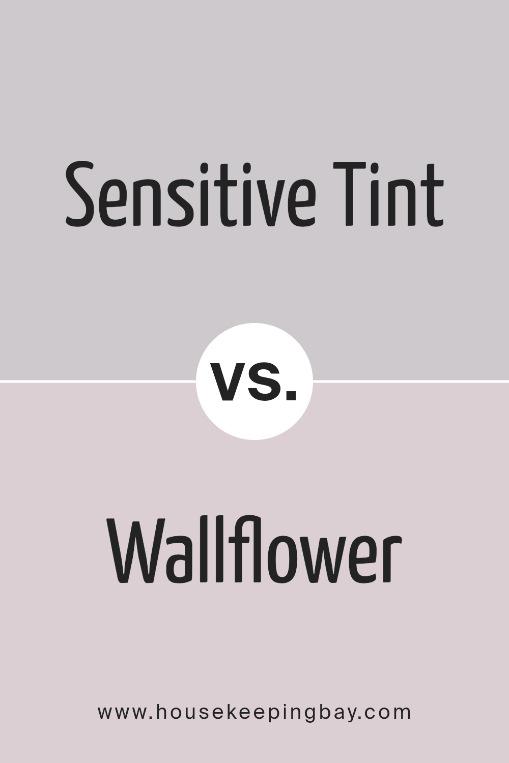
Sensitive Tint SW 6267 by Sherwin Williams vs Wallflower SW 6281 by Sherwin Williams
Sensitive Tint SW 6267 and Wallflower SW 6281 are two colors by Sherwin Williams that offer unique vibes for any space. Sensitive Tint is a soft, gentle hue that leans towards a light lavender, giving a peaceful, calming atmosphere.
It’s perfect for creating a serene environment where relaxation is key. On the other hand, Wallflower is slightly more intense, with a deeper, richer purple tone.
This color offers a bit of mystery and sophistication, adding depth and interest to a room without overwhelming it. While both colors share a purple base, Sensitive Tint is cooler and lighter, making a room feel airy and open.
Wallflower, being deeper, provides a cozy, enveloping feel. These differences make Sensitive Tint ideal for a calming, tranquil space, whereas Wallflower is better for adding a touch of elegance and intrigue.
Choosing between them depends on the mood you want to set in your space.
You can see recommended paint color below:
- SW 6281 Wallflower
housekeepingbay.com
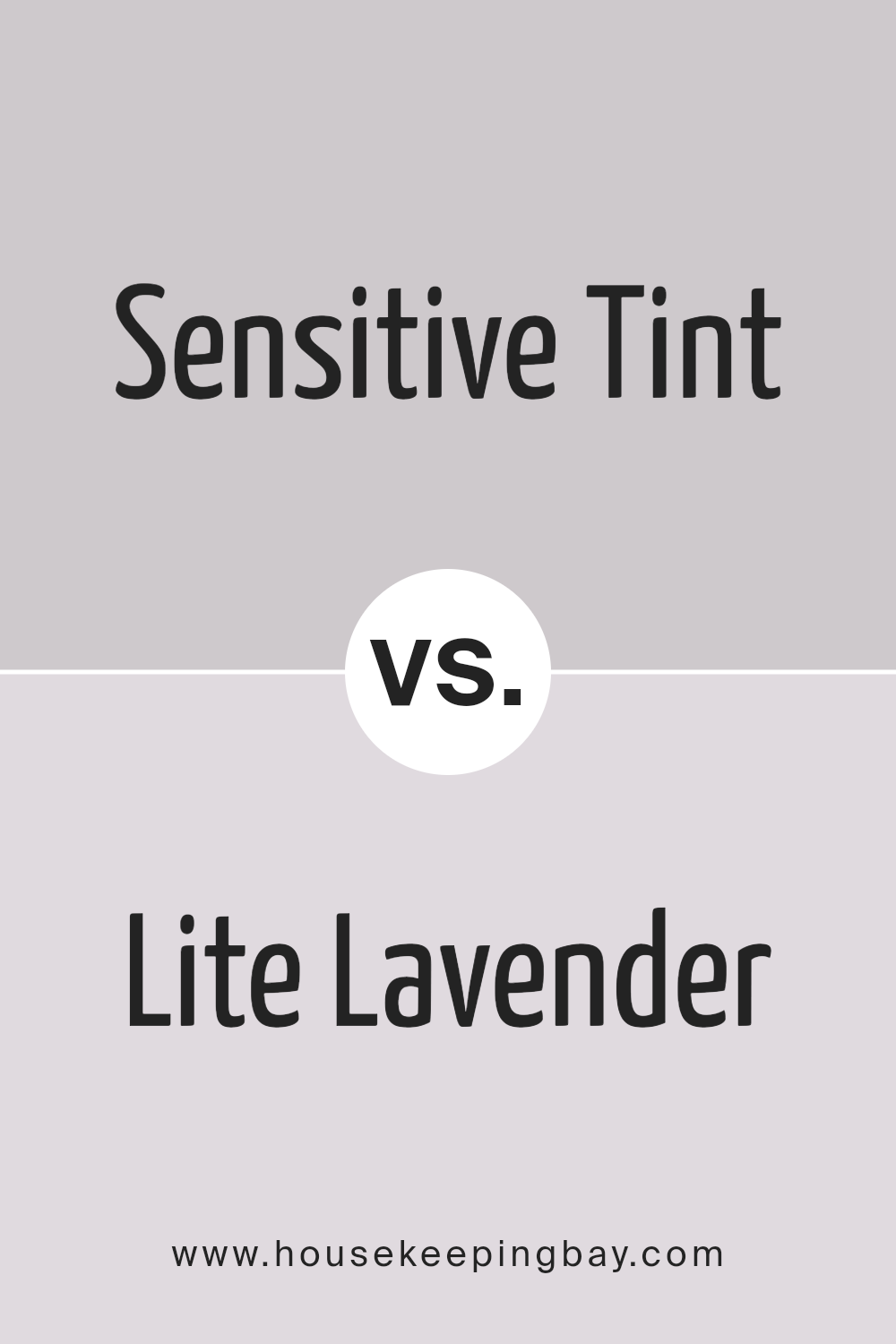
Sensitive Tint SW 6267 by Sherwin Williams vs Lite Lavender SW 6554 by Sherwin Williams
Sensitive Tint SW 6267 and Lite Lavender SW 6554, both by Sherwin Williams, are beautiful, calming colors that each bring a unique vibe to spaces.
Sensitive Tint is a soft, gentle color with grey undertones, offering a subtle and sophisticated feel. It’s perfect for creating a peaceful and relaxing environment in any room.
On the other hand, Lite Lavender has a slightly more vibrant personality, with its soft purple tones adding a touch of warmth and cheerfulness.
While both colors are light and airy, making them great choices for making small spaces appear bigger and brighter, Lite Lavender might add a bit more energy to a room because of its warmer undertones.
Sensitive Tint is more neutral and versatile, blending well with various decor styles, whereas Lite Lavender adds a playful yet gentle pop of color, ideal for adding character and flair.
Together, they could complement each other beautifully in a space that aims to be both soothing and subtly spirited.
You can see recommended paint color below:
- SW 6554 Lite Lavender
housekeepingbay.com
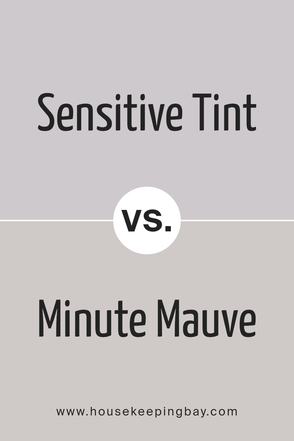
Sensitive Tint SW 6267 by Sherwin Williams vs Minute Mauve SW 7078 by Sherwin Williams
Sensitive Tint SW 6267 by Sherwin Williams is a light and airy color, giving off a gentle vibe that is soothing to the eye.
It’s a type of color that makes a room feel open and spacious, providing a calm and relaxing atmosphere. Imagine the softest whisper or a tender touch; that’s the essence of Sensitive Tint. It’s perfect for spaces where you want to unwind and feel at peace.
On the other hand, Minute Mauve SW 7078 is a slightly richer, deeper hue compared to Sensitive Tint. While it’s still in the realm of soft and soothing colors, Minute Mauve brings a bit more warmth and depth to a space.
It’s like the cozy feeling of a warm blanket on a cool evening. Its subtle mauve tone adds a touch of sophistication and warmth, making it ideal for areas where you want a cozy yet refined look.
Both colors are great choices for creating a serene and inviting environment.
Sensitive Tint works well in areas with lots of natural light, enhancing the feeling of openness, whereas Minute Mauve is perfect for adding a bit of cozy warmth to a room without overwhelming it.
You can see recommended paint color below:
- SW 7078 Minute Mauve
housekeepingbay.com
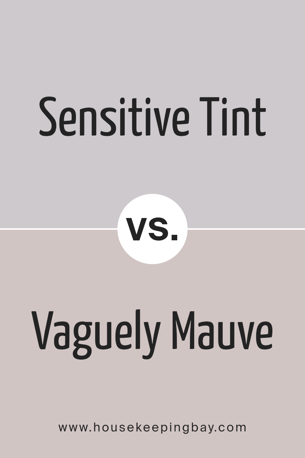
Sensitive Tint SW 6267 by Sherwin Williams vs Vaguely Mauve SW 6015 by Sherwin Williams
Sensitive Tint SW 6267 and Vaguely Mauve SW 6015, both by Sherwin Williams, are unique colors that carry their own charm. Sensitive Tint is a light lavender with a soft, soothing presence, perfect for creating a gentle and calming atmosphere in any room.
Its subtle hint of purple adds a touch of elegance and tranquility, making it ideal for bedrooms or quiet sitting areas.
On the other hand, Vaguely Mauve SW 6015 is a warmer, more subdued shade. It leans more towards a dusky mauve, mixing pink and grey tones for a muted, cozy feel.
This color is wonderfully versatile, fitting well in living spaces, dining areas, or even as an accent wall, providing a hint of color without overwhelming the space.
While both colors share a presence in the mauve family, Sensitive Tint exudes a cooler, more serene vibe, whereas Vaguely Mauve offers a warmer, more inviting feel.
Choosing between them depends on the mood you want to set: serene and airy with Sensitive Tint, or warm and cozy with Vaguely Mauve.
You can see recommended paint color below:
housekeepingbay.com
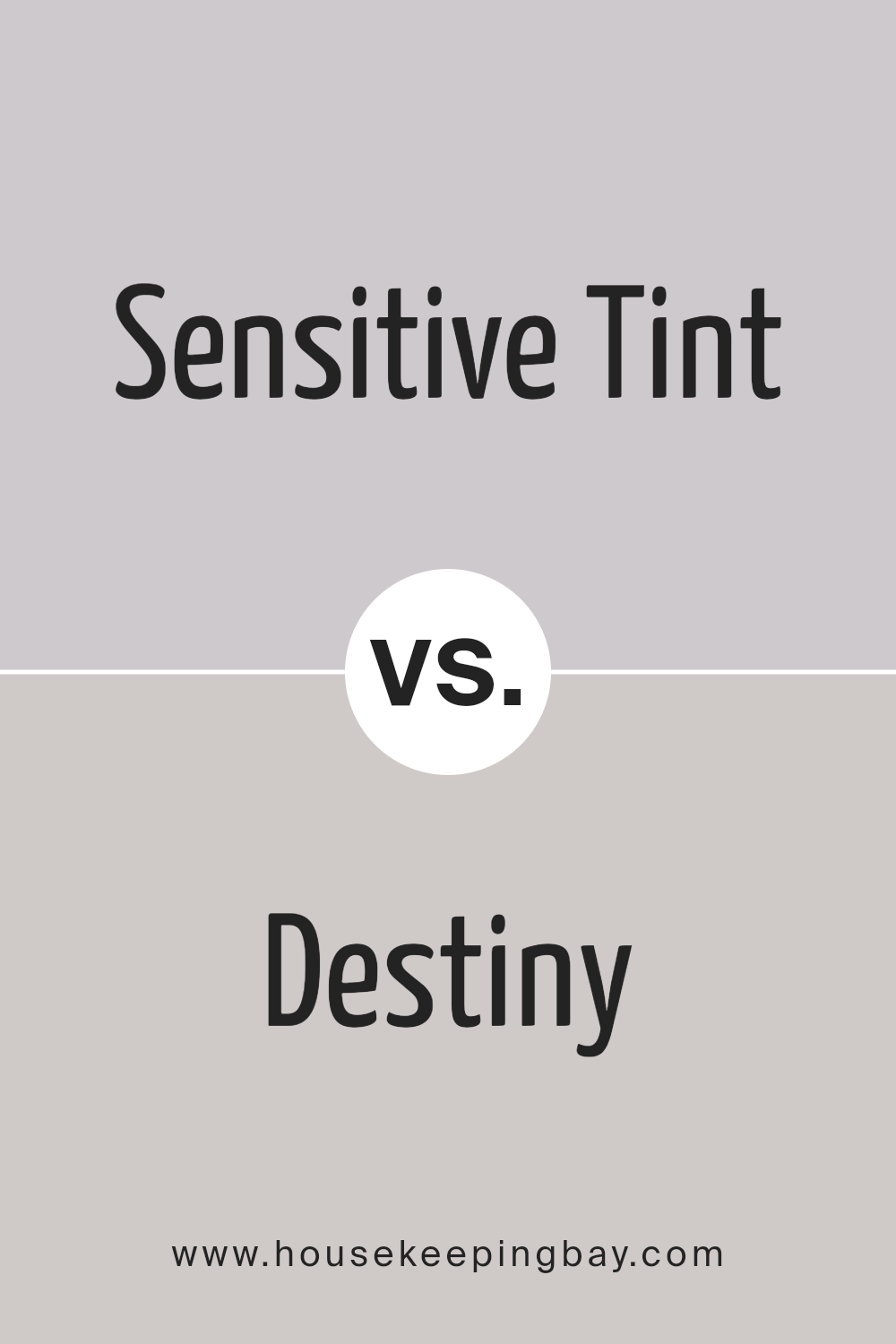
Sensitive Tint SW 6267 by Sherwin Williams vs Destiny SW 6274 by Sherwin Williams
Sensitive Tint SW 6267 and Destiny SW 6274, both by Sherwin Williams, are two colors with unique qualities. Sensitive Tint is a light, soft lavender that brings a calm and serene atmosphere to any space.
It’s very subtle, giving off a gentle, peaceful vibe. This color works well in rooms where you want to relax, like bedrooms or bathrooms.
On the other hand, Destiny SW 6274 is a bit stronger and leans towards a muted, dusty purple. It has a touch more gray compared to Sensitive Tint, which gives it a sophisticated, timeless look.
Destiny is great for spaces that you want to feel cozy yet elegant, such as living rooms or dining areas.
While both colors share a purple base, Sensitive Tint is lighter and airier, making spaces feel more open and soothing. Destiny, with its richer tone, provides depth and a sense of comfort.
Choosing between them depends on the mood you’re aiming for: brighter and lighter with Sensitive Tint or more grounded and refined with Destiny.
You can see recommended paint color below:
housekeepingbay.com
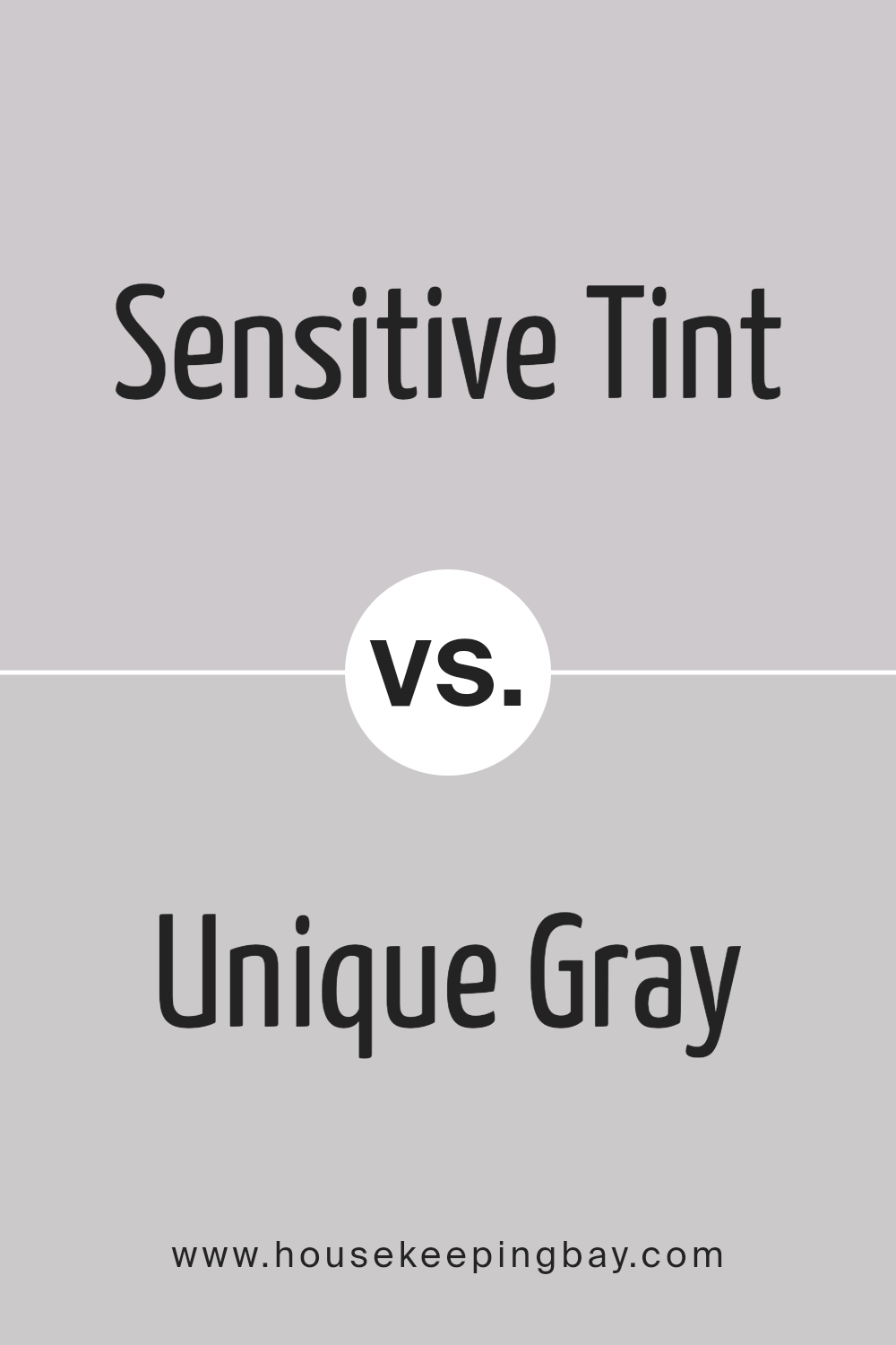
Sensitive Tint SW 6267 by Sherwin Williams vs Unique Gray SW 6260 by Sherwin Williams
Sensitive Tint SW 6267 by Sherwin Williams is a soft and soothing color. It’s like a gentle whisper in a room, providing a light and airy feel. This color is great for creating a peaceful and calming atmosphere, almost like being hugged by a gentle breeze.
On the other hand, Unique Gray SW 6260, also by Sherwin Williams, brings a slightly bolder touch. It has a bit more depth than Sensitive Tint, offering a stronger presence without overwhelming a space.
Unique Gray is versatile, fitting well in many areas, adding a layer of subtle sophistication.
When comparing the two, Sensitive Tint is the lighter, more ethereal option, perfect for a serene and quiet look. Unique Gray, though still in the softer spectrum, serves up a bit more of a statement, grounding a room with its warmth and character.
Both colors work wonderfully for those seeking a muted but inviting space, yet the choice between them hinges on how light or cozy you want your space to feel.
You can see recommended paint color below:
housekeepingbay.com
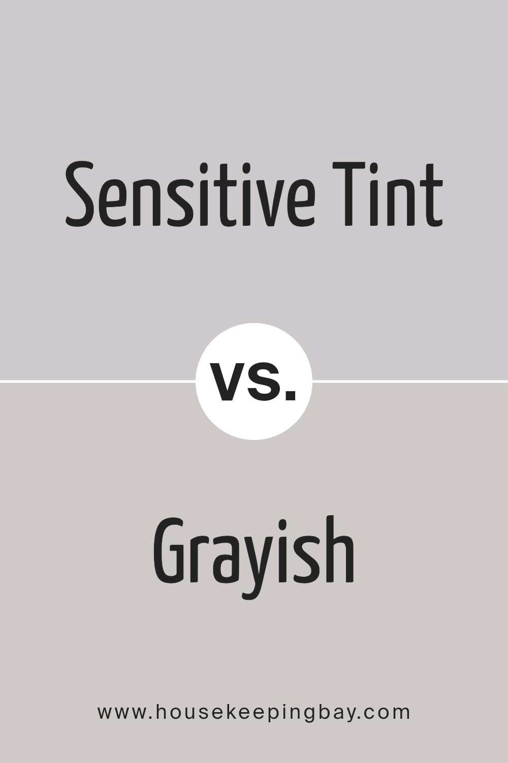
Sensitive Tint SW 6267 by Sherwin Williams vs Grayish SW 6001 by Sherwin Williams
Sensitive Tint SW 6267 by Sherwin Williams is a unique color with a soft, gentle vibe. It’s a lot like looking at the sky on a clear morning, feeling peaceful and calm.
This color is perfect if you want to give a room a soothing feel, making spaces look more open and airy.
On the other hand, Grayish SW 6001 by Sherwin Williams hits a different note. It blends gray tones with a hint of warmth, reminisce of a cozy, well-worn stone.
This color can make a space feel snug and welcoming, adding a modern yet homey touch.
While both colors share a quiet elegance and can brighten up a room, their moods are quite different. Sensitive Tint leans towards a dreamy, serene atmosphere, ideal for bedrooms or bathrooms.
Grayish, however, offers a more grounded, comforting aura, great for living areas or kitchens.
Choosing between them depends on the vibe you’re aiming for: airy and tranquil with Sensitive Tint, or warm and inviting with Grayish.
You can see recommended paint color below:
- SW 6001 Grayish
housekeepingbay.com
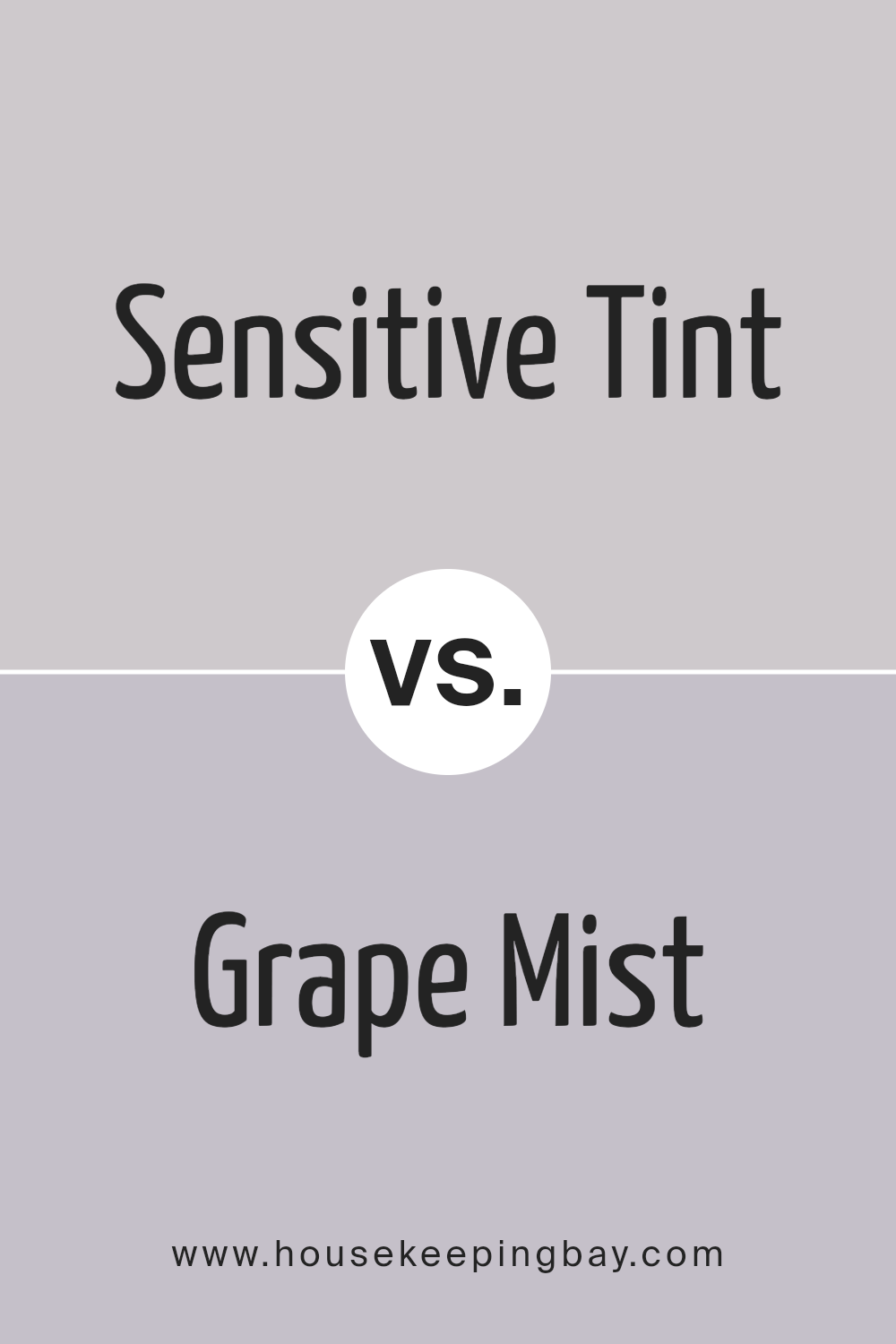
Sensitive Tint SW 6267 by Sherwin Williams vs Grape Mist SW 6548 by Sherwin Williams
Sensitive Tint SW 6267 by Sherwin Williams and Grape Mist SW 6548 by Sherwin Williams are two unique colors, each offering its distinct personality to any space.
Sensitive Tint is a soft, muted shade that leans toward a light, airy gray with a hint of lavender. It’s a subtle color, perfect for creating a calm and soothing atmosphere in a room.
On the other hand, Grape Mist steps up the intensity with a bolder, more pronounced lavender hue that has a touch of blue, making it feel a bit cooler compared to Sensitive Tint.
Grape Mist brings a vibrant energy into a space without being overwhelming, making it suitable for adding a splash of color that’s both refreshing and serene.
While Sensitive Tint is ideal for those looking for a neutral with a hint of color to create a peaceful and tranquil setting, Grape Mist is for those who want to introduce a bit more personality and liveliness into their decor.
Both colors work well in a variety of spaces, from bedrooms to bathrooms, depending on the mood you want to set.
You can see recommended paint color below:
- SW 6548 Grape Mist
housekeepingbay.com
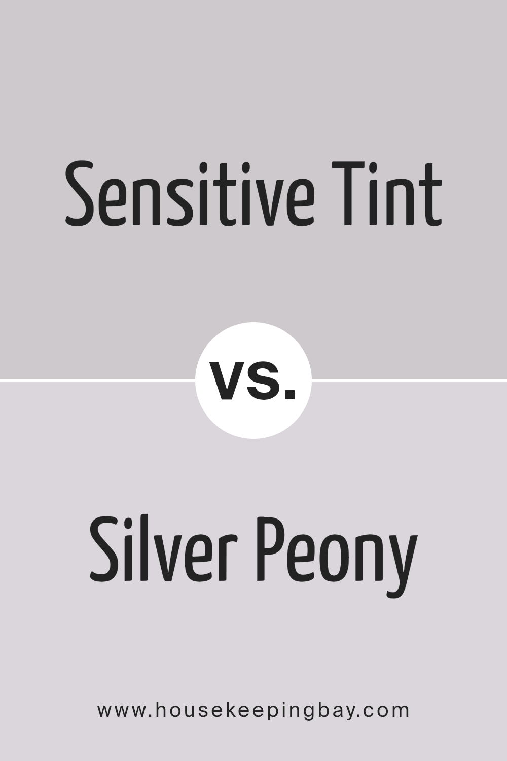
Sensitive Tint SW 6267 by Sherwin Williams vs Silver Peony SW 6547 by Sherwin Williams
Sensitive Tint SW 6267 and Silver Peony SW 6547, both from Sherwin Williams, are two colors that present a soft and muted palette.
Sensitive Tint leans towards a soft, calming lavender, bringing a gentle, soothing vibe to spaces. It’s a color that whispers tranquility and is perfect for creating a peaceful and serene atmosphere.
On the other hand, Silver Peony steps slightly into the realm of light pinks, offering a hint of warmth that feels welcoming and cozy. This color adds a touch of subtle cheeriness to rooms, making spaces feel inviting and comfortable.
It’s like a soft smile that brightens a room without overwhelming it.
While both hues share a softness and subtlety, they evoke different moods due to their color roots. Sensitive Tint, with its lavender essence, tends to steer towards a cooler, more contemplative feel, suitable for creating a restful retreat.
Silver Peony, with its gentle pink touch, leans towards creating a warm, nurturing environment, perfect for spaces meant to comfort and uplift.
Their differences lie not just in color tones but in the atmospheres they create. Sensitive Tint is ideal for those seeking a calm, reflective space, while Silver Peony is for those wanting to bring a soft, joyful glow to their surroundings.
You can see recommended paint color below:
- SW 6547 Silver Peony
housekeepingbay.com
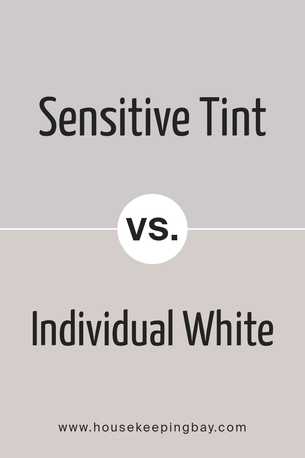
Sensitive Tint SW 6267 by Sherwin Williams vs Individual White SW 6008 by Sherwin Williams
Sensitive Tint and Individual White are two paint colors by Sherwin Williams with their own unique vibes. Sensitive Tint is like a whisper of color, not quite blue, not quite lavender, giving off a soft, soothing feel.
It’s light but carries a bit of depth, making spaces feel cozy yet spacious. On the other hand, Individual White is more straightforward.
It’s a gentle white with a warm undertone, making it perfect for creating a bright and airy space.
It doesn’t shout for attention but instead offers a calming backdrop for any room. When comparing these two, think of Sensitive Tint as adding a subtle hint of color, perfect for adding character without overwhelming a space.
Individual White, however, is your go-to for a classic, clean look that helps other colors in the room stand out. Both are great choices but serve different moods and aesthetics in home decor.
You can see recommended paint color below:
- SW 6008 Individual White
housekeepingbay.com
Conclusion
In summary, Sensitive Tint SW 6267 by Sherwin Williams is a color that offers a unique blend of subtle elegance and versatility. It’s a shade that can easily complement a wide range of decor styles, from modern minimalist to cozy and traditional.
Its understated charm makes it an ideal choice for those looking to create a serene and inviting atmosphere in their homes or offices.
Whether applied to walls, used for accents, or in furniture pieces, Sensitive Tint SW 6267 adds a touch of sophistication without overpowering the space.
Furthermore, this color demonstrates an exceptional balance between warmth and coolness, making it suitable for any room, regardless of its exposure to natural light.
Its adaptability in different lighting conditions ensures that the space remains appealing at all hours of the day. For individuals seeking a fresh and contemporary look that also feels timeless, Sensitive Tint SW 6267 by Sherwin Williams presents an excellent option.
Its ability to blend perfectly with other colors and materials also means that it can easily be incorporated into existing designs, facilitating a simple yet effective update to any interior.
housekeepingbay.com
Ever wished paint sampling was as easy as sticking a sticker? Guess what? Now it is! Discover Samplize's unique Peel & Stick samples. Get started now and say goodbye to the old messy way!
Get paint samples