Sashay Sand SW 6051 by Sherwin Williams
Embrace Warmth in Every Space
In the ever-evolving palette of interior design, colors play a pivotal role in setting the mood and style of any space. Sherwin Williams, a name synonymous with quality and innovation in the realm of paints and coatings, presents “SW 6051 Sashay Sand” – a color that encapsulates the essence of subtle elegance and versatility.
As we embark on an exploration of this distinguished hue within the article, we delve into the unique characteristics that make Sashay Sand a favorite among designers and homeowners alike. From its warm, inviting undertones to its adaptability in various settings and applications, Sashay Sand offers a fresh perspective on neutral colors.
This piece aims to illuminate the significance of this hue in contemporary design, offering insights into how it can transform spaces, evoke emotions, and harmonize with a wide range of decor styles.
Whether you’re looking to refresh a living area, bedroom, or office space, “SW 6051 Sashay Sand” by Sherwin Williams stands as a testament to the power of paint in bringing visions to life.
vis sherwin-williams.com
What Color Is Sashay Sand SW 6051 by Sherwin Williams?
Sashay Sand SW 6051 by Sherwin Williams encapsulates the serenity and warmth of a quiet beach at dawn. Its tone is a subtle blend of beige and gray, embodying the softness of beach sand with a hint of sophistication. This hue exudes a calming presence, making it an impeccable choice for creating tranquil and inviting living spaces. Its understated elegance allows it to seamlessly integrate into various interior styles, from the contemporary minimalism where clean lines and simplicity reign to the rustic charm where textures and natural elements are celebrated.
In modern and Scandinavian interiors, Sashay Sand serves as a perfect backdrop, complementing sleek furniture and metallic finishes, creating a crisp, airy feel. Its neutrality offers a canvas that highlights the boldness of contemporary art pieces or the simplicity of minimalist decor.
For a rustic or farmhouse aesthetic, it pairs wonderfully with natural materials like reclaimed wood, linen, and terracotta, enhancing the cosy, earthy vibes. In traditional settings, it complements ornate woodwork and classic patterns, adding a touch of modernity without detracting from the detail and craftsmanship.
Material-wise, Sashay Sand pairs excellently with soft textiles like wool or chunky knits, adding depth and warmth to the space. Leather, whether sleek or distressed, also works well, contrasting with the color’s softness and adding a layer of richness.
Alongside natural stone and wood, it evokes an organic, grounding feel that resonates with an array of design philosophies. In essence, Sashay Sand SW 6051 by Sherwin Williams is a versatile color that encourages creativity and personal expression in the world of interior design.

housekeepingbay.com
Table of Contents
Is Sashay Sand SW 6051 by Sherwin Williams Warm or Cool color?
Sashay Sand SW 6051 by Sherwin Williams is a warm and inviting neutral paint color that effortlessly brings coziness and elegance into any home. With its soft, sandy undertones, it evokes the feeling of tranquility and serenity, mimicking the comforting essence of a sunlit beach. Its versatility is one of its strongest attributes, allowing it to adapt beautifully across a wide range of decor styles, from contemporary to traditional and everything in between.
Incorporating Sashay Sand into a home can subtly enhance the space, making rooms appear more spacious and welcoming without overwhelming the senses. Its warmth works wonders in creating a harmonious environment, fostering a sense of calm and relaxation.
This color is particularly effective in living rooms, bedrooms, and bathrooms, where its restful qualities are most beneficial.
Furthermore, Sashay Sand acts as an excellent backdrop for both bold and muted color schemes.
It complements vibrant accents with grace and highlights the beauty of minimalist decor. Its ability to blend seamlessly with natural materials, such as wood, stone, and metals, makes it an ideal choice for creating a coherent and attractive space that feels connected to nature and exudes a timeless elegance.
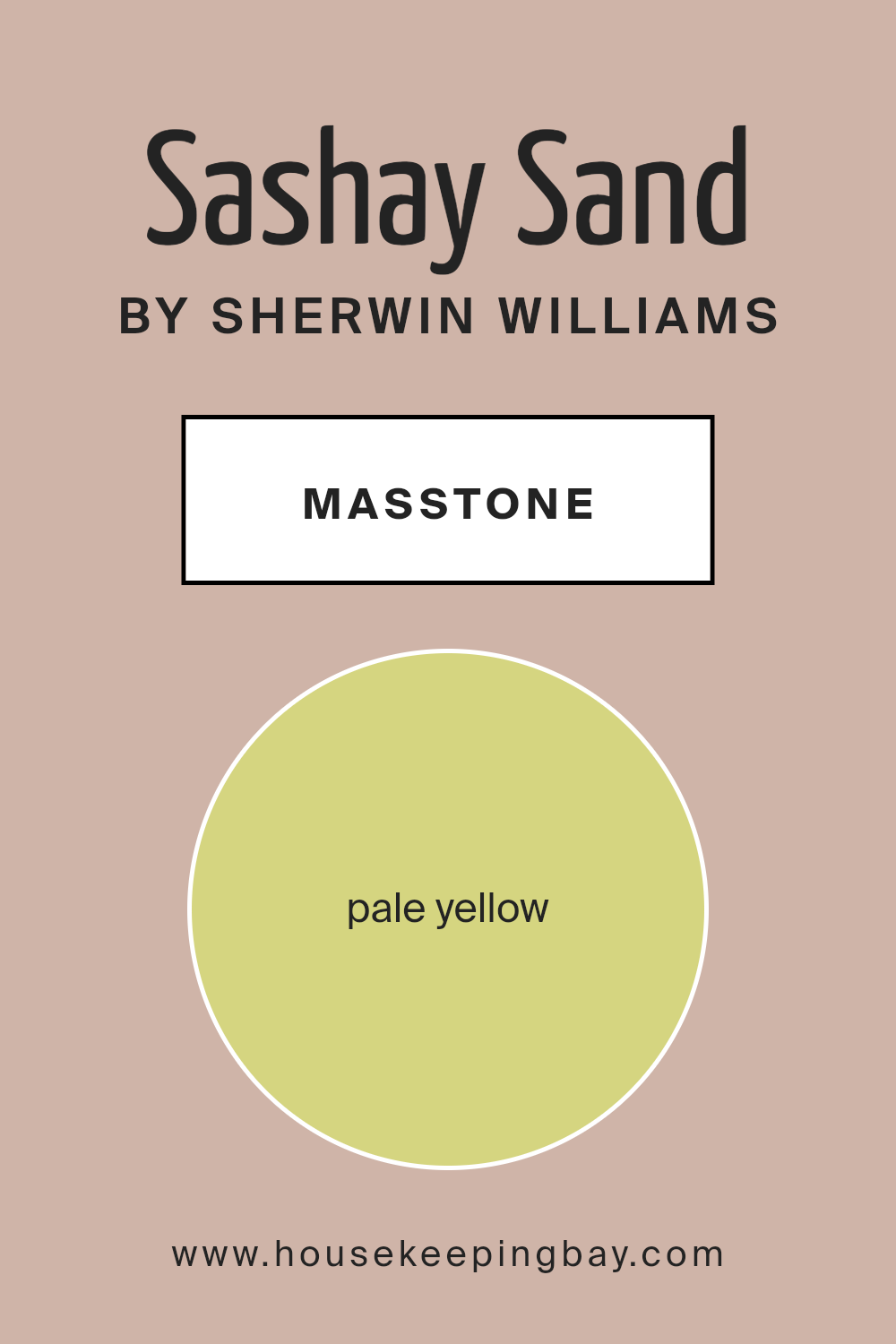
What is the Masstone of the Sashay Sand SW 6051 by Sherwin Williams?
Sashay Sand SW 6051 by Sherwin Williams, with its masstone of Pale Yellow (#D5D580), exudes a soft, welcoming essence that can profoundly influence the ambiance of a home. This subtle hue, a cross between a serene cream and a delicate spring morning, introduces light and warmth without the overpowering brightness some yellows are known for.
Its understated elegance makes it versatile; it works harmoniously in spaces seeking a touch of natural light or a feeling of spaciousness. In living areas, Sashay Sand invites relaxation and calm, transforming them into peaceful retreats.
In smaller or less illuminated rooms, its reflective quality can make spaces appear larger and more open, counteracting feelings of confinement. This color’s psychological impact shouldn’t be underestimated either; it’s known to stimulate happiness and foster creativity, making it an excellent choice for spaces where families gather or personal projects flourish.
When applied to walls, it serves as a delicate backdrop that complements a wide range of decor styles and colors, from bold, contemporary accents to more traditional wood tones, enhancing the home’s overall aesthetic without dominating it.
Thus, Sashay Sand by Sherwin Williams doesn’t just color a space; it subtly enhances the environment’s mood, making it a thoughtful choice for anyone looking to imbue their home with a sense of peace and lightness.
housekeepingbay.com
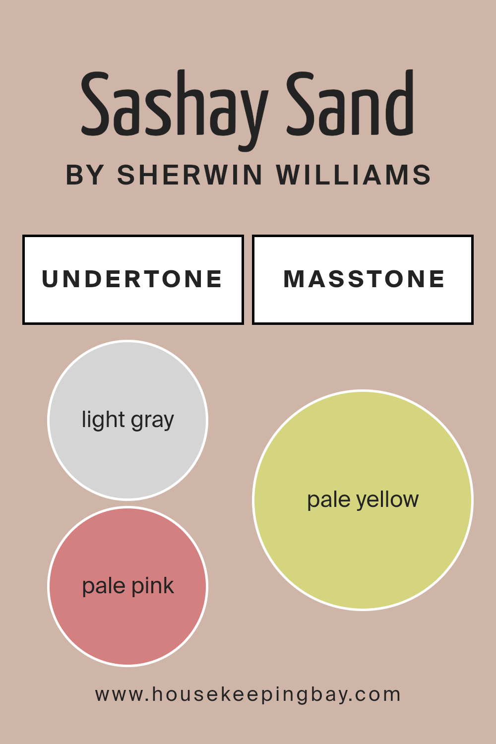
Undertones of Sashay Sand SW 6051 by Sherwin Williams
Sashay Sand SW 6051 by Sherwin Williams is a sophisticated hue that brings warmth and subtlety to interiors, presenting itself as a versatile choice for any room. The magic of this color lies deeply in its undertones, light gray (#D5D5D5) and pale pink (#D58080), which play a crucial role in its perception and application. Undertones, often overlooked, are the subtle colors hidden beneath the surface color, significantly affecting how we perceive the main hue. They can make a color appear cooler or warmer and shift dramatically under different lighting conditions.
For Sashay Sand SW 6051, the light gray undertone adds a serene, calming effect, bringing a sense of tranquility to the space. It provides a neutral backdrop that is both elegant and effortlessly sophisticated. The pale pink undertone, on the other hand, introduces a hint of warmth and vivacity.
It softens the color, making it more inviting and versatile, capable of complementing a wide range of decor styles from modern to traditional.
When applied to interior walls, Sashay Sand SW 6051 radiates a warm, soothing ambiance due to its unique undertones. In natural light, the pale pink undertone gently emerges, infusing the room with a soft, welcoming glow, while in artificial lighting, the light gray undertone becomes more pronounced, creating an understated elegance.
This duality allows Sashay Sand to seamlessly adapt to its environment, changing subtly throughout the day and offering a dynamic backdrop to living spaces. The result is a color that not only enhances the aesthetic of a room but also contributes to a sense of well-being and comfort.
housekeepingbay.com
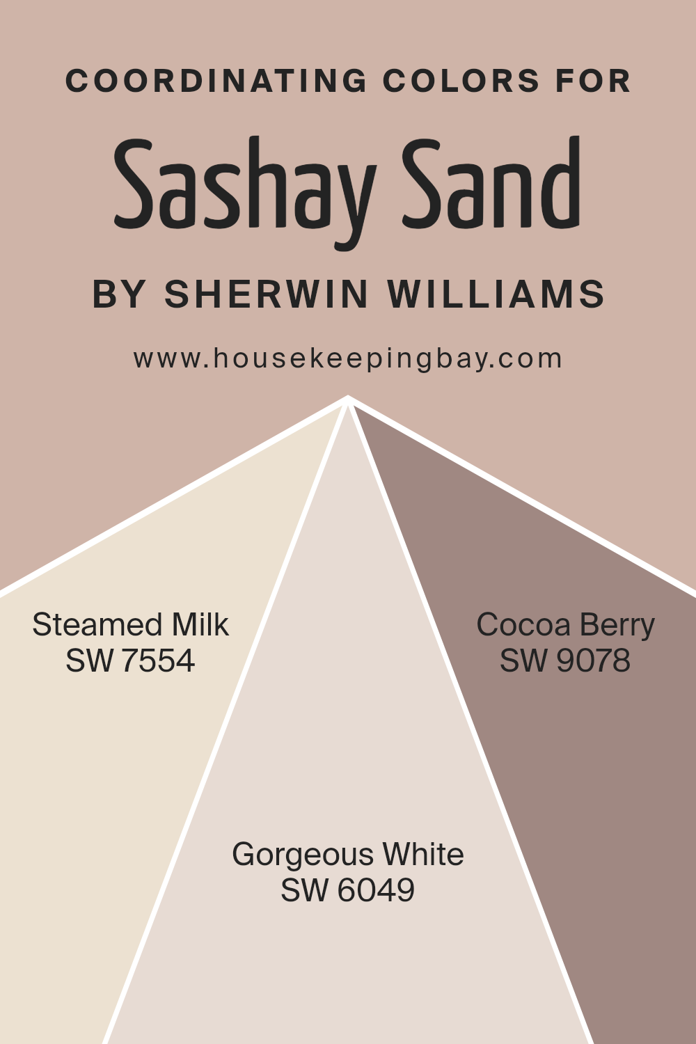
Coordinating Colors of Sashay Sand SW 6051 by Sherwin Williams
In the world of interior design, coordinating colors play a pivotal role in creating harmonious and visually appealing spaces. Coordinating colors are hues that complement each other and work well together, either by belonging to the same color family or by offering a pleasing contrast. They enhance the overall aesthetic of a room by adding depth, balance, and a sense of unity. When chosen thoughtfully, coordinating colors can highlight a room’s architectural features, influence mood, and tie together various elements within a space for a cohesive look.
Sashay Sand by Sherwin-Williams (SW 6051) serves as a beautiful base color, a warm and inviting neutral that evokes the softness of sandy beaches. Complementing this are Steamed Milk (SW 7554), Gorgeous White (SW 6049), and Cocoa Berry (SW 9078), each adding their unique flair to the palette.
Steamed Milk is a subtle, creamy hue that brings a soft, soothing presence, resonating warmth and comfort, ideal for creating a cozy and relaxing space. Gorgeous White offers a crisp, clean look, its brightness providing a fresh contrast that can make other colors stand out while maintaining a sense of spaciousness and light.
Cocoa Berry adds a rich, sophisticated touch with its deep, inviting tone that conjures images of luxurious chocolate berries, perfect for accentuating details or bringing warmth to a cooler palette. Together, these colors complement Sashay Sand, offering a versatile range of options for creating inviting, cohesive interiors.
You can see recommended paint colors below:
- SW 7554 Steamed Milk
- SW 6049 Gorgeous White
- SW 9078 Cocoa Berry
housekeepingbay.com
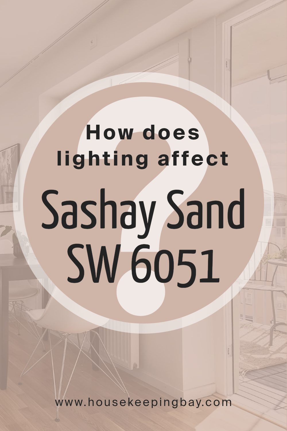
How Does Lighting Affect Sashay Sand SW 6051 by Sherwin Williams
Lighting plays a pivotal role in how we perceive colors, as it can significantly alter their appearance and the ambiance of a space. Various types of light, including natural, artificial, and the direction of a room, can transform how colors are displayed and sensed.
A perfect example to illustrate this phenomenon is the color Sashay Sand SW 6051 by Sherwin Williams, a sophisticated, warm, and neutral shade that adapts uniquely to different lighting conditions.
- Artificial Light: Artificial lighting, depending on its temperature (cool versus warm), can influence how Sashay Sand appears. In warmer artificial light, this color can exude a cozier, more inviting feel, enhancing its beige tones and making the space seem snug and welcoming. Conversely, under cool artificial light, Sashay Sand may lean slightly more towards its cooler undertones, still maintaining its warmth but with a sharper clarity, thus suitable for spaces that aim for a soft yet vibrant feel.
- Natural Light: The effect of natural light on Sashay Sand is truly transformative, showcasing the versatility of this hue. Due to the shifting intensity and angle of sunlight throughout the day, Sashay Sand can transition from a soft, pale beige in the morning light to a deeper, more pronounced warm tone by sunset.
- North-Faced Rooms: These rooms receive less direct sunlight, meaning Sashay Sand may appear more muted and cooler, emphasizing its subtle gray undertones. It creates a serene and tranquil space, proving to be soothing and soft.
- South-Faced Rooms: Here, Sashay Sand flourishes under abundant, warmer light, revealing its richer, creamier side. It radiates warmth and can make a room feel more spacious and sunny, ideal for creating a lively and inviting atmosphere.
- East-Faced Rooms: Morning light in east-facing rooms can make Sashay Sand look very warm and vibrant, capturing the golden hues of sunrise. However, as the day progresses, the color may become softer and more neutral, promoting a calm and peaceful setting.
- West-Faced Rooms: In west-facing rooms, the color starts cooler in the morning and transitions to a warm, golden glow by the afternoon. Sashay Sand can display a dramatic shift, feeling cozy and warm in the evening, perfect for social spaces or relaxing areas.
In essence, Sashay SandSW 6051’s ability to adapt to different lighting conditions makes it an exceptionally versatile color choice for various spaces and styles, proving that lighting isn’t just about visibility—it’s a transformative design tool.
housekeepingbay.com
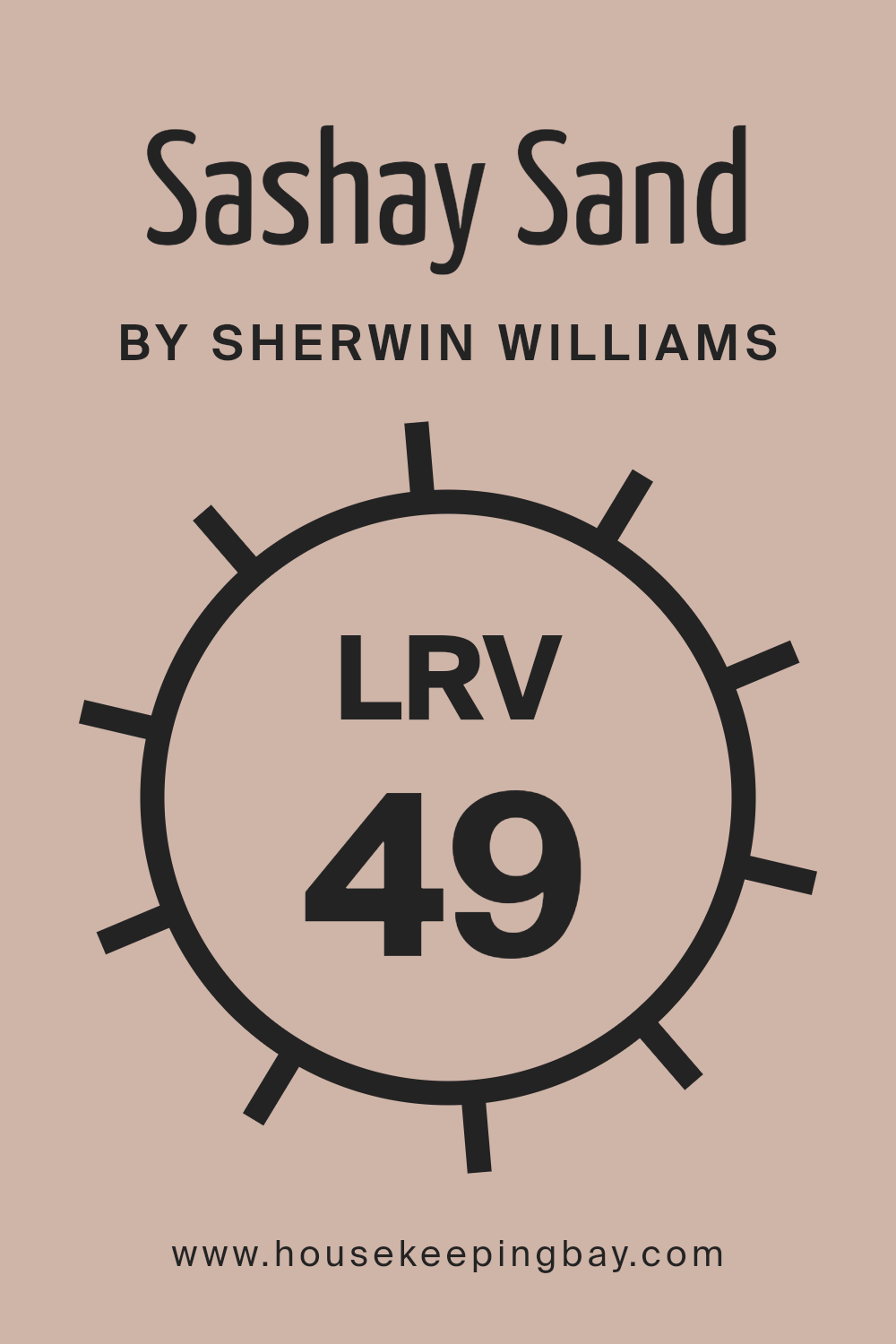
What is the LRV of Sashay Sand SW 6051 by Sherwin Williams
Light Reflectance Value (LRV) is a crucial metric in the world of paint and color design, signifying the percentage of light a paint color reflects from or absorbs into a surface. Ranging from 0% (absolute black, absorbing all light) to 100% (pure white, reflecting all light), LRV helps designers and homeowners understand how light or dark a color will appear under various lighting conditions.
This value is not just about the depth of color but also its impact on spatial perception and ambiance. High LRV colors can make spaces appear more open and airy as they reflect more light around the room, while low LRV colors tend to create a cozier, more intimate feel by absorbing more light.
Sashay Sand SW 6051, with an LRV of 48.769, sits in the middle range of the LRV scale. This means it strikes a balance between reflecting and absorbing light, offering a versatile option for interior spaces. In rooms with ample natural light, Sashay Sand will appear lighter and more vibrant, enhancing the openness of the space without overwhelming it with brightness.
In contrast, in spaces with less natural light, it will present a warmer, more subdued hue, adding depth and warmth without overly darkening the room. This balanced LRV makes Sashay Sand an adaptable choice, capable of bringing a sophisticated and welcoming feel to a variety of settings, adjusting subtly to the room’s lighting conditions and accentuating the space’s natural character.
housekeepingbay.com
What is LRV? Read It Before You Choose Your Ideal Paint Color
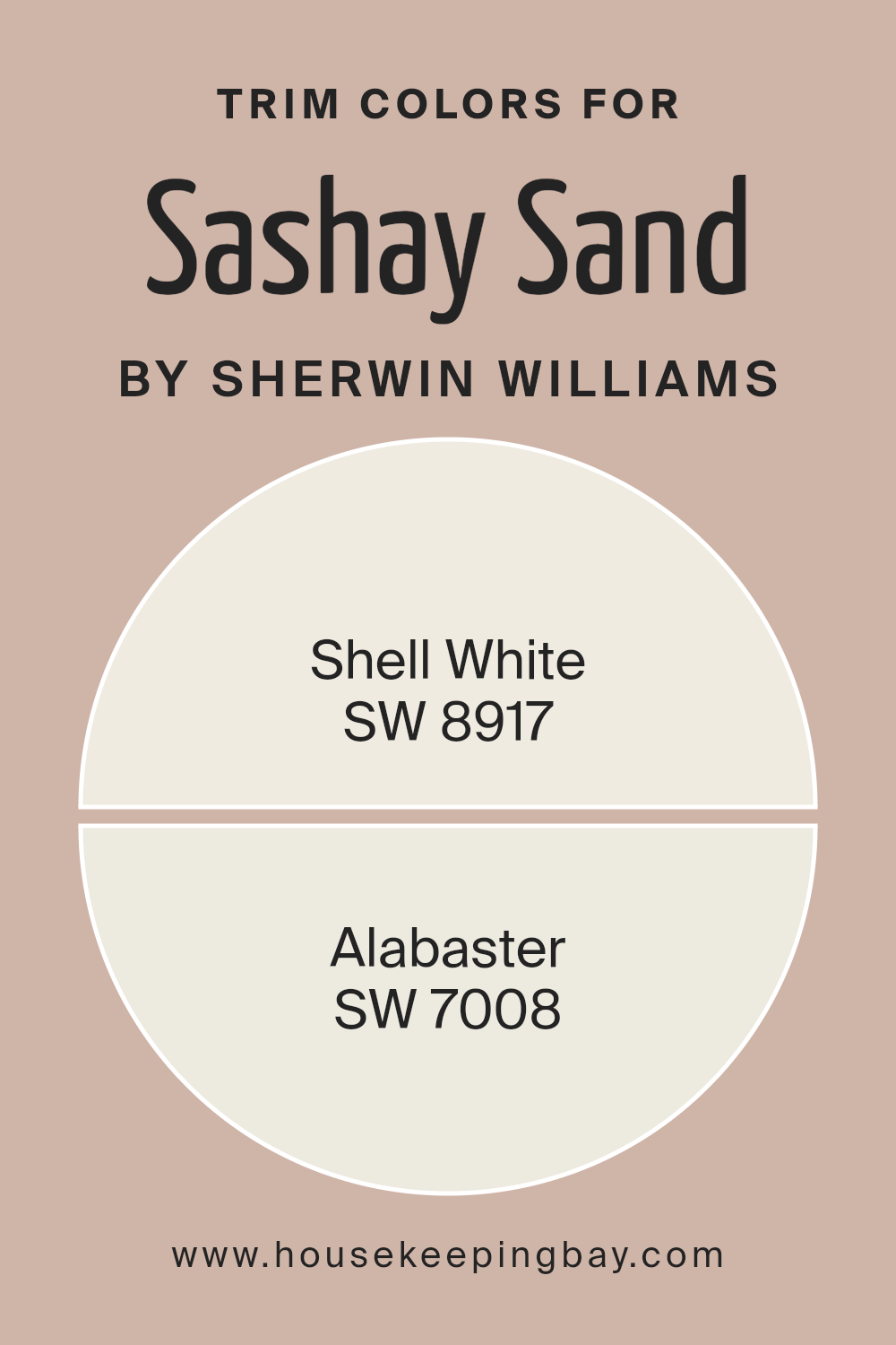
What are the Trim colors of Sashay Sand SW 6051 by Sherwin Williams
Trim colors play a vital role in interior and exterior paint projects, acting as a defining detail that accents and complements the main color palette. In the case of Sashay Sand SW 6051 by Sherwin-Williams, a nuanced and sophisticated hue, the choice of trim color can significantly impact the overall look and feel of a space.
Trim colors, such as SW 8917 – Shell White and SW 7008 – Alabaster, are selected for their ability to highlight and enhance the primary wall color, framing the space with elegance and subtly drawing attention to architectural details.
Whether applied to baseboards, window frames, door casings, or crown moldings, the right trim color can create a cohesive and polished appearance, ensuring that the main color, Sashay Sand in this case, truly stands out.
SW 8917 – Shell White, with its soft, warm undertones, offers a gentle contrast to Sashay Sand, providing a seamless transition between wall and trim that enhances the overall warmth and welcoming feel of a room. It’s a color that whispers elegance rather than shouting, ideal for spaces that aim for a subtle, sophisticated vibe.
On the other hand, SW 7008 – Alabaster, a shade that carries a hint of creaminess, brings a slightly richer and cozier feel to the paint scheme.
This color pairs beautifully with Sashay Sand, adding depth and a touch of luxury to the space, making it perfect for areas of the home that beg for a bit more statement and character. Together, these trim colors offer versatile options to complement Sashay Sand SW 6051, ensuring that any space achieves the desired ambiance and aesthetic appeal.
You can see recommended paint colors below:
housekeepingbay.com
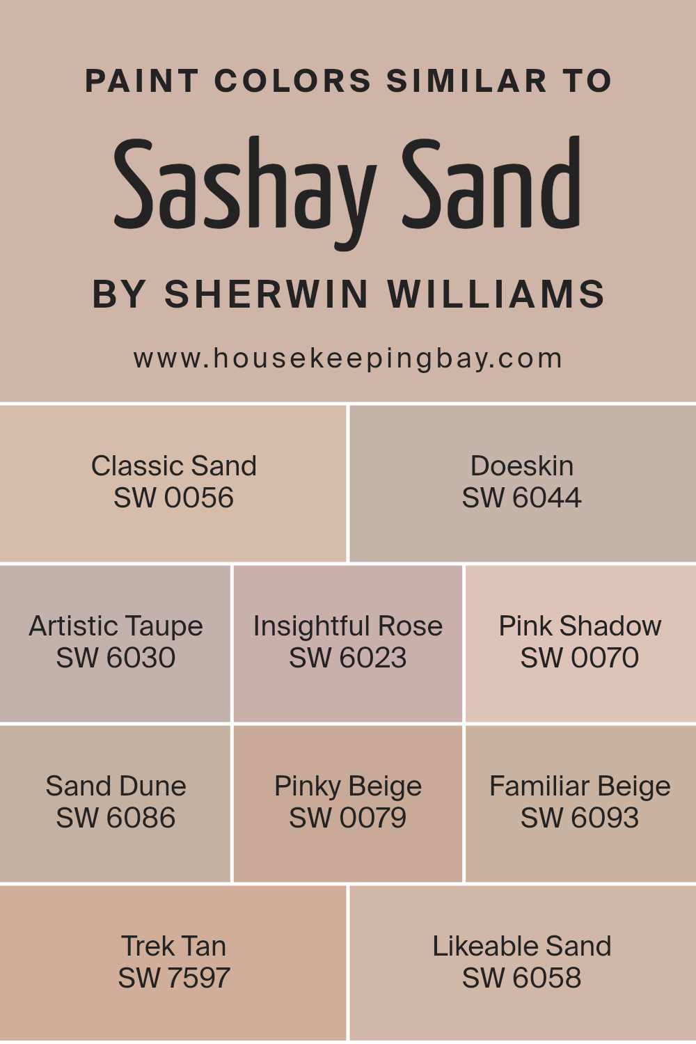
Colors Similar to Sashay Sand SW 6051 by Sherwin Williams
Similar colors, such as the variants inspired by Sashay Sand SW 6051 by Sherwin Williams, are pivotal in creating visually harmonious spaces that exude a sense of balance and elegance. When colors are akin, like SW 0056 – Classic Sand, a gently muted beige that whispers of calm beaches, or SW 6044 – Doeskin, which brings to mind the soft warmth of natural suede, they work together to evoke a unified aesthetic.
This unity is further enhanced by shades like SW 6030 – Artistic Taupe, a deeper, contemplative beige that adds depth, and SW 6023 – Insightful Rose, a subdued, thoughtful pink that introduces a gentle whisper of color.
The addition of SW 0070 – Pink Shadow, a soft, dreamy pink, and SW 6086 – Sand Dune, a robust beige reminiscent of windswept dunes, creates a palette that bridges the gap between softness and strength.
Moreover, colors such as SW 0079 – Pinky Beige, with its tender blush tones, and SW 6093 – Familiar Beige, a warm, inviting beige, work seamlessly to foster a cozy and comforting atmosphere. SW 7597 – Trek Tan offers a bold, adventurous spirit that still aligns with the palette’s grounded nature.
Lastly, SW 6058 – Likeable Sand, a friendly and soft neutral, encapsulates the essence of approachability and ease.
Collectively, these similar colors by Sherwin Williams are not just shades but a symphony of hues that together create spaces of unmatched beauty and tranquility. Their subtle differences provide depth and complexity, allowing for a design that is cohesive yet rich with visual interest.
You can see recommended paint colors below:
- SW 0056 Classic Sand
- SW 6044 Doeskin
- SW 6030 Artistic Taupe
- SW 6023 Insightful Rose
- SW 0070 Pink Shadow
- SW 6086 Sand Dune
- SW 0079 Pinky Beige
- SW 6093 Familiar Beige
- SW 7597 Trek Tan
- SW 6058 Likeable Sand
housekeepingbay.com
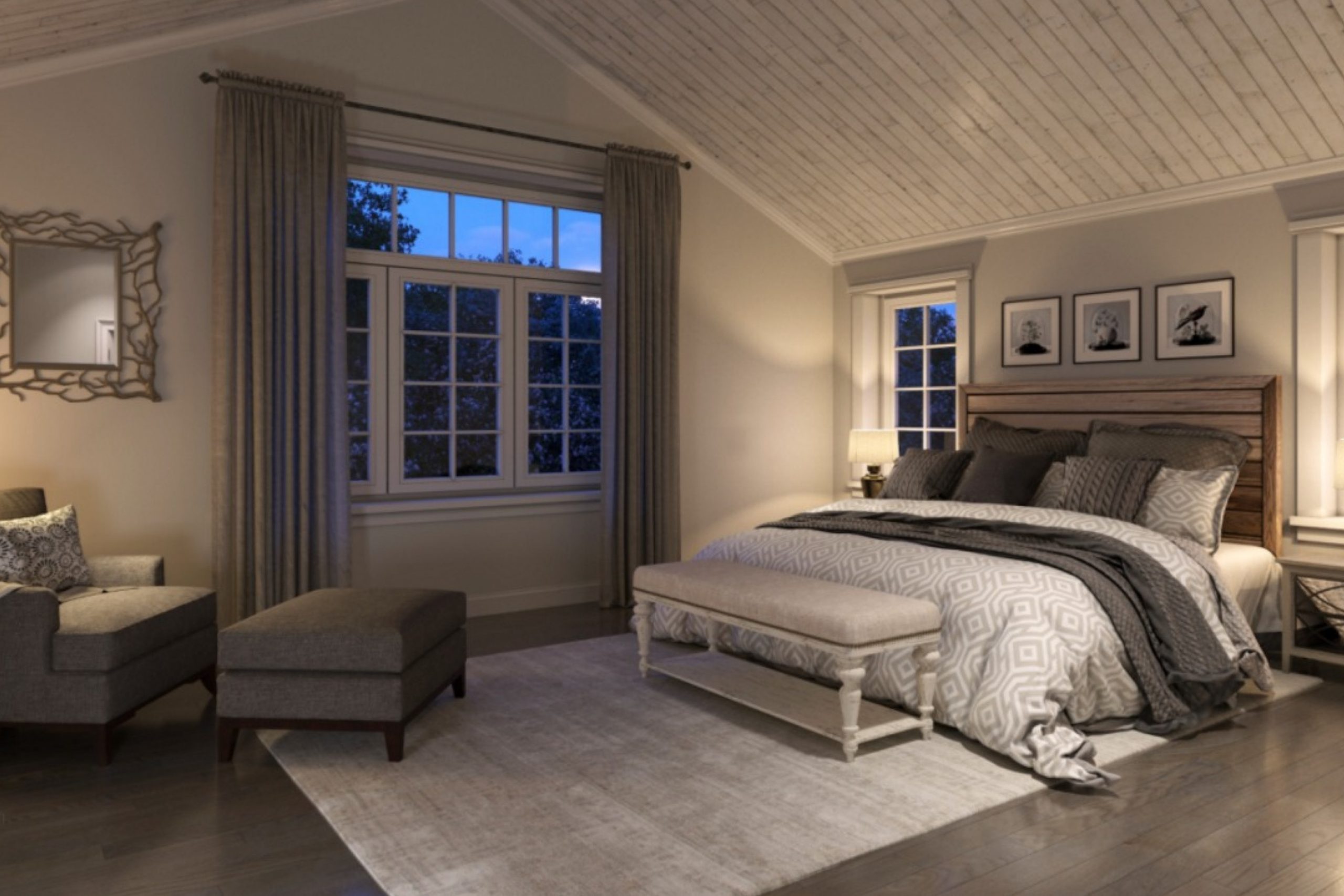
How to Use Sashay Sand SW 6051 by Sherwin Williams In Your Home?
Sashay Sand SW 6051 by Sherwin Williams is a warm, inviting hue that evokes a sense of calm and sophistication in any space. This versatile color, with its subtle sandy tones, bridges the gap between a neutral beige and a soft, earthy tan. Its ability to adapt to a variety of settings makes it an excellent choice for homeowners looking to create a serene and welcoming atmosphere.
Use Sashay Sand in living areas to foster an environment of comfort and relaxation, where family and guests alike feel at ease. This color shines in natural light, making it perfect for spaces with large windows or sunrooms, where it can enhance the brightness of the space while maintaining a cozy ambiance.
In bedrooms, Sashay Sand serves as the ideal backdrop for rest, complementing both dark and light furnishings, enabling a wide range of decorative styles from modern to rustic. For those wishing to sell their home, painting walls in Sashay Sand can also help neutralize spaces, making them more appealing to potential buyers by presenting them as “move-in ready” environments that offer a canvas for personalization.
Tailoring your home with Sashay Sand SW 6051 is an effortless way to add a touch of elegance and warmth, making every room inviting and comfortable.
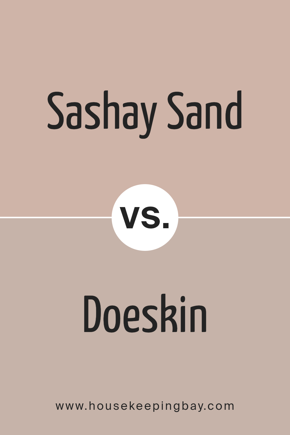
Sashay Sand SW 6051 by Sherwin Williams vs Doeskin SW 6044 by Sherwin Williams
Sashay Sand SW 6051 and Doeskin SW 6044, both by Sherwin Williams, are warm, neutral colors that embody an earthy essence perfect for inviting and cozy spaces. Sashay Sand is lighter, presenting a soft, creamy beige that effortlessly spreads light and warmth throughout a room.
Its subtle undertones can adapt to various decor styles, making it a versatile choice for creating a serene and welcoming ambiance. On the other hand, Doeskin harbors a deeper, richer tone, resembling the natural color of an animal’s hide. Its depth adds sophistication and warmth, creating a more intimate and grounded atmosphere.
While Sashay Sand reflects more light, making spaces appear larger and airier, Doeskin offers an enveloping feel, ideal for creating cozy corners and focal points. Together, these colors can complement each other beautifully, with Sashay Sand providing a light, airy foundation and Doeskin adding depth and character.
You can see recommended paint color below:
- SW 6044 Doeskin
housekeepingbay.com
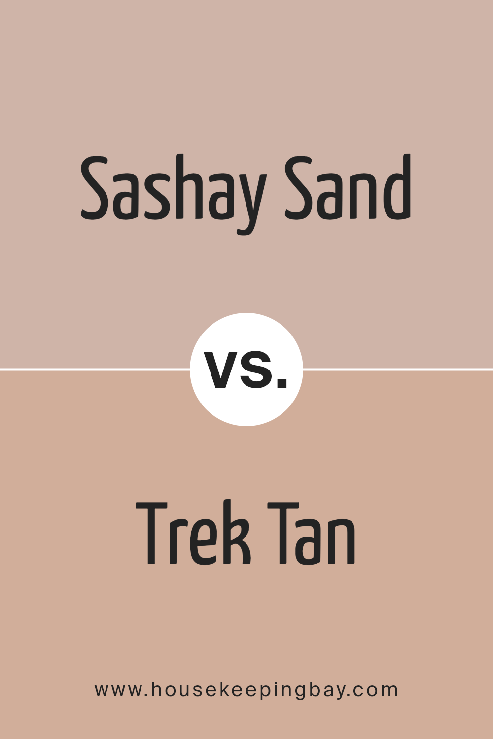
Sashay Sand SW 6051 by Sherwin Williams vs Trek Tan SW 7597 by Sherwin Williams
Sashay Sand SW 6051 by Sherwin-Williams is a soft, muted beige with pink undertones, offering an elegant and understated backdrop for various settings. Its delicacy brings a warm, inviting feel, suitable for creating a serene and cozy atmosphere in living spaces. This color’s gentle nature makes it highly versatile, blending seamlessly with both modern minimalistic themes and more traditional or rustic decors.
On the other hand, Trek Tan SW 7597 by Sherwin-Williams is a robust, earthy tan with richer, golden undertones compared to Sashay Sand. Trek Tan lends itself to a more pronounced, comforting presence in a room, evoking the essence of nature and stability. Its depth adds character and warmth, making spaces feel more grounded and welcoming.
While both colors share a foundation in the beige family, Sashay Sand leans towards a lighter, more ethereal quality, promoting softness and calm. Trek Tan, conversely, boasts a stronger, more vivacious spirit, ideal for spaces intended to feel anchored and enriched. Choosing between them depends on the desired ambiance—light and airy or warm and robust.
You can see recommended paint color below:
- SW 7597 Trek Tan
housekeepingbay.com
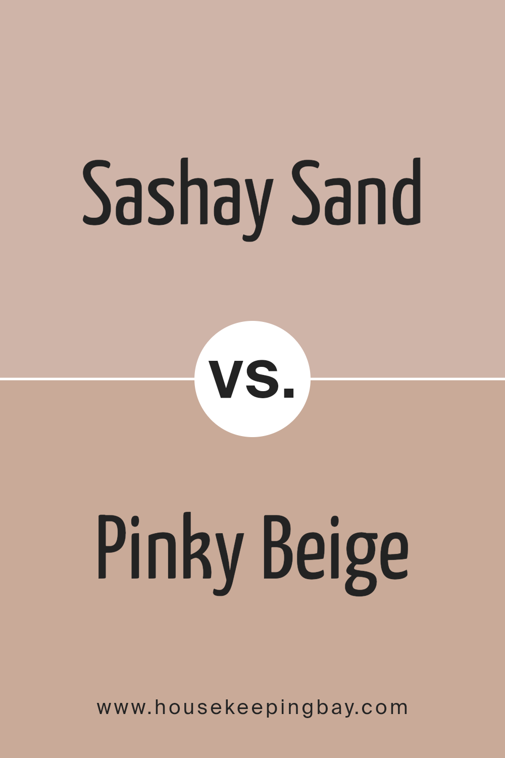
Sashay Sand SW 6051 by Sherwin Williams vs Pinky Beige SW 0079 by Sherwin Williams
“Sashay Sand” and “Pinky Beige” by Sherwin Williams are both nuanced, warm shades that serve as versatile neutrals in any design palette. “Sashay Sand” (SW 6051) is a sophisticated, creamy beige with a soft, welcoming vibe. It carries an earthy, understated elegance that makes it a perfect backdrop for both vibrant and muted tones, allowing for a wide range of decorating styles. Its warmth and subtlety contribute to a serene and inviting atmosphere in any space.
“Pinky Beige” (SW 0079), on the other hand, leans into a soft, warm territory with a distinct pink undertone.
Both colors offer flexibility and warmth, but “Sashay Sand” maintains a traditional neutrality, while “Pinky Beige” introduces a playful, tender blush to spaces. Depending on the desired mood and style, each color has its unique charm and appeal in interior design.
You can see recommended paint color below:
- SW 0079 Pinky Beige
housekeepingbay.com
Sashay Sand SW 6051 by Sherwin Williams vs Classic Sand SW 0056 by Sherwin Williams
The two colors, Sashay Sand SW 6051 and Classic Sand SW 0056 by Sherwin Williams, present unique hues that lend warmth and natural elegance to any space. Sashay Sand, a dusky, muted beige, embodies a sophisticated neutrality. Its undertones suggest a soft blend of gray and pink, making it versatile for combining with a wide array of colors, from bold to soft pallets. This color captures the delicate balance between warmth and coolness, making it suitable for creating a serene and inviting atmosphere.
On the other hand, Classic Sand is a brighter, more pronounced beige. It leans towards a more traditional sandy color, with yellow undertones that exude warmth and sunlight. This hue brings a cheerful and cozy ambiance to environments, promoting a feeling of openness and light.
Classic Sand is particularly effective in spaces where natural light is abundant, as it enhances the room’s brightness and adds a sense of spaciousness.
While both colors share a base in the beige family, their distinct undertones and depth set them apart. Sashay Sand offers a muted elegance for a modern and sophisticated feel, whereas Classic Sand strikes a chord with traditional comfort and sunny warmth.
Choosing between them depends on the desired mood and the specific design aesthetic one aims to achieve.
You can see recommended paint color below:
- SW 0056 Classic Sand

housekeepingbay.com
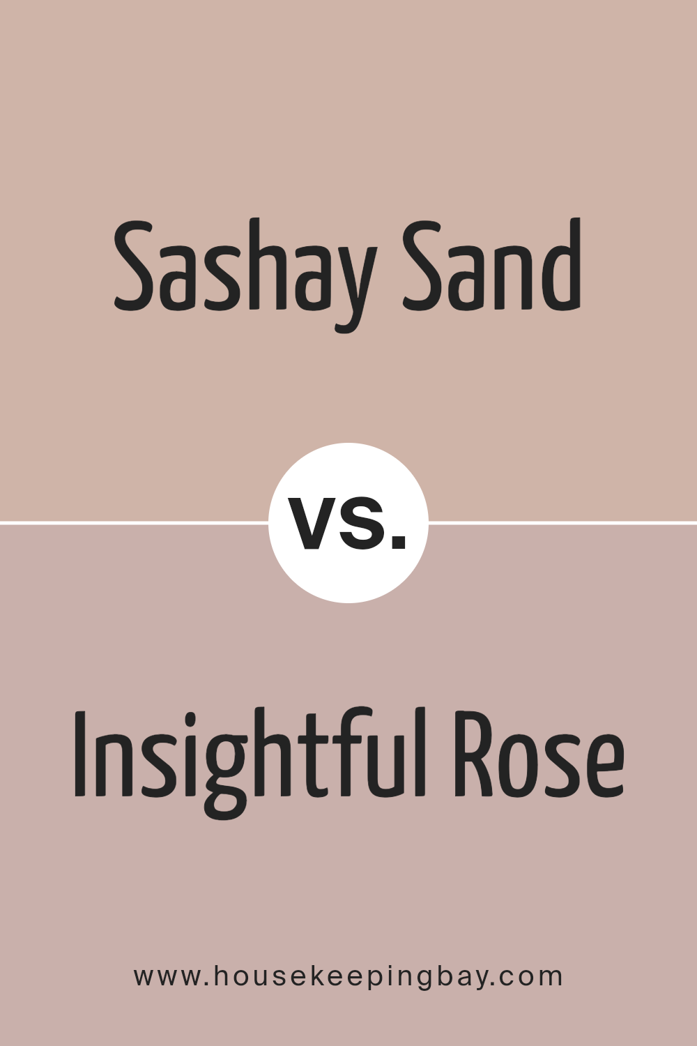
Sashay Sand SW 6051 by Sherwin Williams vs Insightful Rose SW 6023 by Sherwin Williams
Sashay Sand (SW 6051) and Insightful Rose (SW 6023) by Sherwin Williams are two nuanced colors that offer unique aesthetics for any space. Sashay Sand is a warm, inviting neutral with sandy undertones, embodying a serene and earthy vibe.
Its subtle richness can illuminate spaces, giving an airy yet grounded feel, making it a versatile choice for almost any room. On the other hand, Insightful Rose is a deeper, more pronounced hue, with soft rose undertones that exude sophistication and warmth. This color can add a touch of elegance and a hint of romance to interiors, creating an inviting, cozy atmosphere.
While Sashay Sand provides a neutral backdrop that can accompany a wide range of colors, Insightful Rose makes a statement with its distinctive warm blush tones. Together, these colors can create a harmonious balance, blending the earthy, neutral base of Sashay Sand with the vibrant, yet gentle, warmth of Insightful Rose, ideal for spaces aiming for a soft, inviting palette.
You can see recommended paint color below:
- SW 6023 Insightful Rose
housekeepingbay.com
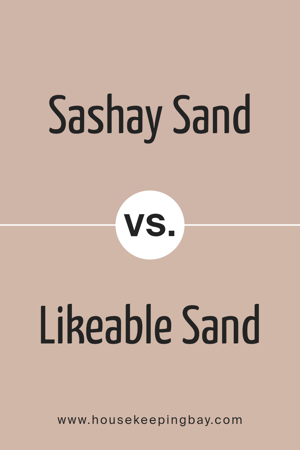
Sashay Sand SW 6051 by Sherwin Williams vs Likeable Sand SW 6058 by Sherwin Williams
Sashay Sand SW 6051 and Likeable Sand SW 6058, both by Sherwin Williams, are nuanced hues that evoke the warmth and serenity of sandy beaches, yet they possess distinct differences that make them suitable for various palettes and settings.
Sashay Sand is the subtler of the two, presenting a lighter, more ethereal beige that brings a whisper of tranquility and an airy brightness to spaces. Its understated elegance makes it a versatile choice for creating a serene backdrop that complements a wide range of decor styles and colors.
On the other hand, Likeable Sand leans towards a deeper, richer beige, imbuing spaces with a cozy warmth that feels inviting and comforting. This shade offers a bit more presence and character, making it ideal for adding depth and warmth to interiors without overwhelming them.
While both colors share a base in sandy beige, Sashay Sand offers a lighter, breezier feel, whereas Likeable Sand provides a snug, more enveloping atmosphere, illustrating how subtle variations in shade can dramatically influence the mood and style of a space.
You can see recommended paint color below:
- SW 6058 Likeable Sand
housekeepingbay.com
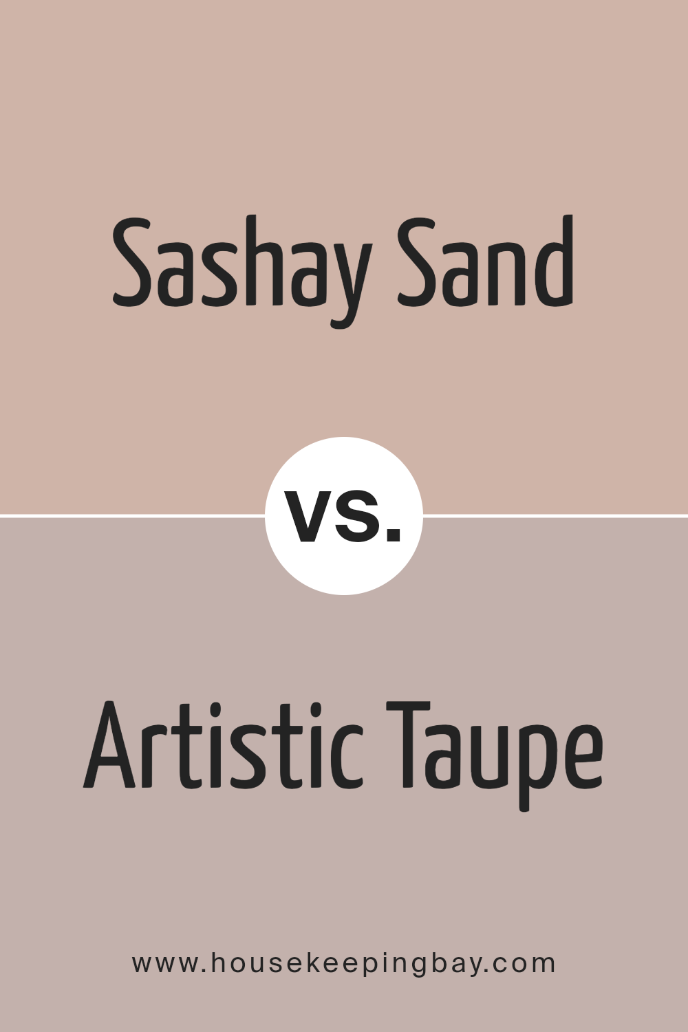
Sashay Sand SW 6051 by Sherwin Williams vs Artistic Taupe SW 6030 by Sherwin Williams
Sashay Sand SW 6051 and Artistic Taupe SW 6030, both by Sherwin Williams, are sophisticated hues that cater to spaces wishing to evoke calmness and warmth. Sashay Sand is a light, warm beige with a subtle pink undertone, which gives spaces an air of elegance and an inviting feel. Its lighter quality allows it to reflect more light, making it an excellent choice for smaller or darker rooms where the goal is to open up the space and infuse it with a gentle warmth.
Artistic Taupe, on the other hand, is a mid-tone gray-brown that leans more towards the taupe family. This color carries a deeper, more pronounced warmth compared to Sashay Sand, owing to its grounding brown base.
It crafts a cozy and comforting atmosphere, making it suitable for creating focal points or highlighting architectural details. Despite its depth, Artistic Taupe maintains a versatile neutrality, enabling easy pairing with a range of colors.
When comparing these two, Sashay Sand offers a light, airy vibe ideal for creating a delicate and sophisticated backdrop, while Artistic Taupe brings a stronger character with its rich and cozy undertones. Both colors complement each other well and can be used together to create a nuanced and layered aesthetic that combines lightness and depth.
You can see recommended paint color below:
- SW 6030 Artistic Taupe
housekeepingbay.com
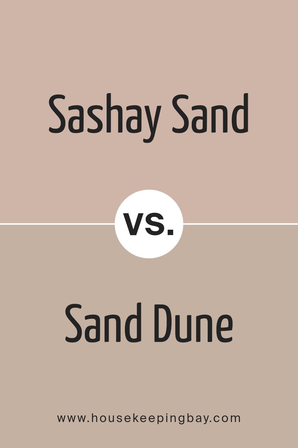
Sashay Sand SW 6051 by Sherwin Williams vs Sand Dune SW 6086 by Sherwin Williams
Sashay Sand SW 6051 and Sand Dune SW 6086, both from Sherwin Williams, embody the warmth and tranquility of sandy landscapes, yet each possesses its own unique character. Sashay Sand is the lighter of the two, offering a subtle, creamy hue that exudes softness and a sense of calm. It is a versatile color that can brighten spaces, making rooms feel more open and airy. Its understated elegance allows it to blend seamlessly with a wide range of decor styles, from modern to coastal.
On the other hand, Sand Dune is deeper and richer, capturing the essence of a sun-warmed beach. This color provides a cozy, enveloping feel, making it perfect for creating intimate and inviting spaces. Its earthy undertones bring a sense of stability and grounding, ideal for areas where you want to instill comfort and warmth.
In essence, while Sashay Sand brings lightness and an expansive feel to interiors, Sand Dune offers depth and coziness, demonstrating a sophisticated earthiness. Both colors reflect the natural beauty of sand but in distinctly different tones and moods, catering to diverse aesthetic preferences and functional needs within home environments.
You can see recommended paint color below:
- SW 6086 Sand Dune
housekeepingbay.com
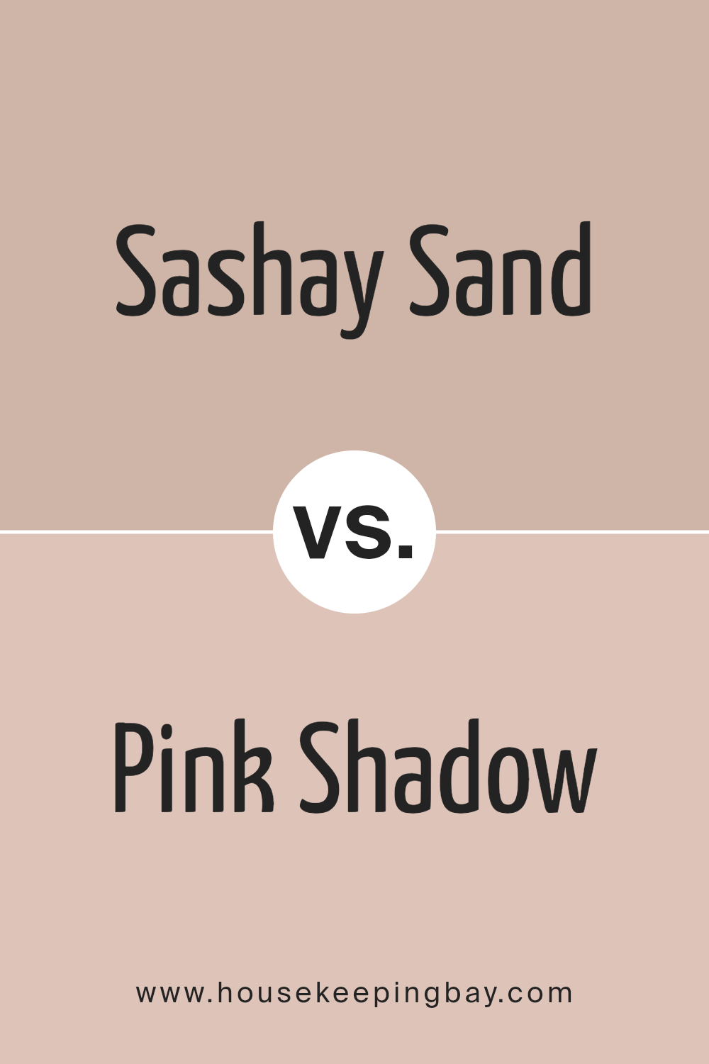
Sashay Sand SW 6051 by Sherwin Williams vs Pink Shadow SW 0070 by Sherwin Williams
Sashay Sand SW 6051 and Pink Shadow SW 0070 by Sherwin Williams embody distinctly different moods and aesthetics, though both share an understated elegance. Sashay Sand is a warm, soft beige with an inviting neutrality that makes it exceptionally versatile.
It conveys a sense of calm and serenity, effortlessly complementing a wide range of color palettes, materials, and styles. Its earthy undertones offer a solid foundation for both contemporary and traditional spaces, promoting a grounded and cohesive atmosphere.
In contrast, Pink Shadow is a delicate, muted pink that whispers of romance and softness. This color carries a subtle charm, providing spaces with a gentle pop of personality without overwhelming the senses. Its inherent softness makes it ideal for creating serene, comforting environments. Pink Shadow serves well as an accent color or when paired with more neutral shades, adding a layer of warmth and whimsy.
Together, Sashay Sand and Pink Shadow could create a harmonious balance, marrying the earthiness of Sashay Sand with the tender allure of Pink Shadow to fashion interiors that feel both grounded and uplifted, encapsulating a refined yet heartwarming aesthetic.
You can see recommended paint color below:
- SW 0070 Pink Shadow
housekeepingbay.com
Sashay Sand SW 6051 by Sherwin Williams vs Familiar Beige SW 6093 by Sherwin Williams
Sashay Sand SW 6051 and Familiar Beige SW 6093, both from Sherwin Williams, dwell within the neutral color spectrum, embodying warmth and versatility. Sashay Sand exudes a lighter, more ethereal quality, hinting at sandy beaches and early morning light – its softness can illuminate and expand a space, imbuing it with a serene, airy feel. This lighter hue is particularly adept at creating a subtle backdrop that can enhance natural light and pair effortlessly with both vibrant and muted tones for a harmonious blend.
Familiar Beige, on the other hand, anchors itself with a bit more depth and warmth, reminiscent of rich, sunbaked clay or the inviting comfort of a well-loved linen. Its slightly deeper, earthier tone offers a grounding presence in a room, making it ideal for spaces that seek to convey comfort and stability.
While inherently neutral, Familiar Beige brings a cozy warmth that complements wood finishes and natural textures, fostering an inviting, cohesive environment.
Together, Sashay Sand and Familiar Beige can harmonize within a space to create a balance between light and warmth, making them versatile choices for those aiming to craft a nuanced and inviting neutral palette.
You can see recommended paint color below:
- SW 6093 Familiar Beige
housekeepingbay.com
Conclusion
Sashay Sand SW 6051 by Sherwin Williams embodies a delicate and serene aesthetic that seamlessly integrates into various living spaces, promoting a sense of warmth and understated elegance.
This subtle hue, part of the Sherwin Williams color palette, captures the essence of tranquility, making it an ideal choice for those looking to create a calm and inviting atmosphere in their home. Its versatility allows it to act as a neutral background that can complement a wide range of decor styles, from contemporary to traditional, ensuring it meets the needs of a diverse audience seeking to enhance the aesthetic appeal of their interiors.
The significance of Sashay Sand extends beyond its visual appeal, as it also reflects a growing trend towards minimalistic and soothing color schemes in home design.
As individuals seek to transform their living spaces into peaceful sanctuaries away from the chaos of the outside world, Sashay Sand SW 6051 emerges as a go-to option, offering a perfect blend of style and comfort.
Moreover, its compatibility with natural materials and other color shades further accentuates its adaptability, enabling homeowners and designers alike to experiment with different combinations to achieve the desired ambiance.
In essence, Sashay Sand is not just a color but a lifestyle choice that resonates with the modern home dweller’s quest for simplicity and harmony.

housekeepingbay.com
Ever wished paint sampling was as easy as sticking a sticker? Guess what? Now it is! Discover Samplize's unique Peel & Stick samples. Get started now and say goodbye to the old messy way!
Get paint samples


