Rattan Palm SW 9533 Paint Color by Sherwin-Williams
All you need to know to make this color work
Colors form the foundation of our visual perception, influencing our mood, behavior, and the overall ambiance of a space. Sherwin-Williams, a renowned name in the paint industry, has a myriad of hues. One shade that stands out is the SW 9533 Rattan Palm. But what is it about this color that makes it so distinctive?
via home design
What Color Is SW 9533 Rattan Palm?
SW 9533 Rattan Palm is a sophisticated hue, resembling the earthy undertones of a woven rattan palm basket. It carries a timeless appeal, making it a favorite for many interior design themes. The color evokes a sense of nature, and its muted tone gives a calm, serene feel.
Best suited for Bohemian, rustic, and contemporary interiors, Rattan Palm pairs exquisitely with natural materials like wood, jute, and linen, providing a harmonious blend of aesthetics.
housekeepingbay.com
Table of Contents
Is It a Warm Or Cool Color?
The warmth or coolness of a color determines its place in the color spectrum. SW 9533 Rattan Palm leans towards the warmer side. Its earthen undertone gives spaces a cozy, inviting feel. Warm colors often create an intimate environment, making rooms appear smaller and cozier, which is exactly how Rattan Palm behaves in a home setting.
Undertones of SW 9533 Rattan Palm
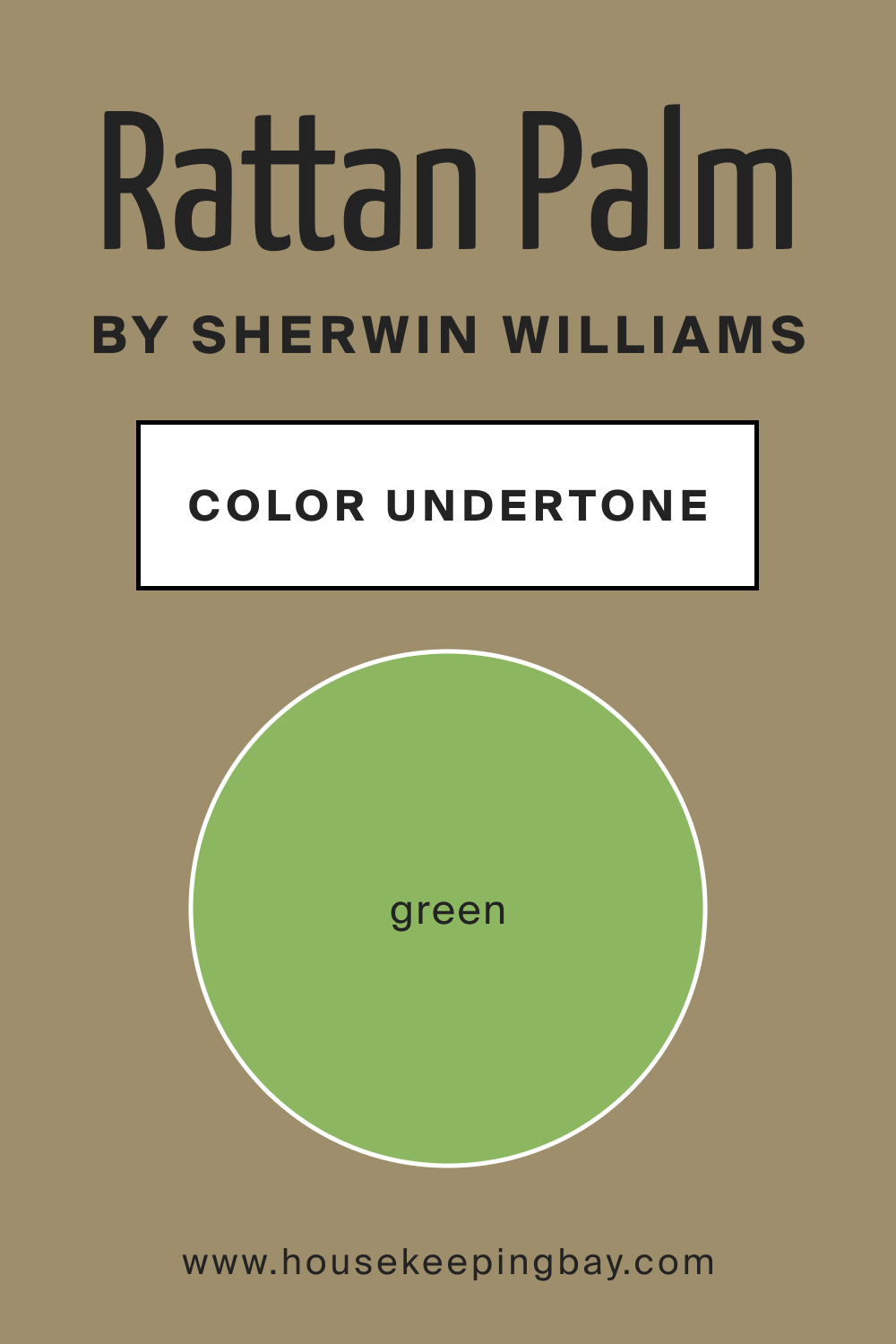
Every color has underlying tones that may emerge more prominently in different settings. SW 9533 Rattan Palm has subtle green undertones, giving it a lush, organic feel. Undertones play a pivotal role in determining the mood a color sets.
In the case of Rattan Palm, its undertones make it versatile, allowing it to fit into varied interiors seamlessly. On walls, these undertones can either pop out or recede, depending on surrounding colors and lighting.
housekeepingbay.com
Coordinating Colors of SW 9533 Rattan Palm
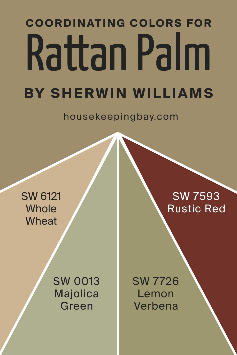
Coordinating colors harmonize with the main hue to create a balanced look. For SW Rattan Palm, these could include muted earthy tones and soft greens. Think of sun-kissed terracotta or the lightest shade of olive. Each of these coordinating shades complements Rattan Palm, enhancing its organic essence. For instance, we recommend the following options:
- SW 0013 Majolica Green
- SW 6121 Whole Wheat
- SW 7726 Lemon Verbena
- SW 7593 Rustic Red
housekeepingbay.com
How Does Lighting Affect SW 9533 Rattan Palm?
Lighting plays a crucial role in determining how a color looks in a space. Rattan Palm, under artificial light, appears warmer, accentuating its brown undertones. In natural light, its green undertones might come to the fore. In north-facing rooms that get cooler, subdued light, it might appear slightly darker.
Conversely, in sun-drenched south-facing rooms, Rattan Palm might seem lighter and more vibrant. East and west-facing rooms, with their ever-changing light, can make Rattan Palm oscillate between its warm and cool undertones.
housekeepingbay.com
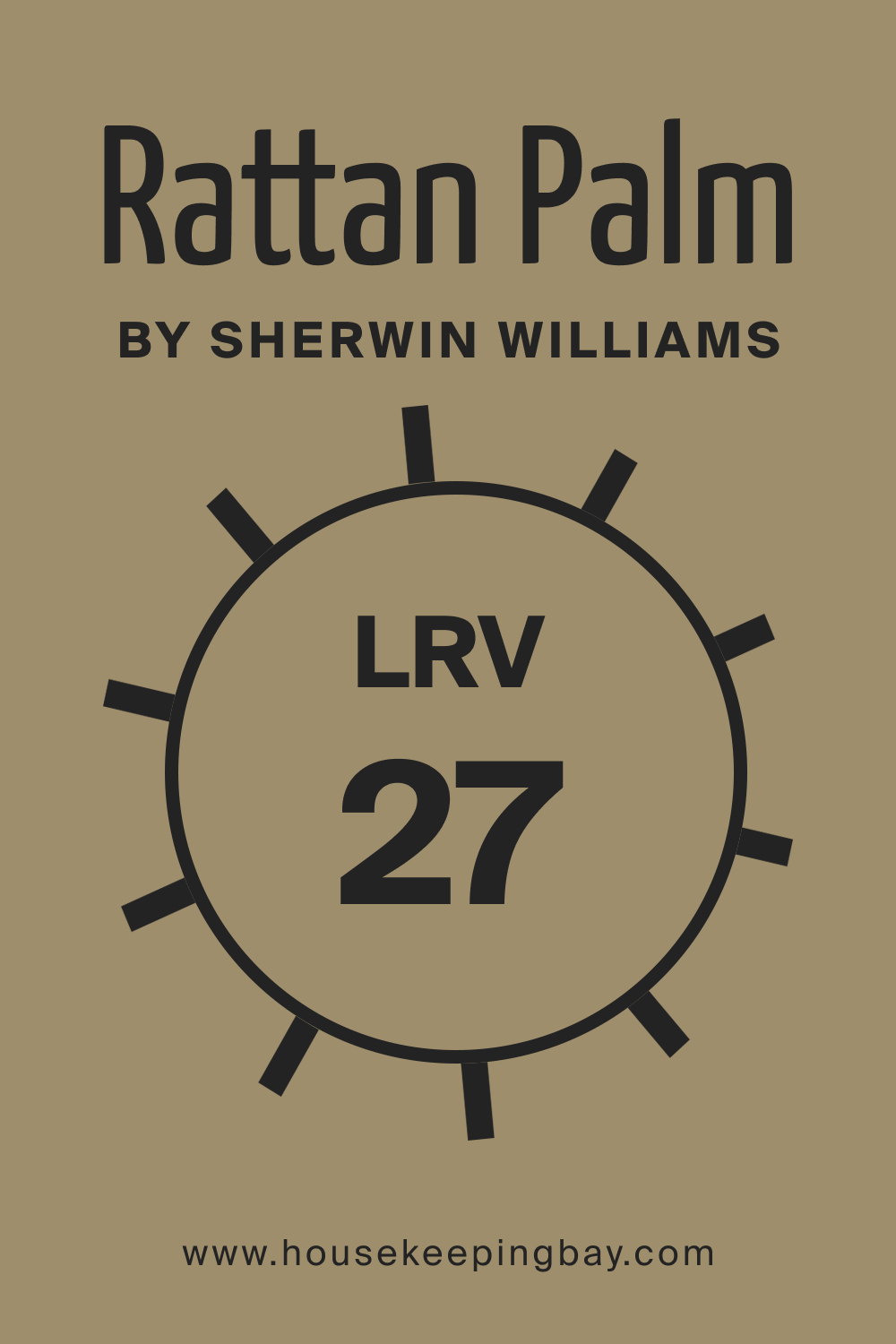
LRV of SW 9533 Rattan Palm
Light Reflectance Value (LRV) determines the amount of light a color reflects. With an LRV of 27, Rattan Palm isn’t too reflective but isn’t too absorbent either. Lower LRVs tend to make spaces feel more intimate and snug, which is precisely the effect Rattan Palm achieves. In large, spacious rooms, this color provides a cozy warmth, while in smaller spaces, it offers depth and character.
housekeepingbay.com
What is LRV? Read It Before You Choose Your Ideal Paint Color
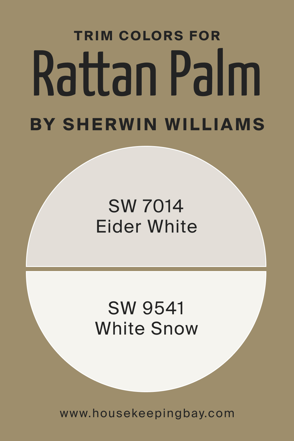
Trim Colors of SW 9533 Rattan Palm
Trim colors frame and accentuate main colors. With Rattan Palm, trims like SW 9154 White Snow (a pure, pristine white) or SW 7014 Eider White (a softer, gray-toned white) can highlight its earthiness.
Such whites offer a crisp contrast, making the wall color pop while preserving the room’s overall harmony.
housekeepingbay.com
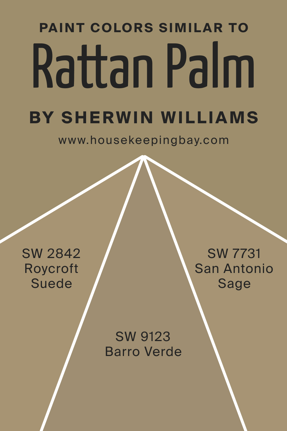
Colors Similar to SW 9533 Rattan Palm
Understanding similar colors is vital for alternative options or achieving a layered look. Try out the following colors that read nearly the same as SW Rattan Palm:
- SW 2842 Roycroft Suede is a deeper, more saturated version of Rattan Palm
- SW 9123 Barro Verde leans more into the green family but retains a similar earthy undertone
- SW 7731 San Antonio Sage is another contender, carrying a muted green-gray tone, making it a cooler counterpart to Rattan Palm.
housekeepingbay.com
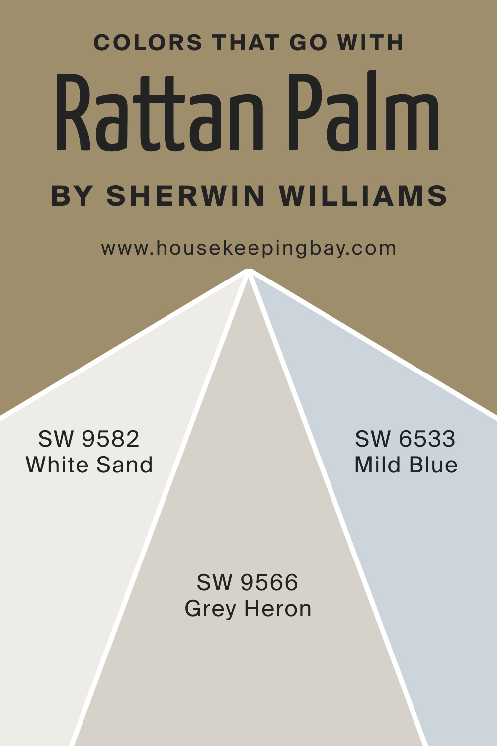
Colors That Go With SW 9533 Rattan Palm
Combining harmonious colors elevates interior aesthetics. SW 9533 Rattan Palm pairs beautifully with the following hues:
- SW 9582 White Sand’s beige undertones
- SW 9566 Gray Heron’s soft gray
- SW 6533 Mild Blue’s tranquil vibes.
Earthier shades like SW 6417 Tupelo Tree and the bold SW 7610 Turkish Tile also complement Rattan Palm. Adding to the mix could be tones like muted coral, soft lavender, and deep teal, each enriching the palette and offering design versatility.
housekeepingbay.com
How to Use SW 9533 Rattan Palm In Your Home?
SW 9533 Rattan Palm is a versatile hue that effortlessly fits into a myriad of rooms and interior design styles. Its earthy undertones are ideal for spaces that require warmth, serenity, and a touch of nature. From the soothing confines of a bedroom to the vibrancy of a kitchen, Rattan Palm is adaptable.
It aligns well with Bohemian, rustic, contemporary, and even Scandinavian interiors due to its organic, neutral palette.
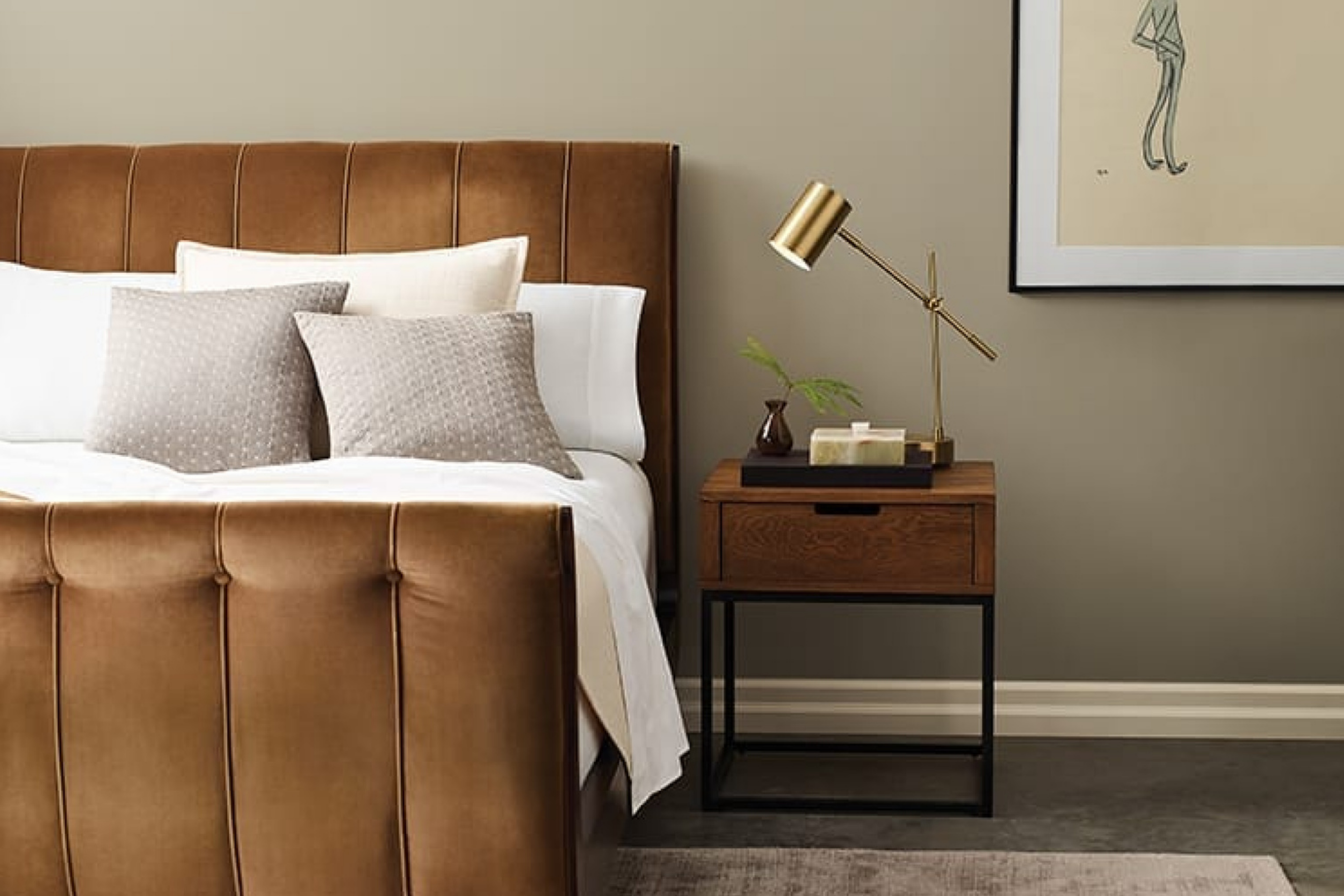
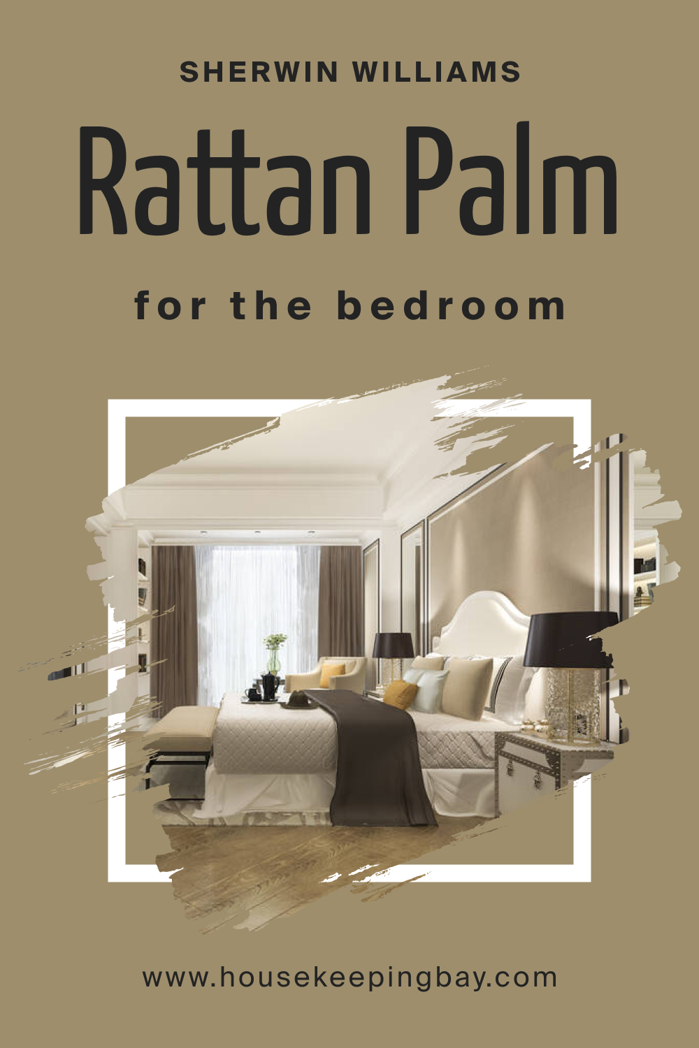
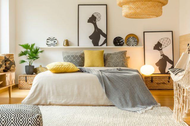
How to Use SW 9533 Rattan Palm in the Bedroom?
In the bedroom, Rattan Palm invites tranquility and calm. Its muted tones promote relaxation, making it perfect for a backdrop wall behind the bed or even for the entire room. Paired with soft linens, wooden accents, and subtle lighting, it creates a sanctuary of peace, ensuring restful nights.
housekeepingbay.com
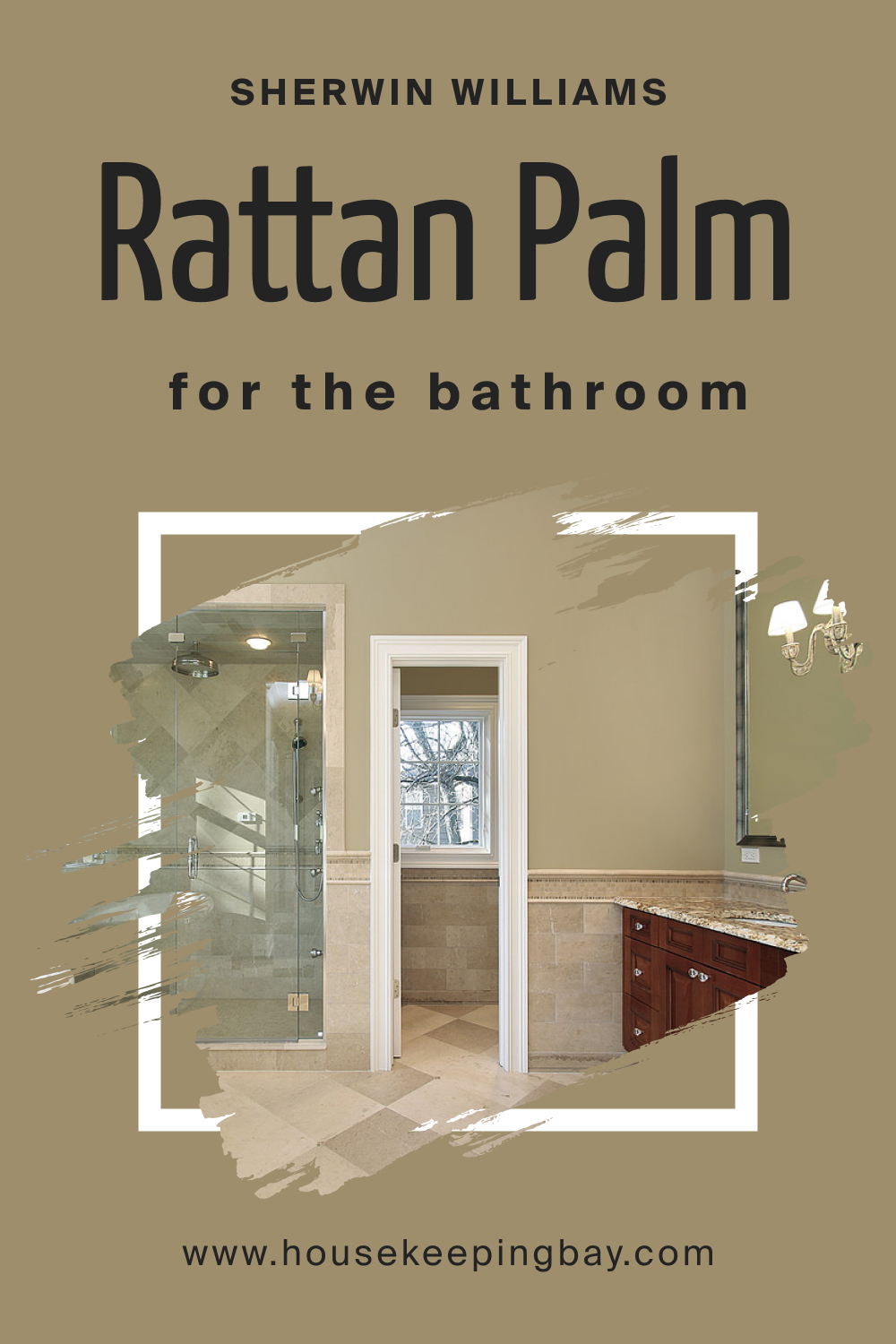
How to Use SW 9533 Rattan Palm in the Bathroom?
For bathrooms, Rattan Palm introduces a spa-like ambiance. When complemented with natural elements like bamboo mats, stone basins, and greenery, it crafts a serene escape. Its warm undertones balance cooler bathroom elements, like metal fixtures and ceramic tiles, lending an air of cozy luxury.
housekeepingbay.com
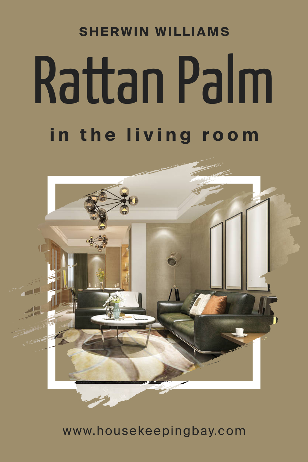
How to Use SW 9533 Rattan Palm in the Living Room?
In the living room, Rattan Palm establishes a welcoming atmosphere. Whether applied on an accent wall or throughout, its earthy shade serves as a backdrop that accentuates furniture and decor. Mix it with plush textiles, eclectic art, and wooden elements to curate a cohesive and inviting space for guests and family.
housekeepingbay.com
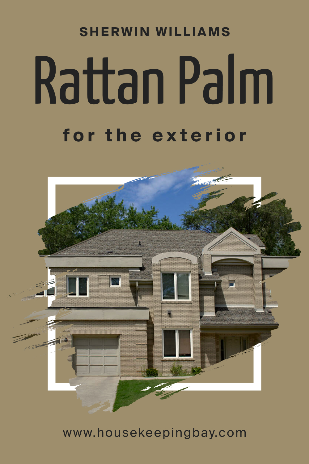
How to Use SW 9533 Rattan Palm for an Exterior?
Exteriors painted with Rattan Palm exude a timeless, elegant charm. It’s a hue that stands out yet blends seamlessly with natural surroundings. Complemented by white trims and lush green landscaping, Rattan Palm provides a homely facade, ensuring your residence appears warm and inviting year-round.
housekeepingbay.com
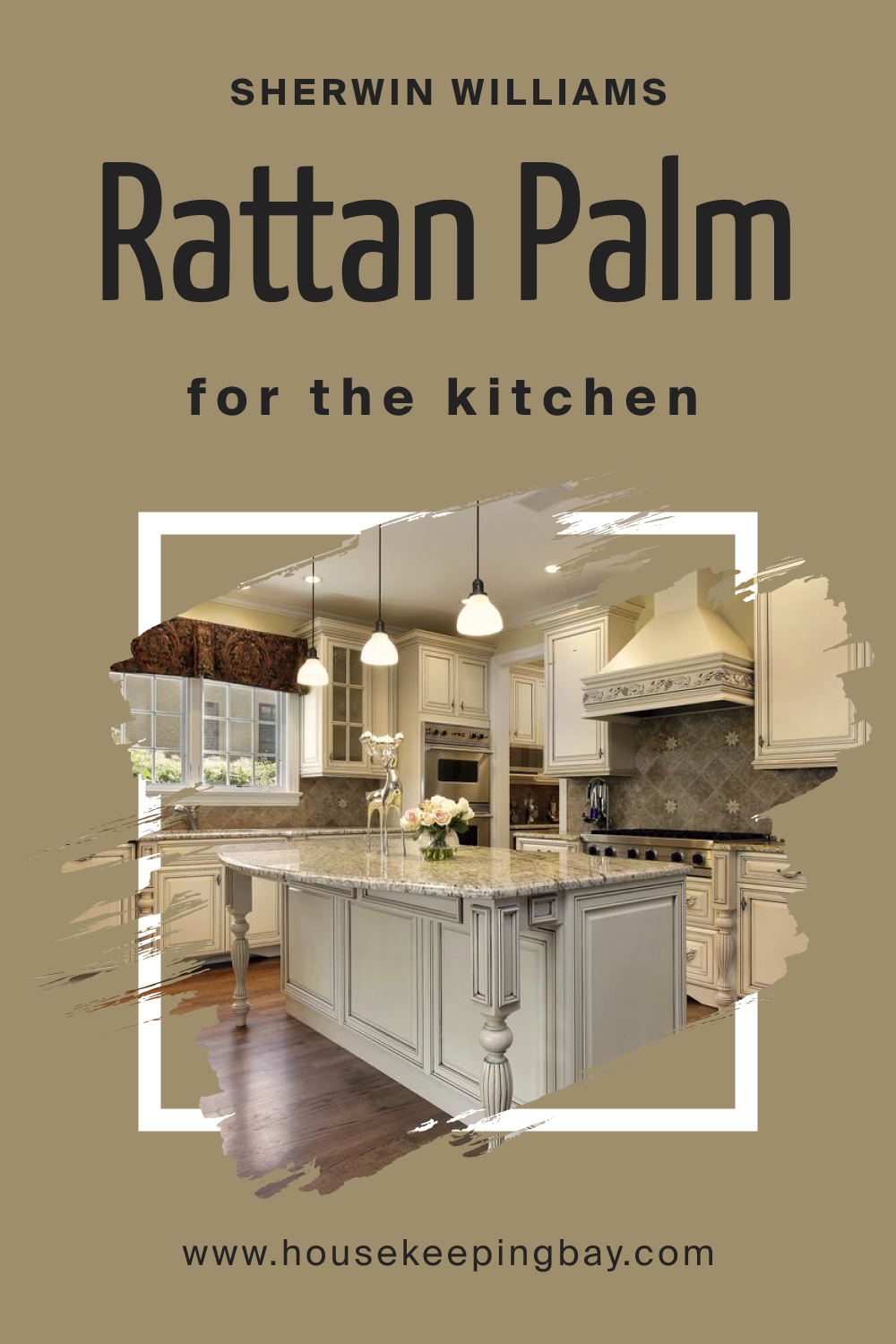
How to Use SW 9533 Rattan Palm in the Kitchen?
Kitchens are the heart of every home, and Rattan Palm ensures they pulse with warmth. On kitchen walls, this shade partners well with wooden countertops, white tiling, and metallic fixtures. It evokes a sense of organic simplicity, making the culinary space both stylish and functional.
housekeepingbay.com
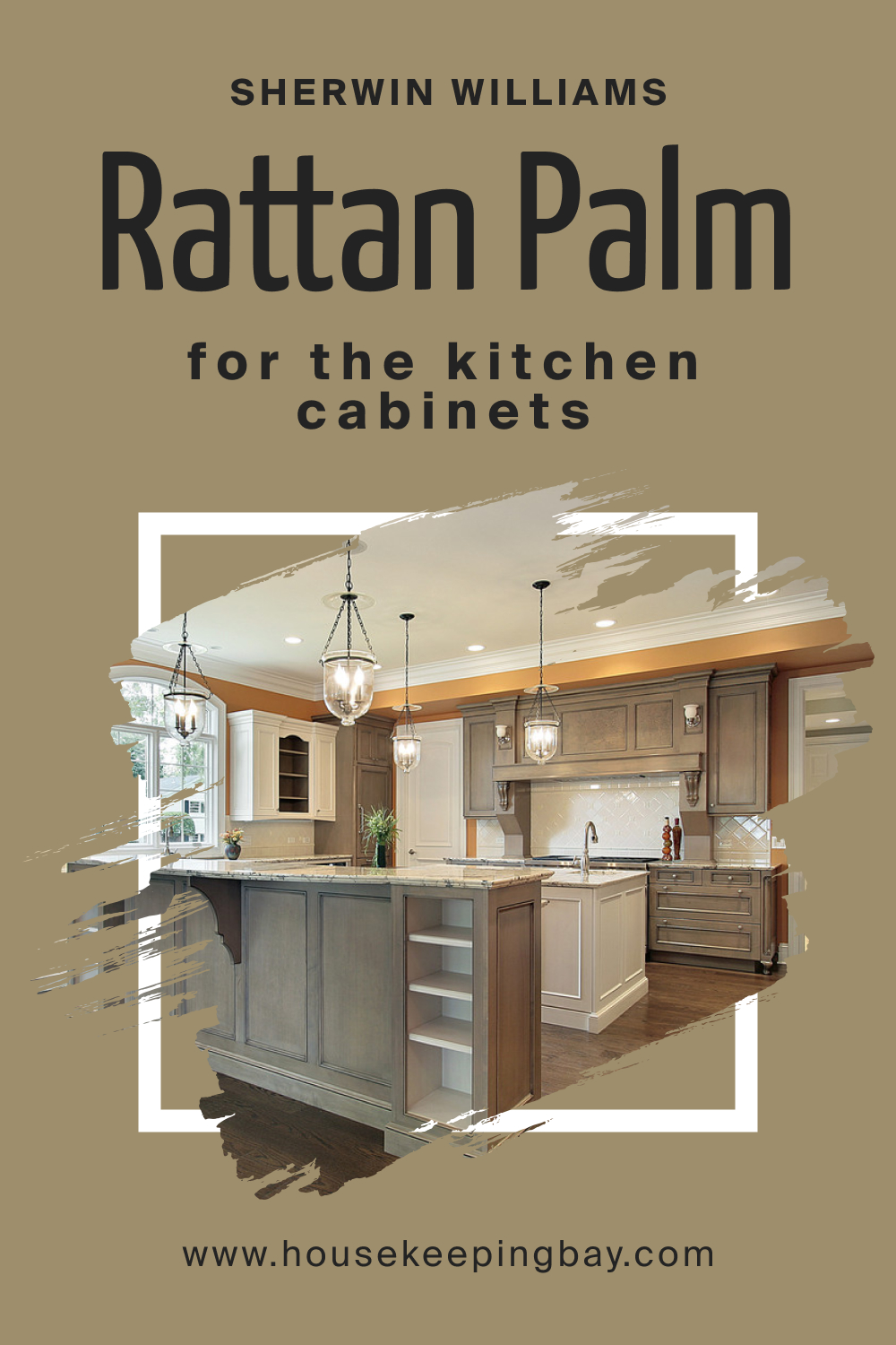
How to Use SW 9533 Rattan Palm for the Kitchen Cabinets?
Choosing Rattan Palm for kitchen cabinets is a statement in understated elegance. These cabinets become the focal point, blending with both darker countertops for contrast or lighter ones for a harmonized look. With gold or brass hardware, the cabinets elevate the entire kitchen’s aesthetics, ensuring every meal preparation feels like a gourmet experience.
housekeepingbay.com
Comparing SW 9533 Rattan Palm With Other Colors
Color comparison is paramount in interior design, as it helps in understanding the mood, ambiance, and energy a specific shade introduces into a space. By juxtaposing colors, we unveil their undertones, their behavior under varied lighting conditions, and their interaction with surrounding hues.
Comparing colors also aids in achieving cohesive aesthetics, ensuring harmonized interiors that resonate with the intended vibe.
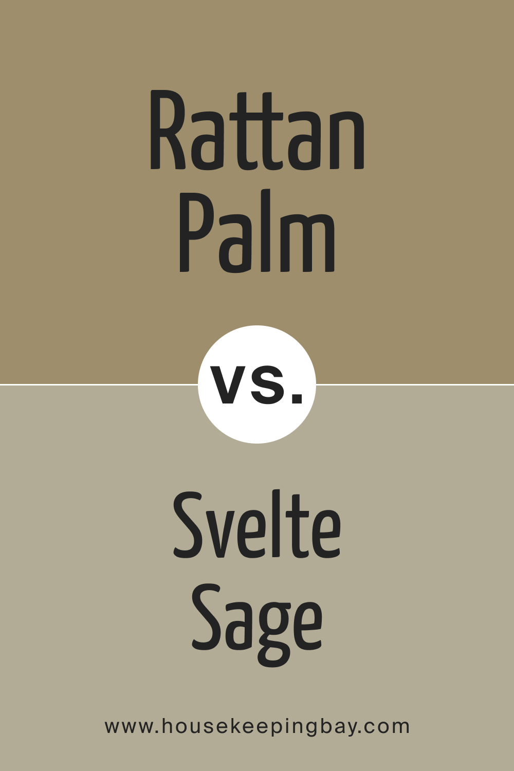
SW 9533 Rattan Palm vs. SW 6164 Svelte Sage
SW Rattan Palm and Svelte Sage both dip into nature-inspired palettes but with distinct differences. While Rattan Palm leans towards a neutral earthiness, Svelte Sage embraces the gentle, muted greens of sage leaves. Svelte Sage is subtly brighter, offering a fresh and airy feel compared to the cozy warmth exuded by Rattan Palm.
housekeepingbay.com
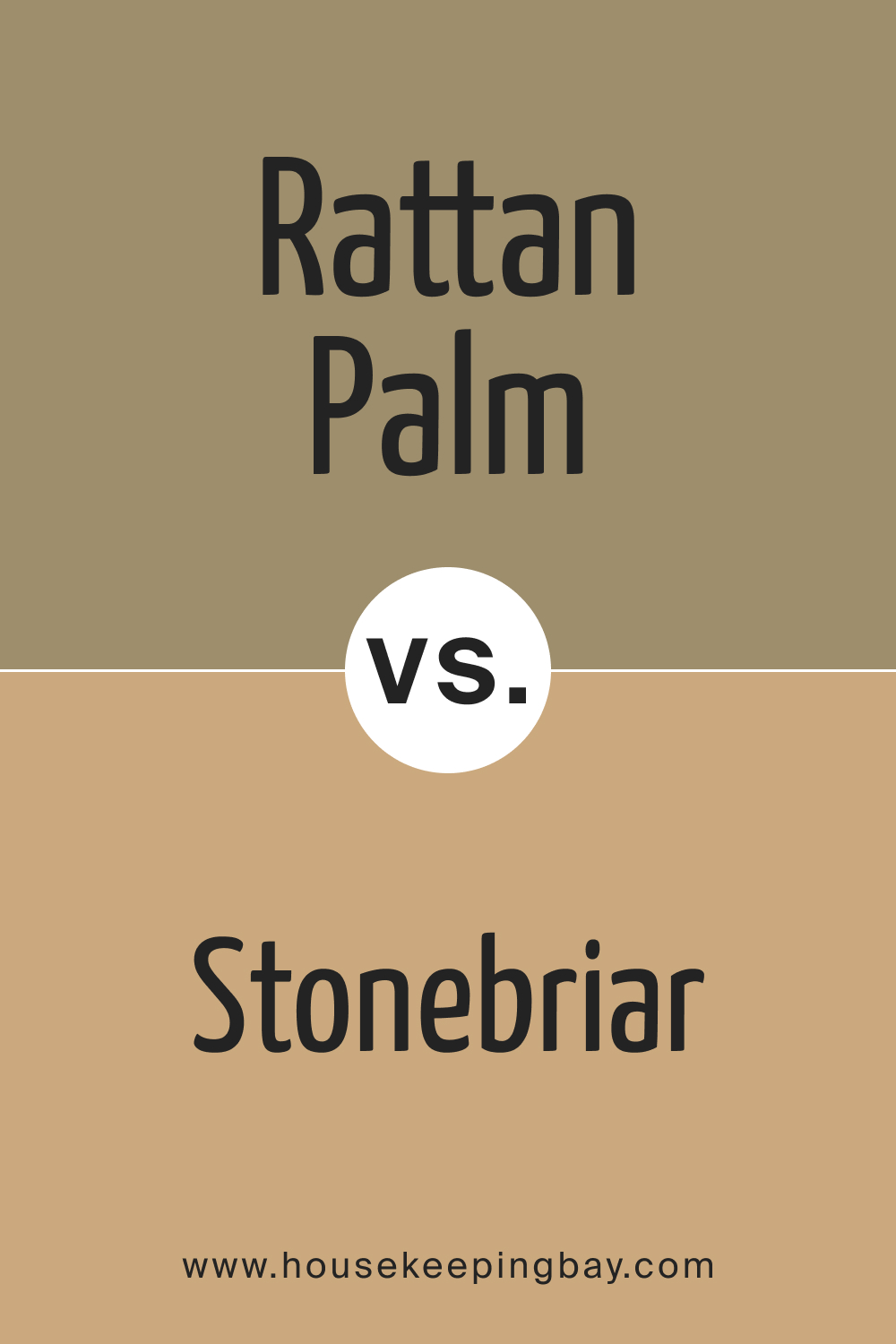
SW 9533 Rattan Palm vs. SW 7693 Stonebriar
SW Stonebriar , with its clay-like warmth, is a more pronounced hue compared to Rattan Palm. The latter is subtler and more versatile, while Stonebriar stands out, evoking rustic, vintage vibes. In spaces where a prominent, aged feel is desired, Stonebriar takes precedence, but for understated elegance, Rattan Palm shines.
housekeepingbay.com
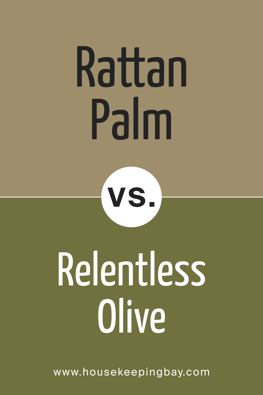
SW 9533 Rattan Palm vs. SW 7011 Relentless Olive
SW Relentless Olive is a deeper, more assertive green. It introduces richness and depth into spaces, ideal for focal walls or statement pieces. In contrast, Rattan Palm’s muted elegance is more versatile, creating serene backgrounds that highlight decor elements effortlessly.
housekeepingbay.com
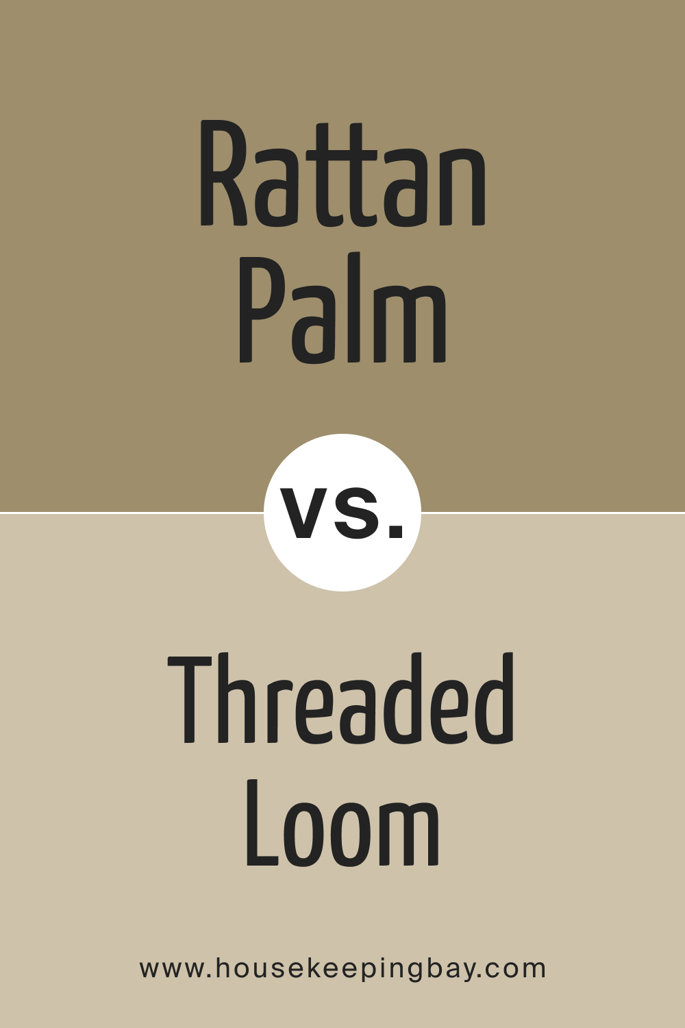
SW 9533 Rattan Palm vs. SW 9512 Threaded Loom
SW Threaded Loom is a lighter , almost pastel-like hue, exuding softness and innocence. Its serene simplicity can brighten spaces, offering a contrasting airy vibe compared to the grounded nature of Rattan Palm. The latter, with its depth, provides warmth and coziness, while Threaded Loom is all about breezy freshness.
housekeepingbay.com
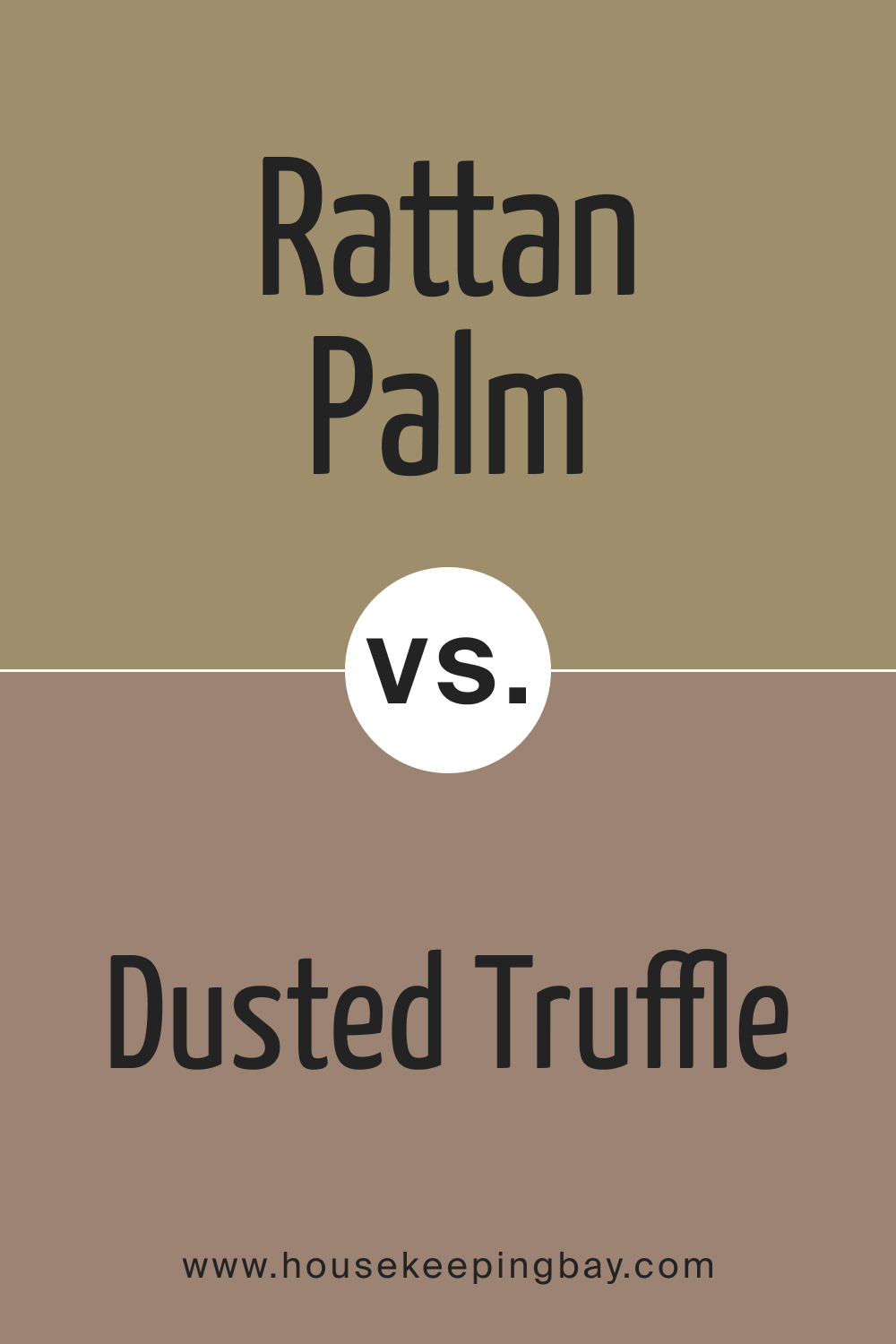
SW 9533 Rattan Palm vs. SW 9083 Dusted Truffle
SW Dusted Truffle is a luxurious, velvety shade reminiscent of rich chocolates. Its deep tones bring in opulence and intimacy. On the other hand, Rattan Palm, with its balanced neutrality, crafts versatile spaces adaptable to varying decor styles, making it a go-to for diverse design intents.
housekeepingbay.com
SW 9533 Rattan Palm vs. SW 7639 Ethereal Mood
SW Ethereal Mood lives up to its name, crafting spaces that are light, airy, and dreamy. It’s a cooler tone with bluish undertones. Rattan Palm, being warmer and earthier, offers a contrasting approach, ensuring spaces feel grounded and cohesive.
housekeepingbay.com
Conclusion
Understanding the subtle nuances between colors is crucial for informed design decisions. While SW 9533 Rattan Palm offers a balanced, nature-inspired backdrop, its interaction with other hues, be it Svelte Sage’s freshness or Dusted Truffle’s richness, determines the final mood of the space.
In essence, comparing shades like Rattan Palm with its peers is a journey into the heart of design aesthetics.
housekeepingbay.com
Ever wished paint sampling was as easy as sticking a sticker? Guess what? Now it is! Discover Samplize's unique Peel & Stick samples. Get started now and say goodbye to the old messy way!
Get paint samples


Frequently Asked Questions
⭐What kind of undertones does SW 9533 Rattan Palm have?
SW 9533 Rattan Palm has subtle, earthy undertones that evoke warmth and comfort, making it an excellent choice for spaces seeking a cozy, grounded ambiance.
⭐Is SW 9533 Rattan Palm more suitable for interiors or exteriors?
This versatile hue works beautifully both indoors and outdoors. Its neutral, warm essence makes it adaptable to various settings, from living rooms to house facades.
⭐How does SW 9533 Rattan Palm look under different lighting conditions?
Lighting can subtly influence Rattan Palm's appearance. Under natural light, its earthy undertones shine through, while artificial light can emphasize its warmth, creating a cozy atmosphere.
⭐Which decor styles does SW 9533 Rattan Palm complement best?
Rattan Palm aligns well with various styles, from Bohemian, rustic, and contemporary to Scandinavian, thanks to its organic and neutral palette.
⭐What trim colors pair well with SW 9533 Rattan Palm?
Shades of white, especially SW 9154 White Snow and SW 7014 Eider White, complement Rattan Palm perfectly, accentuating its depth and warmth.
4 thoughts on “Rattan Palm SW 9533 Paint Color by Sherwin-Williams”
Leave a Reply


Can I use Rattan Palm in a minimalist design setting?
Absolutely! Rattan Palm’s neutral hue makes it a fantastic backdrop for minimalist interiors. Its subtle warmth complements minimalist elements, offering a serene and clean aesthetic.
I have a north-facing living room. How would SW 9533 Rattan Palm look there?
In north-facing rooms, which typically receive cooler, muted light, Rattan Palm’s warm undertones help balance the ambiance, creating a cozy and inviting atmosphere. It’s a great choice for rooms with such lighting conditions.