Nocturne SW 9520 Paint Color by Sherwin-Williams
A Deep Dive into the World of Color
Colors form an integral part of our daily lives, affecting moods, aesthetics, and even architectural choices. With the vast spectrum of colors available, it becomes essential to comprehend the specifics, undertones, and compatibility of each shade.
Among these, Sherwin-Williams’ SW 9520 Nocturne is a color that has garnered attention. This article seeks to unravel the intricacies of this shade.
via interior design
What Color Is SW 9520 Nocturne?
SW 9520 Nocturne, as the name suggests, evokes feelings of the mysterious charm of nighttime. It’s a rich, profound shade, nestling somewhere between deep blue and charcoal gray. Think of a night sky just before it goes pitch black. The depth of this color makes it suitable for contemporary, minimalist, and industrial interior styles.
When combined with materials like polished concrete, raw wood, and metallic finishes, Nocturne resonates perfectly, creating a harmonious palette.
housekeepingbay.com
Table of Contents
Is It a Warm Or Cool Color?
SW 9520 Nocturne leans towards the cool spectrum. This coolness gives rooms a serene, calming ambiance, making it perfect for spaces intended for relaxation or reflection. In homes, cool colors like Nocturne can help balance out spaces that receive ample sunlight, ensuring they don’t feel overly warm.
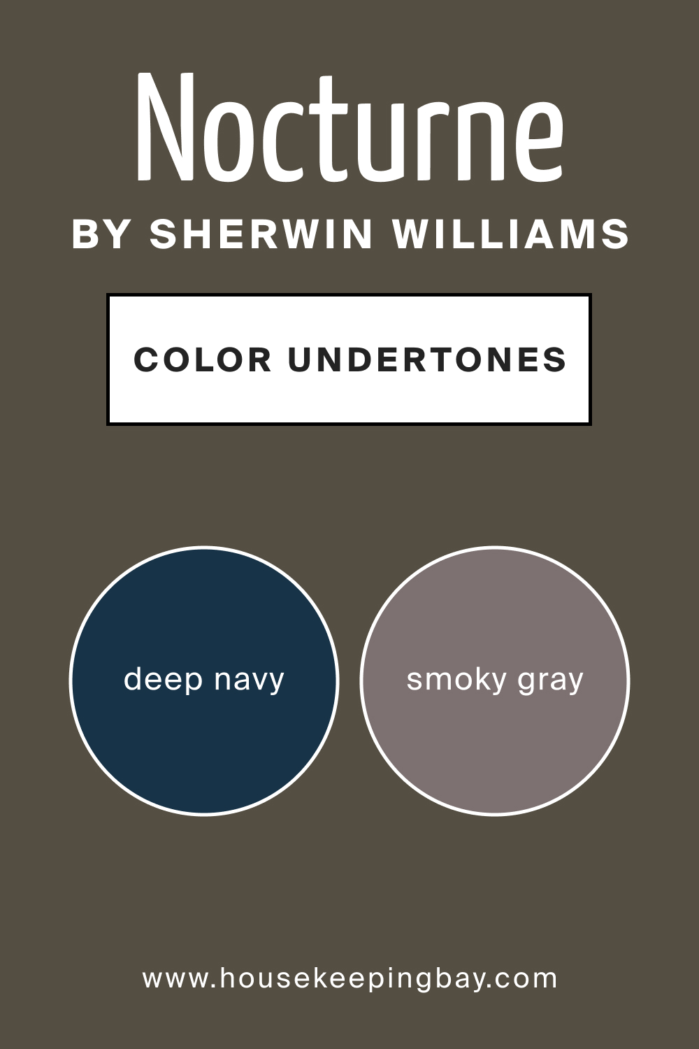
Undertones of SW 9520 Nocturne
Every color has undertones, the subtle backdrop colors that influence its primary shade. For Nocturne, the undertones are a mix of deep navy and smoky gray. Depending on surrounding colors and lighting, one might perceive more blue or gray. On interior walls, these undertones can either be magnified or subdued based on adjacent colors and décor, affecting the room’s overall mood.
housekeepingbay.com
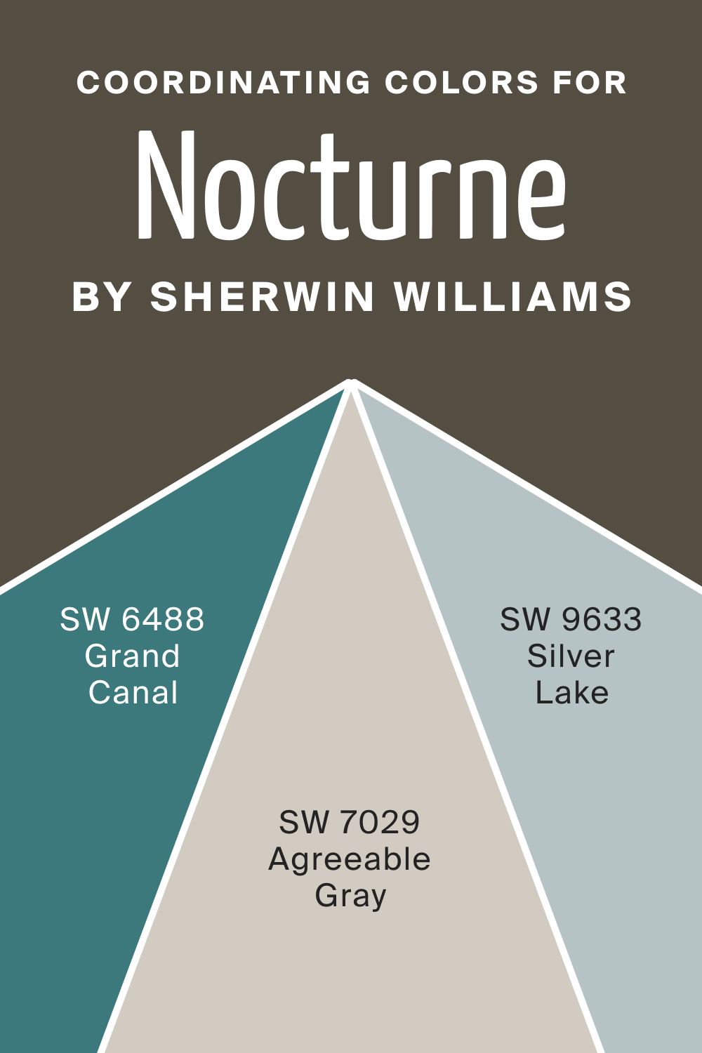
Coordinating Colors of SW 9520 Nocturne
Coordinating colors harmonize and balance the primary color. For SW Nocturne, potential coordinators include muted blues, soft grays, and even some lighter teal shades. For example, consider the following options:
- SW 7029 Agreeable Gray
- SW 6488 Grand Canal
- SW 9633 Silver Lake
These coordinating shades can be used for trim, accent walls, or décor, ensuring a cohesive interior look.
housekeepingbay.com
How Does Lighting Affect SW 9520 Nocturne?
Lighting plays a crucial role in color perception. In artificial light, Nocturne can appear more graphite-like, emphasizing its gray tones. In contrast, under natural sunlight, its deep blue undertones might become more prominent. North-facing rooms, which have cooler and bluer light, can intensify its coolness.
South-facing rooms drenched in warm sunlight can make Nocturne appear slightly warmer. East and west-facing rooms undergo changes: the morning eastern light might reveal soft blue hints, while the evening western light can give it a mellowed warmth.
housekeepingbay.com
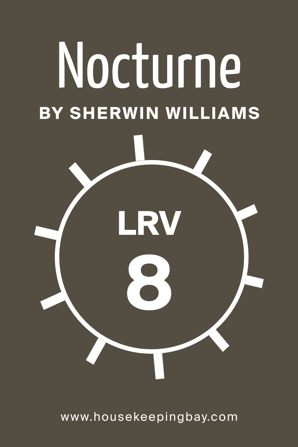
LRV of SW 9520 Nocturne
Light Reflectance Value (LRV) gauges how much light a color reflects. With an LRV of 8, Nocturne is on the lower end, meaning it absorbs more light than it reflects. This makes spaces appear cozier but can also make small rooms feel a bit confined.
housekeepingbay.com
What is LRV? Read It Before You Choose Your Ideal Paint Color
Trim Colors of SW 9520 Nocturne
Trim colors accentuate architectural details. For SW Nocturne, shades of white by Sherwin-Williams, like SW Pure White, SW Alabaster, and SW Whisper White, create a stunning contrast, highlighting features while offering a fresh balance.
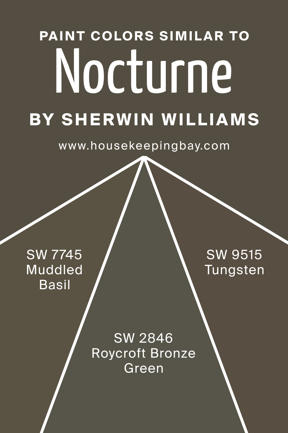
Colors Similar to SW 9520 Nocturne
Understanding similar colors ensures versatility in design. SW 9520 Nocturne shares similarities with the following colors:
- SW 7745 Muddled Basil (a rich, earthy green-gray)
- SW 9515 Tungsten (a balanced gray with a hint of coolness)
- SW 2846 Roycroft Bronze Green (a traditional deep green-gray shade).
housekeepingbay.com
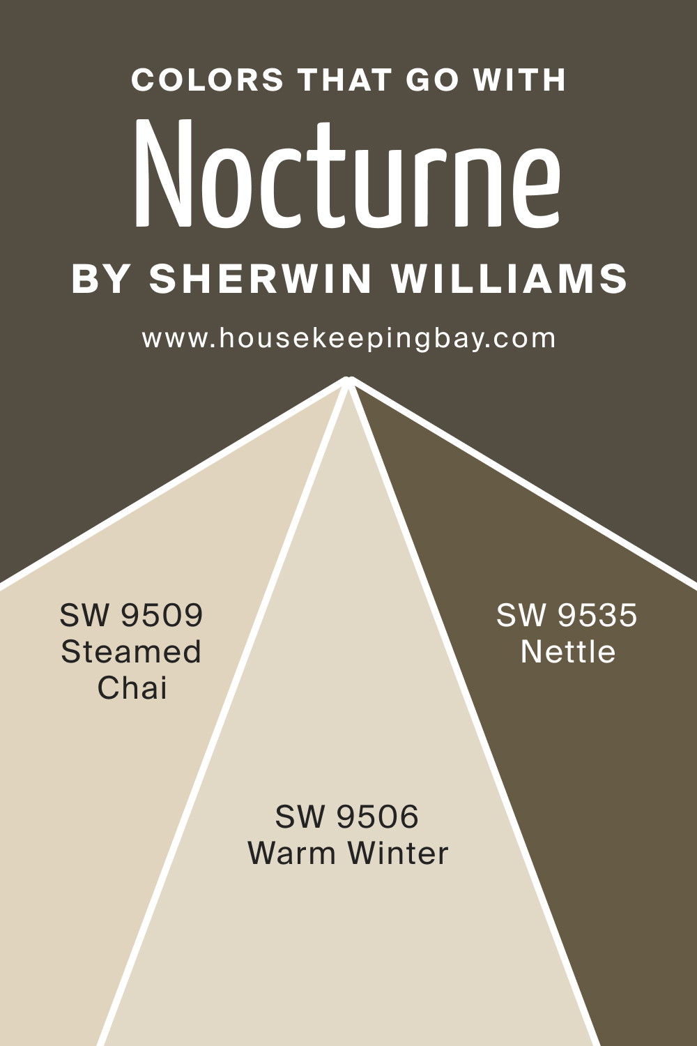
Colors That Go With SW 9520 Nocturne
Pairing complementary colors enhances aesthetics, but it’s often complicated for people to select well-matching hues. With SW Nocturne, we recommend you use the following paint colors if you want to achieve a harmonious palette in your home:
- SW 9509 Steamed Chai introduces a warm neutral
- SW 9535 Nettle brings a gentle green
- SW 9506 Warm Winter offers a soft, muted beige.
Adding shades like SW Misty Blue, SW Charcoal Essence, and SW Moonlit Teal can create a palette that’s both vibrant and cohesive.
Mastering the art of color coordination, understanding undertones, and acknowledging the importance of lighting and LRV can transform any space. SW 9520 Nocturne, with its depth and versatility, proves that the world of color is as profound as it is beautiful.
housekeepingbay.com
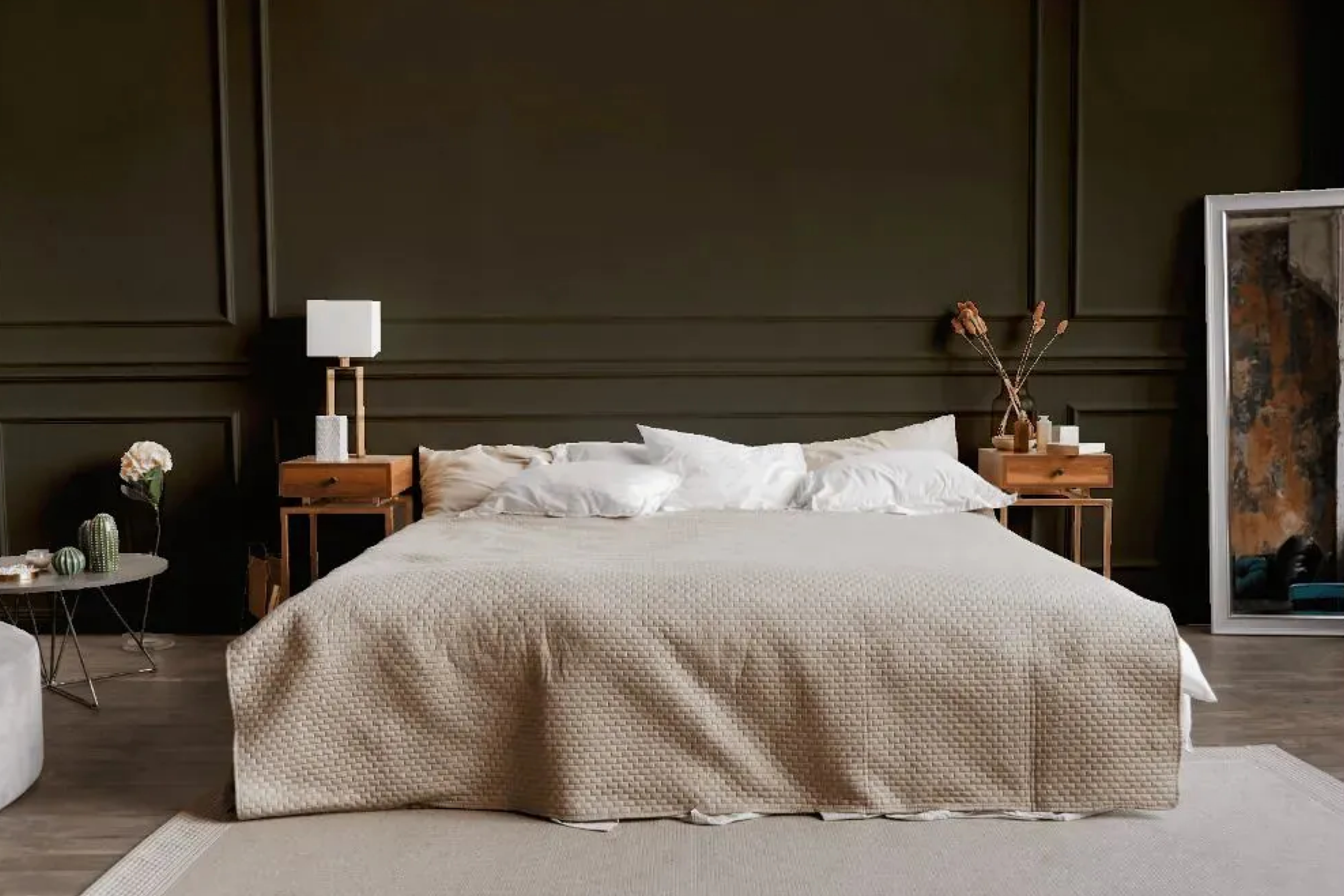
How to Use SW 9520 Nocturne In Your Home?
SW 9520 Nocturne’s deep, evocative tone is versatile, making it apt for various rooms. Its richness pairs well with contemporary, industrial, and minimalist styles. Bedrooms and living rooms can benefit from its calming ambiance, while in bathrooms and kitchens, it adds depth and sophistication. Its dramatic flair even makes it a striking choice for exteriors, especially when contrasted with lighter trim colors.
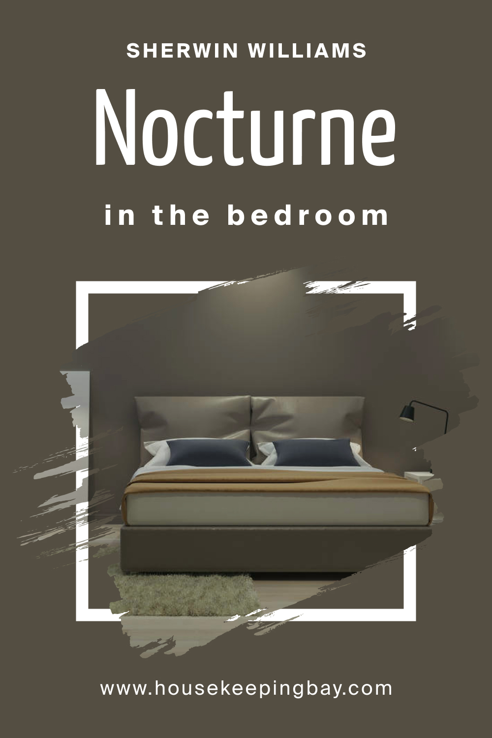
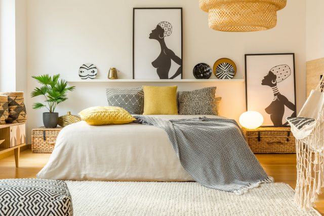
How to Use SW 9520 Nocturne in the Bedroom?
Bedrooms are sanctuaries of rest, and Nocturne provides a serene backdrop. Paired with soft textiles like plush throws and velvet pillows, it creates a cozy atmosphere. Lighter accents or artwork pop against its depth, turning the room into a tranquil yet sophisticated retreat.
housekeepingbay.com
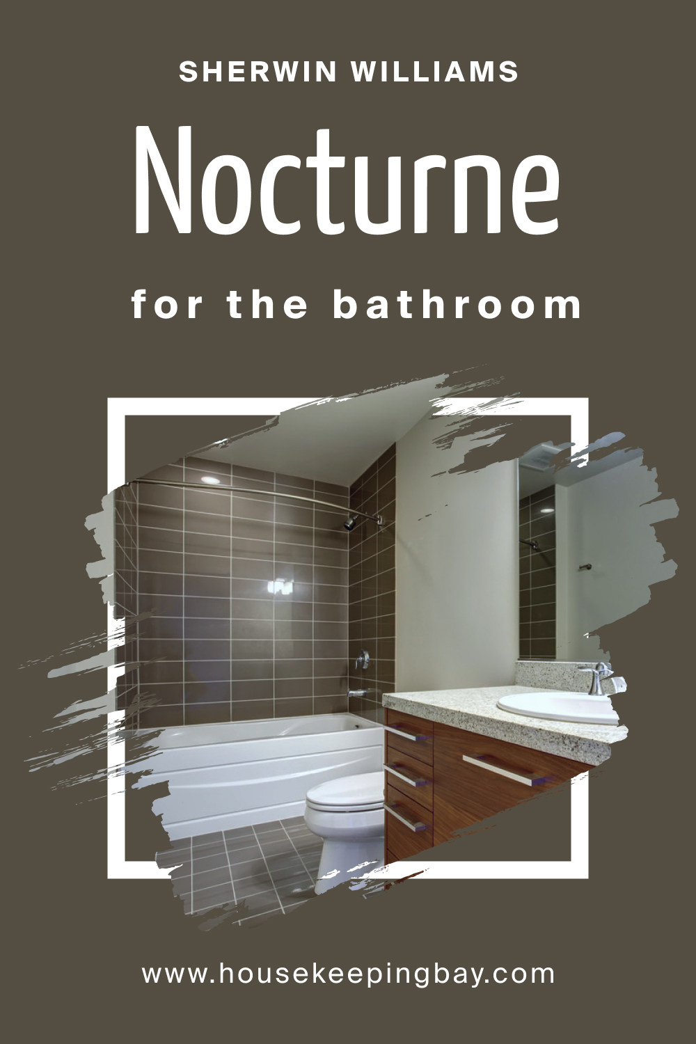
How to Use SW 9520 Nocturne in the Bathroom?
In bathrooms, Nocturne can establish an ambiance of luxury. Teamed with marble countertops, chrome fixtures, or even a standalone white bathtub, this shade can turn an ordinary bathroom into a spa-like oasis. Using it on a feature wall or for cabinetry can also create beautiful contrasts.
housekeepingbay.com
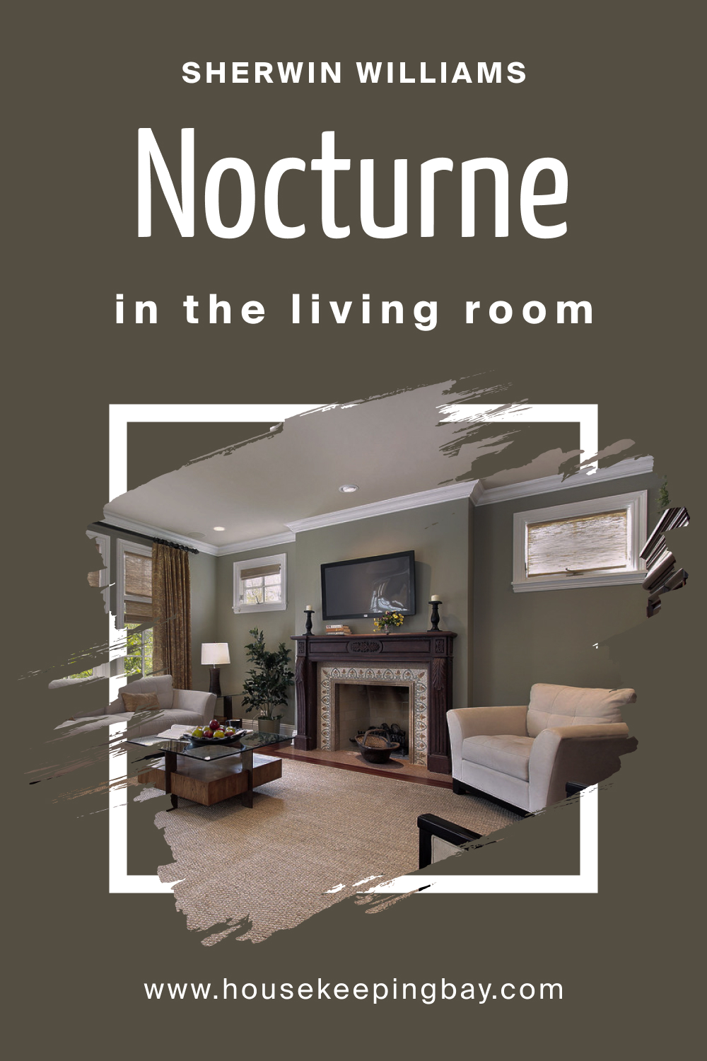
How to Use SW 9520 Nocturne in the Living Room?
Living rooms can feel both chic and welcoming with Nocturne. Its depth balances well with light-colored sofas, wooden furniture, and metallic finishes. Indoor plants or green accents complement its undertones, resulting in a space perfect for relaxation and socializing.
housekeepingbay.com
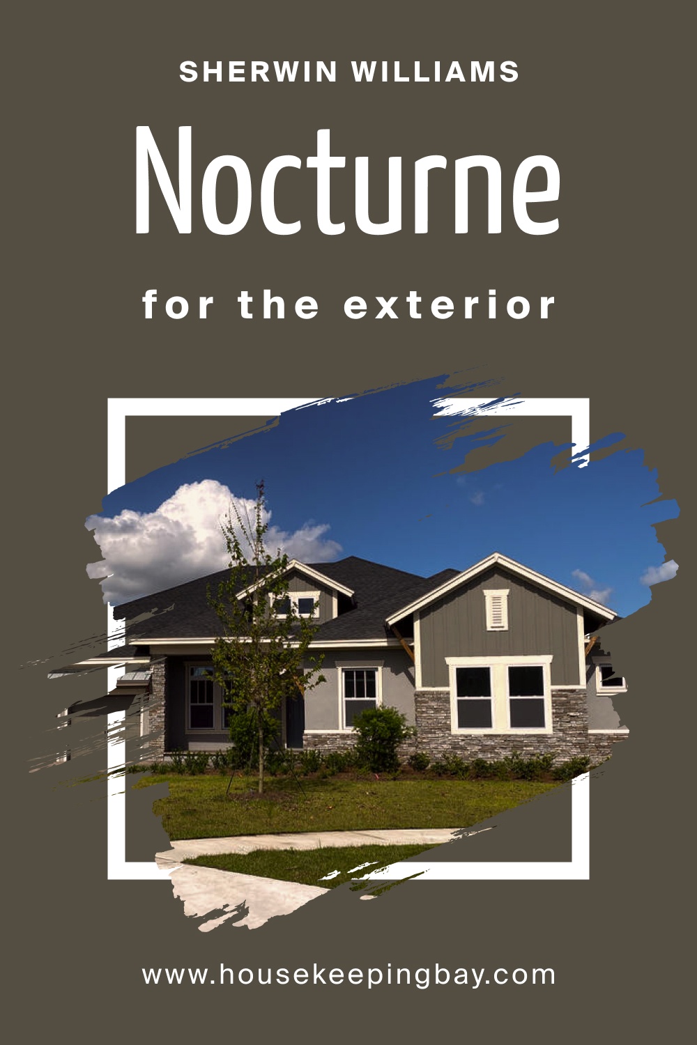
How to Use SW 9520 Nocturne for an Exterior?
SW Nocturne’s boldness makes it a compelling choice for exteriors. It can give a modern look to a home, especially when paired with contrasting trim colors like soft grays or crisp whites. It also contrasts beautifully with green landscapes, creating an elegant home facade.
housekeepingbay.com
How to Use SW 9520 Nocturne in the Kitchen?
A SW Nocturne-painted kitchen exudes sophistication. When used on walls, it provides a striking contrast to white or metallic appliances. Paired with open wooden shelves and greenery, the kitchen strikes a balance between modern design and cozy warmth.
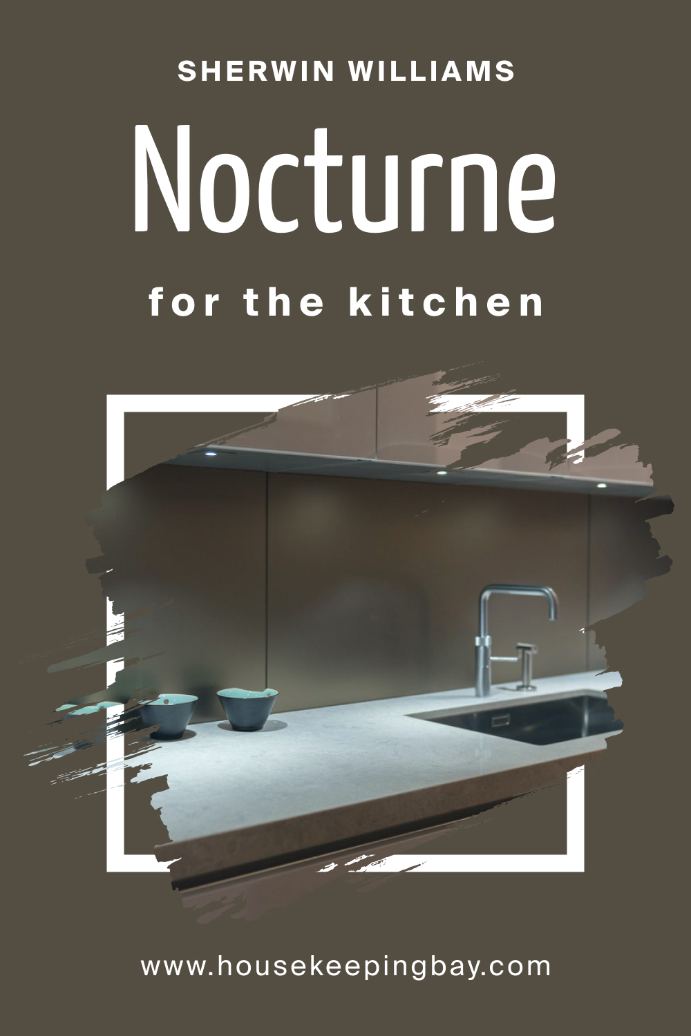
housekeepingbay.com
How to Use SW 9520 Nocturne for the Kitchen Cabinets?
For kitchen cabinets, Nocturne introduces a dramatic flair. It instantly uplifts a kitchen’s aesthetics, making cabinets the focal point. When contrasted with a light-colored backsplash or marble countertops, these cabinets stand out, transforming the kitchen into a stylish culinary space.
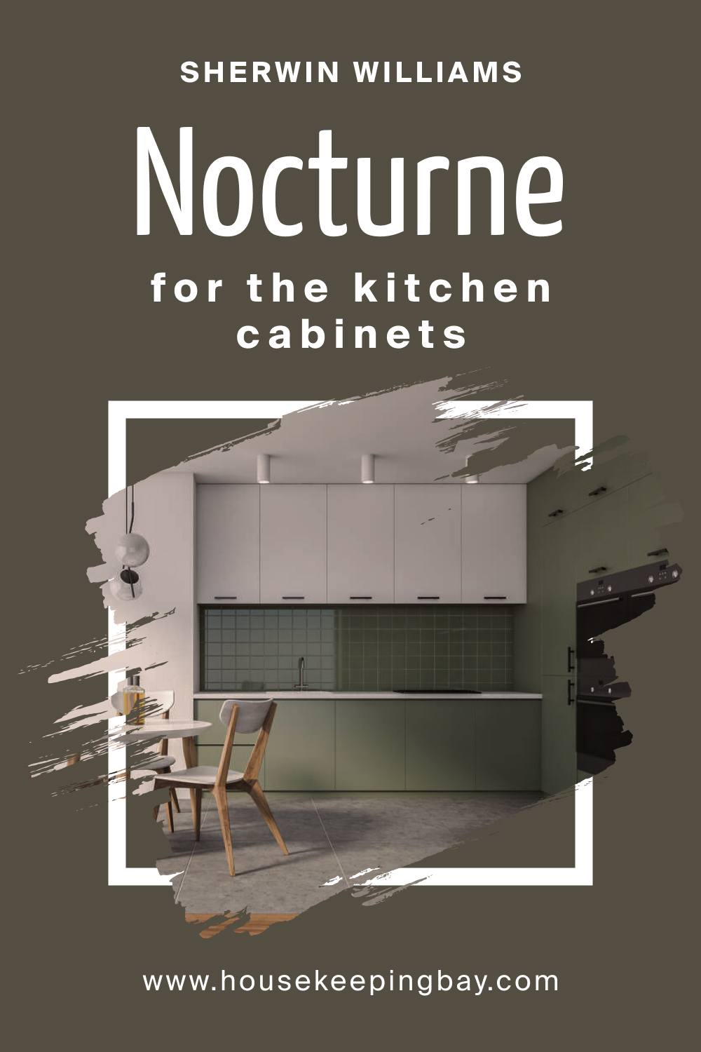
housekeepingbay.com
Comparing SW 9520 Nocturne With Other Colors
Comparing colors is pivotal for multiple reasons. Firstly, colors evoke emotional and psychological responses; understanding subtle differences can influence the desired atmosphere of a space. Secondly, in design, small color variations can dramatically change the aesthetic cohesion and balance of a space. Colors, when juxtaposed, can either complement or clash, affecting the overall visual appeal. Thirdly, light plays a crucial role in how a color appears.
By comparing colors, one can predict how they might change under different lighting conditions, ensuring consistency and avoiding unwanted surprises. Hence, contrasting colors like SW 9520 Nocturne with others is essential for making informed decisions in design, branding, and personal projects.
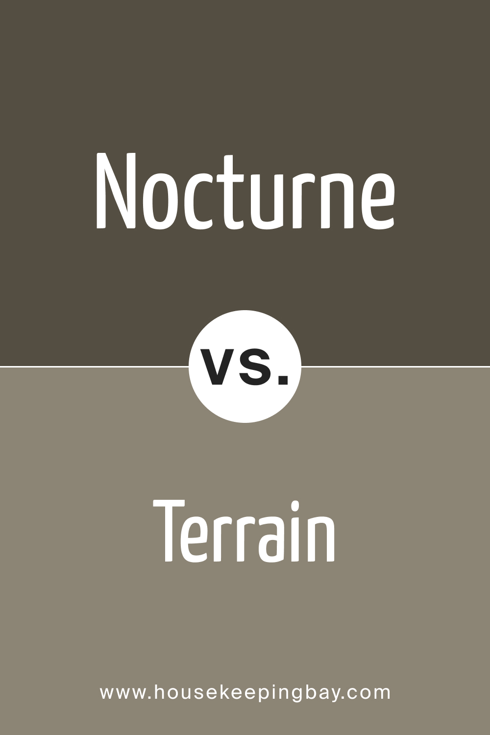
SW 9520 Nocturne vs. SW 9613 Terrain
When contrasting SW 9520 Nocturne and SW 9613 Terrain , several differences emerge. SW Nocturne presents a deeper, possibly richer hue that may evoke feelings of mystery, sophistication, and tranquility. Such shades are commonly used in spaces that aim for a cozy, intimate, or luxurious ambiance, such as bedroom settings or upscale dining areas.
SW 9613 Terrain, on the other hand, channels earthy undertones reminiscent of untouched landscapes and rugged terrains. This color is grounding and can add warmth to spaces. It’s suitable for spaces that aim for a more organic, natural, or rustic feel, aligning with eco-friendly designs or biophilic spaces.
When juxtaposed, Nocturne may come across as more sophisticated and elusive, while Terrain conveys an essence of nature and robustness.
housekeepingbay.com
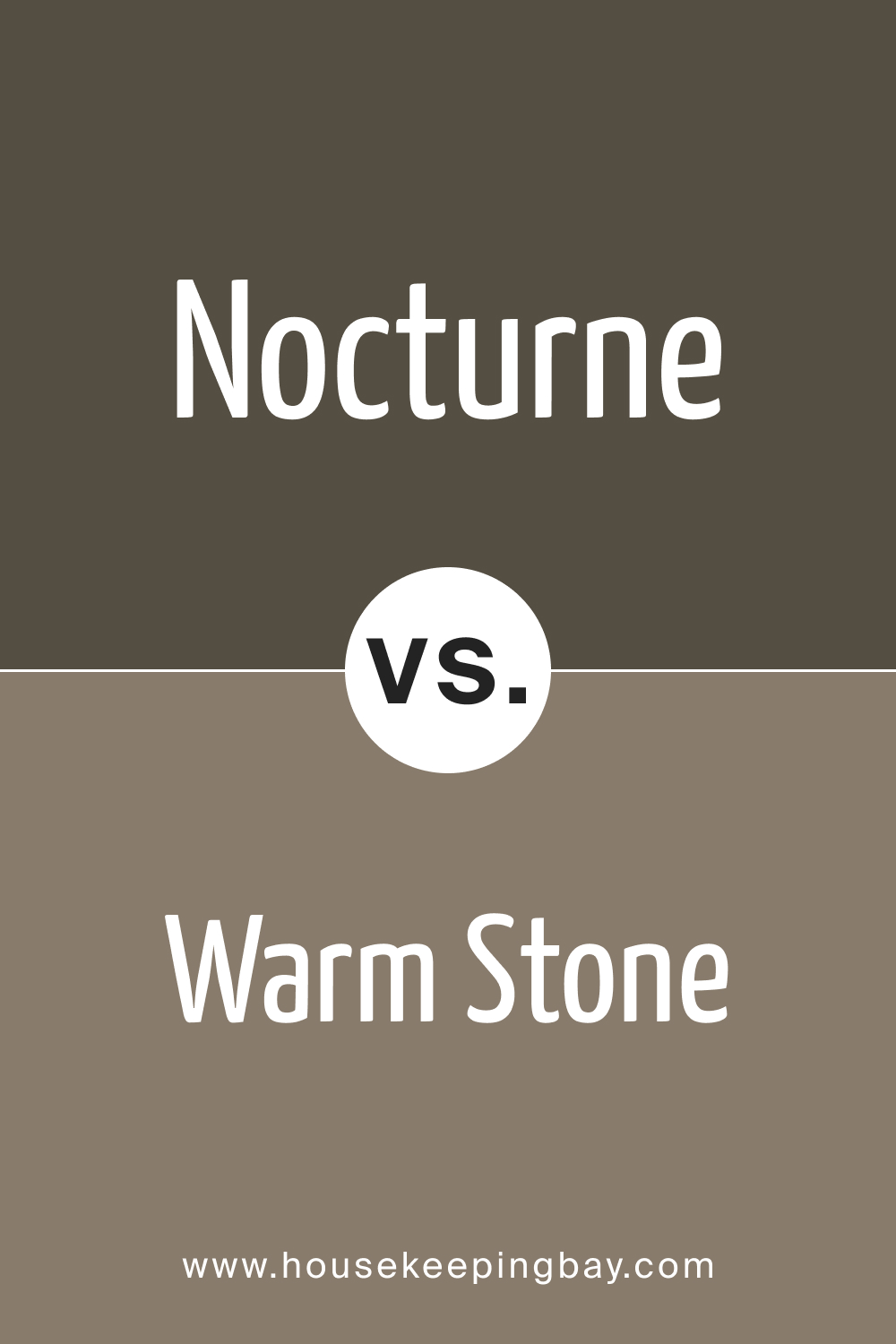
SW 9520 Nocturne vs. SW 7032 Warm Stone
Delving into the intricacies of these colors, SW 9520 Nocturne resonates with the mysteries of the night. Its deep and enveloping tone can create an ambiance of tranquility and contemplation. Conversely, SW 7032 Warm Stone encapsulates the essence of earthy elements, providing a comforting, familiar feel. Its neutral undertones make it versatile for various spaces, exuding warmth and harmony.
While Nocturne can be perceived as more moody and sophisticated, Warm Stone offers a sense of homeliness and grounding. In design contexts, Nocturne would create dramatic emphasis, whereas Warm Stone serves to balance and soothe.
housekeepingbay.com
SW 9520 Nocturne vs. SW 9565 Forged Steel
Comparing Nocturne with Forged Steel introduces a dance of depth and strength. Nocturne’s soft, deep undertones suggest calmness and introspection. In contrast, SW 9565 Forged Steel mirrors the unyielding strength and resilience of metal. This hue possesses an industrial edge, evoking a sense of sturdiness and modernity.
SW Forged Steel might hint at sleekness and contemporary vibes, perfect for modern spaces or industrial-themed designs. On the other hand, Nocturne can introduce a meditative and profound feel, ideal for spaces aimed at relaxation and reflection. Their interaction defines the boundaries between nature’s serenity and industrial fortitude.
housekeepingbay.com
SW 9520 Nocturne vs. SW 7048 Urbane Bronze
Diving into the rich depths of these colors, SW 9520 Nocturne emanates the profound stillness of twilight, providing spaces with a touch of enigma and elegance. On the other hand, SW 7048 Urbane Bronze carries the gravitas of age-old metal combined with a contemporary urban touch. Urbane Bronze is sophisticated and grounded, effortlessly merging modern design with timeless appeal.
When juxtaposed, Nocturne exudes a more introspective ambiance, while Urbane Bronze stands strong with an assertive, modern aura. Their distinction lies in the delicate balance between ethereal nightscapes (Nocturne) and the tactile realm of metals and modernity (Urbane Bronze).
housekeepingbay.com
SW 9520 Nocturne vs. SW 6104 Kaffee
Pitting Nocturne against Kaffee introduces a contrasting tapestry of cool serenity and warm richness. Nocturne, with its nighttime allure, creates a deep and contemplative atmosphere. SW 6104 Kaffee, as its name suggests, evokes the rich, aromatic essence of freshly brewed coffee, offering warmth, comfort, and a touch of nostalgia.
In design scenarios, Kaffee infuses spaces with cozy familiarity, making it apt for lounges or reading corners. Meanwhile, Nocturne plays into the aesthetics of sophistication and depth, suitable for creating intimate, reflective spaces. Their inherent beauty shines differently: Nocturne with its tranquil depth and Kaffee with its inviting warmth.
housekeepingbay.com
SW 9520 Nocturne vs. SW 9122 Dried Edamame
Juxtaposing SW 9520 Nocturne with SW 9122 Dried Edamame unveils a captivating play of deep serenity against natural vitality. Nocturne, living up to its name, is reminiscent of the quiet mysteries of the night. Its depth conveys sophistication, making it apt for spaces seeking a touch of elegance and calm.
housekeepingbay.com
In stark contrast, SW Dried Edamame draws inspiration from the organic and earthy realm. This hue captures the subtle vibrancy of nature’s greens, albeit in a muted, dried form, infusing spaces with a sense of freshness and natural allure. While Nocturne might be chosen for its tranquil ambiance, Dried Edamame shines in settings that celebrate nature and organic simplicity.
The two shades, although diverse, each offer unique aesthetics: Nocturne delves into introspective elegance, while Dried Edamame bridges the gap between the wild and the cultivated.
housekeepingbay.com
Ever wished paint sampling was as easy as sticking a sticker? Guess what? Now it is! Discover Samplize's unique Peel & Stick samples. Get started now and say goodbye to the old messy way!
Get paint samples


Frequently Asked Questions
⭐What type of finish does SW 9520 Nocturne come in?
SW 9520 Nocturne is available in various finishes, including matte, eggshell, satin, semi-gloss, and high gloss. Your choice of finish should depend on the specific application and desired aesthetics.
⭐Is SW 9520 Nocturne suitable for exterior use?
Yes, SW 9520 Nocturne can be used for both interior and exterior applications, ensuring versatility in its usage across various projects.
⭐How does SW 9520 Nocturne appear under different lighting conditions?
The color depth of Nocturne may vary under different lighting. Natural daylight can make it appear slightly brighter, while artificial or dim lighting can enhance its depth and richness.
⭐What colors complement SW 9520 Nocturne?
SW 9520 Nocturne pairs well with neutral shades, metallics, and soft pastels, enhancing its versatility in various design scenarios.
⭐Is a primer necessary before applying SW 9520 Nocturne?
While SW 9520 Nocturne provides excellent coverage, a primer is recommended for optimal paint adhesion, especially on porous or previously unpainted surfaces.
2 thoughts on “Nocturne SW 9520 Paint Color by Sherwin-Williams”
Leave a Reply


Has anyone tried pairing Nocturne with a brighter accent color? Any suggestions?
I’ve paired SW 9520 Nocturne with muted gold accents and soft pastels in my living room. The combination brings out a luxurious and sophisticated vibe while introducing brightness and contrast.