Naturel SW 7542 by Sherwin Williams
Your Guide to a Warm and Welcoming Hue
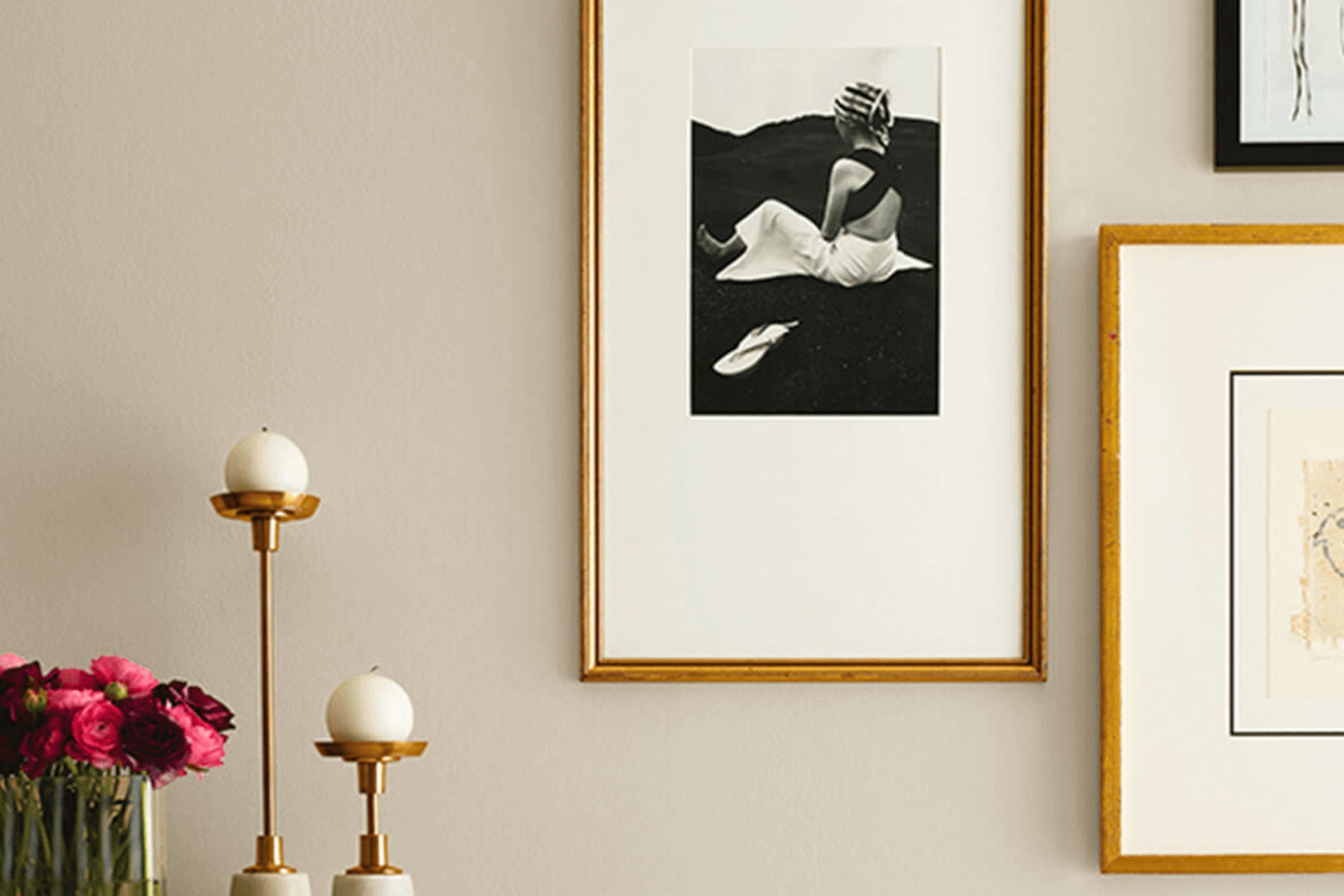
Choosing the right paint color can really set the tone for any room in your home, and if you want a color that brings warmth and coziness, I recommend you take a look at SW 7542 Naturel by Sherwin Williams. This shade is part of Sherwin Williams’s collection and it offers a soothing neutral tone that fits beautifully in many spaces and complements various decor styles.
Naturel is a soft, warm beige that leans towards an earthy taupe, making it perfect for creating a welcoming atmosphere in living rooms, bedrooms, and even kitchens. It pairs well with natural materials like wood and stone, enhancing the textures without overpowering them.
In different lighting, Naturel can appear slightly more gray or more brown, providing a subtle variety that adapts throughout the day. This quality makes it a great choice if you want a paint color that adjusts with natural light and complements both modern and traditional interiors.
Whether you’re repainting a single room or revamping your entire home, consider how Naturel’s gentle hue can contribute to your desired aesthetic.
via sherwin-williams.com
What Color Is Naturel SW 7542 by Sherwin Williams?
Table of Contents
Naturel SW 7542 by Sherwin-Williams is a warm, soft beige shade that exudes a sense of calm and sophistication. This versatile hue acts as a neutral backdrop, making it an ideal choice for a variety of decorating styles. Its understated earthiness can be seamlessly integrated into spaces to create a cozy and inviting atmosphere.
Naturel is particularly effective in interior styles such as modern farmhouse, rustic, and Scandinavian due to its natural, soothing qualities. It also works well in more traditional settings where its ability to blend with various decor elements can be utilized to form a harmonious environment.
This color pairs beautifully with natural materials like wood, enhancing its grain and texture, and with stone, where it underscores the organic feel of the space. Soft fabrics like cotton and linen in similar neutral tones work well with Naturel to promote a relaxed vibe. For a bit of elegance, it can be used alongside brushed metals like bronze or copper, adding a gentle gleam to the space.
Naturel also supports the use of woven textures, including wicker and rattan, that echo its earthy aesthetic, making any interior feel grounded and balanced.
housekeepingbay.com
Is Naturel SW 7542 by Sherwin Williams Warm or Cool color?
Naturel SW 7542 by Sherwin Williams is a warm neutral paint color that brings a soothing vibe to any room in the house. This versatile shade combines beige and soft gray, creating a cozy feel that works well in spaces intended for relaxation.
Naturel’s understated elegance makes it ideal for living rooms, bedrooms, and even kitchens, where it seamlessly complements a variety of decor styles and color palettes. The color performs beautifully in rooms with lots of natural light, as well as in spaces that might lack sunlight.
Its ability to reflect light gently enhances the perception of space, making small rooms appear larger and more inviting. With Naturel SW 7542, homeowners can achieve a polished and refined look without overwhelming the senses. It pairs especially well with wood finishes, from light pine to rich, dark walnut, adding depth and harmonious contrast to any home.
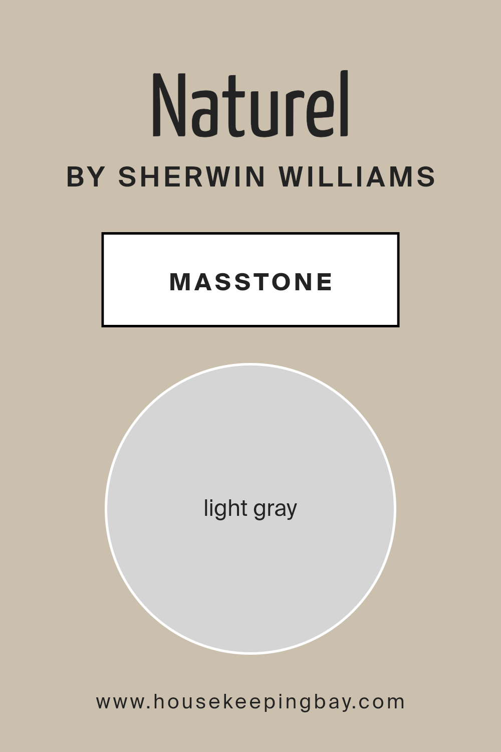
What is the Masstone of the Naturel SW 7542 by Sherwin Williams?
NaturelSW 7542 by Sherwin Williams is a light gray color, specifically coded as #D5D5D5. This shade is versatile and widely used in homes due to its soothing and neutral attributes. When used on walls, it offers a subtle backdrop that works well with many other colors, whether bright or soft. This makes it easy for homeowners to match furniture, curtains, and accessories without the colors clashing.
The light gray tone of NaturelSW 7542 helps to make spaces feel more open and airy. Its neutrality can calm busy areas and is perfect for rooms where you want to maintain a peaceful atmosphere, like bedrooms and living rooms. Since this shade doesn’t overpower, it highlights other features and décor elements in a room.
Using NaturelSW 7542 is also practical for long-term aesthetics because it tends not to go out of style. It adapts well to changing trends in interior design, making it a smart choice for those looking to keep their home looking current without frequent redecorating.
housekeepingbay.com
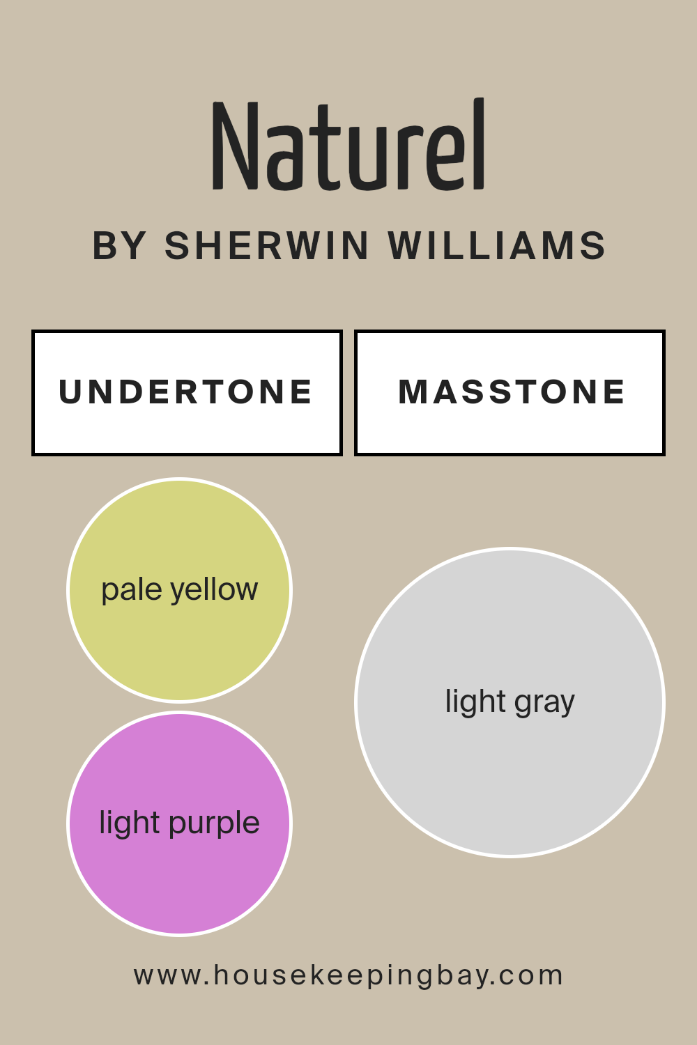
Undertones of Naturel SW 7542 by Sherwin Williams
Naturel SW 7542 by Sherwin Williams is a unique color that subtly incorporates a range of undertones, making it versatile and adaptable for interior spaces. The undertones of a paint color are like hidden shades within the main hue, influencing how the color appears under different lighting conditions and when paired with other colors.
For Naturel SW 7542, these undertones include pale yellow, light purple, pale pink, light blue, mint, lilac, and grey. These hints of color add depth and complexity, which can affect the overall ambiance of a room. In natural light, for example, pale yellow might make the color appear warmer, while the light blue or grey can make it feel cooler. This shift can subtly impact the mood and feel of a space.
Specifically for an interior wall, these undertones can allow Naturel SW 7542 to coordinate well with a wide range of decor styles and color palettes, enhancing the flexibility in designing a room. The grey undertone helps to ground the color, preventing it from becoming too vibrant, which makes it an excellent choice for a soothing and neutral backdrop.
The lighter undertones, like mint and lilac, ensure that the color maintains a hint of freshness and vitality, avoiding a flat or dull appearance.
This balance makes Naturel SW 7542 a sophisticated choice for walls, providing a foundation that is both interesting yet subtle.
housekeepingbay.com
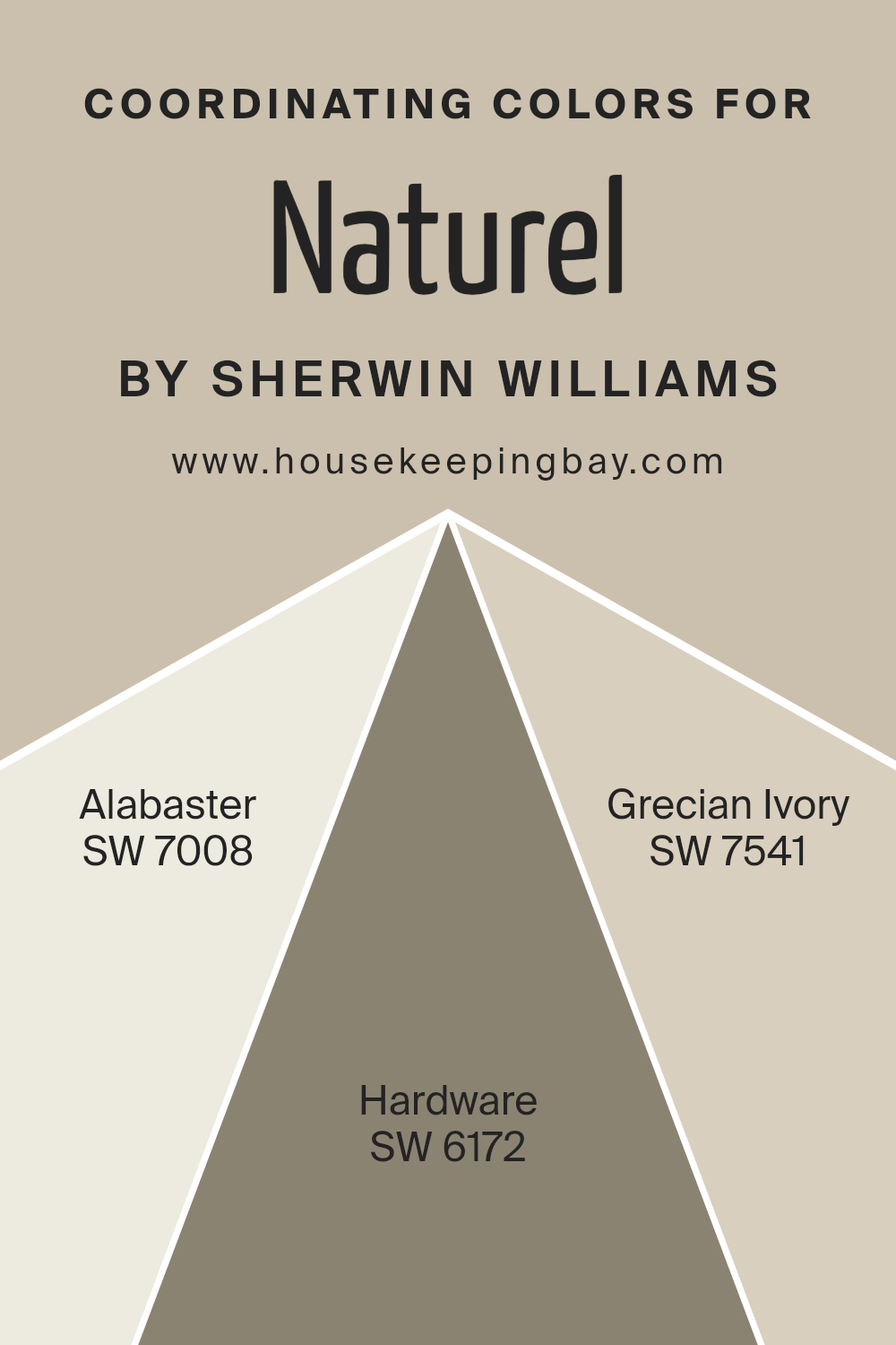
Coordinating Colors of Naturel SW 7542 by Sherwin Williams
Coordinating colors work together to create a harmonious color scheme within a space. These colors complement each other and enhance the overall aesthetic of an area. For example, Naturel SW 7542 by Sherwin Williams pairs well with other specific shades that offer balance and continuity. When chosen thoughtfully, coordinating colors ensure that no single color overly dominates the space, providing a cohesive look that is pleasing to the eye.
One of the coordinating colors for Naturel SW 7542 is Alabaster SW 7008, which is a soft, creamy white. This color offers a subtle contrast, brightening spaces effortlessly without overwhelming the main hue.
Another paired shade, Hardware SW 6172, is a deep, cool gray that provides a striking balance, adding depth and sophistication to the neutral warmth of Naturel. Lastly, Grecian Ivory SW 7541 is a gentle beige with a hint of warmth, working well to soften the overall color scheme and ensuring that the environment remains light and open. Together, these colors create a cohesive and attractive palette, enhancing the beauty of Naturel SW 7542.
You can see recommended paint colors below:
- SW 7008 Alabaster
- SW 6172 Hardware
- SW 7541 Grecian Ivory
housekeepingbay.com
How Does Lighting Affect Naturel SW 7542 by Sherwin Williams?
Lighting significantly impacts how we perceive colors. The quality, intensity, and type of light can change the appearance of paint colors on walls. For instance, Naturel SW 7542 by Sherwin Williams is a versatile neutral color with the ability to shift appearance under different lighting conditions.
In artificial light, such as LED or incandescent bulbs, Naturel SW 7542 can appear warmer.
Incandescent lighting tends to bring out the yellow and brown undertones in neutral colors, making them look cozier and more inviting. Conversely, fluorescent lighting might make this color look flatter and duller due to its cooler tone.
Under natural light, Naturel SW 7542 varies throughout the day.
Morning light in an east-facing room is cool and blue, making Naturel SW 7542 appear more muted. As the sun moves, the natural light becomes warmer, softening the color and making it feel more dynamic and soft in the evening.
In north-facing rooms, light is typically cooler and less direct, which can make Naturel SW 7542 look more gray and subdued. This cooler light doesn’t enhance the warmer undertones of the paint, giving the room a more stark appearance.
South-facing rooms benefit from abundant natural light throughout the day, which can make Naturel SW 7542 look lighter and warmer. The paint can reflect these natural changes, evolving from bright and inviting during the day to a softer, more welcoming tone by evening.
East-facing rooms see the most change with Naturel SW 7542, starting with a cooler morning light that transitions to warmer tones by noon. This dynamism makes the color very responsive to changing light, offering varying experiences depending on the time of day.
West-facing rooms get intense evening light, which can make Naturel SW 7542 appear much warmer and more vibrant in the afternoon and evening, highlighting the paint’s richer undertones and creating a cozy atmosphere as the sun sets.
Overall, lighting plays a crucial role in how Naturel SW 7542 is perceived in any room, altering its character and mood throughout the day.
housekeepingbay.com
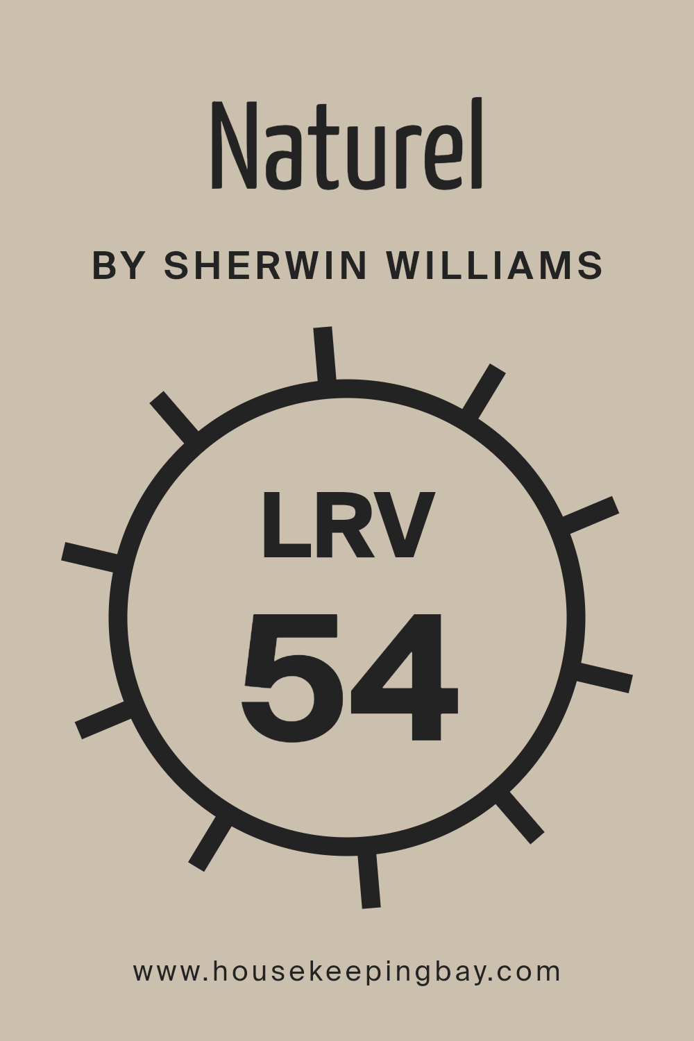
What is the LRV of Naturel SW 7542 by Sherwin Williams?
LRV stands for Light Reflectance Value, a measure that indicates how much light a color reflects or absorbs. This value, scaled from 0 to 100, helps in determining how light or dark a paint color will appear once applied to a wall. A higher LRV means the color reflects more light, making it appear brighter and potentially making the room feel more open and airy.
On the other hand, a lower LRV indicates that the color absorbs more light, which can make a space seem cozier but smaller. This measurement is particularly helpful when choosing paint colors for a space based on how much natural or artificial light it receives.
In the case of Naturel SW 7542 by Sherwin Williams, with an LRV of 53.503, the color is in the mid-range of the LRV scale. This means it neither reflects nor absorbs light excessively but maintains a balance, making it versatile for various lighting scenarios.
In a well-lit room, this color will appear slightly lighter and more vibrant, enhancing the overall ambiance without overwhelming sensory perceptions. Conversely, in a darker room, it will hold its hue well, providing a stable appearance without turning too dim or losing its character. This balanced LRV makes Naturel a practical choice for many interior spaces, blending well with different decor styles and furnishings.
housekeepingbay.com
What are the Trim colors of Naturel SW 7542 by Sherwin Williams?
Trim colors, such as SW 7757 – High Reflective White and SW 7007 – Ceiling Bright White, are used to highlight or define the edges of various surfaces, like door frames, window sills, and baseboards, providing a clean finish to wall paint. Particularly for a natural and subtle hue like NaturalSW 7542 by Sherwin Williams, selecting the right trim color can accentuate the main color, adding a refined contrast that enhances the overall appearance of a room.
These trim colors serve a dual purpose; not only do they create a visual boundary that can make architectural details pop, but they also offer a fresh and polished look that complements the wall color.
SW 7757 – High Reflective White is a bright, clear white that radiates light, maximizing brightness in a space and giving an illusion of a larger area, which makes it perfect for smaller or less-lit rooms. SW 7007 – Ceiling Bright White, on the other hand, is a soft white with a slightly muted finish that helps in calming down the brighter tones of a space, while still supporting a light and open atmosphere.
Both colors support a seamless transition between the primary color on the walls and the crisp detailing of the trims, enhancing both aesthetics and spatial perception.
You can see recommended paint colors below:

housekeepingbay.com
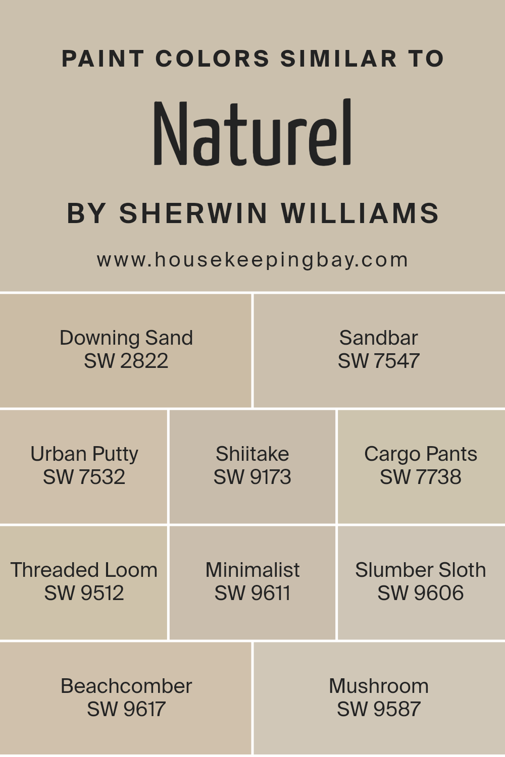
Colors Similar to Naturel SW 7542 by Sherwin Williams
Similar colors are crucial in design because they create a harmonious and soothing atmosphere, making a space feel more cohesive and balanced. Using colors like those similar to Natural SW 7542 by Sherwin Williams can subtly tie together the different elements of a room or exterior without overwhelming the senses.
This gentle blend allows each element to contribute to the overall aesthetic while maintaining a sense of unity. Colors that share a similar tone can be layered to add depth and complexity or used separately to define different areas within a space while keeping the transition smooth and pleasing to the eye.
For instance, SW 2822 – Downing Sand is a warm, sandy beige that evokes a sense of calm and simplicity, making it ideal for creating a relaxed environment. SW 7547 – Sandbar has a slightly greyer tone, offering a neutral backdrop that works well in versatile settings. SW 7532 – Urban Putty adds depth with its richer, taupe hue, perfect for adding warmth.
SW 9173 – Shiitake brings an earthy mushroom color that enriches spaces with its grounded presence. SW 7738 – Cargo Pants offers a muted olive, suggesting stability and nature. SW 9512 – Threaded Loom introduces a light, airy grey that reflects softness and ease. SW 9611 – Minimalist is a whisper of grey, lending subtle elegance to any area. SW 9606 – Slumber Sloth offers a comforting grey, ideal for restful spaces.
SW 9617 – Beachcomber hints at sandy shores with its light tan, enhancing feelings of warmth. Lastly, SW 9587 – Mushroom serves as a solid foundation with its toasted beige, supporting other hues gracefully. Using these complementary shades allows for a fluid visual experience that is pleasing and functional.
You can see recommended paint colors below:
- SW 2822 Downing Sand
- SW 7547 Sandbar
- SW 7532 Urban Putty
- SW 9173 Shiitake
- SW 7738 Cargo Pants
- SW 9512 Threaded Loom
- SW 9611 Minimalist [
- SW 9606 Slumber Sloth
- SW 9617 Beachcomber
- SW 9587 Mushroom
housekeepingbay.com
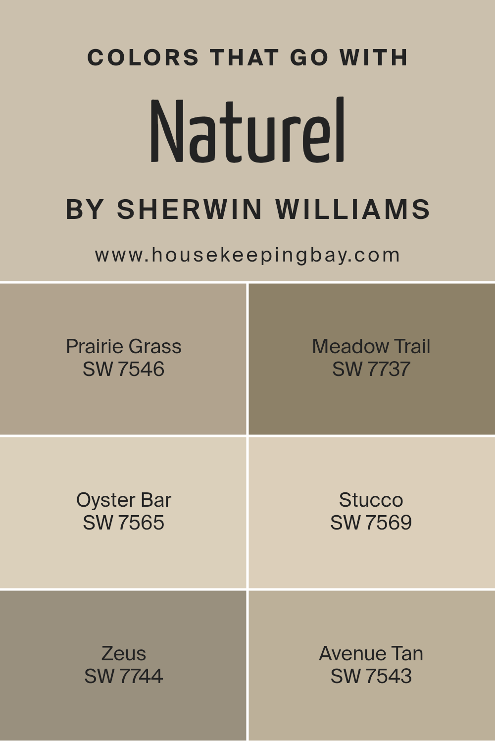
Colors that Go With Naturel SW 7542 by Sherwin Williams
Colors complementing Naturel SW 7542 by Sherwin Williams hold a vital role in creating a harmonious interior palette. These shades help in achieving a balanced look that feels coherent and soothing. The combination of colors like Prairie Grass, Meadow Trail, Oyster Bar, Stucco, Zeus, and Avenue Tan work seamlessly with Naturel, enhancing the overall aesthetic and providing versatility in design options.
Prairie Grass is a subtle green which carries a hint of earthiness, creating a natural, calming environment, while Meadow Trail offers a deeper, more verdant hue which adds depth and a touch of sophistication to spaces. Oyster Bar is a light, sandy taupe that offers a soft, neutral backdrop, ideal for spaces seeking a minimalist touch.
Stucco has a warm, grayish tone, providing a strong yet neutral foundation that complements bolder accents. Zeus is a bold, dark charcoal that offers dramatic contrast, perfect for accentuating features or furniture. Lastly, Avenue Tan is a richer, more pronounced tan which enhances warmth in a room, making spaces feel more inviting and cozy. Each of these colors, when used with Naturel, allows for a flexible color scheme that can suit various decor styles and personal tastes while maintaining an aesthetic unity.
You can see recommended paint colors below:
- SW 7546 Prairie Grass
- SW 7737 Meadow Trail
- SW 7565 Oyster Bar
- SW 7569 Stucco
- SW 7744 Zeus
- SW 7543 Avenue Tan
housekeepingbay.com
How to Use Naturel SW 7542 by Sherwin Williams In Your Home?
Naturel SW 7542 by Sherwin Williams is a warm, neutral paint color that blends beige and gray tones. This versatile shade suits various rooms in a home, providing a cozy and inviting atmosphere without overwhelming the senses. In the living room, Naturel can create a perfect backdrop for both modern and classic furnishings, complementing a wide range of decor.
In the bedroom, this color adds a gentle, soothing touch, ideal for a calming space to unwind. Also, Naturel works well in kitchens or dining areas, where it pairs beautifully with wood finishes and brighter accents.
Homeowners who prefer a minimalistic look can use Naturel as a primary color, unifying different spaces seamlessly. The shade is also very effective for highlighting art or decorative pieces; it doesn’t compete but subtly enhances. Since Naturel is a neutral tone, it’s easy to maintain and refresh, making it a practical choice for busy homes.
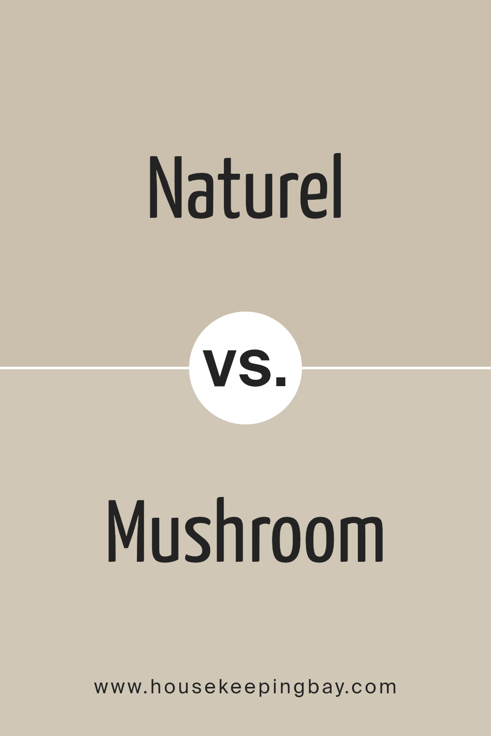
Naturel SW 7542 by Sherwin Williams vs Mushroom SW 9587 by Sherwin Williams
Naturel SW 7542 by Sherwin Williams is a warm, neutral beige that offers a subtle and inviting ambiance. It creates a soft background, perfect for spaces aiming to have a relaxing and calm atmosphere. This color pairs well with brighter tones and natural elements, providing balance without overpowering the surrounding decor.
Mushroom SW 9587, equally from Sherwin Williams, presents a darker, gray-brown shade that evokes an earthier and more grounded feel. This color is ideal for adding depth and warmth to a room, making it cozy and comforting. It complements a variety of furnishings and works especially well in spaces that benefit from a touch of rustic charm.
Both colors can harmonize within the same color palette, allowing for a layered, cohesive interior. Naturel is lighter and softer, lending itself to be more versatile, while Mushroom, being richer and deeper, anchors the space effectively. Together, they can help achieve a balanced and inviting environment.
You can see recommended paint color below:
housekeepingbay.com
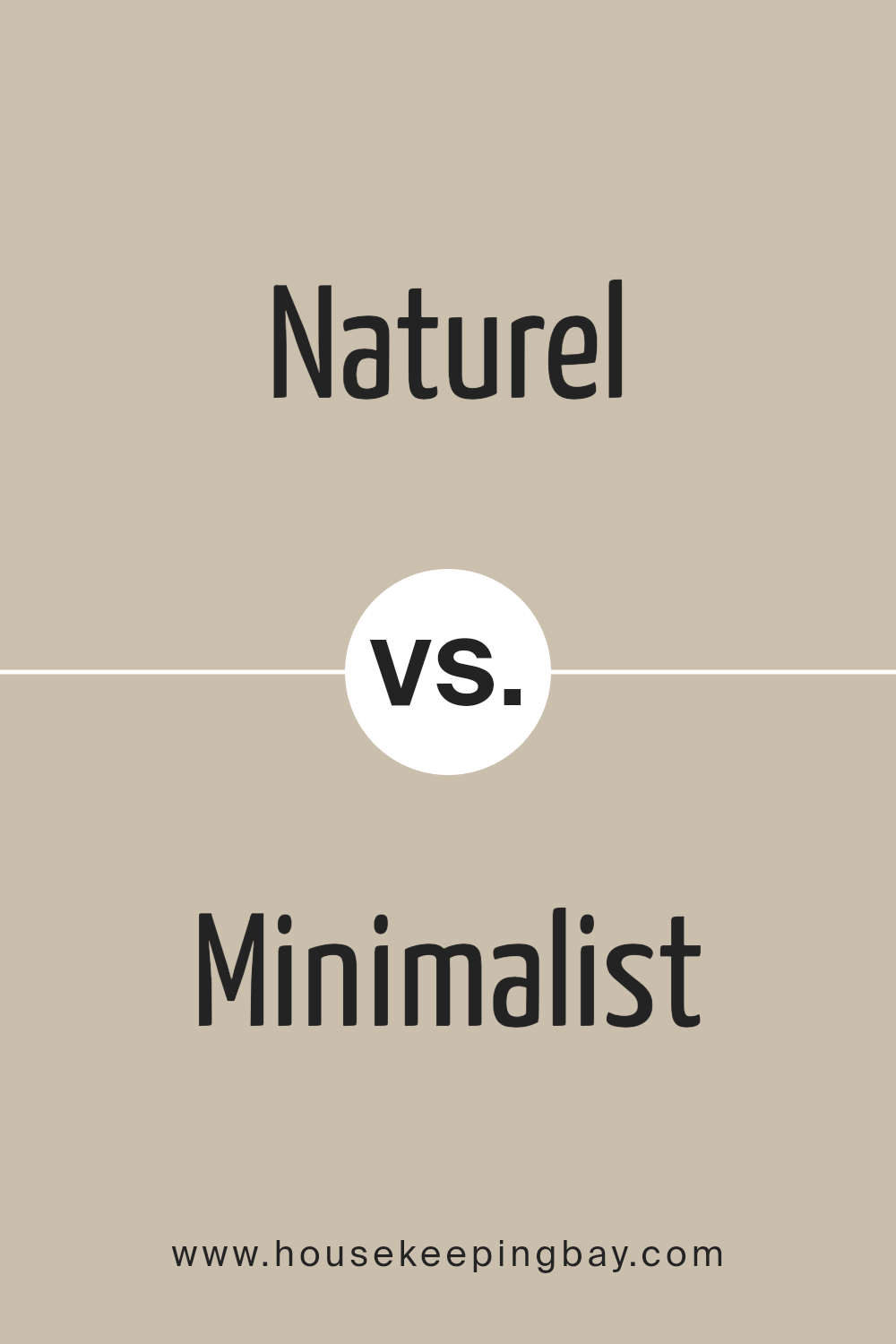
Naturel SW 7542 by Sherwin Williams vs Minimalist SW 9611 by Sherwin Williams
Naturel SW 7542 by Sherwin Williams is a warm and earthy beige. It gives a cozy and inviting feel, making it perfect for living spaces where comfort is key. This color pairs well with various decor styles and brings a sense of groundedness to any room.
In contrast, Minimalist SW 9611 is a lighter, soft beige with a more neutral tone. It provides a clean and calm backdrop, ideal for creating a serene and uncluttered atmosphere. This color works well in spaces that benefit from a subtle and minimalist aesthetic, like modern living rooms or home offices.
Both colors offer a beautiful base for a room, with Naturel adding warmth and Minimalist offering a crisp, fresh look. Their versatility in design is appreciable, as they can blend with other colors and materials easily, helping to achieve a tailored space that feels both personalized and welcoming.
You can see recommended paint color below:
housekeepingbay.com
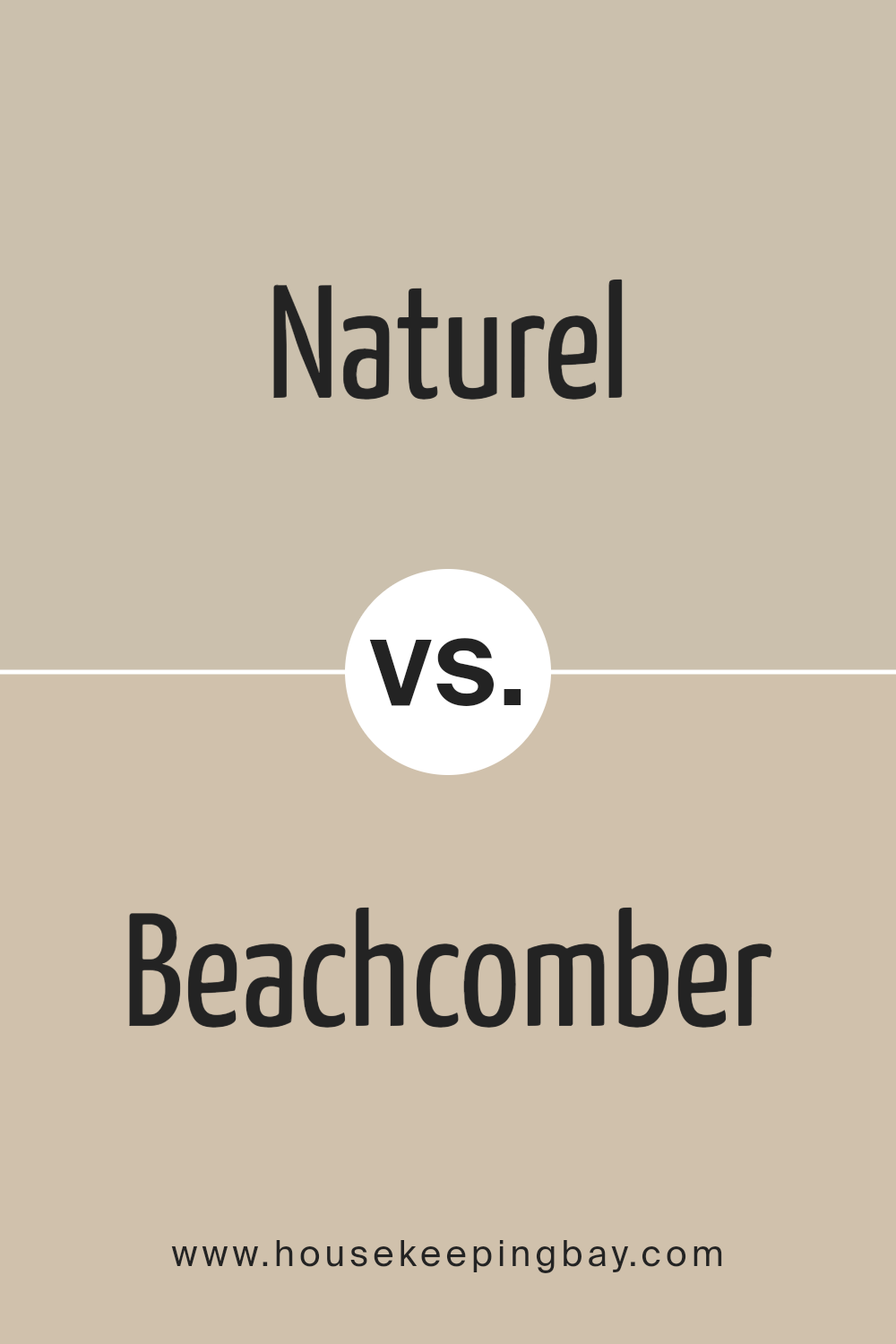
Naturel SW 7542 by Sherwin Williams vs Beachcomber SW 9617 by Sherwin Williams
Naturel SW 7542 by Sherwin Williams is a warm, neutral beige with a cozy and inviting feel. It’s versatile and pairs well with a wide range of colors, making it a great choice for any room looking for a subtle yet welcoming atmosphere.
In contrast, Beachcomber SW 9617 is a lighter, sandy beige with a softer vibe. This color is excellent for creating a relaxed, airy environment, reminiscent of a serene beach setting. While both colors share a neutral base, Naturel leans toward a richer, deeper hue that adds warmth, whereas Beachcomber offers a lighter, more refreshing tone.
This makes Naturel better suited for spaces that benefit from a cozier, more enclosed feel, while Beachcomber is ideal for areas where a sense of openness and light is desired. Both colors provide a calm, neutral backdrop, but their impact varies depending on the mood you want to achieve in your space.
You can see recommended paint color below:
housekeepingbay.com
Naturel SW 7542 by Sherwin Williams vs Shiitake SW 9173 by Sherwin Williams
Naturel SW 7542 by Sherwin Williams and Shiitake SW 9173 by Sherwin Williams are two neutral tones that offer soft, earthy hues perfect for creating a warm, inviting space. Naturel is a lighter beige color that reflects more light, making it ideal for smaller or darker rooms to give an illusion of more space and brightness. It has a sandy, creamy quality that pairs well with a wide range of decor styles, from rustic to modern.
In contrast, Shiitake is a deeper, taupe-like shade that leans more towards gray-brown. It provides a stronger visual impact and brings a sense of warmth and sophistication to a room. This color works well in larger spaces or areas with ample light, where it won’t overpower the room but will instead add depth and a hint of coziness.
Both colors are versatile and can be easily integrated into various color schemes, but the choice between them depends on the desired atmosphere and room characteristics. Naturel is better for creating a light, airy feel, while Shiitake offers a more grounded, enveloping ambiance.
You can see recommended paint color below:

housekeepingbay.com
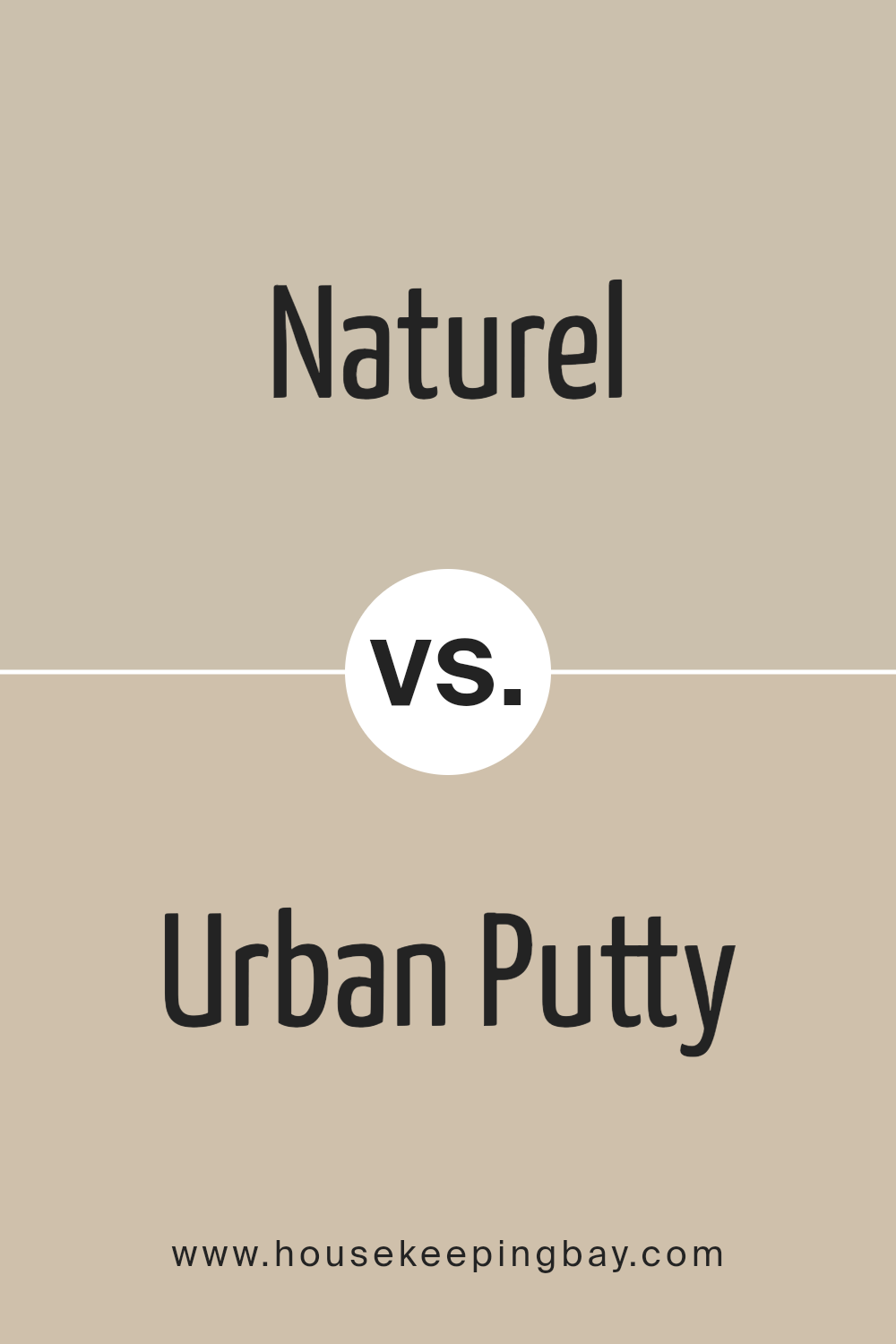
Naturel SW 7542 by Sherwin Williams vs Urban Putty SW 7532 by Sherwin Williams
Naturel SW 7542 by Sherwin Williams is a warm beige color that sets a cozy and inviting tone in any room. It’s a neutral shade, making it versatile for various decorating styles, from rustic to modern. This color pairs well with darker and lighter tones, allowing for flexible design options.
Urban Putty SW 7532 is slightly deeper than Naturel, carrying a taupe hue that feels solid and grounding. It works well in spaces where you want to add a bit of sophistication without overwhelming the area with darker colors.
Both colors offer a subtle backdrop for bold accents, making them ideal for those looking to create a space that’s not overly flashy but still has character. Naturel might lean towards a slightly lighter, airier feel, making it great for smaller or less naturally lit spaces, while Urban Putty could be better for larger areas or rooms that get plenty of light. Overall, both are practical choices that can help make any room feel welcoming and warm.
You can see recommended paint color below:
- SW 7532 Urban Putty
housekeepingbay.com
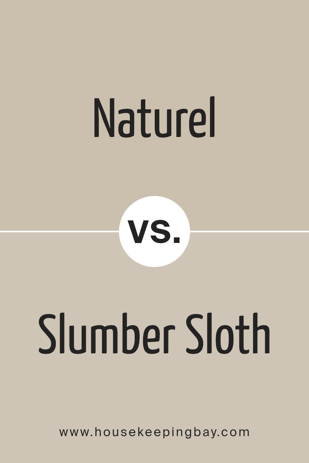
Naturel SW 7542 by Sherwin Williams vs Slumber Sloth SW 9606 by Sherwin Williams
Naturel SW 7542 and Slumber Sloth SW 9606 by Sherwin Williams showcase subtle differences in tone that influence the feel and appeal of each. Naturel SW 7542 is a warm, rich beige with neutral undertones that can help make a space feel cozy and inviting. It pairs well with a variety of decor styles, making it incredibly versatile for use in any room.
In contrast, Slumber Sloth SW 9606 is a darker, gray-brown shade. This color imparts a moodier, more sophisticated vibe to spaces. It’s ideal for creating a strong statement or accentuating focal points in a room. Despite being darker, it maintains a warm undertone, making it comforting and ideal for areas like bedrooms or studies where a calming atmosphere is beneficial.
Both colors lend themselves to a range of decorating themes, from modern to rustic, each providing a distinct base that can profoundly impact a room’s ambiance.
You can see recommended paint color below:
housekeepingbay.com
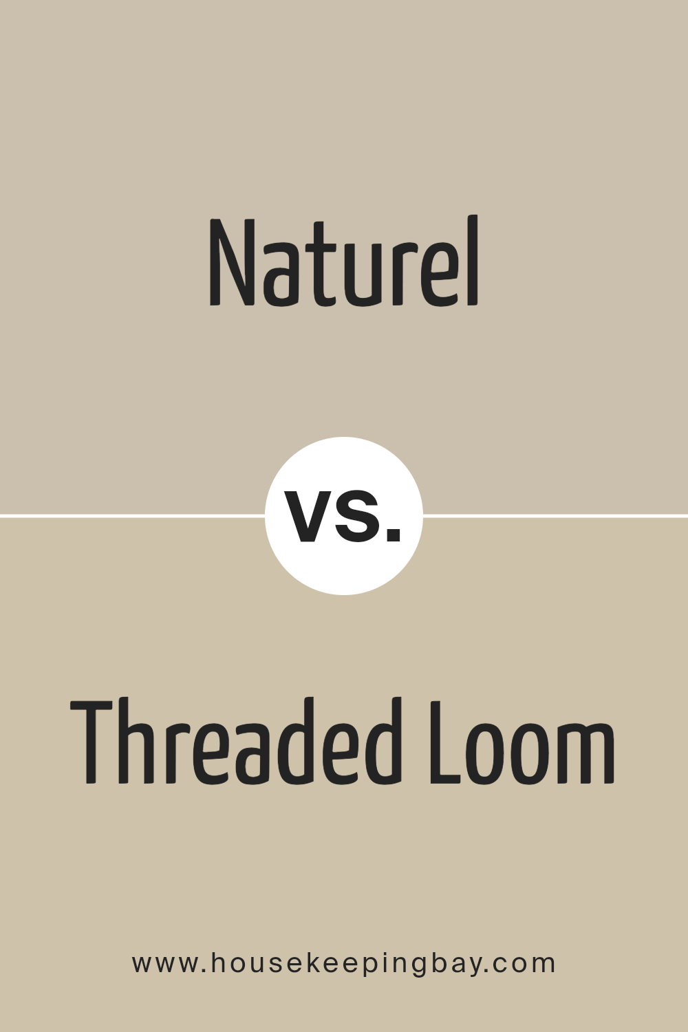
Naturel SW 7542 by Sherwin Williams vs Threaded Loom SW 9512 by Sherwin Williams
Naturel SW 7542 by Sherwin Williams is a warm and inviting beige that gives a cozy, muted backdrop to any room. It’s a versatile color that pairs well with a variety of decor styles, making it a perfect choice for living spaces or bedrooms where calmness is key.
Threaded Loom SW 9512 is a softer, lighter gray that adds a fresh and modern touch to spaces. It functions well in areas that receive lots of natural light, enhancing the openness of the room. This color is ideal for those looking to create a subtle yet contemporary look.
When comparing Naturel and Threaded Loom, you’ll see that both bring their unique characteristics to a space. Naturel offers warmth and a classic appeal, while Threaded Loom provides a cooler tone that can make small rooms appear larger. Depending on your style and the atmosphere you want to create, either could be a great choice.
You can see recommended paint color below:
housekeepingbay.com
Naturel SW 7542 by Sherwin Williams vs Downing Sand SW 2822 by Sherwin Williams
Naturel SW 7542 by Sherwin Williams is a soft, warm beige that brings a calming, neutral backdrop to any space. It’s a versatile shade that works well in various settings, lending a light and airy feel. It pairs beautifully with many other colors, making it easy to use in a room with varied decor styles.
In contrast, Downing Sand SW 2822 is a deeper, more golden-toned beige. This color adds a touch of warmth and richness, creating a cozy atmosphere in rooms that could feel cool or impersonal. It’s great for spaces where you want a bit more character without overwhelming with darker tones.
While both colors share a base in the beige family, Naturel leans towards a lighter, more muted approach, perfect for those seeking a gentle enhancement to their space. Downing Sand, meanwhile, offers a bolder choice, ideal for making a warmer statement. Both paints offer unique benefits depending on the mood and style you aim to achieve in your decorating project.
You can see recommended paint color below:
- SW 2822 Downing Sand

housekeepingbay.com
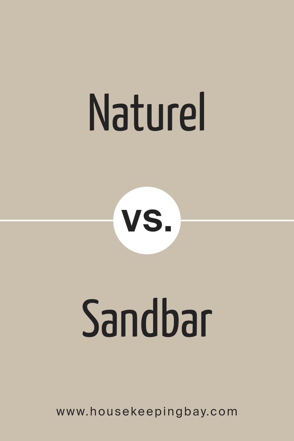
Naturel SW 7542 by Sherwin Williams vs Sandbar SW 7547 by Sherwin Williams
Naturel SW 7542 by Sherwin Williams is a warm, muted beige that gives a calming effect and pairs well with a variety of decor styles. It’s soft enough to serve as a neutral backdrop for rooms but also holds enough warmth to create a cozy atmosphere.
Sandbar SW 7547, on the other hand, is also a neutral color but leans more towards a lighter, sandy beige. It’s slightly brighter than Naturel and imparts a fresh and airy feel to spaces. This color can help open up smaller rooms or areas lacking in natural light.
Both colors carry an understated elegance and are versatile, making them suitable for almost any room in a home. Naturel offers a bit more warmth, which can enhance rooms needing a cozy touch, while Sandbar, being lighter, can make a space feel more spacious and inviting. These qualities make both colors ideal for those seeking a neutral palette that still adds character to their living space.
You can see recommended paint color below:
housekeepingbay.com
Naturel SW 7542 by Sherwin Williams vs Cargo Pants SW 7738 by Sherwin Williams
Naturel SW 7542 by Sherwin Williams is a warm, inviting beige that sets a soft and serene tone. This hue fits well in spaces meant for relaxation and comfort, lending a neutral backdrop that pairs easily with a wide range of decor styles and colors. It radiates a cozy simplicity that makes it ideal for living rooms, bedrooms, and common areas where a gentle and unfussy atmosphere is desired.
Second Color – Cargo Pants SW 7738 by Sherwin Williams
Cargo Pants SW 7738, in contrast, is a deeper, olive green shade that suggests a connection to the outdoors and a rustic vibe. This color is more pronounced and earthy, providing a sense of grounding and stability. It’s a great choice for accent walls or rooms where a touch of nature-inspired robustness is desired. Cargo Pants works particularly well in spaces that incorporate natural materials like wood or stone.
While both colors are inspired by natural elements, Naturel’s beige is lighter and more universally adaptable, making it easier to apply in various settings without overwhelming the space. Cargo Pants’ richer, green tone offers a distinctive presence, suitable for creating more focal points or thematic depth in a room. Both are excellent for creating warm, welcoming environments but achieve this with different levels of intensity and color dynamics.
You can see recommended paint color below:
- SW 7738 Cargo Pants
housekeepingbay.com
Conclusion
This shade stands out as a sophisticated neutral that pairs beautifully with various decors, enhancing without overwhelming. Its warm undertones provide a cozy atmosphere in any room, making it an ideal choice for those looking to create a welcoming space. Whether applied in a busy kitchen, a tranquil bedroom, or a chic living room, Naturel consistently offers a sense of calm and comfort.
As I experimented with different lighting and complementary colors, I noticed that Naturel adapts seamlessly, reflecting subtle changes in its environment. This adaptability ensures that regardless of the style or palette of a home, this color remains both relevant and refined.
For anyone considering a new paint project, SW 7542 Naturel should be on your list.
It promises not just to paint your walls but to enrich your living experience, proving that sometimes the most simple choices are indeed the most sophisticated.
housekeepingbay.com
