Oyster Bar SW 7565 by Sherwin Williams
Find Your Perfect Neutral Shade
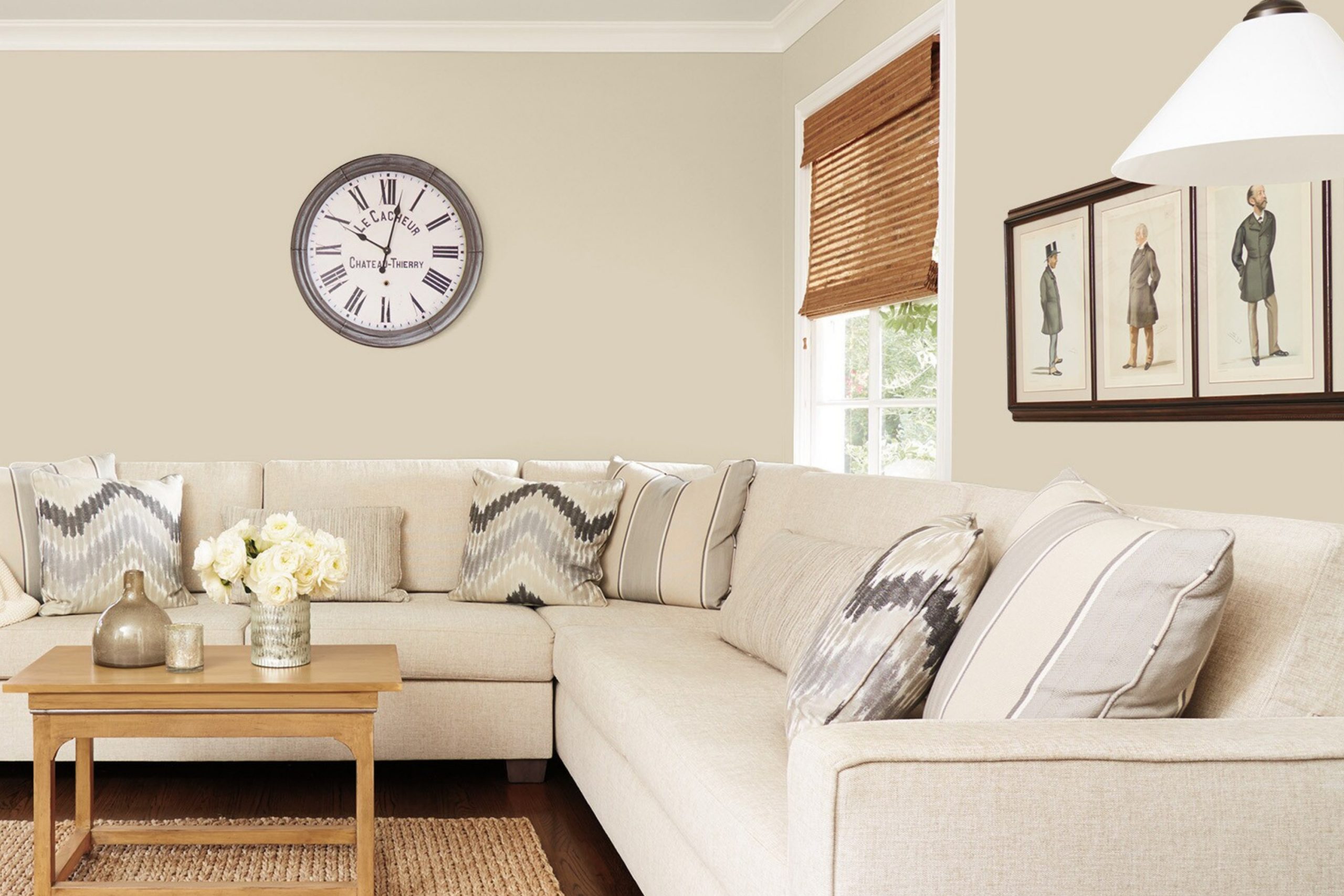
When choosing a paint color, it’s important to find one that complements your space and creates the atmosphere you desire. SW 7565 Oyster Bar by Sherwin Williams is a timeless choice that might catch your attention. It’s a warm, neutral hue with subtle elegance, perfect for those who appreciate understated beauty.
Imagine a color that breathes warmth into a room without overwhelming it. Oyster Bar achieves this balance beautifully. It pairs well with a variety of other colors and styles, making it a flexible option for different homes and personal tastes.
Whether you’re refreshing a living room, updating a bedroom, or even considering a new shade for the kitchen, this color provides a cozy backdrop that enhances the space and adds a sense of comfort.
Visualize entering a room painted in Oyster Bar. It’s welcoming, with a soft undertone that soothes the eyes and relaxes the mind.
This color could be the foundation for decorating with bolder accents or used to create a monochromatic scheme for a modern look. Whatever the setting, Oyster Bar offers a touch of warmth and sophistication without being too showy. It’s a shade that makes everyday living just a little more inviting.
via lowes.com
What Color Is Oyster Bar SW 7565 by Sherwin Williams?
Table of Contents
Oyster Bar SW 7565 by Sherwin Williams is a warm, neutral shade with a subtle hint of beige. Its soft and inviting tone creates a welcoming atmosphere, making it a versatile choice for many spaces. The gentle warmth of this color works beautifully in numerous interior styles, including contemporary, traditional, and minimalist designs. It acts as a perfect backdrop, creating a harmonious balance in any room.
In contemporary spaces, Oyster Bar provides a calming effect that complements sleek furniture and clean lines. Its muted shade pairs wonderfully with light woods and stainless steel, enhancing the modern aesthetic.
In traditional settings, this color supports classic elements such as dark woods and richly textured fabrics, offering a comforting and familiar ambiance.
Oyster Bar combines well with various materials and textures. It highlights the beauty of natural stone surfaces, such as marble and granite, and adds warmth to metal accents like brushed gold or copper. Soft fabrics such as linen and cotton take on a more inviting appeal against its cozy undertone.
Pairing it with bolder colors, like deep navy or forest green, can create contrast, adding depth and interest to a space. Overall, Oyster Bar SW 7565 serves as a versatile, adaptable color in any interior environment.
housekeepingbay.com
Is Oyster Bar SW 7565 by Sherwin Williams Warm or Cool color?
Oyster Bar SW 7565 by Sherwin Williams is a warm, neutral color that can bring a cozy feel to any room. Its soft, beige tone adds a touch of elegance without overwhelming a space, making it perfect for living rooms, bedrooms, or kitchens. This versatile paint choice pairs well with both dark and light furnishings, allowing for flexible decor options. It reflects natural light in a gentle way, creating an inviting and comfortable environment.
When used on walls, Oyster Bar gives a soothing background that complements both modern and traditional styles.
It works well with wood and metallic finishes, offering a balanced look. In smaller spaces, this hue can help open them up, giving a sense of a larger area.
Homeowners may find it an excellent choice for achieving a refined yet relaxed atmosphere in their homes, blending seamlessly with various accent colors and interior designs.
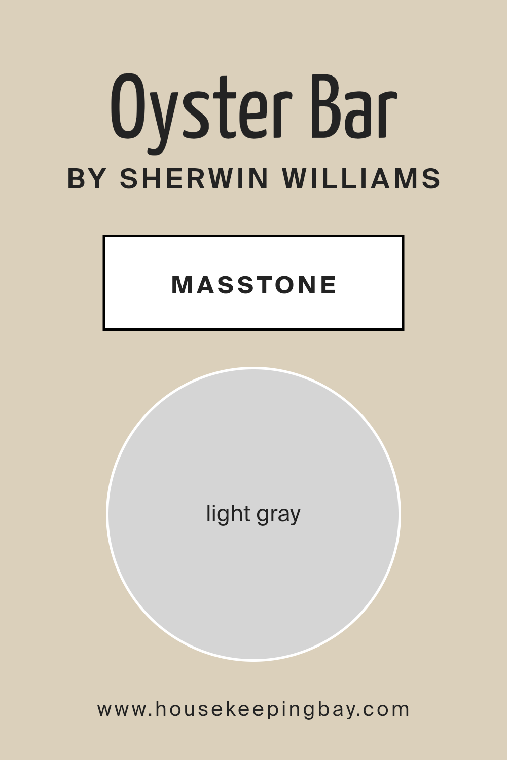
What is the Masstone of the Oyster Bar SW 7565 by Sherwin Williams?
Oyster Bar SW 7565 by Sherwin Williams is a beautiful light gray color with a gentle and calming vibe. As a masstone, it presents a consistent and solid appearance. This shade works well in various spaces within the home due to its subtle and versatile nature.
In living rooms, it creates a soothing backdrop, allowing furniture and decorations to stand out without overwhelming the space. In kitchens, this color gives a clean and modern feel, making the area bright and inviting.
Bedrooms painted in Oyster Bar make use of its peaceful tone, encouraging a restful environment. This light gray also complements many other colors, such as soft blues, pale blush, and warm browns, offering plenty of design flexibility.
Its neutral quality fits different styles, from contemporary to traditional, making it a smart choice for anyone looking to create a harmonious and comfortable living environment.
housekeepingbay.com
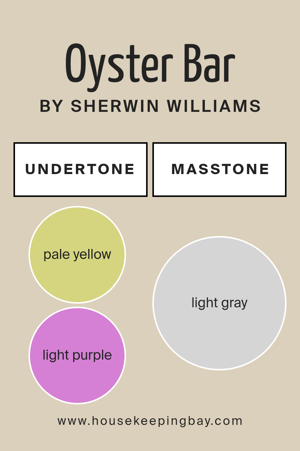
Undertones of Oyster Bar SW 7565 by Sherwin Williams
Oyster Bar SW 7565 by Sherwin-Williams is known for its complex undertones that add depth to this neutral shade. When you look at this color, it might seem straightforward at first, but its undertones tell a different story. These subtle hues, such as pale yellow, light purple, light blue, pale pink, mint, lilac, and grey, influence how we perceive Oyster Bar in various environments.
Pale yellow and pale pink undertones can create warmth, making a room feel cozy and inviting. The light purple and lilac give a hint of sophistication, adding a gentle touch that softens a space. Light blue and mint undertones bring a slight freshness, often leading to a calming effect in a room.
Meanwhile, grey undertones ground the color, providing a balanced backdrop that doesn’t overwhelm.
In interior settings, these undertones mean Oyster Bar changes subtly with different lighting conditions.
In natural light, the warmer and cooler undertones can either brighten the room or create a soft, muted look, depending on the time of day. In artificial lighting, the color may shift, showing more of its complex nature. These nuanced undertones make Oyster Bar a versatile choice for interiors, offering both warmth and neutrality.
housekeepingbay.com
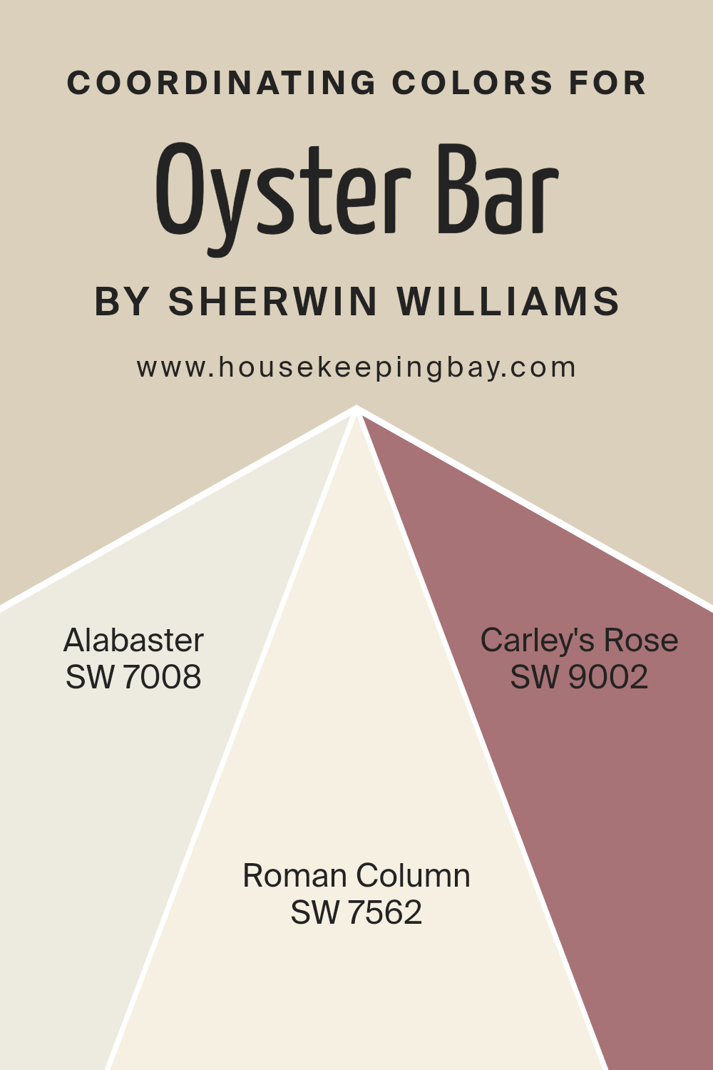
Coordinating Colors of Oyster Bar SW 7565 by Sherwin Williams
Coordinating colors are hues that complement each other, creating a harmonious look in a particular space. They work well together by sharing common undertones or contrast to bring balance. In the case of Oyster Bar SW 7565 by Sherwin-Williams, three colors coordinate beautifully to round out any design.
SW 7008, known as Alabaster, is a soft, warm white that feels welcoming and bright without being stark or cold. It brings a sense of freshness and can open up smaller spaces, making them feel airy.
SW 7562, Roman Column, slightly warmer than Alabaster, has a classic appeal that feels timeless. It’s a gentle neutral that serves as a perfect backdrop in any room, effortlessly blending with other colors.
Meanwhile, SW 9002, Carley’s Rose, offers a gentle touch with its soft pink hue, adding a hint of color that is subtle but effective.
It infuses warmth and a touch of romance without being overwhelming. Together, these colors, when used with Oyster Bar, result in a sophisticated palette that can be both comfortable and stylish in various settings. This combination serves to maintain balance while highlighting different aspects of a room effortlessly.
You can see recommended paint colors below:
- SW 7008 Alabaster
- SW 7562 Roman Column
- SW 9002 Carley’s Rose
housekeepingbay.com
How Does Lighting Affect Oyster Bar SW 7565 by Sherwin Williams?
Lighting plays a crucial role in how we perceive colors. Different types of light can change the appearance of a color, often altering its shade, warmth, and overall impact in a space. Natural light, which includes daylight coming from windows, varies throughout the day and can make colors look different at different times.
When considering a paint color like Oyster Bar SW 7565 by Sherwin Williams, lighting can significantly impact its appearance. Oyster Bar is a soft, muted hue with warm undertones, which can change subtly based on lighting conditions.
In rooms with artificial light, such as LED or incandescent bulbs, Oyster Bar can appear warmer. Incandescent bulbs cast a yellow light, which can enhance the cozy feel of this color. On the other hand, LED lights, particularly those with a cooler temperature, can make the color appear slightly cooler and more neutral.
In natural light, Oyster Bar’s appearance changes based on window orientation. In north-facing rooms, where the light is cooler and softer, Oyster Bar may appear more muted, with its warm undertones subdued, creating a more neutral backdrop. This cooler light can sometimes bring out a hint of gray in the color.
South-facing rooms receive more direct sunlight, making colors appear brighter and warmer. Here, Oyster Bar will likely appear crisp and embrace its warm undertones, adding a cozy, inviting feel to the space.
East-facing rooms receive bright morning light, which can create a warm, golden glow. In these conditions, Oyster Bar will look warmer in the morning and take on a more neutral tone later in the day as the light becomes soft.
West-facing rooms get warm, long shadows in the afternoon and evening. During these times, the color can appear rich and warm, enhancing its inviting nature. Overall, Oyster Bar SW 7565 transforms subtly with lighting, requiring consideration of lighting before painting a space.
housekeepingbay.com
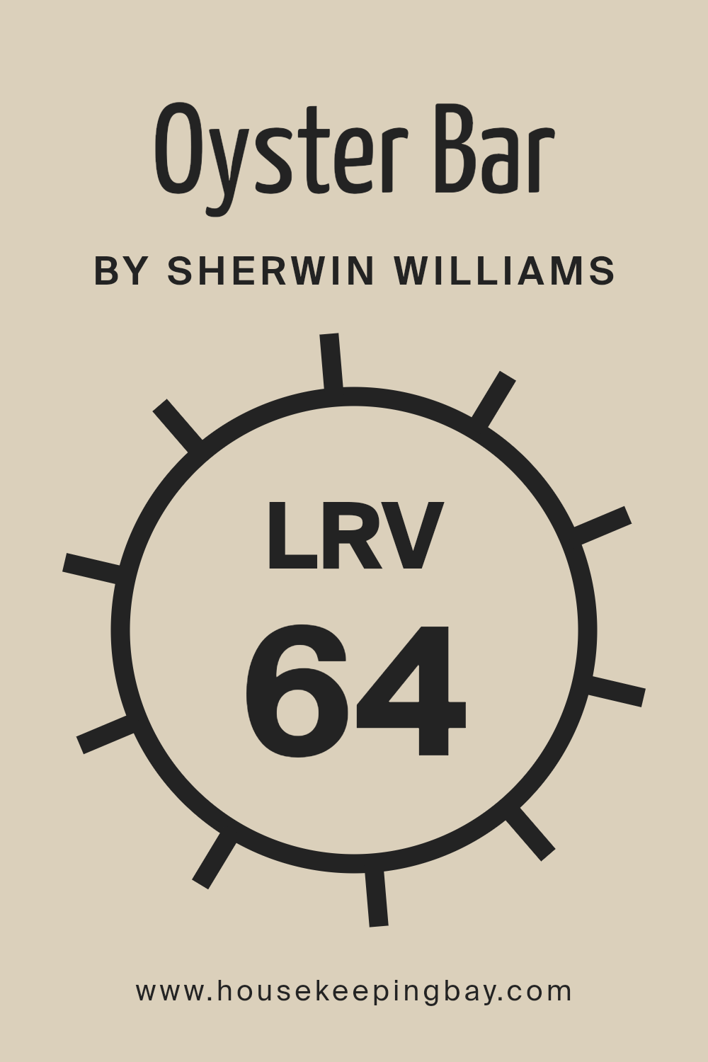
What is the LRV of Oyster Bar SW 7565 by Sherwin Williams?
The Light Reflectance Value, or LRV, is a measure that tells us how much light a color reflects and absorbs. It is a scale from 0 to 100, with 0 being absolute black, which absorbs all light, and 100 being pure white, which reflects all light. Colors with higher LRVs reflect more light and can make a room feel more open and bright.
On the other hand, colors with lower LRVs absorb more light, creating a cozier, more intimate feel. Understanding LRV helps in choosing the right paint color for a room based on the amount of natural light it receives and the desired ambiance.
For Sherwin Williams’ Oyster Bar (SW 7565), the LRV is 63.755. This means it is fairly reflective, like many lighter shades. Because of its higher LRV, Oyster Bar can help a room appear more spacious and airy, making it a good choice for smaller rooms or spaces with limited natural light. Its ability to reflect a decent amount of light also means it works well in rooms where a light, neutral backdrop is desired, ensuring the space does not become too dark or overwhelming.
This makes it a versatile color that can suit various styles and atmospheres.
housekeepingbay.com
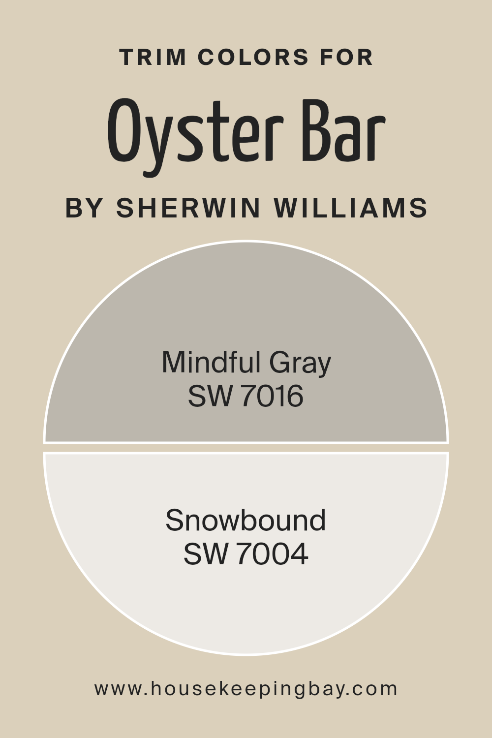
What are the Trim colors of Oyster Bar SW 7565 by Sherwin Williams?
Trim colors are the shades chosen for elements like baseboards, moldings, windowsills, and door frames. They serve a dual purpose: enhancing the main wall color and adding visual interest to a room. In the case of Oyster Bar by Sherwin Williams, using trim colors like Mindful Gray and Snowbound can create a harmonious or striking contrast, depending on your preference.
Trim colors are important because they frame your room delicately and can highlight architectural details, making spaces feel polished and well-defined. They also help balance the room’s color palette, ensuring a cohesive look that feels complete and thoughtfully designed.
Mindful Gray, known as SW 7016, is a versatile gray with subtle warmth, making it a great choice for trim that needs to complement warm wall colors like Oyster Bar. Snowbound, or SW 7004, is a soft white that brings a touch of crispness to any space, perfect for creating clean lines and a fresh look against the beige of Oyster Bar.
Choosing the right trim color can change the feel of a room, adding elegance or a sense of spaciousness, and snowbound’s brightness or the grounding quality of mindful gray enhances the overall effect of your wall color, giving your interiors a finished feel.
You can see recommended paint colors below:
housekeepingbay.com
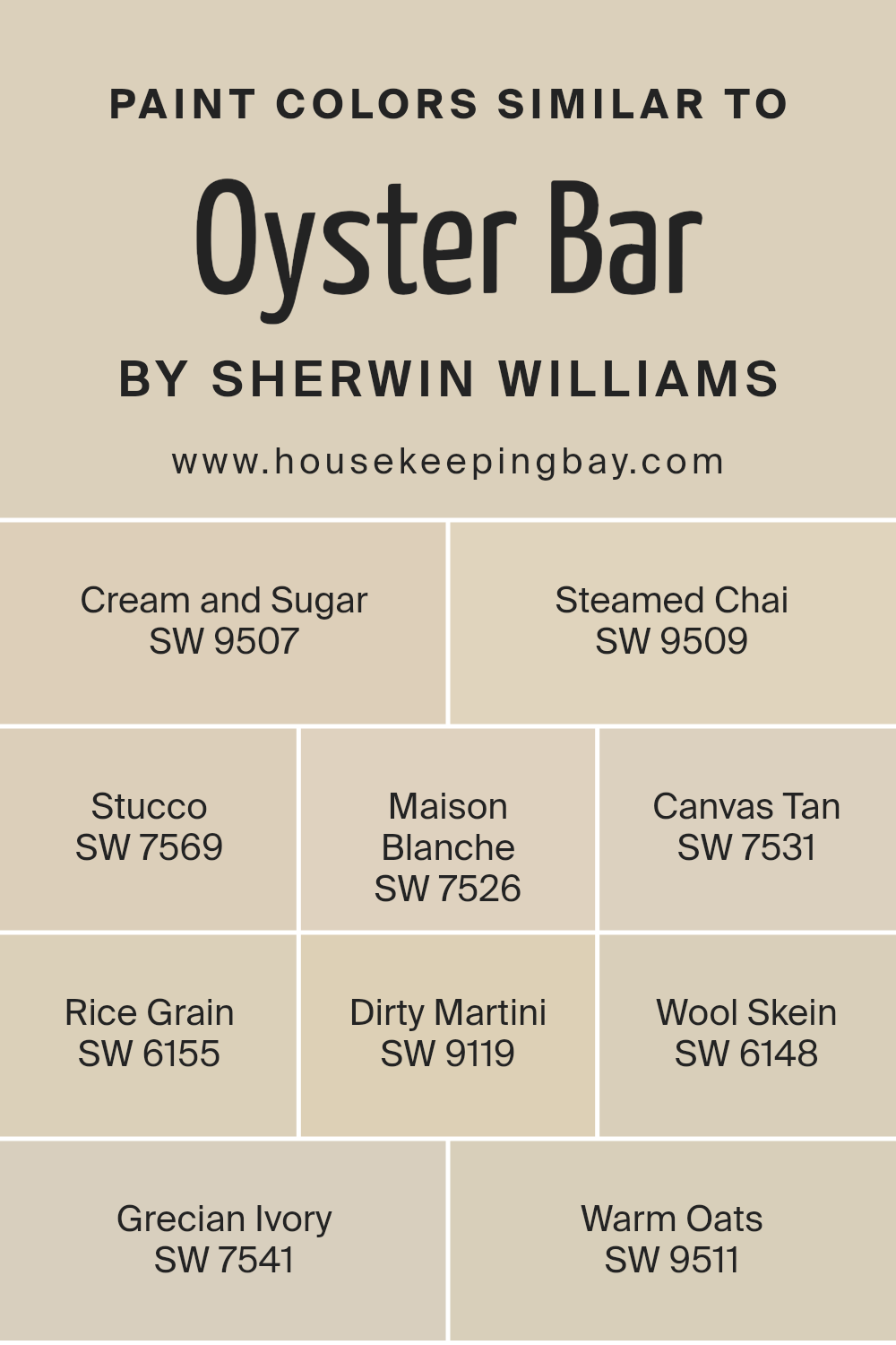
Colors Similar to Oyster Bar SW 7565 by Sherwin Williams
Using similar colors in design can create a harmonious and balanced atmosphere. Colors like SW 9507 Cream and Sugar and SW 9509 Steamed Chai offer soft, comforting tones. Cream and Sugar is a warm, off-white shade that brings a touch of understated elegance, while Steamed Chai exudes a creamy, beige warmth perfect for cozy spaces.
These tones blend seamlessly with SW 7569 Stucco, a muted, earthy hue ideal for adding subtle depth. SW 7526 Maison Blanche introduces a gentle creaminess, reminiscent of a calm, neutral space that feels inviting and warm. SW 7531 Canvas Tan serves as a versatile backdrop with its soft tan hue, complementing both modern and traditional interiors.
SW 6155 Rice Grain and SW 9119 Dirty Martini add a natural, organic feel with their light beige and greenish undertones, respectively. Rice Grain’s gentle warmth pairs beautifully with the more adventurous hint of green in Dirty Martini. SW 6148 Wool Skein, a light khaki, enhances the earthy palette, while SW 7541 Grecian Ivory’s subtle yellow undertone adds a touch of brightness.
Finally, SW 9511 Warm Oats brings a sense of coziness with its warm beige tone. Together, these shades create a serene environment that is calm and inviting, making any space feel cohesive and well-designed.
You can see recommended paint colors below:
- SW 9507 Cream and Sugar
- SW 9509 Steamed Chai
- SW 7569 Stucco
- SW 7526 Maison Blanche
- SW 7531 Canvas Tan
- SW 6155 Rice Grain
- SW 9119 Dirty Martini
- SW 6148 Wool Skein
- SW 7541 Grecian Ivory
- SW 9511 Warm Oats
housekeepingbay.com
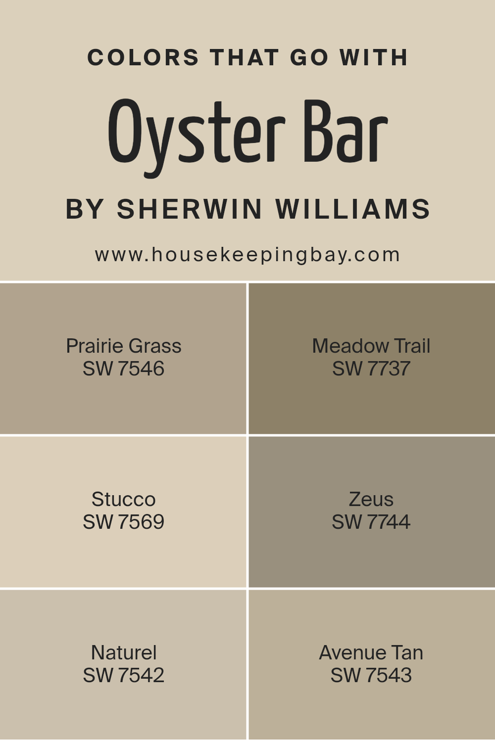
Colors that Go With Oyster Bar SW 7565 by Sherwin Williams
Choosing the right colors to pair with Sherwin Williams’ Oyster Bar SW 7565 is essential in creating a harmonious and pleasing space. Oyster Bar, a soothing neutral, works well with earthy tones. Pairing it with SW 7546 – Prairie Grass can bring warmth; its soft brownish hue adds comfort and coziness.
SW 7737 – Meadow Trail offers a refreshing touch with its hint of nature-inspired green, inviting a breath of fresh air into the room. On the other hand, SW 7569 – Stucco, with its pale warmth, adds gentle elegance without overwhelming the senses.
For those who wish to add depth, SW 7744 – Zeus introduces a darker, more robust choice. Its deep charcoal tone brings a sophisticated contrast while maintaining a calm atmosphere. SW 7542 – Naturel, another light neutral like Oyster Bar, blends seamlessly, offering a calm backdrop that keeps the space bright and open.
Lastly, SW 7543 – Avenue Tan provides a versatile tan that complements the overall palette with subtle richness.
Together, these colors create a balanced look, enhancing Oyster Bar’s versatility and ensuring the space feels both cohesive and inviting.
You can see recommended paint colors below:
- SW 7546 Prairie Grass
- SW 7737 Meadow Trail
- SW 7569 Stucco
- SW 7744 Zeus
- SW 7542 Naturel
- SW 7543 Avenue Tan
housekeepingbay.com
How to Use Oyster Bar SW 7565 by Sherwin Williams In Your Home?
Oyster Bar SW 7565 by Sherwin Williams is a soft, neutral color that feels warm and inviting. It has a subtle hint of gray, making it a great choice for various rooms in your home. In the living room, it creates a cozy atmosphere that makes the space feel welcoming.
When used in the bedroom, Oyster Bar can provide a calming background that helps promote relaxation and rest. It’s a perfect backdrop for both modern and traditional décor, allowing you to change your furniture and accent colors easily over time.
In the kitchen, pairing this shade with white cabinets or stainless steel appliances can give a clean and fresh look. It works well in hallways too, making them feel wider and brighter. With good lighting, this color brings a sense of warmth to any area, helping to make your entire home feel more pulled together and harmonious.
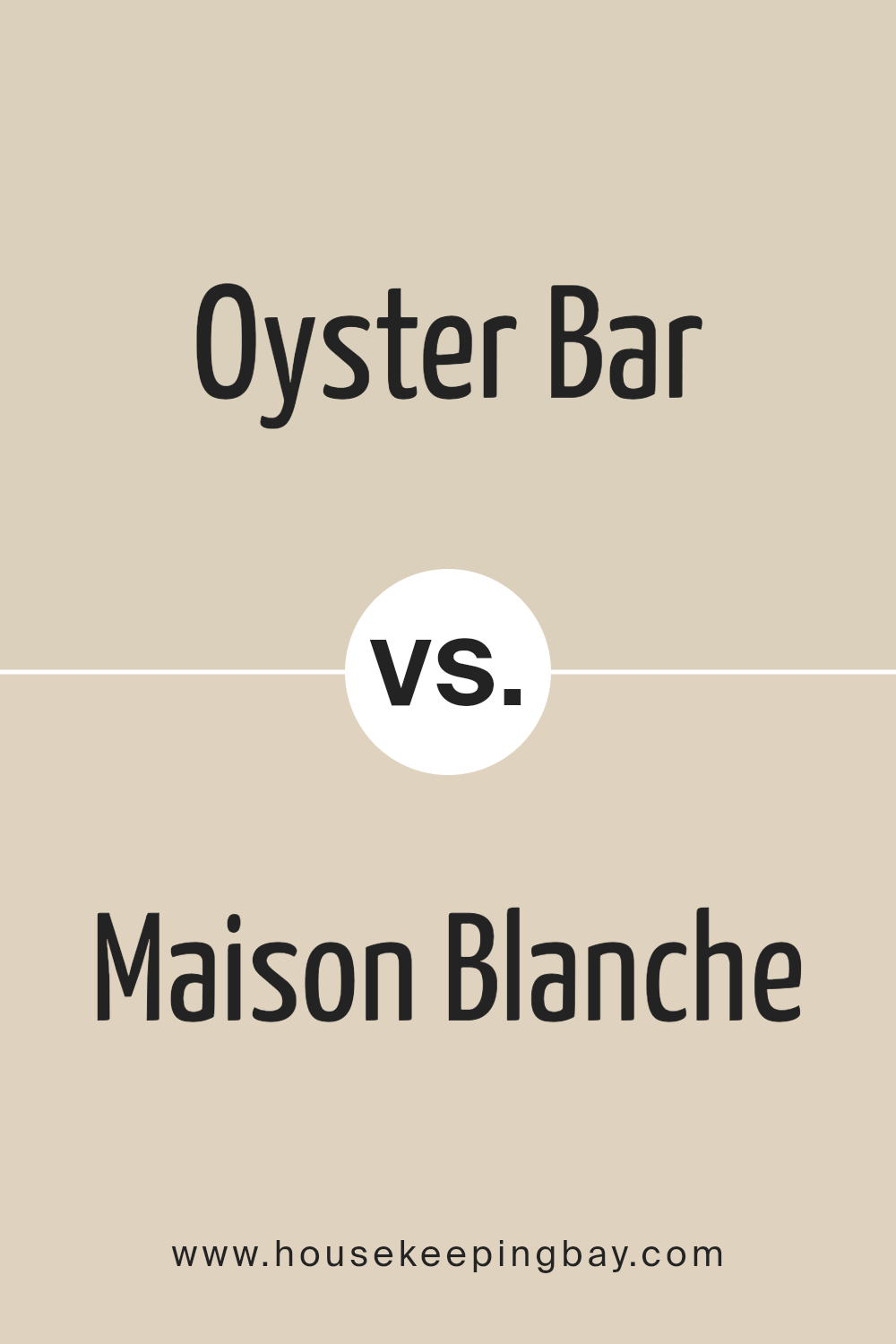
Oyster Bar SW 7565 by Sherwin Williams vs Maison Blanche SW 7526 by Sherwin Williams
Oyster Bar SW 7565 by Sherwin Williams and Maison Blanche SW 7526 are soft, versatile colors, yet they bring different vibes to a space. Oyster Bar is a warm, creamy beige with subtle undertones that create a cozy, inviting atmosphere. It works well in various rooms, giving a sense of warmth and comfort, ideal for living rooms or bedrooms.
Maison Blanche, slightly lighter, leans towards a pale neutral with hints of warmth. It provides a clean, simple backdrop that brightens spaces. This shade can make smaller spaces appear larger and is excellent for rooms needing a fresh, airy touch.
While both colors exude warmth, Oyster Bar offers depth, adding more richness. Maison Blanche gives rooms a bright, light feeling. They complement each other well when used in combination, allowing for a coordinated palette throughout a home. Whether creating a welcoming area or a light and airy room, these shades serve as excellent choices.
You can see recommended paint color below:
housekeepingbay.com
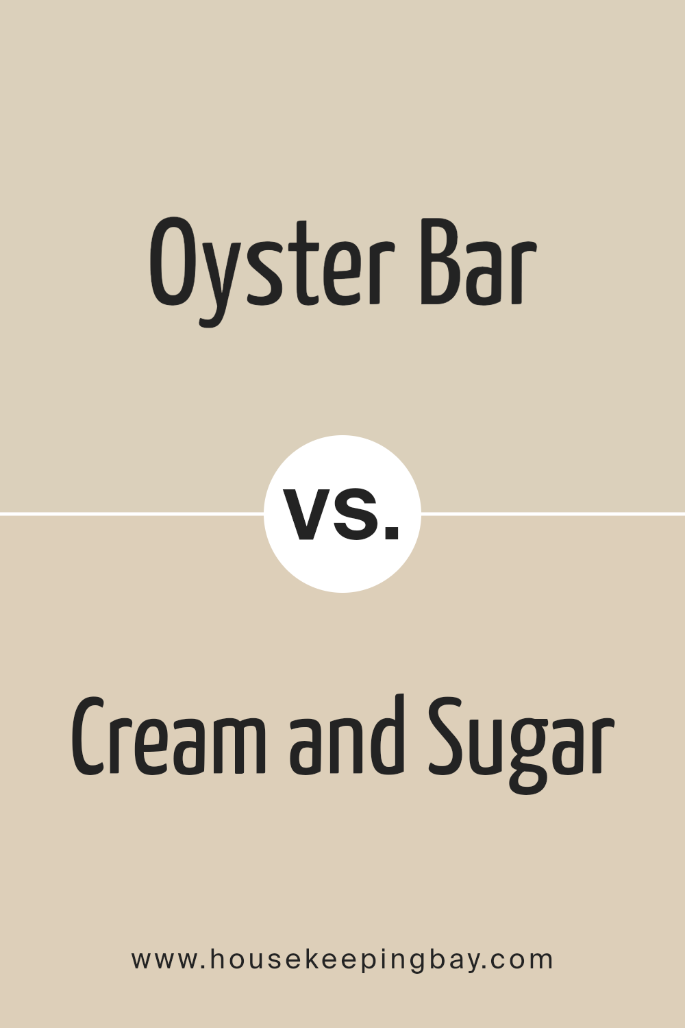
Oyster Bar SW 7565 by Sherwin Williams vs Cream and Sugar SW 9507 by Sherwin Williams
Oyster Bar SW 7565 by Sherwin Williams is a warm, creamy beige. It provides a soft and inviting backdrop, ideal for creating cozy and comfortable spaces. This color works well in living rooms or bedrooms, offering a versatile option that complements many design styles and other colors.
Cream and Sugar SW 9507, also by Sherwin Williams, is slightly lighter and brighter than Oyster Bar. It brings a delicate touch to interiors, adding a sense of lightness and openness to rooms. Cream and Sugar is perfect for kitchens, bathrooms, or any area that benefits from a subtle, airy feel.
While both colors belong to the neutral family, Oyster Bar leans more towards a deeper beige tone. Cream and Sugar offers a paler, more subdued appearance. Choosing between them depends on whether you want a richer, cozy atmosphere or a lighter, more breezy setting in your space.
You can see recommended paint color below:
housekeepingbay.com
Oyster Bar SW 7565 by Sherwin Williams vs Canvas Tan SW 7531 by Sherwin Williams
Oyster Bar SW 7565 by Sherwin Williams is a subtle, soft beige with a hint of gray, creating a calm, neutral look. This color often brings warmth and a touch of sophistication to spaces without overwhelming them. It pairs well with both cool and warm accents, making it versatile for various design styles.
Canvas Tan SW 7531, also by Sherwin Williams, is another neutral, but it leans more towards a creamy beige. It offers a balanced, cozy feel, slightly warmer than Oyster Bar. Canvas Tan can make rooms feel inviting and comfortable, working well in spaces that aim for a classic or traditional look.
While both colors serve as excellent backdrops, Oyster Bar suits those who prefer a modern, understated aesthetic, while Canvas Tan appeals to those seeking warmth and coziness. These shades offer flexibility, allowing them to complement a wide range of furnishings and decor.
You can see recommended paint color below:
housekeepingbay.com
Oyster Bar SW 7565 by Sherwin Williams vs Stucco SW 7569 by Sherwin Williams
Oyster Bar SW 7565 and Stucco SW 7569 by Sherwin Williams share a soft, neutral elegance but differ in subtle ways that can influence a room’s mood. Oyster Bar is a light, creamy hue with a hint of warmth, offering a versatile backdrop suitable for various design styles. It provides a gentle, welcoming atmosphere, ideal for creating serene and cozy spaces.
Stucco, while close in tone, leans slightly warmer and richer. It carries more depth and a hint of earthy undertone, adding a touch of warmth and grounding quality to any room. This makes it suitable for settings that want more inviting and comfortable environments.
Both colors complement each other well and can be used together to create a harmonious look. Oyster Bar’s lighter shade enhances openness, while Stucco’s deeper tone adds warmth and coziness, making them a great pair for balanced interiors.
You can see recommended paint color below:
housekeepingbay.com
Oyster Bar SW 7565 by Sherwin Williams vs Wool Skein SW 6148 by Sherwin Williams
Oyster Bar SW 7565 and Wool Skein SW 6148 are both popular paint colors by Sherwin Williams, but they create different moods. Oyster Bar is a soft, warm beige with subtle gray undertones, providing a cozy and inviting feel. It’s like a calming, neutral backdrop that complements many styles, making it versatile for different spaces.
Wool Skein, however, leans more towards a light taupe with stronger hints of beige. It gives off an earthy vibe, creating a comforting and grounded atmosphere. Wool Skein can add warmth to a room without being overpowering, making it a great choice for those seeking a gentle, natural aesthetic.
Both colors are understated and work well with various palettes, yet Oyster Bar is slightly cooler due to its grayish tint, whereas Wool Skein feels warmer and richer. Choosing between them depends on whether you prefer a subtle gray hint or a more earthy beige presence.
You can see recommended paint color below:
housekeepingbay.com
Oyster Bar SW 7565 by Sherwin Williams vs Rice Grain SW 6155 by Sherwin Williams
Oyster Bar SW 7565 and Rice Grain SW 6155 are two warm and subtle colors by Sherwin Williams. Oyster Bar is a soft, neutral shade with a hint of creaminess, reminiscent of light beige with a touch of gray. It provides a calm and timeless backdrop suitable for both modern and traditional spaces.
Rice Grain SW 6155, however, leans slightly more towards a warm, light taupe. It carries subtle undertones of green, lending a gentle, earthy vibe. This color complements natural elements, making it excellent for creating a cozy and inviting atmosphere.
While both shades belong to neutral families, Oyster Bar tends to have a calming, slightly cooler tone, ideal for creating airy and open spaces. Rice Grain, being warmer, enhances cozy, intimate spaces, providing a welcoming feel. These differences allow each color to uniquely contribute to the mood and style of a room. Both can harmonize with various other colors, offering versatile design possibilities.
You can see recommended paint color below:
- SW 6155 Rice Grain
housekeepingbay.com
Oyster Bar SW 7565 by Sherwin Williams vs Steamed Chai SW 9509 by Sherwin Williams
Oyster Bar SW 7565 and Steamed Chai SW 9509, both from Sherwin-Williams, offer soft, inviting palettes ideal for spaces seeking warmth. Oyster Bar is a light, muted beige with subtle gray undertones, providing a versatile canvas that harmonizes well with various decor styles.
It lends an airy brightness, complementing both modern and traditional interiors. Steamed Chai, slightly warmer and richer, leans more towards a creamy, tan hue with a hint of cozy brown. This color evokes a snug, comforting atmosphere, perfect for creating inviting living areas or intimate bedrooms.
When paired, Oyster Bar’s neutral tones offset Steamed Chai’s warmth, achieving balance and depth. In spaces with good natural light, Oyster Bar opens up the room, while Steamed Chai adds gentle depth and interest.
Together, they create a cohesive, serene environment, each enhancing the other’s innate qualities to produce a harmonious and welcoming space.
You can see recommended paint color below:
housekeepingbay.com
Oyster Bar SW 7565 by Sherwin Williams vs Grecian Ivory SW 7541 by Sherwin Williams
Oyster Bar SW 7565 and Grecian Ivory SW 7541 by Sherwin Williams are both soft, neutral shades that can create a calm, inviting atmosphere. Oyster Bar is a warm, creamy beige color with a slight yellow undertone, giving it a cozy and welcoming feel. It’s versatile and can complement a wide range of decor styles and colors.
Grecian Ivory, in contrast, has a slightly cooler undertone with hints of gray and green. This gentle hue can evoke a sense of calm and subtle elegance. It pairs well with both traditional and contemporary settings, adding a touch of sophistication without overwhelming the space.
Both colors serve as excellent backdrops for various accent colors, but Oyster Bar might feel slightly warmer and more enveloping, while Grecian Ivory offers a cooler, more serene ambiance. Each can enhance a room’s overall look, depending on your desired atmosphere.
You can see recommended paint color below:
housekeepingbay.com
Oyster Bar SW 7565 by Sherwin Williams vs Warm Oats SW 9511 by Sherwin Williams
Oyster Bar SW 7565 by Sherwin Williams is a warm, soft beige that brings a cozy feel to a room. Its subtle undertones create a soothing atmosphere, making it suitable for spaces aimed at relaxation. Warm Oats SW 9511, however, carries a deeper and richer beige tone, which adds a bit more warmth and earthiness.
When comparing these two shades, Oyster Bar tends to reflect more light, which can help brighten a space, making it feel larger and more open. This quality makes it an excellent choice for common areas like living rooms. Warm Oats, with its deeper hue, can make spaces feel more intimate and snug, lending itself well to bedrooms or dens.
Both colors share neutrality, allowing for versatility when pairing with various décor styles. Oyster Bar complements lighter palettes, while Warm Oats pairs beautifully with darker woods and earthy accents to create a grounded look.
You can see recommended paint color below:
housekeepingbay.com
Oyster Bar SW 7565 by Sherwin Williams vs Dirty Martini SW 9119 by Sherwin Williams
Oyster Bar SW 7565 and Dirty Martini SW 9119 by Sherwin Williams each bring distinct tones to a space. Oyster Bar is a subtle, warm off-white. Its versatility makes it suitable for various settings, offering a clean, soft look that suits many palettes. This shade tends to blend harmoniously with lighter surroundings, providing an elegant, calming backdrop without overwhelming other design elements.
Dirty Martini, in contrast, offers a deeper greenish hue. This color has an earthy vibe, adding richness and depth to any room.
Ideal for those wanting a bolder touch, Dirty Martini complements natural wood tones, metals, or darker accents beautifully. It works well in creating a cozy, sophisticated environment, encouraging a connection with nature.
While Oyster Bar serves as an understated canvas, Dirty Martini offers a more pronounced visual impact. Both colors provide unique contributions, appealing to different aesthetic preferences and room purposes.
You can see recommended paint color below:
- SW 9119 Dirty Martini
housekeepingbay.com
Conclusion
As I reflect on SW 7565 Oyster Bar by Sherwin Williams, I appreciate it as an exceptional color choice. This shade offers a soft, muted tone that effortlessly suits various interiors, providing a versatile backdrop to countless design styles. Whether used in a living room, bedroom, or kitchen, Oyster Bar creates a calm and inviting atmosphere.
This warm, neutral hue can make any space feel more open and welcoming. It pairs beautifully with both bold and subtle colors, allowing for flexibility in decor. The balance it brings can enhance natural light, making rooms feel airy and bright.
One of the strengths of Oyster Bar is its ability to complement a wide range of materials. It harmonizes well with wood, metal, and textiles, adding depth without overwhelming other design elements. This makes it a fantastic choice for those looking to update their space with a fresh, yet timeless look.
In my view, Oyster Bar by Sherwin Williams is a perfect option for anyone wanting a neutral backdrop that supports creativity in decorating.
It’s adaptable, soothing, and elegant, making it suitable for modern and traditional homes alike. With its ease and subtlety, Oyster Bar becomes not just a color, but a foundation upon which any room can be built.
housekeepingbay.com
Ever wished paint sampling was as easy as sticking a sticker? Guess what? Now it is! Discover Samplize's unique Peel & Stick samples. Get started now and say goodbye to the old messy way!
Get paint samples


