Miramichi CC-752 Paint Color by Benjamin Moore
Colors are more than just visual experiences; they tell stories, evoke emotions, and set moods.
Colors are more than just visual experiences; they tell stories, evoke emotions, and set moods. In interior design, the choice of color can make or break the ambiance of a room. Today, we delve into the beautiful depths of Miramichi CC-752 and uncover its potential in home decor.
via benjamin moore
What Color Is Miramichi CC-752?
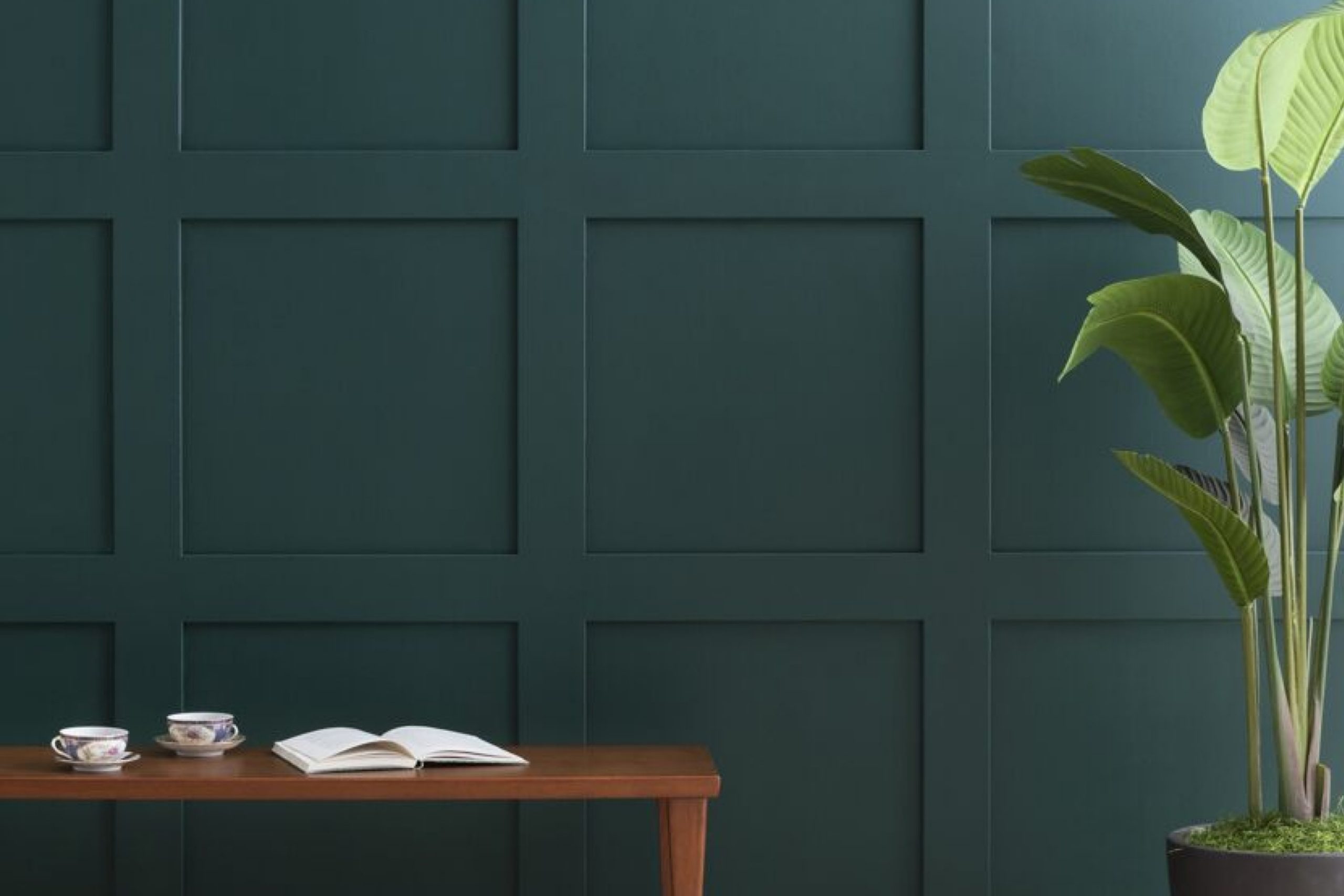
Miramichi CC-752 is a deep, muted shade of green that captures the essence of dense forest foliage after a gentle rain. It is a rich color that evokes feelings of nature, serenity, and elegance. In terms of interior styles, Miramichi is perfect for homes aiming for a cozy, earthy, or rustic feel. Its depth pairs beautifully with natural wood textures, stone finishes, and matte metals, creating an ensemble that brings nature indoors.
housekeepingbay.com
Table of Contents
Is It a Warm Or Cool Color?
Miramichi CC-752 leans more towards the cool spectrum. Its subtle blue undertones give it a calming effect, reminiscent of tranquil forest landscapes. In homes, cool colors like Miramichi can create an inviting atmosphere, making spaces feel more expansive, serene, and fresh. Especially in rooms that receive ample sunlight, this color provides a delightful balance.
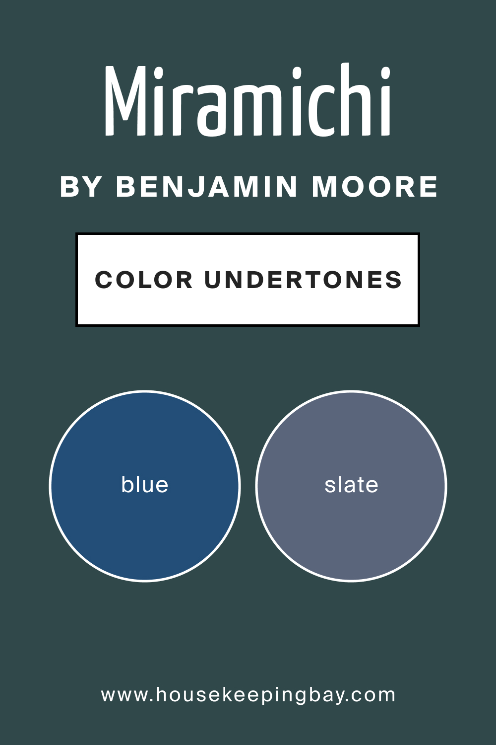
Undertones of Miramichi CC-752
Miramichi CC-752 boasts undertones of slate and ocean blue, which add depth and complexity to its appearance. Undertones play a significant role in how colors interact with other hues and how they transform under different lighting. On interior walls, the undertones of Miramichi can become more pronounced, especially when contrasted with lighter or complementary colors, adding layers of visual interest to the space.
housekeepingbay.com
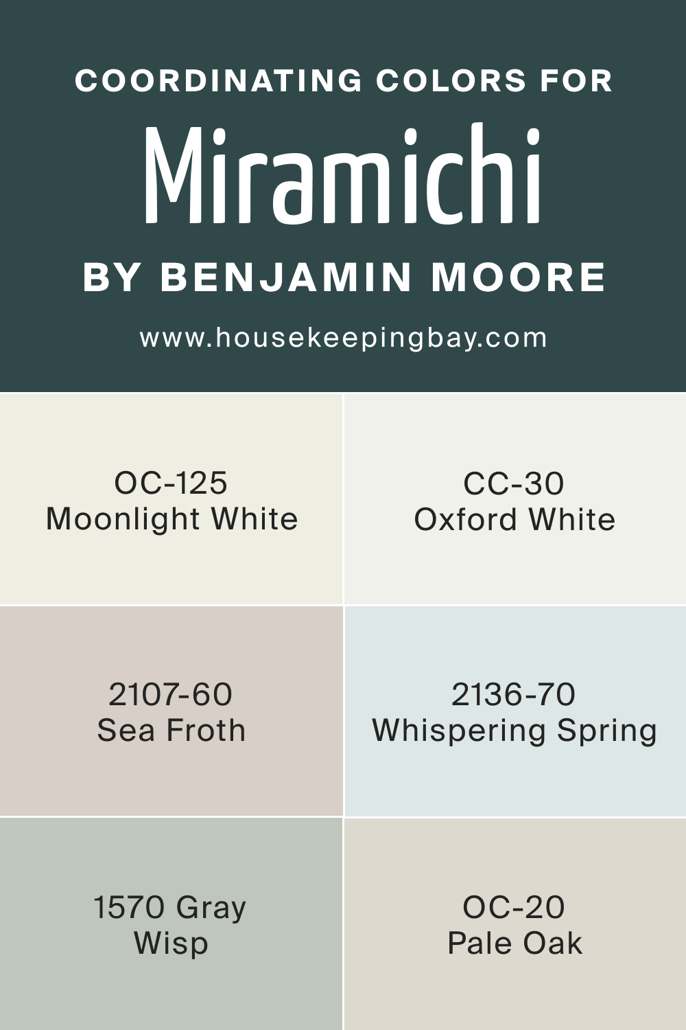
Coordinating Colors of Miramichi CC-752
Coordinating colors enhance the primary shade’s beauty by either contrasting or complementing its essence. For Miramichi CC-752:
- OC-125 Moonlight White : A delicate, luminous white with subtle undertones. It can illuminate spaces and beautifully offsets the depth of Miramichi.
- CC-30 Oxford White : rich, creamy white that provides warmth, making it a perfect companion for Miramichi’s cool demeanor.
- BM 2107-60 Sea Froth : A gentle, pastel green with a breezy feel, adding layers of lightness and airiness.
Other similar colors include BM 2136-70 Whispering Spring, BM 1570 Gray Wisp, and OC-20 Pale Oak, all of which play with varying intensities of greens and blues to harmonize with Miramichi.
housekeepingbay.com
How Does Lighting Affect Miramichi CC-752?
Lighting can dramatically alter our perception of colors. In natural light, Miramichi CC-752 appears vibrant and fresh, while artificial light can intensify its depth, making it more profound and luxurious. North-facing rooms, which tend to be cooler, might emphasize its blue undertones, giving it a more regal appearance. Conversely, south-facing rooms bring out its warmer, greenish hues. East-facing rooms in the morning light can make Miramichi feel refreshing, whereas west-facing rooms in the evening can lend it a cozy, sheltered aura.
housekeepingbay.com
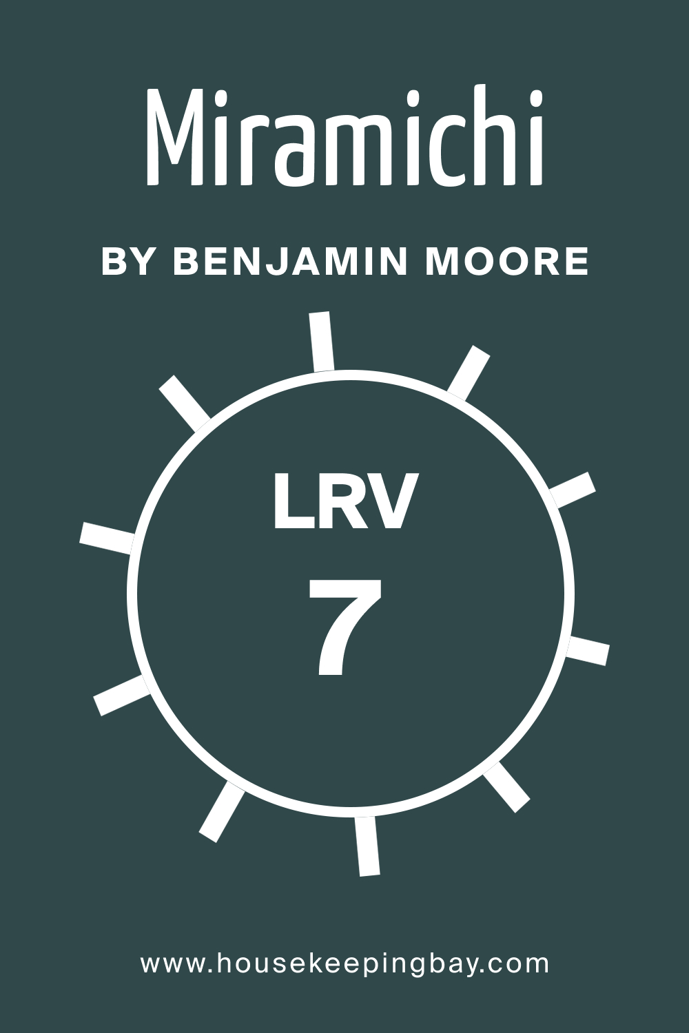
LRV of Miramichi CC-752
Light Reflectance Value (LRV) measures the percentage of light a paint color reflects. With an LRV of 7, Miramichi is on the lower end of the scale, meaning it absorbs more light and appears darker. This value makes it a statement color, perfect for accent walls, cozy corners, or spaces where a more intimate mood is desired. The lower LRV means that, in smaller rooms, it might feel overwhelming unless balanced with lighter furnishings or accents.
housekeepingbay.com
What is LRV? Read It Before You Choose Your Ideal Paint Color
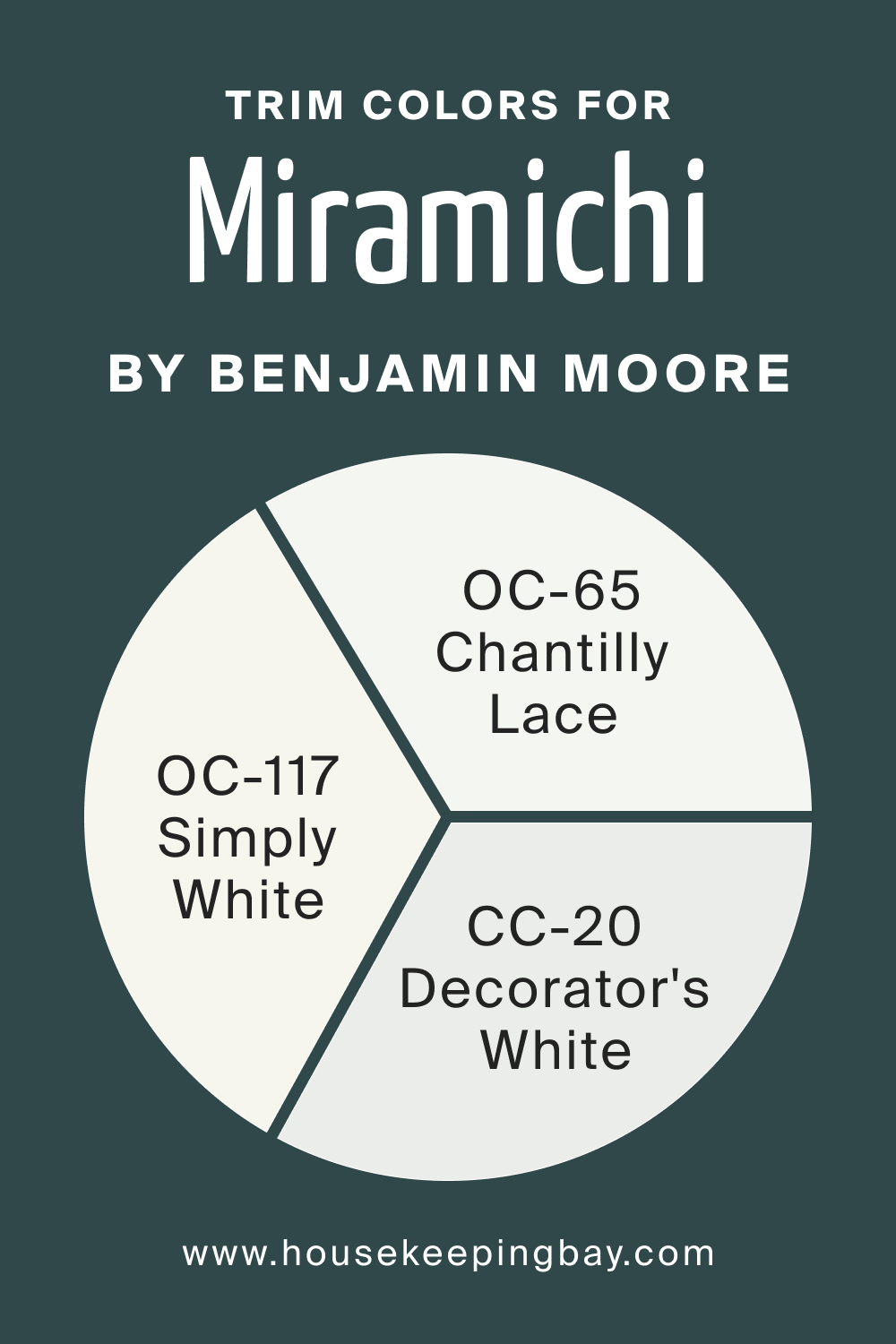
Trim Colors of Miramichi CC-752
Trim colors frame and enhance the primary wall color. For Miramichi, shades like OC-117 Simply White, OC-65 Chantilly Lace, and CC-20 Decorator’s White can be a perfect match. These shades, being variants of white, add brightness, contrast, and elevate the luxuriousness of Miramichi.
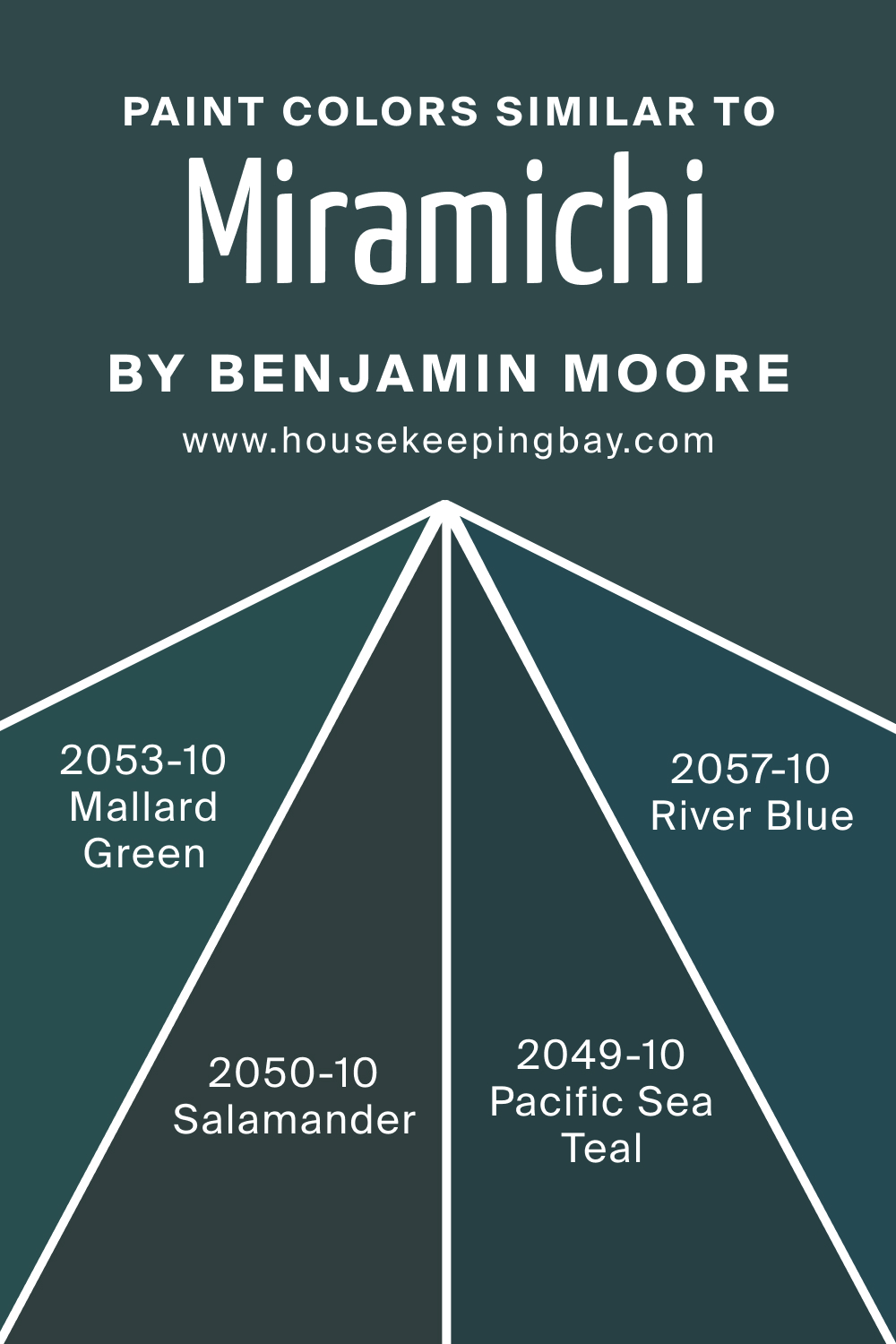
Colors Similar to Miramichi CC-752
Knowing similar colors widens design options. Instead of BM Miramichi, try one of the following colors:
- BM 2049-10 Pacific Sea Teal is a vibrant, oceanic shade;
- BM 2053-10 Mallard Green brings in earthy richness;
- BM 2050-10 Salamander offers a dash of boldness;
- BM 2057-10 River Blue , a tranquil hue.
Each color, while having its unique story, can serve as an alternative or companion to Miramichi, depending on the design vision.
housekeepingbay.com
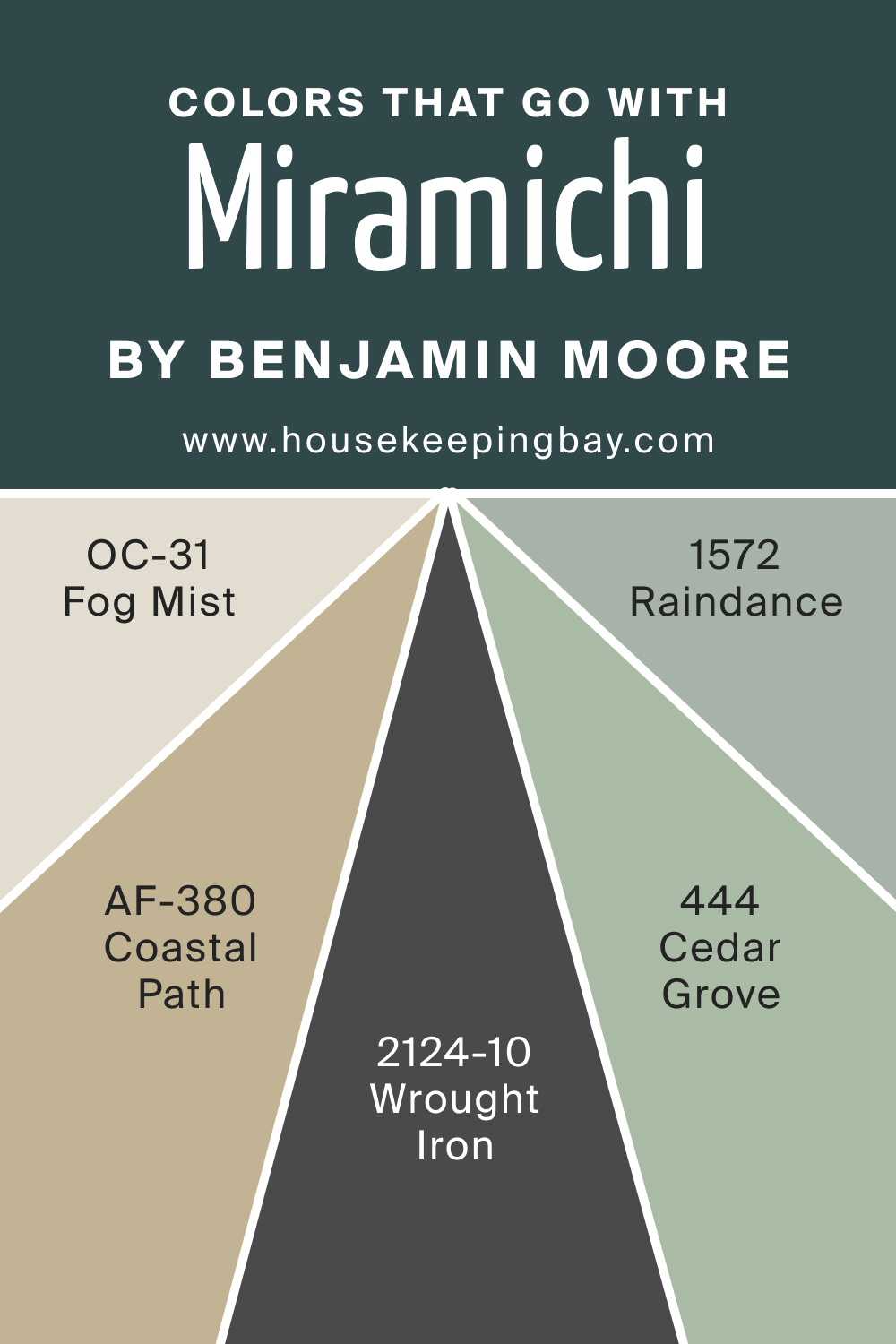
Colors That Go With Miramichi CC-752
Harmony in design often lies in color coordination. BM Miramichi can be paired beautifully with Benjamin Moore’s colors like AF-380 Coastal Path, BM 1572 Raindance, BM 444 Cedar Grove, BM 2124-10 Wrought Iron, and OC-31 Fog Mist. These colors range from earthy browns to serene blues, ensuring that they complement and highlight the elegance of Miramichi CC-752.
Creating a home is an art. With colors like Miramichi CC-752, the canvas becomes vibrant, expressive, and truly unique.
housekeepingbay.com
How to Use Miramichi CC-752 In Your Home?
Miramichi CC-752, with its deep forest green hues, is versatile and can be introduced into various rooms and design styles. This color exudes a sense of calm and is apt for creating a tranquil environment. It aligns seamlessly with traditional, rustic, and modern design styles, providing an earthly touch to Scandinavian designs or adding depth to Bohemian interiors. Whether it’s a bedroom, study, or lounge area, Miramichi provides an organic, nature-inspired backdrop.
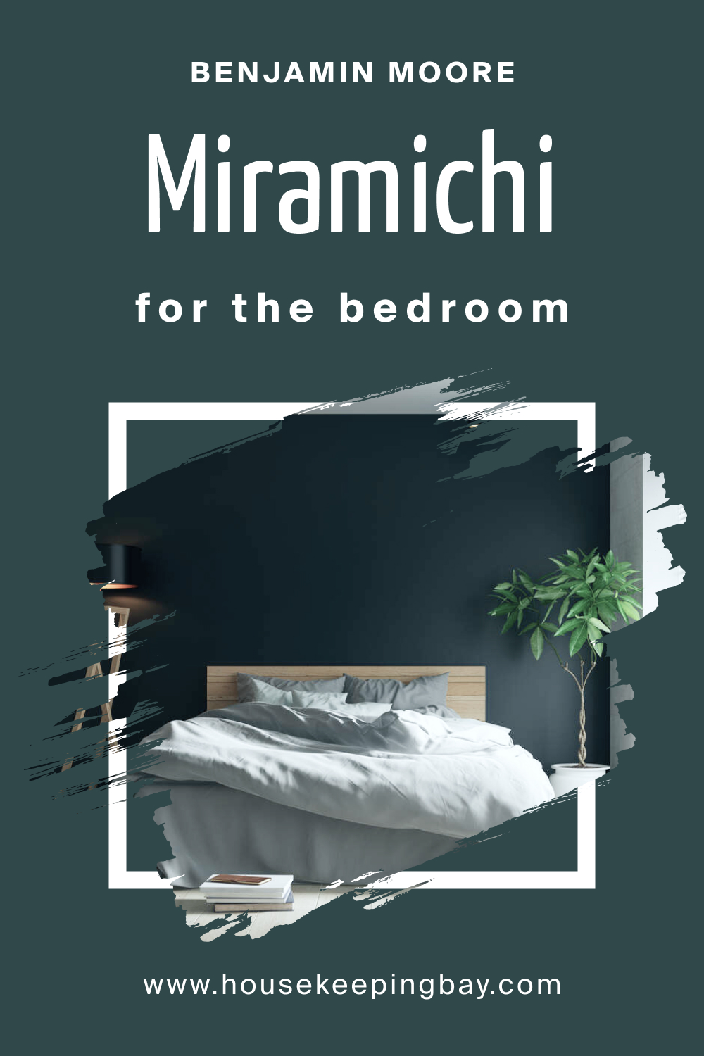
How to Use Miramichi CC-752 in the Bedroom?
In bedrooms, Miramichi creates a soothing environment conducive to relaxation and rest. Pair it with lighter linens, wooden bed frames, and natural elements like potted plants or woven baskets. Gold or brass fixtures can offer a touch of luxury, contrasting beautifully with this deep hue.
housekeepingbay.com
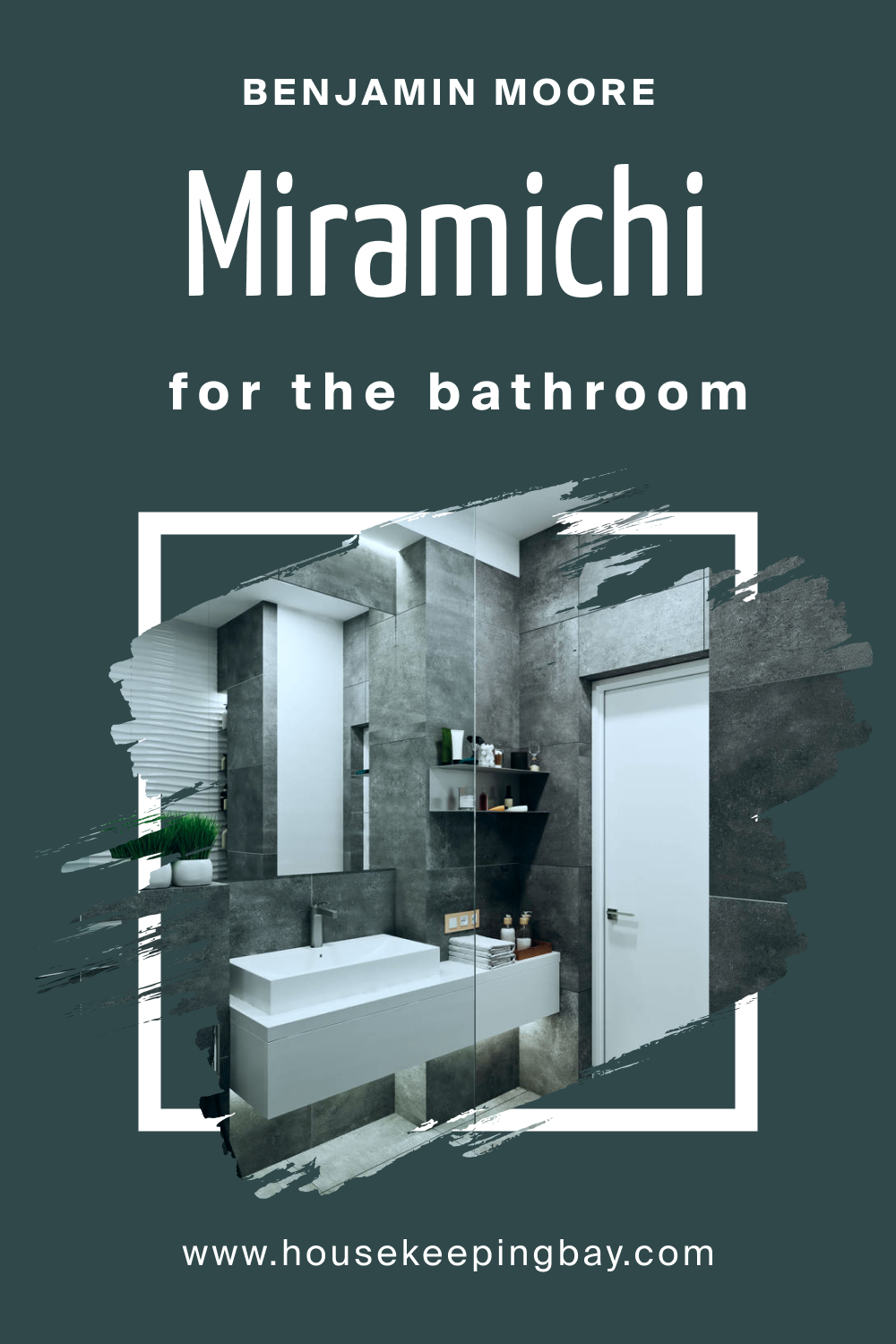
How to Use Miramichi CC-752 in the Bathroom?
Miramichi can transform bathrooms into serene spa-like retreats. Imagine soaking in a tub surrounded by this lush green! Using it on a feature wall, paired with white or light-colored tiles, and adding plants can create a refreshing oasis. Matte black or brushed bronze fixtures would accentuate its richness.
housekeepingbay.com
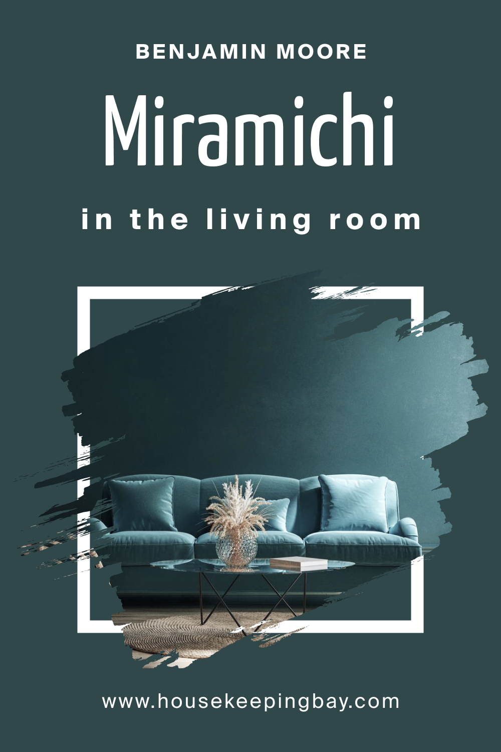
How to Use Miramichi CC-752 in the Living Room?
In living rooms, Miramichi provides a robust backdrop that highlights decor elements. Consider using it on a primary wall, offset by neutral-colored furniture. Accessorize with earth-toned cushions, throws, and wooden elements. Art pieces with gold or copper tones would stand out beautifully against this color.
housekeepingbay.com
How to Use Miramichi CC-752 for an Exterior?
For exteriors, Miramichi is a bold choice that harmonizes with nature. It’s particularly stunning for homes surrounded by greenery. Pairing it with white or beige trims can provide a classic appearance, while darker trims create a contemporary, sleek look.

housekeepingbay.com
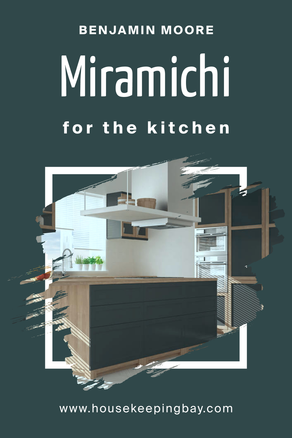
How to Use Miramichi CC-752 in the Kitchen
Miramichi in the kitchen offers an inviting ambiance. Use it as a backdrop, complemented by white or light-colored countertops. Introducing open wooden shelves or metallic fixtures can bring warmth and modernity. Plants, again, can be a lovely addition to enhance the organic vibe.
housekeepingbay.com
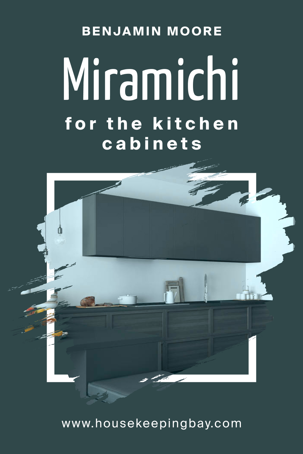
How to Use Miramichi CC-752 on the Kitchen Cabinets
For a dramatic kitchen transformation, painting cabinets in Miramichi is a game-changer. It makes the kitchen feel cozy yet sophisticated. Pair these dark green cabinets with light countertops, such as white marble or quartz, for a striking contrast. Gold or brass handles and knobs would add a touch of elegance.
housekeepingbay.com
Comparing CC-752 Miramichi With Other Colors
Colors can significantly impact the atmosphere and mood of a space. Comparing shades helps in understanding undertones, depth, and how they interact with light or other hues in a setting. It allows homeowners and designers to envision how a particular color might fit into a design scheme and how it contrasts or complements other colors. By juxtaposing Miramichi CC-752 with other colors, one can discern its unique attributes and evaluate how it might stand out or blend in various design situations.
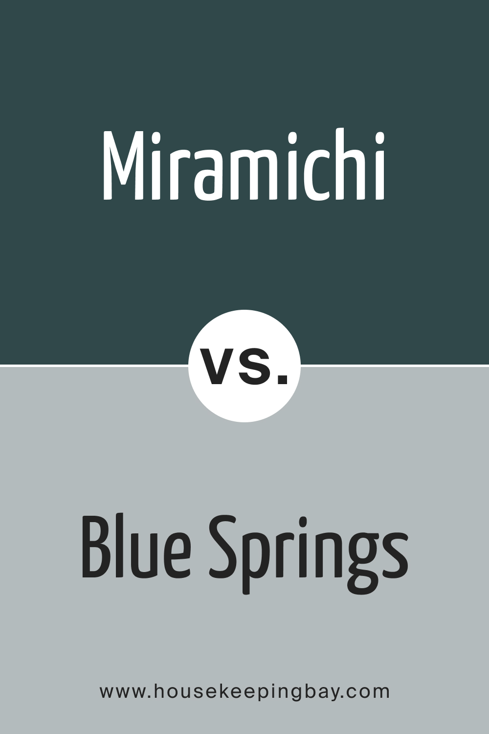
Miramichi CC-752 vs. BM 1592 Blue Springs
While Miramichi is a lush forest green, Blue Springs tends towards a muted blue-gray hue. Blue Springs can evoke a coastal vibe with its calm and airy quality, whereas Miramichi roots you in woodland serenity.
housekeepingbay.com
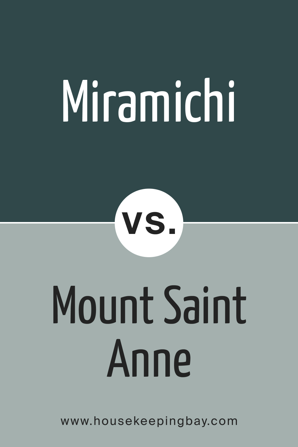
Miramichi CC-752 vs. BM 1565 Mount Saint Anne
Mount Saint Anne carries a blue-gray undertone with a touch of teal. While both colors are deep and rich, Mount Saint Anne has a more aquatic feel, reminiscent of ocean depths, whereas Miramichi brings to mind dense, serene forests.
housekeepingbay.com
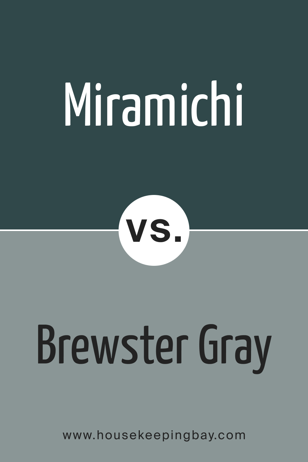
Miramichi CC-752 vs. HC-162 Brewster Gray
Brewster Gray is a true gray with cool undertones. In contrast to the green depths of Miramichi, Brewster Gray offers a neutral, contemporary feel, making spaces feel modern and clean.
housekeepingbay.com
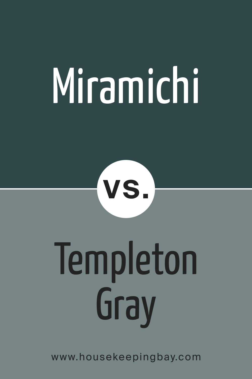
Miramichi CC-752 vs. HC-161 Templeton Gray
Templeton Gray tends towards a gray with subtle blue undertones. While both colors are sophisticated and deep, Templeton Gray evokes a cooler, more refined atmosphere compared to the earthy warmth of Miramichi.
housekeepingbay.com
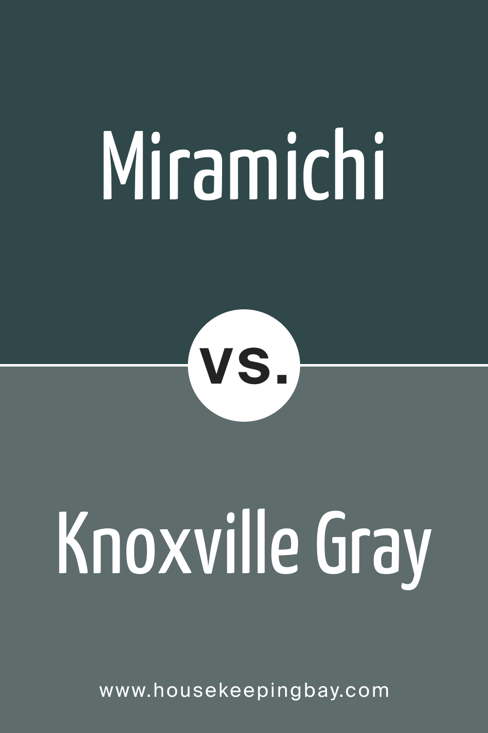
Miramichi CC-752 vs. HC-160 Knoxville Gray
Knoxville Gray , with its deep blue-gray undertone, resembles twilight skies. Compared to the forest-inspired Miramichi, Knoxville provides a more nocturnal and mysterious ambiance.
housekeepingbay.com
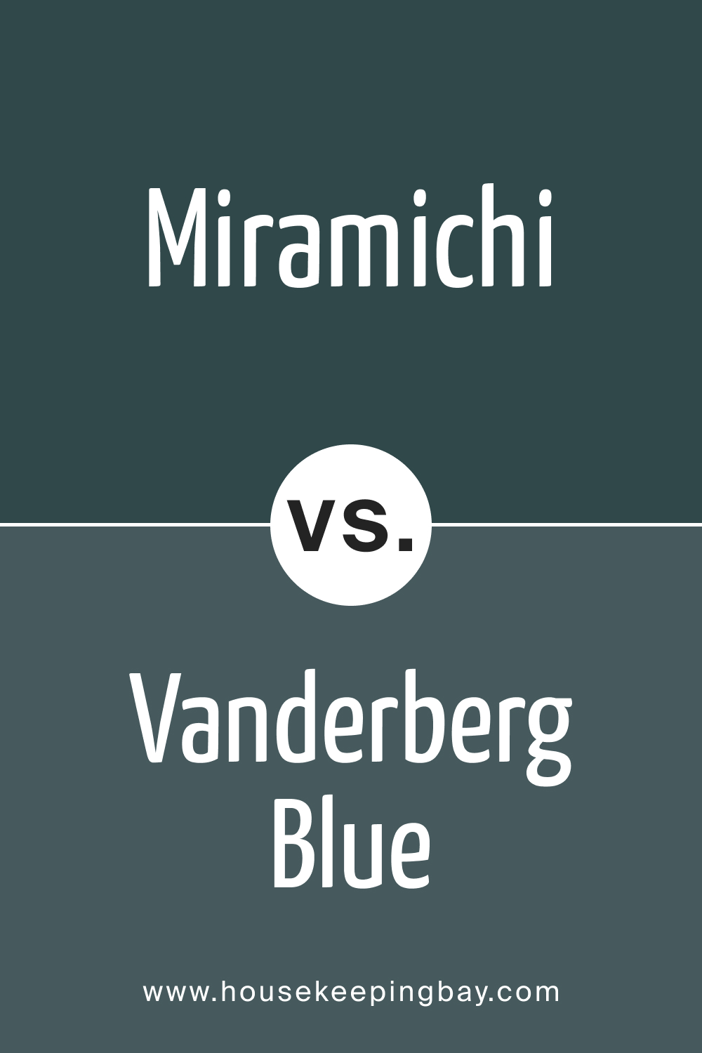
Miramichi CC-752 vs. BM 721 Vanderberg Blue
Vanderberg Blue , as the name suggests, is a striking shade of blue. It’s vibrant and energetic in comparison to the subdued and grounding nature of Miramichi. Where Vanderberg feels fresh and lively, Miramichi exudes calmness.
housekeepingbay.com
Conclusion
Miramichi CC-752 is a versatile color, evoking feelings of serenity and nature. Its deep green essence makes it unique, especially when compared to grays and blues. Such comparisons help in understanding its versatility and the range of emotions it can bring out in a space. Whether you want to create a calming oasis or a lively hub, understanding the nuances between these colors can guide you in achieving the desired ambiance.
housekeepingbay.com
Ever wished paint sampling was as easy as sticking a sticker? Guess what? Now it is! Discover Samplize's unique Peel & Stick samples. Get started now and say goodbye to the old messy way!
Get paint samples


