Top 39 Grey Green Paint Color by Sherwin Williams
The calmest, green-greys I use in real homes—with notes on where they work best
I still remember the first time I used a grey-green paint. It was for a small reading nook, and I wanted something calm, but not boring. Something with depth, but not too dark. I picked a Sherwin-Williams shade that sat right in the middle of green and grey—and it changed everything.
Grey-green paint does something really special. It can make a room feel grounded and soft at the same time. It has that earthy vibe without looking dull. It’s neutral enough to go with almost anything, but it still has personality. And honestly? It makes people feel good when they walk in. That’s not just me saying that—color psychology studies show that green tones can lower stress and help us focus .
In the last couple of years, more and more of my clients have asked for colors that feel natural and calm—but they don’t want beige. They want something that looks updated, soft, and a little special. That’s why grey-green is everywhere right now.
Whether you’re painting your kitchen cabinets, giving your bathroom a little refresh, or thinking of a cozy shade for your living room, this list of 39 Sherwin-Williams grey-green colors will help you find the right one. I’ve used most of them in real homes—and I’ll tell you which ones I reach for again and again.
housekeepingbay.com
Why Grey-Green Works in Every Room
There’s a reason I always keep a few grey-greens in my paint bag. These shades can do so much without shouting for attention. They’re soft, quiet, and feel like a deep breath—but they’re not flat. They shift a little with the light, which makes them feel alive.
The Emotional Power of Grey-Green
Green is connected to nature, so it feels calming. Grey adds balance and keeps it from looking too colorful. Together? They create this really comfortable background that makes people want to stay in the room.
A 2020 study from the Journal of Environmental Psychology found that green shades are linked to better focus, lower anxiety, and even improved creativity in workspaces . That’s why grey-green works not just in bedrooms and living rooms, but in home offices and kitchens too.
Style Chameleon
What I love about grey-green is how it works with so many styles:
- In a modern home, it looks clean and natural.
- In a farmhouse or cottage, it feels cozy.
- In a classic home, it looks rich and grounded.
I used one of my favorite mid-tone grey-greens on kitchen cabinets for a young couple last fall. Paired with brass hardware and warm white walls, the whole room felt both modern and timeless. And six months later, they’re still texting me saying how much they love it.
Things to Know Before You Choose a Grey-Green Paint
Grey-green looks amazing—if you choose the right one for your room. But the same paint color can look totally different depending on the lighting, finish, and even what’s around it. Here’s what I always remind people before they commit.
1. Light Changes Everything
This is the big one. Natural light, warm bulbs, north-facing windows—they all shift how a paint color looks.
- In north-facing rooms, grey-greens can go cooler and more shadowy.
- In south-facing rooms, they get warmer and sometimes greener.
- At night, under artificial light, some shades can turn almost gray or even blue.
👉 My advice: test swatches on every wall and check them in the morning, afternoon, and evening. What looks amazing at noon can feel cold at night.
2. Finish Makes a Difference
Do you want a flat look or a bit of shine? Here’s what I usually recommend:
- Matte or Flat: Good for bedrooms and living rooms. Hides wall flaws.
- Satin or Eggshell: My go-to for kitchens, hallways, and bathrooms. Easy to clean and soft-looking.
- Semi-Gloss: Best for trim and doors. Makes the color pop.
I once used the exact same color—SW 6171 Chatroom—on both a dining room wall (matte) and the kitchen island (semi-gloss). You wouldn’t believe it was the same paint. One felt cozy, the other felt sharp and modern.
3. Compare, Compare, Compare
Don’t look at just one swatch. Look at at least three that are close. Your eye will start to see whether you want more green, more grey, or something with a touch of blue or brown.
“Never pick a color without seeing it in your space first. The lighting in stores or online swatches is not your lighting.” — Sue Wadden, Sherwin-Williams Director of Color Marketing .
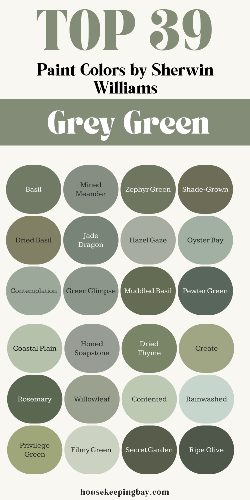
Top 39 Grey-Green Paint Colors by Sherwin-Williams
Soft & Light Grey-Greens
These are perfect when you want just a hint of color. They feel airy, calm, and clean.
- SW 6204 Sea Salt
A favorite for bathrooms and bedrooms. Feels like a spa. - SW 6199 Rare Gray
Whispery soft. I’ve used it in nurseries—it feels so gentle. - SW 6169 Sedate Gray
A little warmer than others. Nice for living rooms with wood floors. - SW 6203 Spare White
Barely green. Clean and soft without being stark. - SW 6208 Pewter Green (lightened 50%)
Try this if you like Pewter Green but want it softer. - SW 6195 Rock Garden (lightened 75%)
Very subtle. Lovely in entryways with natural light. - SW 6183 Conservative Gray
One of the most neutral green-greys. Works with everything. - SW 6190 Filmy Green
Just a breath of green. It almost feels like air. - SW 6207 Retreat (lightened 50%)
Same richness, just softer. Nice for guest rooms. - SW 6187 Rosemary (lightened 75%)
Super soft and cozy when lightened. - SW 6202 Castlegate
Barely-there sage. Really easy to live with. - SW 6196 Cascade Green (lightened 50%)
Dreamy in a kitchen with warm white cabinets. - SW 6206 Oyster Bay (lightened 50%)
This one glows in morning light. Perfect for breakfast nooks.
housekeepingbay.com
Mid-Tone & Moodier Grey-Greens
These are the “just right” tones. You’ll see the color clearly, but it won’t take over.
- SW 6207 Retreat
I’ve used this one on kitchen cabinets. Feels classic and calm. - SW 6192 Coastal Plain
Beautiful on bathroom walls. Pairs well with warm brass. - SW 6205 Comfort Gray
Feels coastal and fresh. Great for open floor plans. - SW 6171 Chatroom
The name fits—it’s warm, welcoming, and easy to talk around. - SW 6206 Oyster Bay
Nice depth, still light enough for big rooms. - SW 6186 Dried Thyme
More green than grey. Earthy but still balanced. - SW 6201 Thunderous
A bit moodier. I love this in a study or media room. - SW 6188 Shade-Grown
Almost mossy. Pairs well with leather and wood. - SW 6191 Contented
Soft with a touch of blue. I used it in a sunroom—it sings with light. - SW 6211 Rainwashed
Cool and clean. Has a slight coastal vibe. - SW 6193 Privilege Green
Slightly retro in the best way. Would be great on built-ins. - SW 6194 Basil
This is warm and grounding. Good for entryways or cabinets. - SW 6209 Ripe Olive (lightened 50%)
Deep base, but when lightened it becomes a rich mid-tone.
housekeepingbay.com
Deep, Bold & Dramatic Grey-Greens
These are for accent walls, cabinets, or full rooms when you want something bolder.
- SW 6170 Techno Gray
Strong and architectural. Looks amazing with black accents. - SW 6177 Softened Green
Very rich. I used it in a formal dining room—it was perfect. - SW 6208 Pewter Green
My go-to for cabinets and front doors. Elegant and grounded. - SW 6198 Sensible Hue
Slightly muted olive. Great in traditional homes. - SW 6197 Aloof Gray
Very cool-toned. Better in rooms with warm lighting. - SW 6200 Link Gray
Clean and bold without being too dark. - SW 6185 Escape Gray
Hint of blue undertone. Works with dark woods beautifully. - SW 6190 Filmy Green (at full strength)
Light, but looks deeper in shady corners. - SW 6189 Ripe Olive
Rich and dramatic. I’ve used it in moody powder rooms. - SW 6181 Secret Garden
Almost military green. Looks stunning with brass and marble. - SW 6184 Austere Gray
Classic and confident. Ideal for libraries or offices. - SW 6202 Castlegate (at full strength)
More bold than you’d think. Almost like stone in color.
How to Pair Grey-Green with Trim, Wood, and More
Choosing a paint color is only part of the story. What you put next to it matters just as much. Grey-green tones shift depending on what you pair them with—so here are my go-to combinations that always work.
Best Trim Colors with Grey-Green
You don’t need to guess. Stick with these and you won’t go wrong:
- SW 7008 Alabaster
A soft white with warmth. Makes grey-greens feel cozy. - SW 7005 Pure White
Clean and crisp. Use this if you want a modern contrast. - SW 7012 Creamy
More yellow in it—great if your grey-green leans cooler.
When I painted a living room in SW 6192 Coastal Plain, I paired it with Alabaster trim and light oak floors. The room felt soft, fresh, and easy to be in.
Wood Tones That Work
This part is really important. The wrong wood tone can make a perfect grey-green look muddy. Here’s what I’ve learned from doing this in real homes:
- Light Oak or Whitewashed Wood – Works with almost all grey-greens. Keeps the look airy.
- Walnut or Rich Brown Wood – Adds warmth. Great with darker tones like Pewter Green or Dried Thyme.
- Red-toned Woods (like cherry) – Can clash. Stick with grey-greens that lean cooler, like Escape Gray.
Metals and Fixtures
- Brass or Aged Gold – Yes, please. Adds warmth and elegance. Perfect with mid-tones like Retreat or Oyster Bay.
- Matte Black – Gives a crisp, bold look. I love it with deeper greens.
- Chrome or Polished Nickel – Best with cooler grey-greens like Rainwashed.
I once staged a mudroom with SW 6186 Dried Thyme, matte black hooks, and light wood benches. It sold in 6 days. The color scheme felt calm but styled—buyers noticed it right away.
Fabrics and Textures That Love Grey-Green
Grey-green paint loves texture. It brings out the color depth.
- Linen and cotton in warm whites or oatmeal
- Leather—especially caramel or tobacco tones
- Textured knits, rattan, and woven baskets
- Deep charcoal or taupe pillows
One of my favorite combos was SW 6205 Comfort Gray walls, a linen slipcovered sofa, and an old reclaimed wood coffee table. Nothing matched, but everything felt calm and lived-in.
Let Me Leave You with This
I’ve painted a lot of rooms in my life. I’ve tried bolder colors, brighter ones, and every kind of neutral. But grey-green is the one I come back to again and again. It makes a home feel grounded. Not trendy. Not cold. Just right.
When people walk into a room painted in one of these shades, they pause. They breathe. They say things like, “This just feels good.” And that’s not something you can force with design—it has to come from the feeling a space gives you.
So if you’ve been circling around grey-greens but haven’t made the leap—test a few swatches. Live with them for a day or two. See what makes you feel good when you walk by.
Because in the end, that’s what color is for. Not just to look pretty, but to make you feel home.
housekeepingbay.com
