Double Latte SW 9108 by Sherwin Williams
Igniting Warmth in Every Space
If you’re on the lookout for a warm, inviting neutral paint color, SW 9108 Double Latte by Sherwin Williams might just be the perfect choice for you. This cozy shade falls right in between a soothing beige and an inviting cream, making it an ideal backdrop for various decor styles. It has the ability to create a comforting atmosphere in any room, from living spaces to bedrooms.
Double Latte brings a sense of warmth without overwhelming a space. It pairs beautifully with rich woods, soft textiles, and can also serve as a delicate contrast against darker colors, enhancing the overall aesthetic of your home.
Whether you aim to achieve a traditional look or want to add a classical touch to a modern design, Double Latte offers a smooth transition between different elements in a room.
When considering new paint options, SW 9108 Double Latte has a lot to offer. It’s not just a paint color, but a way to add subtle richness and warmth to your living environment.
So, if you’re thinking about refreshing your home’s color scheme, consider how Double Latte can complement your existing decor or inspire a new design direction.
via sherwin-williams.com
What Color Is Double Latte SW 9108 by Sherwin Williams?
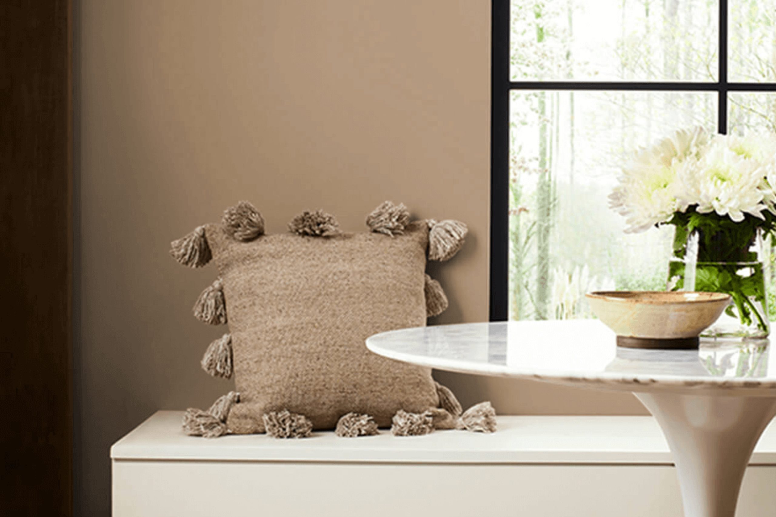
Double Latte SW 9108 by Sherwin Williams is a warm and creamy beige hue that exudes a soft yet welcoming ambience. This color is versatile, creating a cozy environment in any room. It’s a perfect choice for those keen on achieving a neutral backdrop that allows for easy styling with other colors and elements.
The subtlety of Double Latte makes it ideal for interior styles such as modern farmhouse, traditional, and contemporary.
Its inherent warmth makes rooms feel inviting without overwhelming the senses with bold color. This shade functions beautifully in living rooms, bedrooms, and kitchens, providing a calm, cohesive look throughout the home.
When considering materials, Double Latte pairs wonderfully with natural wood, enhancing its warm undertones. It also looks lovely with textured fabrics like linen or chunky knits, adding depth and interest to the space. For a sleek, polished look, incorporate metals such as brass or brushed nickel, which contrast beautifully against its creamy background.
Incorporating Double Latte into a home allows for flexibility in decor while maintaining a sophisticated and unified aesthetic. It supports a range of color palettes, from soft pastels to rich, dark tones, ensuring longevity in design preferences.
housekeepingbay.com
Is Double Latte SW 9108 by Sherwin Williams Warm or Cool color?
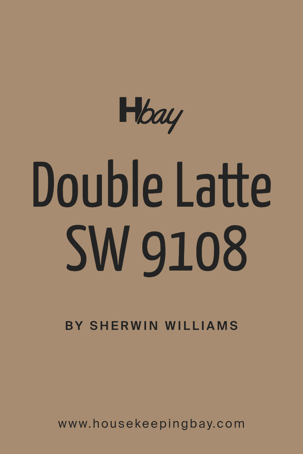
Double Latte SW 9108 by Sherwin Williams is a rich and warm paint color that brings a cozy vibe to any room in your home. Its deep caramel hue resembles the creamy mix of milk and espresso, making spaces feel inviting and comfortable.
This color is versatile, working well in living areas, bedrooms, or even kitchens, adding a touch of elegance without being overpowering.
When used on walls, Double Latte can make large spaces feel more intimate and smaller rooms appear more snug and welcoming. It pairs excellently with muted greens, soft creams, or even bold colors like navy blue for a balanced and harmonious look.
Ideal for both modern and traditional interiors, this paint can help highlight wood furniture and flooring, adding an extra layer of warmth. Natural light enhances the creamy aspects of Double Latte, while artificial lighting brings out its deeper tones, making it a great choice for any lighting situation in a home.
What is the Masstone of the Double Latte SW 9108 by Sherwin Williams?
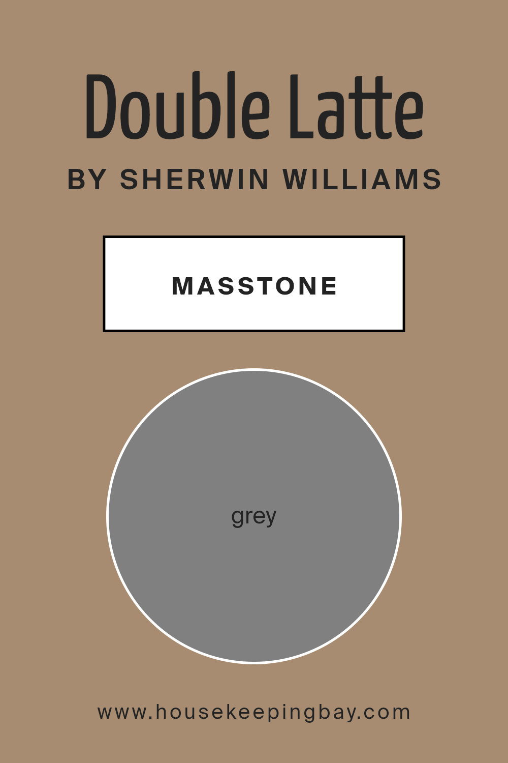
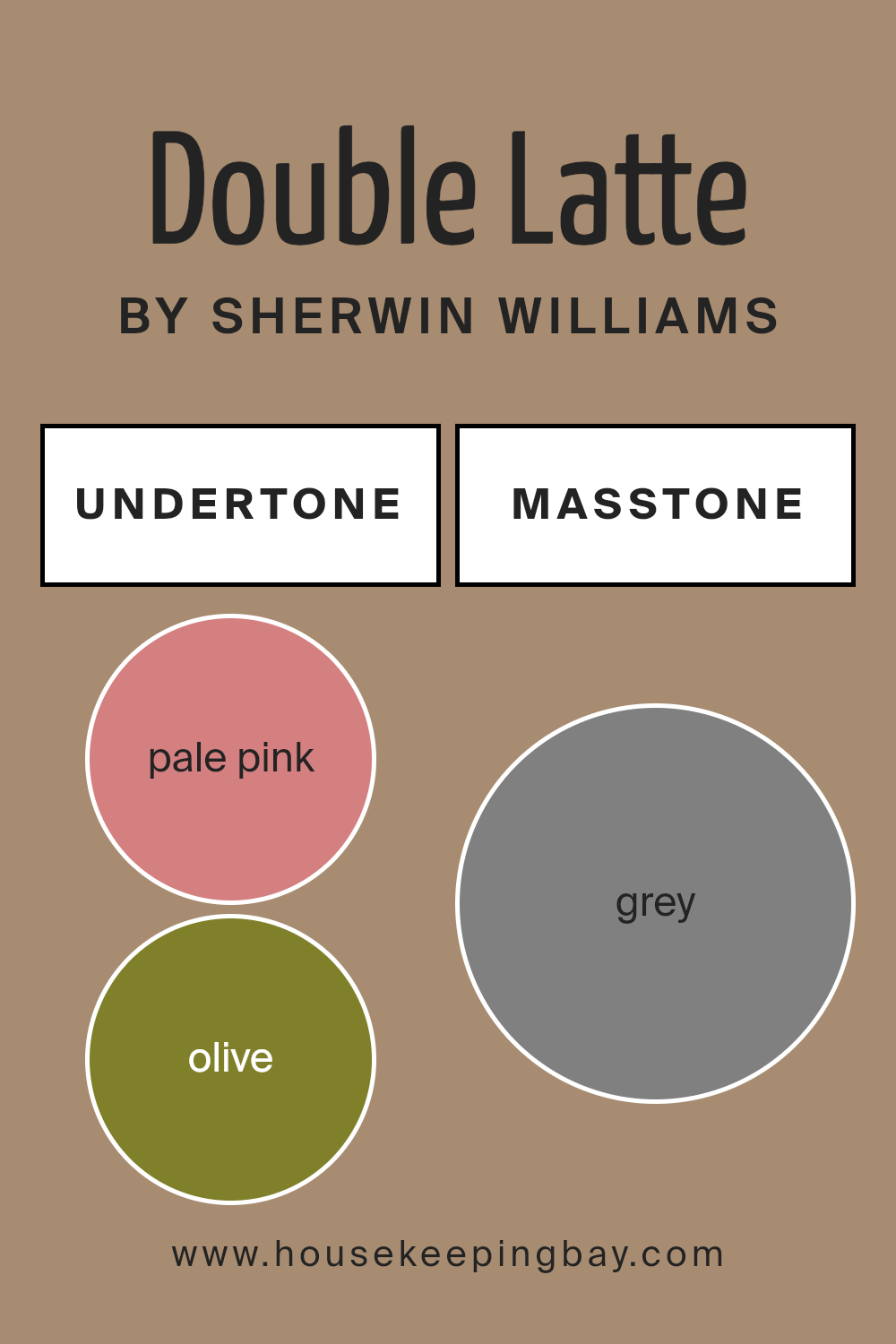
Double Latte SW 9108 by Sherwin Williams has a masstone that is similar to Grey (#808080). This neutral shade is a versatile choice for home interiors because it serves as a solid foundation that works well with a wide range of decorating styles and color schemes.
Grey, as a masstone, imparts a balanced, sophisticated vibe without overwhelming the senses. This makes Double Latte SW 9108 an excellent pick for those aiming for a look that is both modern and timeless.
In homes, this color can effectively enhance spaces to look more refined and orderly. It is particularly useful in areas where you want to achieve a calm atmosphere, such as bedrooms and living rooms, since grey doesn’t clash with other colors and helps maintain a smooth visual flow. Additionally, grey is practical as it conceals minor imperfections better than lighter colors and requires less maintenance. Overall, Double Latte SW 9108 can help in achieving a chic and pulled-together look in any home setting.
housekeepingbay.com
Undertones of Double Latte SW 9108 by Sherwin Williams
Double Latte SW 9108 by Sherwin Williams is a versatile paint color with a complex mix of undertones. The undertones in a paint color are subtle hues that can influence how the color appears under different lighting conditions and when juxtaposed with other colors. For Double Latte SW 9108, the undertones range across a broad spectrum including pale pink, olive, mint, orange, and more.
In interior settings, these undertones play a significant role in defining the ambiance of a room. For instance, the pale pink and lilac undertones in Double Latte can impart a soft, gentle feel to a space, making it ideal for bedrooms or bathrooms where a calm atmosphere is desired.
On the other hand, the brown and dark turquoise undertones provide a grounding effect, suitable for living rooms or offices where a sense of stability is important.
The diverse undertones also mean that Double Latte can react differently to various lighting conditions. Natural light can bring out the lighter, more vibrant undertones like mint and pale yellow, giving the room a fresher look.
In contrast, artificial lighting might highlight the darker undertones like brown and dark green, creating a cozier and more enclosed feel.
When used on interior walls, Double Latte SW 9108 offers a dynamic range of expressions depending on the furnishings and decor.
This adaptability makes it a practical choice for many homeowners looking for both sophistication and flexibility in their color schemes.
housekeepingbay.com
Coordinating Colors of Double Latte SW 9108 by Sherwin Williams
Coordinating colors work together to create a harmonious look in a space, complementing a primary color like Double Latte SW 9108 by Sherwin Williams. These coordinating shades help achieve balance and enhance the design by either providing subtle contrasts or reinforcing the main color.
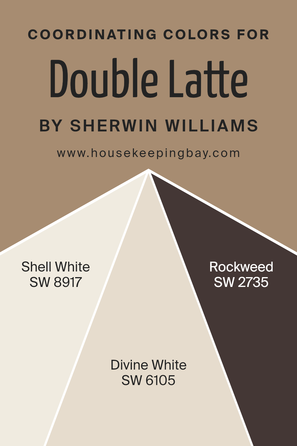
By selecting shades such as SW 8917 – Shell White, SW 6105 – Divine White, and SW 2735 – Rockweed, one can effectively design a room that has visual coherence and a pleasant aesthetic flow.
Shell White SW 8917 is a soft, clean color that offers a gentle restfulness to any room, making it a perfect backdrop for richer tones like Double Latte. It’s subtle enough not to overwhelm but provides a neat, crisp finish. Divine White SW 6105, with its warm undertones, complements deeper colors and works well to create a cozy and inviting space.
It adds a touch of warmth without overpowering the primary color. On the other hand, Rockweed SW 2735 is a deeper, earthy green that adds a natural, grounding element to spaces, pairing well with the warm, comforting hue of Double Latte. It provides an excellent contrast, especially in areas needing a touch of nature’s calmness.
You can see recommended paint colors below:
- SW 8917 Shell White
- SW 6105 Divine White
- SW 2735 Rockweed
housekeepingbay.com
How Does Lighting Affect Double Latte SW 9108 by Sherwin Williams?
Lighting plays a crucial role in how we perceive colors. The type of light under which a color is viewed can significantly change its appearance. Double Latte SW 9108 by Sherwin Williams is a rich, creamy hue that can look different depending on the lighting conditions.
In artificial light, Double Latte tends to appear warmer and more inviting. This warmth is due to the yellow or warm white bulbs commonly used in home lighting, which enhance the creamy and beige tones of Double Latte. This effect makes it an excellent choice for living rooms and bedrooms, where a cozy and pleasant atmosphere is often desired.
In natural light, the color shifts depending on the time of day and the weather. On a sunny day, Double Latte can look lighter and show more of its underlying yellow undertones, making the space feel airy and fresh.
On a cloudy day, it might appear more muted, bringing out a subtler, more neutral aspect of the color.
The orientation of the room also affects how Double Latte looks:
- 1. North-facing rooms: These rooms get less direct sunlight, which can make colors appear cooler. Double Latte may seem more subdued and slightly grayer in these conditions, giving off a softer and calmer feel.
- 2.South-facing rooms: These rooms benefit from abundant, bright light most of the day. Here, Double Latte will look warmer and more vibrant, enhancing the welcoming and soothing vibe of the space.
- 3.East-faced rooms: These rooms enjoy morning light. Double Latte will look very lively and bright in the morning and might transition to a softer tone as the day progresses.
- 4.West-faced rooms: In these rooms, the afternoon and evening light can make Double Latte glow warmly, creating a cozy and inviting atmosphere, especially towards the end of the day when the sunlight turns golden.
Understanding these effects can help in choosing the right paint color for each room, depending on its use, desired mood, and when the room is most in use.
housekeepingbay.com
What is the LRV of Double Latte SW 9108 by Sherwin Williams?
LRV stands for Light Reflectance Value, a measure that indicates what percentage of light a paint color reflects back into a room. The scale runs from 0%, which means no light is reflected and is an absolute black, to 100%, which indicates that all the light is reflected back, appearing as a true white.
This measure is critical when choosing paint colors because it affects how light or dark a color looks on your walls and how it impacts the overall brightness of a room. A higher LRV means the room can look lighter and more open, while a lower LRV can make a room appear cozier and more intimate.
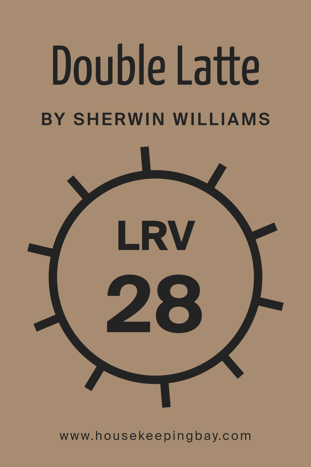
With a LRV of 28.013, Sherwin Williams’ Double Latte SW 9108 will reflect a modest amount of light, making it a darker shade. This characteristic means it can be ideal for creating a warm, inviting atmosphere in spaces like living rooms or bedrooms where a sense of comfort is desired.
However, in a smaller or less naturally lit space, using a color with a low LRV might make the room feel smaller or darker. Therefore, if used in such conditions, careful consideration of lighting and accompanying decor is essential to balance the ambiance and ensure the space does not become too enclosed.
housekeepingbay.com
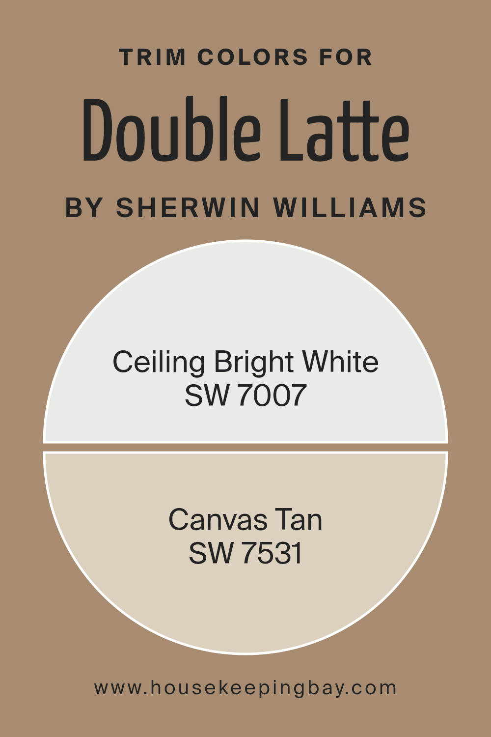
What are the Trim colors of Double Latte SW 9108 by Sherwin Williams?
Trim colors are the shades used on the edges, frames, doors, and moldings in a room or building that enhance visual appeal and create a distinct, polished look. When paired with a main color like Double Latte SW 9108 by Sherwin Williams, selecting the right trim colors is crucial as they highlight the unique features of the space and provide a subtle contrast that can make the wall color stand out more.
For Double Latte SW 9108, a rich and creamy hue, using contrasting trim colors can augment the overall aesthetic of a room, giving it a more cohesive and refined appearance.
SW 7007 – Ceiling Bright White is a crisp, clean shade of white that helps to make a space feel more open and airy. When used as a trim color with Double Latte SW 9108, it offers a fresh and sharp border that accentuates the warmer tones of the walls.
On the other hand, SW 7531 – Canvas Tan is a soft, neutral beige that harmonizes beautifully with earthy and warm colors like Double Latte. As a trim color, Canvas Tan provides a soothing and gentle transition from the wall color, adding a layer of subtle elegance without overwhelming the senses.
Together, these trim colors complement Double Latte SW 9108 by enhancing its warmth and making the space more inviting.
You can see recommended paint colors below:
housekeepingbay.com
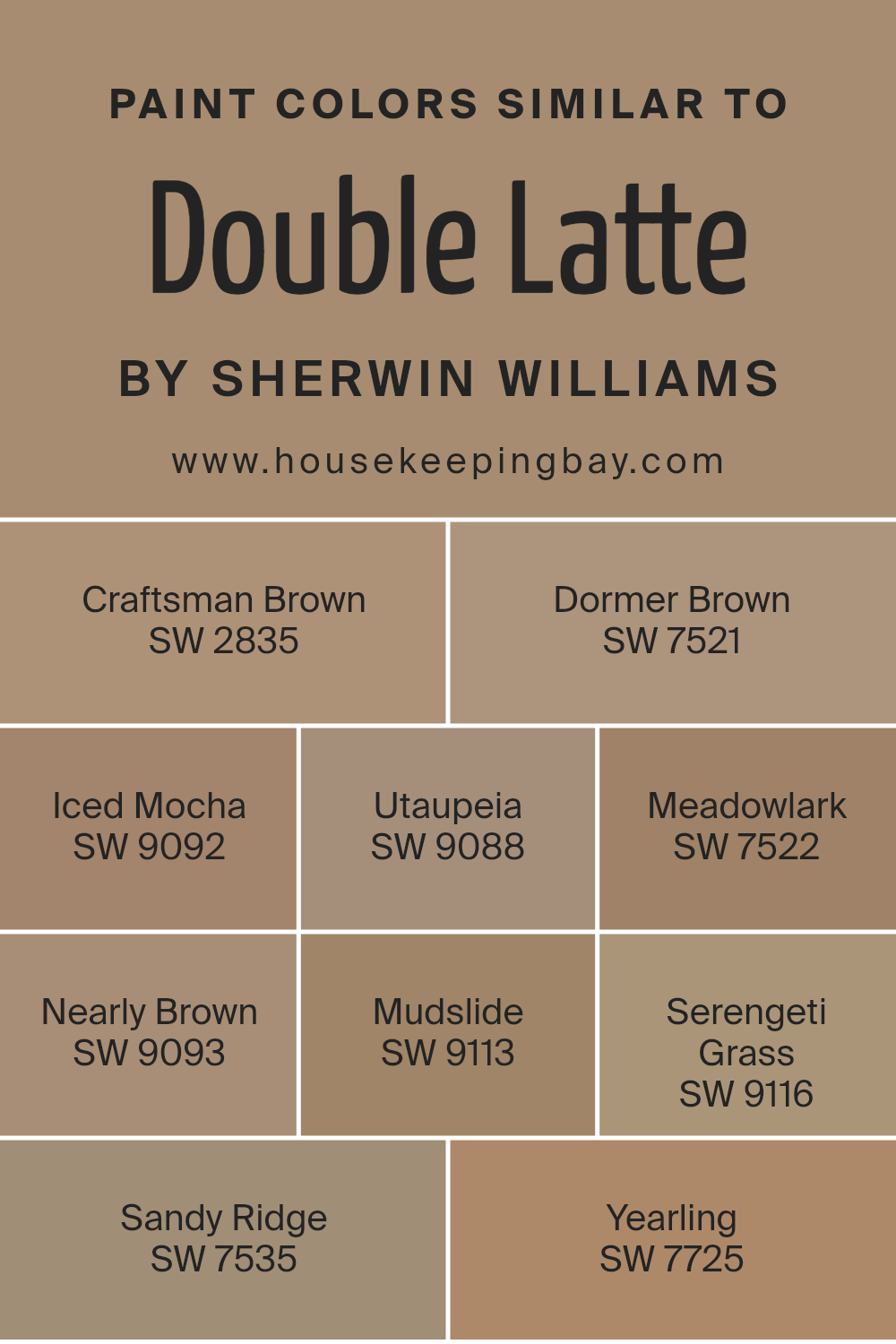
Colors Similar to Double Latte SW 9108 by Sherwin Williams
Similar colors are important in design because they help create a harmonious and cohesive look. When colors like those close to Double Latte SW 9108 by Sherwin Williams are used together, they produce a seamless aesthetic that is pleasing to the eye.
These similar shades allow for gradual transitions and subtle differentiation, which can enhance the depth and texture of a space without overwhelming it with high contrast. Using shades like Craftsman Brown or Dormer Brown can introduce warmth, while options like Iced Mocha and Utaupeia offer a milder, soothing feel.
This approach is especially beneficial in creating a relaxed environment.
For instance, Craftsman Brown exudes a rich, earthy vibe akin to wet soil, making it ideal for areas that benefit from a grounded feeling. Nearby, Dormer Brown provides a slightly lighter, yet robust chocolatey presence, offering a gentle step down in intensity.
Iced Mocha, as its name suggests, swirls in with a slight creaminess, softening its surroundings subtly. Utaupeia, on the other hand, brings a unique taupe blend that is both modern and understated, perfect for contemporary spaces. Meadowlark, with its hint of beige, can brighten spaces subtly without stark changes, while Nearly Brown adds a touch of gray, infusing a sleek yet warm charm.
Mudslide goes darker, reminiscent of fertile earth, enriching spaces with its deep tone. Serengeti Grass introduces a dusty green twist, suggesting an organic feel inspired by nature. Sandy Ridge steps in with a balance of tan that can soften sharper design elements gently.
Lastly, Yearling offers a subdued brown with understated green undertones, perfect for blending with natural themes. When these colors are used thoughtfully, they can unify themes and enhance the visual narrative of any room.
You can see recommended paint colors below:
- SW 2835 Craftsman Brown
- SW 7521 Dormer Brown
- SW 9092 Iced Mocha
- SW 9088 Utaupeia
- SW 7522 Meadowlark
- SW 9093 Nearly Brown
- SW 9113 Mudslide
- SW 9116 Serengeti Grass
- SW 7535 Sandy Ridge
- SW 7725 Yearling
housekeepingbay.com
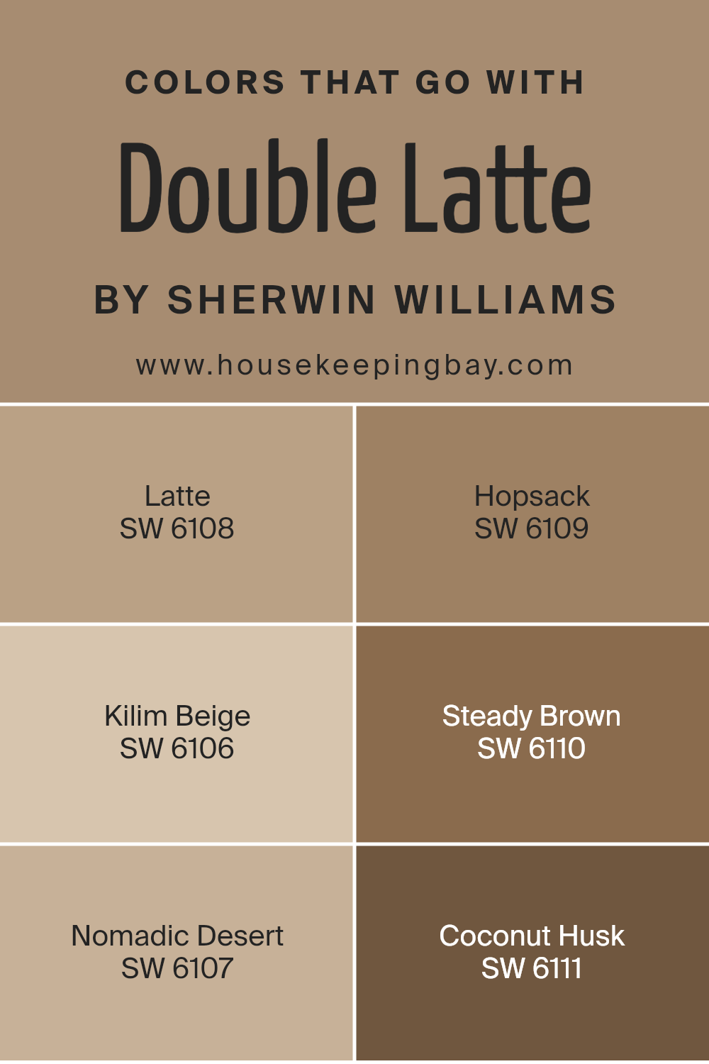
Colors that Go With Double Latte SW 9108 by Sherwin Williams
Choosing the right complementing colors for Double Latte SW 9108 by Sherwin Williams is essential because they help create a harmonious and cozy atmosphere in any space. When you pair Double Latte with colors like Latte SW 6108 or Hopsack SW 6109, you achieve a seamless flow through the space, as these shades have similar warmth and depth, promoting a sense of continuity and comfort.
Latte SW 6108 is a gentle, welcoming beige that adds light and softness to rooms, making them feel more open. Hopsack SW 6109, a slightly darker and richer tone, provides a robust backdrop that enhances the warmth of an area.
Adding another layer to the palette, Kilim Beige SW 6106 introduces more lightness, reflecting a natural sandy tone that brightens spaces subtly without overwhelming with color. Nomadic Desert SW 6107 follows on this theme but with a dustier, earthier quality that pairs well with natural materials like wood and stone.
Steady Brown SW 6110 offers a deep, comforting brown that anchors lighter tones and works well in balancing out spaces. Coconut Husk SW 6111 completes the set with its deep, earthy quality, reminiscent of dark soil, ideal for creating focal points or accentuating furniture pieces.
Combining these colors with Double Latte builds an inviting palette that enhances the decor and overall feel of your space.
You can see recommended paint colors below:
- SW 6108 Latte
- SW 6109 Hopsack
- SW 6106 Kilim Beige
- SW 6110 Steady Brown
- SW 6107 Nomadic Desert
- SW 6111 Coconut Husk
housekeepingbay.com
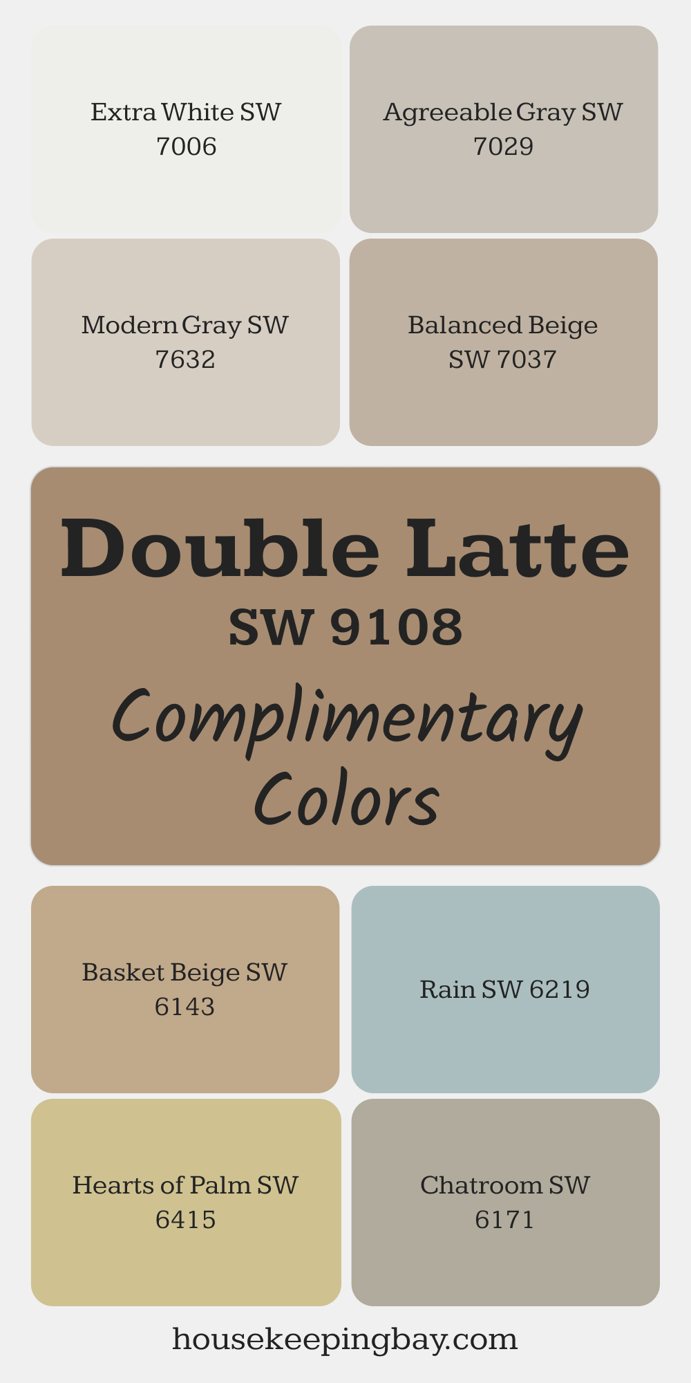
Complimentary Colors for Double Latte SW 9108 Paint Color by Sherwin Williams
Double Latte’s cozy, earthy tone pairs beautifully with Balanced Beige and Basket Beige for a seamless, understated palette. Extra White adds a fresh contrast, giving the space a bright and airy feel.
For a soft, modern touch, Modern Gray and Agreeable Gray blend effortlessly with Double Latte’s warm base.
Add subtle color with Rain or Chatroom for a hint of depth. For a bold accent, Hearts of Palm offers a lively green that complements Double Latte’s inviting warmth.
via housekeepingbay.com
How to Use Double Latte SW 9108 by Sherwin Williams In Your Home?
Double Latte SW 9108 by Sherwin Williams is a warm, inviting shade of brown that brings a cozy and comforting atmosphere to any room. Perfect for living rooms or bedrooms, this color pairs beautifully with soft creams and natural wood tones, creating a harmonious look.
Use it as a main wall color to make your space feel more intimate and snug. It also works well as an accent wall, particularly behind shelves or a fireplace, adding depth and interest without overwhelming the space.
In smaller areas, like bathrooms or hallways, applying Double Latte can make the space feel grounded and welcoming. For those looking to add a bit of sophistication, combine it with bright whites or subtle grays for a chic, modern contrast that still feels homey. Whether you’re refreshing a single room or redoing your entire home, Double Latte SW 9108 offers versatility and warmth, making it a fantastic choice for creating a relaxing, stylish environment.
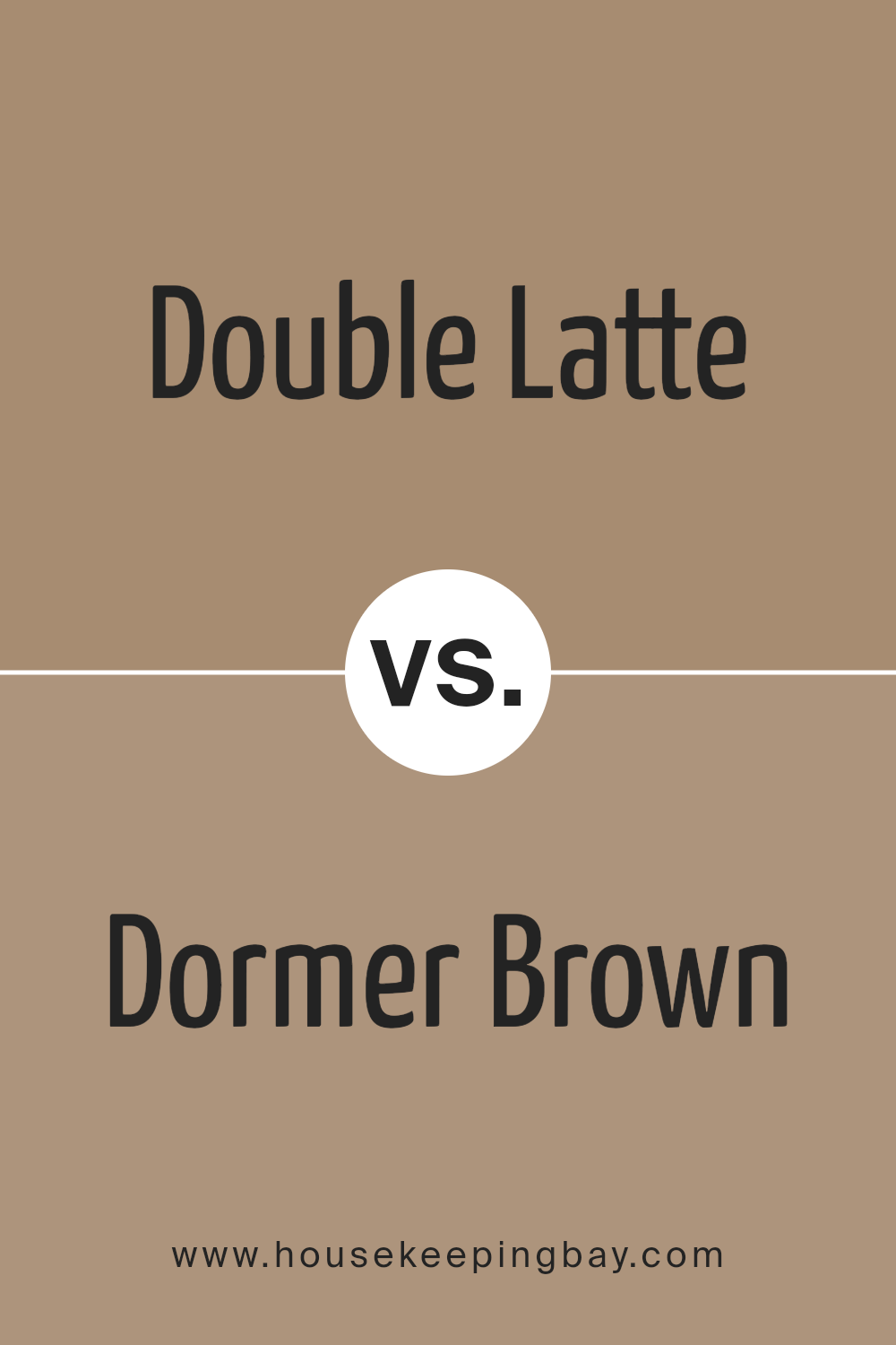
Double Latte SW 9108 by Sherwin Williams vs Dormer Brown SW 7521 by Sherwin Williams
Double Latte SW 9108 and Dormer Brown SW 7521 both come from Sherwin Williams, yet they present unique shades suitable for different settings. Double Latte is a softer, lighter color resembling creamy coffee. It gives a room a warm and inviting feel, perfect for living spaces aiming for a cozy and comfortable atmosphere. This color pairs well with both bright and dark accents, adding versatility to decorating schemes.
Dormer Brown SW 7521, in contrast, is a much deeper and richer brown. It has an earthy tone that provides a solid, grounding effect, making it great for areas where a sense of stability and strength is important. This color works well in offices or dens, and it matches nicely with natural elements like wooden furnishings or green plants.
Although both are in the brown family, Double Latte offers brightness and warmth, while Dormer Brown brings depth and richness, leading to distinct styles and moods for interior spaces.
You can see recommended paint color below:
- SW 7521 Dormer Brown
housekeepingbay.com
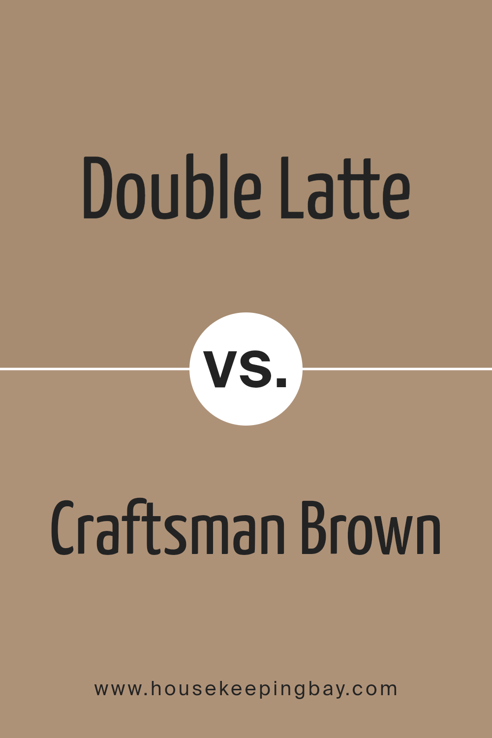
Double Latte SW 9108 by Sherwin Williams vs Craftsman Brown SW 2835 by Sherwin Williams
Double Latte SW 9108 from Sherwin Williams is a warm, creamy beige shade that offers a soft and inviting atmosphere. It has a comforting presence, making it excellent for living rooms or bedrooms where a gentle, calming effect is desired. It pairs well with various decor styles and enhances natural light.
Craftsman Brown SW 2835, also by Sherwin Williams, is a deeper, rich brown tone that gives a sense of solidity and grounding. This color is perfect for spaces where you want to establish a strong, cozy feel, like studies or dining areas. It complements wood furnishings and natural elements beautifully, adding to the sense of warmth.
Both colors create welcoming environments but in distinct ways. Double Latte introduces lightness and softness, making spaces feel airy. Craftsman Brown, however, adds depth and a robust backdrop, ideal for creating a focal point or accenting smaller spaces. Together, these colors could beautifully balance each other in a color scheme.
You can see recommended paint color below:
- SW 2835 Craftsman Brown
housekeepingbay.com
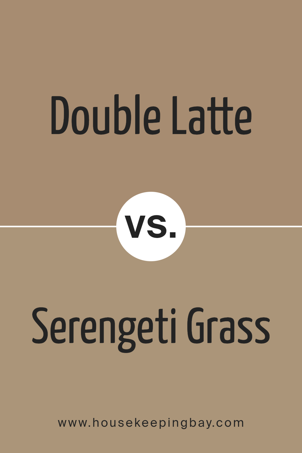
Double Latte SW 9108 by Sherwin Williams vs Serengeti Grass SW 9116 by Sherwin Williams
Double Latte SW 9108 by Sherwin Williams is a warm, creamy beige color that creates a cozy and inviting atmosphere in any room. It’s a versatile shade that pairs well with a variety of decor styles, making it a popular choice for living rooms and bedrooms. Its soft, neutral tone provides a subtle backdrop that complements both bold and muted colors.
Serengeti Grass SW 9116, in contrast, is a deeper, earthy green with hints of khaki. This color is inspired by natural landscapes and brings a sense of calmness and grounding to spaces. It’s particularly effective in areas where you wish to establish a connection with nature, such as studies or sunrooms. Serengeti Grass works well with natural materials like wood and stone, enhancing the overall organic feel.
Both colors offer unique qualities that can distinctly define a space. Double Latte adds warmth and light, while Serengeti Grass introduces depth and a natural element.
You can see recommended paint color below:
- SW 9116 Serengeti Grass
housekeepingbay.com
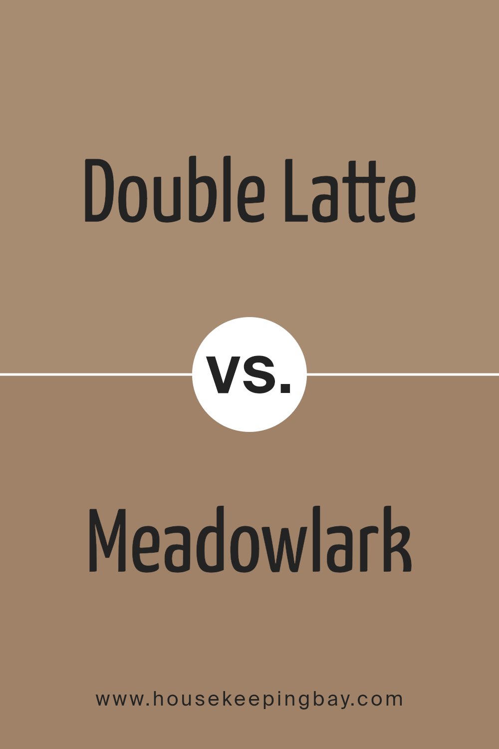
Double Latte SW 9108 by Sherwin Williams vs Meadowlark SW 7522 by Sherwin Williams
Double Latte SW 9108 by Sherwin Williams is a rich, warm beige with creamy undertones that gives a cozy and inviting feel to spaces. It’s perfect for areas where you want to create a soft, neutral backdrop that pairs well with a wide range of decor styles and colors. This color can make rooms feel more intimate and comfortable.
Meadowlark SW 7522, in contrast, is a gentle gray-green hue that offers a soothing, natural vibe suitable for spaces where calmness is desired. This color mimics the serene quality of a lush meadow and works well in areas meant for rest and relaxation, such as bedrooms and bathrooms. Meadowlark is versatile enough to complement both modern and traditional interiors.
While Double Latte infuses warmth into a space, Meadowlark introduces a cool, serene atmosphere, each creating different moods and aesthetic appeals based on their unique tones.
You can see recommended paint color below:
- SW 7522 Meadowlark
housekeepingbay.com
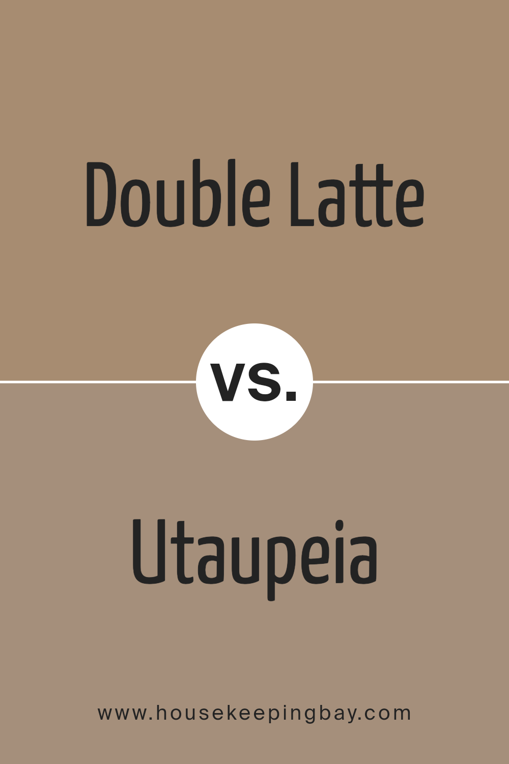
Double Latte SW 9108 by Sherwin Williams vs Utaupeia SW 9088 by Sherwin Williams
Double Latte SW 9108 and Utaupeia SW 9088 both come from Sherwin Williams. Double Latte is a warm beige, offering a creamy and comforting hue that feels cozy and inviting. It’s perfect for creating a soft, neutral backdrop in rooms where you want to relax. Its warmth makes it ideal for living areas and bedrooms where a gentle, soothing presence is desired.
Utaupeia SW 9088 is a grayish taupe, presenting a cooler tone compared to Double Latte. This color lends a modern and sleek look, suitable for spaces that aim for a more contemporary vibe. Utaupeia works well in settings that require a subtle touch of sophistication without overpowering the space.
Both colors offer versatility but bring different atmospheres to a space. Double Latte injects warmth and coziness, while Utaupeia provides a crisp, modern feel. Choosing between them would depend on the mood and style you want to achieve in your space.
You can see recommended paint color below:
housekeepingbay.com
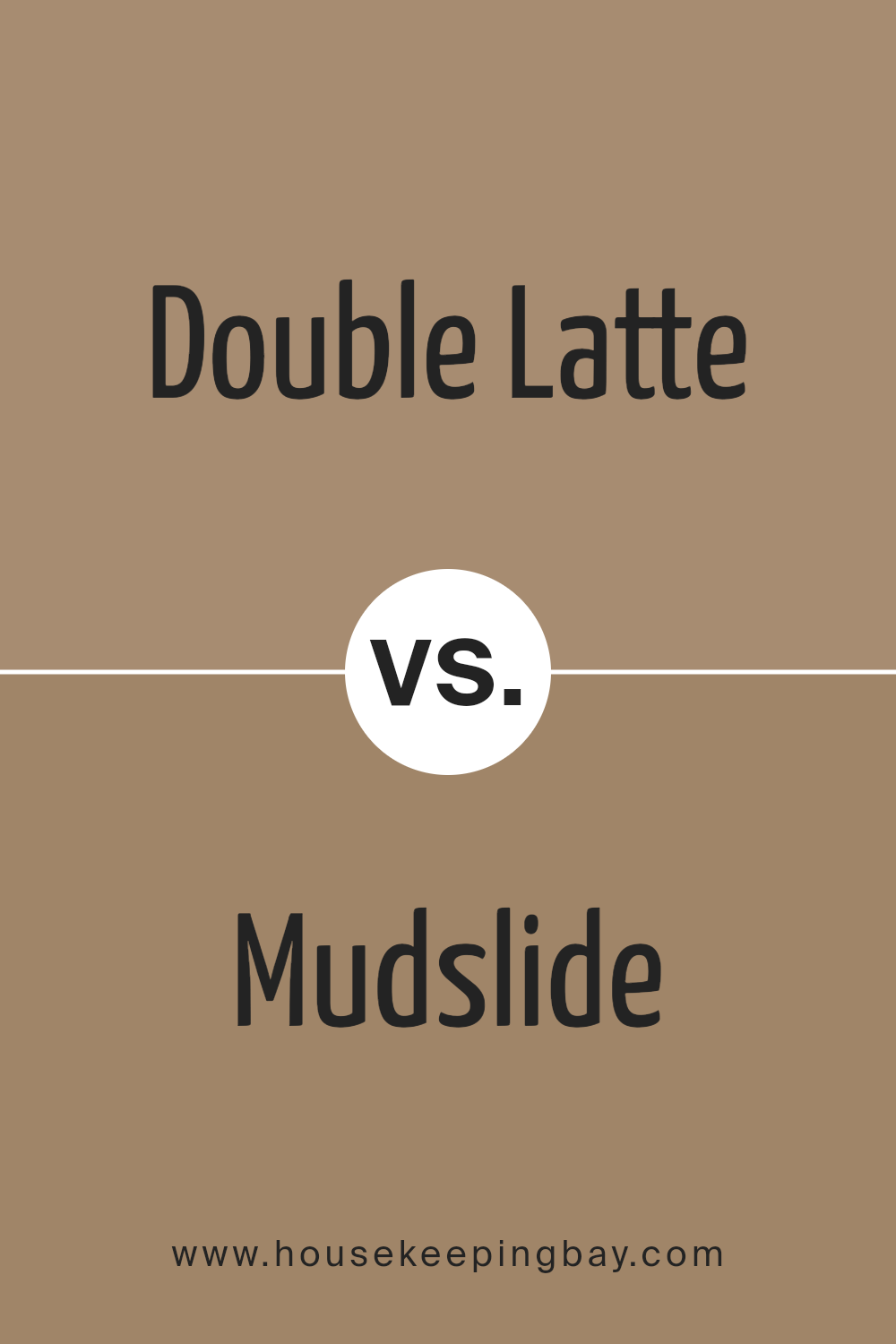
Double Latte SW 9108 by Sherwin Williams vs Mudslide SW 9113 by Sherwin Williams
The Sherwin Williams colors Double Latte SW 9108 and Mudslide SW 9113 both offer warm, inviting tones, but they have distinct differences in shade and atmosphere they bring to a space. Double Latte is lighter, presenting a creamy, soothing beige that’s versatile for various rooms, making spaces feel open and airy. It works well in living areas and bedrooms where a soft, gentle backdrop is desired.
Mudslide, in contrast, is a deeper, richer brown that adds a sense of warmth and coziness. This color is perfect for creating a more intimate and secure feeling, ideal for dens or reading nooks.
While both colors share a warm base, Double Latte reflects more light, enhancing the perception of space in a room, whereas Mudslide offers a more enclosed, snug vibe, making large spaces feel more connected and grounded.
Choosing between them depends on the desired effect in the room: lighter and more open, or darker and more cozy.
You can see recommended paint color below:
- SW 9113 Mudslide
housekeepingbay.com
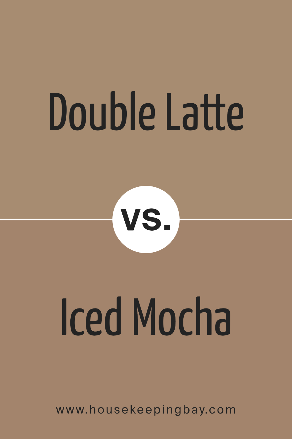
Double Latte SW 9108 by Sherwin Williams vs Iced Mocha SW 9092 by Sherwin Williams
Double Latte SW 9108 and Iced Mocha SW 9092 by Sherwin Williams are both neutral colors, but they have distinct tones that set them apart. Double Latte is a warm, creamy beige that gives a feeling of coziness and softness.
This color works well in spaces where a comfortable, welcoming atmosphere is desired, such as living rooms or bedrooms. It pairs beautifully with darker woods and can also serve as a subtle background for colorful decor.
Iced Mocha SW 9092, in contrast, is a darker, more muted brown that offers a sophisticated and grounding feel. It tends to make spaces look more refined and can be an excellent choice for areas that require a touch of elegance, like dining rooms or home offices. Iced Mocha complements metallic finishes and deep blues or greens, adding depth and richness to a room’s aesthetic.
Each color serves unique purposes and complements different styles and spaces, making them versatile choices for home design.
You can see recommended paint color below:
- SW 9092 Iced Mocha
housekeepingbay.com
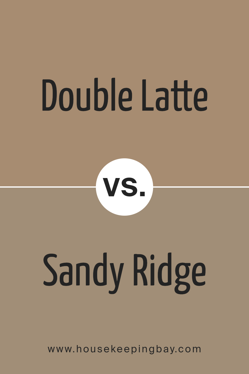
Double Latte SW 9108 by Sherwin Williams vs Sandy Ridge SW 7535 by Sherwin Williams
Double Latte SW 9108 by Sherwin Williams and Sandy Ridge SW 7535 by Sherwin Williams are both warm, neutral colors, perfect for creating a cozy and inviting atmosphere in any room. Double Latte is a deeper, rich beige with a strong presence, making it ideal for areas where you want to add a bit of depth and warmth. It complements darker furniture and natural wood elements really well, adding a comforting and solid feel to spaces.
In contrast, Sandy Ridge is lighter and leans towards a soft taupe, providing a subtle elegance. Its lighter tone makes it great for smaller spaces or rooms that don’t get a lot of natural light, as it helps to brighten and open up the area. Sandy Ridge works beautifully with softer decor and can be used to soften sharper contrasts in your color scheme.
Both colors pair well with a variety of decor styles and are versatile for use in many different homes, but the choice between them depends on the specific mood and spatial effect you want to achieve.
You can see recommended paint color below:
- SW 7535 Sandy Ridge
housekeepingbay.com
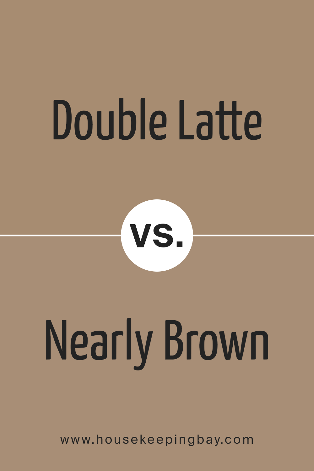
Double Latte SW 9108 by Sherwin Williams vs Nearly Brown SW 9093 by Sherwin Williams
Double Latte SW 9108 and Nearly Brown SW 9093 by Sherwin Williams are both warm, inviting colors. Double Latte is a creamy, beige color that conveys a soft and cozy feeling, making it suitable for spaces where comfort is key, like living rooms or bedrooms. It pairs nicely with a variety of other hues, adding a subtle, soothing touch to any decor.
Nearly Brown, as suggested by its name, is closer to a true brown but retains a softness that prevents it from overwhelming a space. This color provides a strong foundation when used in interior design, offering a feel of stability and warmth. It works well in areas that require a touch of seriousness, such as home offices or dens.
Both colors share a natural warmth, yet Double Latte is lighter, providing a more open and airy feel, while Nearly Brown offers more depth and groundedness. They can be paired together to create a layered, harmonious look.
You can see recommended paint color below:
- SW 9093 Nearly Brown
housekeepingbay.com
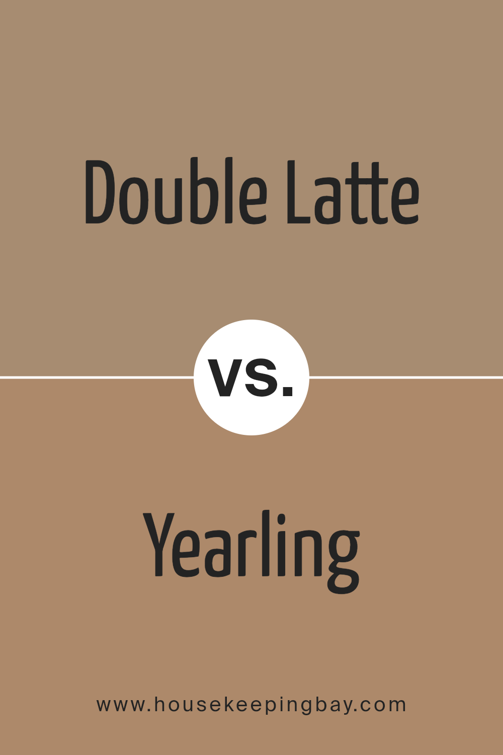
Double Latte SW 9108 by Sherwin Williams vs Yearling SW 7725 by Sherwin Williams
Double Latte SW 9108 and Yearling SW 7725 by Sherwin-Williams are both unique in their appeal. Double Latte has a warm, creamy tone that can make spaces feel cozy and inviting. It’s perfect for creating a soft, comfortable atmosphere in rooms like the living room or bedroom. This color is versatile and pairs well with a variety of decor styles, adding a gentle, nurturing touch to interiors.
In contrast, Yearling SW 7725 is a darker, olive green hue that brings a touch of nature indoors. It has a calm, grounding effect and works well in areas where a connection to the outdoors or a subtle, soothing presence is desired. This green can also complement wood tones and natural elements, making it ideal for spaces that aim for a more organic, earthy vibe.
Both colors offer distinct atmospheres: one is warmly neutral, while the other provides a natural richness. They could even complement each other in a single space, promoting balance between warmth and natural elegance.
You can see recommended paint color below:
- SW 7725 Yearling
housekeepingbay.com
Conclusion
In summing up my thoughts on SW 9108 Double Latte by Sherwin Williams, it’s clear that this paint color is a versatile and warm choice perfect for anyone looking to create a cozy and inviting atmosphere in their home.
Its rich, creamy hue pairs beautifully with a wide range of decor styles, from classic to modern, making it an excellent choice for any room. Whether applied in a busy kitchen or a peaceful bedroom, Double Latte offers a soothing presence that complements various furnishings and accessories.
Furthermore, the quality of Sherwin Williams paints, including their durability and coverage, ensures that choosing SW 9108 Double Latte is not only a stylistic decision but also a practical one. This color works well in spaces that receive a lot of use, standing up to daily wear while maintaining its appealing look.
It also has the added benefit of making spaces appear more expansive and welcoming, which is a significant plus for smaller rooms or apartments.
Overall, for anyone considering a new paint color, SW 9108 Double Latte by Sherwin Williams is definitely worth considering. It offers both aesthetic flexibility and practical benefits, making it a strong contender for anyone looking to refresh their living space.
housekeepingbay.com
Ever wished paint sampling was as easy as sticking a sticker? Guess what? Now it is! Discover Samplize's unique Peel & Stick samples. Get started now and say goodbye to the old messy way!
Get paint samples
