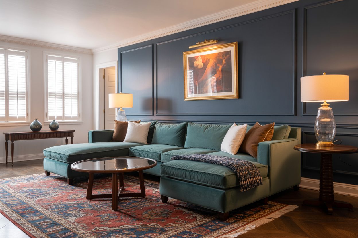
Rich, dramatic, and calming—our favorite Sherwin-Williams dark blues
I’ve seen it over and over again. The moment a deep, moody blue goes up on the wall, something shifts. The room feels grounded. People’s shoulders drop. It’s like the color takes a breath for them.
Dark blue is one of those shades that speaks quietly, but strongly. It doesn’t yell for attention. It sits there with confidence. Maybe that’s why I keep reaching for it in so many of my projects—especially when a client wants something that feels rich and steady but not too flashy.
Bedrooms, home offices, reading corners, dining rooms—these are places where dark blue really works. It gives a sense of calm and control. It also plays well with both warm and cool tones, which makes it flexible when you’re mixing furniture or art.
But not all dark blues are the same. Some carry a hint of green. Some lean charcoal. Others feel like ink or faded denim. That’s why I put together this list of 37 beautiful Sherwin-Williams dark blue colors I’ve personally worked with, tested, or recommended to clients.
Whether you want something bold or something quiet—you’ll find one here that feels right.
housekeepingbay.com
Why Dark Blue Works So Well
There’s a reason people often say dark blue feels like a hug. It pulls you in. It gives a sense of order. It can even help you focus. And this isn’t just my opinion—color psychology backs it up too.
A study from the University of Texas found that cool colors like blue help reduce stress and boost concentration [source: Color and Psychological Functioning, UT Austin]. That’s probably why I’ve used navy tones in so many home offices and study nooks.
Famous designer Nate Berkus once said:
“Navy is one of the only colors that can be both dramatic and neutral.”
Tha’s the sweet spot for me. You can use a strong navy like Sherwin-Williams Naval, and it won’t overpower the room. It just anchors it.
Places Where Dark Blue Shines:
Bedrooms – It helps people relax before bed.
Dining Rooms – It adds mood and depth.
Entryways – It gives that “you’ve arrived” feeling.
Accent Walls – Instant style, without much effort.
And when I pair dark blue with brass or gold, the whole room starts to feel richer—like you added layers without adding stuff.
Of course, not every dark blue is right for every wall. That’s why it helps to understand what to look for before you paint. That’s coming up next.
Tips Before Picking a Shade
I’ve made this mistake more than once—falling in love with a dark blue on a paint chip, only to see it look almost black on the wall. Or worse, way too bright. That’s why I always test first.
Here’s what I’ve learned (the hard way):
1. Light Changes Everything
Dark blue can look rich and inviting in one room, and completely flat in another. It all depends on your light.
In north-facing rooms, blues tend to look cooler and a bit gray.
In south-facing rooms, they warm up and show more color.
If you’re unsure, tape the swatch to different walls and check it in morning, afternoon, and evening light.
2. Don’t Skip the Sample Pot
I always tell my clients: “Try before you commit.” Buy a small sample. Paint a piece of white poster board, not just the wall. Move it around. Live with it for a day or two. You’ll know fast if it’s right—or too dark.
3. Finish Matters
Here’s how I usually guide clients on finish:
Matte or flat: Great for bedrooms or cozy spaces. Hides wall flaws.
Eggshell: A safe choice for most rooms—soft look but easy to clean.
Satin: Nice for darker colors if you want a slight glow.
Semi-gloss: Only if you want it to pop hard (doors, trim, accents).
In general, dark colors look deeper and smoother in matte or eggshell.
4. Watch the Undertone
Some blues lean green. Some look purple. Some almost gray. It can totally change how the room feels. That’s why I’ve broken down the 37 Sherwin-Williams colors by undertone in the next section. It makes it so much easier to compare.
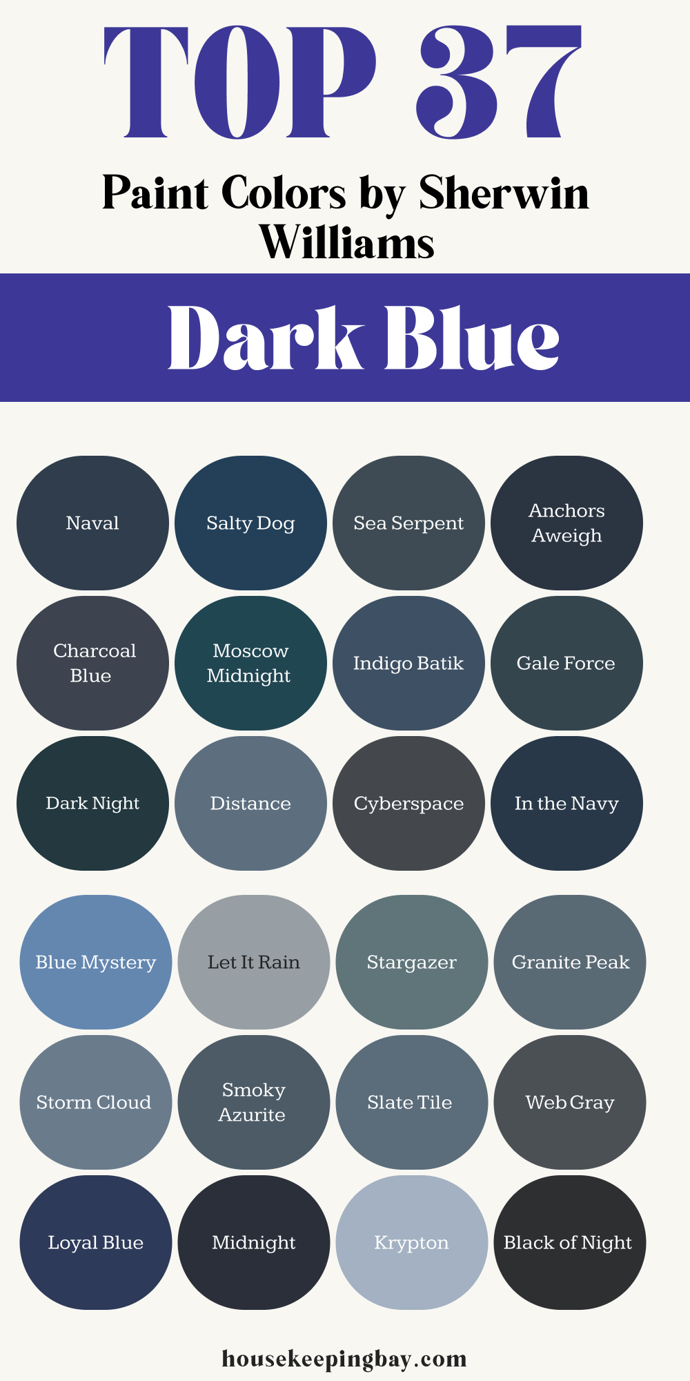
My Go-To Sherwin-Williams Dark Blues
These are colors I’ve either used myself in homes, seen in action, or recommended with confidence. I’ve grouped them by tone so it’s easier to find what fits your style.
1. Rich Navy Tones
These are deep, strong blues with a classic feel. They remind me of tailored suits, crisp linens, and moody dinner lighting. They work in both modern and traditional spaces.
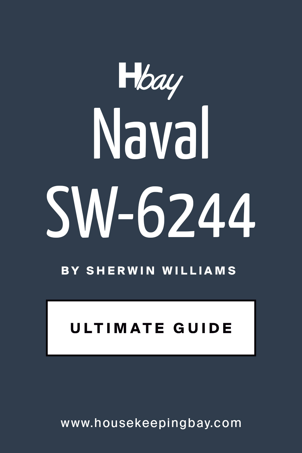
Naval (SW 6244) is a strong, pure navy. Not too green, not too gray. I’ve used it in dining rooms and libraries. Always makes the space feel thoughtful. Pairs well with crisp white trim, brass fixtures, and warm wood. Eggshell or satin gives it just enough glow.
Salty Dog (SW 9177) is bold and slightly brighter. It has a hint of energy. I like it for doors and cabinets. It adds personality without being loud. Pairs well with soft beige, tan leather, and natural fabrics. It looks great in a satin finish.
Sea Serpent (SW 7615) feels deeper and more moody than Naval. There’s a touch of green in the undertone. I used this in a master bedroom with cream bedding—my client still texts me about it. Pairs well with creams, brushed gold, and eucalyptus greens.
Anchors Aweigh (SW 9179) is a strong navy that almost touches black. Great for drama. I’ve used it on kitchen islands and behind beds. Try it in a matte finish with linen-colored accents.
Charcoal Blue (SW 2739) walks the line between navy and slate. It looks stunning in rooms with lots of natural light and softens beautifully throughout the day. Good with white oak, warm grays, and woven textures.
housekeepingbay.com
2. Deep Blue-Greens
These have more movement in them. Depending on the light, they shift between deep blue and foresty green. They feel grounded but not flat. I reach for these when someone wants drama, but not darkness.
Moscow Midnight (SW 9142) is like twilight right after sunset. It has a perfect green-blue balance. Gorgeous in studies and powder rooms. Feels expensive. Pairs well with ivory, walnut, and antique brass. I used it in satin on wainscoting—still proud of that hallway.
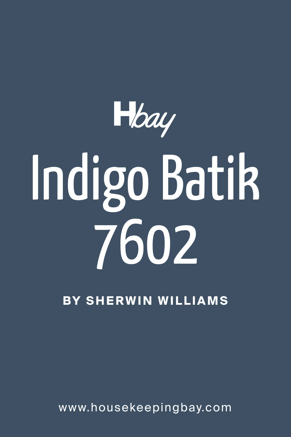
Indigo Batik (SW 7602)is brighter and cooler. Think of denim, but deeper. Works well in playrooms and family areas—it’s lively but not loud. Try it with warm whites and other soft blues.
Gale Force (SW 7605)is strong and stormy. It leans green in warm light. I love this for moody bathrooms with gold sconces. Looks great with marble, black hardware, and dark art.
Dark Night (SW 6237) feels deep and calm. There’s a green-gray tone under the blue. I once used this in an office, and the owner said it helped him focus. Works well with mid-tone wood, off-white trim, and muted green decor.
Distance (SW 6243)is softer but still makes a statement. It reads more muted, which makes it great for bedrooms. I’ve used this in both matte and satin—it depends on how much light the room gets.
housekeepingbay.com
3. Muted and Moody Blues
These blues are a bit softer and quieter. They don’t jump out—they settle in. If you want a room to feel thoughtful or help people slow down, these are your friends.
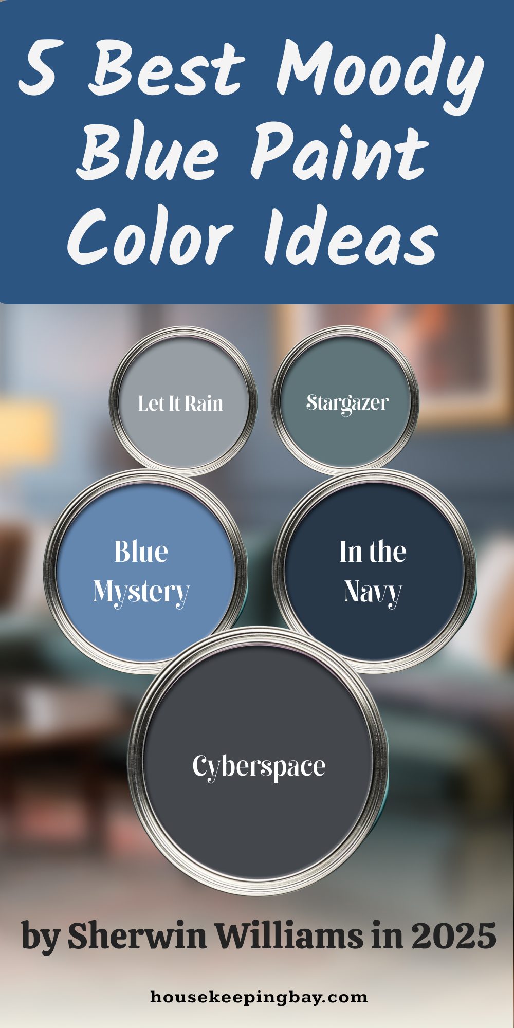
Cyberspace (SW 7076)is almost charcoal, but it’s clearly blue. I’ve used it on built-ins and fireplace walls. It brings depth without shouting. Pairs beautifully with pale linen and matte black hardware.
In the Navy (SW 9178)feels more muted than Naval. A classic navy without harshness. I love it for boys’ rooms or quiet offices. Use it with check patterns, natural woodgrain, and creamy whites.
Blue Mystery (SW 9065) has a dusty, aged quality to it. It feels old-world in the best way. It shines in traditional rooms, especially with trim or crown molding. I prefer it in a matte or soft eggshell.
Let It Rain (SW 9152) is cool and steady. It reminds me of a cloudy sky. I used it in a guest bedroom with silver hardware and charcoal bedding—it was peaceful. Goes well with soft grays and light oak.
Stargazer (SW 9635) feels like nightfall. A bluish charcoal that stays calm and cozy. I like it in TV rooms and dens. It works great with velvet, dim lights, and framed art.
4. Gray-Blue Mixes
These colors balance blue with gray, making them calm and steady. I usually pull these out when someone wants color without it feeling “too much.”
Granite Peak (SW 6250)is a stormy gray with a clear blue push. I’ve used it in open-plan spaces with shifting daylight. It works well with creamy neutrals and leather.
Storm Cloud (SW 6249) is moody with a misty edge. It has that soft foggy vibe I love for bedrooms. I use it in eggshell or satin for softness with a little light reflection.
Smoky Azurite (SW 9148) has a rich green undertone that sneaks in as light changes. I put it in a kitchen with white cabinets and walnut shelves—it turned out stunning. It’s nice with bronze and texture-heavy surfaces.
Slate Tile (SW 7624) is dark and clean, with a cool tone. I use it for exterior walls or bold feature walls. It looks great with cedar and soft beige details.
Web Gray (SW 7075) is a dark gray that dips just enough into blue to feel special. I once chose this for a nursery instead of baby blue—it felt timeless and grown-up. Goes perfectly with white trim and soft peach accents.
5. Inky and Charcoal Blues
These blues lean dark—almost black—but carry enough depth to stay interesting. I use them when I want drama that feels grounded and confident.
Black of Night (SW 6993) is nearly black, but with a subtle navy twist. I used it on a ceiling in an entryway, and it added quiet drama. Try it with white trim and warm wood.
Krypton (SW 6247) sits lighter on the swatch but deepens on the wall. It’s got a soft, cool tone that works well in bathrooms or laundry spaces.
Midnight (SW 6264) lives up to its name—deep, quiet, and strong. I painted interior doors with it, and it gave the hallway character. It’s perfect for contrast with light walls and strong lighting.
Needlepoint Navy (SW 0032) is deep and a little historic. There’s a slight gray-green pull. I like it best on matte walls or satin furniture finishes for a classic touch.
Loyal Blue (SW 6510) has energy. It doesn’t feel sleepy like some navies. I’ve used it for bold cabinets and in kids’ rooms as an accent stripe. Pair it with tan, brass, or even a bold orange.
6. Softer Deep Blues (Great for Larger Walls)
These still have depth, but they let the room breathe. I suggest these when someone wants cozy without making a space feel too dark or closed-in.
Daphne (SW 9151) is a dusty, relaxed blue. It feels soft without being too light. I used it in a big bedroom with white trim and pale oak floors—it felt restful. Works well with off-white and pale gray.
Bracing Blue (SW 6242) is strong but not heavy. It’s right between navy and sky. I love this in family rooms—it brings color without shouting. Use it with warm woods and bright ceilings.
Daphne’s Veil (SW 9057) is lighter than Daphne, and a little airier. It looks great in stairwells or halls where you want color but not weight. Pairs well with soft whites and brushed nickel.
Wall Street (SW 7665)is sharp and cool, like a tailored navy suit. I used it in a loft space with brick and steel, and it looked high-end without trying. Try it with leather and warm lights.
Waterloo (SW 9141)might be the most balanced dark blue I know. Not too green, not too gray. I’ve put this in offices and dining rooms—it always holds the room. Looks great in matte with bronze details.
7. Unique Picks I Recommend
These don’t always make the popular lists, but they’ve surprised me in the best ways. Each one has a twist—color shift, vibe, or how it pairs.
Commodore (SW 6524) is bold and bright for a navy. I once used it on a laundry room door, and the client smiled every time they walked by. Use it with clean white trim for the best pop.
Rainstorm (SW 6230)feels a little livelier than other deep blues. It brings just enough color to tight spots like stairwells. Looks great in satin or semi-gloss.
Naval Night (SW 9176) is rich, dark, and a little formal. I like it in dining rooms with moody lighting. It works well with velvet, deep green, and gold finishes.
Tempe Star (SW 6229)is hard to pin down—blue with green and gray tones. I used it in a breakfast nook with natural wood and white curtains. It felt cheerful but calm.
Indigo (SW 6531) is right between navy and purple. It’s bold, so I use it in small doses—an accent wall or a painted dresser. It plays well with soft neutrals and pale blue.
One Last Thought
Out of all the colors I use, dark blue might be the most steady and trusted. It never feels trendy, and it always brings something solid to the room. It can be rich or quiet, bold or calm—it depends on how you use it.
If you’re standing in a paint aisle, overwhelmed by choices, just think about how you want the room to feel. Not how it should look—but how it should feel when you walk in. That’s where the right color comes from.
Dark blue has helped so many of my clients feel more settled and proud of their homes. I hope one of these shades does the same for you.
Melinda is a skilled Home Designer with a passion for color and personalized interiors. Since 2015, she has transformed homes across the U.S. A graduate of the Academy of Art University with a BFA in Interior Architecture & Design, Melinda continues to expand her expertise through certifications and industry events