Boudoir AF-190 Paint Color by Benjamin Moore
Color plays a pivotal role in transforming the ambiance of any space, and choosing the right shade can significantly impact the overall aesthetic
Color plays a pivotal role in transforming the ambiance of any space, and choosing the right shade can significantly impact the overall aesthetic. In this article, we delve into the captivating world of Boudoir AF-190, a nuanced color that exudes sophistication and charm.
From its specific characteristics to its compatibility with various interior styles, we explore the facets that make Boudoir AF-190 a unique choice for home decor.
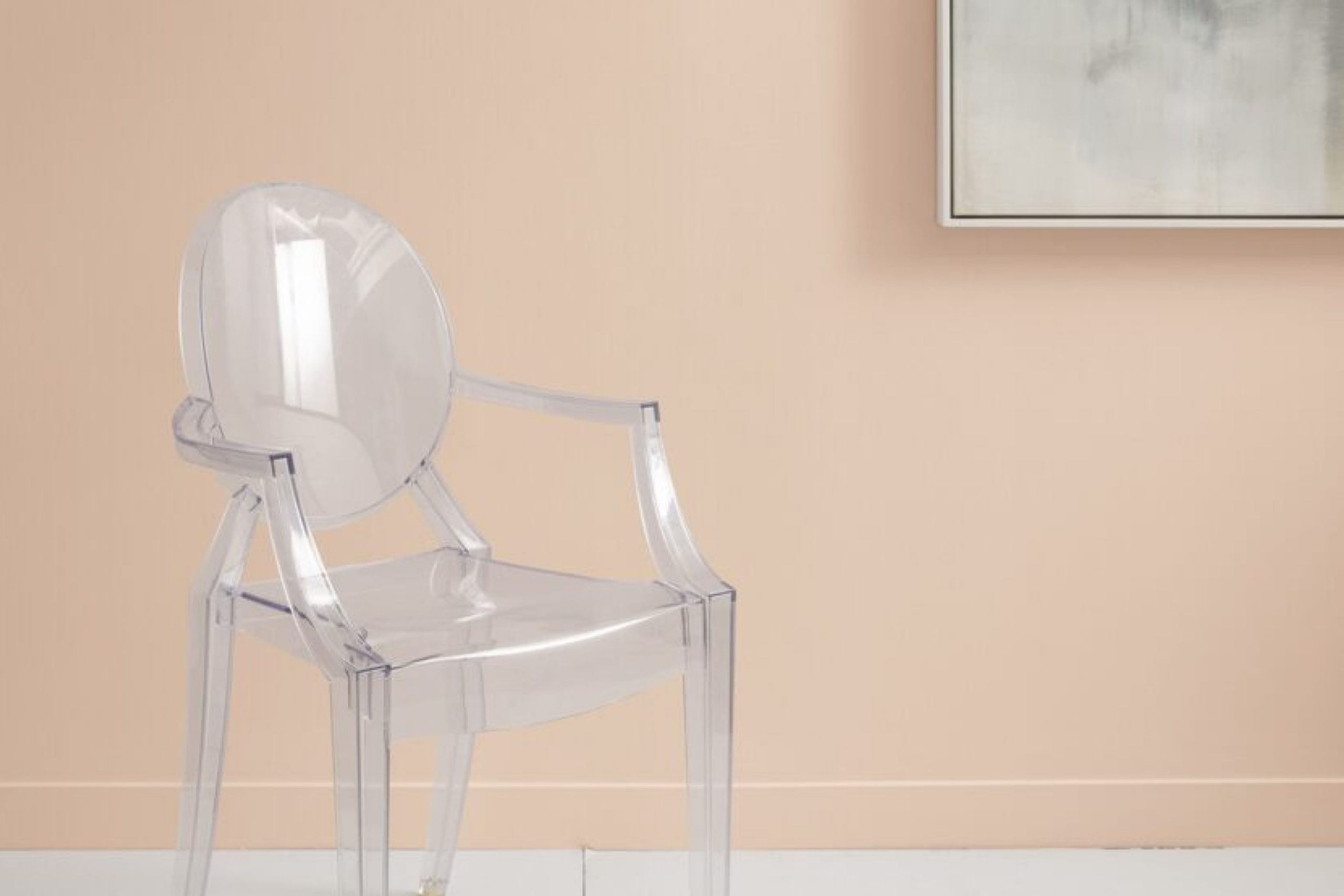
via benjamin moore
What Color Is Boudoir AF-190?
Boudoir AF-190 is an exquisite hue that sits at the intersection of timeless elegance and modern allure. This deep, muted rose possesses subtle undertones that contribute to its versatile nature. The color strikes a harmonious balance between warmth and sophistication, making it an ideal choice for spaces that seek to blend classic charm with contemporary style.
Boudoir AF-190 pairs exceptionally well with materials like rich velvet and natural textures, adding depth and character to any room.
Its versatility allows it to seamlessly integrate into a variety of interior styles, from traditional to eclectic, making it a go-to choice for interior designers seeking a touch of refined luxury.
housekeepingbay.com
Table of Contents
Is It a Warm or Cool Color?
Boudoir AF-190 leans towards warmth, embracing a palette that emanates coziness and intimacy. The subtle warmth in its undertones makes it an inviting choice for living spaces, bedrooms, and areas where a touch of elegance is desired. The warmth of Boudoir AF-190 contributes to its ability to create a welcoming atmosphere, making it a preferred option for those seeking a color that transcends trends and stands the test of time.
Undertones of Boudoir AF-190
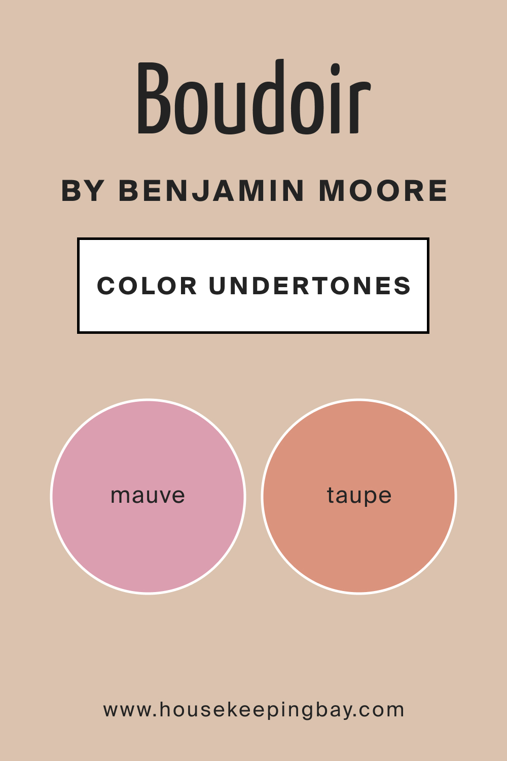
The undertones of Boudoir AF-190 play a crucial role in defining its overall character. Subtle hints of mauve and taupe contribute to the color’s depth, adding a layer of sophistication that sets it apart. These undertones enhance the richness of Boudoir AF-190, making it a dynamic choice for interior walls.
Whether bathed in natural light or illuminated by artificial lighting, the undertones of this hue ensure a consistent and refined appearance, making it an ideal choice for those who appreciate attention to detail in their home decor.
housekeepingbay.com
Coordinating Colors of Boudoir AF-190
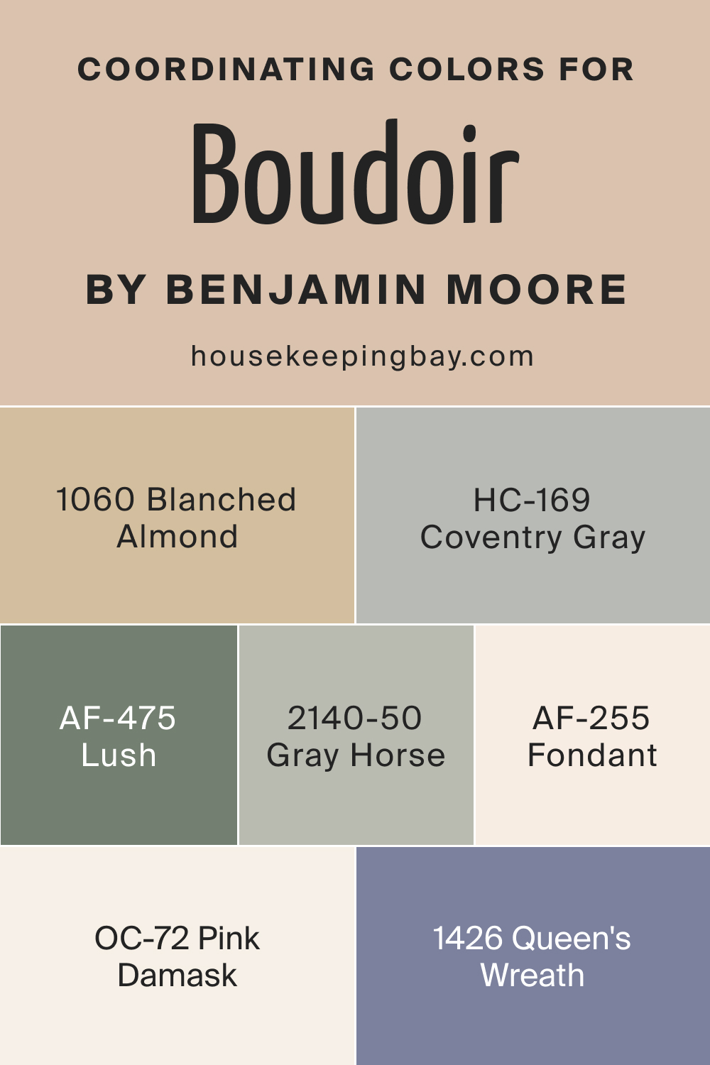
Choosing coordinating colors is an essential step in creating a harmonious color scheme for any space. Boudoir AF-190 effortlessly pairs with a range of complementary colors, adding dimension and interest to the overall design. Coordinating colors for Boudoir AF-190 include AF-255 Fondant, AF-475 Lush, OC-72 Pink Damask, and BM 2140-50 Gray Horse.
- AF-255 Fondant : A soft and creamy hue, Fondant complements Boudoir AF-190 by introducing a touch of sweetness to the color palette. It works well as an accent color in pillows, upholstery, or small decor items.
- AF-475 Lush : Lush, a vibrant and deep green, contrasts beautifully with Boudoir AF-190. This pairing creates a sense of balance, with the green adding a refreshing and nature-inspired element to the overall design.
- OC-72 Pink Damask : A subtle and delicate pink, Pink Damask shares undertones with Boudoir AF-190, creating a seamless transition between the two colors. This combination is perfect for creating a soft and romantic atmosphere.
- BM 2140-50 Gray Horse : Gray Horse, a sophisticated gray with warm undertones, acts as a neutral companion to Boudoir AF-190. It provides a grounding effect, allowing the other colors to shine while maintaining an elegant and cohesive look.
In addition to these coordinating colors, consider including BM 1426 Queen’s Wreath, BM 1060 Blanched Almond, and HC-169 Coventry Gray in your palette. These colors share a similar aesthetic with the previously mentioned hues, providing additional options for creating a cohesive and visually appealing color scheme.
housekeepingbay.com
How Does Lighting Affect Boudoir AF-190?
Lighting plays a pivotal role in how colors are perceived within a space, influencing their intensity and overall ambiance. Boudoir AF-190, with its rich and deep undertones, reacts differently to various lighting conditions.
In artificial light, the color may appear warmer and more intimate, emphasizing its cozy and inviting qualities. In natural light, Boudoir AF-190 takes on a dynamic character, showcasing its versatility. In north-facing rooms, the color might appear slightly cooler, while in south-facing rooms, the warmth of Boudoir AF-190 is accentuated.
East-facing rooms may enhance its undertones in the morning light, and in west-facing rooms, the color could become more pronounced and dramatic as the day progresses.
Understanding these nuances allows homeowners to harness the full potential of Boudoir AF-190 in different lighting scenarios, creating a tailored atmosphere in each room.
housekeepingbay.com
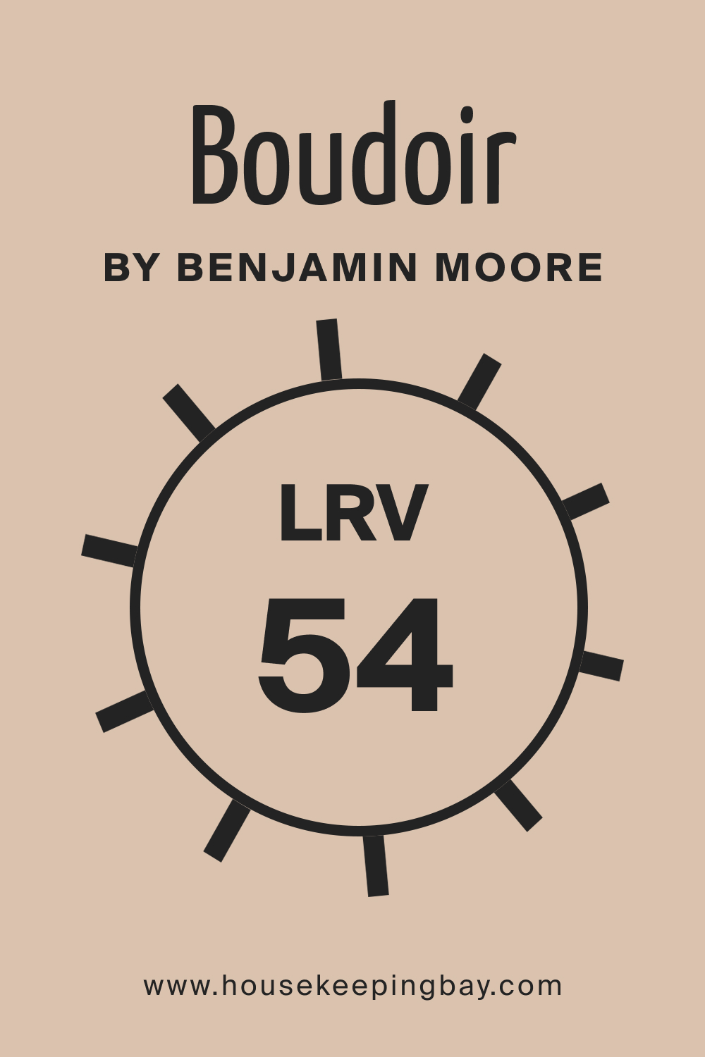
LRV of Boudoir AF-190: Understanding Light Reflectance Value
Light Reflectance Value (LRV) measures the amount of light a color reflects or absorbs. With Boudoir AF-190 having an LRV of 54, it falls into the mid-range category. Colors with higher LRVs reflect more light and appear brighter, while lower LRVs result in darker and more dramatic tones. Boudoir AF-190’s moderate LRV allows it to strike a balance, providing depth without overwhelming a space.
This makes it suitable for various rooms, accommodating different lighting conditions while maintaining a sophisticated allure. Its LRV ensures that Boudoir AF-190 remains versatile, adapting gracefully to both well-lit and dimly lit areas.
housekeepingbay.com
What is LRV? Read It Before You Choose Your Ideal Paint Color
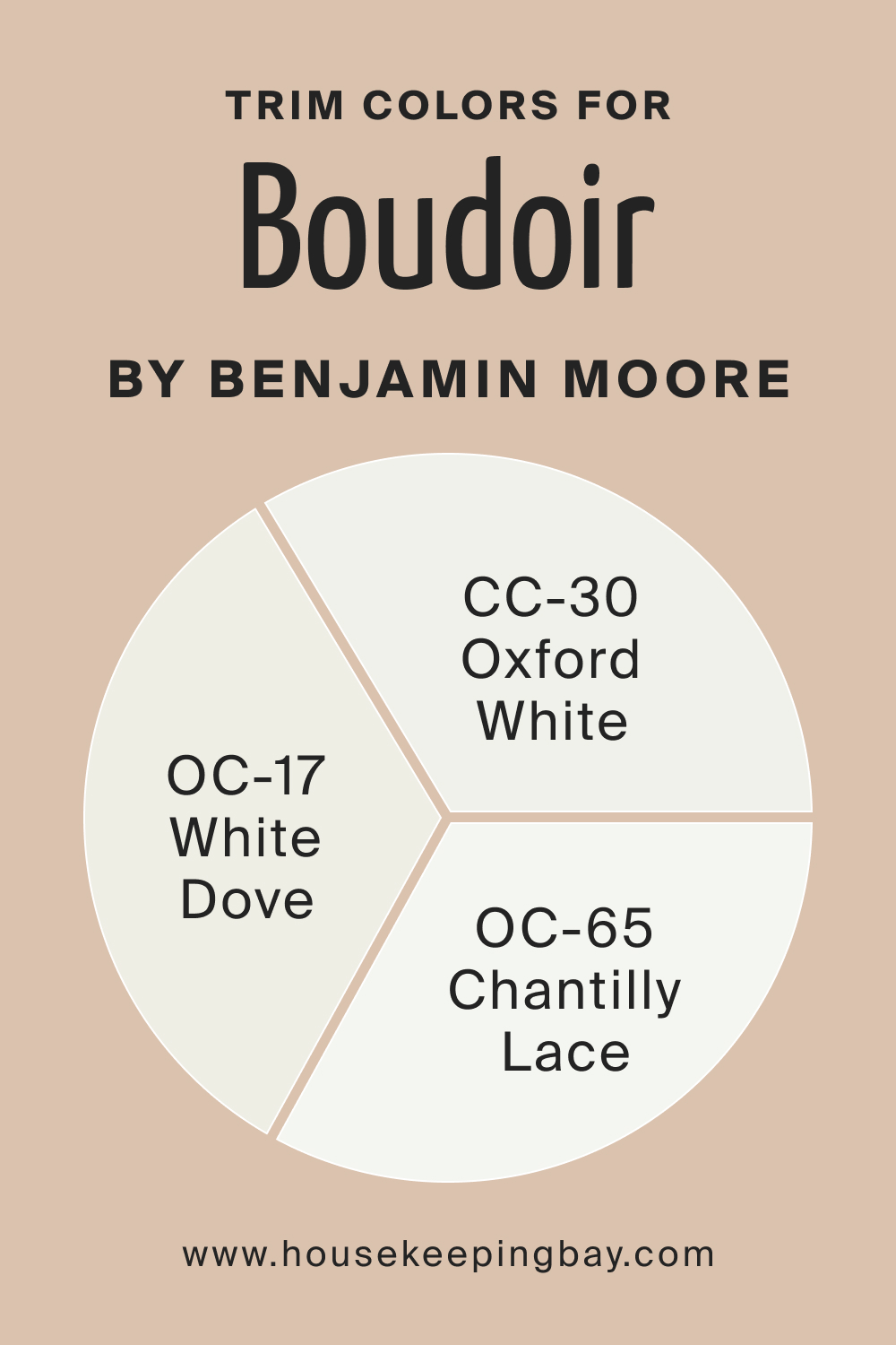
Trim Colors of Boudoir AF-190
Trim colors are crucial in defining the edges of a room and enhancing the overall aesthetic. For Boudoir AF-190, consider using Benjamin Moore’s OC-17 White Dove , CC-30 Oxford White, and OC-65 Chantilly Lace as trim options. These shades of white, from the same brand, provide a crisp and clean contrast, allowing the depth of Boudoir AF-190 to stand out while maintaining a cohesive and elegant look.
housekeepingbay.com
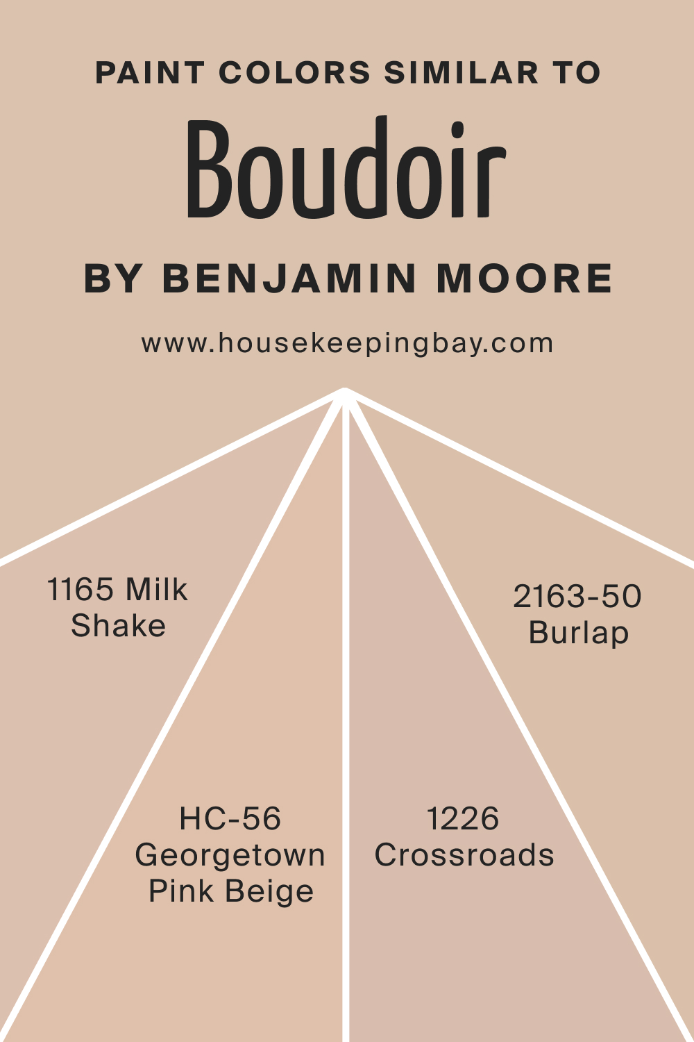
Colors Similar to Boudoir AF-190
Identifying similar colors is essential for creating a harmonious color palette. Colors like BM 1165 Milk Shake , BM 1226 Crossroads , BM 2163-50 Burlap , and HC-56 Georgetown Pink Beige share the same rich undertones as Boudoir AF-190.
Milk Shake exudes a soft and creamy warmth, Crossroads offers a muted and earthy alternative, Burlap introduces a deeper and grounded tone, and Georgetown Pink Beige adds a touch of sophistication with its subtle pink undertones.
housekeepingbay.com
Colors That Go With Boudoir AF-190
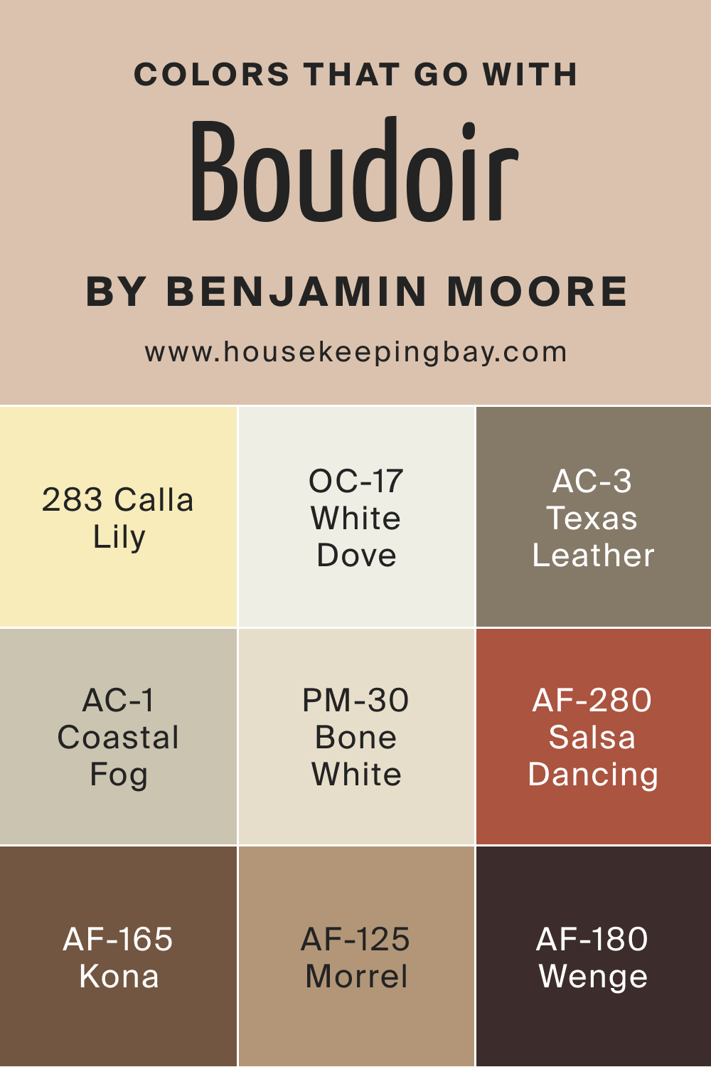
Harmonizing colors within a room is crucial for achieving a cohesive and visually pleasing design. Benjamin Moore offers a range of colors that complement the Boudoir AF-190 seamlessly. BM 283 Calla Lily , AC-3 Texas Leather , OC-17 White Dove , AC-1 Coastal Fog , PM-30 Bone White , AF-165 Kona , AF-280 Salsa Dancing , AF-125 Morrel , and AF-180 Wenge provide a diverse palette.
BM Calla Lily brings a soft and refreshing quality, BM Texas Leather introduces a rich and grounding brown, the White Dove color maintains a classic and clean aesthetic, the Coastal Fog paint color adds a subtle gray elegance, PM-30 Bone White provides a warm neutral base, AF-165 Kona offers a deep and earthy option, AF-280 Salsa Dancing injects vibrancy, AF-125 Morrel brings a muted sophistication, and AF-180 Wenge contributes a bold and dark accent to complement Boudoir AF-190’s depth.
Together, these colors create a harmonious and visually stunning ensemble within the same space.
housekeepingbay.com
How to Use Boudoir AF-190 In Your Home?
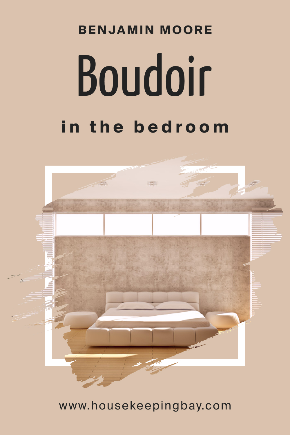
Boudoir AF-190 is a versatile color that can elevate various rooms in your home. It’s ideal for bedrooms, where its warmth fosters intimacy and relaxation. This hue seamlessly integrates into diverse interior design styles, complementing traditional, modern, or eclectic aesthetics alike.
Using Boudoir AF-190 in the Bedroom
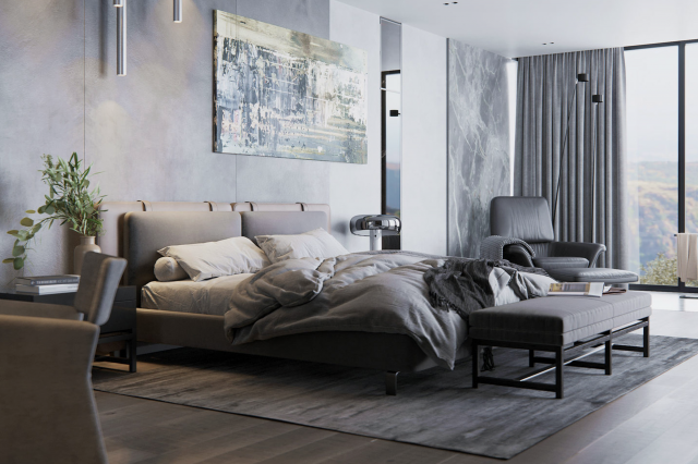
In the bedroom, Boudoir AF-190 creates a serene atmosphere. It’s perfect for accent walls or as the main color, fostering a cozy and intimate space. Pair it with soft textiles like velvet or linen for a luxurious feel.
Using Boudoir AF-190 in the Bathroom
Boudoir AF-190 adds a touch of elegance to bathrooms. Apply it as an accent wall behind the vanity or use it for cabinets to infuse a sense of sophistication. Combine it with metallic accents to enhance its luxurious appeal.
housekeepingbay.com
Using Boudoir AF-190 in the Living Room
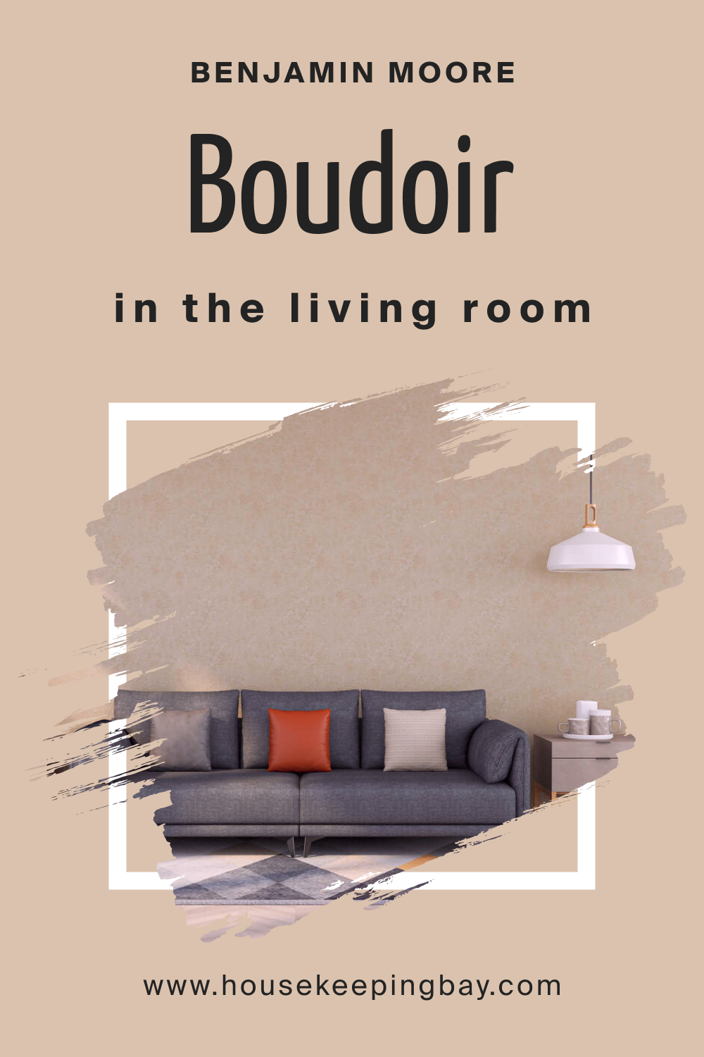
In the living room, Boudoir AF-190 can serve as a statement wall or as the primary color. It brings depth and character, working well with plush fabrics and metallic accents for a glamorous yet inviting space.
housekeepingbay.com
Using Boudoir AF-190 for an Exterior
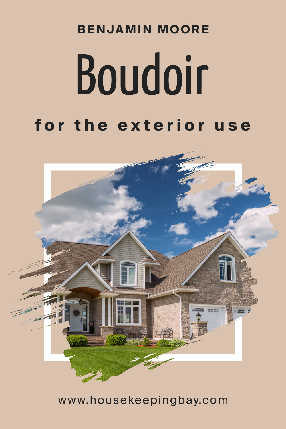
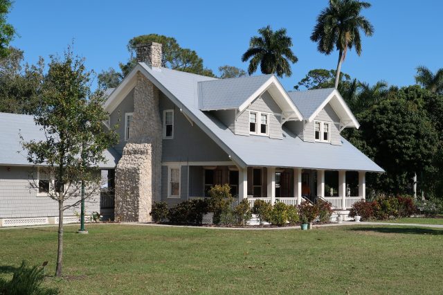
For exteriors, consider using Boudoir AF-190 for doors or shutters. Its rich hue adds curb appeal and a touch of refinement to the façade, especially when paired with neutral siding colors.
housekeepingbay.com
Using Boudoir AF-190 in the Kitchen
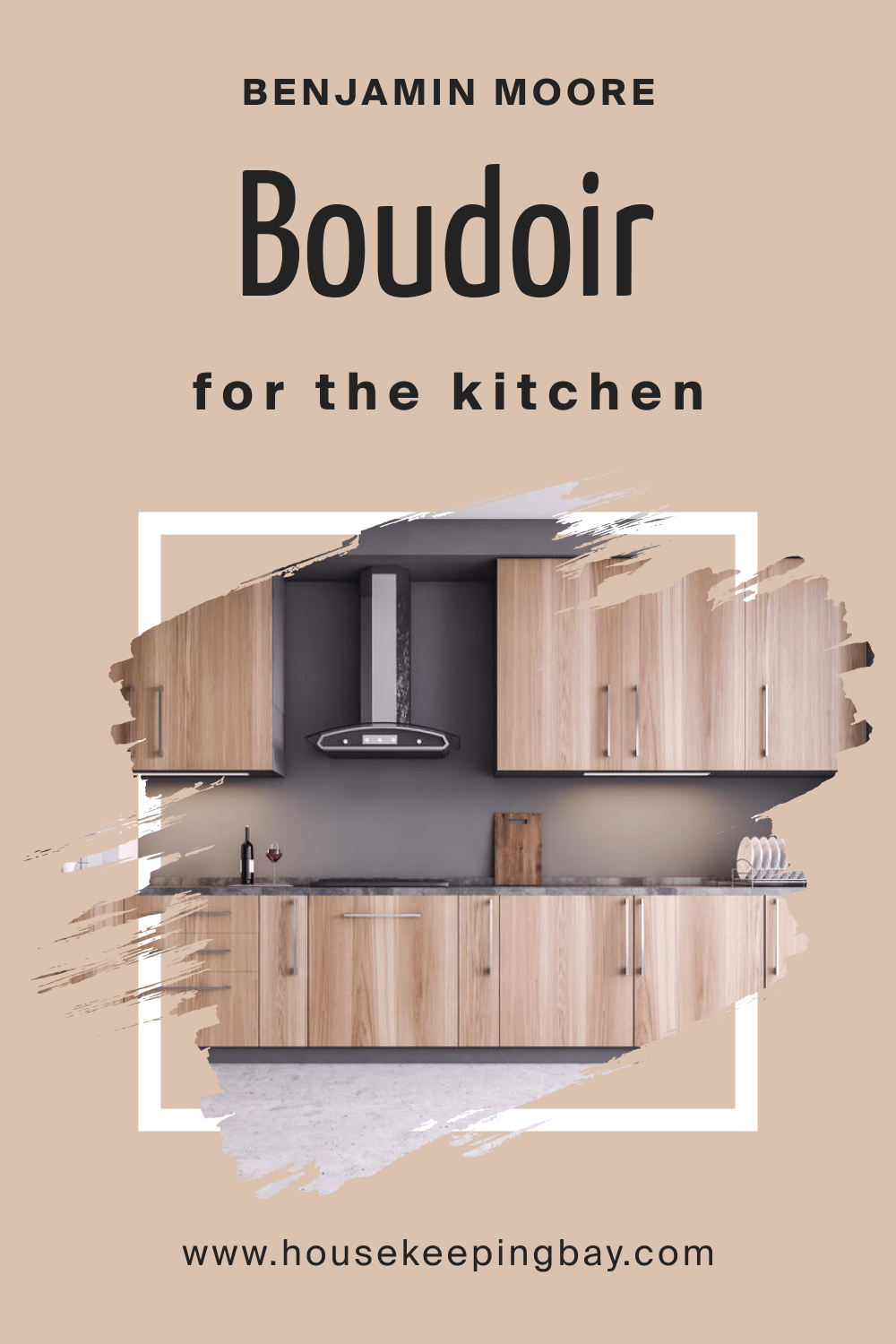
In the kitchen, use Boudoir AF-190 sparingly on an accent wall or through accessories like bar stools or pendant lights. It can complement both light and dark cabinetry, adding a dash of elegance.
housekeepingbay.com
Using Boudoir AF-190 on the Kitchen Cabinets
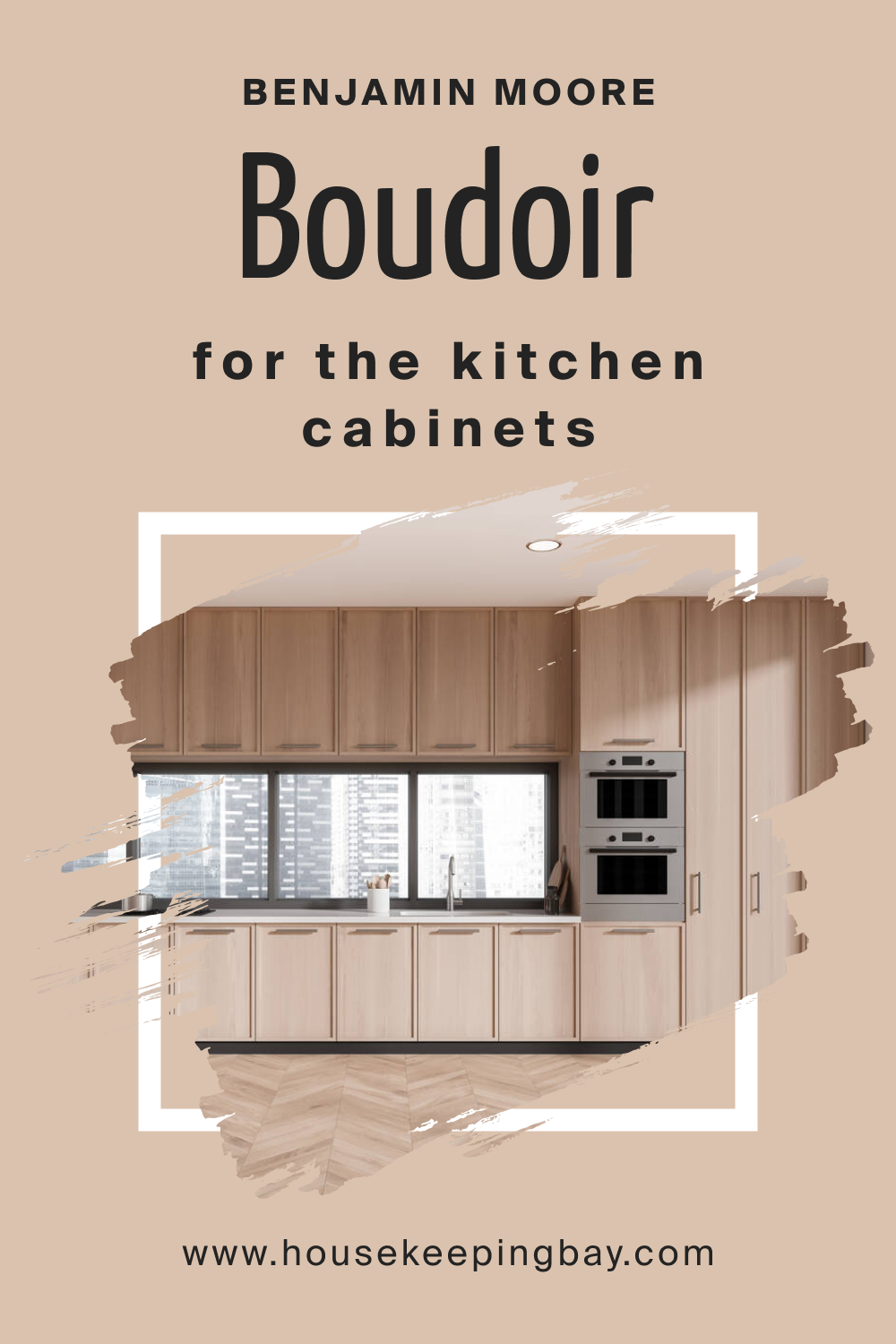
For kitchen cabinets, Boudoir AF-190 brings a sophisticated flair. Apply it to lower cabinets or kitchen islands, contrasting it with lighter tones for a balanced and captivating look.
housekeepingbay.com
Comparing Boudoir AF-190 With Other Colors
Comparing colors is crucial in the design process as it allows for a nuanced understanding of how different hues interact and contribute to the overall aesthetic. It helps in achieving harmony and balance within a space, ensuring that chosen colors complement each other. This process aids in avoiding clashes and creating a cohesive and visually pleasing environment that aligns with the desired mood and style.
Boudoir AF-190 vs. BM 880 White Zinfandel
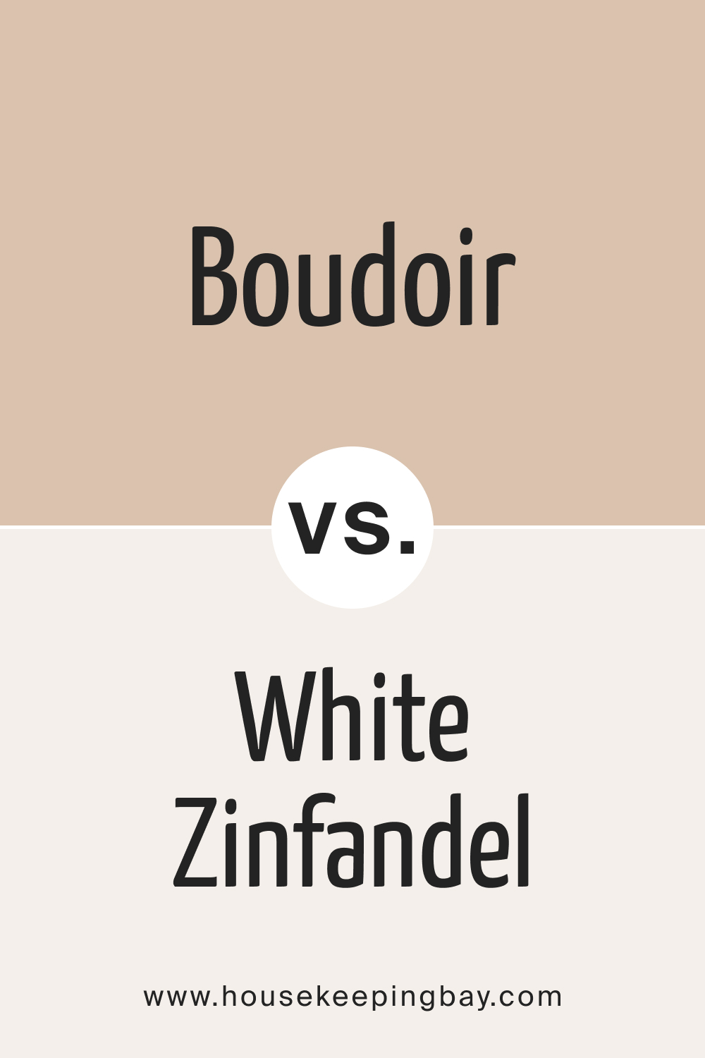
While Boudoir AF-190 exudes warmth and sophistication, BM 880 White Zinfandel introduces a crisp and airy quality. White Zinfandel’s slightness contrasts with Boudoir’s richness, offering a delicate balance between depth and freshness. This pairing is ideal for spaces seeking a harmonious blend of warmth and brightness.
housekeepingbay.com
Boudoir AF-190 vs. BM 1171 Bashful
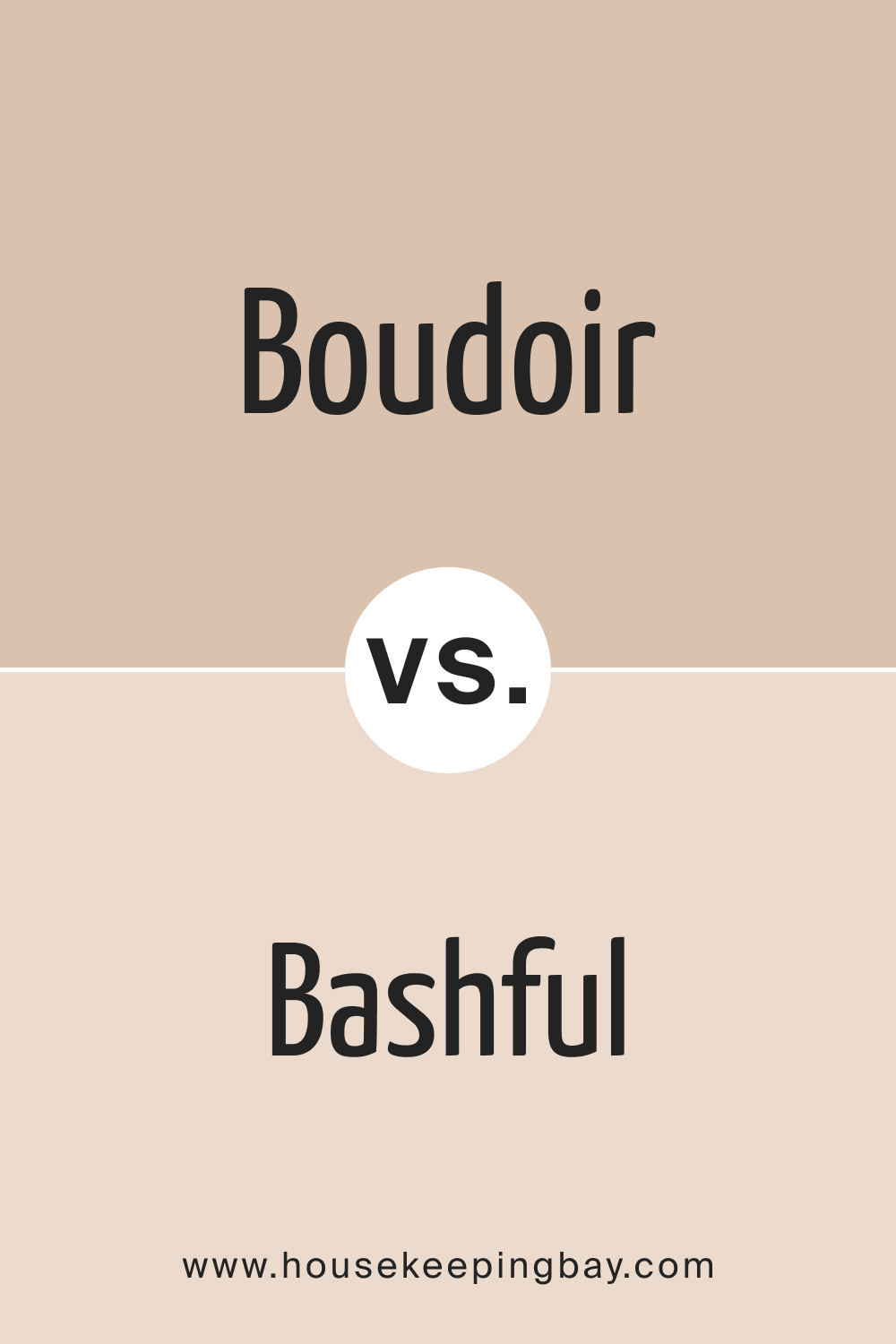
In comparison to the subtlety of Bashful , Boudoir AF-190 makes a bolder statement. Bashful leans towards a muted pink, while Boudoir boasts a deeper and more pronounced rose. The choice between the two depends on the desired level of vibrancy and drama within the space.
housekeepingbay.com
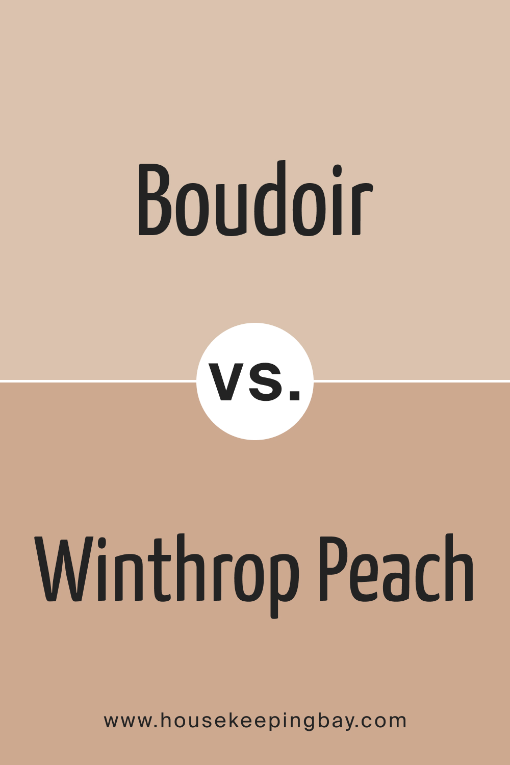
Boudoir AF-190 vs. HC-55 Winthrop Peach
While Winthrop Peach embraces a peachy undertone, Boudoir AF-190 maintains its depth with a more pronounced rose hue. The contrast highlights Boudoir’s sophistication, making it a preferable choice for those seeking a richer and more luxurious color palette.
housekeepingbay.com
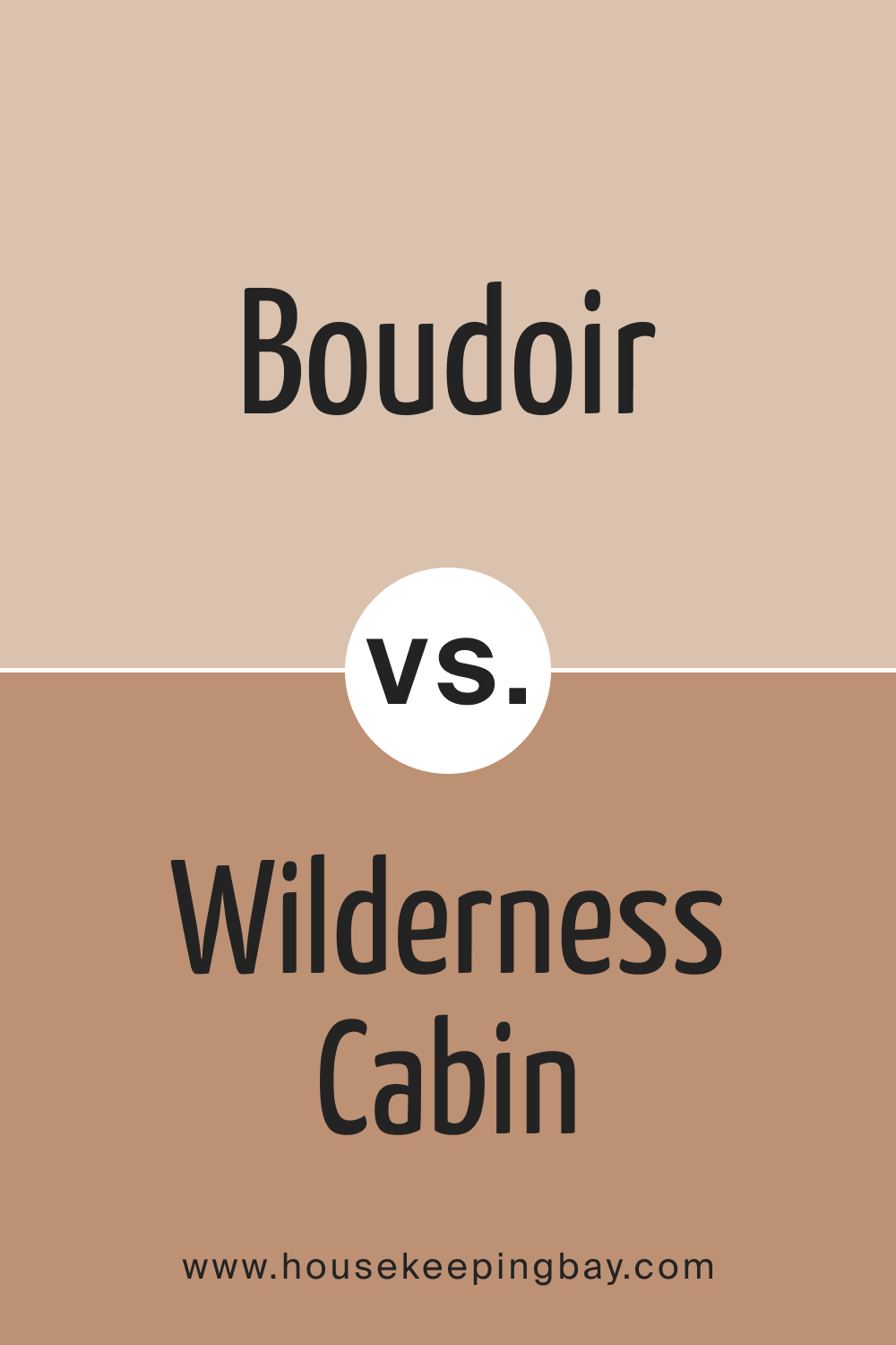
Boudoir AF-190 vs. BM 1168 Wilderness Cabin
Wilderness Cabin , with its earthy undertones, contrasts with Boudoir AF-190’s refined elegance. Boudoir leans towards a sophisticated rose, while Wilderness Cabin introduces a grounded and nature-inspired quality. The choice depends on whether a room calls for a touch of glamour or a more rustic feel.
housekeepingbay.com
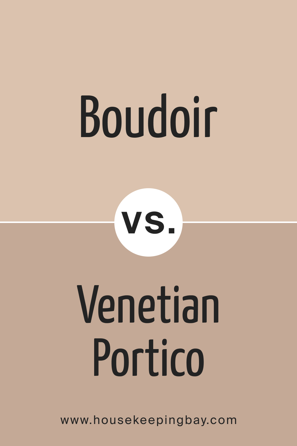
Boudoir AF-190 vs. AF-185 Venetian Portico
Venetian Portico , a deep and muted red, shares some undertones with Boudoir AF-190. However, Boudoir maintains a softer and more elegant appearance. The comparison highlights the nuanced differences in warmth and richness between the two, guiding the choice based on the desired level of intensity.
housekeepingbay.com
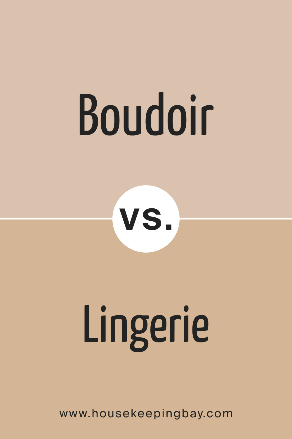
Boudoir AF-190 vs. AF-200 Lingerie
Lingerie and Boudoir AF-190 share a similar depth, but Lingerie leans more towards a traditional muted pink. Boudoir, on the other hand, offers a touch of sophistication with its pronounced rose undertones. The comparison emphasizes the subtle distinctions in undertones, guiding the selection based on the desired level of warmth and elegance.
housekeepingbay.com
Conclusion
Boudoir AF-190 is not just a color; it’s a statement. Its unique blend of warmth, sophistication, and versatility makes it a timeless choice for interior design. Understanding its characteristics, undertones, and coordinating colors opens up a world of possibilities for creating captivating and elegant living spaces.
Whether used as a primary wall color or as accents in furniture and decor, Boudoir AF-190 is sure to leave a lasting impression, transforming any space into a haven of refined
housekeepingbay.com
Ever wished paint sampling was as easy as sticking a sticker? Guess what? Now it is! Discover Samplize's unique Peel & Stick samples. Get started now and say goodbye to the old messy way!
Get paint samples




Frequently Asked Questions
⭐Is Boudoir AF-190 suitable for small rooms?
Absolutely! Boudoir AF-190's warm undertones make it a versatile choice for small spaces. It adds depth without overwhelming, creating an intimate and cozy atmosphere.
⭐Can Boudoir AF-190 be used in a modern interior design?
Certainly! Boudoir AF-190's timeless elegance makes it perfect for modern interiors. It pairs well with clean lines and contemporary furnishings, adding a touch of sophistication.
⭐How does Boudoir AF-190 fare in high-traffic areas?
Boudoir AF-190 is a durable paint suitable for high-traffic areas. Regular maintenance is key, and using a matte finish can help conceal minor scuffs or marks.
⭐Can I use Boudoir AF-190 in a north-facing room?
Yes, Boudoir AF-190 adapts beautifully in north-facing rooms. Its warm undertones counterbalance the cooler light, creating a cozy and inviting ambiance.
⭐What trim colors complement Boudoir AF-190?
Trim colors like OC-17 White Dove, CC-30 Oxford White, and OC-65 Chantilly Lace from Benjamin Moore create a crisp contrast, enhancing the sophistication of Boudoir AF-190.
One thought on “Boudoir AF-190 Paint Color by Benjamin Moore”
Leave a Reply



Has anyone used Boudoir AF-190 in a traditional-style living room?