Lush AF-475 by Benjamin Moore
Embracing the Vibrancy of Nature's Green
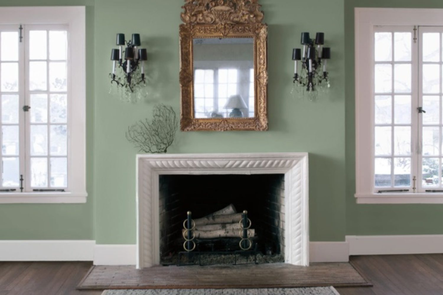
Picture giving your space a fresh, new look with a touch of elegance and serenity. Well, you’re in luck! AF-475 Lush by Benjamin Moore is here to transform your home into a peaceful oasis. This color isn’t just any green; it’s a unique shade that brings the calming essence of nature right into your living spaces. Imagine your walls wrapped in this soothing hue, creating a serene backdrop for your daily life.
Whether you’re looking to freshen up your living room, bedroom, or even your bathroom, AF-475 Lush has got you covered. Its versatility means it pairs wonderfully with a wide range of decor styles, from modern to rustic. Plus, it’s more than just a pretty shade; it also adds a sense of tranquility to your home, making it the perfect retreat from the hustle and bustle of everyday life.
Choosing the right paint can be a game-changer for your home, and with AF-475 Lush, you’re choosing a color that’s both trendy and timeless. Get ready to transform your space into a haven of peace and beauty.
by Benjamin Moore
What Color Is Lush AF-475 by Benjamin Moore?
Lush AF-475 by Benjamin Moore is a rich, vibrant green that brings a touch of nature’s tranquility indoors. It’s a color that balances the freshness of spring with the depth of a forest, making it adaptable and inviting for various interior settings. This hue has a grounding effect, pairing perfectly with a range of interior styles, especially modern, Scandinavian, and rustic. Its versatility allows it to act as a striking focal point or a subtle backdrop for rooms seeking a touch of serenity.
For modern interiors, Lush AF-475 works well as an accent, offering a pop of color against neutral tones like whites, grays, and blacks. In Scandinavian settings, it complements the aesthetic’s love for natural light and simplicity, creating spaces that feel both open and cozy. When applied in rustic decor, this color enhances the style’s warmth and connection to nature, pairing splendidly with raw wood textures, natural stone, and organic fabrics like linen and cotton.
Speaking of pairing, Lush AF-475 teams up wonderfully with a variety of materials and textures. It looks particularly stunning with natural wood, from light oaks to dark walnuts, enhancing the wood’s warmth and character. Leather, in shades of tan or brown, adds a luxurious feel to this color, while metallic accents in gold or brass can introduce a touch of elegance. For a layered, cohesive look, mix in textures like wool throws or jute rugs to bring out the color’s depth and complexity.
In summary, Lush AF-475 by Benjamin Moore is a dynamic, adaptable green that can breathe life and energy into a space while maintaining an air of calm and refinement. Its ability to complement a wide range of materials and textures makes it a versatile choice for various design styles.
housekeepingbay.com
Is Lush AF-475 by Benjamin Moore Warm or Cool color?
LushAF-475 by Benjamin Moore is a special color that brings a unique vibe into homes. This color is not just any typical green; it’s a rich, soothing shade that can make rooms feel more inviting and cozy. When used in a home, LushAF-475 can add a touch of nature indoors, making spaces feel fresh and lively. It’s perfect for anyone looking to add a bit of outdoor charm to their living space.
The beauty of LushAF-475 lies in its versatility. It works great in many areas of a home, from living rooms to bedrooms, and even in kitchens or bathrooms. This color can pair well with various decor styles, whether you’re aiming for a modern look or something more traditional. It also matches nicely with different materials and textures, like wood, metal, or fabric, allowing for a wide range of decorating possibilities.
Adding LushAF-475 to your home can transform an ordinary room into a peaceful retreat. Its ability to create a comfortable atmosphere makes it a fantastic choice for anyone looking to refresh their space.
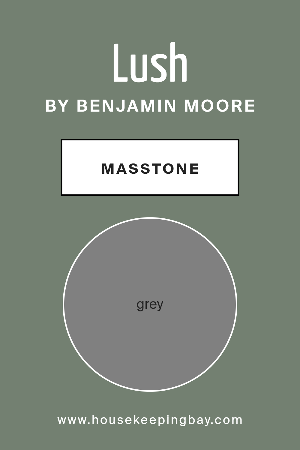
What is the Masstone of the Lush AF-475 by Benjamin Moore?
LushAF-475 by Benjamin Moore is a popular choice for many homeowners. Its main color, known as masstone, is Grey (#808080). This grey color plays a big role in how the paint looks on walls and how it makes rooms feel. Imagine putting on a pair of glasses that makes everything crisp and clear – that’s kind of what this grey does for a room. It’s like a magic color that can fit in anywhere, whether you want your living room to feel cozy or your kitchen to look sleek.
Because it’s a neutral color, LushAF-475 can go well with almost any other color, from bright yellows to deep blues. It’s like the best teammate for other colors, helping them to stand out without taking all the attention. This grey is especially good for making small spaces look bigger and brighter, because it reflects light around the room. So, if you want a color that’s easy to work with and can make your home look great, this grey from Benjamin Moore might be just what you’re looking for.
housekeepingbay.com
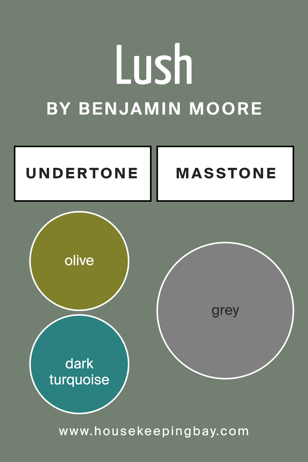
Undertones of Lush AF-475 by Benjamin Moore
LushAF-475 by Benjamin Moore is a unique color that carries a range of undertones, making it versatile and interesting. When we talk about undertones, we’re referring to the subtle colors that are mixed into the main color, affecting how it looks in different lights or when paired with other colors. For LushAF-475, these undertones include a wide spectrum from olive, dark turquoise, and mint, to purple, pale pink, and lilac, along with many others like brown, navy, and even fuchsia.
Understanding the undertones is crucial because they influence the color’s appearance in various settings. For example, in a room with a lot of natural light, LushAF-475 might highlight its lighter undertones like pale yellow or light green, creating a fresh and lively feel. In contrast, in a dimly lit room, the darker undertones like dark grey or brown might stand out, giving the space a cozier and more grounded atmosphere.
When applied to interior walls, LushAF-475’s complexity allows it to adapt and complement different decor styles and color schemes. It could accentuate wooden furniture by bringing out its brown and olive undertones, or pair beautifully with metallic accents by drawing on its dark turquoise and navy hues. The presence of undertones like pale pink and lilac can soften a space, adding a delicate, soothing vibe, while the bolder undertones like red and fuchsia can inject energy and vivacity into a room.
Overall, the undertones of LushAF-475 enrich its character, offering a dynamic palette that can fundamentally alter the mood and feel of a space, making it a versatile choice for any interior.
housekeepingbay.com
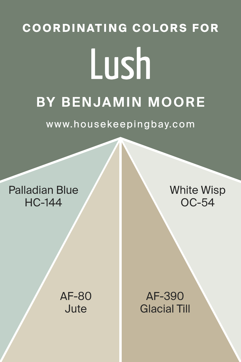
Coordinating Colors of Lush AF-475 by Benjamin Moore
Coordinating colors are shades that harmonize well together, creating a balanced and appealing visual effect. When selecting coordinating colors for a particular hue, such as Lush AF-475 by Benjamin Moore, it’s like picking friends that bring out the best in each other, enriching the room’s ambiance without overpowering it. These colors complement each other in a way that enhances the beauty and character of the primary color.
HC-144, known as Palladian Blue, is a gentle, airy blue that evokes a sense of calm and serenity, perfect for creating a peaceful and inviting space. AF-80, named Jute, is a neutral tone with a warm, earthy quality that provides a versatile backdrop, ideal for adding depth and warmth to any room. AF-390, Glacial Till, introduces a soft, muted lavender-grey, offering a contemporary twist with its soothing, understated elegance. Lastly, OC-54, or White Wisp, is a crisp, clean white with a subtle hint of grey, giving a fresh and luminous lift to any color scheme, making it an essential choice for a bright and airy feel. These colors work together seamlessly, each bringing its unique personality while supporting the overall look and feel of the space.
You can see recommended paint colors below:
- HC-144 Palladian Blue
- AF-80 Jute
- AF-390 Glacial Till
- OC-54 White Wisp
housekeepingbay.com
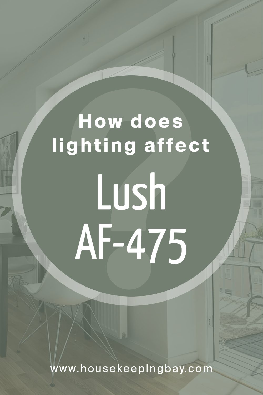
How Does Lighting Affect Lush AF-475 by Benjamin Moore?
Lighting has a huge role in how colors appear to our eyes. The same color can look different under various types of light because light sources have varying qualities and intensities. The color LushAF-475 by Benjamin Moore is a great example to explore how lighting conditions affect how we perceive its appearance.
In artificial light, the perception of LushAF-475 can change depending on the type of bulb used. With warmer, soft white bulbs, LushAF-475 may appear more vibrant and warmer because these lights tend to enhance warmer tones. If you use cooler, daylight bulbs, LushAF-475 might look slightly cooler and more subdued, as these lights mimic the qualities of natural daylight and can tone down warmth.
Natural light brings its own set of changes to LushAF-475. As the Earth rotates, the angle and intensity of sunlight change, impacting how this color appears throughout the day. In the morning and evening, when sunlight is softer and more golden, LushAF-475 can look warmer and more inviting. When the sun is high at noon, it might appear brighter and truer to its original hue due to the direct intensity of the light.
Room orientation plays a pivotal role:
- North-faced rooms receive less direct sunlight, making them cooler and more shadowed. Here, LushAF-475 may present itself as more muted and slightly cooler, lacking the vibrant warmth it could show in a well-lit room.
- South-faced rooms bask in ample sunlight for most of the day, making them brighter. In these rooms, LushAF-475 likely appears more lively and true to color, showcasing its richness and depth fully.
- East-faced rooms get plenty of sunlight in the morning when the light is golden and softer. This means LushAF-475 could look warm and welcoming in the morning, gradually transitioning to a cooler tone as the day progresses and the natural light diminishes.
- West-faced rooms experience the reverse of east-faced rooms, with softer, warmer light in the evening. Thus, LushAF-475 may seem muted during the day but gradually warm up and become more vibrant as the evening approaches with the sunset.
In summary, LushAF-475 by Benjamin Moore, like any other color, is influenced by the light it is viewed under, whether artificial or natural. Its appearance can vary significantly, demonstrating the dynamic relationship between color and light.
housekeepingbay.com
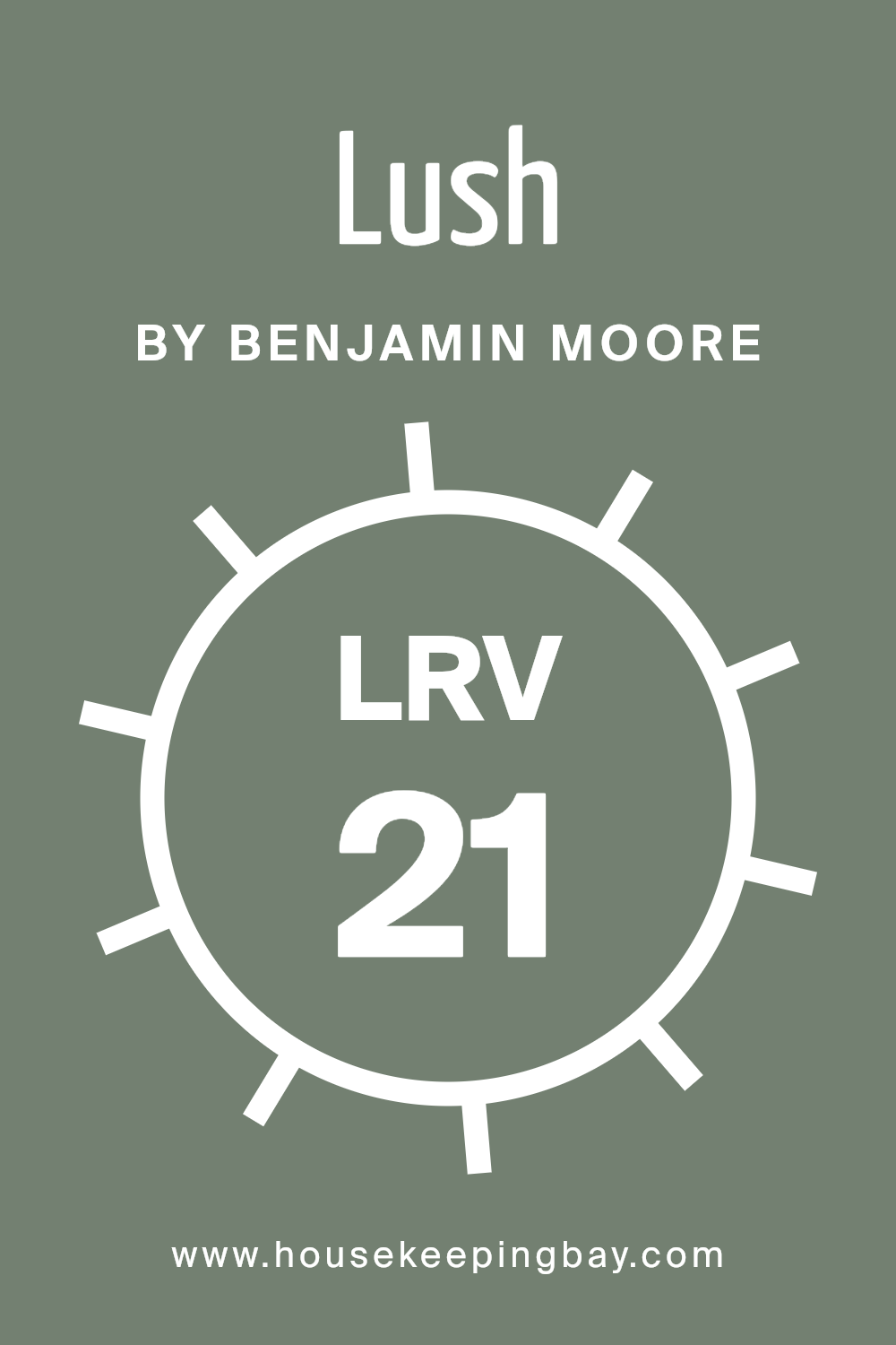
What is the LRV of Lush AF-475 by Benjamin Moore?
LRV stands for Light Reflectance Value, which is a way to measure how much light a paint color reflects or absorbs. Think of it this way: on a scale from 0 to 100, 0 means the paint is as dark as it gets (it absorbs all the light), and 100 means it’s super bright and reflects all the light back. This measurement helps people decide how light or dark a paint will look on their walls, which is pretty handy when you’re trying to set a certain mood in a room or make a space look bigger or cosier.
Given that LushAF-475 by Benjamin Moore has an LRV of 21.09, it’s on the darker side, meaning it won’t reflect a lot of light back into the room. In spaces with less natural light, using a color with this LRV could make the room feel more intimate and grounded. However, if you’re painting a small or poorly lit space, this shade might make it feel even smaller or darker. Alternatively, in a well-lit room or one with plenty of artificial light, this color can add depth and richness without making the space feel too cramped. It’s all about where and how you use it!
housekeepingbay.com
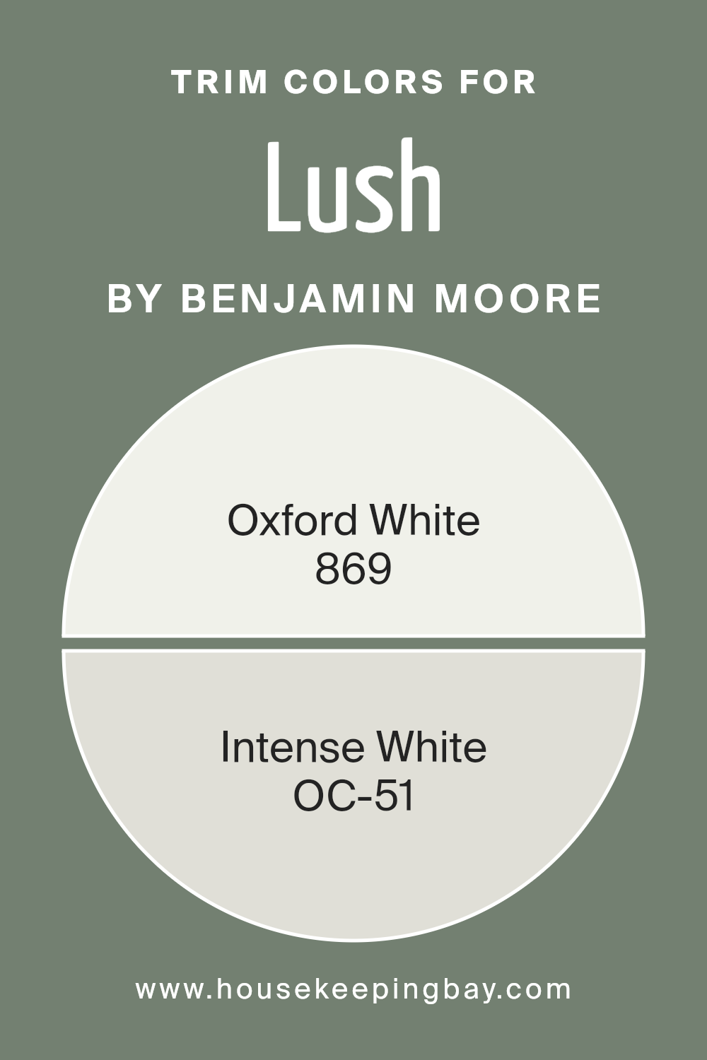
What are the Trim colors of Lush AF-475 by Benjamin Moore?
Trim colors are special shades used to highlight the architectural features of a room like door frames, window trims, and skirtings. They act as a frame for the walls, helping to define the space and add depth and contrast. For a color like LushAF-475 by Benjamin Moore, choosing the right trim color is crucial because it can influence the room’s overall atmosphere and cohesion. The trim colors can subtly complement or boldly contrast with the main wall color, depending on the desired effect, thus enhancing the architectural beauty of the space and contributing to a more polished and refined look.
Two colors often selected for trim with LushAF-475 are 869 – Oxford White and OC-51 – Intense White by Benjamin Moore. Oxford White is a pure, crisp white that brings a fresh and clean look to any space. Its brightness makes it a perfect candidate for trim, providing a sharp contrast that can make the wall color pop, making the room appear more vibrant and spacious. On the other hand, Intense White is a soft, light gray with warm undertones, offering a subtler contrast.
It’s ideal for those seeking a harmonious blend with LushAF-475, without the starkness that comes with pure white, giving the room a sophisticated and cohesive appearance. These colors not only highlight the architectural elements but also contribute significantly to the ambiance and character of the space.
You can see recommended paint colors below:
- 869 Oxford White
- OC-51 Intense White
housekeepingbay.com
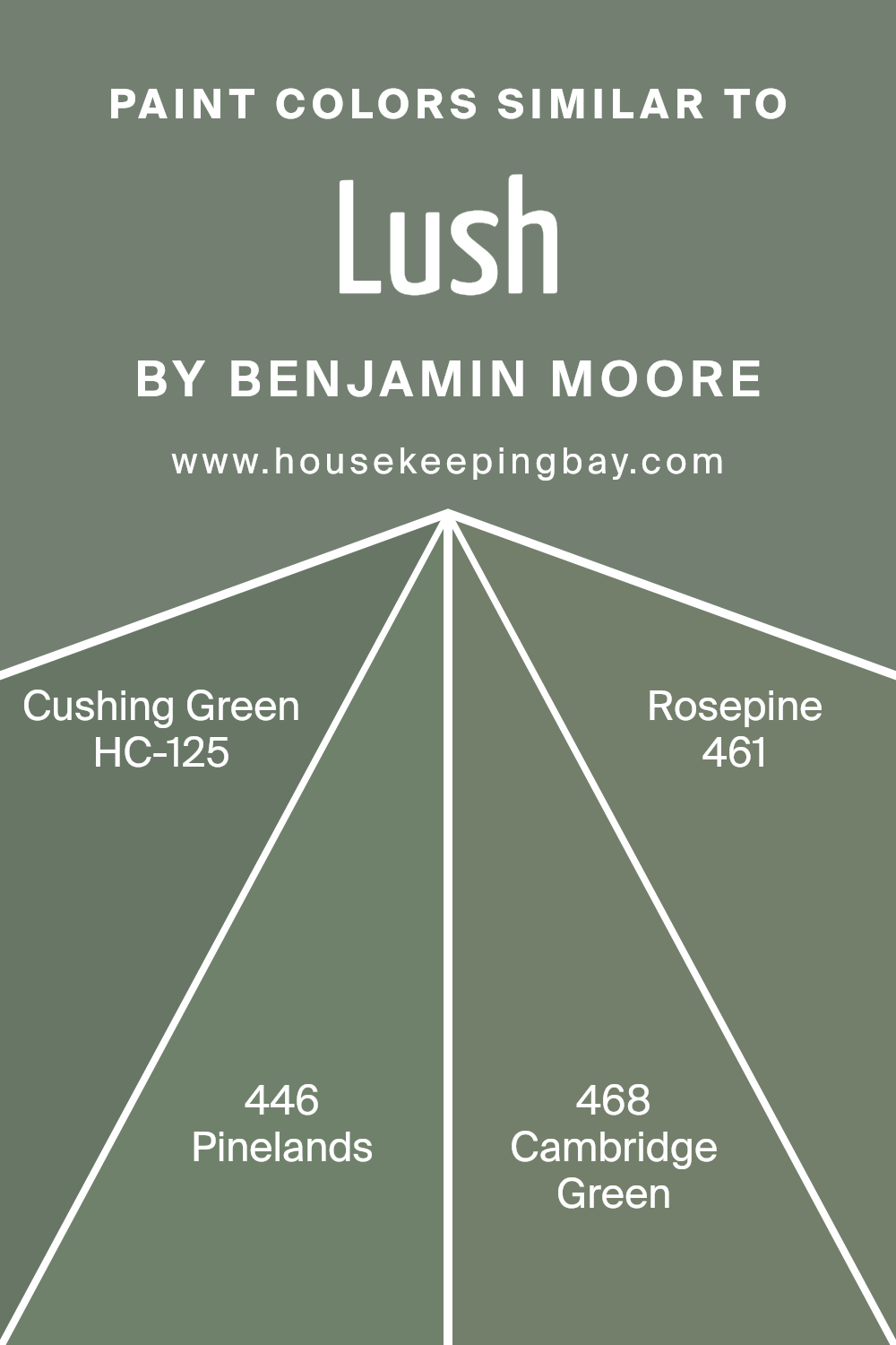
Colors Similar to Lush AF-475 by Benjamin Moore
Choosing similar colors to Lush AF-475 by Benjamin Moore is key to creating a harmonious and appealing space. These similar colors, such as HC-125 Cushing Green, 446 Pinelands, 468 Cambridge Green, and 461 Rosepine, have their unique charm yet share a common foundation that ties the space together beautifully. These colors work well together because they have a balanced level of saturation and brightness that complements each other without competing for attention.
This similarity in hue enables a smooth transition from one color to another, providing a cohesive look that’s pleasing to the eye. The use of similar colors can also enhance the mood of a room, offering a tranquil and refreshing ambiance that’s perfect for relaxation and rejuvenation.
HC-125 Cushing Green is a deep, soothing green that evokes the sense of being in a lush, forest hideaway, making it perfect for spaces where peace and calm are desired. Pinelands, with its number 446, offers a slightly lighter touch, reminiscent of pine needles scattered across a forest floor, adding a soft and serene energy to any room. Cambridge Green, known as 468, carries a more majestic and timeless green, bringing a sense of stability and grounding to the environment.
Lastly, 461 Rosepine introduces a unique blend that hints at underlying warmth, making spaces feel cozy and welcoming. Together, these colors create a seamless palette that enriches spaces with nature-inspired tones and a sense of well-being.
You can see recommended paint colors below:
- HC-125 Cushing Green
- 446 Pinelands
- 468 Cambridge Green
- 461 Rosepine
housekeepingbay.com
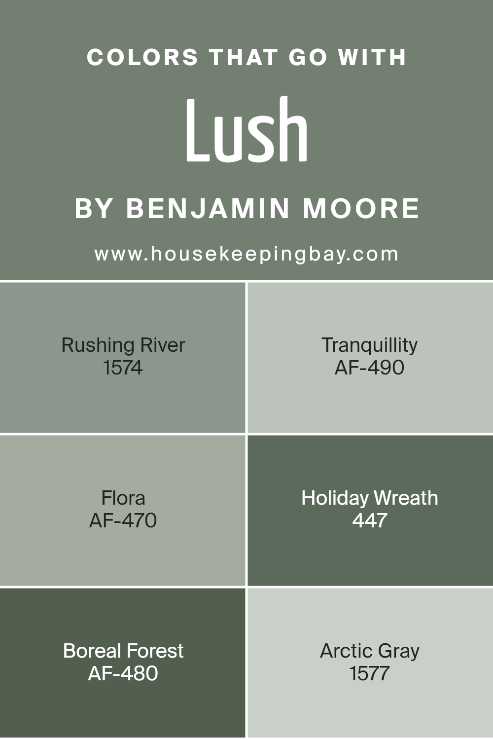
Colors that Go With Lush AF-475 by Benjamin Moore
Selecting companion colors for Lush AF-475 by Benjamin Moore is crucial because these complementary colors enhance the overall ambiance of a space by adding depth and character. When chosen wisely, these colors harmonize to create a visually appealing palette that accentuates the rich qualities of Lush AF-475, making it more striking.
For instance, colors like Rushing River and Arctic Gray bring cool, serene tones that balance the warmth of Lush AF-475, making spaces feel more inviting and balanced. On the other hand, Tranquility and Boreal Forest introduce subtle, natural hues which evoke a sense of calm and connection to the outdoors, perfectly complementing the earthiness of Lush.
Rushing River has a gentle flow of soft grays and blues, resembling a serene waterway, which pairs beautifully with the grounded feel of Lush AF-475, offering a peaceful retreat. Tranquillity, as its name suggests, is a soft, muted color with an airy vibe that brings a sense of peace and lightness to a room, playing nicely against the depth of Lush. Flora and Holiday Wreath lean towards the more vibrant side of the palette, with Flora presenting a fresh, botanical green that breathes life into spaces, and Holiday Wreath adding a richer, celebratory green that anchors the space with its lush vibrancy.
Boreal Forest steps in with a deeper, more mysterious green, enveloping rooms in a cozy, sophisticated embrace that feels both refined and earthy. Lastly, Arctic Gray offers a subtle, sophisticated blend of gray with a whisper of blue, providing a perfect backdrop that enhances the visual appeal of Lush AF-475, ensuring spaces feel harmonious and thoughtfully designed. Together, these colors weave a tapestry of shades that enhance and complement the beauty of Lush AF-475, making it a versatile choice for creating environments that are both stylish and warmly welcoming.
You can see recommended paint colors below:
- 1574 Rushing River
- AF-490 Tranquillity
- AF-470 Flora
- 447 Holiday Wreath
- AF-480 Boreal Forest
- 1577 Arctic Gray
housekeepingbay.com
How to Use Lush AF-475 by Benjamin Moore In Your Home?
Lush AF-475 by Benjamin Moore is a paint color that can truly transform any part of your home. Its unique green shade brings a fresh and lively vibe to a room, perfect for someone looking to add a natural touch. Think of it like bringing a bit of the outdoors inside. You can use it in various ways around your home. For example, painting a single wall in your living room or bedroom with Lush AF-475 can create a stunning focal point without overwhelming the space. It’s like having a statement piece that draws the eye and adds personality to the room.
If you’re not ready to commit to painting a whole wall, consider using it for smaller projects, like refreshing the look of a bookshelf or a piece of furniture. This not only adds a splash of color but also gives old items a new life. In the kitchen or bathroom, Lush AF-475 cabinets can brighten up the space, making it feel clean and welcoming. No matter how you decide to use it, Lush AF-475 brings a cheerful energy that makes your home feel more inviting.
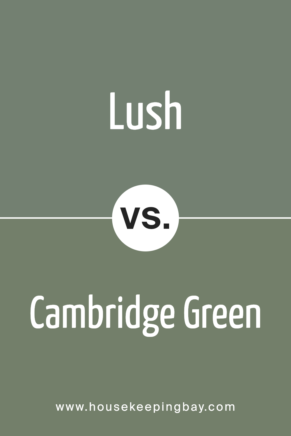
Lush AF-475 by Benjamin Moore vs Cambridge Green 468 by Benjamin Moore
Lush AF-475 and Cambridge Green 468, both by Benjamin Moore, are two distinct shades of green that offer different vibes for any room. Lush AF-475 is a vibrant, rich green that feels very alive and dynamic. It’s the kind of color that stands out, bringing a bold and lively energy to spaces. It can make a room feel fresh and full of life.
On the other hand, Cambridge Green 468 leans towards a more understated, classic look. It’s a softer, more muted green, giving off a calm and soothing atmosphere. This color is perfect for creating a relaxed environment, great for spaces where you want to chill and feel at peace.
While Lush AF-475 pops and draws attention, making a statement, Cambridge Green 468 works harmoniously to set a tranquil tone. Both colors are beautiful in their own right, with Lush AF-475 suited for those looking to add vibrancy and Cambridge Green 468 ideal for creating a serene retreat.
You can see recommended paint color below:
- 468 Cambridge Green
housekeepingbay.com
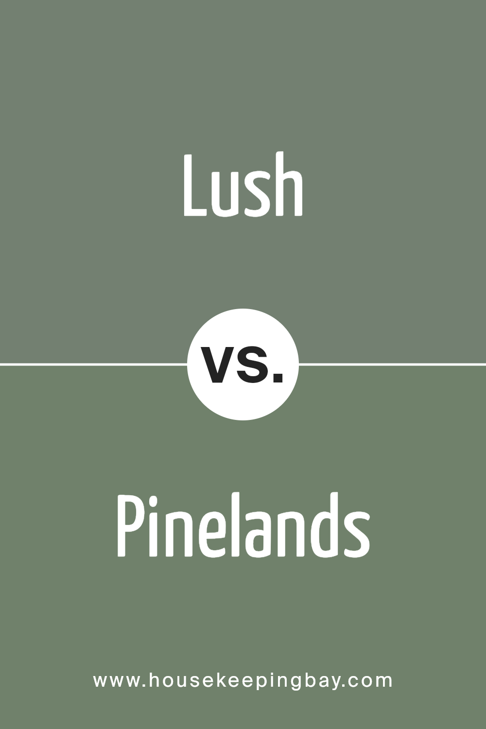
Lush AF-475 by Benjamin Moore vs Pinelands 446 by Benjamin Moore
When comparing Lush AF-475 and Pinelands 446, both by Benjamin Moore, you’ll notice some interesting differences. Lush AF-475 is a color that brings a warm, cozy feel to any space. It’s rich and has an earthy touch, making it perfect for creating a comforting and inviting atmosphere in rooms. On the other hand, Pinelands 446 has a lighter, more subtle vibe. This color leans towards a soft, natural green, reminiscent of a peaceful stroll through a forest.
It’s great for spaces where you want to add a touch of calmness and serenity, without overwhelming the space with too much color intensity. While Lush AF-475 might be the go-to for a more dramatic, cozy effect, Pinelands 446 is your friend for a gentle, soothing environment. Both colors bring their own unique flair to the table, making them suitable for different moods and settings.
You can see recommended paint color below:
- 446 Pinelands
housekeepingbay.com
Lush AF-475 by Benjamin Moore vs Rosepine 461 by Benjamin Moore
Lush AF-475 by Benjamin Moore and Rosepine 461 by Benjamin Moore are two beautiful colors you might choose for your space. Lush AF-475 is a rich, deep green that brings to mind the calmness of a dense forest. It gives off a serene and grounding vibe, perfect for spaces where you want to relax or focus.
On the other hand, Rosepine 461 has a soft, subtle green hue. It’s lighter than Lush AF-475 and carries a touch of warmth, making it ideal for creating a cozy and inviting atmosphere. While Lush AF-475 might be suited for creating a bold statement or adding depth to a room, Rosepine 461 is great for brightening up a space and making it feel more open and airy. Both colors offer unique qualities, with Lush being the go-to for a more dramatic impact and Rosepine being perfect for a gentler, soothing effect.
You can see recommended paint color below:
- 461 Rosepine
housekeepingbay.com
Lush AF-475 by Benjamin Moore vs Cushing Green HC-125 by Benjamin Moore
Lush AF-475 and Cushing Green HC-125, both by Benjamin Moore, have their unique appeal when it comes to choosing paint colors. Lush AF-475 presents a more vibrant and bright green, giving rooms a lively and refreshing look. It’s a color that can make spaces feel more energized and full of life, perfect for social areas like living rooms or kitchens.
On the other hand, Cushing Green HC-125 has a deeper, more subdued hue. This color offers a sense of calmness and sophistication, making it a great choice for bedrooms or offices where a more relaxed atmosphere is desired. Cushing Green’s richness adds a layer of elegance, providing a backdrop that blends well with both modern and traditional decor.
In summary, if you’re looking for a color that brings brightness and vibrancy, Lush AF-475 is your go-to. For those who prefer a more grounded, calming vibe, Cushing Green HC-125 would be the better choice. Both colors offer distinct vibes, allowing for personal expression in any space.
You can see recommended paint color below:
- HC-125 Cushing Green
housekeepingbay.com
Conclusion
In summary, AF-475 Lush by Benjamin Moore is a paint color that brings a unique and beautiful touch to any room in your home. Whether you’re looking to freshen up your living space, add a calming vibe to your bedroom, or give your kitchen a vibrant makeover, AF-475 Lush offers a stunning solution. Its deep, rich tone creates a sense of sophistication and elegance, effortlessly enhancing your home’s aesthetic appeal.
Choosing AF-475 Lush means you’re selecting more than just a paint color; you’re opting for an atmosphere that’s both refreshing and relaxing. This color has the power to transform mundane spaces into luxurious ones, proving to be a versatile choice that works well in various settings and with different decors. It’s perfect for those who want to add a touch of class and depth to their living environment without overwhelming it.
Furthermore, Benjamin Moore is known for its high-quality paints, ensuring that your choice not only looks great but lasts long too. With AF-475 Lush, you can rest assured that you’re making a wise investment in your home’s beauty and comfort. So, if you’re considering giving your home a new coat of paint, AF-475 Lush by Benjamin Moore could be the perfect choice to make your space feel alive and inviting.
housekeepingbay.com
Ever wished paint sampling was as easy as sticking a sticker? Guess what? Now it is! Discover Samplize's unique Peel & Stick samples. Get started now and say goodbye to the old messy way!
Get paint samples


