Grays Harbor SW 6236 by Sherwin Williams
Embracing Sophistication: The Allure of Deep Gray Elegance
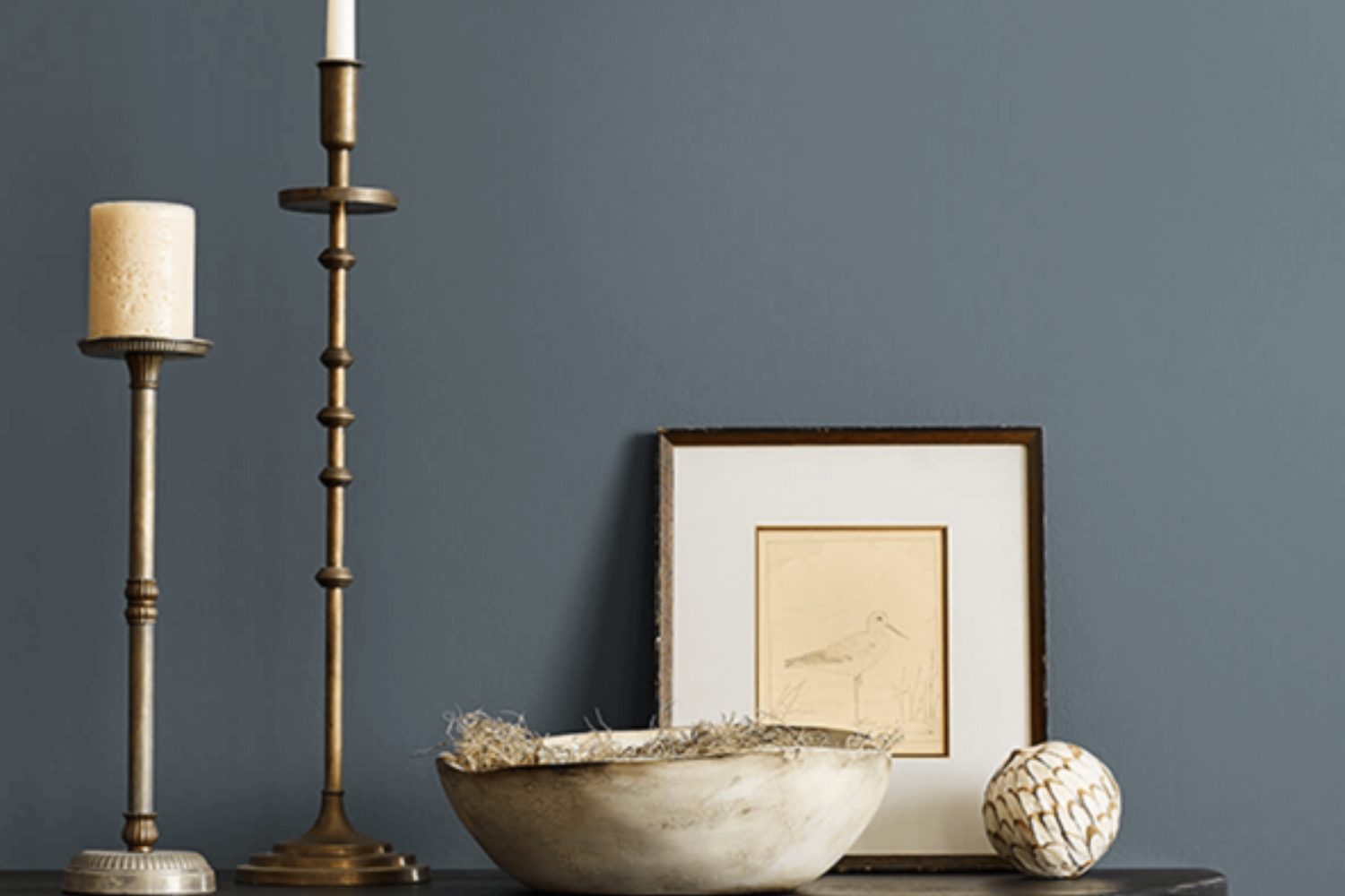
When looking for a fresh look for your space, consider SW 6236 Grays Harbor by Sherwin Williams. This color is a perfect blend between a cozy, welcoming gray and a deep, soothing blue. With Grays Harbor, you get the best of both worlds: the calmness and neutrality of gray, combined with the depth and sophistication of blue. This shade is versatile, making it an excellent choice for any room in your home, whether you’re upgrading your living room, bedroom, or even the kitchen.
Choosing Grays Harbor means adding a touch of elegance and serenity to your surroundings. It’s a color that pairs well with a wide range of decor styles, from modern to traditional. Whether you’re looking to create a peaceful retreat or a stylish entertaining area, Grays Harbor has the potential to transform your space with its unique charm.
Its compatibility with various textures and complementary colors allows you to experiment and personalize your decor. So, if you’re ready to breathe new life into your home with a color that’s both timeless and trendy, SW 6236 Grays Harbor is a choice you’ll love.
via Sherwin Williams
What Color Is Grays Harbor SW 6236 by Sherwin Williams?
Grays Harbor SW 6236 by Sherwin Williams is a rich, sophisticated shade that sits perfectly at the intersection of blue, gray, and green. This versatile color has a deep, muted quality that makes it a great choice for creating a space that feels both cozy and refined. It’s a color that can adapt to different lighting conditions, appearing more green or blue depending on the natural light in the room.
Grays Harbor is ideal for interior styles that lean towards modern, minimalist, industrial, or even rustic. It brings a sense of calm and serenity to modern and minimalist interiors, adding depth without overwhelming the simplicity of the design. In industrial settings, it complements exposed brick, metal fixtures, and reclaimed wood, enhancing the raw, unfinished look. For rustic spaces, this color pairs beautifully with natural elements, adding sophistication to the warmth of rustic wood and stone.
When it comes to materials, Grays Harbor works well with a wide range of textures. It looks stunning with polished concrete, adding an edge to minimalist designs. With metals, it pairs well with both warm tones like brass and cooler ones like stainless steel, offering a balanced backdrop. For textiles, consider soft, plush fabrics in neutral or earthy tones to add warmth to the space. Natural wood, whether light or dark, also pairs beautifully, highlighting the warmth and depth of the color.
In summary, Grays Harbor SW 6236 by Sherwin Williams is a versatile color that works well in a variety of interior styles and pairs beautifully with a wide range of materials and textures, enhancing the overall aesthetic of any room.
housekeepingbay.com
Is Grays Harbor SW 6236 by Sherwin Williams Warm or Cool color?
Grays HarborSW 6236 by Sherwin Williams is a unique shade that brings a cozy and sophisticated vibe into any home. This color belongs to the gray family but stands out because of its deep and warm undertones. When used in a room, it provides a calm and soothing atmosphere, making it perfect for bedrooms, living rooms, or even home offices. Grays Harbor is versatile and pairs well with both light colors, like whites and creams, for a soft, airy look, and bold colors, like rich blues or vibrant yellows, for a more dynamic and contrasting effect.
The beauty of Grays Harbor is in its ability to adapt to different styles and settings. Whether your home is modern, traditional, or somewhere in between, this shade can fit in seamlessly. It creates an elegant backdrop that highlights your furniture and decor without overpowering them. Additionally, in spaces with natural light, Grays Harbor shifts beautifully throughout the day, offering varying hues that keep the room feeling fresh and interesting.
Choosing Grays HarborSW 6236 can transform your home into a soothing retreat that you look forward to returning to every day.
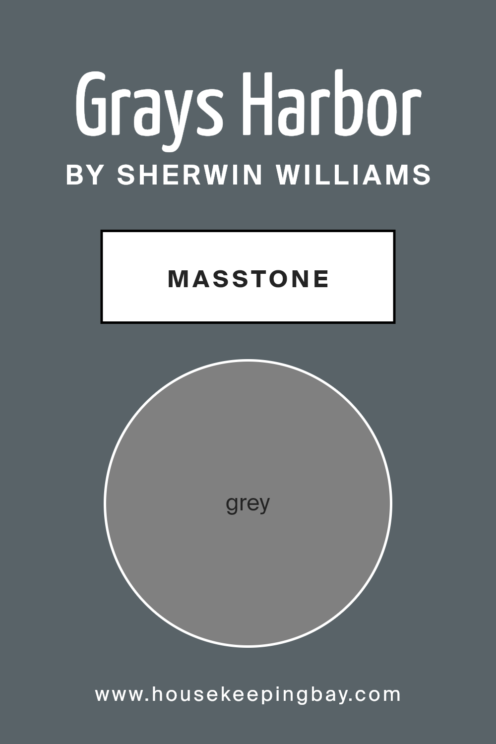
What is the Masstone of the Grays Harbor SW 6236 by Sherwin Williams?
Grays HarborSW 6236 by Sherwin Williams is a unique color that brings a special touch to any home. At its core, the masstone, or the pure color you see when the paint is undiluted, is grey. This isn’t just any grey; it’s a balanced shade that stands perfectly in the middle, not too dark and not too light, much like the grey you might think of when you picture a cloudy day (#808080).
This specific shade of grey has a magical way of working in homes. Since it’s such a versatile color, it fits well in many spaces, whether you’re painting a cozy bedroom, a busy kitchen, or a calm living room. Grey, especially Grays HarborSW 6236, has the power to make other colors in the room stand out. It pairs beautifully with both bright accents for a lively vibe and with softer hues for a more relaxed feel.
Moreover, because this grey is so evenly balanced, it has the benefit of making spaces feel more open and airy while still adding a touch of sophistication and warmth. Whether you’re going for a modern, minimalist look or something more classic, Grays HarborSW 6236 by Sherwin Williams can help achieve the perfect atmosphere in your home.
housekeepingbay.com
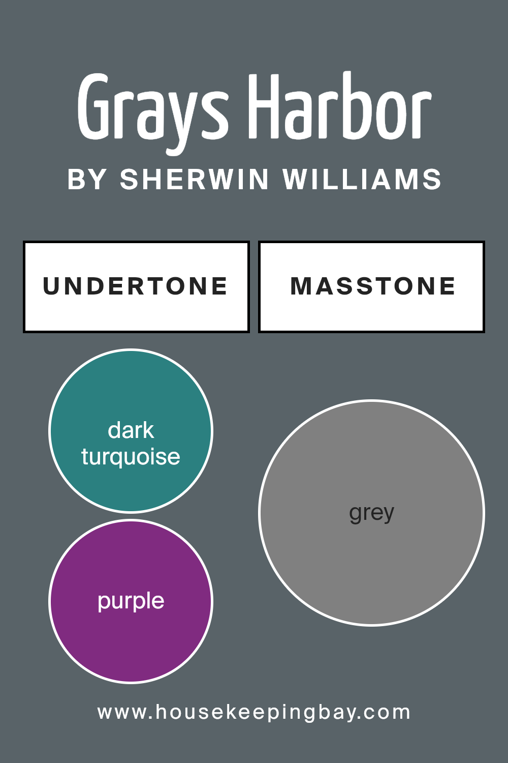
Undertones of Grays Harbor SW 6236 by Sherwin Williams
Grays Harbor SW 6236 by Sherwin Williams is a versatile color that carries a multitude of undertones, making it quite unique in its appearance. The undertones in any color play a huge role in how we perceive it, as they can influence the color’s warmth, coolness, and the overall mood it sets. For Grays Harbor, the undertones range across a broad spectrum, including dark turquoise, purple, navy, and even to lighter shades like mint and pale pink.
When applied to interior walls, these undertones of Grays Harbor affect the room’s ambiance significantly. In natural light, the cooler undertones like navy or dark turquoise might become more pronounced, giving the space a serene and calming feel. These cool undertones can make a room feel more spacious and airy.
On the other hand, in a room with less natural light, the warmer undertones such as brown or olive might stand out, creating a more intimate and cozy atmosphere.
Moreover, the presence of unique undertones like lilac or light turquoise can add complexity and depth to Grays Harbor, making the walls more visually interesting. This complexity allows it to adapt beautifully to different styles and types of decor, from modern to rustic.
The way Grays Harbor transforms under different lighting conditions and complements various decorations is truly remarkable, making it an excellent choice for those who wish to bring sophistication and versatility to their space. Its wide range of undertones ensures that it can evoke different moods and styles, making any room feel just right.
housekeepingbay.com
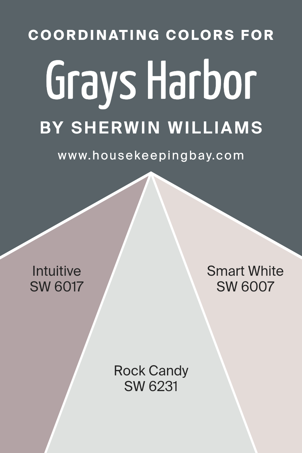
Coordinating Colors of Grays Harbor SW 6236 by Sherwin Williams
Coordinating colors are hues that work well together either by complementing or contrasting with one another in a visually appealing way. Picking the right coordinating colors can enhance the overall look of a space, making it more cohesive and aesthetically pleasing. For Grays Harbor SW 6236 by Sherwin Williams, a deep, serene gray that speaks volumes in its richness and depth, there are specific colors that coordinate beautifully to either soften its intensity or enrich its character.
Intuitive SW 6017 is one of these coordinating colors, offering a graceful green that brings a natural, soothing vibe to the mix.
It’s like a breath of fresh air next to the more somber Grays Harbor, providing a gentle lift to spaces that aim for a balanced, refreshing look. Rock Candy SW 6231, on the other hand, is a soft, almost ethereal gray that whispers elegance and simplicity. It acts as a subtle backdrop, ensuring Grays Harbor stands out without clashing, and harmonizes the space with a touch of lightness. Lastly, Smart White SW 6007 lends itself as a clean, crisp white that can brighten and open up a room.
It provides a sharp contrast to Grays Harbor, creating a striking balance that highlights the rich depth of the gray while injecting a vibrant spark of energy.
Together, these colors form a palette that can transform any space into one of harmony, sophistication, and inviting warmth.
You can see recommended paint colors below:
- SW 6017 Intuitive
- SW 6231 Rock Candy
- SW 6007 Smart White
housekeepingbay.com
How Does Lighting Affect Grays Harbor SW 6236 by Sherwin Williams?
Lighting plays a pivotal role in how we perceive color. The type of light, whether natural or artificial, can significantly change the appearance of a color. Let’s focus on a specific shade, Grays Harbor SW 6236 by Sherwin Williams, and explore how different lighting conditions affect its appearance.
- In artificial light, Grays Harbor can appear darker or lighter depending on the kind of bulbs used. Warm artificial light tends to make this color look more vibrant and cozier, highlighting its subtle undertones. In contrast, cool artificial light can make Grays Harbor seem slightly bluish or even steelier, giving a more modern and sleek look.
- Natural light brings another dimension to Grays Harbor, showing the color’s true complexity. In north-facing rooms, where light is cooler and more constant but less direct, Grays Harbor tends to look more muted and subtle. It might lean a bit towards a softer, more shadowy hue, perfect for creating a peaceful and serene space.
- In south-facing rooms, flooded with warm and bright sunlight for most of the day, Grays Harbor will warm up and reveal its depth. This exposure tends to make the color feel lively and dynamic, changing subtly throughout the day depending on the intensity of the light.
- East-facing rooms get bright morning light, making Grays Harbor appear softer and slightly brighter in the mornings, then transitioning to a cooler tone as the day progresses because the direct sunlight moves away. This creates a refreshing ambiance in the morning, perfect for bedrooms or breakfast nooks.
- West-facing rooms experience the opposite effect, with the color becoming more pronounced and warmer in the afternoons and evenings as the sun sets. Grays Harbor in this lighting can create a cozy and welcoming space, ideal for living rooms where you gather in the afternoon or evening.
Overall, lighting can dramatically impact the appearance of Grays Harbor SW 6236, with the color’s mood and tone shifting from one room to another, presenting a versatile option for various spaces and orientations.
housekeepingbay.com
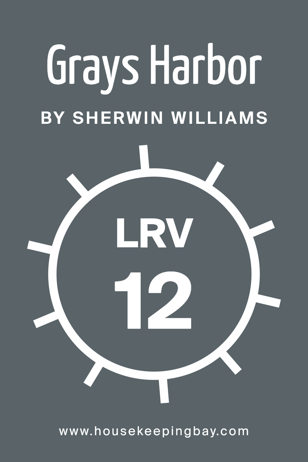
What is the LRV of Grays Harbor SW 6236 by Sherwin Williams?
Given that the LRV of Grays Harbor SW 6236 by Sherwin Williams is 12.12, it is on the darker end of the spectrum. This means it will absorb a lot more light than it reflects. In practical terms, when this color is used on walls, it will give the space a richer, more intimate feel. However, it also means that you’ll need good lighting in the room to keep it from feeling too dark.
Rooms with plenty of natural light will balance out the darkness of the color, but in spaces with limited light, you might want to supplement with additional lighting fixtures. This particular shade of gray, with its low LRV, will create a dramatic and moody atmosphere, perfect for certain design aesthetics but something to consider carefully based on the room’s size and the amount of light it receives.
housekeepingbay.com
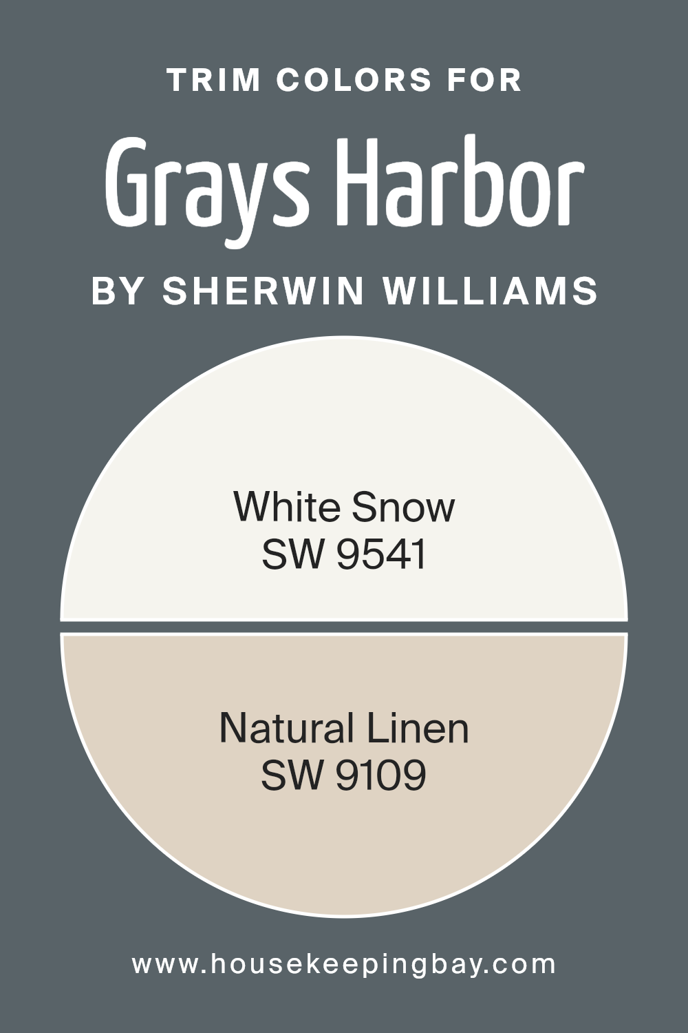
What are the Trim colors of Grays Harbor SW 6236 by Sherwin Williams?
Trim colors, like SW 9541 – White Snow and SW 9109 – Natural Linen, are used to accentuate and define the lines and edges of walls, windows, doors, and other architectural features in a room. When paired with a main color such as Grays Harbor SW 6236 by Sherwin-Williams, trim colors can significantly enhance the aesthetic appeal of a space. They bring a sense of balance and contrast, highlighting the structural beauty of a home. Choosing the right trim color is crucial as it acts like the frame for your wall colors, successfully tying together the look and feel of a room.
SW 9541 – White Snow is a bright, crisp white that brings a fresh and airy feel to any space. It contrasts beautifully with the deep and brooding tones of Grays Harbor, providing a clean edge that can make the walls pop and give the room a more expansive feel. On the other hand, SW 9109 – Natural Linen offers a warmer, softer approach.
It’s a neutral tone that leans towards the earthy side of the color spectrum, adding a subtle warmth to the room while complementing the cooler undertones of Grays Harbor. This combination ensures that while the room is anchored by the depth of the walls, it remains inviting through the thoughtful use of trim colors.
You can see recommended paint colors below:
housekeepingbay.com
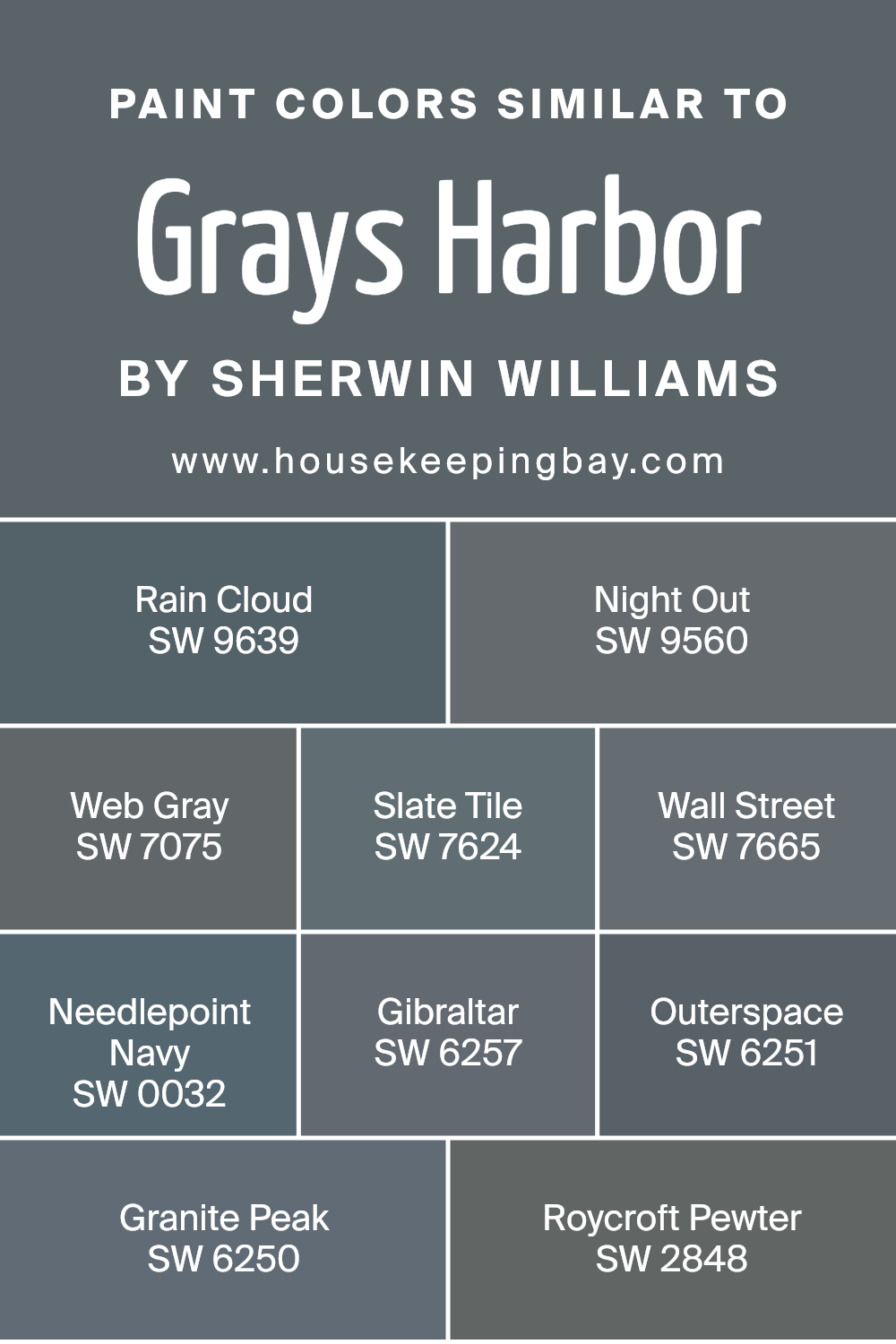
Colors Similar to Grays Harbor SW 6236 by Sherwin Williams
When it comes to painting or decorating, choosing the right colors can make all the difference. Similar colors, like those akin to Grays Harbor SW 6236 by Sherwin Williams, play a crucial role in creating a harmonious and appealing space. These colors work together because they share common hues and tones, making it easier to create a cohesive look.
For instance, SW 9639 – Rain Cloud and SW 9560 – Night Out both draw from the same grey palette as Grays Harbor but with slight variations in depth and intensity. Rain Cloud offers a softer, more serene feel, perfect for a calming bedroom, while Night Out is deeper and bolder, ideal for creating a statement wall.
Moving deeper into the palette, SW 7075 – Web Gray and SW 7624 – Slate Tile bring in a touch of sophistication and versatility. Web Gray has a classic, enduring appeal that works well in office spaces or living areas, whereas Slate Tile adds a bit of edge with its deeper, more pronounced grey tone. Similarly, SW 7665 – Wall Street and SW 0032 – Needlepoint Navy introduce a professional and stately vibe, with Wall Street’s charcoal hue perfect for a sleek, modern look and Needlepoint Navy offering a distinguished, navy twist.
SW 6257 – Gibraltar, SW 6251 – Outerspace, and SW 6250 – Granite Peak, on the other hand, offer varying degrees of gravitas and grounding, from Gibraltar’s solid, earthy feel to Outerspace’s mysterious depths and Granite Peak’s sturdy reliability. Lastly, SW 2848 – Roycroft Pewter ties it all back with its vintage charm, providing a subtle nod to tradition while still fitting in perfectly with its contemporary counterparts.
Together, these similar colors work seamlessly to create spaces that are both inviting and stylish, offering a broad palette to suit any taste or design vision.
You can see recommended paint colors below:
- SW 9639 Rain Cloud
- SW 9560 Night Out
- SW 7075 Web Gray
- SW 7624 Slate Tile
- SW 7665 Wall Street
- SW 0032 Needlepoint Navy
- SW 6257 Gibraltar
- SW 6251 Outerspace
- SW 6250 Granite Peak
- SW 2848 Roycroft Pewter
housekeepingbay.com
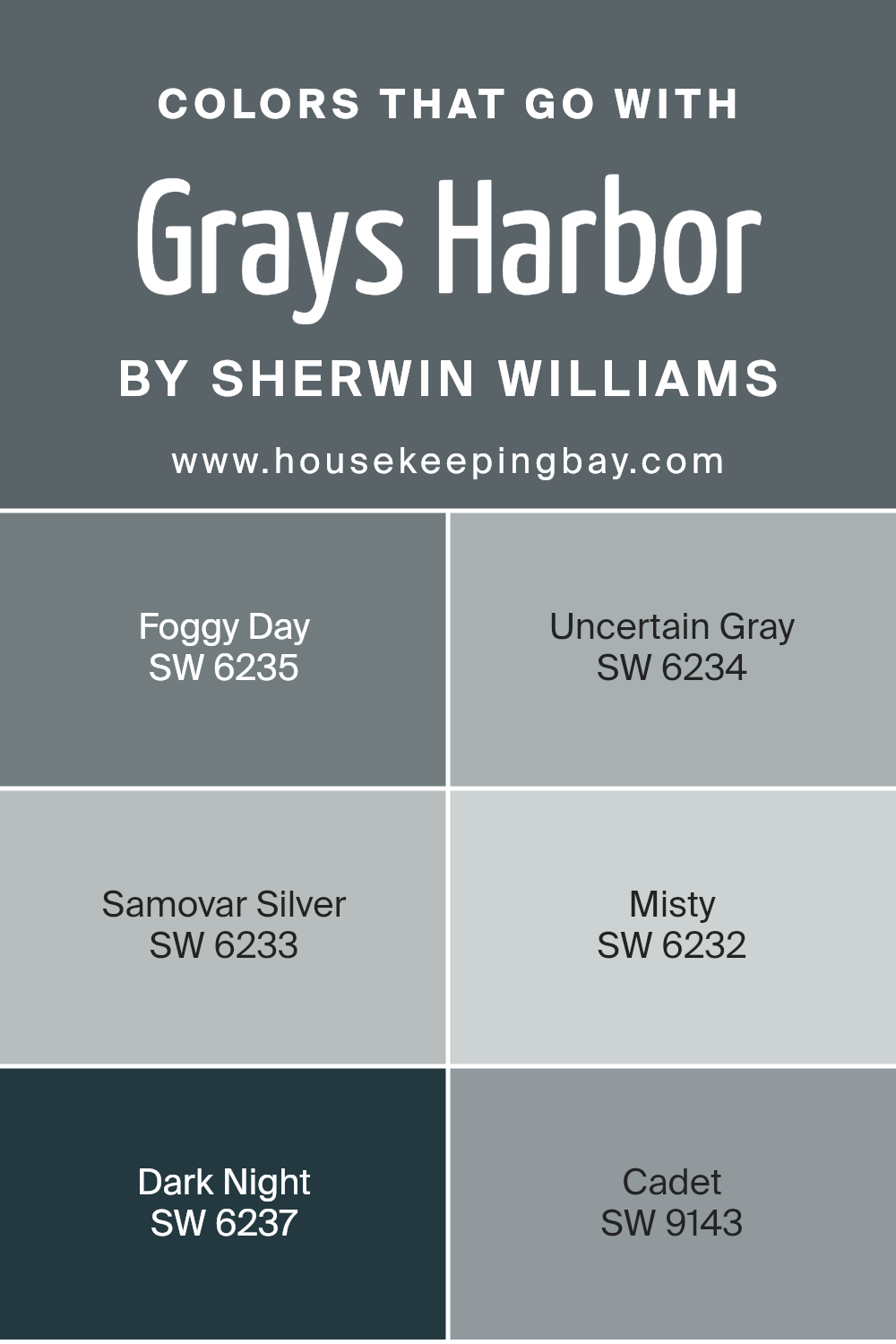
Colors that Go With Grays Harbor SW 6236 by Sherwin Williams
Choosing the right colors to complement Grays Harbor SW 6236 by Sherwin Williams is essential because it ensures a harmonious and balanced look in your space. Colors like SW 6235 – Foggy Day, SW 6234 – Uncertain Gray, SW 6233 – Samovar Silver, SW 6232 – Misty, SW 6237 – Dark Night, and SW 9143 – Cadet are perfect matches. These colors work together by varying in tones and shades, resulting in a dynamic yet cohesive space. They have the ability to enhance the mood and aesthetic of any room, making the choosing of complementary colors a crucial decision in interior design.
Foggy Day is a soothing grey that evokes a sense of calm, making it ideal for bedrooms or offices where serenity is desired. Uncertain Gray has a subtle blue undertone that brings a refreshing vibe to spaces, offering a slight contrast to Grays Harbor without overwhelming the senses. Samovar Silver is lighter, with a shimmering quality that can brighten darker rooms or add a touch of elegance.
Misty, as its name suggests, offers a soft and ethereal feel that pairs beautifully with the deeper tones of Grays Harbor for a layered look. Dark Night steps in as a bold choice, providing a deep, rich contrast that can make Grays Harbor pop beautifully. Lastly, Cadet brings a distinguished blue-gray hue that adds depth and sophistication, perfect for creating a grounded yet airy atmosphere. Together, these colors form a palette that enhances the versatility and beauty of Grays Harbor, making any room feel well-thought-out and professionally styled.
You can see recommended paint colors below:
- SW 6235 Foggy Day
- SW 6234 Uncertain Gray
- SW 6233 Samovar Silver
- SW 6232 Misty
- SW 6237 Dark Night
- SW 9143 Cadet
housekeepingbay.com
How to Use Grays Harbor SW 6236 by Sherwin Williams In Your Home?
Grays Harbor SW 6236 by Sherwin Williams is a dark gray paint with cool undertones. This color has the power to add elegance and sophistication to any room in your home. If you’re looking for a color that’s both modern and cozy, Grays Harbor could be a perfect match. It works really well in living rooms or bedrooms, creating a cozy, inviting space.
This color pairs well with bright whites or soft neutrals for trim and ceilings, providing a beautiful contrast. In a well-lit kitchen, Grays Harbor cabinets could give the space a striking, contemporary feel. If you’re into a more dramatic look, using it on an accent wall can transform any room into a stylish statement. Additionally, combining it with textures like wood or metal in furniture and decor can enhance the warmth of the color, making any room feel more welcoming.
Whether you want to refresh a single room or your entire home, Grays Harbor is a versatile choice that can help you achieve the look you’re going for.
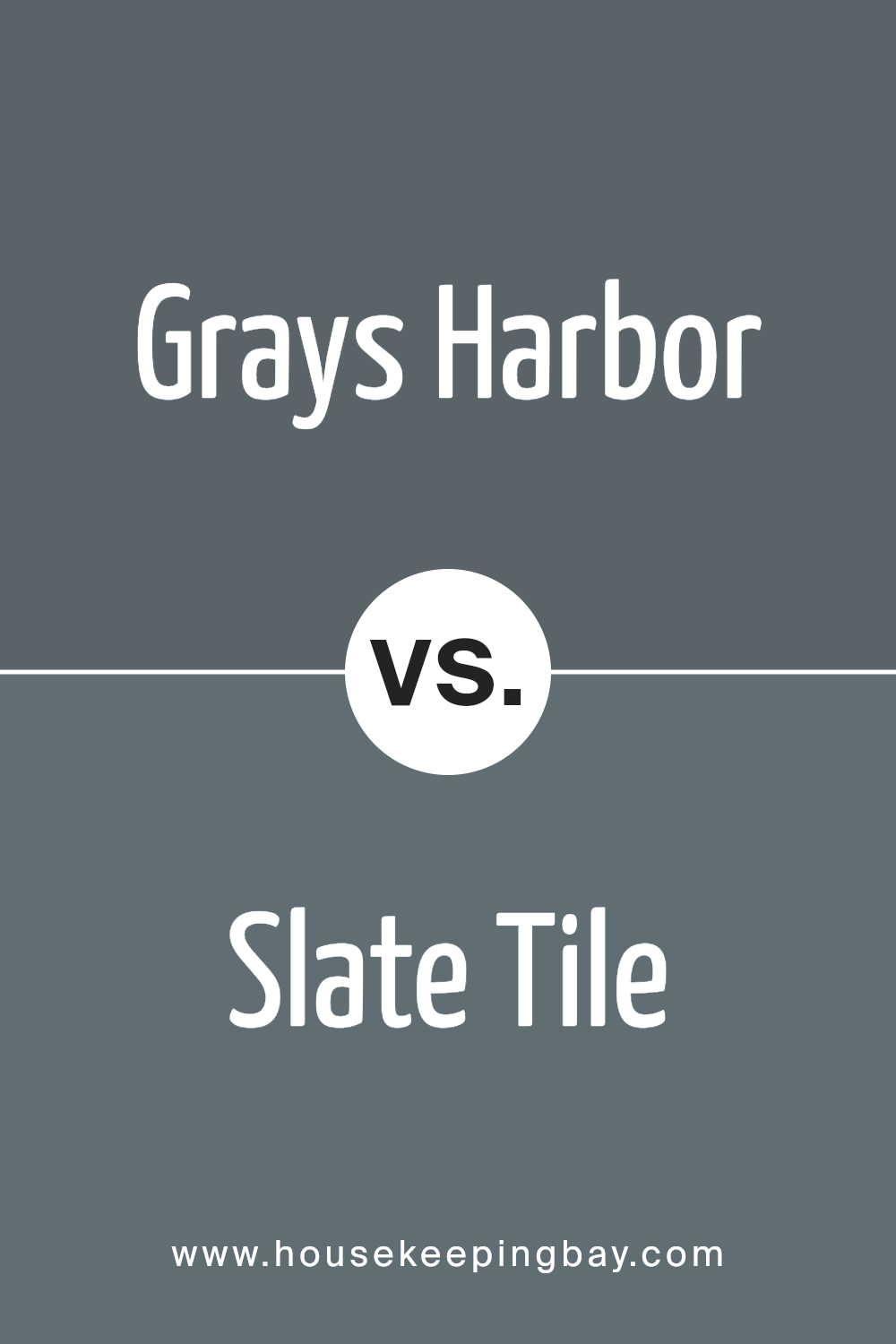
Grays Harbor SW 6236 by Sherwin Williams vs Slate Tile SW 7624 by Sherwin Williams
Grays Harbor SW 6236 by Sherwin Williams and Slate Tile SW 7624, also by Sherwin Williams, are two shades that might seem similar at first glance but have distinct differences upon closer look. Grays Harbor is a darker shade, giving off a cozy and comforting feeling. It has a depth that makes it perfect for creating a warm, inviting atmosphere in a room.
n the other hand, Slate Tile leans towards a slightly lighter and cooler tone, reminiscent of the natural stone it’s named after. It offers a fresher look, making spaces feel more open and airy.
While both colors share a gray base, Grays Harbor brings in a softer, more enveloping vibe, whereas Slate Tile provides a cleaner, crisper appearance. Choosing between them depends on the mood you want to set for your space – warmer and snug with Grays Harbor, or cooler and brighter with Slate Tile.
You can see recommended paint color below:
- SW 7624 Slate Tile
housekeepingbay.com
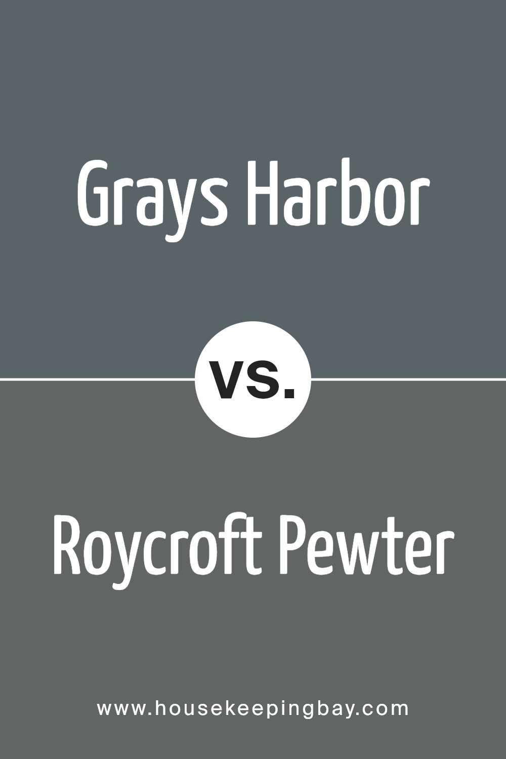
Grays Harbor SW 6236 by Sherwin Williams vs Roycroft Pewter SW 2848 by Sherwin Williams
Grays Harbor SW 6236 by Sherwin Williams is a rich, deep gray that carries with it a strong presence. It’s like the color of a stormy sea, powerful and full of depth. This color can make a bold statement in a room, bringing a sense of sophistication and modern style. It’s perfect for someone looking to add a bit of drama and elegance to their space.
On the other hand, Roycroft Pewter SW 2848 is a lighter, softer gray. It’s more subdued than Grays Harbor, giving off a warm, inviting vibe. This color is like the gentle mist of early morning, soothing and calm. It’s great for creating a cozy, peaceful atmosphere in a home. While it still adds a touch of class, Roycroft Pewter is more about creating a comfortable, welcoming space.
Both colors are beautiful options from Sherwin Williams, but they serve different moods and settings. Grays Harbor brings drama and depth, while Roycroft Pewter offers a gentle, calming presence.
You can see recommended paint color below:
- SW 2848 Roycroft Pewter
housekeepingbay.com
Grays Harbor SW 6236 by Sherwin Williams vs Web Gray SW 7075 by Sherwin Williams
Grays Harbor SW 6236 by Sherwin Williams and Web Gray SW 7075, also by Sherwin Williams, are two unique shades of gray that have their distinct characters. Grays Harbor is a darker, more intense shade that brings a strong, grounding feel to a space. It’s like the color of a stormy sea – deep, with a touch of blue undertone that adds a bit of mystery and sophistication.
On the other hand, Web Gray is lighter, leaning towards a true middle gray. It’s more neutral and versatile, easily fitting into various decor styles without overwhelming the space.
While both colors are beautiful in their right, Grays Harbor might be preferred for making a bold statement or creating a cozy, enveloping feel. In contrast, Web Gray is great for those seeking a cleaner, more understated look that still adds depth and interest to the room. Whether for a living room or a bedroom, each color offers a unique vibe – Grays Harbor brings drama and intensity, while Web Gray offers subtlety and flexibility.
You can see recommended paint color below:
- SW 7075 Web Gray
housekeepingbay.com
Grays Harbor SW 6236 by Sherwin Williams vs Gibraltar SW 6257 by Sherwin Williams
Grays Harbor SW 6236 and Gibraltar SW 6257 are both colors by Sherwin Williams that seem quite similar but have their differences. Grays Harbor is a dark gray with blue undertones. It feels cozy and can make spaces look more intimate and snug. It’s perfect for a room where you want a calm and serene vibe.
Gibraltar SW 6257, on the other hand, is also a shade of gray but leans more towards a slightly lighter blue-gray. It’s not as dark as Grays Harbor, giving a room a brighter feel while still keeping that calm and collected atmosphere. Gibraltar is great for areas where you want a bit of color without overwhelming the space.
So, if you’re trying to decide between the two, think about the mood you want to set. Grays Harbor is ideal for a cozier, more enveloping feel, while Gibraltar offers a lighter, serene backdrop. Both are beautiful, but your choice depends on the specific ambiance you’re aiming for in your space.
You can see recommended paint color below:
- SW 6257 Gibraltar
housekeepingbay.com
Grays Harbor SW 6236 by Sherwin Williams vs Needlepoint Navy SW 0032 by Sherwin Williams
Grays Harbor SW 6236 by Sherwin Williams is a rich, deep gray with strong blue undertones. It’s like looking at a stormy sky just before the rain hits, offering both a sense of calmness and a touch of drama. This color has a way of adding depth and elegance to spaces without overwhelming them. It’s versatile, fitting well in both modern and traditional settings.
On the other hand, Needlepoint Navy SW 0032, also by Sherwin Williams, is a bold and beautiful navy blue. It’s a classic hue that brings to mind the deep ocean or the night sky. Needlepoint Navy is quite striking and has a regal presence, making it perfect for creating a statement. While it can make small spaces feel a bit cozy, in well-lit and larger rooms, it adds a luxurious touch.
Both colors carry their own unique vibes. Grays Harbor is more subdued and versatile, playing well with many themes and styles. Needlepoint Navy, with its vibrant depth, leans towards a more dramatic and sophisticated look.
You can see recommended paint color below:
- SW 0032 Needlepoint Navy
housekeepingbay.com
Grays Harbor SW 6236 by Sherwin Williams vs Night Out SW 9560 by Sherwin Williams
Grays Harbor SW 6236 by Sherwin Williams is a rich, deep gray that carries a sense of sophistication and strength. It’s perfect for spaces where you want to create a feeling of coziness without making the room feel too dark. This color has blue undertones, making it cool and inviting, and it works well in both modern and traditional settings.
Night Out SW 9560, on the other hand, is a much darker shade. It’s closer to black than gray and is ideal for creating dramatic and elegant spaces. This color absorbs light, making it great for accent walls or rooms where you want to make a bold statement. Night Out has a touch of blue undertone as well, ensuring it doesn’t feel stark but rather deep and enveloping.
Both Grays Harbor and Night Out offer unique vibes – Grays Harbor for a subtle, serene environment and Night Out for a more striking, bold look. While both share cool undertones, their impact in a space greatly differs, reflecting either a cozy retreat or a dramatic flair.
You can see recommended paint color below:
- SW 9560 Night Out
housekeepingbay.com
Grays Harbor SW 6236 by Sherwin Williams vs Rain Cloud SW 9639 by Sherwin Williams
Grays Harbor SW 6236 and Rain Cloud SW 9639 are both colors from Sherwin Williams, but they bring different vibes to the table. Grays Harbor is a dark, almost charcoal gray. It’s a strong color, perfect for creating a bold statement in a room. It has the power to make spaces feel cozy and snug, making it a great pick for bedrooms or living rooms where you want to relax.
On the other hand, Rain Cloud is a lighter, softer gray. It’s not as heavy as Grays Harbor, giving off a more gentle and calming effect. This color works wonderfully in spaces where you want to keep things light and airy, like bathrooms or kitchens. It’s also a good choice if you’re looking to make a small room appear bigger without going for a stark white.
In summary, Grays Harbor brings depth and drama, while Rain Cloud offers a softer, more open feel. Depending on what atmosphere you’re aiming for, either color could be the perfect choice.
You can see recommended paint color below:
- SW 9639 Rain Cloud
housekeepingbay.com
Grays Harbor SW 6236 by Sherwin Williams vs Granite Peak SW 6250 by Sherwin Williams
Grays Harbor SW 6236 and Granite Peak SW 6250, both from Sherwin Williams, are two unique colors that bring their own style to the table. Grays Harbor stands out for its deeper, almost maritime gray tone. It’s like looking out at the sea under a stormy sky, offering a sense of calm and depth to any space. It’s a bit more intense, great for making a statement or cozying up a room.
On the other hand, Granite Peak is like the shadowy side of a mountain during dusk. It’s a lighter shade compared to Grays Harbor, leaning towards a cooler, more neutral gray that provides a fresh and modern feel. This color is versatile, fitting in easily whether it’s a busy office or a serene bedroom.
Both colors share a gray base but offer distinct vibes – Grays Harbor brings depth and intensity, while Granite Peak offers a lighter, more adaptable backdrop. Whether you choose the darker, moodier Grays Harbor or the softer, adaptable Granite Peak depends on the atmosphere you’re aiming to create.
You can see recommended paint color below:
housekeepingbay.com
Grays Harbor SW 6236 by Sherwin Williams vs Outerspace SW 6251 by Sherwin Williams
Grays Harbor SW 6236 and Outerspace SW 6251 by Sherwin Williams are two unique colors, each bringing their own vibe to a space. Grays Harbor sits on the darker side of the gray spectrum, offering a rich depth that can make any room feel more grounded and cozy. It’s a versatile color that works well in many settings, adding a serious, yet comforting, touch.
On the other hand, Outerspace SW 6251 leans towards a cooler, slate-like gray. It’s lighter than Grays Harbor and carries a certain freshness with it. It’s great for spaces where you want to maintain a modern, airy feel without going too light. This color can make small rooms appear bigger and brighten areas with less natural light.
While both colors share a gray base, their different tones and depths can significantly affect the mood and size perception of a room. Grays Harbor offers a snug, enveloping feel, making it perfect for cozy, intimate spaces. Outerspace gives a cleaner, more open vibe, ideal for a contemporary, spacious look.
You can see recommended paint color below:
- SW 6251 Outerspace
housekeepingbay.com
Grays Harbor SW 6236 by Sherwin Williams vs Wall Street SW 7665 by Sherwin Williams
Grays Harbor SW 6236 by Sherwin Williams is a rich, deep color. It’s like the color of a stormy sea. It’s not too dark but has a strong presence, making it perfect for a cozy and sophisticated space. It’s great for someone who likes a bit of drama without going too dark.
On the other hand, Wall Street SW 7665 is a bit more reserved. Think of it as the lighter, more subdued cousin of Grays Harbor. It’s still in the family of serious, professional colors but with a softer touch. It’s like the color of a well-worn suit – classic, stylish, and a bit more conservative.
Both these colors are pretty versatile. Grays Harbor brings a bit of drama and depth, while Wall Street offers a classic, clean look. Depending on what vibe you’re going for in a room, you might choose the deeper Grays Harbor for a cozy, enveloping feel or Wall Street for a lighter, more airy and sophisticated space.
You can see recommended paint color below:
- SW 7665 Wall Street
housekeepingbay.com
Conclusion
Wrapping up our thoughts on SW 6236 Grays Harbor by Sherwin Williams, this color is a solid pick if you’re looking to bring a sophisticated yet subtle charm to your space. Remember, Grays Harbor isn’t just another gray. It stands out because of its unique ability to blend with a variety of themes and decorations. Whether your home leans more towards modern minimalism or you have a soft spot for cozy, rustic vibes, this color has got you covered.
When you decide to paint a room or even an accent wall with Grays Harbor, you’re setting yourself up for a beautiful transformation. This color has the magic to create a serene and inviting atmosphere, making it perfect for spaces where you want to relax and unwind. It’s also incredibly versatile, working wonders in well-lit areas as well as spaces that might not get a lot of natural light.
Choosing the right paint color can sometimes feel daunting, but with Grays Harbor, you can rest easy knowing that it’s a choice loved by many for its reliability to make any room look fantastic. As you go about planning your next home makeover, consider how this charming shade could elevate your living space. It truly is a color that provides a beautiful backdrop to your life, adapting to your style and changes over time.
housekeepingbay.com
Ever wished paint sampling was as easy as sticking a sticker? Guess what? Now it is! Discover Samplize's unique Peel & Stick samples. Get started now and say goodbye to the old messy way!
Get paint samples


