Outerspace SW 6251 by Sherwin Williams
Exploring the Depths of a Cosmic Hue
If you’re on the hunt for a color that brings a cool and calm vibe into your space, let’s talk about SW 6251 Outerspace by Sherwin Williams. When you decide to refresh your room or give a new look to your furniture, choosing the right color can make all the difference.
Outerspace isn’t just any gray; it has this unique ability to blend with various styles and spaces, making it a versatile choice for your decorating adventures.
Think about the feeling of calmness and the sense of serenity; that’s what Outerspace brings into your home. It works wonderfully in rooms where you want to unwind and relax or even in spaces that need a touch of sophistication without overwhelming the senses. Whether you’re updating a bedroom, a living room, or even a kitchen, Outerspace has this subtle way of adding depth and character.
Besides, you won’t have to worry about matching it with your current decor. Outerspace pairs beautifully with a wide range of colors, from soft pastels to bold accents, making it easy for you to create a space that feels cohesive and thoughtfully designed.
You’ll find that this color not only transforms your walls but also invites a sense of peace and elegance into your home. So, if you’re looking to give your space a makeover that feels both modern and timeless, Outerspace by Sherwin Williams could be the perfect starting point.
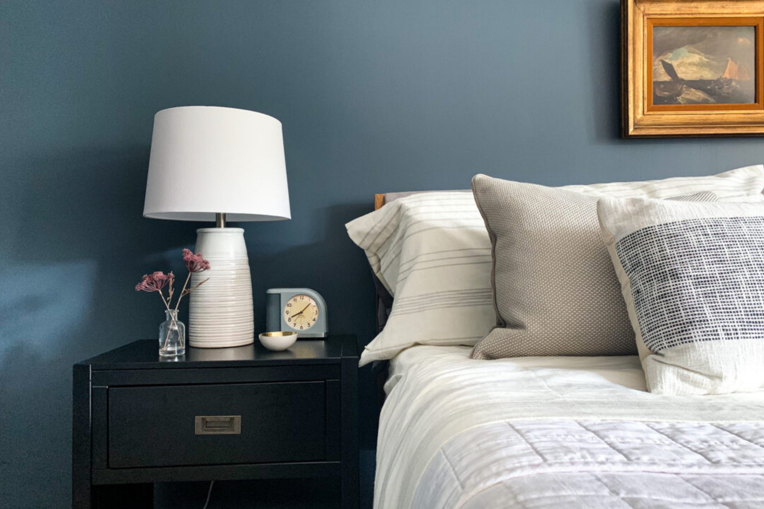
via buildingbluebird
What Color Is Outerspace SW 6251 by Sherwin Williams?
Outerspace SW 6251 by Sherwin Williams is a unique shade that offers versatility and depth for various interior designs. This color, a deep charcoal with a hint of navy blue, brings a sophisticated and modern touch to any room. Its dark hue provides a strong foundation, ideal for creating a statement in spaces while still maintaining an air of elegance and serenity.
This enchanting color works exceptionally well in contemporary, minimalist, and industrial styles, offering a chic backdrop that allows decor elements to stand out. In modern interiors, Outerspace pairs beautifully with clean lines and sleek furniture, emphasizing a clutter-free and stylish environment.
For a more industrial look, its dark tone complements exposed brick, metal accents, and raw wood, enhancing the rugged yet refined aesthetic of the space.
Outerspace SW 6251 pairs wonderfully with a wide range of materials and textures. It looks remarkable with natural wood, bringing warmth to rooms and balancing the coolness of the color. Metallic finishes, like brass or copper, pop against its deep backdrop, adding a touch of luxury.
Soft fabrics or plush textures in light colors create an inviting contrast, making spaces feel cozy and well-balanced. Whether you’re looking to add depth to your living room, bedroom, or office, Outerspace offers a dynamic and stylish solution.
housekeepingbay.com
Is Outerspace SW 6251 by Sherwin Williams Warm or Cool color?
OuterspaceSW 6251 by Sherwin Williams is a unique shade that brings a feeling of calmness and sophistication into homes. Its deep, yet not overwhelming, blue tone has a touch of grey, making it versatile for different living spaces.
This color works well in rooms where you want to create a peaceful and quiet atmosphere, like bedrooms or home offices. It’s like bringing a piece of the serene night sky indoor, setting a soothing vibe that encourages relaxation and concentration.
Using OuterspaceSW 6251 can also make your home feel more spacious and open. Its cool hue pairs beautifully with bright whites or soft neutrals, enhancing natural light in a room and giving a fresh, airy feel. Additionally, this color is great for adding a touch of elegance to furniture or cabinets, especially in kitchens and bathrooms, without making the space feel too dark.
Overall, OuterspaceSW 6251 offers a balance of tranquility and style, making it a smart choice for those looking to update their home’s look while maintaining a cozy and inviting atmosphere.
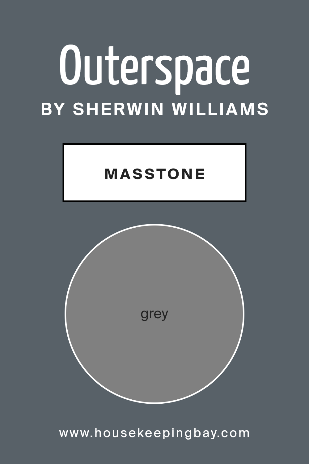
What is the Masstone of the Outerspace SW 6251 by Sherwin Williams?
OuterspaceSW 6251 by Sherwin Williams has a masstone, or main color, that’s grey (like the color #808080). This grey is a great choice for homes because it’s very versatile. Imagine a color that can fit in almost anywhere – that’s what this grey does. Whether you’re painting a cozy living room or looking to give a modern touch to your kitchen, this grey works wonders.
It’s like a chameleon, easily fitting in with different styles and decorations. Because it’s a neutral color, it means you can mix it with bolder colors for a pop or keep things calm and collected with other neutrals. This grey doesn’t overpower; instead, it creates a nice, balanced backdrop.
It’s good for making small spaces look bigger and for helping light bounce around a room. This makes rooms feel more open and airy. In sum, OuterspaceSW 6251 brings a flexible, clean, and inviting feel to homes, making it a top pick for those looking to refresh their space.
housekeepingbay.com
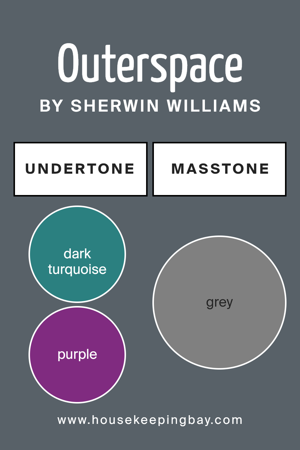
Undertones of Outerspace SW 6251 by Sherwin Williams
OuterspaceSW 6251 by Sherwin Williams is a unique color that might seem simple at first glance but is actually complex due to its various undertones. Undertones are subtle colors that lie beneath the surface of the main color.
These undertones can include a wide range of colors such as dark turquoise, purple, navy, olive, and many others listed. The presence of these undertones means that OuterspaceSW 6251 can look different depending on the lighting and surrounding colors.
When you use OuterspaceSW 6251 on interior walls, these undertones play a key role in the overall ambiance of the room. For instance, in natural daylight, you might notice the cooler undertones like dark blue or lilac more, giving the room a calm and serene feel. However, under artificial lighting, warmer undertones such as brown or pale pink might become more apparent, creating a cozy and welcoming atmosphere.
The wide range of undertones in OuterspaceSW 6251 also means it can easily complement various decor styles and color schemes. For example, its green and light turquoise undertones could enhance a nature-inspired theme, while the purple or light purple undertones could add a touch of elegance to a modern design.
In summary, the undertones of OuterspaceSW 6251 make it a versatile paint color for interior walls, affecting its appearance and the mood it creates in a room. Its ability to display different undertones under various lighting conditions and alongside different colors can help achieve the desired look and feel in a space, making it a popular choice for those looking to add depth and complexity to their interiors.
housekeepingbay.com
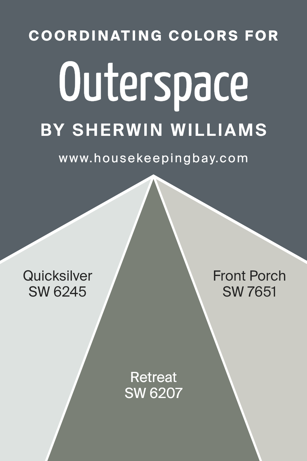
Coordinating Colors of Outerspace SW 6251 by Sherwin Williams
Coordinating colors are hues that work harmoniously together to enhance and balance a design or color scheme. When chosen correctly, these colors amplify the visual appeal and bring a cohesive look to any space.
For example, if we consider Outerspace SW 6251 by Sherwin Williams, a deep, complex gray that evokes a sense of serenity and sophistication, finding the right coordinating colors can accentuate its unique qualities without overwhelming the senses.
Suitable coordinating colors have been thoughtfully selected to pair beautifully with Outerspace, ensuring a polished and well-rounded palette.
Quicksilver SW 6245 is one of these coordinating colors, offering a lighter, airy gray that can illuminate and enlarge a space when paired with the deeper tones of Outerspace. It provides a subtle contrast that is both refreshing and calming, making it perfect for a modern and minimalist aesthetic.
On a different note, Retreat SW 6207 introduces a rich, sage green that brings a touch of nature and depth into the mix. This earthy hue complements Outerspace by adding warmth and inviting an organic feel to interiors. Lastly, Front Porch SW 7651, with its soft, pale gray, exudes tranquility and light.
It acts as a bridge between the darker Outerspace and the brighter or richer coordinating colors, ensuring a seamless transition within the color scheme. These coordinating colors, when used together, create a balanced and appealing visual flow, enhancing the overall ambiance of any room.
You can see recommended paint colors below:
- SW 6245 Quicksilver
- SW 6207 Retreat
- SW 7651 Front Porch
housekeepingbay.com
How Does Lighting Affect Outerspace SW 6251 by Sherwin Williams?
Lighting can greatly influence how we perceive colors. It can make colors look very different depending on the type of light, whether it’s natural daylight or artificial lighting from lamps and fixtures. The color OuterspaceSW 6251 by Sherwin Williams is no exception.
In artificial light, OuterspaceSW 6251 can appear more profound and richer. This is because most artificial lighting tends to be warmer in tone, making cooler colors like Outerspace seem more intense. It’s a cozy color in the evening under lamp light, providing a snug and serene atmosphere.
Under natural light, this color behaves differently. The quality and direction of natural light can change how OuterspaceSW 6251 looks throughout the day. In north-facing rooms, which receive less direct sunlight and have a cooler light, this color can appear more muted and subtle. It maintains a steady, soothing look but with less intensity than in artificial light.
In south-facing rooms, on the other hand, there’s an abundance of warm, bright light for most of the day. This warmth can make OuterspaceSW 6251 feel lighter and more vibrant. The color can seem softer and more inviting, perfect for creating a welcoming space.
East-facing rooms get plenty of sunlight in the morning, which can make OuterspaceSW 6251 look lively and bright early in the day, then more subdued as the light fades. It’s a dynamic experience of the color, from the fresh morning light to the softer afternoon.
West-facing rooms receive strong, warm evening sunlight. This lighting situation enhances the depth of OuterspaceSW 6251, making it appear bolder and more dramatic towards the end of the day. It’s perfect for rooms used mainly in the evenings when the color can really show off its depth.
In summary, lighting dramatically affects how we see colors, and OuterspaceSW 6251 by Sherwin Williams is a versatile shade that can shift from subtle to dynamic, depending on the light source and room orientation.
housekeepingbay.com
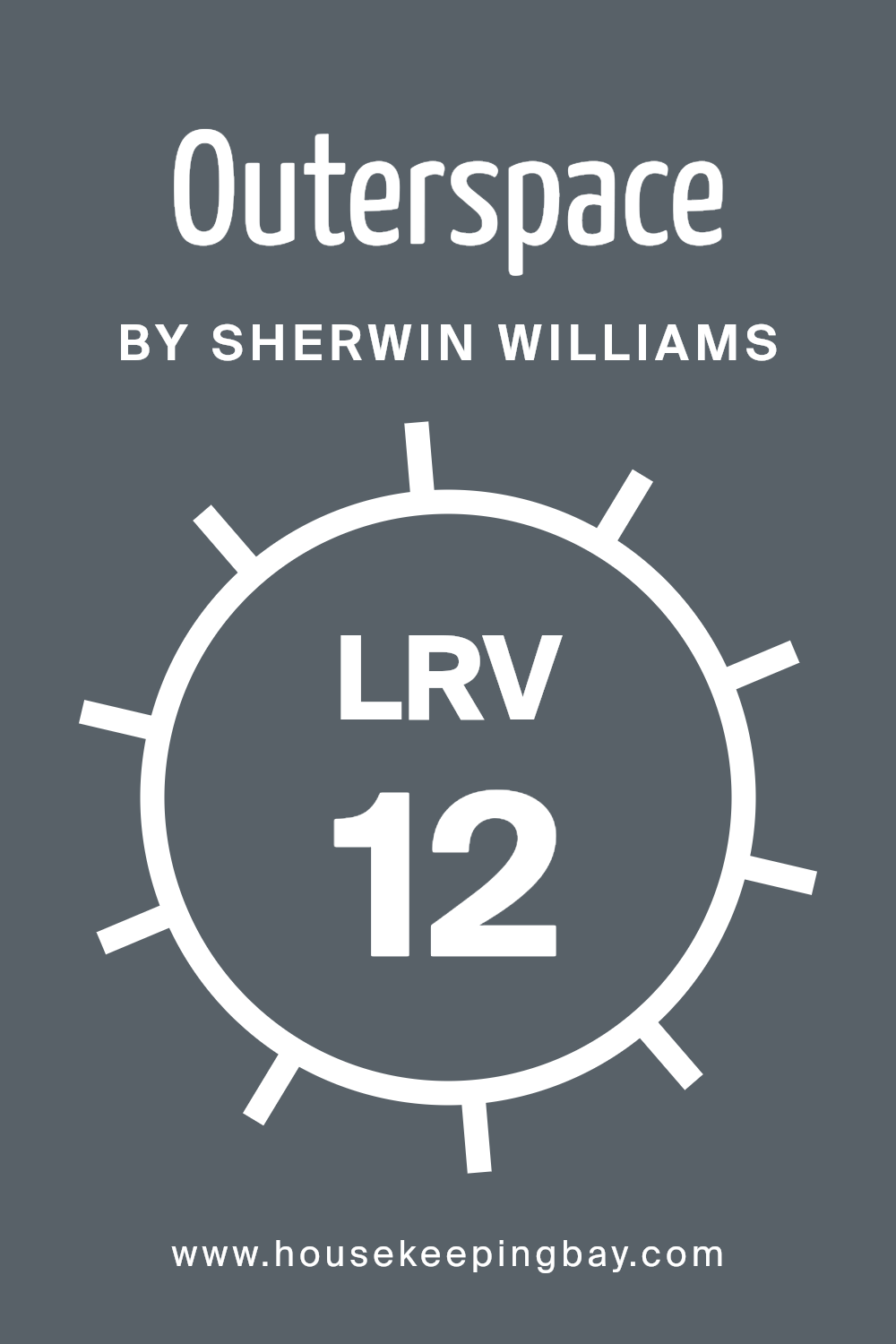
What is the LRV of Outerspace SW 6251 by Sherwin Williams?
With an LRV of 11.64, Outerspace (SW 6251) by Sherwin Williams falls on the darker end of the scale, meaning it will absorb much of the light that hits it rather than reflecting it. This property will likely make rooms painted in this color feel snugger and more enveloped.
In spaces with less natural light, using a color with such a low LRV could make the area seem smaller or cozier, depending on your perspective. In well-lit rooms, however, the depth of Outerspace can add a luxurious or sophisticated touch, making the space feel grounded.
This darker color can be impactful for creating a focal point in a room or when used for accent walls, but it’s important to consider your room’s lighting to ensure the end result aligns with your vision.
housekeepingbay.com
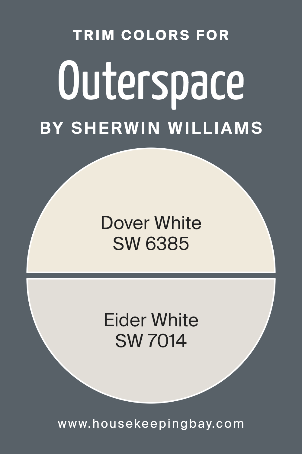
What are the Trim colors of Outerspace SW 6251 by Sherwin Williams?
Trim colors are special shades used to enhance architectural features and define the lines and edges of a room, like door frames, window sills, and baseboards. For a paint like Outer Space SW 6251 by Sherwin Williams, which brings a deep, serene vibe to the walls, selecting the right trim color is crucial.
It acts like a frame for a picture, providing contrast and highlighting the wall color’s richness and depth. Trim colors can dramatically influence the ambiance of a room, emphasizing the main color’s character and tying together the overall aesthetic.
Dover White SW 6385 is a warm, inviting shade that offers a soft, creamy contrast against the cool, dark tones of Outer Space SW 6251, adding a touch of light and spaciousness without overwhelming the room’s cozy feel.
Eider White SW 7014, on the other hand, is a muted, gray-toned white that subtly harmonizes with Outer Space, providing a sleek and modern look that maintains warmth. Both colors help in creating a balanced and inviting atmosphere, allowing Outer Space SW 6251 to stand out in a sophisticated and elegant manner.
You can see recommended paint colors below:
housekeepingbay.com
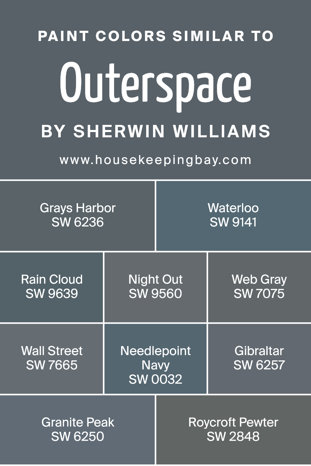
Colors Similar to Outerspace SW 6251 by Sherwin Williams
Understanding the importance of similar colors is essential, especially when it comes to creating a harmonious and visually appealing space. Colors that are similar, like those close to Outerspace SW 6251 by Sherwin Williams, offer a unique way to craft a cohesive look without sacrificing interest or depth.
These colors, including options like Grays Harbor, Waterloo, Rain Cloud, Night Out, Web Gray, Wall Street, Needlepoint Navy, Gibraltar, Granite Peak, and Roycroft Pewter, all maintain a balance between blending with and complementing Outerspace SW 6251.
The use of such colors enables designers and homeowners to layer various shades and textures, ensuring that each room has a fluid yet dynamic aesthetic.
For instance, Grays Harbor introduces a serene, deep gray that whispers of stormy seas and misty mornings, while Waterloo, a shade deeper, leans into the elegant, sophisticated side of the gray spectrum. Rain Cloud softens spaces with its light, airy touch, resembling the gentle embrace of an overcast sky.
Night Out brings a dramatic flair with its deep, mysterious hue, perfect for creating focal points. Web Gray offers a classic, dependable gray that works effortlessly across different spaces. Wall Street steps in with its confident, urban gray, versatile enough to suit both modern and traditional decors.
Needlepoint Navy showcases a hint of maritime inspiration, perfect for adding depth without overwhelming a space. Gibraltar strikes a balance between boldness and subtlety, a gray with a whisper of blue.
Granite Peak and Roycroft Pewter round out the selection, with Granite Peak providing a solid, stony foundation and Roycroft Pewter exuding a warm, inviting quality, both enriching the palette with their distinctive characters. These similar colors to Outerspace SW 6251 present endless possibilities for creating spaces that are cohesive yet full of life.
You can see recommended paint colors below:
- SW 6236 Grays Harbor
- SW 9141 Waterloo
- SW 9639 Rain Cloud
- SW 9560 Night Out
- SW 7075 Web Gray
- SW 7665 Wall Street
- SW 0032 Needlepoint Navy
- SW 6257 Gibraltar
- SW 6250 Granite Peak
- SW 2848 Roycroft Pewter
housekeepingbay.com
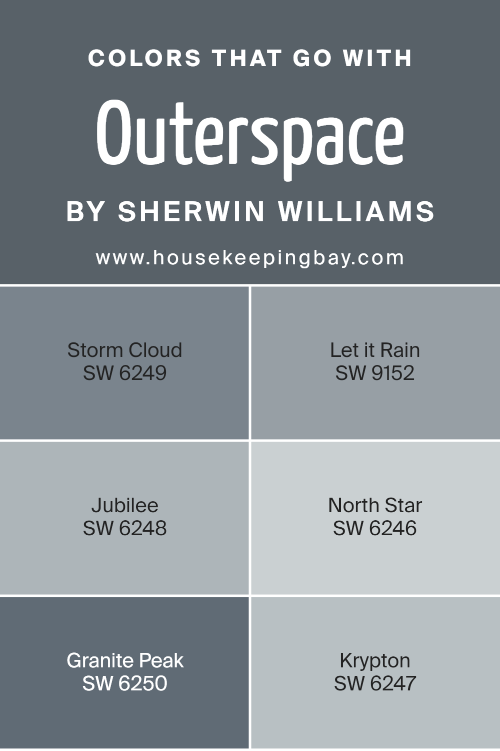
Colors that Go With Outerspace SW 6251 by Sherwin Williams
Selecting the right colors that pair well with Outerspace SW 6251 by Sherwin Williams is crucial because it ensures a cohesive and appealing look in any space. Outerspace is a unique shade that can act as a sophisticated backdrop, allowing for a range of complementary colors to bring out its best qualities.
When colors harmonize correctly, they create an atmosphere that is pleasing to the eye, enhances mood, and ties together the elements of a room seamlessly. These colors, such as Storm Cloud, Let it Rain, Jubilee, North Star, Granite Peak, and Krypton, have been identified as perfect matches, and understanding how they work together can significantly impact the design outcome.
Storm Cloud is a deep grey that, much like the gathering of clouds before a storm, brings a sense of drama and intensity. It’s a fantastic choice for creating depth in a space. Let it Rain is slightly lighter, offering a softer approach with its soothing grey tones that mimic the sky on a rainy day, providing a tranquil vibe.
Jubilee leans towards a muted lavender-grey, adding a touch of understated elegance and versatility. North Star, with its light grey, almost silvery hue, reflects a serene and bright aspect, making it excellent for a refreshing feel. Granite Peak is a stronger, darker grey that mimics the ruggedness of its namesake, ideal for adding a bold statement.
Lastly, Krypton offers a breezy and airy light blue, reminiscent of the sky on a clear day, perfect for bringing a sense of calm. Together, these colors create a palette that complements Outerspace SW 6251, enhancing its appeal and versatility in various design settings.
You can see recommended paint colors below:
- SW 6249 Storm Cloud
- SW 9152 Let it Rain
- SW 6248 Jubilee
- SW 6246 North Star
- SW 6250 Granite Peak
- SW 6247 Krypton
housekeepingbay.com
How to Use Outerspace SW 6251 by Sherwin Williams In Your Home?
Outerspace SW 6251 by Sherwin Williams is a cool, soothing gray color that brings a sense of calm and sophistication to any room. This versatile paint color works well in many areas of the home. For example, in a bedroom, Outerspace can create a peaceful backdrop for relaxation and sleep. In a home office, it offers a crisp, focused environment, helping to boost productivity. It’s also a great choice for living rooms, as its neutral tone makes it easy to pair with different furniture colors and styles.
You can use Outerspace in small spaces, like bathrooms or entryways, to make them feel more open and airy. Or, consider using it on kitchen cabinets for a modern and chic vibe. Because it’s a neutral color, you can easily add accessories or artwork in bold colors to make the space pop.
Outerspace SW 6251 is a fantastic choice for anyone looking to refresh their home with a clean, modern look.
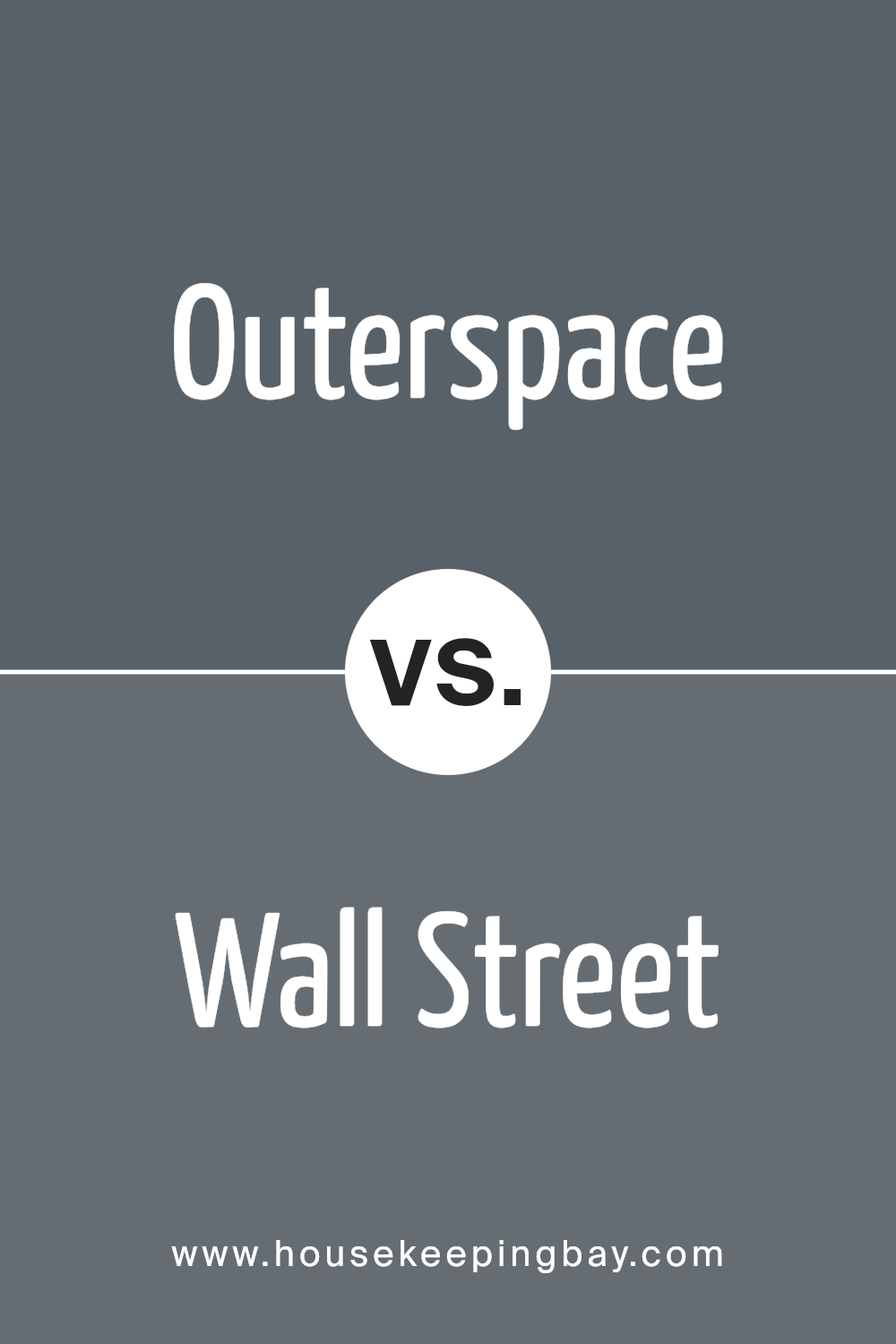
Outerspace SW 6251 by Sherwin Williams vs Wall Street SW 7665 by Sherwin Williams
Outerspace SW 6251 and Wall Street SW 7665, both by Sherwin Williams, are unique colors with distinct vibes. Outerspace is a deep, dark blue that almost feels like the night sky, providing a sense of mystery and depth to any room.
It’s like bringing a piece of the serene, starry night indoors, creating a calming and reflective space. On the flip side, Wall Street is a cooler, sophisticated gray that leans towards the elegance of modern aesthetics.
It’s perfect for those who prefer a sleek and professional look, offering a more neutral backdrop that’s versatile and easy to match with different decor styles.
While Outerspace adds drama and intensity, Wall Street brings an air of simplicity and polish. Both colors make a strong statement, yet cater to different tastes and moods, from the bold and adventurous to the refined and understated.
You can see recommended paint color below:
- SW 7665 Wall Street
housekeepingbay.com
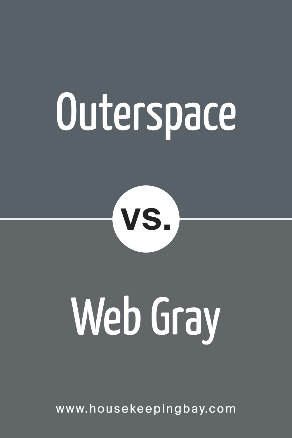
Outerspace SW 6251 by Sherwin Williams vs Web Gray SW 7075 by Sherwin Williams
Outerspace SW 6251 and Web Gray SW 7075 by Sherwin Williams are both unique, beautiful colors but in different ways. Outerspace is a deep, dark blue with a hint of gray. It’s the kind of color that reminds you of the night sky just before it goes completely dark. It has a mysterious and soothing feel to it.
Web Gray, on the other hand, is a true gray color. It’s like the color of storm clouds – neutral but with a strong presence. It has a modern and sophisticated vibe, perfect for someone looking for a chic, understated look.
While Outerspace adds a rich, dramatic flair to spaces, making them feel cozy and intimate, Web Gray works like a quiet backdrop, making other colors pop and giving a room a calm, collected feel. Whether you’re a fan of the serene, endless depths of the night sky or you prefer the elegant simplicity of stormy grays, both Colors offer something special.
You can see recommended paint color below:
- SW 7075 Web Gray
housekeepingbay.com
Outerspace SW 6251 by Sherwin Williams vs Waterloo SW 9141 by Sherwin Williams
Outerspace SW 6251 by Sherwin Williams is a dark, cool shade, almost like the color of the night sky. It’s a deep, mysterious color that can make a room feel cozy and enclosed. Imagine the color of the sky on a clear night, far from city lights, and you have an idea of how Outerspace looks.
Waterloo SW 9141, also by Sherwin Williams, is another cool color, but it leans more towards a softer, grayish blue. It reminds you of a stormy afternoon, where clouds color the horizon in shades of blue and gray. Waterloo is lighter than Outerspace, making it a bit more flexible for spaces that want a hint of color without going too dark.
Both colors share a cool, calming vibe but in different intensities. Outerspace brings a bolder, more dramatic feel, perfect for creating a statement space. In contrast, Waterloo offers a subtle tranquility, ideal for a quiet, serene setting. Each color has its unique charm, ready to transform a space depending on the mood you wish to create.
You can see recommended paint color below:
housekeepingbay.com
Outerspace SW 6251 by Sherwin Williams vs Granite Peak SW 6250 by Sherwin Williams
Outerspace SW 6251 and Granite Peak SW 6250 by Sherwin Williams are two colors that seem quite similar at first glance, but they actually have their own unique characteristics. Outerspace SW 6251 is a deep, almost charcoal-like gray that carries a sense of depth and sophistication. It’s a versatile color that can make a strong statement on walls or bring a moody atmosphere to a space. It has a cool overtone that can pair well with a wide range of decor styles, from modern to traditional.
Granite Peak SW 6250, while also in the gray family, leans slightly towards a bluer tint. This gives it a crisper, more refreshing look compared to the deeper and warmer qualities of Outerspace. Granite Peak can brighten up spaces with its subtler, softer appearance, making it a great choice for creating a calm and serene environment.
While both colors share a gray base, their distinct undertones and depth set them apart, offering different moods and atmospheres for interior spaces. Outerspace brings a bold, dramatic flair, whereas Granite Peak offers tranquility and a lighter feel.
You can see recommended paint color below:
housekeepingbay.com
Outerspace SW 6251 by Sherwin Williams vs Needlepoint Navy SW 0032 by Sherwin Williams
Outerspace SW 6251 by Sherwin Williams and Needlepoint Navy SW 0032, both from Sherwin Williams, offer unique shades for any painting project. Outerspace is a cool, dark gray that almost seems to blend into a night sky. It’s subtle enough for a modern look but also carries a depth that adds character to walls.
On the flip side, Needlepoint Navy is a rich, deep blue. It’s like looking into the deepest parts of the ocean—serene yet full of mystery. This color brings a boldness that can make any space feel more inviting and warm.
While Outerspace leans towards a neutral palette, offering a versatile backdrop for any room, Needlepoint Navy steps in with a splash of color that’s still sophisticated but with a more dramatic flair. Both colors are perfect for someone looking to add a touch of elegance, whether it’s through a calming gray or a confident blue. The choice between them depends on whether you’re looking for a neutral canvas or a standout hue.
You can see recommended paint color below:
- SW 0032 Needlepoint Navy
housekeepingbay.com
Outerspace SW 6251 by Sherwin Williams vs Night Out SW 9560 by Sherwin Williams
Outerspace SW 6251 and Night Out SW 9560 by Sherwin-Williams are two interesting colors to compare. Outerspace is like a deep blue-gray, kind of like the sky just when it starts to get dark, but not completely night yet. It’s cool and has a calming feel, perfect for places in your home where you want to relax.
Night Out, however, is a lot darker. It’s closer to black but with a hint of something extra that keeps it from being just plain black. Think of it as the color of the sky late at night, way past sunset, which gives a more dramatic and sophisticated vibe.
Both these colors are great, but they bring different moods to a room. Outerspace is lighter and might make a space feel more open and airy, while Night Out adds depth and intensity, making it great for creating a cozy, intimate atmosphere. Depending on what feeling you’re going for in a space, you might choose one over the other.
You can see recommended paint color below:
- SW 9560 Night Out
housekeepingbay.com
Outerspace SW 6251 by Sherwin Williams vs Gibraltar SW 6257 by Sherwin Williams
The main color, Outerspace SW 6251 by Sherwin Williams, is a deep, almost charcoal gray that carries a hint of blue undertones. It’s a strong and bold color, perfect for creating striking contrasts in a room or for adding a sense of sophistication and mystery. Think of it as the dark, silent type that stands out without trying too hard.
Now, Gibraltar SW 6257, although slightly related in the color family, is lighter and leans more towards a classic true gray. It’s a versatile shade, great for spaces where you want calmness and serenity. Gibraltar can make rooms feel more spacious and airy, acting as a soft backdrop for any decor theme.
While both colors are beautiful, they serve different moods and settings. Outerspace, with its deeper tone, is ideal for making bold statements. In contrast, Gibraltar offers a gentler approach, perfect for creating a tranquil space. Whether you’re decorating a cozy corner or a spacious living area, choosing between these two colors depends on the atmosphere you’re aiming to achieve.
You can see recommended paint color below:
- SW 6257 Gibraltar
housekeepingbay.com
Outerspace SW 6251 by Sherwin Williams vs Roycroft Pewter SW 2848 by Sherwin Williams
Outerspace SW 6251 and Roycroft Pewter SW 2848 are two distinct colors from Sherwin Williams, each with its unique vibe. Outerspace is a deep, dark blue that might remind you of the night sky just before it goes completely black. It’s quite rich and can bring a lot of depth and mystery to a space. It’s cool-toned, making it perfect for creating a serene and focused atmosphere.
Roycroft Pewter, in contrast, is a warm, medium gray with hints of brown. It’s much lighter than Outerspace and gives off a cozy, welcoming feel. This color is versatile and can easily fit into many different design styles, adding a touch of elegance without overwhelming a room’s aesthetic.
When comparing the two, Outerspace is the bolder choice, likely to make a strong statement in a room, whereas Roycroft Pewter is more understated, ideal for those seeking a neutral backdrop that still offers warmth and character. They cater to different tastes and uses in home decor, with Outerspace leaning towards dramatic flair and Roycroft Pewter being a go-to for soothing, earthy vibes.
You can see recommended paint color below:
- SW 2848 Roycroft Pewter
housekeepingbay.com
Outerspace SW 6251 by Sherwin Williams vs Grays Harbor SW 6236 by Sherwin Williams
Outerspace SW 6251 by Sherwin Williams is a deep, bold color that can add a lot of character to a space. It has a rich, dark base that might make you think of the night sky. This color creates a strong, cozy feel in a room, making it a great choice for areas where you want to unwind and relax, like a bedroom or living room.
Grays Harbor SW 6236, also by Sherwin Williams, is a bit lighter than Outerspace. Although still a dark shade, Grays Harbor leans more towards a softer, gray tone. It gives off a calming vibe without being too overpowering. This color is versatile and can work well in many parts of a home, offering a sophisticated yet inviting atmosphere.
Comparing the two, Outerspace is the darker and more intense color, perfect for making a statement. Grays Harbor, while also dark, offers a lighter, more muted option for those seeking a serene and subtle elegance. Both colors bring unique vibes to a space, one being more dramatic and the other more understated, but each can create a special mood in your home.
You can see recommended paint color below:
housekeepingbay.com
Outerspace SW 6251 by Sherwin Williams vs Rain Cloud SW 9639 by Sherwin Williams
The color Outerspace SW 6251 by Sherwin Williams is a deep, mysterious shade that is close to navy but with a touch of charcoal. This makes it a great choice if you’re looking for a color that adds a touch of seriousness and depth to a space without it feeling too dark. It’s perfect for creating a cozy, sophisticated vibe in rooms.
Rain Cloud SW 9639, on the other hand, is a softer, lighter gray that has a calming effect. It’s a versatile color that can easily fit into any room, adding a gentle, soothing touch. This color is great for spaces where you want to relax and unwind, as it brings a sense of peace and tranquility.
While both colors come from the gray family, Outerspace leans towards a darker, richer tone that can make a bold statement, whereas Rain Cloud offers a lighter, airier feel, making it easier to match with different decors. Both are beautiful in their own right, but they serve different moods and settings within a home.
You can see recommended paint color below:
- SW 9639 Rain Cloud
housekeepingbay.com
Conclusion
Choosing the perfect paint color for your space is a significant decision, and SW 6251 Outerspace by Sherwin Williams is an option that definitely warrants consideration. This unique shade offers a blend of sophistication and versatility, making it suitable for a wide array of spaces and design styles.
Whether you’re looking to create a serene retreat in your bedroom or a refined and elegant living area, Outerspace provides a solid foundation upon which you can build your decor.
One of the key strengths of SW 6251 Outerspace is its ability to adapt to various lighting conditions, revealing different facets of its character in natural and artificial light. This chameleon-like quality ensures that it complements your home throughout the day, transitioning seamlessly from a calming presence in the morning light to a cozy backdrop for evening relaxation.
Moreover, pairing Outerspace with contrasting or complementary colors can unlock even more potential in your decor. It works exceptionally well with bright whites for a crisp and timeless look, but it also harmonizes beautifully with bold colors or soft pastels, depending on the vibe you’re aiming for.
In your quest for a paint color that combines elegance with versatility, giving you the freedom to express your style, SW 6251 Outerspace by Sherwin Williams stands out as a stellar choice. It offers a beautiful canvas that awaits your personal touch.
housekeepingbay.com
Ever wished paint sampling was as easy as sticking a sticker? Guess what? Now it is! Discover Samplize's unique Peel & Stick samples. Get started now and say goodbye to the old messy way!
Get paint samples


