Super Nova 1414 Paint Color by Benjamin Moore
In the vast cosmos of interior design, colors play the pivotal role of bringing life and character to a space.
In the vast cosmos of interior design, colors play the pivotal role of bringing life and character to a space. Among the myriad of hues, “Super Nova 1414” emerges as a bold and enigmatic color that has the power to transform a mundane space into one of striking personality and depth.
via benjamin moore
What Color Is Super Nova 1414?
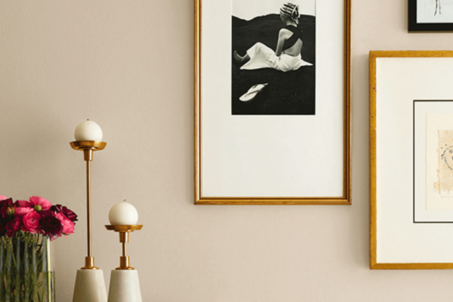
Super Nova 1414 is not just a color; it’s a statement. Enveloping the richness of the night sky, it carries a depth that is both complex and captivating. This profound hue, reminiscent of the dark velvety heavens punctuated by the brilliance of a supernova, is a color that promises to add drama and intensity to any interior.
Best suited for contemporary and minimalist styles, Super Nova 1414 works exceptionally well with sleek materials like polished metal, glass accents, and smooth leather textures, infusing sophistication and a touch of the avant-garde to the decor.
housekeepingbay.com
Table of Contents
Is It a Warm Or Cool Color?
The complexity of Super Nova 1414 lies in its chameleon-like quality, toeing the line between a deep coolness and a warm embrace. In the world of color psychology, it might initially present itself as a cool shade, owing to its deep, dark base. Yet, upon closer inspection, its subtle warmth emerges, akin to the residual glow of a starburst. This dual nature allows it to adapt and shift with the interior elements, making it a versatile choice for homes.
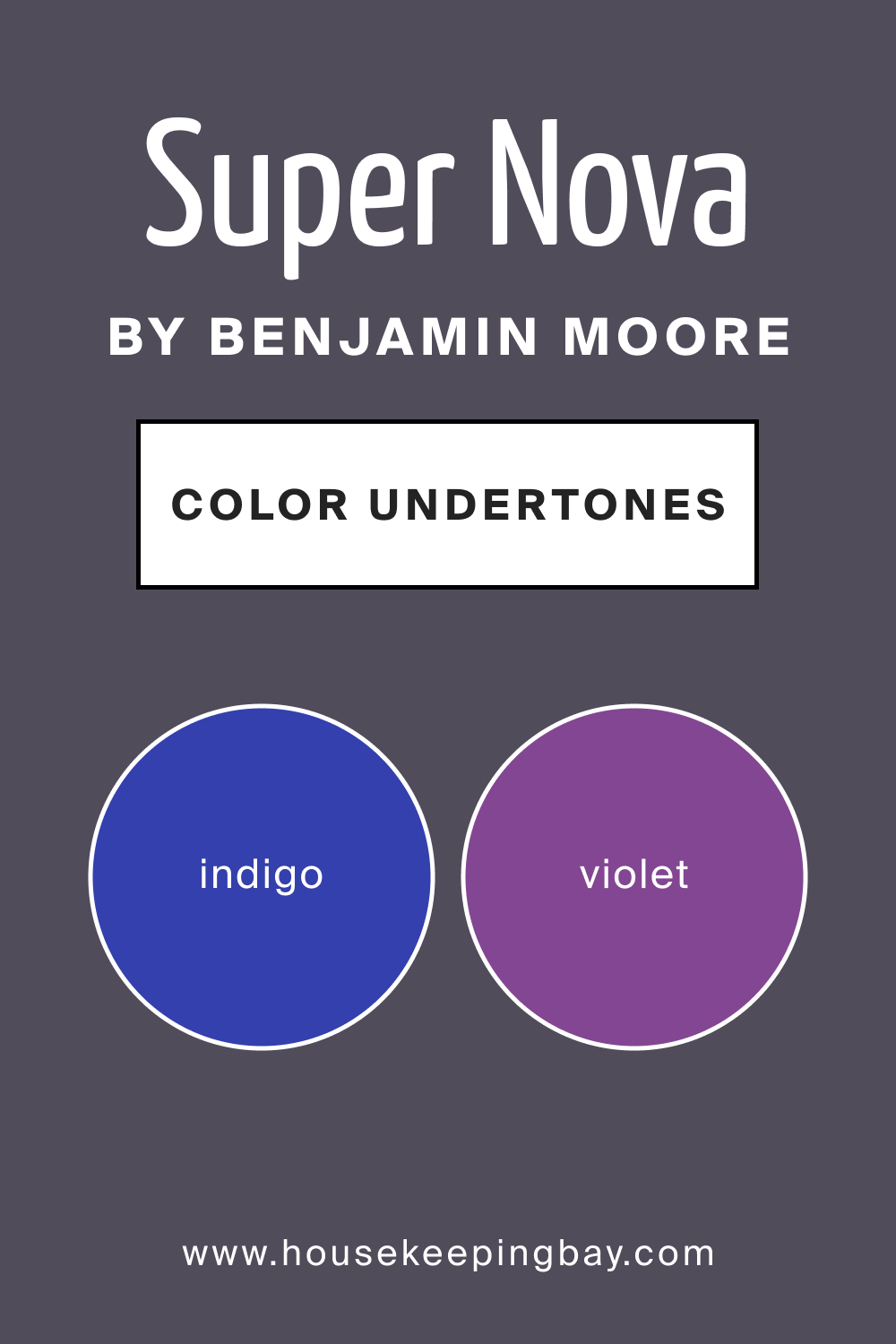
Undertones of Super Nova 1414
Understanding the undertones of Super Nova 1414 is essential in harnessing its full potential. Undertones are like the shadowed whispers of color; they are the subtle hues that linger beneath the surface.
BM Super Nova 1414 is laced with a complex spectrum of undertones that can vary from a dusky violet to a muted indigo, depending on the lighting and surrounding colors.
These undertones are pivotal, as they can bring forth a cooler or warmer presence in the paint, affecting its perception on interior walls.
housekeepingbay.com
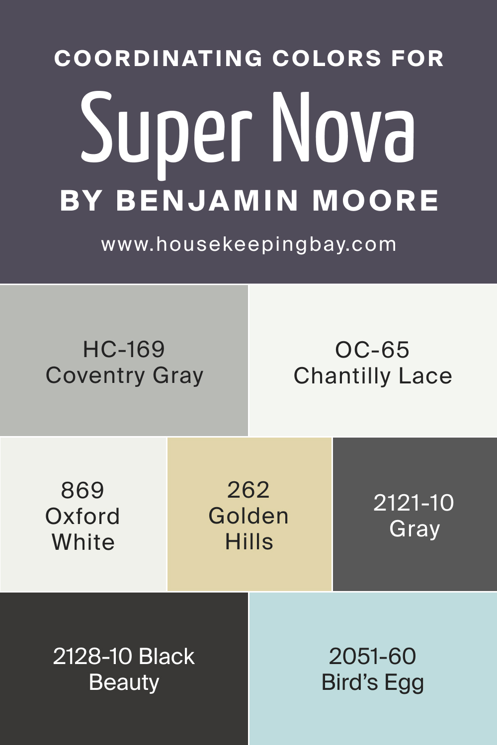
Coordinating Colors of Super Nova 1414
Harmony in design is often achieved through the strategic use of coordinating colors. For Super Nova 1414, the perfect counterparts are those that can stand in contrast without competing for attention.
Benjamin Moore’s BM 869 Oxford White is a crisp and clean balance, while OC-65 Chantilly Lace offers a soft, airy touch. BM 262 Golden Hills introduces a gentle, sunlit warmth, and BM 2051-60 Bird’s Egg contributes a serene, light contrast.
Additional coordinating colors may include:
- BM 2121-10 Gray – a deep, resonant gray that grounds Super Nova 1414.
- HC-169 Coventry Gray – a mid-tone gray with blue-green undertones, providing a muted but complementary contrast.
- BM 2128-10 Black Beauty – a true, deep black that pairs boldly with Super Nova 1414 for a modern edge.
housekeepingbay.com
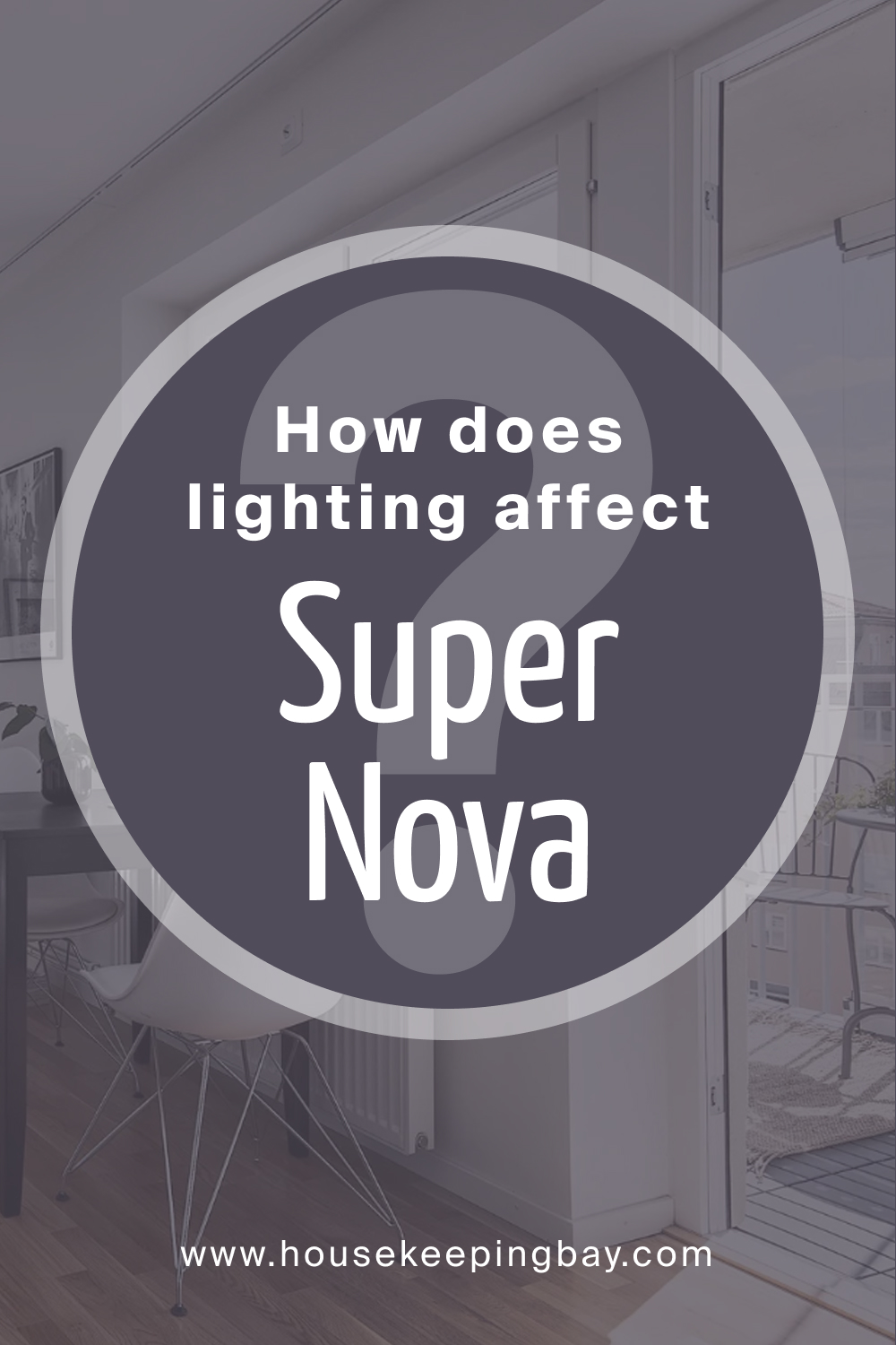
How Does Lighting Affect Super Nova 1414?
Lighting wields transformative power over colors, and Super Nova 1414 is no exception. Under artificial light, it may take on a more intimate and warmer persona, while natural light can pull out its cooler undertones. In north-facing rooms, it tends to reveal a more muted, shadowy character, whereas in south-facing rooms, it can appear slightly lighter and more dynamic.
East and west-facing rooms offer a blend of these effects, with changing appearances throughout the day as the light shifts from warm morning rays to cooler, evening tones.
housekeepingbay.com
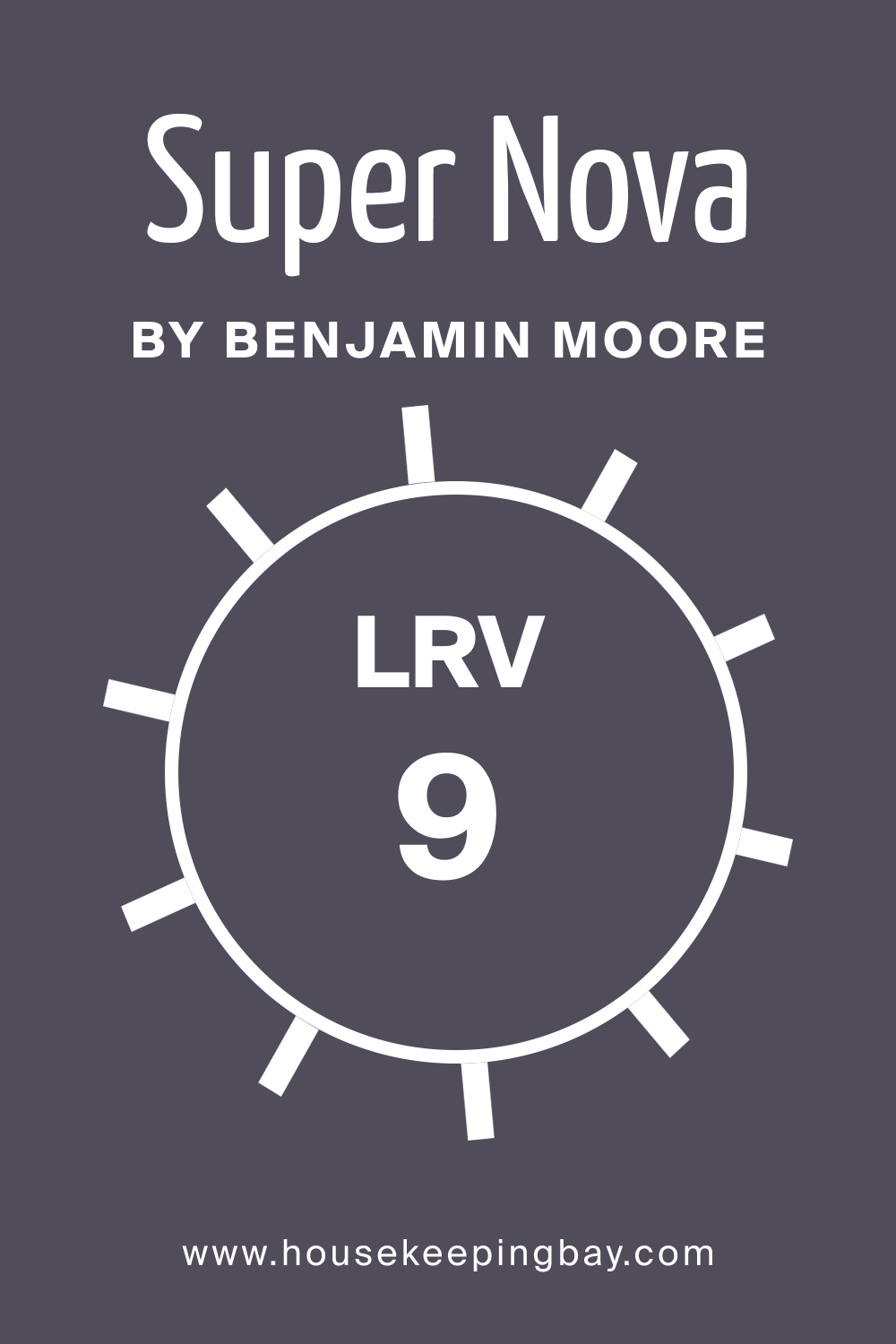
LRV of Super Nova 1414
The Light Reflectance Value (LRV) of a color provides invaluable insight into how it will behave within a space. An LRV of 9 for Super Nova 1414 indicates that it is on the darker end of the spectrum, absorbing more light than it reflects. This low LRV means that Super Nova 1414 will act as a depth-enhancing shade, making it a bold choice for larger rooms or as an accent in smaller spaces.
What is LRV? Read It Before You Choose Your Ideal Paint Color
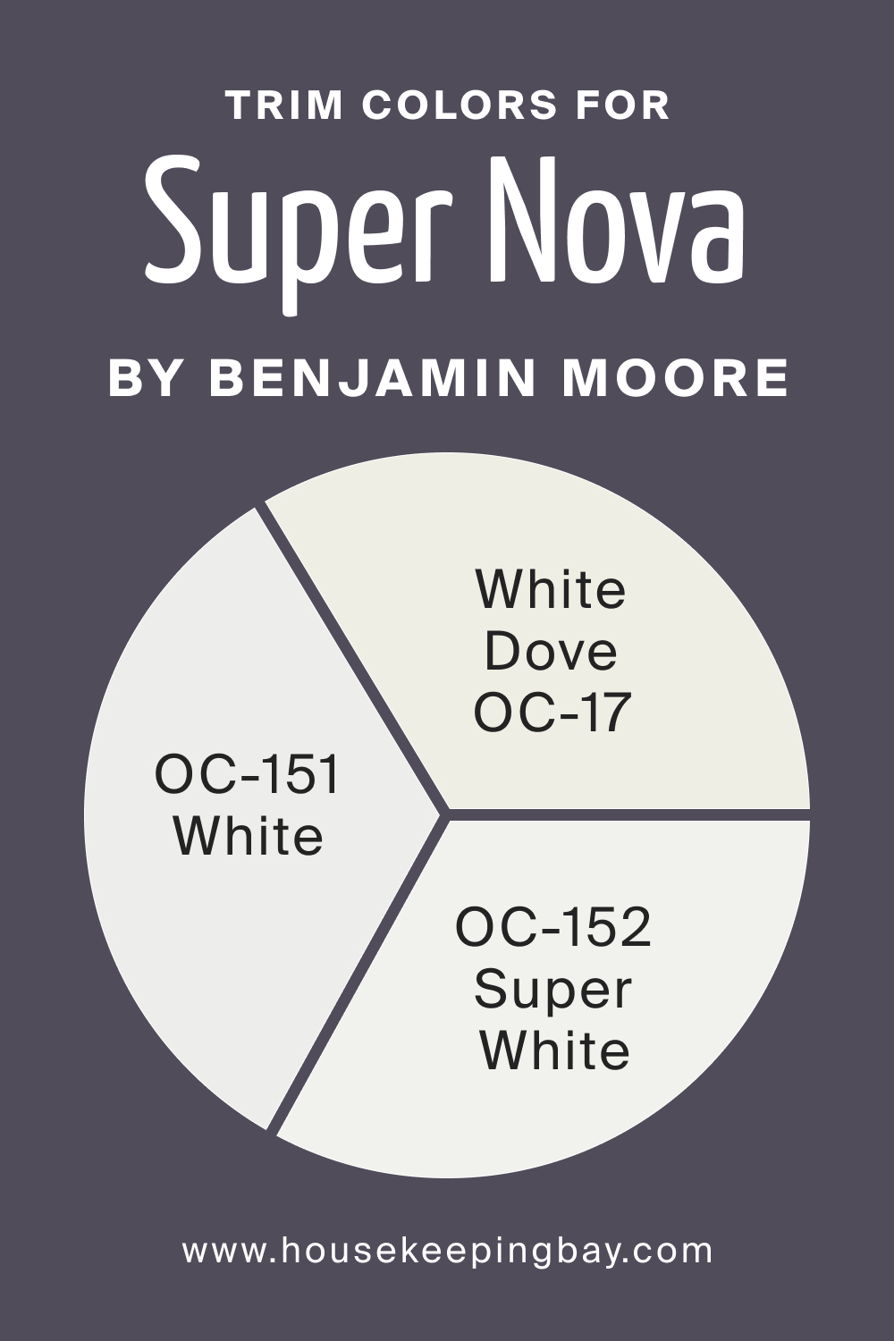
Trim Colors of Super Nova 1414
The trim color is the unsung hero that frames and defines the boundaries of a room. It is the detail that subtly but significantly impacts the aesthetic cohesion of a space. With Super Nova 1414, trim colors should be chosen to either contrast or complement its depth.
Shades of white like OC-151 White, OC-152 Super White, and OC-17 White Dove can be ideal, each offering a different level of warmth and contrast against the profound Super Nova 1414.
housekeepingbay.com
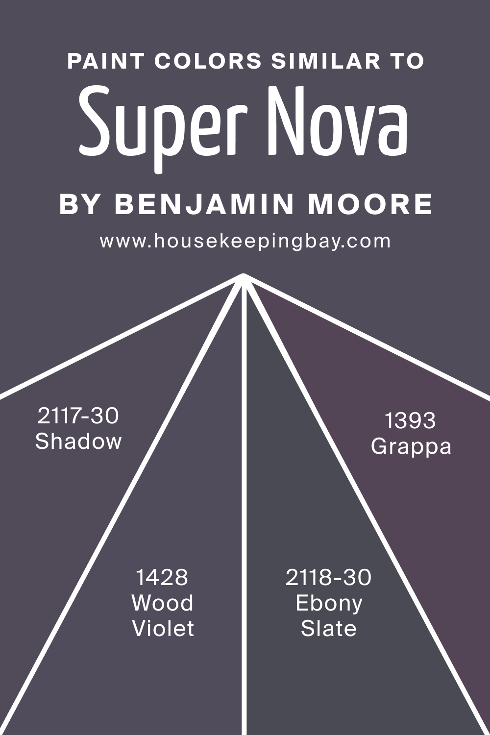
Colors Similar to Super Nova 1414
In the realm of color design, finding similar hues to Super Nova 1414 can provide alternatives that cater to different tastes or lighting conditions. BM 1428 Wood Violet has a more pronounced purple undertone, BM 2117-30 Shadow offers a darker, more enigmatic allure, and BM 2118-30 Ebony Slate brings a stony, almost midnight-blue feel. BM 1393 Grappa presents as a lighter, softer cousin with a more overt the violet presence.
housekeepingbay.com
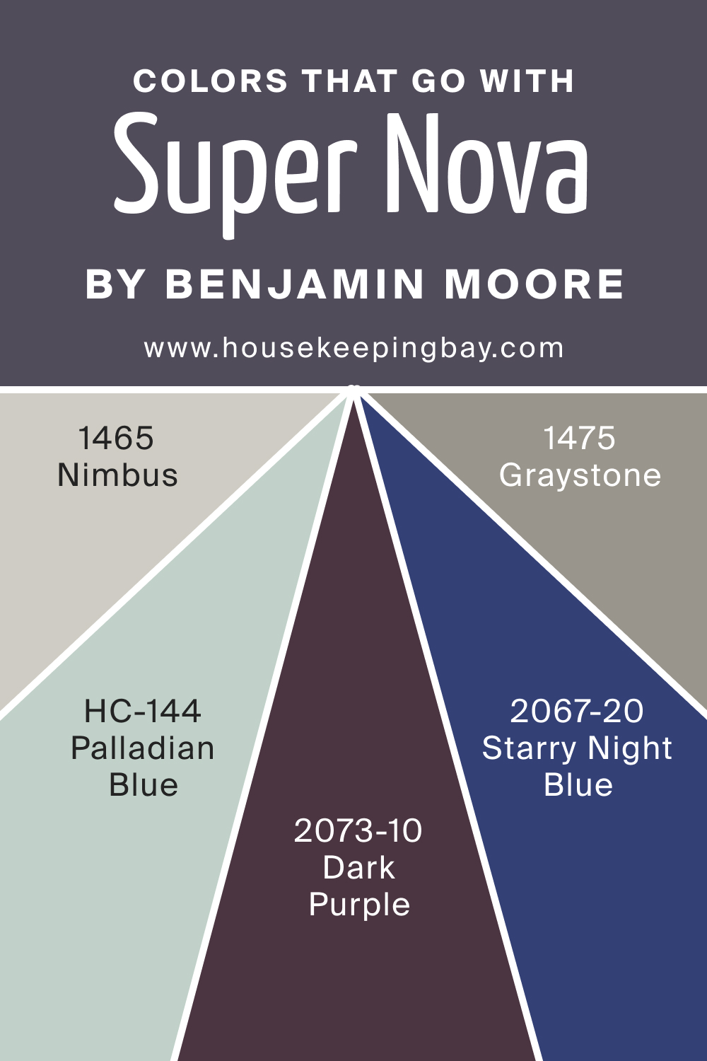
Colors That Go With Super Nova 1414
Selecting companion colors for Super Nova 1414 ensures a holistic and appealing design scheme. Colors that go well with this deep shade by Benjamin Moore include:
- BM 1475 Graystone – a mid-tone gray that harmonizes without overshadowing.
- BM 2067-20 Starry Night Blue – a vibrant blue that adds a punch of color.
- BM 2071-20 Dark Purple – a shade that resonates with Super Nova 1414’s undertones.
- BM 1465 Nimbus – a muted blue-gray for a subtle transition.
- HC-144 Palladian Blue – a soft, reflective hue for a refreshing contrast.
housekeepingbay.com
How to Use Super Nova 1414 In Your Home?
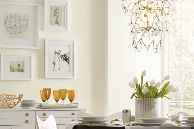
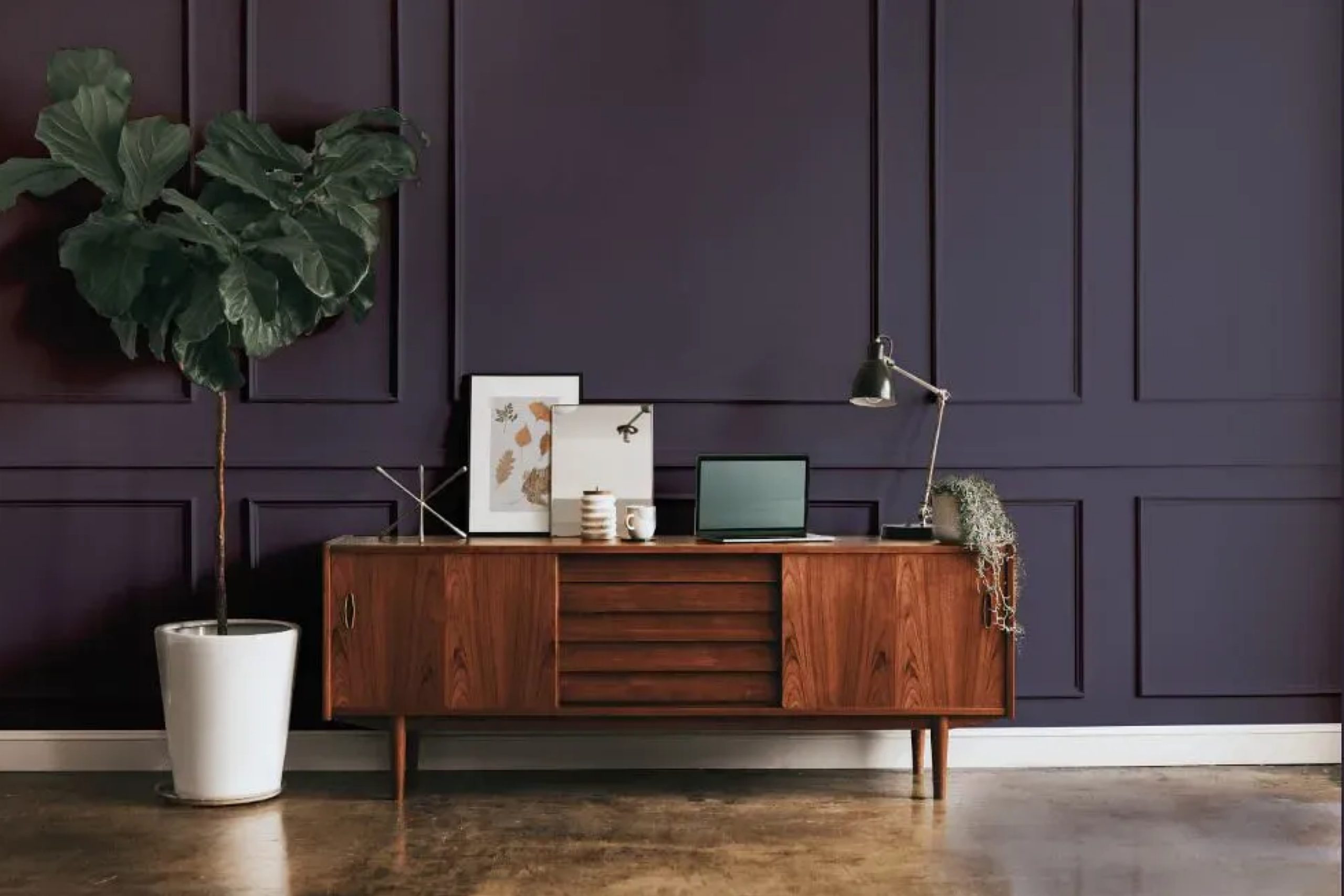
Super Nova 1414, a color with the depth of the midnight sky, can transform rooms with its dramatic flair. Ideal for an accent wall, it makes a striking statement in a living room or dining area, paired with minimalist furnishings in a contemporary style home. In a bedroom, it can create a cozy, den-like ambiance, especially when applied on textured walls for a rustic feel.
For a traditional setting, use it as a backdrop for classic wood furniture and gold accents. In kitchens or bathrooms, it should be used sparingly to avoid overwhelming the space.
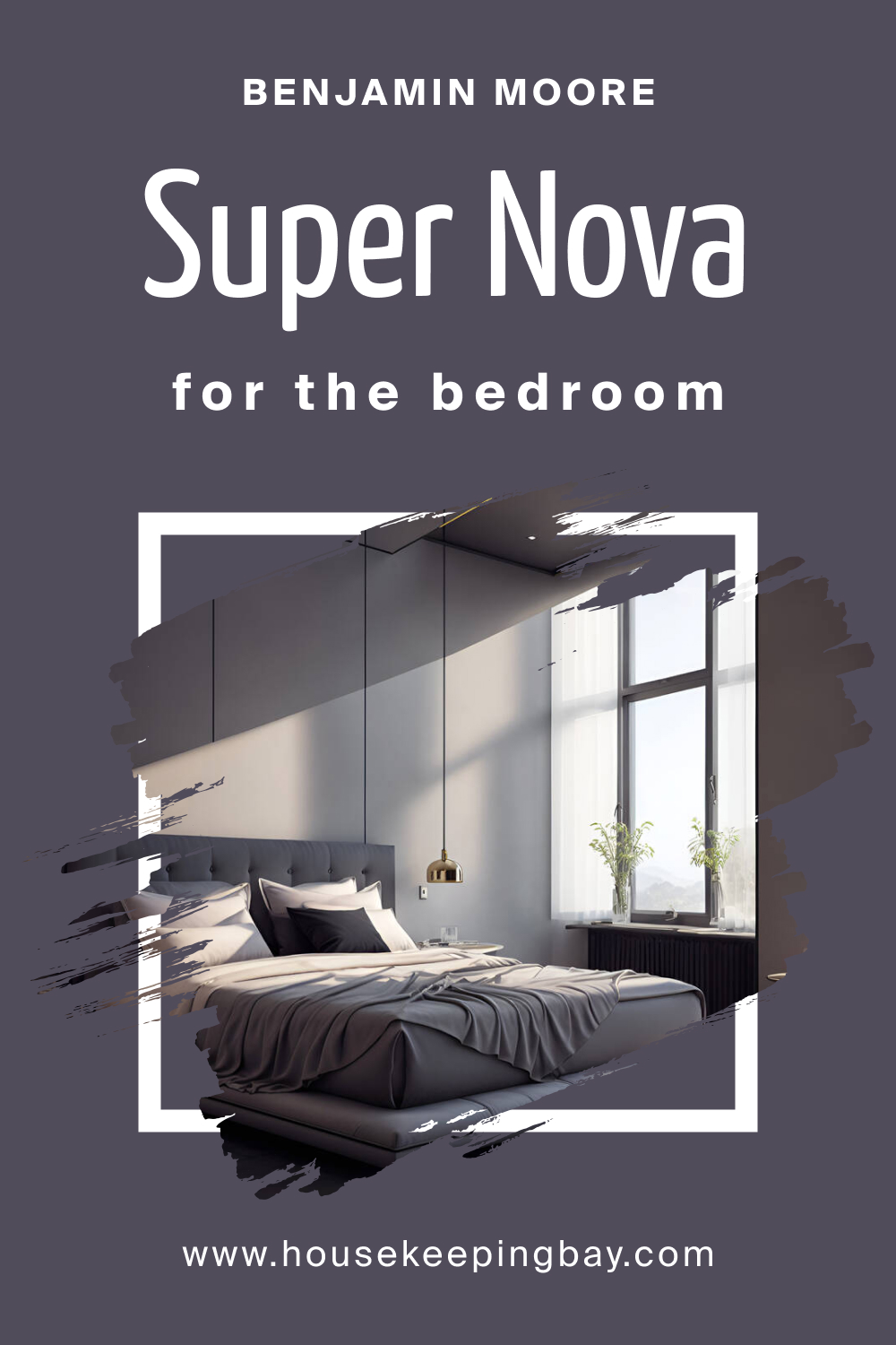
How to Use Super Nova 1414 in the Bedroom?
In the bedroom, Super Nova 1414 brings a sense of tranquility and depth, reminiscent of the night sky. Consider using it on a headboard wall to create a focal point, balanced with lighter linens and soft lighting. It pairs beautifully with glass and mirrored accents that reflect light, softening its intensity. For a modern look, match it with sleek furniture lines and metallic fixtures.
Use plush textures like velvet and faux fur to add warmth and luxury to the room’s atmosphere.
housekeepingbay.com
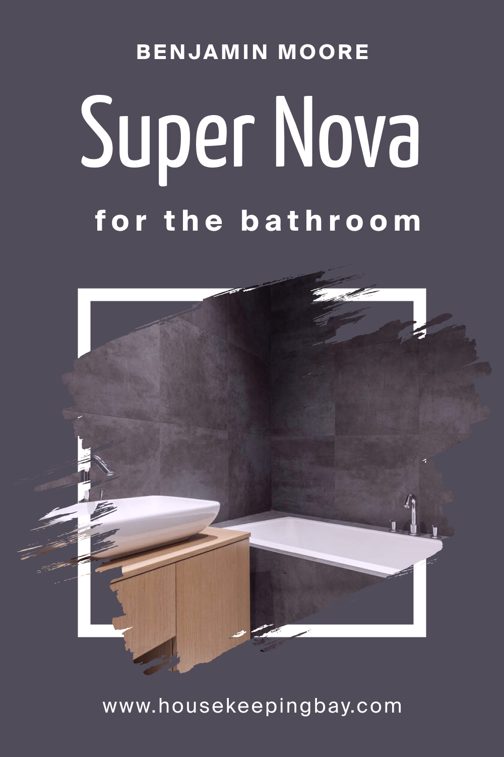
How to Use Super Nova 1414 in the Bathroom?
Super Nova 1414 can turn a bathroom into a sophisticated retreat. Used on cabinetry or an accent wall, it contrasts crisply with white fixtures, enhancing the sense of cleanliness and brightness. Balance its depth with ample lighting and reflective surfaces like a mirrored vanity. Marble or natural wood elements can warm up the space, ensuring the color adds character without confinement. It’s a bold choice for those wishing to bring a modern edge to their bathroom.
housekeepingbay.com
How to Use Super Nova 1414 in the Living Room?
Super Nova 1414 can anchor a living room with its stately presence. Use it on a statement wall behind a light-colored sofa to create a dramatic backdrop, or encompass the room for a more enveloping experience. Coordinate with neutral-toned furnishings and pops of jewel-toned accessories to add vibrancy. For an eclectic touch, incorporate textured fabrics and vintage pieces. The deep hue pairs well with natural light and layered lighting, ensuring the space remains inviting.
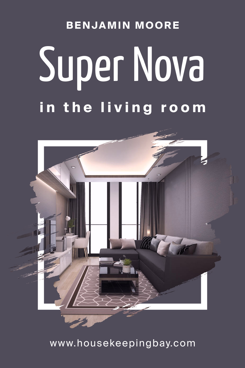
housekeepingbay.com
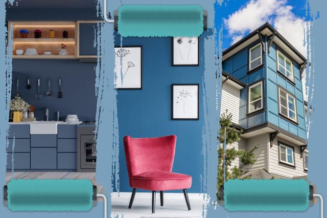
How to Use Super Nova 1414 for an Exterior?
For an exterior, Super Nova 1414 lends a bold and elegant aura. It can highlight architectural features like trim or shutters, providing a striking contrast against lighter siding. Used on a front door, it creates a welcoming entry point. It’s an excellent choice for modern and contemporary homes, especially when offset with warm, outdoor lighting to soften its impact. Ensure landscaping elements provide a fresh counterpoint to its dramatic tone.
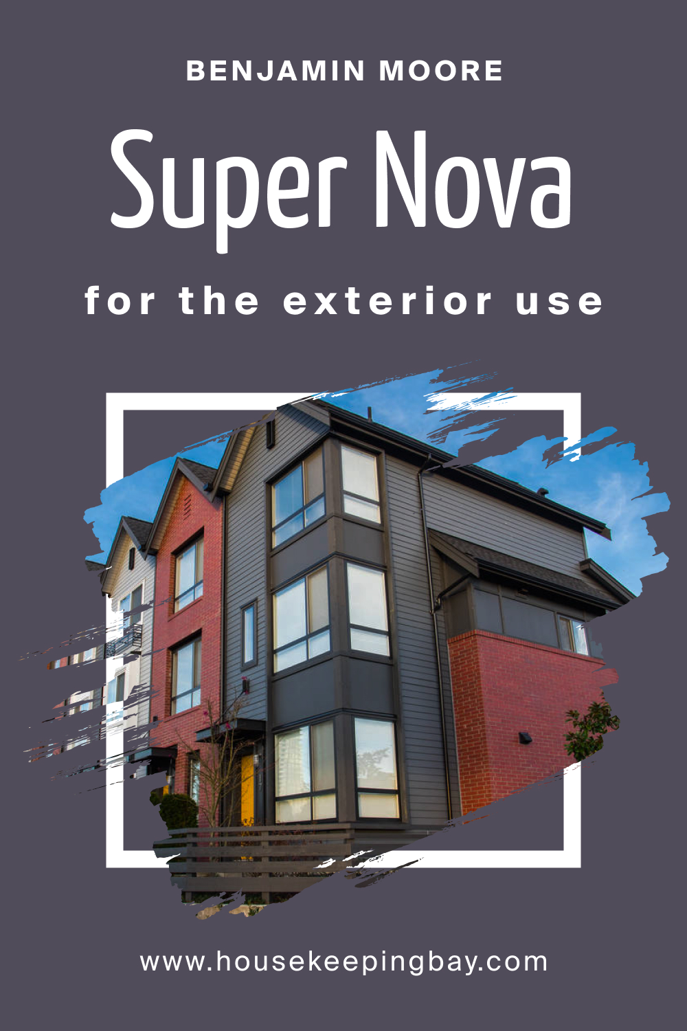
housekeepingbay.com
How to Use Super Nova 1414 in the Kitchen?
Super Nova 1414 can transform a kitchen when used thoughtfully. As an accent, it can define a cooking island or a single wall. To avoid a heavy feel, pair it with lighter cabinetry, countertops, and backsplash tiles. It works well in open-concept kitchens, adding depth and interest to the overall design. Brass or copper hardware and fixtures will stand out against this dark hue, making the kitchen both inviting and stylish.
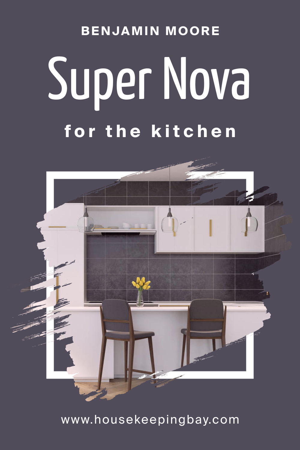
housekeepingbay.com
How to Use Super Nova 1414 on the Kitchen Cabinets?
Super Nova 1414 on kitchen cabinets can create a sense of drama and luxury. It’s perfect for lower cabinets, with lighter colors above to maintain brightness. Complemented by subdued lighting, it can make the space feel grounded and elegant. This color demands simple, sleek hardware in brushed nickel or stainless steel to maintain a modern aesthetic. Ensure countertops and backsplashes are in lighter hues to balance the visual weight of the cabinetry.
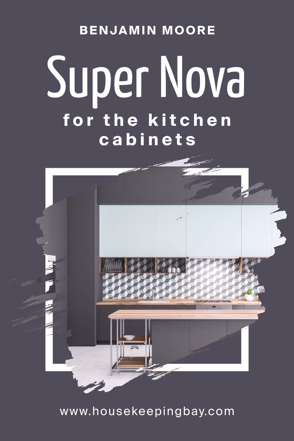
housekeepingbay.com
Comparing Super Nova 1414 With Other Colors
Comparing different colors is vital for understanding how each can influence the mood and visual dynamics of a space. Colors have the ability to interact with one another, affecting perceptions of size, temperature, and harmony within a room. When selecting a palette, contrasting hues can highlight features or create depth, while analogous colors can unify a space and foster a cohesive look.
The comparison process aids in curating a balanced and intentional design scheme that aligns with the desired ambiance and function of a room.
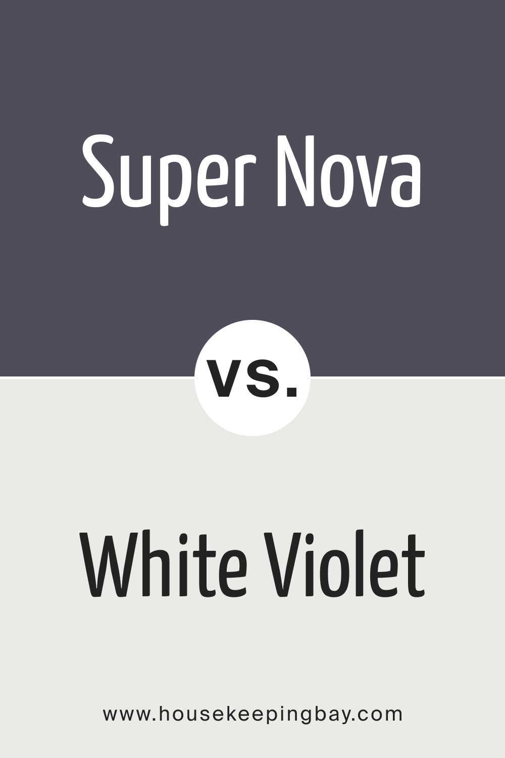
Super Nova 1414 vs. BM 1408 White Violet
Super Nova 1414 and BM 1408 White Violet offer a study in contrasts—Super Nova 1414 is deep and absorbing, reminiscent of the endless night sky, while White Violet is a soft, ethereal color with a gossamer-like delicacy. When paired, White Violet can act as a soothing counterbalance to the intensity of Super Nova 1414, providing a lightness that can open up a space and offer visual respite.
housekeepingbay.com
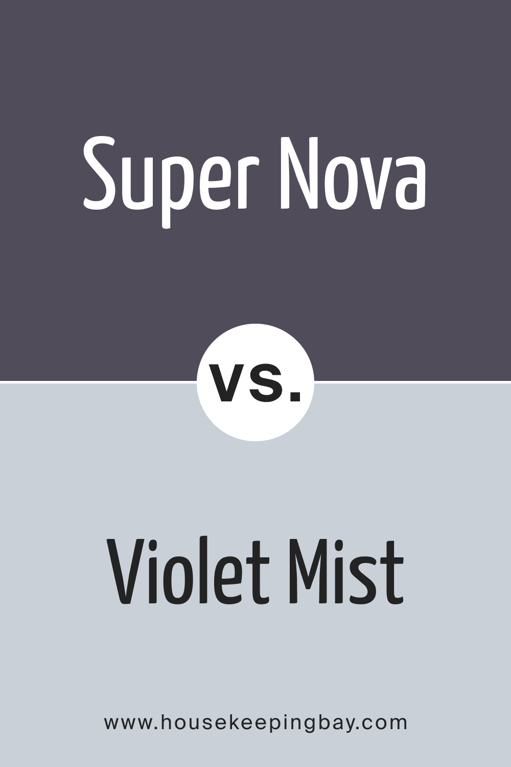
Super Nova 1414 vs. BM 1437 Violet Mist
Super Nova 1414’s rich, velvety quality is dramatically different from the airy and serene feel of BM 1437 Violet Mist . Violet Mist, with its lighter and cooler tone, can introduce a breath of freshness when used alongside the more solemn Super Nova 1414. In a space, the two can play off each other, with Violet Mist serving as an expansive backdrop that allows the depth of Super Nova to stand out strikingly.
housekeepingbay.com
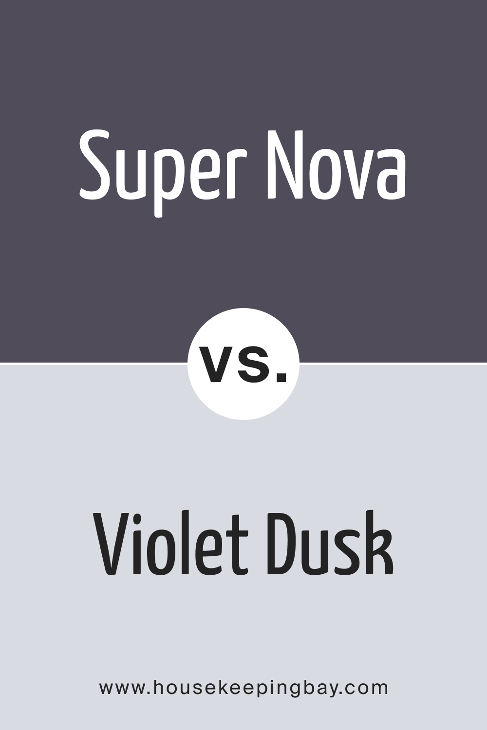
Super Nova 1414 vs. BM 1409 Violet Dusk
Comparing Super Nova 1414 to BM 1409 Violet Dusk is like comparing twilight to the deeper shades of nighttime. Violet Dusk has a dusky, subdued character but carries more lightness than Super Nova 1414, making it more versatile for larger wall expanses. When these two are used together, they can create a nuanced interplay of darkness and subdued light, ideal for creating a space with a layered and sophisticated ambiance.
housekeepingbay.com
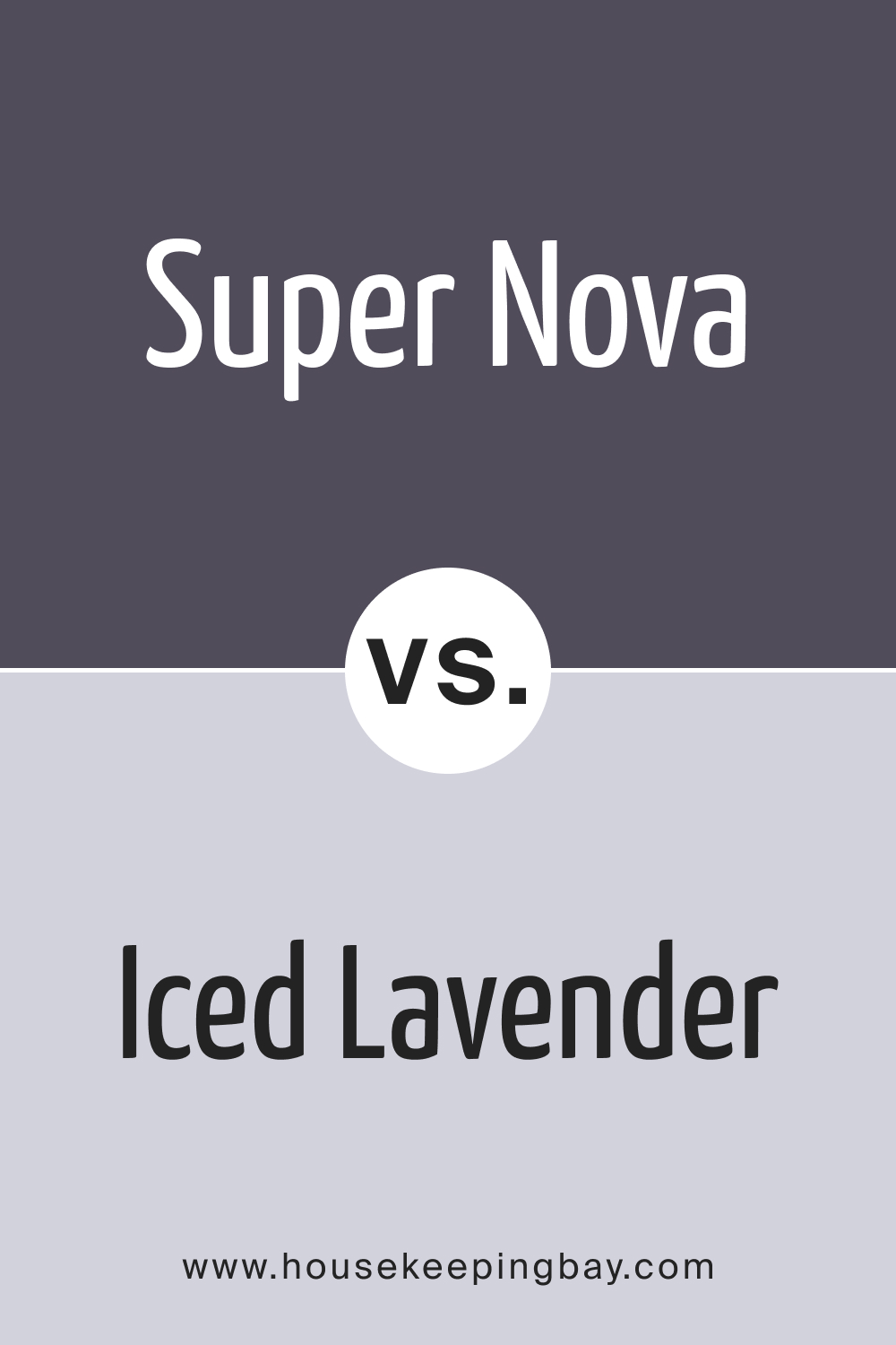
Super Nova 1414 vs. BM 1410 Iced Lavender
Super Nova 1414 juxtaposed with BM 1410 Iced Lavender presents a vibrant interplay between profound darkness and icy lightness. Iced Lavender, with its cool, almost frosty appearance, offers a refreshing lift to the imposing weight of Super Nova 1414. It’s an ideal combination for spaces that aim for a dramatic yet balanced color scheme that’s both bold and invigorating.
housekeepingbay.com
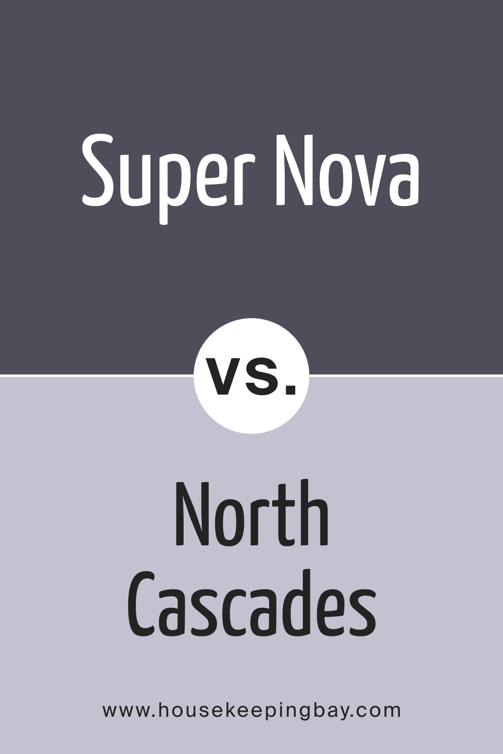
Super Nova 1414 vs. BM 1411 North Cascades
BM 1411 North Cascades stands out as a natural, earthy color with a subtle, muted presence compared to the deep and enigmatic Super Nova 1414. While Super Nova can dominate a space, North Cascades tends to recede, making it a perfect companion for creating a grounding effect in a room that features Super Nova as its main attraction.
housekeepingbay.com
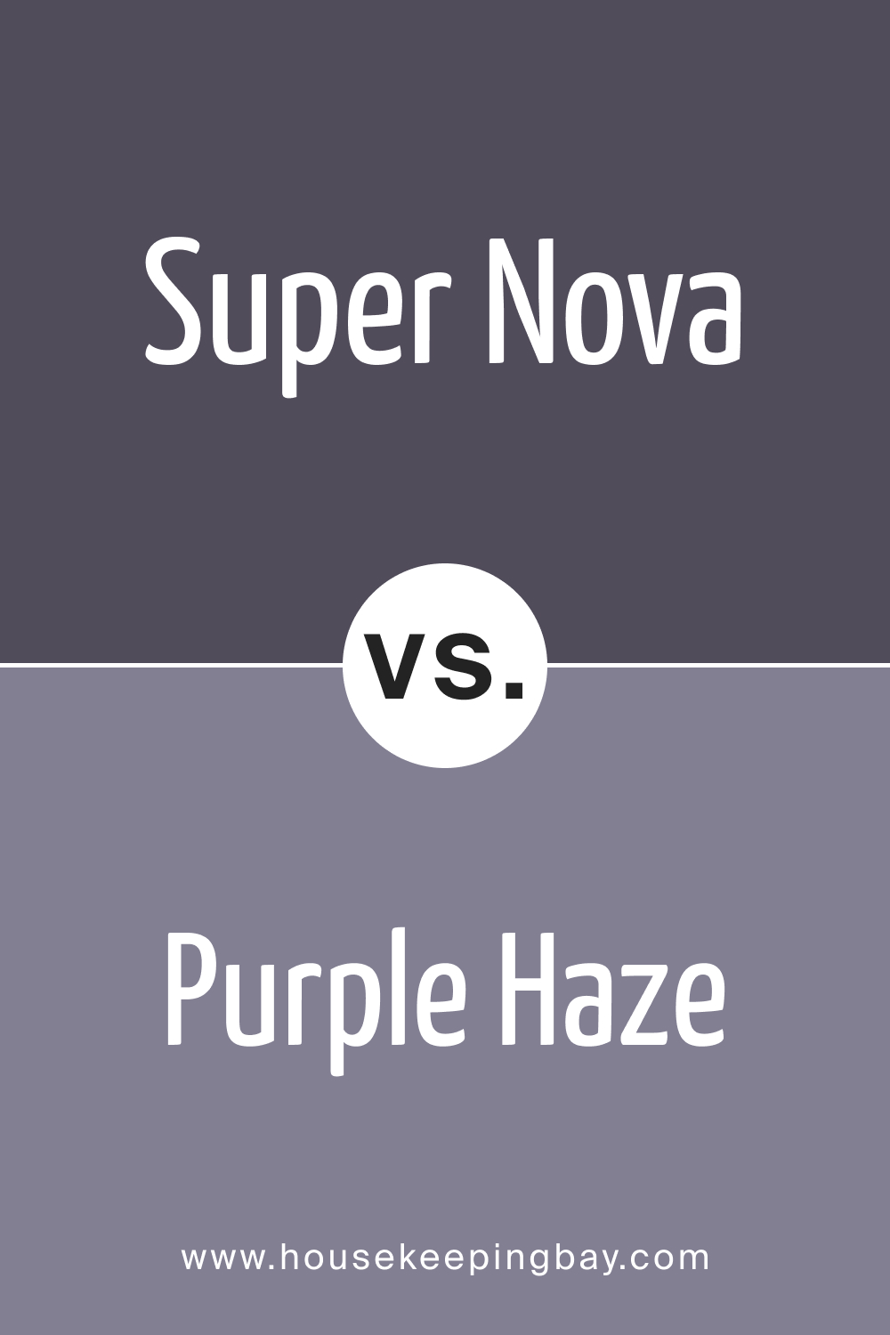
Super Nova 1414 vs. BM 1413 Purple Haze
BM 1413 Purple Haze offers a mid-tone that bridges the gap between the intensity of Super Nova 1414 and lighter lavender hues. While Super Nova provides depth and drama, Purple Haze imparts a sense of mystique without overwhelming a space. Together, they can fashion a room that is dynamic and filled with character, suitable for an artistic or reflective space.
housekeepingbay.com
Conclusion
In conclusion, the act of comparing colors like Super Nova 1414 with others on the spectrum reveals the diverse effects each can have on interior spaces. From the gentle illumination of White Violet to the earthy grounding of North Cascades, each color holds its unique properties that can dramatically alter the perception and feel of a room. Super Nova 1414 serves as a powerful, deep hue that can be both a focal point or an anchor in a color scheme, depending on its pairing.
Understanding these relationships is key to crafting interior designs that are not only visually pleasing but also psychologically comforting and harmonious. When chosen with intention, colors have the power to transform a mere space into a personal sanctuary reflecting one’s taste and spirit.
housekeepingbay.com
Ever wished paint sampling was as easy as sticking a sticker? Guess what? Now it is! Discover Samplize's unique Peel & Stick samples. Get started now and say goodbye to the old messy way!
Get paint samples