Split Pea 2146-30 Paint Color by Benjamin Moore
Colors play a vital role in setting the mood of any space.
Colors play a vital role in setting the mood of any space. Benjamin Moore, a leading name in the paint industry, presents an array of sophisticated shades that cater to varied aesthetics. One such standout color is Split Pea 2146-30.
This article delves into the specifics of this hue, its undertones, coordination with other colors, and its interaction with light.
via plan home
What Color Is Split Pea 2146-30?
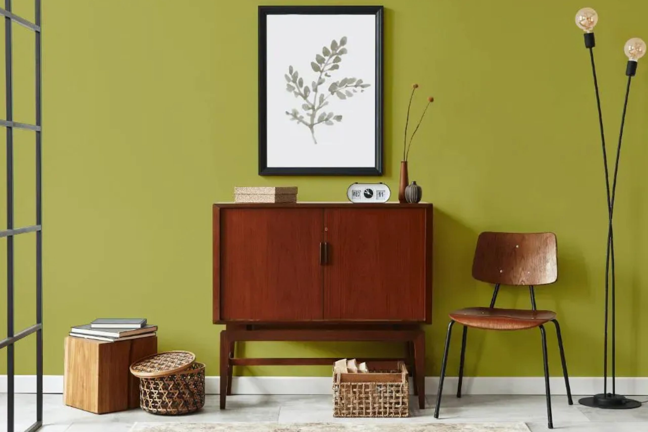
Split Pea 2146-30 resonates with the lush richness of green peas. It brings forth a natural, organic touch with a subdued undertone, echoing earthiness. Ideal for individuals looking to bring a touch of nature indoors, this hue fits seamlessly in rustic, modern, and even Scandinavian interior styles.
Pairing Split Pea 2146-30 with wooden textures, linen fabrics, or even matte finishes accentuates its beauty, allowing it to take center stage.
housekeepingbay.com
Table of Contents
Is It a Warm Or Cool Color?
Split Pea 2146-30 is predominantly a warm hue, with subtle yellow undertones adding to its richness. Warm colors generally bring a cozy, welcoming vibe to spaces, making them feel closer and more intimate. This means that Split Pea 2146-30 can make larger spaces feel cozier, while in smaller rooms, it can evoke a snug atmosphere.
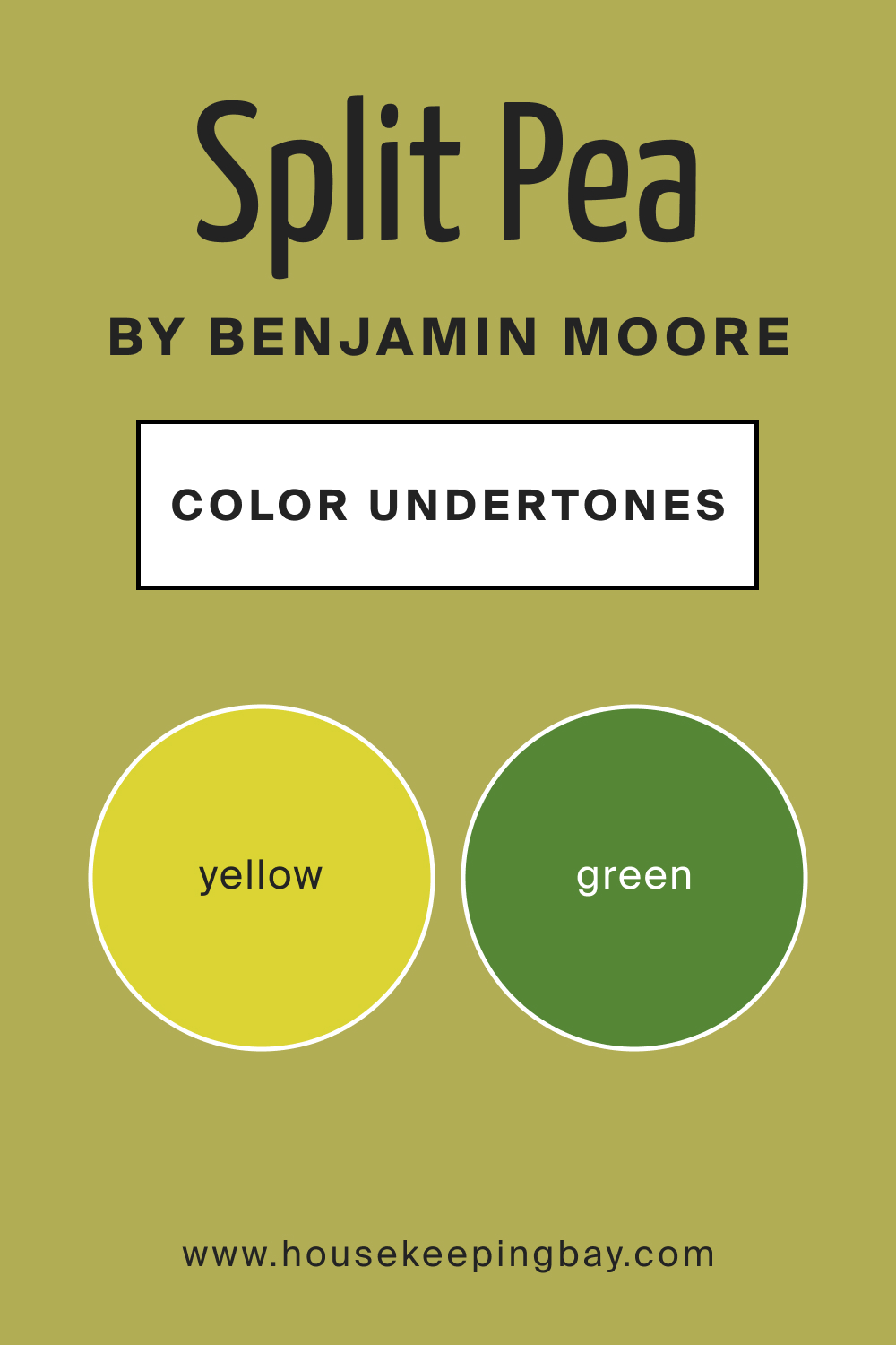
Undertones of Split Pea 2146-30
Every color boasts undertones that subtly shift its perception. Split Pea’s undertones consist of a blend of yellow and green. These undertones can make the color appear differently based on adjacent colors and lighting. On interior walls, these undertones play a significant role. When surrounded by cooler colors, Split Pea’s warm undertones stand out more vividly.
housekeepingbay.com
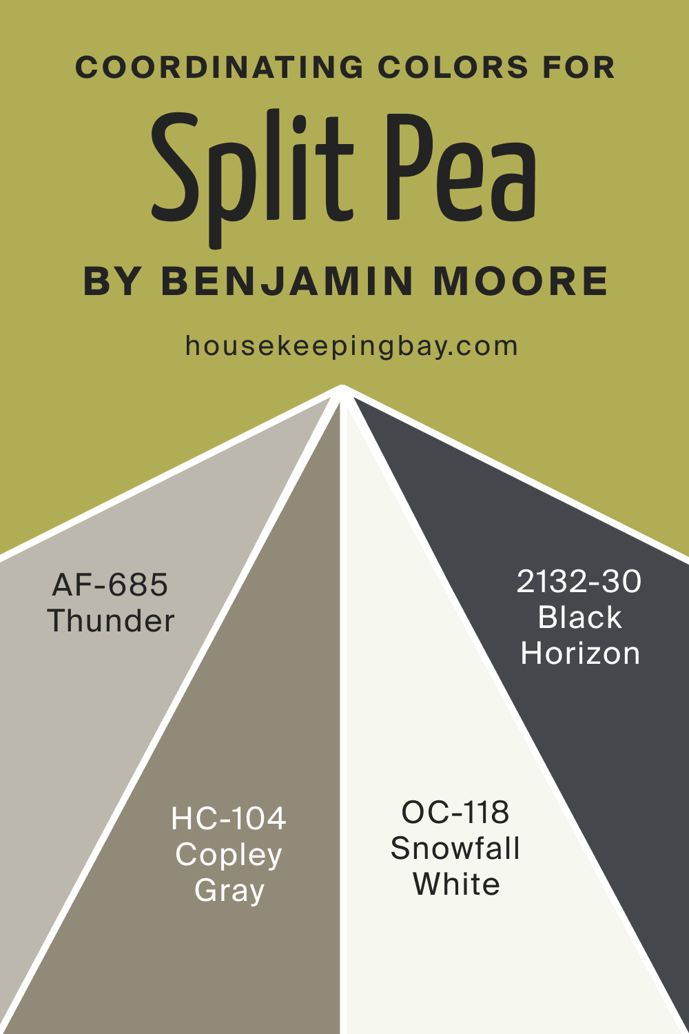
Coordinating Colors of Split Pea 2146-30
Coordinating colors serve as complementary hues that can either contrast or flow seamlessly with the main color. For Split Pea 2146-30:
- OC-118 Snowfall White : A pristine white that offers a crisp contrast.
- HC-104 Copley Gray : A subtle gray with a touch of warmth.
- AF-685 Thunder : A muted lilac-gray that provides depth.
- BM 2132-30 Black Horizon : A deep, almost black shade that brings intensity.
housekeepingbay.com
How Does Lighting Affect Split Pea 2146-30?
Lighting dramatically influences the perception of color. Under artificial lighting, Split Pea 2146-30 may come off as a bit more muted or even slightly yellowish. Natural light, particularly the golden hours, can intensify its warmth. In north-faced rooms, this color can appear darker, while in south-faced rooms, it can seem lighter and more vibrant.
East-facing rooms cast a gentle morning light, emphasizing its greenish tones, whereas west-facing rooms during sunset can bring out its cozy warmth.
housekeepingbay.com
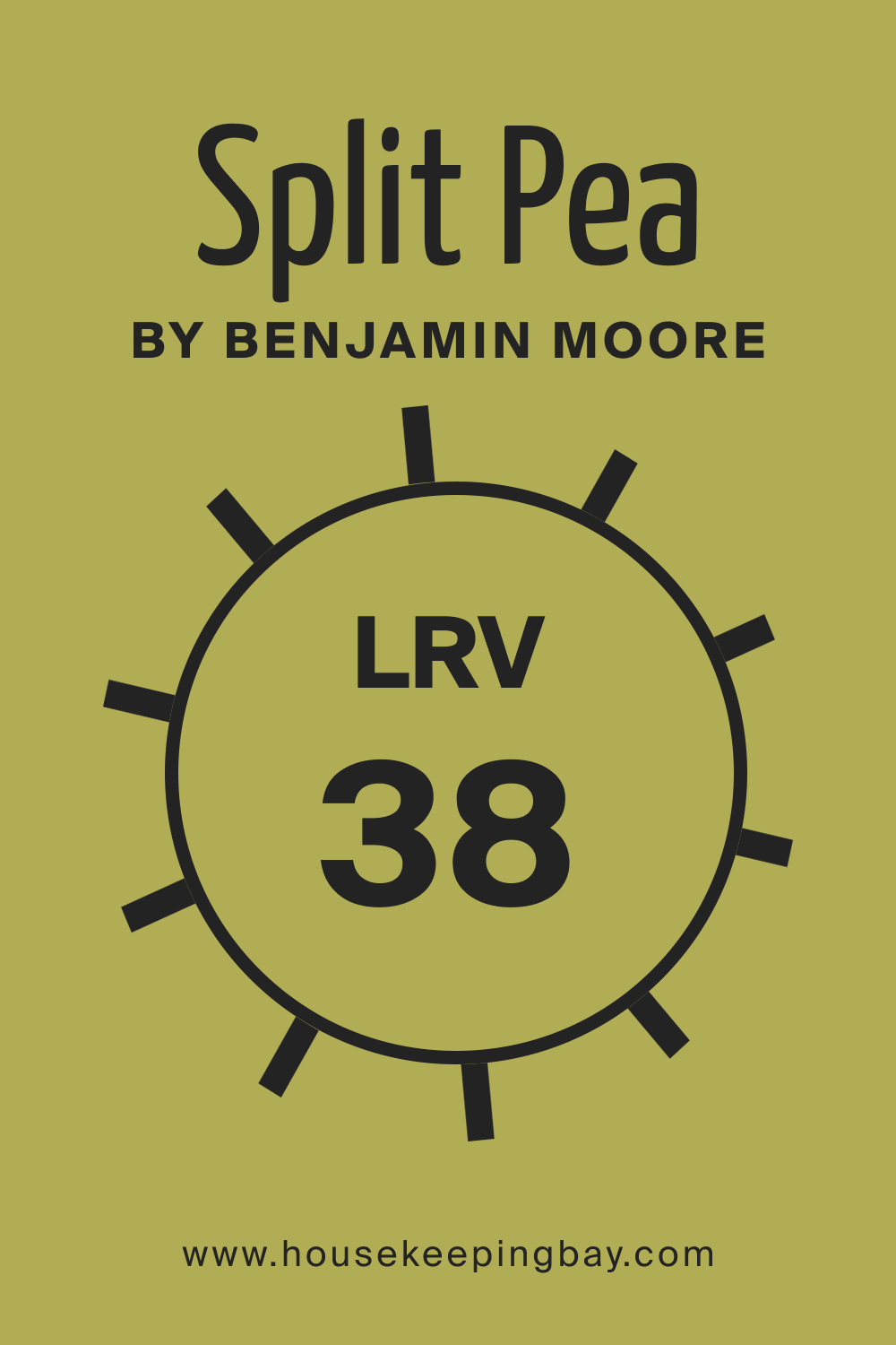
LRV of Split Pea 2146-30
Light Reflectance Value (LRV) indicates how much light a color reflects. At an LRV of 38, Split Pea 2146-30 is in the mid-range. This means it neither reflects too much light nor absorbs it heavily. In practical terms, this color won’t overly brighten or darken a room, making it versatile for various spaces.
housekeepingbay.com
What is LRV? Read It Before You Choose Your Ideal Paint Color
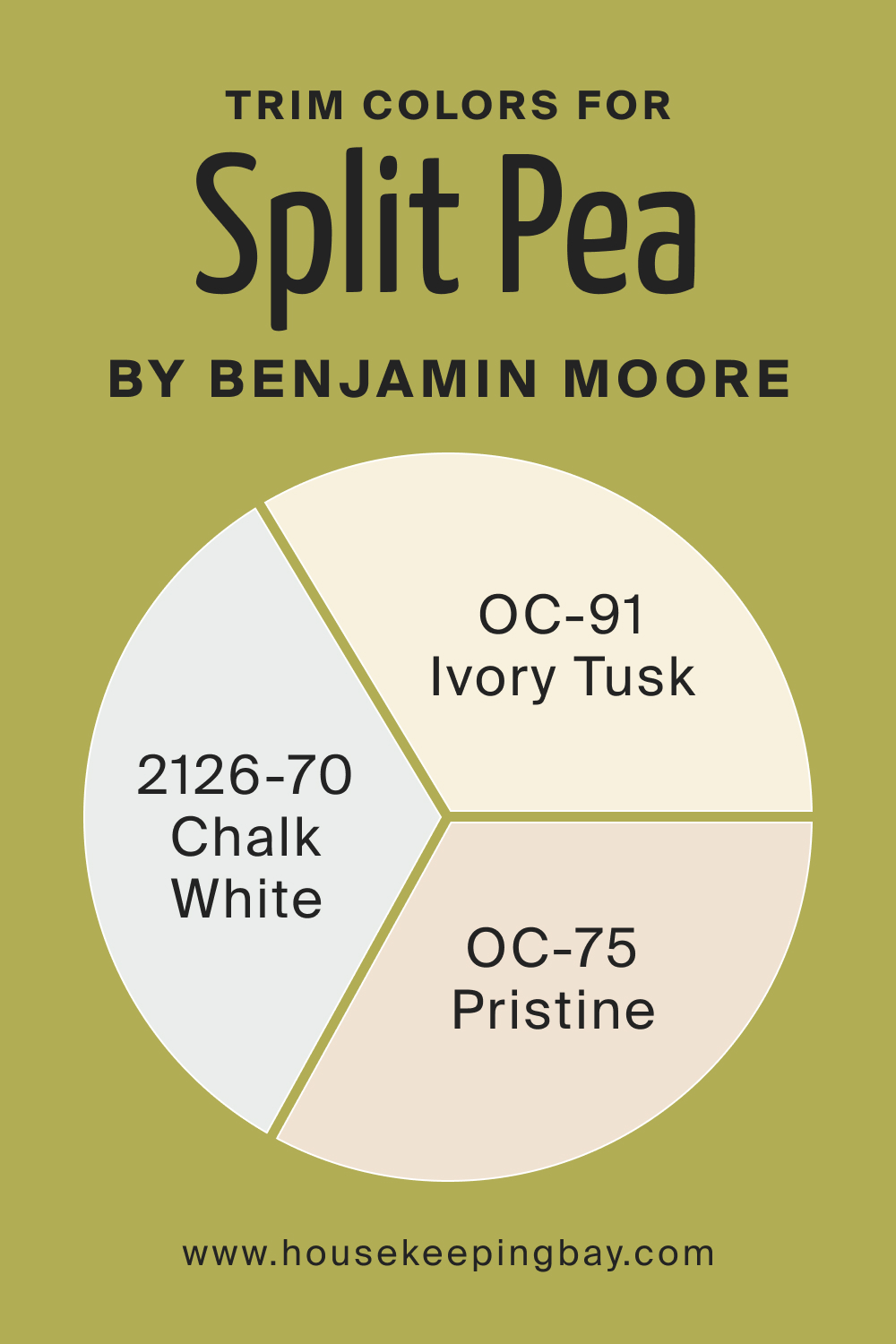
Trim Colors of Split Pea 2146-30
Trims act as borders, framing the primary wall color. For Split Pea 2146-30, shades of white like BM 2126-70 Chalk White, OC-91 Ivory Tusk, and OC-75 Pristine by Benjamin Moore serve as excellent trims. They provide a clean break, allowing the wall color to shine.
housekeepingbay.com
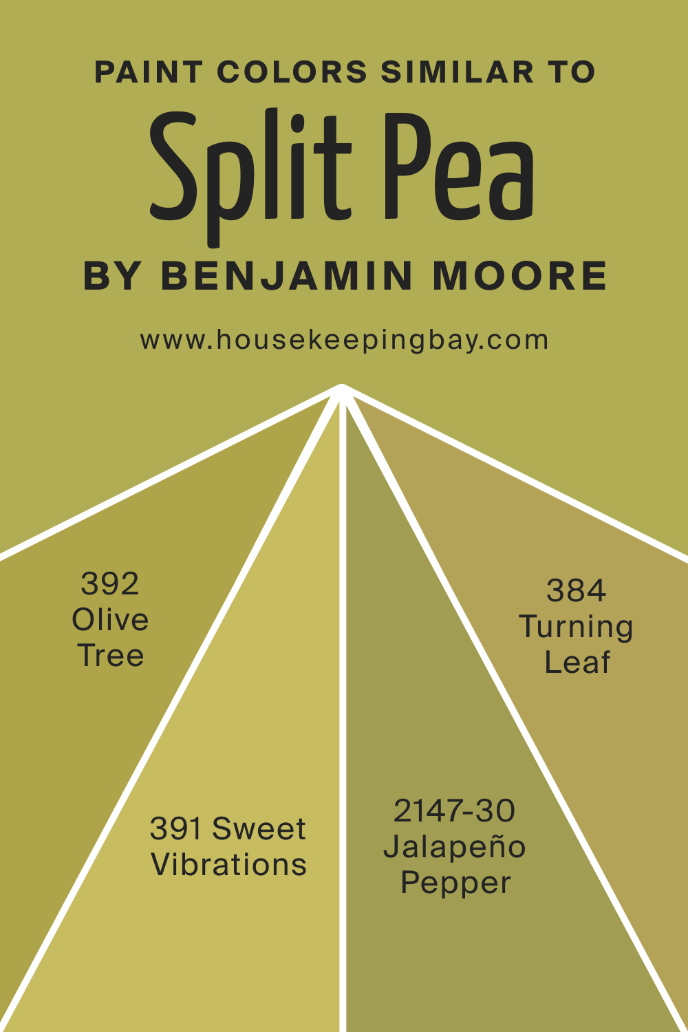
Colors Similar to Split Pea 2146-30
Recognizing analogous colors helps in picking alternatives or identifying slight variations.
- BM 392 Olive Tree : An earthier green with brown undertones.
- BM 384 Turning Leaf : A yellow-green reminiscent of early fall.
- BM 391 Sweet Vibrations : A softer, pastel shade of green.
- BM 2147-30 Jalapeno Pepper : A spicier, more vivid green.
housekeepingbay.com
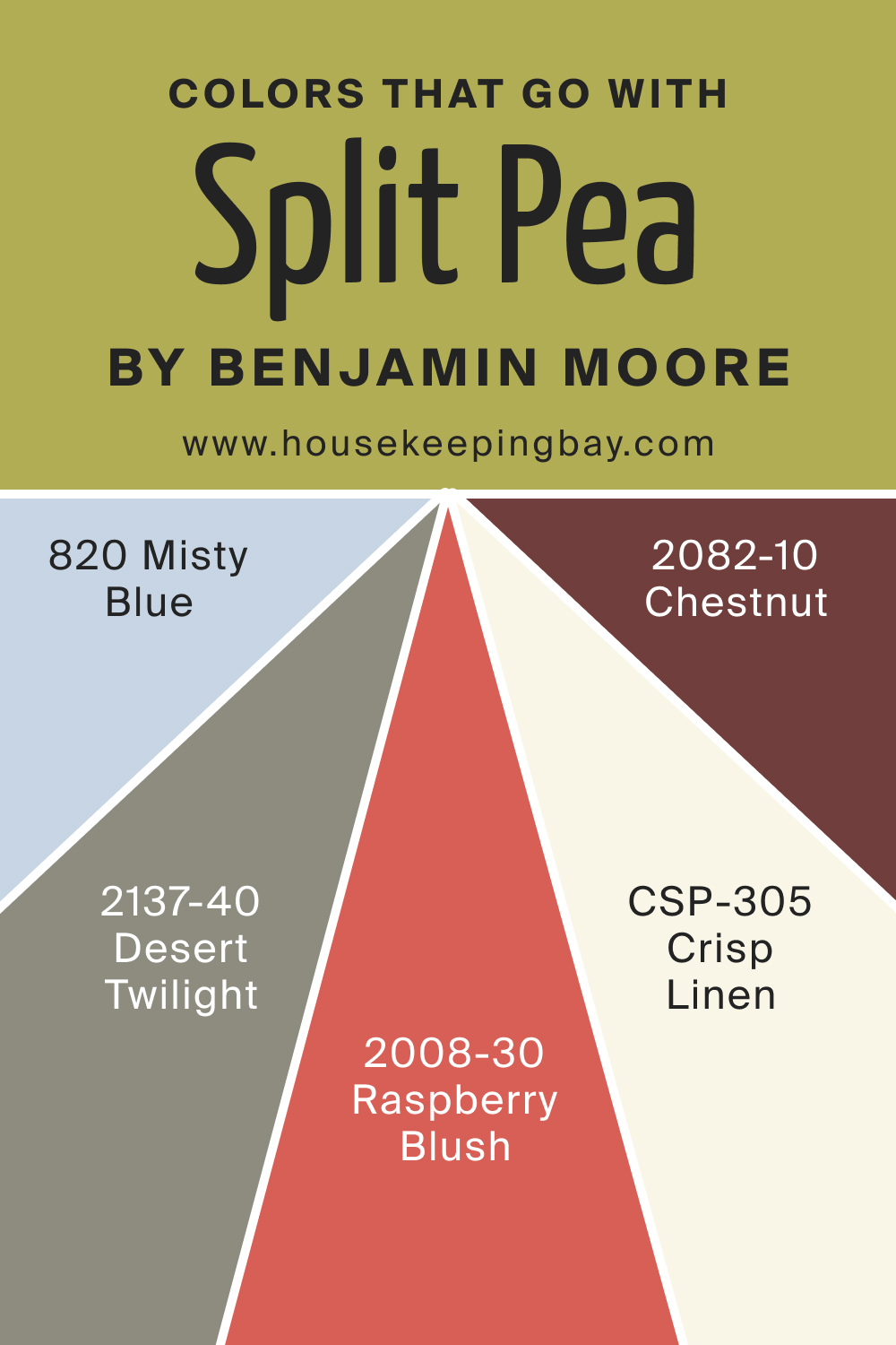
Colors That Go With Split Pea 2146-30
Harmonizing colors create a cohesive palette. Alongside Split Pea 2146-30, Benjamin Moore’s BM 2137-40 Desert Twilight, BM 820 Misty Blue, BM 2082-10 Chestnut, CSP-305 Crisp Linen, and BM 2008-30 Raspberry Blush are remarkable choices. Each adds a unique element, be it warmth, contrast, or a complementary touch, enriching the overall room ambiance.
Incorporating Split Pea 2146-30 into your space is an invitation to nature, warmth, and sophistication. Whether used as a primary wall color or an accent, it promises to elevate the aesthetic of any room.
housekeepingbay.com
How to Use Split Pea 2146-30 In Your Home?
Split Pea 2146-30 is a versatile hue suitable for various rooms. Its organic essence resonates well in living rooms, bedrooms, and even bathrooms, creating a tranquil and welcoming ambiance. In terms of design styles, it complements rustic interiors with its natural touch, modern designs for its sophistication, and Scandinavian spaces for its muted elegance. Moreover, it can act as a statement in exteriors and kitchens, especially when paired with the right accents.
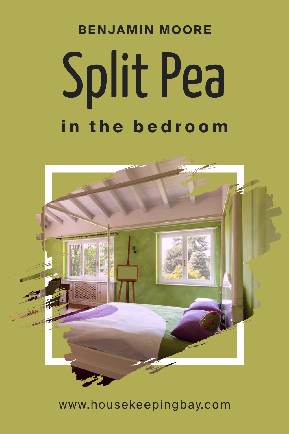
How to Use Split Pea 2146-30 in the Bedroom?
A bedroom adorned in Split Pea offers a sanctuary of serenity. The shade radiates warmth, enveloping sleepers in a cozy embrace. Pair with wooden furniture or white linens to balance its vibrancy. Use gold or brass accents for a touch of luxury, making your bedroom an oasis of calm and sophistication.
housekeepingbay.com
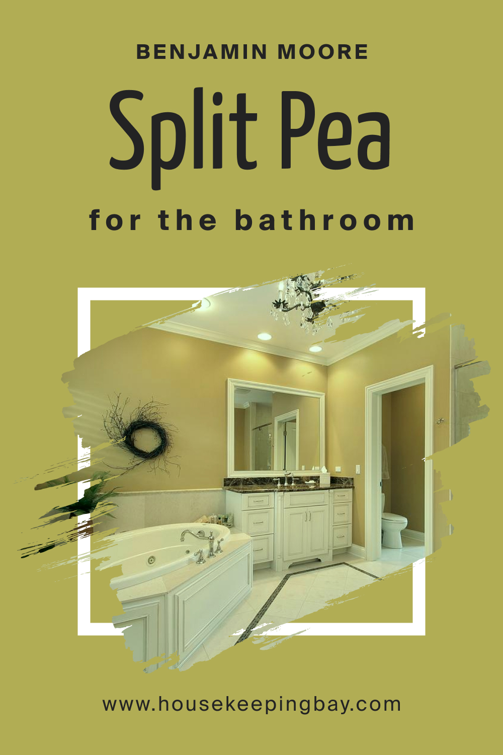
How to Use Split Pea 2146-30 in the Bathroom?
In bathrooms, Split Pea brings forth a spa-like feel. Its earthy green tone pairs beautifully with natural stone tiles or wooden accents. Whether you’re soaking in a tub or enjoying a quick shower, the color sets a rejuvenating mood, reminiscent of nature and tranquillity. Use matte black or brass fixtures to add a contemporary touch.
housekeepingbay.com
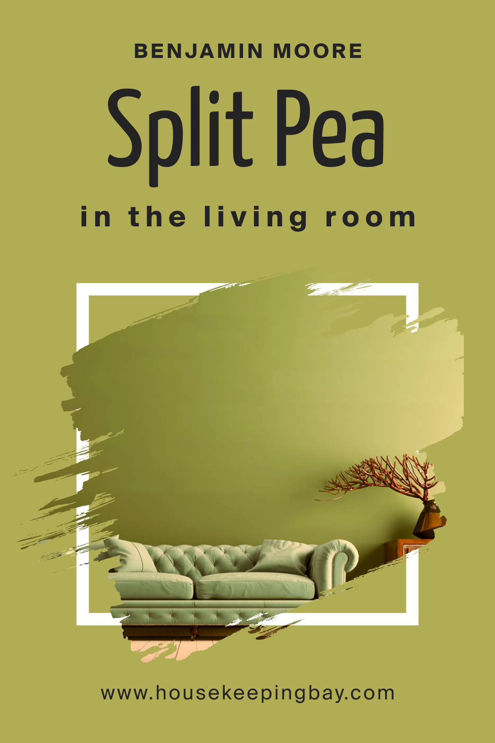
How to Use Split Pea 2146-30 in the Living Room?
The living room becomes an epitome of elegance and comfort with Split Pea. The color fosters conversations and welcomes guests. Incorporate beige or light gray sofas, add green plants, and use soft textiles to create an inviting space. Metallic accents in copper or gold elevate the overall design, making it a perfect blend of nature and luxury.
housekeepingbay.com
How to Use Split Pea 2146-30 for an Exterior?
For exteriors, Split Pea 2146-30 stands out as a sophisticated choice. It reflects nature, blending well with gardens and landscapes. Combine it with white trims or dark gray accents for contrast. This shade also pairs beautifully with wooden or stone pathways, making homes look both inviting and rooted in nature.

housekeepingbay.com
How to Use Split Pea 2146-30 in the Kitchen?
A kitchen in Split Pea transforms into a hub of warmth and vitality. It’s a color that promotes creativity and culinary exploration. Pair it with light wooden countertops or marble surfaces. Complement with rustic elements like terracotta pots or modern touches like stainless steel appliances to create a well-balanced cooking space.
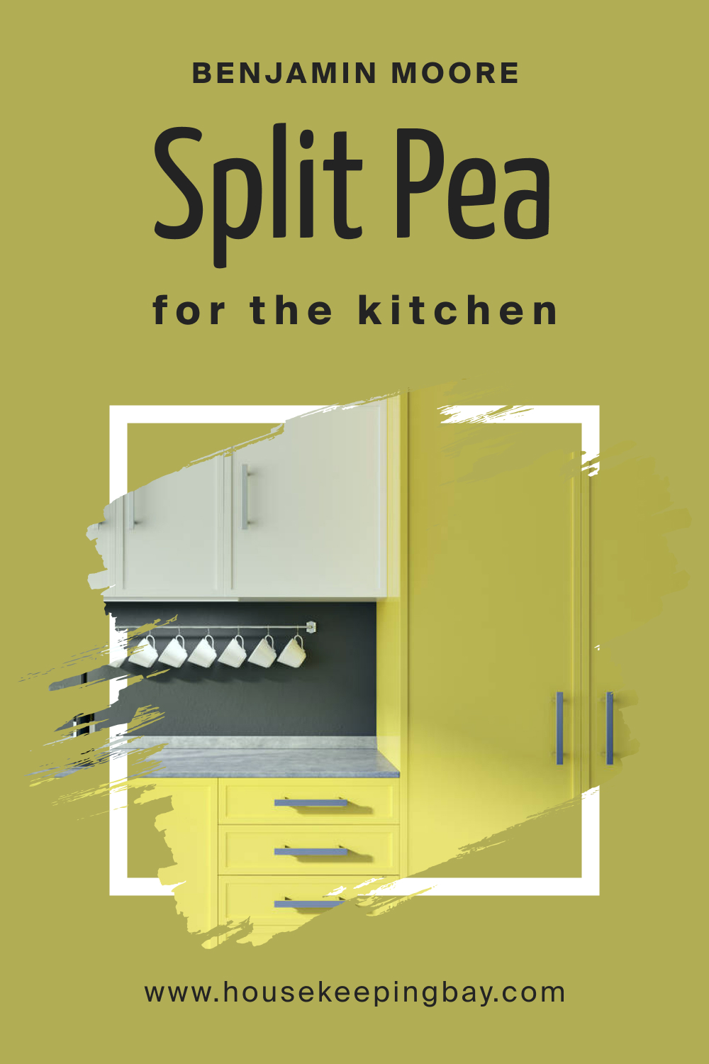
housekeepingbay.com
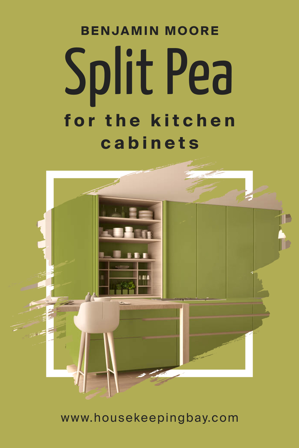
How to Use Split Pea 2146-30 on the Kitchen Cabinets?
Kitchen cabinets in Split Pea become the highlight of the space. They introduce a rich depth without overwhelming the aesthetics. Use brushed gold or silver handles to enhance their appeal. By keeping the backsplash neutral or opting for natural stone, the cabinets shine, making the kitchen both functional and fashion-forward.
housekeepingbay.com
Comparing Split Pea 2146-30 With Other Colors
Comparing colors is fundamental in interior design, allowing designers and homeowners to visualize the potential harmony or contrast within a space. Each color possesses a unique undertone and vibrancy, affecting moods and perceptions. By comparing colors, one can gauge how a particular hue will perform in various lighting conditions and adjacent to different shades.
This comparison aids in making informed decisions, ensuring the chosen palette aligns perfectly with the intended atmosphere and style.
Split Pea 2146-30 vs. BM 2146-70 Bavarian Cream
While Split Pea resonates with the freshness of green peas, Bavarian Cream is a soft, muted yellow. Split Pea exudes an organic feel, and Bavarian Cream brings warmth and coziness. Side by side, Bavarian Cream serves as a subtle contrast to Split Pea, evoking a balance between earthiness and gentle sunlight.
housekeepingbay.com
Split Pea 2146-30 vs. BM 2146-60 Cream Silk
Cream Silk leans towards a more neutral beige with a hint of yellow. Compared to the earthy Split Pea, Cream Silk serves as a soft backdrop. The combination reflects nature – think of green leaves against a sandy beach. It’s a harmonious duo, ideal for those aiming for understated elegance.
housekeepingbay.com
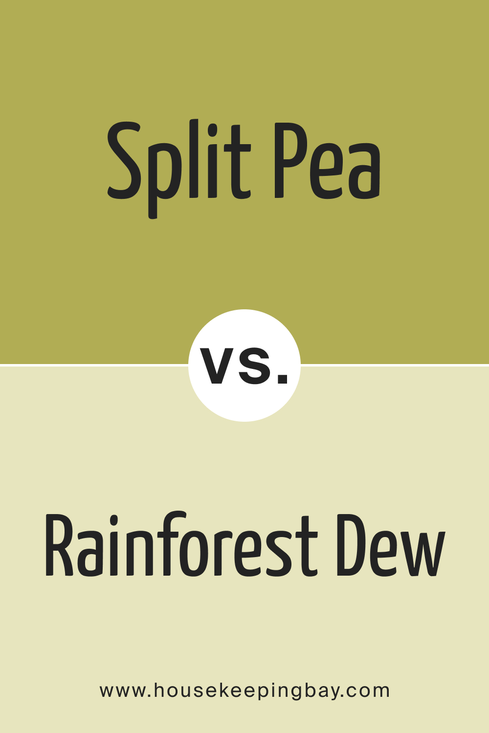
Split Pea 2146-30 vs. BM 2146-50 Rainforest Dew
Rainforest Dew is a lighter, more muted green with a hint of gray undertone. Next to Split Pea, it feels like a misty morning in a forest. The two shades, when combined, can create a gradient effect, reminiscent of lush landscapes transitioning from dense foliage to a dew-kissed clearing.
housekeepingbay.com
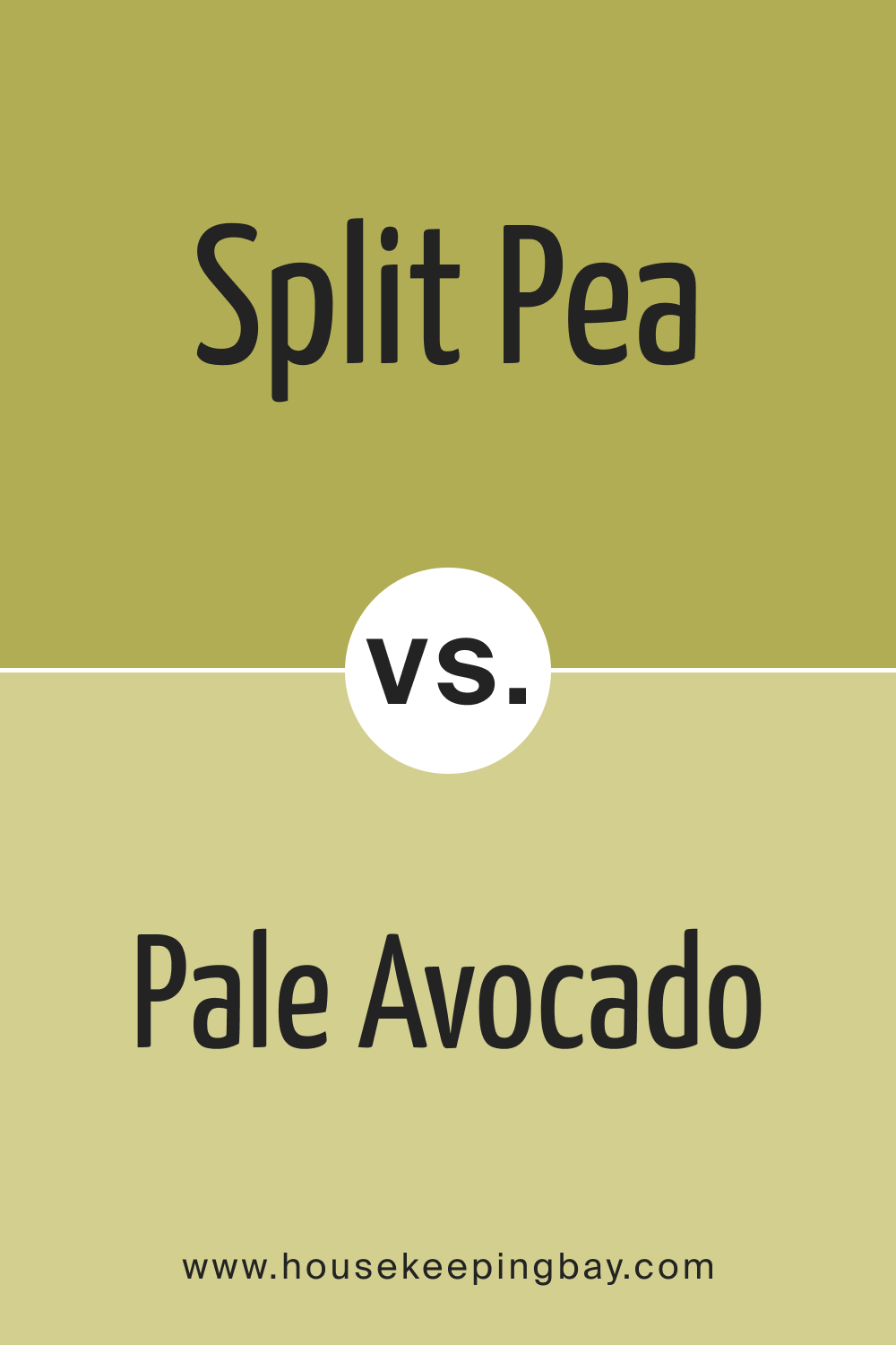
Split Pea 2146-30 vs. BM 2146-40 Pale Avocado
Pale Avocado is a soft green with yellow undertones. It’s like a younger sibling to Split Pea – lighter and more playful. Together, they evoke the spectrum of a thriving avocado tree, from its vibrant leaves to its budding fruit, creating a space bursting with life.
housekeepingbay.com
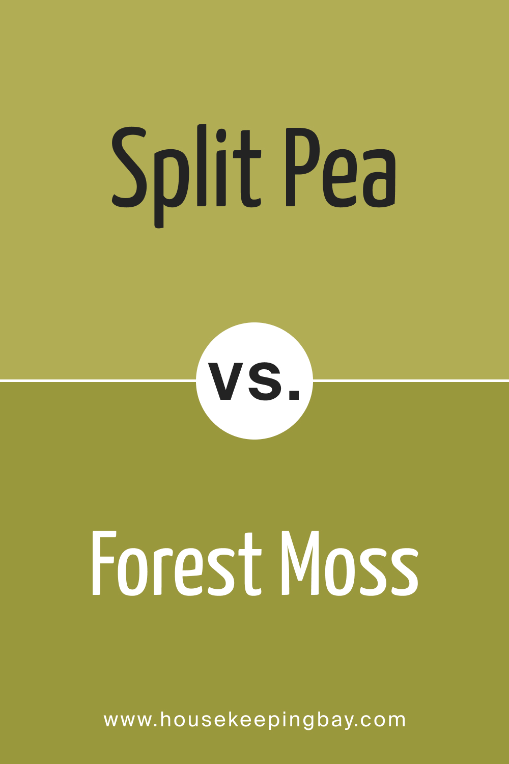
Split Pea 2146-30 vs. BM 2146-20 Forest Moss
Forest Moss is a deeper green, hinting at the dense, shaded areas of a woodland. Next to Split Pea, Forest Moss appears richer and more mysterious. The combination of the two paints a picture of a forest – from its lively outskirts to its profound depths.
housekeepingbay.com
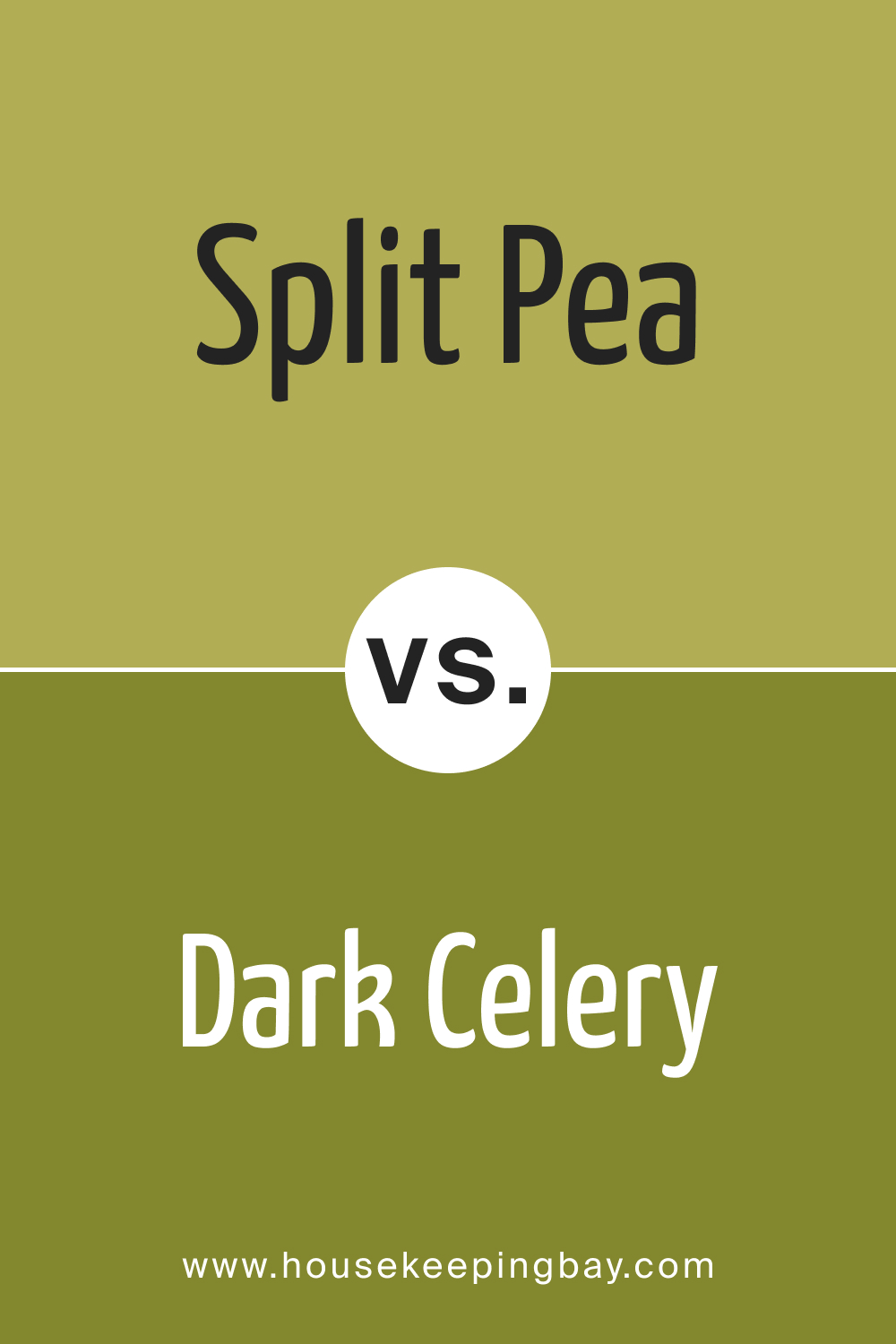
Split Pea 2146-30 vs. BM 2146-10 Dark Celery
Dark Celery is a bold, deep shade of green, almost bordering on a green-black. Against Split Pea, it stands out as a powerful contrast, reminiscent of shadows cast by tall trees on a sunlit meadow. It’s a dynamic pairing, perfect for creating depth and dimension.
housekeepingbay.com
Conclusion
Split Pea 2146-30, with its unique shade, serves as a pivot around which various other colors dance, each presenting a different story and emotion. From soft neutrals like Bavarian Cream to the profound depths of Dark Celery, the comparative exploration reveals the vast potential of Split Pea.
Such comparisons not only highlight the versatility of this particular shade but also emphasize the importance of context in color theory. In essence, colors aren’t just individual entities; they derive meaning and beauty from their surroundings and counterparts.
housekeepingbay.com
Ever wished paint sampling was as easy as sticking a sticker? Guess what? Now it is! Discover Samplize's unique Peel & Stick samples. Get started now and say goodbye to the old messy way!
Get paint samples