Soft Shell 015 Paint Color by Benjamin Moore
Colors have the innate ability to transform, inspire, and evoke emotions.
Colors have the innate ability to transform, inspire, and evoke emotions. One such color that stands as a testament to the transformative power of hues is Soft Shell 015. Let’s delve into the intricacies of this shade and discover its potential in interior design.
via plan home
What Color Is Soft Shell 015?
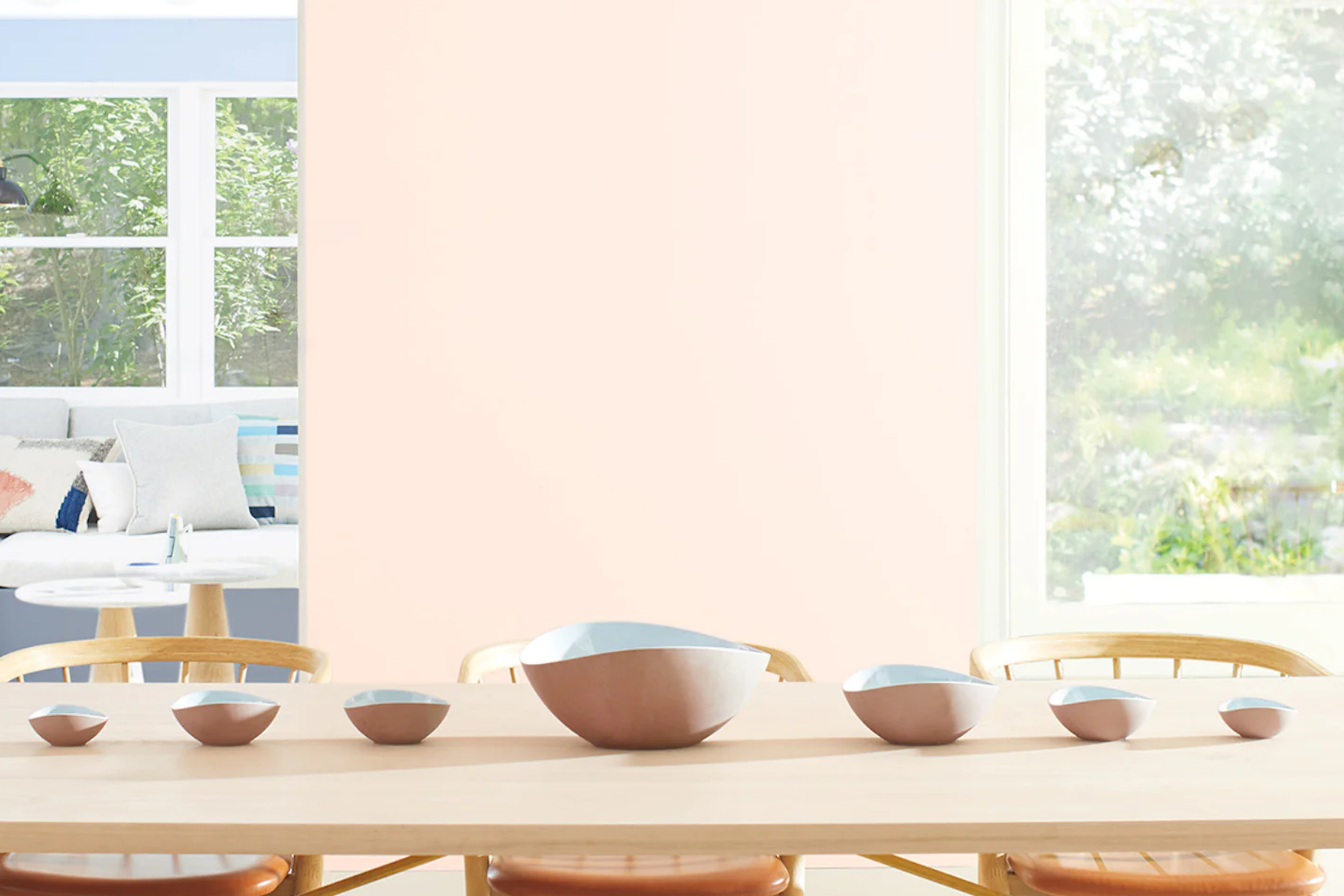
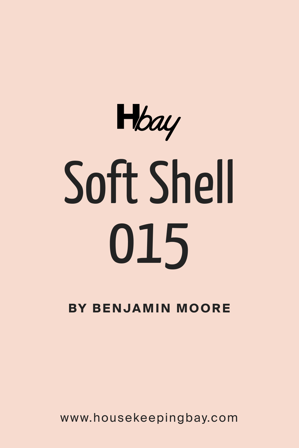
Soft Shell 015 is a delicate, nuanced hue that sits somewhere between a gentle blush and a soft beige. It captures the essence of a serene morning sky and brings that tranquility indoors. Ideally suited for minimalist, contemporary, and coastal interior styles, this shade complements natural materials like linen, wood, and stone.
Its versatility allows it to pair beautifully with rough textures, smooth finishes, and everything in between.
housekeepingbay.com
Table of Contents
Is It a Warm Or Cool Color?
Soft Shell 015 leans towards the warmer side of the spectrum. Its subtle warmth brings an inviting and cozy feeling to spaces. In homes, warm colors like Soft Shell can create an atmosphere of comfort, making rooms feel more intimate and welcoming.
Its warmth counters the starkness of modern interiors and adds a touch of softness.
Undertones of Soft Shell 015
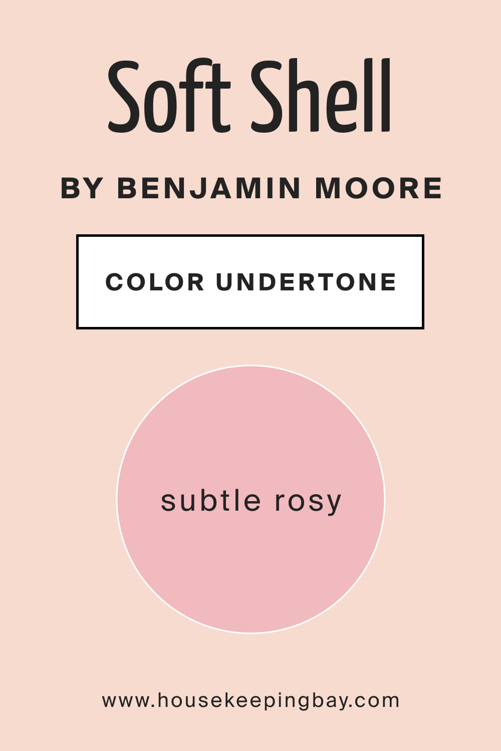
Like many colors, Soft Shell 015 has its own set of undertones that influence its overall look. It carries a subtle rosy undertone, which adds depth and dimension. Undertones play a significant role in how we perceive colors. They can shift a color from being flat to multifaceted.
In the case of Soft Shell 015, its undertones on interior walls interact dynamically with furnishings, accentuating wood grains or making metallic finishes pop.
housekeepingbay.com
Coordinating Colors of Soft Shell 015
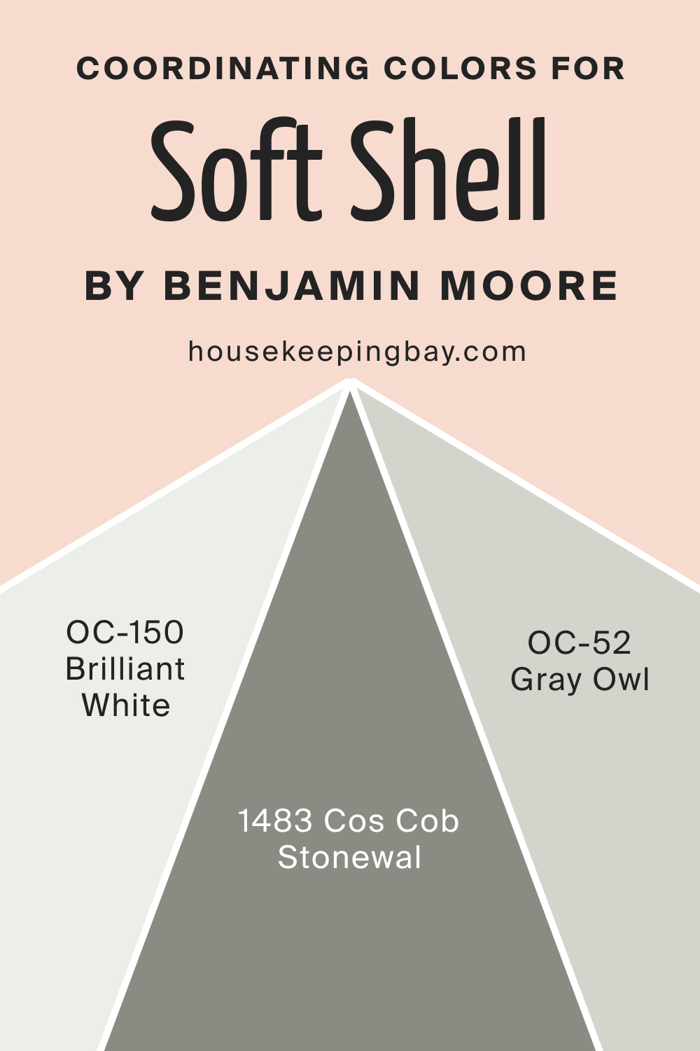
Coordinating colors harmonize with the primary color, enhancing its beauty and creating a cohesive look. For Soft Shell 015, colors like OC-150 Brilliant White, BM 1483 Cos Cob Stonewall, and OC-52 Gray Owl are perfect companions.
- OC-150 Brilliant White : A pristine and crisp white that offers contrast without overpowering.
- BM 1483 Cos Cob Stonewall : A subdued gray-green that adds an earthy touch.
- OC-52 Gray Owl : A versatile light gray with cool undertones, offering balance.
Three additional colors that would complement Soft Shell 015 are: Silver Satin OC-26, Pale Oak OC-20, and Edgecomb Gray HC-173.
housekeepingbay.com
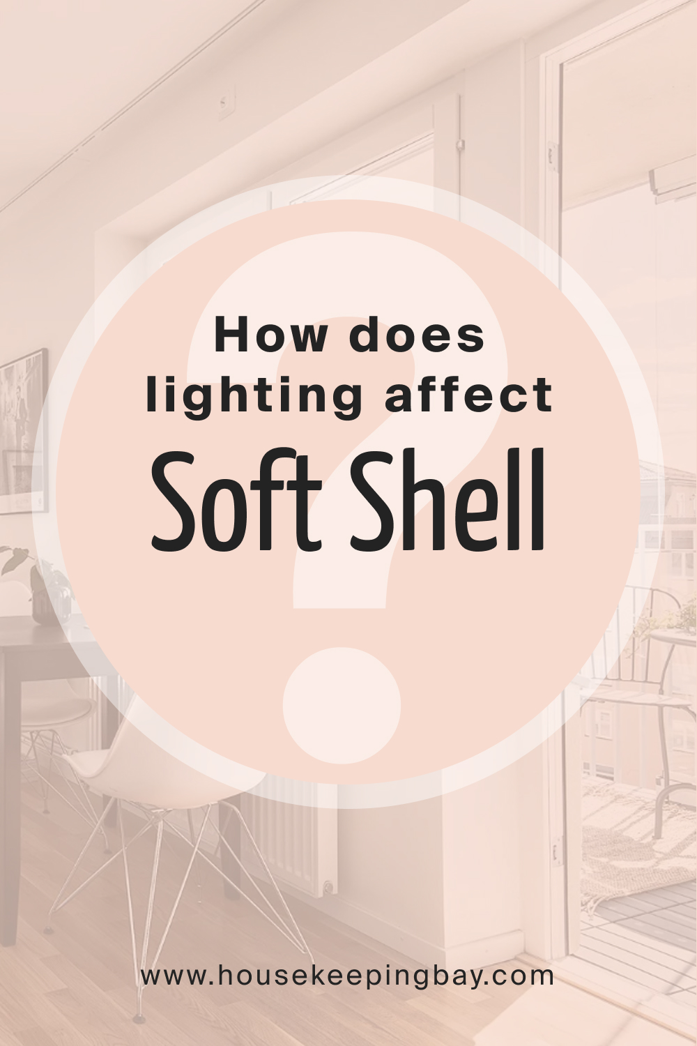
How Does Lighting Affect Soft Shell 015?
Lighting dramatically influences how we perceive colors. In artificial light, Soft Shell 015 may appear slightly warmer, amplifying its rosy undertones. In contrast, under natural daylight, its soft beige characteristic is more pronounced. Room orientation also plays a role.
In north-facing rooms, the color takes on a muted, cooler tone, while in south-facing rooms, it basks in the warmth of the sunlight. In east-facing rooms, Soft Shell 015 will have a brighter hue in the morning, and in west-facing rooms, it’ll warm up during the sunset, creating a cozy ambiance.
housekeepingbay.com
LRV of Soft Shell 015
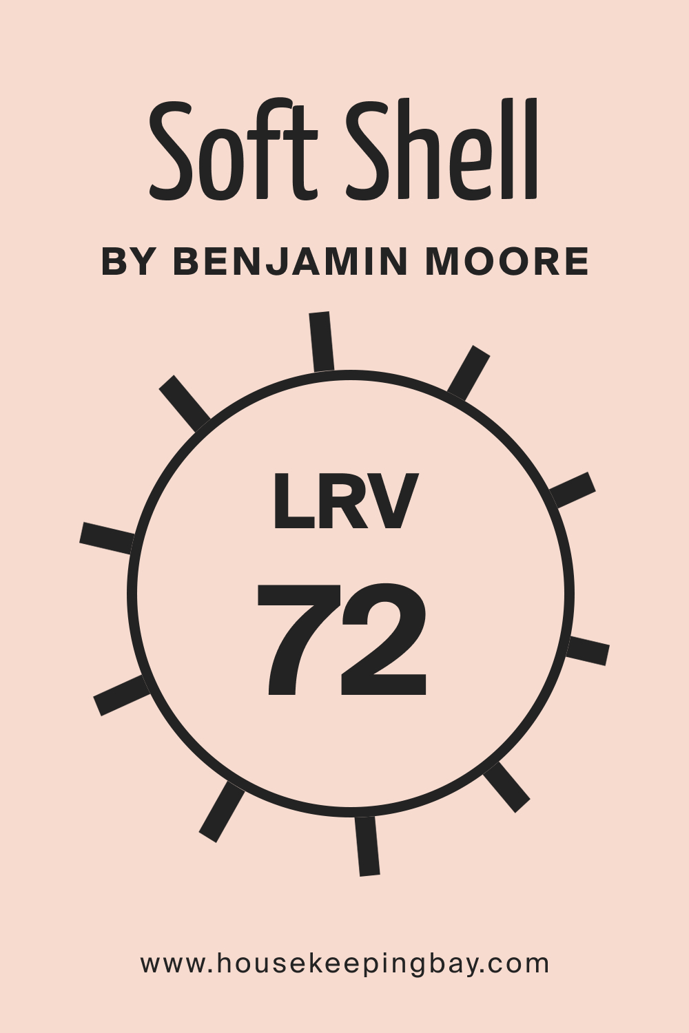
Light Reflectance Value, or LRV, quantifies the amount of light a color reflects. With an LRV of 72, Soft Shell 015 is relatively light, reflecting a good amount of light back into the room. This high LRV means that it can brighten up spaces and make smaller rooms feel larger. For Soft Shell 015, this value ensures that the color remains vibrant and doesn’t feel dull, even in low-light conditions.
housekeepingbay.com
What is LRV? Read It Before You Choose Your Ideal Paint Color
Trim Colors of Soft Shell 015
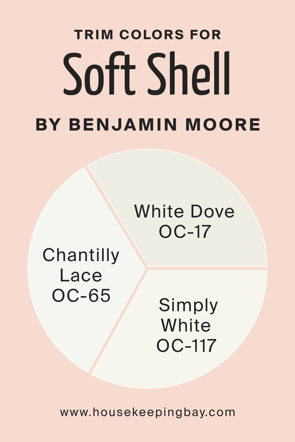
Trim colors accentuate architectural details and create seamless transitions between walls and trims. For Soft Shell 015, opting for shades of white from the same brand will provide a sophisticated look. Choices like Simply White OC-117, Chantilly Lace OC-65, or White Dove OC-17 can beautifully complement Soft Shell 015, framing the walls elegantly.
housekeepingbay.com
Colors Similar to Soft Shell 015
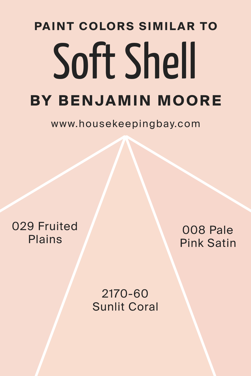
Understanding similar colors allows for flexibility in design choices. BM 029 Fruited Plains, BM 2170-60 Sunlit Coral, and BM 008 Pale Pink Satin share a kinship with Soft Shell 015.
- BM 029 Fruited Plains : A light peachy hue, evoking feelings of summer afternoons.
- BM 2170-60 Sunlit Coral : A brighter shade with a touch of coral warmth.
- BM 008 Pale Pink Satin : A gentle pink that whispers elegance.
housekeepingbay.com
Colors That Go With Soft Shell 01
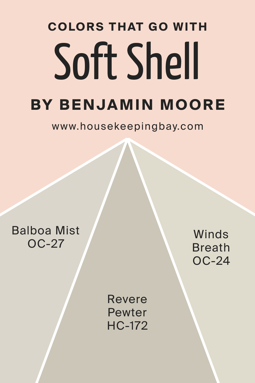
Pairing Soft Shell 015 with harmonious shades can create a curated and refined look. Benjamin Moore’s Revere Pewter HC-172, Balboa Mist OC-27, and Winds Breath OC-24 are perfect candidates. These colors, in tandem with Soft Shell 015, create layers of sophistication, bringing out the best in each hue.
In conclusion, Soft Shell 015 is more than just a paint color; it’s an experience, a mood setter, and a canvas for countless interior design possibilities. With its warm undertones, high LRV, and versatility, it’s poised to be the choice for those looking to create serene and stylish spaces.
housekeepingbay.com
How to Use Soft Shell 015 In Your Home?
Soft Shell 015 is a harmonious blend of blush and beige, making it versatile for various rooms and design styles. It thrives in minimalist settings, evoking a sense of calm, while in bohemian or coastal styles, it provides a neutral backdrop against which vibrant patterns and textures can pop.
Whether it’s a snug study, a serene bedroom, or a spacious living area, Soft Shell 015 lays the foundation for an aesthetic appeal.
How to Use Soft Shell 015 in the Bedroom?
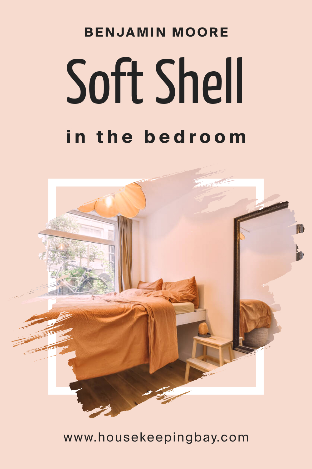
The bedroom is a sanctuary, and with Soft Shell 015, you can elevate its tranquility. The soft, warm undertones create a restful ambiance, ideal for relaxation. Paired with white linens and wooden accents, it brings about a sense of organic luxury. Soft Shell 015 also complements metallic fixtures, allowing for a touch of modernity in the bedroom setting.
housekeepingbay.com
How to Use Soft Shell 015 in the Bathroom?
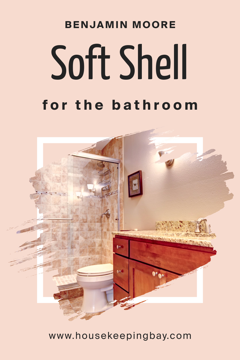
In the bathroom, Soft Shell 015 can be a game-changer. Its soothing palette works wonders in creating a spa-like environment. Pair it with white tiles, marble counters, and gold or brass fittings for a touch of opulence. The color’s warm undertones can counteract the often cool, sterile feel of bathrooms, wrapping the space in a comforting embrace.
housekeepingbay.com
How to Use Soft Shell 015 in the Living Room?
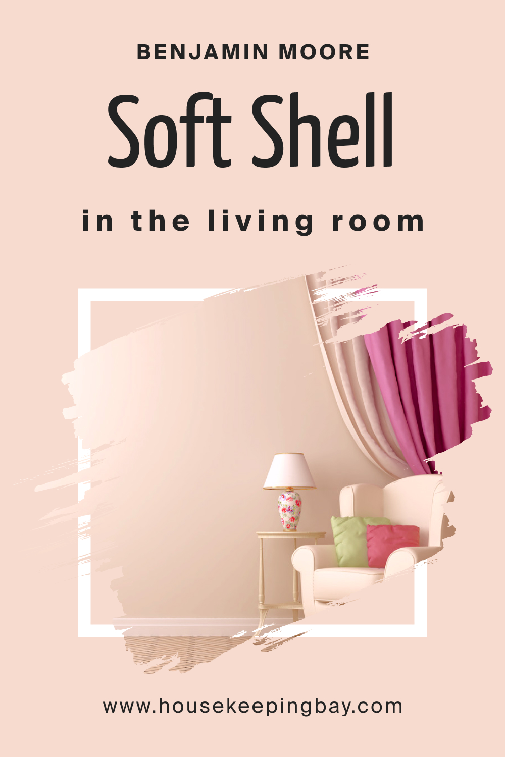
For the living room, Soft Shell 015 provides a neutral canvas that complements a range of furnishings. Its subdued elegance allows for bolder furniture choices, be it jewel-toned sofas or patterned rugs. On the other hand, a monochromatic palette with varying shades of beige and cream can curate a space that’s both sophisticated and inviting.
housekeepingbay.com
How to Use Soft Shell 015 for an Exterior?
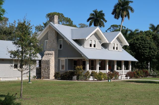
Soft Shell 015 isn’t just confined to interiors. As an exterior shade, it offers a fresh, contemporary look. Perfect for homes that wish to blend with natural landscapes, Soft Shell 015 harmonizes with stone pathways, green lawns, and floral arrangements. The color is particularly effective for homes with a modern architectural style, offering a soft contrast to sharp lines and clear glass.

housekeepingbay.com
How to Use Soft Shell 015 in the Kitchen?
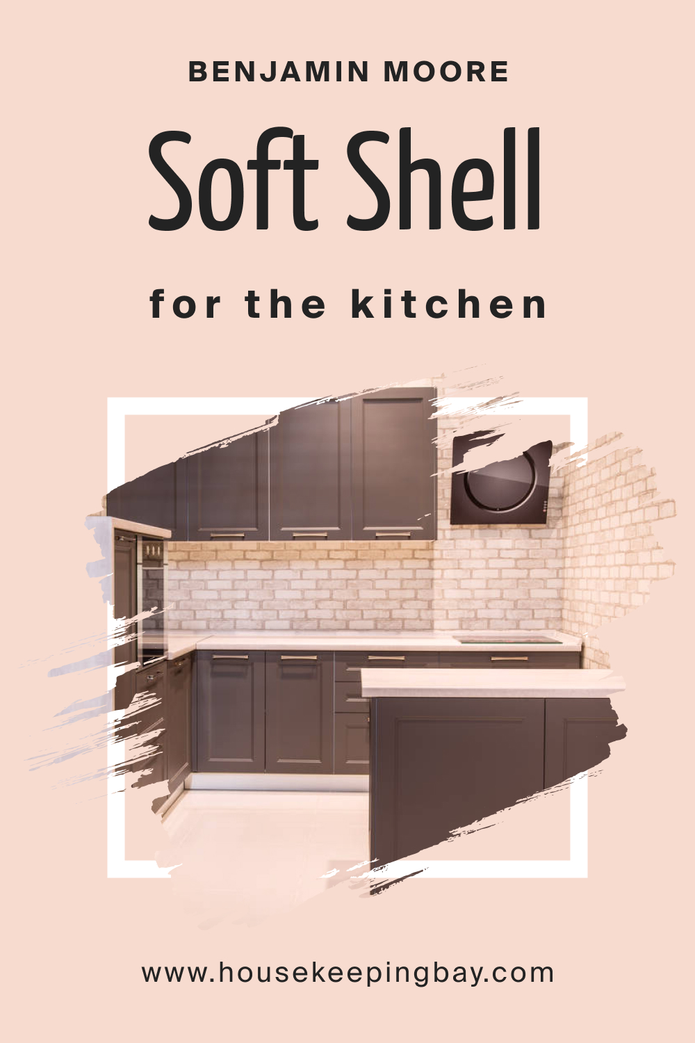
Kitchens can benefit immensely from Soft Shell 015. The hue provides a refreshing alternative to traditional white or gray kitchens. Paired with open wooden shelving, potted herbs, and stainless steel appliances, it offers a perfect blend of modern and rustic. The color also works well with both matte and glossy finishes, giving homeowners flexibility in design choices.
housekeepingbay.com
How to Use Soft Shell 015 for the Kitchen Cabinets?
Using Soft Shell 015 for kitchen cabinets can transform the entire look of the space. The color provides depth without overwhelming the space. Paired with sleek handles or knobs, Soft Shell 015 cabinets exude modern elegance. For a more traditional feel, combining it with glass-fronted cabinets or intricate woodwork can be stunning.
Given its neutral character, Soft Shell 015 cabinets allow for bold countertop choices, from dark granites to patterned quartz.
Comparing Soft Shell 015 With Other Colors
Color is subjective; what might look appealing to one person could appear entirely different to another. Comparing colors, especially when selecting paint for interiors, is crucial. Such comparisons allow individuals to discern the nuances in undertones, vibrancy, and overall mood evoked by each shade.
A side-by-side assessment can also facilitate the identification of a color’s adaptability to different lighting conditions and its compatibility with furnishings and decor.
The fine distinctions between similar shades, such as Soft Shell 015 and others, can be the defining factor in achieving the desired ambiance in a space.
Soft Shell 015 vs. BM 2093-70 Pink Bliss
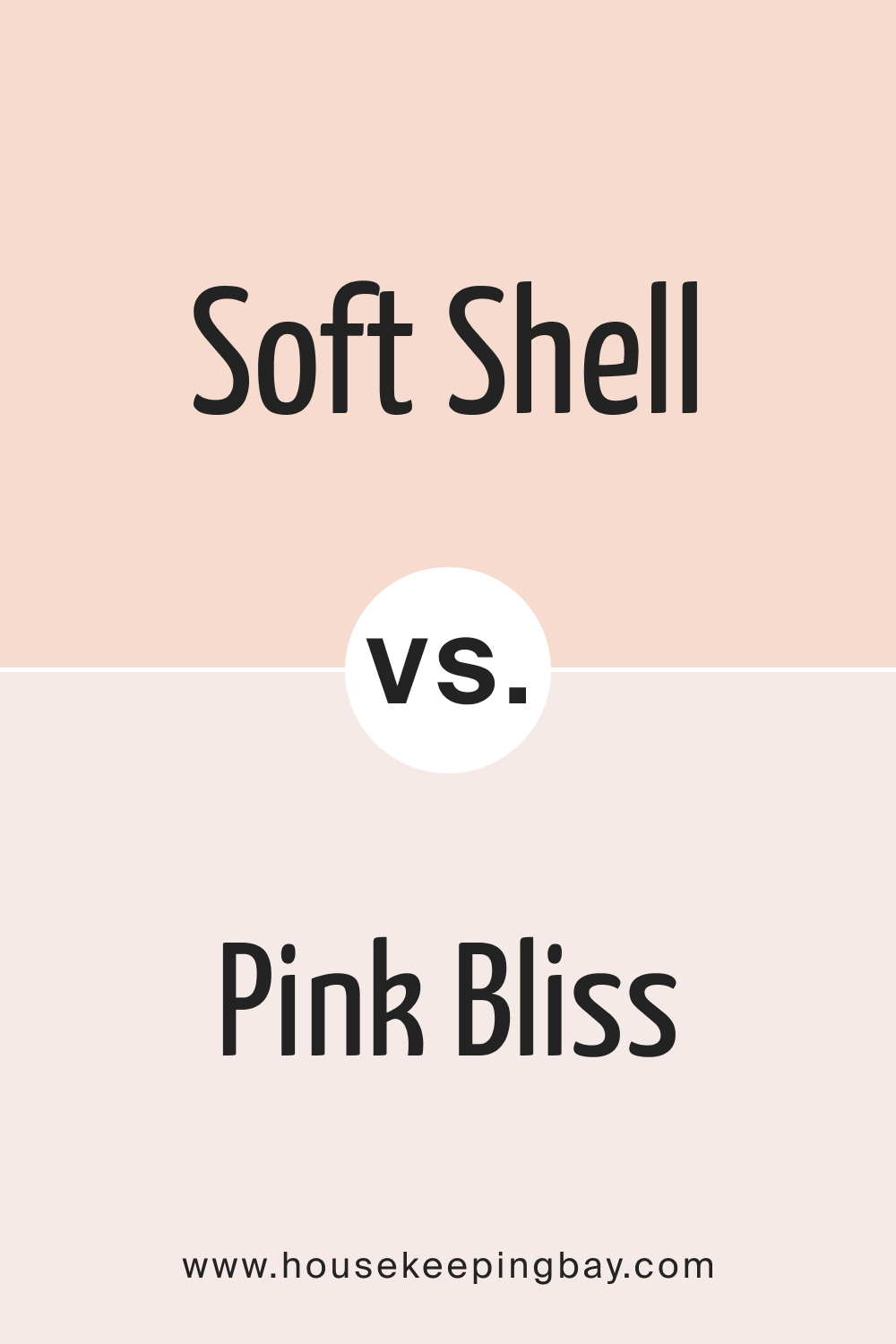
While Soft Shell 015 is a harmonious blend of blush and beige, Pink Bliss leans more into the pink spectrum, giving a youthful and spirited aura. Pink Bliss is brighter, often evoking feelings of springtime freshness, whereas Soft Shell 015 offers more depth and sophistication, suitable for more neutral settings.
housekeepingbay.com
Soft Shell 015 vs. BM 2171-70 Pink Swirl
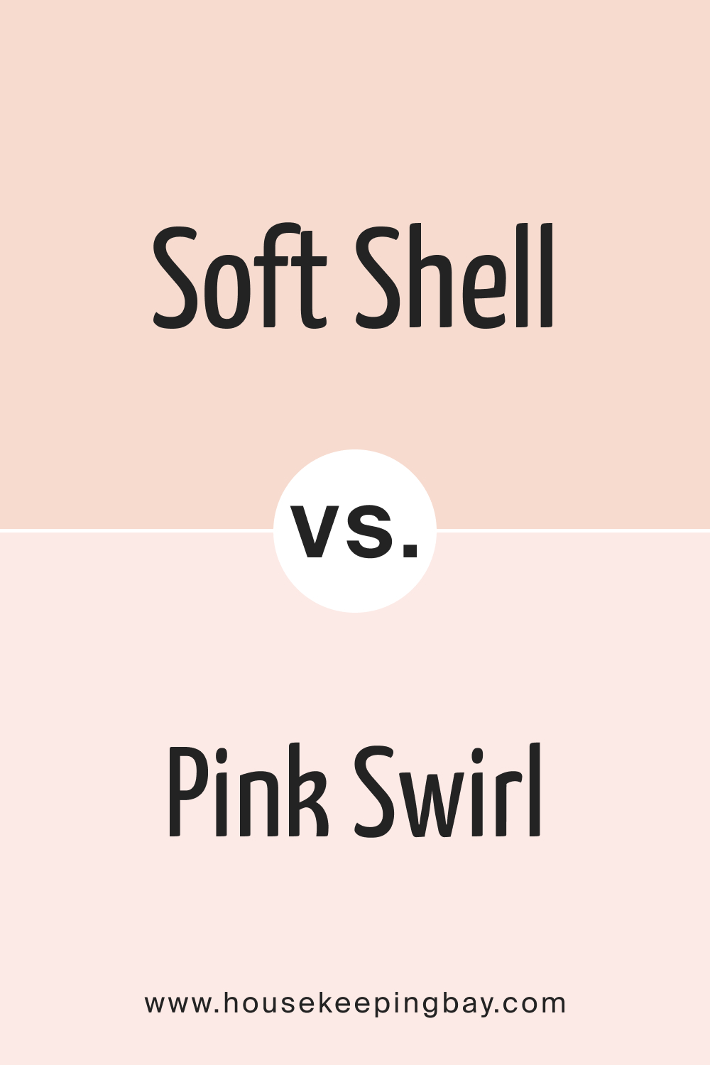
Pink Swirl , as the name suggests, is a delightful swirl of soft pink, reminiscent of candy floss. In comparison, Soft Shell 015 is muted and more mature. While Pink Swirl might be a darling choice for a child’s room, Soft Shell 015’s versatility allows it to thrive in various settings.
housekeepingbay.com
Soft Shell 015 vs. BM 2102-70 First Light
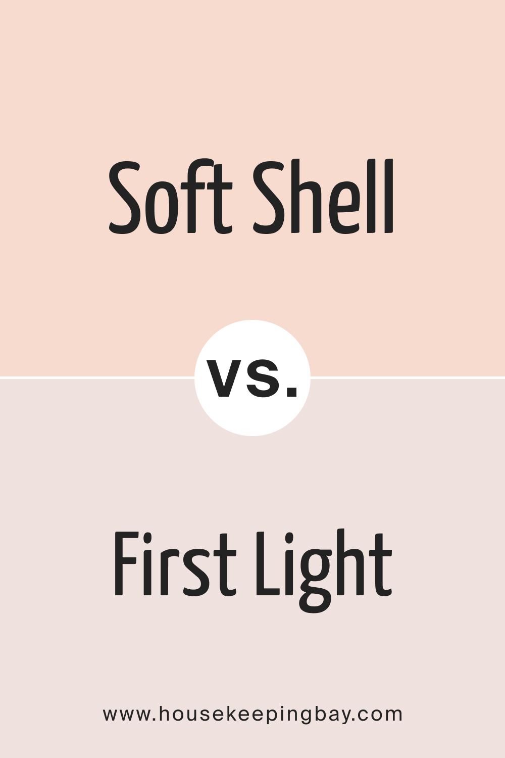
First Light has a dawn-like quality, reflecting the first glow of morning light. While both shades are neutral with a touch of pink, First Light has a slightly cooler undertone. Soft Shell 015, on the other hand, is warmer and blends seamlessly with earthy tones.
housekeepingbay.com
Soft Shell 015 vs. BM 884 Hint of Pink
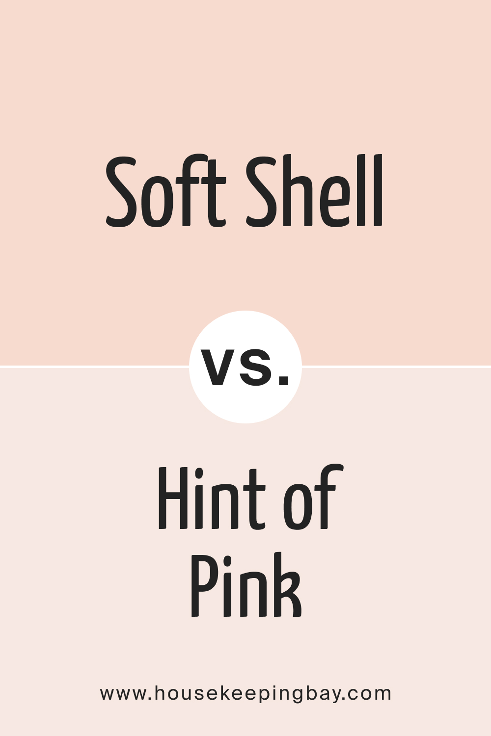
Hint of Pink is aptly named—it’s a white with just a whisper of pink. It’s lighter and almost ethereal compared to the more grounded Soft Shell 015. Where Hint of Pink feels airy, Soft Shell 015 feels comforting.
housekeepingbay.com
Soft Shell 015 vs. BM 2008-70 Touch of Pink
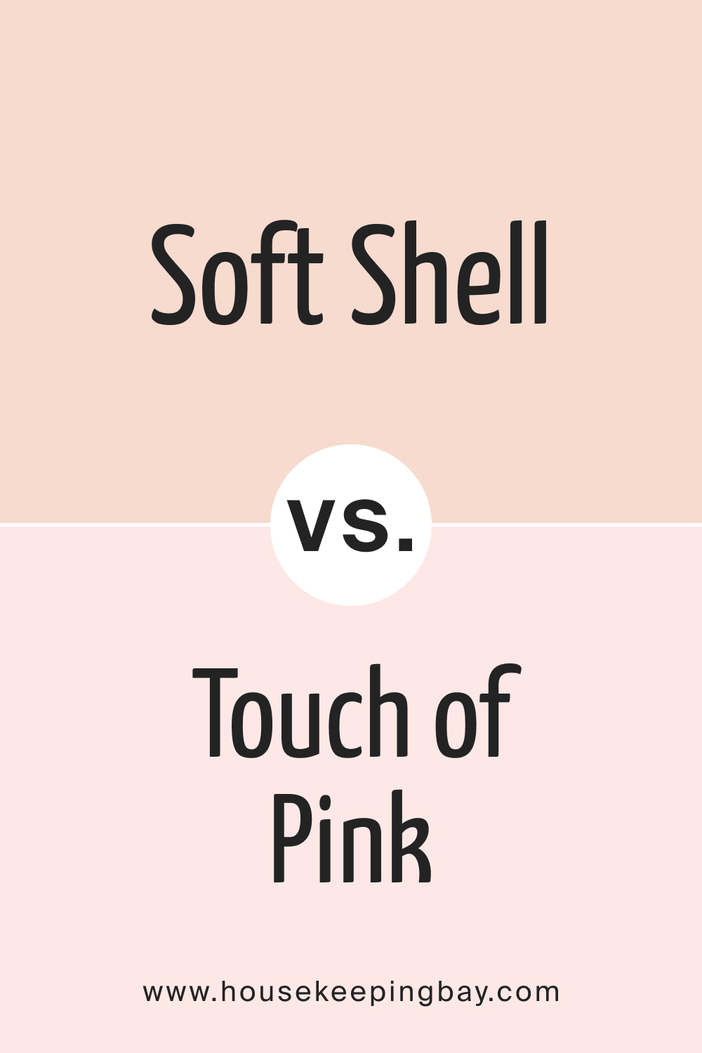
Touch of Pink is a delicate hue, almost ballet slipper-like in its softness. It’s a touch more pink than Soft Shell 015 but retains a similar soothing aura. The choice between them would depend on whether one desires a slightly more pronounced pink presence.
housekeepingbay.com
Soft Shell 015 vs. BM 2173-50 Coral Dust
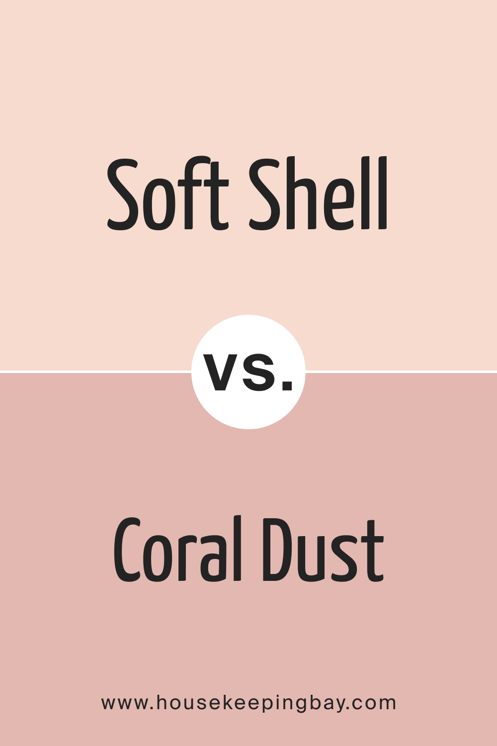
Coral Dust introduces a subtle coral undertone, which makes it vibrant and summery. While both are delightful in their own right, Soft Shell 015 offers calmness, and Coral Dust brings a hint of playful zest.
housekeepingbay.com
Conclusion
Selecting the perfect paint shade, such as Soft Shell 015, is a nuanced task that can shape the mood and feel of a space. Each color, with its unique undertones and intensity, tells a different story. Soft Shell 015, with its elegant blend of blush and beige, stands out as a versatile choice, merging seamlessly with various styles and settings.
By comparing it with similar shades, its distinct charm becomes more pronounced, ensuring that one’s design vision is achieved with precision and flair.
housekeepingbay.com
Ever wished paint sampling was as easy as sticking a sticker? Guess what? Now it is! Discover Samplize's unique Peel & Stick samples. Get started now and say goodbye to the old messy way!
Get paint samples




Frequently Asked Questions
⭐What kind of undertone does Soft Shell 015 have?
Soft Shell 015 boasts a harmonious undertone that blends both blush and beige. This unique undertone gives the color its distinct sophistication and warmth, making it versatile across various interior designs.
⭐Is Soft Shell 015 more suitable for traditional or modern interiors?
Soft Shell 015 is incredibly versatile. Its muted elegance complements traditional settings, while its contemporary undertone allows it to fit seamlessly into modern interiors as well.
⭐Can Soft Shell 015 be used for exteriors?
Absolutely! Soft Shell 015 can be a serene and elegant choice for home exteriors, lending a calm and inviting ambiance.
⭐How does Soft Shell 015 appear under different lighting conditions?
Lighting can influence any paint color, and Soft Shell 015 is no exception. Under natural light, it might appear slightly brighter and fresher, while artificial lighting can enhance its warmth. Its beauty, however, remains consistent.
⭐Which trim colors work best with Soft Shell 015?
Soft Shell 015 pairs beautifully with shades of white, especially those from the same brand. A few good options are OC-150 Brilliant White, BM 1483 Cos Cob Stonewall, and OC-52 Gray Owl.
17 thoughts on “Soft Shell 015 Paint Color by Benjamin Moore”
Leave a Reply





Can I use Soft Shell 015 on the ceiling?
Yes, Fatima. Soft Shell 015 can be a subtle and stylish choice for ceilings, especially if you’re looking to add a hint of color without it being too dominating
Would this color work for a home office?
It would, Mathew. Soft Shell 015’s soothing quality can create a focused and calm environment, ideal for a home office setting.
Is it easy to find coordinating decor and furnishings for Soft Shell 015?
Certainly, Sophie. Given its neutral nature with a hint of blush, Soft Shell 015 pairs well with a wide range of decor and furnishings, making the task quite effortless.
I have a lot of natural greenery outside my living room windows. Will this color suit?
Yes, Ibrahim! Soft Shell 015 would complement natural greenery beautifully, creating a tranquil indoor-outdoor connection.
Can I pair Soft Shell 015 with bold accent colors?
Definitely, Rachel! Soft Shell 015’s muted elegance can serve as a great backdrop, allowing bold accent colors to truly shine.
How does this color compare to more traditional beige shades?
Soft Shell 015 offers a modern twist to the traditional beige. While retaining the neutrality of beige, it introduces a blush undertone, giving it a contemporary and fresh feel.
I’m considering this color for a nursery. Thoughts?
Soft Shell 015 is an excellent choice for a nursery, Aisha. Its calming hue can provide a serene backdrop, perfect for a child’s room.
Absolutely, Liam! The warm undertones of Soft Shell 015 would harmonize beautifully with dark walnut, creating a balanced and cohesive look.
Is Soft Shell 015 good for small spaces like powder rooms?
Certainly, Jane! Soft Shell 015, with its neutral yet fresh hue, can make small spaces like powder rooms feel inviting without overwhelming the space.