20 Paint Colors that Go With Dark Wood
My Favorite Wall Colors That Make Dark Wood Feel Just Right
I’ve worked with so many homes where the dark wood was already there—flooring, trim, cabinets, even ceilings sometimes. And let me tell you, dark wood can be absolutely beautiful.
It’s rich, warm, and full of character. But if the walls are the wrong color?
The whole room can start to feel heavy, flat, or even dated.
I had one client—let’s call her Rachel—who had this gorgeous walnut flooring and chestnut trim in her 1950s home.
But the walls were painted a cool gray that just made the whole place feel dull. Once we picked the right warm neutral, everything lit up. The wood looked like it belonged again.
That’s what a good wall color does. It doesn’t compete with the wood. It helps it shine.
via housekeepingbay.com
A Balance of Light and Depth
Table of Contents
When you’ve got dark wood, you already have deep tones in the room. So your paint color needs to balance that. It should either:
- Lighten the room just enough to make it feel open
- Or warm it up so it feels soft and welcoming
Picking paint is not just about color—it’s about how you want the room to feel.
And if you’re wondering which colors do that best?
Don’t worry. I’ve gathered my favorite 20, and every single one of them works beautifully with dark wood.
How to Choose the Right Color for Dark Wood?
You know how some people can wear brown beautifully, and others just look kind of… washed out? Same goes for paint next to dark wood. It all comes down to the undertones and the lighting.
I’ve walked into rooms where someone clearly picked a color they liked on the swatch—but once it was on the wall, the wood trim looked orange, or the floors felt too red. That’s because they didn’t look at the whole picture.
Let me break it down simply.
What to Look For
1. Check the Undertones
Dark wood often has warm undertones—red, brown, sometimes even a little purple. So you want your wall color to match that warmth, or at least not fight against it.
✅ Warm whites, soft beiges, taupes, earthy greens—all great choices.
🚫 I usually avoid cold grays or icy blues—they make the wood look harsh.
2. Think About the Light
Natural light changes everything.
- In bright rooms, you can use slightly deeper shades without feeling closed in.
- In darker rooms, go a little lighter or warmer to keep the room cozy, not cave-like.
3. Don’t Skip the Sample
Always test the paint next to the wood. Look at it in the morning, afternoon, and evening. It will change. I learned this the hard way early in my career.
Quick Tips to Make It Easier
- Use large paint swatches (not just those tiny squares)
- Match undertones: warm wood = warm paint
- Go soft, not stark (no pure whites!)
- Pick your paint after your wood, not before
- Try the color on multiple walls
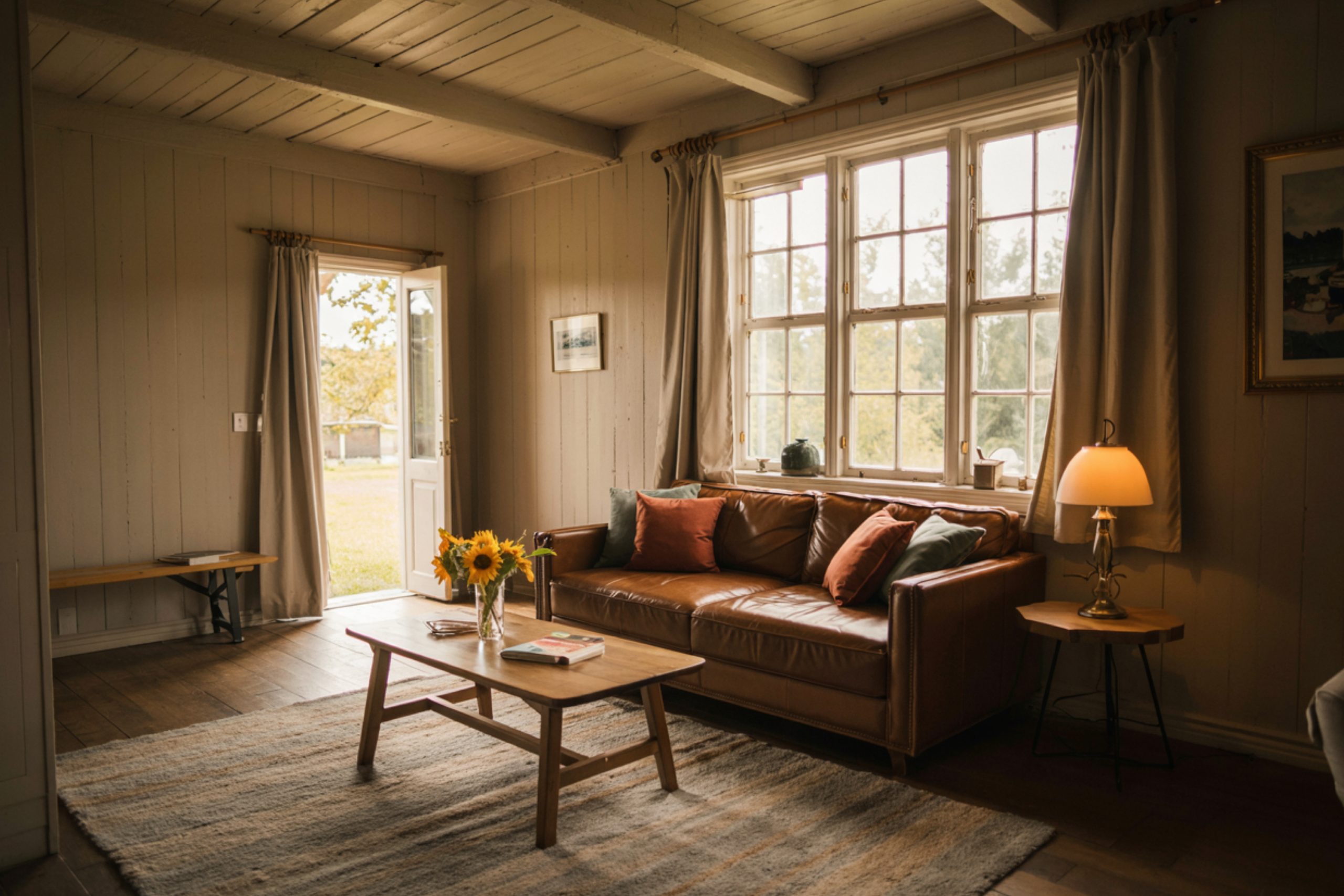
Soft Neutrals That Bring Out the Beauty of Dark Wood
These are the “safe but stunning” choices. They don’t scream for attention, but they make the wood look warmer and the room feel calm.
My Go-To Soft Neutrals:
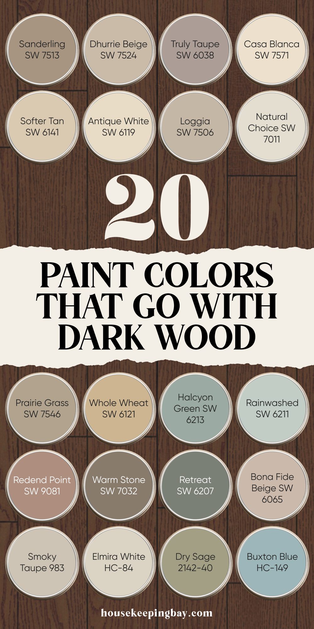
1. Casa Blanca SW 7571
Creamy with just a touch of warmth. Looks amazing with walnut or cherry wood. Great for bedrooms or living rooms.
2. Natural Choice SW 7011
Not too yellow, not too gray. It’s a solid pick when you want a natural look that doesn’t steal the spotlight.
3. Antique White SW 6119
A classic. Feels a little richer than a standard white. Pairs beautifully with oak and deep brown floors.
4. Loggia SW 7506
It’s beige with a brain. Has enough depth to hold its own next to dark trim. Lovely in dining rooms or hallways.
5. Softer Tan SW 6141
This one gives a soft, easy warmth. If your wood has red tones, this helps calm it down just a bit.
via housekeepingbay.com
Taupes and Beiges That Add Subtle Contrast
These colors give you a little more definition than soft neutrals, but still keep the warmth. They’re great when you want the walls to feel a bit different from the trim or floors, without being bold.
My Favorite Picks:
1. Truly Taupe SW 6038
This one is cozy but cool in the best way. Has a gentle purple undertone that flatters mahogany and espresso woods.
2. Dhurrie Beige SW 7524
Soft beige with a whisper of yellow. Warms up a room without turning it gold. Nice for family rooms.
3. Sanderling SW 7513
Sits right between gray and tan. Adds a quiet contrast that makes dark trim pop, especially in older homes.
4. Prairie Grass SW 7546
It’s grounded and earthy. Works especially well with rustic or weathered wood styles.
5. Whole Wheat SW 6121
Rich and golden without being too bold. This is beautiful in kitchens with dark wood cabinets.
These give you just enough contrast to make the room feel finished—like you meant it. Nothing loud, just solid, good design.
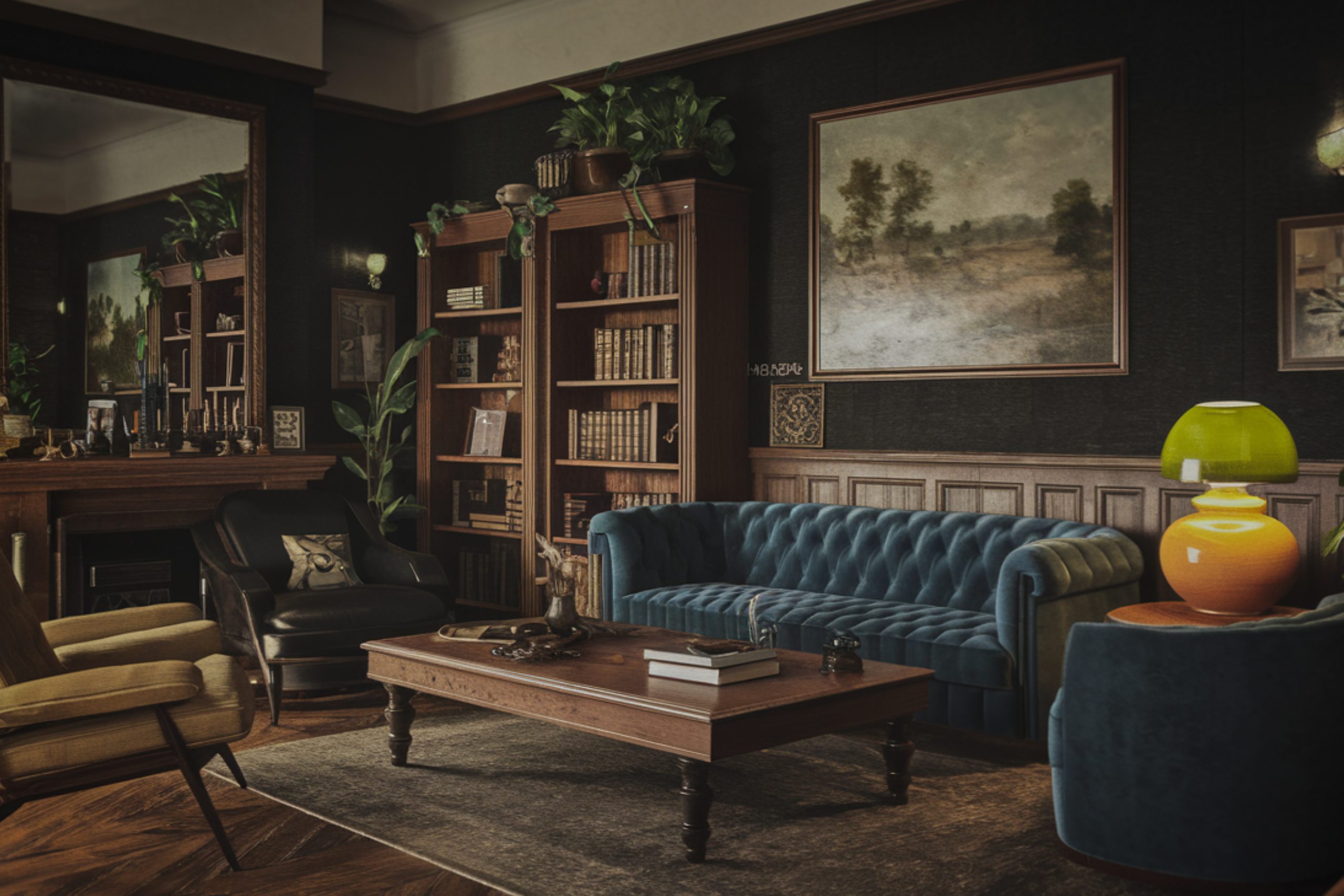
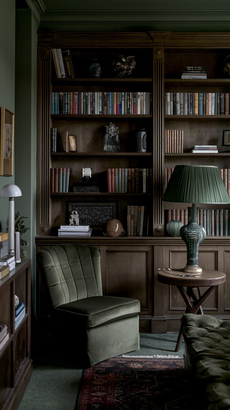
Soft Greens and Blues That Feel Calm but Rich
Sometimes, the best way to make dark wood feel alive is with a gentle color that has some personality. Greens and blues do that. They add freshness, but still feel grounded.
These are especially beautiful in bedrooms, offices, and bathrooms.
My Tried-and-True Shades:
1. Rainwashed SW 6211
A whispery mix of blue and green. Fresh but soft. I’ve used it in a small guest room with dark oak trim—looked like a boutique hotel.
2. Halcyon Green SW 6213
More green than blue, but still gentle. It feels natural, like something you’d see in an old garden. Lovely with walnut.
3. Retreat SW 6207
A deeper, moodier green-gray. Pairs beautifully with dark wood floors in a study or reading nook.
4. Buxton Blue HC-149 (Benjamin Moore)
A dusty blue that doesn’t feel cold. It lifts a room without fighting the wood. Think: classic New England style.
5. Dry Sage 2142-40 (Benjamin Moore)
Exactly what it sounds like—dry, soft green. Earthy and calm. Makes cherry or reddish wood feel elegant.
These colors create a sense of quiet and comfort. And when you get the lighting right?
They’re magic with wood.
via housekeepingbay.com
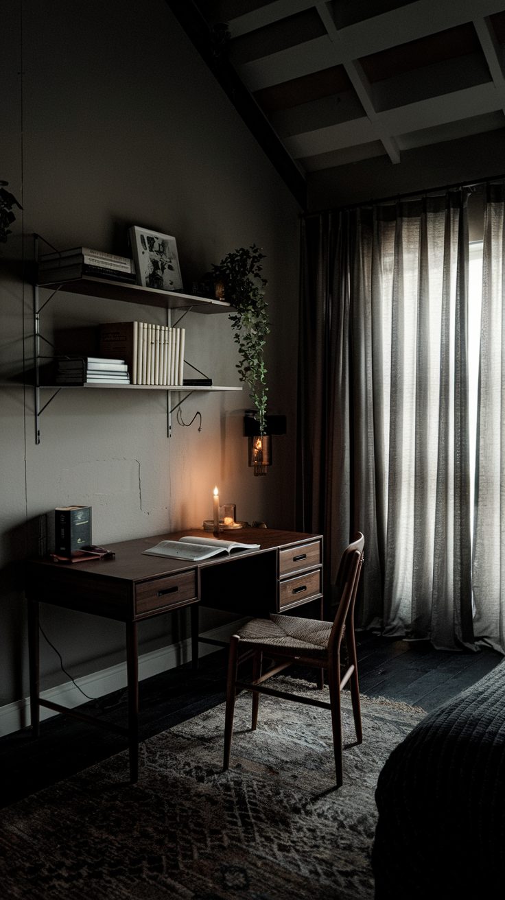
Deeper Earthy Shades for a Cozy, Grounded Look
These are the colors I reach for when a room needs a hug. They’re warm, deeper, and give that tucked-in feeling. Perfect for living rooms, dens, or anywhere you want to feel settled.
My Favorite Cozy Picks:
1. Warm Stone SW 7032
A soft brown-gray that feels solid without being heavy. Looks amazing with espresso or black walnut furniture.
2. Redend Point SW 9081
This one was Color of the Year for a reason. A muted clay tone that brings depth and softness at the same time. Pairs beautifully with mid-century wood tones.
3. Bona Fide Beige SW 6065
Feels traditional in the best way. Has a creamy richness that supports dark wood without clashing.
4. Smoky Taupe 983 (Benjamin Moore)
Not too gray, not too brown. Just enough mood to add interest. Works well in dining rooms or cozy bedrooms.
5. Elmira White HC-84 (Benjamin Moore)
This is a softer white-beige with a hint of gray. It helps tone down any redness in the wood. Good for trim too, not just walls.
These colors feel like fall sweaters—warm, simple, and comforting. Great for grounding the drama of dark wood.
via housekeepingbay.com
What I Always Tell My Clients Before They Paint
If you’ve got dark wood, you already have something beautiful in your home. The trick is not to fight it. The right paint doesn’t just sit on the wall — it brings the wood to life. It softens, balances, and makes the room feel right.
I’ve seen Casa Blanca turn a dull hallway into a warm welcome. I’ve watched Rainwashed make a dark wood bathroom feel fresh again. And I’ve used Redend Point more than once when a room just needed a bit more soul.
If I had to pick just one?
Honestly, Natural Choice SW 7011. It’s calm, it works almost anywhere, and it makes dark wood look classic instead of old.
One last tip? Don’t get stuck staring at color cards. Try the real paint on your walls, let it sit for a day, and trust what feels good to you. Because in the end, you’re the one living in it — and it should feel just right.
via housekeepingbay.com
