Martini Olive CSP-890 Paint Color by Benjamin Moore
In a world replete with color, choosing the right shade for a space can be overwhelming.
In a world replete with color, choosing the right shade for a space can be overwhelming.
Yet, colors like Martini Olive CSP-890 stand out for their versatility and charm. This article delves into the specifics of this intriguing color and how it can be optimally used in various interiors.
via barrydowne paint
What Color Is Martini Olive CSP-890?
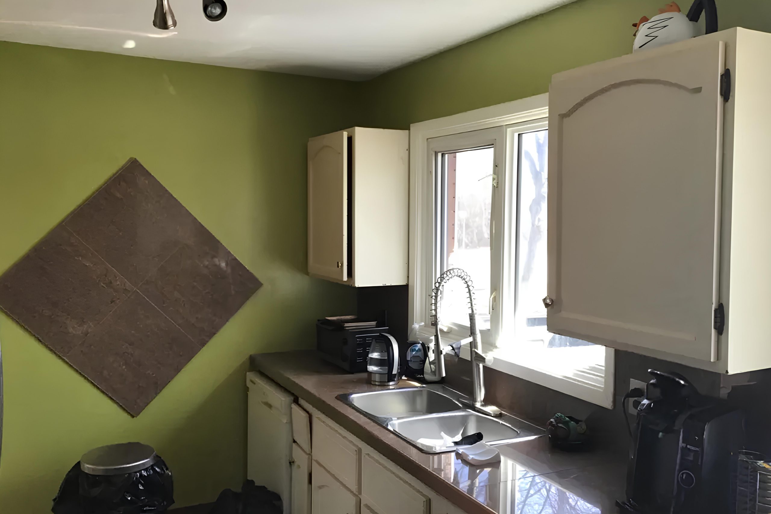
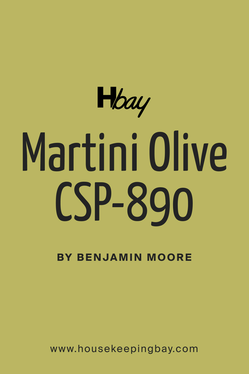
Martini Olive is a sophisticated blend of green and brown, reminiscent of the olives that grace classic martinis. This mature, muted shade lends an organic feel to interiors, making it apt for styles that resonate with earthiness such as rustic, contemporary, and bohemian. Its rich depth pairs exceptionally well with raw materials like wood, leather, and terracotta, emphasizing the authentic textures these materials bring.
housekeepingbay.com
Table of Contents
Is It a Warm Or Cool Color?
Martini Olive leans towards the warmer spectrum. Its inherent warmth offers a cozy and inviting ambiance, making spaces feel more intimate. In homes, warm colors like Martini Olive are known to stimulate relaxation, making rooms feel more approachable and familiar, which is especially beneficial for living areas and bedrooms.
Undertones of Martini Olive CSP-890
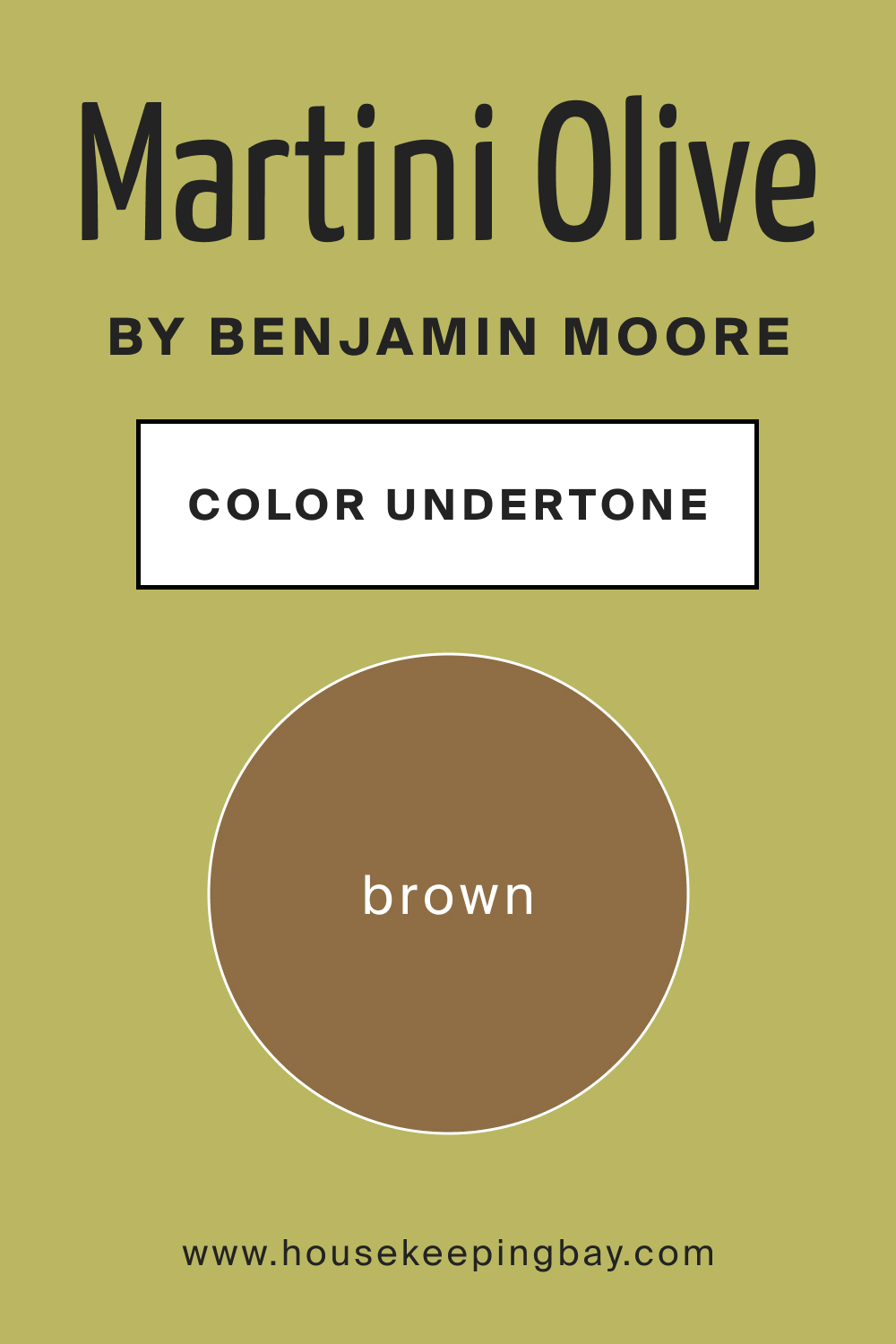
Martini Olive boasts undertones of earthy brown, which lends it a grounded feel. Undertones subtly influence our perception of the primary color, adding layers of depth and complexity. In the case of Martini Olive, its brown undertones evoke a sense of nature and organic harmony, making walls painted in this shade feel both rich and soothing.
housekeepingbay.com
Coordinating Colors of Martini Olive CSP-890
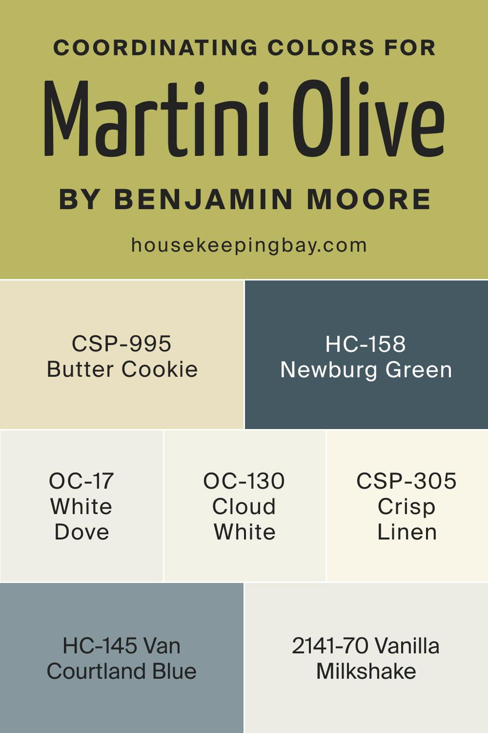
Coordinating colors harmonize with the primary shade, enhancing its appeal. For Martini Olive, colors like CSP-305 Crisp Linen, OC-130 Cloud White, CSP-995 Butter Cookie, and HC-158 Newburg Green work beautifully.
- CSP-305 Crisp Linen is a fresh off-white, bringing in airiness.
- OC-130 Cloud White is a soft white with a hint of warmth, complementing Martini Olive’s earthiness.
- CSP-995 Butter Cookie is a gentle beige, echoing the muted sophistication of Martini Olive.
- HC-158 Newburg Green is a deeper green-blue, offering a nice contrast.
Three additional coordinating colors are: BM 2141-70 Vanilla Milkshake, OC-17 White Dove, and HC-145 Van Courtland Blue.
housekeepingbay.com
How Does Lighting Affect Martini Olive CSP-890?
Lighting dramatically influences how we perceive color. In artificial light, Martini Olive appears cozier and richer, while natural light emphasizes its earthy undertones. In north-facing rooms, which receive cooler, bluish light, the color appears slightly darker. South-facing rooms, bathed in warm, golden light, enhance its warmth.
East-facing rooms in the morning light make it appear vibrant, while west-facing rooms in the evening give it a serene glow.
housekeepingbay.com
LRV of Martini Olive CSP-890
Light Reflectance Value (LRV) measures how much light a color reflects. With an LRV of 43, Martini Olive is in the mid-range, meaning it neither reflects too much light nor absorbs too much. This balance ensures the color doesn’t overpower spaces but rather adds depth and dimension, especially in well-lit rooms.

housekeepingbay.com
What is LRV? Read It Before You Choose Your Ideal Paint Color
Trim Colors of Martini Olive CSP-890
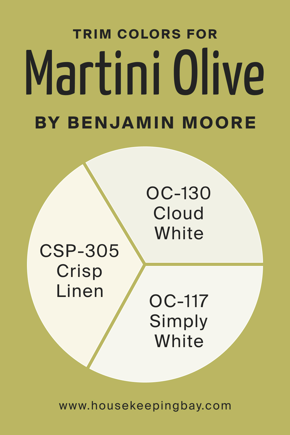
Trim colors delineate spaces and accentuate design elements. For Martini Olive, whites like OC-130 Cloud White, CSP-305 Crisp Linen, and OC-117 Simply White from Benjamin Moore would be ideal, providing a crisp contrast and making the green pop.
housekeepingbay.com
Colors Similar to Martini Olive CSP-890
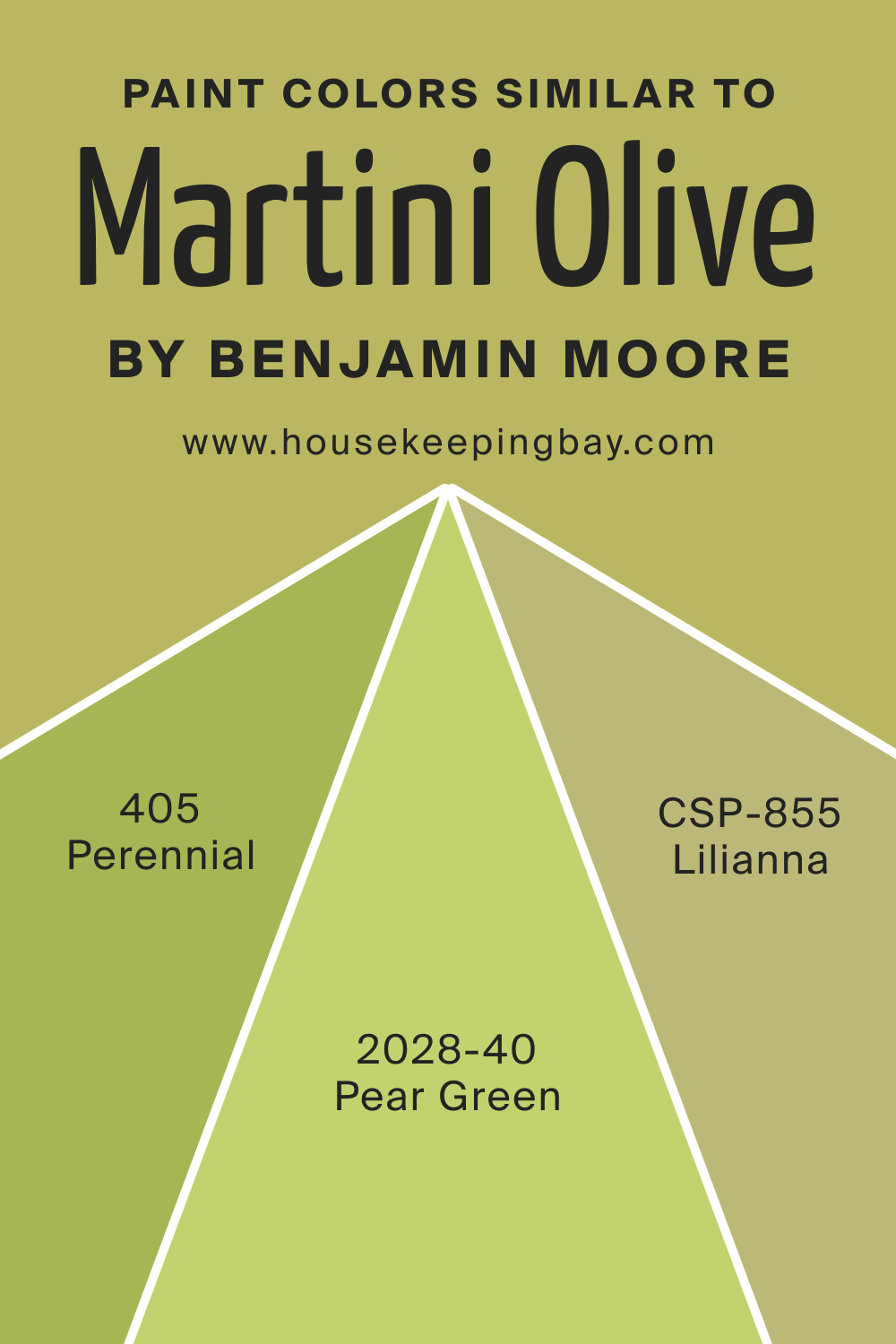
Understanding similar colors helps in creating a cohesive color scheme. BM 405 Perennial, CSP-855 Lilianna, and BM 2028-40 Pear Green mirror Martini Olive’s essence.
- BM 405 Perennial is a verdant green with lively undertones.
- CSP-855 Lilianna is a muted olive with a touch more green.
- BM 2028-40 Pear Green is a vibrant shade, reminiscent of spring.
housekeepingbay.com
Colors That Go With Martini Olive CSP-890
Creating a harmonious space involves pairing colors that complement each other. For Martini Olive, Benjamin Moore shades like HC-158 Newburg Green, OC-130 Cloud White, CSP-995 Butter Cookie, HC-145 Van Courtland Blue, and CSP-250 Vanilla Milkshake enhance its organic charm, each in their unique way, be it through contrast or harmony.
How to Use Martini Olive CSP-890 In Your Home?
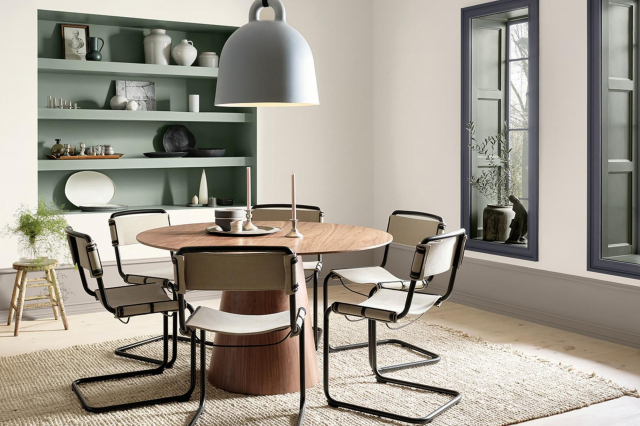
Martini Olive CSP-890 is a versatile hue that effortlessly brings warmth and sophistication to any space. Its earthy tones make it ideal for living rooms, bedrooms, and studies, creating an ambiance of coziness and relaxation. In addition, its organic essence resonates well with interior styles that lean towards nature-inspired themes, such as rustic, bohemian, and even certain modern aesthetics.
Furthermore, the rich depth of Martini Olive pairs brilliantly with raw materials like wood, jute, and terracotta, allowing a plethora of decorative opportunities.
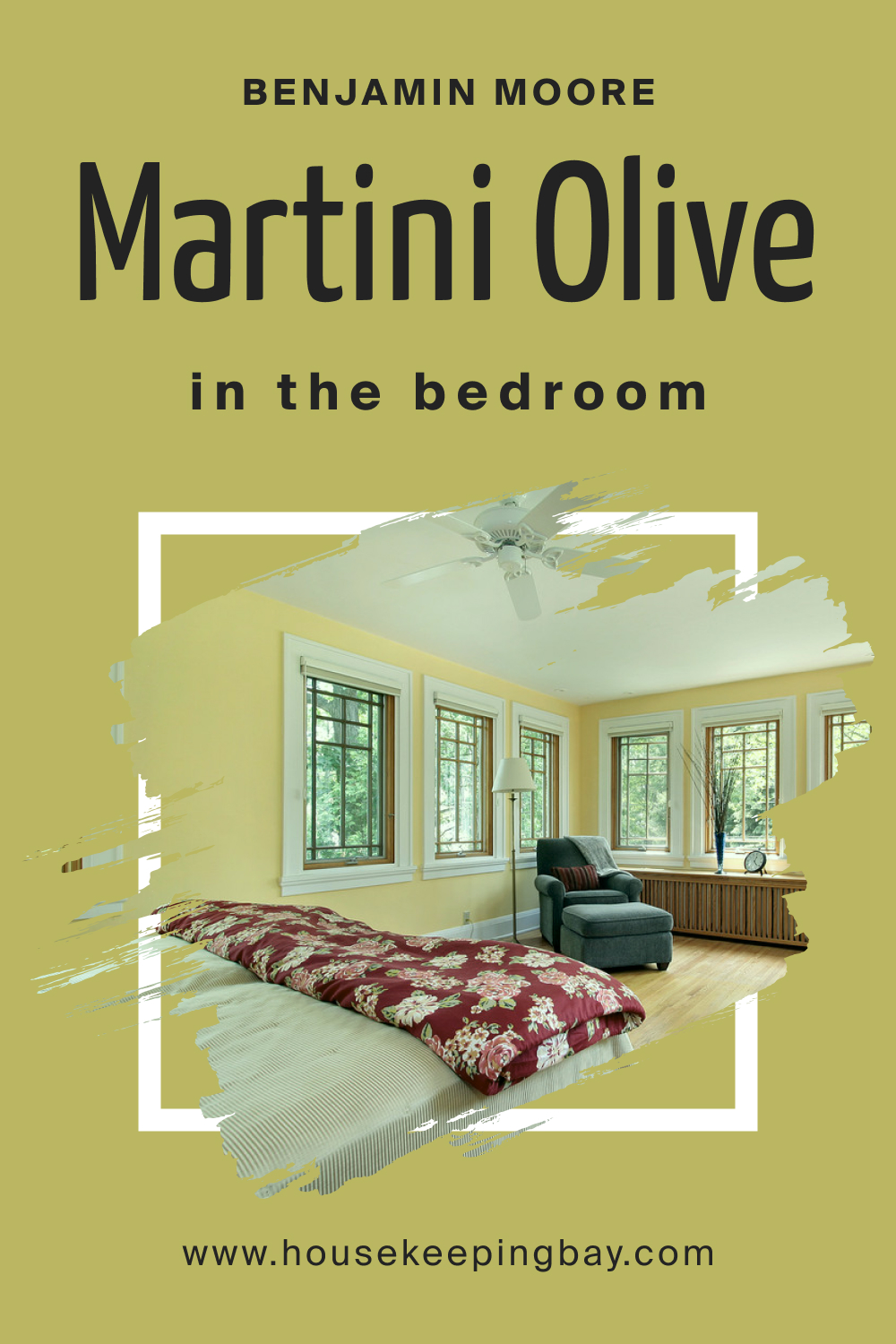
How to Use Martini Olive CSP-890 in the Bedroom?
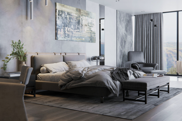
In the sanctuary of sleep, Martini Olive brings forth an environment of tranquility and repose. Its muted green-brown undertones instill a sense of connection with nature. Paired with soft linens, wooden furnishings, and dim lighting, this color ensures a serene and restful atmosphere, making it a top choice for bedrooms seeking a calming aura.
housekeepingbay.com
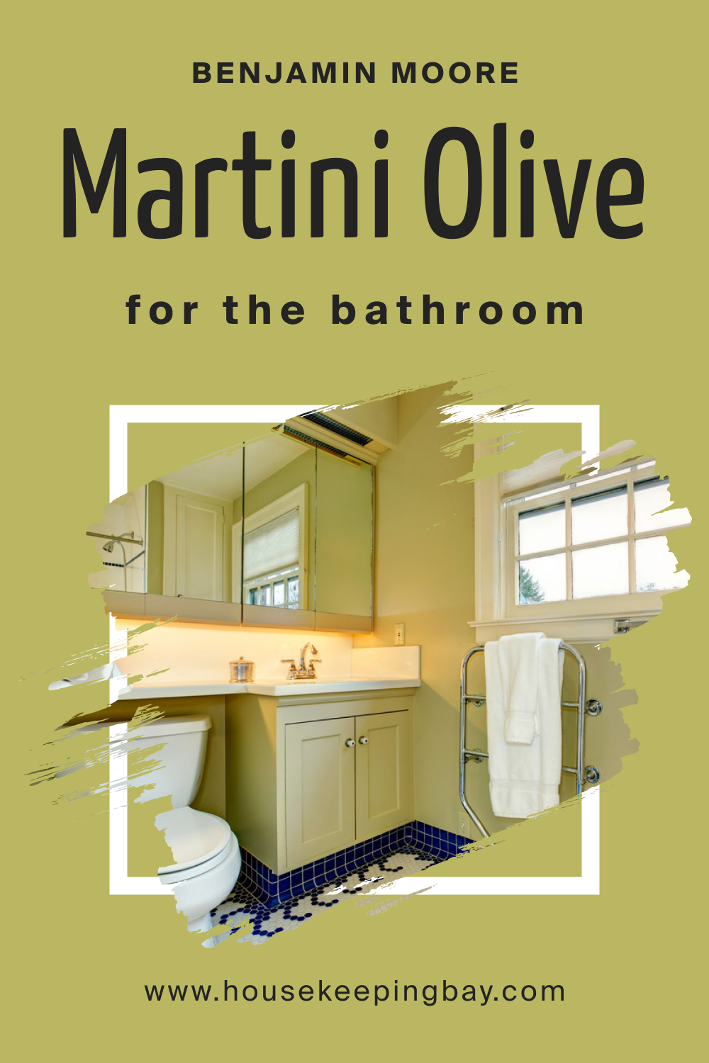
How to Use Martini Olive CSP-890 in the Bathroom?
Martini Olive in the bathroom offers a spa-like retreat. Its earthy vibe complements natural stone tiles, wooden accents, and bronze fixtures. Paired with softer shades like Crisp Linen or lighter greens, it provides depth without being overpowering. This shade turns ordinary bathrooms into luxurious sanctuaries of relaxation.
housekeepingbay.com
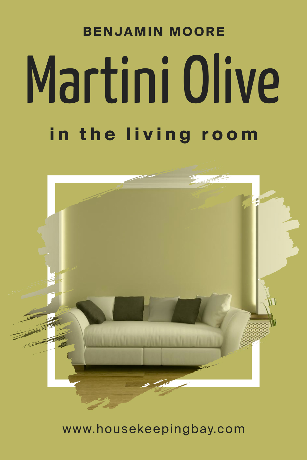
How to Use Martini Olive CSP-890 in the Living Room?
Living rooms adorned in Martini Olive exude warmth and sociability. This hue serves as a neutral backdrop against which vibrant decor pieces or artworks can shine. Paired with plush, beige couches, golden accents, and plenty of indoor plants, it brings together both modern and organic aesthetics for a balanced, inviting space.
housekeepingbay.com
How to Use Martini Olive CSP-890 for an Exterior?
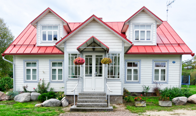
For exteriors, Martini Olive lends a timeless elegance. It’s robust enough to stand out, yet sufficiently subdued to blend with natural surroundings. Perfect for homes surrounded by greenery, this color gives off an old-world charm, especially when coordinated with stone pathways and wooden trims.

housekeepingbay.com
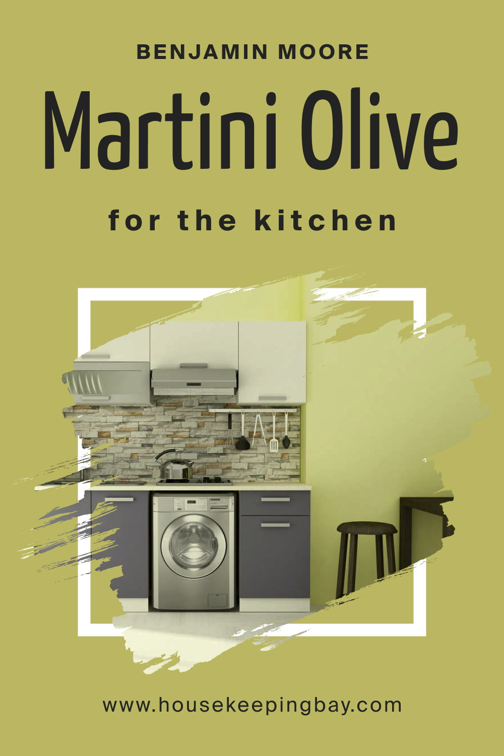
How to Use Martini Olive CSP-890 in the Kitchen?
Martini Olive brings a gourmet touch to kitchens. Whether applied on a feature wall or interspersed with backsplash tiles, it’s a hue that speaks of culinary adventures amidst an organic setting. Pair with butcher block countertops, copper pots, and hanging herbs for a kitchen scene that’s as appealing to the eyes as it is to the culinary senses.
housekeepingbay.com
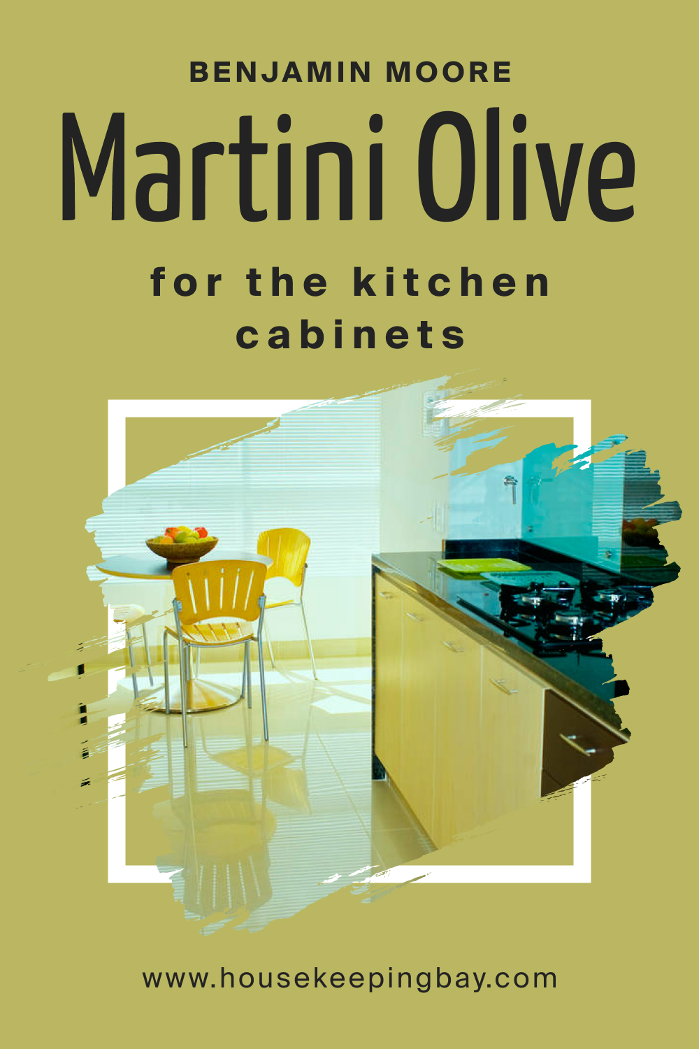
How to Use Martini Olive CSP-890 on the Kitchen Cabinets?
Kitchen cabinets in Martini Olive are a bold yet sophisticated choice. The shade adds depth and character to the kitchen, making white countertops and stainless-steel appliances pop. Accented with gold or brass handles, these cabinets exude luxury, ensuring the kitchen isn’t just a place for cooking, but also a statement in design.
housekeepingbay.com
Comparing Martini Olive CSP-890 With Other Colors
Color is a vital element of design that evokes emotions, creates mood, and sets the tone for any space. Comparing different colors enables designers and homeowners to make informed decisions based on how colors relate, contrast, or complement each other. It offers insights into undertones, intensity, and the feelings certain shades can inspire in a room.
Additionally, color comparisons help in visualizing the harmony of a potential color scheme, ensuring the chosen palette creates the desired ambience and effect.
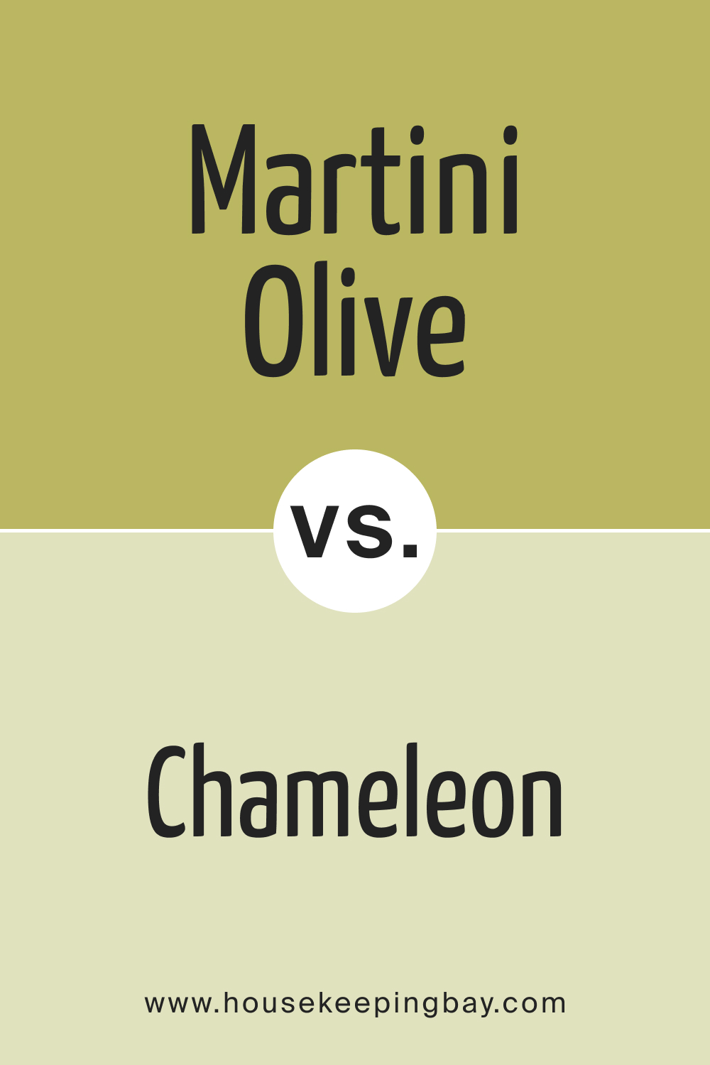
Martini Olive CSP-890 vs. BM 526 Chameleon
Chameleon , a subtle shift from Martini Olive, is a shade that changes its essence depending on lighting and surroundings. While Martini Olive carries a grounded, earthy feel, Chameleon presents a mutable character, fluctuating between green and gray. It’s more reserved, making it versatile, but lacks the richness of Martini Olive.
housekeepingbay.com
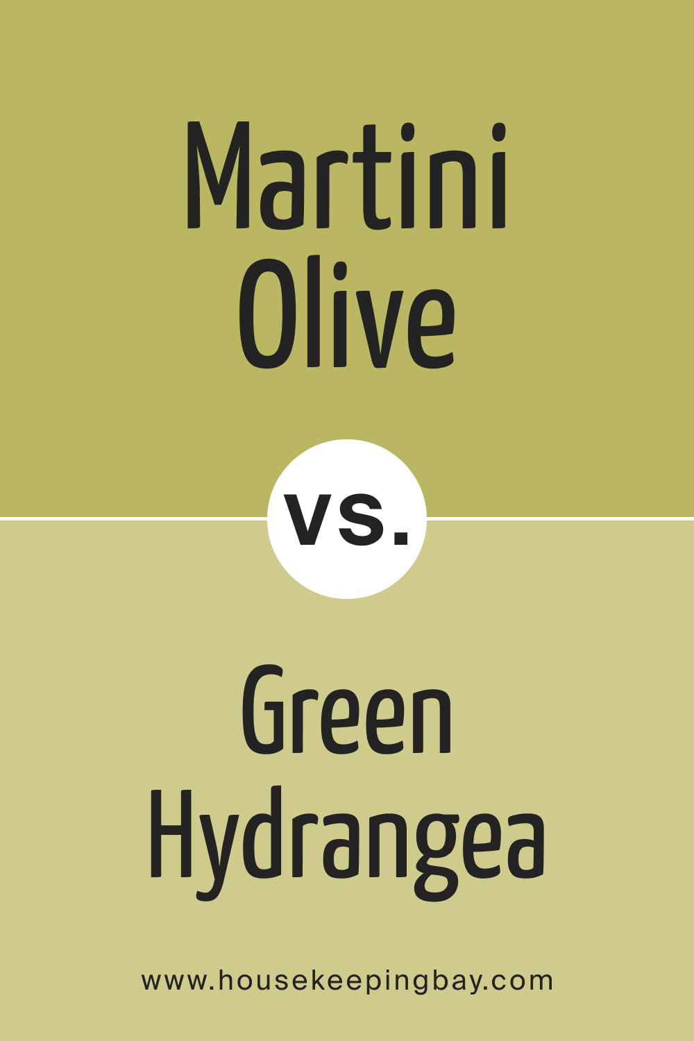
Martini Olive CSP-890 vs. CSP-850 Green Hydrangea
Green Hydrangea is a fresher take on green, reminiscent of budding spring leaves. While Martini Olive has a depth and maturity, Green Hydrangea offers a light-hearted, youthful energy to spaces. It’s brighter and less muted, ideal for areas needing vibrancy.
housekeepingbay.com
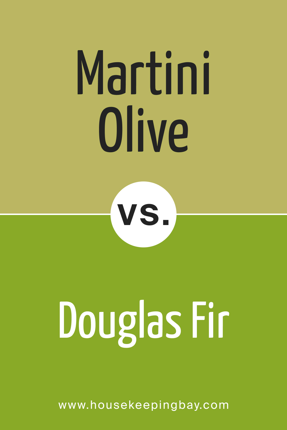
Martini Olive CSP-890 vs. BM 2028-20 Douglas Fir
Douglas Fir is a robust, forest-inspired hue. Its depth is reminiscent of Martini Olive but leans more into the true green territory. This shade is more suitable for accent walls or spaces aiming for a bold statement, while Martini Olive offers subdued sophistication.
housekeepingbay.com
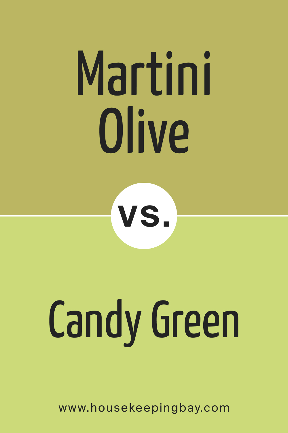
Martini Olive CSP-890 vs. BM 403 Candy Green
Candy Green is almost the playful cousin of Martini Olive. With its lively vibrancy, it brings zest and dynamism, contrasting Martini Olive’s calm and composed nature. Candy Green is a go-to for contemporary and energetic environments.
housekeepingbay.com
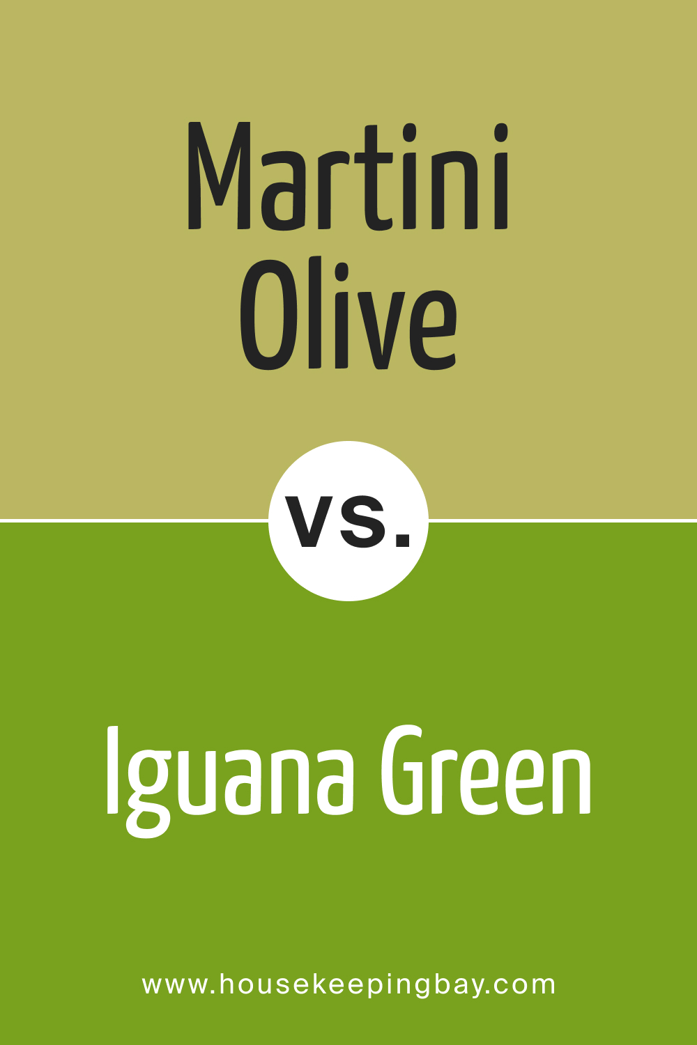
Martini Olive CSP-890 vs. BM 2028-10 Iguana Green
Iguana Green is a bright, tropical green that instantly captivates the eye. While Martini Olive is subtle and deep, Iguana Green demands attention, making it perfect for focal points. It contrasts Martini Olive’s muted tones with its radiant presence.
housekeepingbay.com
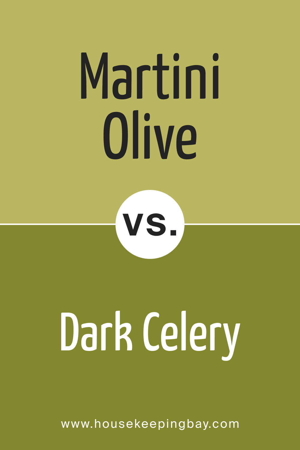
Martini Olive CSP-890 vs. BM 2146-10 Dark Celery
Dark Celery , leaning towards the yellow-green spectrum, offers a unique vibrancy. It has the earthiness of Martini Olive but combined with a brighter undertone. It can brighten up spaces while retaining a connection to nature, just like Martini Olive.
housekeepingbay.com
Conclusion
Colors are not just visual elements; they’re experiences. Martini Olive CSP-890, with its earthy and sophisticated tone, provides a plethora of design opportunities. When compared to other shades, its versatility and depth become even more evident. However, every hue, from the vibrant Iguana Green to the mutable Chameleon, has its unique story and potential.
Selecting the right one depends on understanding its essence and the mood one desires to evoke in a space.
housekeepingbay.com
Ever wished paint sampling was as easy as sticking a sticker? Guess what? Now it is! Discover Samplize's unique Peel & Stick samples. Get started now and say goodbye to the old messy way!
Get paint samples
