Limewash SW 9589 by Sherwin Williams
Brightening Spaces with a Splash of Zest
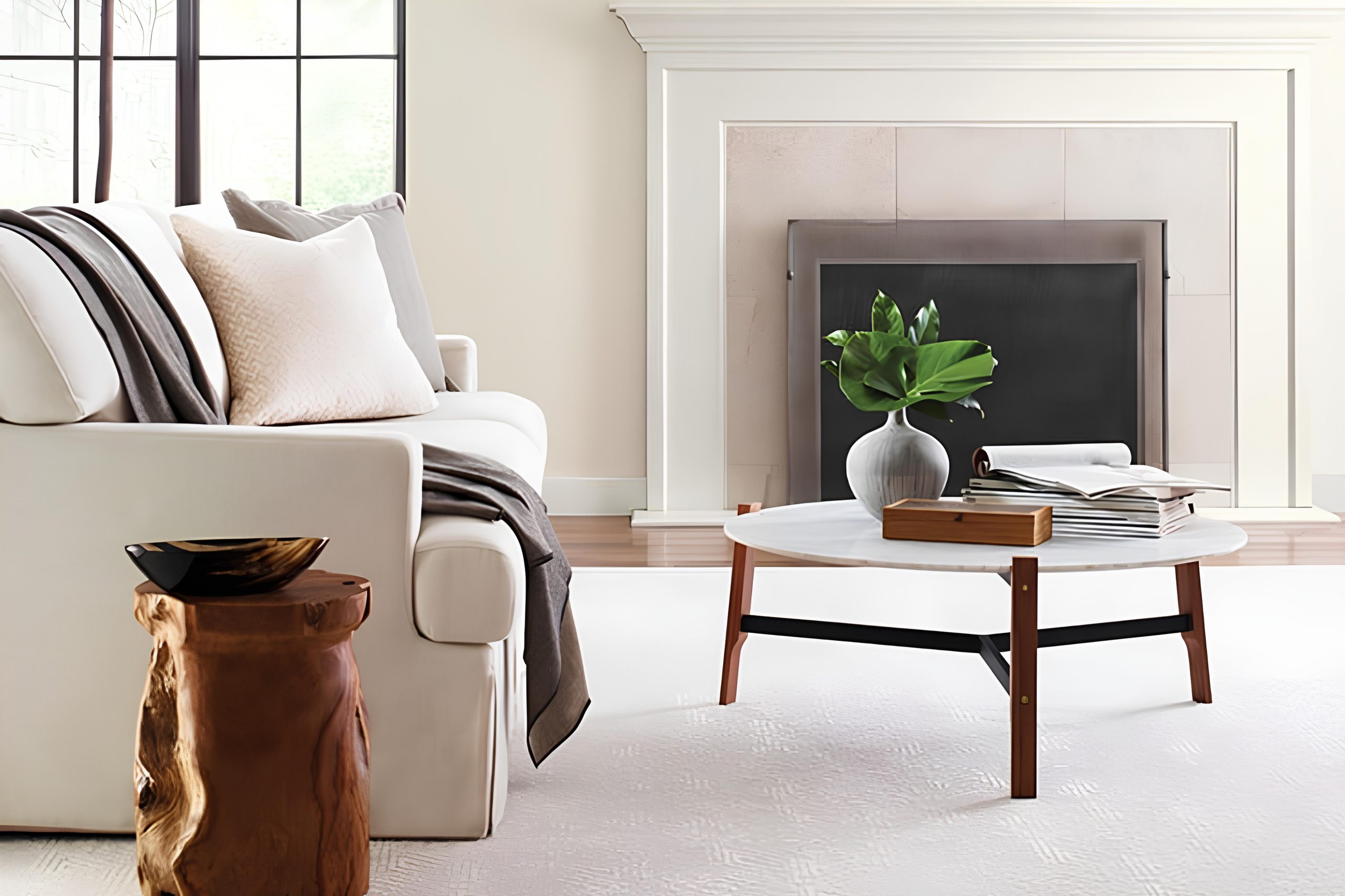
When you’re looking to give your space a fresh, updated look without overwhelming it, SW 9589 Limewash by Sherwin Williams is a fantastic choice. This color brings a subtle hint of elegance and a breath of fresh air into any room. Imagine transforming your walls with this beautiful shade; it’s like giving your home a mini makeover that speaks volumes.
Limewash has a unique ability to complement various styles and decors, making it incredibly versatile. Whether you’re jazzing up your living room, bedroom, or even your kitchen, this color can tie everything together seamlessly. It’s not just about changing the color of your walls, it’s about creating an atmosphere that reflects your personal style and enhances your living space.
And the best part? You don’t need to be a professional decorator to make it look stunning. So, if you’re looking for a way to refresh your home’s look with a modern twist that feels cozy and inviting, SW 9589 Limewash could be your perfect match.
Let’s get your home looking its best with this gorgeous shade!
via swemeralddesigner
What Color Is Limewash SW 9589 by Sherwin Williams?
Limewash SW 9589 by Sherwin Williams is a refreshing and airy color that reminds one of the first light of dawn. It’s a soft, subtle shade that leans towards a pale green, offering a hint of natural vibrancy without overpowering a space. This soothing hue brings a sense of tranquility and lightness to any room, making it perfect for creating a serene and inviting atmosphere.
Ideal for a variety of interior styles, Limewash works exceptionally well in modern, minimalist, and Scandinavian designs where its light and breezy feel can enhance the sense of space and simplicity. It’s also a great match for coastal or beach-themed interiors, where its natural tones complement the casual, airy vibe often sought in these settings.
When it comes to pairing materials and textures with Limewash, think of elements that emphasize comfort and natural beauty. Light woods such as oak or birch can highlight its earthy base, while adding furniture or decor in white or soft pastel tones can keep the space feeling open and bright.
For textures, consider linens, cottons, or even soft wools to bring in a touch of coziness that doesn’t weigh down the room. Natural textures like jute or sisal rugs can also ground the space and tie the look together.

housekeepingbay.com
Is Limewash SW 9589 by Sherwin Williams Warm or Cool color?
Sherwin Williams’ LimewashSW 9589 is a unique color choice for your home. It brings a soft, natural vibe into any space. This color stands out because it has a subtle, soothing feel, making rooms look calm and inviting. LimewashSW 9589 is great for anyone wanting to add a touch of elegance without going too bold.
The beauty of this color lies in its versatility. It works amazingly well in spaces that get a lot of light, but it’s also capable of making smaller or dimmer rooms feel more open and airy. This is because LimewashSW 9589 has a way of reflecting light, giving off a gentle glow that can make your home feel more welcoming and lively.
Another fantastic thing about LimewashSW 9589 is how it plays well with different colors and decors. Whether your home is modern, rustic, or anything in between, this color can fit right in. It pairs wonderfully with natural materials like wood and stone, bringing out their beauty without overshadowing them.
If you’re looking to freshen up your home with a soft, yet impactful color, LimewashSW 9589 by Sherwin Williams could be the perfect pick.
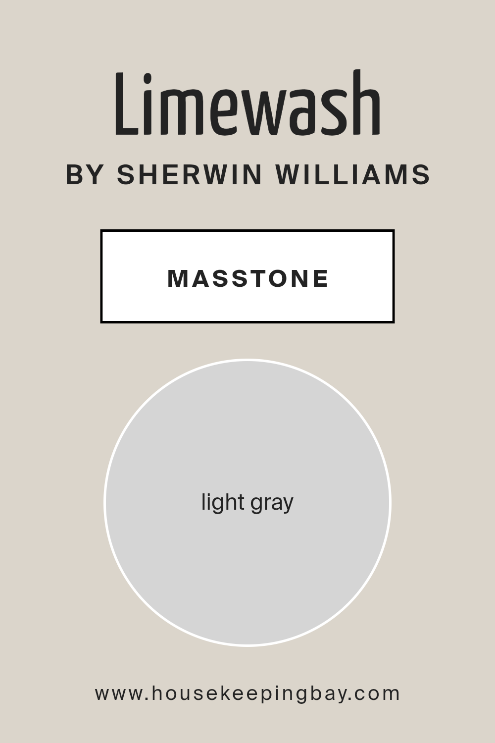
What is the Masstone of the Limewash SW 9589 by Sherwin Williams?
Limewash SW 9589 by Sherwin Williams has a light gray masstone, similar to the color #D5D5D5. This soft and subtle shade is excellent for homes because it brings a peaceful and calm feeling to any room. When you paint your walls with this color, your space will feel more open and bright, making it perfect for both small and large rooms.
This light gray works well with a variety of decor styles, whether you like things modern, rustic, or somewhere in between. It’s like a quiet background, allowing your furniture and decorations to stand out without competing for attention. Plus, it’s incredibly versatile – it can look great in a living room, kitchen, bedroom, or bathroom.
The refreshing quality of Limewash SW 9589 helps to create a serene environment that’s just right for relaxing at home. Its simplicity and warmth make it a wonderful choice for anyone looking to refresh their living space.
housekeepingbay.com
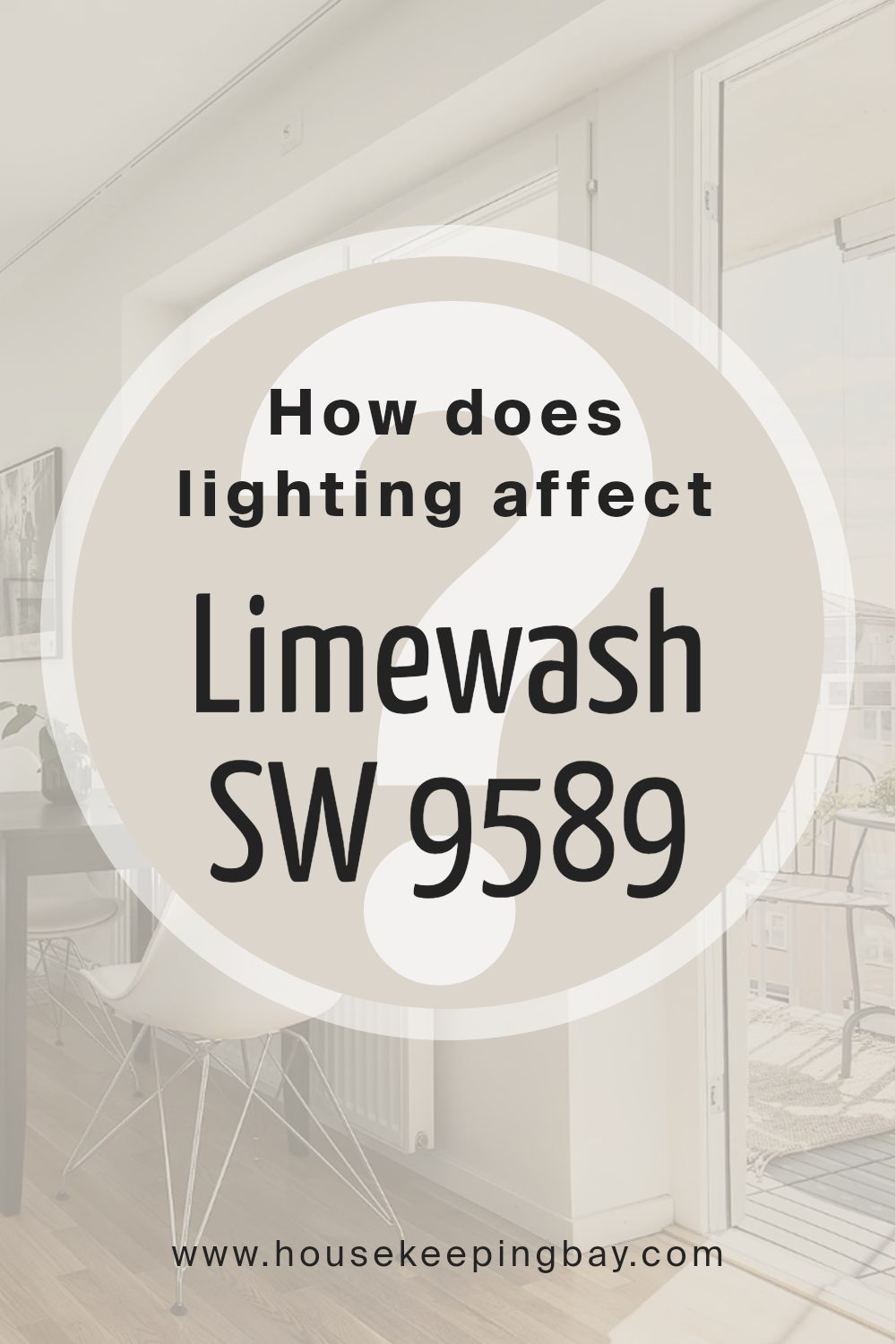
How Does Lighting Affect Limewash SW 9589 by Sherwin Williams?
Lighting plays a crucial role in how we see colors. Different types of light can make a color look brighter, darker, or change its hue. This is because light sources vary in terms of their color temperature, which affects the appearance of colors. For instance, a color can appear warmer under yellow or orange light and cooler under blue or white light.
When it comes to the color LimewashSW 9589 by Sherwin Williams, its appearance can change significantly under different lighting conditions. In natural light, which is the light that comes from the sun, LimewashSW 9589 might look true to its color during the middle of the day when the sunlight is brightest and most neutral. This means the color will likely appear as intended, without much distortion from external factors.
In artificial light, such as that from LED bulbs or fluorescent lights, LimewashSW 9589 might look different. LEDs, which often have a cooler, bluish tint, could make the color appear fresher and slightly cooler than it does in natural light. On the other hand, incandescent bulbs, which cast a warmer, yellowish glow, might make the color seem warmer and richer.
The direction a room faces also impacts how LimewashSW 9589 appears. In north-facing rooms, which receive less direct sunlight and hence have cooler, somewhat bluish light, the color might seem slightly muted and cooler. South-facing rooms get a lot of sunlight, making colors look brighter and more vivid; this means LimewashSW 9589 would likely appear very lively and true to its swatch in these rooms.
East-facing rooms get bright light in the morning, which is warmer, making the color appear slightly warmer in the mornings but cooler and more subdued as the day progresses. West-facing rooms receive intense sunlight in the late afternoon, which could make LimewashSW 9589 look very warm and welcoming in the afternoon and evening, contrasting with a cooler, more neutral appearance in the morning.
Overall, lighting dramatically influences how we perceive the color LimewashSW 9589, with the color’s appearance varying depending on the light source and the room’s orientation.
housekeepingbay.com
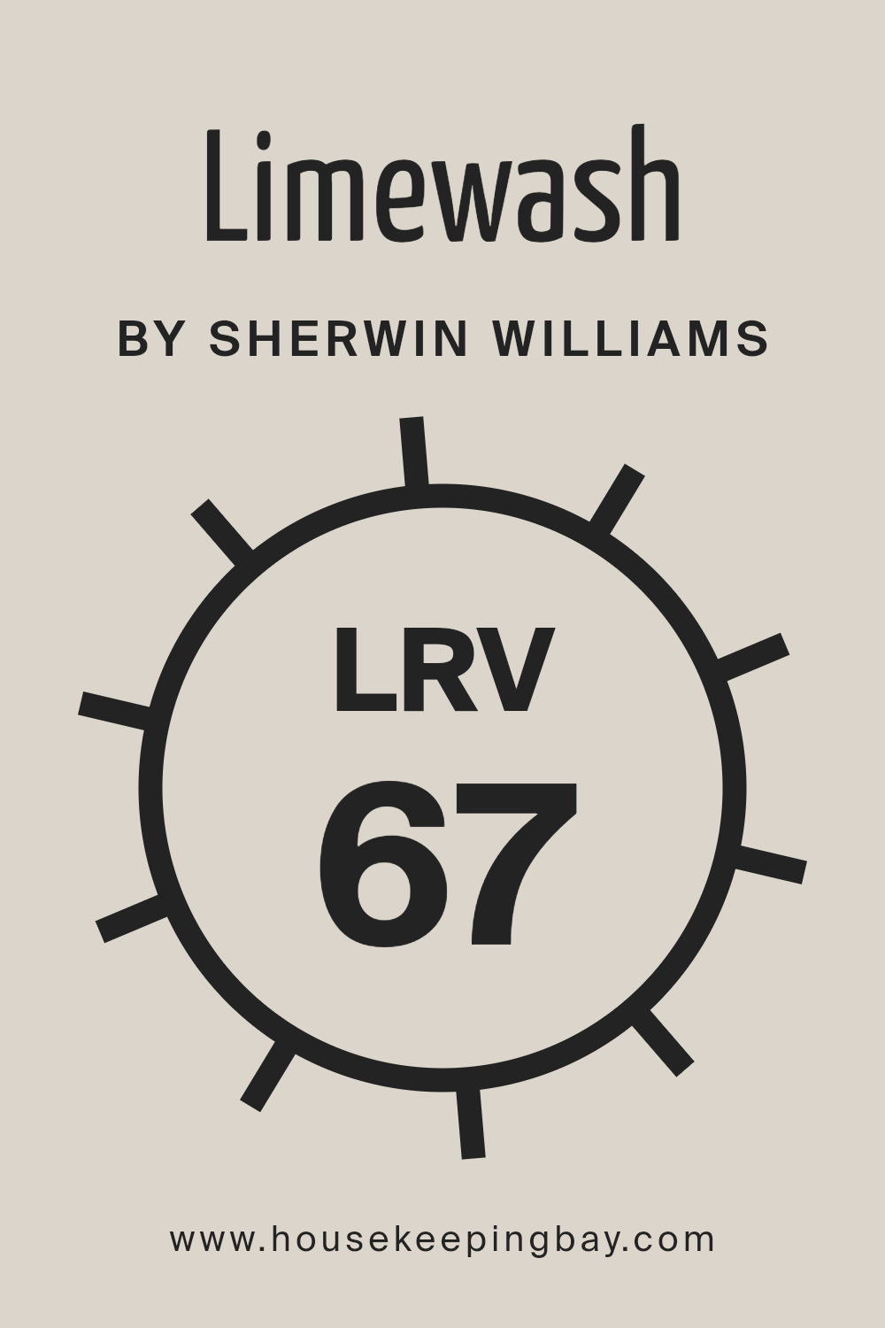
What is the LRV of Limewash SW 9589 by Sherwin Williams?
This is important because it helps you understand how bright or dark a color will look on your walls. Colors with a higher LRV will make a room feel brighter and more open because they reflect more light around the room.
On the other hand, colors with a low LRV can make a space feel cozier but smaller, as they absorb more light.
The LRV of Limewash SW 9589 by Sherwin Williams is 66.868. This means it’s on the lighter side of the scale, indicating it has a good ability to reflect light, making rooms feel brighter and more spacious. For this particular color, its LRV suggests it’s a great choice for spaces where you want to enhance natural light or make the room feel airy and welcoming without going for a stark white. In rooms with less natural light, using a color with this LRV can help compensate by reflecting artificial light well, enhancing the room’s overall luminosity.
This makes Limewash an adaptable color that works well in many settings, contributing positively to the ambiance of a space by making it feel more open and refreshed.
housekeepingbay.com
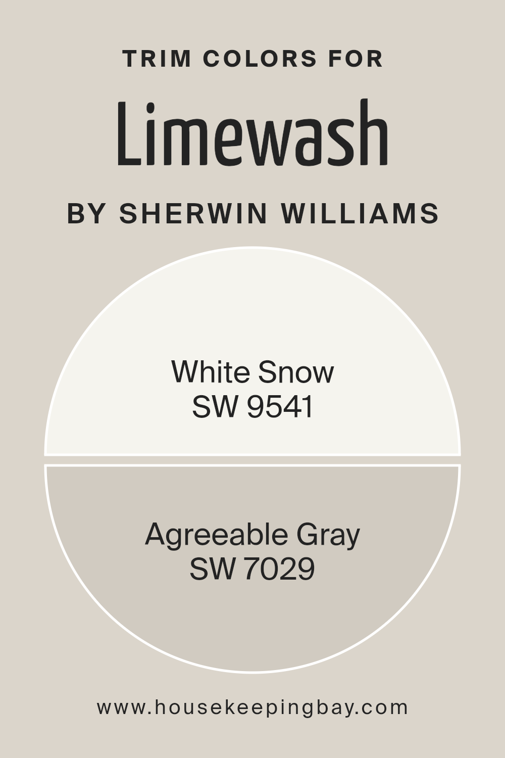
What are the Trim colors of Limewash SW 9589 by Sherwin Williams?
Trim colors are the accent shades used on the edges, corners, and frames of walls, doors, and windows to highlight architectural details and enhance the overall aesthetic appeal of a space.
When it comes to Limewash SW 9589 by Sherwin-Williams, choosing the right trim colors is crucial because it complements the main hue, bringing out its unique texture and depth. The trim acts like a frame for the Limewash color, making it stand out and giving the room a polished and coherent look.
For a classic and crisp appearance, SW 9541 – White Snow serves as an excellent trim color. This pure and bright shade works splendidly with Limewash SW 9589 by creating a sharp contrast that accentuates the architectural features of the room while adding a touch of freshness and clarity.
On the other hand, SW 7029 – Agreeable Gray offers a softer, more subtle contrast. This warm, versatile gray pairs beautifully with the Limewash, enhancing its natural charm without overwhelming it. The combination of either White Snow or Agreeable Gray with Limewash SW 9589 ensures that the main color shines through, elevating the space with style and sophistication.
You can see recommended paint colors below:
housekeepingbay.com
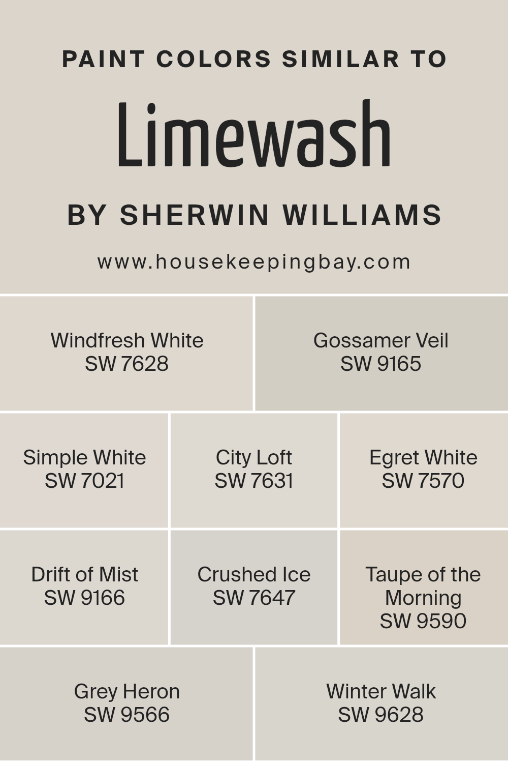
Colors Similar to Limewash SW 9589 by Sherwin Williams
Similar colors play a crucial role in design and aesthetics because they create harmony and a sense of balance in a space. When colors closely match each other, like Limewash SW 9589 by Sherwin Williams and its similar shades, they allow for a seamless transition from one hue to another, creating a soothing and cohesive look.
This palette, comprising shades like Windfresh White, Gossamer Veil, Simple White, and others, provides a range of options that share a subtle connection, making them perfect for creating layered and sophisticated designs. The use of similar colors can quietly tie different elements of a room together without the stark contrasts that more diverse palettes might introduce.
Take, for instance, Windfresh White, a clean and airy shade that offers a fresh backdrop, perfect for accentuating bolder colors or standing elegantly on its own. Gossamer Veil adds a gentle warmth, suggesting a soft, enveloping atmosphere ideal for creating inviting spaces.
Simple White is bright and crisp, providing a classic look that complements any style. City Loft, with its slightly gray undertone, introduces a modern twist, offering versatility and understated elegance. Egret White hints at a nuanced, creamy texture, providing a delicate and refined touch.
Drift of Mist, with its ethereal quality, can illuminate spaces, offering a gentle lift. Crushed Ice, Taupe of the Morning, Grey Heron, and Winter Walk each contribute their unique characteristics, from the cool sophistication of Crushed Ice to the warm depths of Grey Heron, crafting spaces that feel both cohesive and distinct.
This approach, using similar colors, ensures that regardless of the specific shade chosen, there’s a harmonious backdrop that supports the overall aesthetic, ensuring a space that is both well-designed and welcoming.
You can see recommended paint colors below:
- SW 7628 Windfresh White
- SW 9165 Gossamer Veil
- SW 7021 Simple White
- SW 7631 City Loft
- SW 7570 Egret White
- SW 9166 Drift of Mist
- SW 7647 Crushed Ice
- SW 9590 Taupe of the Morning
- SW 9566 Grey Heron
- SW 9628 Winter Walk
housekeepingbay.com
How to Use Limewash SW 9589 by Sherwin Williams In Your Home?
Limewash SW 9589 by Sherwin Williams is a beautiful paint option for anyone looking to add a soft and natural look to their home. This particular shade is similar to the whitewash effect but with a bit more texture and depth. It’s perfect for creating a cozy and welcoming atmosphere in any room.
One of the best things about Limewash SW 9589 is how versatile it is. You can use it in various places around your house, like on your walls, to give a room a fresh and clean look. It’s also great for updating furniture or kitchen cabinets for a more modern farmhouse vibe.
Applying it is pretty straightforward, making it a good choice for DIY enthusiasts. Whether you’re aiming to lighten up a dark space or add a bit of rustic charm, Limewash SW 9589 can help you achieve the look you’re going for. Plus, it pairs well with a wide range of colors and décor styles, meaning it can easily fit into your home’s existing aesthetic.
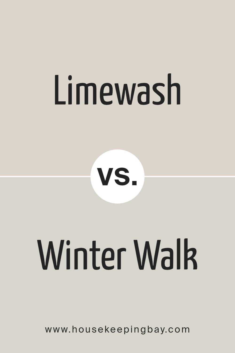
Limewash SW 9589 by Sherwin Williams vs Winter Walk SW 9628 by Sherwin Williams
Limewash SW 9589 and Winter Walk SW 9628 by Sherwin Williams are both unique colors, but they have their own distinct vibes. Limewash is like the soft glow of morning light, giving off a warm, soothing feel. It’s a kind of color that can make any room feel cozy and inviting, kind of like wrapping yourself in a sunbeam.
On the flip side, Winter Walk offers a cooler, more subdued look. It’s reminiscent of a quiet, frosty morning walk, where the air is crisp, and everything looks peaceful and calm. This color might make a space feel more open and serene, perfect for anyone looking to create a tranquil retreat.
While Limewash adds warmth and cheer, Winter Walk brings a calm and cool elegance. Both are beautiful in their own right, offering different ways to beautify a space depending on what mood you’re aiming for.
You can see recommended paint color below:
- SW 9628 Winter Walk
housekeepingbay.com
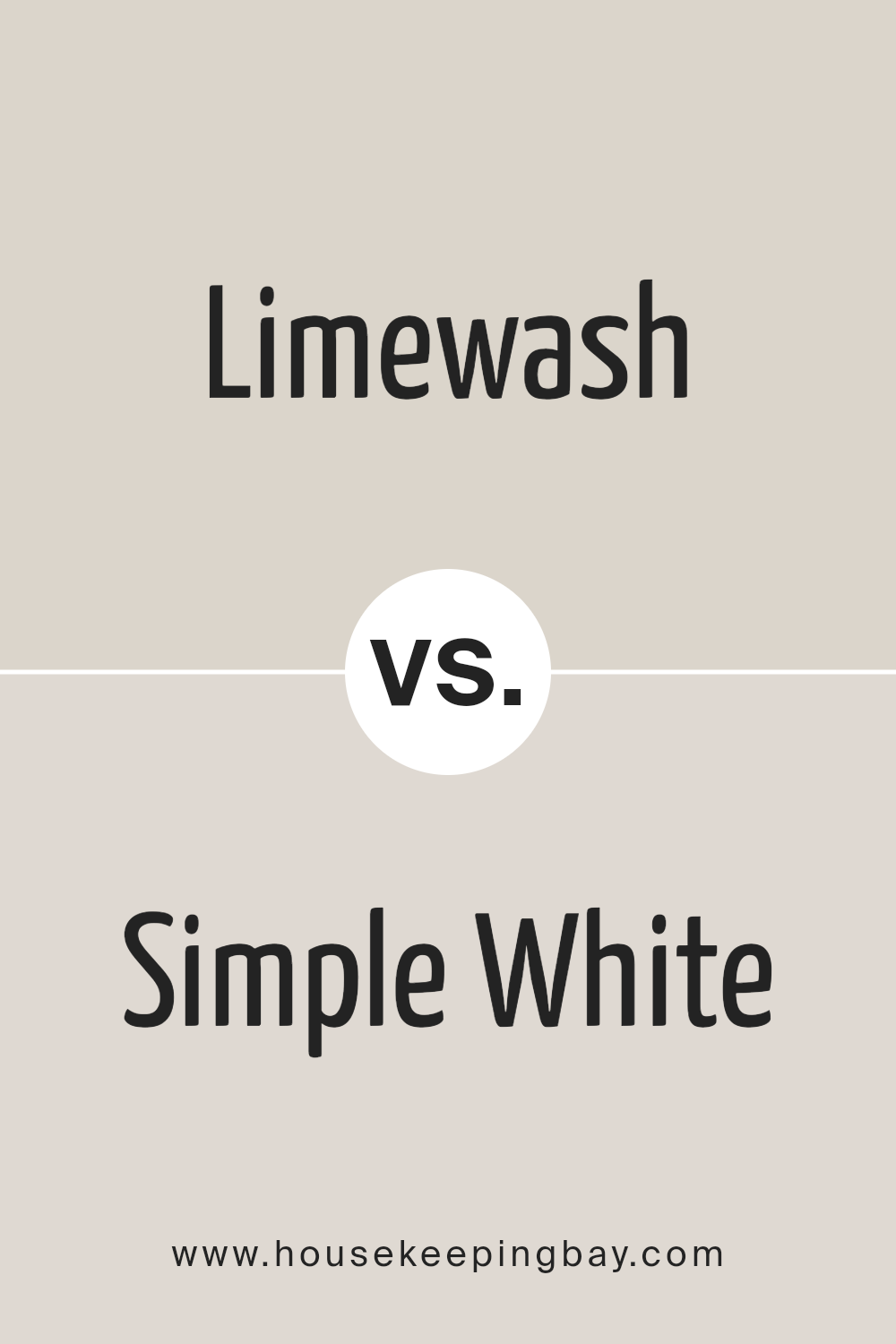
Limewash SW 9589 by Sherwin Williams vs Simple White SW 7021 by Sherwin Williams
Limewash SW 9589 by Sherwin Williams is a light and airy color that gives off a natural, fresh vibe. It’s like a breath of fresh air in a room, bringing a sense of calm and relaxation. This color has a subtle hint of green, reminiscent of a soft lime, adding a touch of nature and freshness to any space. It’s perfect for creating a serene, inviting atmosphere.
Simple White SW 7021 by Sherwin Williams, however, is a true classic. It’s a clean and crisp white that can brighten up any room, making it feel more spacious and open. Unlike Limewash, Simple White doesn’t have a noticeable undertone, which makes it incredibly versatile. It works beautifully in any setting, providing a perfect backdrop for all types of decor. Simple White is the go-to choice for a timeless, elegant look.
Both colors offer distinct vibes – Limewash brings a subtle, natural feel while Simple White offers a blank canvas that’s both elegant and adaptable.
You can see recommended paint color below:
housekeepingbay.com
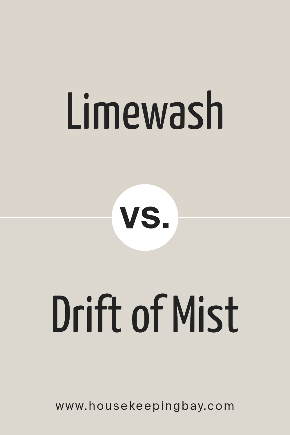
Limewash SW 9589 by Sherwin Williams vs Drift of Mist SW 9166 by Sherwin Williams
Limewash SW 9589 by Sherwin Williams is a unique color. It brings a bit of brightness to any space, resembling the light, creamy shades of actual lime wash. This color is perfect for adding a subtle touch of cheer without overwhelming the room. It feels fresh and can help make small spaces appear bigger and more open.
Drift of Mist SW 9166, also by Sherwin Williams, is different. It’s a soft, neutral gray that provides a calm and soothing vibe. This color is versatile; you can use it in any room to create a peaceful and serene atmosphere. It’s like a soft blanket, comforting and gentle, blending well with various decor styles.
While Limewash adds a touch of brightness, Drift of Mist offers a tranquil background. Whether you’re looking for a slight burst of energy or a calming retreat, each color has its charm.
You can see recommended paint color below:
housekeepingbay.com
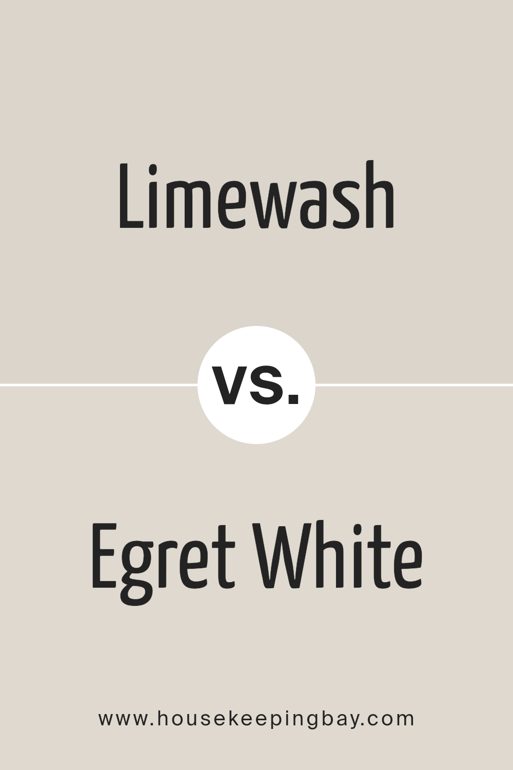
Limewash SW 9589 by Sherwin Williams vs Egret White SW 7570 by Sherwin Williams
Limewash SW 9589 and Egret White SW 7570, both by Sherwin Williams, are subtle shades that offer unique touches to spaces. Limewash is a light, airy color with hints of green, creating a refreshing and clean feel. It’s like the soft glow of early morning light in a serene, natural setting. This color works well in spaces looking for a gentle touch of nature while maintaining a bright and open vibe.
Egret White SW 7570, in contrast, leans more towards a soft, warm, off-white with a cozy undertone. It brings warmth to rooms, offering a soothing and welcoming atmosphere. It’s akin to the softness of a well-loved cotton quilt, providing a neutral backdrop that pairs well with a wide variety of decor.
Both colors reflect light beautifully, making spaces feel more spacious and airy. While Limewash has a subtle hint of green for a natural, refreshing look, Egret White brings warmth and softness, making it ideal for creating a soothing and inviting environment. Choosing between them depends on the mood and atmosphere one aims to achieve in their space.
You can see recommended paint color below:
housekeepingbay.com
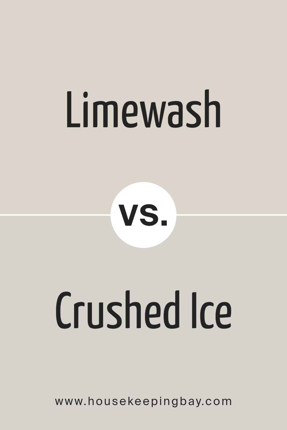
Limewash SW 9589 by Sherwin Williams vs Crushed Ice SW 7647 by Sherwin Williams
Limewash SW 9589 by Sherwin Williams is a light, airy color that brings a feeling of openness and brightness to any space. It’s a type of white with a hint of warmth, making it ideal for creating a cozy yet spacious atmosphere. This color works well in rooms that get a lot of sunlight, as it enhances the natural light and makes the room feel more inviting.
Crushed Ice SW 7647, another Sherwin Williams color, also has a light and subtle vibe but leans more towards a cooler, muted gray tone. It’s perfect for adding a touch of modern sophistication and neutrality to a space. This color is versatile and pairs well with nearly any décor, providing a clean and calming background.
While both colors are excellent choices for creating a fresh, airy feel, Limewash tends to add warmth to a room, making it feel homier. Crushed Ice, in contrast, offers a sleek, modern look that works well in contemporary settings. Depending on the desired atmosphere and decor style, either of these colors could beautifully enhance a room.
You can see recommended paint color below:
housekeepingbay.com
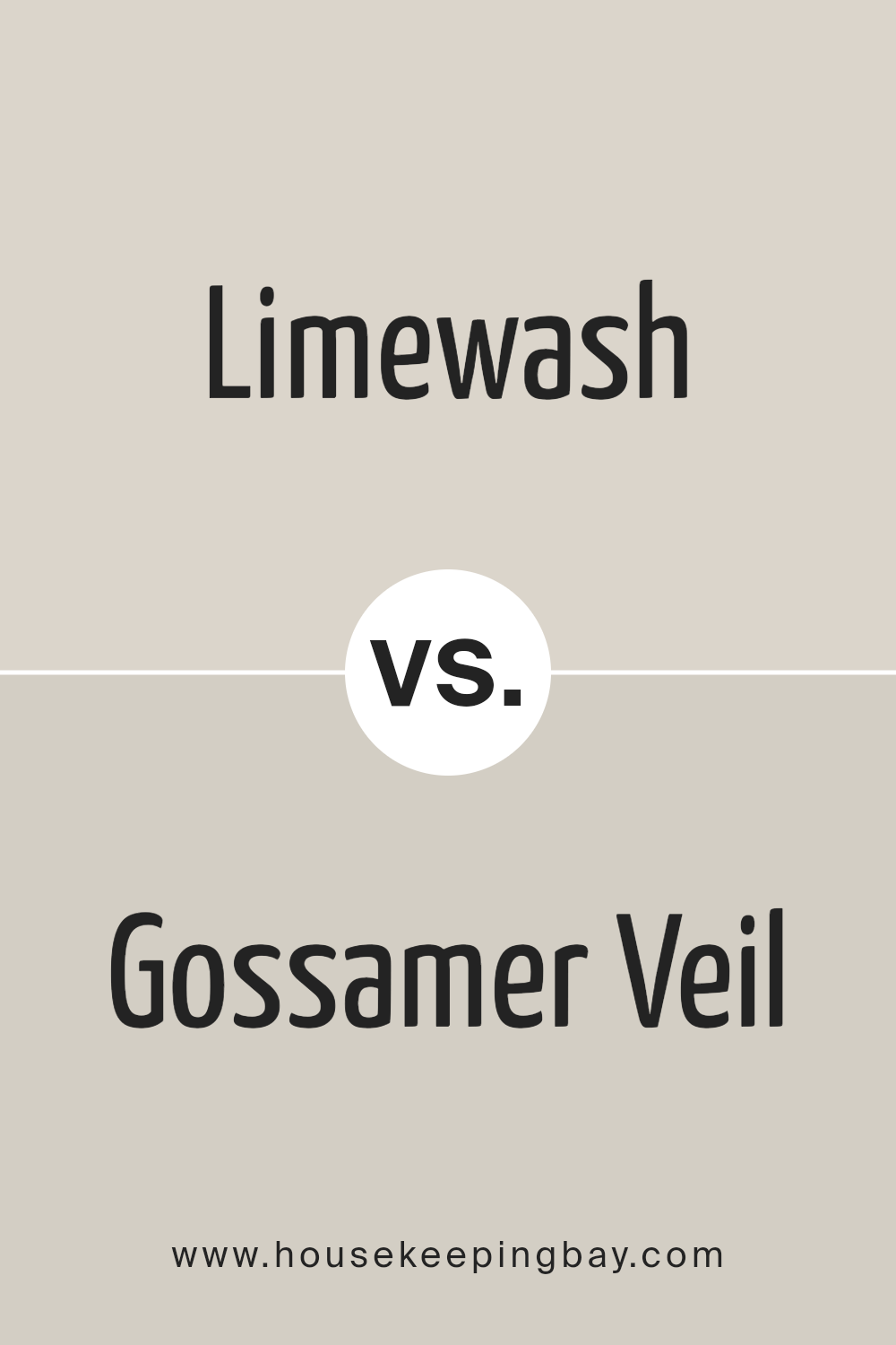
Limewash SW 9589 by Sherwin Williams vs Gossamer Veil SW 9165 by Sherwin Williams
Limewash SW 9589 by Sherwin Williams is a light, refreshing color that brings a hint of nature into a space. It’s like the soft, pale green of early spring leaves, giving rooms a fresh and airy feel. It’s great for places where you want a touch of color without overwhelming the senses.
Contrastingly, Gossamer Veil SW 9165 is a subtle, warm gray shade that provides a serene, calm backdrop for any room. This color leans more towards a neutral palette, making it incredibly versatile and perfect for matching with other colors and decor. While Limewash adds a delicate splash of color, Gossamer Veil offers a sophisticated, understated elegance.
Both colors can brighten up a room, but they do so in different ways: Limewash with its faint green hue brings vibrancy, whereas Gossamer Veil creates a soft, tranquil environment through its quiet gray tones. Choosing between them depends on the atmosphere you’re aiming to achieve; vibrant and fresh with Limewash or calm and soothing with Gossamer Veil.
You can see recommended paint color below:
housekeepingbay.com
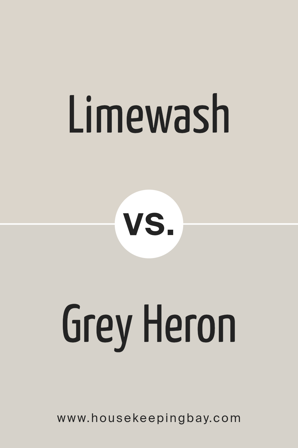
Limewash SW 9589 by Sherwin Williams vs Grey Heron SW 9566 by Sherwin Williams
Limewash SW 9589 by Sherwin Williams and Grey Heron SW 9566 by Sherwin Williams are two unique colors, each with its own charm. Limewash is a soft, muted color that gives a subtle, airy feel to any space. It’s light and almost has a gentle, creamy touch, making it perfect for creating a warm, welcoming atmosphere. This color works well in rooms where you want a cozy, soothing vibe.
In contrast, Grey Heron is a darker, more defined color. It carries a sense of elegance and sophistication, with a solid presence that adds depth to a room. Grey Heron can make a bold statement or serve as a strong foundation when paired with other colors, offering versatility in design choices.
Both colors offer different moods and atmospheres. Limewash brings a lighter, softer feel, ideal for a relaxed and calm setting, while Grey Heron offers a more striking, grounded look, perfect for spaces that aim for a touch of elegance and modern flair. Together, they could complement each other well in a space that seeks balance between warmth and sophistication.
You can see recommended paint color below:
- SW 9566 Grey Heron
housekeepingbay.com
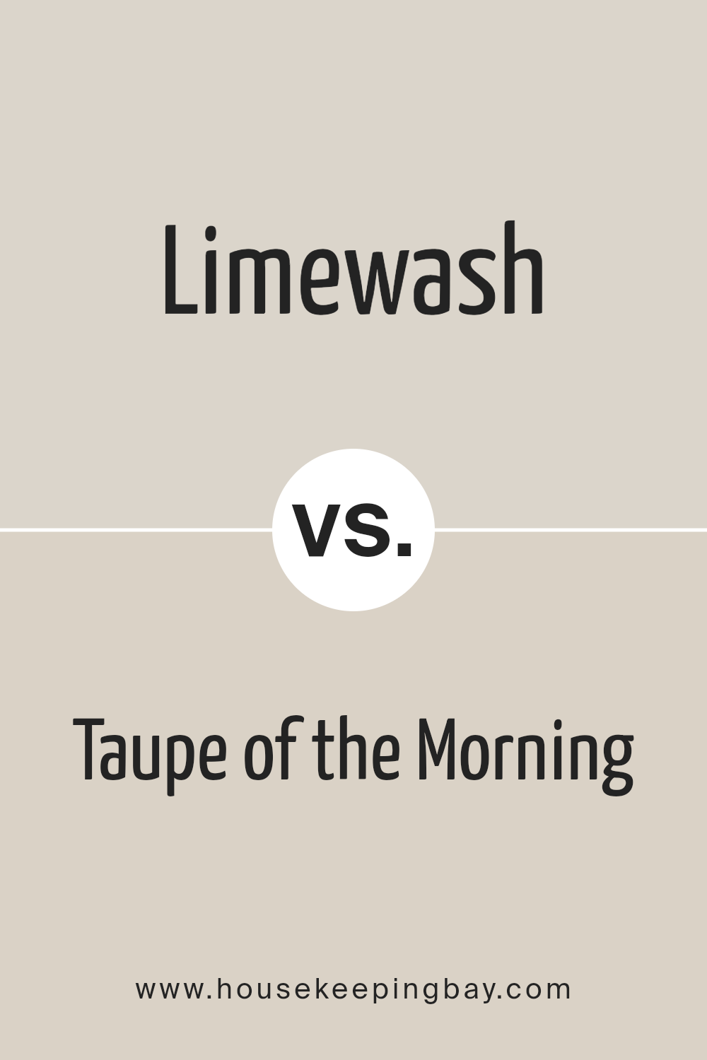
Limewash SW 9589 by Sherwin Williams vs Taupe of the Morning SW 9590 by Sherwin Williams
Limewash SW 9589 by Sherwin Williams and Taupe of the Morning SW 9590 by Sherwin Williams are two unique colors with their own charm. Limewash is a light, airy color that brings a sense of freshness and brightness to any space. It has a subtle green undertone that gives it a natural, earthy feel, making it perfect for creating a calm and soothing environment. It’s great for rooms where you want to add a touch of nature without overwhelming the space with darker colors.
In contrast, Taupe of the Morning is a warm, cozy hue that leans towards a soft, muted brown with a hint of gray. It offers a more grounded and comforting vibe, making it ideal for spaces where relaxation and warmth are key. This color works well in areas where you want to create a snug, inviting atmosphere without going too dark.
Both colors serve different purposes but are versatile enough to blend well with various decor styles. Limewash can refresh and lighten up a space, while Taupe of the Morning adds depth and warmth, making each suitable for creating distinct moods in your home.
You can see recommended paint color below:
- SW 9590 Taupe of the Morning
housekeepingbay.com
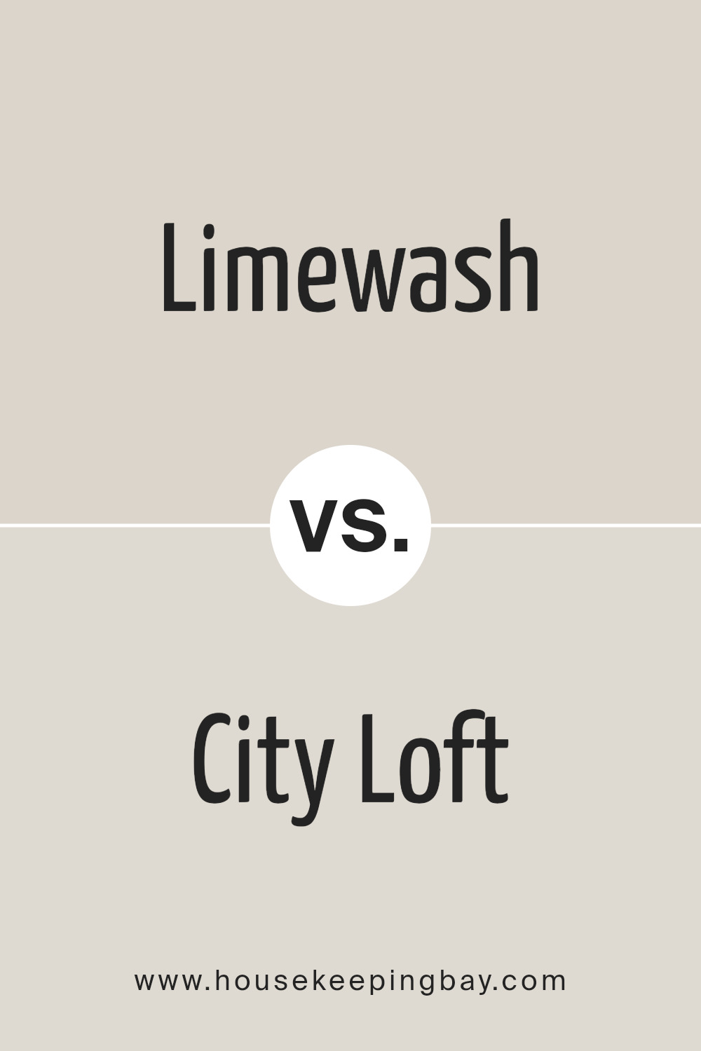
Limewash SW 9589 by Sherwin Williams vs City Loft SW 7631 by Sherwin Williams
Limewash SW 9589 and City Loft SW 7631, both by Sherwin Williams, bring their own unique vibes to a space. Limewash is a soft, creamy white that leans towards a natural, subtle ambiance. It’s like the color of a gently sunlit wall in a cozy room, giving off a calm and soothing effect. It’s great for making spaces feel open and airy without being too stark or cold.
City Loft, on the other hand, is a light, warm grey with a welcoming touch. It’s a bit deeper than Limewash, providing a sophisticated yet understated backdrop for any room. This color can add a bit more definition and character to your walls compared to the softer Limewash. It’s perfect for those looking to add a hint of modernity without going too dark.
Both colors are incredibly versatile but cater to different aesthetic preferences. Limewash is ideal for lovers of minimalist and serene décor, while City Loft suits those aiming for a chic, contemporary feel. Whether you choose the creamy, peaceful Limewash or the slightly bolder, cozy City Loft, each color offers its unique charm to transform your space.
You can see recommended paint color below:
housekeepingbay.com
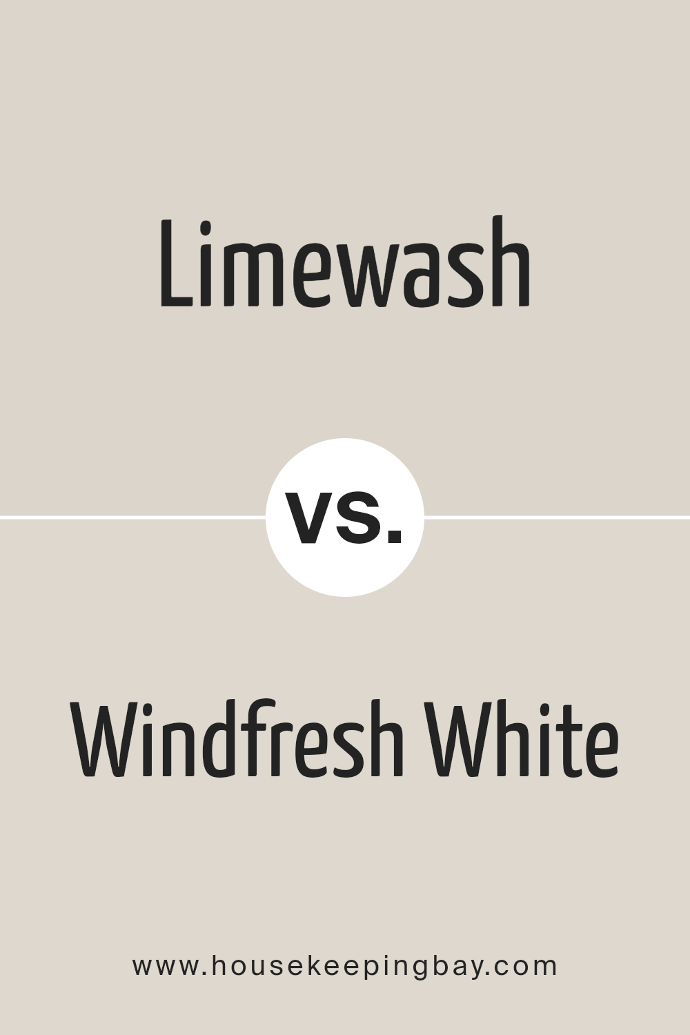
Limewash SW 9589 by Sherwin Williams vs Windfresh White SW 7628 by Sherwin Williams
Limewash SW 9589 and Windfresh White SW 7628 by Sherwin-Williams are two soft, subtle colors with unique tones. Limewash has a gentle, creamy feel, which brings warmth to spaces. It’s like a soft blanket on a chilly evening, making rooms cozy and welcoming. This color pairs beautifully with natural wood and can make your living space feel more inviting.
Windfresh White, in contrast, is like the first light of dawn. It’s a crisp, clean white with just a hint of coolness, making it perfect for creating a bright and airy vibe. It reflects light beautifully, making small rooms appear larger and darker spaces brighter.
Both colors work well in various settings, from modern to traditional, but they offer different moods. Limewash leans towards a warm, cozy atmosphere, ideal for living rooms or bedrooms, while Windfresh White is more about creating a fresh, open space, perfect for kitchens and bathrooms. Combining them can balance warmth and brightness in any home.
You can see recommended paint color below:
housekeepingbay.com
Conclusion
In conclusion, SW 9589 Limewash by Sherwin Williams is a fantastic paint choice if you’re seeking to give your space a fresh, vibrant feel without overwhelming it. Imagine transforming your room into a serene, welcoming area where every moment feels like a gentle breath of fresh air. Sherwin Williams has crafted this color with the delicate balance of warmth and brightness, making it perfect for anyone looking to refresh their home’s look with a subtle yet impactful change.
Using SW 9589 Limewash means you’re choosing a color that’s versatile enough to blend with various decor styles, from modern minimalism to cozy rustic. It’s a color that can bring out the best in your furniture and decorations, allowing for a harmonious look throughout your space.
Plus, it’s a testament to Sherwin Williams’ commitment to quality, ensuring that the fresh coat of paint won’t just look good on day one but will continue to charm you and your guests for years to come.
So, if you’re ready to breathe new life into your home, this paint might just be what you need. It’s an opportunity to refresh your space with a touch of elegance and simplicity, creating a backdrop that complements your life and style beautifully.
With SW 9589 Limewash, your home transformation is promising to be both easy and stunning, making it a superb choice for your next home improvement project.
housekeepingbay.com
Ever wished paint sampling was as easy as sticking a sticker? Guess what? Now it is! Discover Samplize's unique Peel & Stick samples. Get started now and say goodbye to the old messy way!
Get paint samples


