9 Greige Paint Colors That Don’t Look Pink from Sherwin Williams
Create a cozy, balanced look with these trusted shades.
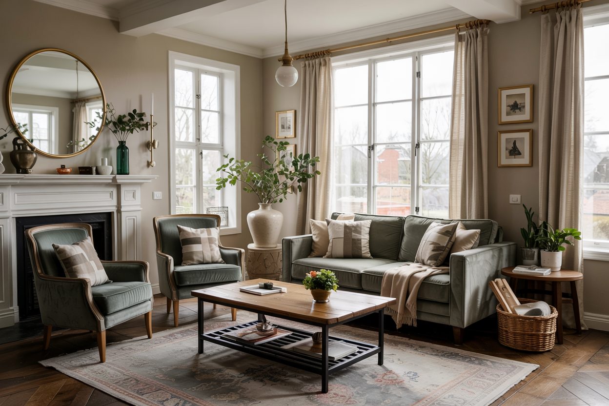
Choosing the right greige paint can feel like a big task.
You think you’ve found the perfect shade… until it dries on the wall and suddenly looks pink. I’ve been there myself, standing in a half-painted room, wondering how it went so wrong.
That’s why picking the right greige is so important.
It’s not just about the color — it’s about creating a feeling. A calm, welcoming, beautiful home that doesn’t feel “off” because of weird undertones.
Today, I’ll share 9 of my favorite Sherwin Williams greige paints that stay true. No pink surprises — just cozy, easy-to-love colors.
housekeepingbay.com
Why Some Greige Paints Look Pink
I get asked this all the time — “Why does my greige look pink on the wall?”
It usually comes down to three things:
1. Lighting
Different light changes how paint looks.
Cool light (like north-facing windows) brings out cool tones.
Warm light (like south-facing windows) can pull out warm, sometimes pink or peachy tones.
2. Undertones
Every greige has a secret color hiding underneath — we call that the undertone.
Some greiges carry red or purple undertones, even if they look neutral on a paint chip.
3. Surroundings
Other colors in the room matter too!
If your floors, furniture, or even your curtains have warm colors, they can reflect onto your walls and make your greige look pink.
When I work with clients, I always remind them:
“Paint doesn’t live alone. It lives with everything else you have.”
And believe me, even a “safe” greige can surprise you if you don’t check it first.
What Makes a Greige Perfect
Over the years, I’ve learned that the best greiges have balanced undertones.
Not too warm. Not too cool. They stay neutral in different lights and with different decor.
Here’s what I look for:
- Soft taupe or beige undertones (not red or purple)
- A little bit of gray to cool things down
- Medium depth — not too light, not too dark
According to Sherwin Williams color expert Sue Wadden,
“Greige works because it doesn’t commit too heavily to warm or cool.”
That’s exactly what we want — a color that behaves well no matter what.
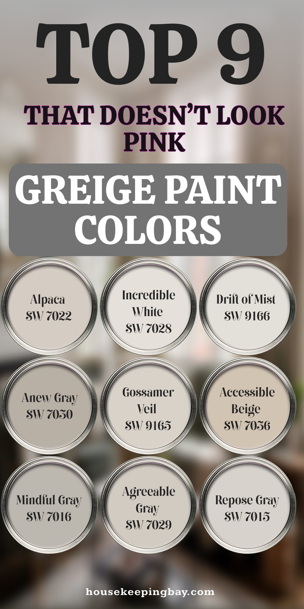
8 Best Greige Paint Colors From Sherwin Williams
Here are the eight colors I trust the most when I want a greige that won’t surprise me with pink tones.
Each one has a special place in my heart (and in my projects)!
1. Sherwin Williams Repose Gray (SW 7015)
Repose Gray is like the gold standard.
It’s soft, a little cool, and it holds steady without turning pink.
Why I love it:
-
It has a tiny bit of warmth, but mostly reads as a true gray.
-
It looks amazing in both bright and dim rooms.
Tip: I use this in open floor plans because it flows so nicely between spaces.

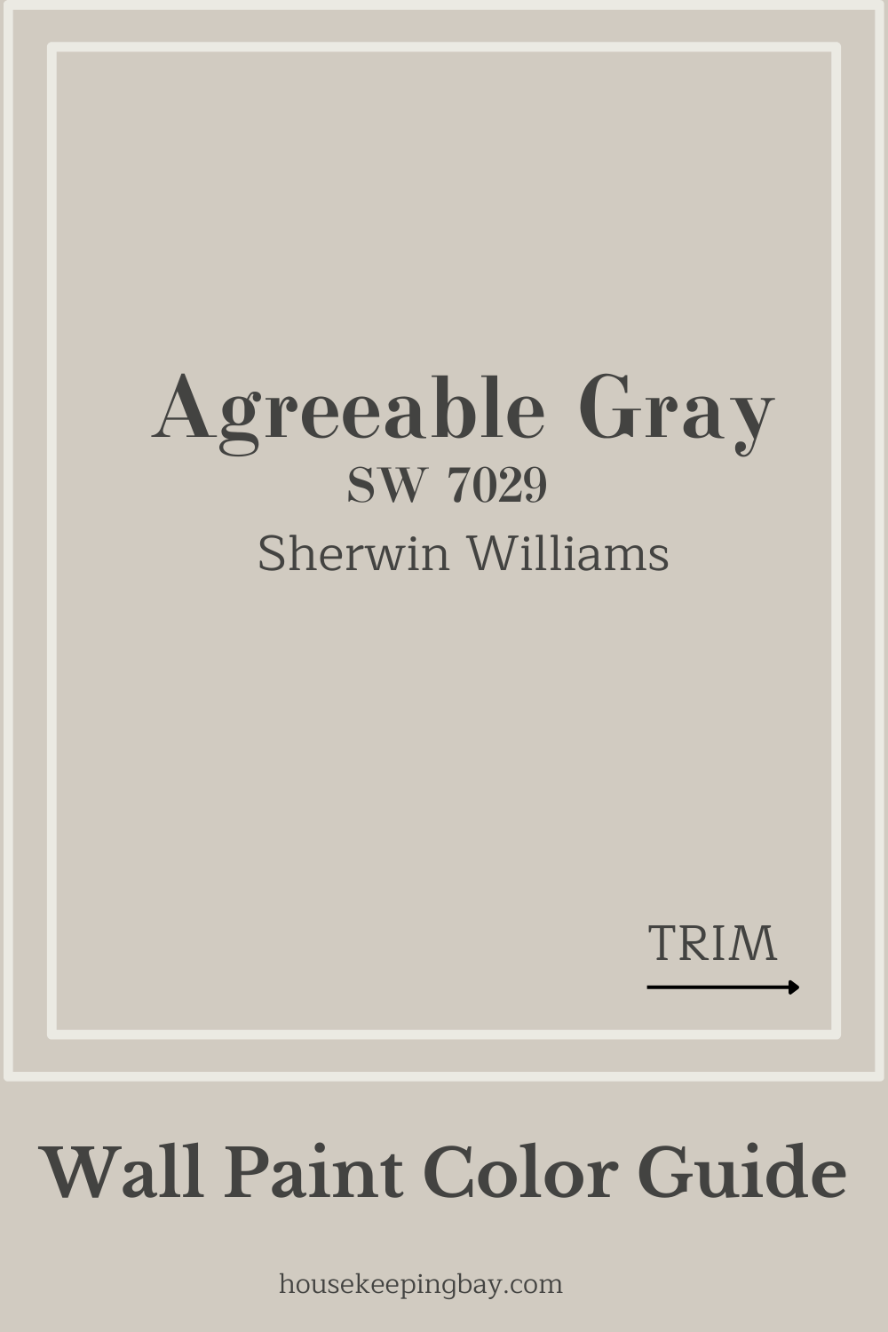
2. Sherwin Williams Agreeable Gray (SW 7029)
Agreeable Gray is probably the most popular greige ever — and for good reason.
Why it’s safe:
-
It’s a perfect mix of gray and beige.
-
No strong undertones jumping out.
My advice: If you’re nervous about choosing a color, start with Agreeable Gray. It almost always works.
housekeepingbay.com
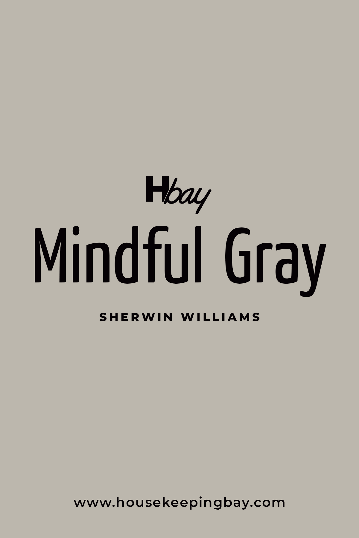
3. Sherwin Williams Mindful Gray (SW 7016)
Mindful Gray is a little deeper than Repose or Agreeable, but still neutral.
Why I trust it:
-
It has more body — perfect for a cozy living room or den.
-
It doesn’t have any sneaky purple or pink tones.
Personal note: I used this in my cousin’s house. Every wall looks perfect, day or night!
Housekeepingbay.com
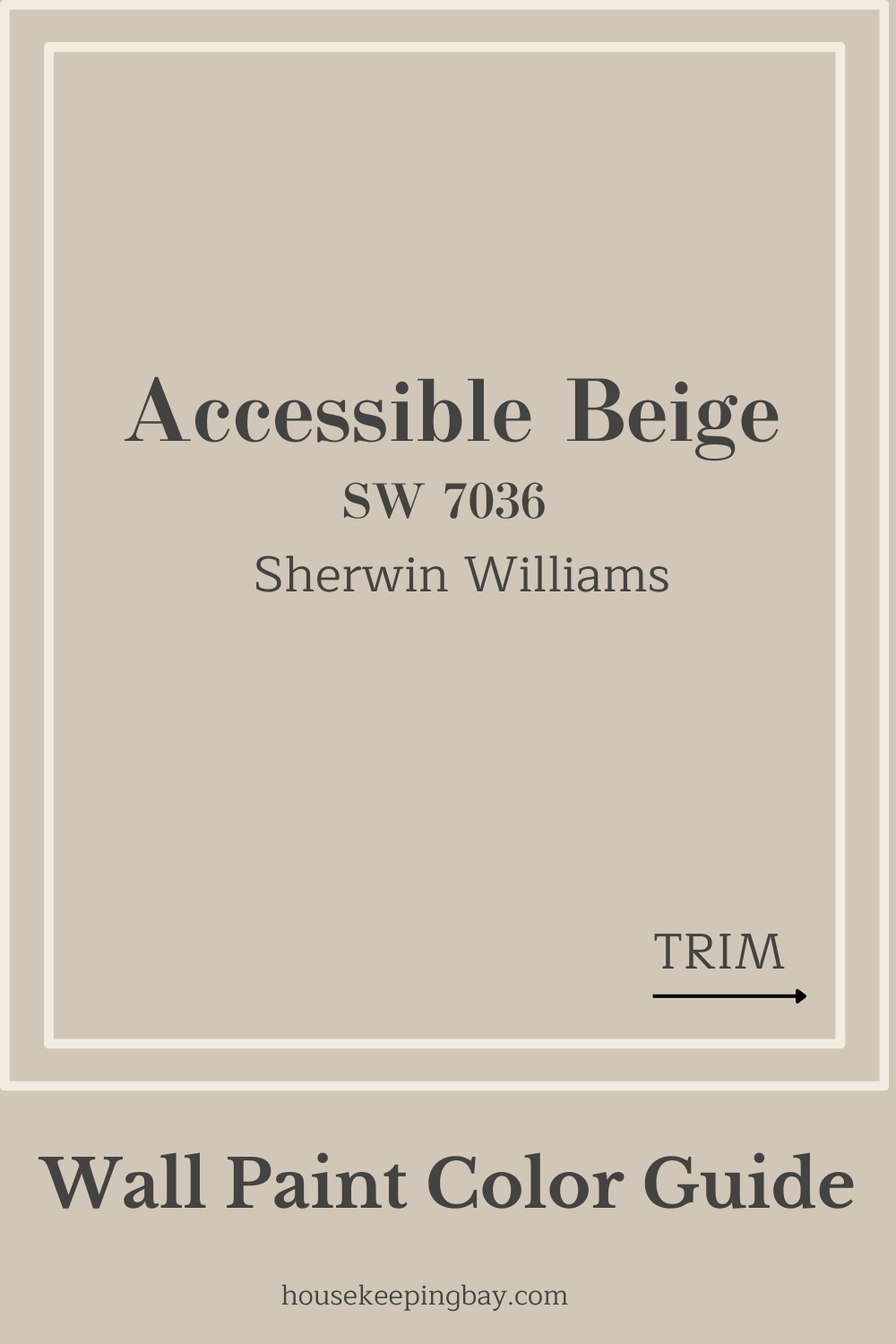
4. Sherwin Williams Accessible Beige (SW 7036)
Don’t be fooled by the name — Accessible Beige is actually a soft, warm greige.
Why it’s a gem:
-
A creamy, inviting feel without turning yellow or pink.
-
Works beautifully with wood floors.
My secret: I often pair this with white trim for a classic, timeless look.
5. Sherwin Williams Gossamer Veil (SW 9165)
Gossamer Veil is lighter and a touch cooler.
Why it’s special:
-
Very subtle and clean.
-
No noticeable pink, even in bright sunlight.
Pro tip: This is a fantastic choice for kitchens and bathrooms where you want a crisp, airy feeling.

housekeepingbay.com
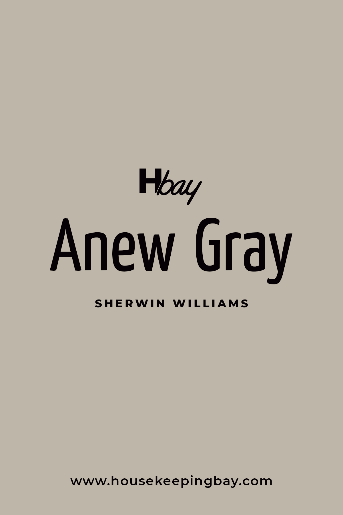
6. Sherwin Williams Anew Gray (SW 7030)
Anew Gray feels richer without being heavy.
Why it’s reliable:
-
Balanced warm-cool mix.
-
Great for making big rooms feel cozy without darkening them too much.
My advice: Pair it with brass fixtures for a gorgeous, modern look.
Housekeepingbay.com
7. Sherwin Williams Alpaca (SW 7022)
Alpaca is a slightly warmer greige — but don’t worry, it stays clear of pink.
Why I like it:
-
Very soft and calming.
-
Plays well with natural textures like linen and wood.
Personal note: I used this in a nursery project, and it created the coziest feeling.

Housekeepingbay.com
8. Sherwin Williams Incredible White (SW 7028)
Even though it’s called “white,” Incredible White is a beautiful soft greige.
Why it’s a favorite:
-
Subtle warmth without any peachy weirdness.
-
Makes small rooms feel bigger.
My tip: Perfect choice if you want a nearly white wall with just a hint of depth.
Quick fun fact:
A survey from HomeAdvisor showed that 40% of homeowners regret their paint color choices. Sampling before you commit can save a lot of money — and stress!

housekeepingbay.com
Tips for Testing Greige Paints at Home
Even the best greige can go wrong if you don’t test it the right way.
Here’s what I always do before picking a final color:
1. Buy Samples — Not Just Chips
Paint chips are too small and too printed.
I always get real paint samples and paint big squares on the wall — at least 2 feet by 2 feet.
2. Test on Multiple Walls
Color looks different on different walls!
I paint samples on:
-
A wall that gets lots of sunlight
-
A wall that’s mostly in shade
-
A wall near my furniture
3. Check Morning, Afternoon, and Night
Light changes all day long.
A color that looks perfect in the morning could look strange at night under lamps.
4. Use White Poster Boards (Optional Trick)
If you don’t want to mess up your walls yet, paint on big white poster boards and tape them around the room.
That way you can move them and see the color everywhere.
5. Watch What’s Around It
Look at your floors, your curtains, your couch.
They all reflect color onto the walls.
Personal Tip:
If your couch is a warm beige, it might make your greige walls look warmer too — and sometimes a little pinker.
👉 My favorite rule:
“Live with the samples for a full week before you choose.”
I tell every client this because it helps avoid rush decisions — and regret later!
housekeepingbay.com
Final Touches for a Beautiful Home
Choosing the right greige paint isn’t just about getting the color right.
It’s about creating a home that feels peaceful, inviting, and yours.
I always remind my clients — and myself — that walls are like the background music of your home.
If they’re off, everything else feels a little off too.
But when you find the perfect greige, it’s magic.
- Your furniture looks better.
- Your art pops.
- Your whole home feels pulled together, even if you’re still adding the finishing touches.
Remember:
-
Trust your eyes and your heart.
-
Take your time testing colors.
-
Don’t be afraid to repaint if it doesn’t feel right — paint is one of the easiest things to change.
As architect Frank Lloyd Wright said,
“The space within becomes the reality of the building.”
Your walls create that “within.”
They set the feeling you come home to every single day.
🎨 I hope my favorite Sherwin Williams greiges help you find the one that makes your home feel just right — no pink surprises, just pure, simple beauty.
housekeepingbay.com
