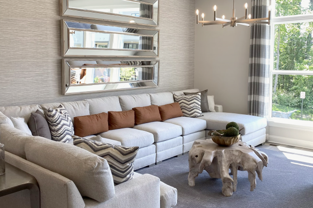
Faded Violet CSP-455 Paint Color by Benjamin Moore
In the world of interior design, color serves as a powerful tool to evoke emotions, set moods, and define spaces.
In the world of interior design, color serves as a powerful tool to evoke emotions, set moods, and define spaces. One such captivating hue that has been making waves is Benjamin Moore’s Faded Violet CSP-455. This delicate yet sophisticated shade adds a touch of elegance and tranquility to any room it graces.
In this exploration, we delve into the specifics of BM Faded Violet CSP-455, uncovering its unique characteristics, warmth or coolness, undertones, and the perfect coordinating colors for a harmonious interior palette.
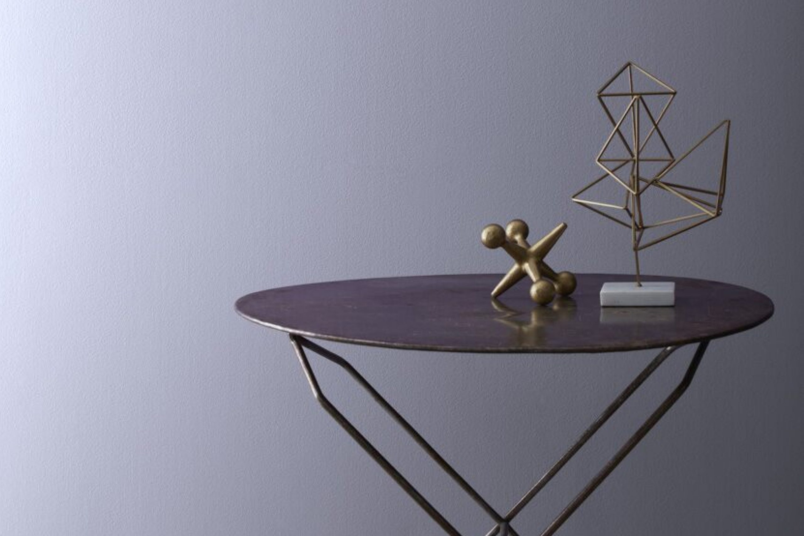
via benjamin moore
What Color Is BM Faded Violet CSP-455?
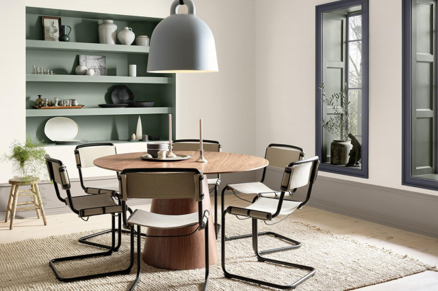
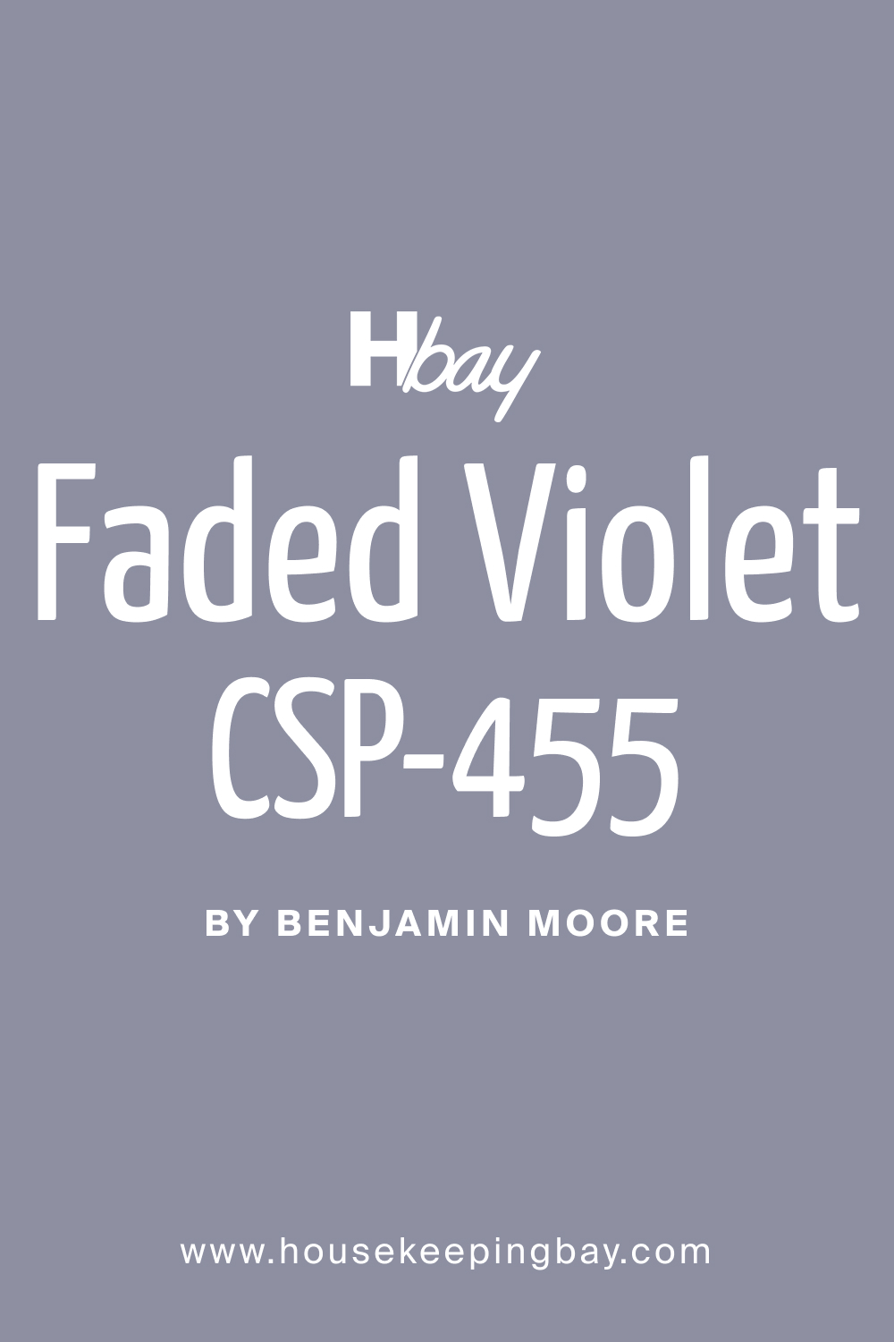
BM Faded Violet CSP-455 is a soft and muted violet with a hint of gray, creating a serene and sophisticated ambiance. Its muted nature allows it to be both subtle and impactful, making it a versatile choice for various interior styles. This color pairs seamlessly with contemporary and transitional design schemes, adding a touch of refinement to the space.
Faded Violet works exceptionally well with materials like brushed metal, light-colored woods, and fabrics with subtle textures, creating a balanced and visually appealing atmosphere.
housekeepingbay.com
Table of Contents
Is It a Warm or Cool Color?
BM Faded Violet CSP-455 leans towards the cooler side of the spectrum. This cool undertone imparts a sense of calmness and tranquility to the color, making it an ideal choice for bedrooms, living rooms, or spaces where a relaxing atmosphere is desired. The coolness of Faded Violet contributes to its versatility, allowing it to pair effortlessly with both warm and cool-toned furnishings and accessories.
In homes, this color’s cool undertone promotes a soothing and inviting environment, creating a retreat-like feel.
Undertones of BM Faded Violet CSP-455
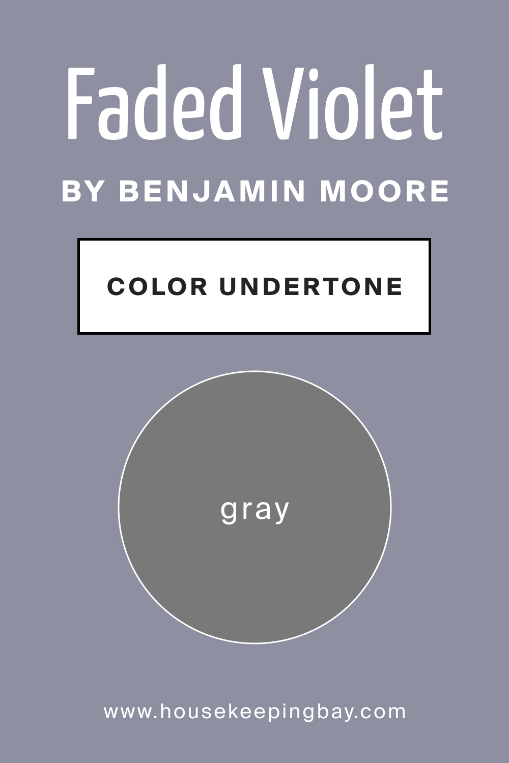
The undertones of BM Faded Violet CSP-455 are subtly grayish, adding depth and complexity to the color. Undertones play a crucial role in how we perceive a color, influencing its overall appearance and interaction with surrounding elements. In the case of Faded Violet, the gray undertones create a muted and sophisticated effect, preventing the color from being overly vibrant or intense.
When applied to interior walls, these undertones contribute to a nuanced and refined backdrop, allowing for a broad range of design possibilities from understated elegance to bold accents.
housekeepingbay.com
Coordinating Colors of BM Faded Violet CSP-455
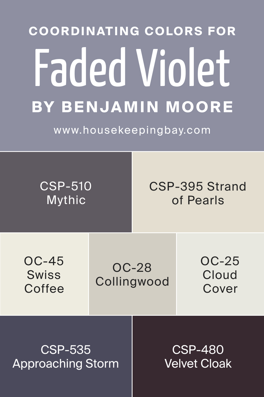
Coordinating colors are essential for creating a harmonious and visually appealing color scheme. BM Faded Violet CSP-455 pairs effortlessly with OC-25 Cloud Cover, CSP-395 Strand of Pearls, CSP-535 Approaching Storm, and OC-28 Collingwood.
- OC-25 Cloud Cover : A soft and neutral off-white, Cloud Cover provides a clean and fresh contrast to Faded Violet, creating a timeless and elegant look.
- CSP-395 Strand of Pearls : A delicate and subtle gray, Strand of Pearls complements Faded Violet, adding depth and sophistication to the color palette.
- CSP-535 Approaching Storm : A deep and muted gray, Approaching Storm pairs seamlessly with Faded Violet, creating a rich and elegant ambiance.
- OC-28 Collingwood : A warm and versatile neutral, Collingwood enhances the warmth of Faded Violet, offering a balanced and cohesive color scheme.
In addition to these coordinating colors, consider CSP-510 Mythic, CSP-480 Velvet Cloak, and OC-45 Swiss Coffee for a diverse and complementary palette that maintains the soft and sophisticated atmosphere introduced by Faded Violet. Beachcomber brings a hint of blue, Sea Star introduces a warm beige, and Swiss Coffee offers a creamy and neutral tone.
In the symphony of colors, the coordinated palette ensures that each shade complements the others, creating a cohesive and visually stunning interior. The delicate balance between Faded Violet and its coordinating colors allows for flexibility in design, making it suitable for a range of personal styles and preferences.
Whether you aim for a tranquil retreat or an elegantly curated space, the interplay of these colors will transform your home into a sanctuary of sophistication and style.
housekeepingbay.com
How Does Lighting Affect Faded Violet CSP-455?
Lighting is a crucial factor in how colors are perceived within a space, and Faded Violet CSP-455 is no exception. In natural light, this delicate violet shade takes on a softer and more muted appearance, allowing its subtle gray undertones to shine. In north-facing rooms, where light is cooler, Faded Violet maintains its elegance without becoming overly intense.
In south-facing rooms with abundant sunlight, the color appears warmer and more inviting. East-facing rooms, bathed in soft morning light, showcase Faded Violet’s versatility, while West-facing rooms with warm afternoon light enhance the richness of the color.
In artificial light, such as warm incandescent or cool fluorescent lighting, Faded Violet adapts, revealing different facets of its muted charm.
housekeepingbay.com
LRV of Faded Violet CSP-455
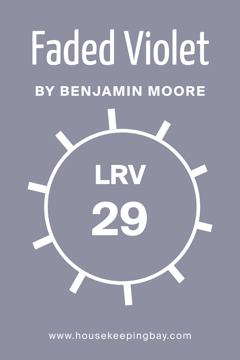
Light Reflectance Value (LRV) measures the percentage of light a color reflects. With an LRV of 29, Faded Violet has a relatively low reflectance, indicating a deeper and more subdued hue. Colors with lower LRV values, like Faded Violet, absorb more light, creating a sense of coziness and intimacy in a space.
This makes it well-suited for bedrooms, living rooms, or spaces where a serene and comforting ambiance is desired. The lower LRV value of Faded Violet also allows it to maintain a sophisticated presence without being too overpowering or dark.
housekeepingbay.com
What is LRV? Read It Before You Choose Your Ideal Paint Color
Trim Colors of Faded Violet CSP-455
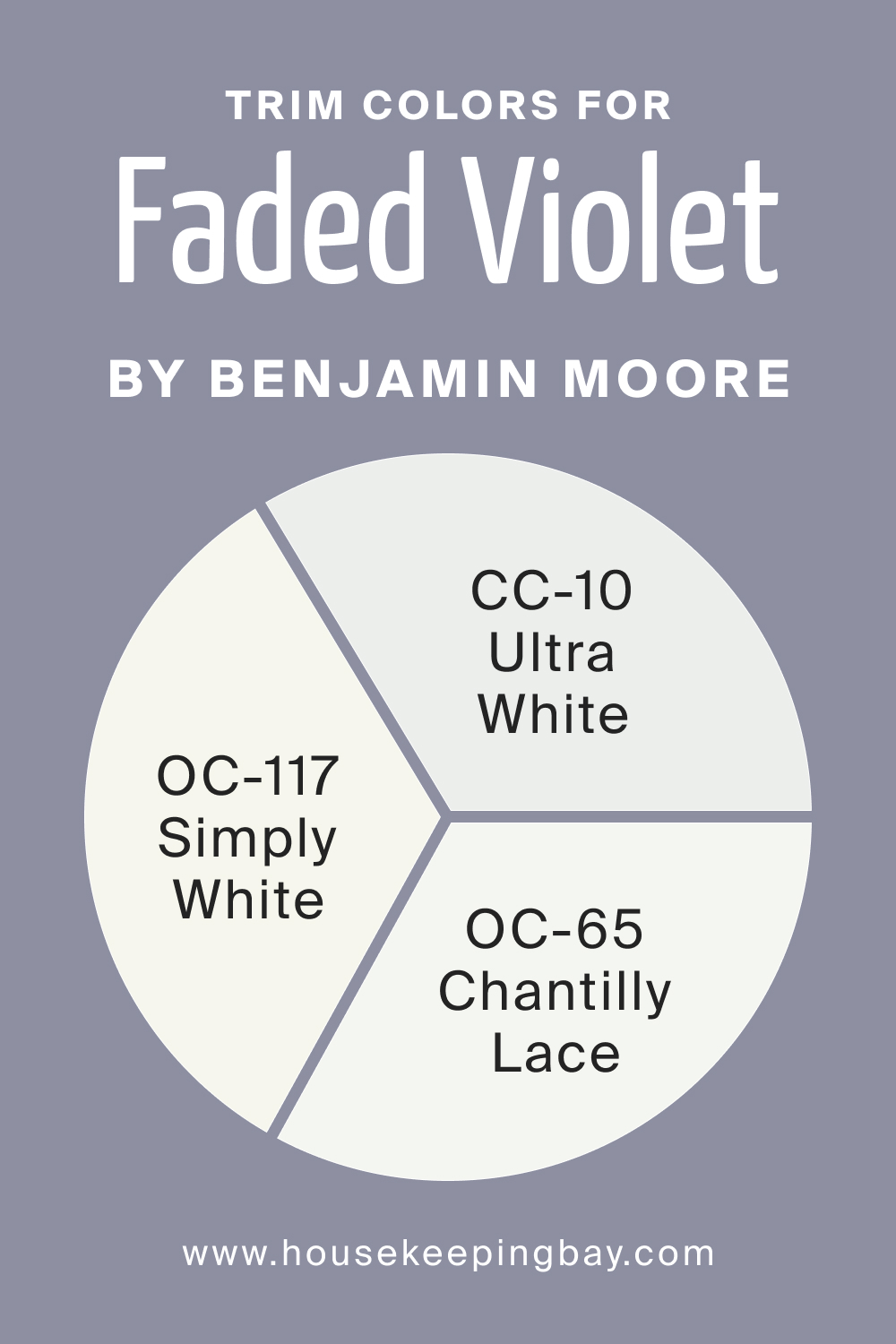
Trim colors play a crucial role in defining and accentuating architectural elements within a space. For Faded Violet CSP-455, consider shades of white from the same brand, such as OC-117 Simply White, CC-10 Ultra White, and OC-65 Chantilly Lace.
Simply White offers a crisp and clean contrast, Ultra White provides a bright and neutral backdrop, and Chantilly Lace imparts warmth and depth. These trim colors not only enhance the visual appeal of Faded Violet but also contribute to a cohesive and polished look within the room.
housekeepingbay.com
Colors Similar to Faded Violet CSP-455
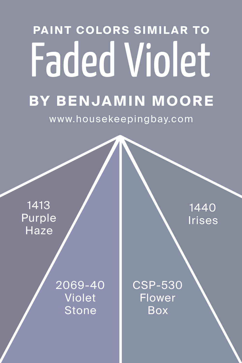
Knowing similar colors is important for creating a harmonious color palette. Colors like CSP-530 Flower Box, BM 2069-40 Violet Stone, BM 1440 Irises, and BM 1413 Purple Haze share the same violet undertones as Faded Violet. Flower Box brings a hint of coral warmth, Violet Stone introduces a deeper violet, Irises adds a touch of lavender, and Purple Haze imparts a subdued and sophisticated vibe.
- CSP-530 Flower Box : A soft coral with violet undertones, Flower Box adds a touch of warmth and vibrancy.
- BM 2069-40 Violet Stone : A deeper and more saturated violet, Violet Stone creates a rich and luxurious atmosphere.
- BM 1440 Irises : A delicate lavender with violet undertones, Irises introduces a calming and serene vibe.
- BM 1413 Purple Haze : A subdued and sophisticated violet, Purple Haze offers a muted and refined alternative to Faded Violet.
housekeepingbay.com
Colors That Go With Faded Violet CSP-455
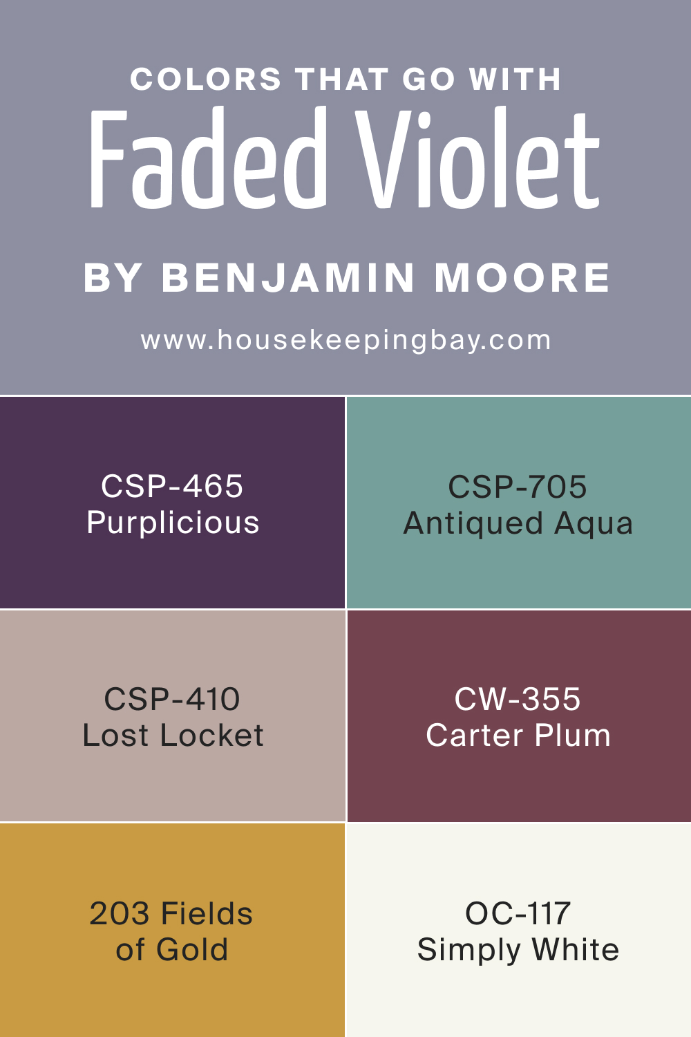
Harmonizing colors in a room is essential for a cohesive and visually appealing design. Colors that go well with Faded Violet include CSP-465 Purplicious, CSP-705 Antiqued Aqua, CSP-410 Lost Locket, CW-355 Carter Plum, OC-117 Simply White, and BM 203 Fields of Gold.
- CSP-465 Purplicious : A deep and saturated purple, Purplicious complements Faded Violet, creating a rich and sophisticated color palette.
- CSP-705 Antiqued Aqua : A soft and muted aqua, Antiqued Aqua adds a refreshing and contrasting element to Faded Violet.
- CSP-410 Lost Locket : A warm and earthy brown, Lost Locket pairs well with Faded Violet, creating a balanced and grounded look.
- CW-355 Carter Plum : A deep plum with violet undertones, Carter Plum enhances the richness of Faded Violet, adding depth and drama.
- OC-117 Simply White: A classic and clean white, Simply White provides a timeless and elegant contrast to Faded Violet.
- BM 203 Fields of Gold : A warm and muted yellow, Fields of Gold introduces a touch of brightness and warmth, complementing Faded Violet’s muted charm.
Understanding the interplay of these colors ensures a cohesive and visually stunning color scheme in any room. Whether creating a serene bedroom, a lively living room, or an elegant dining space, the careful selection of coordinating and complementary colors enhances the overall design, creating a harmonious and inviting atmosphere.
housekeepingbay.com
How to Use Faded Violet CSP-455 In Your Home?
Faded Violet CSP-455 is a versatile color that can be employed in various rooms and interior styles. Ideal for bedrooms and living rooms, it creates a tranquil and sophisticated atmosphere. This muted violet works well in contemporary, transitional, and even vintage design schemes, seamlessly adapting to different aesthetics.
How to Use Faded Violet CSP-455 in the Bedroom?
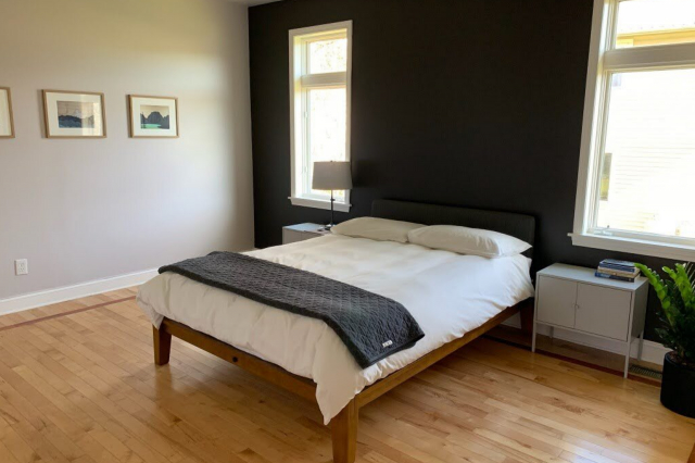
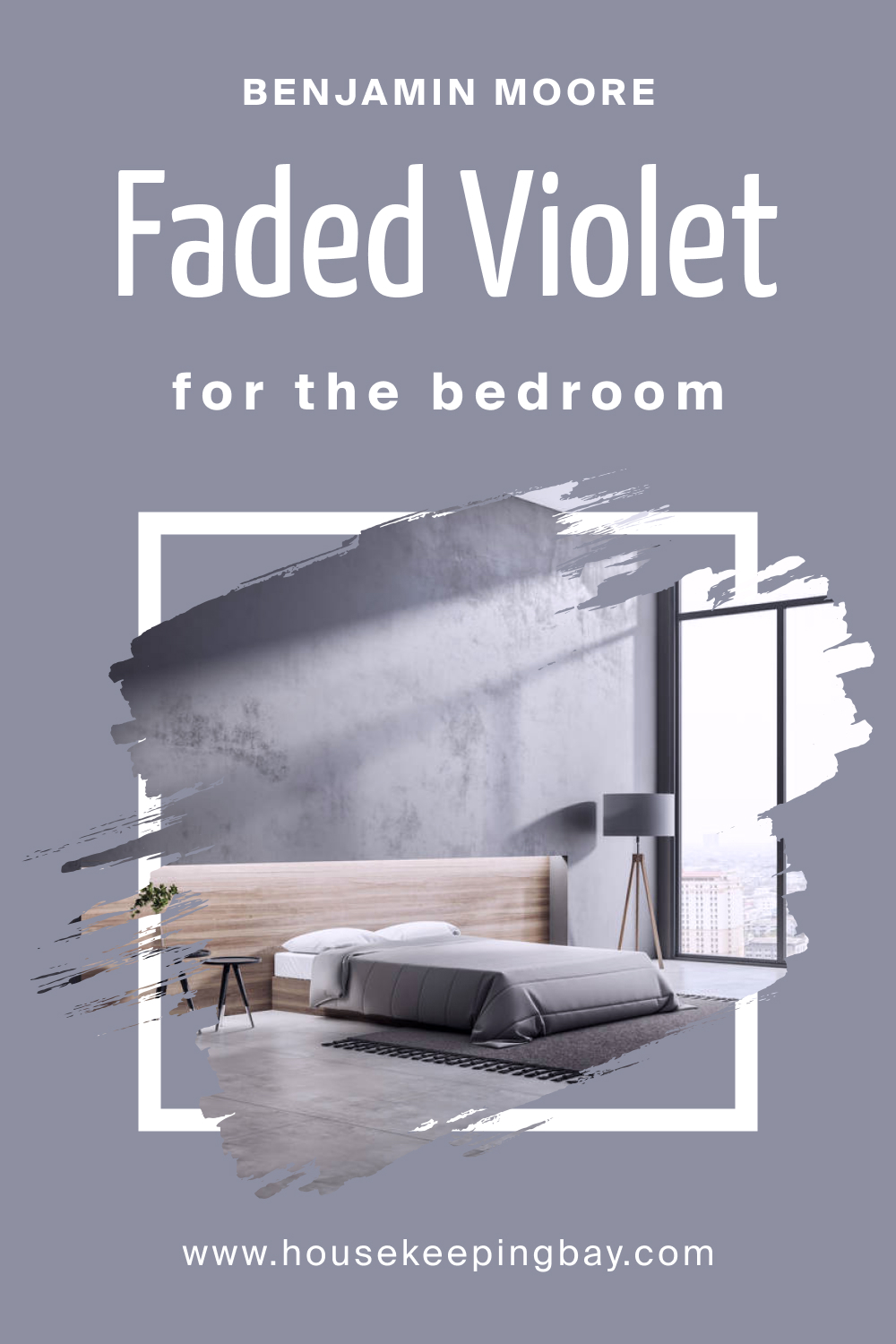
In the bedroom, Faded Violet CSP-455 brings a sense of serenity and sophistication. Use it as an accent wall or for the entire room to create a calming and elegant retreat. Pair with neutral bedding and soft textures for a cozy yet refined ambiance.
housekeepingbay.com
How to Use Faded Violet CSP-455 in the Bathroom?
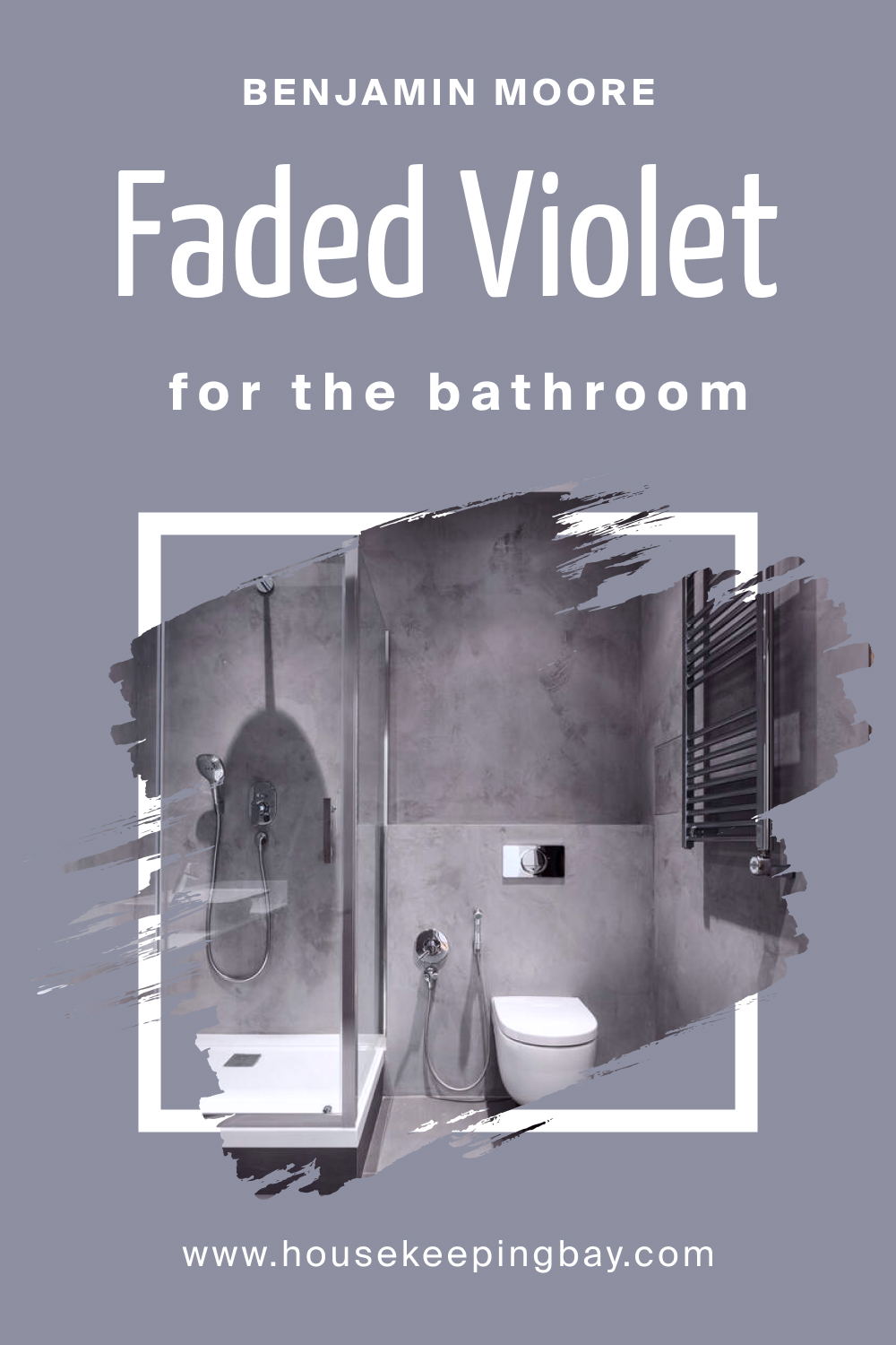
For a spa-like atmosphere in the bathroom, Faded Violet CSP-455 is an excellent choice. Apply it to walls or cabinets, complemented by white fixtures and chrome accents, to create a sophisticated and calming
housekeepingbay.com
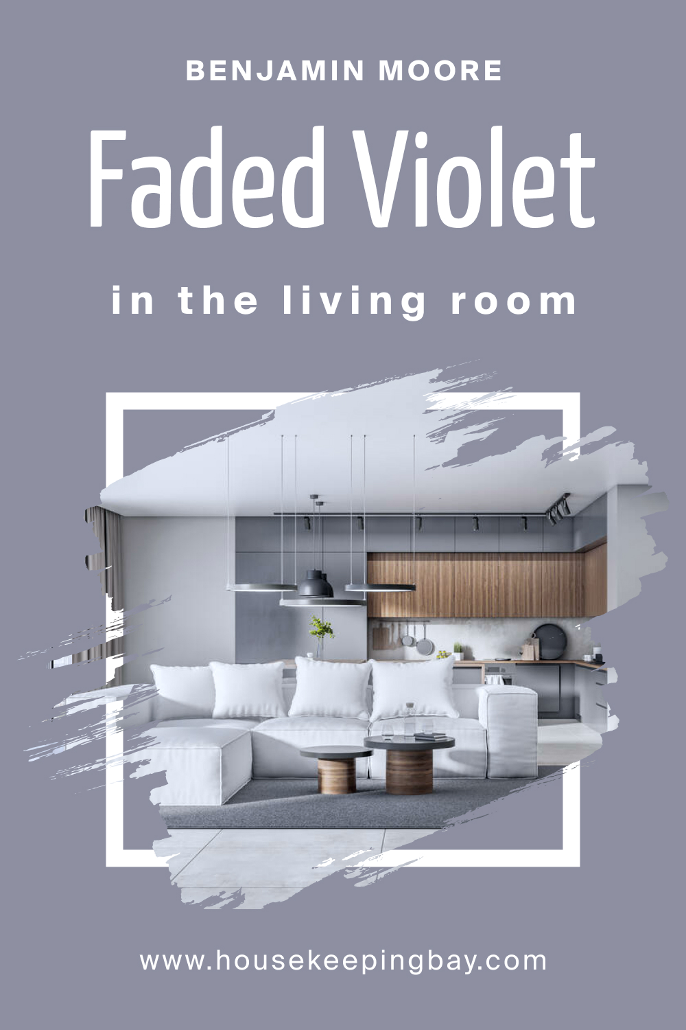
retreat.How to Use Faded Violet CSP-455 in the Living Room?
In the living room, Faded Violet CSP-455 adds a touch of refinement. Use it on walls or as an accent color paired with neutral furniture to create a sophisticated and inviting space. This color complements various decor styles, from modern to traditional.
housekeepingbay.com
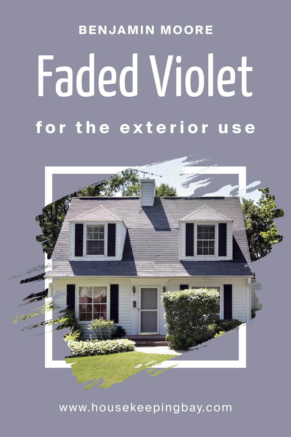
How to Use Faded Violet CSP-455 for an Exterior?
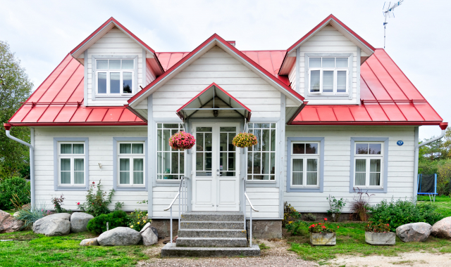
For an exterior that stands out, use Faded Violet CSP-455 on the front door. Pair it with neutral siding and trim colors for a bold and elegant curb appeal. This color choice adds a contemporary touch to the exterior while maintaining timeless sophistication.
housekeepingbay.com
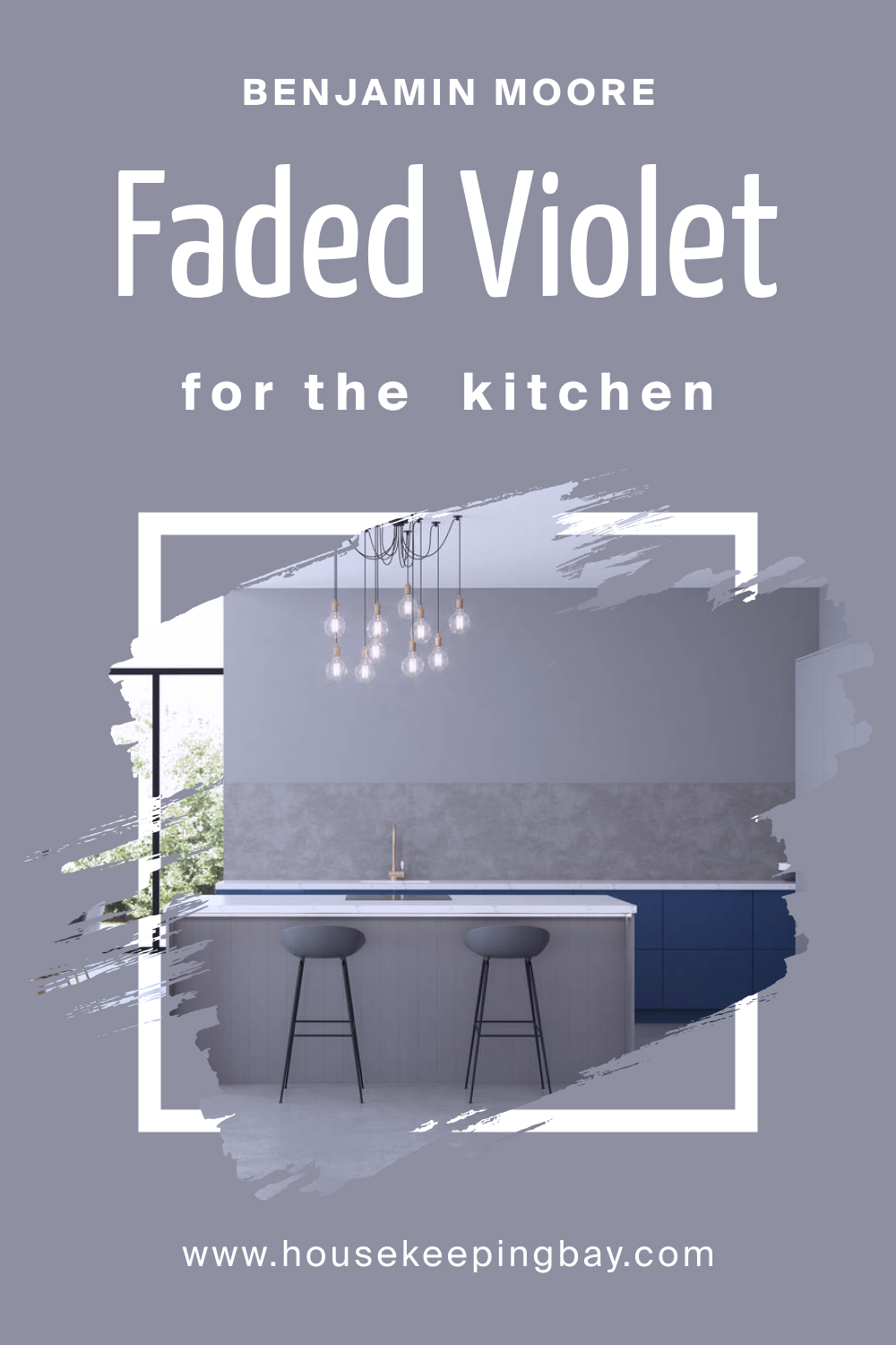
How to Use Faded Violet CSP-455 in the Kitchen?
In the kitchen, Faded Violet CSP-455 brings a modern and chic vibe. Apply it to walls or cabinets, complemented by stainless steel appliances and white or light-colored countertops. This color adds a touch of sophistication to the heart of the home.
housekeepingbay.com
How to Use Faded Violet CSP-455 on the Kitchen Cabinets?
Transform your kitchen by using Faded Violet CSP-455 on kitchen cabinets. Pair it with light-colored countertops and neutral backsplashes for a balanced and stylish look. The muted elegance of Faded Violet adds a touch of luxury to the kitchen, creating a timeless and inviting space.

housekeepingbay.com
Comparing Faded Violet CSP-455 With Other Colors
Comparing different colors is a crucial step in choosing the right shade for your space. It allows for a nuanced understanding of the undertones, intensities, and overall vibes each color brings, ensuring the perfect fit for your design vision.
Faded Violet CSP-455, with its muted elegance, demands consideration alongside other colors to create a cohesive and visually pleasing palette that suits your preferences and style.
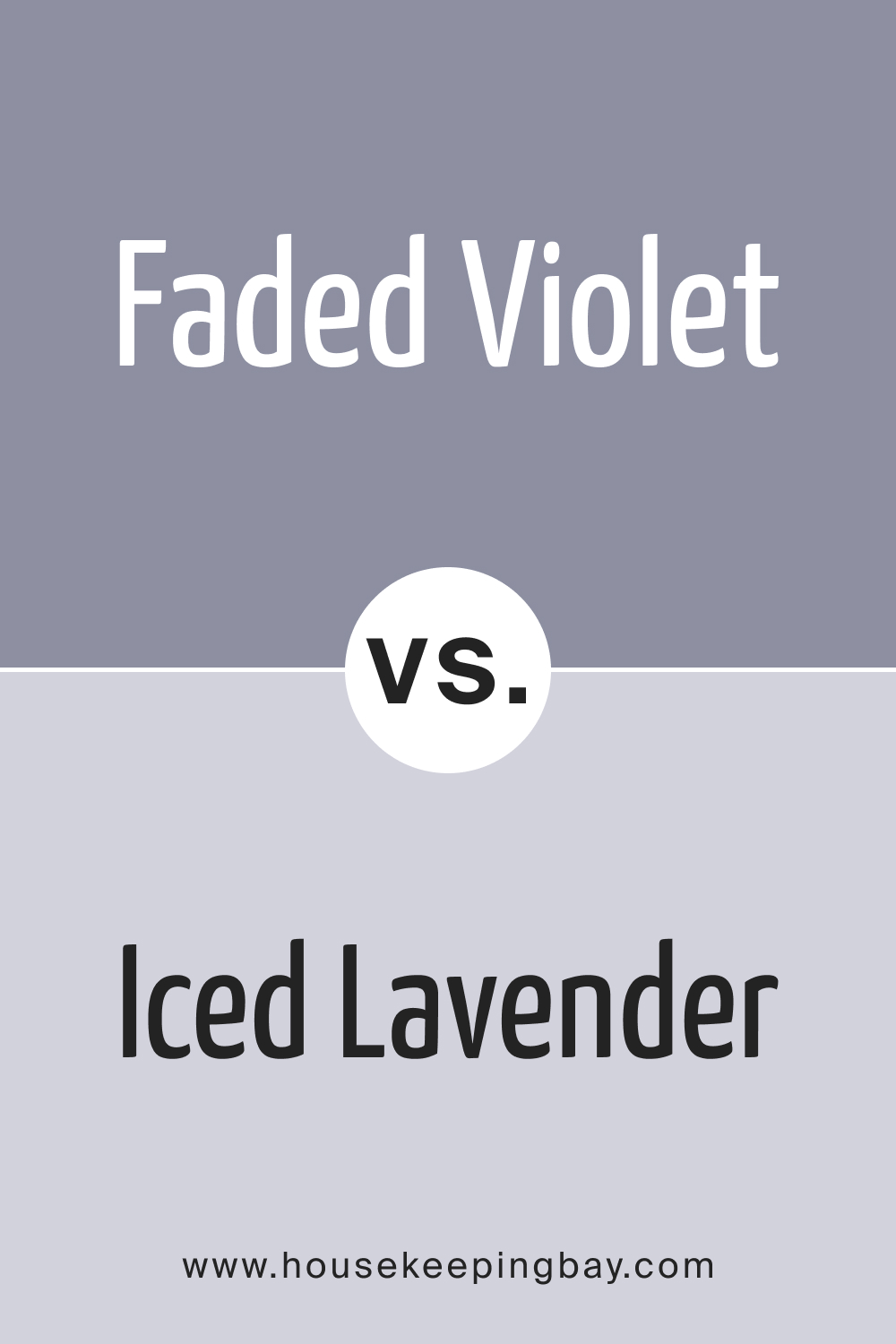
Faded Violet CSP-455 vs. BM 1410 Iced Lavender
While both share a violet base, Iced Lavender is cooler and lighter, providing a fresher and airier feel compared to the subdued sophistication of Faded Violet.
housekeepingbay.com
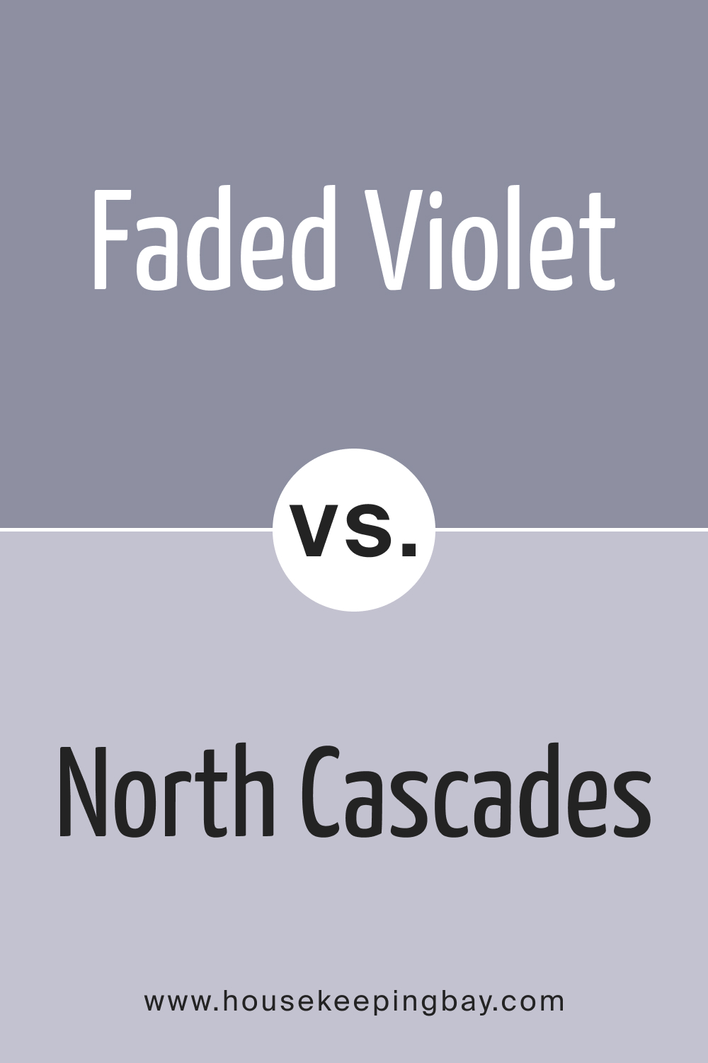
Faded Violet CSP-455 vs. BM 1411 North Cascades
North Cascades , with its gray undertones, appears darker and more muted than Faded Violet, making it a bolder choice for those seeking a richer color palette.
housekeepingbay.com
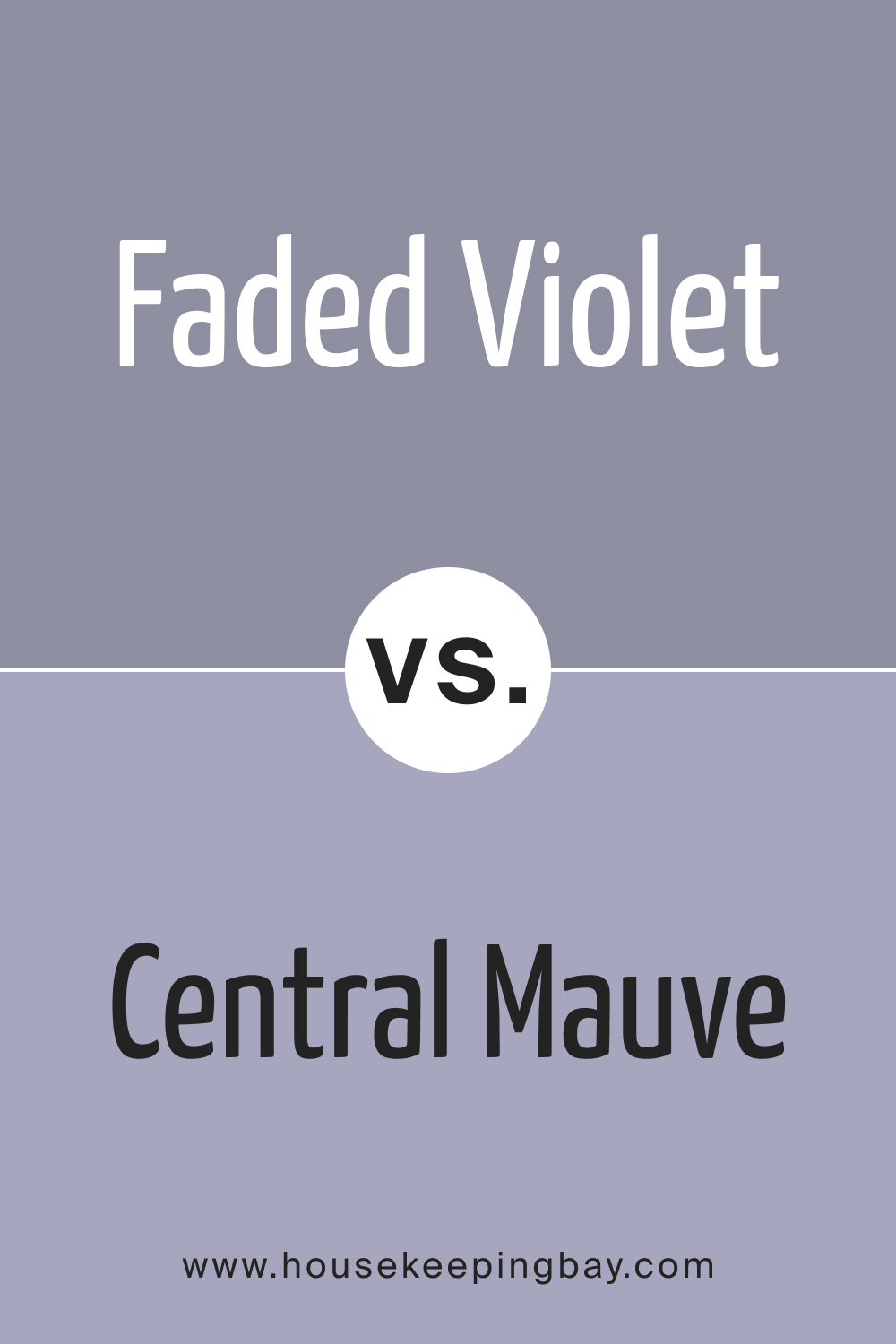
Faded Violet CSP-455 vs. BM 1412 Central Mauve
Central Mauve introduces warmth and depth, leaning towards taupe, in contrast to Faded Violet’s cooler and more muted profile, offering diverse options for different design aesthetics.
housekeepingbay.com
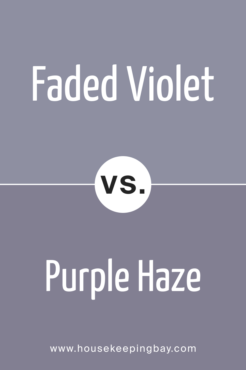
Faded Violet CSP-455 vs. BM 1413 Purple Haze
While both share violet undertones, Purple Haze is more intense and saturated, making Faded Violet an ideal choice for those seeking a subtler and sophisticated color scheme.
housekeepingbay.com
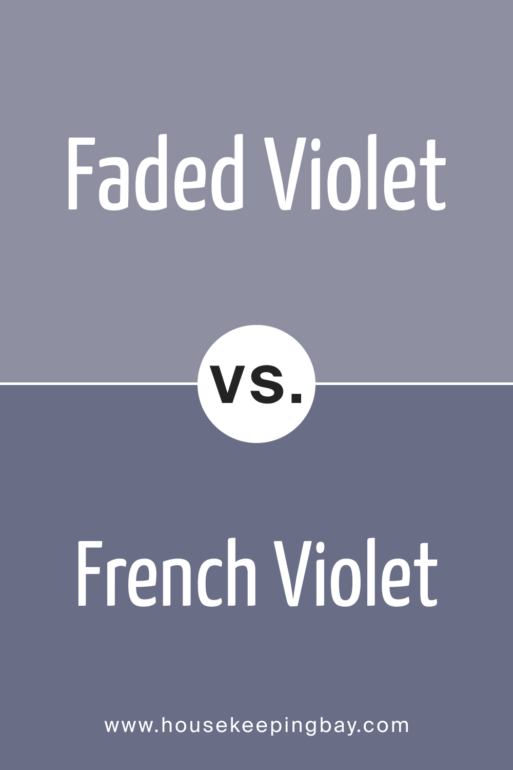
Faded Violet CSP-455 vs. BM 1427 French Violet
French Violet , with its brighter and more vibrant hue, contrasts Faded Violet’s muted elegance, providing options for different levels of intensity and visual impact.
housekeepingbay.com
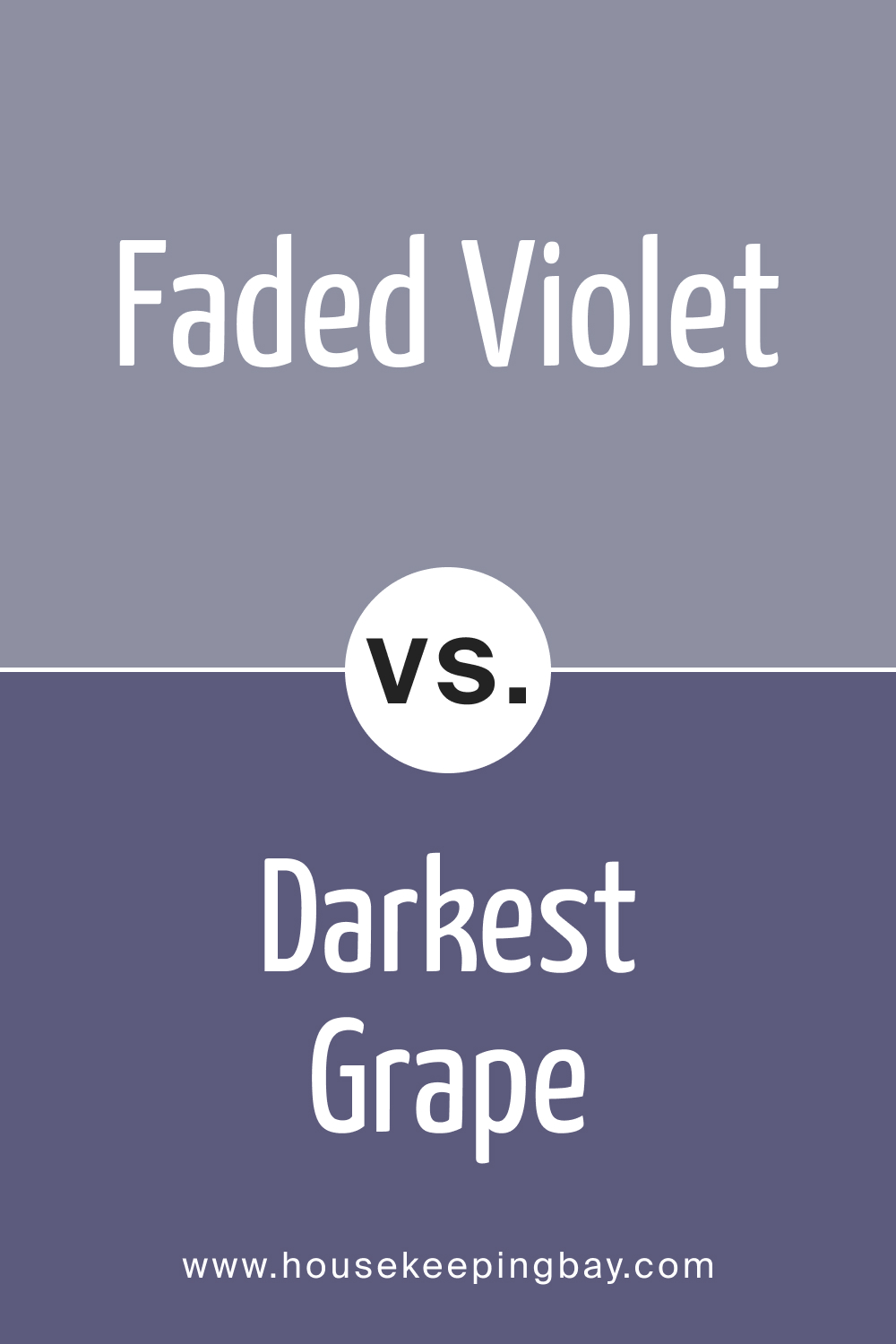
Faded Violet CSP-455 vs. BM 2069-30 Darkest Grape
Darkest Grape , as the name suggests, is significantly deeper and darker than Faded Violet, offering a more dramatic and bold choice for those looking to make a statement with their color selection.
housekeepingbay.com
Conclusion
In the rich tapestry of colors, the comparison of Faded Violet CSP-455 with its counterparts emphasizes the importance of thoughtful selection. Understanding the subtle differences in undertones, intensity, and mood allows for a more informed decision, ensuring that the chosen color aligns seamlessly with your design aspirations.
Whether seeking a muted and elegant feel or a bolder and more intense presence, the comparison of colors provides the palette needed to turn your space into a harmonious and visually stunning masterpiece.
housekeepingbay.com
Ever wished paint sampling was as easy as sticking a sticker? Guess what? Now it is! Discover Samplize's unique Peel & Stick samples. Get started now and say goodbye to the old messy way!
Get paint samples




Frequently Asked Questions
⭐Is BM Faded Violet CSP-455 suitable for a small room?
Absolutely! Faded Violet CSP-455, with its muted and sophisticated tone, can work wonders in a small room. The color's subtlety adds depth without overwhelming the space, creating a cozy and elegant atmosphere.
⭐Can Faded Violet CSP-455 be used with bold furniture and accessories?
Certainly! Faded Violet's muted elegance allows it to pair well with bold furniture and accessories. Consider vibrant hues like gold, emerald, or navy for a striking and sophisticated color combination.
⭐Does Faded Violet CSP-455 work well with natural light?
Yes, it does! Faded Violet adapts beautifully to natural light, taking on a soft and inviting appearance. The color's versatility ensures it complements various lighting conditions, creating a harmonious atmosphere in any room.
⭐Can I use Faded Violet CSP-455 in a vintage-themed room?
Absolutely! Faded Violet's muted and timeless quality makes it a perfect choice for a vintage-themed room. Pair it with antique furniture, distressed finishes, and soft textures to evoke a sense of classic charm.
⭐Is Faded Violet CSP-455 difficult to pair with other colors?
Not at all! Faded Violet is a versatile color that pairs well with various neutrals, grays, and even bold accents. Consider coordinating it with whites, grays, or muted pastels for a balanced and elegant color scheme.

