Dignified SW 6538 by Sherwin Williams
A Rich Touch for Your Space
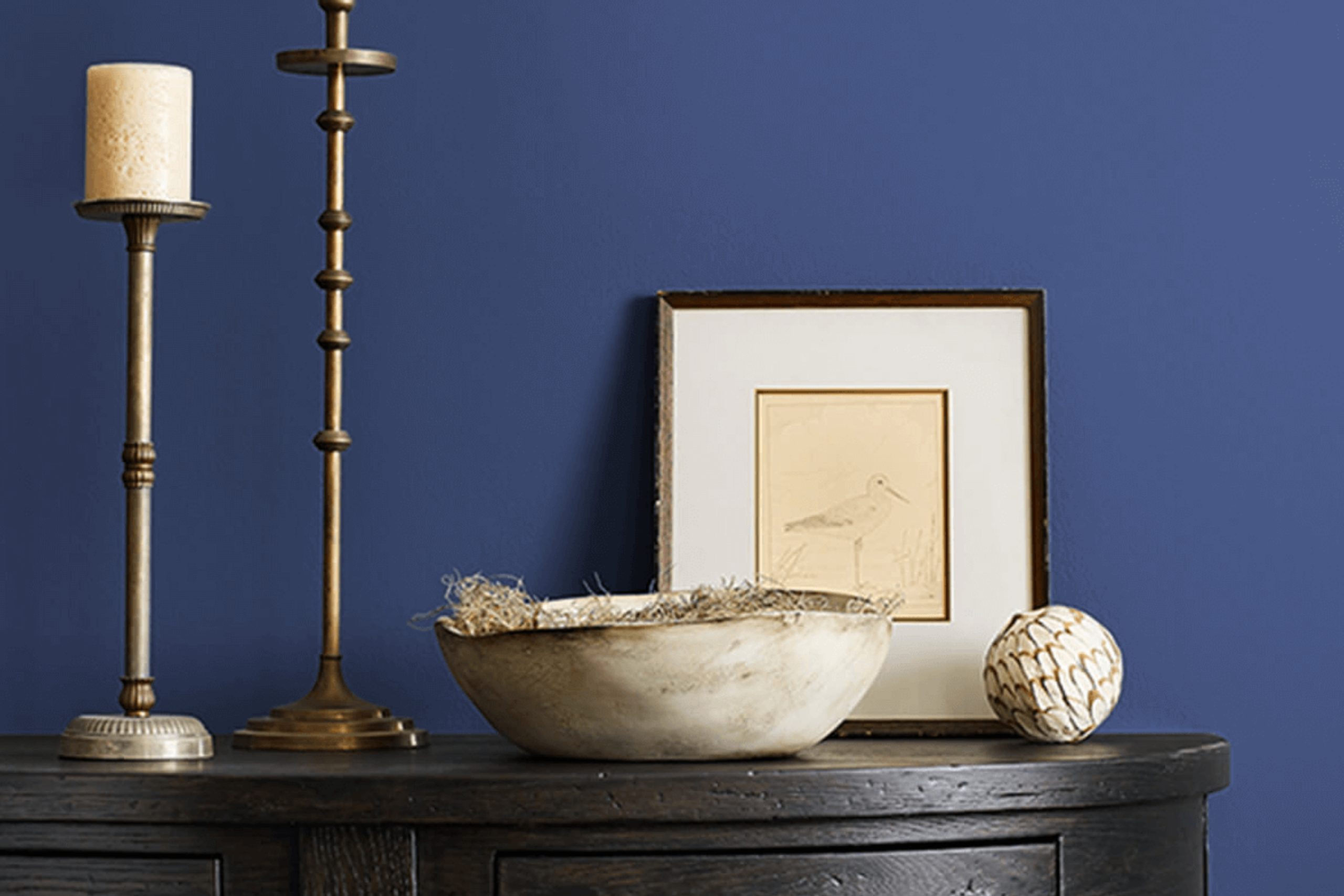
Choosing the right paint color can truly change the mood of a room. Sherwin Williams SW 6538 Dignified is one of those shades that can offer a sense of elegance and calm to any space. It’s a rich blue, deep and full of character, but not so overpowering that it dominates the room. Instead, it provides a backdrop that makes other elements in your space stand out while still pulling everything together.
Imagine sitting in a room painted in this color. It feels soothing, like a quiet evening where you can unwind and feel at home. It’s sophisticated yet comforting, perfect for a bedroom, study, or any place where you want to create a peaceful environment.
The color pairs beautifully with both light and dark accent colors, offering flexibility when it comes to furniture and decor choices.
Consider using SW 6538 Dignified to create a space that reflects your style while maintaining a timeless appeal.
It’s about finding that balance between beauty and serenity, helping your space resonate with the right energy. As you choose colors for your home, think about how this shade can bring a sense of quiet elegance to your surroundings.
via sherwin-williams.com
What Color Is Dignified SW 6538 by Sherwin Williams?
Table of Contents
Dignified SW 6538 by Sherwin Williams offers a rich, deep blue tone with a hint of regal elegance. It brings a sense of calm and sophistication to spaces. This color works beautifully in interiors that need a touch of depth without overwhelming the senses.
In terms of interior styles, Dignified fits perfectly within traditional and contemporary settings. It pairs well with modern design elements, providing a strong contrast to white or light-colored furniture. It’s equally at home in a classic decor, complementing dark woods and vintage pieces.
This versatile shade enhances a room’s ambiance, whether used on walls or as an accent color.
Dignified harmonizes with various materials and textures. Consider pairing it with natural materials like rich woods and organic textiles. Imagine plush velvet sofas or chairs in a similar tone to add warmth and comfort.
This color also pairs well with metals like brass or gold, offering a luxurious touch. For additional texture, incorporate woven fabrics or natural fibers to create a welcoming environment.
In lighting, Dignified’s depth shines, especially in spaces with soft, warm lighting. Whether used in a living room or bedroom, this color creates an inviting atmosphere, making any space feel cozy and refined.
housekeepingbay.com
Is Dignified SW 6538 by Sherwin Williams Warm or Cool color?
Dignified SW 6538 by Sherwin Williams is a rich, deep blue color that can bring a sense of sophistication to any room. Its deep tone provides a strong visual impact, making it perfect for creating an accent wall or for use in a study or library where a serious, focused atmosphere is desired.
This color pairs well with lighter, neutral shades, which can help to balance its intensity and create a visually pleasing space.
In living rooms, Dignified SW 6538 can serve as a strong backdrop for art pieces or a statement piece of furniture, allowing these items to stand out even more. In bedrooms, it creates a calm, cozy environment that encourages relaxation and rest. This color works well with natural materials like wood and leather, enhancing their warmth and texture.
Overall, Dignified SW 6538 adds depth and character to spaces, making rooms feel more intimate and refined. It’s a versatile color that brings a touch of elegance to homes.
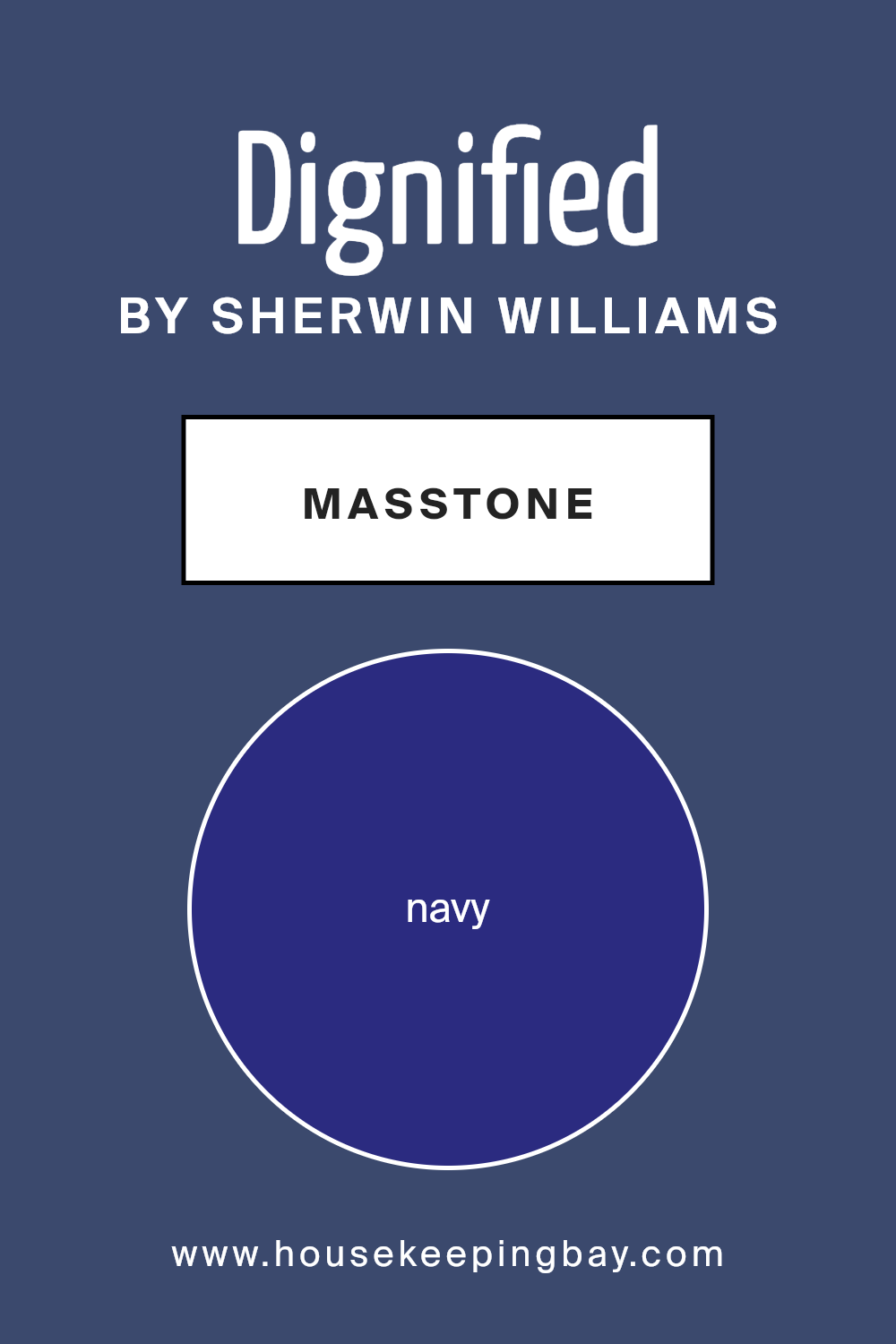
What is the Masstone of the Dignified SW 6538 by Sherwin Williams?
Dignified SW 6538 by Sherwin Williams is a rich navy color, identified by the code #2B2B80. This deep shade works beautifully in homes for creating a cozy and stylish ambiance. Navy colors like Dignified have a classic appeal, making them versatile for various room designs.
In living rooms or bedrooms, this color can add warmth and sophistication. When used on an accent wall, it draws the eye and provides a striking contrast against lighter surroundings. Pairing it with white or lighter neutrals can brighten the space, making it feel inviting yet elegant.
Dignified can also work well in smaller areas like bathrooms or home offices, adding depth without overwhelming the space. It pairs nicely with metallic accents, such as gold or silver, enhancing its chic appearance.
Overall, this is a color choice that brings a sense of calm and polished luxury to any room in the home.
housekeepingbay.com
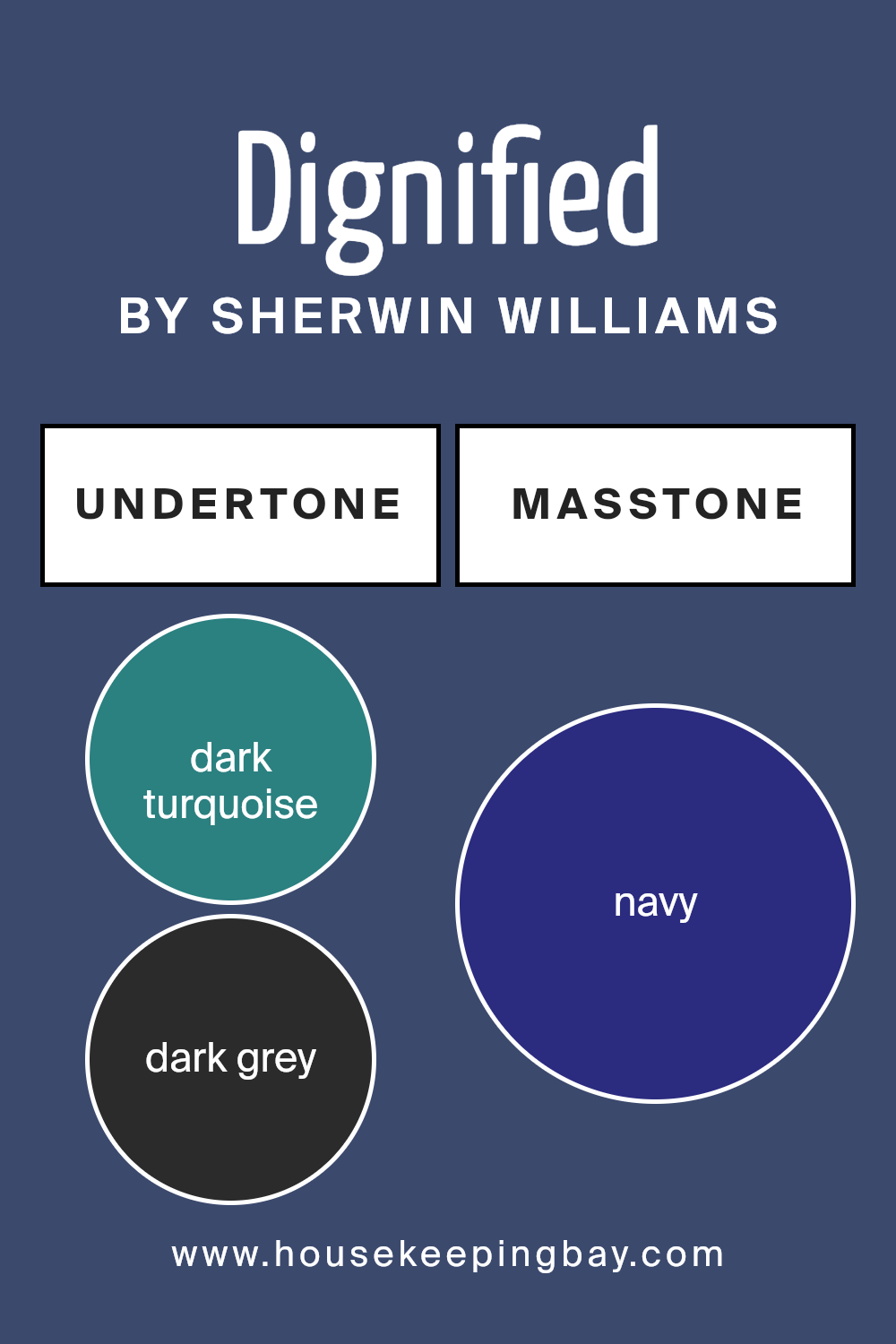
Undertones of Dignified SW 6538 by Sherwin Williams
Dignified SW 6538 by Sherwin-Williams is a complex color with rich undertones. These undertones significantly affect how the color appears in different lighting conditions and when paired with other colors in a room. The dark turquoise, dark gray, and dark green give Dignified a strong, earthy foundation, making it feel grounded and stable. These undertones can add a touch of elegance and sophistication to a space.
The purple and violet hints introduce a sense of depth and luxury, subtly enhancing the paint’s richness. Grey and lilac undertones can make the hue feel softer and more versatile, adapting well to various interior styles.
Dark blue and blue tones contribute to a cool, calming atmosphere, potentially making a room feel larger and more open. Olive adds warmth, complementing the cooler tones and creating a balance that adds interest.
Lastly, the brown undertone gives Dignified warmth, adding a natural and inviting feel.
On interior walls, Dignified SW 6538 can change throughout the day. Morning light may highlight the cooler blue tones, while evening light might bring out the warmer brown and olive shades, creating a cozy, inviting atmosphere. These undertones give the color a versatile character, allowing it to fit in both traditional and modern settings.
housekeepingbay.com
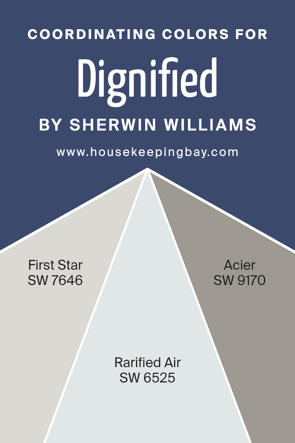
Coordinating Colors of Dignified SW 6538 by Sherwin Williams
Coordinating colors are hues chosen to work harmoniously with a main color, enhancing its visual appeal and creating a balanced look. When you look at Dignified SW 6538 by Sherwin Williams, you find a richly nuanced blue that stands strong on its own.
To find coordinating colors, you look for shades that either complement or contrast with it in a pleasing way. SW 7646 – First Star is a gentle, neutral gray that provides a light, airy backdrop. Its subtle presence can highlight Dignified’s depth by offering a brightening counterbalance without overwhelming the space.
On the other hand, SW 6525 – Rarified Air brings a touch of soft, cool blue that mirrors calmness. This shade adds a whisper of color that keeps the palette light and cohesive, while still echoing the main hue’s undertones. Lastly, SW 9170 – Acier presents itself as a warm, versatile gray, offering slight earthiness.
It works to anchor the boldness of Dignified, bringing warmth and depth. Together, these coordinating colors create a palette that feels unified and sophisticated, allowing each shade to enhance the other’s qualities, resulting in a visually appealing and harmonious environment.
You can see recommended paint colors below:
- SW 7646 First Star
- SW 6525 Rarified Air
- SW 9170 Acier
housekeepingbay.com
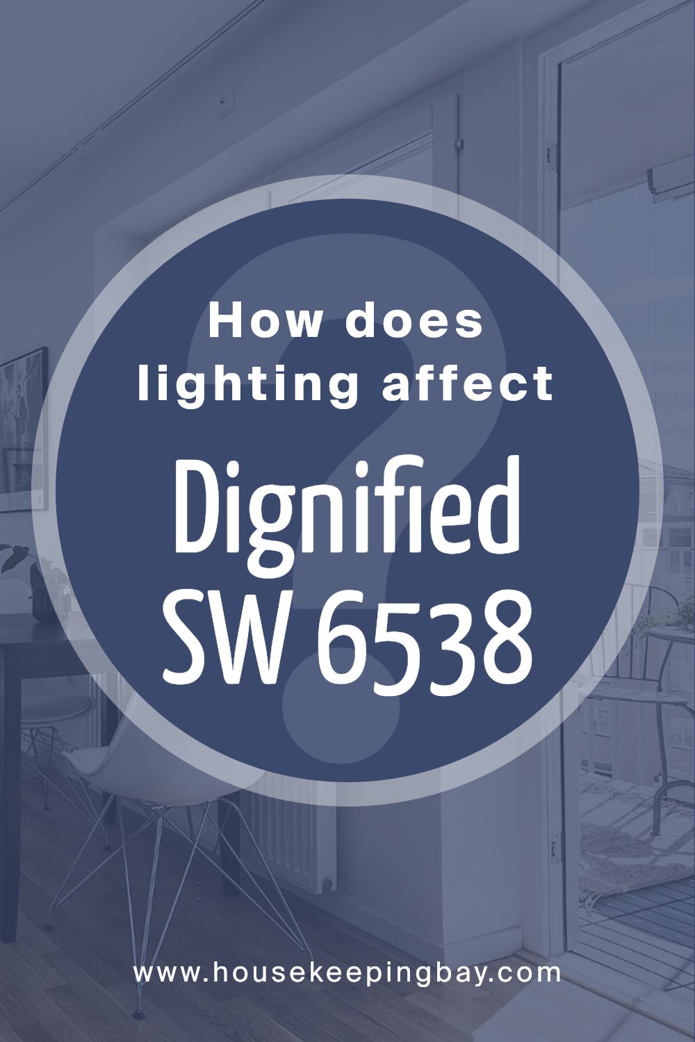
How Does Lighting Affect Dignified SW 6538 by Sherwin Williams?
Lighting has a significant impact on how colors appear in a space. The color of walls can change dramatically depending on whether the light is natural or artificial. Sherwin Williams’ “Dignified” (SW 6538) is no exception. It’s a rich, deep blue that can be quite versatile, but its appearance can vary significantly based on lighting conditions.
In natural light, “Dignified” tends to show more of its true blue tones. When used in a north-facing room, the color can appear cooler and more muted since these rooms get indirect light that’s softer and often bluer in tone. This can make the “Dignified” color feel a bit more subdued and grayish.
In south-facing rooms, the abundance of natural light tends to be warmer and more direct. Here, “Dignified” can appear brighter and its richness is enhanced. The light brings out the color’s depth, making it appear more vibrant and full-bodied.
East-facing rooms receive warm morning light that becomes cooler and more neutral as the day progresses. In the morning, “Dignified” might seem softer and more welcoming. As the day goes on, the color can get cooler and slightly more intense.
West-facing rooms enjoy warm light in the afternoon and evening. In the morning, these rooms can appear a bit dark and the color might look heavier. However, as the sun sets, the golden tones can bring out the depth and sophistication of “Dignified,” making it feel warmer and richer.
Under artificial light, the color’s appearance can change depending on the type of lighting. Incandescent bulbs, with their warm, yellowish glow, can soften “Dignified,” making it appear cozier. LED lights, which have various tone options, can either enhance the color’s brightness or make it cooler, depending on their specific warmth.
Fluorescent lighting, often cooler and less flattering, can make “Dignified” seem duller or more muted. Thus, it’s important to consider the type of artificial lighting used when applying this color indoors.
housekeepingbay.com
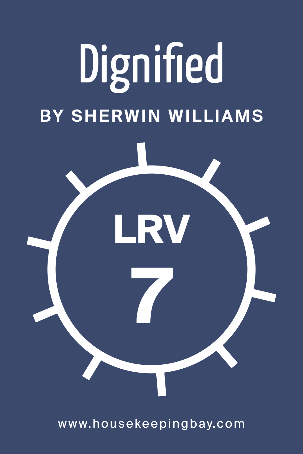
What is the LRV of Dignified SW 6538 by Sherwin Williams?
LRV stands for Light Reflectance Value. It’s a measure from 0 to 100 that shows how much light a color reflects. A higher LRV means the color reflects more light, making spaces feel lighter and brighter. A lower LRV indicates that the color absorbs more light, which can make a room feel cozier and more intimate.
When choosing paint, it’s important to consider LRV because it affects how a color looks under different lighting. Natural and artificial light can change the way we see colors, and LRV helps predict whether a color will make a room feel open or snug.
The LRV of Dignified SW 6538 by Sherwin Williams is 6.819. This is on the low side, meaning it’s a dark color that absorbs a lot of light. On walls, this color can create a rich, enveloping atmosphere. In a room with lots of natural light, Dignified will show its depth beautifully without overwhelming the space.
However, in a room with less light, the color can make the space feel more intimate and cozy.
Dark colors like this one may also require multiple coats to achieve an even finish, due to their light-absorbing nature. This low LRV means that Dignified is a bold choice best suited for spaces where you want a dramatic yet sophisticated feel.
housekeepingbay.com
What are the Trim colors of Dignified SW 6538 by Sherwin Williams?
Trim colors refer to the shades used on the edges or borders of a room, such as baseboards, window frames, and moldings. They serve as an accent to the main wall color, creating contrast and highlighting architectural details.
Trim colors are important because they can enhance the overall appearance of a space by adding depth and interest. For Dignified SW 6538 by Sherwin Williams, using the right trim colors can balance the richness of the main color and complement its elegance.
SW 7029 – Agreeable Gray and SW 7036 – Accessible Beige are excellent choices for this purpose, offering subtle contrasts that enhance the primary hue.
Agreeable Gray SW 7029 is a soft, warm gray that exudes a welcoming and timeless feel. Its neutral tone makes it versatile and easy to pair with various colors. Accessible Beige SW 7036, on the other hand, is a warm, light beige with undertones that add warmth without overpowering the main color, creating a harmonious blend.
Both Agreeable Gray and Accessible Beige work beautifully as trim colors because they highlight the key features of the space while providing a gentle contrast to Dignified SW 6538. They enhance the overall aesthetic by adding a layer of sophistication and helping the room feel more complete.
You can see recommended paint colors below:
- SW 7029 Agreeable Gray
- SW 7036 Accessible Beige

housekeepingbay.com
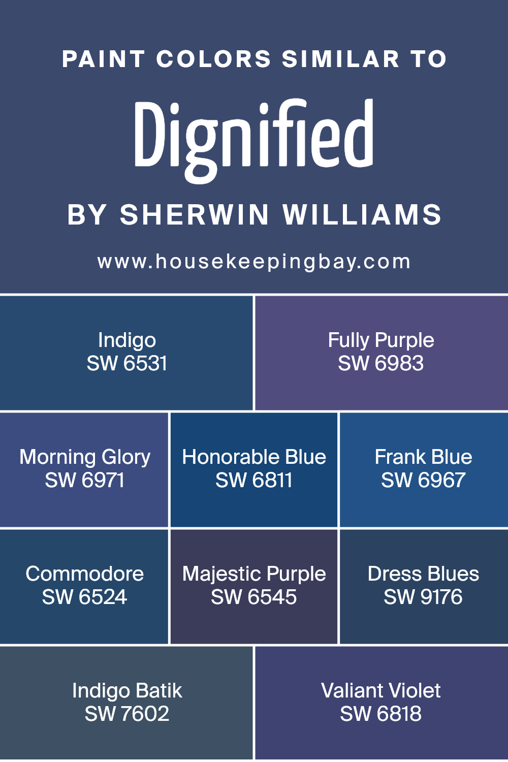
Colors Similar to Dignified SW 6538 by Sherwin Williams
Similar colors can create harmony and balance in any space because they share visual qualities that make them pleasing to the eye. Dignified (SW 6538) by Sherwin Williams is a deep, rich hue that inspires confidence.
To complement it, the similar colors SW 6531 – Indigo and SW 6983 – Fully Purple bring both depth and a sense of mystery; Indigo is a profound blue that exudes sophistication, while Fully Purple adds a vibrant yet balanced pop of color.
Then there’s SW 6971 – Morning Glory, a delightful and cheerful shade that combines the gentleness of early morning skies with a hint of purple’s grace. SW 6811 – Honorable Blue presents a dignified and trustworthy hue, perfect for creating calming environments.
SW 6967 – Frank Blue echoes the coolness of the sea, making spaces feel crisp and refreshing.
On the other hand, SW 6524 – Commodore offers a suave, timeless blue reminiscent of naval charm. SW 6545 – Majestic Purple embodies a regal presence, combining depth and elegance impeccably. SW 9176 – Dress Blues gives an authoritative and calming vibe, essential for settings needing subtle intensity.
SW 7602 – Indigo Batik leans into the depth of darker indigo tones, conveying complexity and charm.
Finally, SW 6818 – Valiant Violet marries boldness with classic elegance, creating a color that is both striking and soothing. These similar shades not only complement Dignified but also blend seamlessly across various spaces, crafting cohesive and inviting atmospheres without any decor clashes.
You can see recommended paint colors below:
- SW 6531 Indigo
- SW 6983 Fully Purple
- SW 6971 Morning Glory
- SW 6811 Honorable Blue
- SW 6967 Frank Blue
- SW 6524 Commodore
- SW 6545 Majestic Purple
- SW 9176 Dress Blues
- SW 7602 Indigo Batik
- SW 6818 Valiant Violet
housekeepingbay.com
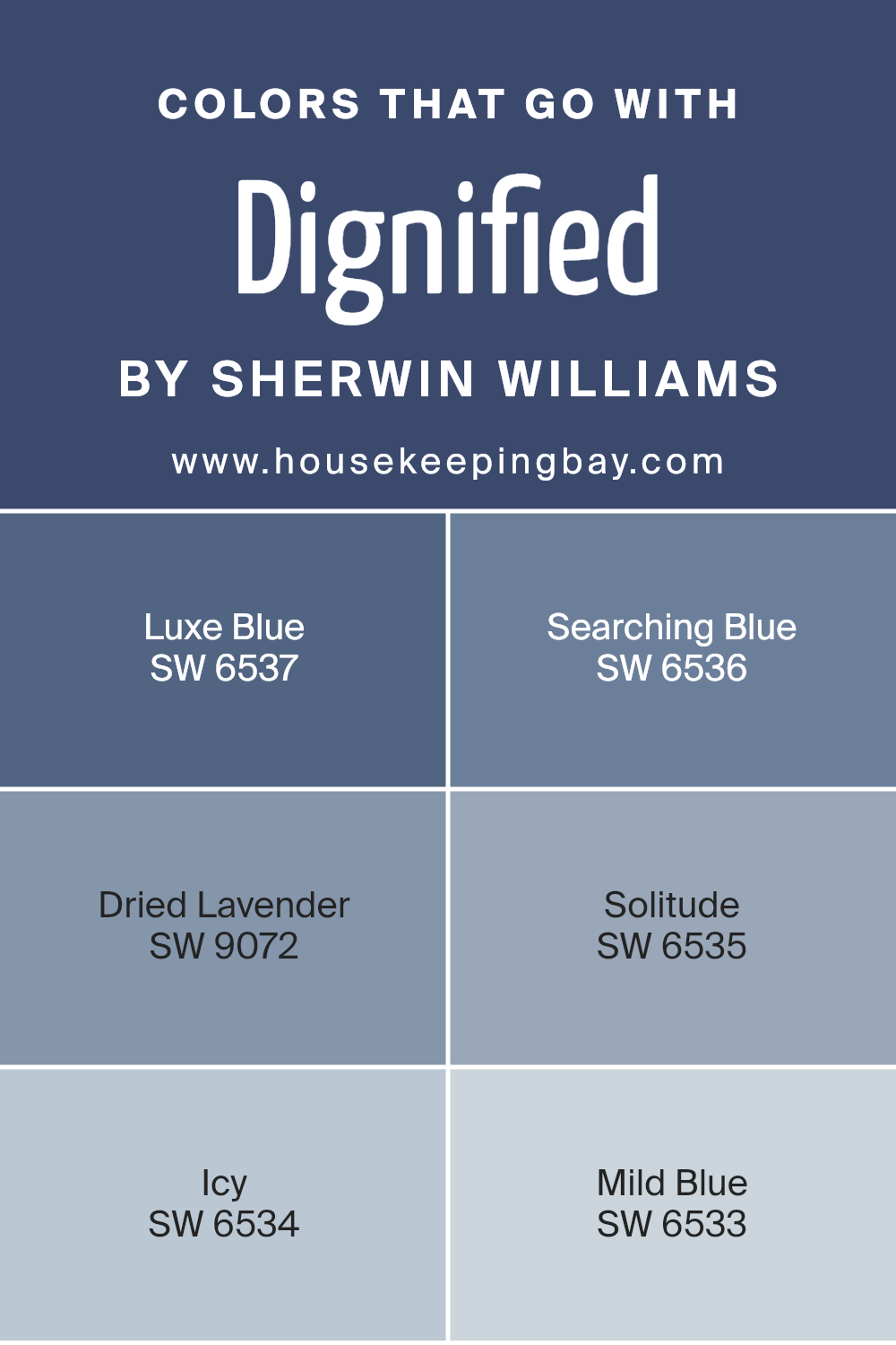
Colors that Go With Dignified SW 6538 by Sherwin Williams
Choosing colors that go with Dignified SW 6538 by Sherwin Williams is important because it helps create a harmonious and balanced look in a space. Dignified is a deep, rich blue, and pairing it with complementary shades enhances its beauty and adds depth to your decor.
SW 6537 Luxe Blue works well alongside Dignified as it shares similar deep tones but offers a slightly lighter shade, providing a soft contrast. SW 6536 Searching Blue, on the other hand, is a bit darker, adding depth while still keeping the serene blue theme.
The gentle touch of SW 9072 Dried Lavender brings a hint of warmth from its subtle purple undertones, which can soften the boldness of Dignified. SW 6535 Solitude offers a more muted blue that feels peaceful, pairing well without overwhelming the senses.
Meanwhile, SW 6534 Icy introduces a crisp and cool feel with its light, airy blue, perfect for a refreshing touch.
Lastly, SW 6533 Mild Blue provides a delicate and light hue that harmonizes beautifully, completing a well-rounded color scheme. Together, these colors create an inviting and visually pleasing environment that feels cohesive and refreshing.
You can see recommended paint colors below:
- SW 6537 Luxe Blue
- SW 6536 Searching Blue
- SW 9072 Dried Lavender
- SW 6535 Solitude
- SW 6534 Icy
- SW 6533 Mild Blue
housekeepingbay.com
How to Use Dignified SW 6538 by Sherwin Williams In Your Home?
Dignified SW 6538 by Sherwin Williams offers a deep, rich shade of blue. It suits spaces where a touch of elegance and calmness is desired. In a living room, this color can pair well with light-colored furniture, creating a beautiful contrast while maintaining a cozy atmosphere.
For bedrooms, using Dignified on an accent wall can introduce a serene backdrop, making the room perfect for relaxation. The color can be used in kitchens to add a unique touch, especially when combined with white or neutral cabinets and stainless steel appliances.
It works wonders in bathrooms as well, making even compact spaces feel sophisticated. To enhance this shade, consider using warm lighting throughout the room, which will highlight the richness of the color. Accessories like cushions, curtains, or a rug in complementary hues like beige or cream can further complement the elegance of Dignified SW 6538.
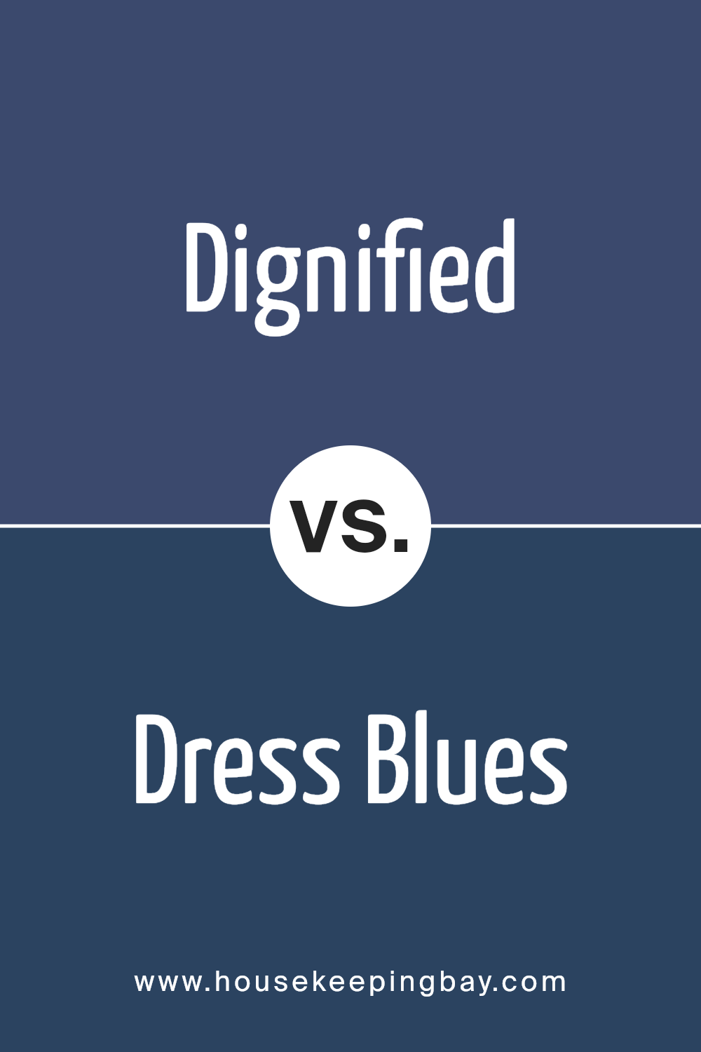
Dignified SW 6538 by Sherwin Williams vs Dress Blues SW 9176 by Sherwin Williams
Dignified SW 6538 by Sherwin Williams and Dress Blues SW 9176 by Sherwin Williams each offer a unique shade of blue that can enhance any space. Dignified is a deeper, richer blue that has a slightly muted, almost gray undertone, giving it a sophisticated and mature feel. It’s a color that can impart a sense of calm and elegance to a room.
Dress Blues, while also a deep blue, tends toward a more vibrant and classic navy tone. It has a bold presence that feels timeless and strong, making it a great choice for creating a dramatic yet traditional look.
Both colors have their own charm. While Dignified brings a quieter, more understated elegance, Dress Blues commands more attention with its boldness. These shades work well in formal settings, but their unique depths offer different moods—one is more subdued and calming, while the other exudes a sense of classic authority.
You can see recommended paint color below:
housekeepingbay.com
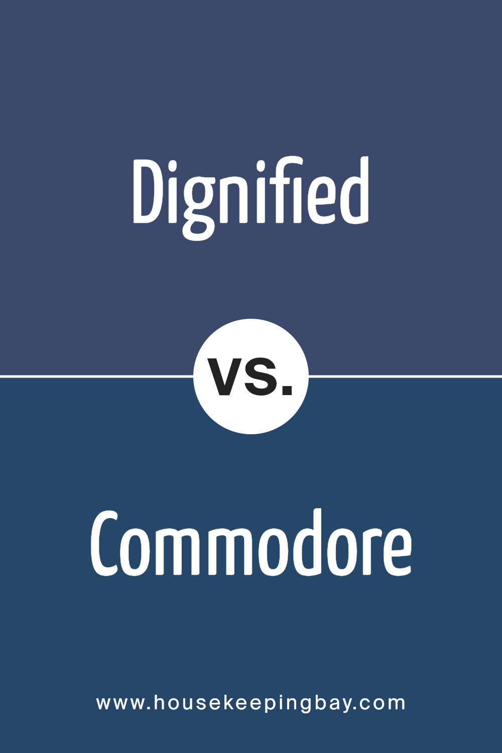
Dignified SW 6538 by Sherwin Williams vs Commodore SW 6524 by Sherwin Williams
Dignified SW 6538 by Sherwin Williams is a deep, rich blue with subtle gray undertones. This color evokes a sense of stability and calm, making it a great choice for spaces where a serene ambiance is desired. It’s sophisticated and can serve as an elegant backdrop that pairs well with both light and dark accents.
Commodore SW 6524, also by Sherwin Williams, is a brighter, more vibrant blue compared to Dignified. This color has more energy and presence, making it suitable for areas that could use a lively touch. Commodore can brighten a room and create a sense of openness, working nicely with softer colors that complement its vividness.
Both colors share a blue base but serve different moods. Dignified is more muted and versatile, suitable for a classic look, while Commodore offers a bolder option, adding personality and energy to any space.
You can see recommended paint color below:
- SW 6524 Commodore
housekeepingbay.com
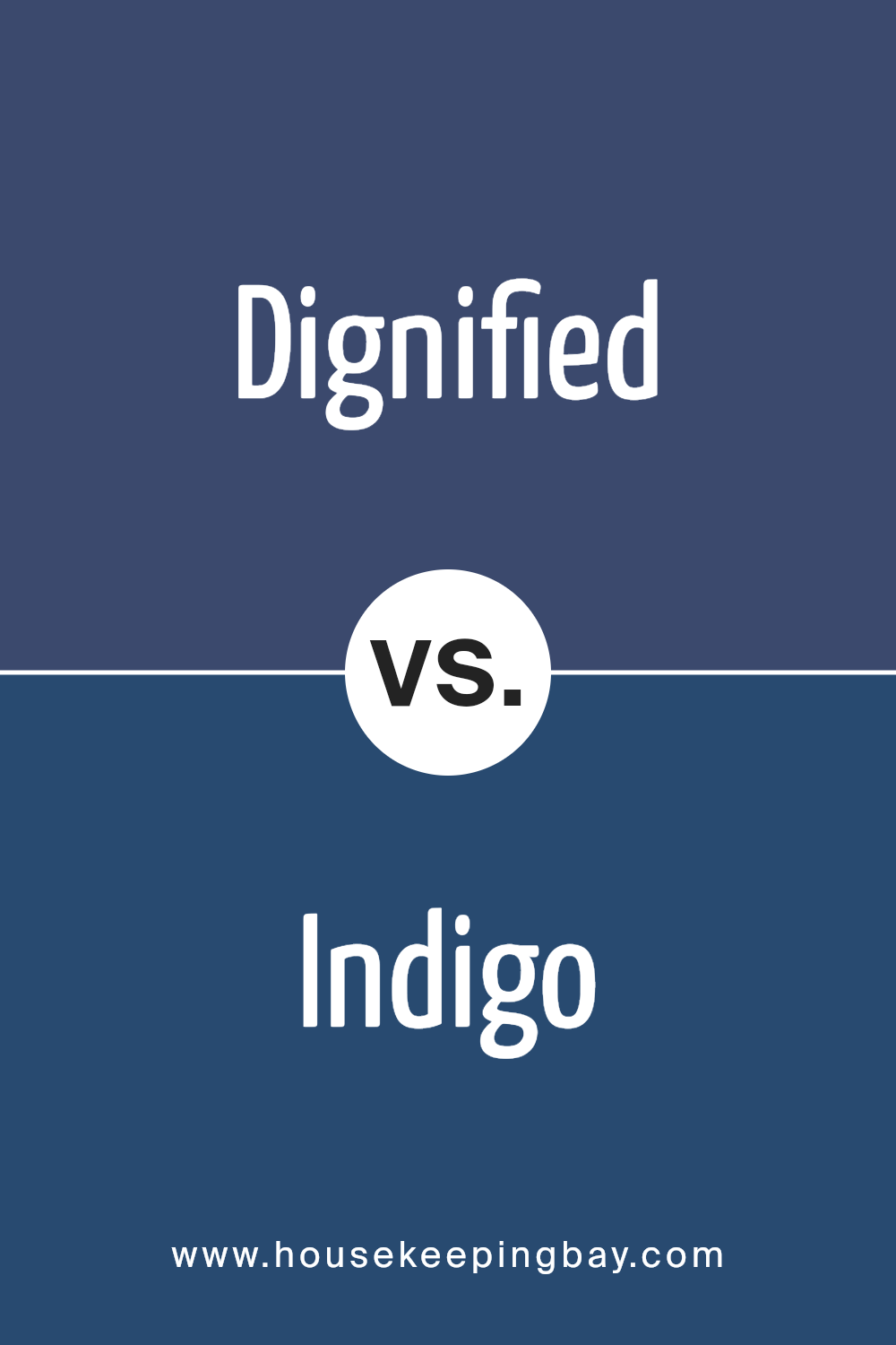
Dignified SW 6538 by Sherwin Williams vs Indigo SW 6531 by Sherwin Williams
Dignified SW 6538 and Indigo SW 6531 by Sherwin Williams are both shades of blue, but they offer different vibes and uses. Dignified SW 6538 is a dark, muted blue with gray undertones. It provides a sense of calm stability, making it great for creating a cozy or sophisticated atmosphere. This color works well in formal settings or spaces where you want a touch of elegance.
Indigo SW 6531 is a bolder, more vibrant shade of blue. It has richer, deeper tones, which can add energy and a modern feel to a room. Indigo is versatile, often used to create a statement wall or to provide a pop of color without being too overpowering.
While both colors belong to the blue family, Dignified is more subdued and formal, whereas Indigo offers boldness and vibrancy—perfect if you wish to add some lively energy to your space.
You can see recommended paint color below:
- SW 6531 Indigo
housekeepingbay.com
Dignified SW 6538 by Sherwin Williams vs Indigo Batik SW 7602 by Sherwin Williams
Dignified SW 6538 and Indigo Batik SW 7602 are two rich colors from Sherwin Williams, each bringing its own flair to a space. Dignified SW 6538 is a deep, muted blue with a hint of gray undertones, giving it a calm and sophisticated look. Indigo Batik SW 7602, however, leans more toward a classic navy blue, possessing a bit more depth and intensity.
Dignified can create an elegant and serene environment, often used in spaces designed for relaxation and quiet reflection. Indigo Batik, with its stronger blue presence, can bring about a sense of drama and vibrancy, making it an ideal choice for making a bold statement in a room.
Both colors have a strong presence and pair well with neutrals such as whites or beiges. However, Indigo Batik’s deeper tone might be more striking in spaces that aim to feel bold and confident, while Dignified offers a gentle, understated elegance.
You can see recommended paint color below:
housekeepingbay.com
Dignified SW 6538 by Sherwin Williams vs Valiant Violet SW 6818 by Sherwin Williams
Dignified SW 6538 by Sherwin Williams is a sophisticated, muted blue with subtle gray undertones, creating an elegant and calming atmosphere. It’s understated yet powerful, making it perfect for spaces where a serene ambiance is desired, such as a living room or bedroom. This color brings a sense of refinement and maturity, complementing both traditional and modern decor styles.
Valiant Violet SW 6818, also by Sherwin Williams, presents a more vibrant and lively personality. It’s a rich violet that exudes confidence and creativity, suitable for spaces meant to inspire energy and imagination, like an office or creative studio.
This color can add a bold touch when used as an accent or feature wall, making it ideal for those who enjoy a dynamic splash of color.
While Dignified offers a soothing and restrained backdrop, Valiant Violet stands out, encouraging a lively and spirited environment. Both colors, though different in impact, provide unique charm and character.
You can see recommended paint color below:
- SW 6818 Valiant Violet
housekeepingbay.com
Dignified SW 6538 by Sherwin Williams vs Honorable Blue SW 6811 by Sherwin Williams
Dignified SW 6538 and Honorable Blue SW 6811 by Sherwin Williams each offer their own unique touch. Dignified is a deep, rich hue that exudes a calm and timeless elegance. Its darker tone works beautifully as a statement color in a room, providing a backdrop that feels both classic and sophisticated. Honorable Blue, however, presents itself with a lighter, yet equally compelling character. It carries a sense of freshness and vitality, delivering a more airy and energizing atmosphere.
While Dignified leans into the world of deep, muted blue with hints of gray, providing a more grounded and formal feeling, Honorable Blue introduces a brighter, more vibrant blue. It calls to mind clear skies and open seas, offering a sense of openness and liveliness.
Both colors can complement a variety of styles, yet they each bring a different mood — one rooted in warmth and sophistication, the other in brightness and energy.
You can see recommended paint color below:
- SW 6811 Honorable Blue
housekeepingbay.com
Dignified SW 6538 by Sherwin Williams vs Fully Purple SW 6983 by Sherwin Williams
Dignified SW 6538 by Sherwin Williams is a muted blue-grey hue with a sophisticated presence. It evokes calmness and a touch of elegance, making it suitable for spaces where a soothing atmosphere is desired. This color complements neutrals and other soft tones, creating a cohesive and serene environment.
Fully Purple SW 6983 by Sherwin Williams, in contrast, is a bold and vibrant shade of purple. It commands attention, adding a burst of energy and creativity to any space. Ideal for areas where you want to make a lively statement, Fully Purple can invigorate a room and stimulate the senses.
While Dignified offers subtlety and relaxation, Fully Purple presents intensity and excitement. Used together, they can balance each other: Dignified’s calm tones grounding Fully Purple’s vibrancy. The choice between them depends on whether you desire a peaceful backdrop or a cheerful, dynamic space.
You can see recommended paint color below:
- SW 6983 Fully Purple
housekeepingbay.com
Dignified SW 6538 by Sherwin Williams vs Majestic Purple SW 6545 by Sherwin Williams
Dignified SW 6538 by Sherwin Williams is a deep, muted shade of blue-grey that exudes sophistication and calm. It carries a certain timelessness, fitting well in spaces meant for relaxation or focused work. The color works well in both modern and classic settings, accentuating wood tones and neutral palettes effortlessly.
Majestic Purple SW 6545, also by Sherwin Williams, is a deep, rich purple that brings a sense of luxury and creativity to a space. It is bold and expressive, offering more intensity and drama compared to Dignified. While Dignified leans towards calming and understated, Majestic Purple stands out with a regal quality.
Together, these two colors create an intriguing contrast. Dignified’s subtle elegance balances the power and vibrancy of Majestic Purple. Use Dignified for an overall serene atmosphere, while Majestic Purple can function as a striking accent, enriching any room with its opulent hue.
You can see recommended paint color below:
housekeepingbay.com
Dignified SW 6538 by Sherwin Williams vs Morning Glory SW 6971 by Sherwin Williams
Dignified SW 6538 by Sherwin Williams is a deep, rich purple with a mix of blue tones, resembling the color of a classic amethyst or a starry night sky. It’s a bold choice, often associated with themes of sophistication and royalty. This color creates a serious, thoughtful atmosphere, ideal for spaces where contemplation or focus is desired, like a study or a living room.
Morning Glory SW 6971, also by Sherwin Williams, presents a lively, vibrant blue reminiscent of a sunny afternoon or a bright field of flowers. It brings a sense of energy and playfulness, suitable for areas meant for activity and joy, such as a kitchen or a child’s room.
Where Dignified offers depth and complexity, Morning Glory offers lightness and cheer. Together, they provide a strong contrast, with one exuding calmness and the other radiating zest, allowing for creative and dynamic interior design possibilities.
You can see recommended paint color below:
- SW 6971 Morning Glory

housekeepingbay.com
Dignified SW 6538 by Sherwin Williams vs Frank Blue SW 6967 by Sherwin Williams
Dignified SW 6538 by Sherwin Williams is a rich, muted blue with a touch of gray. It feels calm and sophisticated, making it an excellent choice for spaces that aim for a serene yet luxurious atmosphere. Dignified provides a more timeless look and can complement both traditional and modern designs. Its subdued tones make it versatile, pairing well with neutrals, whites, or deeper colors for contrast.
Frank Blue SW 6967, in contrast, is a brighter and more vibrant blue. It has a lively and fresh feel, perfect for adding energy to a room. This bold color can make a statement and works well in playful or creative environments, such as children’s rooms, kitchens, or accent walls.
Frank Blue pairs nicely with lighter colors to keep a space cheerful, and it can be balanced with darker tones for a more dramatic effect. Both colors provide unique styles and moods for any space.
You can see recommended paint color below:
housekeepingbay.com
After considering SW 6538 Dignified by Sherwin Williams, I find it to be a wonderful color choice for bringing richness and depth into spaces. This shade of blue exudes calmness and elegance, making it suitable for various settings—from living rooms to bedrooms.
The color’s versatility allows it to blend seamlessly with both modern and traditional décor.
Using Dignified can significantly impact the mood of a room. Its cool tones provide a sense of relaxation and sophistication. Pairing it with lighter colors can add contrast and balance, ensuring the room doesn’t feel too dark.
Additionally, elements like metallics or wood accents can complement Dignified to create a more dynamic look.
I appreciate how this color can adapt to different styles and personal tastes. Whether in a home or professional space, Dignified has the ability to make a strong yet understated statement. Its timeless quality ensures that it will remain a favorite, regardless of changing design trends.
In summary, SW 6538 Dignified by Sherwin Williams stands as a reliable option for enriching interiors with its depth and elegance.
housekeepingbay.com
Ever wished paint sampling was as easy as sticking a sticker? Guess what? Now it is! Discover Samplize's unique Peel & Stick samples. Get started now and say goodbye to the old messy way!
Get paint samples


