Majestic Purple SW 6545 by Sherwin Williams
Create a Regal Ambiance with Luxurious Hues
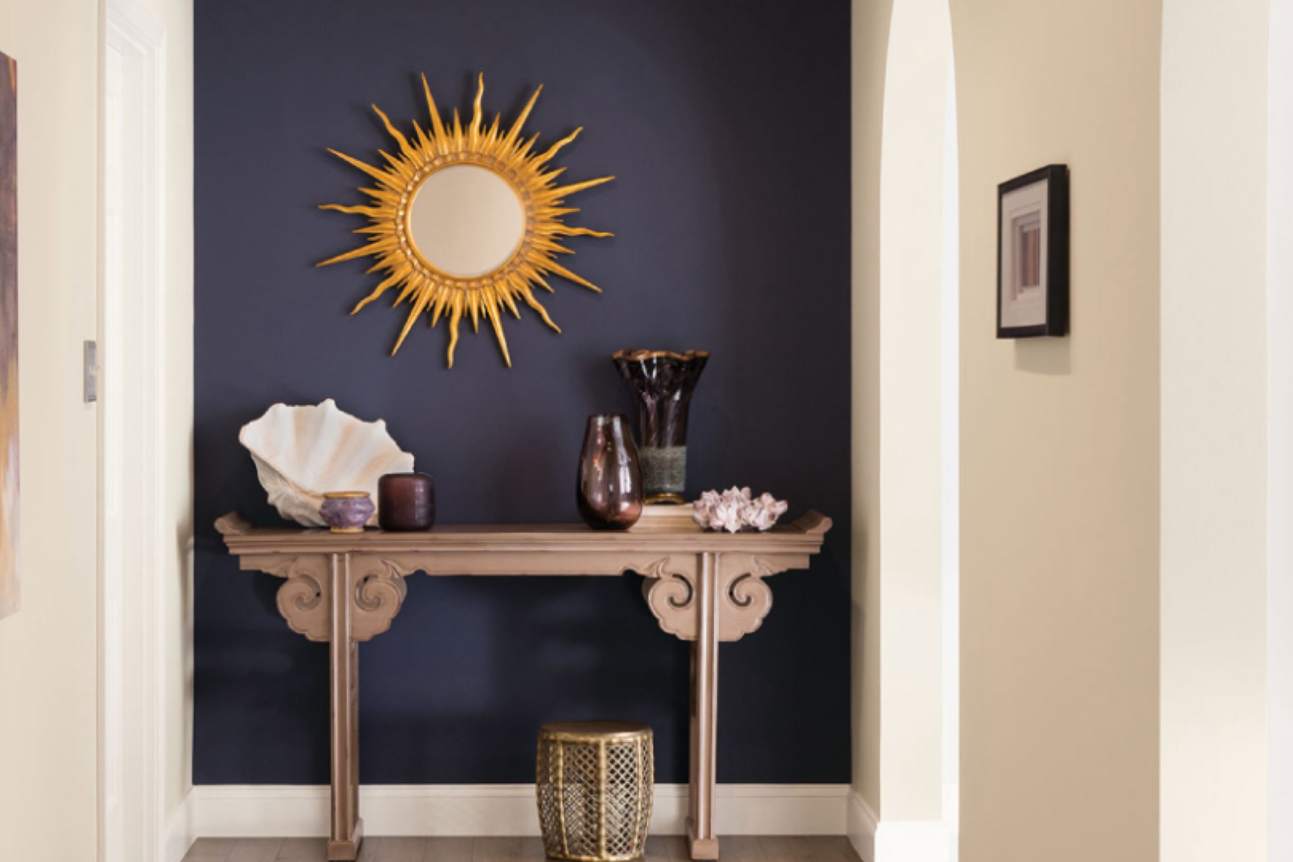
SW 6545 Majestic Purple by Sherwin Williams adds warmth and depth without trying too hard. It’s rich, cozy, and has that bold touch that makes a room feel special. Perfect if you want something a little different but still welcoming.
You might be surprised at how this deep shade can transform a space, whether you’re painting an entire room or just using it as an accent.
Majestic Purple is perfect for those who love a bold touch. It pairs beautifully with neutral colors like gray or cream, creating a balanced look that feels both modern and timeless. But don’t feel limited to just those combinations.
Whether in a living room, bedroom, or office, this shade can create a focal point that draws you in, making the space feel both intimate and expansive.
Another beauty of Majestic Purple is its ability to complement a variety of styles, from traditional to contemporary. It’s a color that adapts to your personal taste and makes a statement without being overwhelming. With Majestic Purple, you’re not just choosing a paint color—you’re setting the mood and tone of your entire space.
via holicolors.ru
What Color Is Majestic Purple SW 6545 by Sherwin Williams?
Majestic Purple SW 6545 by Sherwin Williams is a rich, deep shade of purple that brings a sense of luxury and sophistication to any space. This color captures the eye with its dark and mysterious tones, featuring a blend of mulberry, wine, and subtle blue undertones. It creates an inviting and cozy atmosphere, making it excellent for spaces where comfort is key.
Majestic Purple works well in a variety of interior styles. It’s perfect for traditional designs, where its depth complements classic furniture and ornate details. In modern settings, this purple provides a bold contrast against clean lines and minimalist decor.
It’s particularly effective in eclectic rooms, where it adds a touch of drama without overwhelming other elements.
Pairing Majestic Purple with the right materials and textures can enhance its appeal. Velvet and suede fabrics harmonize beautifully, emphasizing its luxurious nature. Incorporate metallic finishes, like brass or gold, for an elegant touch.
Wood in dark stains will bolster the warmth this color brings. For lighter accents, consider soft creams or muted grays to balance the depth of the purple.
In summary, Majestic Purple SW 6545 enriches any interior with its opulent hue, making it a versatile choice for various styles and material combinations.
housekeepingbay.com
Is Majestic Purple SW 6545 by Sherwin Williams Warm or Cool color?
Majestic Purple SW 6545 is a rich, deep shade of purple from Sherwin Williams that brings sophistication to any space. Its deep hue creates a sense of luxury and elegance, making rooms feel both cozy and upscale. This color works wonderfully as an accent wall, giving a room a bold focal point without being too overpowering.
In living rooms or bedrooms, Majestic Purple can add warmth and depth, making these spaces feel more intimate and inviting.
When used in dining areas or home offices, this color can encourage creativity and stimulate conversation due to its vibrant undertones. Pairing Majestic Purple with neutral shades like whites and grays can balance its intensity, ensuring rooms don’t feel too dark.
Adding metallic accents or light woods can enhance its elegance, making spaces feel more stylish. Overall, Majestic Purple SW 6545 can dramatically enhance home interiors, offering style and character to various settings.
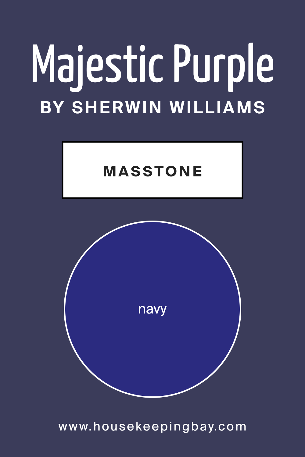
What is the Masstone of the Majestic Purple SW 6545 by Sherwin Williams?
Majestic Purple SW 6545 by Sherwin Williams is a rich, deep shade with a navy undertone, resembling the color Navy (#2B2B80). This strong masstone adds a sense of sophistication and depth to any space. In homes, Majestic Purple can create a warm and cozy atmosphere, perfect for living rooms or bedrooms where relaxation is key.
When used on walls, it provides a striking backdrop that can highlight furnishings and artwork, allowing colors and textures to stand out. Its deep hue can make a room feel more intimate, which is great for creating a comforting environment.
In brighter spaces with plenty of natural light, this color can appear lively and full of character. In areas with less light, such as hallways or small rooms, Majestic Purple can add a touch of elegance without overwhelming the space.
This versatile color suits both contemporary and traditional styles, providing a timeless quality to home interiors.
housekeepingbay.com
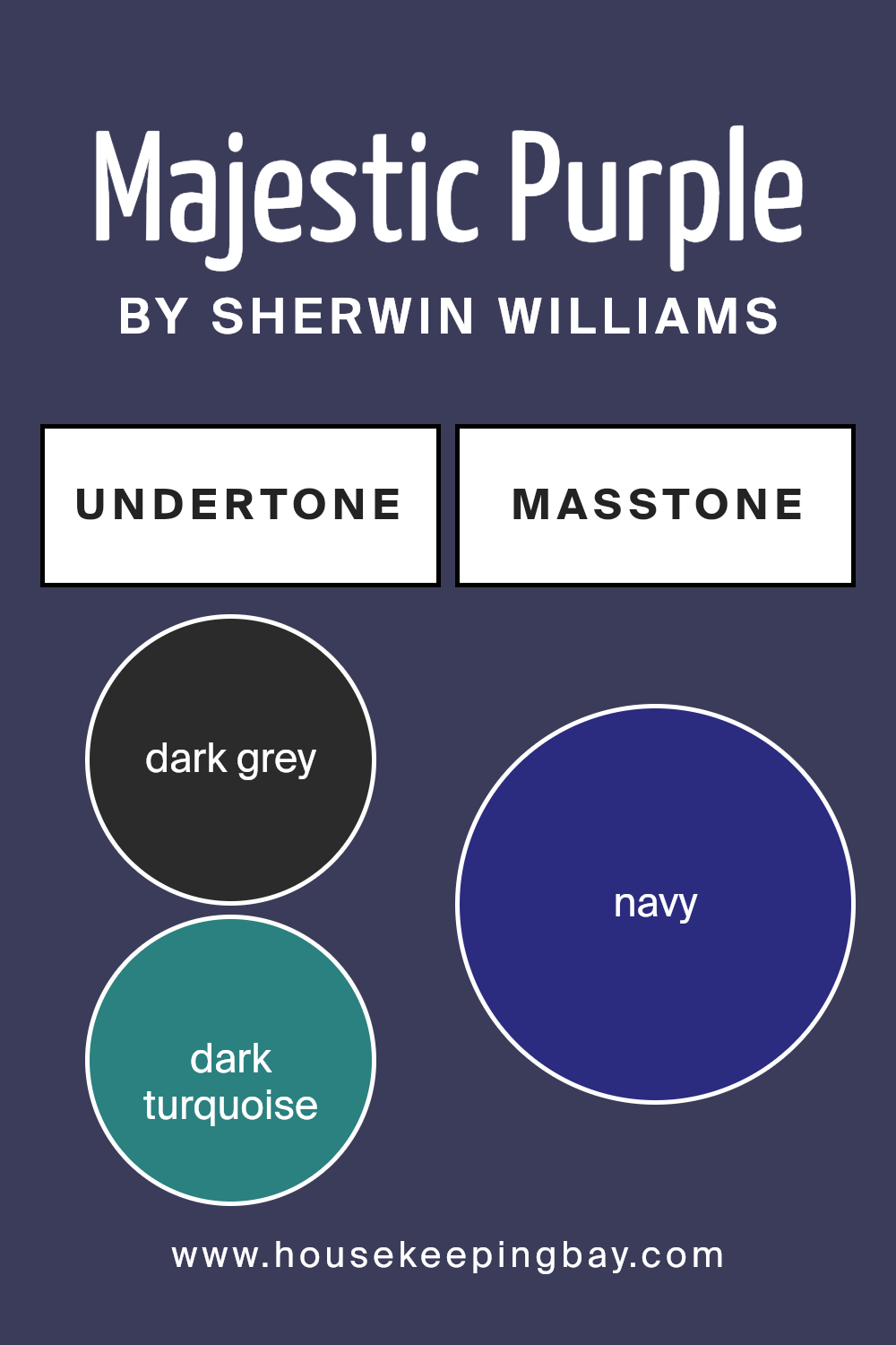
Undertones of Majestic Purple SW 6545 by Sherwin Williams
Majestic Purple SW 6545 by Sherwin Williams is a rich, deep purple with a variety of undertones that influence how we see it. The undertones in this color include dark grey, dark turquoise, purple, dark green, brown, grey, olive, dark blue, blue, violet, and lilac.
These subtle undertones can change how the color appears based on the surroundings, lighting, and other nearby colors.
Undertones are essential because they can alter the perceived temperature of a color—making it feel warmer or cooler. For example, the blue and turquoise undertones in Majestic Purple can give it a cooler appearance, especially in natural light or when paired with cool-toned furnishings.
In contrast, brown and green undertones can add warmth, softening its intensity under warm lighting such as incandescent bulbs or when surrounded by earthy tones.
When used on interior walls, Majestic Purple can evoke different moods. The grey and dark blue undertones can make the room feel more relaxed and sophisticated, while the lilac and violet can add a hint of playfulness and creativity. The brown and olive undertones contribute to a sense of stability, grounding the color.
Depending on the light and decor, Majestic Purple can look equally inviting and refined, creating a unique atmosphere tailored to the space.
housekeepingbay.com
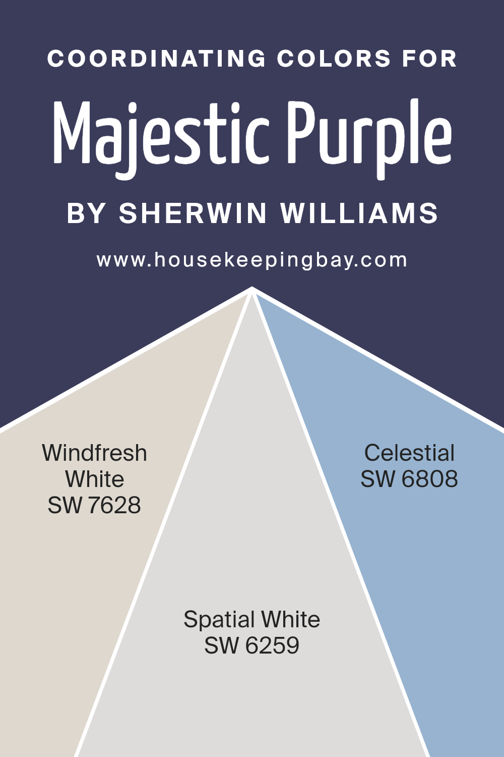
Coordinating Colors of Majestic Purple SW 6545 by Sherwin Williams
Coordinating colors are shades that complement or match a primary color to create a harmonious look. When working with a bold shade like Majestic Purple SW 6545 by Sherwin Williams, it’s essential to pair it with colors that enhance its richness without overwhelming the space.
Windfresh White SW 7628 is a soft, neutral white, providing a crisp and clean look. It offers a subtle backdrop, allowing Majestic Purple to stand out while maintaining a sense of balance in the room.
Spatial White SW 6259 is a cool, muted white that adds a slight touch of sophistication. It imparts an airy quality, making spaces feel open and inviting. Celestial SW 6808, on the other hand, is a gentle blue with hints of lavender. It brings a calming effect, perfectly complementing the vibrancy of Majestic Purple.
Together, these colors create a well-rounded palette that enhances each other’s beauty, making any space feel cohesive and thoughtfully designed.
Using these shades, anyone can achieve a look that feels both refreshing and lively, creating an environment that’s as welcoming as it is elegant.
You can see recommended paint colors below:
- SW 7628 Windfresh White
- SW 6259 Spatial White
- SW 6808 Celestial
housekeepingbay.com
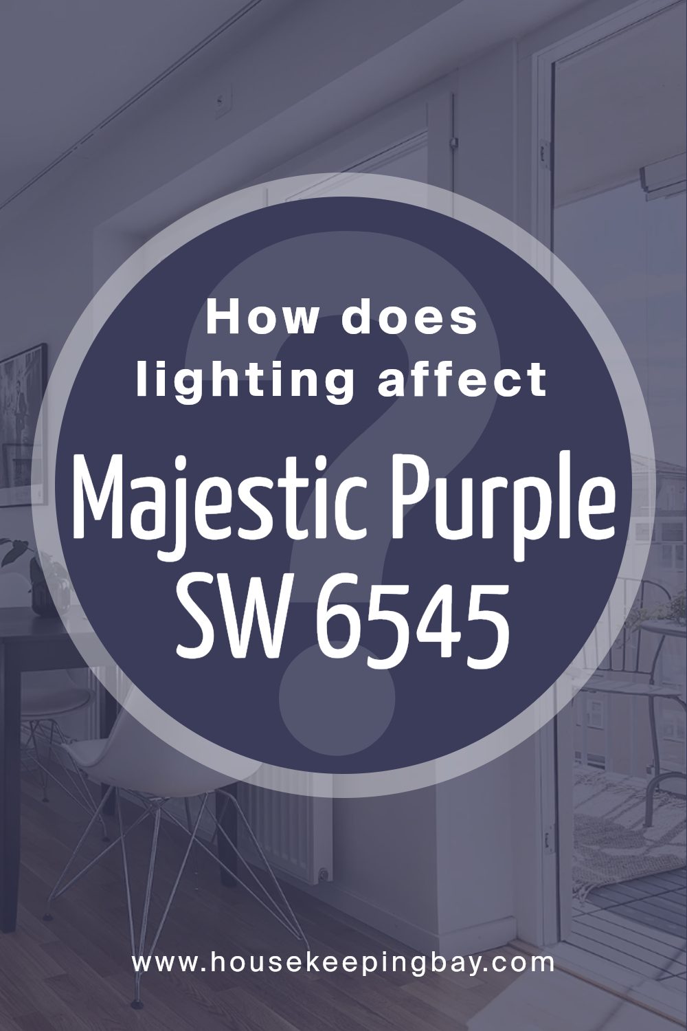
How Does Lighting Affect Majestic Purple SW 6545 by Sherwin Williams?
Lighting plays a crucial role in how we perceive colors. Different types of light can dramatically change the appearance of paint colors on walls. Majestic Purple SW 6545 by Sherwin Williams is a deep, rich purple with subtle nuances that can shift under varying lighting conditions.
In natural daylight, the color tends to reflect the true richness and depth of the purple hue. However, the direction from which the light enters the room can influence its appearance. In north-facing rooms, which receive cool, indirect light, Majestic Purple might appear a bit cooler or even take on a slightly bluish tone.
The light in these rooms is steady throughout the day, but it often makes colors appear less vibrant and more muted.
In south-facing rooms, where sunlight is warmer and more direct for much of the day, Majestic Purple will look warmer and possibly more vibrant.
The warm light enhances the reddish undertones of the purple, making the space feel cozier and more inviting during daylight hours.
East-facing rooms receive bright, warm light in the morning, which can make this purple feel alive and energetic. As the day progresses and the light diminishes, the color may appear more muted and subdued.
Meanwhile, in west-facing rooms, Majestic Purple can look muted and less intense throughout the morning but becomes more saturated and warmer in the afternoon and evening as the sunlight takes on an orange-red tint.
Under artificial lighting, such as fluorescent light, the purple could take on a cooler appearance, potentially emphasizing its blue components. In contrast, warm incandescent or LED lighting might enhance its red components, making the color feel richer and more inviting. Therefore, choosing the right light bulb can significantly affect how Majestic Purple is perceived in a space.
housekeepingbay.com
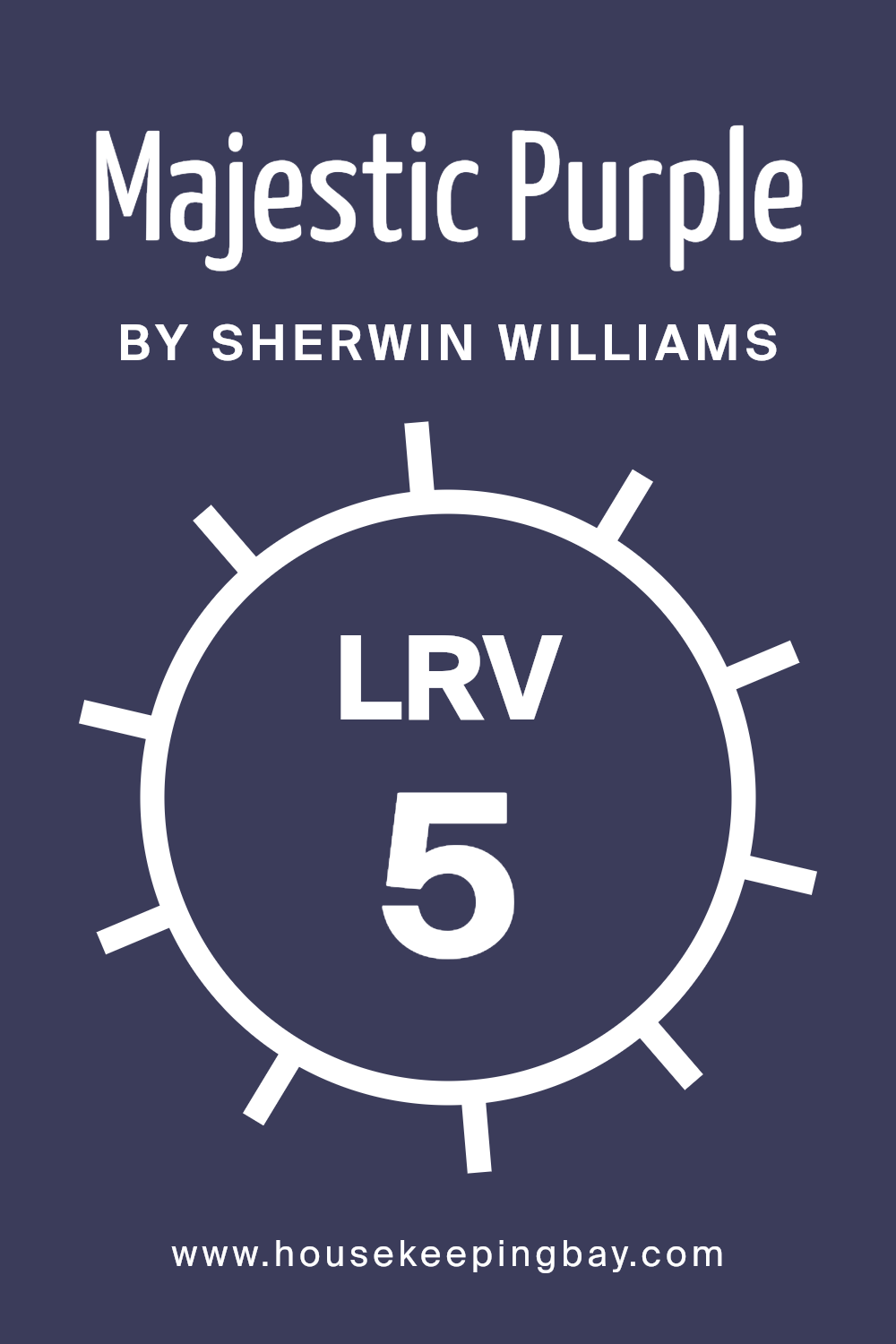
What is the LRV of Majestic Purple SW 6545 by Sherwin Williams?
LRV stands for Light Reflectance Value, a measurement that tells us how much light a color reflects when it is painted on a surface. The scale ranges from 0, which reflects no light and therefore is completely black, to 100, which reflects all light and is completely white.
LRV is an important factor because it affects how light or dark a color will appear in a space. Colors with low LRV will absorb more light, making rooms feel warmer and cozier but potentially smaller. High LRV colors, on the other hand, will reflect more light, making spaces feel larger and more open.
For Majestic Purple SW 6545, the LRV is 4.86, indicating that it is a very dark color. This means it will absorb most of the light in a room rather than reflecting it. As a result, Majestic Purple can create a moody, rich atmosphere, making it ideal for rooms where you want an intimate feel.
However, because it reflects little light, it might make a space feel more enclosed, so it works best in larger rooms or those with plenty of natural light.
If you appreciate the depth and intensity of purple but want to prevent the room from feeling too dark, it can be balanced with lighter accents or contrasting brighter colors.
housekeepingbay.com
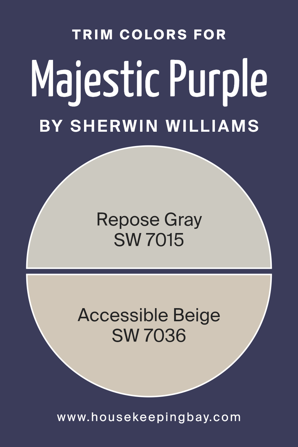
What are the Trim colors of Majestic Purple SW 6545 by Sherwin Williams?
Trim colors are the shades used for the edges and details around doors, windows, and baseboards. They enhance the main wall color by providing contrast or complementing it. When using Majestic Purple SW 6545 by Sherwin Williams, trim colors like SW 7015 – Repose Gray and SW 7036 – Accessible Beige are important.
These trims allow the deep, rich tone of Majestic Purple to stand out while maintaining a cohesive look throughout the space. They add depth to the room, creating a balanced and harmonious appearance.
SW 7015 – Repose Gray is a soft, neutral gray with a hint of warmth. It provides a subtle contrast to Majestic Purple, making the room feel more cohesive. SW 7036 – Accessible Beige has a warm undertone that complements the rich purple, giving the trim a gentle, inviting aura.
This beige links the boldness of Majestic Purple with other design aspects, creating a welcoming atmosphere.
Both trim colors act as neutral anchors, ensuring that the vibrant purple remains the room’s focal point.
You can see recommended paint colors below:
- SW 7015 Repose Gray
- SW 7036 Accessible Beige
housekeepingbay.com
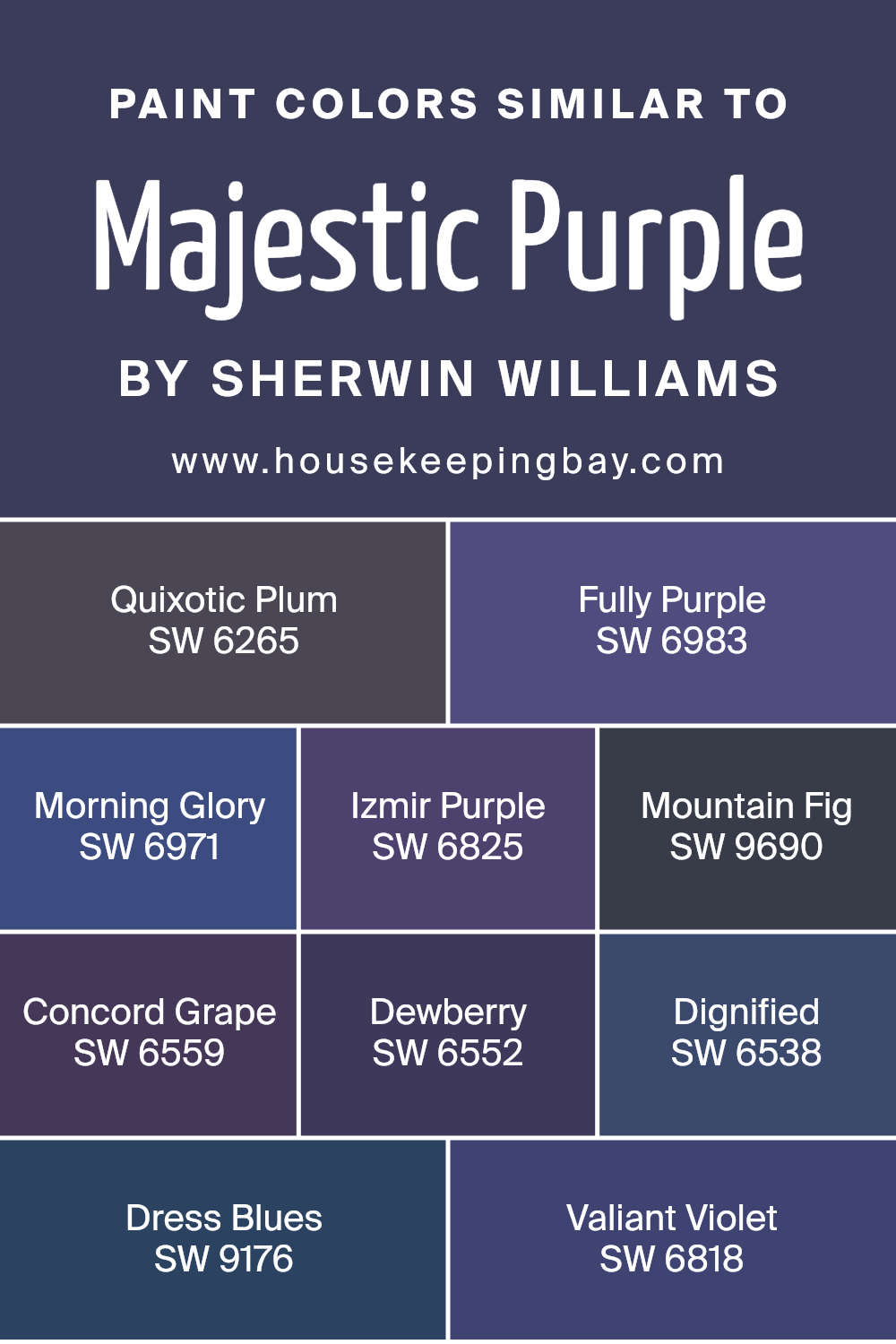
Colors Similar to Majestic Purple SW 6545 by Sherwin Williams
Similar colors play a key role in design by creating harmony and coherence in a space. They blend smoothly with each other, providing a balanced and unified look. Majestic Purple by Sherwin Williams is a rich and deep purple, and its similar colors add depth and variety while maintaining harmony.
SW 6265, Quixotic Plum, is a beautifully dark purple with a subtle warmth, adding complexity and elegance. SW 6983, Fully Purple, is vibrant with a noticeable energy, ideal for making a bold statement.
SW 6971, Morning Glory, is a lighter, cheerful shade, perfect for spaces that need a fresh feeling. SW 6825, Izmir Purple, brings a hint of red, adding warmth and passion.
SW 9690, Mountain Fig, is a subdued, earthy tone, offering a natural and calming effect.
SW 6559, Concord Grape, is a classic, refined purple that feels both rich and inviting. SW 6552, Dewberry, is a softer, muted option, providing quiet elegance and subtlety. SW 6538, Dignified, exudes formality with its deep, strong hue. SW 9176, Dress Blues, adds a touch of mystery with its deep, almost navy presence.
SW 6818, Valiant Violet, is a vibrant, spirited shade that adds a lively touch to any palette. Together, these colors combine to create an array of moods, from energetic and vibrant to calm and sophisticated, making them perfect companions to Majestic Purple’s regal nature.
You can see recommended paint colors below:
- SW 6265 Quixotic Plum
- SW 6983 Fully Purple
- SW 6971 Morning Glory
- SW 6825 Izmir Purple
- SW 9690 Mountain Fig
- SW 6559 Concord Grape
- SW 6552 Dewberry
- SW 6538 Dignified
- SW 9176 Dress Blues
- SW 6818 Valiant Violet
housekeepingbay.com
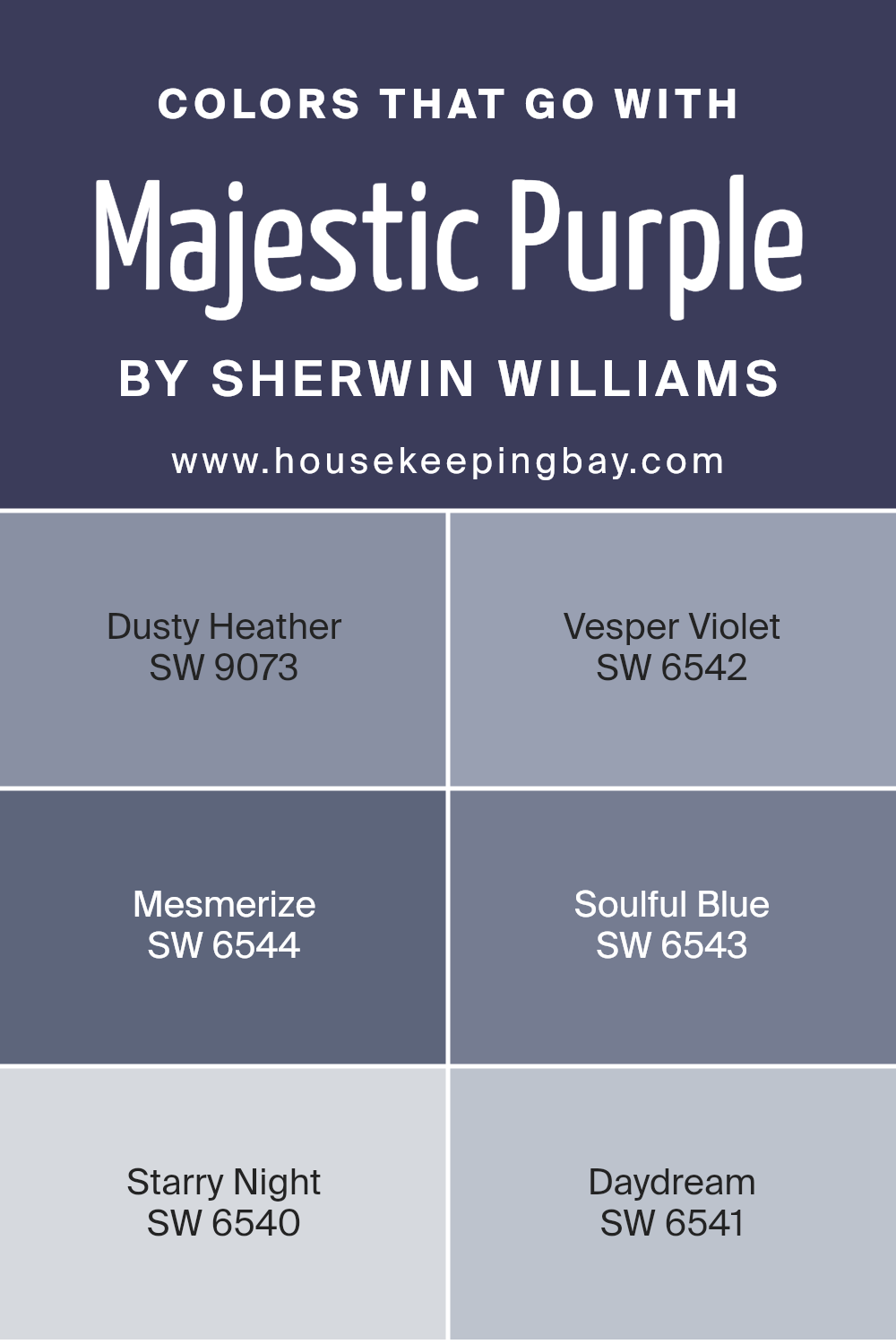
Colors that Go With Majestic Purple SW 6545 by Sherwin Williams
Colors that complement Majestic Purple SW 6545 by Sherwin Williams play a significant role in enhancing spaces and creating a cohesive look. These colors add depth, variety, and harmony, which can make any room feel complete. SW 9073 Dusty Heather, for instance, is a soft, muted purple that pairs wonderfully with Majestic Purple.
It brings a gentle and calming effect that balances the richness of the main color. SW 6542 Vesper Violet offers a slightly deeper shade of purple, adding a touch of elegance and sophistication when used alongside Majestic Purple. This combination can create a luxurious and inviting space.
Mesmerize SW 6544 is a bold, vibrant hue that adds excitement and energy to the palette. It contrasts beautifully with Majestic Purple, keeping the room lively and engaging. SW 6543 Soulful Blue brings in a cool, serene vibe, perfect for creating a relaxed atmosphere.
Its subtle blue undertone pairs well by providing a fresh and airy feel. Starry Night SW 6540 adds drama with its deep, dark shade, creating a striking backdrop that highlights the purple tones.
Lastly, SW 6541 Daydream offers a lighter, dream-like quality that softens the overall scheme, adding a soft touch to the bolder colors. Together, these colors work to create rooms with depth and character.
You can see recommended paint colors below:
- SW 9073 Dusty Heather
- SW 6542 Vesper Violet
- SW 6544 Mesmerize
- SW 6543 Soulful Blue
- SW 6540 Starry Night
- SW 6541 Daydream
housekeepingbay.com
How to Use Majestic Purple SW 6545 by Sherwin Williams In Your Home?
Majestic Purple SW 6545 by Sherwin Williams offers a rich, deep hue, perfect for adding a touch of luxury to any home. This color brings warmth and sophistication, making it an ideal choice for various spaces. In a living room, Majestic Purple creates a cozy yet elegant atmosphere.
Complement it with soft grays or beiges for a balanced look. For a bedroom, this shade adds a touch of romance. Combine it with white or cream for a serene and inviting environment. Dining rooms benefit from the regal tone, feeling both inviting and classy. Pair with metallic accents, like gold or silver, to enhance its depth.
When used on an accent wall, Majestic Purple serves as a bold statement, drawing attention without overwhelming. Use it in smaller doses, like on furniture or decorative pieces, for subtle elegance. Its versatility ensures the color will harmonize with different styles, from modern to traditional.
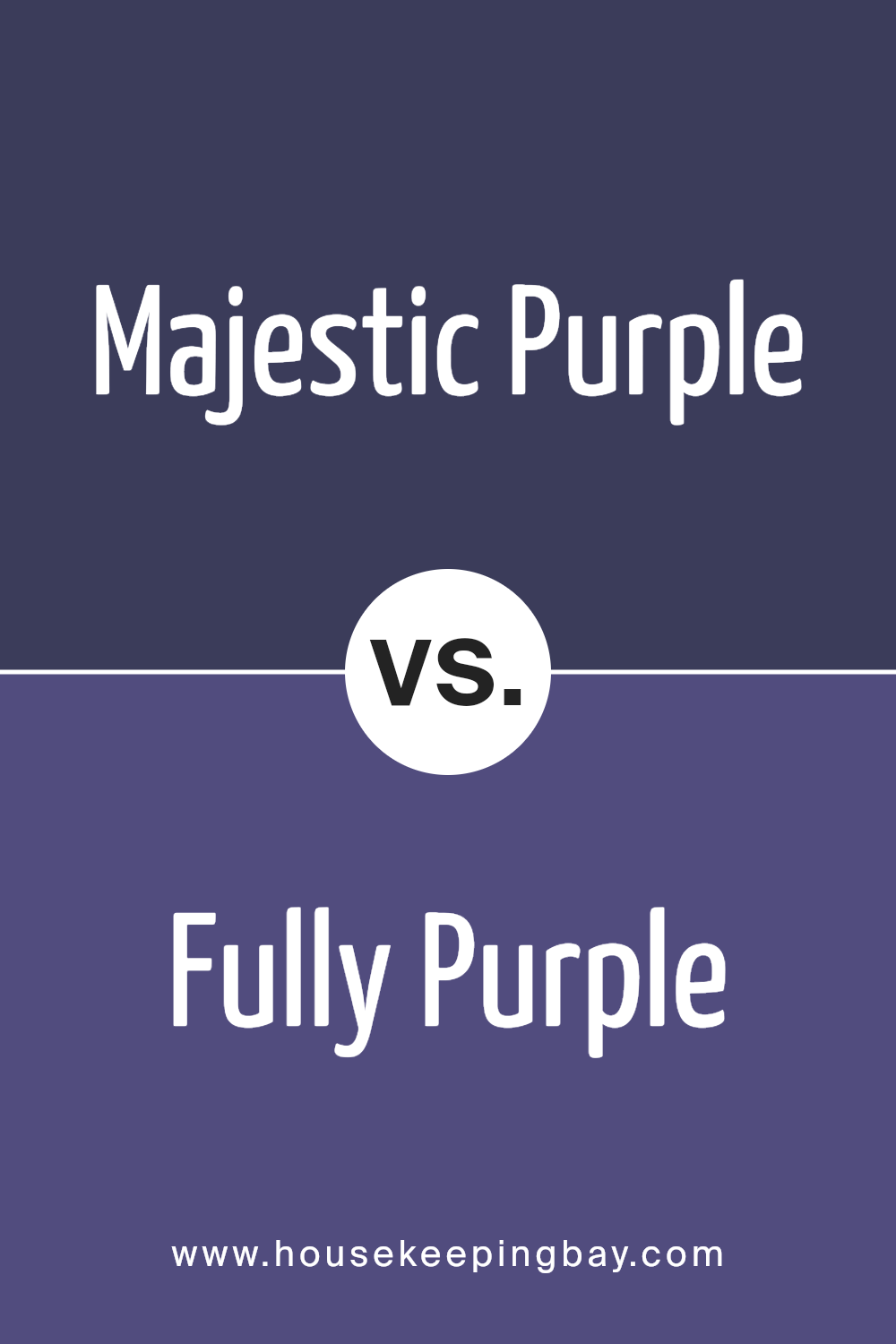
Majestic Purple SW 6545 by Sherwin Williams vs Fully Purple SW 6983 by Sherwin Williams
Majestic Purple SW 6545 by Sherwin Williams is a deep, rich purple that exudes sophistication and elegance. This color has a dark, muted tone which makes it feel calm and regal. It works well in spaces where you want to create a cozy yet luxe atmosphere. Imagine a library or a bedroom grounded by this deep hue, providing a feeling of warmth and refinement.
In contrast, Fully Purple SW 6983 is a brighter, more vibrant shade. It’s a playful, energetic version of purple that can add boldness and excitement to a room. This color is more suited for spaces that aim to inspire creativity or fun, such as a kid’s playroom or an accent wall in a lively living room.
While Majestic Purple provides depth and ensures a sophisticated ambiance, Fully Purple brings energy and cheerfulness. Choosing between them depends on whether you seek a soothing retreat or a lively flair.
You can see recommended paint color below:
- SW 6983 Fully Purple
housekeepingbay.com
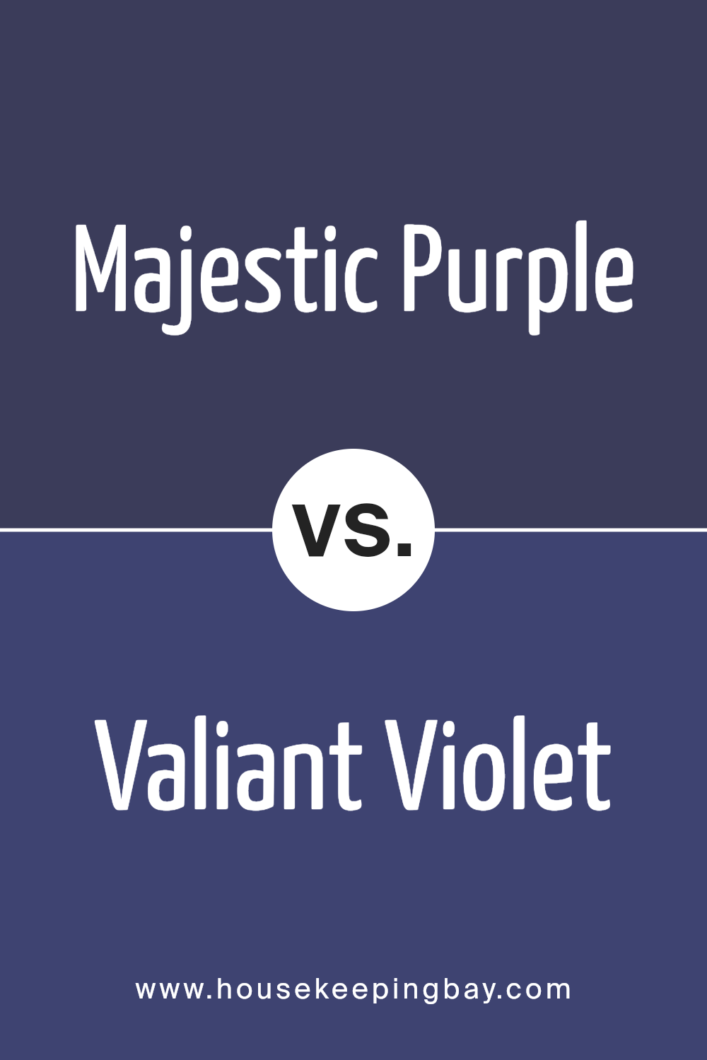
Majestic Purple SW 6545 by Sherwin Williams vs Valiant Violet SW 6818 by Sherwin Williams
Majestic Purple SW 6545 and Valiant Violet SW 6818 are two distinct shades from Sherwin Williams. Majestic Purple is a rich, deep hue that exudes elegance and sophistication. It carries a sense of luxury and opulence, making it a great choice for creating a dramatic and classy atmosphere in any space.
Valiant Violet, however, is lighter and more vibrant. It has a playful and energetic feel due to its brighter tone. Valiant Violet lends itself well to lively spaces, stirring creativity and excitement.
Both colors share a purple base, but their intensity and mood set them apart. Majestic Purple’s deeper tones make it suitable for spaces where a more formal or traditional feel is desired. Meanwhile, Valiant Violet shines in areas that benefit from a fresh and lively touch. Whether used in a home or work environment, each color brings its own unique character to a room.
You can see recommended paint color below:
- SW 6818 Valiant Violet
housekeepingbay.com
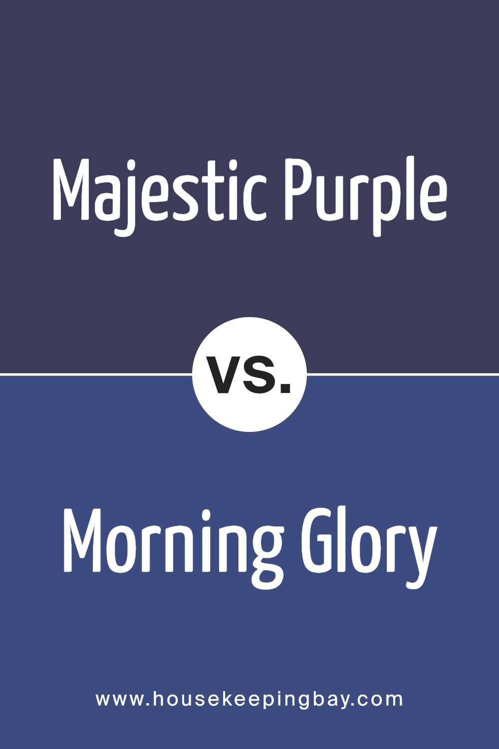
Majestic Purple SW 6545 by Sherwin Williams vs Morning Glory SW 6971 by Sherwin Williams
Majestic Purple SW 6545 by Sherwin Williams is a deep, rich purple with a hint of blue. It radiates elegance and sophistication, often lending a space a sense of depth and luxury. This color works well for accent walls or to create a cozy, intimate atmosphere in a room. It makes a striking statement when paired with lighter hues or metallic accents.
Morning Glory SW 6971, in contrast, is a bright, lively blue. It’s fresh and vibrant, bringing energy and a sense of openness to a space. Ideal for areas needing a burst of color, Morning Glory can brighten a room and create a cheerful ambiance.
When paired with whites or light grays, it can add a playful yet serene touch.
While Majestic Purple offers a moody, regal tone, Morning Glory provides a cheerful, spirited vibe. Together, they create an interesting balance of depth and brightness in any space.
You can see recommended paint color below:
- SW 6971 Morning Glory
housekeepingbay.com
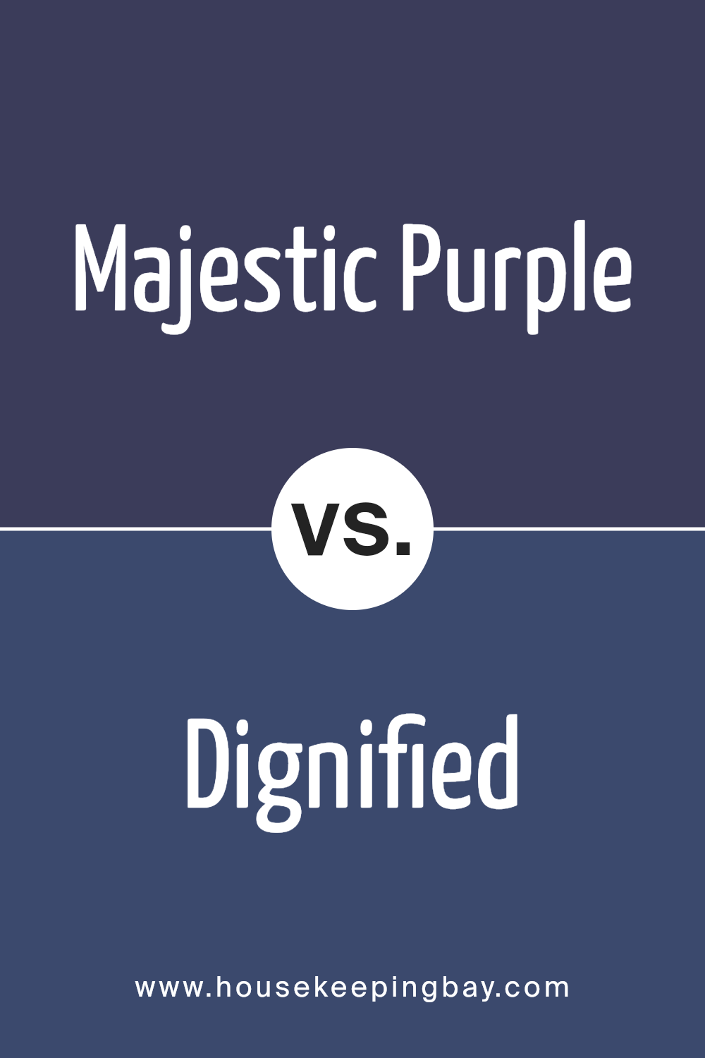
Majestic Purple SW 6545 by Sherwin Williams vs Dignified SW 6538 by Sherwin Williams
Majestic Purple SW 6545 is a bold, deep purple with a rich undertone. It’s a color that exudes luxury and sophistication, making a strong statement in any space. The richness of Majestic Purple can create a cozy, intimate atmosphere, perfect for a bedroom or reading nook.
Dignified SW 6538, while also a purple shade, is softer and more subdued. It leans toward a grayish-purple, offering a calmer and more understated vibe compared to Majestic Purple. Dignified is versatile and suits larger spaces, providing a sense of elegance without being overpowering.
While Majestic Purple demands attention and adds drama, Dignified provides a subtle touch of color, creating balance and harmony. Both colors have their unique charm, and their selection depends largely on the feel you wish to achieve in your space—be it dramatic and cozy or serene and relaxed.
You can see recommended paint color below:
- SW 6538 Dignified
housekeepingbay.com
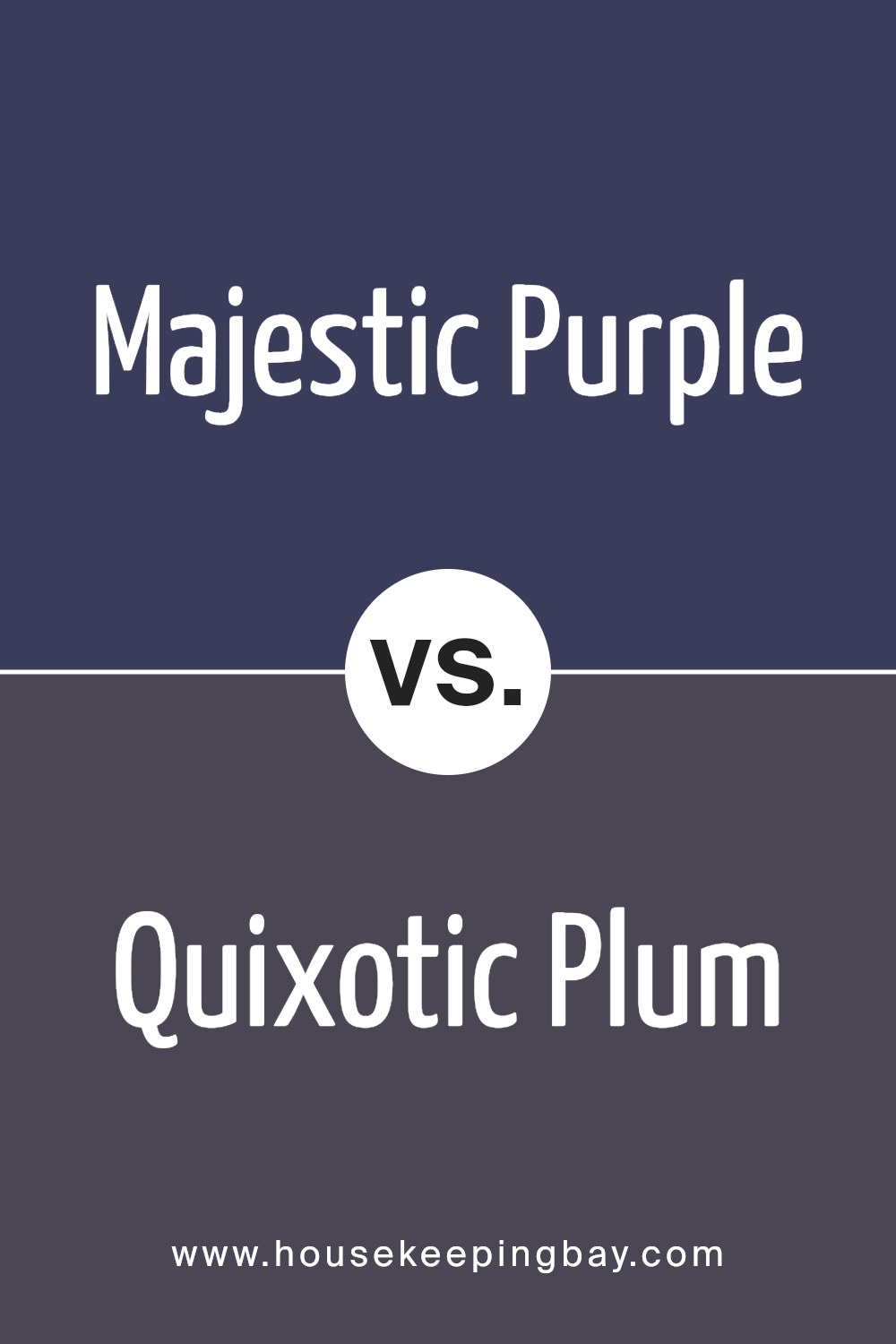
Majestic Purple SW 6545 by Sherwin Williams vs Quixotic Plum SW 6265 by Sherwin Williams
Majestic Purple SW 6545 by Sherwin Williams and Quixotic Plum SW 6265 both offer intriguing shades of purple, each adding unique character to a room. Majestic Purple is a rich, bold shade that can create a sense of elegance and luxury. Its deep hue has a slightly blue undertone, which can provide a dramatic backdrop in a space, giving it a royal and sophisticated feel.
Quixotic Plum, however, leans slightly more towards a warmer, redder tone. This color provides a slightly softer feel compared to Majestic Purple, introducing warmth and coziness into a room. While it still offers depth, its warmth can make a space feel inviting and comfortable.
Both colors carry distinctive qualities suited for different moods. Majestic Purple suits those aiming for a regal, striking environment. In contrast, Quixotic Plum delivers a more inviting, intimate atmosphere, ideal for creating a relaxed space. Both colors bring a level of depth, yet each serves a unique purpose based on the desired ambiance.
You can see recommended paint color below:
- SW 6265 Quixotic Plum
housekeepingbay.com
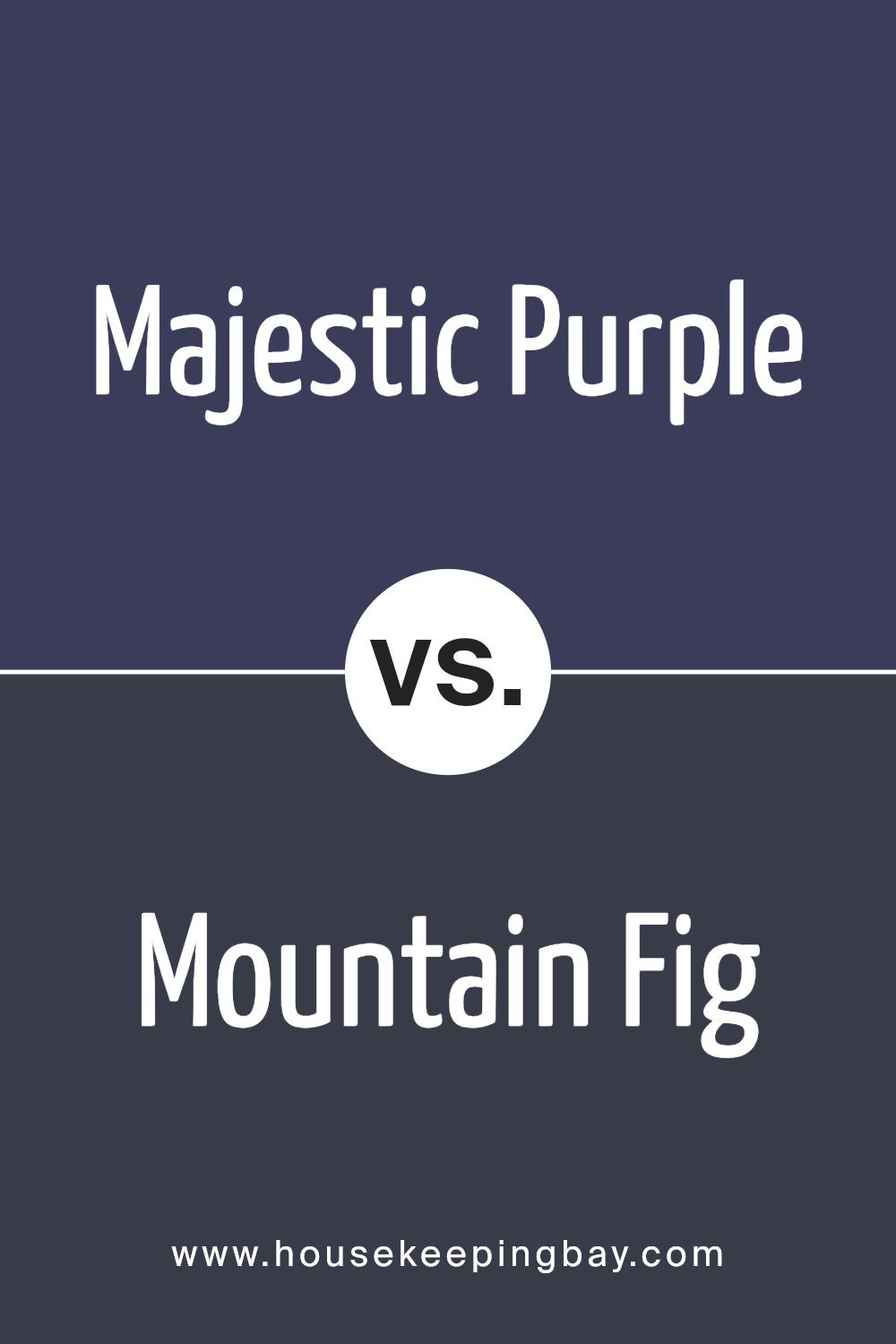
Majestic Purple SW 6545 by Sherwin Williams vs Mountain Fig SW 9690 by Sherwin Williams
Majestic Purple SW 6545 by Sherwin Williams is a rich, deep purple with regal undertones, evoking a sense of luxury and elegance. It combines red and blue hues, offering a balance that feels both warm and cool. This color works well in creating a sophisticated atmosphere in living rooms or dining areas.
Mountain Fig SW 9690 by Sherwin Williams, meanwhile, presents a more subdued and earthy tone. It leans towards a grayish mauve, which gives it a softer, more understated appearance than Majestic Purple. Mountain Fig carries an earthy quality that makes it suitable for cozy bedrooms or serene study spaces.
While Majestic Purple demands attention and exudes opulence, Mountain Fig offers a more relaxed and grounding vibe. Both colors bring their own unique charm; one shines through its bold statement, while the other offers calm subtlety. Choosing between them depends on the ambiance you desire for your space.
You can see recommended paint color below:
- SW 9690 Mountain Fig
housekeepingbay.com
Majestic Purple SW 6545 by Sherwin Williams vs Concord Grape SW 6559 by Sherwin Williams
Majestic Purple SW 6545 and Concord Grape SW 6559, both by Sherwin Williams, offer rich, bold hues. Majestic Purple is a deep purple that leans slightly blue, creating a royal and luxurious feel. It works well in sophisticated spaces, adding depth and drama.
Concord Grape, while also a deep purple, carries a warmer tone with hints of red, reminiscent of ripe grapes. It introduces warmth and coziness, making spaces feel inviting and intimate.
When choosing between these colors, consider the mood you wish to set. Majestic Purple’s cooler undertones suit elegant and formal environments, while Concord Grape’s warmer tint adds comfort and richness, ideal for living areas or cozy corners. Both colors make strong statements, yet their differing undertones mean they work best in unique settings. Whether seeking a cool, regal atmosphere or a warm, inviting aura, these purples bring character to any room.
You can see recommended paint color below:
- SW 6559 Concord Grape
housekeepingbay.com
Majestic Purple SW 6545 by Sherwin Williams vs Dress Blues SW 9176 by Sherwin Williams
Majestic Purple SW 6545 and Dress Blues SW 9176, both by Sherwin Williams, offer distinct moods. Majestic Purple exudes richness and warmth, with its deep violet hue, adding sophistication to spaces. It’s a bold choice for those seeking a touch of luxury. Its intensity can create a dramatic focal point or dominate a room for an elegant feel.
Dress Blues, a dark navy, carries the essence of classic elegance and stability. Its deep blue tones bring a calming and soothing atmosphere, making it a versatile choice for both modern and traditional settings. It’s suitable for spaces requiring a serene or serious ambiance.
While Majestic Purple brings vibrant energy and opulence, Dress Blues offers a more subtle, refined look with its timeless appeal. Choosing between them depends on desired ambiance: bold and rich, or calm and classic. Both colors transform spaces with their unique qualities, complementing different styles.
You can see recommended paint color below:
- SW 9176 Dress Blues

housekeepingbay.com
Majestic Purple SW 6545 by Sherwin Williams vs Dewberry SW 6552 by Sherwin Williams
Majestic Purple SW 6545 and Dewberry SW 6552 are two intriguing colors from Sherwin Williams. Majestic Purple stands as a regal, deep shade of purple, evoking a sense of richness and sophistication. It can add a touch of luxury to any room while maintaining a warm and inviting feel. This color works well in spaces where you want to create a cozy, yet elegant atmosphere.
Dewberry SW 6552, slightly darker and more muted than Majestic Purple, carries a more subdued tone. It feels grounding and can complement areas where a calming presence is desired.
Dewberry leans towards a cooler undertone, giving it a more serious and intense vibe compared to the vibrant energy of Majestic Purple.
When using these colors together or separately, Majestic Purple might be ideal for highlighting features or accentuating decor, while Dewberry could serve as a perfect backdrop, adding depth and character to a room’s overall aesthetic.
You can see recommended paint color below:
- SW 6552 Dewberry
housekeepingbay.com
Majestic Purple SW 6545 by Sherwin Williams vs Izmir Purple SW 6825 by Sherwin Williams
Majestic Purple SW 6545 and Izmir Purple SW 6825 are both fascinating shades from Sherwin Williams, yet they each bring their own unique vibe to a space. Majestic Purple leans towards a more muted, sophisticated tone.
It’s rich and deep, offering a sense of luxury and calm sophistication, ideal for spaces where a touch of elegance is desired. It pairs beautifully with neutral tones and can serve as a dramatic accent.
In contrast, Izmir Purple is brighter, with a more vibrant and lively energy. It reflects light differently, making it pop and add a bold character to any room. This shade works well in spaces meant to inspire creativity or add an energetic touch.
Izmir Purple might pair effectively with lighter grays or whites to balance its intensity. Both purples have the ability to change the mood of a space, each with its distinct personality and appeal.
You can see recommended paint color below:
- SW 6825 Izmir Purple
housekeepingbay.com
Conclusion
Majestic Purple by Sherwin Williams is a rich and bold color that makes a strong statement. When I first encountered this shade, I was struck by its deep, regal tone that feels both sophisticated and welcoming. It adds depth and character to any space, making it a perfect choice for those looking to add warmth and personality to their home.
Using Majestic Purple in a room can give it a luxurious and cozy vibe, whether applied as an accent wall or throughout the entire space. It’s a versatile color that pairs well with both light and dark tones, offering flexibility in design choices.
It complements neutral shades like gray and beige beautifully, while also standing out when paired with metallics or vibrant colors.
Personally, I see Majestic Purple as an opportunity to express creativity and individuality. It’s more than just a color; it brings life and energy to a room.
Whether you’re updating a living space or designing a new one, this color can add a touch of elegance and a sense of comfort.
Overall, SW 6545 Majestic Purple is a choice that offers depth and style, perfect for those who want to make a bold yet sophisticated impression.
housekeepingbay.com
Ever wished paint sampling was as easy as sticking a sticker? Guess what? Now it is! Discover Samplize's unique Peel & Stick samples. Get started now and say goodbye to the old messy way!
Get paint samples


