Dried Lavender SW 9072 by Sherwin Williams
Effortless Elegance in Every Hue
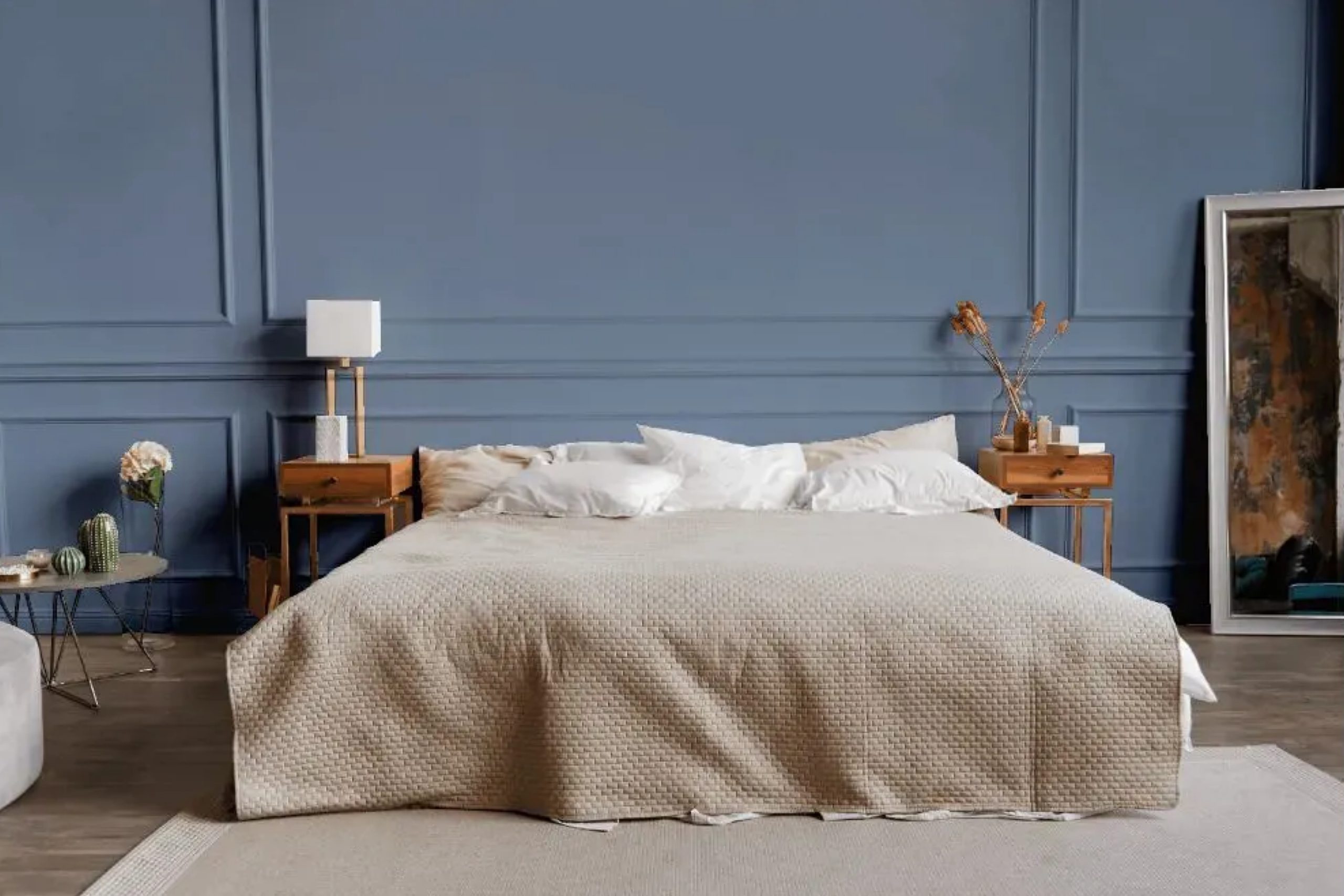
When choosing a color that adds both warmth and calm to your space, SW 9072 Dried Lavender by Sherwin Williams stands out. Picture a shade that combines the soothing essence of lavender with a hint of gray to ground your surroundings. It’s not just a color; it’s a feeling.
This particular shade offers a perfect balance, making it suitable for nearly any room in your home. Imagine it in the living room, where it invites relaxation, or in the bedroom, creating a subtle sanctuary for sleep.
It’s like having a small piece of nature indoors, blending effortlessly with both bold and neutral palettes.
Whether you have bright accents or prefer soft, muted tones, Dried Lavender is adaptable, providing a seamless backdrop that complements your unique style.
It’s a color that doesn’t scream for attention but gently makes its presence known.
So, when you want a versatile and elegant choice for your walls, Dried Lavender provides a serene touch that enhances your environment and reflects your personality. Its quiet charm might be just what you need to feel at home.
via plan-home.com
What Color Is Dried Lavender SW 9072 by Sherwin Williams?
Dried Lavender SW 9072 by Sherwin Williams is a gentle, muted purple with gray undertones. It carries a soft, soothing quality that can infuse a space with a calm, relaxed vibe. This color works incredibly well in interiors that aim for a peaceful, cozy atmosphere.
In terms of style, Dried Lavender fits beautifully into cottage and farmhouse interiors. Its understated elegance also makes it a great choice for modern minimalist designs, where subtle colors enhance the clean lines and simple shapes.
Mid-century modern spaces may use this color to add warmth without overwhelming the overall look.
Pair Dried Lavender with natural materials like light wood or stone for a harmonious effect. Consider textures such as linen or cotton for curtains or cushions, as they complement this hue nicely. Rattan elements or wicker furniture can add an organic touch, enhancing the natural feel.
For contrast, use crisp whites or deep charcoals, which make Dried Lavender pop while maintaining an understated elegance. Adding metallic accents like brushed nickel or matte brass can introduce a bit of shine and sophistication.
Overall, Dried Lavender SW 9072 allows crafting of spaces that feel warm, welcoming, and grounded, fostering comfort and quiet relaxation effectively.
housekeepingbay.com
Is Dried Lavender SW 9072 by Sherwin Williams Warm or Cool color?
Dried Lavender SW 9072 by Sherwin Williams is a soft, calming color that brings a sense of peace to any room. Its light purple shade, with hints of gray, makes spaces feel open and airy. Unlike bold colors, Dried Lavender provides a gentle background that does not overwhelm.
In living rooms, this hue creates a welcoming atmosphere, perfect for relaxation after a long day. When used in bedrooms, it promotes calmness and restfulness, helping to ensure a good night’s sleep.
The color works well with both modern and traditional furniture, making it versatile for any home style. It pairs beautifully with whites, creams, and even darker purples or blues for added depth.
The understated elegance of Dried Lavender also allows for easy decoration changes. Whether you prefer minimalist designs or colorful accents, this shade accommodates various tastes. Its subtlety ensures that it remains a pleasing choice for years.
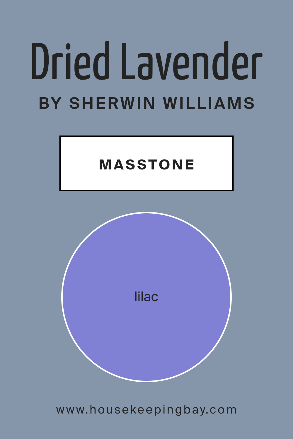
What is the Masstone of the Dried Lavender SW 9072 by Sherwin Williams?
Dried Lavender SW 9072 by Sherwin Williams is a gentle, soft color that adds a sense of calm to any room. Its masstone, Lilac (#8080D5), is a light purple shade with a touch of blue, giving it a refreshing and soothing feel. This color works beautifully in homes where a peaceful and relaxing atmosphere is desired.
Because of its soft tones, Dried Lavender can make spaces feel more open and airy, and it pairs well with neutrals like white or gray for a balanced look.
In bedrooms, it encourages restful sleep and relaxation. In living areas, it adds a touch of elegance without feeling overwhelming. This shade can also work well in home offices, creating a serene environment that boosts focus and productivity.
When used in bathrooms, the lavender shade gives a spa-like feel, making it a perfect choice for those moments of unwinding after a long day.
housekeepingbay.com
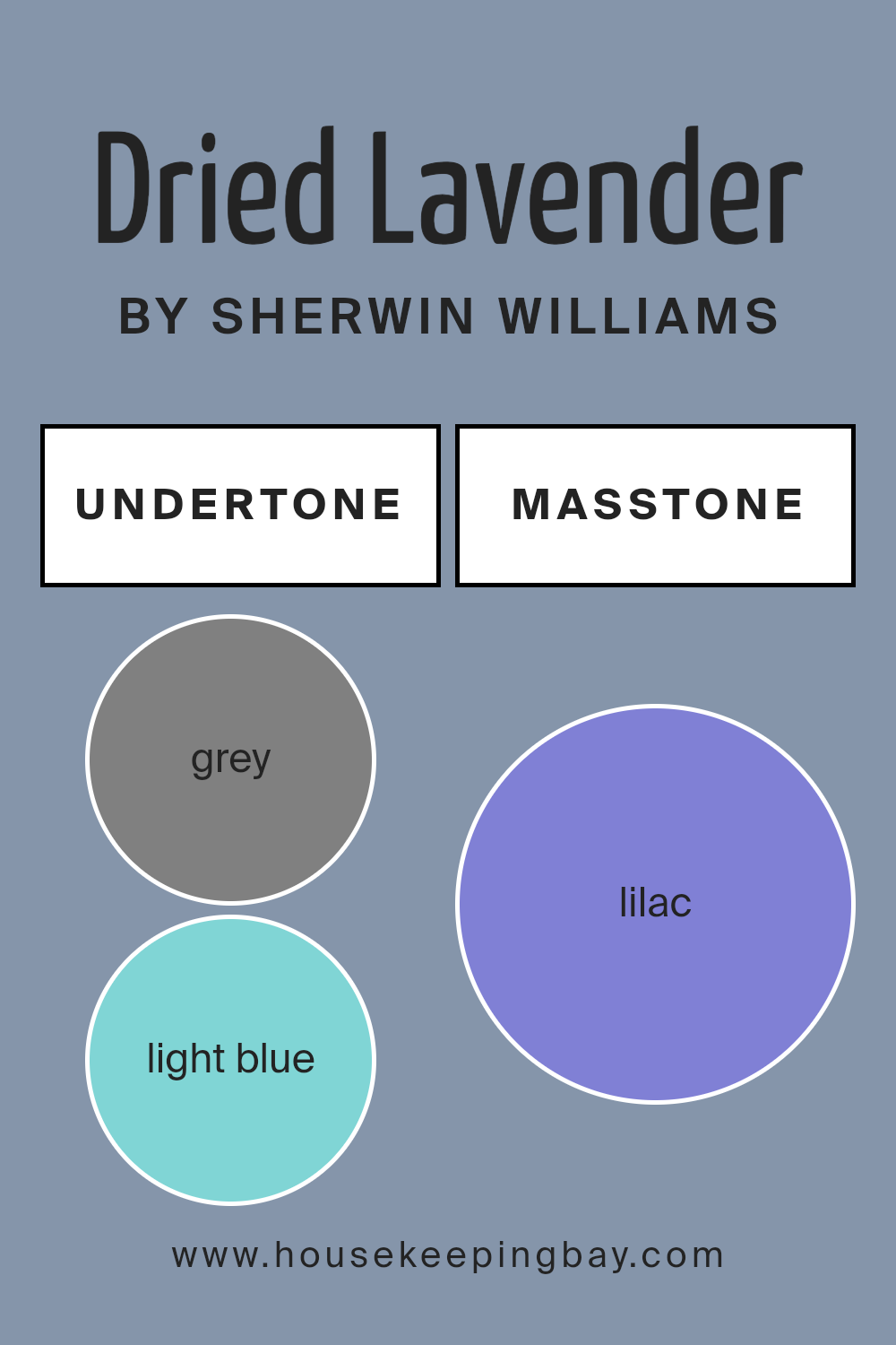
Undertones of Dried Lavender SW 9072 by Sherwin Williams
Dried Lavender SW 9072 by Sherwin Williams is a gentle, muted hue that combines elements from various undertones. The overall effect is a soft, calming color that feels both sophisticated and comforting. Its grey undertones add a neutral, balanced aspect, making it versatile and grounding. The hints of light blue and dark blue give it a cooler feel, creating a sense of calm and relaxation, while mint and light turquoise add a refreshing, subtle liveliness.
Light purple and violet undertones are apparent as well, which give Dried Lavender a soft, delicate twist that avoids being too overpowering. These purple elements can add more depth and interest to the color, making it more dynamic on walls.
Pale pink and pink add a touch of warmth and softness, giving a gentle contrast to cooler shades.
Turquoise and dark turquoise undertones bring a hint of depth and richness, enhancing the overall color with a slight sense of mystery.
Pale yellow hints introduce a subtle warmth that may brighten spaces. The inclusion of dark, navy, and light gray tones helps this color mesh well with other colors, providing harmony and coherence to rooms.
Overall, these varied undertones ensure Dried Lavender remains a flexible and appealing choice for interior walls.
housekeepingbay.com
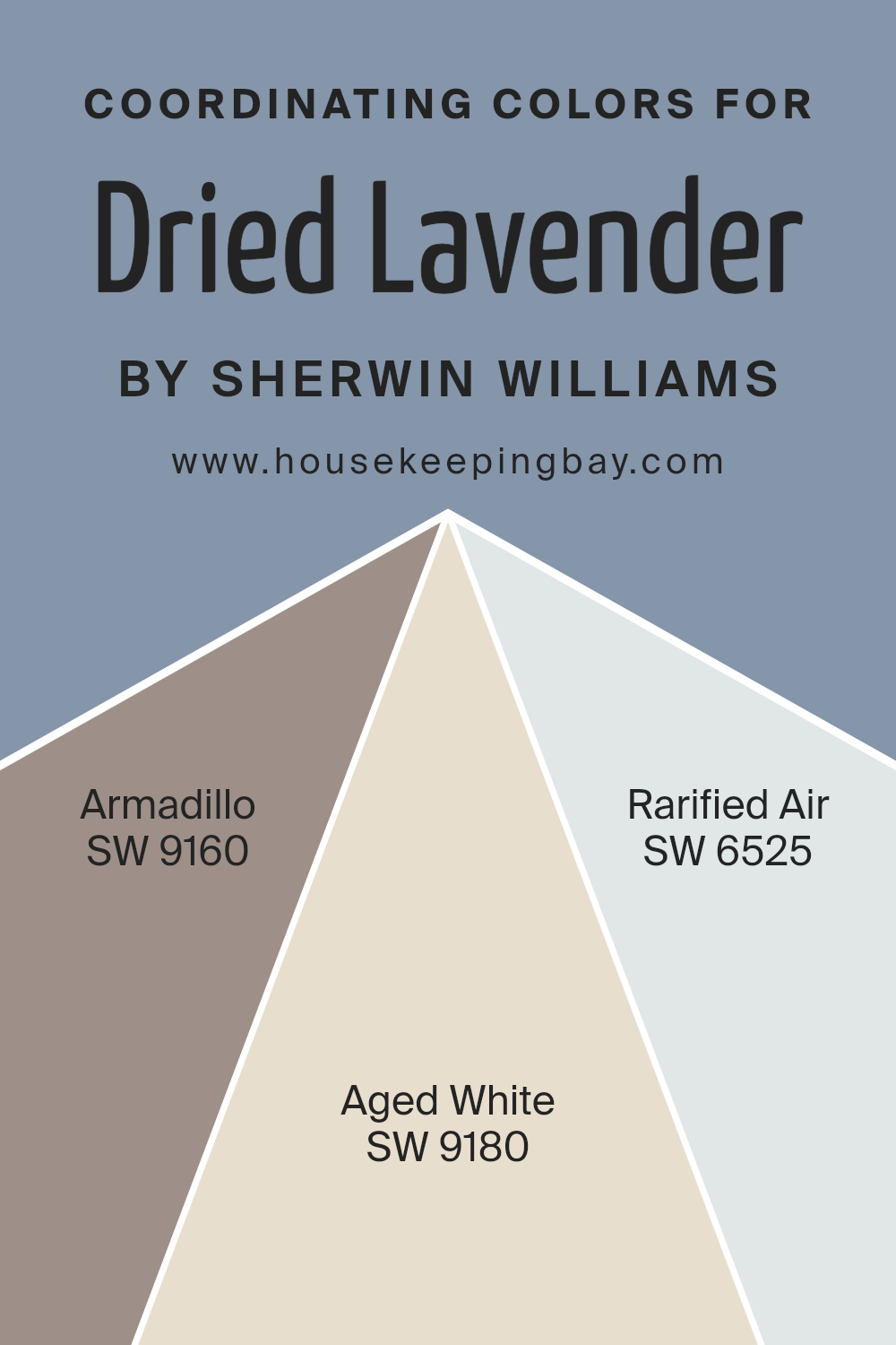
Coordinating Colors of Dried Lavender SW 9072 by Sherwin Williams
Coordinating colors are hues that work well together to create a cohesive and pleasing look in a space. They complement one another by sharing certain undertones or by providing a harmonious contrast. When used alongside Dried Lavender by Sherwin Williams, coordinating colors like Armadillo, Aged White, and Rarified Air can enhance the overall aesthetic of a room.
These colors can be used on walls, furniture, or accents to add depth and interest without clashing.
Armadillo is a muted, earthy shade that brings warmth and depth. It pairs seamlessly with Dried Lavender, adding richness and sophistication. Aged White offers a soft, creamy backdrop that can make spaces feel open and welcoming. Its gentle tone balances the cooler notes of Dried Lavender, contributing to a comforting atmosphere.
Meanwhile, Rarified Air is a light, airy blue with a hint of gray. It introduces a subtle coolness that complements both the lavender and the deeper tones of Armadillo.
By choosing these coordinating hues, you can create a balanced and inviting environment. Such combinations help bring a room together, offering visual interest and harmony.
You can see recommended paint colors below:
- SW 9160 Armadillo
- SW 9180 Aged White
- SW 6525 Rarified Air
housekeepingbay.com
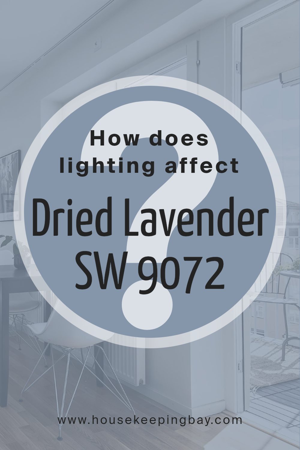
How Does Lighting Affect Dried Lavender SW 9072 by Sherwin Williams?
Lighting plays a crucial role in how we perceive colors, and the color Dried Lavender SW 9072 by Sherwin Williams is no exception. This soft, muted lavender hue can change appearance based on the type of lighting and the orientation of the room.
In natural light, colors show their true shade. In a north-facing room, where light tends to be cooler and more diffused, Dried Lavender may seem a bit more subdued and bluish. This cooler light can make the color appear slightly grayer, which might enhance its muted lavender quality.
In south-facing rooms, the abundant, warm sunlight can bring out the warmer, pinker undertones in Dried Lavender. The room will have bright, warm light for most of the day, allowing the color to appear more vibrant and lively.
In east-facing rooms, morning light is warm and soft, making Dried Lavender appear slightly warmer, possibly bringing out its pinkish tones. However, as the day progresses and the sun moves away from the east, the light becomes cooler and the room gets less direct sunlight, which may make the color appear slightly cooler and grayer later in the day.
West-facing rooms receive warm and intense sunlight in the late afternoon and evening. In these rooms, Dried Lavender may look warmer and a bit brighter as the sun starts to set. During midday, when the light is less direct, the color might appear similar to its true form, but with reduced intensity compared to later in the day.
In artificial light, the effect greatly depends on the type of bulbs used. Warm incandescent bulbs can enhance the warmth in Dried Lavender, drawing out any pinkish hues. On the other hand, cool fluorescent or LED lights can emphasize the gray or blue undertones, giving the room a cooler feel.
Thus, choosing the right lighting for the mood and effect you desire is essential, especially with colors like Dried Lavender.
housekeepingbay.com
What is the LRV of Dried Lavender SW 9072 by Sherwin Williams?
Light Reflectance Value (LRV) is a measurement that tells us how much light a color reflects and how much it absorbs. It’s a scale from 0 to 100, where 0 is pure black, reflecting no light, and 100 is pure white, reflecting all light.
Colors with higher LRV values reflect more light, making rooms feel brighter and more open. Conversely, colors with lower LRV values absorb more light, leading to a cozier, more intimate atmosphere.
Designers and homeowners look at LRV to understand how a color will behave in a space, especially concerning natural and artificial lighting.
With an LRV of 29.319, Dried Lavender by Sherwin Williams is on the darker side of the scale.
This means it will absorb more light than it reflects, giving walls a backdrop that can feel warm and snug. In rooms with a lot of natural light, the color might appear slightly lighter and less intense, while in spaces with less light, it can create a rich, enveloping effect.
Because of its moderate LRV, Dried Lavender is often used to add depth and character, ideal for bedrooms or cozy living areas where a relaxing ambiance is desired.

housekeepingbay.com
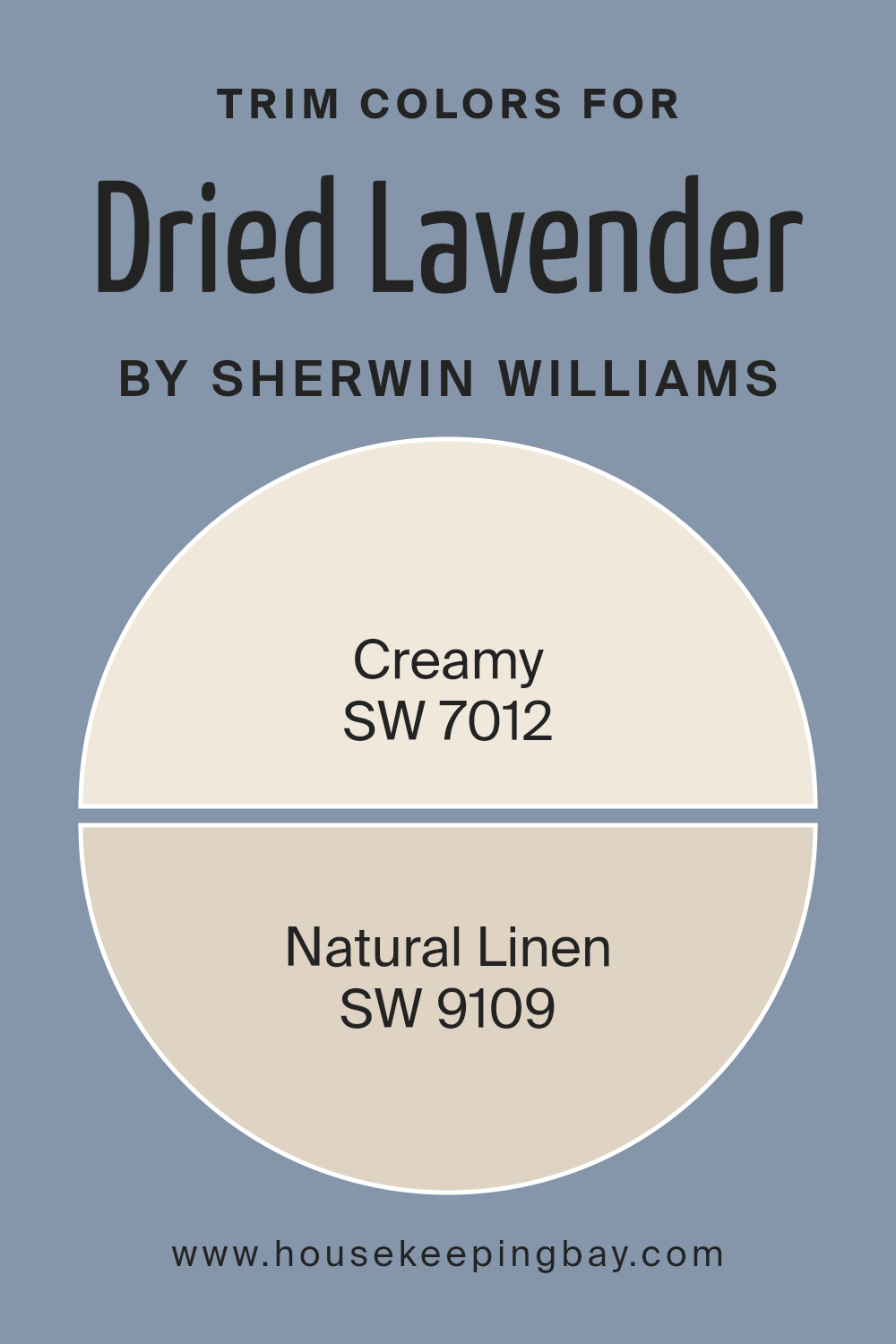
What are the Trim colors of Dried Lavender SW 9072 by Sherwin Williams?
Trim colors refer to the shades applied to the edges and frames of a room, such as moldings, baseboards, and window trims. These colors play a vital role in highlighting architectural details and creating contrast within a space.
In the case of Dried Lavender SW 9072 by Sherwin Williams, selecting the right trim colors can make a significant difference in how the main wall color is perceived.
Using appropriate trim colors like SW 7012 – Creamy and SW 9109 – Natural Linen can enhance Dried Lavender’s soft and earthy tones, adding depth and interest to the room. Both trim colors work to either complement the main color or contrast it to bring out its best features.
SW 7012 – Creamy is a warm and inviting off-white that adds a sense of coziness without overwhelming the main color.
It offers a subtle backdrop that highlights Dried Lavender’s dusty purple shade. On the other hand, SW 9109 – Natural Linen provides a delicate, barely-there taupe with a warm tint, adding a soft, neutral contrast that keeps the overall look balanced and harmonious.
Both colors help to ground Dried Lavender while either enhancing its warmth or its gentle, muted character. By carefully selecting these trim colors, the room achieves a well-rounded and visually pleasing aesthetic.
You can see recommended paint colors below:
housekeepingbay.com
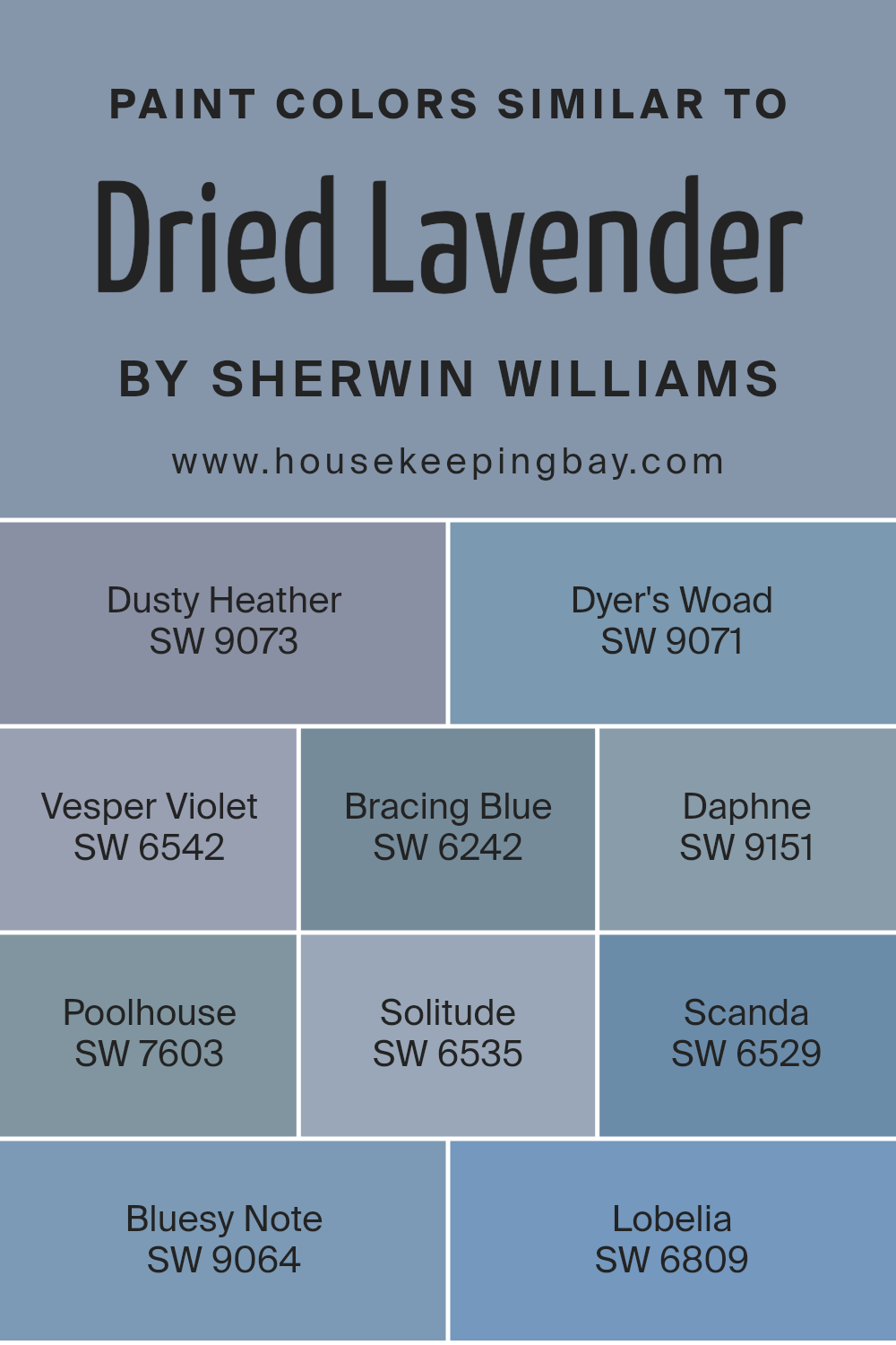
Colors Similar to Dried Lavender SW 9072 by Sherwin Williams
Similar colors are important in design because they create harmony and cohesion. When you use colors that are close to each other on the color wheel, they often blend well, providing a balanced and unified appearance.
In the case of Dried Lavender SW 9072 by Sherwin Williams, opting for similar shades enhances calming and soothing qualities, making spaces feel inviting and comfortable. These colors complement each other naturally, creating a seamless visual experience.
Exploring the range of similar hues, SW 9073 – Dusty Heather brings a soft, muted purple that adds a gentle touch to any room. SW 9071 – Dyer’s Woad provides a rich, deep blue, perfect for adding depth. SW 6542 – Vesper Violet offers a slightly darker violet with a calming effect.
Moving towards blue tones, SW 6242 – Bracing Blue presents a strong, cool hue, while SW 9151 – Daphne adds a lighter, airy blue with hints of gray.
For a softer blue, SW 7603 – Poolhouse carries a peaceful vibe. SW 6535 – Solitude brings a serene lavender-blue tone. Then there’s SW 6529 – Scanda, a refreshing light blue that brightens spaces. A deeper choice, SW 9064 – Bluesy Note, gives a classic denim feel, and rounding out the palette, SW 6809 – Lobelia offers a cheerful, vibrant blue. Each of these colors complements Dried Lavender, allowing for a harmonious design.
You can see recommended paint colors below:
- SW 9073 Dusty Heather
- SW 9071 Dyer’s Woad
- SW 6542 Vesper Violet
- SW 6242 Bracing Blue
- SW 9151 Daphne
- SW 7603 Poolhouse
- SW 6535 Solitude
- SW 6529 Scanda
- SW 9064 Bluesy Note
- SW 6809 Lobelia
housekeepingbay.com
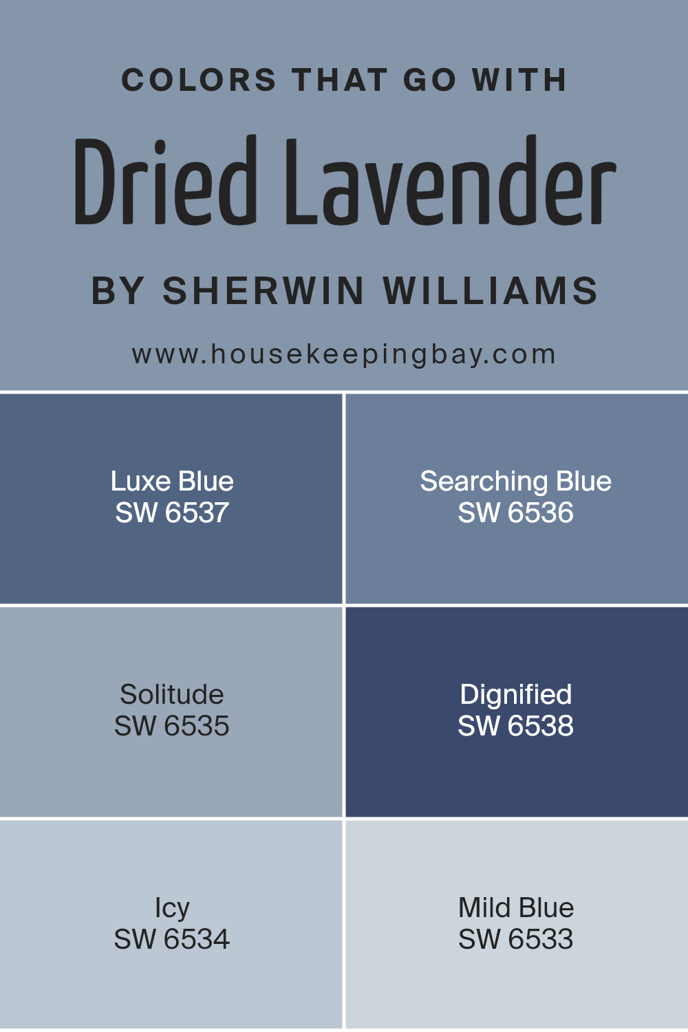
Colors that Go With Dried Lavender SW 9072 by Sherwin Williams
Colors that complement Dried Lavender SW 9072 by Sherwin Williams enhance its soft, calming vibe. They add depth and personality to a room, creating a balanced environment. Using colors like Luxe Blue SW 6537 alongside Dried Lavender can add a sophisticated touch, with its rich, deep blue tone.
Searching Blue SW 6536, a slightly lighter hue, offers a serene balance, working well to promote a relaxing atmosphere. Solitude SW 6535 gently bridges the gap between these two, with its muted, peaceful vibe that complements Dried Lavender’s gentle elegance.
Dignified SW 6538 offers a deeper, more introspective tone that provides contrast while still blending well with the softer colors. Then there is Icy SW 6534, which adds a crisp, fresh breath to the palette with its pale blue shade, creating an airy feel.
Mild Blue SW 6533 rounds out the scheme with a subtle, gentle blue that can soothe any space.
Each of these colors brings its unique character, but together they create harmony with Dried Lavender, bringing a sense of completeness and cohesion.
You can see recommended paint colors below:
- SW 6537 Luxe Blue
- SW 6536 Searching Blue
- SW 6535 Solitude
- SW 6538 Dignified
- SW 6534 Icy
- SW 6533 Mild Blue
housekeepingbay.com
How to Use Dried Lavender SW 9072 by Sherwin Williams In Your Home?
Dried Lavender SW 9072 by Sherwin Williams is a soft, muted lavender color that brings a gentle touch to any space. This shade is perfect for creating a cozy and calming atmosphere, making it ideal for bedrooms or living rooms where relaxation is key. You can use this color on walls to give a room a subtle hint of lavender without being overwhelming.
Pair it with neutral furniture and white trim to let the color truly shine. Dried Lavender also works well in nurseries, offering a sweet and serene environment for a baby. In bathrooms, this color complements white tiles and fixtures, giving a clean yet inviting feel.
Additionally, consider using Dried Lavender as an accent color by painting a single wall or a piece of furniture. Accessories in soft grays or natural wood tones can enhance the warmth of the space while keeping it stylish and comfortable.
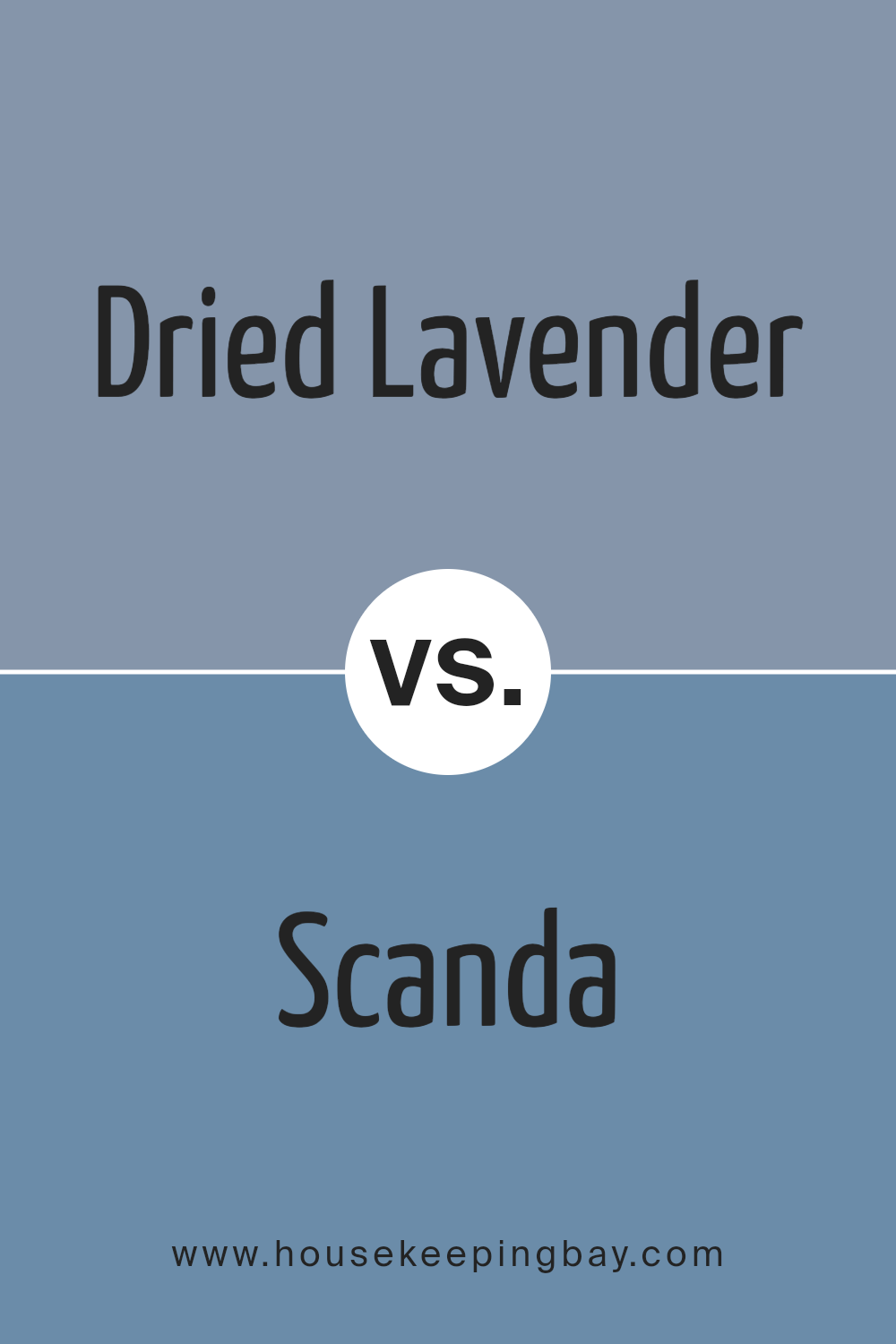
Dried Lavender SW 9072 by Sherwin Williams vs Scanda SW 6529 by Sherwin Williams
Dried Lavender SW 9072 by Sherwin Williams is a muted, soft purple with calming gray undertones. It’s a versatile shade that can create a relaxed and cozy environment. This color works well in living rooms, bedrooms, or any space seeking a gentle touch of color without being too overpowering. It’s perfect for those who enjoy a hint of lavender without being overly vibrant.
Scanda SW 6529, also by Sherwin Williams, is a cool, refreshing blue with hints of gray. It offers a crisp and clean appearance, reminiscent of a serene sky or a peaceful ocean. Scanda can add a refreshing and invigorating feel to spaces like bathrooms, kitchens, or any room that benefits from a cool, airy vibe.
When comparing these colors, Dried Lavender leans towards warmth and softness, while Scanda offers a cooler and more invigorating atmosphere. Both colors provide distinct moods, each suitable for different environments.
You can see recommended paint color below:
- SW 6529 Scanda
housekeepingbay.com
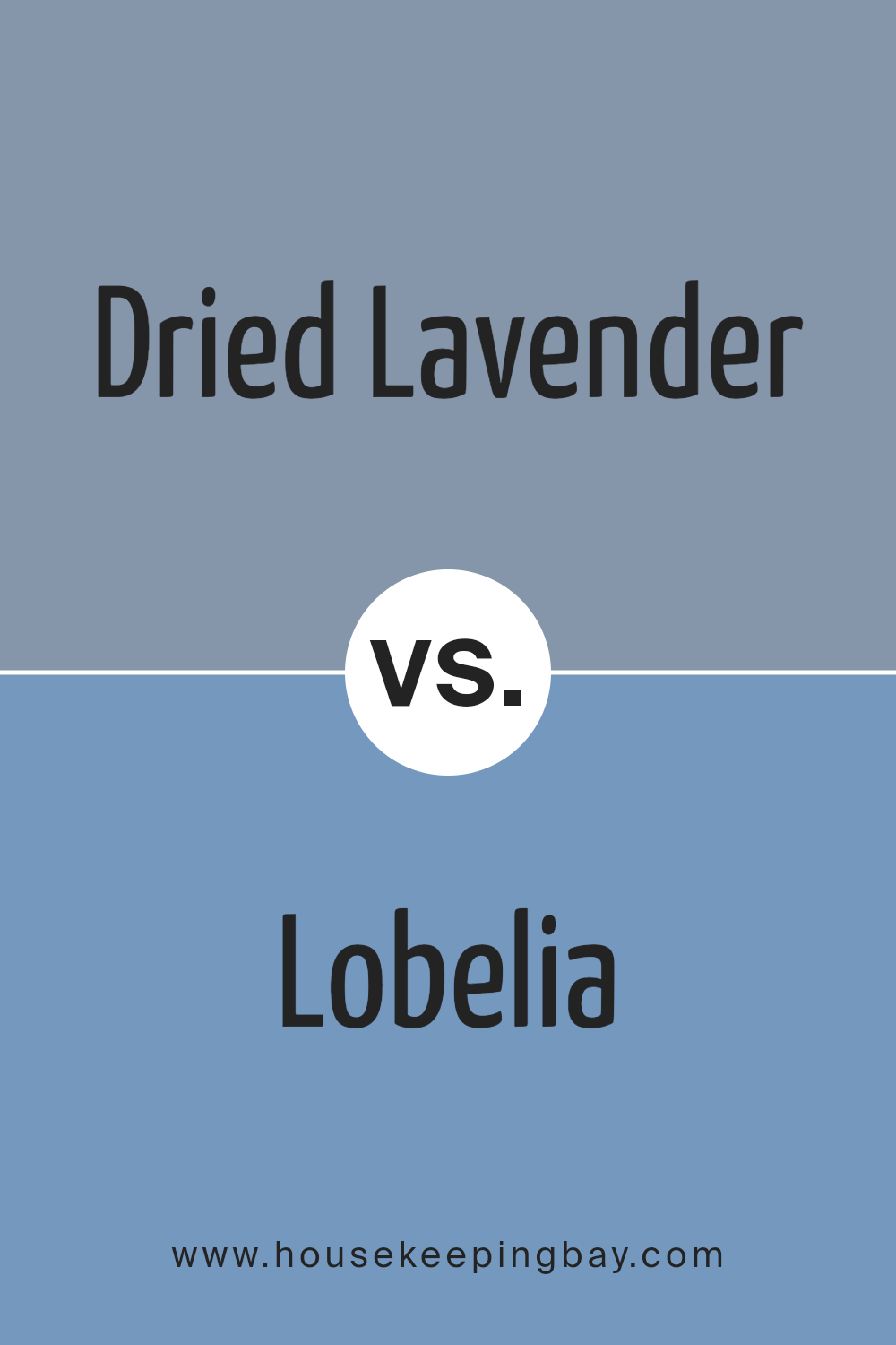
Dried Lavender SW 9072 by Sherwin Williams vs Lobelia SW 6809 by Sherwin Williams
Dried Lavender SW 9072 and Lobelia SW 6809 both belong to the purple family but offer distinct vibes. Dried Lavender presents a soft, muted purple with a hint of gray, giving it a calming, understated look. It fits well in spaces aiming for a relaxed, cozy atmosphere. Think of it like a gentle whisper of color, perfect for bedrooms or living spaces.
Lobelia SW 6809, however, offers a bolder shade of purple with blue undertones. It feels lively and vibrant, making it ideal for spaces that need energy and character. This color works well in places like creative studios or accent walls, where a pop of color can add interest and personality.
When placed side-by-side, Dried Lavender brings calm and serenity, while Lobelia provides energy and liveliness. Both colors can complement each other, with Dried Lavender offering a subdued elegance and Lobelia reflecting spirited enthusiasm.
You can see recommended paint color below:
- SW 6809 Lobelia
housekeepingbay.com
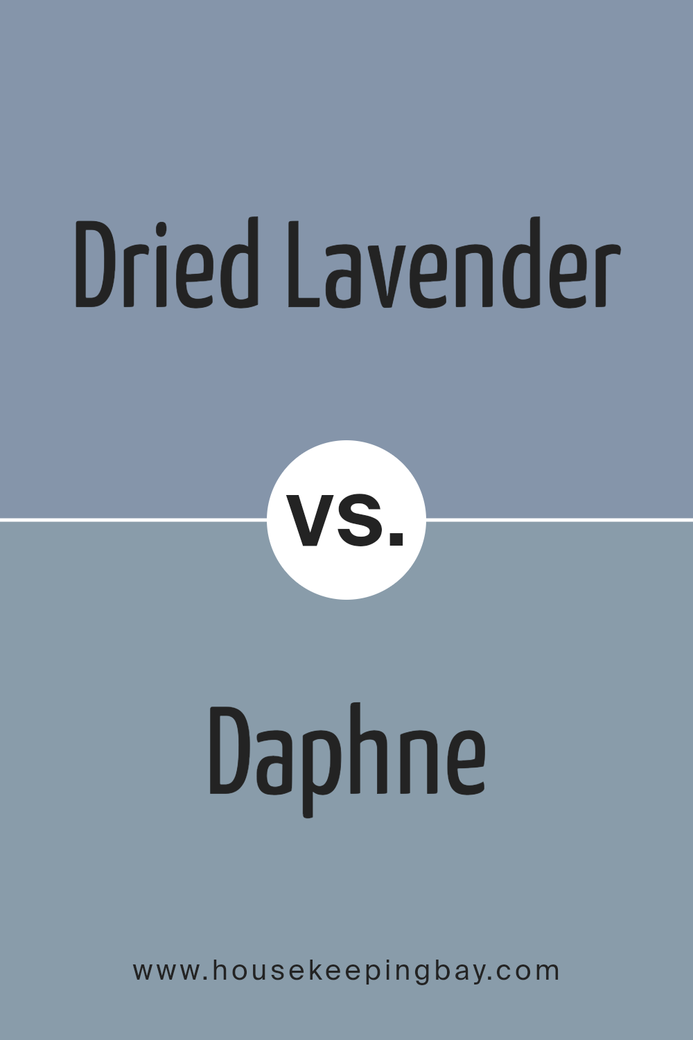
Dried Lavender SW 9072 by Sherwin Williams vs Daphne SW 9151 by Sherwin Williams
Dried Lavender SW 9072 and Daphne SW 9151, both from Sherwin Williams, present unique shades within the palette. Dried Lavender boasts a gentle, muted purple tone. It’s soft and soothing, creating a calming atmosphere. This color embodies subtle elegance, making it versatile for various spaces, ideal for bedrooms or quiet areas.
In contrast, Daphne SW 9151 offers a richer, more vibrant blue-green hue. Its lively nature injects energy into spaces, perfect for creating a fresh, uplifting feel in living rooms or study areas. The color stands out with its ability to bring in a hint of nature and tranquility.
While Dried Lavender leans towards a more pastel, subdued expression suited for relaxation, Daphne offers vibrancy and a touch of liveliness. Both colors serve different purposes: one evokes softness, the other, dynamic excitement. These colors can beautifully complement or function individually, enhancing the ambiance of a room.
You can see recommended paint color below:
- SW 9151 Daphne
housekeepingbay.com
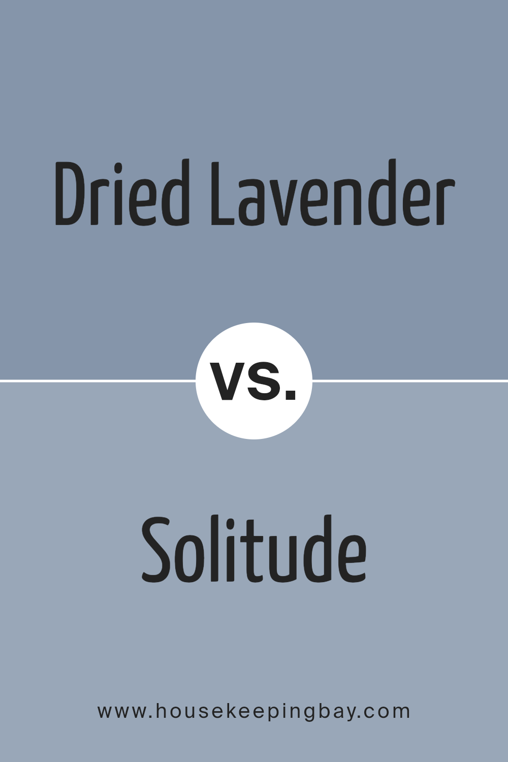
Dried Lavender SW 9072 by Sherwin Williams vs Solitude SW 6535 by Sherwin Williams
Dried Lavender SW 9072 and Solitude SW 6535, both by Sherwin Williams, offer two distinct yet calming shades. Dried Lavender, a soft purple, gently whispers hints of gray, evoking a sense of peace and subtlety. It creates a soothing and mellow atmosphere, ideal for spaces meant for relaxation or rest. Imagine a gentle lavender field under an overcast sky.
Solitude SW 6535, meanwhile, is a cooler, muted blue with a touch of gray. This color conveys serenity and calmness, reminiscent of a quiet ocean or a calm lake. Compared to Dried Lavender, Solitude feels more serene and composed, perfect for spaces designed for clarity and focus.
Together, these colors blend well, offering a harmonious balance of light purple and gentle blue. While Dried Lavender brings a hint of warmth and softness, Solitude’s cooler tones ground the space, ensuring a balanced, peaceful ambiance without being overpowering.
You can see recommended paint color below:
- SW 6535 Solitude
housekeepingbay.com
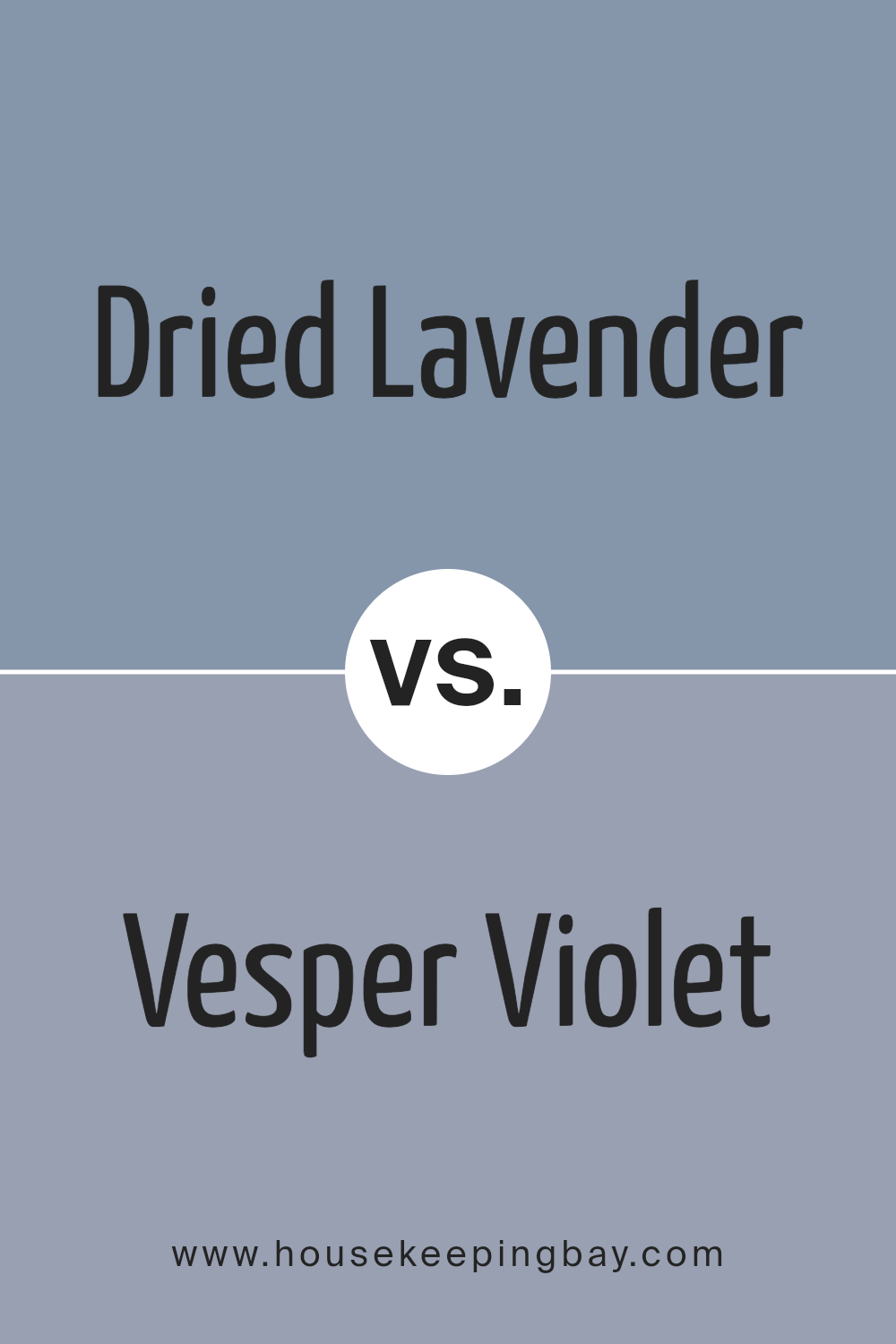
Dried Lavender SW 9072 by Sherwin Williams vs Vesper Violet SW 6542 by Sherwin Williams
Dried Lavender SW 9072 and Vesper Violet SW 6542 offer distinct vibes despite both being part of the purple family. Dried Lavender leans towards a softer, muted hue with gray undertones, making it a soothing choice for spaces aiming for calmness and subtle elegance. It’s perfect for bedrooms or living areas where a gentle ambiance is desired.
Vesper Violet, however, is more vibrant and bold. It has deeper tones that bring energy and drama to a room. This makes it suitable for accent walls or spaces requiring a touch of personality and richness.
While Dried Lavender provides a light, airy feel, Vesper Violet injects liveliness and warmth. Both can beautifully complement neutrals but deliver different impacts: one subtle, one striking. Choosing between them depends on whether you want a room to whisper softness or make a spirited statement.
You can see recommended paint color below:
- SW 6542 Vesper Violet
housekeepingbay.com
Dried Lavender SW 9072 by Sherwin Williams vs Dusty Heather SW 9073 by Sherwin Williams
Dried Lavender SW 9072 and Dusty Heather SW 9073 by Sherwin Williams both capture soft, muted tones that evoke a sense of calm. Dried Lavender leans towards a gentle purple with a hint of gray, creating an elegant and peaceful atmosphere. It’s a color that works nicely in spaces meant for relaxation, like bedrooms or living rooms, offering a touch of subtle sophistication.
Dusty Heather SW 9073, though similar, presents a slightly deeper hue. It carries more warmth with a bit more brown mixed into the purple, giving it a cozy, earthy feel. This color lends itself well to spaces looking for a bit more warmth without losing the soothing, muted quality.
Both colors complement each other and can be paired together to create a layered, cohesive look. Used separately or together, these shades introduce a gentle, understated charm into any space.
You can see recommended paint color below:
- SW 9073 Dusty Heather

housekeepingbay.com
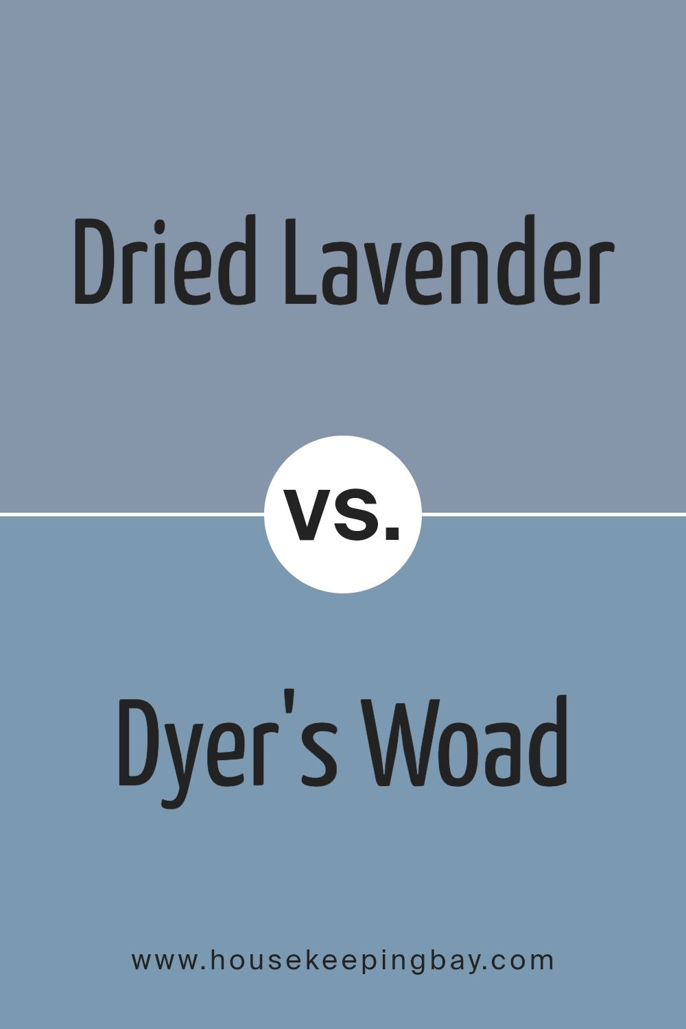
Dried Lavender SW 9072 by Sherwin Williams vs Dyer’s Woad SW 9071 by Sherwin Williams
Dried Lavender SW 9072 by Sherwin Williams is a soft, muted purple with a gentle, calming presence. It feels airy and light, perfect for creating a peaceful atmosphere in a room. The pale lavender hue conveys a sense of serenity and works well in spaces aiming for a relaxing environment, such as bedrooms or bathrooms.
Dyer’s Woad SW 9071, while still in the purple family, leans more towards a blue-toned slate. It is deeper and has a bit more intensity compared to Dried Lavender. Dyer’s Woad can lend a more dramatic and cozy effect to spaces, offering a touch of sophistication.
Both colors share a purple base, making them complementary choices, yet they differ significantly in tone and mood. Dried Lavender feels softer and more understated, while Dyer’s Woad offers a richer, bolder touch.
They can be paired together for a harmonious look or used individually depending on the desired ambiance.
You can see recommended paint color below:
- SW 9071 Dyer’s Woad
housekeepingbay.com
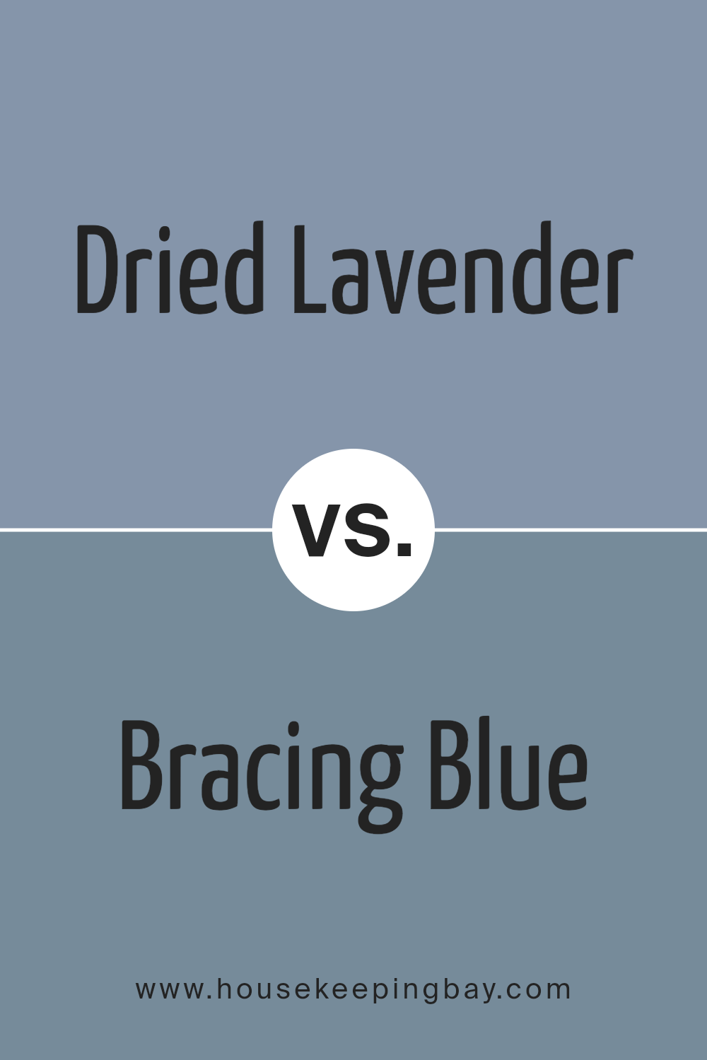
Dried Lavender SW 9072 by Sherwin Williams vs Bracing Blue SW 6242 by Sherwin Williams
Dried Lavender SW 9072 by Sherwin Williams is a muted, soft purple shade. It has a calming, subtle presence, reminiscent of lavender fields under the sun. This color brings a sense of peace and relaxation, making it suitable for bedrooms or living spaces where a serene atmosphere is desired.
Bracing Blue SW 6242, also by Sherwin Williams, presents a different vibe. This color is a cool, refreshing blue with hints of gray, like the sky on an overcast day. It feels crisp and clean, providing a fresh, invigorating touch to any room.
Bracing Blue works well in spaces where you want an energizing yet soothing feel, such as bathrooms or kitchens.
While Dried Lavender creates a warm, cozy environment, Bracing Blue feels cooler and more modern. They can complement each other if used together, with Dried Lavender softening the boldness of Bracing Blue in a balanced manner.
You can see recommended paint color below:
- SW 6242 Bracing Blue
housekeepingbay.com
Dried Lavender SW 9072 by Sherwin Williams vs Poolhouse SW 7603 by Sherwin Williams
Dried Lavender SW 9072 by Sherwin Williams features a soft, muted purple with a gentle gray undertone. It creates a calming and soothing atmosphere, reminiscent of dried flowers or a serene lavender field, fitting for spaces needing a touch of warmth and coziness. This color works well in bedrooms or living areas, offering a peaceful and relaxing vibe.
Poolhouse SW 7603, by contrast, presents a cool, muted blue with subtle hints of gray. This color evokes feelings of freshness and airiness, similar to a breezy, sunny day by the water. It suits bathrooms, kitchens, or any space where a crisp and refreshing look is desired.
Both colors share a muted quality, making them versatile and easy to pair with other colors. However, Dried Lavender leans warmer and more relaxed, while Poolhouse provides a cooler, more invigorating feel, offering different moods for varying spaces.
You can see recommended paint color below:
housekeepingbay.com
Dried Lavender SW 9072 by Sherwin Williams vs Bluesy Note SW 9064 by Sherwin Williams
Dried Lavender SW 9072 and Bluesy Note SW 9064 are two distinct shades from Sherwin Williams, bringing different vibes to a space. Dried Lavender is a soft, muted purple with gray undertones, offering a gentle and calming presence. It’s a color often associated with relaxation and comfort, making it a suitable choice for bedrooms or peaceful areas. The muted quality of Dried Lavender lends itself well to spaces needing a subtle pop without being overwhelming.
Bluesy Note, in contrast, provides a rich, deep blue hue. This strong, vibrant color carries a sense of depth and mystery, perfect for creating a focal point or adding energy to a room. Its bold nature makes it suitable for accent walls or to add character to living spaces or creative environments.
Both colors have unique attributes, with Dried Lavender leaning towards a serene, understated look, while Bluesy Note brings boldness and vibrancy, allowing them to complement or contrast based on the design vision.
You can see recommended paint color below:
- SW 9064 Bluesy Note

housekeepingbay.com
Conclusion
I’ve spent some time looking at SW 9072 Dried Lavender by Sherwin Williams, and I feel it offers a unique approach to color in any space. This shade of lavender strikes a balance between muted sophistication and a touch of warmth. It’s a versatile color that can blend well with various styles and palettes.
In my view, Dried Lavender brings a soft sense of comfort, making it ideal for spaces where relaxation is a priority, like bedrooms or reading nooks. It pairs beautifully with neutrals like whites and grays but can also serve as a gentle contrast to deeper hues.
I think incorporating this color into a home could add a sense of calm without feeling cold. Its subtle nature allows for flexibility in design choices, making it an excellent option for both bold interiors and more minimalist settings.
Overall, I see SW 9072 Dried Lavender as a harmonious and adaptable color. It invites creativity while maintaining an understated elegance, ensuring it remains a timeless choice for different rooms and styles.
housekeepingbay.com
Ever wished paint sampling was as easy as sticking a sticker? Guess what? Now it is! Discover Samplize's unique Peel & Stick samples. Get started now and say goodbye to the old messy way!
Get paint samples


