Dress Blues SW 9176 by Sherwin Williams
Navy’s Charm with a Bold, Fresh Look
SW 9176 Dress Blues by Sherwin Williams feels like your favorite navy jacket—familiar, warm, and classic. This deep blue brings comfort and style to any room, whether it’s a bedroom, living room, or just one standout wall. It’s a bold pick that still feels easy to live with.
You don’t have to worry about being trendy when choosing Dress Blues. It exudes a classic feel that pairs beautifully with a range of colors and materials. Think about how it might look alongside crisp whites, warm woods, or even lighter shades of blue.
This flexibility allows you to play with different design elements and create a room that feels both modern and inviting.
Dress Blues can effortlessly transition from a casual vibe to something more formal, depending on your style and decor.
It offers the perfect balance of depth and subtlety, creating a mood that’s both calming and sophisticated. Whether you’re aiming for a nautical theme or something more contemporary, this shade is a reliable choice. So, picture your updated space; the possibilities with Dress Blues are endless, and achieving the look you dream of is just a brushstroke away.
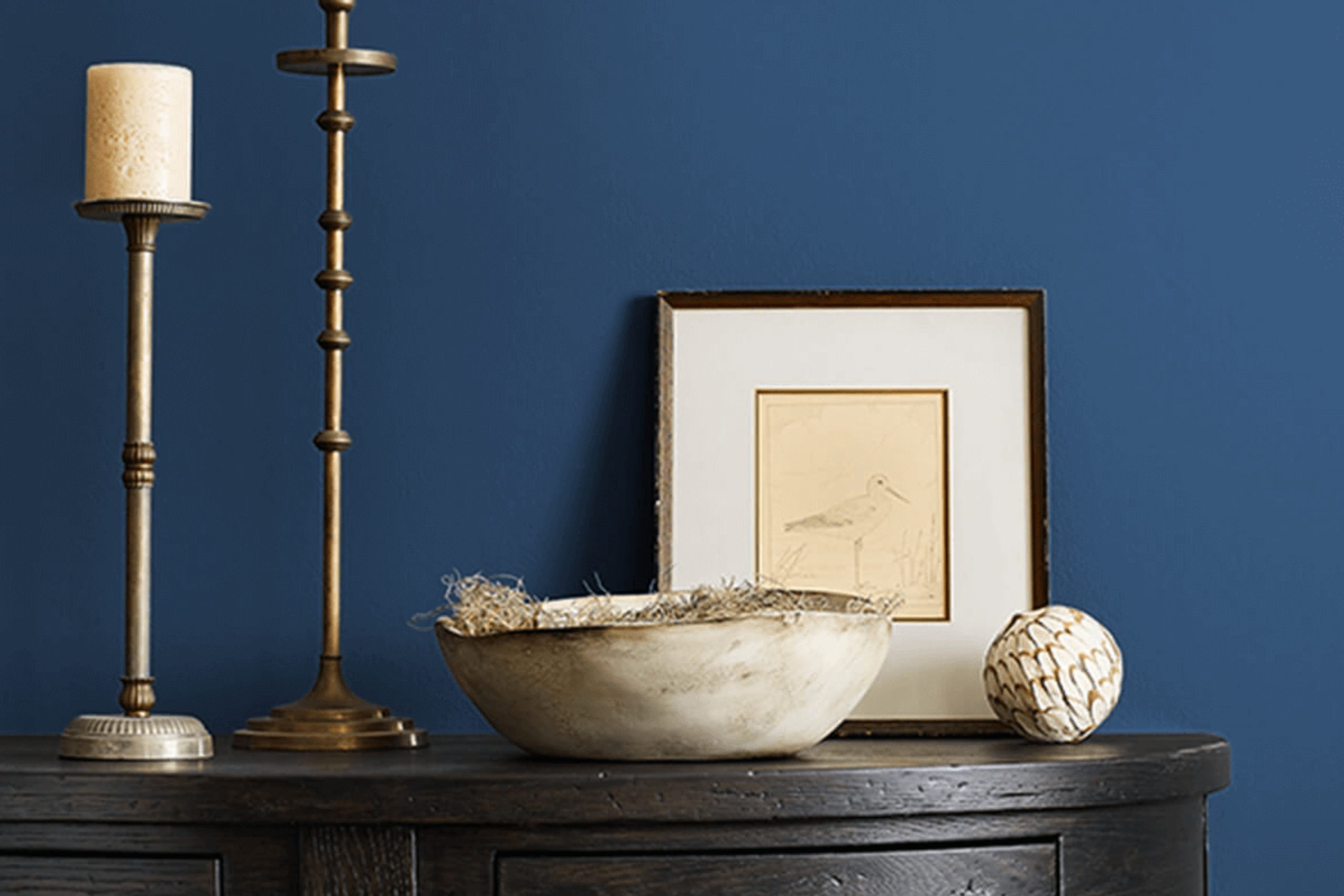
via sherwin-williams.com
What Color Is Dress Blues SW 9176 by Sherwin Williams?
Dress Blues SW 9176 by Sherwin Williams is a rich navy color that exudes depth and sophistication. Its deep blue tone provides a refined backdrop, making it an excellent choice for creating an elegant and timeless interior. Dress Blues can anchor a room, lending a touch of formality while maintaining a cozy and inviting atmosphere.
This versatile hue fits perfectly in both traditional and contemporary settings. In traditional interiors, Dress Blues serves as a classic element that complements dark wood furniture and antique pieces. In modern spaces, it provides a striking contrast to minimalist décor, highlighting clean lines and modern forms.
When it comes to materials, Dress Blues pairs beautifully with natural wood tones, especially dark mahogany or oak. Leather and metal accents, such as brass or gold, enhance its luxurious appeal, while soft, plush fabrics like velvet add a sense of comfort and richness.
This color also works well with lighter shades of blue or neutral tones, such as grays and creams, to create a balanced look.
Whether used on an accent wall, trim, or even cabinetry, Dress Blues SW 9176 adds depth and character, transforming spaces into sophisticated and harmonious areas that capture the eye and invite relaxation.

housekeepingbay.com
Is Dress Blues SW 9176 by Sherwin Williams Warm or Cool color?
Dress Blues SW 9176 by Sherwin Williams is a timeless, deep navy blue that brings a sense of sophistication and coziness to any space. Its rich, dark tone makes it an excellent choice for creating a focal point or adding depth to a room.
When used on walls, Dress Blues can provide a bold, elegant backdrop, highlighting lighter furnishings and decorations.
In smaller spaces, this color helps in creating an intimate atmosphere without feeling oppressive. In contrast, in larger rooms, it can add a touch of drama while maintaining a comforting, grounded ambiance. Paired with crisp whites, metallic accents, or even warm woods, Dress Blues complements various styles, from modern to traditional.
It brings a classic touch while remaining versatile enough for contemporary settings. Overall, Dress Blues SW 9176 serves as a strong yet flexible option for those looking to add a layer of richness and character to their homes.
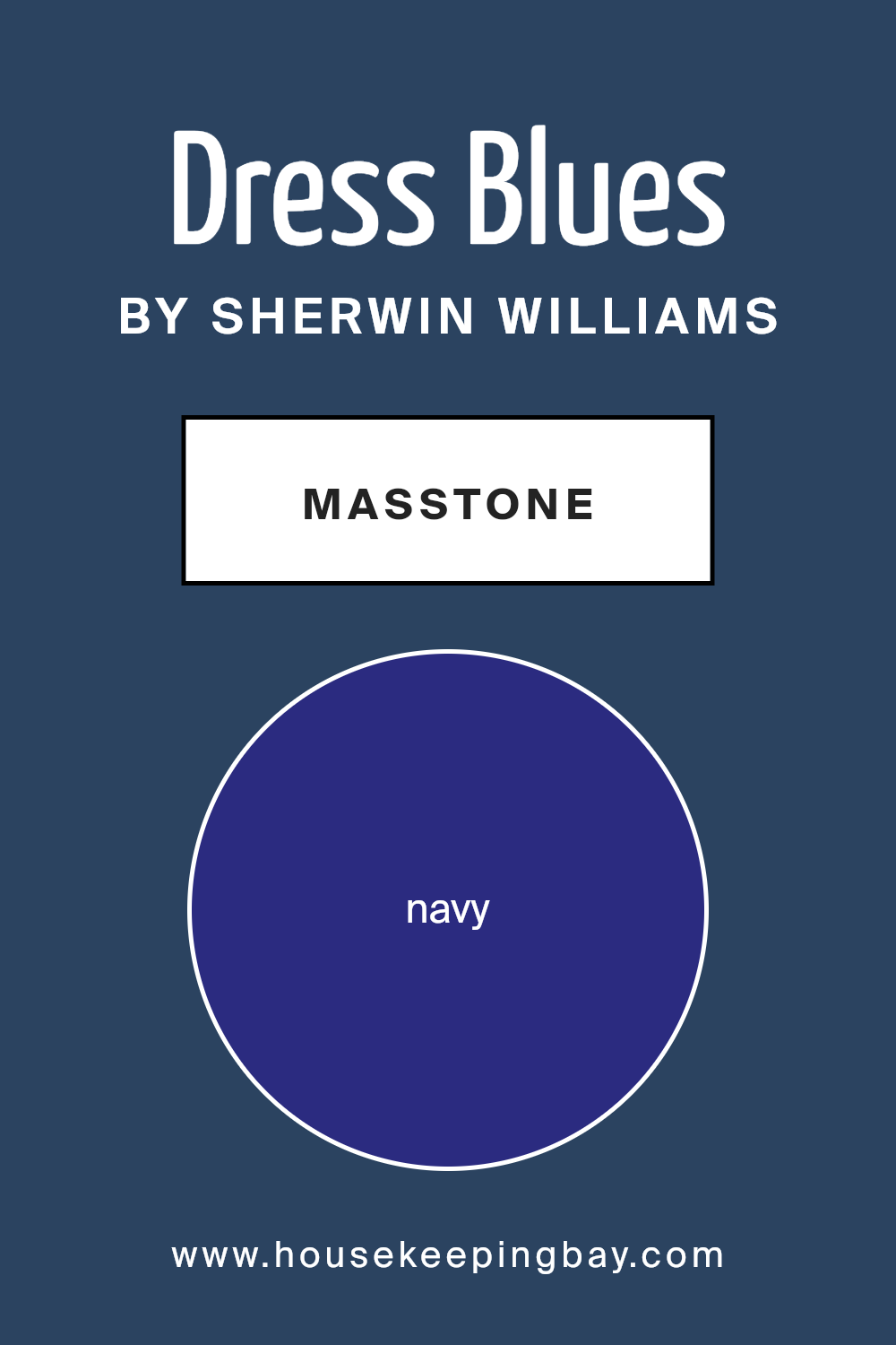
What is the Masstone of the Dress Blues SW 9176 by Sherwin Williams?
Dress Blues SW 9176 by Sherwin Williams is a deep and rich navy blue. The masstone, which is the main color you see, is a strong shade of navy (#2B2B80). This navy creates a feeling of depth and intimacy in a room. When used on walls, it adds a sense of warmth and coziness, making large spaces feel more welcoming.
The color is versatile and pairs well with lighter shades, like whites or creams, to create a classic and timeless look. It also complements metallic accents, such as gold or silver, adding a touch of elegance and sophistication.
In a bedroom, Dress Blues can offer a calming atmosphere, while in a living area, it can form a striking backdrop for art or furniture. This navy shade fits well in traditional and modern settings alike, making it a favorite for creating rooms with personality and style.
housekeepingbay.com
Undertones of Dress Blues SW 9176 by Sherwin Williams
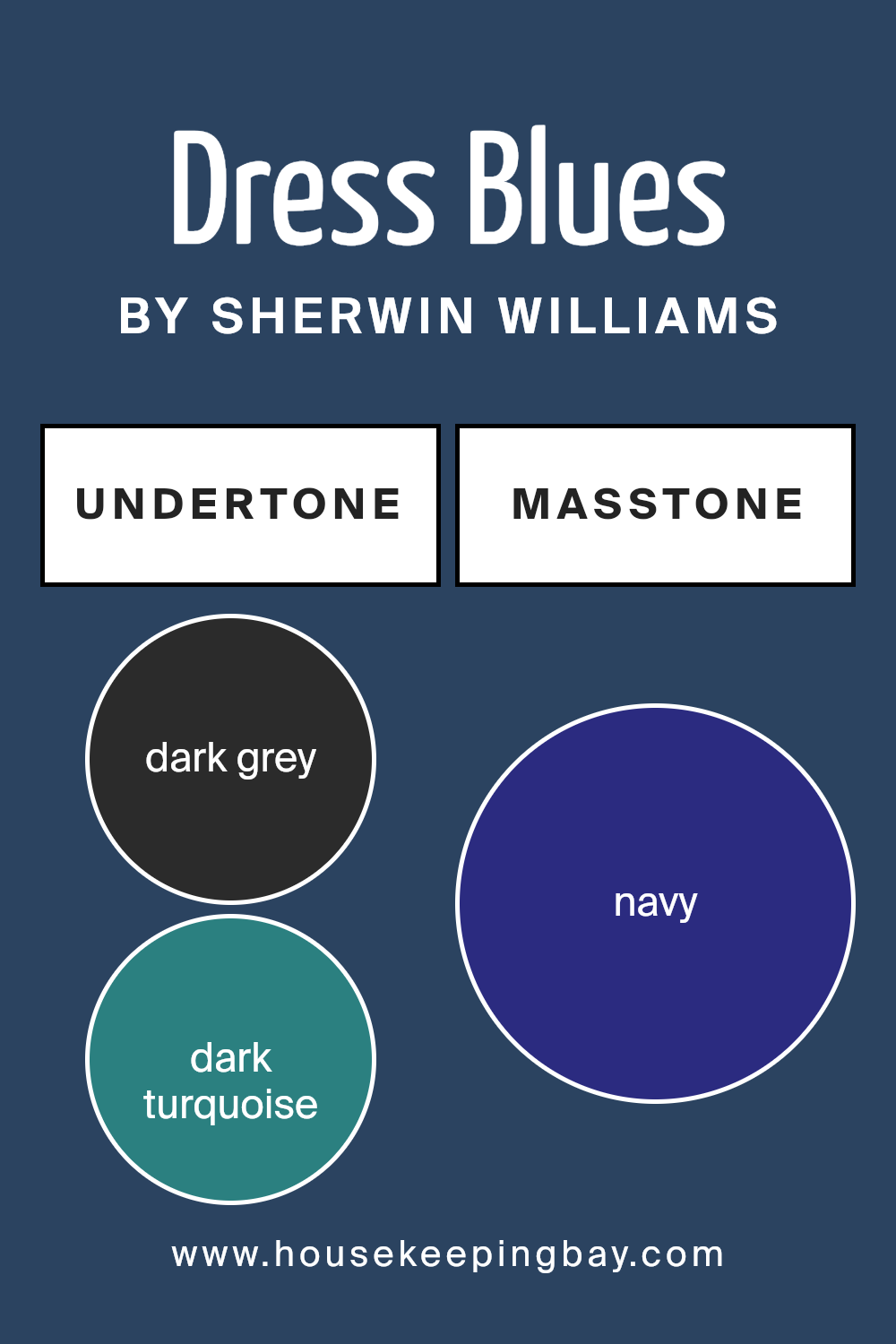
Dress Blues SW 9176 by Sherwin Williams is a rich and dramatic color. This deep blue has many undertones that affect its look and feel.
Its undertones include dark gray, dark turquoise, dark green, purple, brown, and more. These undertones influence how we perceive the color. For instance, the dark gray in Dress Blues adds a serious, sophisticated note. The dark green and turquoise give it a hint of nature and calm.
The presence of purple provides a subtle warmth, while brown brings a grounded feel. Blue and dark blue contribute to its classic, reliable nature. Violet and lilac cast a touch of softness and romance, while olive adds an earthy element.
These undertones shape Dress Blues SW 9176’s appearance in a room. The deep gray and blue make spaces feel intimate and secure. Purple and violet lend a hint of elegance and luxury. The subtle green and turquoise can make it feel harmonious, connecting the indoors with nature.
Depending on lighting and surrounding colors, Dress Blues can appear different. In bright light, green and blue may stand out more. In dim light, its gray and brown undertones might become more visible. Overall, this color makes a room look cozy, sophisticated, and balanced due to its varied undertones.
housekeepingbay.com
Coordinating Colors of Dress Blues SW 9176 by Sherwin Williams
Coordinating colors are hues that work well together to create a harmonious and balanced appearance. They complement each other, enhancing the overall design without clashing or overwhelming the senses. When paired correctly, coordinating colors can bring depth and interest to any room or design project.
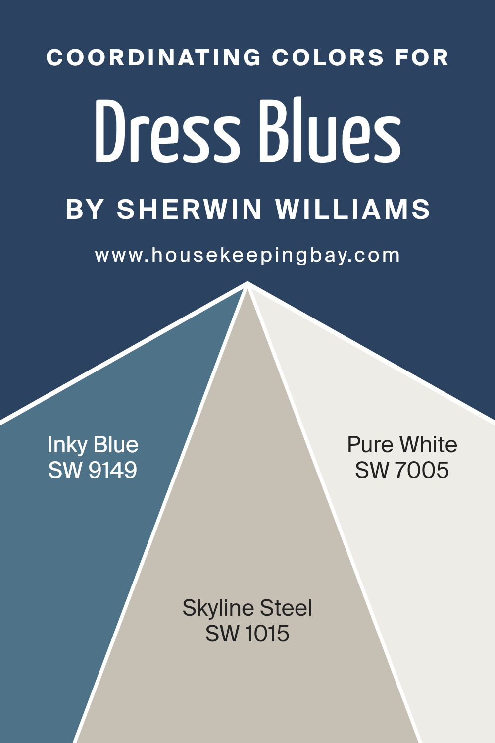
The key to selecting coordinating colors lies in understanding their relationship on the color wheel and how they interact with one another. For Dress Blues (SW 9176) by Sherwin Williams, three coordinating colors create a cohesive and stylish look: SW 9149 – Inky Blue, SW 1015 – Skyline Steel, and SW 7005 – Pure White.
Inky Blue (SW 9149) adds richness and depth, making it an excellent choice for accents or feature walls. Its dark, moody tone contrasts beautifully with Dress Blues. Meanwhile, Skyline Steel (SW 1015) provides a soft, neutral backdrop.
This color has a subtle hint of coolness, balancing the darker tones without taking center stage. Finally, Pure White (SW 7005) is crisp and clean, offering a bright counterpoint that highlights the darker hues.
Together, these colors create a balanced palette where each tone plays a distinct role, ensuring a visually appealing and cohesive atmosphere.
You can see recommended paint colors below:
- SW 9149 Inky Blue
- SW 1015 Skyline Steel
- SW 7005 Pure White
housekeepingbay.com
How Does Lighting Affect Dress Blues SW 9176 by Sherwin Williams?
Lighting significantly impacts how colors appear in a room. Natural and artificial light can change a color’s hue, saturation, and brightness. A color like Dress Blues SW 9176 by Sherwin Williams will look different depending on the light it is exposed to.
Under artificial light, Dress Blues SW 9176, a deep navy-blue shade, can appear darker or even slightly muted. This happens because many artificial lights have a warmer tone, often bringing out the depth in cooler colors like navy. LED lights, which can vary in color temperature, might make it look sharper if they are cooler or muddier if they are warmer.
Natural light changes throughout the day, affecting how colors like Dress Blues appear in a space. In a north-facing room, which tends to have consistent, cooler light, Dress Blues might appear darker and more subdued. The constant cool light can emphasize the color’s deep and muted tones, giving a cozy feel to the room.
In contrast, a south-facing room gets a lot of bright, warm sunlight, especially during the midday hours. Here, Dress Blues SW 9176 will look brighter and more vibrant. The rich navy shade will stand out, showcasing its complexity and richness under warmer natural light.
East-facing rooms get bright morning light that gradually cools as the day progresses. In these rooms, Dress Blues may look brighter in the early hours, catching the soft, warm light, and then turn slightly cooler and deeper as the day goes on.
West-facing rooms have the opposite effect: they receive cooler light in the morning and warmer light in the late afternoon and evening. In this setting, Dress Blues may look muted and cool early in the day, then gain warmth and depth as the sun sets, creating a cozy atmosphere.
Understanding these effects helps in choosing the right color for the desired mood and ambiance.
housekeepingbay.com
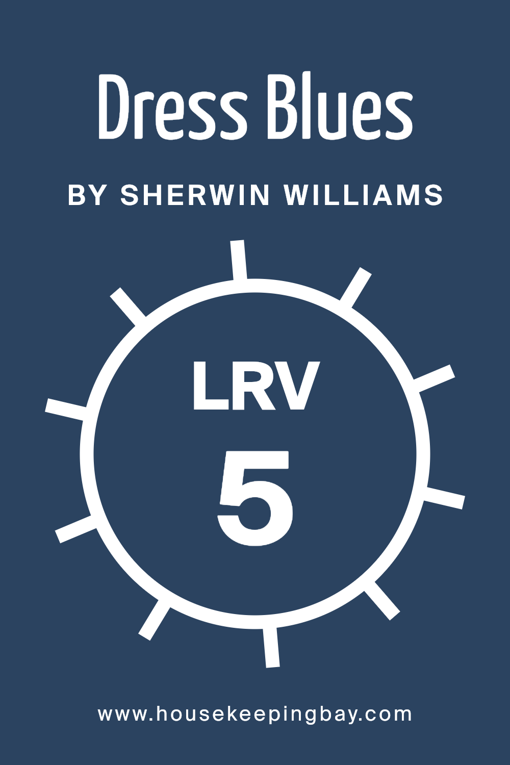
What is the LRV of Dress Blues SW 9176 by Sherwin Williams?
LRV stands for Light Reflectance Value, which measures the amount of light a color reflects. It’s a scale from 0 to 100, where 0 means no light is reflected (pure black) and 100 means all light is reflected (pure white). In simple terms, LRV tells you how light or dark a color might appear once it’s on a wall.
When choosing paint, LRV is important because it affects how colors look in different lighting. For example, a color with a low LRV can make a room feel cozy and intimate but might also make it feel smaller and darker. Conversely, a high LRV can make a room feel larger and brighter.
The LRV of Dress Blues (SW 9176) by Sherwin-Williams is 5.424, which is quite low on the LRV scale. This means the color reflects very little light and, therefore, appears dark and deep on walls. Such a color can add a bold, dramatic feel to a room, creating a striking background that can either enhance other design elements or stand out on its own.
However, because it absorbs much of the light, it might make a room feel smaller and is less effective in spaces that need a lot of light. If used in a well-lit room, the dark shade can provide a rich contrast and a sense of depth, but in darker rooms, it might make the space feel more compact.
housekeepingbay.com
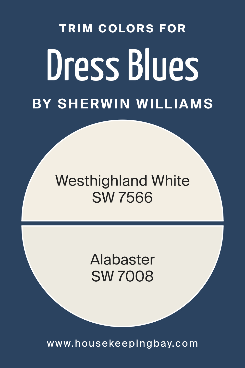
What are the Trim colors of Dress Blues SW 9176 by Sherwin Williams?
Trim colors are essential in creating a polished look for Dress Blues, like the SW 9176 from Sherwin Williams. They help define the edges and accents of a room, giving it a more complete and stylish appearance.
Choosing the right trim color can enhance the main wall color, making the walls stand out while adding depth to the room’s décor. When you pair SW 9176 Dress Blues with lighter trim colors, it allows the dark and rich tones of the blue to pop, making the entire space feel more balanced and thoughtfully designed.
Using SW 7566 Westhighland White and SW 7008 Alabaster as trim colors provides a beautiful contrast to Dress Blues. Westhighland White is a soft, creamy shade that offers warmth without overwhelming the senses. It creates a welcoming vibe that pairs well with deeper blues.
On the other hand, Alabaster is a crisp, clean white that adds brightness and clarity. Both colors enhance the overall look by ensuring the dramatic blue does not appear too heavy, giving the space a harmonious and inviting feel.
You can see recommended paint colors below:
housekeepingbay.com
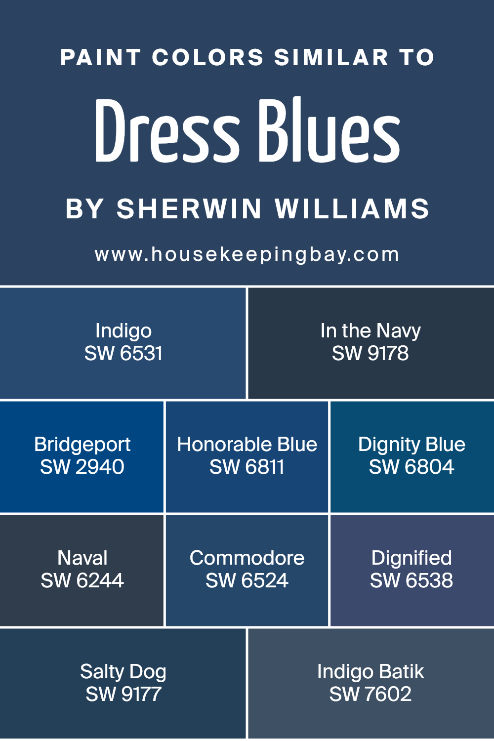
Colors Similar to Dress Blues SW 9176 by Sherwin Williams
Similar colors play a crucial role in design, creating harmony and unity in any space. With the palette inspired by Dress Blues SW 9176 from Sherwin Williams, the selection of colors like SW 6531 – Indigo and SW 9178 – In the Navy can set the perfect mood.
Indigo has a deep, rich tone reminiscent of twilight, providing depth and elegance. In the Navy exudes a strong, steady presence, perfect for creating a classic and sophisticated atmosphere. SW 2940 – Bridgeport offers a slightly lighter shade, bringing subtle warmth and vitality to the palette.
The cool undertone of SW 6811 – Honorable Blue lends a calming, serene vibe, while SW 6804 – Dignity Blue adds a sense of confidence with its crisp and fresh hue.
Each of these colors complements the others, enhancing their natural beauty. SW 6244 – Naval commands attention with its bold and pronounced tone, suitable for making a statement. SW 6524 – Commodore suggests stability and reliability, fostering a sense of trust.
Meanwhile, SW 6538 – Dignified speaks to a sense of quiet sophistication, appealing in its understatement. SW 9177 – Salty Dog introduces an unexpected richness, offering a more playful yet refined option. Finally, SW 7602 – Indigo Batik presents a gentle touch of exoticism, rounding off this collection with a sense of subtle artistry. These colors work together to create a unified, pleasing aesthetic, perfect for a wide array of interior design projects.
You can see recommended paint colors below:
- SW 6531 Indigo
- SW 9178 In the Navy
- SW 2940 Bridgeport
- SW 6811 Honorable Blue
- SW 6804 Dignity Blue
- SW 6244 Naval
- SW 6524 Commodore
- SW 6538 Dignified
- SW 9177 Salty Dog
- SW 7602 Indigo Batik
housekeepingbay.com
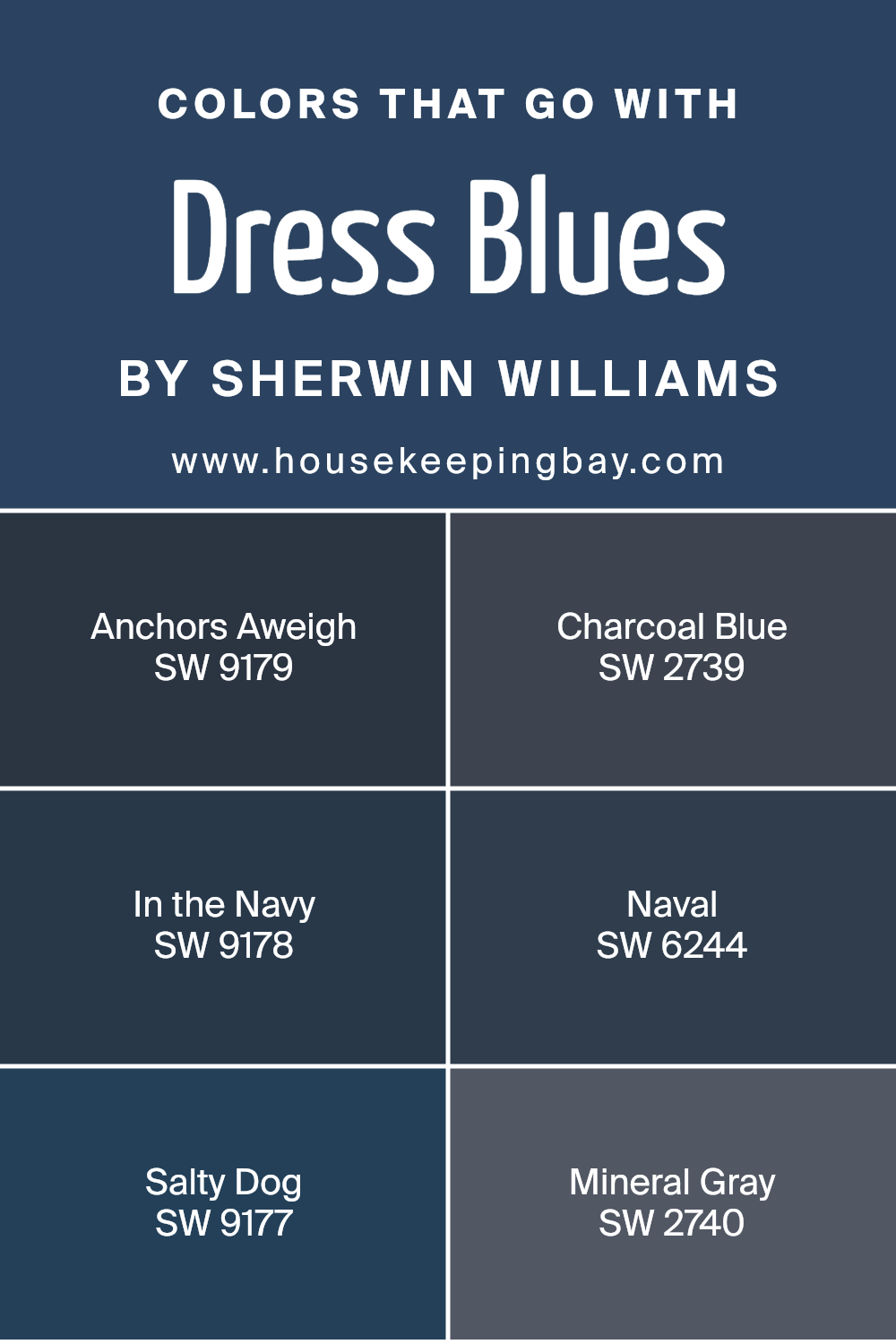
Colors that Go With Dress Blues SW 9176 by Sherwin Williams
Colors play a crucial role in completing the look of a room, especially when paired with Dress Blues SW 9176 by Sherwin Williams. This rich hue serves as a perfect starting point to bring depth and elegance to any space. Pairing it with SW 9179 – Anchors Aweigh offers a similar deep blue shade with subtle variations, creating a seamless transition that enriches the overall ambiance.
Charcoal Blue SW 2739 introduces a darker, moodier tone that contrasts well, imparting a sophisticated feel. In the Navy SW 9178 provides a classic navy shade that complements Dress Blues beautifully, adding layers and depth to your aesthetic.
Naval SW 6244, another deep blue, offers a timeless quality and works harmoniously with Dress Blues to create a serene and cohesive environment.
Among these, SW 9177 – Salty Dog adds a playful twist, bringing a bit of vibrancy without overshadowing the main hue, making it ideal for accents or focal points.
Mineral Gray SW 2740 lends a neutral balance to the mix, offering a grounded feel against the darker blues. These colors collectively work in harmony, each contributing its unique character. They enhance the overall look of a room, creating spaces that feel both bold and balanced.
You can see recommended paint colors below:
- SW 9179 Anchors Aweigh
- SW 2739 Charcoal Blue
- SW 9178 In the Navy
- SW 6244 Naval
- SW 9177 Salty Dog
- SW 2740 Mineral Gray
housekeepingbay.com
How to Use Dress Blues SW 9176 by Sherwin Williams In Your Home?
Dress Blues SW 9176 by Sherwin Williams adds depth to any space with its rich, deep blue hue. This color works well as an accent wall in living rooms, providing a dramatic backdrop that enhances other elements like furniture and artwork.
When applied in a bedroom, Dress Blues offers a cozy, cocoon-like feel, promoting relaxation and restful sleep. Pair this shade with lighter colors such as soft whites or light grays to create a balanced and open atmosphere.
In a bathroom, Dress Blues can lend a sense of luxury and calm, especially when combined with crisp white tiles and fixtures. For a home office, this color can provide a focused, serene environment conducive to productivity. Using Dress Blues on cabinetry or interior doors adds an unexpected touch of sophistication.
Accessories like throw pillows or rugs featuring this shade can tie the room together without overwhelming the space.
Dress Blues SW 9176 by Sherwin Williams vs Indigo SW 6531 by Sherwin Williams
Dress Blues SW 9176 and Indigo SW 6531 by Sherwin Williams are two striking shades of blue. Dress Blues resembles a deep navy, offering a rich, classic look that’s both elegant and timeless. It brings a sense of depth and sophistication, making it ideal for creating cozy, intimate spaces. This color works well for accent walls, office areas, or any room where a calm, serious atmosphere is desired.
Indigo SW 6531, meanwhile, presents a vibrant, royal blue with an energetic undertone. This shade has a lively, bold feel compared to Dress Blues. Indigo can uplift a space with a splash of color that feels both modern and inviting.
It suits creative or energetic environments, lending a more youthful and dynamic vibe to living areas or kids’ rooms.
Both colors are versatile but cater to different moods – Dress Blues fits traditional or serene settings, while Indigo injects a lively, contemporary feel.
You can see recommended paint color below:
- SW 6531 Indigo
housekeepingbay.com
Dress Blues SW 9176 by Sherwin Williams vs Commodore SW 6524 by Sherwin Williams
Dress Blues SW 9176 and Commodore SW 6524, both from Sherwin Williams, offer unique shades of blue. Dress Blues SW 9176 presents a dark, rich navy hue that feels sophisticated and timeless. Its depth makes it suitable for spaces where a cozy, refined ambiance is desired. It pairs well with lighter accents and can ground a room with elegance.
Conversely, Commodore SW 6524 is a more vibrant and energetic blue. This color has a brighter tone, exuding a sense of lightness and dynamism. Its lively shade works well in spaces aiming for a fresh, open feel. Commodore is excellent for creating a bold statement, adding a pop of color to neutral settings.
While Dress Blues evokes calmness and classic style, Commodore breathes life and brightness into a space. Both colors serve different moods and purposes, allowing for creative expression depending on the desired atmosphere.
You can see recommended paint color below:
- SW 6524 Commodore
housekeepingbay.com
Dress Blues SW 9176 by Sherwin Williams vs Indigo Batik SW 7602 by Sherwin Williams
Dress Blues SW 9176 by Sherwin Williams presents a rich and deep blue shade, reflecting a sense of sophistication and calm. This color is often associated with elegance and timelessness, making it a versatile choice for various spaces. It brings to mind the image of a refined, classic suit, imparting a feeling of stability and quiet strength to any room.
Indigo Batik SW 7602, by Sherwin Williams, is also a deep blue, yet it carries a more vibrant undertone. This color offers a lively, bold quality that can add energy and dynamism to a space. While both colors are blues, Indigo Batik has a brighter, more energetic disposition compared to Dress Blues.
Together, these colors offer different moods: Dress Blues exudes calm and composed elegance, while Indigo Batik injects vibrancy and a hint of adventurous spirit into decor. Both colors can complement each other well in a thoughtful palette.
You can see recommended paint color below:
housekeepingbay.com
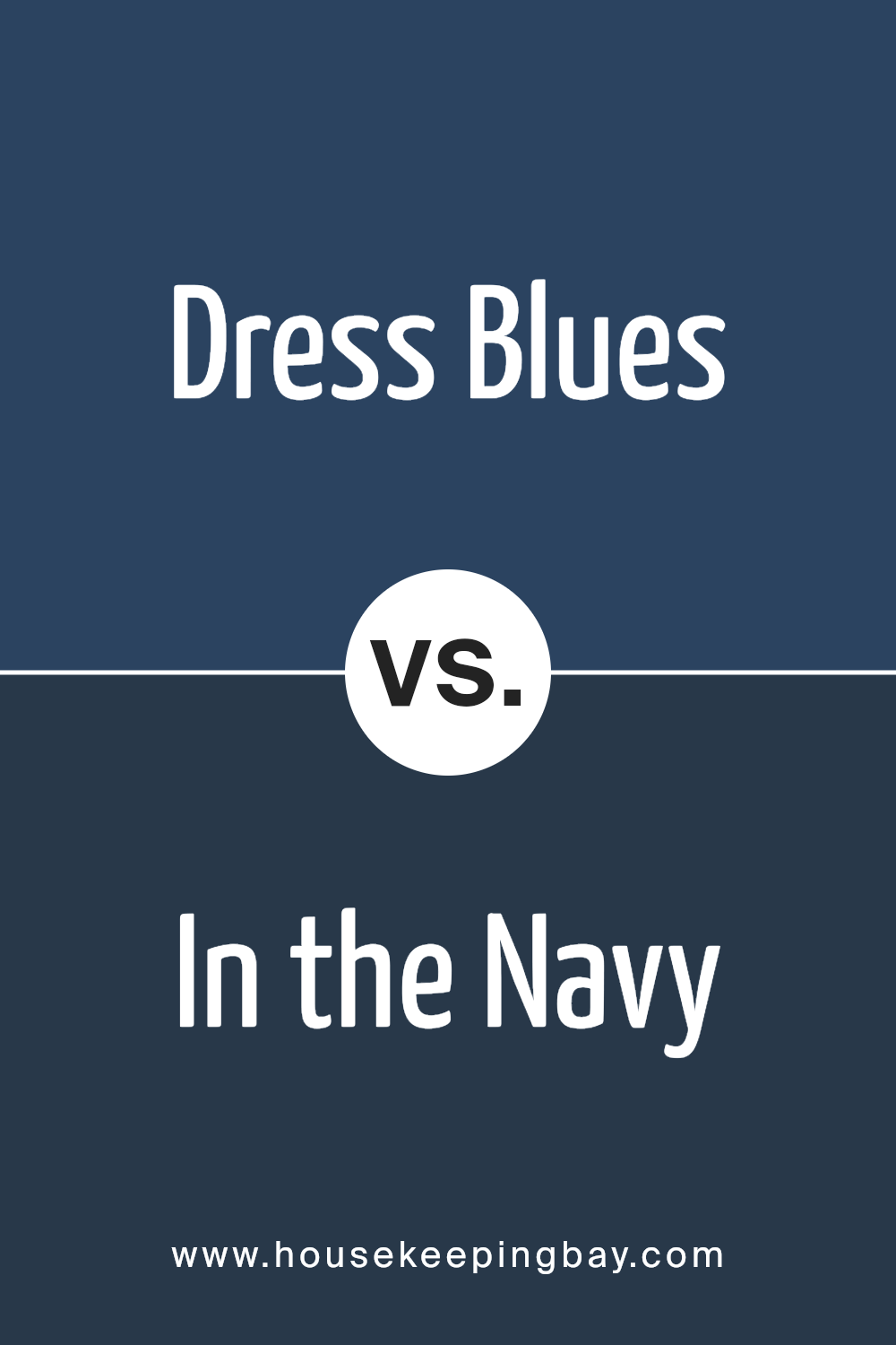
Dress Blues SW 9176 by Sherwin Williams vs In the Navy SW 9178 by Sherwin Williams
Dress Blues SW 9176 and In the Navy SW 9178 are both deep, rich shades of blue by Sherwin Williams, but each carries its own unique character. Dress Blues is a classic navy with a subtle warmth, making it feel welcoming and versatile. It’s perfect for spaces where you want to add depth without feeling too stark.
In contrast, In the Navy is a deeper, more intense navy with a cooler undertone. This color lends itself well to modern and sophisticated spaces, offering a bolder and more dramatic effect. While Dress Blues can pair nicely with warmer tones and create a cozy atmosphere, In the Navy works great with cooler accents for a crisp, clean look.
Both colors are excellent choices for creating statement pieces in a room, with Dress Blues leaning towards subtle elegance and In the Navy delivering a more pronounced, commanding presence.
You can see recommended paint color below:
housekeepingbay.com
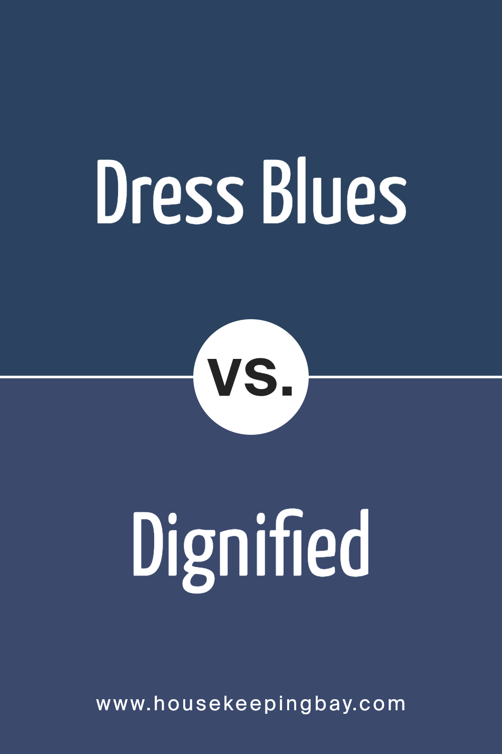
Dress Blues SW 9176 by Sherwin Williams vs Dignified SW 6538 by Sherwin Williams
Dress Blues SW 9176 and Dignified SW 6538 are two distinct shades by Sherwin Williams. Dress Blues is a dark navy tone, offering a rich, classic feel. It creates a sense of sophistication and pairs well with lighter accents, like whites or pale greys, providing a timeless look. The strong blue undertone gives spaces a bold yet calming atmosphere.
Meanwhile, Dignified is also a dark blue, but with a slightly warmer and softer hue compared to Dress Blues. It contains subtle hints of purple, making it feel more muted and refined. Dignified can add depth without overpowering, working beautifully in both modern and traditional settings. It complements wood tones and metallic finishes nicely.
Both colors share a deep blue base, yet Dress Blues leans more toward a true navy, while Dignified provides a subtle touch of warmth. Their differences allow versatile applications, depending on the mood and feel desired for a space.
You can see recommended paint color below:
- SW 6538 Dignified
housekeepingbay.com
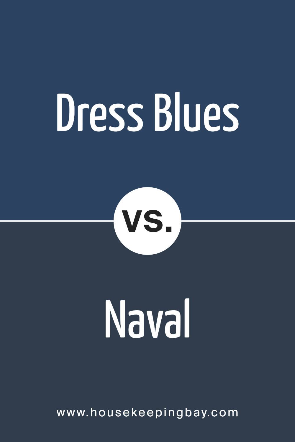
Dress Blues SW 9176 by Sherwin Williams vs Naval SW 6244 by Sherwin Williams
Dress Blues SW 9176 and Naval SW 6244, both by Sherwin Williams, present two rich shades of blue. Dress Blues SW 9176 carries a slightly muted tone, resembling a classic navy tailored for versatile spaces. It offers a balance, leaning neither too dark nor too light, suitable for an elegant backdrop or to create a cozy atmosphere.
Naval SW 6244, by comparison, is deeper and more intense. It has a profound, solid presence, making it a choice for bold, standout statements. While Dress Blues offers a touch of refinement and adaptability, Naval projects confidence and depth.
Both can be paired effectively with various accents, yet their distinctiveness allows each to offer unique personality—a softer, more adaptable feel with Dress Blues, and a powerful, confident aura through Naval. Each color brings its unique flair depending on desired ambiance and personal style preferences.
You can see recommended paint color below:
housekeepingbay.com
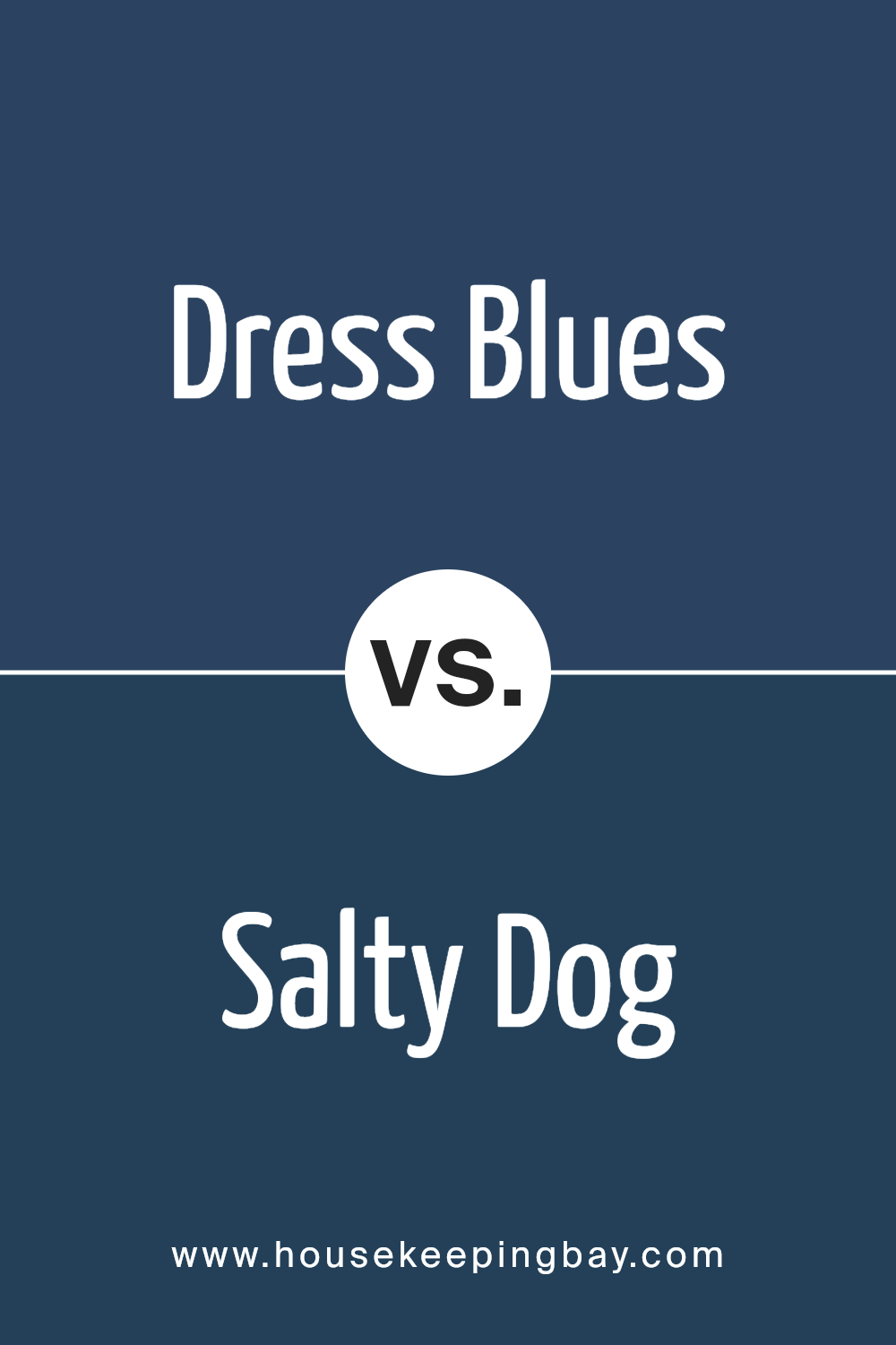
Dress Blues SW 9176 by Sherwin Williams vs Salty Dog SW 9177 by Sherwin Williams
Dress Blues SW 9176 and Salty Dog SW 9177, both by Sherwin Williams, are deep shades of blue but offer distinct vibes. Dress Blues is darker, resembling a classic navy, offering a sense of sophistication and seriousness. It’s a versatile color, suitable for creating a grounded, elegant atmosphere.
In contrast, Salty Dog is slightly lighter, with a hint of marine freshness. It feels more vibrant, adding a touch of boldness and energy to spaces. While both colors share the blue family essence, Dress Blues leans more towards a formal, muted tone, ideal for traditional setups or professional environments.
Salty Dog, with its livelier feel, works well in rooms that aim for a bit more playfulness and creativity. Together, they show the range within blue hues— from the serious and subdued to the more lively and dynamic. Both can enhance room styles in unique ways.
You can see recommended paint color below:
- SW 9177 Salty Dog
housekeepingbay.com
Dress Blues SW 9176 by Sherwin Williams vs Bridgeport SW 2940 by Sherwin Williams
Dress Blues SW 9176 by Sherwin Williams is a deep, rich navy color that exudes sophistication and elegance. It brings a strong, bold presence to a space, making it an excellent choice for statement walls or accent pieces. Its dark tone can ground a room, creating a cozy and intimate atmosphere. This shade pairs well with lighter colors and metals, adding a modern and chic look to any design.
Bridgeport SW 2940, also by Sherwin Williams, is a lighter blue-green hue. It has a breezy, coastal vibe, perfect for creating relaxed and airy spaces. This color evokes a sense of calm and openness, making it suitable for bedrooms or living areas where tranquility is desired.
Bridgeport complements whites, light woods, and soft textures, adding freshness to any environment.
Both colors offer unique qualities: Dress Blues projects intensity and drama, while Bridgeport invites calmness and serenity.
Choosing between them depends on the desired mood and style of the room.
You can see recommended paint color below:
- SW 2940 Bridgeport
housekeepingbay.com
Dress Blues SW 9176 by Sherwin Williams vs Dignity Blue SW 6804 by Sherwin Williams
Dress Blues SW 9176 and Dignity Blue SW 6804 are two distinct colors by Sherwin Williams, each bringing a unique vibe to spaces. Dress Blues is a deep navy hue. It offers a sense of sophistication and elegance, making it perfect for creating a cozy and intimate atmosphere. This color pairs well with neutral tones and metallic accents, adding depth and richness to a room.
In contrast, Dignity Blue is a brighter, more vibrant blue. It carries a sense of freshness and energy, making it ideal for areas where you want to foster creativity and positivity. This shade is lively and works well in spaces that benefit from a cheerful and energetic feel, such as children’s rooms or creative workspaces.
While Dress Blues conveys calmness and maturity, Dignity Blue introduces an element of brightness and fun. Each color brings its own personality, allowing you to choose based on the mood you want to create.
You can see recommended paint color below:
- SW 6804 Dignity Blue
housekeepingbay.com
Dress Blues SW 9176 by Sherwin Williams vs Honorable Blue SW 6811 by Sherwin Williams
Dress Blues SW 9176 and Honorable Blue SW 6811, both by Sherwin Williams, bring unique qualities to a space. Dress Blues is a deep and dark navy shade. It gives off a sophisticated and serious vibe, perfect for creating a cozy, intimate setting. You might picture it in a study or library, where a calm and concentrated atmosphere is desired.
Honorable Blue SW 6811, however, is a brighter, more vivid blue. It can inject energy and liveliness into a room. This shade might suit a more relaxed area like a living room or bedroom, offering vibrancy without overwhelming the senses.
While Dress Blues leans towards creating a sense of tradition and elegance, Honorable Blue brings a fresh, lively feel. Both colors are blue at heart, yet they impart different moods. Choosing between them depends on whether a deeper, more dramatic effect or a lighter, more spirited environment is preferred.
You can see recommended paint color below:
- SW 6811 Honorable Blue
housekeepingbay.com
Conclusion
SW 9176 Dress Blues by Sherwin Williams brings a sense of timeless elegance and sophistication to any space. As I dive into the color’s characteristics, I find its deep navy hue to be both classic and versatile. It offers a perfect balance that can adapt to various design styles, from traditional to modern.
When I look at Dress Blues, I see how it grounds a room, providing a solid yet peaceful backdrop that allows other elements to shine. Its rich, saturated tone adds depth and character, making it a great choice for creating a cozy, inviting atmosphere.
I can visualize it in a dining room, encouraging intimate conversations, or in a home office, fostering focus and creativity.
Pairing Dress Blues with lighter neutrals or metallic accents can showcase its beauty, while combining it with bold, vibrant colors can create striking contrasts. It fits well on an accent wall or as a primary color, depending on the mood I want to set.
Overall, Dress Blues stands out as a versatile and enduring choice for someone like me who appreciates sophisticated and calming spaces. Whether used sparingly or as a dominant hue, it never fails to leave a lasting impression, proving its worth as a staple in any color palette.
housekeepingbay.com
Ever wished paint sampling was as easy as sticking a sticker? Guess what? Now it is! Discover Samplize's unique Peel & Stick samples. Get started now and say goodbye to the old messy way!
Get paint samples


