Frank Blue SW 6967 by Sherwin Williams
Breathe Life into Your Space with Elegance
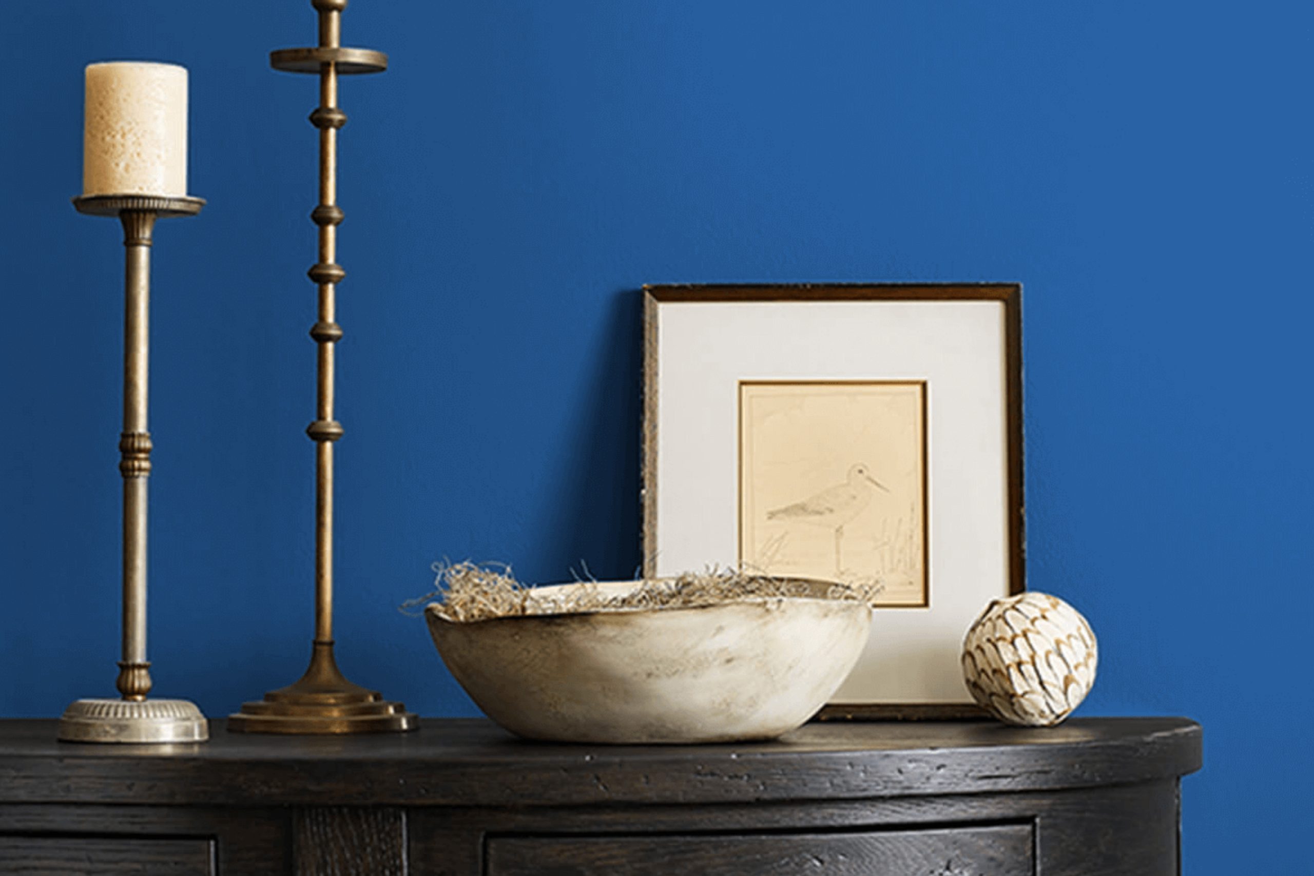
Imagine stepping into a room that instantly feels serene and comforting. That’s the power of SW 6967 Frank Blue by Sherwin Williams. This paint color blends depth and calmness, creating a space that feels both cozy and stylish. Frank Blue is more than just a shade—it’s a mood.
It’s perfect for anyone who wants to bring a touch of sophistication and ease into their home. It stands strong on its own, yet it pairs beautifully with other colors for those who love a more layered look.
One of my favorite aspects of Frank Blue is how it changes with the light, offering various atmospheres throughout the day.
Whether you use it in a bedroom for relaxation or in a dining room to make a statement, you’ll find it adds a fresh and inviting feel. Perfect for those wanting a timeless look without too much fuss, Frank Blue is a reliable choice for any room.
It’s a color that welcomes you every time you walk in, making it a standout choice for transforming your home environment into a peaceful retreat.
via sherwin-williams.com
What Color Is Frank Blue SW 6967 by Sherwin Williams?
Frank Blue SW 6967 by Sherwin Williams is a rich, deep blue that feels both crisp and classic. This blue carries a hint of sophistication while maintaining a cozy, inviting vibe, making it perfect for various spaces.
In interior styles, Frank Blue works beautifully in both traditional and modern designs. Its depth adds drama to a room, making it great for accent walls or as a primary color in a more minimalist space. When used in a traditional setting, it pairs well with white trim or wainscoting, creating an elegant, timeless look.
In a modern setting, combine it with sleek, neutral furniture and geometric patterns for a striking effect.
Frank Blue pairs excellently with natural materials. Woods, particularly lighter shades like oak or maple, offer a pleasing contrast. Metals such as brushed nickel or chrome highlight its cool tones, providing a sophisticated touch. This blue also harmonizes with soft textures like velvet or linen, adding warmth and depth.
Accessories in soft greys, whites, or even mustard yellow can enhance its appeal, creating an inviting yet polished space. With these combinations, Frank Blue SW 6967 proves versatile for creating impactful, harmonious interiors that feel both grounded and stylish.
housekeepingbay.com
Is Frank Blue SW 6967 by Sherwin Williams Warm or Cool color?
Frank Blue SW 6967 by Sherwin Williams is a calming and versatile color often used to create a peaceful environment in homes. This soft blue shade brings a sense of openness to any space, making rooms feel airier and more spacious. It works well in various settings, from living rooms to bedrooms and even bathrooms.
The color pairs nicely with both light and dark shades, providing a great backdrop for furniture and decor. It complements neutral tones like whites and grays, enhancing the overall look of a room.
This blue shade also fits with natural elements, such as wooden accents or indoor plants, creating a harmonious atmosphere.
People often choose Frank Blue for its ability to add a touch of calmness without overwhelming other design elements. Whether used on walls or as an accent, this color helps create a welcoming and serene home environment.
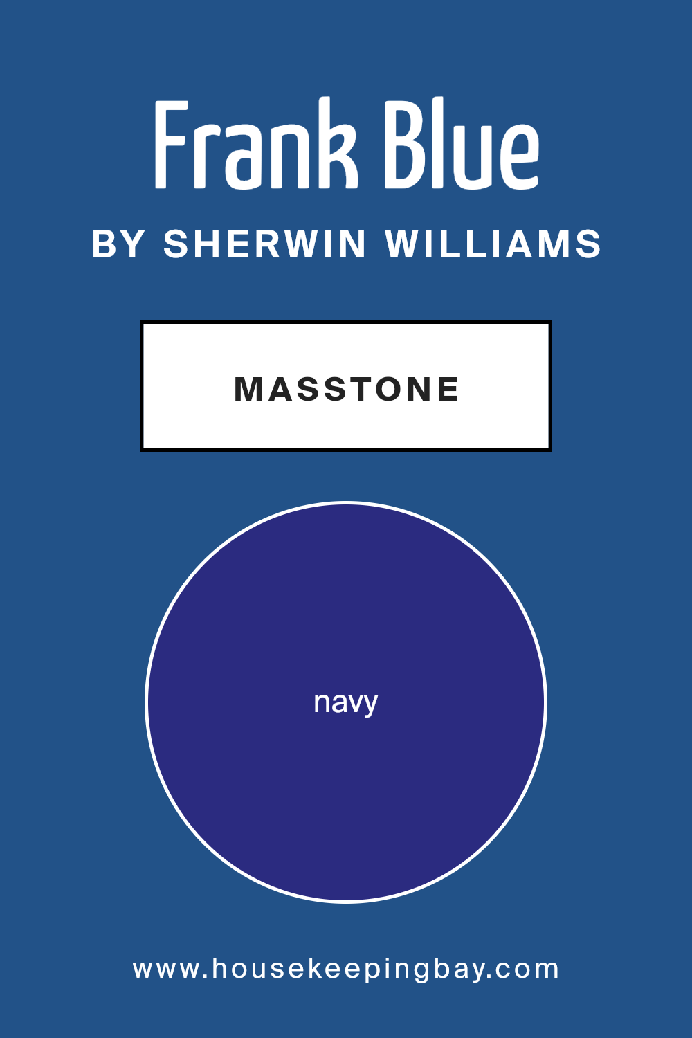
What is the Masstone of the Frank Blue SW 6967 by Sherwin Williams?
Frank Blue (SW 6967) by Sherwin Williams is a deep, rich navy color. The masstone of this paint leans towards a dense navy hue, like #2B2B80. This deep navy can bring a cozy feeling to homes.
When used on walls, it can make a room feel more intimate and inviting. It’s a great choice for creating a warm atmosphere in large spaces, making them feel more comfortable and less empty. In smaller rooms, this color can add a sense of depth and richness.
Frank Blue works well with lighter shades. Pair it with whites, creams, or light grays to create a balanced look, allowing the navy to stand out without overwhelming the space. It also complements natural wood tones, adding a touch of sophistication. This color is ideal for accent walls, furniture, or cabinets, providing a classic and elegant touch to any room.
housekeepingbay.com
Undertones of Frank Blue SW 6967 by Sherwin Williams
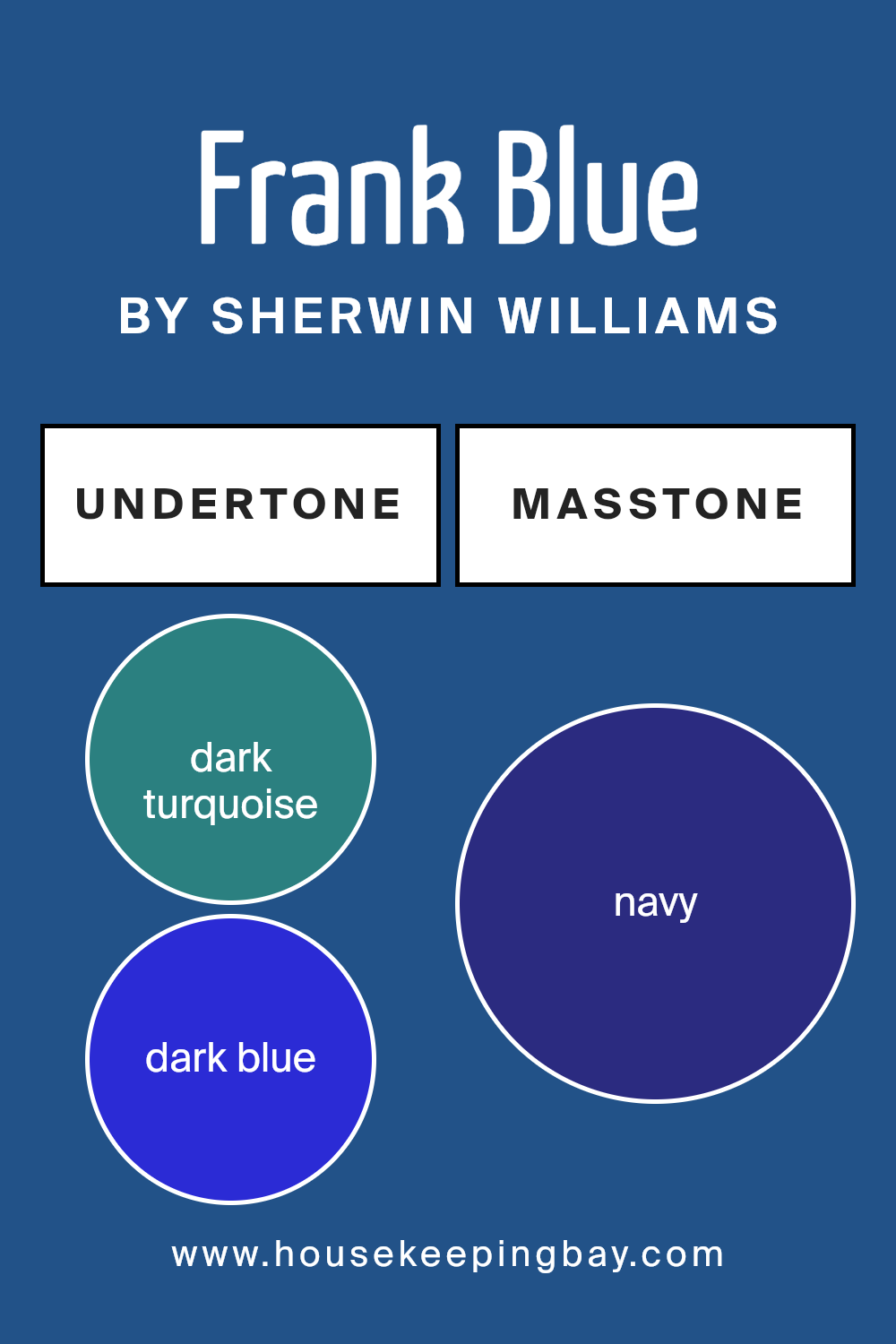
Frank Blue SW 6967 by Sherwin Williams is not just a simple shade of blue; it carries a unique blend of undertones that give it depth and character. Undertones are subtle color hints that influence our perception of any primary color. They can impact how a color appears in different lighting and settings, creating warm, cool, or neutral impressions depending on the mix.
Frank Blue is enriched with a mix of undertones: dark turquoise, dark blue, deep grey, and more, making it versatile. These undertones create nuances that make Frank Blue look slightly different, shifting between a serene and a more intense feel based on the lighting and surrounding decor.
The presence of dark turquoise and dark green hints lends a natural, earthy vibe, making interiors feel grounded and balanced. Dark blue and lilac lend a soft elegance, adding sophistication to the space. However, influences from dark grey and violet give the color a subtle, moody edge.
On interior walls, Frank Blue can alter a room’s mood significantly. In bright sunlight, it may seem fresh and bright due to blue and grey influences, creating an open and airy atmosphere.
In dimmer settings, the darker shades in the mix cast a cozier, more intimate feeling, making spaces feel comfortable and welcoming.
housekeepingbay.com
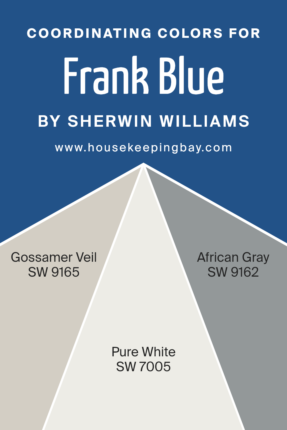
Coordinating Colors of Frank Blue SW 6967 by Sherwin Williams
Coordinating colors are hues that complement each other, creating a harmonious look when used together in design spaces. These colors either share a common undertone, contrast effectively, or provide balance in a palette, making rooms feel cohesive and visually pleasing.
One of the chosen colors is Gossamer Veil SW 9165, a soft, warm gray that brings a touch of warmth without overwhelming a space, allowing for a neutral backdrop that pairs well with deeper shades. Next is Pure White SW 7005, which is a true, clean white, perfect for creating crisp lines and borders that enhance brighter colors without clashing.
African Gray SW 9162 adds a bit more depth to the palette. It is a mid-tone gray with hints of green that can add richness, complementing a spectrum of colors while maintaining sophistication. When combined with Frank Blue SW 6967, these coordinating colors create an engaging and balanced environment.
Frank Blue, a vibrant yet soothing blue, can stand out against these hues, while being toned down to not dominate the room. The combination ensures each room feels thoughtfully designed, offering continuity with varied rooms or spaces harmonizing beautifully.
You can see recommended paint colors below:
housekeepingbay.com
How Does Lighting Affect Frank Blue SW 6967 by Sherwin Williams?
Lighting plays a crucial role in how we perceive colors. Different light sources can change the way a color looks, making it appear brighter, duller, warmer, or cooler. Frank Blue SW 6967 by Sherwin Williams is a striking shade of blue that can vary depending on lighting conditions.
In natural light, Frank Blue can show its true, rich hue. However, the color’s appearance will change depending on the direction of the light. In north-facing rooms, the light tends to be cooler and softer. This may make Frank Blue appear a bit darker, or muted, with a cooler undertone. It can give a sense of coziness but may feel slightly less vibrant.
In south-facing rooms, the light is warmer and more abundant throughout the day. Frank Blue will likely appear brighter and more lively. The warm sunlight enhances its richness, making it more vibrant and eye-catching. The color’s true depth and brightness will show, bringing more energy into the space.
East-facing rooms receive warm light in the morning and cooler light in the afternoon. In these rooms, Frank Blue might start with a warm glow as the morning sun enhances its color. As the day progresses, it might seem cooler and softer. This can create an interesting dynamic atmosphere throughout the day.
West-facing rooms receive cool morning light and warm afternoon light. In the morning, Frank Blue may appear subdued and cooler. As the afternoon sun bathes the room in warm light, the color can take on a richer and more intense look. It can make the room feel inviting and lively by late afternoon.
Under artificial lighting, Frank Blue may vary based on bulb types. Warm bulbs can bring out its depth and warmth, while cool bulbs might emphasize its cooler tones. Choosing the right bulb can subtly alter how this color feels in a space.
housekeepingbay.com
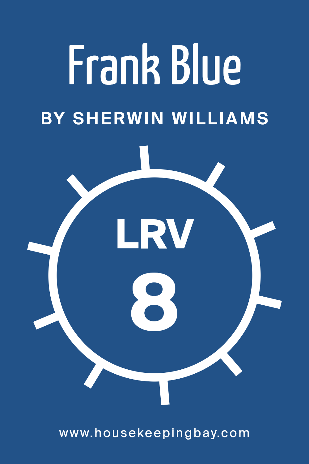
What is the LRV of Frank Blue SW 6967 by Sherwin Williams?
The Light Reflectance Value, or LRV, is a measure of how much light a color reflects. It is a scale from 0 to 100, where 0 means the color absorbs all light (pure black), and 100 means it reflects all light (pure white).
Colors with high LRV, like whites and pale pastels, make rooms feel brighter and more spacious by reflecting more light. On the other hand, colors with low LRV absorb more light, making spaces feel cozier and more intimate.
This is important to consider when choosing paint colors because the room’s natural light and the size of the space can change how the color appears on the walls.
For Frank Blue SW 6967 by Sherwin Williams, the LRV of 8.187 means it is a very dark color. With such a low LRV, Frank Blue will absorb a lot of light, making it appear deep and rich. In a well-lit room, it can add a sense of depth, but in spaces with little natural light, it might make the room feel smaller and more enclosed.
This color is a great choice for creating a moody ambiance or adding dramatic impact to a space. To balance its intensity, it’s useful to pair it with lighter colors or to use it on an accent wall.
housekeepingbay.com
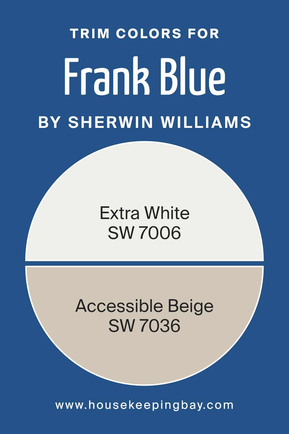
What are the Trim colors of Frank Blue SW 6967 by Sherwin Williams?
Trim colors are the hues used on the edges, moldings, and details of walls, doors, and windows, complementing the main wall color and adding depth and contrast to a room’s design. For a color like Sherwin Williams’ Frank Blue SW 6967, which is a bold and rich shade of blue, choosing the right trim color is essential to create a balanced look without overpowering the space.
Trim colors help frame the main color, making it stand out and giving the room a polished and cohesive appearance. Opting for the right trim can also enhance the architectural features of a space and tie together different elements within a room.
Using SW 7006 – Extra White as a trim color can give a room a crisp, clean look. This color is a pure white that brightens a space and provides a strong contrast against the deep hue of Frank Blue. On the other hand, SW 7036 – Accessible Beige offers a warm and inviting feel.
It adds a soft contrast that complements Frank Blue while not being too stark. Accessible Beige, being neutral, works to soften the edges, creating a cozy atmosphere.
Both of these colors, when paired as trims with Frank Blue, allow flexibility in room decor, enhancing visual appeal and ensuring that the boldness of the main color is balanced beautifully.
You can see recommended paint colors below:
- SW 7006 Extra White
- SW 7036 Accessible Beige
housekeepingbay.com
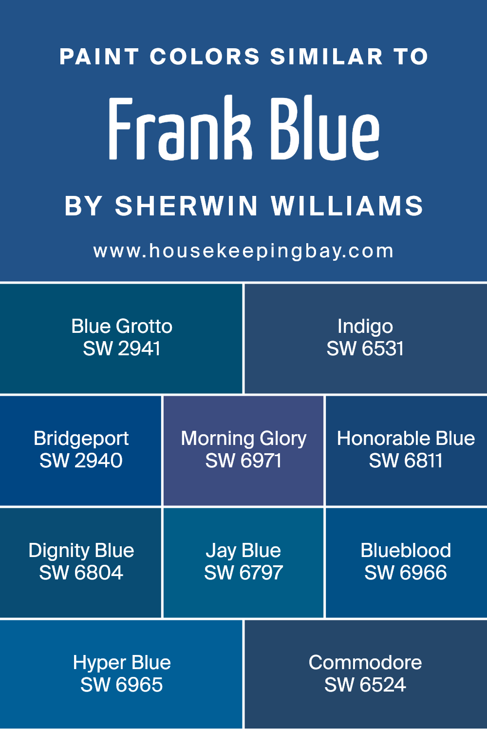
Colors Similar to Frank Blue SW 6967 by Sherwin Williams
Similar colors are essential in design because they create a sense of harmony and balance. They work well together because they share undertones, making them easy to mix and match without clashing. With Frank Blue SW 6967 by Sherwin Williams as the inspiration, colors like SW 2941 – Blue Grotto, with its reminiscent feel of a hidden, serene cave, and SW 6531 – Indigo, which adds depth and richness akin to a twilight sky, fit the palette beautifully. These colors complement each other and build a cohesive look.
SW 2940 – Bridgeport has a softer touch, mixing the strength of blue with gentle gray undertones, while SW 6971 – Morning Glory brings a lively, cheerful energy like a fresh morning bloom. SW 6811 – Honorable Blue provides a classic, timeless tone, echoing a noble and refined spirit.
Meanwhile, SW 6804 – Dignity Blue offers a more muted, sophisticated feel. SW 6797 – Jay Blue presents a lighter, airy hue akin to a sunny, clear sky. SW 6966 – Blueblood has an intense, deep vibe that speaks of confidence, while SW 6965 – Hyper Blue offers vibrant energy. SW 6524 – Commodore rounds off the spectrum as a stately, commanding presence.
Together, these colors can transform a space with cohesive beauty.
You can see recommended paint colors below:
- SW 2941 Blue Grotto
- SW 6531 Indigo
- SW 2940 Bridgeport
- SW 6971 Morning Glory
- SW 6811 Honorable Blue
- SW 6804 Dignity Blue
- SW 6797 Jay Blue
- SW 6966 Blueblood
- SW 6965 Hyper Blue
- SW 6524 Commodore
housekeepingbay.com
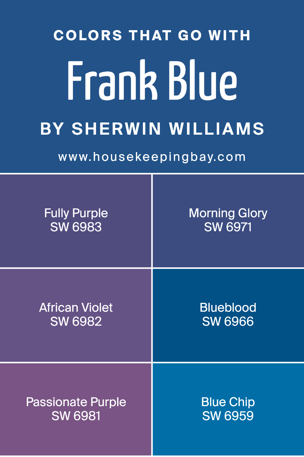
Colors that Go With Frank Blue SW 6967 by Sherwin Williams
When choosing colors to pair with Frank Blue SW 6967 by Sherwin Williams, it’s crucial to understand how each hue complements or contrasts with this vibrant blue. Colors like SW 6983 – Fully Purple can create a rich and bold palette, offering a deep and royal element that enhances the lively nature of Frank Blue.
Meanwhile, SW 6971 – Morning Glory brings a fresh, soft touch; it’s a lively lavender that contrasts beautifully with the strong blue, adding a bright and cheerful vibe to a space. Alternately, SW 6982 – African Violet offers a delicate, slightly muted shade that balances the brightness of Frank Blue and introduces a sense of calm sophistication.
On another note, SW 6966 – Blueblood can add depth with its darker tone, creating a layered effect that feels both elegant and cozy. Introducing SW 6981 – Passionate Purple enhances the space with energy and creativity; this intense hue is perfect for making a statement.
Lastly, SW 6959 – Blue Chip offers a classic, versatile shade that ties the palette together with its timeless appeal. The interaction of these colors with Frank Blue can shape the mood and style of a space, ensuring each room tells its own vibrant story while maintaining harmony.
You can see recommended paint colors below:
- SW 6983 Fully Purple
- SW 6971 Morning Glory
- SW 6982 African Violet
- SW 6966 Blueblood
- SW 6981 Passionate Purple
- SW 6959 Blue Chip
housekeepingbay.com
How to Use Frank Blue SW 6967 by Sherwin Williams In Your Home?
Frank Blue SW 6967 by Sherwin Williams is a soft, soothing shade of blue that brings a sense of calm and relaxation to any room. It’s a versatile color that works well in many areas of the home. In the bedroom, Frank Blue can help create a peaceful and serene atmosphere, making it a perfect choice for walls or as an accent color. Pairing it with white or light gray bedding and furniture enhances this calming effect.
In the living room, Frank Blue can add freshness and a light touch. It works beautifully with neutral tones and natural materials like wood and linen for a welcoming space. This color also suits bathrooms, offering a clean and crisp appearance that feels spa-like.
For a cohesive look, consider using Frank Blue on cabinetry or as an accent wall. Complement it with metallic fixtures or accessories to add a modern feel. This versatile blue harmonizes effortlessly with various styles and decor.
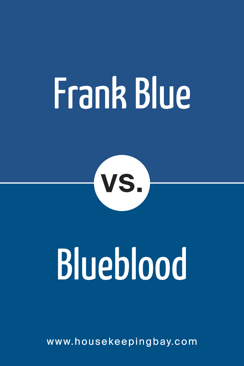
Frank Blue SW 6967 by Sherwin Williams vs Blueblood SW 6966 by Sherwin Williams
Frank Blue SW 6967 and Blueblood SW 6966 by Sherwin Williams are two shades of blue, but each has its own personality. Frank Blue is a bright, vivid blue that brings energy and liveliness to a space. It can make a room feel vibrant and active, often suiting lively areas or contemporary settings.
In contrast, Blueblood is a deeper, more intense blue. It carries a rich and sophisticated feel, adding a sense of depth and elegance to any room. This color works well in spaces where a calm and classic ambiance is desired, making it a perfect choice for more formal settings or cozy environments.
While both colors are from the same palette, Frank Blue leans towards a spirited expression, whereas Blueblood evokes a more refined and composed atmosphere. These colors reflect different moods and styles, offering choices to suit varying tastes and room purposes.
You can see recommended paint color below:
- SW 6966 Blueblood
housekeepingbay.com
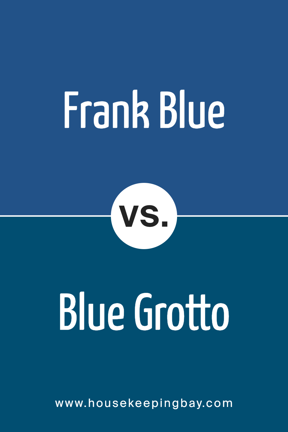
Frank Blue SW 6967 by Sherwin Williams vs Blue Grotto SW 2941 by Sherwin Williams
Frank Blue SW 6967 and Blue Grotto SW 2941, both by Sherwin Williams, offer distinct shades of blue. Frank Blue is a rich, bold color with strong undertones. It feels vibrant and energetic, making it an excellent choice for creating a lively space. The shade stands out and adds a modern touch to interiors.
Blue Grotto, however, is a softer, more muted blue. It carries a gentle, calming vibe, perfect for those seeking a peaceful atmosphere. This shade gives off a serene feeling, making it suitable for bedrooms or places where relaxation is desired.
While Frank Blue injects energy into a room, Blue Grotto settles with a more soothing presence. Both hues bring their unique characteristics to a space, with Frank Blue being more striking and Blue Grotto offering a quiet elegance. Depending on the mood and style desired, each color can significantly alter the ambiance of a room.
You can see recommended paint color below:
- SW 2941 Blue Grotto
housekeepingbay.com
Frank Blue SW 6967 by Sherwin Williams vs Bridgeport SW 2940 by Sherwin Williams
Frank Blue SW 6967 by Sherwin Williams is a bold, rich blue with a sense of elegance. It has a deep hue that makes spaces feel sophisticated and can serve as a striking main color in various rooms. Its intensity provides a strong presence and makes a statement without overwhelming.
Bridgeport SW 2940, also by Sherwin Williams, offers a different vibe. This color leans towards a softer, more muted tone with hints of green, making it feel more calming and soothing. It fits well in spaces where a gentle atmosphere is desired, providing a subtle backdrop.
While Frank Blue commands attention with its depth, Bridgeport promotes a softer ambiance. Frank Blue often works well in modern or dramatic settings, while Bridgeport suits those looking for a serene and understated environment. Both colors bring unique qualities, allowing them to complement different parts of a design depending on the desired mood.
You can see recommended paint color below:
- SW 2940 Bridgeport
housekeepingbay.com
Frank Blue SW 6967 by Sherwin Williams vs Jay Blue SW 6797 by Sherwin Williams
Frank Blue SW 6967 and Jay Blue SW 6797 by Sherwin Williams are two distinct shades. Frank Blue is a deep, rich shade that feels grounded and bold. It’s perfect for creating cozy spaces or adding a strong accent to a room. Its intensity gives rooms a dramatic touch.
Jay Blue, in contrast, is lighter and brighter. It evokes a more energetic and playful feel compared to the seriousness of Frank Blue. This lively shade often creates an open and airy atmosphere, making it suitable for areas where more light and energy are desired.
Both colors fall within the blue family, yet their unique qualities set them apart. Frank Blue does well in providing a moody and sophisticated environment while Jay Blue reflects vibrancy and cheerfulness. Choosing between the two depends on the mood you want to create: a calm and enclosed space or one that feels lively and fresh.
You can see recommended paint color below:
- SW 6797 Jay Blue
housekeepingbay.com
Frank Blue SW 6967 by Sherwin Williams vs Honorable Blue SW 6811 by Sherwin Williams
Frank Blue SW 6967 and Honorable Blue SW 6811 by Sherwin Williams both offer distinct shades that can enhance spaces differently. Frank Blue appears as a rich, deep blue, giving rooms a bold and sophisticated feel. It suits formal spaces or areas where you wish to make a strong impression.
In contrast, Honorable Blue presents a softer, more muted tone. This shade offers a gentler, more comforting atmosphere, fitting well in bedrooms or living spaces where calmness and relaxation matter.
Frank Blue’s intensity makes it an excellent choice for accent walls or features, while Honorable Blue can coat entire rooms without overwhelming the senses. Frank Blue can energize and define spaces, whereas Honorable Blue tends to soothe and balance.
Both colors beautifully complement neutral palettes or lighter blues, allowing flexibility in design choices. Whether you want boldness or calmness, these shades provide unique advantages for various needs.
You can see recommended paint color below:
- SW 6811 Honorable Blue
housekeepingbay.com
Frank Blue SW 6967 by Sherwin Williams vs Morning Glory SW 6971 by Sherwin Williams
Frank Blue SW 6967 and Morning Glory SW 6971 by Sherwin Williams share similarities but also have distinct differences. Frank Blue is a rich and muted blue with a hint of gray, presenting a calm, sophisticated vibe. It’s versatile, often used in spaces meant to feel stable and grounded. This color adapts well to both modern and traditional settings, offering a sense of depth.
Morning Glory, in contrast, is a more vibrant and lively blue with an undertone of green, giving it an uplifting and cheerful feel. This color brings energy and brightness to a space, working well in areas where you want a lively atmosphere, such as a playroom or an accent wall.
While both colors belong to the blue family, Frank Blue leans towards subtleness and elegance. Morning Glory, on the other hand, adds a splash of vibrant personality, making it suitable for creating a fresh and lively environment.
You can see recommended paint color below:
- SW 6971 Morning Glory
housekeepingbay.com
Frank Blue SW 6967 by Sherwin Williams vs Commodore SW 6524 by Sherwin Williams
Frank Blue SW 6967 and Commodore SW 6524, both by Sherwin Williams, are vibrant, bold blues. Frank Blue exudes a bright, crisp atmosphere. It is a lighter blue, with a hint of brightness that feels clean and refreshing. This makes it an excellent option for creating an uplifting mood in any space.
Commodore, however, carries a deeper tone. It presents a richer, more intense blue with hints of depth, evoking a sense of calm strength. This darker shade often works well in rooms where a sense of depth or coziness is desired, like a study or a bedroom.
While Frank Blue brings a sense of airy lightness, Commodore offers a grounded, substantial feel. Depending on your space, Frank Blue may enhance light and openness, while Commodore could add a touch of bold elegance and solidity. Both colors have their unique charm based on their nuances, providing versatility to your decor.
You can see recommended paint color below:
- SW 6524 Commodore
housekeepingbay.com
Frank Blue SW 6967 by Sherwin Williams vs Hyper Blue SW 6965 by Sherwin Williams
Frank Blue SW 6967 by Sherwin Williams offers a gentle, muted shade of blue that has a calming and relaxed vibe. It is perfect for creating a peaceful atmosphere in any space, whether it’s a bedroom, living room, or bathroom. The tone is soft, making it versatile and easy to pair with other colors and home decor.
Hyper Blue SW 6965, however, presents a more vivid and energetic shade of blue. This color has a bold appearance that can add a lively touch to any room. Hyper Blue can act as a statement color, bringing vibrancy to feature walls or accents.
When comparing the two, Frank Blue feels more subtle and soothing, whereas Hyper Blue stands out with its intensity. Depending on the mood and ambiance you wish to create, Frank Blue offers calmness, while Hyper Blue delivers energy and brightness.
You can see recommended paint color below:
- SW 6965 Hyper Blue
housekeepingbay.com
Frank Blue SW 6967 by Sherwin Williams vs Dignity Blue SW 6804 by Sherwin Williams
Frank Blue SW 6967 and Dignity Blue SW 6804 by Sherwin Williams are both appealing shades of blue, but each offers a distinct feel. Frank Blue is darker, giving a strong and bold impression. It brings a sense of depth and richness, making it suitable for creating dramatic spaces or accent walls. This color can be described as deep and intense, evoking a sense of stability.
Dignity Blue, in contrast, is lighter. It carries a touch of vibrancy, offering a brighter, more energetic look. This hue can make a space feel open and lively, bringing a cheerful vibe to any room. It is perfect for spaces where you want to encourage positive energy and brightness.
While Frank Blue can add a sense of sophistication and depth, Dignity Blue brings a spirited and fresh feel. Both colors can beautifully enhance a space, but they cater to different moods and settings.
You can see recommended paint color below:
- SW 6804 Dignity Blue
housekeepingbay.com
Frank Blue SW 6967 by Sherwin Williams vs Indigo SW 6531 by Sherwin Williams
Frank Blue SW 6967 by Sherwin Williams and Indigo SW 6531 by Sherwin Williams are both beautiful shades with different vibes. Frank Blue stands out for its unique blend of blue and green, resulting in a soft, almost teal tone. It brings a fresh and calming effect to spaces. This color works well in rooms where a peaceful and refreshing atmosphere is desired, such as bedrooms or bathrooms.
In contrast, Indigo SW 6531 offers a deeper, richer blue that leans into a more traditional palette. With strong undertones of purple, Indigo creates a sense of depth and warmth. This shade can add a more dramatic and sophisticated feel to a room, making it an excellent choice for living areas or dining rooms where a bold statement is welcome.
While Frank Blue is cool and serene, perfect for creating a calming environment, Indigo adds richness and mood, ideal for making spaces feel cozy and inviting.
You can see recommended paint color below:
- SW 6531 Indigo
housekeepingbay.com
Conclusion
Frank Blue by Sherwin Williams offers a unique shade that caught my attention with its rich, deep tone. This color, SW 6967, brings a calming yet bold presence to any room. I see it as a versatile option, fitting well in both modern spaces and classic settings.
Its blue tone carries a sense of sophistication, yet remains inviting and warm.
As I considered its application, the possibilities seemed endless. Whether on a feature wall or as part of a comprehensive color scheme, Frank Blue stands out without overwhelming the senses. The way it interacts with light throughout the day adds layers of interest, making it a dynamic addition to a home or workspace.
Choosing a color often presents challenges, but Frank Blue simplifies the decision process with its adaptability. It pairs well with neutrals, such as whites or grays, and can even complement stronger shades if you prefer a bold palette.
In my view, the balance it provides—combining both serenity and confidence—makes it a standout choice.
In summary, Frank Blue by Sherwin Williams serves as a solid foundation for anyone looking to refresh their space. Its inherent versatility and stylish appeal can breathe new life into interiors, making it much more than just another shade on the color chart.
housekeepingbay.com
Ever wished paint sampling was as easy as sticking a sticker? Guess what? Now it is! Discover Samplize's unique Peel & Stick samples. Get started now and say goodbye to the old messy way!
Get paint samples


