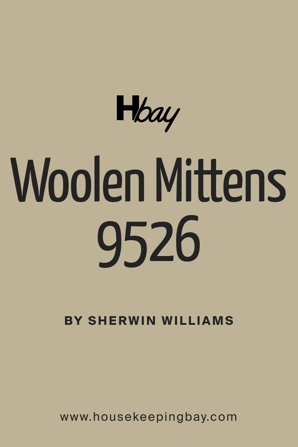
Woolen Mittens SW 9526 Paint Color by Sherwin-Williams
SW 9526 Woolen Mittens is a color that comes to us as a part of Sherwin-Williams’ expansive and diverse paint color collection.
SW 9526 Woolen Mittens is a color that comes to us as a part of Sherwin-Williams’ expansive and diverse paint color collection. It evokes the simplicity and coziness attributed to the woolen mittens we wear during the chilly winters. When one is considering the perfect color to introduce warmth and coziness to their spaces, understanding the color’s characteristics and undertones is crucial.
This article explores the nature, undertones, and ambient creation of SW 9526 Woolen Mittens, aiming to assist in making informed decisions for interior and exterior spaces.
via plan home
What Color is SW 9526 Woolen Mittens?
SW 9526 Woolen Mittens is reminiscent of the soft texture and warm feeling of actual woolen mittens. It is a sophisticated and neutral shade, a blend of grey and beige, often referred to as “greige.” This hue brings forward the best of both worlds, making it versatile enough to complement various color schemes and interior settings.
When applied, SW 9526 Woolen Mittens can act as a unifying element within a space, blending seamlessly with various textures and furnishings. It is compatible with both contemporary and classic designs, making it a popular choice among homeowners and interior designers.
Whether used as a primary color or an accent, it elevates the aesthetic appeal of the space, bringing warmth and elegance to the environment.
housekeepingbay.com
Table of Contents
Is it a Warm or a Cool Color?
SW 9526 Woolen Mittens leans more towards being a warm color due to its beige undertones, although the grey component can introduce a cool factor. The warmth of this color makes spaces appear more inviting and cozy, providing an atmosphere of relaxation and comfort. However, the gray element ensures that it does not overwhelm the spaces with excessive warmth, maintaining a balanced and neutral ambiance.
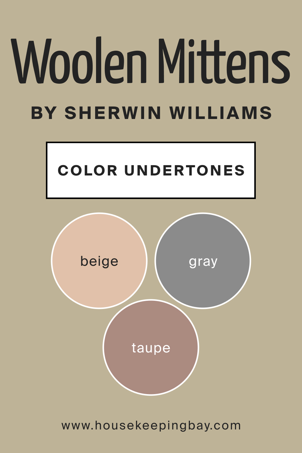
Undertones of SW 9526 Woolen Mittens
- Beige Undertone
The beige undertone of SW 9526 Woolen Mittens lends it the warm and comforting aura, rendering it ideal for living rooms and bedrooms where a cozy atmosphere is desirable.
- Grey Undertone
The grey undertone introduces a subtle coolness and neutrality to the color, making it versatile. This undertone enables it to be an ideal backdrop for both vibrant and muted color palettes, offering flexibility in decor and design choices.
- Taupe Undertone
A subtle taupe undertone is also present, enhancing its sophistication and elegance. This undertone provides a grounding effect, creating a calming and serene environment, making SW 9526 Woolen Mittens a preferred choice for spaces meant for relaxation and reflection.
housekeepingbay.com
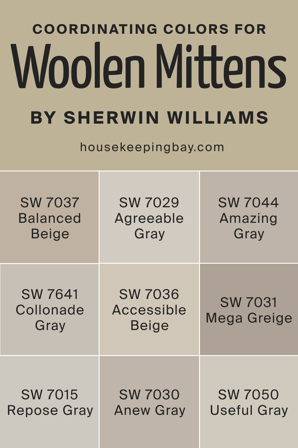
Coordinating Colors of SW 9526 Woolen Mittens
Coordinating colors are those that work harmoniously together to create a balanced and aesthetically pleasing color scheme. The concept is grounded in color theory, where colors are chosen based on their relationships on the color wheel, considering aspects like hue, saturation, and brightness.
Coordinating colors can be analogous, sharing a base color, or complementary, being opposite each other on the color wheel. The selection of coordinating colors is crucial in interior and exterior design as it influences the mood, perception, and visual appeal of a space. When colors coordinate well, they create a sense of harmony and unity, making the space feel cohesive and well thought out. In contrast, poorly coordinated colors can make a space feel chaotic, cramped, or disjointed.
SW 7036 Accessible Beige
This color complements SW 9526 due to its neutral and adaptable nature, effortlessly blending with various elements in a room.
SW 7015 Repose Gray
A soft and timeless gray, Repose Gray aligns harmoniously with Woolen Mittens, adding a touch of cool sophistication to spaces.
SW 7641 Collonade Gray
This is a warm, muted color that seamlessly coordinates with Woolen Mittens, enhancing the overall warmth and cozy feel of a space.
SW 7030 Anew Gray
Anew Gray is a versatile and balanced hue, harmonizing well with Woolen Mittens to create an inviting and serene ambiance.
SW 7029 Agreeable Gray
This color brings a soft and neutral touch, coordinating well with Woolen Mittens and contributing to a harmonious color palette.
SW 7037 Balanced Beige
As its name suggests, Balanced Beige aligns perfectly with Woolen Mittens, adding to the welcoming and balanced feel of the environment.
Additional colors to consider:
SW 7050 Useful Gray
This color is a sophisticated, balanced gray that can act as a soft counterpart to Woolen Mittens, fostering a calm atmosphere.
SW 7044 Amazing Gray
A subtle and neutral gray, Amazing Gray complements Woolen Mittens by adding depth and dimension to the palette without overpowering it.
SW 7031 Mega Greige
Mega Greige brings a rich, warmer tone, complementing the cozy warmth of Woolen Mittens and enhancing the overall aesthetic of the space.
housekeepingbay.com
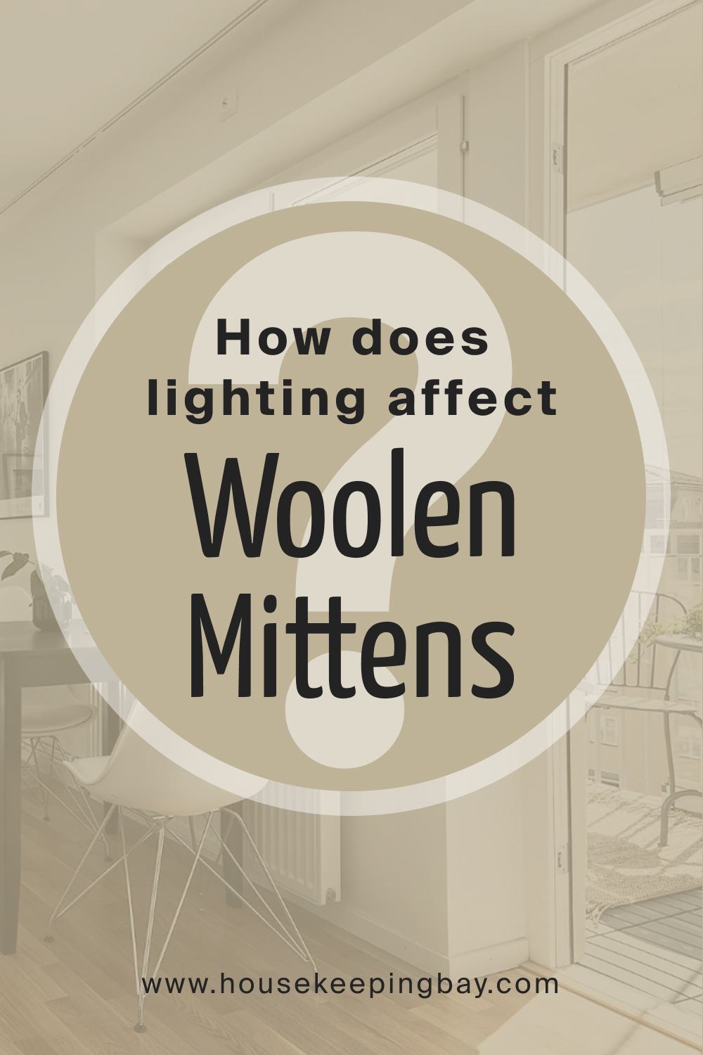
How Does Lighting Affect SW 9526 Woolen Mittens?
Lighting has a significant impact on how we perceive SW 9526 Woolen Mittens. In abundant natural light, the warm beige undertones are more pronounced, creating a more inviting and cozy atmosphere.
In spaces with less natural light or when illuminated with cooler artificial light, the grey undertones become more dominant, presenting a more neutral and sophisticated appearance.
Therefore, considering the lighting conditions is crucial when choosing to apply SW 9526 Woolen Mittens to ensure the desired ambiance and aesthetic are achieved.
housekeepingbay.com
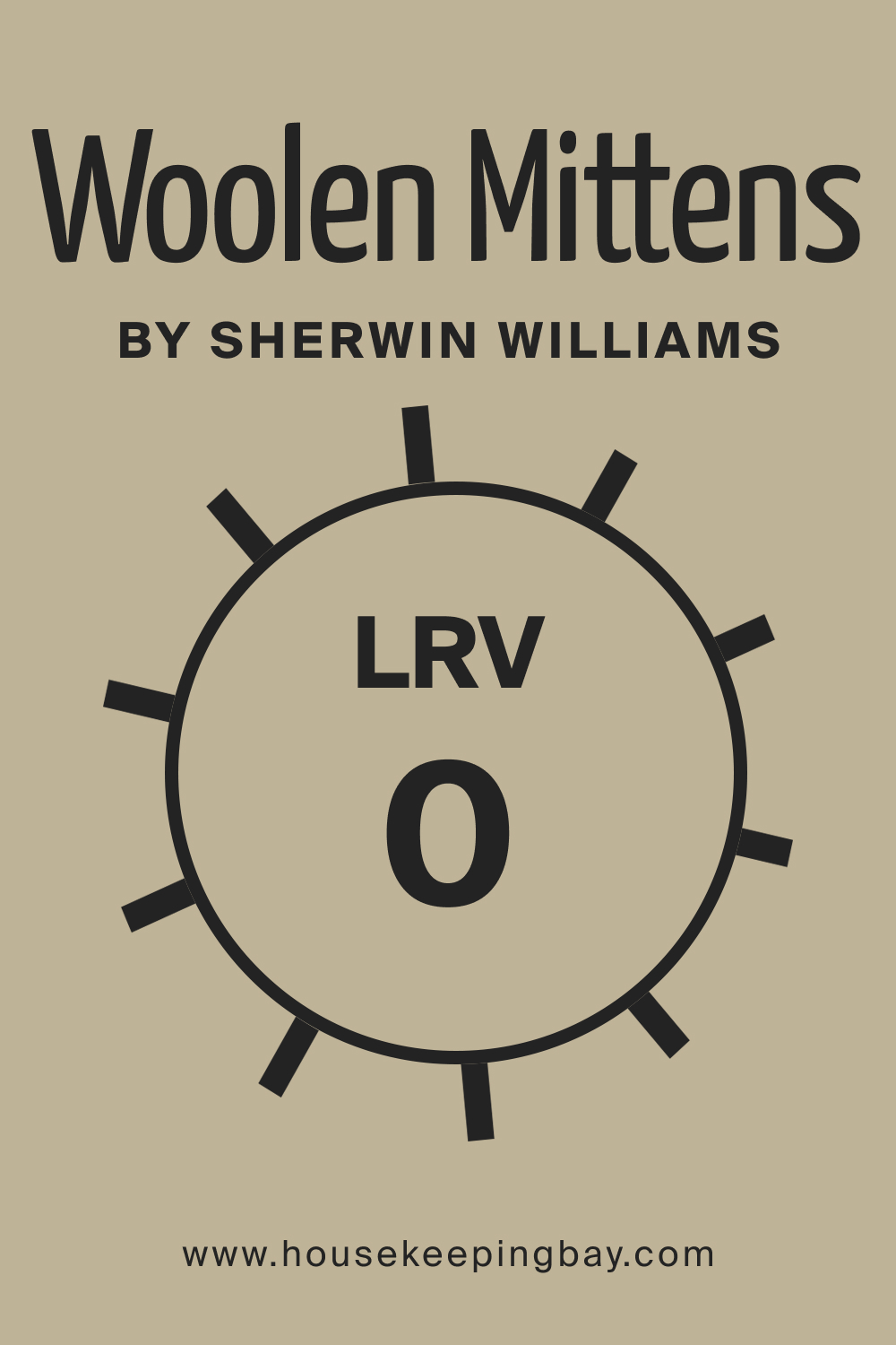
LRV of SW 9526 Woolen Mittens
The Light Reflectance Value (LRV) of a color quantifies how much light it reflects, with values ranging from 0%, representing absolute black, to 100%, representing pure white. SW 9526 Woolen Mittens, being a balanced and neutral shade, has a moderate LRV, allowing it to maintain a harmonious balance between light and dark, ensuring versatility in various spaces and lighting conditions.
The LRV of a color influences the perception of space; higher LRVs tend to make a space appear larger and more open, while lower LRVs create a more intimate and enclosed feel.
Understanding the LRV of SW 9526 Woolen Mittens (which is 35) is crucial for optimizing its application in different settings. The careful consideration of LRV ensures that the color contributes positively to the ambiance of the space, either by amplifying natural light or by creating a sense of coziness and intimacy. It’s essential for designers and homeowners to consider the LRV of Woolen Mittens to achieve the desired aesthetic and atmospheric effects, creating spaces that are not only visually pleasing but also functionally apt and comfortable.
housekeepingbay.com
What is LRV? Read It Before You Choose Your Ideal Paint Color
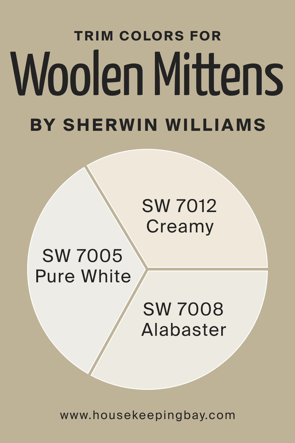
Trim Colors of SW 9526 Woolen Mittens
Trim colors refer to the shades chosen for the trimmings around doors, windows, baseboards, and moldings in a space. These colors are crucial as they frame and accentuate the architectural features of a room, acting as a sort of visual punctuation and helping to define the spaces within a home.
The selection of trim colors can either complement or contrast with the main wall color, impacting the overall aesthetic and feel of a room. A well-chosen trim color can elevate the design, add depth and dimension, and create a cohesive and harmonious look within the space.
For SW Woolen Mittens, opt for the following colors:
- SW 7008 Alabaster
This is a pure, clean shade of white that can create a sharp and sophisticated contrast with Woolen Mittens, highlighting architectural details.
- SW 7005 Pure White
Pure White is a neutral and balanced white, which can complement the greige tones of Woolen Mittens without overpowering them.
- SW 7012 Creamy
This is a soft, slightly warm white that can harmonize well with the warm beige undertones of Woolen Mittens, creating a cozy and inviting atmosphere.
housekeepingbay.com
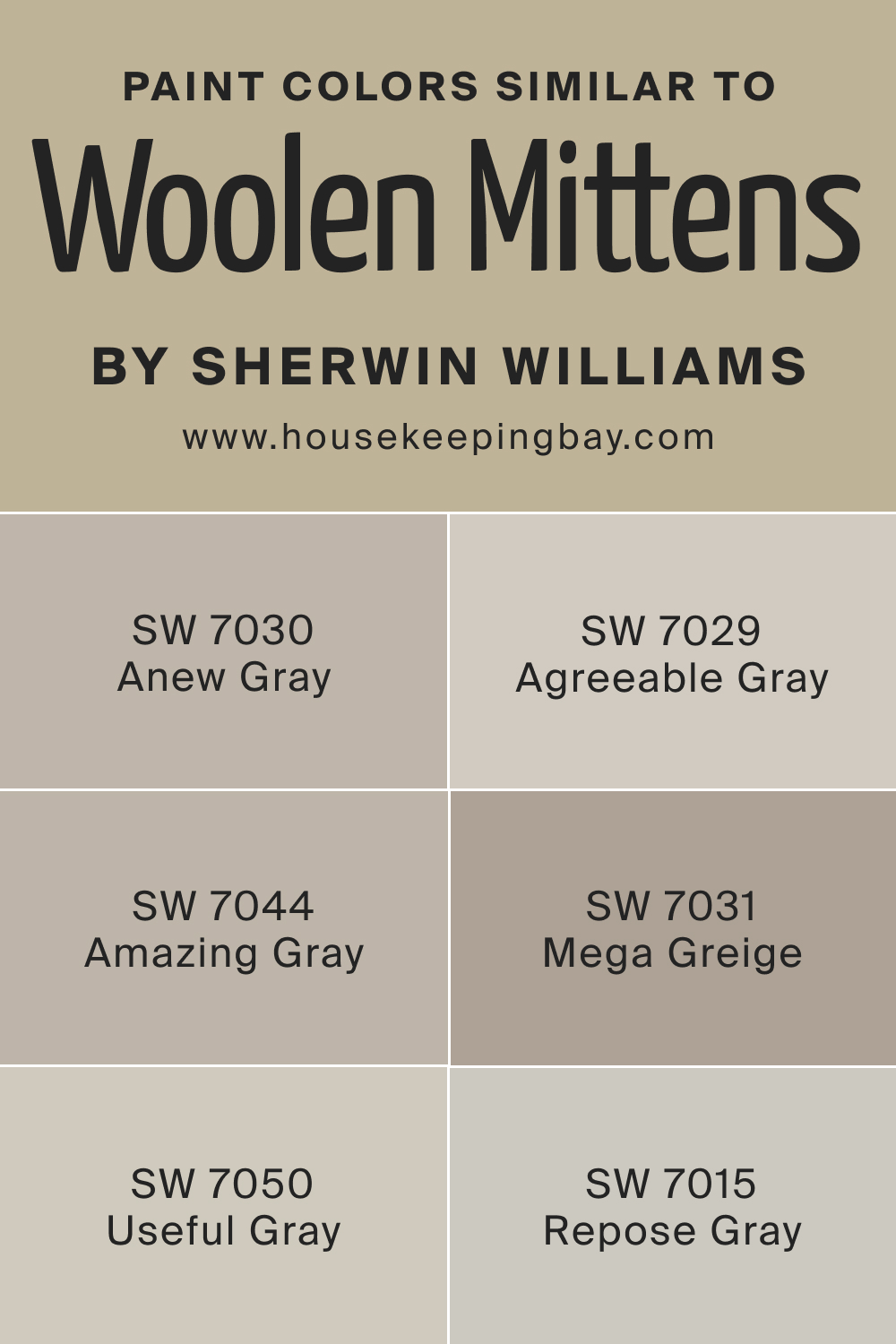
Colors Similar to SW 9526 Woolen Mittens
Knowing similar colors to your wall paint is significant as it offers flexibility and options in creating a harmonious color scheme within a space. It allows for subtle variations in tone and shade, enabling the creation of a nuanced and layered visual experience.
Recognizing similar colors is crucial when looking to create a cohesive and balanced color palette, whether aiming for a monochromatic design or looking to introduce complementary colors. It aids in making informed decisions that contribute to the aesthetic coherency and atmospheric ambiance of a space, ensuring each color enhances the others and contributes to the overall design vision.
Here are several recommendations regarding similar colors for SW Woolen Mittens.
SW 7030 Anew Gray
A balanced and versatile gray with warm undertones, creating a friendly and welcoming ambiance.
SW 7029 Agreeable Gray
A soft, neutral gray that offers a harmonious and sophisticated feel, complementing various design elements.
SW 7044 Amazing Gray
This color is subtle and neutral, providing depth and dimension without overshadowing other colors.
SW 7050 Useful Gray
A sophisticated, balanced gray, fostering a calm and serene atmosphere in any space.
SW 7031 Mega Greige
It brings a rich, warmer tone, enhancing the overall aesthetic with its depth and warmth.
SW 7015 Repose Gray
A timeless and elegant soft gray, which aligns harmoniously with other neutral tones, adding a touch of sophistication.
housekeepingbay.com
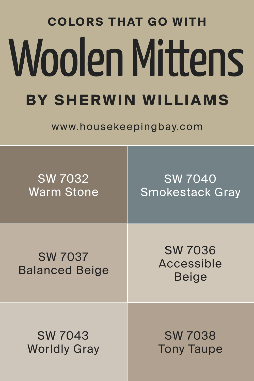
Colors That Go With SW 9526 Woolen Mittens
Due to its neutral and balanced nature, SW 9526 Woolen Mittens pairs well with a wide range of colors. It goes well with earth tones, creating a harmonious and natural look, and can also be paired with vibrant colors to make them stand out.
In terms of decor, it complements wooden furniture and metallic accents, enhancing the richness and diversity of the room’s aesthetic components. Plush fabrics and textured furnishings synchronize well with this color, enhancing the overall cozy and comforting vibe.
Check out these colors that go well with SW Woolen Mittens.
SW 7032 Warm Stone
This is a gentle and cozy color, resembling the warmth of natural stone, suitable for creating a comfortable and welcoming ambiance in any room.
SW 7037 Balanced Beige
Balanced Beige is a harmonious and neutral color, providing a sense of stability and calmness, ideal for creating balanced and serene spaces.
SW 7038 Tony Taupe
Tony Taupe offers a subtle and elegant hue, bringing a sophisticated touch to spaces with its muted and refined undertones.
SW 7043 Worldly Gray
Worldly Gray is a versatile and adaptable color, projecting a sense of elegance and refinement, making it a suitable choice for various design styles and settings.
SW 7040 Smokestack Gray
This color is a soft and smoky gray, delivering a sense of depth and mystery, ideal for creating dramatic and impactful interiors.
SW 7036 Accessible Beige
Accessible Beige is a friendly and approachable color, making it an ideal choice for creating inviting and sociable environments.
housekeepingbay.com
How to Use SW 9526 Woolen Mittens In Your Home?
Understanding how colors work in your home is paramount as colors play a significant role in influencing the mood, energy, and perceived space within a room. The right color can create a sense of comfort, warmth, and tranquility, while the wrong one can evoke feelings of chaos, confinement, and discomfort. Knowledge of color interaction and impact is crucial to create harmonious, balanced, and aesthetically pleasing interiors that also cater to the functional needs and preferences of the inhabitants.
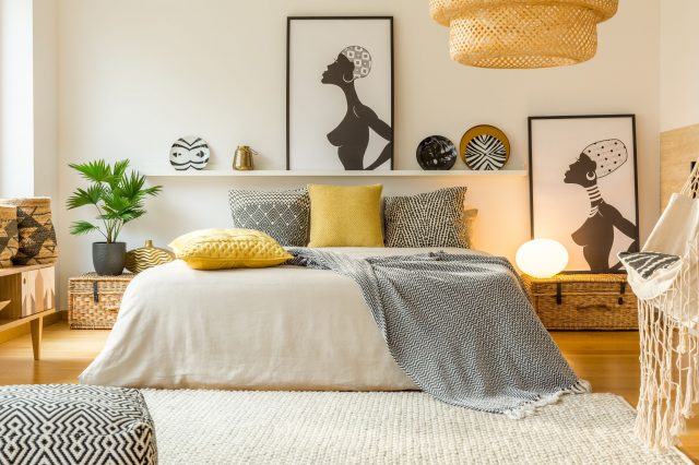
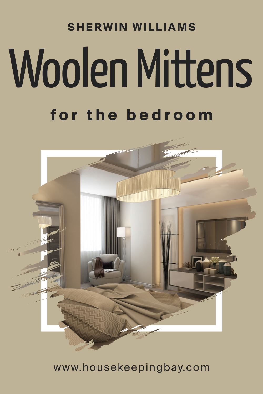
SW 9526 Woolen Mittens In the Bedroom
SW 9526 Woolen Mittens is a versatile color for a bedroom due to its balanced and neutral tone, allowing for the creation of a calming and serene environment conducive to rest and relaxation. Its warm undertones can make the bedroom feel more inviting and cozy, providing a sanctuary away from the hustle and bustle of everyday life.
When paired with the right accessories and furnishings, Woolen Mittens can accentuate a sense of luxury and comfort in the bedroom. Soft linens, plush pillows, and warm lighting can complement the color, enhancing the overall ambiance and making the room feel like a tranquil retreat.
housekeepingbay.com
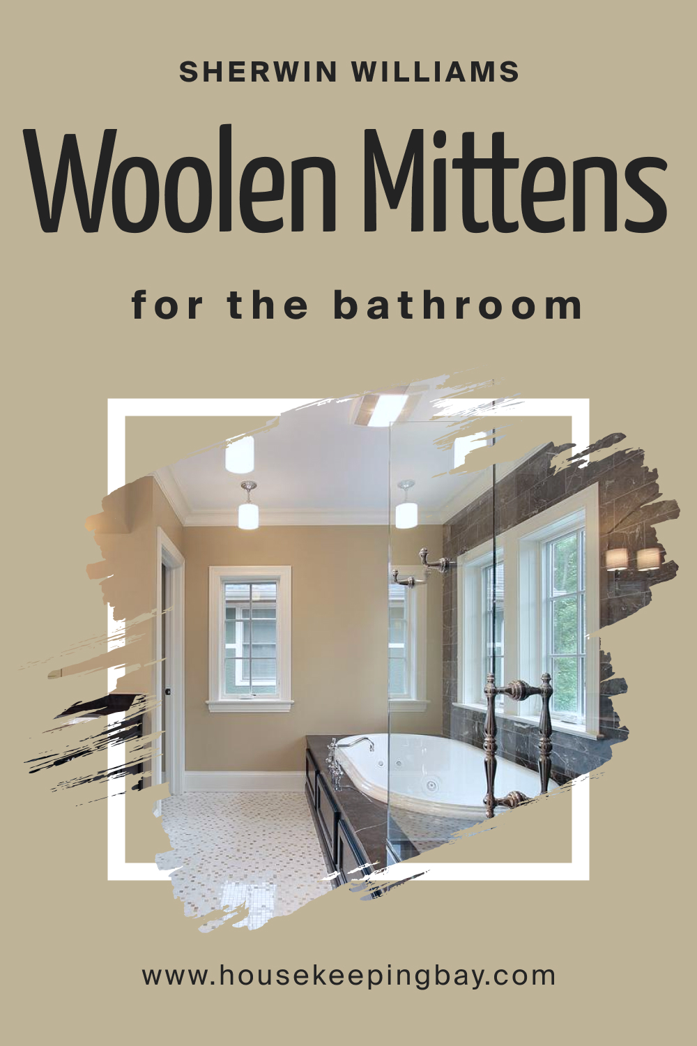
SW 9526 Woolen Mittens In the Bathroom
Utilizing SW 9526 Woolen Mittens in the bathroom can invoke a spa-like atmosphere, transforming the space into a peaceful oasis. Its neutral and balanced hues pair well with natural materials like wood and stone, creating a harmonious and revitalizing environment.
Additionally, Woolen Mittens can act as a sophisticated backdrop to bold accents and fixtures in the bathroom, allowing for flexibility in design. Whether opting for modern chrome fittings or more traditional brass ones, the color adapts well, maintaining a sense of cohesion and elegance.
housekeepingbay.com
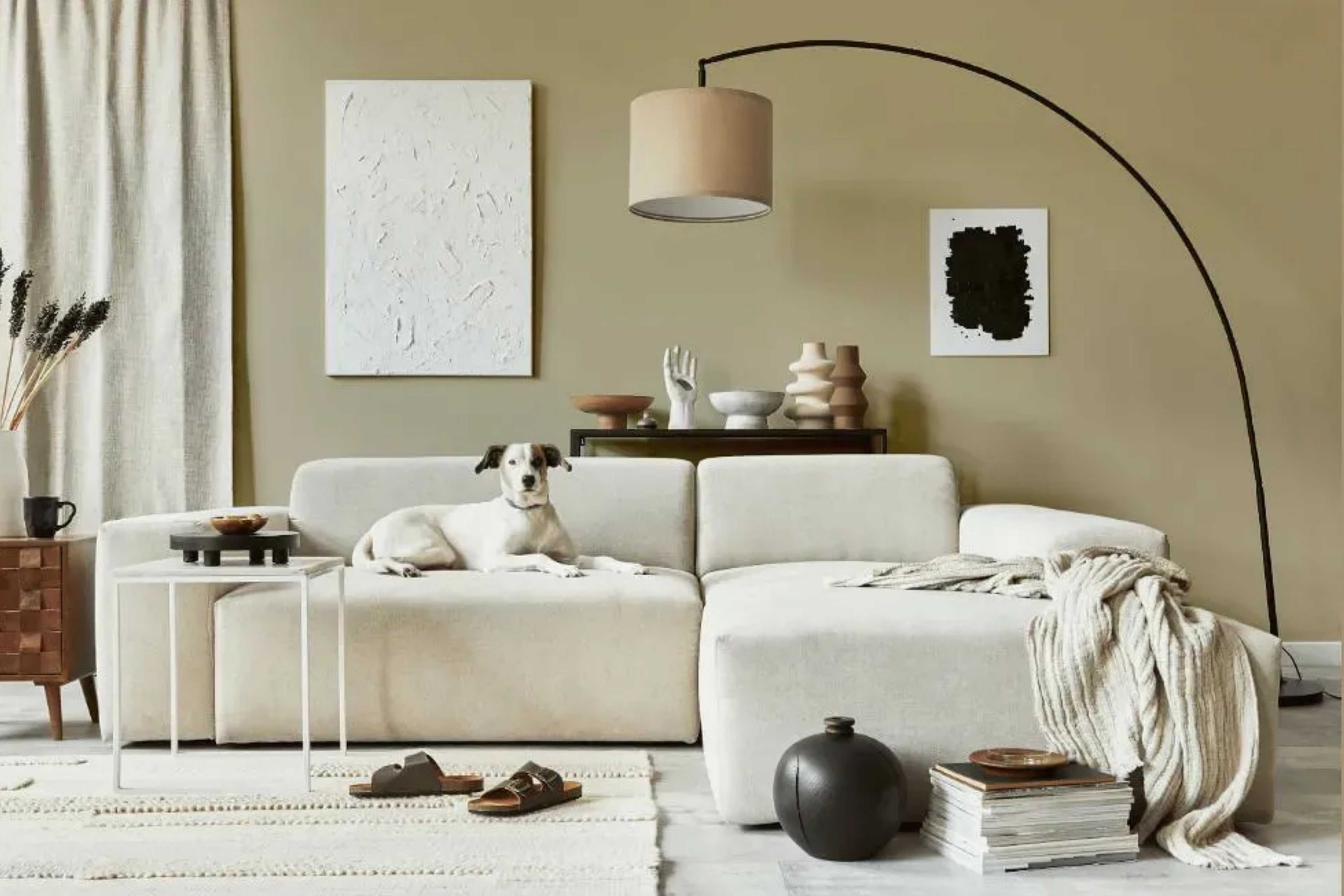
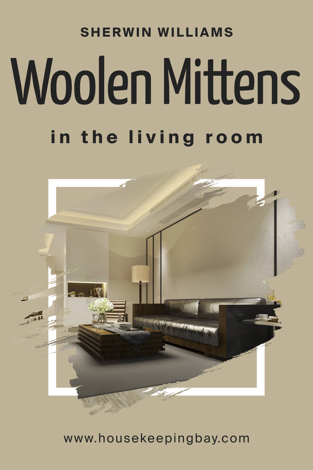
SW 9526 Woolen Mittens In the Living Room
In the living room, SW 9526 Woolen Mittens can serve as a neutral canvas, allowing for the incorporation of various textures, patterns, and colors, enabling a dynamic and layered visual experience. It fosters a warm and welcoming atmosphere, making it an ideal choice for spaces designed for socializing and relaxation.
When paired with the right decor elements, Woolen Mittens can elevate the living room’s aesthetic appeal. Elegant furnishings, art pieces, and decorative items can be harmoniously integrated, with Woolen Mittens tying everything together and enhancing the overall design narrative.
housekeepingbay.com
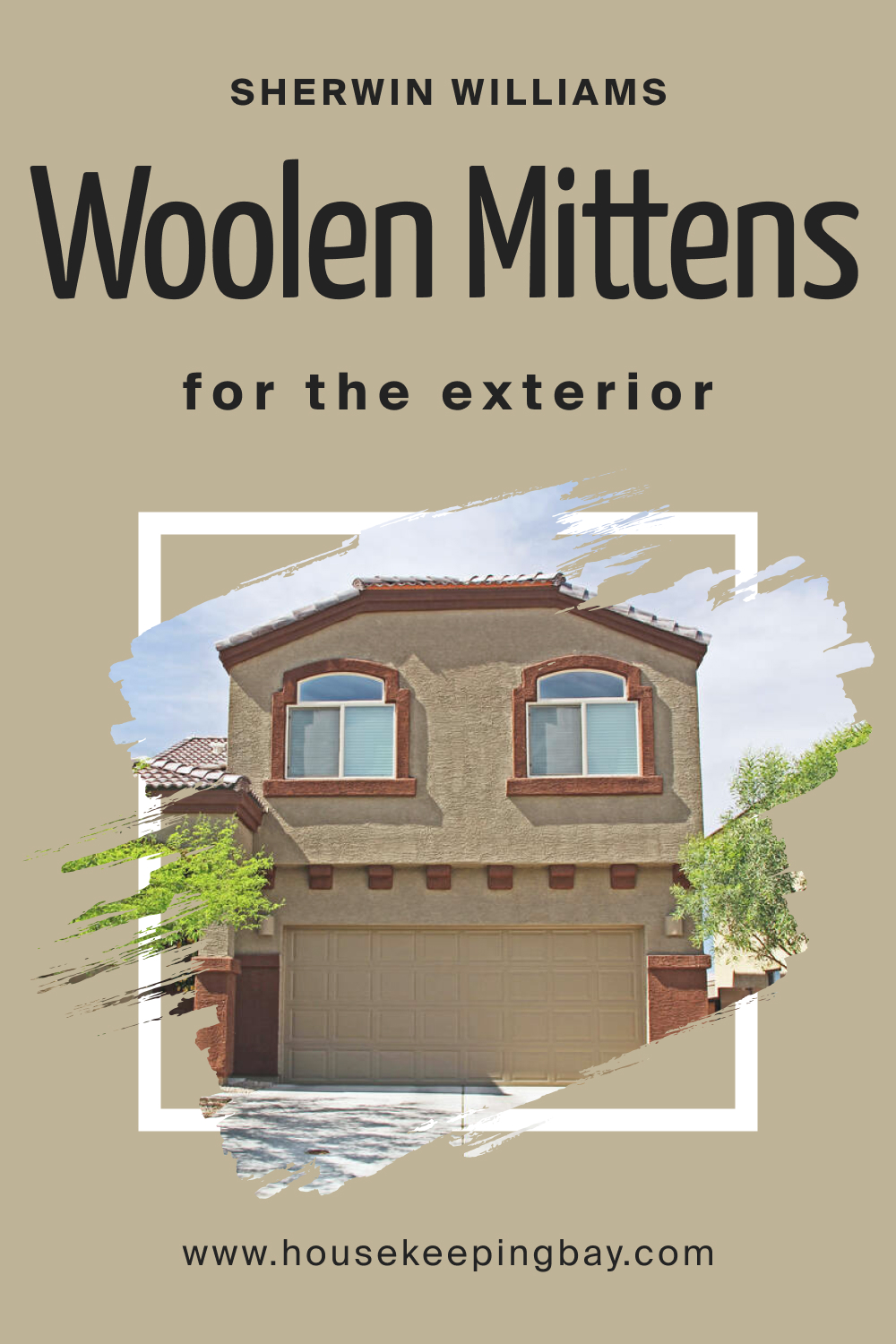
SW 9526 Woolen Mittens For the Exterior
Employing SW 9526 Woolen Mittens for the exterior can impart a timeless and elegant appearance to the home. It harmonizes well with natural surroundings, making it a suitable choice for various landscapes and architectural styles. Its neutral tone offers a sophisticated backdrop to accentuate landscaping and architectural details.
Moreover, Woolen Mittens is versatile enough to complement a range of trim and accent colors, allowing homeowners to play with different color schemes to enhance curb appeal. Whether opting for bold door colors or subtle trim shades, Woolen Mittens provides a balanced and pleasing aesthetic, adding to the home’s visual charm.
housekeepingbay.com
Comparing SW Woolen Mittens With Other Colors
Choosing the right color for your home is essential because it significantly influences the atmosphere, mood, and perceived space within a room. Each color has its unique characteristics, and comparing them ensures the selected color complements the aesthetics, furniture, and overall theme of the house, resulting in a harmonious and pleasing environment.
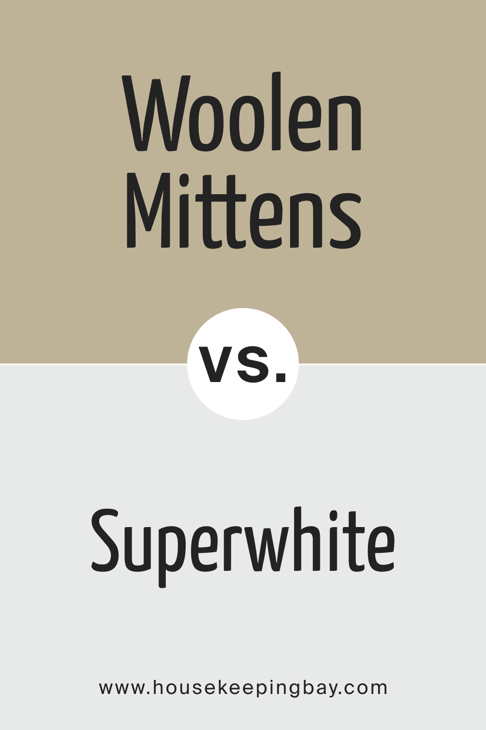
SW 9526 Woolen Mittens vs. SW 6995 Superwhite
Woolen Mittens is a warm and cozy color that can create a soothing and welcoming ambiance, whereas Superwhite , being a pure and neutral white, brings a sense of cleanliness, spaciousness, and simplicity. When juxtaposing these two, consider the kind of atmosphere you want to create; a balance between the two can result in a warm and open space.
The starkness of Superwhite can be softened by the subtle tones of Woolen Mittens, providing a harmonious contrast, which can be especially beneficial in rooms where both relaxation and focus are needed, such as a study or a home office.
housekeepingbay.com
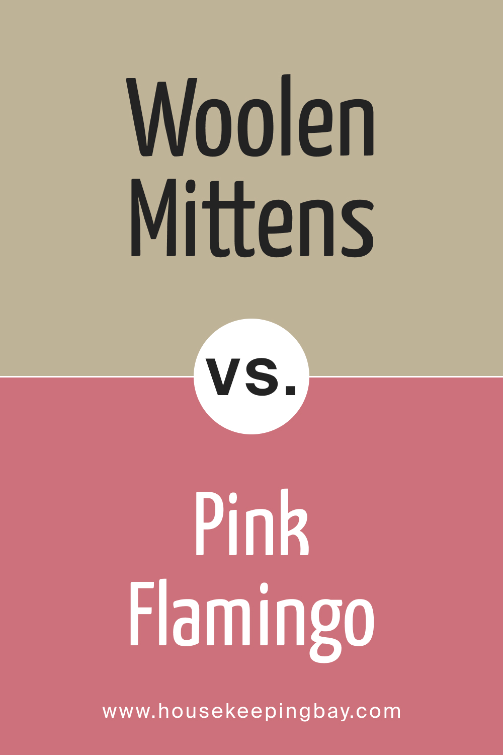
SW 9526 Woolen Mittens vs. SW 0080 Pink Flamingo
Woolen Mittens contrasts sharply with the vibrant and energetic Pink Flamingo . Woolen Mittens provides a calming and subtle backdrop, which can balance out the boldness and excitement brought by Pink Flamingo, allowing for spaces that are lively yet not overwhelming.
When comparing these two shades, it’s important to consider the function of the space and the mood you want to create, using Pink Flamingo as an accent color to inject energy without compromising the comforting presence of Woolen Mittens.
housekeepingbay.com
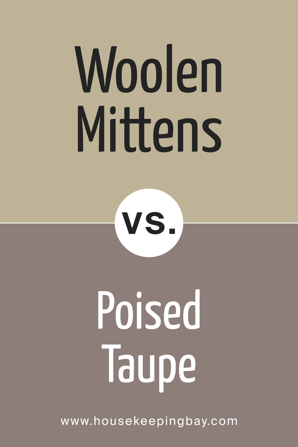
SW 9526 Woolen Mittens vs. SW 6039 Poised Taupe
When compared, Woolen Mittens and Poised Taupe both offer a neutral and balanced background but differ in undertones. Woolen Mittens may have a softer, warmer undertone which can create a comforting environment, while Poised Taupe, being a greige tone, brings a more sophisticated and modern feel.
Balancing these colors could result in a contemporary yet cozy space, combining warmth with modern elegance, suitable for living rooms or bedrooms where comfort and style are key.
housekeepingbay.com
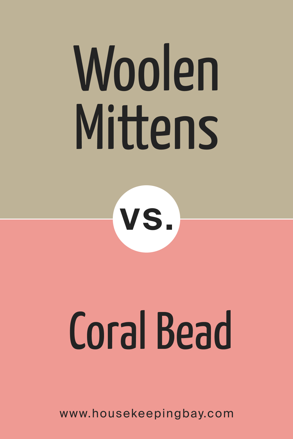
SW 9526 Woolen Mittens vs. SW 6873 Coral Bead
Coral Bead , with its vivid and warm tones, offers a stark contrast to the subdued and neutral Woolen Mittens. While Woolen Mittens infuses calmness, Coral Bead can add a splash of warmth and vitality. The combination can create spaces that feel inviting and uplifting, suitable for spaces intended for gatherings and social interactions.
When combining these two, consider using Coral Bead strategically to avoid overwhelming the senses, allowing Woolen Mittens to maintain an overall sense of tranquility in the space.
housekeepingbay.com
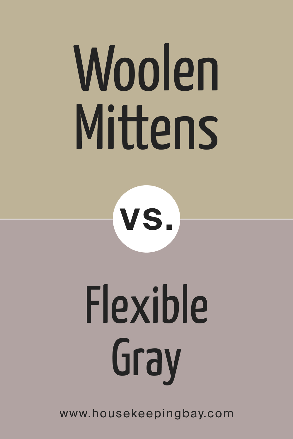
SW 9526 Woolen Mittens vs. SW 6010 Flexible Gray
Flexible Gray and Woolen Mittens are both neutral colors but diverge in temperature and mood. Flexible Gray, being cooler, can project a sleek and professional atmosphere, whereas Woolen Mittens, with its warmer tones, brings forth a sense of coziness and warmth.
The interplay between these colors can harmonize a space, blending professionalism with comfort, making it ideal for home offices or spaces where a calm and focused environment is desired.
housekeepingbay.com
SW 9526 Woolen Mittens vs. SW 9628 Winter Walk
Winter Walk , a cool and serene color, contrasts with the warm and enveloping Woolen Mittens. This contrast can create a refreshing and balanced atmosphere, blending coziness with a breath of fresh air, suitable for spaces intended for relaxation and rejuvenation.
Consider the balance between the coolness of Winter Walk and the warmth of Woolen Mittens to achieve a space that feels both inviting and refreshing, such as a bedroom or a reading nook.
housekeepingbay.com
Conclusion
SW 9526 Woolen Mittens is more than just a paint color; it’s a reflection of comfort, balance, and elegance. Its versatile ‘greige’ palette, the blend of warm beige and cool grey, with subtle taupe undertones, makes it an invaluable asset in the world of color and design.
This color is not only synonymous with warmth and coziness but also brings forward a balanced neutrality, acting as a canvas for various decor elements and color palettes.
Whether one is aiming for a relaxed and soothing environment or looking to bring forward a sophisticated and refined aesthetic, SW 9526 Woolen Mittens emerges as a distinguished choice, wrapping our spaces in a visual embrace as warm as the woolen mittens it is named after.
housekeepingbay.com
Ever wished paint sampling was as easy as sticking a sticker? Guess what? Now it is! Discover Samplize's unique Peel & Stick samples. Get started now and say goodbye to the old messy way!
Get paint samples


Frequently Asked Questions
⭐Is SW 9526 Woolen Mittens a suitable color for all room types?
Yes, the versatile and neutral nature of Woolen Mittens makes it suitable for any room, be it a bedroom, living room, kitchen, or bathroom. Its warm undertone can create a cozy and inviting ambiance, making it a flexible choice for various spaces and decor styles.
⭐Can SW 9526 Woolen Mittens be paired with both warm and cool tones?
Absolutely, Woolen Mittens can harmoniously blend with both warm and cool tones, allowing for a balanced and well-rounded color palette. Its warm, neutral base can complement a range of colors, providing a cohesive look in diverse design settings.
⭐How does lighting affect the appearance of Woolen Mittens?
Lighting can significantly impact how Woolen Mittens is perceived. Under natural light, its warm and cozy characteristics are enhanced, whereas, under artificial lighting, the color can appear more neutral. It is recommended to observe the color under various lighting conditions in your space before finalizing your decision.
⭐Is SW 9526 Woolen Mittens suitable for exterior painting projects?
Yes, Woolen Mittens is an excellent choice for exterior projects due to its warm and neutral character, contributing to a welcoming and timeless facade. Its adaptability ensures it blends well with different architectural styles and natural surroundings.
⭐Does SW 9526 Woolen Mittens require any specific type of finish?
Woolen Mittens does not necessitate a specific finish; however, the choice of finish can impact the final look. A matte finish might emphasize its cozy and warm attributes, while a glossy finish can make the color appear more vibrant and lively. Your choice of finish should align with the desired aesthetic and functional needs of your space.