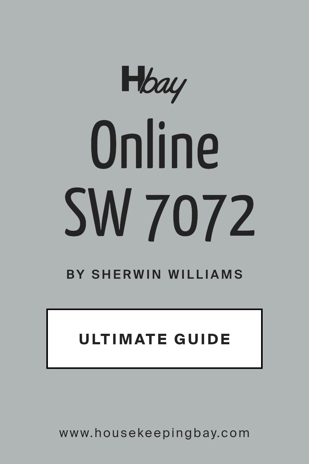
Online SW 7072 by Sherwin Williams
Connecting Through Cool Grays
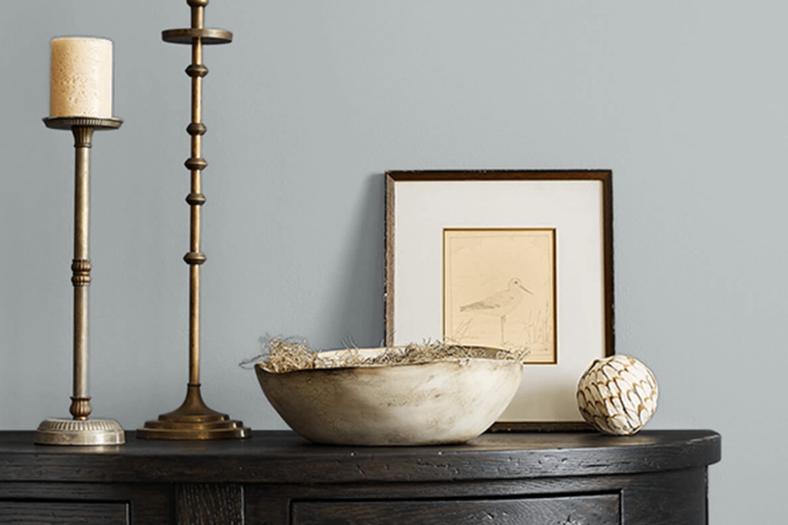
Are you interested in finding the perfect color for your next painting project? Check out SW 7072 Online by Sherwin Williams. This shade offers a beautiful balance between a cool gray and a soft blue, making it a versatile choice for any space in your home. Whether you’re looking to paint your living room, bedroom, or even your kitchen, SW 7072 Online could be the ideal option.
The color works well in a variety of lighting conditions and complements different decorating styles. It can serve as a calming backdrop for a modern look or add a touch of sophistication to a more traditional setting.
Additionally, pairing this color with other shades from Sherwin Williams can help you achieve a cohesive look that reflects your personal style.
So, if you’re eager to give your room a fresh look, consider using SW 7072 Online. It’s a reliable and attractive choice that can help you create a beautiful and inviting space.
sherwin-williams.com
What Color Is Online SW 7072 by Sherwin Williams?
Sherwin Williams’ Online SW 7072 is a rich, deep gray with a subtle blue undertone. Its unique shade makes it versatile for various uses in home decor. Online tends to shift slightly under different lighting conditions, displaying a cooler presence in well-lit areas and a warmer tone in dimmer spaces. This quality allows it to blend seamlessly with a range of interior styles from modern minimalist to cozy traditional.
Online SW 7072 works exceptionally well in spaces aiming for a sleek, contemporary look. It provides a crisp, clean backdrop that highlights metallic accents like stainless steel, chrome, and brushed nickel, enhancing a modern aesthetic.
In traditional settings, pairing it with rich wood textures, like mahogany or walnut, brings warmth and sophistication. It also compleates well with natural materials such as stone and leather, adding depth and texture to the environment.
For textiles, Online pairs beautifully with soft, plush fabrics like velvet or wool, creating an inviting and comfortable atmosphere. It also supports the use of bold patterns without overwhelming the space, allowing for creative design expressions in rugs, throw pillows, and drapery.
Whether used as a focal wall color or as a subtle accent, Online SW 7072 offers flexibility and timeless appeal in interior design.

housekeepingbay.com
Is Online SW 7072 by Sherwin Williams Warm or Cool color?
Online SW 7072 by Sherwin-Williams is a versatile gray color with cool blue undertones, making it an excellent choice for a modern and sleek look in homes. This shade fits well in various spaces, whether you’re aiming for a calming bedroom atmosphere or a sophisticated living area.
Online enhances smaller spaces, making them appear more open and airy, and provides a neutral backdrop that complements bold colors and minimalist designs alike. In rooms with ample natural light, Online takes on a lively, crisp tone, while in areas with less light, it offers a subtle, cozy feel.
This adaptability makes it a reliable choice for many homeowners looking to refresh their interiors without overwhelming existing decor. Furthermore, its neutral character allows for easy pairing with different textures and furnishings, ensuring that it can grow with changing trends and personal tastes.
Thus, Online SW 7072 establishes a grounded yet dynamic foundation for any room.
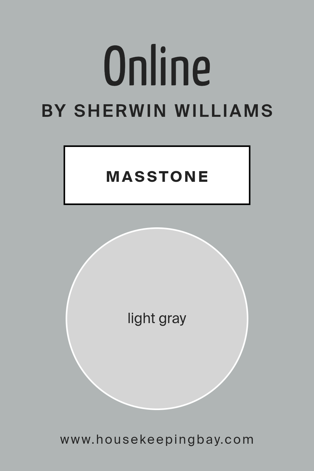
What is the Masstone of the Online SW 7072 by Sherwin Williams?
OnlineSW 7072 by Sherwin Williams has a masstone of light gray, described by the code #D5D5D5. This gentle and subtle shade of gray offers a clean and understated look, making it an excellent choice for interior walls in homes.
Its neutrality helps in creating a peaceful and inviting atmosphere, serving as a perfect backdrop for various decor styles and colors. Whether paired with bold, vibrant accessories or softer, muted tones, light gray maintains balance without overpowering the space.
The versatility of this color is one of its strongest points. It can help small rooms appear larger and brighter as it reflects light well. In larger spaces, it serves as a cohesive foundation that can unify different areas seamlessly. Because it’s so neutral, it is also less likely to clash with existing furniture and decorations, making it a great choice for those looking to update their walls without a complete decor overhaul.
Light gray’s adaptability and calming effect make it a popular choice for bedrooms, living rooms, and even kitchens, enhancing the overall aesthetic of a home.
housekeepingbay.com
Undertones of Online SW 7072 by Sherwin Williams
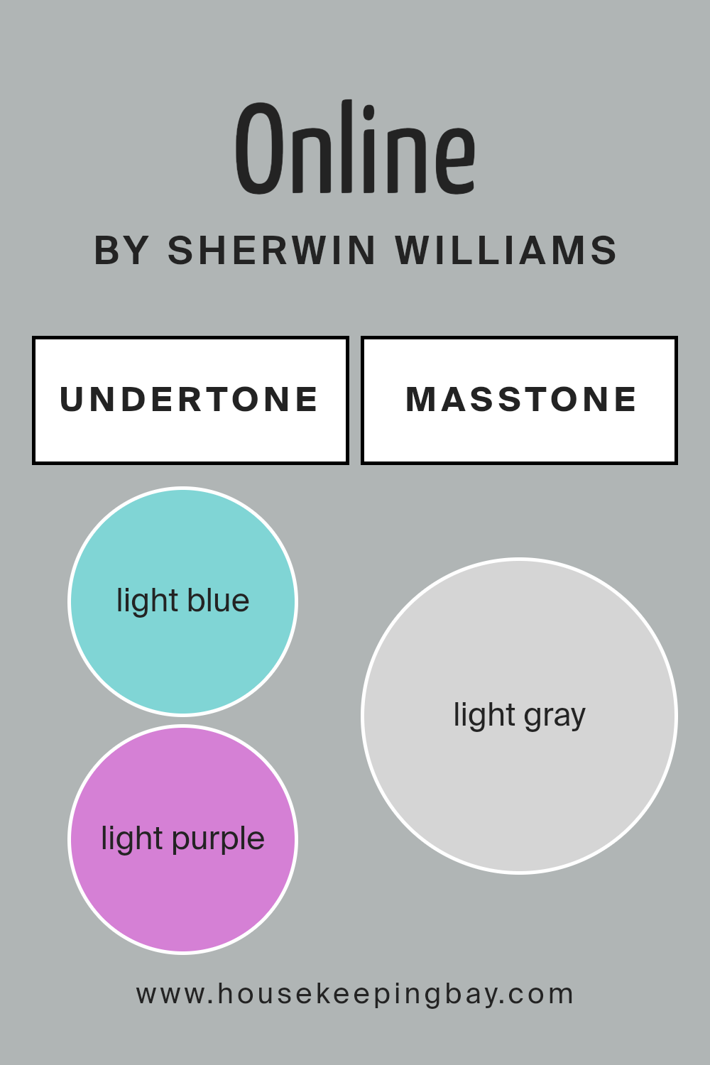
OnlineSW 7072 by Sherwin Williams is a versatile paint color that interestingly adjusts based on its environment due to its range of subtle undertones. With undertones of light blue, light purple, pale yellow, lilac, mint, pale pink, and grey, this color takes on unique shades under different lighting conditions.
Undertones are like the secret ingredients in a color recipe that subtly influence how we perceive the main hue. They can make a color appear warmer or cooler and can significantly impact the feel of a room. In home decor, the right choice of color undertones can enhance natural light, play with artificial lighting, or bring out specific features in furniture and artworks.
For OnlineSW 7072, the integration of these undertones means it doesn’t just look like a simple grey. In spaces with ample sunlight, pale yellow and light blue might make the paint look softer and slightly vibrant. Artificial lights, particularly warmer tones, can draw out the lilac and pale pink, giving a room a cozy and welcoming feel.
In areas with cooler light, the mint and light purple undertones might become more pronounced, infusing the space with a calm, serene atmosphere.
Applying OnlineSW 7072 on interior walls offers a dynamic canvas that adjusts subtly throughout the day and according to room settings and decor. Thanks to its complex undertone structure, it can harmonize with various furnishing styles and preferences, making it an adaptive choice for any interior space.
housekeepingbay.com
Coordinating Colors of Online SW 7072 by Sherwin Williams
Coordinating colors are shades that complement each other and create a harmonious look when used together in a design scheme. The art of pairing colors involves finding hues that balance visually and enhance the overall aesthetic of any space.
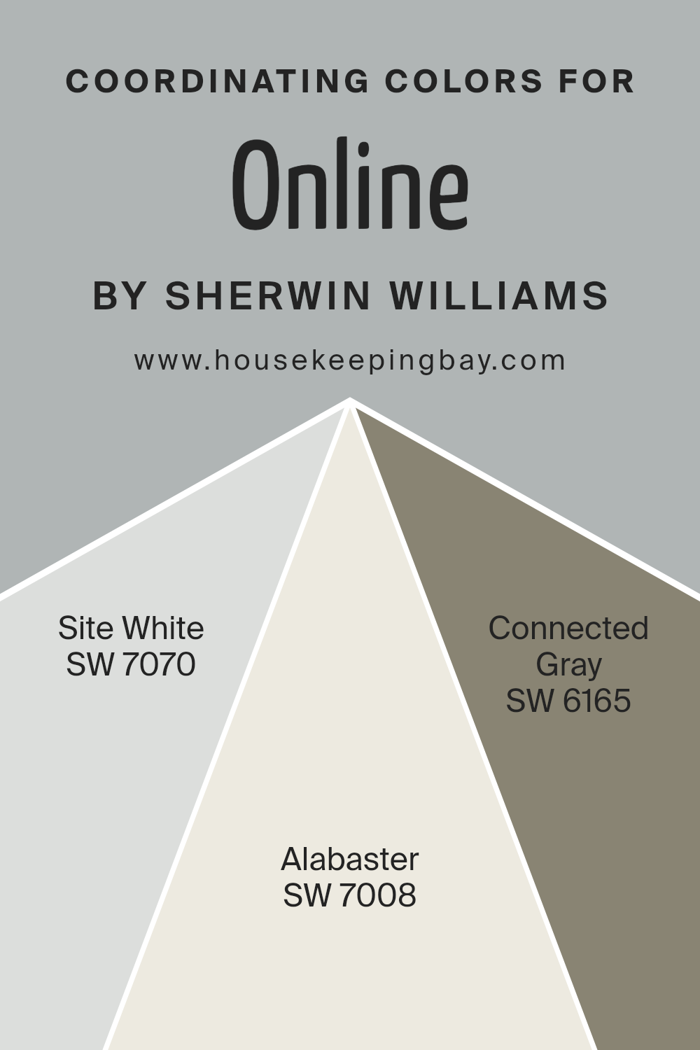
For example, Online SW 7072 by Sherwin Williams pairs well with a selection of coordinating colors such as Site White SW 7070, Alabaster SW 7008, and Connected Gray SW 6165.
Site White SW 7070 is a clean and subtle off-white with just a hint of warmth, making it a versatile background color that allows other shades to stand out without overpowering them. Alabaster SW 7008 offers a touch of creamy richness, providing a soft, soothing presence that works well in any setting seeking a calm and inviting atmosphere.
Meanwhile, Connected Gray SW 6165 is a deeper hue that adds depth and sophistication, serving as an excellent contrast or complementary color alongside lighter tones like Site White and Alabaster. Together, these coordinating colors support and enhance the character of Online SW 7072, allowing for a cohesive and attractive design palette.
You can see recommended paint colors below:
- SW 7070 Site White
- SW 7008 Alabaster
- SW 6165 Connected Gray
housekeepingbay.com
How Does Lighting Affect Online SW 7072 by Sherwin Williams?
Lighting plays a crucial role in how colors appear in different environments. The same color can look dramatically different depending on the type of light it is exposed to. For example, Sherwin Williams’ color OnlineSW 7072, a versatile gray hue, will vary in appearance under different lighting conditions.
In artificial light, the characteristics of bulbs—whether they are LED, fluorescent, or incandescent—impact how OnlineSW 7072 looks. LED lights, which often have a cooler tone, can make this gray appear more crisp and vibrant. In contrast, incandescent bulbs, which typically emit a warmer glow, can make OnlineSW 7072 look softer and slightly more beige.
Natural light brings its own variations. The direction a room faces affects the quality and quantity of sunlight it receives, which in turn alters the appearance of OnlineSW 7072. In north-facing rooms, light is cooler and more consistent throughout the day. Here, OnlineSW 7072 will look more true to its cool gray tone, maintaining a steady appearance without significant changes.
South-facing rooms receive the most sunlight, with intense light throughout the day. In these rooms, OnlineSW 7072 can appear lighter and may pick up warmer undertones during sunny days, making the walls feel lively and vibrant.
East-facing rooms are lit with warm sunlight in the morning and cooler light in the afternoon. OnlineSW 7072 in an east-facing room will look warmly inviting in the morning but will transition to a truer gray as the day progresses.
West-facing rooms receive evening sunlight, which is warmer; thus, OnlineSW 7072 will have a warmer tone in the afternoon and evening. During the morning, when the light is less intense, it maintains a neutral gray appearance.
Understanding how lighting affects colors like OnlineSW 7072 can help in making informed choices about paint colors for different rooms based on the lighting conditions they offer.

housekeepingbay.com
What is the LRV of Online SW 7072 by Sherwin Williams?
Light Reflectance Value (LRV) measures the percentage of light a paint color reflects from or absorbs into a painted surface. An LRV scale ranges from 0%, indicating absolute black that absorbs all light, to 100%, which reflects all light similar to pure white.
This value is crucial when deciding on paint colors because it affects how light or dark a color looks on walls and how it influences the overall brightness of a room. Choosing the right LRV can help achieve the desired ambiance in a space, either by making it feel more open and airy with higher LRVs or more intimate and cozy with lower LRVs.
With an LRV of 45.487, OnlineSW 7072 by Sherwin Williams is almost in the middle of the scale, meaning it neither reflects nor absorbs light excessively. This balanced LRV makes it a versatile color that can adapt well to various lighting conditions, appearing neither too dark nor too bright. In natural light, it can enhance a room with a moderate, soothing presence, while under artificial lighting, it maintains a steady, neutral appearance without overwhelming the senses.
This medium LRV allows it to work well in a variety of settings, making it a practical choice for those wanting to maintain a neutral yet inviting atmosphere.

housekeepingbay.com
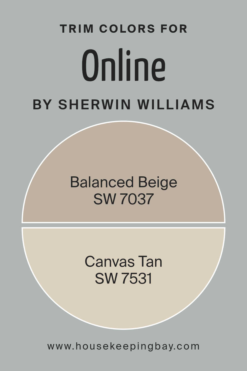
What are the Trim colors of Online SW 7072 by Sherwin Williams?
Trim colors are specific shades used to highlight or enhance the architectural elements of a room, such as door frames, baseboards, moldings, and window sills. These colors are crucial in defining the space and accentuating the primary wall color.
For OnlineSW 7072 by Sherwin Williams, trim colors like SW 7037 – Balanced Beige and SW 7531 – Canvas Tan are ideal choices. They provide a subtle contrast that can effectively complement the primary color, adding depth and coherence to the aesthetic of any room without overpowering the main hue.
SW 7037 – Balanced Beige is a soothing beige tone that imparts a gentle warmth to spaces, making them feel more inviting and cozy. This color works well in various settings, enhancing the overall feel of a room by adding a touch of softness and warmth.
On the other hand, SW 7531 – Canvas Tan is a slightly deeper tan shade that offers a neutral backdrop but with a bit more body than Balanced Beige. Canvas Tan is effective in rooms that need a more pronounced, yet still subtle, delineation between the trim and the wall color, thereby adding a level of sophistication and completeness to the décor.
You can see recommended paint colors below:
housekeepingbay.com
Colors Similar to Online SW 7072 by Sherwin Williams
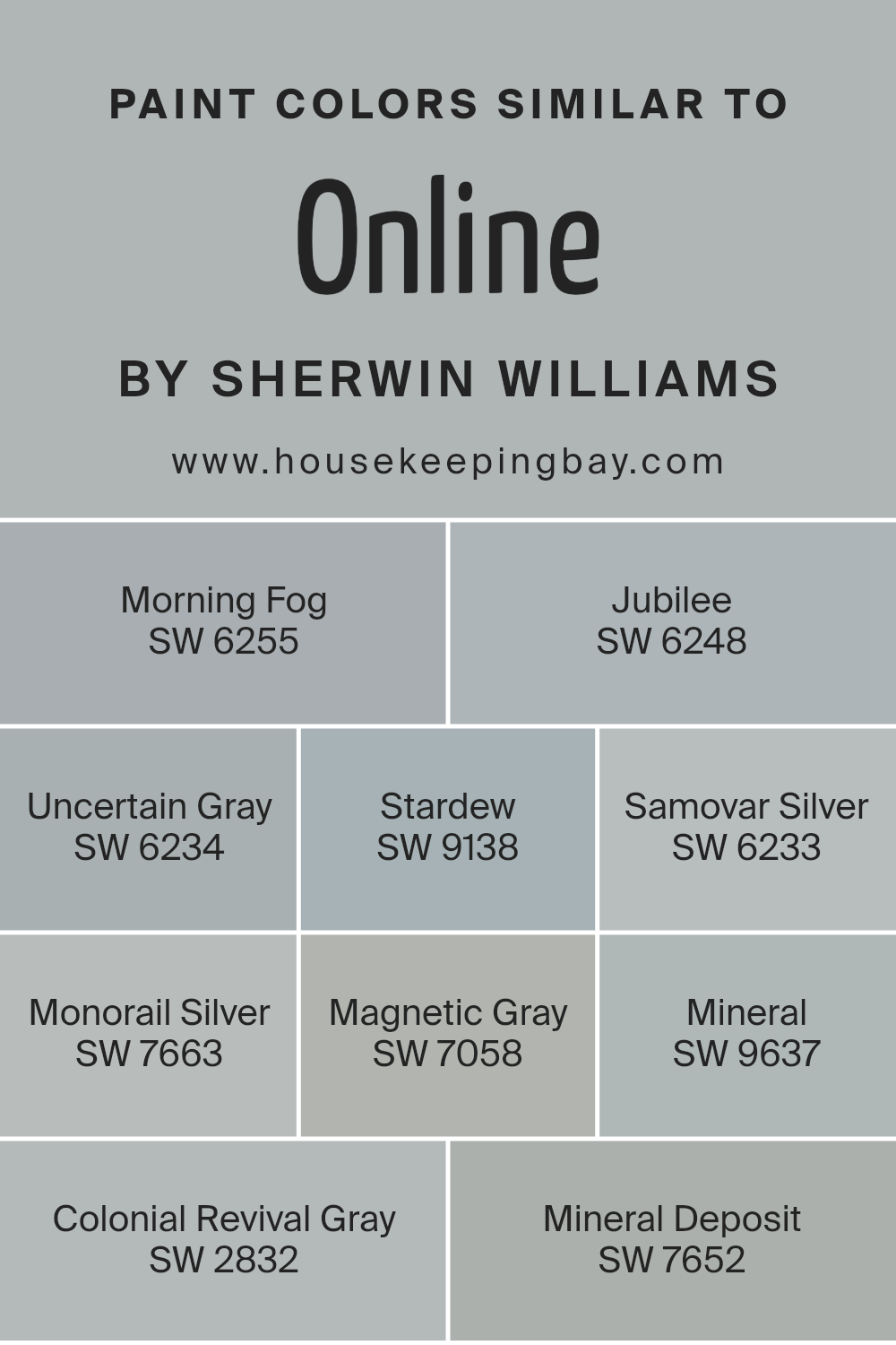
Using similar colors in design enhances aesthetic harmony and creates subtle distinctions within a space. This concept is particularly clear when you consider colors like those similar to OnlineSW 7072 by Sherwin Williams, a versatile shade that pairs easily with other nuanced hues.
Colors such as SW 6255 – Morning Fog, which imparts a soft, misty feel, or SW 6248 – Jubilee, a gentle gray with a touch of blue, offer understated variations that contribute to a cohesive look. These colors are great for achieving continuity in areas where you want to maintain a calm and collected ambiance.
Other shades like SW 6234 – Uncertain Gray and SW 9138 – Stardew provide a slightly deeper tone, adding a hint of strength without overwhelming the senses. Similarly, SW 6233 – Samovar Silver and SW 7663 – Monorail Silver lend a metallic edge, bringing a futuristic flair to modern settings.
For those who prefer a deeper, more enveloping feel, SW 7058 – Magnetic Gray is excellent, as it suggests a magnetic intensity. Conversely, SW 9637 – Mineral and SW 7652 – Mineral Deposit channel the raw beauty of earthy stones, and SW 2832 – Colonial Revival Gray brings a historic charm, making it ideal for spaces that honor past and present.
All these colors share a root in gray, promoting continuity while allowing room for individual expression and visual interest.
You can see recommended paint colors below:
- SW 6255 Morning Fog
- SW 6248 Jubilee
- SW 6234 Uncertain Gray
- SW 9138 Stardew
- SW 6233 Samovar Silver
- SW 7663 Monorail Silver
- SW 7058 Magnetic Gray
- SW 9637 Mineral
- SW 2832 Colonial Revival Gray
- SW 7652 Mineral Deposit
housekeepingbay.com
Colors that Go With Online SW 7072 by Sherwin Williams
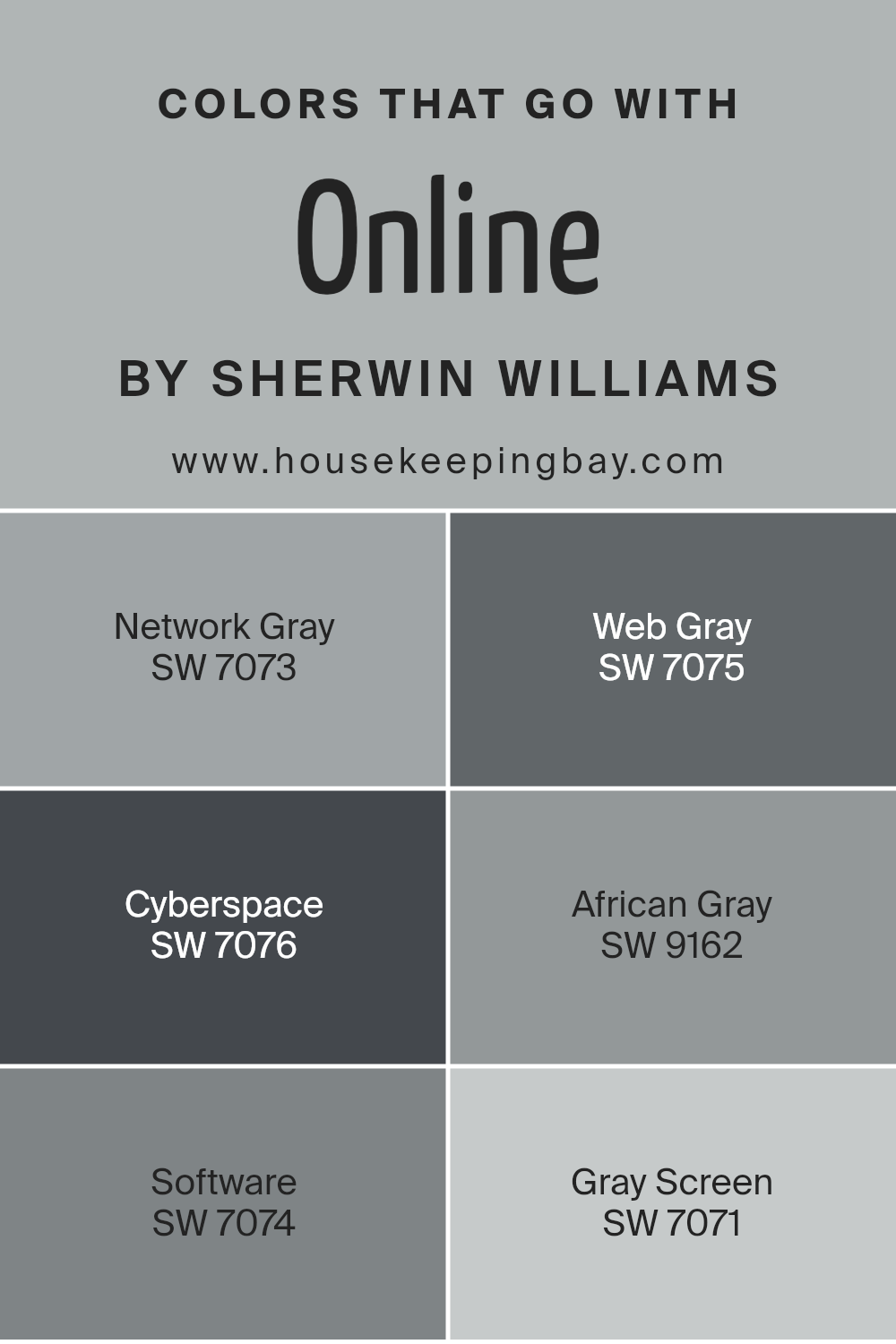
Selecting complementary colors for Sherwin Williams Online SW 7072 is vital as it helps create a harmonious and appealing atmosphere in any space. When paired properly, these colors enhance the character of rooms, making them look more cohesive and aesthetically pleasing.
For example, pairing it with SW 7073 – Network Gray, a light gray with a subtle blue undertone, provides a soothing backdrop that complements the deeper tone of Online. Meanwhile, SW 7075 – Web Gray, darker and more intense, gives a robust contrast that can make features in a room stand out, perfect for accent walls.
Furthermore, including shades like SW 7076 – Cyberspace, a nearly black shade, adds dramatic flair and creates a bold visual impact, especially in modern settings. Matching with SW 9162 – African Gray, which has a taupe-like quality, introduces warmth and natural elements that balance cooler gray schemes. SW 7074 – Software, a mid-tone gray, works seamlessly for a softer transition between the darker and lighter grays, making the space feel more connected.
Lastly, SW 7071 – Gray Screen, which is lighter than Online, helps in brightening up spaces while maintaining the serene mood that gray tones offer, ideal for smaller or less lit areas to give a more spacious appearance.
You can see recommended paint colors below:
- SW 7073 Network Gray
- SW 7075 Web Gray
- SW 7076 Cyberspace
- SW 9162 African Gray
- SW 7074 Software
- SW 7071 Gray Screen
housekeepingbay.com
How to Use Online SW 7072 by Sherwin Williams In Your Home?
Online SW 7072 by Sherwin Williams is a versatile gray paint that can add a modern touch to any home. This color is perfect for those looking to maintain a sleek, cohesive look in their living spaces. Online’s neutral tone means it can complement a wide variety of decor styles, from minimalist to eclectic.
It’s especially effective in rooms where natural light is abundant, as the color takes on different subtle hues throughout the day, adding depth to the space without overwhelming it. Homeowners can use Online in various rooms, such as the living room, kitchen, or bedrooms, to create a fresh, polished look.
It can also be used on exterior surfaces, providing a sophisticated facade that enhances curb appeal. Online pairs well with bright whites for trims and ceilings, or it can be coordinated with darker grays and blues to craft a more dramatic atmosphere.
Online SW 7072 by Sherwin Williams vs Mineral Deposit SW 7652 by Sherwin Williams
Online SW 7072 and Mineral Deposit SW 7652 from Sherwin Williams offer distinct visual experiences. Online SW 7072 presents as a deep, cool gray with a slightly blue undertone, giving a sense of solidity and seriousness. This color suits spaces where concentration and focus are important. It pairs well with bright accents or white trim, providing a grounded, professional look.
Mineral Deposit SW 7652, however, is lighter and carries a softer, more subdued gray tone. It has the versatility to blend well with a variety of decor styles, creating a calm and inviting atmosphere without being overwhelming.
This color works exceptionally well in smaller rooms or areas with limited natural light, as it helps to open up the space and infuse it with a gentle warmth.
Both colors offer unique advantages and set different moods, making them suitable for specific purposes and spaces within a home or office. Their cool tones coordinate well with modern aesthetics, emphasizing cleanliness and sleekness.
You can see recommended paint color below:
- SW 7652 Mineral Deposit

housekeepingbay.com
Online SW 7072 by Sherwin Williams vs Magnetic Gray SW 7058 by Sherwin Williams
Online SW 7072 by Sherwin Williams is a dark gray with a hint of blue, giving it a cool, modern vibe that suits spaces needing a touch of sophistication. It pairs well with metallic accents and white trim for a clean, crisp look.
Contrastingly, Magnetic Gray SW 7058 is a lighter gray that leans towards a soft, neutral palette. It’s versatile, making it ideal for various rooms, from kitchens to bedrooms. While Online is bolder and more dramatic, Magnetic Gray offers a subtler, calming effect that has a widening effect on spaces.
Both colors work well in contemporary settings, but Online is better for making strong statements, whereas Magnetic Gray supports a quieter, more understated elegance. When choosing between them, consider the mood and function of the room.
You can see recommended paint color below:

housekeepingbay.com
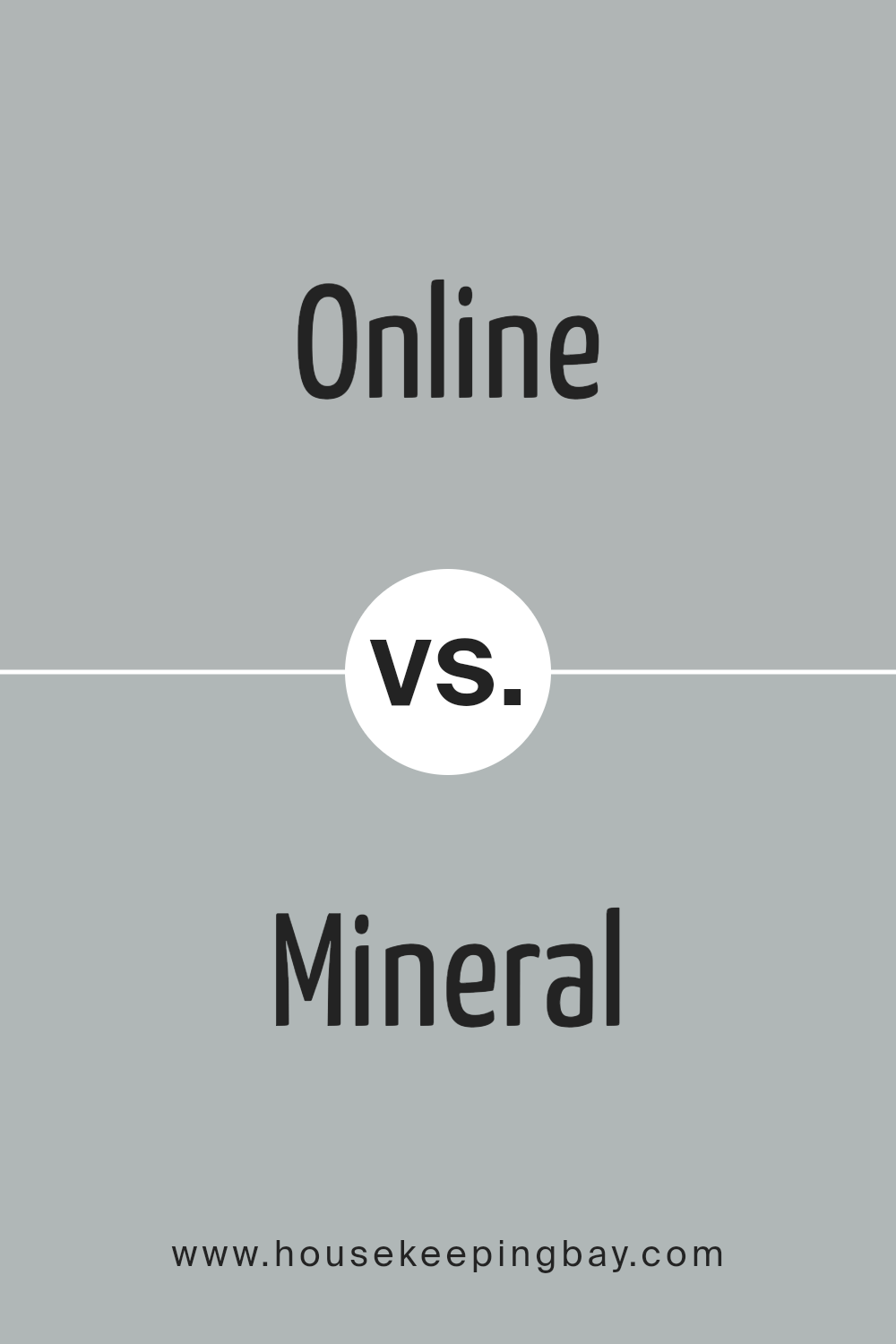
Online SW 7072 by Sherwin Williams vs Mineral SW 9637 by Sherwin Williams
Online SW 7072 by Sherwin Williams is a dark gray hue with blue undertones, giving it a cool, modern vibe. This color suits spaces aiming for a bold, yet refined atmosphere. It works well in technology-driven or minimalist designs, and can make large rooms feel more intimate and cozy.
In contrast, Mineral SW 9637 is a softer, lighter gray that leans towards a neutral beige. This makes it versatile and easy to pair with a wide range of decor styles, from rustic to contemporary. Mineral helps to create a calm, soothing environment and is ideal for areas where relaxation is key.
Both colors offer unique qualities. Online, with its deeper, cooler tone, sets a dramatic mood, while Mineral provides a gentle backdrop that enhances other elements in the space. Each offers distinctive possibilities depending on the desired aesthetic and functional needs of a room.
You can see recommended paint color below:
- SW 9637 Mineral
housekeepingbay.com
Online SW 7072 by Sherwin Williams vs Morning Fog SW 6255 by Sherwin Williams
Online SW 7072 by Sherwin Williams is a cool, deep gray with blue undertones, giving off a modern and refined vibe. It’s a versatile color that works well in spaces aimed at focus and productivity, like home offices or studios. Its depth makes it a good choice for accent walls or furniture, adding a touch of sophistication to any decor.
In contrast, Morning Fog SW 6255 is a lighter shade of gray that leans more towards a soft, silvery tone. This color offers a more subtle and airy feel, making it perfect for bedrooms and living rooms where a calming atmosphere is desired. It complements various decor styles and brings a fresh and clean look to any space.
Both colors provide unique advantages depending on the mood and functionality you want to create in your space. Whether it’s the striking impact of Online SW 7072 or the gentle serenity of Morning Fog SW 6255, each color has its own charm and utility.
You can see recommended paint color below:

housekeepingbay.com
Online SW 7072 by Sherwin Williams vs Uncertain Gray SW 6234 by Sherwin Williams
Online SW 7072 by Sherwin Williams is a deep gray with blue undertones, providing a strong and solid appearance. It’s ideal for spaces where a calm, but assertive ambiance is desired. This color works well in office spaces or bedrooms, adding depth and sophistication without overwhelming the room.
Uncertain Gray SW 6234, also by Sherwin Williams, is a lighter shade of gray compared to Online. It carries a subtle green undertone, making it a more relaxed and soft hue suitable for creating a soothing environment. It’s excellent for bathrooms and kitchens where a gentle, inviting atmosphere is preferable.
In contrast, Online is darker and more intense, thus better suited for areas that benefit from a dramatic flair. Meanwhile, Uncertain Gray is perfect for locations where a gentle, lighter touch is necessary. Both colors are versatile and stylish, providing different ambiances to suit varied tastes and room functions.
You can see recommended paint color below:
- SW 6234 Uncertain Gray

housekeepingbay.com
Online SW 7072 by Sherwin Williams vs Colonial Revival Gray SW 2832 by Sherwin Williams
The main color, Online SW 7072 by Sherwin Williams, is a deep gray that almost touches the spectrum of blue. It provides a modern and sleek vibe, making it an excellent choice for spaces that aim for a contemporary look. This color works well in offices or living areas, pairing nicely with bright accents or soft whites for a balanced aesthetic.
The second color, Colonial Revival Gray SW 2832 by Sherwin Williams, is lighter and warmer compared to Online. It is a soft gray that leans slightly towards taupe, giving it a cozy and inviting feel. This makes it perfect for traditional settings and works especially well in living rooms or bedrooms where a softer, more relaxed atmosphere is desired.
Both colors offer unique gray shades, but Online is cooler and darker, suggesting a more formal, sophisticated feel. In contrast, Colonial Revival Gray is lighter and exudes comfort and warmth, suited for casual, comforting environments.
You can see recommended paint color below:

housekeepingbay.com
Online SW 7072 by Sherwin Williams vs Samovar Silver SW 6233 by Sherwin Williams
Online SW 7072 by Sherwin Williams is a deep, dark gray with a hint of blue. It creates a strong, modern vibe, making it perfect for contemporary spaces or as an accent wall to add sophistication. In contrast, Samovar Silver SW 6233 is much lighter, a soft gray with blue undertones that give it a calm and airy feel.
This color works well in spaces where you want to promote a serene and open atmosphere, such as bedrooms and bathrooms. While Online SW 7072 tends to draw the eye and make bold statements, Samovar Silver SW 6233 is more understated, providing a subtle backdrop that complements various decor styles.
Both colors are versatile but serve different purposes depending on the mood and function you want to create in a space.
You can see recommended paint color below:

housekeepingbay.com
Online SW 7072 by Sherwin Williams vs Jubilee SW 6248 by Sherwin Williams
Online SW 7072 by Sherwin Williams is a refined, deep gray hue with slight blue undertones. It provides a serene backdrop to any room, making it feel both modern and cozy. Due to its darker nature, Online works well in spaces that aim to promote focus and sophistication.
Jubilee SW 6248, also by Sherwin Williams, is a lighter, more muted gray that leans slightly towards the lavender spectrum. This softer color is perfect for creating a calm, soothing environment. It is ideal for bedrooms or other areas where relaxation is key.
Both colors, Online and Jubilee, belong to the gray family, but they offer distinct vibes due to their differing intensities and undertones. Online, being darker, suits a bold, contemporary aesthetic, whereas Jubilee, with its touch of lavender, fosters a gentle, peaceful atmosphere. Each color can beautifully transform a space, depending on the ambience you want to achieve.
You can see recommended paint color below:
- SW 6248 Jubilee

housekeepingbay.com
Online SW 7072 by Sherwin Williams vs Stardew SW 9138 by Sherwin Williams
Sherwin Williams offers two unique colors: “Online” SW 7072 and “Stardew” SW 9138. “Online” is a dark, slate gray showcasing depth and sophistication. Its deep tone makes it perfect for creating a strong statement in areas needing a touch of modernity and formality, such as offices or home exteriors.
In contrast, “Stardew” leans towards a soft, airy gray-blue, reminiscent of a serene sky or calm ocean, lending a soothing feel to any space. This color works wonderfully in bedrooms or bathrooms, promoting a peaceful atmosphere.
While “Online” provides a bold backdrop, potentially absorbing light, “Stardew” reflects light gently, enhancing a room’s brightness. Both colors offer unique vibes: “Online” for striking impact and “Stardew” for gentle calmness, making each suitable for specific rooms depending on the desired effect.
You can see recommended paint color below:

housekeepingbay.com
Online SW 7072 by Sherwin Williams vs Monorail Silver SW 7663 by Sherwin Williams
Online SW 7072 by Sherwin Williams is a deep, cool gray that leans toward a charcoal hue. It offers a sophisticated and slightly moody atmosphere, making it ideal for spaces that aim for a modern and contemplative vibe. It pairs well with vibrant colors as well as other neutrals, which allows for versatile design options.
Monorail Silver SW 7663, also by Sherwin Williams, is a lighter gray that has a more neutral and balanced tone. This color is softer and can help make small rooms feel larger and more open. It’s excellent for spaces where you desire a calm, cohesive look without making the area feel too dark.
Both colors provide great foundations for decorating, yet their impact varies based on how and where they are used. Online, being darker, suits accent walls and statement areas, whereas Monorail Silver works well as a primary color across larger wall expanses to maintain brightness and spaciousness.
You can see recommended paint color below:
- SW 7663 Monorail Silver

housekeepingbay.com
Conclusion
In conclusion, SW 7072 Online by Sherwin Williams is a versatile paint color that appeals to those looking to create a serene and stylish ambiance in their home or office. This particular shade offers a balance of cool undercurrents, complemented by a subtle gray tone, making it a perfect fit for anyone aiming to achieve a modern and sophisticated look in their space.
Whether you’re planning to refresh a living room, design a calming bedroom, or give your workspace a sleek update, SW 7072 Online provides a dependable base that works beautifully on walls, as well as in accents and trim.
This color adapts seamlessly to various lighting conditions, maintaining its integrity without overwhelming a room’s aesthetic. For you, this means you can rely on it to contribute to a peaceful backdrop in spaces meant for relaxation or focus.
Moreover, pairing this color with contrasting or complementary shades can enhance its impact, allowing personal style preferences to shine through.
Choosing SW 7072 Online is more than just picking a paint color; it’s about creating an environment where you can feel comfortable, focused, and at ease. So, for anyone considering a fresh paint job that can uplift their environment without dramatic changes, SW 7072 Online is definitely worth considering.
housekeepingbay.com
